2 – Statistics Background
for Forecasting
2
Previsão | Pedro Paulo Balestrassi | www.pedro.unifei.edu.br
Time Series Notation
Ex.: Uma equação
Isso é apenas uma notação
Forecast error / Residual
Forecast Error
) (
)
( τ = y − y t − τ
e t t t
) 1 (
) 1
( = y − y t − e t t t
t t
t y y
e = −
Lead 1 Forecast Error
Residual (RESI=y
t-FITS)
The reason for this careful distinction between forecast errors and residuals is that
models usually fit historical data better than they forecast. That is, the residuals from
a model-fitting process will almost always be smaller than the forecast errors that are
4
Previsão | Pedro Paulo Balestrassi | www.pedro.unifei.edu.br
Time Series Notation
FITS1 foi obtido a partir de uma equação (Ex.: uma eq. do segundo grau)
A previsão (FORE1) foi feita a partir de t=15 com os dados de 1 a 15 usando uma determinada equação.
RESI1=y-FITS1
Faça no Minitab
TSnotation.mtw
Time Series Plot
… the human eye can be a very
sophisticated data analysis tool.
6
Previsão | Pedro Paulo Balestrassi | www.pedro.unifei.edu.br
Time series plots
Notice that the histograms look very similar even though the time series behavior is very different
Time Series Plot / Histogram
When there are two or more variables, scatter plots can be useful:
Scatter Plots
The scatterplot cannot establish a causal relationship between two variables
(neither can naive statistical modeling
techniques, such as regression), but it is
useful in displaying how the variables have
varied together in the historical data set.
8
Previsão | Pedro Paulo Balestrassi | www.pedro.unifei.edu.br
Variations of time series plots
Between/Within Variation- Candlestick
This type of plot is potentially more useful than a time series plot of just the closing (or opening) prices, because it shows the volatility of the stock within a trading day.
If the opening price was higher than the closing price, the box is filled, while if the
closing price was higher than the opening price, the box is open.
Moving Average
10
Previsão | Pedro Paulo Balestrassi | www.pedro.unifei.edu.br
Centered Moving Average
Faça o gráfico no Minitab.
Perceba uma sazonalidade trimestral (N_Span=4).
Yt** representa the Centered Moving Average Use Graphs (Smoothed)
11 10 9 8 7 6 5 4 3 2 1 1000
900 800 700 600 500 400 300
Index
Yt
The moving average exhibits less variability than found in the original series. It also makes some features of the data easier to see; for example, it is now more obvious that the global air temperature decreased from about 1940 until
Moving Average
12
Previsão | Pedro Paulo Balestrassi | www.pedro.unifei.edu.br
The moving average plot smoothes the day-to-day noise and shows a generally increasing trend.
Moving Average
Plots of moving averages are also used by analysts to evaluate stock price trends;
common MA periods are 5,
10, 20, 50, 100, and 200
days.
Moving Average - Minitab
Employ.mtw
You wish to predict employment over the next 6 months in a segment of the metals industry using data collected over 60 months. You use the moving average method .
52 50 48 46 44 42 40
Metals
14
Previsão | Pedro Paulo Balestrassi | www.pedro.unifei.edu.br
Moving Average
To calculate a moving average, Minitab averages consecutive groups of observations in a series. For example, suppose a series begins with the numbers 4, 5, 8, 9, 10 and you use the moving average length of 3.
The first two values of the moving average are missing.
The third value of the moving average is the average of
4, 5, 8; the fourth value is the average of 5, 8, 9; the
fifth value is the average of 8, 9, 10.
Moving Average – Minitab Help
Centered moving average
By default, moving average values are placed at the period in which they are calculated. For example, for a moving average length of 3, the first numeric moving average value is placed at period 3, the next at period 4, and so on.
When you center the moving averages, they are placed at the center of the range rather than the end of it. This is done to position the moving average values at their central positions in time.
· If the moving average length is odd: Suppose the moving average length is 3. In that case, Minitab places the first numeric moving average value at period 2, the next at period 3, and so on. In this case, the moving average value for the first and last periods is missing ( *).
· If the moving average length is even: Suppose the moving average length is 4. The center of that range is 2.5, but you cannot place a moving average
value at period 2.5. This is how Minitab works around the problem. Calculate the
average of the first four values, call it MA1. Calculate the average of the next four
values, call it MA2. Average those two numbers (MA1 and MA2), and place that
value at period 3. Repeat throughout the series. In this case, the moving average
values for the first two and last two periods are missing ( *).
16
Previsão | Pedro Paulo Balestrassi | www.pedro.unifei.edu.br
Hanning Filter
An obvious disadvantage of a linear filter such as a moving average is that an unusual or erroneous data point or an outlier will dominate the averages that contain that observation, contaminating the moving
averages for a length of time equal to the span of the filter.
For example, consider the sequence of observations
which increases reasonably steadily from 15 to 25, except for the
unusual value 200. Any reasonable smoothed version of the data should also increase steadily from 15 to 25 and not emphasize the value 200. Now even if the value 200 is a legitimate observation, and not the result of a data recording or reporting error (perhaps it should be 20!), it is so unusual that it deserves special attention and should likely not be analyzed along with the rest of the data.
Filter Problem
18
Previsão | Pedro Paulo Balestrassi | www.pedro.unifei.edu.br
Running Median
Running Median
20
Previsão | Pedro Paulo Balestrassi | www.pedro.unifei.edu.br
Running Median
Odd-span medians can smooth data with atypical values
Running Median
22
Previsão | Pedro Paulo Balestrassi | www.pedro.unifei.edu.br
Running Median
Numerical Description: Stationary TS
Bom critério:
Mesma média e variância em diferentes intervalos da
série!
24
Previsão | Pedro Paulo Balestrassi | www.pedro.unifei.edu.br
Stationary data:
Note that the time series seem to vary around a fixed
level. This is a characteristic of stationary time series.
Stationary data:
Pode-se usar testes de hipóteses
para saber se as propriedades de
média e variância são diferentes
em vários seguimentos.
26
Previsão | Pedro Paulo Balestrassi | www.pedro.unifei.edu.br
Stationary TS
Stationary TS
28
Previsão | Pedro Paulo Balestrassi | www.pedro.unifei.edu.br
Coeficiente de Correlação
Ex .: Suponha que o nosso desejo seja o de quantificar a
associabilidade entre duas variáveis relacionadas a cinco agentes de
uma seguradora. Assim, temos:
X ≡ Anos de experiência do agente.
Y ≡ Número de clientes do agente.
8 7
6 5
4 3
2 70
60
50
Experiência Anos de
C lie nt es
Agente x y A 2 48 B 4 56 C 5 64 D 6 60 E 8 72
(x, y) é um par aleatório – Dados emparelhados
Diagrama de
Dispersão
y
x x x −
y y −
x x
s z
x x
− =
y y
s z y y − =
r=Correlação de Pearson
Série de dados
originais (x e y) são valores quantitativos.
O conjunto de pontos é deslocado, tendo agora como centro, os valores médios.
A escala de x e y é agora padronizada. Isso torna os valores independente da sua unidade.
∑
=
= X Y n z z
r Corr ( , ) 1
30
Previsão | Pedro Paulo Balestrassi | www.pedro.unifei.edu.br
∑ =
=
= n
i z x
iz y
iY n X r
1
) 1 , ( Corr
Quadrantes e Correlação
Agente x y z x z y z x . z y
A 2 48 -3 -12 -1.5 -1.5 2,25
B 4 56 -1 -4 -0.5 -0.5 0,25
C 5 64 0 4 0 0.5 0
D 6 60 1 0 0.5 0 0
E 8 72 3 12 1.5 1.5 2,25
Total 25 300 0 0 0 0 4,75
x x − y y −
Coeficiente de Correlação
x = 5
S x = 2 S y y = = 60 8 0 , 95 95 % 5
75 , ) 4
,
( X Y = = =
r = Correlação
32
Previsão | Pedro Paulo Balestrassi | www.pedro.unifei.edu.br
r X Y
n z z
n
x x s
y y
x y s
i
n i
x
i i y
n
i i
= = = −
−
= =
∑ ∑
Corr ( , ) 1 1
1 1
( )( )
r n
x x y y s s
X Y s s
i i
x y x y
= − −
⋅ =
⋅
∑
1 Covariância ( , ) − ≤ ≤ 1 r 1
A correlação apresentada aqui é linear. Existem outros tipos de correlação!
P_value p/ Correlação
Agente x y
A 2 48
B 4 56
C 5 64
D 6 60
E 8 72
Pearson correlation of Anos Exp and Clientes = 0,950 P-Value = 0,013
Ex.: Cálculo da correlação da tabela ao lado
Forte Correlação pois P-Value <0,05
Faça a análise de Correlação das variáveis ao lado na planilha
Bidimensional.mtw
Correlação no Minitab
O Coeficiente de Correlação é também
chamado de
Coeficiente de
Pearson.
34
Previsão | Pedro Paulo Balestrassi | www.pedro.unifei.edu.br
Correlação significa
Causa/Efeito?
Stationary TS – Lag - Autocorrelation
Yt Yt-1 Yt-1 0,051
0,881
Yt-2 -0,133 0,050 0,713 0,891 Cell Contents:
Pearson correlation P-Value
Observe que a operação Lag produz
resultados (-1).
Na Linha 4, por exemplo. Os valores 9, 4 e 1 representam
informações no tempo t, t-1 e t-2,
respectivamente
36
Previsão | Pedro Paulo Balestrassi | www.pedro.unifei.edu.br
Uncorrelated Data
Correlated Data
38
Previsão | Pedro Paulo Balestrassi | www.pedro.unifei.edu.br
Autocovariance / Autocorrelation Parameters
Joint Probability / Finite and Infinite Serie
Joint Probability
Multivariate Normal
Finite Time Series
40
Previsão | Pedro Paulo Balestrassi | www.pedro.unifei.edu.br
Second Order Stationary / Sample ACF
Autocovariance / Autocorrelation
42
Previsão | Pedro Paulo Balestrassi | www.pedro.unifei.edu.br
Chemical process viscosity data
Desenvolver no Minitab - Usar várias séries
Montgomery Viscosity
ACF
44
Previsão | Pedro Paulo Balestrassi | www.pedro.unifei.edu.br
ACF
Série de ACF finita Série
temporal estacionária
ACF
LBQ são valores para se testar hipóteses de um
“White Noise”. Serão
vistos adiante.
46
Previsão | Pedro Paulo Balestrassi | www.pedro.unifei.edu.br
ACF
ACF
Série de ACF não claramente finita
Série temporal não estacionária
48
Previsão | Pedro Paulo Balestrassi | www.pedro.unifei.edu.br
TS ACF
Use of Data Transformations and Adjustments
Data transformations are useful in many aspects of statistical work, often for stabilizing the variance of the
data. Nonconstant variance is quite common in time series data.
Some methods of Transformation:
• Box Cox Transformation;
• Johnson Transformation.
Métodos de Padronização e Escalonamento
não são efetivos em se estabilizar variâncias.
50
Previsão | Pedro Paulo Balestrassi | www.pedro.unifei.edu.br
Data Transformations
Power family of transformations
52
Previsão | Pedro Paulo Balestrassi | www.pedro.unifei.edu.br
Log transformation
The log transformation is used frequently in situations
where the variability in the original time series increases
with the average level of the series. When the standard
deviation of the original series increases linearly with the
mean, the log transformation is in fact an optimal variance-
stabilizing transformation.
Log transformation
54
Previsão | Pedro Paulo Balestrassi | www.pedro.unifei.edu.br
Trend and Seasonal Adjustments
EMPLOY.MTW
Trend Analysis
You collect employment data in a
trade business over 60 months and wish to predict employment for the next 12 months. You use trend
analysis and fit a trend model.
56
Previsão | Pedro Paulo Balestrassi | www.pedro.unifei.edu.br
Trend Analysis
Best
Accuracy Measures
Trend Analysis
58
Previsão | Pedro Paulo Balestrassi | www.pedro.unifei.edu.br
Trend Analysis
Trend Analysis
60
Previsão | Pedro Paulo Balestrassi | www.pedro.unifei.edu.br
Residual Analysis
Backshift Operador - B
62
Previsão | Pedro Paulo Balestrassi | www.pedro.unifei.edu.br
Backshift Operador / Backward difference
Backward difference
64
Previsão | Pedro Paulo Balestrassi | www.pedro.unifei.edu.br
Backward difference
Backward difference
66
Previsão | Pedro Paulo Balestrassi | www.pedro.unifei.edu.br
Seasonal difference
Seasonal difference
68
Previsão | Pedro Paulo Balestrassi | www.pedro.unifei.edu.br
Seasonal difference
Seasonal difference
70
Previsão | Pedro Paulo Balestrassi | www.pedro.unifei.edu.br
Seasonal difference
Seasonal difference – Ex 2.8
72
Previsão | Pedro Paulo Balestrassi | www.pedro.unifei.edu.br
Spectral Analysis
Spectral Analysis
74
Previsão | Pedro Paulo Balestrassi | www.pedro.unifei.edu.br
Spectral Analysis
Fast Fourier Transform
E(t)= 2+
3*SIN(2*(3,14)*t/12) + 4 *COS(2*(3,14)*t/ 4 )+
5 *SIN(2*(3,14)*t/ 9 )
Periodogram
Algoritmos de FFT revelam os valores dos coeficientes de
Senos e Cossenos
76
Previsão | Pedro Paulo Balestrassi | www.pedro.unifei.edu.br
Additive and Multiplicative Model
Additive and Multiplicative Model
Crystal Ball Predictor
78
Previsão | Pedro Paulo Balestrassi | www.pedro.unifei.edu.br
Additive and Multiplicative Model
Additive and Multiplicative Model
80
Previsão | Pedro Paulo Balestrassi | www.pedro.unifei.edu.br
Nesse exemplo tem-se uma planilha de dados
semanais de Janeiro a Setembro.Deseja-se fazer a
previsão de vendas pelas próximas 13 semanas até o final do ano.
Um exemplo com o CB Predictor
ShampooTropical.ppt Ver e
ShampooTropical.xls
CB Predictor – Input Data
82
Previsão | Pedro Paulo Balestrassi | www.pedro.unifei.edu.br
CB Predictor – Raw Data
CB Predictor - Autocorrelations
84
Previsão | Pedro Paulo Balestrassi | www.pedro.unifei.edu.br
CB Predictor - Data Attributes
CB Predictor - Gallery
86
Previsão | Pedro Paulo Balestrassi | www.pedro.unifei.edu.br
CB Predictor - Adv. Options
CB Predictor - Results
88
Previsão | Pedro Paulo Balestrassi | www.pedro.unifei.edu.br
CB Predictor - Preview
CB Predictor - Results / Preferences
90
Previsão | Pedro Paulo Balestrassi | www.pedro.unifei.edu.br Method Errors:
Method RMSE MAD MAPE
Best:
Double Exponential Smoothing 7081,9 5310,8 17,96%
2nd:
Double Moving Average 7174,1 5527,8 15,53%
3rd:
Single Moving Average 7569,6 5953,6 19,90%
4th:
Single Exponential Smoothing 8202,2 6605 22,31%
Method Statistics:
Method Durbin-Watson Theil's U Best:
Double Exponential Smoothing 2,576 0,831
2nd:Double Moving Average 2,882 0,719
3rd:Single Moving Average 2,676 0,802
4th:Single Exponential Smoothing 2,488 0,814
Method Parameters:
Method Parameter Value
Best:
Double Exponential Smoothing Alpha 0,159
Beta 0,392
2nd:
Double Moving Average Periods 7
3rd:
Single Moving Average Periods 2
4th:
Single Exponential Smoothing Alpha 0,448
Date Lower: 5% Forecast Upper: 95%
30/set 60.102 71.810 83.519 07/out 63.685 74.601 85.516 14/out 65.099 77.391 89.684 21/out 67.551 80.182 92.813 28/out 69.009 82.972 96.936 04/nov 70.012 85.763 101.514 11/nov 71.815 88.554 105.292 18/nov 72.881 91.344 109.807 25/nov 75.234 94.135 113.035 02/dez 75.140 96.925 118.711 09/dez 75.798 99.716 123.634 16/dez 74.146 102.506 130.867
CB Predictor - Run!
EMPLOY.MTW
Decomposition
You wish to predict trade employment for the next 12 months using data
collected over 60 months. Because
the data have a trend that is fit well by trend analysis' quadratic trend model and possess a seasonal component , you use the residuals from trend
analysis example (see Example of a trend analysis) to combine both trend analysis and decomposition for
forecasting.
92
Previsão | Pedro Paulo Balestrassi | www.pedro.unifei.edu.br
Decomposition usando Linear Trend
Veja arquivo TrendDecompositionAnalysis.ppt
Decomposition usando Quadratic Trend
Desenvolva:
1) Trend (Quadratic): Gere (Res1/Fits1/Forec1)
2) Decomposition(aditive Seasonal only): Gere (Res2/Fits2/Forec2) 3) Fits=Fits1+Fits2
Forec=Forec1+Forec2
94
Previsão | Pedro Paulo Balestrassi | www.pedro.unifei.edu.br
Minitab Example
Example 2.9
The decomposition approach can be applied to the beverage shipment data. Examining the time series plot in Figure 2.2, there is both a strong positive trend as well as
month-to-month variation, so the model should include both a trend and a seasonal component. It also appears that the magnitude of the seasonal variation does not vary with the level of the series, so an additive model is appropriate.
Faça no Minitab (Differences Shipment.mtw).
Minitab Example
Additive +
Seasonal
96
Previsão | Pedro Paulo Balestrassi | www.pedro.unifei.edu.br
Minitab Example
Minitab Example
98
Previsão | Pedro Paulo Balestrassi | www.pedro.unifei.edu.br
Minitab Example
Minitab Example
100
Previsão | Pedro Paulo Balestrassi | www.pedro.unifei.edu.br
Minitab Example
Minitab Example
102
Previsão | Pedro Paulo Balestrassi | www.pedro.unifei.edu.br
General Approach to Time Series
Modeling and Forecasting
General Approach
104
Previsão | Pedro Paulo Balestrassi | www.pedro.unifei.edu.br
Model Performance
Model Performance
106
Previsão | Pedro Paulo Balestrassi | www.pedro.unifei.edu.br
ME, MAD and MSE (or MSD), are all scale-dependent measures of forecast accuracy
Model Performance
! No Minitab tais métricas são simplesmente obtidas em
função de FITS e não de FORECASTS
Model Performance
108
Previsão | Pedro Paulo Balestrassi | www.pedro.unifei.edu.br
Relative or percent forecast error
MAPE
! No Minitab tal métrica é simplesmente obtida em função de
FITS e não de FORECASTS
110
Previsão | Pedro Paulo Balestrassi | www.pedro.unifei.edu.br
Accuracy Measures
Reproduza
a tabela a
partir de (1)
e (2)
Forecast Error
112
Previsão | Pedro Paulo Balestrassi | www.pedro.unifei.edu.br
MAPE
Normality of forecast errors
114
Previsão | Pedro Paulo Balestrassi | www.pedro.unifei.edu.br
If the sample ACF suggests that the forecast errors are not random then this is evidence that the forecasts can be improved by refining the
forecasting model.
ACF of Errors
Example 2.11
Table 2.3 presents a set of 50 one-step-ahead
errors from a forecasting model.
This sample ACF was obtained from Minitab. Note that sample autocorrelations for the first 13 lags are computed. This is consistent with our guideline
indicating that for T observations only the first T/4 autocorrelations should be
ACF of Errors
116
Previsão | Pedro Paulo Balestrassi | www.pedro.unifei.edu.br
Gaussian White Noise
If a time series consists of uncorrelated observations and has constant variance we say that it is white noise . If, in addition, the observations in this time series are normally distributed , the time series is Gaussian white noise . Ideally forecast errors are Gaussian white noise.
Minitab T test é
mais adequado!
This plot does not indicate any serious problem, with the normality assumption so the forecast errors are Gaussian white noise.
Gaussian White Noise
Fig. 2.32
118
Previsão | Pedro Paulo Balestrassi | www.pedro.unifei.edu.br
Box-Pierce Statistic, Q BP
Ljung-Box Statistic, Q LB
120
Previsão | Pedro Paulo Balestrassi | www.pedro.unifei.edu.br
Ljung-Box Statistic, Q LB
Ljung-Box Statistic, Q LB
122
Previsão | Pedro Paulo Balestrassi | www.pedro.unifei.edu.br
Resultados do Minitab:
T no lugar de Z
Ljung-Box Statistic, Q LB
Choosing between competing models
Concentrating too much on the model that produces the best historical fit often results in overfitting, or including too many parameters or terms in the model just because these additional terms improve the model fit.
In general, the best approach is to select the model that results in the smallest standard deviation (or mean squared error) of the one-step-ahead forecast errors when the model is applied to data that was not used in the fitting
process. Some authors refer to this as an out-of-sample forecast error
standard deviation (or mean squared error). A standard way to measure this out-of-sample performance is by utilizing some form of data splitting; that is, divide the time series data into two segments-one for model fitting and the other for performance testing.
Sometimes data splitting is called cross-validation. It is somewhat arbitrary
as to how the data splitting is accomplished. However, a good rule of thumb is
to have at least 20 or 25 observations in the performance testing data set.
124
Previsão | Pedro Paulo Balestrassi | www.pedro.unifei.edu.br
Mean Squared Error
FITS 2
~1 or 2 parameters
R 2
The R 2 statistic always increases as the model is expanded
2
126
Previsão | Pedro Paulo Balestrassi | www.pedro.unifei.edu.br
R 2 adj
2
Akaike and Schwarz Criterion
2
2
128
Previsão | Pedro Paulo Balestrassi | www.pedro.unifei.edu.br
Consistency
AICC
2
130
Previsão | Pedro Paulo Balestrassi | www.pedro.unifei.edu.br
Parsimony
Monitoring a Forecasting Model
No matter how much effort has been expended in
developing the forecasting model, and regardless of how well the model works initially, over time it is likely that its performance will deteriorate.
There are several ways to monitor forecasting model
performance. The simplest way is to apply Shewhart
control charts to the forecast errors.
132
Previsão | Pedro Paulo Balestrassi | www.pedro.unifei.edu.br
Example 2.12
Reproduza no Minitab.
Arquivo ACF Error.mtw
<Control Chart > I/MR
I/MR Control Chart
There is no reason to suspect that the
forecasting model is
performing inadequately, at least from the
statistical stability viewpoint. Forecast
errors that plot outside the control limits would
indicate model
inadequacy, or possibly
the presence of unusual
observations such as
outliers in the data. An
investigation would be
required to determine
why these forecast errors
exceed the control limits
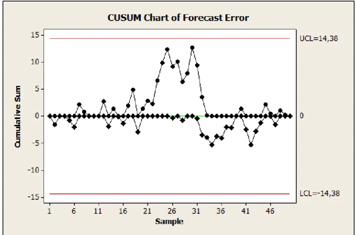
Two other types of control charts. the cumulative sum (or CUSUM) control chart and the exponentially weighted moving average (or EWMA) control chart. can also be useful for monitoring the performance of a forecasting model. These charts are more effective at detecting smaller changes or disturbances in the forecasting model performance than the individuals control chart.
CUSUM/EWMA Control Chart
Example 2.13
Reproduza no Minitab.
Arquivo ACF Error.mtw
<Control Chart > CUSUM (Plan Type h=5)
<Control Chart > EWMA (Lambda=0,1)
Example 2.14
134
Previsão | Pedro Paulo Balestrassi | www.pedro.unifei.edu.br
The CUSUM control chart reveals no obvious forecasting model inadequacies.
CUSUM Control Chart
FIGURE 2.34 CUSUM control chart of the one-step-ahead forecast errors in Table 2.3.
EWMA Control Chart
136
Previsão | Pedro Paulo Balestrassi | www.pedro.unifei.edu.br
Tracking Signals
Tracking Signals
138
Previsão | Pedro Paulo Balestrassi | www.pedro.unifei.edu.br