Faculdade de Engenharia da Universidade do Porto
Email Visualization
Celso Renato da Rocha Cardoso
Master in Informatics and Computing Engineering Supervisor: Maria Teresa Galvão Dias (PhD) Co-Supervisor: Paula Alexandra Silva (PhD)
Email Visualization
Celso Renato da Rocha Cardoso
Master in Informatics and Computing Engineering
Approved in oral examination by the committee:
Chair: Ana Cristina Ramada Paiva Pimenta (Auxiliar Professor)
External Examiner: José Ângelo Braga de Vasconcelos (Assistant Professor) Supervisor: Maria Teresa Galvão Dias (Auxiliar Professor)
_______________________________________________
Abstract
Over the years, email has become a widespread means of communication. Thanks to this broadcast, nowadays most people have one or more email accounts. With the increasing of the email usage, the number of incoming emails is increasing and since an email characteristic is persistency (i.e. email messages remain on people's accounts for many time), the difficulty to find particular information is higher.
Over the past years, characteristics were being added to the email systems, but the display of email systems has undergone many changes. Examples of email systems are Microsoft Outlook, Mozilla Thunderbird, Gmail, among others. There are some visualizations of emails systems but do not have the same end as a email system. Those visualizations just allow see emails or other information‘s related to email, such as relations between people, time between answers, the keywords in emails, among others. The types of visualizations that most inspired the development of this project were visualizations based on real world metaphors.
Initially, the aim of this thesis was to develop a visualization of emails to help users finding an email or detecting patterns among emails. But, during the research of different ways to visualize emails, emerged an idea of creating a prototype of an email application which joined a large part of the initial objectives. A particularity of the prototype is the visualization of the email system that has a different approach to the user interface.
The target audience of the visualization are the college students. When they start their academic life, the amount of emails received increases. Then, the main contribution of this work is to develop an application that helps college students acquiring habits in emails management and improving the way they search for an email, a contact or a folder.
The objectives of this study are acquiring knowledge about different ways of email visualization, studying the email usage by college students, in order to develop a visualization that meets their needs. Throughout the application development, do usability testing with college students.
Initially, college students and ―overloaded users‖ were interviewed in order to identify their needs and the differences, among the two groups of users, in the use of the email. Then, were created low fidelity prototypes of the application. Before reaching the final idea, other ideas, which emerged first, were also drawn.After the first stage of application design, usability tests were performed with college students. In these tests, some problems were identified. To minimize these problems, some interfaces were redesigned. Usability tests were again applied to the new interface. The results of these tests were quite positive, indicating that the changes were well drawn.
The feedback obtained from users was very positive.
At the end, were developed some medium fidelity prototypes, which simulate the actual operation of certain features of the application.
Resumo
O email tornou-se ao longo dos anos um meio de comunicação muito difundido. Graças a esta difusão, hoje em dia, muitas pessoas têm uma ou mais contas de e-mail. Com o aumento do uso do email, o número de e-mails recebidos é cada vez maior e dado que uma característica do email é a persistência (emails permanecem nas contas das pessoas por muito tempo), a dificuldade para encontrar uma determinada informação aumenta. Nos últimos anos, várias características foram sendo adicionados aos sistemas de e-mail, mas a visualização dos sistemas de e-mail não sofreram muitas mudanças. Exemplos de sistemas de e-mail são o Microsoft Outlook, Mozilla Thunderbird, Gmail, entre outros. Existem algumas visualizações de sistemas de e-mails, mas não têm o mesmo fim que um sistema de e-mail. Estas visualizações permitem detectar padrões na utilização de email, como por exemplo, relações entre pessoas, tempos entre respostas, as palavras chave nos emails, entre outras. Os tipos de visualizações que mais inspiraram para o desenvolvimento deste projecto foram visualizações baseadas em metáforas reais. Através de metáforas os utilizadores podem perceber melhor o conceito e ter uma utilização mais agradável da aplicação.
Inicialmente o objectivo era desenvolver uma visualização de email que ajudasse o utilizador a encontrar um email ou que detectasse padrões entre emails. Mas durante o estudo de diferentes visualizações de emails, surgiu a ideia de criar um protótipo de uma aplicação de email que juntasse grande parte dos objectivos iniciais. Uma particularidade do protótipo é a visualização do sistema de email que tem uma abordagem diferente da interface.
O público alvo da visualização desenvolvida são os estudantes, pois quando eles iniciam a sua vida académica a quantidade de emails recebidos aumenta. Então, a principal contribuição do trabalho é desenvolver uma aplicação que ajude os estudantes a criarem hábitos na organização de email e a melhorar a pesquisa, de emails, contactos ou pastas.
Os objectivos deste trabalho são a aquisição de conhecimento sobre diferentes formas de visualização de email, o estudo da utilização do email por parte dos estudantes de modo a ser desenvolvida uma visualização que vá de encontro às suas necessidades. Ao longo do desenvolvimento da aplicação ir realizando testes de usabilidade com os estudantes.
Inicialmente, estudantes e utilizadores com enormes quantidades de email recebidas, foram entrevistados de modo a identificar as suas necessidades e diferenças na utilização do email entre os dois grupos de utilizadores. Depois a aplicação foi desenhada em protótipos de baixo nível. Antes de se chegar à ideia final, outras ideias, que surgiram primeiro também foram desenhadas. Após uma primeira fase de desenho da aplicação, foram realizados testes de usabilidade da mesma com estudantes. Nestes testes, foram identificados alguns problemas. De modo a puder colmatar esses problemas, algumas interfaces foram redesenhadas. Testes de usabilidade foram de novo aplicados à nova interface. Os resultados desses testes foram bastante positivos, o que indica que as alterações foram bem desenhadas.
O feedback obtido pelos utilizadores foi bastante positivo.
No final foram desenvolvidos alguns protótipos de média fidelidade, que permitem simular o real funcionamento de algumas funcionalidades da aplicação.
Acknowledgements
My special thanks to my co-supervisor Paula Alexandra Silva for her guidance, advices and criticism that were very important to me and to my work. I want also to thank to my supervisor Maria Teresa Galvão for her advice and help.
I would like to thank Ricardo Melo. His help gave the work a much better visual appearance. I would like to thank Fraunhofer Portugal Research for all the support and conditions that I received. Fraunhofer was an amazing place to develop the thesis with a very good environment.
I would also like to thank each college student and teacher who participated on the interviews or in the usability tests. Their information‘s was very important in the development of the work.
Finally, I would like to acknowledge my family and friends, for the comprehension and support during this journey.
Table of Contents
Introduction ... 1
1.1 - Domain ... 1
1.2 - Motivation ... 2
1.3 - Contribution ... 2
1.4 - Project Context ... 3
1.5 - Report Organization ... 3
The Role of Human-Computer Interaction in Email Applications ... 5
2.1 - Email ... 5
2.1.1 - Email History ... 5
2.1.2 - The Importance of Email ... 6
2.2 - Information Visualization ... 6
2.2.1 - Information Visualization... 6
2.2.2 - Interaction ... 7
2.2.3 - Human-Computer Interaction ... 8
2.2.4 - Information Visualization Studies ... 9
2.2.5 - Email Platform ... 18 2.2.6 - Email Add-ons ... 23
2.3 - Users ... 27
2.3.1 - Perception ... 27 2.3.2 - Memory ... 29Methodology ... 31
3.1 - User-Centered Design ... 31
3.2 - User Research and Data Collection ... 33
3.2.2 - Questionnaires ... 34
3.3 - Prototyping... 35
3.3.1 - Low-Fidelity Prototype ... 35 3.3.2 - Medium-Fidelity Prototype ... 363.4 - Evaluation ... 36
3.4.1 - Think-Aloud Protocol... 37 3.4.2 - Wizard-of-Oz ... 383.4.3 - System Usability Scale ... 38
User Research and Data Collection ... 41
4.1 - Problem Statement ... 41
4.2 - Selected methodology ... 42
4.3 - Interview Objectives ... 42
4.4 - Interview Design ... 43
4.5 - Results and Discussion ... 43
4.6 - Conclusion ... 44
Prototyping and Evaluation ... 47
5.1 - Initial Ideas ... 47
5.2 - Low-Fidelity Prototype ... 55
5.3 - Evaluation of Low-Fidelity Prototype ... 77
5.3.1 - Test Description ... 77
5.3.2 - Description of Methodology ... 78
5.3.3 - Test Environment ... 79
5.3.4 - Results and Discussion ... 79
5.4 - Redesign ... 81
5.5 - Redesign Evaluation ... 90
5.5.1 - Test Description ... 90
5.5.2 - Description of Methodology ... 92
5.5.3 - Test Environment ... 92
5.5.4 - Results and Discussion ... 92
5.6 - Medium-Fidelity Prototype ... 93
5.7 - Conclusions ... 105
Attachment A ... 115
Attachment B ... 133
B.1 Interview Design ... 133
B.1.1 Interview ... 133 B.1.2 Demographic Data ... 134B.2 Results ... 135
B.2.1 Students Interview Results... 135
B.2.2 Students Demographic Data Results ... 138
B.2.3 ―Overloaded Users‖ Interview Results ... 139
B.2.4 ―Overloaded Users‖ Demographic Data Results ... 141
Attachment C ... 143
C.1 Final Questionnaires Design ... 143
C.1.1 Demographic Data ... 143
C.1.2 System Usability Scale ... 143
C.1.3 System Functionalities Questionnaire ... 145
C.2 Evaluation of Low-Fidelity Prototype ... 146
C.2.1 Test Design ... 146 C.2.2 Results ... 147
C.3 Redesign Evaluation ... 158
C.3.1 Test Design ... 158 C.3.2 Results ... 160Attachment D ... 169
List of Figures
Figure 1 - Interaction design process (Ferreira, 2009) ... 8
Figure 2 - Closeup email visualization (Hegeman) ... 10
Figure 3 - Closeup email visualization (Hegeman) ... 10
Figure 4 - Anymails categories (Horn, 2007) ... 10
Figure 5 - Anymails status (Horn, 2007) ... 11
Figure 6 - Anymails visualization (Horn, 2007) ... 11
Figure 7 - Anymails filter (Horn, 2007) ... 12
Figure 8 - Anymails group on rollover (Horn, 2007) ... 12
Figure 9 - Anymails group continuously (Horn, 2007) ... 12
Figure 10 - Mail garden visualization (Wilkens, Mail Garden, 2008) ... 13
Figure 11 - Jellyfish visualization (Horn, 2007) ... 14
Figure 12 - Jellyfish group (Horn, 2007) ... 14
Figure 13 - Jellyfish artists (Horn, 2007) ... 15
Figure 14 - Jellyfish works (Horn, 2007) ... 15
Figure 15 - Rama visualization (Sarmento, Gouyon, Costa, & Oliveira) ... 16
Figure 16 - Different status of a folder (Horn, 2007) ... 17
Figure 17 - Different status of a document (Horn, 2007) ... 17
Figure 18 - BumpTop visualization ... 18
Figure 19 - Emails separated by date (IBM) ... 19
Figure 20 - Emails categorized by colors (IBM) ... 19
Figure 21 - Emails that are part of a thread highlighted (IBM) ... 19
Figure 22 - Thread map (IBM) ... 20
Figure 23 - Pop-up with the content from an email (IBM) ... 20
Figure 24 - Email collections (IBM) ... 20
Figure 26 - Icons representative of protocols (IBM) ... 21
Figure 27 - Calendar (IBM) ... 21
Figure 28 - Thread Arcs (IBM) ... 22
Figure 29 - Correspondence Map (IBM) ... 22
Figure 30 - Remail message map (IBM) ... 23
Figure 31 - Emails categorized by correspondent (NeoPro) ... 23
Figure 32 - Emails categorized by date (NeoPro) ... 24
Figure 33 - Emails categorized by category (NeoPro) ... 24
Figure 34 - Emails categorized by attachment (NeoPro) ... 24
Figure 35 - Priority emails (NeoPro) ... 25
Figure 36 - Emails search (NeoPro) ... 25
Figure 37 - Messages sent and answers (Hubmann-Haidvogel, 2008) ... 26
Figure 38 - Messages involves more than two users (Hubmann-Haidvogel, 2008)
... 26
Figure 39 - Time between messages without time indication
(Hubmann-Haidvogel, 2008) ... 26
Figure 40 - Time between messages with time indication (Hubmann-Haidvogel,
2008) ... 26
Figure 41 - ThreadVis in a message (Hubmann-Haidvogel, 2008) ... 27
Figure 42 - UCD model (UPA) ... 32
Figure 43 - First paper prototype idea ... 47
Figure 44 - Historic buildings of Porto city ... 47
Figure 46 - Read email ... 48
Figure 45 - Unread email ... 48
Figure 47 - Roof email keywords ... 48
Figure 48 - First idea redesigned prototype ... 49
Figure 49 - Building doors representing different folders ... 49
Figure 50 - Building redesigned ... 49
Figure 51 - Desk in a library ... 50
Figure 53 - Read email ... 50
Figure 54 - Second idea visualization... 50
Figure 55 - Bookcase that represent folders ... 51
Figure 56 – Email view ... 51
Figure 57 - Books stacked ... 51
Figure 58 - Thread visualization ... 52
Figure 59 - Postcard ... 52
Figure 60 - Third idea visualization ... 53
Figure 61 – Corkboard that represents folders ... 53
Figure 62 - Fourth idea visualization ... 54
Figure 63 - Unread and read letter ... 54
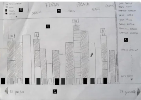
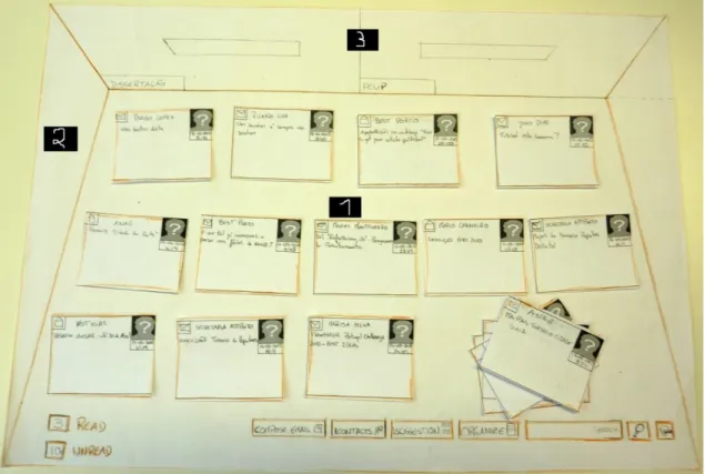
Figure 64 - Final idea ... 55
Figure 65 - Initial view ... 56
Figure 66 - Letters pilled ... 56
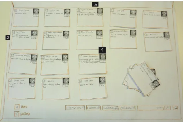
Figure 67 - Letters in the stack ... 57
Figure 68 - Options of letters piled ... 57
Figure 69 – Letter view ... 58
Figure 70 - Status of letter ... 58
Figure 71 - Content of a letter ... 59
Figure 72 - Options menu ... 59
Figure 73 - Reply form ... 60
Figure 74 - Zoom in on the bottom right corner of the reply form ... 60
Figure 75 - Confirmation to delete message ... 61
Figure 76 - Forward form ... 61
Figure 77 - Number of read and unread letters ... 61
Figure 78 - Initial view menu... 62
Figure 79 - Compose email ... 62
Figure 81 - Complete contact information ... 63
Figure 82 - Letters suggestion ... 64
Figure 83 - Confirmation to ignore suggestion ... 64
Figure 84 - Move options ... 65
Figure 85 - Organize options ... 65
Figure 86 - Search result ... 66
Figure 87 - Waste bin ... 66
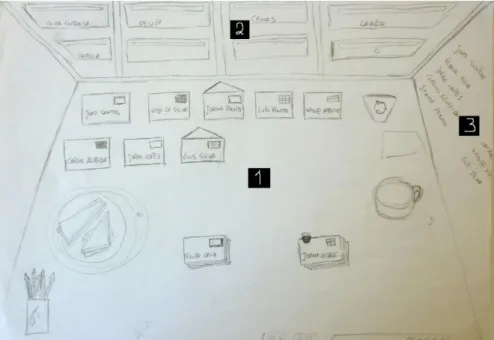
Figure 88 - Desk view ... 67
Figure 89 - Contacts wall view ... 68
Figure 90 - Contact ... 68
Figure 91 - Contact options ... 69
Figure 92 - Emails received of a contact ... 69
Figure 93 - Edit contact information ... 70
Figure 94 - Confirmation to delete contact ... 70
Figure 95 - Contact information ... 71
Figure 96 - Options of contacts ... 71
Figure 97 – Menu of the contact wall ... 72
Figure 98 - New contact ... 73
Figure 99 - Archives wall view ... 74
Figure 100 - Archive opened ... 75
Figure 101 - Folder opened ... 75
Figure 102 - Menu of the archives wall ... 76
Figure 103 - Confirmation to delete archive/folder ... 77
Figure 104 - Initial view redesigned ... 81
Figure 105 - Menu of the initial view redesigned ... 82
Figure 106 - Help ... 82
Figure 107 - Zoom in on the help menu ... 83
Figure 109 - Message to forbid the suggestion of appear again ... 83
Figure 110 - Edit contact information redesigned ... 84
Figure 111 – Contact information ... 85
Figure 112 - Buttons modified in the forms send, reply and forward ... 85
Figure 113 - Buttons modified in the letter content form ... 86
Figure 114 - Notification in an email thread reply ... 86
Figure 115 - Move to archives or to folders ... 87
Figure 116 - Contacts menu redesigned ... 87
Figure 117 - Archives wall redesigned ... 88
Figure 118 - Archive opened ... 89
Figure 119 – Folder opened ... 89
Figure 120 - Folders menu redesigned ... 90
Figure 121 - Desk view with letter selected ... 94
Figure 122 - Letter opened ... 94
Figure 123 - Reply form opened ... 95
Figure 124 - Suggestion of letters ... 96
Figure 125 - Move to an archive ... 96
Figure 126 - Waste bin selected ... 97
Figure 127 - Desk view with stack selected ... 98
Figure 128 - Confirmation of the deletion ... 98
Figure 129 - Archives wall ... 99
Figure 130 - Folders menu ... 100
Figure 131 - Archives wall ... 100
Figure 132 - Archive opened ... 101
Figure 133 - Folder opened ... 102
Figure 135– Contacts wall menu ... 103
Figure 134 - Contacts wall ... 103
Figure 137 - Letters of a contact ... 105
Figure 138 - Sync/Lost design (Rafael, Wagner, Cruz, Robalo, Sampaio, &
Cancela, Sync Lost, 2009) ... 115
Figure 139 - Sync/Lost design zoomed (Rafael, Wagner, Cruz, Robalo, Sampaio,
& Cancela, Sync Lost, 2009) ... 115
Figure 140 - Enron categories (Heer, 2005) ... 116
Figure 141 - Enron version 1 visualization (Heer, 2005) ... 117
Figure 142 - Enron message viewer (Heer, 2005) ... 117
Figure 143 - Enron communities (Heer, 2005) ... 118
Figure 144 - Enron version 2 visualization (Heer, 2005) ... 119
Figure 145 – Timeline (Heer, 2005) ... 119
Figure 146 - Timeline plain (Heer, 2005) ... 119
Figure 147 - Enron search (Heer, 2005) ... 120
Figure 148 - SolidSX visualization (SolidSource IT, 2009) ... 120
Figure 149 - SolidSX zoomed in (SolidSourceIT, 2009) ... 121
Figure 150 - NetFlix visualization (Hefele, 2010) ... 121
Figure 151 - NetFlix zoomed in (Hefele, 2010) ... 122
Figure 152 - PostModernNews visualization (Ford, PostModernNews, 2009) 122
Figure 153 - PostModernNews select message (Ford, PostModernNews, 2009)
... 123
Figure 154 - Enron pattern visualization (Marsh, 2005) ... 123
Figure 155 - Enron pattern zoomed in (Marsh, 2005) ... 124
Figure 157 - Email constellation zoomed in (Krikorian, Email Constellations,
2002) ... 125
Figure 158 - ITP students list conversations visualization (Knowles, ITP Student
List Conversations, 2007) ... 126
Figure 159 - ITP students list conversations zoomed in (Knowles, ITP Student
List Conversations, 2007) ... 126
Figure 160 - Email map visualization, one person relationships (Baker, Email
Map, 2007) ... 127
Figure 161 - Email map zoomed in (Baker, Email Map, 2007) ... 128
Figure 163 - Universe visualization (Harris, Universe, 2007) ... 129
Figure 164 - Universe image (Harris, Universe, 2007) ... 129
Figure 165 - Phylotaxis visualization (Harris, Phylotaxis, 2005) ... 130
Figure 166 - Phylotaxis culture visualization (Harris, Phylotaxis, 2005) ... 130
Figure 167 - Mountain visualization (Viégas, 2005) ... 131
Figure 168 - Mountain selection (Viégas, 2005) ... 131
List of Tables
Table 1 - UCD techniques ... 33
Table 2- Test 1, task 1 ... 153
Table 3 - Test 1, task 2 ... 153
Table 4 - Test 1, task 3 ... 154
Table 5 - Test 1, task 4 ... 154
Table 6 - Test 1, task 5 ... 155
Table 7 - Test 1, task 6 ... 155
Table 8 - Test 1, task 7 ... 156
Table 9 - Test 2, task 1 ... 164
Table 10 - Test 2, task 2 ... 164
Table 11 - Test 2, task 3 ... 165
Table 12 - Test 2, task 4 ... 165
Table 13 - Test 2, task 5 ... 166
Abbreviations
AICOS Assistive Information and Communication Solutions ARPANET Advanced Research Projects Agency Network AUTODIN Automatic Digital Network
FhP Fraunhofer Portugal EmailViz Email Visualization
HCI Human-Computer Interaction IBM International Business Machines
ICT Information and Communication Technology InfoVis Information Visualization
IxD Interaction design ReMail Reinventing Email
R & D Research and Development SMTP Simple Mail Transfer Protocol SUS System usability Scale UCD User-Centered Design
Publications
This dissertation is the result of my own work, under the supervision of Maria Teresa Galvão Dias and has not been submitted in support of an application for another degree at this or any other university. It is the result of my own work, research and judgment, and includes nothing which is the outcome of work done in collaboration, except where specifically indicated; therefore, I acknowledge full responsibility for the work presented. Excerpts of this thesis have been submitted in conferences, most notably:
Celso Cardoso, Paula Alexandra Silva,
Chapter 1
Introduction
Nowadays most people have one or more email accounts, for work, personal or school purposes. With the increasing use of the email as a mean of information exchange, the difficulty in finding and obtaining particular information is becoming increasingly larger. There are several examples of platforms which facilitate the distinction between emails by using tags (as Gmail (Google)), but sometimes this is not enough. For example, an email can belong to two categories, ‗work‘ and ‗university‘, which will result in account size overload, since, in this case, information will be replicated.
An efficient information search for users who constantly appeal to their email account is very important. In the last year, a growing number of studies were focused on email visualization (EmailViz) and several applications have been implemented (Horn, 2007) (Wilkens, Mail Garden, 2008).
EmailViz should not be confused with the visualization of a specific email (e.g., when a user accesses the mailbox of a given email platform and wants to see a specific email message) or even with the layout of an email application. Instead, EmailViz is a graphical way to view information of an email. There are several different variables which can be taken into account in an EmailViz study, such as the peers involved in the thread of an email, those who sent email, the time between replies to an emails, the keywords of a specific email, etc.
The analysis and visualization of this information allows people, which regularly use their email account, to filter and easily find a particular email, because it is based on context.
The main focus of this dissertation is to analyze the existing EmailViz systems. After have the sufficient knowledge in the EmailViz area, is necessary understand the user‘s needs, to propose a new application of an email system. During the development of the prototype, realize usability tests with the users, in order to have a usable application.
In Attachment D, the article submitted in Interacção 2010 in Aveiro is presented.
EmailViz is closely related to Information Visualization (InfoVis). There are many areas where InfoVis can be applied. In the context of email, as noted above, it can be applied to visualize the users involved in a thread, who sent the email and to whom it was sent, to view the time between emails, the period during which the user received more emails, the number of emails per category, among other uses.
This dissertation will be mostly focused on the development of new email visualization application. This visualization is to improve the management of the emails, read and unread, and the search of an object which belongs to an email application (contact, folder or email).
1.2 - Motivation
Email has become a popular tool over time, as well as a pervasive and successful collaboration tool. It facilitates communication between people who are at different places in the world, needing only one point of Internet access and a device to access e-mail. Regarding collaboration, though it was not the main purpose of its creation, it allows communication to/from groups, such as an organization, using this medium to streamline processes, between other things (Whittaker & Sidner, 1996).
Moreover, email can be seen as a victim of its own success, because with its growth, new applications have been added, leading users to use it, sometimes, in a way for which it wasn‘t conceived, and with its high use, the excess of information received, and often unwanted, contributes to difficulties in filtering the information received (IBM).
The challenge of this project, which can be translated in the main motivation, consists in the proposal of a new application of EmailViz. The propose application will provide the users a new way of interaction with the email and even facilitate their understanding. The application will help the users to organize their email, to improve the way they search for an email and to manage unread email.
1.3 - Contribution
With the increasing use, many emails are being saved, due to their importance or simply for being read later. This leads to an overload of emails, which turns the task of finding information difficult.
The main contribution of this work is to study existing email platforms, but especially to study ways of InfoVis and add-ons that can be applied to email, allowing an easy EmailViz.
The user‘s opinion will also be considered, in order to understand where they feel the biggest difficulties, when visualizing an email and their possible suggestions.
After understanding the user needs and have the sufficient knowledge in the EmailVis, propose a prototype of an email application with a different approach to the user interface.
With this application, helps users to acquire habits in email (read and unread emails) management and to improve the way they look for an email. To do that, develop an enjoyable and usable email application.
1.4 - Project Context
The project will be developed at Fraunhofer AICOS (Assistive Information and Communication Solutions) in Porto, Portugal.
Fraunhofer is a German research organization with many research institutes focusing on different fields of applied science, such as health, safety, energy, communication, environment and mobility.
The purpose of AICOS is to democratize access to Information and Communication Technology (ICT) through the development of assistive solutions applied R & D, commercially successful and market oriented (FhP).
The main target of the project is the set of users that frequently use and need to search emails in their email accounts.
1.5 - Report Organization
This master thesis is divided in six chapters.
First of all there is a description of the problem‘s context and explanation of the main goal of this project.
The second chapter is a theoretical overview that covers some information about email and explains some concepts about users, InfoVis and interaction. In this chapter emails platforms, EmailViz studies and email add-ons are also presented.
In the chapter three is explained the methods used during the thesis development.
The chapter four presents the data collected near the users by the author. Those data will be considered by the author in the development of the prototype.
In the chapter five, the prototypes are described. The results of the evaluations made are also presented.
Chapter 2
The Role of Human-Computer
Interaction in Email Applications
This chapter is an introduction to the subject, highlighting the main aspects that surround it. First, we will present a brief history of the evolution of the email focusing on its increasing importance over the years.
Then, certain aspects related to InfoVis will be described, in order to understand the importance of this subject for users. In this section will be given emphasis to existing projects related to the theme of this dissertation. It will address different types of InfoVis, whether or not related to email, existents add-ons to email platforms and email platforms.
Finally, it will be analyzed how some cognitive function of the users, such as perception and memory, may affect the InfoVis approaches.
2.1 - Email
Email is a method that allows exchange of messages through electronic communication systems. It can be used in Internet-based systems, with SMTP (Simple Mail Transfer Protocol) as its base protocol, and in systems such as intranet, which are based on proprietary protocols, used within a company, for example.
Email came first to the Internet, being a crucial tool for their creation. The first system of exchange of messages appears in 1965 and only allowed exchange of messages between computers that were of mainframe type. It is possible that, in 1966, the system AUTODIN (Automatic Digital Network) was the first to allow the transfer of electronic messages between different computers, although the system SAGE (Semi Automatic Ground Environment) possesses the same functionality before (Vleck, 2001) (Tomlinson).
The computers network ARPANET (Advanced Research Projects Agency Network) created in 1969, played an important role in the evolution of email, since it allowed the transfer of electronic messages between systems located in the same network (Hauben). In 1971, programmer Ray Tomlinson introduced the use of the ‗@‘ signal as the separator between user name and machine in the email address (Crocker).
2.1.2 - The Importance of Email
Over the recent past, people have been changing their ways of communication, and email is not an exception. Nowadays, face-to-face communication is not always chosen. Instead, communication can be accomplished by phone, fixed or mobile, fax or any other mode of communication using computers.
Email has become very popular thanks to its easiness to break geographical barriers, because it is only necessary to have a computer or a device with internet access and access to an email client in order to send a message to anyone in the world. Besides being a mean of information exchange between people, the use of email it‘s also a factor of productivity in companies and organizations, since it allows streamline processes, democratizing access to information and decreasing costs (Whittaker & Sidner, 1996).
Due to its development and close relation to networks, it allows sending messages to more than one user. Versatility is a quality which can also be appointed to email, since users can use it in tasks for which it was not projected to perform, such as task management, personal archive and file transfer.
2.2 - Information Visualization
To visualize a set of data it is necessary to build an image from it, in order to elucidate the nature of the data and deriving insight. The challenge in the visualization is to represent the information through a visual metaphor that allows user understand, realize and find the same in a clear way.
Visualization as a sub-field of science, statistics, and graphics has only been recognized as its own entity since the mid-to late-80s. The depth of the seminal work is in line with that of a young field, but finds its strength in background drawn from years of statistics and graphic design (Fry, 2004).
Information Visualization (also called InfoVis) exploits graphics to help people comprehend and interpret data and helps in forming mental models of the data and obtain a better understanding of specific features of the data (Robertson, Card, & Mackinlay, 1993) (Gershon & Page, 2001).
“Information visualization, sometimes called InfoVis, is a special kind of visualization. Visualization is a part of computer graphics, which is in turn a subset of computer science. Visualization is defined as follows [Card et al., 1998]: Visualization is the use of interactive visual representations of data to amplify cognition. This means that the data is transformed into an image, it is mapped to screen space. The image can be changed by users as they proceed working with it. This interaction is important as it allows for constant redefinition of goals when new insight into the data has been gained. Visualization makes use of what is called external cognition [Card et al., 1998]. External resources are used for thinking. People are relieved from having to imagine everything. Instead they can just look at an image. This is only possible because human vision has a very large bandwidth, the largest of all senses [Card et al., 1998]. Information visualization is visualization of abstract data. This is data that has no inherent mapping to space. Examples for abstract data are the results of a survey or a database of the staff of a company containing names, addresses, salary and other attributes. Information visualization should be seen in contrast to scientific visualization, which deals with physically-based data. This kind of data is defined in reference to space coordinates, which makes it relatively easy to visualize in an intuitive way. The space coordinates in the dataset are mapped to screen coordinates. Examples are geographic data and computer
tomography data of a body.
Visualization of abstract data is not straightforward. One has to find a good way to map data values to screen space. It makes a difference whether the data is structured or unstructured. Examples for structured data are networks, software, and algorithms. This kind of data does not play a role in this thesis, only unstructured data is used here.” (Voigt, 2002)
2.2.2 - Interaction
Interaction is particularly important in InfoVis: for exploration, analysis, and presentation of data. Interaction allows the user to implicitly form mental models of the correlations and relationships in the data, through recognition of patterns, marking or focusing in on those patterns, forming mental hypotheses and testing them, and so on (Kosara, Hauser, & Gresh, 2003).
―Interaction between human and computer is at the heart of modern information
being able to change one's view of a corpus of data. Usually that corpus is so large that no single all-inclusive view is likely to lead to insight. Those who wish to acquire insight must explore, interactively, subsets of that corpus to find their way towards the view that triggers an 'a ha!' experience.” (Spence, 2007)
2.2.2.1 - Interaction Design
Interaction design (IxD) is a professional discipline that illuminates the relationship between people and the interactive products they use. While interaction design has a firm foundation in the theory, practice, and methodology of traditional design, its focus is on defining the complex dialogues that occur between people and interactive devices of many types — from computers to mobile communications devices to appliances (Preece, Rogers, & Sharp, 2002).
Interaction design is grounded in an understanding of the real user, their goals, tasks, experiences, needs, and wants, to create useful and usable products and services (Moggridge, Designing Interactions, 2007).
As technologies are often overly complex for their intended target audience, interaction design aims to minimize the learning curve and to increase accuracy and efficiency of a task without diminishing usefulness. The objective is to reduce frustration and increase user productivity and satisfaction.
Interaction design attempts to improve the usability and experience of the product, by first researching and understanding certain users' needs and then designing to meet and exceed them.
2.2.3 - Human-Computer Interaction
InfoVis is a branch of Human-Computer Interaction (HCI) field with origins in late '80. Human-Computer Interaction is the study of how people work with computers and how computers can be designed to help people effectively use them (Dix, Finlay, & Abowd, 2004). HCI is a scientific and applied field where the focus is on how people use computers and how
computers can be designed to help people use them more effectively. The subject is studied from a wide variety of perspectives from many diverse areas, including (among others): computer science, psychology, ergonomics, information sciences, graphic design and sociology.
A basic goal of HCI is to improve the interactions between users and computers by making computers more usable and receptive to the user's needs. Specifically, HCI is concerned with:
Methodologies and processes for designing interfaces
Methods for implementing interfaces
Techniques for evaluating and comparing interfaces
Developing new interfaces and interaction techniques
Developing descriptive and predictive models and theories of interaction
A long term goal of HCI is to design systems that minimize the barrier between the human's cognitive model of what they want to accomplish and the computer's understanding of the user's task (Dix, Finlay, & Abowd, 2004).
2.2.4 - Information Visualization Studies
In this section more emphasis to existing projects related to information visualization will be given.
It will address different ways of InfoVis, whether or not related to email, existent add-ons to email platforms and email platforms.
Other visualizations can be seen in attachment A.
2.2.4.1 - Information Visualization Related to Email
Email VisualizationIt is a work done by Jamin Hegeman (Hegeman) where the user can visualize sent and received emails (including spam).
The emails that can be seen in figures 2 and 3 were taken from three accounts: personal, work and school. Each blue circle represents an email. The blue lines represent the emails received and the red the emails sent. The red circle is where the data, form each account, are gathered.
Anymails
Anymails (Horn, 2007), developed by Carolin Horn with the help of her advisor, Professor Brian Lucid, is a visualization of received emails. They used a metaphor based on microbes.
As can be seen in figure 4, Anymails is composed by six categories: family and friends, school, job, e-commerce, unclassified and spam. Each category is represented by different species, each one corresponding to a color.
In figure 5, the different species for each category as well as their different status can be observed. If a given email is unread and recent, the animal representing it will be big and hairy. Otherwise, the latter will be small, hairy and presenting a slightly lighter color. If the email has been read, the microbe representing it will show less hair, and, if it has been
Figure 4 - Anymails categories (Horn, 2007) Figure 2 - Closeup email visualization (Hegeman)
replied to, it will not present any hair at all. The size of the microbe representation in these last two cases is the same as in the unread case.
The application (figure 6) defines the animals‘ speed according to the conditions of the email they represent. An animal that represents an unread email moves quickly, those representing a read email move slower while an email which has been replied to practically does not move. Only the emails associated to a certain period of time are visualized, a parameter which can be easily defined by the user.
This type of information display allows the user to visualize the amount of received emails within a given period of time, the received spam messages, to distinguish certain periods of his life depending on the amount of received emails associated with a certain species, among others.
Anymails allows filtering of emails by species and by status (figure 7), for example, it is possible to see all the emails belonging to the school category or simply those which have been read.
Figure 5 - Anymails status (Horn, 2007)
When selecting an animal (figure 8), it is possible to visualize some information related to it. The animals, which have topics related, move closer to him. The other animals, which topics are not related, move away. The user defines the emails that are related, by sender, species, status or period they were sent. It can also order the group line by status, age, size, person or species. Grouping the animals provides the user with an easy method to read and filter his emails.
Another possible away of grouping emails is the continuous mode, in which the animals move in strings, which are defined by the user. When the emails are grouped it is possible to extend some information, such as, if an email is read or not (figure 9).
Figure 9 - Anymails group continuously (Horn, 2007) Figure 7 - Anymails filter (Horn, 2007)
Mail Garden
Mail Garden (Wilkens, Mail Garden, 2008) was created in 2008 in Visualizar, Medialab Prado institution. It was suggested by Kjen Wilkens, designed and programmed by Damian Stewart (New Zeland/Portugal), Jenny Cahier (Sweden), and Marcela Machuca (Mexico/United Kingdom).
Mail Garden (Figure 10) visualizes the contents of an email mailbox on a computer as a forest of trees (Wilkens, Mail Garden, 2008). Each tree in this forest represents an email, with the height of the trees reflecting the length of the mail. Moving your mouse over a tree shows some details about the email. Unfortunately, this is the only information available.
2.2.4.2 - Information Visualization Non Related to Email
Jellyfish
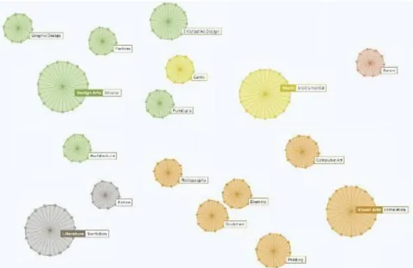
Jellyfish (Horn, 2007) (figure 11) was developed by Carolin Horn with the help of her advisor, Professor Brian Lucid and Florian Jenett, is a visualization of the hierarchical and semantic structure of an art encyclopedia.
The encyclopedia is divided into six main categories: visual arts, design arts, performing arts, literature, film and music. Six colorful jellyfish represent each category, which is composed of subcategories, each represented by a jellyfish with the color of the category to which it belongs.
All jellyfish swim freely while the application is running. When the user clicks on a jellyfish, the others belonging to the same category move to a closer position while those which do not belong move away. For example, when the user clicks on the ‗Arquitecture’ jellysfish (highlighted in gray in figure 12), all jellyfishes that belongs to ‗Design Arts’ category swim next to it.
Each jellyfish is surrounded by dots representing artists related to its subcategory. By selecting an artist, the user can visualize information about him, as well as connections to others artists. The user can also consult the work of that particular artist, since they emerge inside the jellyfish representative of the subcategory. If a particular work is selected, connections to other work present on different categories are also shown.
As it can see in the figure 13, when the artist Michael Thonet, which belongs to ‗furniture’ subcategory, is selected, the connection to the architect Le Corbusier ( famous for using furniture in his buildings) appears and a new circle grows around the jellyfish which contains the work information.
Figure 11 - Jellyfish visualization (Horn, 2007)
In figure 14, ‗chair no.14‘ is selected, triggering the emergence of a text with information related to it and a connection to another art work.
It is possible increase or decrease a jellyfish, allowing the presentation of more or less information.
RAMA – Relationship International Artists
RAMA (Sarmento, Gouyon, Costa, & Oliveira) (figure 15) is a prototype of a Web application that brings together different features of artists drawn from Last.fm 's API. It emphasizes the commonalities as well as the main differences among the artists. It allows the users to interact with the graphs, for example, to remove or expand artists). RAMA provides two simultaneous layers of information:
a graph built from artist similarity data
overlaid labels containing user-defined tags
Figure 13 - Jellyfish artists (Horn, 2007)
Natural Icons: Natural metaphors for InfoVis
The following two examples, Folder and Document Icons, were performed by Carolin Horn (Horn, 2007) with the help of her advisor, Professor Jan Kubasiewicz. It uses natural methaphors to represent folders and documents existents in workplace.
Folder Icon
The figure 16 shows the possible status of a folder, which is represented by a tree.
From this image we can see the age of folder. If it has been created recently, it is green (as in Spring), or else, according to the age, it will lose the leaves (remember the Fall and Winter). Concerning the amount of files contained in the folder, the more documents it has, higher the tree becomes.
Document Icon
Through the figure 17, we can see the status of a document, which is represented by a leaf.
As in folders, the more green is the leaf and larger, the younger and bigger is the document.
BumpTop
Figure 16 - Different status of a folder (Horn, 2007)
BumpTop (figure 18) is a 3D desktop environment supporting normal behavior of a real-world desk (Lifehacker). It was created at the University of Toronto as Anand Agarawala‘s masters thesis. Users can sort, stack, and search items on their virtual desk. Photos and documents can be pinned to the walls of user‘s virtual workspace or grouped together in piles. As BumpTop is integrated with the API of popular social media sites uploading files is as easy and tossing the stack of them onto the icon for that social network.
The BumpTop was acquired by Google and is no longer available for sale neither for free download (The Bumps). The BumpTop was presented in TedTalks (Agarawala, 2007).
2.2.5 - Email Platform
ReMail (IBM) will be described in this section. This email platform was chosen because it has different ways of email visualization. This platform also can visualize other platforms messages, distinguishing those messages from the user emails.
ReMail – Reinventing Email
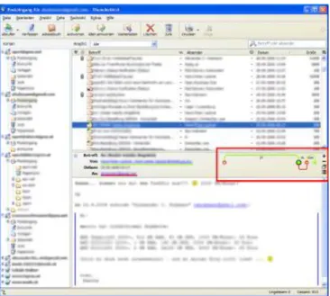
Remail (IBM) is a prototype email client created by IBM to solve problems of email overload. It contains features such as email, calendar and chat. The most notable feature is the introduction of list separators (figure 19), i.e., as in traditional mailboxes, they are divided by the column headers. Besides these, there are tabs to divide information, for example, by date.
Users can categorize their messages by giving them different colors, depending on relevance (figure 20).
ReMail allows seeing the threads of messages in two different ways. One separate messages as if they were different messages. The other shows the messages together, i.e.,
show only one message with all together (figure 21).
When user chooses to view separate messages, if the selected message is part of a thread, all the others that are part of the same thread are highlighted.
Figure 19 - Emails separated by date (IBM)
Figure 20 - Emails categorized by colors (IBM)
If we choose to view all the threads of a message as a single one, this shows the summary of the most recent message received.
In both cases, the user can switch between messages of a thread through a thread map that appears in the preview pane (figure 22).
Hovering the counter threads, a pop-up window appears with the contents of each message in the thread and who sent it (figure 23).
ReMail has a system of collections to divide the emails in folders (figure 24). Users can set their rules to remove messages from the mailbox or from collections. They can also move messages from the inbox to users 'in-sight' and 'out-sight‘ collections. Messages that are in the collections 'out-sight' can only be viewed within their respective folders. A message can be part of different collections and a user can sort the collections in the order he want, as well as their priorities.
ReMail allows to receive messages from different protocols, and the users can add any information of interest in one place. Destinations include blogs, RSS feeds, wikis, among others (figure 25).
Figure 22 - Thread map (IBM)
Figure 23 - Pop-up with the content from an email (IBM)
Icons are used to facilitate the distinction of messages originating from users of other sources (figure 26).
The calendar (figure 27) enables the user to drag the messages into it. When a message is added to a calendar, a reminder or an event defined by the user is associated to it.
Remail has different viewing modes in order to help users to see the connections between messages and people that would otherwise be invisible.
Thread Arcs (figure 28) shows the sequence of messages of the thread. The selected message and its arches for parents and children are highlighted in blue, unread messages have a black border and sent by the user are hollow circles. As in ThreadVis, the chronological order is from left to right, i.e., from the oldest to the most current.
Figure 25 - Different protocols (IBM)
Figure 26 - Icons representative of protocols (IBM)
Correspondent Map (figure 29) groups messages into collections by senders, as these are grouped by their areas. In an area people are sorted by the number of messages sent, the sending more are placed first. The color of the rectangles indicates the age of most recent
message from the sender.
Messages that require a response aren‘t highlighted.
Message Map (figure 30) uses icons to represent messages in a folder of a user. Each case involves a message, and the boxes are shown in reverse chronological order. A selected message is highlighted in blue, and those involved in the thread with a light blue. Message Map allows the user search by filtering for different aspects such as send, unread, among others.
Figure 28 - Thread Arcs (IBM)
2.2.6 - Email Add-ons
NEO
NEO (NeoPro) is an add-on for Microsoft Outlook (Microsoft, 2010) that provides the users with a greater freedom in viewing emails.
It allows the visualization of the emails categorized by correspondent (figure 31), category (figure 32), date (figure 33) and attachments (figure 34).
Figure 30 - Remail message map (IBM)
2.2.6.1 -
The highest priority messages are separated from the lowest and it contains a search engine that allows the search by different categories (figure 35).
Figure 33 - Emails categorized by category (NeoPro)
Figure 32 - Emails categorized by date (NeoPro)
The user can uses the Neo search engine (figure 36).
NEO is just an interface that works on top of Outlook, which continues to receive the emails. NEO will attach a copy.
ThreadVis
ThreadVis (Hubmann-Haidvogel, 2008) is an add-on for Mozilla Thunderbird (Mozilla). The messages in the thread are displayed horizontally and arranged chronologically from left to right.
Figure 35 - Priority emails (NeoPro)
Usually the selected message has a different color or a circle around a node representative of the same.
When the user sends message and the recipient replies, the message sent by the user is represented with a not filled circle. The answers received from the other user are represented with a filled circle, as can be seen in figure 37).
If the message thread involves more than two users, different colors are used (figure 38).
The time between each message can be visualized in two different ways. One that just highlights the gap among messages. The larger the space among messages, the longer the time between them (figure 39). The other possibility indicates the time in hour, minutes or seconds among messages (figure 40).
The user can visualize the ThreadVis add-on in the header of the message (figure 41).
Figure 37 - Messages sent and answers (Hubmann-Haidvogel, 2008)
Figure 38 - Messages involves more than two users (Hubmann-Haidvogel, 2008)
Figure 39 - Time between messages without time indication (Hubmann-Haidvogel, 2008)
Figure 40 - Time between messages with time indication (Hubmann-Haidvogel, 2008)
2.3 - Users
InfoVis is very important to facilitate user‘s lives in finding and understanding information. So, the user is necessarily a very important element in the interaction and design of InfoVis. To design better interfaces is necessary to understand the user, his memory, perception and thought. In this section we will briefly approach, some characteristics of the human cognitive psychology.
2.3.1 - Perception
Perception is the brain function that assigns meaning to sensory stimuli, from the history of past experiences (James, 1890). It‘s through the perception that a person can assign a meaning to his environment, because he acquires, interprets, selects and organizes the information obtained by the senses.
―Perception is our "window to the world" that enables us to experience what is "out
there" in our environment. Thus, perception is the first step in the process that eventually results in all of our cognitions. Paying attention, forming and recalling memories, using language, and reasoning and solving problems all depend--right at the beginning--on perception. Without perception, these processes would be absent or greatly degraded. Therefore it is accurate to say that perception is the gateway to cognition.” (Goldstein,
2005)
Figure 41 - ThreadVis in a message (Hubmann-Haidvogel, 2008)
There are several types of perception: visual perception auditory perception olfactory perception taste perception tactile perception time perception spatial perception proprioception
In this section we will only approach visual perception, because it‘s related with InfoVis.
2.3.1.1 - Visual Perception
The vision is the perception of light rays by the visual system. Visual perception is the vision end product, which is the ability to detect light and interpret the effects of light stimulation (James, 1890).
Types of visual perception:
Shape perception
Faces and associated emotions perception
Spatial relations, that involves deep, orientation and movement
Color perception
Light intensity perception
2.3.1.2 - Attention
Attention is the cognitive process that allows focus on something specific in the surrounding environment, ignoring the rest. It also can be defined as the allocation of processing resources.
―Everyone knows what attention is. It is the taking possession by the mind, in clear and
vivid form, of one out of what seem several simultaneously possible objects or trains of thought. Focalization, concentration, of consciousness are of its essence. It implies withdrawal from some things in order to deal effectively with others, and is a condition which has a real opposite in the confused, dazed, scatterbrained state which in French is called distraction, and Zerstreutheit in German‖ (James, 1890)
It‘s very important in many areas, for example, to ignore other visual, sound, among other stimuli, passing around them.
There are two attention types:
Concentrated: only one stimulus is selected and processed
Divided: several stimuli are simultaneously selected and processed
2.3.1.3 - Pattern Recognition
Pattern recognition involves the identification of faces, objects, words, sounds, etc, referring to the process of recognition of a set of stimuli.
Is very important to InfoVis, because there are often used metaphors involving shapes and their recognition is a positive element in the perception of the meaning of information.
2.3.2 - Memory
Memory is the ability of an organism to acquire, store, retain and recall information.
Neuroscientists distinguish declarative memory of non-declarative memory. Declarative memory stores the knowledge that something happened, something that can be declared (facts, names, events…) and is more easily acquired, but also quickly forgotten. Non-declarative or procedural memory stores how this happen, includes motor procedures (such as drawing, running…).
Memory, according to several scholars, is the basis of knowledge. As such, should be worked and stimulated. It‘s through her that we gave mean to every day experiences and accumulated for use during life (James, 1890).
There are several types of memory:
Declarative memory: is the ability to verbalize a fact and can be divided into:
o Immediate memory: has duration between fractions and few seconds. The retained facts, after are completely forgotten.
o Short-term memory: has duration of some seconds or minutes. Allows remember events that happened recently.
o Long-term memory: has duration of days, months or years. Allows keep the facts that are rarely forgotten.
Procedural memory: is the ability to retain information which can‘t be verbalized, such as cycling.
Chapter 3
Methodology
During the project, it was used different methodologies. Those methodologies are presented in this chapter.
3.1 - User-Centered Design
In the 1980s was originated the term ‗user-centered design‘ in Donald Norman‘s research laboratory at the University of California San Diego (UCSD). UCS became widely used after the publication of a co-authored book entitled: User-Centered System Design: New Perspectives on Human-Computer Interaction (Norman & Draper, User Centered System Design; New Perspectives on Human-Computer Interaction, 1986). UCD is an approach to design that focus on the people who will use the product through the planning, design and development of a product (Abras, Maloney-Krichmar, & Preece, 2004).
The users are involved, one way or another, in the different ways in UCD. For example, some types of UCD consult users about their needs and involve them at specific times during the design process; typically during requirements gathering and usability testing. There are other UCD methods in which users have deep impacts on the design by being involved as partners with designers throughout the design process (Abras, Maloney-Krichmar, & Preece, 2004).
Norman offers four basic suggestions on how a design should be that places the user at the center of the design:
Make it easy to determine what actions are possible at any moment.
Make things visible, including the conceptual model of the system, the alternative actions, and the results of actions.
Make it easy to evaluate the current state of the system.
Follow natural mappings between intentions and the required actions; between actions and the resulting effect; and between the information that is visible and the interpretation of the system state (Norman, The Psychology Of Everyday Things, 1988).
The need to involve actual users, often in the environment in which they would use the product being designed, was a natural evolution in the field of UCD. The users‘ involvement lead to more effective, efficient and safer products and contributed to the acceptance and success of products, so they became a central part of the development process (Preece, Rogers, & Sharp, 2002).
There is an international standard that is the basis for many UCD methodologies (Usability Professionals' Association). This standard (ISO 13407: Human-centered design process) defines a general process for including human-centered activities throughout a development life-cycle, but does not specify exact methods (UPA).
In this model, once the need to use a human centered design process has been identified, four activities form the main cycle of work (UPA):
1. Specify the context of use
Identify the people who will use the product, what they will use it for, and under what conditions they will use it.
2. Specify requirements
Identify any business requirements or user goals that must be met for the product to be successful.
3. Create design solutions
This part of the process may be done in stages, building from a rough concept to a complete design.
4. Evaluate designs
The most important part of this process is that evaluation (ideally through
usability testing with actual users), is as integral as quality testing is to good software development.
The process ends once the requirements are met.
The next table suggests ways to involve users in the design and development of a product/artifact (Preece, Rogers, & Sharp, 2002).
Technique Purpose Stage of the Design
Cycle
Background Interviews and Questionnaires
Collecting data related to the needs and expectations of users; evaluation of design alternatives, prototypes and the final artifact
At the beginning of the design Project
Sequence of work interviews and questionnaires
Collecting data related to the sequence of work to b performed with the artifact
Early in the design cycle
Focus groups Include a wide range of stakeholders to discuss issues and requirements
Early in the design cycle
On-site observation Collecting information concerning the environment in which the artifact will be used
Early in the design cycle
Role Playing, walkthroughs, and Simulations
Evaluation of alternative designs and gaining
additional information about user needs and expectations; prototype evaluate
Early and mid-point in thedesign cycle
Usability testing Collecting quantities data related to measurable usability criteria
Final stage of the design cycle
Interviews and questionnaires
Collecting qualitative data related to user satisfaction with the artifact
Final stage of the design cycle
Table 1 - UCD techniques
In this work it will be used background interviews, usability testing and final questionnaires.