A N Á L I S E T É C N I C A A P L I C A DA A O S
M E R C A D O S C A M B I A I S E S T U D O
C O M PA R A T I V O D A S C O T A Ç Õ E S
E U R / U S D, G B P / U S D E J P Y / U S D
Cláudio Couto dos Santos
L i s b o a , N o v e m b r o d e 2 0 1 4
I N S T I T U T O P O L I T É C N I C O D E L I S B O A
I N S T I T U T O S U P E R I O R D E C O N T A B I L I D A D E
I N S T I T U T O P O L I T É C N I C O D E L I S B O A I N S T I T U T O S U P E R I O R D E C O N T A B I L I D A D E E A D M I N I S T R A Ç Ã O D E L I S B O A
A N Á L I S E T É C N I C A A P L I C A DA A O S
M E R C A D O S C A M B I A I S E S T U D O
C O M PA R A T I V O D A S C O T A Ç Õ E S
E U R / U S D, G B P / U S D E J P Y / U S D
Cláudio Couto dos Santos
Dissertação submetida ao Instituto Superior de Contabilidade e Administração de Lisboa para cumprimento dos requisitos necessários à obtenção do grau de Mestre em Contabilidade e Análise Financeira, realizada sob a orientação científica de Doutora Sónia Ricardo Bentes, Professora Adjunta, Finanças e Economia.
Constituição do Júri:
Presidente _______________________________ Doutor Joaquim Martins Ferrão Arguente_________________________________ Doutor Carlos Pacheco Pinheiro Vogal___________________________________ Doutora Sónia Ricardo Bentes
iv
Declaro ser o(a) autor(a) desta dissertação, que constitui um trabalho original e inédito, que nunca foi submetido (no seu todo ou qualquer das suas partes) a outra instituição de ensino superior para obtenção de um grau académico ou outra habilitação. Atesto ainda que todas as citações estão devidamente identificadas.
Mais acrescento que tenho consciência de que o plágio – a utilização de elementos alheios sem referência ao seu autor – constitui uma grave falta de ética, que poderá resultar na anulação da presente dissertação.
v
Acknowledgments
Throughout these two years many were those that helped me and gave me strength to conclude this master. Some of them were present temporarily and other were there since the beginning until the end.
Of course, the first people to receive my acknowledgments are my parents that always encouraged me to take this course and were always there when I arrived late at night from classes. They have been and always will be the reason for me to be ambitious and fight for more.
I would also give a special thanks to all the teachers that challenged me in order to achieve better results and my colleague Marta Marques that always encouraged me to carry on when I wanted to quit.
There are other people that weren´t forgotten in these acknowledgments which made their impact in my life during this period.
vi
Resumo
Desde a sua origem, a Análise Técnica tem vindo a dividir opiniões entre aqueles que compreendem os benefícios na utilização das suas ferramentas, e aqueles que se recusam aceitar estes conceitos estatísticos. Conceitos como os padrões gráficos, as médias móveis, os osciladores, entre outros têm fundamentos estatísticos. Os cálculos dos indicadores técnicos baseiam-se todos em conceitos estatísticos que utilizam os preços ocorridos no passado.
Utilizando o mercado cambial, especificamente os pares EUR/USD, o GBP/USD e o JPY/USD, algumas das principais ferramentas técnicas serão testadas. Serão postas à prova de modo a determinar se os sinais por elas emitidos são válidos e se são emitidos atempadamente em relação à movimentação do preço.
Verificou-se neste estudo em que situações a Análise Técnica se torna útil e em que situações deve ser posta em segundo plano em relação a uma abordagem mais fundamental. Ferramentas como os suportes e resistências mostraram-se muito úteis especialmente em conjunto com alguns dos indicadores técnicos. Os sinais de compra/venda emitidos pelos indicadores técnicos foram um pouco irregulares em algumas situações pelo que a utilização dos mesmos deve ser feita com cuidado e sempre com a princípio de aguardar pela confirmação em mente.
Palavras-Chave: Análise Técnica, Padrões Gráficos, Médias Móveis, Osciladores, Indicadores Técnicos.
vii
Abstract
Since its origin, Technical Analysis has been dividing opinions between those who understand the benefits in the usage of this tool, and those that refuse to accept these statistic concepts. Concepts like graphic patterns, the moving averages, the oscillators, among others have statistic fundamentals. The calculations of the technical indicators base themselves in statistic concepts which use prices occurred in the past.
Using the foreign exchange market, specifically the EUR/USD, GBP/USD and JP/USD pairs, some of the principle technical tools will be tested. They will be put to the test in order to determine if the signals triggered by them are valid and if they are triggered timely related to the price movement.
It was found in this study in which situations Technical Analysis becomes useful and in which situations it should be placed in the background in relation to a more fundamental approach. Tools like supports and resistances showed themselves very useful especially in conjunction with some technical indicators. The buy/selling signals triggered by the technical indicators were quite irregular in some situations whereby it should be used always with the principle of waiting for confirmation in mind.
Keywords: Technical Analysis, Graphic Patterns, Moving Averages, Oscillators, Technical Indicators.
viii
Index
1. Introduction ... 1
2. Technical Analysis ... 3
3. Foreign Exchange Market ... 5
4. Market Concepts ... 8
5. Ways to display prices ... 9
5.1. Candlestick Chart ... 9
5.2. Bar Chart ... 10
5.3. Line Chart ... 10
6. Dow Theory ... 11
6.1. The prices discount everything... 12
6.2. The market has three trends... 13
6.3. The market has three phases ... 13
6.4. The averages must confirm each other ... 14
6.5. Volume must confirm the trend... 14
6.6. A trend is assumed to be in effect until it gives definite signals that it has reversed ... 15
7. Chart Analysis ... 15
7.1. Trends ... 15
7.1.1. Trends´ directions ... 16
7.1.2. Trends´ classification ... 16
7.2. Support and Resistance ... 17
7.3. Trendlines ... 19
7.4. Price Gaps... 20
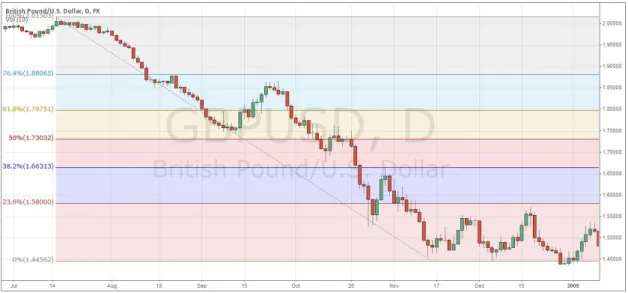
7.5. Fibonacci Retracement ... 22
7.6. Price Patterns ... 23
7.6.1. Simple Candle Patterns ... 25
7.6.1.1. Bullish Reversal Patterns ... 25
7.6.1.2. Bearish Reversal Patterns ... 26
7.6.1.3. Bullish Continuation Patterns ... 28
ix
7.6.2. Complex Candlestick Pattern ... 30
7.6.2.1. Reversal Patterns ... 30
7.6.2.2. Continuation Patterns ... 34
8. Technical Indicators ... 37
8.1. Moving Averages ... 37
8.1.1. Simple Moving Average ... 38
8.1.2. Exponential Moving Average ... 39
8.1.3. Bollinger Bands ... 40
8.2. Oscillators ... 42
8.2.1. Stochastic ... 43
8.2.2. Relative Strength Index ... 43
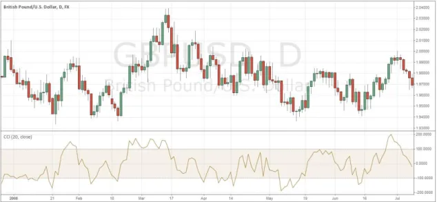
8.2.3. Commodity Channel Index ... 45
8.2.4. Moving Average Convergence/Divergence ... 46
9. Case Study ... 48 9.1. EUR/USD ... 48 9.2. GBP/USD ... 61 9.3. USD/JPY ... 76 10. Conclusion ... 90 11. References ... 95 12. Appendix ... 97 12.1. Appendix 1 ... 98 12.2. Appendix 2 ... 124
x
Figures Index
Figure 9.1.1 ... 49 Figure 9.1.2 ... 50 Figure 9.1.3 ... 51 Figure 9.1.4 ... 52 Figure 9.1.5 ... 53 Figure 9.1.6 ... 53 Figure 9.1.7 ... 55 Figure 9.1.8 ... 56 Figure 9.1.9 ... 57 Figure 9.1.10 ... 58 Figure 9.1.11 ... 59 Figure 9.1.12 ... 60 Figure 9.2.1 ... 61 Figure 9.2.2 ... 63 Figure 9.2.3 ... 64 Figure 9.2.4 ... 65 Figure 9.2.5 ... 66 Figure 9.2.6 ... 67 Figure 9.2.7 ... 68 Figure 9.2.8 ... 69 Figure 9.2.9 ... 71 Figure 9.2.10 ... 71 Figure 9.2.11 ... 72 Figure 9.2.12 ... 73 Figure 9.2.13 ... 74 Figure 9.2.14 ... 76 Figure 9.3.1 ... 77 Figure 9.3.2 ... 78 Figure 9.3.3 ... 79 Figure 9.3.4 ... 80 Figure 9.3.5 ... 81xi Figure 9.3.6 ... 83 Figure 9.3.7 ... 84 Figure 9.3.8 ... 85 Figure 9.3.9 ... 86 Figure 9.3.10 ... 86 Figure 9.3.11 ... 87 Figure 9.3.12 ... 88 Figure 9.3.13 ... 89 Figure 9.3.14 ... 90 Figure 1.1 ... 99 Figure 2.1 ... 99 Figure 2.2 ... 100 Figure 2.3 ... 100 Figure 5.1.1 ... 100 Figure 5.1.2 ... 101 Figure 5.2.1 ... 101 Figure 5.2.2 ... 102 Figure 5.3.1 ... 102 Figure 6.2.1 ... 103 Figure 7.1.1 ... 103 Figure 7.1.1.1 ... 104 Figure 7.1.1.2 ... 104 Figure 7.1.1.3 ... 105 Figure 7.2.1 ... 105 Figure 7.2.2 ... 106 Figure 7.3.1 ... 106 Figure 7.3.2 ... 117 Figure 7.4.1 ... 107 Figure 7.4.2 ... 108 Figure 7.5.1 ... 108 Figure 7.6.1 ... 109 Figure 7.6.2 ... 109 Figure 7.6.3 ... 110
xii Figure 7.6.4 ... 110 Figure 7.6.1.1.1.1 ... 110 Figure 7.6.1.1.2.1 ... 111 Figure 7.6.1.1.3.1 ... 111 Figure 7.6.1.2.1.1 ... 111 Figure 7.6.1.2.2.1 ... 112 Figure 7.6.1.2.3.1 ... 112 Figure 7.6.1.3.1.1 ... 112 Figure 7.6.1.3.2.1 ... 113 Figure 7.6.1.3.2.2 ... 113 Figure 7.6.1.4.1.1 ... 113 Figure 7.6.1.4.2.1 ... 113 Figure 7.6.2.1.1 ... 114 Figure 7.6.2.1.2 ... 114 Figure 7.6.2.1.2.1 ... 115 Figure 7.6.2.1.2.2 ... 115 Figure 7.6.2.2.1.1 ... 116 Figure 7.6.2.2.1.2 ... 116 Figure 7.6.2.2.1.3 ... 116 Figure 7.6.2.2.1.4 ... 117 Figure 7.6.2.2.1.5 ... 117 Figure 7.6.2.2.2.1 ... 118 Figure 7.6.2.2.2.2 ... 118 Figure 8.1.1.1 ... 118 Figure 8.1.2.1 ... 119 Figure 8.1.2.2 ... 120 Figure 8.1.3.1 ... 121 Figure 8.2.1.1 ... 121 Figure 8.2.2.1 ... 122 Figure 8.2.3.1 ... 122 Figure 8.2.4.1 ... 123
xiii
Abbreviations
DJIA – Dow Jones Industrial Average
DJRA – Dow Jones Railroad Average
NYSE – New York Stock Exchange
GATT – General Agreement on Tariffs and Trade
NFA – National Future Association
FSA – Financial Service Authority
EBS – Electronic Brokering Services
MA – Moving Average
SMA – Simple Moving Average
EMA – Exponential Moving Average
RSI – Relative Strength Index
CCI – Commodity Channel Index
1
1. Introduction
Financial markets, like the foreign exchange market or Forex, attract people´s attention due to the possibilities of profiting from them. But once people start to do some research about how to go about it, they are overwhelmed by the amount of sites that offer full courses and methods to profit from technical analysis. t There are many websites on the Internet that offer simple technical methods that guarantee profit. Some of them are even sponsored by well-known traders and fund managers and sell their services through them. Technical analysis is sometimes presented as an easy way to profit from the markets and that is why, since its origin, there have been many analysts and traders who have been sceptical of it.
Technical analysis had its origin in the 18th century and since then it has been struggling to get some credit. But only when Charles Dow started to predict price movements on the Dow Jones Industrial Average (DJIA) and Dow Jones Railroad Average (DJRA) did it catch some attention. With his theory´s five tenets and the usage of moving averages, people started to believe in some of the technical tools and concepts related to technical analysis. Since then, many people created different and diverse tools to use in their analysis.
There are several concepts and tools available to analysts and traders to predict prices’ next move. Concepts like support and resistance levels, trendlines, price patterns, and various others have been developed and used. Support and resistance levels are areas where prices are unable to get through and bounce back or remain there waiting for further developments. This is the basic concept to understand trendlines that act as support and resistance that limit price movements. Price patterns are complex figures that form on particular occasions and can have many trendlines, support or resistance levels. Price patterns were discovered after many years observing price movements, when it started to become clear that prices had, more or less, the same behaviour before the same kind of events. To complement the previous concepts, technical analysis has a lot of tools called technical indicators. There are many types of indicators invented according to their nature and that are always being upgraded. The main categories are moving averages and oscillators and they depend on the type of signal sent by the indicator. The signal differs between them, as the oscillators trigger signals of oversold or overbought situations and the moving averages, as the name indicates, give different types of averages depending on the indicator.
2 This dissertation will address some of the main tools and concepts of technical analysis and test them on some currency pairs. The pairs chosen were the EUR/USD, the GBP/USD and the USDJPY, due to the fact that they include three major countries’ currencies. These currencies are traded in the foreign exchange market. This type of market will be explained along with the three existing types of charts: line, candlestick and bar charts.
The concept of a trend will also be examined, as all the concepts and tools related to it, like the aforementioned support and resistance. The three types of trends - trendlines, gaps, and Fibonacci´s Retracements -, among others, will all be analysed and demonstrated resorting to images taken directly from live market charts. Some of the most famous patterns are included in this dissertation before the technical indicators are explained. Regarding the technical indicators, the mathematical formula will be exposed and the signs they trigger explained.
For the case study, all characteristics of each technical indicator were independently used on the three currencies during the year of 2008. The year was chosen due to the major event that occurred and the impact it had on the markets: the financial crisis following the collapse of a few banks
The technical indicators will be analysed independently in order to study all the signals they triggered based only on their definitions.
3
2. Technical Analysis
Technical analysis has its origin in Japan in the 18th century with the creation of candlestick charts. These charts were invented to price the different types of rice that were imported to a city called Osaka. Since then, analysts have studied these charts and realised that there were some patterns that formed in identical circumstances along with other concepts developed through times.
Several analysts started observing the market´s movement and began noticing it had a similar reaction on similar events. Technical analysis was born as observations started to be useful to forecast future market movements. Very much like with fundamental analysis, there is a set of tools developed to help trigger signals of market movements. There are indicators, oscillators, graphical patterns, and much more that show that market actors have identical reactions to identical situations over and over again. The difficult part of this process is to forecast the amplitude of the movement, for example, a resistance line can be broken and start a 100 pips bull movement or it could move only 10 pips. Before the movement ends, nothing can forecast its extent. Murphy (1999: 1) describes technical analysis as a study of market action, primarily through the use of charts. He establishes three major premises of technical analysis: markets’ actions discount everything; prices move in trends; and history repeats itself.
All economic and financial actors accept supply and demand as the major rule for market movements. What Murphy defends is that any fact or event that creates oscillations between supply and demand must be reflected in the asset´s price. When prices are trending upwards, it means that demand is stronger than supply, and when prices are in a descending trend, then the supply is stronger than demand (Murphy, 1999: 2) This premise is also accepted by the fundamental analysis community and comes from the famous Dow theory, which will be explained further. This first premise announced by Murphy (1999: 3) is the most important. Based on the aforementioned supply and demand rule, the technician will not attempt to discover what fact or event causes imbalances between supply and demand; he just lets the market´s charts indicate which direction it is going and takes advantages of it. Appendix 1, Figure 1.1, shows how the market started to give signs of losses when the subprime crisis in the United States of America started to hinting at what was coming. The red arrow indicates the moment when market actors started to be
4 suspicious and predict bad news coming even before this was confirmed in 2008, six months later.
This may seem quite simple and unrealistic but it is not. Technicians rely on tools like indicators, support and resistance levels, and retracements, among others, also keeping in mind that the charts only reflect the market´s sentiment about that specific asset. They attribute less importance to the reason why the market is moving, only concerned about forecasting the direction as early as possible. In other words, they want to discover the trends and, with it, the second premise is introduced.
There is a common saying about trends that states that they are our best friend, As a matter of fact, they are! As soon as an analyst sees a chart, the first thing he/she must look for is the ongoing trend. The concept of a trend and all its characteristics will be explained later, but, for now, it is important to clarify that a trend is nothing more than the direction that the market is taking. Using figure 1.1 again as an example, the beginning of a downtrend after the first sign of crisis is clear.
Last but not least is the premise that makes it possible to forecast markets through technical analysis. If history was not to repeat itself then there would be no point in observing the market because what is happening today would not happen ever again, so “[…] the key to understanding the future lies in a study of the past”. (Murphy, 1999: 5). From the outset, fundamental analysts have criticised and underestimated technical analysis´ methods. They say that using patterns and indicators to predict its behaviour is
no different and no less primitive than reading entrails of a dead animal in order to divine your future. Schlossberg (2006: 25). This idea could not be more wrong!
Technical analysis is based on patterns observed and catalogued that occurred in the past. With more than one hundred years of observation, the market has shown its cycling properties. To exemplify, in his book, Schlossberg (2006: 25) uses the example of a person that he calls Mr. X, and the capability of another person to determine his movements. It is obvious that without any observation, no one would be able to predict what time he leaves to work in the morning. But maybe with the possibility of observing Mr. X for more than one week, one would be able to predict the time he will leave home tomorrow. This prediction would be based on one week’s observation, so what would happen if the person watching Mr. X´s movements observed him for months or even years? It would probably make him capable of determining Mr. X´s movements seven days a week, or maybe tell
5 which month Mr. X is likely to go on holiday. He would start realising that on Fridays he works from home, that on Monday and Thursday he takes his kids to school, and so on…
3. Foreign Exchange Market
The Foreign Exchange Market, also called Forex, FX market or spot currency, consists in a market where about 1.9 trillion dollars (1.4 trillion euros) are traded in just one day. To have an exact idea of the volume of this market let us compare it with the biggest stock market in the world, the New York Stock Exchange (NYSE). According to the NYSE database (www.nysdata.com), January, which had a trading volume equal to June, which was the best month of 2013, amounted to a volume of 60 billion dollars, that is 0.06 trillion dollars. These numbers translate into high liquidity.
The Forex market was created after the gold standard monetary system of 1875. This monetary system consisted in a country´s government allowing its currency to be freely converted into fixed amounts of gold and vice versa. Before this, all international payments were made in gold and silver. However, this system had a flaw, in that the value could be affected by external events, like the discovery of a new gold mine. Even if a discovery was made abroad, the amount of money that each country had was affected by this new quantity of gold supplied. With the gold standard monetary system, each country had to specify the right amount of gold it would trade for one ounce of gold. That ‘price’ had to be backed by a substantial gold reserve. This led to the first exchange rates, which was the difference between the prices of gold in two countries.
With the beginning of World War I, the gold standard lost its value due to all the military projects that had to be created as a result of the tension with Germany, which led to governments starting to print off money beyond their gold reserves. After the war, governments all around Europe started to use the gold standard again but it was all in vain because World War II started. Learning from their own mistakes, even before the end of World War II, the Allied nations began to prepare a monetary system to cover the void that the war left behind.
It was at Bretton Woods, New Hampshire, in 1944, that more than 700 representatives from the Allies convened to create what was called the Bretton Woods System of international monetary management. Not only the monetary system, a method of fixed exchange rates, was created, but international agencies to oversee economic activity, like
6 the International Monetary Fund (IMF), were also set up. The U.S. dollar replaced the gold standard to become a primary reserve currency, the only currency that is backed up by gold. The Bretton Woods System came to an end in 1971 at the hands of President Richard Nixon, when he announced that gold y would no longer be exchanged for U.S. dollars held in foreign reserves, due to the series of balance payment deficits leading to the shortage of gold in the U.S. treasury.
The Bretton Woods System left behind a legacy that was incorporated into three agencies created in 1940: the IMF (International Monetary Fund), the International Bank for Reconstruction and Development and GATT (General Agreement on Tariffs and Trade).
Unlike the stock market, which is full of rules and constraints, in the Forex market there are no rules. The market regulates its actors by its ‘own hands’ that is, if an investor has some unwanted attention he will not be fined or sent to prison. The process is much simpler: when the other markets’ actors know about the bad procedure, they will refuse to have a commercial relationship with the ‘bad’ actor and the word will spread. Still, one should not misjudge this market and think it is a wild west out there. There are regulatory agencies that oversee the major money centres around the world. For example, all foreign currency transactions are regulated by the National Futures Association (NFA), while the Commodity Futures Authority (FSA) in the United Kingdom is regulated by Financial Service Authority (FSA). Each country or region has its own agencies that oblige each member firm to obey to strict rules.
The market structure is something more complex, as we seen in Figure 2.1 of Appendix 1, showing that the market hierarchy starts with the major banks such as Citibank, UBS, Deutsche Bank and Bank of Tokyo.
These major banks use the Forex market trade among them directly or through the Electronic Brokering Services (EBS) or the Reuters Dealing 3000-Spot Matching. These two companies, EBS and Reuters compete fiercely to win market share from each other. The currencies offered by both companies are more or less the same, so the liquidity offered is what gives advantages to each company. The EBS platform offers more liquidity in EUR/USD, USD/JPY, EUR/JPY and EUR/CHF, whereas Reuters offers more liquidity in the following pair: GBP/USD, EUR/GBP, USD/CAD, AUD/USD and NZF/USD. The credit relationship between the major and medium-sized banks and EBS and Reuters is what will determine the prices of the currency pairs and the market´s liquidity.
7 Next in the hierarchy stand the retail market makers, hedge funds and commercial companies. These actors are the primary hedgers in the market and their interest is to offset their business risks. All these companies have import and exportation costs, international payrolls, and international loans with their interest rates that force them to pay attention to currency price movements. (Schlossberg, 2006: 5)
The hedge funds´ main objective is to speculate in order to take advantage of major economic and political trends. They also generate large volume of transactions so that the market moves in directions that will favour their interests.
Within the ‘Retail Traders’ group, stand he world´s biggest central banks that participate in the market for a variety of reasons. Some of them just want to adjust their books and foreign reserves. Others, like the People´s Bank of China, just day trade billions of dollars at a clip if they think they have an edge and will often pocket millions of dollars in profit for their reserve vaults. And there are even those that just want to manipulate or defend their country´s currency. (Schlossberg, 2006: 6)
Another great feature of the Forex market is its extended schedule, opening 24 hours a day 5 days a week, from 10 P.M. West European Time on Sunday to 10 P.M. West European Time on Friday. Figure 2.2 of Appendix 1 shows the hours when the main indexes are working in comparison with the Forex Market.
Finally, the universally agreed currencies’ basic quotation is that the price will be quoted to four or more decimal points and each of these points are called pips. Pip is an acronym for ‘percentage in point’ and is the smallest unit used in pricing a currency pair. A currency pair and not a currencies’ price is used here because in the Forex Market all currencies are quoted in comparison with another. That is why they are referred to as EUR/USD, GBP/USD, USD/JPY, etc. To better understand the relation between the two currencies, one can think of it as a scale. Using the EUR/USD as an example, there is the EUR (also called the base currency) on the left side of the scale and the USD (the counter currency) on the right. If the EUR is strengthening, then the chart will rise. On the other hand, if USD begins to strengthen, the chart will start to descend.
Figure 2.3 shows how the EUR was stronger than the USD until February 2013 and how from that month onwards the USD started to strengthen and, accordingly, push the prices down.
8
4. Market Concepts
There are some terms that are often used in the trading activity and in Forex market analysis that are crucial to know.
In the trading activity there are two possible market orders: to buy or go long and to sell or go short. When a trader goes long it means that he is buying the base currency believing that it valorises. If the market rises like the trader forecasted, he will be able to exchange the same amount on the base currency for a bigger amount of the counter currency. If the trader goes short it means that he is forecasting a decrease in the pair´s price or he is predicting the counter currency will strengthen. In this position, what happens is exactly the opposite of a long position when the trader sells the base currency for the counter currency and when the market shrinks he will exchange his counter currency for a bigger amount of the base currency. Closing a position is selling a long position or buying a short position.
When a trader decides to go long or short he has two very useful tools to protect himself from a bad forecast called limit and stop order. The trader sets a price that is lower than the current one and if the price decreases at that point, the system will automatically buy the asset. A ‘sell limit’ has the contrary logic, a maximum price that the trader is willing to short sell the currency pair is chosen. There is also the ‘stop order’, a tool whereby the system will automatically close the position if the set profit or loss is reached.
Besides these possible actions available to the actors, there are other terms that are often referred to when talking about market analysis. The first two that will be explained refer to the market´s sentiment: bearish and bullish. These terms are not exclusive to the Forex Market and are used in all financial markets. The term ‘bearish’ is used when a market is going down. The reverse sentiment is ‘bullish’, which means exactly the opposite, that the asset´s price is rising.
When analysing a market, the analyst is looking for a trend. When that trend is found, another thing that is important to pay attention to is the momentum. The idea of momentum is the possibility that the currency pair continues its trend. If not, it means that the price is losing momentum.
9
5. Ways to display prices
The three mostly used ways to display an asset´s price are through a line chart, a candlestick chart or a bar chart. All these charts are built with two axis (x,y), the X axis being the temporal indicator and the Y axis the price indicator.
To explain each price representation, a chart from the second semester of 2008 of the USD/JPY currency pair with daily periodicity was used. The particularity of this chart is that each figure represents price movements for one day. The periodicity can be weekly, daily, and hourly, or even by the minute, whichever suits one’s analysis. The three charts will represent exactly the same period to make comparing them easier.
5.1.
Candlestick Chart
Due to their incredible ability to produce descriptive images of the price´s action in a highly compressed manner, Japanese Candlesticks, illustrated in Figure 5.1.1 of Appendix 1, are the tool technicians like the best, attributing them almost mystical powers . (Schlossberg, 2006: 43)
In the 18th century, Japanese rice traders came up with this system to represent this good´s price movement through time. However, the man who popularized this graphical representation and all its advantages for technical analysis was Steve Nison (Murphy, 1999: 43). Founder and President of ‘www.candlecharts.com’, Steve Nison ‘was the first to receive the Chartered Market Technician (CMT) designation from the Market Technicians Association (MTA) and was nominated for the MTA´s “Best of the Best” for Price forecasting/Market analyses’.
Schlossberg (2006: 43) defends that candlesticks alone can be ‘almost useless’ and that their full potential is reached when used in conjunction with other technical indicators. That is true because there are signals that are sent through the candlestick that need to be confirmed through an indicator, otherwise the confirmation coming from the candlestick will arrive too late. The purpose of any analysis is to act as soon as possible, even if it means taking action after the price has already started its movement. In that case, the position will be opened with extra confidence because confirmation has been triggered.
Candlestick charts are built with four variables: open price, closing price, highs and lows reached within the period. The visual appeal and information contained in each candlestick
10 is what makes this chart so useful. Figure 5.1.2 shows the anatomy of both types of candlestick.
The opening and closing price builds the ‘body’, which can be green or red and black or white depending on the analyst’s convenience. If the body is green or white it means that the opening price is lower than the closing price. But if the body is red or black it means that the price has shrunk and that the opening price is higher than the closing price. According to Murphy (1999: 298), black and white are used because, when printing, the result is always the same. It was developed by the Westerners, as the Japanese used red and green colours. The lines that show the highest and lowest price reached on the day have many names, such as ‘wicks’, ‘hairs’ or ‘shadows’. (Murphy: 1999: 298)
Knowing what is represented in candlestick charts is very important in order to understand some patterns.
5.2.
Bar Chart
This graphical representation is very similar to the candlestick chart but the information is shown through a bar with two ticks. These ticks represent the opening and closing price but there is no body, as shown in Figure 5.2.1 of Appendix 1.
In this type of charting, even with the same information as the candlestick chart, the visual perception is not so easy and friendly. The fact that the figure is fully coloured makes it difficult to see the highs and lows of the period, which, as will be shown later, are crucial to determine support and resistance levels. The anatomy of each bar is shown in Figure 5.2.2 of Appendix 1.
5.3.
Line Chart
Last but not least, there is the well-known but much simpler line chart. This chart offers a more basic visualization, as seen in Figure 5.3.1 of Appendix 1, of the price´s movement because it only takes into consideration one price, which is normally the closing price. The line is formed by connecting each period´s closing price. In the books consulted and Internet sites viewed, few used this chart type to forecast, but Schlossberg (2006: 41) defends that ‘it is precisely because of [their] simplicity that line charts can be a valuable tool for quickly ascertaining trend or trend exhaustion’. Basically, what it means is that as this chart eliminates all of the market´s ‘visual noise’, what one sees is nothing but the core price movement.
11 The line chart is a good tool to get an overview of the asset´s price movement, but if the objective is to analyse it in depth, it is better to use the candlestick chart. This will be better understood when the main technical tools are explained further on.
6. Dow Theory
Dow theory was much like a seed that was developed years later. It was one of the first technical analysis ideas ever and it was the foundation of every aspect of it. This idea is unanimous among students and researchers.
Charles Henry Dow1 was born in 1851 in Sterling, Connecticut and spent most of his life helping his mother managing their family farm due to early losses. When he was only 6 years old his father Charles Dow and two older brothers died. Although close friends remember him as having ´the measured speech of a college professor´, Dow never went to college. In 1969 he started working for a journalist called Samuel Bowles III who owned a local newspaper called Springfield Republican. Bowles started mentoring Dow, sharing with him his view that a journalist must possess the astuteness to know which news is worth publishing. Years later Dow became the night editor at another newspaper, the
Providence Star, where he met Edward D. Jones.
In order to pursue one of his many dreams, in 1879 Dow left his job and went to New York City to seek work as a reporter on mining stocks. Mining stocks are also called commodities and include gold, silver, and other mineral goods. With his reticent, quiet-spoken attitude, Dow impressed some people and got hired at the New York Mail and
Express preparing financial reports and producing some critiques.
On July 3, 1884, Dow published a composed average of stock prices that became the first index ever created. He composed a stock market average of the closing prices of eleven stocks. These stocks belonged to nine railroad companies and two manufacturing firms. His objective was to provide a good indication of the economic health of the country. Later on, in 1897, the index was substituted by two other indexes that he thought represented the country´s health better. Those two indexes were composed of 12 industrial stocks and 20
1 American National Biography Online
12 rail stocks. The final modification in the industrial index occurred in 1928 when the number of stocks rose to 30. (Murphy, 1999: 23)
Dow´s index is still operational nowadays and his work has received ample recognition. Unfortunately, he never wrote a book enunciating his discoveries and registering his theory. Still, many people managed to compile and organize all his ideas from his work and editorials published in The Wall Street Journal and published them as ‘Dow´s Theory’. From 1903 until now much research has been done and published on this matter.
The six tenets that support Dow´s theory will be explained and developed in the next topics.
6.1.
The Prices Discount Everything
An asset´s price, for in this work the assets are currency pairs, is the result of two forces, bulls and bears, fighting each other. If the price rises, it is a sign that bulls are gaining force but if it is descending, it is well-know that bears are on top. This constant ‘fight’ between these two forces results in a price that pleases both sides. However, this seemingly price that pleases both sides does not maintain itself for long. Soon one of the sides will push towards a price that it considers to be more appropriate. This constant change of mind by the market actors comes from external factors that influence the market sentiment. A bear is not always a bear and a bull is not always a bull; depending on the market, opinions change or are even maintained, but with more conviction.
Entities like central banks, governments, rating entities, and major companies, among many others, ,influence the market and make it move. In other words, the currency pair reflects all these knowable factors that influence and affect the supply and demand forces. This is the basic tenet of Dow´s theory, and the first lesson an investor or trader should learn before entering the market.
When describing this tenet, Murphy (1999: 25) refers to an extreme example on how an ‘act of God’, like an earthquake, occurs, the markets discount it. Even with today’s technology, predicting earthquakes is a practically impossible task. Still, if one observes the currency price of the affected country, it is possible to know exactly when the earthquake occurred.
13
6.2.
The Market Has Three Trends
Before developing and explaining this tenet, Murphy (1999: 25) explained what a trend is in Dow´s definition. According to Dow, an uptrend is a situation in which each successive
rally closes higher than the previous rally high, and each successive rally low also closes higher than the previous rally low, a downtrend being exactly the opposite, a ‘successively
lower peaks and troughs’. These definitions continue to be endorsed nowadays.
Dow related the behaviour of trends to tide, waves and ripples by considering that they are divided into three parts: primary, secondary and minor. The primary trend works like a tide whose direction can be determined by paying attention to the wave’s movement, also known as the secondary trend. If a wave is reaching more into land it means that the tide is flowing in, if not, it is ebbing. The same conclusions can be drawn when analysing the market.
Figure 6.2.1 shows the EUR/USD movement between May 2011 and June 2012, and the main downtrend is clearly visible. But this downtrend is not always going down, as there were certain periods when the currency pair went up, like in October 2011.
The secondary trend is nothing more than corrections made to the primary trend. There is a very useful technical tool called Fibonacci Retracement to forecast these corrections in order to benefit from them.
According to Dow, there are still minor trends, or fluctuations, that occur in the secondary trends.
6.3.
The Market Has Three Phases
After dividing the trends, Dow focused on the primary trends and discovered that the primary trend is divided into three phases: accumulation phase, public participation phase, and distribution phase.
The accumulation phase is when astute investors take action and enter the market. This is, if the previous trend was down and the market assimilated all the ‘bad’ news, the first investors enter the market at this phase to take advantage of the new trend that is starting.
Next comes the public participation phase, which means that investors are now clear that a new trend is starting. It occurs when prices begin to rise rapidly and business news improves, capturing the attention of normal investors.
14 The last phase, the distribution phase, is when newspapers and other business and economic news sources have the confirmation of a new trend and start issuing bullish/bearish news. During this phase, the speculative volume increases and the unobservant investors open their positions. In many cases, the astute investors who opened their positions in the accumulation phase start to close those positions now, before the last investor enters the trend and it starts to lose momentum.
6.4.
The Averages Must Confirm Each Other
The title of this tenet remits to a market that is not the one being studied in this dissertation because, as mentioned earlier, Dow theory was created and developed by observing the stock market, not the Forex market. However, it does not mean that it cannot be applied to the latter, because there are no average indexes for currencies and the same kind of information could be obtained through other indicators.
Murphy (1999: 27) explains that Dow used both his averages to prove this tenet. Since the Industrial and Rail averages are the best representation of the U.S. economic health, a new trend in the stock market must be confirmed by both averages. If the two averages change trend, it means that there is a new ongoing trend. If they start to drift apart, it means that the previous trend is still ongoing.
When transposing this principle into the Forex market, these averages are also very useful to determine the movement of the US Dollar, because, if the economy shows good signs, the interest in this currency starts to increase. Indexes are another tool used to support this tenet because each country´ major indexes are nothing but an average of the major stocks that are exchanged in its market.
6.5.
Volume Must Confirm the Trend
Even though Dow considered volume to be an important factor to confirm price signals, he recognised that volume was a secondary signal of price change. (Murphy, 1999: 27)
The volume indicator shows the amount of transactions made in a determined period and the rule says that volume should expand or increase in the direction of the major trend. In other words, during an uptrend volume increases as prices move higher and diminishes as prices fall. The inverse happens when a downtrend is ongoing. (Murphy, 1999: 27)
15
6.6.
A Trend Is Assumed to Be in Effect Until It Gives
Definite Signals That It Has Reversed
Murphy (1999: 28) relates this tenet to a physical law that states that an object in motion tends to continue in motion until some external force causes it to change direction. The same happens with a currency that has an ongoing trend; the trend will continue until an external factor changes its course. The changing factor can be either fundamental or technical in nature.
Despite all the tools available to aid the investor to detect these changing factors, it is not easy to be sure which particular information will have a strong impact in changing the trend. A normal secondary correction in an existing trend and the first leg of a new trend in the opposite direction look exactly the same in a chart, so the investor must be provided with tools that will aid him differentiate these movements. This will be the difference between failure and success.
7.
Chart Analysis
7.1.
Trends
The most elementary definition of a trend is given by Schlossberg (2006: 59) who describes it as ‘higher lows for an uptrend or lower highs for a downtrend, both of which form stutter-step patterns in the price action’. A trend is like a direction that is being taken by the currency, but one should not be misled into thinking that the trend moves on through a straight line, as the course zigzags a lot as shown below in Figure 7.1.1 of Appendix 1.
Figure 7.1.1 represents the price movement of the EUR/USD currency pair in the second semester of 2013, showing an obvious uptrend in the price movement. Besides the evident uptrend, there are some higher peaks and troughs that shake up the market but do not break the trend. These corrections or retracements work like a two step forward, one step backward and often shake off insecure traders, leading them to closing up their positions.
The forex market is very peculiar in this aspect because it has strong trends that derive from its major economic themes that seize the market for long periods of time. The speculation around these matters goes on for extended periods due to its long-term
16 decisions and the effects they cause. These trends are the technical analysts’ main goal and this is why trading books often start with a dictum that says the trend is your friend.
7.1.1.
Trends´ directions
A market can develop in one of three directions. It can be following an uptrend (Figure 7.1.1.1 of Appendix 1), a downtrend (Figure 7.1.1.2 of Appendix 1) or be moving sideways, like in times of uncertainty or between two trends as seen in Figure 7.1.1.3 of Appendix 1. Murphy (1999: 51) calls this sideways trend a trading range because it reflects equilibrium between the two forces making the market trendless. This scenery is propitious to traders’ loss because of their tendency to use technical tools and systems. Technical tools and trading systems are very focused on detecting markets that are moving up or down, so when the markets start to move sideways, frustration kicks in and consequently the losses start to show.
7.1.2.
Trends´ classification
As mentioned previously, a trend is not exactly a straight line, which is normal due to the market corrections that occur. Those corrections are other trends that form during smaller periods of time and which are included in the bigger trend. Each trend is a portion of its next larger trend and each trend is classified according to three categories: major trend, intermediate trend and near term trend. This classification works like a guiding line when analysing trends because, in fact, there are almost infinite trends ongoing. These trends could cover minutes, hours or even years. It is up to the investor to follow the one that best suits its trading system. (Murphy, 1999: 53)
According to Murphy (1999: 52), Dow theory classifies a major trend as one that is in effect for longer than a year, but he disagrees with the use of this classification in future markets. Given that this market operates in a shorter dimension than the stock market, the major trend should be the one that is in effect for over six months. Despite this small disagreement with Dow theory, Murphy agrees with the other ranges for the intermediate and near term trends, three to many months and two to three weeks top, respectively.
With reference to Figure 7.1.1, the major uptrend can be observed throughout the second semester of 2013, but there are 3 intermediate down trends in the same period: from the
17 half of June to the beginning of July, the end of August to the beginning of September and between the end of October and the beginning of November.
Just like Murphy assumed that he disagreed with Dow´s classification, there are many traders who also disagree. The main reason for this is the fact that there are long-term investors and short-term investors. Obviously, what is a long-term for a short-term investor could be a short-term trend for a long-term investor.
7.2.
Support and Resistance
These concepts are related, or, to be more precise, they are the explanation for every peak and trough that happen throughout the evolution of a currency´s price. Previously, when the trend’s concept was explained, Figure 7.1.1 showed that a trend does not develop in a straight line and that there are corrections that occur during it. These corrections are limited by support and resistance levels like the ones represented in Figure 7.2.1 and Figure 7.2.2.
Murphy (1999: 55) describes a support level as a level or area on the chart under the
market where buying interest is sufficiently strong to overcome selling pressure. In other
words, a support level represents a price area where the bulls gain strength in order to overcome the bear side of the market. The concept of resistance is identical to that of support, but inverted, because a resistance is an area where bulls are not able to continue imposing their uptrend strength so the price does not rise anymore. A resistance level resists a rise in the currency´s price and a support level protects the price, preventing it from descending.
In order to demonstrate that technical analysis is not some scheme used by lazy investors and that there are more fundamental supporting technical tools than believed, the following is a story used by Murphy to explain the psychology behind support and resistance levels.
Murphy (1999: 59) separates market participants into three categories: the long, the short and the uncommitted. Using this classification and supposing one is facing a scenario of the end of a downtrend at support level and the beginning of an uptrend, those who have already purchased their contracts and opened their positions are called the long ones. The short ones, as the name indicates, are those who are still on the selling side. Finally, there
18 are the uncommitted ones who either remain on the selling side or have not yet made up their minds on whether they should open a long position.
Assuming a scenario where, after fluctuating at a support line, the price of a currency pair starts to go up, the longs are in heaven with their long positions summing profits. Their only regret is not having bought more when the price remained near the support line but maybe if the price dips a little they will have an opportunity to make that acquisition. At this moment the shorts are having a rough time seeing their losses accumulating because they are on the wrong side of the market. Even more than the longs, the shorts are praying for some kind of price correction that makes the currency pair drop and get them closer to the breakeven point to close their selling positions and thus reduce their losses. When this correction starts to take shape, the more nervous investors will start closing their positions, contributing to a further drop in the price. Afterwards, the other shorts will gradually start closing their positions, making the selling volume rise until there are no short positions opened. This will create a new support level because there are no more actors to pull the price down. What will happen now is that the uncommitted who, to date, have not made up their minds will grab this opportunity to open long positions to make some profit. However, they are not the only ones doing so, as the longs who have been waiting for a dip to open more buying positions will do so now, and the shorts who want to make up for their losses will also enter the market. The volume of currency that is bought will drive the currency pair up returning to its previous uptrend. Even if due to superior forces the price continues to fall, it will only increase the buying eagerness of the three groups.
A support or resistance becomes more important when it leads to more trading. There are three ways to ascertain if the amount of trading is important enough to make the support/resistance relevant: the amount of time the price stays in the support/resistance area; the volume; and the moment when the volume starts to rise.
Murphy (1999: 61) ends his topic saying that technical analysis does not work by some kind of magic produced by a couple of lines and drawings and that chart analysis is
actually a study of human psychology and the reactions of traders to changing market conditions.
With the psychology behind support/resistance explained, the next phenomenon is the reversal of these two areas. When a support level is broken, that is, when the price does not stop falling and goes through this area, it transforms what was once called a support into a
19 resistance. When bears win over the bulls by driving the currency pair to surpass that obstacle, they will not allow handing over that ‘territory’ again. The same thing happens when a resistance area is broken and turns into a support level.
This technique seems simple and easy to use but there is one thing that is complicated, which is when to consider that the support or resistance level was actually broken. Various rules are used, such as percentage penetration or the amount of time spent by the market beyond that area to determine if the penetration is valid. Still, the most reliable way to be sure that the support/resistance level was actually broken is to wait for it to move away from that area. The more the currency pair deviates from the support/resistance area, the more the market will believe in the reversal.
7.3.
Trendlines
A trend is formed by higher lows for an uptrend and lower highs for a downtrend. During this process, successive lows and peaks occur, which are considered market corrections. These corrections are the key to obtaining useful trendlines. (Schlossberg, 2006: 59)
A trendline is a ‘dynamic area of support and resistance’ so, to draw these lines, the first peak or trough and the last must be connected. (Pring, 2002: 137) However, an investor cannot wait for the last low or peak, otherwise he will never make a profit, because, by the time he finds the last market correction, it will be too late,as the trend will be over. Figure 7.3.1 of Appendix 1 shows two trendlines in the EUR/USD currency pair that work like channel lines. Channel lines are basically two trendlines, one working like a support area and the other as a resistance level that delimit the trend´s area. As Pring (2002) writes
constructing trendlines is very much a matter of using common sense rather than applying hard and fast rules and this is because it is not some geometrical theorem that is applied on
the same occasion giving the same results. To draw a valid trendline there must be several adjustments in order to include the maximum peaks and troughs.
To start, the analyst must find strong evidence of a trend so that he can start analysing the
20 Murphy writes (and most authors appear to be unanimous about this) that after drawing a line with only two peaks or lows, if a third peak or low touches the trendline and bounces off, it means that the trendline is valid. After determining its value, each trendline has its own importance depending on three variables, which are the length of the line, the number of times it has been touched and its angle. (Pring, 2002: 144)
The length is the first thing that jumps right off the chart because if it is a trendline that has been valid for the last 10 years it is far more reliable than a trendline that started last week. Pring (2002) uses the phrase big trends result in big signals, small trends in small signals to emphasise the importance of a good long lasting trend.
The number of times a trendline has been successfully tested is also another sign of its quality. A trendline that is successfully tested is the one that reached the currency pair and bounced off. The more often this happens, the more important the trendline is. But one should be very cautious when these encounters happen because of the support/resistance reversal phenomenon that was introduced earlier. There are small penetrations that analysts must be aware of so that they do not catch them by surprise by turning into a trendline break. This may be a signal of a market correction maintaining the downtrend, like the one shown in Figure 7.3.2 of Appendix 1 or a signal that a new trend is forming.
The angle of the trendline is also something to pay attention to because a very sharp trendline is hard to maintain and soon will end. This kind of trenline is very important because it could mean a new trend is starting.
To take advantage of a trendline, the investor, after drawing a valid trendline, just has to wait for the market to touch the trendline working as a support level to open a long position and wait for the market to touch the trendline used as a resistance area to close that position and open a short one.
7.4.
Price Gaps
Price gaps are a price range within which there is no trading. Ping (2002) gives a possible explanation saying that it reflects strong psychological motivations like fear or greed. These formations happen when the open price is above the closing price of the previous period in an uptrend, and the opening price is under the closing price of the previous period, in case of a downtrend. In both scenarios, an empty vertical space between both periods is created. Price gaps only occur in bar charts and are more common when the chart is daily. Figure 7.4.1 of Appendix 1 shows a price gap between 28 and 29 April 2014.
21 Many authors like Murphy (1999) and Pring (2002) divide the gaps into three types. Depending on its nature, a gap can be considered a breakaway gap, a runaway gap or an exhaustion gap.
The breakaway gap is related to the completion of an important price pattern and precedes a significant market move (Murphy, 1999: 94). This gap must not be confused with something that happens only when a new trend starts to form. The main characteristic is that it occurs when the price breaks out of a price pattern, emphasizing the bullishness or bearishness of the breakout, depending on which direction it takes. (Pring, 2002: 104) The main indicator that confirms the end of the price pattern is the rising of the trading volume. Normally these gaps occur under heavy volume.
Figure 7.4.2 is a good representation of a gap of this type. When that market starts to develop out of the flag, a price pattern that will be explained later, a gap occurs before the price develops in order to break the existing support.
The second gap category is called the runaway gap and occurs in a continuous market movement. It is not involved in any change in the price direction or any price pattern, it occurs on a moderate volume setting and is like a price ‘slip’.
Murphy (1999) considers that in an uptrend market these gaps are a positive sign but in a downtrend panorama the effect is the opposite, signalling some market weakness. He also gives another name to this type of gap, which is measuring gap. He says that this gap represents the half point of the trend and that doubling the movement already achieved gives us the probable extent of it.
The last type of gap is called exhaustion gap because it appears at the final impulses of the ongoing market move. After the breakaway and exhaustion gaps occur, investors must start looking for this last gap. It does not mean that there could be more than one runaway gap in a trend, but if this final gap appears it means that the ongoing trend is losing its momentum. At this point, trading must also reach its top volume because all investors are closing their previous position and opening new ones to be able to take advantage of the new possible trend.
Since technical analysis is all about the study of psychological attitudes, gaps are very important. This is because the market will not forget this emotional extreme and will probably turn into a support or resistance area (Pring, 2002: 106).
22
7.5.
Fibonacci Retracement
Fibonacci is the most popular mathematician in trading because of a sequence of numbers that Schlossberg (2006) refers to as mystical. His real name was Leonardo of Pisa and he lived between 1170 and 1250. His discovery competes with the famous Fischer Black and Myron Scholes, the creators of the options pricing model, Black and Scholes.
Fibonacci´s sequence of numbers is calculated through the following formula:
( ) ( ) ( ) (6.5.1)
‘P(n)’ represents the number of the sequence that is being calculated and ‘n – 1’ the previous number and ‘n – 2’ the 2nd number behind ‘n’. In other words, the next number is calculated from the sum of the two previous numbers. In order to start the sequence, the two first numbers of the sequence, called seeds, must be chosen. Fibonacci´s choices for the seeds were 0 and 1 and the sequence obtained was: 0, 1, 1, 2, 3, 5, 8, 13, 21, 34, 55, 89, 144, 233, 377, and so on…
This sequence has several neat mathematical properties that Pring (2002), Schlossberg (2006) and Murphy (1999) refer to:
The ratio between a number to its next higher converges to 0.618 and the ratio between a number to its next lower converges to 1.618. The number 0.618 is called
phi. But this property is only applied after the first four numbers. The ratio 1.68 multiplied by the ratio 0.618 equals 1.
Taking three adjacent numbers and squaring the middle one and multiplying the two outside ones, the difference between the two results will always be 1.
The last funny fact about Fibonacci´s sequence is that the sum of 10 adjacent numbers is equal to the result of multiplying the seventh number of the selected adjacent numbers by 11.
Schlossberg (2006) quotes a series of tests done by a professor at Lock Haven University of Pennsylvania called Donald Simanek who tried to find proof throughout the universe that Fibonacci´s ratio and sequence is the critical value to understand the universe. He
23 studied the flowers´ number of petals and found several that corresponded to Fibonacci´s numbers, although there were always some that were the exception. In another study of the planets´ orbit, he discovered that many planets´ rotations respect Fibonacci´s ratio but four of them did not. These planets are Pluto, Neptune, Venus and the Earth.
However, failure to prove that Fibonacci´s numbers are the answer to understanding the universe does not render it useless. In the forex market´s charts, his ratio is observed very often and ‘phi’ has an important role in technical analysis.
‘Phi’ is used to draw levels that traders follow in order to make their trades. Figure 7.5.1 of Appendix 1 illustrates a trendline with these levels, also called retracement levels or Fibonacci retracements, and shows how they condition the market. The retracements are done after drawing the trendline that connects the ‘absolute swing low to the absolute swing high’. Then a line at 50%, that is half way through the trendline’s total length is attached to it, and two more lines are attached at 61.8% (‘phi’) and 38.2% (1 minus ‘phi’) of that very same line (Schlossberg, 2006: 102)
Fibonacci´s retracement works like support and resistance levels but they must not be seen as precise lines where the price will either break through or bounce back. Schlossberg (2006: 106) compares them to an elastic rubber band that dynamically absorb[s] price
action in a broad zone before the price resumes its original move. The retracement must
be seen as areas where analysts must pay extra attention to the market´s movement. Schlossberg (2006) justifies the success of these numbers due to the fact that they represent proportions of about one-third and two-thirds of the total value of the move, and these quantities are related to human psychology. Since these numbers are well known by all market actors, including the media, they have a strong influence on it. Even the media, when doing their forecasts and analyses sometimes support their speech on these numbers.
7.6.
Price Patterns
A Japanese candle pattern is a psychological depiction of trader´s mentality at the time. It vividly shows the actions of the traders as time unfolds in the market. The mere fact that human react consistently during similar situations makes candle pattern analysis work.
(Murphy, 1999: 301)
The market usually moves either in an uptrend, downtrend or sideways, so technical analysts who can anticipate the next price path will be in a better position to make some profit on it. To help them achieve their goal, over the years analysts have been collecting a
24 series of price patterns, which, for a good market observer, hint of what is coming. The price patterns are divided into two categories: reversal and continuation.
As the name indicates, reversal patterns are those that indicate that prices are about to change direction. In other words, if the market is in an uptrend, these patterns show that a downtrend is about to start, and vice versa.
Figure 7.6.1 shows, through the EUR/USD pair, the most common way the market reverses. First, there is an uptrend that finishes in the middle of March 2008 and gives place to a series of peaks and troughs between a support and a resistance level (coloured in blue). These highs and lows correspond to a phase when the market is transiting from the previous uptrend to a downtrend. It is a very important phase and technical analysts must be sharp in order to catch the new trend as soon as possible. In this transcending phase, the two forces (bulls and bears) find some equilibrium but in the end only one will win and move the market its way. However, one should be cautious because, as in all other concepts and tools examined in this work, it is not a dogma and it does not always happen this way, since the market can move sideways. One example that invalids this technique is a natural disaster. Supposedly, a major earthquake strikes the United States of America between March and August causing the economy to collapse and devaluating the US Dollar, strengthening the Euro in the process. That would make the EUR/USD currency pair price continue to rise. This is why it is very important to keep an eye on the world´s major news in order to avoid unpleasant surprises.
Figure 7.6.2 illustrates another common way for the market to reverse, albeit a more unstable reversal. The fact that the two forces did not measure strengths for some time indicates that it did not have time to consolidate. It is probable that the gains or losses are overextended and there is a major probability that it will suffer a serious setback. (Martin J. Ping, 2002: 65)
The other existing price patterns are the continuation patterns, which are nothing but a pause in the market from an ongoing trend. The reason could be that it is near the overbought or oversold condition, or a waiting period for an expected indicator to be released.
Price patterns are also categorized from the amount of figures that it involves. That is, there are price patterns that use 1 to 5 candles, like those in Figure 7.6.3, and there are others far more complex that are measured over time, not according to the numbers they