Universidade de Lisboa
Faculdade de Ciências
Departamento de Informática
3D Visualization of Very Large Databases - Integrating
and expanding the state of the art in Bioinformatics and
Astroinformatics
Mestrado em Bioinformática e Biologia Computacional
Especialização em Bioinformática
Miguel Dias Duarte Ferreira Gomes
Dissertação orientada por:
Professor Doutor André Maria da Silva Dias Moitinho de Almeida
Professor Doutor Francisco José Moreira Couto
3
Resumo
A exploração visual de dados é essencial para o processo científico. Muitas vezes, é o ponto de partida e até mesmo a referência de orientação para o pensamento científico.
Tanto a Biologia como a Astronomia enfrentam o desafio comum da análise de grandes conjuntos de dados altamente multidimensionais. O atual estado da exploração visual de dados tabulares, muitas vezes sobre o formato de nuvens de pontos, é feito principalmente usando representações 2D. No entanto a dimensionalidade reduzida esconde facilmente características e relações nos dados. Como exemplo, a redução de dimensionalidade facilmente produz “overplotting” e vistas desorganizadas. Vários painéis 2D são muitas vezes utilizados para melhorar este problema, mas a ligação entre dados em diferentes painéis frequentemente não é clara. Estudos indicam que a redução de 3D para 2D reduz significativamente a quantidade de informação visual na análise de dados genómicos. Curiosamente, a visualização 3D não é generalizada na análise de nuvens de pontos. Esta técnica é usada quase exclusivamente no estudo de fluidos e campos, que são corpos estendidos. Uma das razões é a falta de boas ferramentas para seleção 3D e interação com grandes conjuntos de pontos.
Os arquivos extremamente grandes produzidos pelos levantamentos astronómicos do presente, em conjunto com os padrões estabelecidos pelo Observatório (Astronómico) Virtual Internacional para troca de dados e interação de aplicações estão a produzir uma mudança de paradigma na forma como os dados são explorados. A tendência atual é de se deixar de fazer a exploração dos dados unicamente localmente, isto é trazendo-os para as estações de trabalho dos utilizadores, e passando-se a recorrer a serviços “on-line” para pesquisar e explorar os arquivos, quer localmente na estação de trabalho como em dispositivos móveis. O mesmo tipo de mudança de paradigma é visto nas Ciências Biológicas, onde, por exemplo, os dados genómicos são armazenados em diferentes repositórios on-line.
Como tal, também se torna natural abordar a exploração moderna de dados visuais também com serviços on-line. Na verdade, isso está-se a tornar uma realidade com serviços recentes, como Rapidgraph e Plot.ly que estão a receber atenção tanto da comunidade astronómica como de outros campos. Na biologia, o Epiviz um serviço on-line projetado para visualização de dados genómicos funcionais tem recebido grande atenção ultimamente, depois de ter sido destaque na revista Nature.
Neste trabalho foi desenvolvida uma aplicação web para visualização de dados, denominada SHIV, acrónimo de Simple HTML Interactive Visualizator, cuja tradução é Visualizador Interativo HTML Simples. Esta aplicação web funciona como um cliente para outra aplicação, o Object
Server, um servidor de dados. O Object Server é a aplicação que irá fornecer à missão Gaia da
Agência Espacial Europeia, um levantamento de 1% das estrelas da Via Láctea (ainda assim para cima de mil milhões de objetos), as funcionalidades de visualização interativa tanto em 2D como em 3D.
Este trabalho, o conjunto de cliente web com a aplicação servidor, propõe-se a oferecer aos seus utilizadores uma plataforma capaz de providenciar capacidades de visualização interativa de dados de vários domínios, indo desde dados astronómicos a dados genómicos. Os utilizadores têm à sua disposição uma ferramenta acessível em qualquer plataforma, de um comum computador desktop a correr Windows a um tablet a correr Android, desde que exista uma ligação de rede e um navegador de internet razoavelmente recente é possível utilizar a aplicação.
4 Para ultrapassar tanto as limitações associadas aos navegadores, em termos de capacidades de processamento e de armazenamento, como limitações no tratamento de grandes quantidades de dados, escolheu-se modificar um servidor de dados, principalmente astronómicos, já provado.
A grande quantidade de dados a visualizar é um problema atual no domínio astronómico, que ultrapassa em muito as capacidades disponíveis nos computadores de secretária atuais, e tudo leva a crer que com a tendência de crescimento associado à Bioinformática o mesmo aconteça num futuro próximo.
Para oferecer aos utilizadores de computadores normais a capacidade de visualizar o catálogo da missão Gaia, foi desenvolvido uma aplicação que fornece, entre outras, funcionalidades de níveis-de-detalhe (do inglês level-of-detail), detalhe-a-pedido (do inglês detail-on-demand) e vistas ligadas (do inglês linked-views). A conjunção de níveis-de-detalhe, a descrição de um objeto ou conjunto de objetos com sucessivos níveis de detalhe progressivamente mais complexos, com detalhe-a-pedido, a capacidade de obter só os dados relevantes a um dado campo de visão ou filtro de dados, oferece a clientes com capacidades limitadas uma visão fiel dos dados, uma visão adaptada às suas restrições, quer de resolução disponível quer de outras limitações relacionadas com a capacidade de processamento existentes. A capacidade de ligar vistas oferece aos utilizadores a possibilidade de ligar vários gráficos de uma mesma fonte de dados, por exemplo ao fazer um gráfico de dispersão de um conjunto de amostras, pode ver como é que uma dada seleção se relaciona com um histograma de expressão média. Estas capacidades, tanto para visualizações 2D como para 3D, ao serem oferecidas por uma aplicação que funciona como um serviço oferece persistência dos dados, o que significa que um utilizador pode começar uma visualização num dispositivo e terminá-la noutro. Oferece também a possibilidade de partilhar tanto os dados como visualizações já criadas com outros utilizadores. No âmbito deste trabalho várias modificações e adições tiveram que ser efetuadas na aplicação servidor, de modo a poder integra-la no domínio da Bioinformática. Foi, por exemplo, adicionada a capacidade de carregamento de ficheiros em formato FASTA ou FASTAQ assim como de ficheiros em formato GFF ou GTF, formatos comuns. Foram também melhoradas as capacidades de serviço de aplicações web, já que a aplicação original está focada em clientes nativos. Várias funcionalidades de transformação de dados, como por exemplo a capacidade de criar transpostas de uma dada tabela ou a capacidade de gerar matrizes de distâncias de amostras.
O cliente foi desenvolvido com base na biblioteca D3.js de Mike Bostock, esta biblioteca oferece capacidades de produção de gráficos dinâmicos e interativos para a web, utilizando as especificações, largamente utilizadas, de HTML5, Gráficos Vetoriais Escaláveis (do inglês
Scalable Vector Graphics) e Folhas de Estilo em Cascata (do inglês Cascading Style Sheets). Para
o aspeto gráfico e ambiente de interação do cliente foi também utilizada a biblioteca Bootstrap, que oferece um conjunto de elementos de tipografia comuns como botões, formulários, etc., que facilitam a criação de interfaces modernas e que funcionam de maneira similar em diferentes navegadores.
Para além de oferecer capacidades de visualização interativa de dados em uma ou duas dimensões, através dos muito utilizados gráficos de dispersão (scatter plot), gráficos de linhas, histogramas, Heatmaps e gráficos de blocos. A aplicação oferece também capacidades básicas de visualização de dados em três dimensões.
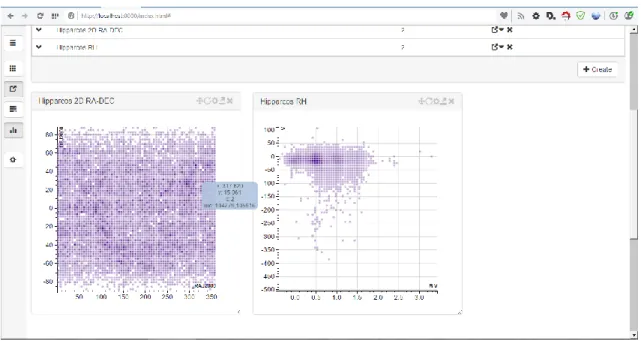
5 O 3D é discutido neste trabalho porque é pouco comum ainda no domínio da Bioinformática, e no geral nas ciências biológicas, a sua utilização. Embora existam utilizações, como por exemplo a visualização da estrutura de proteínas, no resto do domínio são raras as menções da utilização do 3D para efetuar ciência e gerar conhecimento. Um possível motivo para tal é que as ferramentas atualmente existentes não contemplam a possibilidade da criação de visualizações em três dimensões. Espera-se que com a inclusão, à partida, de capacidades 3D numa aplicação que espera ser uma base de trabalho para o futuro fomente a utilização do 3D na Bioinformática. Para demonstrar as capacidades do conjunto das aplicações, são mostrados casos de uso. O primeiro, um caso de uso tipicamente astronómico, mostra como é possível efetuar a visualização dos dados da missão Hipparcos da Agência Espacial Europeia, a primeira missão focada em astrometria de precisão que efetuou medidas precisas da posição de objetos celestes, num diagrama de Hertzsprung–Russell. Este diagrama de cor-magnitude é utilizado no conhecimento da evolução estelar nos domínios da astronomia e astrofísica. Ao mesmo tempo cria-se e visualiza-se um gráfico de dispersão das posições das estrelas observadas e compara-se compara-seleções efetuadas num dos gráficos com a sua localização no outro gráfico, fazendo uso da funcionalidade de vistas ligadas.
O segundo caso de uso é um exemplo típico de bioinformática exploratória. Com o carregamento de dados de expressão genética, obtidos pelo método de Cap Analysis of Gene
Expression de amostras humanas do consórcio FANTOM5. Estas 70 amostras, principalmente de
tecido cerebral juntamente com alguns outliers como tecido do útero, servem como base do caso de uso. Após o carregamento dos dados cria-se e visualiza-se um gráfico MA da expressão de genética em amostras de adulto e de recém-nascido de substantia nigra. Seguidamente criam-se histogramas para a largura da expressão genética assim da expressão média dos genes. Estas visualizações demostram as capacidades interativas da aplicação. Seguidamente compara-se a largura da expressão genética com a expressão média, faz-compara-se também uso da funcionalidade de acrescentar linhas de regressão ao gráfico para verificar a existência de tendências nos dados. Depois cria-se a matriz de distâncias das amostras que serve de base a um Heatmap onde se pode visualizar facilmente as amostras outlier. Finalmente mostra-se a utilização de gráficos em 3D para a visualizar a informação obtida no Heatmap e como também se poderia distinguir
outliers com recurso à mesma.
Para terminar faz-se uma discussão do trabalho e apresenta-se as áreas onde o trabalho futuro se pode focar.
Palavras-chave
Bioinformática; Astroinformática; Visualização 3D; Grandes Bases de Dados; Exploração visual de dados
7
Abstract
Visual data exploration is essential to the scientific process. It is often the starting point and even the guiding reference for scientific thought.
Both biology and astronomy face the common challenge of analysing large sets of highly multidimensional data. Current day visual exploration of tabular data (point clouds) is mostly done using 2D representations. But reduced dimensionality easily hides features and relations in the data. As an example, collapsing dimensions easily produces overplotting and cluttered views. Multiple 2D panels are often used to improve this problem but the link between data in different panels is frequently not clear. Studies indicate that reduction from 3D to 2D reduces significantly the quantity of visual information in the analysis of genomic data. Curiously, 3D visualisation is not widespread in the analysis of point clouds. It is almost exclusively used with fluids and fields, which are extended bodies. One of the reasons is a lack of good tools for 3D selection and interaction with large sets of point.
The extremely large archives produced by today's astronomical surveys, together with the International (Astronomical) Virtual Observatory standards for data interexchange and application messaging are producing a paradigm shift in the way data is explored. The tendency is becoming not to download the data to the user’s workstation or mobile device and explore it locally, but instead to use on-line services for querying and exploring those archives. The same kind of paradigm shift is seen in the Biological Sciences where, for example, genomic data are stored in different on-line repositories.
Thus, it also becomes natural to address modern visual data exploration also with on-line services. Indeed, this is becoming a reality and recent services such as Rapidgraph and Plotly are receiving attention from the astronomical community among others. In biology, the Epiviz on-line service designed for visualisation of functional genomics data has received great attention lately, having been featured by Nature.
In this work a web-based interactive visualization tool, the Simple HTML Interactive Visualizator (SHIV), was developed which in conjunction with a server software, Object Server, used for providing the interactive 2D and 3D visualization infrastructure to the European Space Agency’s Gaia mission, a survey of over a billion starts or 1% of the stellar content of the Milky Way. The conjunction of a web-based client with a server software allows users, with normal computers and/or in mobile devices, to visualize the large amounts of data that are common in the Astronomy and Astrophysics fields, and are expected to happen in the near future in the Bioinformatics field if the tendency to growth holds. This capacity is made possible with the usage of features like levels-of-detail, detail-on-demand and linked views. The creation of progressively more complex levels of detail for a given object or objects (levels-of-detail), in conjunction with the possibility to just request the data associated with a given viewport or filter (detail-on-demand) allow that clients with limited resources and/or limited screen space offer to users visualizations that faithfully represent the totality of the data. Allowing users to link views, gives them the possibility to explore multiple dimensions of the same data by using several graphs to focus on specific features.
The client offers common visualization tools, with the creation of scatter plots, histograms, heatmaps, linecharts and block charts in two dimensions, as well as the creation of three dimensional visualizations. It is hoped that the support for 3D since the inception of the client will provide users with the tool necessary to analyse their data in new and innovative ways.
8
Key-words
Bioinformatics; Astroinformatics; 3D Visualization; Very Large Data Bases; Visual Data Exploration
9
Acknowledgements
First of all I would like to thank my supervisors André Moitinho de Almeida and Francisco Couto for their support in this work. By working with both it is clear to me how the work in one field of study can be used to develop solutions that are much better than the sum of two independent solutions, one for each field.
I would also like to thank all the support given by Alberto Krone Martins, whose comments were also invaluable, Helder Savietto for the influx of new ideas and ways to think on problems and António Falcão for being a role model in management.
A big thank you also is needed to my family, my parents, grandfather and grandmother, brother and uncles, for the support in achieving my goals and for letting me make my choices.
Finally a big thanks is deserved to Cristina for being there during these past few months and for putting up with me even when I was low on sugar.
11
Contents
Resumo ...3 Abstract ...7 Acknowledgements ...9 List of Acronyms ...13 1 Introduction ...151.1 Context and motivation ...15
1.2 Contributions ...16
1.3 Dissertation outline ...16
2 Background ...17
2.1 History and theory ...17
2.1.1 The big data problem ...18
2.1.2 3D visualizations ...20
2.2 State of the Art ...22
2.3 Key concepts ...22 2.3.1 Data source...22 2.3.2 Dataset ...23 2.3.3 Table ...23 2.3.4 Table column ...23 2.3.5 Table cell ...24 2.3.6 Visualization ...24 2.3.7 Selection ...24 2.3.8 Subset ...24 2.3.9 Linked view ...25 3 Developed framework ...27 3.1 Overview ...27 3.2 Implementation ...27 3.2.1 Server ...27 3.2.2 Client ...33 4 Use cases ...43
4.1 Use case 1 – Plotting representations of ESA’s Hipparcos data set ...43
4.2 Use case 2 – Exploratory bioinformatics...50
5 Discussion and final remarks ...61
5.1 Discussion ...61
5.2 Final remarks and future work ...62
12 7 List of Figures ...67 8 List of Tables ...69
13
List of Acronyms
Table 1 - List of acronyms
Acronym Description
ADQL Astronomical Data Query Language - Query language similar to SQL to query astronomical data, defined by IVOA.
CSV Comma Separated Values - Text based format where data columns are separated by the comma character.
DBMS Data Base Management System - Software application that interacts with users, other DBMS and itself to capture and analyse data.
FASTA A text-based format for representing either nucleotide sequences or peptide sequences.
HTTP Hyper Text Transfer Protocol - An application protocol for distributed, collaborative, hypermedia information systems.
IVOA International Virtual Observatory Alliance - A worldwide scientific organisation formed in June 2002. Whose mission is to facilitate international coordination and collaboration necessary for enabling global and integrated access to data gathered by astronomical observatories.
JDBC Java Database Connectivity - A Java database connectivity technology.
RDBMS Relational Data Base Management System - A database management system that is based on the relational model as invented by E. F. Codd, of IBM's San Jose Research Laboratory.
SAMP Simple Application Messaging Protocol – Inter-application messaging protocol, defined by IVOA.
SQL Structured Query Language - A special-purpose programming language designed for managing data held in a relational database management system, or for stream processing in a relational data stream management system.
TAP Table Access Protocol - Specification for accessing tabular data, defined by IVOA.
TSV Tab Separated Values - Text based format where data columns are separated by the TAB character.
UCD Unified Content Descriptor - Can be viewed as a hierarchical glossary of the scientific meanings of the data contained in VOTables.
URI Uniform Resource Identifier - A string of characters used to identify a name of a resource, i.e. a file.
URL Uniform Resource Locator - A reference to a resource that specifies the location of the resource on a computer network and a mechanism for retrieving it, i.e. a link like http://www.google.com/.
VOTable Virtual Observatory Table - Specification of a format for data interexchange, defined by IVOA.
15
1
Introduction
1.1 Context and motivation
The human race has been using images ever since its dawn as a species. From the first human that decided to paint what he saw on the walls of a cave to the complex visualizations of the present. Fuelled by our desire to understand the world and at the same time the need to persist and communicate ideas to others we have been using images to transmit information with ever evolving techniques. Using images to communicate has several advantages, some are evolutive, i.e. much of the human brain is dedicated to process and interpreter the information contained in the visual input (1), others are practical, sometimes images are self-explanatory whereas words most of the time are ambiguous and depend on both parts speaking the same language. In science, the field of study that encompasses visualizations is broadly called Scientific Visualization, and although some examples of scientific visualizations date back to the 19th century, and depending on how one wishes to interpret start of scientific visualizations even as soon as 32000 B.C. with representations of the lunar cycle (2), with Maxwell’s thermodynamic 3D surface model in clay (3) and Charles Minard's flow map of Napoleon’s march to Russia (4), it was with the advent of computers and computer graphics that the field has gained the importance and configuration it has today.
It is with the ever increasing amount of data to be analysed today that the value of data visualization is evident. We have massive amounts of data produced from a growing amount of simulations and observations, from Astronomy missions like the European Space Agency’s Gaia Mission to chart a 3D map of the Milky way with data from more than a billion stars (5) (6) or Biology projects like the Human Genome Project (7) which sequenced the human genome with its approximately 3.3 billion base-pairs to discover that it contains around 20500 different genes. All this data needs to be understood so that knowledge can be obtained, to this end visual exploration plays a massively important role often being both the starting point as well as the guiding reference to scientific thought and discovery. Still the massive amount of data to analyse poses a serious problem, most users do not have access to the computational resources necessary to handle the large quantities produced, either in terms of storage or in processing power, most scientists have to do science using desktops and/or laptops and do not have multi-million euro computational clusters available. Even having access to these kinds of resources do not really enable science, especially in the case of exploratory knowledge discovery, having to wait hours or several days to see the results of change in parameter leads to loss of focus and associated thought flow. Interactivity is necessary for data exploration. The results of an action has to be seen as much as possible nearly instantaneously, this is not saying that everything has to be instant, there is no problem in having to wait for some pre-computation that will allow interactivity, it is the workflow that needs to be interactive.
An aspect that is often overlooked, is the opportunity offered by the 3rd dimension. Computers have stopped being strictly bound in 2 dimensions since the late 1970’s with the advent of 3D graphics, although the primary means of displaying images is still a computer screen, hence 2D, nothing prevents users from using 3D to analyse data. Nevertheless we still primarily do science using 2D constructs like scatter plots and histograms. There is nothing wrong in using 2D, and often it is enough, but by not using 3D we are also losing the chance to use our brain to do one of the things it does so well, analyse 3D data to discover patterns. It is hoped that with the inclusion of support for 3D visualizations since the inception of this fork, it will foster users to
16 analyse and explore their data in new and innovative ways. Sometimes it is necessary to create the need before the necessity arises as Apple is so keen on demonstrate with their product lines. An application of 3D visualization in the Bioinformatics field is visual validation of data after dimensionality reduction, i.e. the action of deriving a set of features smaller than the original set. Dimensionality reduction follows two general methodologies: Feature Extraction and Feature Selection. The first tries to apply algorithms to transform in a new reduced set of features, one common example of an algorithm used for feature extraction is Particle Components Analysis. Feature selection on the other hand tries to find the best minimal set of features that describe the data, the most common criterion used to indicate whether or not a set is minimal is Information Gain. Feature selection for example is commonly used in study of MicroArray and SNP data. More information about Dimensionality Reduction can be found for example in Cunningham’s work (8).
Going hand with hand with the increase of data to analyse (9) (10) we have also been seeing a redefinition of the work place and of the work platform, scientists are no longer bound to their workstations, they can do their work on-the-go accessing an ever increasing amount of online platforms that provide the resources to do data exploration, one example of these tools is the EpiViz tool (11) that offers a fully featured web-based genome browser and works even in tablets and mobile phones, this kind of portability is something that up to some years ago was impossible, even multiplatform applications some years ago were something of a rare occurrence.
In this work it will be shown that is possible to apply the Gaia’s visualization infrastructure to explore the data of a billion stars to a Bioinformatics tool. Thus enabling it to support the very large data amounts that are expected to appear in the near future and also to provide it with support for 3D visualizations, allowing users to explore data in new ways.
1.2 Contributions of this work
The contributions of this dissertation to the mentioned areas are:
Introduction of a server-side infrastructure capable of handling a very large amount of data, incorporating indexing, levels-of-detail and detail-on-demand capabilities;
Adding support for common bioinformatics data formats, i.e. FASTA.
Implementation of a prototypical web-based graphical user interface capable of interacting with the server-side software to provide data visualization and manipulation capabilities to users anywhere.
1.3 Dissertation outline
This dissertation is presented in three parts: background, developed framework and use cases. In the first part, an historical overview of the problems presented to researchers when dealing with data visualization and manipulation, focusing in the large data issue for both the astronomic and bioinformatics fields. Key concepts and some of the extensive theory in the data visualization field used to build the application is also mentioned. In the second part, the functionalities of both the server-side software as well as of the client-side application are described. Finally, some of the applications of the developed tool are shown, focusing in use cases from both the astroinformatics and bioinformatics fields. The astroinformatics use case is also used to exemplify how the system can be applied to the visualization of very large datasets in the bioinformatics field.
17
2 Background
In this section a short overview of data visualization theory and the current state of the art will be conveyed as well as the introduction to the key concepts behind the developed work.
2.1 History and theory
Data visualization is not a recent field of study, the human race has been dealing with ways to visualize information for several thousands of years, from the simplest pictogram to fully immersive 3 dimensional visualizations.
To effectively convey the knowledge contained in a given dataset solutions have been devised, from pencil and paper solutions (12) to solutions that join the learnings of pencil and paper with the added possibilities offered by computers (13). The same computers that allow us many new and innovative ways to explore data are also the cause of one difficult problem, the increase in quantity of data has brought new problems to the table.
The main problem with the current, sometimes vast, quantities of data is how to convey the underlying information in a way that is easy to understand and at the same time easy to manipulate. Humans are capable of processing very complex information via the visual system, extracting patterns, for example, from spatial, colour and size cues as well as relations between these visual cues (14).
Colin Ware (14) describes Information Visualization as “[…] the use of interactive visual representations of abstract data to amplify cognition”. Thus proposed visualization systems must provide users with ways to improve cognition.
The process of providing information, requires some understanding of the end-user and of the data that is being handled. Although it is possible, and desirable, to develop systems that cater a general audience and are able to handle generic data in an automated way, these systems will probably never be as powerful or effective as custom built systems tailored to one specific end-user and one specific data set.
Knowing the user is necessary because, visualizations for colour-blind users are not the same as visualizations for “normal” colour-perception users. Users can also be using the system on different systems with different resolutions and colour depths, thus limiting the quantity and the quality of the information that can be conveyed. Knowing the data is also necessary to some extent, it is just not possible to develop a system that will convey generic and random data to the user in a way that always makes sense, for example some data only makes sense if its displayed using a logarithmic scale, etc.
General systems, like the one developed, are based on the fact that “normal” perception users will be using them and that the user has some foreknowledge about the data being displayed and is prepared to play with the system to explore the data by changing settings and interact with it.
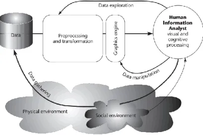
These two elements are often referred as the Representation (user related) and Interaction (between the user and the data) (14) (15) (16). These elements can be represented with the following diagram that also demonstrates the visualization process.
18 Figure 1 - Visualization Process. Ware (14)
The Interaction process between the user and the data, is what makes a good visualization, i.e. a good visualization is just not a static image. A good visualization for Ware is “[…] something that allows us to drill down and find more data about anything that seems important”, this sentiment is also apparent in a mantra coined by Ben Shneiderman “Overview first, zoom and filter, then details on demand” (17).
Shneiderman also proposed seven high-level tasks that help understand how Interaction can be added to visualizations and how these tasks make good visualizations:
Overview: Gain an overview of the entire collection.
Zoom: Zoom in on items of interest
Filter: filter out uninteresting items.
Details-on-demand: Select an item or group and get details when needed.
Relate: View relations hips among items.
History: Keep a history of actions to support undo, replay, and progressive refinement.
Extract: Allow extraction of sub-collections and of the query parameters.
These steps represent how almost all contemporary visualization software is presented today.
2.1.1 The big data problem
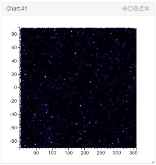
Very large amounts of data represent a substantial problem in the data visualization community. For smalls amounts of data (i.e. up to 1000 data points) it is relatively easy to create visualizations that convey all the necessary information and are easy to understand and navigate. The problem arises when it is necessary to handle amounts of data in excess of the tens of million points. Imagine plotting 1 million points in a 400 by 400 pixels scatter plot, even if each point only occupies 1 pixel, there is only 160 thousand points available for display. The information of the other 840 thousand pixels is either lost or the resulting visualization suffers from overplotting (Figure 2).
19 Figure 2 - Overplotting example, representation of 1 million star positions using the equatorial coordinate system Another issue is the computational resources needed to handle large amounts of data. Current datasets, either from simulated or actual observations, can range in the billions of entries, or even more. These large datasets can occupy from several gigabytes to several petabytes of storage, one such example is the ESA’s Gaia mission data which is expected to take 1PB of storage.
Aside from the storage issue, which is reasonably cheap to solve for the order of the terabyte even for the general user (i.e. 1TB disk should cost about €75 at 2015 prices), the memory issue is not trivial to solve. Data that is being visualized must at some point be brought to main system memory for operations to be executed on the data. Even for high-end consumer hardware this is usually about 16 GB of memory (which can be had for about €125). The order of magnitude in difference between slow disk storage (access speed for hard drives ranges in the 10ms for HDDs and 0.1ms for SSDs) and fast system memory (access speed in the 10ns range) limits the amount of data that can be used to create dynamic and interactive visualizations. Another aspect to have in mind is that for most current visualizations GPUs, data must then be transferred from system memory to GPU memory, which again is limited in the average consumer area to around 2 to 4GB (for GPUs in the €200~€400 range, high-end solutions can have up to 12GB of memory in the thousand euros range).
As such, ways to handle the big data problem are necessary. One way is too have computational clusters (which can cost in excess of 100 thousand euros) handle all the process. The problems from this approach are that not many users have such hardware available and, most of the time,
20 interactivity for more than a couple of users at time is not guaranteed (18) (19). For the general public, which does not have access to such resources other approaches have to be considered. One general approach, used by both the large computational clusters and general software, is to make use of the first 3 Shneiderman tasks to reduce the amount of data presented to the user in one go, in a way hiding the data complexity, first presenting an overview of the data to the user, then allow him/her to zoom in/filter out the relevant area/volume and finally provide detail when needed.
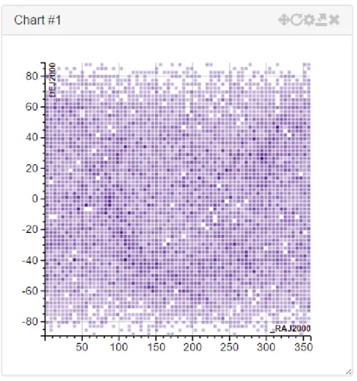
A very basic example of how this can be done, is simply by doing a point density plot of the data, and use colour and/or opacity to convey information on how many points a given data point represents (Figure 3). Thus giving the user a general overview of where the points are located as well as the amount of points in any given area, the user can then zoom in areas of interest to view the full point information.
Figure 3 - Density plot of start positions of the Hipparcos (20) catalogue in the equatorial coordinate system The solutions used by the proposed system will be explained in further detail in chapter 3.
2.1.2 3D visualizations
With the emergence of graphics processing units (GPUs) in the 1990’s 3D visualizations have become more common place and in fact have become the default way to view some kinds of data. Point clouds generated by 3D scanners are commonly visualized in 3D.
21 Figure 4 - Torus point cloud (21)
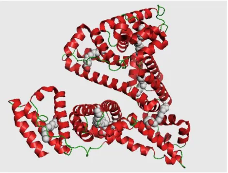
Fluid dynamics, CAD design and Chemistry, where molecules are also frequently visualized in 3D, are also other fields that use 3D as a way to visualize information.
Figure 5 - 3D Visualization of Human Serum Albumin (HAS) (22)
It should be noted that although the current, and most common, way to view 3D in computers is by projecting 3D positions to a 2D plane, which is the screen plane. Stereoscopic 3D also exists, where 3D positions are still projected to a 2D plane, but some depth information is recovered by projecting each position to two different planes, with a very slight translation between them. Then, depending on the technology, these planes can then be quickly alternated, interlaced or even of different colours (colour anaglyph). The translation difference between each plane corresponds to the angular distance between eyes. The alternating of each plane creates the illusion of 3D to the human brain.
Even without stereoscopy, 3D adds another dimension to data visualization which in most cases is beneficial. Nevertheless 3D also adds another level of complexity both to the information being displayed and to the algorithms used to handle the big data issue.
22
2.2 State of the Art
Due to the fact that the web offers cross-platform functionality over a broad range of devices, ranging from fully featured desktop computers to tablets and even mobile phones, this section will focus on web based technologies used for data visualization.
Web based tools can have some drawbacks depending on how they are made. Currently there are two main areas of development, tools that use Scalable Vector Graphics (SVG) to display the data and tools that use HTML5 canvas or WebGL features (raster based).
Tools that use SVG have some advantages in that it is possible to bind data directly to graphical elements, this makes it possible for solutions of this kind to offer rich interactivity solutions and are in general terms easy to work with from the implementation side. One large drawback is that the performance of SVG tools is very low for amounts of data in the excess of around 5 to 10 thousand individual points. This is due to the fact that all the individual points must be added (and updated) to a graph structure, the Dynamic Object Model (DOM). This structure consumes large amounts of memory and operations, even on fast browsers, take several milliseconds to seconds to execute. One very successful and known example of a library that uses SVG rendering is the D3.js library created by Mike Bostock (23).
The other main solution for web based graphics, are the HTML5 feature canvas and WebGL. HTML5’s canvas can be thought of as an area where draw instructions can be executed, the main advantage of this solution is that it can be accelerated by graphics hardware (whereas SVG is not). WebGL is a subset of OpenGL ES, which in turn is a subset of OpenGL (a cross-platform high-level graphics framework). Canvas is usually used for 2D while WebGL is used for 3D. The main advantage of both these solutions is that the performance offered is very high and in some cases should be comparable to a fully featured OpenGL client (as both share the same code base), though in practice experiments show that 50% is more common (24). This offers programmers a solution to which rendering millions of points is feasible while maintaining good interactivity. The main downside is that because both canvas and WebGL are solutions were data is rendered to a stateless “canvas”, maintaining the link between the visuals and data can be problematic. For situations where only data navigation is necessary this is not a problem but for data exploration solutions must be implemented. One very successful and known example of library used for 3D rendering is the Three.js library by Ricardo Cabello (25).
2.3 Key concepts
The following concepts are in most part abstractions of the data structures used in the system and knowing what they mean help in understanding it.
2.3.1 Data source
Data provenance, may be one of:
Local: data local to the user, supported formats:
o VOTable files, for astronomical data (though the format is generic); o FASTA files, for genomic data;
o GFF/GTF files, for genomic data; o CSV, TSV or in general delimited files;
Remote: data loaded from a remote source, supported sources:
o HTTP(S): any supported file type (see above) can be loaded from an HTTP(S) location;
23 o JDBC: any table obtained from a supported DataBase server or from an SQL
query;
o SAMP: Any application can send data via SAMP to the application Each Data Source must have associated metadata, the minimal requirements are:
Name - Human readable name (either provided by the data source or by the user);
Identifier - Unique identifier (generated by the application);
Description - Human readable description of the server (either provided by the data source or by the user);
Location - URL of the data source (provided by the user)
2.3.2 Dataset
A Dataset is a collection of at least one Table.
Each Dataset has associated metadata, the minimal requirements are:
Name - Human readable name (either provided by the dataset or by the user);
Identifier - Unique identifier (generated by the application);
Description - Human readable description of the dataset (either provided by the dataset or by the user);
Location - URL of the dataset (provided by the user)
2.3.3 Table
A Table is a means of organizing data in rows and columns. Each row can be thought of as a single data point and each column represents an attribute of the data point.
Each Table has associated metadata, the minimal requirements are:
Name - Human readable name (either provided by the table or by the user);
Identifier - Unique identifier (generated by the application);
Description - Human readable description of the dataset (either provided by the table or by the user);
Location - URL of the table (provided by the user);
Type - Format of the data, supported formats are VOTable, FASTA and CSV, TSV;
Number of Rows - Number of rows in the table
Dataset - Identifier of the associated Dataset
2.3.4 Table column
A Table Column represents an attribute of each data point (i.e. row). Each Column has associated metadata, the minimal requirements are:
Name - Human readable name (either provided by the column or by the user);
Identifier - Unique identifier (generated by the application);
Description - Human readable description of the dataset (either provided by the column or by the user);
Location - URL of the table (provided by the user);
Type - Data type, i.e. integer, floating point number, string, etc.;
Table - Identifier of the associated Table (omitted on memory based or structured representations)
24
2.3.5 Table cell
A Table Cell represents the intersection of a Table Row with a Column and represents a specific attribute.
2.3.6 Visualization
A visualization is a way to represent data, usually in a graphical manner. Some common ways to represent data include:
Data Tables - Used to visualize tabular data;
Histograms - Used to visualize uni-dimensional data;
Scatter plots - Used to visualize n-dimensional data (can be in 2D or in 3D);
Line charts - Used to visualize bi-dimensional data;
Contour plots - Used to visualize n-dimensional data (can be in 2D or in 3D);
Heat maps - Used to visualize n-dimensional data, usually in matrix format
Due to the fact that the most common medium to represent visualizations is a 2D plane (i.e. sheet of paper, a computer screen), 3D visualizations are in fact projections onto 2D. This is in normal cases accepted and without issues. Also, it is usually possible to expand on the dimensionality of the by associating colour, size and glyph of each data point to extra dimensions.
2.3.7 Selection
A Selection is a collection of one or more data points, by the means of:
Picking individual points;
Selecting a region (i.e. a square or a cube);
Applying a data filter (i.e. select all points where 4 < X <= 10)
A Selection is a transient collection without any associated metadata but that needs to be highlighted by appropriate means and can be transmitted to other views of the same underlying data either in the same application or to external applications via some interprocess communication protocol (i.e. SAMP, RPC, etc.).
In the case of the region and data filter based Selections, a single region or filter can apply to multiple overlaid visualizations.
2.3.8 Subset
A Subset is a collection of one or more rows of a specific Table, these rows can be sequential or interleaved.
A Subset can be transient, in which case it is just a Selection or persistent in which case it has associated metadata, the minimal requirements are:
Name - Human readable name (provided by the user);
Identifier - Unique identifier (generated by the application);
Description - Optional human readable description of the Subset (provided by the user);
Number of items - Number of selected rows;
Table - Identifier of the associated Table (omitted on memory based or structured representations)
25 Visually a Subset can be highlighted by attributing to associated data-points specific visual attributes like: colour, size or glyph. These attributes are specified by the user and the visualization software tries to make a best effort solution to prevent attribute clashing.
A Subset can, like a Selection, be transmitted to other views of the same underlying data either in the same application or to external applications by SAMP.
2.3.9 Linked view
A Linked View is the name given to two or more views of the same underlying data, either in the same application or in different applications that can share data selections. Highlighting the same data point in different representations.
27
3 Developed framework
3.1 Overview
The Simple HTML Interactive Visualizator (SHIV) framework, is composed by a freely available open-source web based client and a server application created in the scope of ESA’s Gaia Mission (freely available for academic purposes upon request*).
The main features of this tool are the ability to interactively handle visualizations of data in the gigabyte to petabyte range, support for linked views both across the same client as well as between connected clients, support for extending the framework using a modular plugin infrastructure and the support for multi-dimensional visualizations ranging from 1D to 3D visualizations.
The source code of the framework is open-source under an LGPLv2 licence and freely available at https://bitbucket.org/miguel_gomes/shiv and the tool can be used either in stand-alone mode by downloading the source or by accessing http://shiv.byethost9.com.
3.2 Implementation
SHIV was developed using a client-server architecture. This option was made so that it was capable of handling very large datasets and capable of properly link views between clients, nevertheless if those requirements were relaxed it would be possible to implement the framework on the client-side only albeit restricted by the limitations of the runtime of the browser.
The server part of the framework is implemented in Java and was developed firstly for an Astronomy use-case, handling the ESA’s Gaia Mission database. It was developed in the context of the Gaia’s Data Processing and Analysis Consortium (DPAC) Coordination Unit 9 (CU9) – Catalogue Access, Visualization work package. It was co-opted for use in the SHIV framework with extensions for the Bioinformatics field.
The client part of the framework is implemented as a web interface, developed using JavaScript and other open web standards. The layout was created using Bootstrap (26) for CSS, Zepto.js (27) for some JavaScript needed in handling AJAX calls and D3.js (23) for graphics functionality and some user interaction.
In the following sections a more detail description of each part and functionalities is going to be provided.
3.2.1 Server
This server platform was selected because its capability of handle massive amounts of data interactively (tested using a Gaia Universe Model Snapshot (28) simulation with 2.4 Billion objects), support for linked views and easy extensibility.
Other platforms capable of handling large amounts of data were also evaluated, like Potree (29) which was discarded due to being overly directed to point cloud representation and Paraview (30) which was discarded due to the inability to link data to visualized points.
The server can be described in broad terms as a base system that listens to incoming TCP connections and that then handles these connections based on the application protocol being
28 used.Each connection is considered a session, which is associated to a given user; as such, users and user requests are the main drive of the service.
As the server exists to process client requests, a communication protocol was developed. Between TCP and the communication protocol several application layers can optionally be adopted. Currently, raw sockets (the default), HTTP (used by SHIV) and WebSockets are supported.
The communication protocol is based on the concept of requests and replies with known start and end-markers. Thus it is feasible to adopt UDP instead of TCP for transport if necessary. Requests represent the concept of commands to execute along with optional arguments in a REST-like idiom. Each command is executed in the context of a user session and not of a connection session. Replies follow the HTTP response idiom with a status code and a status message along with optional content. Supported commands are implemented as plugins, thus making easy to support new or custom functionality without modifying the base software, and by extending the implemented functionalities.
Commands are the main bridge between Object Server’s services and the Visualisation clients, which are responsible for rendering visualisations on the user’s screen.
The main service offered by the Object Server is the capability of taking a very large amount of data and generating visualisations that clients can handle with consumer level hardware. This is achieved by leveraging spatial data indexing, by the generation of different levels-of-detail and finally by the concept of providing detail-on-demand. Other services that are offered by the Object Server are the ability to link views between different views of the same dataset and interoperability with third part SAMP-enabled software (31).
These services are provided on top of the storage system of the Object Server, which is responsible for taking input data and converting it to a workable format offering random access capabilities and the ability of generating composite data for each input row.
There is also support for a user permission system. This system is capable of supporting multiple users from different domains and provides for each major data object (i.e. datasets, visualizations, tables, etc.) a basic UNIX permission system, with read, write, execute permission for owner, group and other. It should be noted that in the current context of SHIV this permission system is functioning in single-user mode.
3.2.1.1 Visualization backend
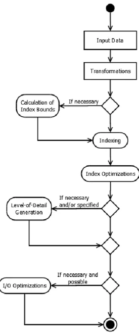
The process of creation or pre-computation of a visualisation involves several steps, some of them optional, which can be attributed to the creation of the backing index of the visualisation, to the creation of the different levels-of-detail or to the optimization of the resulting data structures to be served to clients more optimally.
29 Figure 6 - High level diagram of the process of producing a Visualisation in the Object Server
The processing starts with a client request for producing a new Visualisation based on a given source table and some parameters for the Visualisation. At this point, the most important parameters are the expressions that define the visual representation and the number of dimensions of the Visualisation, since this will influence the minimum necessary number of axes definitions. Moreover, this dimensionality will also decide the index structure that will be adopted by the Visualisation: the current defaults are B+Tree for 1 dimensional, Quadtree for 2 dimensional and Octree for 3 dimensional visualisations. It is possible to define expressions for size, colour and glyph of data points, but these expressions do not influence the indexing scheme.
The other main parameter during the creation of a Visualisation is the selection of the Level-of-Detail Generator. Currently there are four options for generating levels-of-detail (not considering the available parallel implementations). These options are:
Automatic selection based on the number of rows that actively contribute to visualization;
30
Random Sampling;
K-Means based Clustering.
The default selection is random sampling if the number of points in the source table contains data points in an excess of 10000 points, or no levels of detail otherwise. For a low amount of points there is no need to generate levels of detail as clients running on modern hardware should be able to handle that amount of points. K-Means based clustering is an optional plugin for generating Levels-of-Detail that comes with the caveat of needing extra storage space for the produced LoDs and much more compute-time to compute the LoDs. New LoD Generators can be easily created via Plugins.
The first step in creating the indexes for the Visualisation is to define its physical bounds. These bounds are defined by going over all the source data applying the requested transformations (i.e. the definitions for x, y and z) and obtaining the maximum and minimum points for each dimension. If all the definitions for each axis are numeric or a single source table column identifier and table has stored the data limits for the column, this step can be bypassed. It should be noted that this step could be bypassed altogether but the resulting index would have very poor performance. This step is multithreaded and usually reasonably fast even on mechanical storage (due to sequential reading).
The next step in producing Visualisation is to go over all the source table data, apply the definitions to it and obtain the new index position. Some parts of this step can be combined with the previous step if it is possible to execute both passes entirely in memory. In any case this step is multithread and moderately fast even on mechanical storage (large sections of sequential reading and sequential storage).
After the indexes are created an optimisation of the structure is done for improving the performance of data serving. This is done in two steps. First, the index is compressed to reduce the number of existing pages by merging child pages to its parent page when the number of objects is below a certain limit (defaults to 10000 objects). This helps reducing the amount of index metadata as well as ensuring that pages have a reasonable amount of data, which helps both with loading data from storage was well as in reducing the overhead in transmitting headers of small pages to the client.
Figure 7 - Example of Index compression. Left: original. Right: compressed
The second step in the optimization process is to sub-divide the pages that contain more than a certain amount of data points (default to 100000 points). This optimization is costly if not executed in memory due to the large amounts of random access, but the overall benefits for the Visualisation are huge, as it maintains a low number of data points per page.
31 Next, if it is necessary to create levels-of-detail for the dataset, the selected LoD Generator will use the index to produce the levels. As the exact way this step works is dependent on the selected generator and those are Plugins we only describe the baseline, which is the Random Sampling generator.
The Random Sampling generator produces reduced levels of detail by recursively taking a pre-defined percentage, say 50%, of data points from leaf pages and moving them to the parent pages. As an example, if a page has 2 leaves, one with 10 points and the other with 20 points, the algorithm would end up with a parent page with 15 points, a child with 5 points and another with 10 points. This process is repeated recursively until the root of the index. The result are pages that have successively more detail, and the full detail of any spatial region can be obtained by composing all the pages that belong to that region.
The final step is optional and aimed at optimizing the final index for serving the metadata and the object data. To favour the client access patterns (i.e. requesting pages), this is performed by organizing the underlying storage.
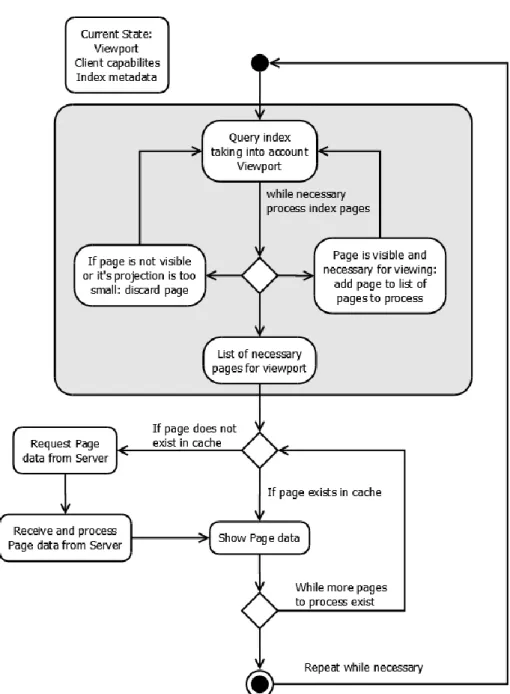
The second part of the Visualisation system is serving the Visualisation data to the clients. This part is closely tied to the indexes of the Visualisation, as it is used for speeding up the spatial queries employed in the determination of what is visible and what is not visible at any given moment. This part is crucial for enabling clients in low-end and off-the-shelf hardware to visualise datasets larger than their capabilities would allow directly.
The first step in determining what is visible and what is not visible in a given dataset, is to perform a spatial query on the index. This query must take into account the view frustum, which will either be a line segment (1D), box (2D) or a cuboid (3D) shape depending on the dimensionality of the visualisation. The query is usually executed top-down on the index metadata, keeping in a list all pages that are either fully visible or partially visible and discarding invisible pages. The search is recursively executed until a given search branch reaches leaves or there are no more pages to explore. If there is a given limit to the number of points that a client needs or can have visible, the depth-first search described previously is replaced by a breadth-first search were depth levels are searched progressively and the search will stop when the requested number of points is reached. The downside of this type of search is that it requires extra memory to execute due the fact it needs to store temporary information on which pages can continue to the next level. The index compression step has direct impact into the performance of this step as more pages means more time to process.
Another stop condition that can be applied to this search considers the fact that the system is built on the notion of having different levels-of-detail. Thus, instead of executing a search down to the leaves of the index, a given recursive search on a branch can halt if the projection of the page to the screen plane is smaller than a configured minimum value (by default 1 pixel in height). When this happens, the page contents will add no extra information to the current rendered visualisation data and a single point of the page will be enough to represent itself and also all of its descendants.
32 Figure 8 – Object Server’s visualisation serving high level diagram
Client applications that are aware of the data structures used by the Object Server can become “intelligent” clients. In these clients, the Visualisation index metadata is downloaded beforehand. Since the relevant data structures are known to these clients, and the algorithm described above is public, the clients can execute some processing on their side. This enables large gains in interactivity, as there is no need to wait for the Object Server and rely on network conditions for the client to discover which pages are visible at any given moment.
The next step is to take the list of visible pages and obtain its data. If the client simply informed the server of its viewport and of the maximum number of points it is capable to deal with, this step is included in the response from the server and the client will only need to render the point data to the screen. The “intelligent” clients, on the other hand, have another point for improved performance by caching frequently used pages: these clients only need to request pages that are not in their cache, which can reduce substantially the time needed for updating the visualisation display.
33 It is important to note that “intelligent” clients are the only clients which, using off-the-shelf hardware, are capable of interactively (i.e. quickly updating) navigating the large data archives, as the client-to-server bandwidth is a major bottleneck in most situations.
3.2.2 Client
The client component of SHIV is a web-tool developed using the D3.js library for graphical and interactivity functionalities and Bootstrap for layout. This web interface functions as a frontend to some of the functionalities provided by the server.
The D3.js library was selected, and with it the choice to use a Scalable Vector Graphics as the medium to display visualizations, due to several factors:
The extensive library of samples where to draw from;
The vast user base which provide a basic amount of safety with regards to project abandonment;
The ability to link data to graphical elements directly;
The ability to easily alter the structure of the graphs via JavaScript;
The support for several necessary events
o Input based, like on element clicking, mouse events, etc.; o Context based, pan and zoom, brushing, etc.;
The ability to export what is being seen as is to print ready formats (i.e. PNG, SVG). Other options were analysed, especially D3 based charting libraries (i.e. Rickshaw, C3, etc.) which were discarded either due to performance overhead or the inability to access important base D3 functionality. Common Javascript charting libraries that have been in use for some time like Highcharts and Charts.am were also discarded due to the inability to extend its functionality to support necessary features (i.e. linked views). Finally raster based libraries, including those based on HTML5 canvas and WebGL technologies (I.e. Chartsjs, CanvasJS, etc.) were discarded because the amount of work necessary to introduce support for the necessary features (linked views, data selection, etc.) did not compensate the greater performance advantage.
The web client needs a running server instance, either locally or remote. If no instance is found running in the same machine as the client the user will be asked to input the settings for a remote server.
34 Upon start the user is provided with a list of the currently available (i.e. pre-computed) visualizations in the server to which the user has access. On the left side a sidebar provides access to the main work areas.
On the left it can be seen the expanded sidebar with the button descriptions which can be achieved by pressing the top “hamburger” button.
Then from top to bottom the buttons toggle the display of the following areas:
Datasets – Which show the currently available Datasets;
Visualizations – Which show the currently available visualizations;
Jobs – Which show the current and past server jobs;
Charts – Which show the currently loaded charts.
Finally there is a button to change some application settings, mostly related with the connected Server.
The buttons provide a quick and efficient way to toggle between contexts, for example it is possible to have several areas visible at the same time, making it easy to view both the currently available datasets and the available visualizations for quick reference.
3.2.2.1 Datasets
On the Datasets area it is possible to view the currently available datasets from which new visualizations can be constructed.
Figure 11 – SHIV Web Client: Workspace datasets
Each row of the Datasets “table” represents one dataset and it is possible to view at the glance information like the name and title of the dataset as well as the number of tables associated with the given dataset. Hovering in the name of the dataset will provide a tooltip giving the Figure 10 – Expanded sidebar
35 internal identifier of the dataset and similarly for the title it is possible, for datasets that have such information, to view the associated description.
On the right side for each dataset there are context actions available, in the case of datasets the actions available are download and delete. The delete action will remove a given dataset upon user confirmation and the download action allows the user to download a copy of the dataset in the most appropriated format (not necessarily the original format). It should be noted that if a dataset is removed associated tables and visualizations will also be removed.
Users can also view the available tables for a given dataset by clicking the chevron sign on the left of the name, as can be seen in the example figure. Each row of tables for a given dataset contains the table name, number of rows (i.e. objects) and columns (i.e. object attributes) and available actions. Hovering the table name will provide users with a tooltip with the table identifier and, where present, the table description. The available action is to create a visualization based on the current table.
For each table the user can toggle the visibility of available columns/attributes by clicking the chevron on the left. Each row of the columns table represents a given attribute and provides information about the attribute name (with the tooltip providing a description if available), Unified Content Descriptors (UCD), Unit (i.e. m/s, m2 for m2, restricted to S.I. conventions) and data type (i.e. integer, floating point number, etc.).
It should be noted that it is possible to upload new datasets by using the “+ Add” button on the bottom of the table. Currently format detection is based on the file extension as such it should match the contents. In the case the format of a given file is not recognized an error message will be presented to the user.
3.2.2.2 Visualizations
The Visualizations area is the main starting point of the application and allows users to load up charts based on pre-computed visualizations or to create new visualizations based on existing data sources.
36 Each row in the Visualizations table represents a given pre-computed visualization and indicates its name and dimensionality (i.e. the number of indexed dimensions). By hovering on the visualization name the user can see its identifier and, where available, the description. Each visualization has the following available context actions: create chart and delete visualization. If the user clicks on the create chart chevron a number of possible charts appear. The delete action will remove a given visualization upon user. It should be noted that if the user does not have permission to delete a visualization the icon will not be available.
It is also possible to view some information about a given visualization by expanding it using the chevron button on the left of the Name, the available information includes identifier, source table, Level-of-Detail Generator, number of levels-of-detail and the definitions for each possible axis.
A user can always create new visualizations by using the “+ Create” button on the bottom of the Visualizations table.
Figure 13 - SHIV Web Client: Visualization Create dialog
This button will present the user with a dialog (Figure 13) where the user can instruct the server to create a new visualization based on its inputs. The necessary inputs are the name, which indicates a human readable name for the visualization, the source table and the necessary dimensionality. Upon selecting a source table and dimensionality new fields will be made available, i.e. if the user wants to create a 2D visualization fields for the X and Y axis will be available. Of note is that on modern browsers the input fields will have auto-complete information for existing source table columns/attributes. It is also possible to type in expressions for the fields, i.e. the definition of Axis X is the result of multiplying Column A and Column B. The only requirement is that for indexing to work the main axis definitions must evaluate to numbers (i.e. integers or floating point numbers).
3.2.2.3 Jobs
37 Figure 14 - SHIV Web Client: Jobs area
Each row of the jobs table provides information about the job name, phase, owner and start and end. If the job is ongoing the end will provide, where possible, an estimate of the time it will complete.
It should be noted that the table does not automatically update but can be refreshed manually by using the “refresh” button on the top right alongside with the close button.
3.2.2.4 Charts
The charts area is the where all created charts are grouped, the purpose of grouping all the chars under the same area is to allow easy toggling of the visibility of all charts.
Figure 15 - SHIV Web Client: Charts area
Each chart is created in its own “window”. Each window is composed of a title area, where the chart title and available chart options are placed, and a content area where the chart is actually rendered.
38 The chart options are buttons that allow users to perform some chart related actions, they are from left to right:
Toggle Zoom+Pan/Brushing – Clicking on this button will toggle between the Zoom+Pan functionality and the Brushing (multiple item select) functionality, the button will change to indicate which mode is active;
Reset – Clicking this button will reset the chart to the initial zoom level and default viewport;
Settings – Clicking this button will show a dialog where the user can alter some settings about the current chart;
Export – Clicking on this button will export the current chart (as is) to a PNG image file;
Close – Clicking this button will close the current chart.
Each chart window can also be dragged around the page and be resized above certain predefined minimum values.
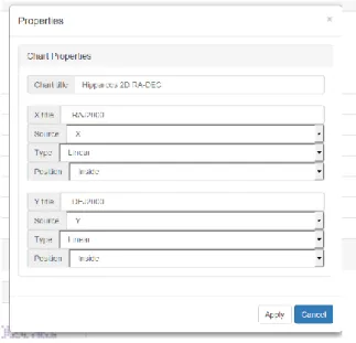
Chart properties vary depending on the current chart type but clicking on the chart settings button will yield a dialog similar with this example:
Figure 17 - SHIV Web Client: Chart properties
In this dialog it is possible to alter the chart title as well as change definitions for each axis. For each axis the user can specify its label, source attribute, scale type and the position of the axis label in relation to the chart area.
3.2.2.5 Available chart types
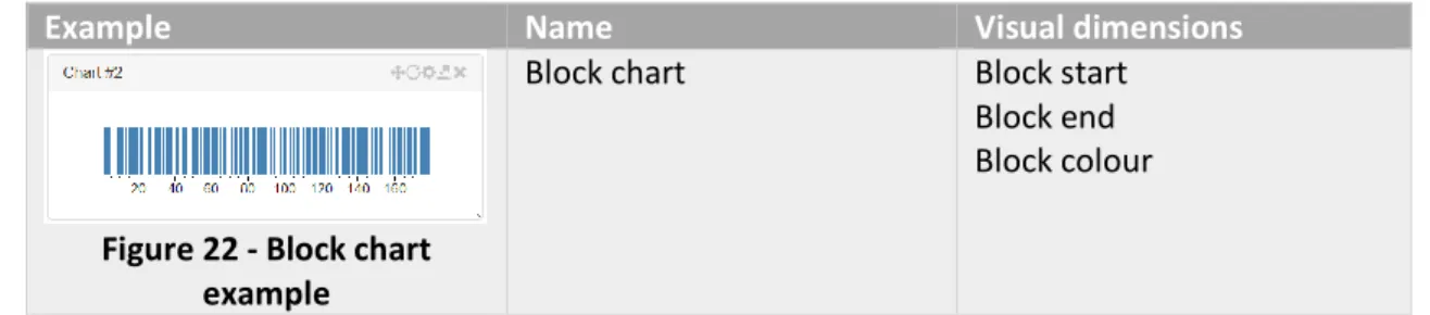
SHIV currently supports the following chart types: Figure 16 -