Spatial analysis of cyclist mobility patterns using
geo-visualization to improve public bike-share
system in a small size city
Spatial analysis of cyclist mobility patterns using geo-visualization to
improve public bike-share system in a small size city
Dissertation supervised by Carlos Granell, PhD
Professor, Institute New Imaging Technologies, University Jaume I,
Castellón, Spain
Dissertation co-supervised by Sven Casteleyn, PhD
Professor, Institute of New Imaging Technologies, University Jaume I,
Castellón, Spain
Dissertation co-supervised by Marco Painho, PhD
Professor at NOVA, Information Management School, Universidade Nova de Lisboa,
Lisbon, Portugal
i
ACKNOWLEDGMENT
Thanks Carlos for your patience and support until the last moment.
Thanks to my friends for help me in my worst moments.
ii
Spatial analysis of cyclist mobility patterns using geo-visualization to improve public bike-share system in a small size city
ABSTRACT
Nowadays, a large amount of data with high spatio-temporal resolution is increasingly produced in cities arising from different systems. One system on trend is Bike share systems, which creates data that allow tracking bicycles positions located at the stations network when a bike is taken from one station and later parked at the destination point. These data can be used to explore how cyclists move around the city. In this work, we use data provided by Bicicas, bike share system provider in Castellón de la Plana, the focus is set in the analysis of the cyclist mobility patterns through the use of geo-visualization tools. We propose a method which goes from data collection to the development of an interactive dashboard used for the visual analysis of the movements. The data collected and the analytical code developed during this study will be available on GitHub to enhance reproducible research practices.
iii
KEYWORDS Geospatial Data
Bike share system Visual dashboard Mobility Patterns Visual Analytics
iv
ACRONYMS
NACTO - National Association of City Transportation Officials VGI - Volunteered Geographic information
OSM - Open Street Map
v INDEX OF TEXT ACKNOWLEDGMENT i ABSTRACT ii KEYWORDS iii ACRONYMS iv 1- INTRODUCTION 1 2- LITERATURE REVIEW 3
3 - DATA AND STUDY AREA 5
3.1 - Introduction to the Study Area 5
3.2 - Introduction to the BICICAS 5
3.3 -Introduction to the Data 6
4 - APPROACH, METHODOLOGY AND TOOLS 8
4.1 Approach 8
4.2 Tools 8
4.3 Methodological steps and data analysis workflow 11
4.3.1 Data acquisition 11
4.3.2 Data cleaning 12
4.3.3 Data format and merging 18
4.3.4 Data analysis 23
4.3.5. Data visualization: Shiny interactive app 23
5 - RESULTS AND DISCUSSION 25
5.1 Periodity Daily activity of Bicicas 25
5.2 Movement patterns 28
5.2.1 Spatial K- Means Clustering 28
5.2.2 Movement patterns analysis 29
5.3 Bike redistribution 34
5.4 Limitations 36
5.5 Reproducibility 37
6. CONCLUDING REMARKS 39
vi
INDEX OF FIGURES
Figure 1: capacity of Bicicas stations 6
Figure 2: Workflow representation 10
Figure 3: Jobs executed by Heroku scheduler per day. 12
Figure 4: geoJSON Bicicas 13
Figure 5: Stations where the bicycle 1443 was located for four days. 15 Figure 6: example of repeated times for one bike. In green the correct records, in red the duplicated records that need to be deleted.
17
Figure 7: number of loans of station 2 against time 19
Figure 8: number of loans of station 2 against time. 20
Figure 9: number of loans of station 25 20
Figure 10: comparison of the number of loans (red) and trips detected (black) 22 Figure 11: histogram of the differences: loans minus trips 22 Figure 12: Shinyapp showing travels that start and end from station 2 23
Figure 13: Shinyapp showing interactive map 24
Figure 14: Loans per hour for each day 25
Figure 15: Accumulated rain on 2018-11-19 25
Figure 16: Calendar heat map of loans per hour 26
Figure 17: Calendar heat map of loans per hour differentiated per day of the week 26 Figure 18: Calendar heat map of the total number of loans per day 27
Figure 19: Stations clustered 28
Figure 20: Average clusters dendrogram 28
Figure 21: Movements from 5 to 10 during weekdays 30
Figure 22: Movements from 11 to 16 during weekdays 30
Figure 23: Movements from 17 to 22 during weekdays 31
Figure 24: Movements from 23 to 04 during weekdays 31
Figure 25: Movements from 05 to 10 during weekends 32
Figure 26: Movements from 11 to 16 during weekends 32
Figure 27: Movements from 17 to 22 during weekends 33
Figure 28: Movements from 23 to 04 during weekends 33
Figure 29: Density plots of the bikes redistribution 34
Figure 30: Space cub plot of the bike redistribution movement 35
vii
Figure 32: Movements from 05 to 10 during weekdays 41
Figure 33: Movements from 11 to 16 during weekdays 41
Figure 34: Movements from 17 to 22 during weekdays 42
Figure 35: Movements from 23 to 04 during weekdays 42
Figure 36: Movements from 05 to 10 during weekends 43
Figure 37: Movements from 11 to 16 during weekends 43
Figure 38: Movements from 17 to 22 during weekends 44
Figure 39: Movements from 23 to 04 during weekends 44
Figure 40: Heatmap Calendar plot between clusters 45
INDEX OF TABLES
Table 1: station capacity 6
Table 2: number of bike records repeated 15
Table 3: extract of number of records repeated per bike and timestamp 16 Table 4: Bike with incident detected on bike redistribution movement 35
1
1- INTRODUCTION
A bike-share system is a mean of transportation which its main idea is that a person can pick up a bike at a certain point in the city and return it after a period of time at another point. Since the original idea came up in 1965, the truly potentiality of these systems was not re-discovered until the beginning of the 2000s. Since then, bike-share system became a new trend in transportation and cities started to adopt their own forms due to its benefits. Bike-share systems provide a sustainable option to enhance city mobility complementing other public transports (buses, metro or tram), filling the gap between the stations and the final destination or offering a healthy alternative for short trips. Additionally, they help to reduce car congestion and, consequently, improve air quality. Nowadays there are more than 600 cities around the world that count with one kind of bike-share system and the number grows every year [1].
Different transport agencies and mobility-related research institutes provide several guidelines and recommendations to promote cycling as a transport option and help to design a successful system and its implementation [1] [2]. Among the parameters to be taken into account in the design, the emphasis is set in the station’s density and its location. To ensure the market penetration in terms of increasing the user share of the biking service, it is necessary to determine an adequate and balanced density of stations, as well as to ensure a good estimate of the number of working bikes and the number of docks available per bike [1]. Furthermore, the success of the system depends mostly on the user’s ability to find a station closer to the departure point with bikes available and a station closer to the destination point with empty docks to park the bike. Systems with lower station’s density require much more effort in the redistribution of the bikes to avoid the saturation of the system [1]. For example, one station that is a common destination for cyclists can get full rapidly, without docks available to park bikes, forcing users to find an alternative station. In a network with low density of stations, this situation can become annoying for the users, since the nearest station to the complete one can be quite distant. Indeed, according to a recent NACTO report on “walkable station spacing” [10], the authors suggest that bike-share stations should be about a five-minute walk among each other for optimal density and equitable distribution.
The solution to these problems requires, in part, to conduct a spatial and temporal analysis of the use of the biking service to inform decision making and guarantee an optimal service for the success of the system over time. In their seminal work on visual analytics, Adrienko et al. [9] compile a variety of different visual techniques that help to understand the
2
aspects of the movements, highlighting the use of flow maps and interactive space-time cubes maps. In this work, we base on geo-processing and geo-visualization tools such as network analysis and map-based dashboards, to offer new insights and a better understanding of the data produced by a bike-share system.
The focus of the proposed thesis is to perform an analysis of the cyclist mobility patterns (co-location, concentration or periodicity) using the data provided by the Bicicas provider in Castellón. Besides, this work is framed in a larger project whose aim is to spatially explain to society the impact and connections between UJI and the city of Castellón through informative visualizations and maps. In this overall context, this thesis is intended to approach the mobility issue from a geographical perspective to find or propose novel ways to tackle it. In particular, we intend to provide a new perspective of the mobility patterns of cyclists in Castellón, in order to understand and explore the movement within the city and determine how visual and descriptive analysis could be used to enhance the local bike-share system. We expect that the findings and results obtained in this thesis can inform different city actors (e.g. users, citizens, Bicicas workers, and policymakers) to improve the public service and even to improve local mobility policies. Lastly, the work conducted in this research project also takes into account research reproducibility practices [10]. We briefly mention in the Discussion section the level of reproducibility achieved in this thesis, according to the criteria established by Nüst and colleagues.
The rest of the thesis is organized in the following way. Chapter 2 briefly outlines the literate of bike-sharing systems and mobility. Chapter 3 describes the input data set and the study case, as the work presented here is closely linked to a local area. Chapter 4 explains the general approach, the tools used in the research project, and the methodological phases seen as a series of steps in a data-driven analysis workflow. Chapter 5 exposes the main results and discusses them in the context of the main research question, i.e. the cyclist mobility patterns in Castellón. Finally, some concluding remarks are stated in Chapter 6.
3
2- LITERATURE REVIEW
Nowadays, a large amount of data with high spatio-temporal resolution is increasingly produced in cities. This organic data containing a geographic component results from the most various situations, such as using a transport card, a sensor located on a street or the use of mobile apps. In fact, daily and mundane activities such as commuting to work, shopping, running, etc. generate a detailed digital footprint that is closely linked to the particular spatial configuration and morphology of the city or urban area. These tons of data are valuable and timely sources of information for the city. Therefore, finding new ways of using, and interpreting this data can help key stakeholders and urban agent to sense and monitor the city dynamics and, consequently, measure its fast and continuous changes. However, data derived from these activities tend to be not well organized, unstructured, unclear and not fully reliable [12]. New approaches using available open data and other kinds like crowdsourced data and VGI [13] have been emerging providing better understanding of cities and resulting in better-informed decisions taken by city stakeholders [12].
Movement data is central, obviously, to analyze movement, be it of objects (e.g. cars, ships, icebergs, good distribution networks), people (e.g. migration flows, commuting, tourism flows), or animals (e.g. birds flows, animals migrations)is central to analyze movement, be it object, people or goods. When it comes to the mobility of cyclists, [18] presents an interesting way to understand cycling patterns and examine cyclist commuting trips of cyclists in Glasgow, using data from the activity tracking app Strava and comparing it with the shortest routes. Results of this research work can undoubtedly help land and transport policymakers to decide where cycling tracks are needed. Taken also data collected through the Strava app, [16] uses it to evaluate the impact of new cycling infrastructures. In particular, the study aimed to explore the impact of new urban installations and/or infrastructural changes on the population mobility habits, especially to detect changes in the spatial-temporal distribution of cyclists in Ottawa-Gatineau, Canada. This approach demonstrates how a change in urban infrastructure can affect the traffic and movement behavior in a different location of the city.
Similar to the crowdsourced data captured by Strava users through their mobile phones, Open Street Map (OSM) has turned into the most popular, widely adopted source of public crowdsourced geospatial data [14]. [17] combines the use of bike share records with points of interest from OSM data in Hangzhou, China to identify urban functional zones and compared the results with the urban land use. These innovative approaches, methods and
4
tools to use and combine data available from different sources is definitely a promising way to deliver added-value information of the urban structure and mixed land uses to a wide variety of stakeholders and users.
Nevertheless, data itself does not provide an accurate and deep understanding by itself. Data combined with computational techniques offer a new insight to produce and convey new findings [12]. Within these computational techniques, we can include the use of visual analytics tools where the human and computational capabilities are combined to extract knowledge through interactive visual interfaces and support information sources and results communication [9]. Visual analytic techniques are helpful to detect movement patterns, explore the movement of objects and extract useful information, especially in pattern detection. Dodge et al. [3] compiled different movements patterns creating a “standardize” definition as a basis for further studies.
Fortunately, some examples are recently emerging to apply computational spatial analysis to crowdsourced mobility data. [15] is a remarkable study. The authors analyze mobility data by means of a self-developed location-aware, gamified mobile app to explore the perception of cyclists towards high-level gameplay strategies such as collaboration and competition to encourage bicycle commuting. Interestingly, a side effect of this work is the analysis of cycling mobility data based on the behavioral patterns and difficulties faced by cyclists, in terms of their preferred streets but also the frictions they faced during cycling. In summary, bike-sharing systems in cities and bicycle commuting are gaining attention are at the front of the research agenda in urban mobility, urban planning, urban computing, and sustainable cities. Any effort to make these systems more visible and comprehensible to policymakers and urban planners is extremely necessary. Revealing how these systems actual work and how users use them, it is a step forward toward sustainable mobility in our cities.
5
3 - DATA AND STUDY AREA
3.1 - Introduction to the Study Area
Castellón de la Plana is the capital of the province of Castellón, located in the Valencian Community, Spain. It has a population of about 170.000 people (Census 2015) and it is composed of two urban areas: Castellon and Grao. Castellón is located four kilometers away from the Mediterranean sea, while Grao is located nearby the port. The short distances and flat surface make Castellon ideal for cycling. The travel time, calculated with Google service, between the furthest stations of Castellon public bike share system is around 35 minutes. For this reason, Castellon government tries to enhance the accessibility within the city, delimiting areas of exclusive use for walkers and cyclists.
3.2 - Introduction to the BICICAS
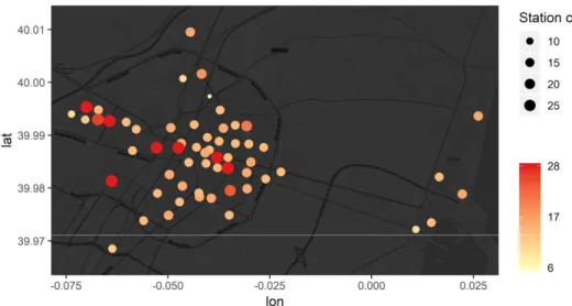
Bicicas is a public bike-share system located in Castellón de la Plana managed by the city council. It started working in 2008 with 6 stations and 140 bikes. Nowadays, the system counts with 59 operating stations distributed along the city with approximately 500 bikes. The stations have different sizes, having between 6 and 28 anchors where bikes are locked. Around sixty percent of the stations have a capacity of 14-16 anchors. A detail of the quantity of the stations capacity can be seen in the table below. In the following map, we can find the stations locations noticing that the bigger ones are located at the surrounding of the university, Centro comercial Salera, train station, park Ribalta, and city center. According to the Sustainable Urban Mobility Plan 2007-2015 [6], it is planned to reach 62 stations in the future. Users previously registered can pick up a bike from a dock using the terminal accessing it with a card or a mobile app which generates a code. The terminals and the mobile app inform the user about the number of bikes available in each station. Bicicas also counts with trucks that regularly redistribute the bikes among the stations with a capacity for 22 bikes.
6
Figure 1: capacity of Bicicas stations
Table 1: station capacity
3.3 -Introduction to the Data
The data used in this study was obtained from Bicicas web service. The web service was accessed every 10 minutes during 13 weeks in total. The period of time studied includes the range between 29-11-2018 and 27-01-2019.
The web service presents the data in a GeoJSON format containing information of the 58 stations and its corresponding anchors. While the current study was done, Bicicas added a new station, station “25. Chencho”1 located on the top north of the city, and expanded the capacity of station “10. Plaza Doctor Marañón” from 14 to 24 available anchors.
1 h
7
The data collected and the analytical code developed during this study will be available on GitHub to enhance reproducible research practices as commented in the Introduction.
8
4 - APPROACH, METHODOLOGY AND TOOLS
4.1 Approach
The study is based on the analysis and visualization of the data obtained from the stations of the bike share system located in Castellón de la Plana called Bicicas. The analysis is focused on the bikes’ movements between stations to understand the mobility within the city and extract meaningful patterns of movements during the day and between weekdays and weekends. Furthermore, a descriptive analysis of the stations' records is performed to detect missing data and erroneous attributes caused by the system and the anchor mechanism itself.
The methodology approach is composed of the generic steps of any data-driven research exploration. It is then structured in five sections: data acquisition, data cleaning, data format and merging, data analysis, and data visualization. The first three define the required steps for data preparation prior to the spatial analysis itself. As usual, these three steps were time-consuming and signified most of the effort of the research project, absorbing a significant proportion (90% approximately) of the development time. Getting familiar and understanding the nuances of the data, as well as the detection and correction of existing errors were the main tasks in the pre-analysis phase. The last two steps, spatial data analysis and visualization, define the analysis phase of the project. They concentrated on answering the main research question -- to explore cyclists mobility patterns in terms of co-location, concentration and periodicity.
4.2 Tools
Data was collected and stored in a PostgreSQL database using Python scripts to request remote data on a regular basis. This simple app was designed using Django and deployed in Heroku. The app access Bicicas web service every 10 minutes and store it in the database.
After collecting the data for several weeks, a copy of the database was restored on the local machine using pgAdmin and the table containing the geoJSON was exported as a CSV file to be cleaned also using Python. The geoJSON was parsed obtaining two different data sets, one containing information about the stations and the other one containing the records of the bikes. The file with the records contained duplicate records for the same bike at the same time, meaning that a bike was present at two or more different positions at the same time.
9
From this file two files were obtained, one with the correct records and other one containing the erroneous records. With the cleaned records of the bikes, the file with the movements was obtained.
Later, the files were imported into R Studio. In the format and merging phase, more attributes were added to the stations and the bike movement file in order to get a better understanding of the data. Moreover, it was possible to detect the redistribution journeys between stations.
Finally, a Shiny App was done in R Studio to provide interactivity to the visualization and supply the base to perform the visual and descriptive analysis of the movements and stations.
10
11
4.3 Methodological steps and data analysis workflow
In this section, the data flow through the methodological steps is explained. Figure 2 shows the set of tasks involved in each methodological step. It also illustrates the functions and processes developed in this project to transform the raw data into processed data ready for the analysis and data visualization steps at the end of the analytical workflow. Next, we describe each step in detail.
4.3.1 Data acquisition
The data acquisition step is composed of the two main tasks in this project. The first task is the collection of data from remote web services on a regular basis. The second task is to store the collected data in a local database for conducting the subsequent data preparation and analysis steps. As indicated in the previous chapter, this data set is the main input of the analysis.
The first step was to write a Python script that ran locally to request data periodically from a remote service. The geoJSON-formatted response was saved into a Postgres database. This was done using a python-Postgres adapter called psycopg2. The geoJSON data was stored in the Postgres databases, adding to additional fields to the collected record: an ID and timestamp when the data was collected. As a result, each row of the table was composed of three fields: id, timestamp, and the retrieved (raw) data stored in geoJSON format.
After reading about different platforms as a service (PaaS) and considering its pro and cons, Heroku was chosen because it is well documented and was found very simple to use. After getting familiar with Heroku3, the previous script that ran locally was adapted to run on top of Django, a high-level Python Web framework, to run as a service.
To access the Bicicas web service4 every ten minutes a task scheduler provided by Heroku was implemented (similar to scheduled tasks in operating systems). This scheduler is a free add-on and it is easier than adding a clock to the app. On the downside, the only inconvenience of the scheduler is that, in very rare cases, a task may be skipped or run twice5. If the scheduler worked as expected, it should collect 144 records per day (6 records per one hour). Figure 3 shows that during the 92 days of data collection, only 8 days missed one
2http://initd.org/psycopg/
3 https://devcenter.heroku.com/articles/getting-started-with-python 4 https://ws2.bicicas.es/bench_status_map
12
record and in the remaining four days the scheduler skipped two, three, four and six tasks. In total, 13081 observations were collected for the project.
Figure 3: Jobs executed by Heroku scheduler per day.
The Postgres database provided for the free option of Heroku has a limit of 10000 rows. When the row limit was going to be achieved, a security copy of the database was created and a dump file downloaded. Later, the older rows were deleted to provide more space in the Heroku database. In pgAdmin, an empty local database was created, and the dump files were restored and merged. The entire table with the Bicicas data in geoJSON format was exported as a CSV file for the next step.
4.3.2 Data cleaning
The goal of this step is to obtain a data set that only includes the data relevant to the stations and the bicycles (anchors). Taken as input the exported CSV file, where each record contains an id, timestamp and the raw data in geoJSON format, we focused on the latter and selected portions of the geoJSON data to process them and extract relevant information for the later analysis.
13
(A) Attributes of the input file referring to the stations
(B) Attributes of the input file referring to the anchors
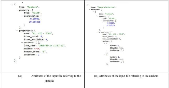
Figure 4: geoJSON from https://ws2.bicicas.es/bench_status_map
The geoJSON data contains information about the stations and their anchors. Every station in Figure 4 (A) has the following properties:
● geometry.type, geometry.Coordinates: feature type, and latitude and longitude of the station respectively.
● Name: station number and name.
● bikes_total: total number of bikes parked at the station. ● bikes_available: number of bikes available to be used. ● last_seen: last time when the station was accessed.
● online: TRUE if the station is online or FALSE if it is offline.
● number_loans: number of loans given from that station. Cumulative number of bikes taken by the users throughout the day. The count re-starts from zero at 5 am every day.
● incidents: total number of incidents reported by the anchors of the station.
In addition, the property anchors is a list with the following properties (Figure 4 - B): ● number: number of anchor.
14
● bicycle: the number of bicycle parked or NULL if it is empty.
● incidents: [ ] if there is no incident or [ 0 ] if the bicycle or the anchor cannot be used.
We first preprocessed the above input data to extract the stations (Above Figure 4 - A). Using the libraries pandas, csv and json of Python, a function called get_stations_info was implemented to parse the filed contained the geoJSON data of the CSV data file (exported from the database) to extract the information related to the stations, excluding the anchors attribute. The resulting data set was exported as a CSV file containing the following columns: time_scraped, station_id, name, long, lat, bikes_total, bikes_available, number_loans, incidents, last_seen and online. The dimension of the station dataset is 764,458 records.
Next, with the function obtain_records, the data related to the anchors was parsed (Above Figure 4 - B). The resulting data set contains the number of bicycles parked at each anchor and station. If the anchor is empty the bicycle attribute is NA. The records obtained were exported as a CSV file containing the following attributes: time_scraped, bicycle, station_id, name, long, lat, anchor and incident. The dimension of the anchors dataset is the number of observations combined with the number of anchors per station, resulting in 12,462,448 records.
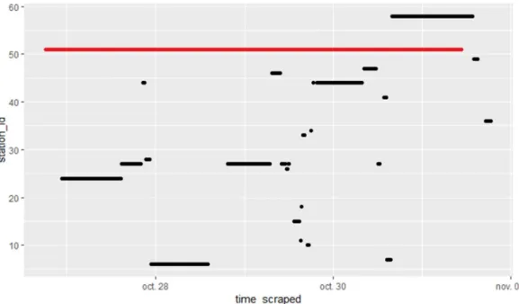
Next, we computed and plotted the trajectories of the bicycles from the anchors dataset to validate the data. As Figure 5 shows, an error in the data was detected. A simple exploratory graph in R as we can see below revealed that several times a bicycle could be found in two or more stations at the same time (i.e. two or more horizontal lines coincide in the same instant of time). In this case the station “51. San Agustín”, continued to register the bicycle with id 1443 as if it was parked there for almost four days (red line in the plot), while, in reality, the bike moved between different stations.
15
Figure 5: Stations where the bicycle 1443 was located for four days.
The problem with the bicycle 1443 was not isolated to these fours days. It was quite common due to some kind of mechanical defect on the anchor mechanism. Indeed, a depth look into the data revealed that up to four anchors recorded the same bike at the same time. Table 2 shows the number of records repeated. In total, 69896 times a bike was recorded at two different anchors) at the same time, 398 times a bike was present at three different anchors, and three times a bike was simultaneously in four anchors. The number of observations produced by the faulty station is usually greater than the stations to which the bikes move if the error lasts for several hours or even days. Even though this error only represents 1.4% of the number of records in the data, it needs to be corrected before the trajectories are created.
16
Table 3: extract of number of records repeated per bike and timestamp.
To detect which station and anchor is failing, first, we subset the data by bike to detect which timestamps are repeated. One record per bike and timestamp indicates a correct functioning. Otherwise, multiple records signal a potential error. The list of repeated times is divided into groups. If there is a difference higher than 12 minutes between two consecutive times, the list is splitted. The interval difference is produced when a journey lasted more than 10 minutes or the station stopped recording wrong values and other station begun to fail.
Next, the number of the stations and anchors of these repeated times are marked “in conflict” and grouped in the same way of the repeated time list. Then the script checks if there are stations/anchors in common between one group and the next one. When there is no common station among breaks, here the error of one station stopped and other station started to fail. The station/anchor is divided according to where the error changes.
For every group we find which station was previous in time. This station is the one where the bike was parked, then the bike was taken but the station kept recording the bike as if it was still there. This station is the one that needs to be corrected replacing on the corresponding record the bicycle attribute with NA. Below we can see a simulation over time that recreates the faulty behavior.
17
Figure 6: example of repeated times for one bike. In green the correct records, in red the duplicated records that need to be deleted.
The records file need to be processed as many times as the maximum number of “failing anchors” at the same time happens. In this study case, the file had to be processed 4 times to correct the erroneous attributes and produce the final records file to work with. As we can see in the table above, the code is structured to correct one “failing anchor” at time. In this example, the code detects that the station/anchor 1 was the one that started to fail, so it will replace the number of the bicycle with NA in this erroneous records. When the file is processed the second time, the error of the station 1 is not in conflict anymore, and the code detects that the station/anchor 9 is now the one that is failing and needs to be corrected. With the delete_duplicate_records function, we obtain 2 files: one containing the file with the records cleaned (depurated anchors dataset) and other one containing the records that were wrong and evident a problem in the anchor or the bikes.
The final file created with Python is the bike movements file. With the records finally clean in the depurated anchors dataset, we subset each bike and with the records ordered chronologically, and compare if there is a change on the station position. When a station change is detected, the following data is appended to a new data sets (bike trips) and then exported as a CSV file: bicycle, datetime_start, station_start, st_name_start, long_start, lat_start, anchor_start, datetime_end, station_end, st_name_end, long_end, lat_end, anchor_end.
18
In summary, the outcomes of the data cleaning step are two data files: ● stations dataset : contains 764,458 records.
● bike trips dataset: contains 220,859 records.
4.3.3 Data format and merging
With the two outcomes of the data cleaning step, we proceed with adding value to these data sets by computing the temporal dimension and statistical aggregates, to finally merging the two enhanced data sets into one data set, which will be the input for the last two steps: data analysis and visualization. Technically, while the tasks in the previous two steps were developed in python, R is the preferred programing language in this step, and also in the subsequent steps of data analysis and visualization.
A key task developed in this step is the standardization of the temporal dimension, i.e. all the variables related to time in all of the datasets produced: bikes trips, depurated anchors, and stations. In particular, the lubridate and data.table library were used to extract and process the information regarding the time variable. This step includes the conversion of the time_scraped column from character to POSIXct format and the creation of several fields related to the time variable:
● spanish_datetime / datetime_start / datetime_end: convert the datetime from time_scraped / datetime_start / datetime_end in time zone UTC to time zone "Europe/Madrid" and round it to minutes.
● Date / date_start / date_end: get the date from the spanish_datetime ● time / time_start / time_end: get the time from the spanish_datetime. ● hour: hour of the time
● working_date: considering that the number of loans restart at 5 h the working day goes from 5 h of the day till 5 h of the following day.
● weekday: number of the day. Starting from 1 Sunday till 7 Saturday. The weekday is calculated from working_date.
● travel_duration: for the bikes movements the time difference of the datetime_end and datetime_start.
19
Another important task is the computation of the number of loans per anchor and station, and the validation of loans in order to detect potential errors and apply corrections if needed. The number of loans counts the cumulative number of loans of the stations. In normal conditions, the count is restarted at 5 am every day, meaning that the field related to the accumulated number of loads is set to zero. As can be seen in the graphs, if there is a problem with the station that goes offline, the number of loans does not restart and keeps recording. The stations 25, 55 and 59 do not get restarted and keep recording continuously. The plot below (Figure 7) shows the number of loans of station 2 over time, and each color denotes a weekday. The error of accumulating the number of loans over several days is easily recognized because the three columns (i.e., number of loans) highlighted in the chart are colored in two or more colors instead of a single color. Next figure also refers to station 2 but shows the exact moment to restart the counter (red dots). The last plot (station 25) shows that this error may expand several days, even weeks, and the counter of loans is never reset. To sum up, we identified the variations of the error in the number of loans in these problematic stations and corrected them. As a result, the stations cleaned dataset was produced.
Figure 7: number of loans of station 2 against time
20
Figure 8: number of loans of station 2 against time.
Figure 9: number of loans of station 25
Next task was related to the identification of strange values in the availability of bikes per station. The number of loans registered by the stations refers to the bikes taken by Bicicas users. However, the stations also register the bikes available at any moment. When there is a sudden decrease in the number of available bikes, but there is no equivalent increase in the number of loans, it means that those bicycles were taken by Bicicas for redistribution to other stations in the network. By detecting the time when this occurs, we can filter the bikes’ movements to find out where these bikes have been moved and get a clean dataset with only the travels done by the users.
21
Finally, we compute the street route between each pair of stations to simulate how cyclists move across the city from the station A to the station B. Obviously, we did not capture these trajectories but simulated them for enhancing data visualization. station
A dataframe with all the combinations possible between stations was created to calculate the shortest route between each pair of stations on bicycling mode using the function google_directions from the library googleway. Once the coordinates of the routes were calculated they were converted to polylines, and a SpatialLinesDataFrame was created joining the polylines with their starting and ending stations. Later, a left join was done to add the geometry column to the bike movements dataframe. The route distance and the travel time provided by google_distance was also added as attributes.
In summary, the outcomes of the data format and merging steps are the following data sets. They are the output of the pre-analysis phase to get the data ready for the spatial analysis:
● Bikes trips users dataset: contains 167,228 records
● Bikes trips redistribution dataset: contains 53,631 records representing almost 25% of the trips total.
The graphs in Figure 10 show a comparison for each station of the number of loans registered by Bicicas (red) and the number of trips done by users (black) detected by our app. We can appreciate that the dots do not match perfectly meaning that several observations could not be detected with a 10 minutes interval. Especially in the stations with a higher number of loans.
22
Figure 10: comparison of the number of loans (red) and trips detected (black)
With more detail the histogram of the differences (Figure 11), loans minus trips, also reveals negative values, resulting in trips assigned erroneously to other station. The total amount of loans for the 93 days was 231.658 while the trips done by the users detected was 167.228 representing 72% of the real data. Only 840 trips were assigned wrongly to a different station, less than 0.4%.
23
4.3.4 Data analysis
The data analysis step is aimed to respond to the research question posed in the
Introduction section. No specific spatial methods or techniques were employed, beyond of the data manipulation, aggregation and integration with R to prepare the data for exploratory visualizations with ggplot, ggmaps and leaflet.
4.3.5. Data visualization: Shiny interactive app
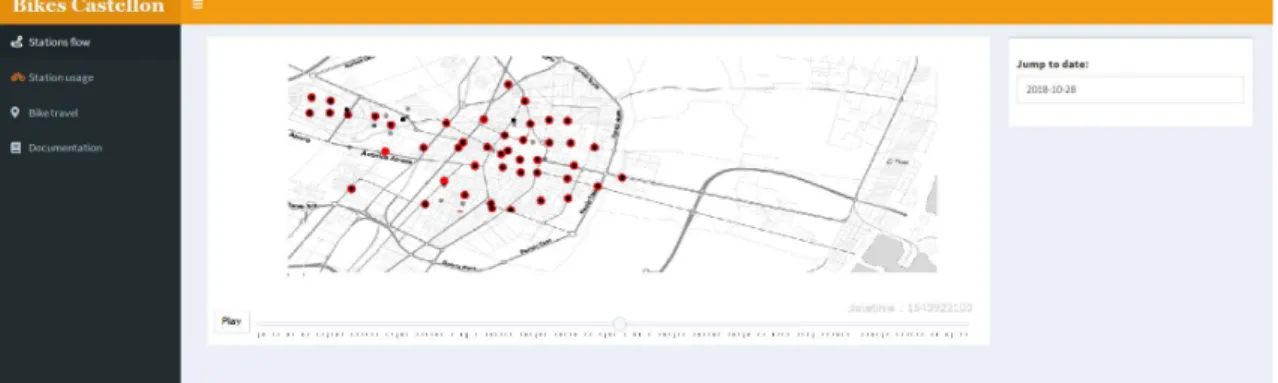
Shiny app (Figure 12) was created to group together the different visualization and plots created in the previous step, to support exploratory analysis and interactive visualizations. In the app, different maps and information about the station can be seen. In the first tab, we can visualize a map with the theoretical routes between stations for a selected day. We can select a day and a station and see the travels that start and/or end in that station. Moreover, an interactive slider goes through the days to see the changes over time.
Figure 12: Shinyapp showing travels that start and end from station 2
An animated map (Figure 13) was done to visualize the bikes represented as black points moving between stations. From this map, we can visualize the dynamics of the city, and detect visually movements patterns like concentration and dispersion. The inconvenience
24
of the map is that cannot be translated to paper. However, we can extract similar information from the calendar heatmap plots and the facet maps.
25
5 - RESULTS AND DISCUSSION
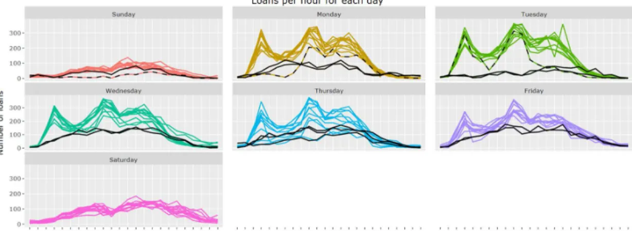
5.1 Periodity Daily activity of Bicicas
Facets graphs (Figure 14) and calendar heatmap plots help to visualize daily activity representing the number of loans over time. By means of a simple visualization, we can differentiate between the working days (Monday - Friday) and the weekends (Saturday-Sunday). During the working days, the peak of loans is registered at 8 in the morning, 14-15 in the afternoon and 19 in the evening. From Monday to Thursday the pattern is similar, while on Friday starting from 16 h the curve starts to flatten.
During the weekend, the number of loans per hour increase and decrease slightly, without abrupt changes. On Saturdays, the small peaks are given at lunch hour and around 17 h, while on Sundays there is no relevant increase in the number of loans during lunch. The black continuous lines correspond to the Spanish holidays and days between New Year and Epiphany day (January 6th). These days have a behavior similar to the one observed on Saturdays. The black dashed lines that do not match the others belongs to rainy days. In the case of the brown and black dashed line of 2018-11-19, the rain started at 6 h affecting the number of users that traveled during the morning. The rain continued intermittently until 12 h when the rain stopped and the number of loans started to recover its usual values for the rest of the day, except a decrease around 18 h affected by light rain.
26
Figure 15: Accumulated rain on 2018-11-19 6
In the following calendar heatmap plots (Figure 16 and 17) we can also visualize the general behavior described before and detect a constant number of loans from 17 to 20h.
Figure 16: Calendar heat map of loans per hour
27
Figure 17: Calendar heat map of loans per hour differentiated per day of the week
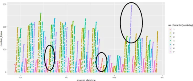
Aggregating the number of loans per day (Figure 18), we can distinguish differences between days and between weeks. During the week the number of loans tends to reach its maximum during Wednesdays and its minimum during Sundays as expected. The weekends keep constant values during the 13 weeks, while in the working days between Christmas and Epiphany day (weeks 52 and 53) a reduction in the number of loans can be detected as a consequence of Christmas holidays.
28
5.2 Movement patterns
5.2.1 Spatial K- Means Clustering
Extracting information using visualization requires readable maps. The large amount of stations and trips between them represented as lines tend to obfuscate the map difficulting the lecture and analysis obtained from it. For this reason, the stations were grouped by clusters and the trips data aggregated. Each cluster is represented in the map by the centroid of the stations' clusters.
A hierarchical clustering analysis was performed to group the stations geographically. This method was preferred because is subjective and the number of clusters depends on the observer. The technique chosen was the ‘Average’ which grouped the stations in clusters more closed visually to urban morphology considering the barriers of the city like the river and the presence of remotely located stations on Grao and outsides. The result is shown in the dendrogram and visualized on the following map presents, as expected, that the stations located in the same area were grouped together. The cut was done at 0.9 obtaining 12 clusters.
29
Figure 20: Average clusters dendrogram 5.2.2 Movement patterns analysis
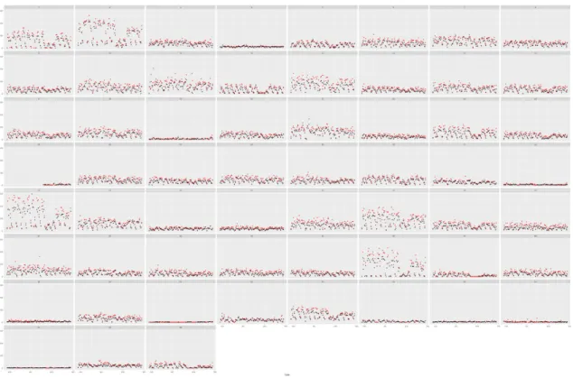
The trips were group by weekdays and weekends (including holidays) obtaining the average amount of trip per hour (sum of all trips between clusters per hour divided the number of days). If the average is smaller than 0.5, meaning that the number of trips is not frequent, the travel is discarded for this analysis. In the appendix can be found the maps containing all the trips. The following maps show the different movements patterns obtained from this data presenting the hours in the columns and the ending trip clusters in the rows. The calendar heatmaps plots between stations attached in the appendix (Figure 39) help us to understand how often this route between stations takes place.
On weekdays the first movements at 5 h occur from Grao (cluster 3) to the City center (cluster 2), within the city center and from this one to UJI (cluster 1). At 6h the trips to the city center start slightly to increase and movements from the center to Av. Valencia (cluster 5 ) and Donoso Cortes (cluster 6) appear. From 7 to 10 the center surroundings (clusters ) and Salera (includes Train station) start receiving trips that increase during the morning reaching peaks during midday and 20 h. The pattern is mostly constant. From 21h the number of flows starts to decrease. The city center and UJI concentrate most of the trips.
Hospital General (cluster 4) receives most of his trips during the morning at 7-8 h from UJI, the city center and surroundings. Later from 9 to 15 and from 18 to 20, the
30
predominant movement comes only from the center, with almost no activity during the 16-17h.
During the period 23-4 movements from the city center to UJI Raval Universitari occurs till midnight and starts again at 4 h. The city center receives trips during the whole night, at 3 and 4 h we can see movements within the cluster stations represented as a red circle. Av. Valencia and Av. del Mar have less activity but still receiving trips coming from the center.
During the weekends, at 5-6 in the morning we can detect a dispersion from the city center towards UJI Raval Universitari, Av. Valencia and Donoso Cortes maybe as results of the nightlife. Salera (train station) has a similar behavior as weekdays but with a lower number of trips. UJI Raval Universitari mostly only receive trips from the center and Av.Valencia. The pattern is very different to the weekdays due to the University opening hours.The center and its surroundings have similar behavior to weekdays but receiving less amount of trips.
From the morning until the evening at spaced hourly we can notice a regular pattern repetition in most of the clusters.
31
Figure 22: Movements from 11 to 16 during weekdays
32
Figure 24: Movements from 23 to 04 during weekdays
33
Figure 26: Movements from 11 to 16 during weekends
34
Figure 28: Movements from 23 to 04 during weekends
One of the most important advantages of animated visualizations is that we can visualize the temporal dimension transcurring in front of our eyes as a time lapse. From the interactive dashboard (Figure 13) we can observe how the bikes move between stations giving us a general idea of the movements every 10 minutes. The patterns of concentration and dispersion take place in the main places of the city: at the University located on the west and the city center. During the morning we can notice how there is a predominant movement from and towards the center, and from the center towards the University. At midday, during lunch hour, the concentration is predominant in the city center and during the night the dispersion takes place from the University towards the center.
5.3 Bikes redistribution
Redistribution is performed by the provider to balance the bikes available per station according to the demand. Considering the trips detected that were redistributed we can notice that the rebalancing during the weekends is slightly different from the weekdays (Figure 29). During the weekends the redistribution during midnight is higher than during the weekdays. The two peaks corresponding to 12-13 h and 17-18 h during the weekends matching the
35
lunch and coffee hour. The bike redistribution from 8 to 20 h keeps almost constant from Monday to Fridays.
Figure 29: Density plots of the bikes redistribution
In the following graph (Figure 30) we can see a representation of the redistribution path corresponding to November 14th from 00:00 to 09:00. The red dots represent the number of bikes transferred. We can notice that the bike redistribution is more spaced from 2 to 5-6 in the morning and starts get more often when the users start using the bikes. Because of the redistribution is done by more than one truck, the graph is only representative of how the bikes were moved and it does not correspond with the route done. It is common to detect only one bike being moved from one station. Looking into the records (Table 4) we can appreciate that usually corresponds to bicycles with incidents reported that need to be repaired.
36
Figure 30: Space cub plot of the bike redistribution movement
Table 4: Bike with incident detected on bike redistribution movement
5.4 Limitations
Several limitations have been faced during the development of this thesis. The main one is related to the data. Despite the possibility of accessing the web service and retrieve a geoJSON with the stations' situation in real time, the data in the format as it was needed is not publicly available and had to be collected, stored and interpreted. Another inconvenient was the lack of documentation which required a deep look into the data to understand it correctly. This step was fundamental to obtain the derived datasets, detect errors and inconsistencies and eventually correct them. Additionally, the temporal resolution of 10 minutes is not good to detect all the trips for those stations where bicycles are taken with more frequency, especially on rush hours. This not only results on missing trips but also creates fake trips between stations which did not really occur, obscuring the analysis of the movement patterns. Implementing a custom clock process to access the web service frequently reducing the time interval would improve the temporal resolution making the data more accurate, but would also increase the size of it to work with. Finally, the differentiation between trips done by the users and trips done by the redistribution trucks needs to be improved. At the moment, it only has been detected the bikes redistribution when there are no changes in the number of loans but there is a decrease in the number of bikes in the stations. It is common to happen that when the stations are been loaded or unloaded during rush hours, users can also take bicycles.
37
If the loan is registered when the redistribution occurs, it has not yet been detected in this work.
5.5 Reproducibility
One novel aspect of this thesis is the self-assessment of the reproducibility level of the research project. We borrow and adapt the definition of reproducible paper provided by [11], to define a “reproducible thesis” when a reader, committee member, student or even other researchers can potentially recreate the computational workflow of the thesis, including the prerequisite knowledge and the computational environment. The former (prerequisite knowledge) implies the scientific argument to be understandable and sound. This mostly refers to the scientific narrative of the written manuscript. The latter (computational environment) requires a detailed description of used software and data, and both being openly available.
Figure 31 shows the reproducible research criteria used for the evaluation which we applied here to evaluate the reproducible level of this thesis manuscript. Further details fo the meaning of these criteria and the proposed levels are described in [11]. Obviously, the manuscript has its own flaws with respect to reproducibility. We do not understand it as a yes/no flag but as a broad spectrum of potential levels between not reproducible at all and completely reproducible. In summary, we believe that this work ranks quite well, with a total score of 2 in overall over a scale from 0 to 3. In particular, the data, code (preprocessing and method/analysis/processing subcategories) and results are transparently published on GitHub
(https://github.com/fabianperotti/master_thesis_geotec). According to the classification in
Figure 31, this corresponds to level 2. With respect to the computational environment, we have exclusively used open source tools, libraries and development environments as indicated earlier. However, we have not provided an open runtime image/container to easily distribute and deploy our code. The use of Docker (https://www.docker.com/) or Binder (https://mybinder.org/) would have allowed other researchers to easily open an interactive analysis environment in a browser to reproduce our analytical workflow. Therefore, we critically assign ourselves level 1 for computational environment.
38
39
6. CONCLUDING REMARKS
This thesis is an example of data-driven spatial analysis to explore and discover cyclist mobility patterns, trends and behavior of cyclists based on real data. We systematically collected 3-month data to get a detailed picture of the use of the Bicicas bike-shared system in the city of Casstellón, Spain. Based on this raw data set, the approach taken was based on a series of analytical steps to prepare, clean, pre-process and merge which was finally turned into a suitable dataset for the subsequent spatial data analysis and visual analytics. As a result, we have presented and discussed a wide range of plots, images and maps that altogether revealed a new view of the actual use mobility patterns of the users of the Bicicas system.
When a project is over, it is worth to step back and reflect on the lessons learned. First and foremost, working with real data is extremely challenging and uncertain. We fail to properly estimate the complexity of the data preparation phase given the time frame period of the project. This phase consumed by large most of the part of the project, at the expense of reducing considerably the scheduled plan for the data analysis and visualization phase. On the positive side, the use of real data provided several benefits as the insights and findings achieved can enhance real public services in a city. Therefore, this thesis can lead to real impacts in city services for mobility beyond the scientific and personal learning purposes of a master thesis.
40
REFERENCES
1. Institute for Transportation & Development Policy, The bike-share planning guide. 2013. Retrieved from
https://www.itdp.org/wp-content/uploads/2014/07/ITDP_Bike_Share_Planning_Guide.pdf (Accessed May 21, 2018).
2. Shared-Use Mobility Center, Shared-use mobility toolkit for cities. 2016. Retrieved from http://sharedusemobilitycenter.org/wp-content/uploads/2016/07/SUMC-Toolkit-Final-Report.pdf (Accessed May 21, 2018).
3. Dodge S, Weibel R & Lautenschütz A. Towards a taxonomy of movement patterns. Palgrave Macmillan, 2008. 7: p. 240-252.
4. Froehlich J, Neumann J & Oliver N. Measuring the Pulse of the City through Shared Bicycle Programs. In UrbanSense08. 2008. Raleigh, NC, USA.
5. Froehlich J, Neumann J & Oliver N. Sensing and Predicting the Pulse of the City through Shared Bicycling. In Conference IJCAI. 2009. Pasadena, California, USA.
6. Ayuntamiento de Castellón de la Plana. Plan de Movilidad Urbana Sostenibl. Retrieved from
http://www.castello.es/web20/archivos/menu0/1/adjuntos/Plan_MovilidadUrbana_Sostenible _20121016070326.pdf
7. Ayuntamiento de Castellón de la Plana. Plan director de movilidad ciclista del municipio de Castellón. Retrieved from
http://www.castello.es/web20/archivos/menu3/156/Memoria_PDB.pdf 8. Patterns of movements. Retrieved from
http://movementpatterns.pbworks.com/w/page/21692527/Patterns%20of%20Movement
(Accessed May 21, 2018)
9. Andrienko N & Andrienko G. Visual analytics of movement: an overview of methods, tools, and procedures. Information Visualization, 2013. 12(1): p. 3-24. DOI:
10.1177/1473871612457601
41
https://www.citylab.com/transportation/2015/04/for-bike-share-equity-convenience-is-key/391790/ (Accessed February 21, 2019).
11. Nüst D, Granell C, Hofer B, Konkol M, Ostermann F, Sileryte R & Cerutti V.
Reproducible research and GIScience: an evaluation using AGILE conference papers. PeerJ, 6:e5072, 2018, ISSN 2167-8359. doi: 10.7717/peerj.5072
12. Singleton A, Spielman S & Folch D, Urban Analytics. 2018, London: SAGE Publications Ltd.
13. Goodchild, M. F. Citizens as sensors: the world of volunteered geography. GeoJournal, 2007. 69(4): p. 211-221.
14. Haklay M & Weber P. Openstreetmap: User-generated street maps. IEEE Pervasive Computing, 2008. 7.4: p.12-18.
15. Pajarito, D. and Gould, M. Mapping Frictions Inhibiting Bicycle Commuting. ISPRS Int. J. Geo-Inf. 2018, 7(10), 396; https://doi.org/10.3390/ijgi7100396
16. Boss D, Nelson T, Winters M, Fester C. Using crowdsourced data to monitor change in spatial patterns of bicycle ridership. Journal of Transport & Health, 2018. p. 226-233 17. Zhang X, Li W, Zhang F, Liu R & Du Z. Identifying Urban Functional Zones Using Public Bicycle Rental Records and Point-of-Interest Data. ISPRS Int. J. Geo-Inf, 2018. 7(12), 459; https://doi.org/10.3390/ijgi7120459
18. McArthur D and Hong J. Visualising where commuting cyclists travel using crowdsourced data. Journal of Transport Geography,2019. 74: p. 233-241 https://doi.org/10.1016/j.jtrangeo.2018.11.018
42
APPENDIX
Movements for weekdays
Figure 32: Movements from 05 to 10 during weekdays
43
Figure 34: Movements from 17 to 22 during weekdays
44
Movements for weekdays
Figure 36: Movements from 05 to 10 during weekends
45
Figure 38: Movements from 17 to 22 during weekends
46