Tese de Mestrado
Mestrado em Media Interativos
Trabalho efectuado sob a orientação do
Professor Doutor Nelson Troca Zagalo
Rui Miguel Miranda Dias
Mobile Interface Design:
Instant Places Mobile Application Case
Universidade do Minho
Declaração
Nome
Rui Miguel Miranda Dias
Endereço electrónico [email protected] Telefone +351 934 284 666 Cartão de Cidadão 13386997 Título da Dissertação
Mobile Interface Design:
Instant Places Mobile Application Case
Orientador
Professor Doutor Nelson Zagalo
Ano de conclusão
2014
Mestrado em Media Interativos Instituto de Ciências Sociais Universidade do Minho
DE ACORDO COM A LEGISLAÇÃO EM VIGOR, É AUTORIZADA A
REPRODUÇÃO PARCIAL DESTE TRABALHO APENAS PARA EFEITOS DE INVESTIGAÇÃO, MEDIANTE DECLARAÇÃO ESCRITA DO INTERESSADO, QUE A TAL SE COMPROMETE
Universidade do Minho, 30 de Janeiro de 2014 Assinatura:
Acknowledgments
First of all, I would like to thank my parents and family, who made this work possible. Not just due the financial support, but also for understanding the time a project of this kind consumes. Also for encouraging me to follow my goals, even when it means my absence in certain moments.
I also would like to thank my supervisor, Professor Nelson Zagalo, for his time, knowledge, and criticism, which helped me to improve this project.
Thank you people at Ubicomp, namely Professor Rui José and Bruno Silva, who accompanied my work and did their criticism as well, contributing to a better conduct of it.
Thank you so much Ana for your help and unconditional support. Thank you for keeping me motivated and never let me down. I also apologize for the time this project stole from us.
Overall, a big thanks to all the people who directly or indirectly contributed to this project, the friends who gave their tips and opinion, the testers for their time and contribution, the people who, somehow, turn the result a little bit better.
Mobile Interface Design:
Instant Places Mobile Application Case
Abstract
Interactive public displays have the potential to innovate in the way we communicate, and express, ourselves publicly. Instant Places project, developed by Ubicomp group at Department of Information Systems, University of Minho, wants us to have the opportunity, through these displays, to become not only spectators but also influence the content generated in them, as well as marking (and managing) a public presence or interacting with other users, for example. This interaction is possible through the platform that is becoming increasingly more ubiquitous and used these days, the Smartphone.
This dissertation aims to find a solution for instant Places mobile application, which will be the main vehicle for interacting with public displays. Moreover, it is intended that the results found on this document can not only contribute to the project that is intended, but can also be applied in the development of interfaces for mobile devices in general terms.
It is expected that this dissertation show the key aspects to consider for that kind of project, such as how do we use the device, the differences from the traditional computer, technical aspects, limitations and opportunities, as well as other issues that will allow a combination between the aesthetic and functional factors.
Keywords: User Interface; Mobile Interface Design; Public Displays
Mobile Interface Design:
Instant Places Mobile Application Case
Resumo
Os ecrãs públicos interativos têm o potencial de inovar na forma como comunicamos e nos expressamos publicamente. O projeto Instant Places, desenvolvido pelo grupo Ubicomp, do Departamento de Sistemas de Informação da Universidade do Minho, pretende que, através desses ecrãs, tenhamos a oportunidade de nos tornar não só meros espectadores, mas também influenciar o conteúdo gerado nos mesmos, bem como marcar (e gerir) uma presença pública ou interagir com outros utilizadores, por exemplo. Essa interação é possível através da plataforma que se tem tornado cada vez mais ubíqua e utilizada nos dias que correm, o Smartphone.
Esta dissertação, pretende encontrar uma solução para a Interface do Utilizador da aplicação, para Smartphone, do Instant Places, a qual será o principal veículo de interação com os ecrãs públicos. Por outro lado, pretende-se que as conclusões deste documento possam contribuir não só para o projeto que se destina, mas que possam ser igualmente aplicadas no desenvolvimento de interfaces para dispositivos móveis em geral.
É expectável que se encontrem aspectos fundamentais a ter em conta para tal desenvolvimento, como a forma de utilização do aparelho, as diferenças para o computador tradicional, aspectos técnicos, limitações e oportunidades, bem como outras questões, que permitirão uma conjugação entre o factor estético e o funcional.
Palavras-chave: Interface do Utilizador; Desenho de Interface Mobile;
Contents
Acknowledgements iii Abstract v Resumo vii Contents ix Figures xii Tables xiv Abbreviations xv 1. — Introduction 11.1 — What is Instant Places 1
1.2 — Motivation 3 1.3 — Methods 4 1.4 — Objectives 5 1.5 — Structure 7 I. PART 1 — CONTEXT 2. — Mobile Scenario 11
2.1 — What does “mobile” mean 11
2.2 — Why mobile 14
2.3 — Patterns 17
2.3.1 — What have been done 18
2.4 — Mobile vs. Desktop 23
2.4.1 — Touch Influence 26
2.5 — Limitations 28
2.5.2 — Performance 29
2.5.3 — Native, Web, Hybrid 29
2.6 — Conclusions 31
3 — Principles of user Interface 33
3.1 — Graphical User Interface 36
3.2 — Usability 38
3.3 — User Centred Design 40
3.4 — User research / Focus Group 41
3.5 — Form or Function? 42
3.6 — Ergonomics / Human Factors 43
3.6.1 — Using One Handed Mobile Touchscreen Devices 44
3.6.2 — Field Study and Conclusions 48
3.6.3 — Target Size 52
3.7 — Responsive Design 56
3.8 — Navigation 58
3.9 — Defining features 61
3.10 — Conclusions 62
II. INSTANT PLACES MOBILE APPLICATION DESIGN
4 — Wireframe 65
4.1 — Join Instant Places 67
4.2 — Connecting to a Display 69
4.3 — Activity Feed 73
4.4 — Presence Management 75
4.4.1 — Navigating inside sections 76
4.5 — Apps Panel 77
4.6 — Menu 78
4.7 — Navigation overview 80
5.1 — Method 86 5.2 — Results 88 6 — Visual Design 93 7 — Conclusions 97 8 — References 101 8.1 — References of Figures 110
Figures
Figure 1 — Facebook Android App (2013) 19
Figure 2 — Facebook iPhone App (2013) 19
Figure 3 — Google+ Android App (2013) 19
Figure 4 — Google+ iPhone App (2013) 19
Figure 5 — Example of a hidden menu that is revealed when the user touches
the menu icon 20
Figure 6 — Youtube Android App menu (2013) 20
Figure 7 — Youtube iPhone App menu (2013) 20
Figure 8 — RBMA Radio Android App menu (2013) 20
Figure 9 — RBMA Radio iPhone App menu (2013) 20
Figure 10 — “Back Button” on Soundcloud Web App and browser’s history
back button 21
Figure 11 — Google Nexus website — button similar to many mobile
applications (September, 2013) 21
Figure 12 — Mailbox App (swipe to mark as read) 27
Figure 13 iOS7 Mail App (swipe to reveal options) 27
Figure 14 — Facebook messenger App (swipe to reveal options) 27
Figure 15 — Interface 33
Figure 16 — Interpretation of Abraham Maslow’s Hierarchy of Needs by Walter 35
Figure 17 — Comfortable zone referred by Clark (2010) 46
Figure 18 — Comfortable zone referred by To (2013) 46
Figure 19 — Responsive Web Design example 55
Figure 20 — Responsive UI elements / Minimum button size 55
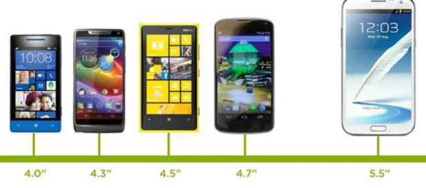
Figure 21 — Variety of Smartphone dimensions 57
Figure 22 — Variety of device sizes, and interface adaptation 57
Figure 24 — first steps till searching a Display nearby 69
Figure 25 — Since searching for a Display 70
Figure 26 — Displays found 71
Figure 27 — Connected 72
Figure 28 — From Display to personal device 74
Figure 29 — Rotating the device 75
Figure 30 — Presence Management 76
Figure 31 — Navigating inside divisions 77
Figure 32 — Applications Panel layout 78
Figure 33 — Accessing Activity feed and menu button 79
Figure 34 — Main Menu 80
Figure 35 — Navigation Flow 81
Figure 36 — Application Flow 82
Figure 37 — Application Flow 2 83
Figure 38 — Interactive PDF prototype 85
Figure 39 — Tests 86
Figure 40 — Visual Design 1 94
Figure 41 — Visual Design 2 95
Tables
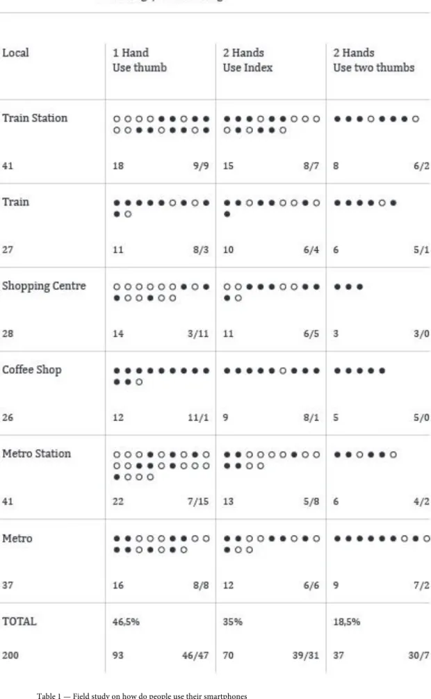
Table 1 — Field study on how do people use their smartphones 50
Table 2 — Test results 89
Abbreviations
API — Application Programming Interface App — Application
CPU — Central Processing Unit CRT — Cathode Ray Tube CSS — Cascade Style Sheet GUI — Graphical User Interface HCI — Human-Computer Interaction HTML — HyperText Markup Language
iOS — Apple's mobile devices Operating System SDK — Software Development Kit
Introduction
This study has been made under the Instant Places project, developed at University of Minho. The main feature of this project is to provide people a way to express themselves, publish and share content publically and get information of their interest, all made through public displays. We are assisting an incredible growing of smartphones usage, and it’s making this devices an ubiquitous tool in our everyday lives for uncountable tasks — according to Strategy Analytics1, the number of smartphone users around the world has reached one Billion in the third quarter of 2012. This ubiquity makes it the most appropriate medium to make the bridge between the user and the public displays. The mobile application for interacting with the public displays is the main reason of this research and will be presented as the final result. It is also pretended to reach conclusions able to improve the Mobile User Interface Design in general.
1.1
— What is Instant Places
Instant Places is a research project on situated displays, based at Universidade do Minho, looking for ways to put people interacting with digital public displays, an increasingly important element of our technological landscape, with the ability to change our communication habits in public and semi-public spaces. According to José et all (2013), “this trend could enable us to move from a world of closed display networks that function as isolated islands to scenarios in which large-scale networks of pervasive public displays and associated sensors are open to applications and content from many sources”. The goal is to take people to generate content on the screen based on what they find valuable, instead of standing passive. Researchers also refer that display systems haven’t reached their potential as an open communication medium. People usually ignore its content, but this project intends to attract people’s attention
1 Source: http://blogs.strategyanalytics.com/WDS/post/2012/10/17/Worldwide-Smartphone-Population-Tops-1-Billion-in-Q3-2012.aspx
making themselves part of it. The challenge of meaningful communication using public displays requires specific paradigms to enable people to control content and publishing.
This is where user Interface Design role comes in. It should help user to make decisions and have an accessible control over his interactions between each public display. Being a project based in situated displays, the application is location-based, that puts users creating a “relationship” with each display2.
By now, instant places main features are:
— Places
Might have one or more displays as a symbolic environment that provides a meaningful context for situated social interactions.
— Personal Identities
Let people explicitly and systematically manage publication and self-exposure in public displays. For now, that means people can create different identities for each display and use them to publish content, either by attaching pins or creating posters.
— Display applications
Place owners would be able to select multiple display applications for use on respective displays. Each display’s applications should be able to adapt their behaviour according to place’s available resources and current circumstances. Applications can also access data shared in each place by users — like pins and
2 Not every system feature is defined yet. Although, it may be possible to publish on several screens at once, based on other displays’ activity. For now, it isn’t already a reality. Thus, this study is based on concrete established functions.
posters, e.g. — so that they can create visualization of this data information. Main applications available now are:
— Pins
A pin refers to an institution, cause, campaign, sports team, or band that people might identify with. Users can associate pins with their identities by associating it from a pre-defined list (constantly growing). A pin compromises a visual icon, a name, a set of tags, and a set of sources from which people should be able to generate screen content. Pins aren’t exactly a mechanism for user-generated content. Pins work more on a crowdsourcing model in witch users express support for or interest in particular content sources. Each time a user connects to a display, this information might be considered as part of their identity and used to increase the popularity of the content associated with those pins.
To know more about Instant Places and, for a better interpretation of this dissertation, please access www.instantplaces.org
Note: Henceforth, Instant Places public displays will be referred to as Display or Displays.
1.2 — Motivation
As one of the most important subjects in user experience design, the interface became an inevitable research case for Instant Places mobile application. It’s important to clarify that visual interface design isn’t just about text, and forms (although it’s essential too), but it’s mostly about usability, navigation, and information architecture. Nielsen (2000, 11) puts usability in front of artistic approach to web design. Nevertheless, the author points that there is a need for art, fun, and general good time on the web, but the main goal of a well-designed web interface is to conduct the user right through what he wants in minimum steps and without needing
to think too much. Krug (2006, 11), who considers “don’t make me think” the first law of usability, says that “as far as is humanly possible, when one look at a web page it should be self-evident, obvious and self-explanatory”. Colours, symbols and typography are indispensable elements to help that (as it is on road signs, e.g.) and, consequently, to provide a good experience. In just a few years, the number of mobile applications available at digital stores of the two most relevant systems in the market — Apple App Store and Google Play — has reached more than one million applications each3. And this number will certainly grow in the next few years.
Having said that, it’s plausible to research, not just the improvement of technology, but the Human-Computer relationship. After searching on documented studies about Smartphone and TV interaction, it was possible to find some studies exploring the possibilities to improve the experience of watching television at home, focusing essentially on entertainment. However, we missed exploration and research on interface design and interaction with public displays, focused on social activity. It’s important to understand, in this case, what people intends to do, what the application itself can be and how to provide users the best way to make it all happen correctly and intuitively. Again, the results of this study shouldn’t only be seen as a solution for Instant Places, but take some methods to apply on any other mobile website or application.
1.3 — Methods
Usability tests and metrics are an important data source to help designers make a better work when designing interfaces, but some previous studies and knowledge from interface design scholars and professionals may, and should, be applied too. There isn’t much academic research based on the most recent mobile devices interface and respective applications, although this technology is becoming the principal digital device people use for all kinds of tasks. So it’s opportune to do
3 Source: http://www.theverge.com/2013/10/22/4866302/apple-announces-1-million-apps-in-the-app-store and http://mashable.com/2013/07/24/google-play-1-million/
research about this subject. A lot of scientific knowledge acquired over the years largely refers to websites and software design optimized for desktop/laptop computers. The challenges are about collecting what have been concluded before and join it with this study’s collected data in order to reach new conclusions. Likewise, online publications are becoming an important source of information and a shared platform of ideas between professionals, nowadays. There are really important articles on online magazines, company’s webpages, and even great professional’s personal blogs. For researchers, it’s undoubtedly advantageous as it’s a faster way to access content. Nevertheless, there’s the issue of being able to filter which content really matters. However, it is certainly becoming indispensable and considered, by many, as the new main source of information.
1.4 — Objectives
The goal of this study is to find a proposal that solves the mobile interface problem for Instant Places. User’s mobile device will be the vehicle utilized to interact with the public displays. A good, user-friendly, intuitive and also pleasant interface is the expected final result. Still, it’s important to clarify that there are often other ways to solve an interface problem, although this study intends to find limitations, possibilities and solutions that contribute to a greater experience for the users.
This study shouldn´t be seen as a hypothetical case, but as a concrete result to be applied essentially on Instant Place’s mobile application. However, it doesn’t mean this is the only possible solution but, according to the carried research, the one found more plausible. As an academic research, the final result should be as conclusive as possible, but in several cases interfaces take years to perfect and simplify. Interface design is the visible (and touchable) side of a complex range of programming languages, microprocessors and a wide range of components that make technology work. But we have to keep in mind that the end-user almost never cares about it. Mostly users just want to pick up the devices they bought and simply (and easily) use them. Almqvist (2000) points that what reaches the user is what’s visible on the
screen. He doesn’t care about backend, but cares about function, and function is helped by good designs and smart, but invisible, technical solutions. This means the designer should transform a complex system to an easy-to-use forefront.
“Good design makes a product understandable”
— Dieter Rams, 1978
One of Nielsen’s (1995) usability heuristics4 — “Match between system and the real world” — refers that the system should speak the user’s language, with words, phrases and concepts familiar to the user, rather than system-oriented terms. This means a designer should think the interface focused on who will use it and that was the ultimate objective case of our work. The main goal of this research is to understand how interface design can improve the user experience in Instant Places mobile application while interacting with a public screen, but also elicit some conclusions to be applied on different kind of situations. Above all, it intends to be a contribution to an improvement of the mobile interface design.
Is important to note that this is not a global user experience project. This work is focused on User Interface Design, as part of the experience. There are many factors that contribute to the overall experience. Interface is an important one, but not the only one.
4 Jakob Nielsen’s Usability Heuristics for User Interface Design — Visibility of system status; Match between system and the real world; User control and freedom; Consistency and standards; Error prevention; Recognition rather than recall; Flexibility and efficiency of use; Aesthetic and minimalist design; Help users recognize, diagnose, and recover from errors; Help and documentation.
1.5 — Structure
This dissertation is essentially divided into two stages: an introduction to the mobile scene and a collection of principal issues to take into account before starting to design a User Interface project and then, the conceiving of the project itself.
The first stage — Context — aims to understand the environment this project will be conceived. It was found essential to collect information in order to know the requirements of designing a User Interface, what have been done before, what main authors and experts have concluded, what are the possibilities and limitations as well as recognizing the technical issues to care before starting to develop an idea or design concept.
On a second stage — Instant Places Mobile Application Design — a proposal is presented, based on earlier conclusions. As it was intended, the collected information allowed us to create an interface that respects the issues found before. It aims to join aesthetics with functionality, contributing to a better User Experience.
PART 1
2 — Mobile Scenario
2.1 — What does “Mobile” mean?
Prior to deepen on a mobile project is to know what “mobile” means. Although the term is being adopted as referring to smartphones and tablets, it may be confusing, since a laptop, for example, is a portable and mobile device too. Some authors, like Weiss (2002) use the term “handheld”, which captures the essence of the device size, although allows the inclusion of television remote control into the definition. According to Ballard (2007: 3), “mobile” refers to the user, and not the device. The term “mobile” refers to devices that can be used “on-the-go” (while walking for example) and don’t have to be static while using them. Weiss further notes that to be considered a handheld device, it must pass those three requirements:
— It must operate without cables, except temporarily (recharging, synchronizing with a desktop)
— It must be easily used while in one’s hands, not resting on a table
— It must allow the addition of applications or support Internet connectivity Hoober and Berkman (2011, xvi) classify the evolution of mobile telephony in four eras:
1. Voice
2. Paging and text
3. Pervasive network connectivity 4. General computing devices.
Considering the current mobile phone as being a “fourth era” device, it must have the following characteristics:
— Small: It’s small enough to a person carry all the time, preferably on their pocket
— Portable: It is battery-powered and independent from electrical current
— Connected: It’s wirelessly connected, not attached to the wall or connected only when user makes special effort. Whenever possible, it is connected in multiple ways, to both voice and data networks
— Interactive: It’s inherently interactive. Allows much more interactions than a MP3 or a PDA
— Contextually aware: Uses the ability to understand the network to which it’s attached, to help the user get things done
For Firtman (2010:4) a mobile device is portable, personal, carried by people almost all the time, easy and fast to use and somehow network connected. The author adds that when we think about mobile devices, we need to exclude de “phone” concept. Voice calls are just a simple feature. The term “mobile” can refer to a wide range of devices, so he classifies them as:
— Mobile Phones
— Low-end mobile devices
— Mid-end mobile devices
— High-end mobile devices
— Smartphones
— Non-phone devices
— Small Personal Object Technology (SPTs)
— Tablets, netbooks, and netbooks
Nevertheless, this study is focused on smartphones. But Firtman considers it the most difficult category to define. He also questions why some mid-end and high-end
devices are not considered “smart” enough to fit this category. Smart is a concept that evolves every year. What today is considered a simple mobile phone would have been considered very smart ten years ago. As defined today, a smartphone has a multitasking operating system, a full desktop browser, wireless LAN (WLAN, also known as WiFi) and 3G connections (now 4G), a music player and several of the following features:
— GPS (Global Positioning System) or A-GPS (Assisted Global Positioning System) — Digital Compass — Video-capable camera — TV out — Bluetooth — Touch support — 3D video acceleration — Accelerometer
David (2011: 1) points the iPhone as the highest representative of what a smartphone is. He goes further saying that it’s fair to compare this device to a computer, due to be equipped with almost the same features. When the iPhone was launched in 2007, Steve Jobs hailed the phone as three devices in one: a phone, an MP3 Player and the best way to experience the web.
We can assume that the term “mobile” refers to devices that don’t have to be stationary, are small enough to carry with one hand and may be easily transported everywhere. According to the described categories, this study is based on a Smartphone, as it has a multitasking operating system, a full desktop browser, Wireless LAN (WLAN, also known as Wi-Fi), 3G connections, GPS, as many other features, although those are essential for the concerned application in case.
2.2 — Why Mobile?
With an increasing role of computers and digital devices in our everyday lives, the HCI discipline grew both in academia and industry (Canny, 2006). Software usability, especially on smartphones and tablets, is now an important subject to study, once digital applications are becoming more and more ubiquitous for all kinds of tasks. According to mobiThinking5, based on a Portio Research6 from March 2013, 1.2 billion people worldwide were using mobile applications at the end of 2012. Also, there’s a forecast for this number to grow 29.8 per cent each year, reaching 4.4 billion users by de end of 2017. Coursaris and Kim (2006) refer that the turn of this century marked an increased focus on mobile usability studies for research in the field of Human Computer Interaction. Although there’s a considerable number of usability studies in general, the use of mobile devices is exponentially increasing, and we’re missing more research mobile oriented.
Studies on this area may contribute to improve mobile products and services, once smartphone is becoming the preferred vehicle to access information by the majority of users. Since 1970’s, the main focus of HCI studies has been on desktop software and websites, controlled by a keyboard and a mouse, but nowadays, designers, developers and also scholars are starting to turn to smaller and tangible screens to display information. Markoff (2009) refers that cell phone is “the world’s most ubiquitous computer”. The New York Times journalist adds that software designers who early revolutionized the use of Personal Computer making it truly personal with a visual system called WIMP — windows, icons, menus and pointer, as we know it for Macintosh and Windows computers — say they see the same happening now with mobile phones. That was written only two years after the release of the first Apple iPhone presented by the company’s CEO (Steve Jobs) in January 2007 and placed on sale in June of same year. A device that is considered by many not
5
mobiThinking, (2013). Global mobile statistics 2013 Section E: Mobile apps, app stores, pricing and failure rates, http://mobithinking.com/mobile-marketing-tools/latest-mobile-stats/e, 13 August 2013.
6 Source: http://www.portioresearch.com/en/blog/2013/fast-growth-of-apps-user-base-in-booming-asia-pacific-market.aspx
the first cell phone with a “full-screen” tangible surface neither the first smartphone, but the one that defines what a smartphone really is. Plus, it came with a new technology, which, at the time, was not accessible by the masses, a multi-touch screen controlled by our own fingers. At a TED talk in 20067, Jeff Han refers Bill Bruxton (and his crew at University of Toronto’s Dynamic Graphics Project) as a pioneer on multi-touch screen technology by the 80’s but was the Han’s project that jumped into the spotlight as a truly interactive multi-touch sensible surface. It gave rise to what is called NUI (Natural User Interfaces) which is characterized by the end of graphic elements and “pointing and clicking” and the introduction of swipe, pull, drag, hold, etc. The word “click” is being replaced by the word ”tap”. Apple just spread this technology through its devices — first iPhone and lately the iPad — popularizing this new study field of “mobile interface design”. The term may be related to the first mobile phone, since it has an interface too, although it was manufactures responsibility to design it. Nowadays, any individual is able to design not only websites that fit and look better, but also applications that run on these devices operating systems. It can explain why this is a growing topic of interest. Joos (2013), on a Smashing Magazine article wrote: “The iPhone ushered in a revolution in interactive communication. Only five years later, touchscreen devices are all around us, and interaction designers are redefining ways people use digital content”. Also, it’s important to note that this technology is now common to us, but it’s not the latest kind of interaction. Google revealed its Google Glass8 project in the middle of 2012. It reflects how technology is becoming wearable and starting to be part of us too — interesting to see an example of it as Neil Harbisson9. Despite touch screens became a mass product in recent years, new forms of human-computer interaction were born very quickly.
Fox (2010), points that the mobile device is the Internet for many people. The researcher argues that more people will use mobile devices instead of traditional computers to obtain information. McGrane (2012) states that: “If people want to do something on the Internet, they will want to do it using their mobile devices. Period.”
7
Source: http://www.ted.com/talks/jeff_han_demos_his_breakthrough_touchscreen.html
8
Google Glass website — http://www.google.com/glass/start/
9
Through his point of view, there’s a trend for “mobile-only” users who access information exclusively on mobile devices like smartphones and don’t even own a desktop or laptop. To argue that, the author points some facts:
— In India, seventy per cent of the population — approaching to a billion people — has a mobile phone
— China now has more mobile Internet users then there are people in the United States
— In Egypt, of the ten million people who access the web, seventy per cent of them are “mobile-only” users
— For billions of people in the developing world, mobile phones are the only way they will ever connect to the Internet
In developed countries, a large and growing number of users who access the Internet do it only through a mobile device. Marcotte (2010) tells that mobile browsing is expected to exceed desktop-based access within three to five years. McGrane also points that in June 2012, thirty-one per cent of Americans who accessed the web from those kind of equipment, rarely or never use any other device for the same task. The author indicates that this number tends to increase, referring the Pew Research Centre that reported, in an early study form July 2011 that 28% of smartphone users go online mostly using their phone, although having access to a computer at home or at work, and one-third of those users have no access to a broadband connection at home. As an example, Jeff Weiner, CEO of LinkedIn, a well-known professional network, announced the company’s strategy will pay a big focus on mobile. It’s expected that 50% of LinkedIn’s unique visitors will come via mobile devices in 201410. This data predicts an upcoming future where people no longer need, neither want, a computer and to be at certain location to access the Internet. Those facts also indicates that globally, the number of people who access information from a mobile
10
device will be bigger than who use a desktop or laptop computer.
Twitter CEO, Dick Costolo, at D11 conference (All Things Digital) on May 29, 2013 has pointed the company’s strategy not to compete with traditional media, but to complement it. Its intention is a Television partnership (as they’re already working with ESPN and Turner Broadcasting11), which can be used, e.g., as advertising campaigns, making audience interact through their mobile phones via Twitter, providing a “much more engaging experience for users”, in Costolo words. He also approached the “mobile first” trend of web services revealing Twitter’s intention: “We’re not just mobile first, we’re all-in on mobile”12.
2.3 — Patterns
The Architect Christopher Alexander, as components of a language to build towns, planning urbanism as in the construction of buildings, introduced the pattern concept. In A Pattern Language, Alexander et all (1977, x) refer an extremely practical language that “You can use it to work with your neighbours, to improve your town and neighbourhood. You can use it to design house for yourself, with your family; or to work with other people to design an office or a workshop or a public building like a school. And you can use it to guide you in the actual process of construction.” Through these words, we are able to have a perception of what a pattern is. They should be seen as proven solutions for certain problems, and documented as such. As in architecture and engineering, the same concepts might be applied to interaction design and development. Although, it doesn’t mean it should be followed as the only solution to a problem, but one which has been proven to work.
Reusing and reapplying known best cases in graphic design is a common concept. Hoober and Berkman (2011, 18) refer that “There has always been a culture
11 Tweney, D. (2013) Twitter CEO: We’re not competing with TV and News media, we’re ‘complementary’ http://venturebeat.com/2013/05/29/twitter-ceo-were-not-competing-with-tv-and-news-media-were-complementary/#WYqDjtpkpw4gBlJp.99 12 November 2013
12 Full intervewi: Isaac, M. Twitter CEO Dick Costolo: The Full D11 Interview. http://allthingsd.com/20130529/twitter-ceo-dick-costolo-the-full-d11-interview-video/. 12 November 2013
of sharing, borrowing, and building over the work of others”. It’s the nature of things. Nothing is completely invented from scratch. Although, patterns may lead to a conflict between design managers who are apologists of repeatability and the use of templates, stencils or any pre-made work, and those who want freedom to explore new solutions. However, Hoober and Berkman warn for a misunderstanding of how patterns should be used. As referenced before, they don’t consist in rules, but in well-defined and well-researched best practices. Yet, the basic principles of design must always be kept in mind, centring efforts on user and always considering the purpose of the design. The authors also cite Alexander when referring to design patterns, and point object-oriented software development as applier of the Architect’s concept.
2.3.1 — What have been done?
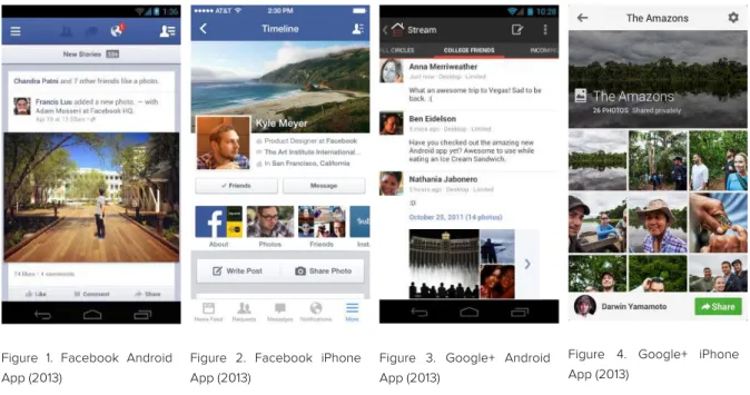
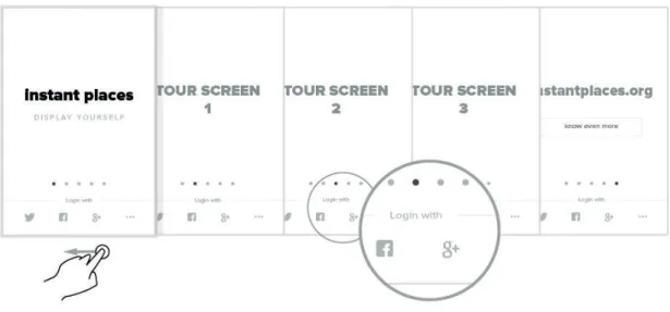
Often we see native applications following guidelines provided by the respective operating system companies, in order to fulfil their requirements. Almost every well-known mobile application is conceived under these guidelines. There is always a Navigation Bar at the top edge of the screen and, when necessary, a Toolbar at the bottom. As we see on Facebook mobile application for Android OS (Figure 1) and iOS (Figure 2) and Google+ Android application (Figure 3) and iOS (Figure 4) respectively, these guidelines have been followed.
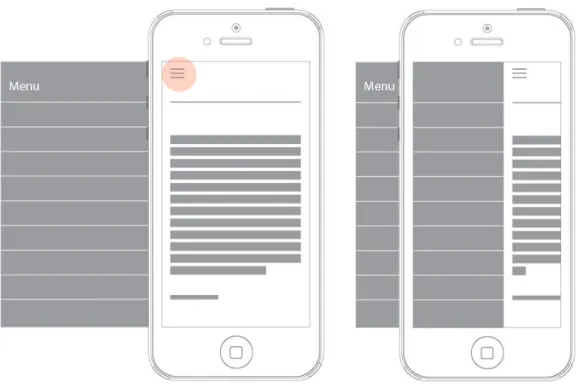
There has been a tendency to use off-canvas side menus (Figure 5) like YouTube Android (Figure 6) and iOS (Figure 7) applications does, as well as RBMA Radio for both operating systems (Figures 8 and 9).
Figure 1. Facebook Android App (2013)
Figure 2. Facebook iPhone App (2013)
Figure 3. Google+ Android App (2013)
Figure 4. Google+ iPhone App (2013)
These are just a few examples, but a quick search on the web or application distributors will show it as a very common practice. This approach has been very frequent on mobile versions of websites too, with several advantages, like: Add more content without needing to change the layout; doesn’t occupy space on the front page; just one tap away and, of course, being a very common solution, users get used to it.
Wroblewski (2012) warns to the fact that responsive design tends to put everything listed vertically on small screens, resulting in long pages full of diverse components. In author’s words, “(…) you might say there’s always more space off-screen (…) than there is on-off-screen”. These examples show how a pattern is applied, and something that has proven to work might be used several times, to “play safe”. As referenced before, there is also the question of repetition, and habits. Users are driven to understand a symbol or functionality because, since they’ve learned to use a device, it always has been like that. Everyone knows the two traces symbol on a Music Player is to pause the music, not because they know the origin of it13, but because it has been like that since ever.
13
Figure 5. Example of a hidden menu that is revealed when the user touches the menu icon
Figure 6. Youtube Android App menu (2013)
Figure 7. Youtube iPhone App menu (2013)
Figure 8. RBMA Radio Android App menu (2013)
Figure 9. RBMA Radio iPhone App menu (2013)
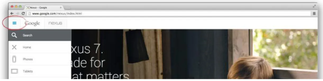
It’s interesting to see how mobile patterns are influencing web in general. Nowadays, it is common to see a “back button” on several websites or applications for desktop — Soundcloud (Figure 10) is an example — while it became an intrinsic
navigation solution on mobile, even there’s a history back button in every browser. Also, the off-canvas menu is a trending practice these days. Even though, sometimes, without any advantage on a desktop screen size, but it visually cleans the front page. Google Nexus 7 website (Figure 11) is an example of a “mobile first” approach, hiding functions that could be immediately accessible. There is a lot of unused space in the white bar at the top edge, but they decided to hide the menu. It is important to note that it’s probably an influence of flexible design, which will be discussed later.
Figure 10. “Back button” on Soundcloud Web App and browser’s history back button. (September, 2013)
Figure 11. Google Nexus 7 website — button similar to many mobile applications (September, 2013)
It’s far from a proper resume of what have been done. But probably another thesis might be needed just to study that. As it’s not plausible to show all patterns on this paragraph, and it’s not the main subject of this study, these are just few examples of very common solutions applied on mobile design. Nevertheless, Neil (2012: 2) points essentially seven primary navigation patterns:
— Springboard
— List Menu
Such as the examples shown before.
— Tabs
Normally horizontal bars with several options
— Gallery
Usually for photo albums or collections, disposed as a grid.
— Dashboard
Probably the most completed, showing to user great part of information needed, without menus.
— Metaphor
Use real world similarity conducting user to easily understand a function.
— Mega Menu
Similar to springboard menu, but usually more focused on important categories user may want to use first. Icons are big enough to catch user’s attention and make it easier to remind.
And, as secondary navigations, Neil points three main solutions:
— Page Carousel
User swipes left or right to navigate through different pages. It is common to use as much dots as the number of pages to tell user where he is.
— Image carousel
Similar to Page Carousel but usually, when a user opens an image on a gallery, swiping to left must led him to the next one.
— Expanding list
Opens subcategories on a list menu.
There are several other patterns14, namely for: Forms; Tables and lists; Search, sort and filter; Tools; Charts; Invitations; Feedback and affordance; Help. But the ones found most relevant for Instant Places case will be highlighted during this study.
2.4 — Mobile vs. Desktop
Smartphones are approaching to laptop / desktop computers, when we analyse some technical specifications: processors, screen resolution, network connections, storage, etc. Although, according to David (2011), it’s already fair to put both devices at the same level. Smartphones are now little computers we carry on our pocket and fit our hand’s palm. However, the utility is different from a computer. It can be compared to a Swiss Knife, since we are using it for all kinds of tasks on our everyday lives. Thus when it comes to design an interface for it, there is a set of factors that makes it different form a laptop / desktop to take into account.
Wroblewski (2011) warns that designing for mobile means designing for its reality. When conceiving a mobile-based application, everything should be done to improve performance. The main focus on this project is how to design graphical user interfaces for tangible small screens. Although, it is important to analyse what factors may cause a decrease on the experience, and avoid them. Interface design is also about animations, effects, and little “tricks” not just to make the product look better, but also to guide the user and improve the pleasure of using it. But implementing it may cause lower performance and it should not harm the experience. There are some differences that may influence the design of interfaces for mobile platforms instead of desktop ones.
14
Mobile
Smaller screen
Our fingers make the input No “right-click”
Virtual keyboard crosses content Less space to display information Target elements need to be large enough for finger size to point
Nothing happens until the user really touch the device
Great variety of models and screen sizes. In each device, there’s an unalterable window size
Vertical
Inferior network connection Weaker CPU
Desktop
Bigger screen
Keyboard and mouse as input devices Right-click
Keyboard is apart, all screen area free Space liberty to display content Elements and links can be smaller, accessible by cursor precision
Change a visual element when the mouse cursor is over it
A standard resolution of 1024x76815 was established as standard for websites. Although, window may change size Horizontal
Better network connection Better CPU
Haitani (apud Moggridge, 2007: 221) refers he has developed “Zen Riddles” to articulate points in a way people would remember. The most core point was the riddle of “How do you fit a mountain into a tea cup?” which people argued, “Well,
you have to shrink the mountain”. This is thinking like “More is better” — the
desktop thought. The point is to start by thinking what really is necessary and not trying to fit all features in such less space.
15
Budiu and Nielsen (2011: 7) point that small screens mean fewer visible options at any given time, requiring users to rely on their short-term memory to build an understanding of an online information space. This makes interactions harder. They give the example of comparative product research as a trouble, being difficult to find room for multiple windows or other interface solutions. However, it is not necessarily a bad thing. As we live in information era, which means we are required to process tons of visual “trash” everyday, designing for smaller screens might be a way to go straight to the point and synthetize that information. While websites often contain a wide range of content, mobile sites usually include only the most relevant functions and features. Ma (2011) warns that mobile site designs should give priority to the features and content users are most likely to need when viewing a site using a mobile device. Wroblewski (2011: 18) refers the natural constraints of mobile devices as a help to focus and simplify mobile experiences. He also points that solid information architecture principles, like clear labelling, balanced breadth and depth and appropriate mental models are fundamental to organize content on mobile. Although, it also needs to:
— Align with how people use their mobile devices and why — Emphasize content over navigation
— Provide relevant options for exploration and pivoting — Maintain clarity and focus
The Instant Places mobile application has some aspects that are not possible to be backed by previous research work. Although it’s an application for smartphones, it works as an input to interact with a third party device. Some research on interaction between a smartphone and a Smart TV, and even Social TV offer important information, but interacting with public displays is not yet a common , therefore scientific studies are scarce. A lot of results of this research are based on usability tests and field studies.
2.4.1 — Touch influence
Designing complex interfaces for such small viewports16 can mean a very hard task. However, one of the main features Steve Jobs presented when introduced the iPhone, was the use of natural gestures to manipulate a digital, touch-based, interface. Like zooming an image just by pinching or stretching with two fingers, e.g.. He also referred that it would be distributed without the typical User’s Guide, claiming however it wouldn’t be necessary. What Steve Jobs meant was the interface would be so intuitive that the user would know how to use it, even if he never experienced a touch screen before. It’s true that his viral presentation video from 2007 spread over every media, and was seen by millions of people all over the world, and that helped to know how to use the iPhone and, consequently, upcoming touch-based smartphones. As Hoober and Berkman (2011: 18) observed, most of user interface paradigms from the desktop have been applied to mobile, not making use of gesture interactions, and based just on simply replace mouse pointer to a finger tap. Usually, it’s the operating system itself that makes use of most touch opportunities. But in fact, we are witnessing a steady growth in the use of tangible smartphones capabilities. Likewise, there has been an emerging development focused on user and experience improvement. Almost everyone was fascinated by iPhone’s presentation in 2007 because the interface had a kind of “magic factor” implicit.
One of the main differences to desktop, designers must care when designing a user interface for mobile, is the extinction of mouse “hover” technique, like referred by Scott and Neil (2009: 85). On touch screens, is impossible to make an element change visually just pointing the cursor to it — when a button is touched, it’s expected to immediately do something, but on a desktop computer, it is possible to make an element react when a user points the mouse cursor over it, without clicking. However, there are other ways to make use of this technique on touch-based devices, but it involves more actions from the user. Here are two examples:
— The hidden element that supposedly shows when we point the cursor on a computer, on a tangible device is shown when the user taps the element for the first
16
time, but needs to tap it again to make an action, what may annoy the user. The advantage of this is that an element automatically reacts without any influence and gives user a hint to understand what the specific button does.
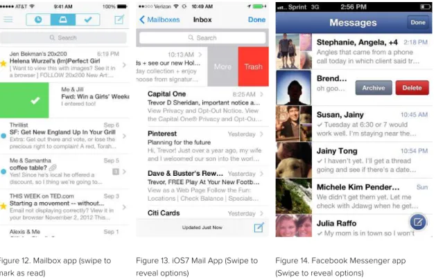
— Other technique makes the use of natural gestures, a common approach since the introduction of tangible devices. It’s a very useful solution when there is so much less space to display information on a screen. Some applications like Mailbox (Figure 12) are using gesture-based interactions instead of buttons to replace visual elements (in this case, buttons) and give space to relevant content. The new iOS7 Mail (Figure 13) App or Facebook Messenger (Figure 14), for example, use the swipe gesture to show more options. This technique might be used to reveal a hidden element and then close it automatically when dropped. It may require more action, but when it’s necessary to have many features on a small screen, it is seen as a good solution. Although, Operating Systems themselves make use of gesture-based interactions for, e.g., go to previous screen (like iOS7 does if you swipe from the left edge instead of touching the “back” button). Designers must keep in mind what areas of the interface will be (or wont’ be) affected by native OS interactions.
Figure 12. Mailbox app (swipe to mark as read)
Figure 13. iOS7 Mail App (Swipe to reveal options)
Figure 14. Facebook Messenger app (Swipe to reveal options)
The iBooks app for iOS has no button to turn the page. Instead, it uses the metaphor approach to indicate that feature. It is expected that users turn the page by swiping left or right with no visual indication for that (it eliminates visual elements from the screen freeing more space for content). Basically, it makes use of instinct and user learnt experience.
We also can take advantage of device orientation. Almost every video App, like Youtube or Vimeo, automatically changes to full screen mode when we turn a phone to horizontal perspective. It allows user to focus just on video content, when he wants, turn the device again or tap the screen and the interface shows navigation options again.
Ma (2011) refers that there are many people who believe the basic principles and guidelines applicable in website design should still be applied for mobile platforms. In fact, today’s web standards are a lot more different than the basic text-based HTML known from 1990’s. The Usability Analyst also wrote that design of mobile websites is still in its infancy. New principles and best practices will arise as this field on design continues to evolve.
2.5 — Limitations
2.5.1 — Designer vs. Developer vs.
Technology
Designers are sometimes conditioned, whether it’s because of technical issues, financial resources or even by the client’s (or whoever asked for the design) impositions. In the case of Instant Places, it was decided that, rather than conceiving a native mobile application for each operating system, it would be built a hybrid one, under web technologies, namely HTML5.
This title doesn’t mean a conflict between designers and developers but that both should work as a team in order to conceive a pleasant looking interface yet easy to use and stress-free for the final user. In short, there are many factors that make a piece of software a good or bad experience, however the two expertize areas complete each other (see “Form or function?” point). On the other side, both designer and developer might have an opponent in common: Technology. It’s certain that, nowadays, it evolves at a stunning velocity. Yet, it still imposes some limitations, moreover when we’re committed to create an application transversal to the majority of available devices.
2.5.2 — Performance
There are technical considerations we must take into account when designing for mobile. Though mobile devices are similar in specifications to the desktops of yesterday, they are still not as powerful as today’s desktops (Rischpater and Zucker, 2010: 13). These authors advise to keep an eye toward the limited resources available for mobile — memory, both dynamic and non-volatile are limited; the CPU is also typically less powerful than that available on a desktop. Although speed is an important issue, it’s not just on mobile. Wroblewski (2011: 24) refers the tests done by Amazon, Yahoo!, Microsoft and others which suggest that even very small delays on desktop can turn users away. He also points that long-term studies by Google show that slow performance has lasting effects, reducing people’s activity for five weeks.
2.5.3 — Native, Web, Hybrid
It was decided by Instant Places team to develop the mobile application under HTML5 technology, compiling it into a Hybrid application to run across devices. For
clarification about Native, Web and Hybrid applications, Seven (2012) marks the following points:
— Native Apps
Are built for a specific platform, with its SDK, tools and languages, typically provided by the platform vendor (e.g. xCode under Objective-C language for iOS, Eclipse uses Java for Android, Visual Studio requires C# for Windows Phone)
— Mobile Web Apps
Are built with any server-side technology (like PHP, Node.js, ASP.NET) that render HTML
— Hybrid Apps
Like native Apps, run on the device, and are written with web technologies (HTML, CSS and JavaScript). Native apps run inside a native container, and leverage the device’s browser engine to render the HTML and process the JavaScript locally. A web-to-native abstraction layer enables access to device capabilities that are not accessible in Mobile Web applications, such as accelerometer, camera and local storage.
One of the main problems in developing HTML5 is the susceptibility to system lag due to heavyweight JavaScript libraries. Cederholm (2010) points CSS3 as a solution to replace, in punctual situations, JavaScript, making use of its new properties to make animations and transitions, e.g., in order to conceive a lighter document, and economize the data and time needed to load. The main issue of using CSS3 is because it’s part of HTML5 technology, which is not supported by older mobile devices in the market. Although, the latest devices, as well as the following ones are supporting this emerging technology and performance is tending to become better and better. Nevertheless, designers and developers must work side by side to conceive the most lightweight application possible. Hardware performance matters to a designer when he is projecting an interface because design choices can influence its functionality. It also has to do with hardware itself and its performance (which is referenced on
“Performance” point), so all these issues must be kept in mind to provide a better user experience.
2.6 — Conclusions
A mobile device, namely the Smartphone is the new personal computer. Consequently, it means an all-new area for designers and developers to focus on. Most paradigms of web design and usability are known from the past, when the major Interfaces were for desktop computers. Those paradigms are changing, as the technology evolves and mobile devices are gaining ground over PCs. Most experts from the area began to advise a “Mobile First” approach, when designing a web product.
It is important for a designer to understand in what technology he’s working under. Like an architect needs to know in what materials a building will be conceived. He doesn’t do the engineer job, but it will dictate a successful and functional work. In mobile application development, designer must have some knowledge on hardware support and technology for the kind of software he is projecting. The discussion “Native vs. Hybrid” applications for mobile, e.g., can lead to new research. However, the most important issue is to understand constrains and opportunities to create efficient and functional products and avoid user frustration and stress.
3 — Principles of User Interface
The user interface of a system concerns itself with the system, the user of that system and the way in which they interact. It is composed by those parts of a system that are designed to be apparent and manipulated by the user and those models and impressions that are built up in the mind of the user in response to interacting with these features. Also, the user interface incorporates elements that are part of the user and methods of communicating information from one to the other (Barfield, 1993; 2).
Figure 15 — Interface
According to Stone et all (2005: 3) computer science, psychology, ergonomics, engineering and graphic design are disciplines which all contribute to Human-Computer Interaction. Although, when users interact with a computer system, they do so via a User Interface. Good user interface design encourages easy, natural, and engaging interactions between a user and a system, and it allows users do execute their required tasks. It also make user forget he’s using a computer system and get on with what he wants to do. The authors refer that what makes an interface good or bad is based on usability.
Designers always have to keep in mind the final user needs and wellbeing. Designing an interface isn’t just about organizing information, but the context and how users carry their devices and really interact with the product is fundamental to a
good user experience (Hoober, 2013). As this study focuses on mobile devices, it’s important to know how people utilize it.
It was hard to find a title for this dissertation because it is related to the experience of using Instant Places, but the definition couldn’t be “User Experience”. The goal of this work is to provide users the best tool to interact with the public displays — easily, intuitively and accessible — not being cause of stress or unpleasant experience. Although, User Experience is much more than a User Interface, so it’s not viable to describe this work that way while there’s so much left to fit that definition. Nevertheless, User Interface stills a hard topic to discuss every aspects of it. The main concern is to solve Instant Places mobile interface issue, identifying stakeholder priorities and give the best possible response.
At first, also as a landmark, the main goal was to make users start using Instant Places. Once again, it depended on several facts (as communication, marketing, etc.), yet usability is a common sense quality for any product to succeed.
Porter (2008: viii) refers the principles for successful social interface are the basics of human psychology. To web designers, tasked with increasingly sophisticated applications, it can seem daunting to get into these psychological issues. How do we make not only services personally valuable with easy-to-use interfaces, but also support people’s social desire for interactivity, authority, reputation, identity and control?
According to Porter, the five stages of the usage lifecycle are: — Unaware
Includes who never used our application
— Interested
Need an explanation of benefits before taking the plunge
— First-time use
— Regular use
People feel they’re getting value from a product
— Passionate use
People really enjoy your product and share their knowledge about it.
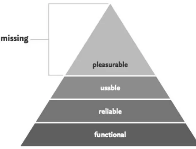
In the 1950s and 60s, Abraham Maslow (apud Walter, 2011: 5), an American psychologist, discovered something we all knew but had yet to put into words: no matter our age, race, or station in life, we all have basic needs that must be met. Figure 16 shows Walter’s interpretation of Maslow’s Hierarchy of Needs17, which, according to Walter (2011: 6) can help designers to understand their goals when designing interfaces. The bottom three strata of the needs pyramid might be sufficient to “build” a product, but it’s in that top layer that we can live a truly fulfilled life. “Interface design is design for humans” Walter adds.
Figure 16 — Interpretation of Abraham Maslow’s Hierarchy of Needs by Walter
17
Abraham Maslow’s Hierarchy of Needs, from bottom to top: Physiological; Safety; Love/Belonging; Esteem; Self-Actualization.
“Design is so simple, that’s why it is so complicated”
— Paul Rand
This mobile application is distinguished from “single-device” apps we are used to. However, the Display part stills a limited prototype lacking design work, which is not contemplated here. We started by conceiving the mobile device application even with no concrete “Display” version, because the display works as a “diffuser” of content created by users through their devices, or generates information based on user’s preferences and interests. Thus, Display application design was influenced by the mobile version. It is also important to realize that future third party applications (which run inside Instant Places system) are responsibility of respective developers. Hereupon, the following topics are related to what revealed to be relevant for creating a mobile application digital interface.
3.1 — Graphical User Interface
A Graphical User Interface (GUI) of a computer system is composed by metaphors, images and interaction concepts that are used to express the functionality and meaning of the system on its screen (Horton and Lynch, 2004: 17). Graphic design and visual “signatures” should be used not only to give life to webpages, but graphic elements are part of User Experience. GUIs were projected for people to control their personal computers. Today, users expect a sophisticated design level on every graphical interface, including webpages and mobile applications. The goal is to satisfy user needs, adapting technology to them and not the other way around. Users may not be forced to understand (and overcome) unnecessary obstacles. Horton and Lynch also point, as one of the main problems for users, knowing where he is on a