Revival and Transition: Evolving Roles and
Various Forms of Informative Graphics
Tingyi S. Lin Graphical Method, Information Design, Informative Graphics, Narrative Graphics, Visual CommunicationCurrently, informative graphics has attracted considerable attention for its efficient and effective methods of communication. The ways in which people receive information strongly influence their ability not only to comprehend the information but also to capitalize on the purported benefits of the information. Information-design approaches can facilitate the creation of many good-quality Information-designs. By understanding both the history of information design and pertinent case studies, we can familiarize ourselves with information-design methods and applications. In this article, I discuss the evolution and various forms of informative graphics on the basis of historical, content-oriented, and phenomenological analyses. I investigate visual representations’ roles and identify the strengths and deficiencies of visual communication for information design. Historical evidence—such as Playfair’s graphic charts and his method, Winderlich’s clinical graphics, Nightingale’s statistical graphs, and Snow’s dot maps—show that appropriate visual formats can depict data and that these depictions can demonstrate effects over time. The graphical method can also aid in the measurement of small-time intervals between biological effects. Multiple variables enhance the exploratory power of graphics in relation to analysis and discovery. Narrative graphics associate the spatial dimension with time-series displays to depict space and time. Although many disciplines acknowledge “the importance of communication,” the general public in Taiwan has only recently begun to acknowledge the importance of informative graphics. We should reflect now and then on the evolution and various forms of informative graphics.
1 Introduction
In recent years, the field of infographics (also known as informative graphics) has garnered praise for its efficient and effective facilitation of communication. From an information-design viewpoint, this specific design practice has borrowed from the crafting, the romantic, and the rhetorical traditions (Schriver, 1997). Neither chronologically nor exclusively, infographic designers have drawn from these three traditions to expand design. These designers articulate, transmit, and interpret the effects of design on culture. Some designs serve no purpose other than the fulfillment of an inner vision of the designers. Furthermore, some designs reflect the needs, the capabilities, and the values of the audience. Constructivist designs have linked art and technology for functional purposes (Hollis, 1994, pp. 44-48; Meggs, 1992, pp. 285-287). An interest in information design began to emerge
when the design-methods movement was prominent the 1960s. The movement emphasized problem-solving techniques, human-machine interaction, and the issues of planning and production. Till now, developments in technology have continued to influence both people’s ideas about and people’s engagement in design practices. Different kinds of recording tools, such as paper, pencils, pens, typewriters, and computers, have been providing various possibilities for all kinds of creativities throughout history. Given the digital era’s challenges of information anxiety (Wurman, 2001), the need for accessible and understandable approaches to information creation are more important than ever.
The ways in which people receive information strongly
influences their ability not only to comprehend it but also to capitalize on the purported benefits of such information. The information-design approach can provide a means by which many good-quality designs can be performed. Recent surveys, however, suggest that productivity is richer than ever owing to improvements in technology, thus boosting the quantity of visual information while posing questions about the effective development of information. By investigating both the history information design and several pertinent case studies, we can understand information-design methods and applications. In this article, I discuss the evolution and various forms of informative graphics from a global viewpoint. With historical methods, I illustrate socio-cultural, political, and economic changes that have broadened our approaches to information design. Not until the early 21st century did Taiwanese pay attention to information-design practices, both current problem-solving efforts and future quality-of-life issues have benefited from these practices, which cover informative graphics, document design, wayfinding design, interface design, user-experience research, and the like. In this article, I also use content analysis and phenomenology to investigate how visual representation has been a powerful analytical tool, and I identify the strengths and deficiencies of Taiwan’s creative industries, which have brought forth new forms of visual communication for information design.
2 The historical view and evidence
William Playfair enhanced Joseph Priestley’s historical charts by transforming abstract concept “into something that can be imagined and visualized” (Sachs, 2018, p. 52) and, more specifically, by
extending geometric principles to the subject. Playfair’s “linear arithmetic” (1786) (Rima, 2002, pp. 113-117), which constitutes the first known set of time-series graphics, demonstrates that the financial measurement of prosperity and decline can be quantified and measured, and can be visualized by lines, shapes, and colours. Since then, Playfair’s graphic charts and his method have shed light on the
shape of data and have fostered comparative perspectives, with which designers have developed new ways of seeing time in commercial contexts. The chart that shows wheat prices and labor wages in weekly increments exemplifies Playfair’s graphical demonstration of the relationship between three parallel plots: prices, wages, and the reigns of British kings and queens. He created the chart to question whether the price of wheat over the course of approximately 255 years (from 1565 to 1821) exhibited any changes in comparison with the wages of labor. Alongside the history of visual information, the history of time-series graphics has given us several paths of representations in different disciplines.
The clinical chart, for example, often provides a comparative and comprehensive perspective by which clinicians can grasp patterns, including causal relationships. It forges, from subjective findings, a scientific discipline founded on objective data (Reiser, 2000). Carl A. Winderlich’s clinical graphics depict rising and falling temperatures over time, essentially presenting portraits of disease. After all, the biological functions of patients can be analyzed and understood with the assistance of a visual representation. Florence Nightingale’s new types of statistical graphs was famous for their beauty, as well as their functionality. The coxcomb chart (also known as the polar-area diagram or the Nightingale-rose diagram) is Nightingale’s most famous visual aid, which is similar to a pie chart but more intricate: it presents layers of data with slices extending radially from the center point. The specific organization of the coxcomb chart facilitates the presentation of complex information. The chart’s color coding marries beauty with functionality, as the shading indicates cause-and-effect relationships. She was considered a pioneer in statistical graphics and visual information presentation.
Furthermore, John Snow used the dot map, lithographed by Charles Cheffins, to illustrate the connection between water sources and incidences of cholera. Snow identified and connected the causes and effects of the 1854 London epidemic by showing that cholera cases were clustered around water pumps. These visual aids can lead to both the diagnosis of problems and the identification of solutions.
The graphical method can further aid in the measurement of small time intervals between biological effects. Étienne-Jules Marey’s studies of movement used image-recording methods to make significant findings that would eventually aid later physiological discoveries. Marey’s time-series movement studies tracked galloping horses, turning starfish, growing geckos, and sequential stick-figure photographs (Marey, 1885, 1894 1899). The photographed image of a stick-figure, Marey’s man in black velvet, was considered the time-series forerunner of Marcel Duchamp’s Nude Descending a Staircase (Braun, 1992; Tufte, 1983/2001). Marey’s use of readily understood graphical forms represents the transposition of a series of observations, and the columns of the figure provide instantaneous comparisons of the results. The vision of a graphic method of
depiction had a tremendous influence beyond the achievements of medical research, clinical observation, and experimental sciences. Not only were many physiological and clinical phenomena transformed into graphs during the second half of the 19th century, but more
specifically Marey’s profound vision significantly affected modern clinical medicine and its science. Since then, graphical technology has led medical and biological research into a new methodological territory. Compelling evidence shows that successful graphic charts can benefit humans’ thinking processes and facilitate decision making, regardless of whether they are consolidating data or observing visual information.
Narrative graphics, which constitute another influential form of visual representation, associate spatial dimensions with time-series displays to depict space and time. Both graphic novels and thematic-mapping narratives exemplify this form. Graphic novels usually represent scenes and stories in the form of sequential juxtaposed panels. Comics, sequential art, and picture books are popular and valued visual forms in markets. Although it was believed that comics originated in 18th-century Japan, comics as an art form did not become popular until the 1930s. Different from graphic novels, thematic-mapping narratives depict multiple relations beyond latitudinal and longitudinal coordinates in displays. Multiple variables enhance the exploratory power of graphics in relation to analysis and discovery. Napoleon’s March Against Moscow (1861) by Charles Minard has been considered a milestone of thematic mapping and narrative graphics. Minard was a cartographer and mapmaker, and was able to weave six variables together on a single representation. His visual depiction of numerical and relational aspects to depict plots of data was later employed by a growing number of scholars and researchers. Thematic explanations, abstract visualizations, relation descriptions, clinical examinations, and statistical thought, as expressed in
graphics, have expanded into various disciplines. In this regard, although graphic novels and thematic-mapping narratives seem to have developed along two distinct paths and have involved various disciplines, the two forms use visual storytelling to analyse and to communicate. The power of narrative graphics will be discussed later in this paper regarding their dynamic presentation of styles and techniques.
The development of information design has relied on either the parallel paths of analytical representation and narrative expression or the merging of science and the humanities. Many studies have shaped our understanding of information design’s specific applications. Richard Saul Wurman coined the term information architecture in 1975, and many inventors created data maps, charts, and graphical displays, with which to record psychological, geographical, and historical phenomena. The records widely and aesthetically disseminate concepts and events across time and space on two-dimensional displays.
Pioneers in the field of information design include Playfair, Winderlich, Snow, Marey, Minard, and Nightingale have provided a substantial infrastructure of knowledge for the practice of information design. Nightingale’s work was recognized in the field of statistics, in sanitation reform, and in wartime medical care, as she worked with a team of 38 nurses during the Crimean War (Keith, 1988, pp. 147-150; Kopf, 1978, pp. 93-102), and later brought public health to national attention. Snow’s cross-disciplinary study between public health and geography was regarded as foundational in the science of epidemiology. Otto Neurath’s ISOTYPE (International System of Typographic Picture Education, also known as International Picture Language) created a non-verbal language system that eventually fostered new views of communication and learning. The accumulation of these past inventors’ insights has enabled contemporary practitioners of design and art to perform their work with greater efficiency. Wurman, who regarded new ways of thinking about communication at the end of the twentieth century, claimed that information can be structured for greater usability and findability and claimed that designers who can clarify complex ideas are ‘information architects’ (Wurman, 1997). With his expertise in architecture, cartography, and graphic arts, Wurman’s information theories shed light upon user experience. Thos influential pioneers who make data to be visualized with certain aesthetical way, insofar as possible to present the information understandable and pleasurable to access. Many designers in the late 20th century had a wide variety of tools with which to create information-presentation platforms. Ever-developing technology has forced visual designers to alter their approach to their work, while granting them more and more possibilities to create and show their work. Visual representations are becoming ubiquitous as a result of computer technology, which focuses more of our attention on filtering, selecting, organizing, and delivering, rather than on merely producing texts and images. This dynamic backdrop has been allowing designers and researchers in the information-design field to rethink and refine what design should be and how it can be efficient and effective.
3 Narratives & Storytelling
Information design is a way of organizing information into visual representations that convey, as simply as possible, complex relationships. Charles Minard set a standard for excellence in
graphical representation when he depicted narratives as flowing and comprehensible objects. Among his many narrative works, Minard’s Napoleon’s March Against Moscow (1861) is a standard in information design’s use of graphics as a professional practice. He tells a rich and coherent story by displaying the interactions of multivariate data including spatial relationships, population sizes, population directions,
population movements, and temperature changes, all on a two-dimensional surface.
Considered a milestone of thematic mapping and narrative graphics, Minard’s work portrays the devastating losses suffered in Napoleon’s Russian campaign of 1812. The left of the document represents the Polish-Russian border near the Niemen River, and a thick band shows the size of the army (422,000 men) as it invaded Russia in June 1812. The width of the band indicates the size of the army at each campaign and place on the map. In September, the army reached Moscow with 100,000 men. The path of Napoleon’s retreat from Moscow is depicted by the darker, lower band, which is linked to a temperature scale and to dates at the bottom of the chart. It was a bitterly cold winter, and many froze on the march out of Russia. As the graphic shows, the crossing of the Berezina River was a disaster, and the army finally struggled back into Poland with only 10,000 men remaining. Also shown are the movements of auxiliary troops, as they sought to protect the rear and the flanks of the advancing army (Marey, 1885; Tufte, 2001, pp. 40-42, 176). Regardless of the kinds of innovative techniques, pie charts, or flow maps available to Minard, he always used proportional sizing of symbols. Proportion expressed relationships.
In general, graphics can successfully explore multiple variables. Narrative graphics associate the spatial dimension with time-series displays to depict space and time. Information design concerns not only the study of both information organization and information communication but also the practice of defining, planning, and shaping ideas to satisfy particular needs of users. By organizing information, by altering conceptual forms, and by creating visual representations, graphic designers promote users’ transformation of outer messages into inner knowledge.
4 Explanation and persuasion
Multiple colonizations by the Dutch, Spanish, Qing Chinese, and Japanese resulted in a fascinating mixture of Taiwan’s culture. Most of the informative graphics from the period between the early 1600’s and 1895 are hand-made literary and cartographical images, including documents pertaining to household registration, rental and lease agreements, natural-environment planning, and economic-development records (Blaeu, 1638; Noordeloos, 1625; Schmalkalden, 1652; Vera, 1626; Verbiest, Blaeu, & Hummel, 1674). The modern consciousness of ‘Taiwaneseness’ emerged during Japanese rule (1895-1945) and is a pressing political and cultural facet of Taiwan today. The Westernisation and modernisation that Japan imposed on Taiwan resulted in the characteristic features of the island’s colonial heritage. Many official documents, newspapers, magazines, posters, advertisements, and educational materials from the Japanese colonial
period functioned as propaganda for Japan’s colonial objectives. Between 1949 and 1987, the anti-communist Kuomintang (KMT) forces ruled Taiwan after they had suffered defeat in mainland China. At the end of this period, the government lifted its decades-old martial law and a democratic Taiwan emerged in the context of the current “two Chinas” policy. Democracy has liberated many aspects of Taiwanese culture, including informative graphics. Figure 1 shows Taipei districts and townships combining monthly calendars and photographs of architecture in 1954 (National Development Council, 1954). Not only technology, but also rich layers of colonial history and international politics have made Taiwan an excellent site for growth in the productivity of informative graphics. Therefore, the evolution of design in Taiwan reflects major international trends, and typically fuses updated technology and contemporary US and Japanese styles with those of other cultures.
Figure 1 Dividing districts with varieties of colours, this map combines a calendar and photographs to
represent Taipei townships in 1954. (National Development Council, 1954)
Many disciplines acknowledge, in parallel, “the importance of communication,” yet the general public sometimes misses this point. Specifically, the Taiwanese public failed to sufficiently recognize the importance of informative graphics until the early 21st century. An
“explanation graphics” series by Apple Daily and communication materials by participants in the Sunflower Student Movement are two examples of informative graphics’ important roles in Taiwan.
4.1 Explanation Graphics
Apple Daily, a sister publication of a Hong Kong-based newspaper, has produced weekly explanation graphics that tell stories visually, thereby enhancing readers’ understanding of selected topics. Apple Daily’s popularity is derived from its sensational style of reporting and its anti-government political positions. In contrast to this brashness, the publication relies on explanation graphics that explain topics in a style that reflects refined techniques common in graphical journalism. “The Taiwanese version has its own identity and adjusts itself to the local market (Newman, Fletcher, Kalogeropoulos, Levy, & Nielsen, 2017). As one of top brands and weekly usage news publishers, Apple Daily reaches a large amount of print and online readers. The publication, thus, became a useful resource for many readers, who appreciated its effective explanation and intellectual visual storytelling style (Figure 2). Staff from Apple News had reported that they
often received requests from school teachers and parents regarding a specific infographics item in a daily newspaper for their teaching and learning purposes. Upon receiving the requests, the staff would find the infographics item from their archives so as to allow readers to reuse and review those items. This became a common practice between teachers, parents and the archive department of Apple Daily. Those requests demonstrated the trust and appreciation the readers had in the quality of Apple Daily’s infographics.
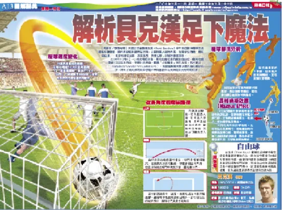
Figure 2 The magic techniques of David Beckham in infographics, including Magnus Effect, Free Kick in a
Graphical journalism has a long history in several leading newspapers such as USA Today, the Washington Post, and the New York Times. Articles would feature charts and other graphics, sometimes the graphical journalism were even shown on full-page spreads, to explain the complexities of a given topic. Apple Dailys’ weekly explanation graphics were, in Taiwan, the first of their kind to couple a series of visually dominated graphics with half-page newspaper displays. It was an alternative way to represent a piece of news. Rather than merely ‘write’ the news as before, two groups of team-members would accomplish the job: one for information research and the other for graphics production. This would essentially constitute a visualization of the former group’s researched and
synthesized information. The production team had to work in this way due to the inadequacies found among information designers at that time. In order to make a successful explanation graphic, the former group would research, organize and synthesize the information, while the latter team would visualize it. The challenge was to determine who would draft of the initial graphics to represent the research concepts. The translation of research to visual product resulted in conversations of the crucial information transference between the information research and graphics teams. After some discussion, it was determined that it was essential for the research team to develop graphic skills to better transfer ideas and research to experts in the graphics department. After several trial-and-error experiments, the research group had learned how to draw and sketch concepts expressively. The research group, though obviously not yet expert at information design, attracted the attention of many readers and allowed them to experience effective and efficient informative graphics. While paying greater attention to visual representations in industry, many companies started to realize the importance and the needs of cultivating such a designer. This demand also calls for the demands of cultivating information designers.
4.2 Sunflower Movement
Informative graphics came to be regarded as a popular and useful means of propaganda by the Sunflower Student Movement, also known as the March 18 Student Movement, in April 2014. The activists asserted that trade with China (the People’s Republic of China) would hurt Taiwan’s economy and lead to political pressure from China. To spread their ideas, the activists harnessed social media and Internet services. This widespread use of informative graphics helped raise support for the activists’ cause. Since then, a growing number of Taiwanese have acquired cutting-edge graphics-production skills from colleges and universities and often network with one another. They design and publish informative graphics without official support from major media. These efficient and explicit ways of
visual communication were highly praised. The recognition of useful visual information also resulted in more discussions and creativity of such works. Because of this success, much of the general public started to value more of the designers’ efficient approaches to visual communication and information design. The praise has, in turn, fueled creativity in the design community. Currently, many small public-sector operations, including start-ups, rely on these informal producers of informative graphics for marketing pitches.
5 Conclusion
Good informative graphics should clearly explain ideas to people and even persuade people in the truth of these ideas. To this end, information design involves a series of steps that designers follow when they find, gather, organize, analyze and represent data competently.
The contemporary development of infographics has witnessed the merging of graphical journalism with graphic design, both of which are rooted in print production with strong principles for visual communication. The mass production of images and the rapid spread of information through the Internet fueled the dynamism of informative graphics, which in turn fueled their popularity. The combination of texts and such images as animation, maps, and videos takes readers to a whole new experience in reading (Usher, 2016). For example, in 2018, the New York Times laid claim to three Pulitzer Prize finalists: ‘Harassed’ (about sexual harassment), ‘Trump and the Russians’ (about possible collusion between the two), and ‘Welcome to the New World’ (about a Syrian refugee family). The finalists’ commitment to visual storytelling allowed readers to experience news intimately and elevated the influence of such combinations of text and graphics. Neil Brown, a member of the Pulitzer Prize board, stated that such reports can “bring matters to light, and in doing so that puts more power in the hands of citizens” (LaForme, 2018). Moreover, the New York Times exemplifies how information presentation with updated mix-media, including animation, AR/VR/MR via television, webpages, social media, and mobile applications are now must-haves for reaching the general public.
By reflecting on the evolution and various historical forms of infographics, we can better inquire into its future. The mass production of prints and digital images has enabled information designers to serve larger numbers of people, expanding the growth of the industry. Free and instantaneous circulation of these images through the Internet allows this type of information to go anywhere, anytime. In the past, drawing was considered the fundamental skill that a designer must master in order to acquire competence in the trade. Nowadays, a proper designer is the person who can synthesize, organize, and present ideas so that they are easily understood and
even highly persuasive, resulting in “personal enlightenment” and “mutual change” (Jacobson, 1999). In this manner, informative
graphics can establish strong connections between three components: content, community, and communication (so that communication can establish itself effectively). As Levy (1990) noted, designers should discuss and exchange their ideas regarding the manipulation of images rather than focus only on techniques. In order to expand their abilities and insights related to design set against a rapidly changing backdrop, the younger generation should forge their capabilities through
accumulated experiences, problem-solving skills and creative thinking.
Acknowledgment
Thanks is owed to the support of the Ministry of Science & Technology, ROC, Taiwan. Appreciation also extends to VIDlab project assistants, Hsin-Ya Tang and Jou-Yin Sun, who always delightfully assist in design studies and projects.
References
Apple Daily. (2007). The magic techniques of David Beckham. March 12, 2007. Retrieved April 20, 2007, from http://apple.1-appble.com.tw/cgnews Blaeu, W. J. (1638). Carte hollandaise manuscrite de l’Ile de Formose. Available
from Bibliothèque nationale de France.
Braun, M. (1992). Picturing time: The work of Etienne-Jules Marey (1830-1904). Chicago, IL: The University of Chicago Press.
Hollis, R. (1994). Graphic design: A concise history. London: Thames and Hudson. 44-48.
Jacobson, R. (1999). Introduction: Why information design matters. In R. Jacobson (Ed.). Information design. Cambridge, MA: MIT Press. Keith, J. M. (1988). Florence Nightingale: Statistician and consultant
epidemiologist. International Nursing Review, 35(5). 147-150. Retrieved January 15, 2019, from https://www.ncbi.nlm.nih.gov/pubmed/3053483 Kopf, E. W. (1978). Florence Nightingale as statistician. Research in Nursing &
Health, 1(3). 93-102.
Laforme, R. (2018). Here are the winners of the 2018 Pulitzer Prizes. St. Petersburg, FL: Poynter Institute. Retrieved February 16, 2019, from https://www.poynter.org/reporting-editing/2018/ here-are-the-winners-of-the-2018-pulitzer-prizes/
Levy, R. (1990). Design education: Time to reflect. Design Issues: History, Theory, Criticism, 7(1), 42-52.
Marey, E. J. (1885). La Méthode graphique dans les sciences expérimentales et principalement en physiologie et en médecine. Paris: G. Masson.
Marey, E. J. (1894). Le mouvement / Etienne-Jules Marey. (L’ouvrage original a paru en 1894 aux éditions Masson). Nîmes, France : Editions J. Chambon. 79-80, 204, 269.
Marey, E. J. (1899). La Chronophotographie. Paris: Gauthier-Villars.
Meggs, P. (1992). The history of graphic design (2nd ed.). NY: Van Nostrand Reinhold. 285-287.
National Archives Administration, National Development Council. (1954). A dialogues with maps: Stories behind the National Archives’ Maps. Retrieved July 02, 2019, from https://atc.archives.gov.tw/naamaps/map-3.html Newman, Nic. Fletcher, R., Kalogeropoulos, A. Levy, D., & Nielsen, R. K. (2017).
Digital news report 2017. Reuters Institute / University of Oxford. Noordeloos, J. (1625). Map of Formosa. National Archive.
Pulitzer Prizes. (2018). Pulitzer Prizes: journalism. Retrieved February 16, 2019, from https://www.pulitzer.org/prize-winners-by-year/2018.
Reiser, S. (2000). The technologies of time measurement: Implications at the bedside and the bench. Technology of Time, 132(1), 31-36. Retrieved Oct. 13, 2003, from Annals of Internal Medicine: http://www.annals.org/cgi/ content/full/132/1/31
Rima, I. H. (2002). Measurement, quantification and economic analysis: Numeracy in economics. New York, NY: Routledge. 113-117.
Sachs, J. (2018). The poetics of decline in British Romanticism. Cambridge, UK: Cambridge University Press.
Schmalkalden, C. (1652). Insula Formosa. Via Gotha Research Library / Wikimedia Commons.
Schriver, K. (1997). Dynamics in document design. NY: John Wiley & Sons, Inc.
Tufte, E. R. (1983/2001). The visual display of quantitative information. Cheshire, Connecticut: Graphics Press.
Usher, N. (2016). Interactive journalism: Hackers, data, and code. Champaign, Illinois: University of Illinois Press.
Vera, P. D. (1626). File: Map of the Spanish port in Jilong, Taiwan. Retrieved March 12, 2019, from Wikimedia Commons.
Verbiest, F.; Blaeu, J. & Hummel, A. W. (1674). A map of the whole world (Kun Yu Quan Tu). British Library. Retrieved March 12, 2019, from Wikimedia Commons.
Wurman, R. S. (1997). Information architects. Watson-Guptill Publications. Wurman, R. S. (2001). Information anxiety 2. Indiana: QUE.
Author:
Tingyi S. Lin
[email protected] Design Department,
National Taiwan University of Science and Technology.
Paper submitted on 11/04/2019 Approved on 28/07/2019