Data Visualization Techniques for
real-time information -
A Custom and Dynamic Dashboard for Analyzing Sur
veys’ Results
Renato Toasa1,2, Marisa Maximiano1, Catarina Reis1, David Guevara2
1 Computer Science and Communication Research Centre (CIIC), Polytechnic Institute of Leiria, Portugal
[email protected], {marisa.maximiano, catarina.reis}@ipleiria.pt
2 Facultad de Ingenieria en Sistemas, Electronica e Industrial, Universidad Tecnica de Ambato, Ecuador
Abstract — To achieve the most understandable and accurate display of information, a study on the available techniques of data visualization for real-time information must be made. Customizing existing platforms and designing specific boards, are among the important task to perform an accurate visualization of the information. In this paper, we conduct a literature review of data visualization, its techniques and existing dashboard platforms. We implemented a generic and dynamic dashboard based on real-time information with the aim to assess the impact of the available Data Visualization Techniques in the developed dashboard. Therefore, our Dashboard users will be able to interact with the information, based on an initial set of hints, charts, tables and reports, produced by the Dashboard itself. This will allow us to test an existing set of data visualization techniques and create a new tailored dashboard, showing that dashboards can become a unique and powerful means to provide information.
Keywords - Data visualization techniques; dashboard; real-time information; platform; tailored
I. INTRODUCTION
A picture is worth a thousand words especially when you are trying to understand and discover insights from data. Visuals elements are helpful when you are trying to find relationships among hundreds or thousands of variables to determine their relative importance or if they are important at all [1].
To create meaningful visuals of data, some techniques must be considered. When selecting, representing and summarizing data, its size and composition play an important role. Data analytics requires adequate graphic representation and using temporal data, multidimensional data, 2D area plots and hierarchical representation, can demonstrate how data can be made visual [2].
Regardless of how much data you have, one of the best ways to discern important relationships is through advanced analysis and easy-to-understand visualizations. You do not want to miss a significant correlation or draw an incorrect conclusion that could adversely affect your decision making.
When sophisticated analyses can be performed quickly, even immediately, the results can be presented in ways that are easy to consume while allowing queries and exploration. Therefore, people across all levels in your organization can dive deeper into data and use the insights for faster, more effective decisions [3].
Throughout the years, several authors have addressed information visualization techniques as a tool to help in the decision making and service management activities. For instance, the work presented in “A Survey on Information Visualization for Network and Service Management” [4] offers a survey in the use of information visualization techniques as a tool to support the network and service management process; while “The Visual Display of Quantitative Information” [5] provides a study and literature review of the visual display of quantitative information. Several research papers carry out similar studies, which allows to determine that the current research will be helpful in the scientific and academic community.
The paper is organized as follows. Section II succinctly describes the methodology used in this research. Section III shows the complex field of data, information, knowledge and the relevance of data visualization. Section IV presents some of the most widely used data visualization techniques, while some data visualization platforms are shown in Section V. Section VI describes our case study to release a practical and generic real-time dashboard platform. Section VII presents the real real-time generic and custom Dashboard and, finally, conclusions and future work are presented in Section VIII.
II. LITERATURE REVIEW
First it is necessary to carry out a review of the work related to the subject of this research. For this the following steps were followed: (see Figure 1).
A. Framing questions for a review
The goal was to answer the following questions: Who has already researched the topic of data visualization for real-time information? What have they done? What techniques and
visualization platforms are being used? What are the most used tools for web development?
Figure 1 Literature Review Steps [6]
B. Identifying relevant work
For this step, criteria such as the language of the research, year of publication, database in which it is published, was used. Ensuring that the articles found are of great help to the current research
.
C. Assessing the quality of the studies
The evaluation of the quality of the study is relevant for each step of a review. It was verified the number of citations that the article had and whether it is responsible for initiating further and new research
.
D. Summarizing the evidence
A summary was made and the main idea of each investigation, obtained, identifying which part could be helpful to the current research.
E. Interpreting the findings
An analysis of the summary of the articles was made, identifying which can be referenced in the current research. The details of the actual application of these steps is show in the Figure 2
.
Figure 2 Results –Review.
As a result, we obtained 50 relevant documents that include papers, books and book chapters. They meet all the steps of the review, their context is on the subject of this research, and they
are indexed in high impact academic databases. They served as a starting point for the development of this research.
Some of the most relevant publications are: The Visual Display of Quantitative Information, by Edward R. Tufte [7], Dashboard Design: Why Design is Important, by Richard Brath and Michael Peters [8], Data, Information, Knowledge, and Wisdom by Gene Bellinger, Durval Castro, and Anthony Mills [9], Exploring incomplete data using visualization techniques by Matthias Teml, Andreas Alfons, and Peter Filzmoser [10].
III. DATA,INFORMATION AND KNOWLEDGE In visualization, data, information and knowledge are three terms used extensively, often in an interrelated context. In many cases, they are used to indicate different levels of abstraction, understanding or truthfulness [11]. For instance, visualization is concerned with exploring data and information, the primary objective in data visualization is to gain insight into an information space, and Information Visualization is for data mining and knowledge discovery.
Information is data that has been given meaning by a way of relational connection, while Knowledge is the appropriate collection of information, such that it's intent is to be useful. Knowledge is a deterministic process which allows decisions to be made, [9]. Figure 3 presents the relationship between these concepts.
Figure 3 Data Information, knowledge and decisions[9]
Information design is the art and science of incorporating writing and design, so that people can use content in ways that suit their personal goals. Information design involves making communication artifacts by shaping verbal language and visual language [12]. Artifacts are physical objects, such as clothing, homes, and cars, that indicate to others a person's particular and social beliefs and habits [13].
Due to the massive amount of information that exists and is created every day, the number of existing artifacts and the needs of all users and consumers of knowledge that exist, it is difficult to find ways to present the information in an accessible way or make sense out of it [7]. This is when the need arises to implement a tool that fulfills these functions. One of the tools currently available is what is known as Dashboard: a graphical and visual representation of information. A dashboard was initially aimed at technology managers of organizations to plan, design, implement and Framing questions for a review
Identifying relevant work
Assessing the quality of the studies
Summarizing the evidence
direct applications in real time, and thus monitor the information that works.
Nowadays, dashboards are widely used for monitoring and conducting the analysis of business processes. Numerous companies such as IBM , SAP, Tableau Software or TIBCO Spotfire, to name a few well-known vendors, offer complete Business Intelligence (BI) and information visualization solutions [14].
Dashboards can provide a unique and powerful mean to present information, but they rarely live up to their potential. Most dashboard fail to communicate efficiently and effectively, not because of inadequate technology, but because of poorly designed implementations. No matter how great the technology, a dashboard's success as a medium of communication is a product of design, and a result of a display that speaks clearly and immediately. Dashboards can tap into the power of visual perception to communicate, but only if those who implement them understand visual perception and apply that understanding through design principles and practices, aligned with the way people see and think [15].
Dashboards and visualization are cognitive tools that improve your “span of control” over a lot of business data. These tools help people visually identify trends, patterns and anomalies. They help people to reason about what they see and guide them toward effective decisions. As such, these tools need to leverage people’s visual capabilities. With the prevalence of, dashboards and now widely available for business users to review their data, the issue of visual information design is more important than ever [8].
IV. DATA VISUALIZATION TECHNIQUES
There are several data visualization techniques currently in use. Table I provides some of the techniques that have proven to be of high value in exploratory data analysis, and they also have a high potential for mining large databases. There is consensus that the next breakthroughs will come from integrated solutions that allow end users to explore their data using graphical metaphors and unify data mining algorithms and visual human interfaces [16].
TABLE I. DATA VISUALIZATION TECHNIQUES
Technique Description
Autocharting Intelligent autocharting produces the best visual based on what data you drag and drop onto the palette. It is important to note that autocharting may not always create the exact visualization the user has in mind. In that case, the user must build a specific visual [17].
Correlation Matrix Shows a table which lists the correlation coefficients of the columns and rows and combines big data and fast response times to quickly identify which variables are related [11].
Network Diagram Provides relationships in terms of nodes (representing individual actors within the network) and ties (which represent relation-ships between the individuals, such as friendship or business relationships) [1]. Sankey Diagrams These diagrams use path analysis to show
the dynamics of how transactions move
through a system. They display a series of linked nodes, and the width of each link indicates the frequency or the measure implied [18].
Visualization for Mobile Devices
In mobile devices is necessary to consider fluid grids to enable designing layouts both for online or offline and for distinct screen shapes. All the images must be presented without losing quality. For instance, search results should be available on any mobile device (even when the returned results are unpredictable)[19].
Word Cloud A visual representation where the size of the word represents its frequency within a body of text [1].
The amount and heterogeneity of big data brings challenges because semi structured and unstructured data require new visualization techniques.
Figure 4. a) a word cloud [1]; b) a network diagram [1]; c) a correlation
matrix [11]; d) autocharting produces a bar chart to show the distribution of a single measure [11]; e) sankey diagram [12]; f) grid design translated to different screens[13].
A word cloud visual can be used on unstructured data as a way to display high- or low-frequency words (see Figure 4 a).
Another visualization technique that can be used for semi structured or unstructured data is the network diagram These networks are often depicted in a diagram where nodes are represented as points and ties are represented as lines (see Figure 4 b).
A correlation matrix also shows how strong the relationships are between variables. As can be seen in Figure 4
a) b)
c) d)
c), darker boxes indicate a stronger correlation; lighter boxes indicate a weaker correlation.
When you are first exploring a new data set, autocharts are useful because they provide a quick view of the data. For example, with autocharting, when a single measure is selected, distribution of that measure is shown (Figure 4 d).
Sankey diagrams enables you to see flow patterns and recognize trends such as where customers enter your website, where they navigate to and where they exit. It is possible to identify successful flow patterns or isolate flows that failed to deliver the desired action (Figure 4 e).
Proliferation of mobile devices means that businesses need to deliver company information to smartphones and tablets any time and from anywhere [14]. Figure 4 f) provides an example of one of the required considerations for mobile devices visualizations: a grid design that is translated to different screens.
V. DATA VISUALIZATION PLATFORMS
There are some Data visualization platforms available, that can automatically create visualizations, enable you to create your own, or offer both capabilities.
The most popular platforms are show in Table II. TABLE II. DATA VISUALIZATION PLATFORMS Platforms Description
Google Analytics
Organized according to the products you use, showing data associated with that product or service as well as direct links to that product's privacy and security settings. [20].
SAS Visual Analytics
Is a form of inquiry in which data that provides insight into solving a problem is displayed in an interactive, graphical manner [2].
Sisense Is an intelligence software that provides analytic solutions and market insights for small to enterprise-level businesses. It is one of only a few fully-functioning BI software systems that let non-technologically inclined users combine multiple data sets, customize dashboards and generate data visualizations, [21].
Tableau Allows non-technical users to create interactive, real-time visualizations in minutes. Sharing a dashboards requires no programming, skills [22].
Zoho Reports
Is a provider of award-winning online business apps. The suite lives in the cloud, so businesses can access their data wherever needed [23].
Data visualization can, definitely, be considered the pretty face of data analytics. It doesn't change the numbers or the questions, it simply gives you more ways of looking at them. That can be invaluable for some organizations. These platforms help users to make good graphics in a short time, although most of them are very expensive and difficult to manipulate by non-technical users.
In order to validate the findings of this research, we made a comparison between the mentioned platforms (see Table III).
As can be seen the platforms are used by important companies such as: World Wide Express, Outdoor Sport use Zoho, Nasa, Espn, Sony use Sisense, Coca Cola, Paypal, Skype use Tableau, Panasonic, Progressive Transunion use Google Analytics, Staples Scotia Bank use SAS.
All these platforms have a cloud platform available, but they must pay for certain services, also these platforms are available for various operating systems as detailed in the following table.
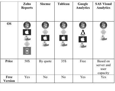
Only Zoho Reports, Google Analytics and SAS Visual Analytics have a free version, the other platforms are paid.
TABLE III. PLATFORMS COMPARISON
VI. CASE STUDY
The generic database used in this research includes the pedagogical questionnaires elaborated by the pedagogical councils of the 5 Schools of the Polytechnic of Leiria [24] and the questionnaire on patient satisfaction of health units developed by the Picker Institute [25]. These two questionnaires are only examples of possible application areas, where we can find several other dozen examples. They are a proof that the model that sustains the proposed dashboard is generic enough and highly customizable.
The questions of these questionnaires have many types of possible answers, such as [26]:
A. Open-ended Questions
An open-ended question cannot be answered with a "yes" or "no" response, or with a static response. Open-ended questions are phrased as a statement which requires a response.
B. Closed-ended Questions
Four types of closed-ended questions are most commonly used: rating scale, forced choice, dichotomous and demographic/firmographic questions.
- Rating scale questions
Zoho Reports
Sisense Tableau Google Analytics
SAS Visual Analytics
OS
Price 50$ By quote 35$ Free Based on server and
user capacity
Free Version
Respondents assess the issue based on a given dimension. Two frequently used types of rating scale questions are Likert-type scales and semantic differential scales.
C. Semantic differential
In a semantic differential scale, each end of the scale marked is with different or opposing statements.
D. Multiple Choice Questions
Multiple choice questions ask the respondent to choose between two or more answer options. Questions can be as simple as “yes/no” or can give a choice of multiple answers.
The entire structure of the database has been designed with the aim of being the most generic possible, so that all questionnaires containing open-ended questions or multiple types of multiple choice can be entered into the database. Throughout the structure design of the database, care is taken to insert extra attributes especially for statistics, such as in the Survey entity, the start, created, and finish attributes, which contain the start, create, and end dates.
VII. REAL TIME GENERIC DASHBOARD
To develop the real-time dashboard, sophisticated web technologies are used such as PHP, Composer, Javascript, CSS, Boostrap, Socket.io, Redis and MySQL. To achieve a controlled and rapid development environment, the Laravel framework was chosen.
A. Architecture
First, XAMPP is installed, since it has all the necessary services and dependencies for web development with PHP. For the real time communication, we use Node.js, Socket.io and Redis server. General architecture is presented in Figure 5.
Figure 5 General architecture of the Dashboard.
B. Configurations for dashboard development
To join the database in Laravel, the migration process in the tables is carried out, defining all the fields and relationships of the tables, then are performed the controllers, where the functions required by the dashboard are performed. In addition to this, are created access routes for the views depending from the dashboard section.
C. Visual Elements selected
Charts are a visual element that shows information in a simple way, often using lines and curves to show amounts. In this research we selected: Line chart, Radar chart and Pie chart. They usage was adequate for the data types saved in the database.
1) Line Chart: Is drawn by interconnecting all data points
in a data series using straight line segments. Line Charts are normally used for visualizing trends in data that varyies continuously over a period of time or range [27]. The line chart is used to show the number of questions answered by the user.
2) Pie Chart: Divides a circle into multiple slices that are
proportional to their contribution towards the total sum. A Pie chart is useful when comparing the share or proportion of various items [28]. The pie chart is used to show the number of questions that each type of question has, currently there are three types M, O, S
3) Radar chart: Data points are drawn evenly spaced,
clockwise around the chart. The value of the. A point is represented as the value for the distance from the center of the chart, where the center represents the minimum value, and the chart edge is the maximum values [29]. The radar table is used to show the time when each survey is completed.
D. Real time communication
In order to perform an actual automatic dashboard that reacts when some data is entered into the database in real time, our dashboard was developed using real time technologies:
1) Redis: An open source (BSD licensed), in-memory data
structure store, used as a database, cache, and message broker. [30]. It is the server that allows communication between the web client and the database.
2) Node.js: A platform built on Chrome’s JavaScript
runtime for easily building fast and scalable network applications. [31]. In the dashboard, when any data is entered, it sends a message to the server and through an event the charts are updated.
3) Socket.io: A JavaScript library for real-time web
applications that enables real-time, bi-directional communication between web clients and servers. Socket.IO has two components: a client-side library that runs in the browser, and a server-side library for Node.js. Both components have nearly identical APIs [32]. In the dashboard application the server address and port are defined, and then used when sending messages to the server.
In order for the dashboard to start working, the redis server and the socket.io client must be started. This to ensure real time communication between the application and the database.
E. Views
Views contain the HTML used by the application and separate the controller / application logic from the presentation logic. The main view contains a menu of options to display and insert data in the tables; it also contains information of certain tables and shows the charts in real time (see figure 6).
Figure 6 Generic Dashboard – Main View.
VIII. CONCLUSIONS AND FUTURE WORK
In this research we conducted a state of the art review about Data visualization and identified a set of distinct Data Visualization techniques. A Dynamic Dashboard for Analyzing Surveys’ Results was developed using the Laravel framework as the base for development. The dashboard is still under development, so no functioning tests are shown.
Due to the massive amount of information that exists and is created every day, the number of existing artifacts and the needs of all users and consumers of knowledge out there, it is difficult to find ways to present the information in an accessible way or make sense out of it. Our proposal is to develop a dashboard where users will be able to interact with the information, based on an initial set of hints, charts, tables and reports, produced by the dashboard. This dashboard will be free and easy to use by users.
Dashboards can provide a unique and powerful means to present information. No matter how great the technology, a dashboard's success as a medium of communication, is a product of design, a result of a display that speaks clearly and immediately.
After the development of the dashboard it is necessary to assess the impact of the available Data Visualization techniques in the Dashboard and finally establish a list of initial information security requirements for the Dashboard.
ACKNOWLEDGMENT
Renato Toasa would like to thank the Secretaría de Educación Superior, Ciencia, Tecnología e Innovación (SENESCYT) from Ecuador, for supporting his masters studies
.
REFERENCES
[1] Sas, “Data Visualization Techniques,” White Pap., pp. 2–16, 2013. [2] S. Rose, “Return on Information : The New ROI Getting value from
data.,” SAS Inst. Inc. U.S.A, 2014.
[3] “SAS Visual Analytics | SAS.” [Online]. Available: https://www.sas.com/en_us/software/visual-analytics.html.
[Accessed: 23-Mar-2018].
[4] V. Tavares et al., “‘A Survey on Information Visualization for
Network and Service Management’ Guimaraes,” IEEE Commun.
Surv. Tutorials, 2015.
[5] E. R. Tufte, “The Visual Display of Quantitative Information,”
Technometrics, vol. 2nd. p. 197, 2001.
[6] K. S. Khan, R. Kunz, J. Kleijnen, and G. Antes, “Five steps to conducting a systematic review,” Jrsm, vol. 96, no. 3, pp. 118–121, 2003.
[7] E. R. Tufte and G. M. Schmieg, “The Visual Display of Quantitative
Information,” Am. J. Phys., vol. 53, no. 11, pp. 1117–1118, 1985.
[8] R. Brath and M. Peters, “Dashboard Design: Why Design is Important,” Data Min. Rev., 2004.
[9] G. Bellinger, D. Castro, and A. Mills, “Data , Information , Knowledge , and Wisdom,” Syst. Think., p. 5, 2004.
[10] M. Templ, A. Alfons, and P. Filzmoser, “Exploring incomplete data using visualization techniques,” Adv. Data Anal. Classif., vol. 6, no. 1, pp. 29–47, 2012.
[11] C. Min et al., “Data, information, and knowledge in visualization,” IEEE Comput. Graph. Appl., vol. 29, no. 1, pp. 12–19, 2009.
[12] L. Chapman and E. Roberts, “Point of contact.,” Can. Nurse, vol. 74, no. 9, pp. 28–31, 1978.
[13] Joseph Devito, Essentials of Human Communication: Joseph DeVito: 9780558323158: Amazon.com: Books. 2009.
[14] M. Kintz, “A Semantic Dashboard Description Language for a Process-oriented Dashboard Design Methodology,” CEUR
Workshop Proc., vol. 947, pp. 31–36, 2012.
[15] S. Few, “Clarifying the vision,” Inf. Dashboard Des. Eff. Vis.
Commun. Data, p. 223, 2006.
[16] U. M. Fayyad, A. Wierse, and G. G. Grinstein, Information
visualization in data mining and knowledge discovery. Morgan
Kaufmann, 2002.
[17] “SAS Whitepaper Data Visualization Techniques - Documents.” [Online]. Available: https://docgo.org/sas-whitepaper-data-visualization-techniques. [Accessed: 28-Sep-2017].
[18] “Sankey Flow Show - Attractive flow diagrams made in minutes!” [Online]. Available: http://www.sankeyflowshow.com/. [Accessed: 28-Sep-2017].
[19] “Data Visualization: Designing for Mobile Devices.” [Online]. Available: http://www.dummies.com/programming/big-data/big-data-visualization/data-visualization-designing-for-mobile-devices/. [Accessed: 28-Sep-2017].
[20] google, “Google Dashboard.” [Online]. Available: https://sites.google.com/a/pressatgoogle.com/googledashboard/. [Accessed: 27-Sep-2017].
[21] “Sisense Reviews | TechnologyAdvice.” [Online]. Available: http://technologyadvice.com/products/sisense-reviews/. [Accessed: 09-Oct-2017].
[22] “Business Dashboards: Data at a Glance.” [Online]. Available: https://www.tableau.com/solutions/topic/business-dashboards. [Accessed: 27-Sep-2017].
[23] “Zoho Reviews | TechnologyAdvice.” [Online]. Available: http://technologyadvice.com/products/zoho-reviews/. [Accessed: 09-Oct-2017].
[24] “Politécnico de Leiria.” [Online]. Available: https://www.ipleiria.pt/home/. [Accessed: 27-Mar-2018].
[25] “Picker: Patient Centred Care Improvement.” [Online]. Available: http://www.picker.org/. [Accessed: 27-Mar-2018].
[26] Canada Business Network, “Types of survey questions - Canada Business Network.” [Online]. Available:
https://canadabusiness.ca/business-planning/market-research-and-statistics/conducting-market-research/types-of-survey-questions/. [Accessed: 23-Mar-2018].
[27] “JavaScript Line Charts & Graphs | CanvasJS.” [Online]. Available: https://canvasjs.com/html5-javascript-line-chart/. [Accessed: 07-Jan-2018].
[28] “JavaScript Pie Charts & Graphs | CanvasJS.” [Online]. Available: https://canvasjs.com/html5-javascript-pie-chart/. [Accessed: 07-Jan-2018].
[29] “Radar Charts | Image Charts | Google Developers.” [Online]. Available:
https://developers.google.com/chart/image/docs/gallery/radar_charts . [Accessed: 07-Jan-2018].
[30] “Redis.” [Online]. Available: https://redis.io/documentation. [Accessed: 20-Jan-2018].
[31] “Node.js.” [Online]. Available: https://nodejs.org/es/. [Accessed:
20-Jan-2018].
[32] “Socket.IO.” [Online]. Available: https://socket.io/. [Accessed: 20-Jan-2018].
![Figure 3 Data Information, knowledge and decisions[9]](https://thumb-eu.123doks.com/thumbv2/123dok_br/18406447.894227/2.918.99.438.737.931/figure-data-information-knowledge-and-decisions.webp)
![Figure 4. a) a word cloud [1]; b) a network diagram [1]; c) a correlation matrix [11]; d) autocharting produces a bar chart to show the distribution of a single measure [11]; e) sankey diagram [12]; f) grid design translated to different screens[13]](https://thumb-eu.123doks.com/thumbv2/123dok_br/18406447.894227/3.918.495.837.328.754/figure-network-correlation-autocharting-produces-distribution-translated-different.webp)