Repositório ISCTE-IUL
Deposited in Repositório ISCTE-IUL:
2018-10-10Deposited version:
Post-printPeer-review status of attached file:
Peer-reviewedCitation for published item:
Pestana, M., Pereira, R. & Moro, S. (2018). A productivity dashboard for hospitals: an empirical study. In Wrycza S., Malankowski J. (Ed.), 11th SIGSAND/PLAIS EuroSymposium on Information Systems: Research, Development, Applications, Education. (pp. 184-199).: Springer.
Further information on publisher's website:
10.1007/978-3-030-00060-8_14Publisher's copyright statement:
This is the peer reviewed version of the following article: Pestana, M., Pereira, R. & Moro, S. (2018). A productivity dashboard for hospitals: an empirical study. In Wrycza S., Malankowski J. (Ed.), 11th SIGSAND/PLAIS EuroSymposium on Information Systems: Research, Development, Applications, Education. (pp. 184-199).: Springer., which has been published in final form at
https://dx.doi.org/10.1007/978-3-030-00060-8_14. This article may be used for non-commercial purposes in accordance with the Publisher's Terms and Conditions for self-archiving.
Use policy
Creative Commons CC BY 4.0
The full-text may be used and/or reproduced, and given to third parties in any format or medium, without prior permission or charge, for personal research or study, educational, or not-for-profit purposes provided that:
• a full bibliographic reference is made to the original source • a link is made to the metadata record in the Repository • the full-text is not changed in any way
The full-text must not be sold in any format or medium without the formal permission of the copyright holders.
Serviços de Informação e Documentação, Instituto Universitário de Lisboa (ISCTE-IUL) Av. das Forças Armadas, Edifício II, 1649-026 Lisboa Portugal
Phone: +(351) 217 903 024 | e-mail: [email protected] https://repositorio.iscte-iul.pt
Study
Miguel Pestana1, Rúben Pereira 2 and Sérgio Moro3
1 Instituto Universitário de Lisboa (ISCTE-IUL),Lisboa, Portugal [email protected]
2 Instituto Universitário de Lisboa (ISCTE-IUL), ISTAR-IUL,Lisboa, Portugal [email protected]
3 Instituto Universitário de Lisboa (ISCTE-IUL), ISTAR-IUL,Lisboa, Portugal [email protected]
Abstract. Health information systems are key assets in managing health units’
daily operations. Nevertheless, literature is scarce concerning information sys-tems for increasing and managing hospital productivity. This study aims at filling such gap through an empirical research based on large Portuguese hospital. Specifically, a dashboard prototype is proposed addressing productivity indica-tors in areas such as assistance, hospitalization, surgery, among others.
This dashboard is tuned using a design science research approach where health experts successively validate the prototype.
Interviews are conducted to assess the benefits of using our proposal to manage productivity on a daily basis.
Keywords: Health information systems; Business Intelligence; dashboards;
hospital management; KPIs.
1
Introduction
Healthcare is a sector with exponential growth, making it one of the largest industries in the world with enormous impact on countries’ economy [1] . However, like all other institutions, healthcare organizations are at the mercy of the unstable environment of external factors such as technological advances . For these reasons and due to this im-pact on the healthcare system at the level of effectiveness it is necessary that hospitals constantly improve their performance [2]. Therefore, to improve performance, it is nec-essary to measure and evaluate it, so that it is possible to allow healthcare organizations to define strategies to achieve hospitals’ goals [1].
The strategic objectives of healthcare organizations are difficult to achieve given their complexity [3]. The data volume is increasing due to more than 20 years of electronic storage of patients' data, with the Hospital Information System (HIS) being able to store and subsequently provide useful information throughout the hospital's medical history [4]. The impact of the introduction of information and communications technology
(ICT) in the multifaceted health sector is well known and acknowledged by health stakeholders who have witnessed the role of ICTs in diverse levels in hospitals [5].
Business Intelligence (BI) is a valuable asset in today’s organizations, having a direct impact on the following aspects: providing data visualization tools, improving and in-fluencing strategic business decisions, supporting analysis of breaking organizational information barriers, , and helping to give meaning to organizational data [6].
When designed to measure performance and backed by a business-oriented BI infra-structure, dashboards enable health managers to be able to measure performance, mon-itor Key Performance Indicators (KPI’s) by preventing deviations, understand undesir-able behaviors and redefine the trajectory of the objectives [7]. The dashboard is a mechanism that effectively and efficiently aggregates relevant information to be ex-plored through three tasks: Monitor, Analyze and Manage [8].
Currently, the growing need for hospital organization to have valid and reliable tools that help in the process of analyzing and evaluating the services provided to patients [9]plus the need to have adequate and available information to facilitate measurement of the productivity of hospital organization [10]call for further investigation in this do-main. Moreover, international organizations such as the Organization for Economic Co-operation and Development (OECD) launched in 2000 the first document to help sim-plify the process of productivity analysis [11] which reinforce the relevance and com-plexity of the domain.
This research is focused on the development of a dashboard for hospital organiza-tions productivity which intends to help to solve the problems identified at Table 1.
Tab. 1 The key problems of the study
ID Description
P1 The two problems the authors are trying to help to solve, are: healthcare needs to find ways to explore, analyze, and synthesize valuable information to make decisions in real-time.
Sharpe, A., Bradley, C., & Messinger, H. (2007) P2 and to obtain a productivity analysis that allows to understand that it can be improved in the provision of service to the patients and consequently to obtain a better knowledge of the costs of a hospital organization.
Al-HAJJ, S., Pike, I., & Fisher, B. (2012)
This study is based on a comparative analysis between two decision support solu-tions an institution of the national health service, aiming at the development of a dash-board with a focus on productivity. The measurement of production always had enor-mous complexity because healthcare is not tradable. This fact hinders the observation of prices and results, technological advances also increases complexity of price analysis and results [11].
The remaining document is organized as follows: chapter two presents the Theoret-ical background; chapter three, explains the methodology followed in this research (DSR); chapter four presents the first DSR iteration; Chapter five presents the second DSR iteration; finally, in Chapter six, conclusion and future work are drawn.
2
Theoretical background review
The article is based on four important areas that will be the subject of a brief analysis in this section Production and Productivity, KPIs, Dashboards and Visualization and Drill Techniques.
Productivity growth in health organizations is generally lower than the growth of the economy as a whole, which is attributed by experts to measurement problems [12].
Productivity is a critical aspect for the performance of health systems, which can be defined by physical inputs used (labor, capital and supplies) to achieve a certain level of health outcomes in the treatment of a specific disease [13]. Measuring production and productivity is essential to achieve a more efficient allocation of resources in a hospital organization [11]. By measuring productivity, it will be possible to make im-provements in the service of organizations, which will not imply an increase in ex-penses, but an optimization of re-courses [13].
Health organizations need to improve the mechanisms for measuring and analyzing estimates so as to measure productivity, which will improve the performances of the same organizations [11]. Dashboards, when designed to measure performance and backed by a business-oriented BI infrastructure, will enable health managers to be able to measure performance, monitor KPI by preventing deviations, understand undesirable behaviors and redefine the trajectory of the objectives set [7].
The role of the Dashboard has been increasing in both the health sector and the research community that addresses this topic. Dashboards to be effective in decision support need to strike a balance between the visual aspects and the information contained in them. This equilibrium is intended to avoid the excess of information that is not rele-vant, providing access only to the crucial information for decision-makers [14].
Dashboards allow reducing the time spent in a manual analysis and facilitate the obtaining of information by a greater number of people, due to the appealing way of presenting the data [15].
Moreover, the idealization of the visual design of a dashboard is a determinant factor for the success or failure of this. The decision makers need of dashboards to help in the decision support phase in organizations. The great challenge is to make use and visual-ization to facilitate the extraction of the information contained in the dashboard [8].
The dashboard that are developed based on techniques should provide unambiguous information, the visualizations should not be prone to misinterpretations, the infor-mation should be ready to consume by the decision makers only so dashboards will be an added value [16]. Such visualization techniques may allow the stakeholders to obtain basic knowledge [17].
Visualization. Several advantages can be noted with the application of visualization techniques. For example, they help in the exploration of information and provide the tools needed to create a dashboard that provides a big picture [19].
The drill down technique enables the capacity to analyze indicators, to present answers to the questions of the decision makers and to support the creation of multiple types of perspectives with more or less detail, which enables the materialization of the big pic-ture of that information [10, 23-24].
3
Research Methodology
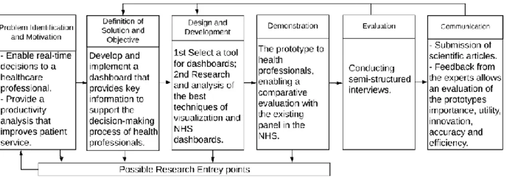
The Research Methodology that endowed in the study and is Design Science Research (DSR), this methodology premise to design, build and evaluate the prototype that we are going to want. When the aim of the research is to expand the limits of human capacities and organizations, in order to create new artefacts invoking the Design Science Research Methodology (DSRM) is the right choice [20]. In contrast to other paradigms of research, this one stands out as it tries to develop and obtain artefacts that are possible to buy the effectiveness of this in the real world [21]. The approach (DSR) would include three elements: conceptual principles that help define DSR, practical rules for DRS impersonation, and a prosthetic to perform and conduct research [21]. The DSR is an interactive process methodology as it is possible to verify in fig1.
Fig. 1. DSRM Process Model Followed
3.1 Principles
The principles of DSR have their pillars in the engineering of artificial things and in-formation systems are a perfect example of artificial systems, when implementing an objective information system is to reduce the efficiency of the organization [22]. For this reason, the authors follow the principles present at Table 2.
The principles alone do not provide for the requirement of requirements to obtain an effective job in Design science, so here we present the guidelines that have this purpose to establish guidelines that help the research community understand this need [20]. Ta-ble 3 shows the 7 DSR guidelines.
4
DSR First Iteration
The authors followed the DSR methodology and carried out 2 iterations to improve the developed prototype. This was populated with information from the hospital in which the interviews were conducted. In this section the authors provide the main information regarding the three phases of each iteration: the proposal; demonstration and evaluation.
Tab. 2. Design Science Research principles
Abstraction This research presents a proposal for a dashboard that intends to
improve the decision support process for stakeholders. For this the authors follow indicators that are in the National Health Service (NHS), which is the entity by which the Portuguese Government regulates health in Portugal. The dashboard was validated in a large Portuguese hospital.
Originality The proposed artefact is not in any body of knowledge (BoK).
Justification The justification for the device is based on the methods proposed
for its evaluation.
Benefit The Development of dashboards that allows to obtain in a single
location the macro information of production and productivity of a hospital organization, that allows the decision makers to obtain useful information so that they can make the right decisions in a timely manner. This added value can help improve the care of the users and in the last instance may even have an impact on the lives of the users.
Tab. 3. Design Science Research Guidelines [24]
Guideline 1: Design as an Artefact
The artefact proposed by the study is production dashboard and productivity. Guideline 2: Problem Relevance
Need to have a dashboard on production and productivity that allows an analysis of each hospital organization
Guideline 3: Design Evaluation Semi-structured interviews
Guideline 4: Research Contributions
A new artefact not present in the body of knowledge.
The main principles, practices and procedures of DSR were adopted, in order to in-crease the credibility of the artefact and the consequent contribution of the study Guideline 5: Research Rigor
Construction:
Stephen Few: guidelines practical Rules for Using Colour in Charts Gestalt theory: and forming principles of visual perception
Evaluation: interviews with health stakeholders Guideline 6: Design as a Search Process
The result obtained is the departure from unknown. Combination of good visualiza-tion practices and other relevant guidelines for prototype development
Guideline 7: Communication of Research
Evaluated by health stakeholders who have to make decisions using dashboards, which assigns greater credibility. Plus, the submission of the article to a journal/con-ference with great credibility and respect in the scientific community
4.1 Proposal
The develop the artefact the authors carried out three main steps: research and analysis, ETL processes and construction of dashboards.
The research and analysis phase were divided into two parts. The first part was de-voted to researching and analyzing the existing supply of dashboards for health organ-izations, then a survey on visualization techniques was done to validate what best prac-tices in this area and also to verify if these techniques are already being used in health organizations. The second part of the research and analysis phase was devoted to the analysis of NHS panels and to the study of information and data contained in monthly monitoring and benchmarking. After this study, the authors selected the indicators of the production and productivity segment.
In the ETL (Extract Transform Load) process phase were extracted the data of production and productivity of the site NHS. An analysis of the data and some necessary adjustments were made to import the data into the application.
During the development phase of the panel was made the creation of new measures and indicators that were not created during data exportation. Therefore, new graphic decisions were made having into consideration the previously presented visualization techniques and the guidelines presented in the next section. Figure 2 helps to demonstrate what has been described.
4.2 Guidelines
The use of colours in a dashboard can be a plus, but for that, you need to know the issues related to colour perception and follow rules that help you convey the infor-mation. To achieve a dashboard according to good colour practice, there are rules that must be used and followed in the proposed panel, these rules are presented and ex-plained in books[23],[24].
Gestalt's principles of visual perception help to understand which elements of train-ing are crucial to the transmission of information and which elements are pollutants and / or enhancements. These principles are approached by several authors can be studies of more detailed form in one of the following works [28- 30].
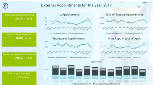
For the first iteration, a panel was created in the production and productivity segment of the following areas of surgery, internally, external consultations and emergencies. The segments present in the dashboard are defined in a decree-law by the Portuguese State and are used by the NHS in the benchmarking and the monthly monitoring that this entity provides to hospital organizations. The data contained in the dashboards are referring to the hospital organization where we were to carry out interviews which prematurely stakeholders a familiarization with the data and get faster to evaluate the value of the proposed dashboards. At the level of the dashboard structure this is divided by three types of principal and applied views whenever the data foresee, annual, monthly and target. These perspectives are presented whenever the data allow. In the monthly perspective fig. 3 it is possible to verify that if it is divided into two header and detail areas being that in the header is where the title of the segment that is being viewed
return button and filtering per year is. The detail area is divided in two, and on the left side we have the KPI's with annual values and compared with the homologous year, and on the right side we have the graphs with the monthly distribution of KPIs and other analyzes that can be used by the decision-makers, also in these graphs is the comparison of current year with the homologous.
Fig. 2. Proposal Development Workflow
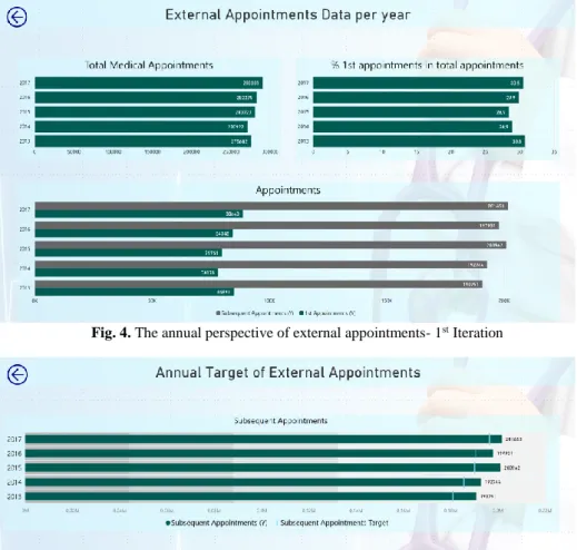
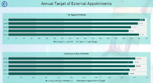
In Fig. 3, it is noticeable that the authors followed the following principles of Gestalt: Proximity, Similarity, Closing and Connection. These forms are also followed in the views (Annual and Target). Throughout the dashboard the guidelines of the colours rule, being that. The rules 4 and 5 are the ones that stand out more whereas the colours only change when they are different subjects and the use of more attractive colours for the KPI's. Fig4 is refers to the annual information, the color guidelines are also visible. Finally, the separated from the target fig. 5 only those indicators that have a de-fined goal in the contract program (annual agreements between the Portuguese State and the hospitals where the levels of economic and financial assistance that are assured by each hospital are defined).
Fig. 4. The annual perspective of external appointments- 1st Iteration
The dashboards are idealized in the light of the guidelines we mentioned before at the level of organization and distribution of information, as well as the choice of graphics and colour choices. Its main objective is to provide ready to use information for decision-makers.
4.3 Demonstration
In order to demonstrate that the artefact develop can be applied in practice the authors have populated the artefact with the respective information of the health organizations under study. The presentation of the panel in terms of navigability, available infor-mation, graphics and functionalities allows for a more detailed analysis of KPIS. More information about the evaluation of the artefact can be seen in section 4.4.
4.4 Evaluation
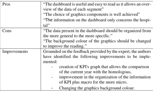
The first evaluation was carried out by a stakeholder in the department of planning, studies, analysis and control. The interviewee was a female with more than 23 years of experience in the hospital and a total of 23 years in the health area.
To present the qualitative results of the interviews, the authors organized the infor-mation in a table that shows the pros, cons and improvements. The improvements were the starting point for changing the panel to the next interaction.
Tab. 4. Evaluation of the 1st Iteration Prototype
Pros “The dashboard is useful and easy to read as it allows an over-view of the data of each segment”
“The choice of graphics components is well achieved” “The information on the dashboard only concerns the hospi-tal”
Cons “The data present in the dashboard should be organized from the more general to the more specific.”
“The background colour of the graphics should be changed to improve the reading.”
Improvements Grounded on the feedback provided by the expert, the authors have identified the following improvements to be imple-mented:
- creation of KPI's graph that allows the comparison of the current year with the homologous,
- improvement in the organization of the information of KPI plus macro for the more micro.
5
DSR Second Iteration
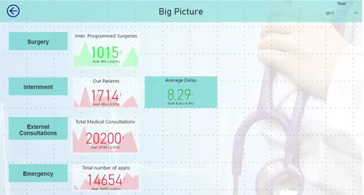
After the first iteration and with the feedback provided by the practitioner the authors performed some changes in the dashboard. At this stage also began the creation of Big picture. The big picture allows you to get a global picture of production and productiv-ity and in case you need the drill down on the dashboards for more detail [14].
5.1 Proposal
With the evaluation of the first iteration the order of the indicators was altered, the background colours were modified, a big picture was started and modified and changed to the areas of the KPIs, with a comparison of the current year with the target. The guidelines that the authors indicated are well visible in this iteration, only added the essential and a care with the colours.
By analyzing Fig.6 it is also visible the implementation of other principles of Gestalt Enclosure in the KPIs column.
In Fig. 7 and 8 it is again apparent that the improvements are implemented and that the colors are to be respected in particular the choice of the background color which only makes a little contrast but improves the reading of this. Figure 9 presents a sketch of the Big Picture that is being built with stakeholder input.
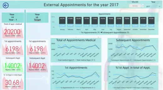
Fig. 6. The monthly perspective of external appointments - 2nd Iteration
5.2 Evaluation
The information used for building the dashboard is originated in the hospital’s data sources. This enables an improved decision support.
The second evaluation was performed by a female stakeholder responsible for the surgical area with 41 years old and with a total of 20 years of experience in the area of health both in public hospital organizations and private.
In order to present the results of the interviews, a table was composed of pros, cons and improvements. The enhancements were the starting point for changing the dash-board to the next interaction.
Fig. 7. The annual perspective of external appointments- 2nd Iteration
Fig. 9. Big Picture - 2nd Iteration
Tab. 5. Evaluation of the 2ª Iteration Prototype
6
Conclusion and Future Work
The results obtained with the interviews show that the implementation of dashboards on production and productivity is an asset for hospital organizations. Another important aspect that can be concluded from the study is that applying the guidelines of colours and Gestalt's principles of visual allow enhancing the value of dashboards for stake-holders. It is also important to note that the prototype was populated with real hospital information which allowed the stakeholders to become more familiar with the data and Pros "The dashboard allows immediate analysis and monitoring of
production data and hospital productivity"
"Good colour pallet helps with information readings" "The dashboard displays only hospital information unlike the NHS"
Cons "It is a macro view of production and productivity";
"It was a plus if the dashboard allowed for a detailed analysis by department, services and stakeholders."
"Implement the target of the emergency " "Implement information of the day hospital" Improvements Obtain data at the contractual level;
Allow for a more detailed analysis of the information, allow-ing an analysis by department, service and health stakehold-ers.
Add more emergency information and put information of the day hospital.
to gain more certainty of the information they need to obtain with dashboards. The implementation of the dashboards has all the conditions to materialize since the feed-back of the stakeholders interviewed indicate this. Moreover, the dashboard allows us to respond to a need to be able to measure the production and productivity of the hos-pital organization.
Grounded on such findings and results the authors argue that the two problems iden-tified in section 1 (P1 and P2) were successfully addressed in our proposal.
However, this research also has some limitations. The study was only performed in one hospital which makes it difficult to generalize the conclusions drawn. Plus, only two stakeholders of the hospital were interviewed so far which means that more im-provements may very well be proposed in the future.
As a proposal of future work, the authors intend to continue the study with the real-ization of more iterations in the same hospital and in other hospitals as well. This will premise the generalization of the conclusions. In the second iteration it was requested to increase the detail of the dashboard, so it can provide information by department and service. That’s also part of the future work.
References
1. Rahimi, H., Kavosi, Z., Shojaei, P., Kharazmi, E.: Key performance indicators in hospital based on balanced scorecard model. J. Heal. Manag. Informatics. 4, 17–24 (2016)
2. Koumpouros, Y.: Balanced scorecard: application in the General Panarcadian Hospital of Tripolis, Greece. Int. J. Health Care Qual. Assur. 26, 286–307 (2013). doi:10.1108/09526861311319546
3. Engla, N.E.W.: New engla nd journal. Perspective. 363, 1–3 (2010). doi:10.1056/NEJMp1002530
4. Kawamura, T., Kimura, T., Tsumoto, S.: Estimation of Service Quality of a Hospital Information System Using a Service Log. Rev. Socionetwork Strateg. 8, 53–68 (2014). doi:10.1007/s12626-014-0044-x
5. Alexander Berler, Sotiris Pavlopoulos, and D.K.: Using Key Performance Indicators as\nKnowledge-Management Tools at a Regional\nHealth-Care Authority Level. Ieee Trans. Inf. Technol. Biomed. 9, 184–192 (2005). doi:10.1109/TITB.2005.847196
6. Safwan, E.R., Meredith, R., Burstein, F.: Business Intelligence (BI) system evolution: a case in a healthcare institution. J. Decis. Syst. 25, 463–475 (2016). doi:10.1080/12460125.2016.1187384
7. Ghazisaeidi, M., Safdari, R., Torabi, M., Mirzaee, M., Farzi, J., Goodini, A.: Development of performance dashboards in healthcare sector: Key practical issues. Acta Inform. Medica. 23, 317–321 (2015). doi:10.5455/aim.2015.23.317-321
8. ECKERSON, W.W.: Performance Dashboards. (2005)
9. Daley, K., Richardson, J., James, I., Chambers, A., Corbett, D.: Clinical dashboard: use in older adult mental health wards. Psychiatrist. 37, 85–88
(2013). doi:10.1192/pb.bp.111.035899
10. Gordon, J., Richardson, E.: Continuous Improvement in the Management of Hospital Wards: The Use of Operational Dashboards. Int. J. Manag. 30, 414– 417 (2013)
11. Sharpe, A., Bradley, C., Messinger, H.: The Measurement of Output and Productivity in the Health Care Sector in Canada : An Overview The Measurement of Output and Productivity in the Health Care Sector in Canada : An Overview Abstract Résumé. 1–58 (2007)
12. Hill, H.M.: Measuring productivity in bioanalysis. Bioanalysis. 4, 2317–2319 (2012). doi:10.4155/bio.12.207
13. Baily, M.N., Garber, A.: Health care productivity. Br. Med. J. 333, 312–313 (2006). doi:10.1136/bmj.333.7563.312
14. Zhang, X., Gallagher, K., Goh, S.: BI application: Dashboards for healthcare. 17th Am. Conf. Inf. Syst. 2011, AMCIS 2011. 5, 3898–3902 (2011)
15. Stadler, J.G., Donlon, K., Siewert, J.D., Franken, T., Lewis, N.E.: Improving the Efficiency and Ease of Healthcare Analysis Through Use of Data Visualization Dashboards. Big Data. 4, 129–135 (2016). doi:10.1089/big.2015.0059
16. Martin, N., Bergs, J., Eerdekens, D., Depaire, B., Verelst, S.: Developing an emergency department crowding dashboard: A design science approach. Int. Emerg. Nurs. 1–9 (2017). doi:10.1016/j.ienj.2017.08.001
17. McLeod, B., Zaver, F., Avery, C., Martin, D.P., Wang, D., Jessen, K., Lang, E.S.: Matching capacity to demand: A regional dashboard reduces ambulance avoidance and improves accessibility of receiving hospitals. Acad. Emerg. Med. 17, 1383–1389 (2010). doi:10.1111/j.1553-2712.2010.00928.x
18. Silva, P., Quintas, C., Duarte, J., Santos, M., Neves, J., Abelha, A., MacHado, J.: Hospital database workload and fault forecasting. 2012 IEEE-EMBS Conf. Biomed. Eng. Sci. IECBES 2012. 63–68 (2012). doi:10.1109/IECBES.2012.6498150
19. Santos, M.Y.: A Data-driven Analytics Approach in the Study of Pneumonia ’ s Fatalities. (2015)
20. Hevner, A.R., March, S.T., Park, J., Ram, S.: Design Science in Information Systems Research. MIS Q. 28, 75–105 (2004). doi:10.2307/25148625 21. Peffers, K., Tuunanen, T., Rothenberger, M.A., Chatterjee, S.: A Design
Science Research Methodology for Information Systems Research. J. Manag. Inf. Syst. 24, 45–77 (2007). doi:10.2753/MIS0742-1222240302
22. De Sordi, José Osvaldo; Meireles, Manuel; Sanches, C.: Design science aplicada às pesquisas em administração: reflexões a partir do recente histórico de publicações internacionais. RAI - Rev. Adm. e Inovação. 8, nú, 10--36 (2013)
23. Few, S.: Information Dashboard Design - The effective Visual Communication of Data. (2006)
24. Wexler, Steve, Shaffer Jeffrey, C.A.: The Big Book of Dashboards: Visualizing Your Data Using Real-World Business Scenarios. Wiley (2017)
25. Knaflic, C.N.: Storytelling with data: A data visualization guide for business professionals. John Wiley & Sons (2015)

![Tab. 3. Design Science Research Guidelines [24]](https://thumb-eu.123doks.com/thumbv2/123dok_br/19207475.956713/6.892.191.705.585.1004/tab-design-science-research-guidelines.webp)