2017
IEVA MARIJA
REIKALAITĖ
SCREEN PRINTING
–
ROOTS AND
2017
IEVA MARIJA
REIKALAITĖ
SCREEN PRINTING
IN CONTEMPORARY CULTURE
–
ROOTS AND MEANING
o júri
presidente Doutor Flávio Henrique de Almeida
professor Auxiliar do IADE – Universidade Europeia
vogais Doutor Aprigio Morgado
professor Auxiliar da Escola Superior de Artes e Design das Caldas da Rainha
Doutor Fernando Jorge Matias Sanches Oliveira
acknowledgements From all my heart would like to thank all the people who
put their time and effort into helping me writing this Master Thesis. First of all would like to thank my father
Šarūnas Reikalas, who was always present and helped me financially and emotionally with any issue I had. Secondly – my work cordinators, professors Fernando J. Oliveira and Paulo T. Silva, for being always available, answering infinite questions and sharing their knowledge. Would like to thank my friend A. Margaret Orlowski for being a role model and english text supervisor, Carlos Taveira and João Henriques for reviewing and helping to translate texts to Portuguese, Luara Reis and Rodrigo Gonçalves for their incredible patience with my clumsiness while learning to screen-print, Kathrin Slavik for support and advising not only in the field of screen-printing, Tiago André for motivation, Oficina Arara and especially Miguel Carneiro for taking time from very busy schedule to answer my interview questions personally, Oficina do Cego for trust, knowledge and support. Would like to thank personally Jim O'Raw, Chloe Lum, Todd Slater, Giancarlo Impiglia, What is Adam aka WIA, Geoff McFetridge, Paolo Berra, Marzia Faranda, Tiziana
Barrilá, Maria Mollo, Borja Arévalo, Eglė Bazaraitė for their time and their answers to my questions and especially to Rossella Catanese, who took her time not only to reply, but also to share her incredible books and articles.
palavras-chave
resumo
Serigrafia; História; Significado; Técnicas; Cultura Contemporânea.
A serigrafia é uma técnica de impressão que permanece praticamente inalterada desde os seus primórdios, com apenas ligeiras melhorias, e que está a renascer em diversos movimentos na cultura contemporânea. A pesquisa que se segue examina a história, estilos e técnicas da serigrafia, procura as razões pelas quais sobreviveu e porque é ainda utilizada como técnica de impressão até aos dias de hoje. Nesta linha, vários impressores e designers contemporâneos, bem como admiradores da técnica, são entrevistados. A serigrafia é ainda comparada a outros recentes ressurgimentos analógicos e aplicada na prática, sendo documentados todos os processos de aprendizagem e experimentação, e conclui com a sua produção e materialização na forma de um cartaz.
Keywords
abstract
Screen-Printing; History; Meaning; Techniques; Contemporary Culture.
Screen-printing is a printmaking technique, which exists in almost original form since ancient times just with a few improvements and is having a revival In contemporary culture. This research examines history, styles, techniques of screen-printing and searches for reasons why it survived and is still used as a printmaking technique until nowadays. Due to find out, a number of contemporary printmakers and screen-printing admirers is interviewed. Afterwards screen-printing is compared to other recent analogue revivals and employed in practice documenting all the learning and experimentation processes and before the conclusion producing a final material result in form of a poster.
TABLE OF CONTENTS
ACKNOWLEDGEMENTS i
RESUMO ii
ABSTRACT iii
TABLE OF CONTENTS iv
LIST OF FIGURES v
LIST OF TABLES vi
1. INTRODUCTION 01
1.1 Visual Culture 02
1.2 Screen-Printing 02
1.3 Question 02
1.4 Goals 03
1.5 Methodology 03
1.5.1 Iconic Screen-Prints Selection Methodology 03
1.5.2 Interview Methodology 07
1.5.3 Data Analysis Methodology 11
2. THEORETICAL FRAMEWORK 14
2.1 Literature Review 14
2.1.1 History of Screen Printing 14
2.1.2 Terminology 21
2.1.3 Equipment 22
2.1.4 Screen-Printing Methods 26
2.1.5 Photo Stencil 29
2.2 Visual Review 35
2.2.1 Iconic Screen-Prints 35
2.2.2 Contemporary Printmakers 39
3. CASE STUDIES 44
3.1 Global Case Studies (Europe, USA, Canada) 44
3.2 Local Case Studies (Portugal) 59
3.3 Interest Case Studies 65
4. DATA ANALYSIS AND COMPARISONS 69
4.1 Data Analysis 69
4.2 Comparisons 78
4.2.1 Slow Food Movement 78
4.2.2 Analogue Cinema 79
4.2.3 Analogue Music 81
4.2.4 Analogue Photography 82
5. PROJECT 83
5.1 Learning to Print 83
5.1.1 Workshop with Oficina Arara 83
5.1.2 Workshop with José Feitor 84
5.1.3 Personal Experiments 84
5.1.4 Exhibition 84
5.2 Visual Project 85
5.2.1 Important Message 85
5.2.2 Make War Not War Poster 86
6. CONCLUSION 91
BIBLIOGRAPHY 93
ANNEXES 97
LIST OF FIGURES
Figure No Page
Figure 1 Gargas Cave Paintings. (2017, January 5). Photo by Heinrich Wendel. Copyright: The Wendel Collection, Neanderthal Museum. Retrieved from:
http://donsmaps.com/gargas.html
14
Figure 2 Tapa Cloth. Polynesia. (2017, January 5). Copyright: Queensland Museum. Retrieved from:
https://en.wikipedia.org/wiki/Tapa_cloth#/media/File:PN G_Turtle_Tapa_Cloth_QM_r.jpg
15
Figure 3 Buddha preaching the Law. Tang Dynasty, early 8th century.
Tung-Huan caves. Prints of the Thousand Buddhas (Cat. Stein LHAS Photo 44.6). (2017, January 5). Retrieved from: http://dunhuang.mtak.hu/en/large-ch-53-1.htm
15
Figure 4 Peacock feathers. Ise Katagami Stencil. Photo by Suzuka City Art Research Center, Ritsumeikan University. (2017, January 8). Retrieved from:
https://www.google.com/culturalinstitute/beta/exhibit/D wJS1XVSx5phKg
16
Figure 5 Printmaker in Ancient China. (2017, January 8). Retrieved from: http://www.kalipo.com/origen-de-la-serigrafia/
16
Figure 6 Crusaders Uniform. Still frame from Predator: Dark Ages
(2015). Directed by James Bushe. (2017, January 8). Retrieved from: http://leericketts.blogspot.pt/2015/08/predator-dark-ages.html
17
Figure 7 Evenlode indigo discharge and block-printed textile. (1883) William Morris. (2017, January 8). Retrieved from:
https://en.wikipedia.org/wiki/Morris_%26_Co.#/media/File :Morris_Evenlode_printed_textile.jpg
17
Figure 8 Samuel Simon of Manchester. (2017, January 8). Retrieved
from:
https://internationalcoatings.wordpress.com/tag/samuel-simon/
18
Figure 9 John C. Patrick Pilsworth. (2017, February 6). Retrieved from: http://www.silkscreenhistory.com/geschUSA/usa3.html
18
Figure 10 Nufilm Ad. (2017, February 6). Retrieved from:
https://lh3.googleusercontent.com/Njr5GqTkxGVQt4vX77 MipizVskGs9LmcKyHv5HSWolqfxRWBGFLv7XIbQ_i5Zlrz8w C8OQ=s114
18
Figure 11 I Love Liberty. (1982). Roy Lichtenstein. (2017, January 9). Retrieved from:
http://andipa.com/artist/roy-lichtenstein/i-love-liberty
19
Figure 12 Portrait of Roy Lichtenstein. (2017, January 9). Retrieved from: http://nassartblog.blogspot.pt/2012/07/pop-art-02.html
19
Figure 13 Portrait of Andy Warhol. Photo by Robert Mapplethorpe.
Copyright: Tate. National Galleries of Scotland. (2017, January 27). Retrieved from:
http://www.tate.org.uk/art/artworks/mapplethorpe-andy-warhol-ar00219
20
Figure 14 Portrait of Liz. (1969). Andy Warhol. (2017, January 25). Retrieved from: http://ew.com/gallery/elizabeth-taylor-15-auction-items/
20
Figure 15 Mao (II.91). (1972). Andy Warhol. Courtesy of Jordan D. Schnitzer and His Family Foundation. Copyright: 2016 The Andy Warhol Foundation for the Visual Arts, Inc. and Artists Rights Society (ARS), New York. (2017, January 23). Retrieved from: https://portlandartmuseum.org/exhibitions/warhol/
21
Figure 16 Screen Printing Unit. (2017).Oficina do Cego, Lisbon. Photograph by Author.
22
Figure 17 Screen-Printing Frame (2017). Oficina do Cego, Lisbon. Photograph by Author.
23
Figure 18 Badly cleaned Squeegees. (2017, January 5). Retrieved from: https://imagescapesembroidery.com/plastisol-ink-or-water-based-ink/
23
Figure 19 Screen-printing board covered with old ink. (2017, January 20). Retrieved from:
https://rachbook.files.wordpress.com/2010/07/dscn3299.j pg
Figure 20 Screen-printing Fabric. (2017, March 13). Retrieved from: https://www.lisoni.com/Screen-printing-mesh-80T-yellow
24
Figure 21 Still frame from the video explaining the process of fabric replacement. (2017, March 5). Retrieved from:
https://www.youtube.com/watch?v=ApHU9WiXsTI
25
Figure 22 Different Colors of Screen-Printing Fabric. (2017, March 8). Retrieved from:
https://www.tradeindia.com/manufacturers/polyester-screen-mesh.html
25
Figure 23 Squeegee. (2017, March 20).Retrieved from:
http://www.thepicta.com/user/printroom.club/2260172741
26
Figure 24 Clean Mesh (2017). Workshop with Oficina Arara. Sintra. Photograph by Author.
30
Figure 25 Coating (2017). Photograph by Author 30
Figure 26 Design preparation to light exposure (2017). Design and Photograph by Author.
31
Figure 27 Exposure to light (2017). Photograph by Author. 31
Figure 28 Registration (2017). Photograph by Author. 32
Figure 29 Frame corner adjustment (2017). Photograph by Author. 32
Figure 30 Pouring ink (2017). Photograph by Author. 33
Figure 31 Printing (2017). Photograph by Author. 33
Figure 32 Drying rack (2017). Photograph by Author. 34
Figure 33 Wittgenstein in New York (1964-65). Sir Eduardo Paolozzi. (2017, March 13). Retrieved from:
http://www.tate.org.uk/art/artworks/paolozzi-as-is-when-65450/12
35
Figure 34 Retroactive 1 (1962-64), Robert Rauschenberg. (2017, March
23). Retrieved from:
http://www.criticalcommons.org/Members/ebreilly/clips/ retroactive-i/view
Figure 35 Brushstroke (1965). Roy Lichtenstein. (2017, March 2). Retrieved from: http://www.artnet.com/artists/roy-lichtenstein/brushstroke-a-JX9-hByR1Hm70h_nefTc7A2
36
Figure 36
Campbell’s Soup Can on Shopping Bag (1966). Andy Warhol. (2017, March 1). Retrieved from:
http://www.artnet.com/artists/andy-warhol/campells-
soup-can-on-shopping-bag-a-gJeTwJrmwP4SnHjSDOwlNA2
37
Figure 37 Marilyn Monroe (1967). Andy Warhol. (2017, March 2).
Retrieved from:
http://revolverwarholgallery.com/portfolio/marilyn-monroe-23/
37
Figure 38 The Velvet Underground & Nico (1967). Andy Warhol. (2017, March 1). Retrieved from:
https://en.wikipedia.org/wiki/The_Velvet_Underground_% 26_Nico
38
Figure 39 Come Alive (1967). Sister Mary Corita Kent. (2017, March 6). Retrieved from: http://observer.com/2015/08/the-pop-art-of-sister-mary-corita-kent-to-be-shown-at-harvard/
38
Figure 40 Hope (2008) Shepard Fairey. (2017, March 5). Retrieved from: https://en.wikipedia.org/wiki/Barack_Obama_%22Hope%22 _poster
40
Figure 41 We the People (2017). Shepard Fairey. (2017, March 5). Retrieved from: https://obeygiant.com/people-art-avail-download-free/
40
Figure 42 Dan Mather Studio Fragment. (2017, March 4). Retrieved from: http://danmatherscreenprint.tumblr.com/
41
Figure 43 Flyer from the Decade of Faile exhibition at the Lazarides Gallery in London (2010). (2017, March 17). Retrieved from: https://stimulacra.wordpress.com/2012/06/15/faile/
41
Figure 44 Illustration. Dogboy. (2017, March 17). Retrieved from:
http://cargocollective.com/camberwellillustration/Dogboy
42
Figure 45
Rasheed does a Kickflip. Mr. Bingo. (2017, March 18). Retrieved from: https://www.nellyduff.com/gallery/mr-bingo/rasheed-does-a-kickflip
Figure 46 The Black Keys (2014) Screen-printed poster for The Black Keys performance at Barclay Center in Brooklyn. David Welker. (2017, March 18). Retrieved from:
https://www.welkerstudios.com/#/the-black-keys-brooklyn-2014/
43
Figure 47
Poster for Pearl Jam (2015). Broken Fingaz. (2017, April 4). Retrieved from:
https://ghostowncrew.com/shop/product/bfc-x-pearl-jam-tant/
43
Figure 48 Print. Emma Fisher. (2017, April 4). Retrieved from: http://emmafisher.co.uk/portfolio/screen-prints/
44
Figure 49 Playboy Bunny. Jim O Raw. (2017, April 4). Retrieved from: http://beautifuldecay.com/2011/03/18/jim-oraw/
44
Figure 50 Particles Collide Below the Rising Sea. Jim O Raw. (2017, April 6). Retrieved from:
http://beautifuldecay.com/2011/03/18/jim-oraw/
45
Figure 51 Fruit of a Lion. Jim O Raw. (2017, April 6). Retrieved from: http://beautifuldecay.com/2011/03/18/jim-oraw/
45
Figure 52 Utopia. Jim O Raw. (2017, April 6). Retrieved from: http://beautifuldecay.com/2011/03/18/jim-oraw/
46
Figure 53 Sciami Pensieri (2012). Paolo Berra. (2017, April 7). Retrieved from: https://cargocollective.com/paoloberra/Sciami-pensieri
46
Figure 54 Felce (2012). Paolo Berra. (2017, April 8). Retrieved from: https://cargocollective.com/paoloberra/Felce
47
Figure 55 Figura 22 (2011). Paolo Berra. (2017, April 9). Retrieved from:
https://cargocollective.com/paoloberra/Figura-22
47
Figure 56 Di Natura Stupida (2011). Paolo Berra. Fragment of a book. 15 Fables of Leonardo da Vinci. 15 Illustrations of Paolo Berra. Fragment of a book. (2017, April 20).
Retrieved from:
https://cargocollective.com/paoloberra/Di-natura-stupida
Figure 57 Abison for Avett Brothers. Todd Slater. (2017, April 20). Retrieved from: https://toddslater.net/collections/posters-
in-stock/products/copy-of-avett-brothers-atx-1?variant=27212140417
48
Figure 58 ATX- Avett Brothers (2016). Todd Slater. (2017, April 20). Retrieved from: https://toddslater.net/collections/posters-
in-stock/products/copy-of-avett-brothers-ny-2?variant=21657546241
49
Figure 59
Ween. Todd Slater. (2017, April 21).
Retrieved from: https://toddslater.net/collections/posters-
in-stock/products/copy-of-avett-brothers-ca?variant=28422737613
49
Figure 60 Stereolith. Todd Slater. (2017, April 25).
Retrieved from: https://toddslater.net/collections/posters-in-stock/products/stereolith
50
Figure 61 Another Party (1981). Giancarlo Impiglia. (2017, April 27). Retrieved from:
http://rogallery.com/Impiglia_Giancarlo/w-973/impiglia-print-another_party.html
51
Figure 62 The Grand Party (1986). Giancarlo Impiglia. (2017, April 29). Retrieved from:
http://rogallery.com/Impiglia_Giancarlo/impiglia-grand_party-print.htm
51
Figure 63 Backgammon Players (1988). Giancarlo Impiglia.
(2017, April 30). Retrieved from:
http://rogallery.com/Impiglia_Giancarlo/ig1.htm
52
Figure 64 Black Tie (1983). Giancarlo Impiglia. (2017, April 19). Retrieved from:
http://rogallery.com/Impiglia_Giancarlo/ig2.htm
52
Figure 65 Oreo Illustration for the "Play With Oreo" Campaign (2017). Geoff McFetridge. (2017, April 20).Retrieved from:
http://championdontstop.com/site3/clients/Oreos/Oreo.h tml
53
Figure 66 Greenpeace Stop the Stump. Geoff McFetridge. (2017, April
20). Retrieved from:
http://championdontstop.com/site3/clients/greenpeace/ greenpeace.html
Figure 67 Death Cab for Cutie & Magick*Magick Orchestra Live LP Layout Design for limited edition double LP release specific for Record Store Day (2014). Geoff McFetridge. (2017, April 21). Retrieved from:
http://championdontstop.com/site3/clients/DeathCab/De athCab.html
54
Figure 68 Hewlet Packard Commerical spot for Hewlet Packard
explaining nano technology. Geoff McFetridge. (2017, April 25). Retrieved from:
http://championdontstop.com/site3/clients/hp/hp.html
54
Figure 69
Logo Design for Brushfire Records. Geoff McFetridge. (2017, April 24). Retrieved from:
http://championdontstop.com/site3/clients/brushfire/bru shfire.html
55
Figure 70 Yannick Desranleau and Chloe Lum (Seripop). Photograph by
Kristel Jax. (2017, April 20). Retrieved from:
https://www.vice.com/en_au/article/8gkq5a/seripops- chloe-lum-and-yannick-desranleau-on-garbage-grants-and-life-after-aids-wolf
55
Figure 71 Partly Excavated (2011). Seripop. Photograph by Yannick
Grandmont.
(2017, April 18). Retrieved from: http://lum-desranleau.com/projects/partly-excavated/
56
Figure 72 J’aurais pas été si j´a ais su (2011). Seripop. Photograph by Yannick Grandmont.
(2017, April 16). Retrieved from: http://lum-desranleau.com/projects/taking-it-outside/
56
Figure 73 La Battue (2011). Seripop. Photograph by Yannick
Grandmont. (2017, April 28). Retrieved from: http://lum-desranleau.com/projects/la-battue/
57
Figure 74 Maple Sizzurp (2015). What is Adam aka WIA. (2017, April 20). Retrieved from: http://www.whatisadam.com/studio-work/1t4h1gxfdp5dgc3zvrpfhmb7b957th
57
Figure 75 Montréal, Mon Amour (2015). What is Adam aka WIA.
(2017, April 19). Retrieved from: http://www.whatisadam.com/studio-work/pklo5feild8xt9qoj2odvfh10dwb8p
Figure 76 Monkey Man. What is Adam aka WIA. (2017, May 18). Retrieved from:
https://www.station16gallery.com/collections/silkscreen-prints/products/monkey-man
58
Figure 77 Montréal, Mon Amour. What is Adam aka WIA.
(2017, May 12). Retrieved from:
https://www.station16gallery.com/collections/wia-aka-whatisadam/products/montreal-mon-amour-white
59
Figure 78 Carnaval. Poster. Oficina Arara.
(2017, May 14). Retrieved from:
https://www.facebook.com/622773437741083/photos/a.14 40179812667104.1073742023.622773437741083/1440180676 000351/?type=3&theater
59
Figure 79 Jungle Trio. Poster. Oficina Arara.
(2017, May 16). Retrieved from: http://www.oficina-arara.org/products-page/print/selva/
60
Figure 80 Carnaval. Poster. Oficina Arara.
(2017, May 12). Retrieved from:
https://www.facebook.com/622773437741083/photos/a.14 40179812667104.1073742023.622773437741083/1440180676 000351/?type=3&theater
60
Figure 81 Andromeda. Poster. Oficina Arara.
(2017, May 20). Retrieved from: http://www.oficina-arara.org/products-page/print/andromeda/
61
Figure 82 Macaco Sábio. Poster. Oficina Arara. Miguel Carneiro. (2017, May 22). Retrieved from:
https://www.facebook.com/622773437741083/photos/a.14 87013317983753.1073742027.622773437741083/14870142313 16995/?type=3&theater
61
Figure 83 Nympha. Poster. Oficina Arara. João Alves & Miguel Carneiro. (2017, May 23). Retrieved from:
http://www.oficina-arara.org/products-page/print/nympha/
62
Figure 84 CARTAZ P.A. V. Poster. Oficina Arara.
(2017, May 25). Retrieved from:
https://www.facebook.com/622773437741083/photos/a.13 93106260707793.1073742012.622773437741083/1393106460 707773/?type=3&theater
Figure 85 Totem. Poster. Oficina Arara. João Alves.
(2017, May 18). Retrieved from: http://www.oficina-arara.org/products-page/print/totem/
63
Figure 86 Poster for Rumor III. Poster. Oficina Arara. (2017, May 15). (2017, May 18). Retrieved from:
https://www.facebook.com/622773437741083/photos/a.11 96667003685054.1073741986.622773437741083/1196667177 018370/?type=3&theater
63
Figure 87 Oficina Arara. Posters in a Fair. Photographer unknown. (2017, May 20). Retrieved from:
https://www.facebook.com/622773437741083/photos/a.15 47781315240286.1073742037.622773437741083/15477815019 06934/?type=3&theater
64
Figure 88 Oficina Arara. Poster in the street. Photographer unknown. (2017, May 21). Retrieved from:
https://www.facebook.com/622773437741083/photos/a.15 17656444919440.1073742034.622773437741083/1517656734 919411/?type=3&theater
64
Figure 89 Pandemónio. Poster. Oficina Arara. Miguel Carneiro. (2017, May 22). Retrieved from: http://www.oficina-arara.org/products-page/print/pandemonio/
65
Figure 90 Beginning of the Workshop (2017). Workshop with Oficina
Arara. Photograph by Author
83
Figure 91 Results of the Workshop (2017). Workshop with Oficina Arara. Photograph by Author
83
Figure 92 Workshop with J. Feitor (2017). Workshop with j. Feitor. Photograph by Author
84
Figure 93 DIY wooden frame (2017). Photograph by Author 84
Figure 94 Result of first printing at home (2017). Photograph by Author 85
Figure 95 Print in the Exhibition (2017.) Artwork and photograph by Author
88
Figure 96 Print in the Exhibition (2017.) Artwork and photograph by Author
89
Figure 97 Make War Not War Poster #1 (2017) Poster and Photograph
by Author
Figure 98 Make War Not War Poster #2 (2017) Poster and Photograph by Author
91
Figure 99 Make War Not War Poster #3 (2017) Poster and Photograph
by Author
92
LIST OF TABLES
Table No Page
Table 1 Iconographic Analysis Structure. Reprinted from What is the Visual Culture? (p. 13), by Vilas Boas A. (2010). Porto, Portugal: AVB Cop
06
Table 2 Overview of Analysis. Reprinted from Qualitative Data Analysis
Using a Dialogical Approach (p. 84), by Sullivan P. (2011). Los Angeles, CA: SAGE.
12
Table 3 Summary Table - Artists working in the field (Europe, USA, Canada) #1
(2017). Table made by Author.
70
Table 4 Summary Table - Artists working in the field (Europe, USA, Canada) #2
(2017). Table made by Author.
71
Table 5 Summary Table - Interest Case Studies #1 (2017). Table made by Author
74
Table 6 Summary Table - Interest Case Studies #2 (2017). Table made by Author
1
1.
INTRODUCTION
1.1 Visual Culture
Print-making since ancient times took a significant part in Visual Culture. As
stated by Elaine Shemilt (2009, p. 25):
Printmaking quickly developed as the first efficient way of imparting information and ideas.
Screen-Printing as a print-making technique most probably developed and
survived because of its efficiency and as a result of its strong visual impact as
well. In the mostly digital present it brings a spectator to the different level of
visual experience it brings back the material feeling of reproduction. As
Walter Benjamin in his widely celebrated essay The Work of Art in the Age of Mechanical Reproduction (2009, p. 9) explains:
Getting closer to things in both spatial and human terms is every bit as passionate a concern of today s masses as their tendency to surmount the uniqueness of each circumstance by seeing it in reproduction .
In the age of digital massive reproduction, screen-printing technique brings the
spirit-less perfect mechanical copy back to the art-world. Screen-process
printing has been gaining significant importance in recent years music industry,
poster design, packaging design, textiles, etc. all these different kinds of highly
technologically developed areas seems to come back to the beginning and
search for the roots. According to Angie Kordic in her article Screen Printing
the Complete Story for Widewalls Web-Magazine:
2
1.2 Screen-Printing
Screen-printing in the 60s, when it was being used as a highly industrial printing
technique, might have be seen as a mass production-copying medium.
Nowadays, in the face of extremely efficient and fast digital printing, it gained a
new name, standing in between painting and intaglio printing techniques.
According to American artist Kiki Smith in the book Kiki Smith: Prints, Books and Things (2003, p.11):
With a print, I get to have an experience in making it. It takes time and its a struggle and at some point I get the rewards when I say it s finished.
Based on that, is possible to claim that the screen-printing technique is mostly
based on both the print-maker s and spectator s physical and emotional
experience while producing and perceiving it. This paper will aim to prove this
hypothesis.
1.3 The Question
This fact raises the question: What are the history, styles and techniques of
Screen Printing? And the sub-questions as well: why has it became so popular
nowadays? What is the reason that brings people to buy or construct old style
printing machines, immerge their hands in ink and abandon or combine the
newest high-end digital printing methods? What makes people buy the prints?
What makes screen printing such a special technique that it survived throughout
the ages almost without changing its general aspects?
1.4 Goals
This document researches the roots, possible techniques and recent rebirth of
the screen-printing medium, trying to figure out why this particular print-making
3 The goals of the research are:
1. To research the literature sources.
2. To interview artists and the audience.
3. To compare screen-printing to other fields (slow food movement,
analogue cinema, analogue music and analogue photography).
4. To research, learn and experiment the technique.
5. To find out the reason of screen-printing revival and longevity.
However, it s not an easy topic to research. The literature mostly is old and just
partially relevant to the most contemporary printing, most of the information can
be found on the web or in special print-dedicated magazines, special
publications of museums or art galleries. Also, most of the information can be
gathered talking to people and documenting their personal experiences.
1.5 Methodology
1.5.1 Iconic Screen-Prints Selection Methodology
The first methodology for choosing iconic screen-prints is the mixed method
described by Dr. Gillian Rose in the book Visual Methodologies . The method
used in this paper combines all four visual research methods described in the
book (The Good Eye Method, The Content Analysis Method, The Semiology Method
and Discourse Analysis Method). According to Dr. Gillian Rose (2012, p. 188):
The large body of work exploring the meanings of visual images suggests that there are three
sites at which the meanings of images are made: the site of production, the site of the image
itself, and the site of its audiencing. That is, how an image is made, what it looks like, and how it
is seen are the three crucial ways in which a visual image becomes culturally meaningful.
Dr. Rose also claims that each of those 3 aspects might be perceived in terms of
3 modalities technological, compositional and social. The compositional
4
social concerns the social, economic, political and institutional practices and
relations that produce, saturate and interpret an image, further stresses Dr. Rose.
However, as stated in the book, these 3 modalities are often hard to distinguish
neatly in practice, for this reason Dr. Rose suggests a series of questions,
simplifying the process:
1. Questions about the production:
When was it made? Where was it made? Who made it?
Was it made for someone else?
What technologies does its production depend on?
What were the social identities of the maker, the owner and the subject of the image?
What were the relations between the maker, the owner and the subject?
Does the genre of the image address these identities and relations of its production?
Does the form of the image reconstitute those identities and relations?
2. Questions about the image:
What is being shown? What are the components of the image? How are they arranged?
Is it one of series?
5
What relationships are established between the components of the image visually?
What use is made of colour?
How has its technology affected the text? What is, or are, the genre(s) of the image?
To what extent does this image draw on the characteristics of its genre? Does this image comment critically on the characteristics of its genre? What do the different components of an image signify?
What knowledges are being deployed?
Whose knowledges are excluded from this representation?
Does this image's particular look at its subject disempower its subject? Are the relations between the components of this image unstable? Is this a contradictory image?
3. Questions about the audiencing:
Who were the original audience(s) for this image?
Where and how would the text have been displayed originally? How is it circulated?
How is it stored? How is it redisplayed?
Who are the more recent audiences for this text?
6
Is the image one of a series, and how do the preceding and subsequent images affect its meanings?
Would the image have had a written text to guide its interpretation in its initial moment of display, for example, a caption or a catalogue entry?
Is the image represented elsewhere in a way which invites a particular relation to it, in publicity materials, for example, or in reviews?
Have the technologies of circulation and display affected the audiences' interpretation of this image?
The second methodology used was described in the book What is the Visual
Culture? by Professor Armando Vilas-Boas (using the description originally
written by Erwin Panofsky). According to him, it s a theory of Iconography and
Iconology . As prof. A. Vilas-Boas writes (2010, p. 13):
Iconography and iconology: the science of images (the first is descriptive classification and the
second interpretative). While iconography bases its operation on the more or less pragmatic
forms, iconology consists of the discovery and interpretation of the symbolic values contained
in the images (they are the intention of the author or not), using various disciplines to the
understanding of the meaning and social function that the visual signs had to the public at the
time they were produced.
(Translated from Portuguese by Ieva M. Reikalaitė)
According to Michael Hatt and Charlotte
Klonk in their book Art History: A Critical
Introduction to Its Methods , Panofsky
separates his method into three steps: first,
the concern for the formal elements of art;
second the iconographical analysis of its
subject matter; and third an iconological
analysis to show how the works under
consideration formed part of the culture in
7
J. Walker and S. Chaplin in their book Visual Culture: an Introduction clarify
Panofsky s theory (1997, p. 132):
Panofsky s third level intrinsic meaning or content - was defined as those underlying
principles which reveal the basic attitude of a nation, a period, a class, a religious or philosophical
persuasion . Whereas iconography was analytic, iconology was synthetic. It considered the work
of art a whole and as a symptom of the personality of its creator and/or as a historical document
of the culture or civilization, of which it was a manifestation .
The image selection was done using a mixture of these methodologies first
applying the questionnaire of Dr. Gillian rose and second Panofsky s method.
1.5.2 Interview Methodology
Methodology for Interviews for Global and Local Case Studies
To collect information for this research, the interview method was chosen. The
reason was to directly approach the actual practitioners, who engage with the
screen-process technique on a day-by-day basis and are publicly recognized in
USA, Canada and Europe.
The questionnaire was created following William Foddie s book Constructing
Questions for Interviews and Questionnaires: Theory and Practice in Social
Research (1994).
When constructing questions for questionnaires, William Foddie states, that the
correspondent has to define the topic of each question clearly (T), determine the
applicability (A) of the question to all of the respondents, and specify the
perspective (P) for responding to the question. The paradigm is purportedly
based on symbolic interaction theory, which stresses the situational nature of
meaning in social interaction.
Based on William Foddie s theory, the questionnaire was sent in the form of a
simple, informal email, containing a brief description of the research and 10
partially open questions about the respondent s personal relationship with the
screen-printing technique. William Foddie stresses the advantages of open
8
Twoissues seem to differentiate the two formats. In the first place, respondents are more likely
to endorse a particular option if it has been explicitly listed than they are if they have to
spontaneously think of it for themselves. In the second place it has been found that respondents
often give very different types of answers to open questions than they do to congruent closed questions.
The questionnaire was sent to more than 50 respondents. Eight of them were
kind to respond. The emails were written in 3 different languages (English, Italian
and Portuguese) according to the respondent s nationality and mother-tongue.
The idea of interviews was to contact screen-printers with different approaches
to the medium and following their answers find out the connecting pattern
why did they chose screen-printing as the technique, what were the conditions,
what is their personal relationship with the technique?
The Questionnaire:
(Descriptions belo the questions eren’t included into the email sent to the print-makers)
1. What are 3 general reasons for choosing screen printing?
The first question is a generic one to clarify the print-makers relationship with
the medium.
2. How did you learn about screen-printing? Did you study Screen Printing
at any school or are you self-taught artist?
The second question was added to highlight the background the print-maker
came from.
3. For how long are you screen printing?
The third question is to discover the level of experience.
4. Do you prefer screen printing to digital printing?
The forth question shows the print-makers direction.
9
The fifth question shows the print-makers interest and the type of production
he/she works on.
6. For which genre are you creating most? (Music industry, art printing,
design, advertising, etc.)
The sixth question shows the context of the production.
7. What are your insights about screen-printing - what do you think are the
cons and pros of screen printing?
The seventh question highlights print-makers personal experience and his/her
thoughts on the topic.
8. Do you have advice for a screen printer who just started?
The eighth question indirectly makes a print-maker think about the starting years
and initial experiences with the medium.
9. What are your favorite contemporary and classical screen printers /
artists?
The ninth question reveals the print-makers inspiration, education in the field
and personal taste in art.
10. What do you think will happen to screen printing in the digital
technology future?
The tenth question is to find out about the print-makers insights and forecasts
about the future of the screen printing method.
Methodology for Interest Case Studies
While selecting the informants for the actual interviews, no attention was paid
to the people unfamiliar with the screen-printing technique, as stated in Field
Methods for Academic Research: Interviews, Focus Groups and Questionnaires
by Dan Remenyi; its critical that the researcher and the informant share a
common vocabulary of professional language. This led to the focus group of
10
However, the goal was to interview individuals from different countries, different
occupations and social circumstances, to be able to find the relevance or
common pattern between the answers.
The questionnaire used to interview this focus group was shorter than the one
used to interview artists.
Social media was used as a medium for the interviews. Interviews were personal
as the researcher already knew the informants. Questions were being asked
directly and improvising on the situation, leaving space for the informant to
answer freely without any restrictions or interrupting. Questions also were being
left partially open, leaving space to the respondent to talk, as Dan Remenyi
stresses, in preparing the questions for the interview schedule the researcher
needs to bear in mind that he or she is looking for insights which could shed light
on a new way of understudying the situation being researched, which means
that it s a good practice to follow the interviews line interrupting as little as
possible and collecting the respondents insight without stiff guidance that
way more unexpected information may come up.
The Questionnaire:
(Descriptions below the questions eren’t included to the inter ie s)
1. Are you familiar with screen printing technique?
This question introduces a respondent to the topic and if the answer is negative,
the researcher can end the interview here, because in this case other questions
make no sense.
2. Do you prefer screen-printing to digital printing?
This question is the same as one on the questionnaire dedicated to the artist. It
specifies the preference of the respondent and his point of view about printing
culture itself.
11
The question highlights the level of sympathy to the technique. A person who
doesn t like screen-printing technique would never invest in such merchandise.
4. If not, is there any particular reason for that?
This question is used just in case a person never bought a screen-printed object
and justifies it.
5. What do you think will happen to screen-printing technique in the
digital future?
This question is another one from the questionnaire for the artists. It gives the
researcher an opportunity to compare the answers of two focus groups.
1.5.3 Data Analysis Methodology
As stated by Norman Denzin (2008, p. 3):
Qualitative research is a field of inquiry in its own right. It crosscuts disciplines, fields and subject
matters. A complex, interconnected family of terms, concepts and assumptions surround the
term qualitative research . <…> There are separate and detailed literatures on the many methods
and approaches that fall under the category of qualitative research, such as case study, politics
and ethics, participatory inquiry, interviewing, participant observation, visual methods and interpretative analysis.
Based on the statement of Denzin (2008), case study, interview and
interpretative analysis methods were chosen.
Following J. Miller and B. Glassner (2010, Chapter 8, Qualitative Research, p. 131):
The primary issue is to generatedata which give an authentic insight into peoples experiences.
And based on that construct, this research selected a number of case studies
mirroring the reality of screen printing practitioners in Europe, Canada and USA
12 Methodology for Interpretative Approach
Case studies were constructed based on the information provided by
printmakers on their official websites or trustworthy art websites selling their art
and from the interviews which were sent to them personally.
(Original conversations and permissions sent via email can be found in Annexes.)
As the initial method of analysis the summarizing table method by Paul Sullivan
in Qualitative Data Analysis Using a Dialogical Approach (2011, p. 84) was
selected:
This summary of the analysis also helps to clarify how exactly one should continue with the
write-up foregrounding what is particularly significant in the analysis of the data.
The sample table the author used to explain the analysis method interviewing 3
different artists, was adapted to this research to summarize the particular
information collected in Case Studies (see Table 2 below).
To analyze summarized information about collected data, interpretative practice
13
measurable, this approach was chosen as the most suitable for analysis
write-up. According to N. Denzin (2008, p. 4-5):
Accordingly, qualitative researchers deploy a wide range of interconnected interpretative
practices, hoping always to get a better understanding of the subject matter at hand. It is
understood, however, that each practice makes the world visible in a different way.
Comparison Approach Methodology
As stated before by N. Denzin (2008), it s important to deploy more than one
interconnected interpretative practice.Due to this, the Comparative approach
was chosen to add more value to the Data Analysis. According to Patricia
Bazeley (2013, p. 255):
To compare incident against incident for similarities and differences; to consider opposites and extremes; or to think through what an absolute expression would mean if it wasn t treated as absolute. <…>. The process of comparison, like no other, brings into sharp focus the distinguishing features of whatever it is you are considering. <…> And so, by questioning when and where and
why those differences where expressed you will be led on to explore possible relationships with other contexts, experiences, emotions, interactions and so on.
As P. Bazeley (2013) mentioned, the Comparison Approach may reveal
unexpected contexts, unifying from first glance incomparable environments. In
our case, the Screen-Printing Technique was compared to other Analogue
Revivals Analogue Cinema, Analogue Music, Analog Photography and Slow
Food Movement, which are not interconnected with art techniques, but its
philosophy appears to be relevant and comparable to the topic.
However, Uwe Flick (2013) stresses, that it s not possible to compare all the
topics, whatever it is. She states that it s important to set criteria for comparison
units in order to achieve a certain level of relativity, even if that criteria is abstract
(2013, Chapter 7):
The criteria of comparison have to be formulated on a somewhat abstract level, in the form of
markers which basically raise the same set of questions to the empirical contexts that are being
14
Due to this, four very different areas were chosen to compare, but applying three
general criteria. First criteria they all were overwhelmed by digital mass
production (in case of Slow Food Movement by mass factory production) in last
decades and are living the significant revival nowadays. The second criteria
they all involve physical materials and human interaction. The third criteria all
four fields require significant amount of time for production.
2. THEORETICAL FRAMEWORK
2.1
Literature Review
2.1.1 History of Screen-Printing
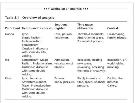
According to M. and J. Schwalbach in Silk-Screen
Printing for Artists and Craftsmen (1980, Dover), the
first stencil prints were discovered in the Caves of
Tibiran, Gargas and Maltravieso in the Pyrenees,
Estremadura province in Spain. There we can find 200
prints of hands. These prints, in red ochre and black
manganese, represent the first examples of transfer
prints. Their meaning now can be only a guess, but
close study clearly shows them to be an aesthetic
expression. More exciting than this, the positive prints
were made by pressing the hand covered with color
to the wall of the cave and the negative ones, which
has the strange effect of the halo around them,
15
apparently were made by spraying color over and
around the hand, most probably directly from the
mouth or through the hollow bone. The softened
edge, negative images are ancestors of the screen
stencil of today, reaching around 30 000 years BC.
However, in the Widewalls web magazine article
Screen Printing - The Complete Story Angie Kordic
stresses that the earliest story of stencil production
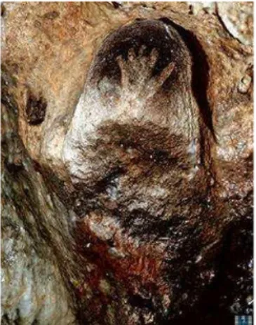
originates from the Fiji islands in Polynesia and its
inhabitants: they practiced the cutting of banana
leaves and the pushing of ink through it for the
production of a specially printed cloth called tapa,
which islanders decorated with vegetable dyes and
nature inspired tribal ornaments.
Further development of Silk Screen Printing evolved
in the Far East - Between 500 and 1000 A. D. The rise
of Buddhism, which boosted the mass reproduction of
Buddha's image, encouraged the art of stencil making.
In the caves of Tun-Huang in western China,
excavated from the sandstone hills and extending for
half a mile, there are images of Buddha ranging from
a few inches high to 21 meters. Some of the unfinished
images show the typical pale grey lines, characteristic
of the perforations of stencils which were used to
duplicate the pattern, writes John Dawson in The
Complete guide to prints and print making techniques
and materials .
J. I. Biegeleisen in The Complete Book of Silk Screen Printing Production states that open stencils cut from
sheet of impervious material were often used in Japan
to decorate ceremonial kimonos, walls, ceilings and
Figure 2 Tapa Cloth. Polynesia
Figure 3 Buddha preaching the
16
pottery, the colors were being brushed across the
open areas to produce a facsimile print. Before
silk-screen, Japanese artists used a human-hair-crossed
net as a medium. The principle of using an invisible net
of hair as a screen to support the stencil images (in
order to eliminate in final print visible ties connecting
open parts of the stencil) was the forerunner of todays
screen stencil.
Coming back to the article of Widewalls web
magazine, the style of screen printing as we come to
know it today, originates far back to the era of Song
Dynasty Art in China, around 960 1279 CE. A truly
remarkable level of expression and mastery was
reached by the Chinese artists for the creation of
special masks, also known as matrixes, what we today
understand as a modern screen printing frame. The
making of such masks was an extremely complex
process. The small pieces, which created the mask,
were glued together with human hair allowing perfect
ink passage. Adopted as such and re-defined in Japan,
it arrived in Europe around 1907. It was due to the
success of the Japanese textiles shown at World Fairs
that the craftsmen in England and France began to
use screens made of silk with stencils from
impregnated paper for printing on fabric.
In Europe, during the Middle Ages, simple, crude
stencils were used for hand colored playing cards and
religious pictures. The simple technique of
wood-blocks were used by applying the color in black and
then the printer applied colors by using very simple,
crude stencils. The Crusaders applied a stencil for
Figure 4 Peacock feathers. Ise Katagami Stencil
17
printing their symbol, the Red Cross, on their white
uniforms. Their solution was to use pitch or ships tar
to paint out the resist area around a cruciform on a fine
hair cloth. Their white tabards, or anything else on
which they wanted to print a cross, were placed under
this screen and red paint was stamped through the
open mesh areas with a coarse brush, states M. and J.
A. Schwalbachs in their book Silk-Screen Printing for
Artists and Craftsmen .
Maggie Jennings in Fine Art Screen-Printing
suggests that the screen-printing technique arrived in
Europe in the late 18th Century and mostly was used
for fabric patterns. Silk was stretched on the wooden
frame and the ink was forced through the silk with a
stiff brush. The squeegee (a rubber-blade used
nowadays to force the ink through the mesh) was
introduced in the early 19th century.
According to Print Liberation: Screen Printing , the Silk
Screen Printing Process later evolved in England,
where technique of using a bristle brush to force color
through the mesh of a stencil was a feature of the first
silkscreen patent granted in 1907 to Samuel Simon of
Manchester who employed stopping out liquid to
paint the negative image onto a mesh of bolting silk,
stretched on a wooden frame. The rubber bladed
squeegee, which spreads the paint more evenly, had
not yet been developed. Silk-Screen Printing for
Artists and Craftsmen (M. and J. A. Schwalbachs)
states, that William Morris is a great example of a
designer who used the process extensively in his
famous interior decorations. Early in the 20th century,
18
stenciling was extremely popular in France and
England.
In the The Complete Book of Silk Screen Printing
Production J. I. Biegeleisen discusses that the
development and exploitation of the screen process
became popular in the United States at the turn of the
century and there was a lot of movement on the West
Coast of America during the early 1900s. During the
great Depression era, the Selectasine method, for
producing multicolor work by progressively painting
out the open areas on a single screen, was invented
by John Pilsworth from San Francisco who was
granted the first patent. The use of the process spread
rapidly from California to the East.
In the United States during the WW1 the
silk-screening came into widespread use for the
production of banners, flags, pennants and bunting.
Also, the first photo-stencil was produced during this
period. From then the silkscreen may be used for such
industrial purposes as textile manufacture. The fast
growth of the American chain stores and the need of
standardized house style for fascia boards, tickets,
show-cards and advertising also helped to transform
the industry. Many of the sign-writers, who first
obviously were suspicious about the process, became
its new enthusiasts and specialists, stresses M. and A.
Schwalbach in Silk-Screen Printing for Artists and
Craftsmen .
Following J. Dawson in The Complete guide to prints and print making techniques and materials
everything changed with the invention made by Louis
Figure 8 Samuel Simon of Manchester
Figure 9 John C. Patrick Pilsworth
19
F. d Autremont of Dayton. Ohio, of a knife-cut
stencil-film tissue. This eliminated the characteristic raw edge
of the print. The patent was granted to an associate -
A. S. Danemon under the name Profilm, which later
was set aside by Nufilm, created by Joe Ulano, an
owner of one print shop in New York. Nufilm was faster
to use, adhered well to silk and easier to cut. This
simple improvement of the hand cut stencil
immediately attracted great interest and paint
manufacturers, examining the potential market for
their products, quickly produced ranges of specially
formulating colors eminently suitable for screen
process printing. After that, it was finally possible to
use the automatic presses commercially for the first
time and the industry boomed, developing into the
versatile and efficient form we know today - capable
of printing on any surface and with production speeds
of 3000 impressions per hour.
It was in the 1950s, however, that the medium was
acclaimed by artists as a valid means of
communication. Pop Art, focused on the imagery of
urban culture, saw the silkscreen as a well-suited
medium to the reproduction of its subject matter. The
bold, simplistic shapes, bright flat colors as well as the
impersonal quality of the technique were widely used
by such artists as Andy Warhol and Roy Lichtenstein.
Indeed, the ability of screen process printing to
reproduce the powerful, instant image made it one of
the most popular printing techniques in the 2nd half of
the 20th century, states A Griffiths in Prints and
Figure 11 I Love Liberty (1982) Roy Lichtenstein
20
printmaking: an introduction to the history and
techniques .
According to the Widewalls web magazine article,
for much of the 20th-century, this printing method was
kept confidential and protected as a trade secret . As
an artistic form, it appeared for the first time in the
USA, where since the 1930 s screen printed images
were shown at exhibitions and received much
appreciation in the art market. It was during this time
that the term serigraphy was coined to differentiate
the artistic application of silkscreen printing from the
industrial use.
With the emergence of Pop Art during the 1960 s and
its love for popular culture along with its iconic figures
the true face of screen printing was born. The
traditional application of the technique for the
production of printed images in service of decoration
and advertisements received new vocabulary and
produced a new idea of the aesthetic in the hands of
Andy Warhol. Using the method to its fullest, playing
along with the idea of appropriation and the isolation
from the traditional hands-on approach by the artists,
Warhol produced some of the most striking images.
Realizing the full potential of the medium the artist
used and re-used images, experimenting with
repetition art and some of the most daring choices of
color not to mention subject matter, argues Anthony
Griffiths in Prints and Printmaking: An Introduction to
the History and Techniques .
According to J. Dawson in The Complete guide to prints and print making techniques and materials
Figure 13 Portrait of Andy Warhol
21
Warhol s, interest in the iconic film and music stars for
some is considered to represent the superficiality and
adoration of the glittering surface of the American
popular culture of the day, but many considered his
choice of subject matter to stand for deeper issues
and anxieties surrounding death. The famous
silkscreen print of Marilyn Monroe, one of the firsts for
Warhol, was produced slightly after the actress s
death. Alongside Warhol major artists such as Roy
Lichtenstein, Robert Rauschenberg, Jim Dine, Richard
Hamilton, and the famous sister Mary Corita Kent,
produced striking images combining words, letters,
images from the newspaper and photographs, using
the dots and pixels that were until then, part of the
newspaper and advertising world, as a fresh idea of
the new artistic marks.
2.1.2 Terminology
Following Ian Chilvers and John Glaves-Smith in the Dictionary of Modern and
Contemporary Art the term Serigraphy, a synonym for fine-art Screen-printing,
came from the Latin word sēricum (silk) and the Greek graphein (to write or
draw). Mostly the word Serigraphy is used to distinguish artistic print-making
from industrial screen-printing. In Europe, serigraphy was mostly used after the
Second World War while some of the famous European artists, such as Henri
Matisse relied on the stencil technique, known as pochoir for the creation of their
printed editions.
Screen-printing itself has never been an exclusively industrial one. In the 1930s
screen-printing became popular among American artists. According to M. and J.
Schwalbach in Silk-Screen Printing for Artists and Craftsmen one of the reasons
22
wanted to buy original, but not expensive prints. Credit for the development of
screen-printing as a medium of art belongs to Anthony Velonis and Carl
Zigrosser. During the Great Depression the WPA Federal Arts Project was born.
A separate silk-screen unit of this project was set up in New York under
supervision of Mr. Anthony Velonis. Early artist working with serigraphy were:
Guy McCoy, Hyman Warsager, Edward Landon, Elisabeth Olds, Harry Gotlieb,
Mervin Jules, Ruth Gikow and Harry Sternberg. In 1938 the first one artist
exhibition was held at the Contemporary Art Gallery in New York with the works
of Guy McCoy. However, the recognition for this new medium used in art, must
go to Carl Zigrosser, curator of prints at the Museum of Fine Arts of Philadelphia
(USA), who made it appealing for the artists, the public and most importantly
for the art collectors, art galleries and museums, by coining the term
serigraphy . That s when the term and the process itself were officially accepted
by screen-print artists and the public. Moreover, by then the term silk-screen
printing had been abandoned by the industry for the term screen-process
printing , due to the fact that silk is not always used as a medium, which is being
used until nowadays.
2.1.3 Equipment
The Screen-Printing Unit
The basic screen-printing unit consists of an open
frame with a usually synthetic fabric mesh stretched
firmly on one face, a flat base, the hinging system
joining them and a squeegee which forces the color
through the clear areas of the mesh onto the paper
held in register on the baseboard, states John Dawson
in The Complete guide to prints and print making techniques and materials .
According to Harry Summer in the Handbook of the
screen-printing process , the baseboard can be a
23
drawing board, a piece of plywood or for larger work,
the top of the table. In all cases the baseboard has to
be at least several centimeters bigger than the frame.
The Frame
Frames can be made from wood, marine ply, light
tubular steel or aluminium. Old picture frames
stretched with mesh can be converted too. A wooden
frame is the most straightforward type to make, but
the aluminium one is the most solid and long lasting. If
using the wooden frame, it would be better if the
wood is knot-free, stresses John Dawson.
The Ink
The range of inks, continues Dawson, is enormous and
includes metallic inks, matt inks, gloss inks, water inks,
plastic inks or cellulose based inks, all of which can be
applied to a great number of surfaces, as varied as
glass, paper and copper. Another piece of basic
equipment is a pallet knife, used for mixing and
spreading inks and cleaning off the screen any excess
which might be left over when printing is finished.The
amount of ink which is deposited onto the print
depends on the thickness of the mesh and the type of
material used, so an appropriate fabric should be
chosen with care and on purpose.
Albert Kosloff in Elementary Silk Screen Printing
discusses the inks. There are different kinds of silk
screen process inks, all destined to a different kind of
job and it s better not to mix them. A good ink is the
Figure 17 Screen-Printing Frame
24
one which does not clog the screen, does not rub or
chip off the material upon which is being printed, one
which goes through the finest cloth and is easily
applied, one which prints a clean and sharp edge and
one which dries quickly (but not too quickly).
Inks may be mixed by a printmaker as well. Maggie
Jennings claims that (2015, p.65):
Printing medium and acrylic paint mixed about 50:50 make up
the printing ink. You can use any make of acrylic paint it all
works. The better quality of paint you have, the better the color
quality.
The Fabric
Silk was the original fabric used in the silkscreen
process printing and Silk cloth and taffeta weave silk
are still in use because of their durability and ability to
handle heavy printing, their good strength and the
uniformity of the mesh.
All fabrics used in screen process printing are
classified by a number of threads per linear
centimeter/inch and a code which relates to the
weight of the fabric. Various other fabrics were
invented with time and the wide range includes nylon,
terylene, polyester, metal-polyester, copper and
stainless steel, states H. Summer in the Handbook of
the screen-printing process .
Organdie is the most economic mesh to use, but it has
a disadvantage of being unstable. It tends to shrink
when wet and then slacken off as it dries out. Good
Figure 19 Screen-printing board covered with old ink
25
organdie or cotton organdie with a mesh count of 90
threads per inch can be used.
Synthetic Meshes are differentiated by the letters S, M,
T and HD. The S is widely used and is a thin thread weave. M is medium weave and T gauze is a twilled
weave used if the screen is to be exposed to strain.
The HD gauze is heavy duty, writes Dawson in The
Complete guide to prints and print making techniques
and materials .
Nylon is produced in finer grades than silk. It consists
of a smooth monofilament thread with a taffeta weave
and it is resistant to attack by chemical solvents and
acids. It is elastic as well as extensible and stretching
should be carried out in two stages. It has a
disadvantage of being slightly unstable. This limits its
use for precision work.
Polyester is slightly less resistant to chemical agents
but less extensible than nylon. It has the added
advantage of being unaffected by moisture and
comes in a wide range of mesh sizes. Its strength and
stability make it popular for high precision work,
follows up Dawson.
The Squeegee
J. I. Biegeleisen in The Complete Book of Silk Screen
Printing Production extensively discusses squeegees.
The squeegee used in the silk-screen process
consists of a heavy strip of rubber bolted between two
pieces of wood or metal. The rubber comes in various
thicknesses in a numerous compositions of both
Figure 21 Still frame from the video explaining the process of fabric replacement
26
natural and synthetic rubber. There are one-hand
squeegees and two-hand squeegees, the second one
is more common. The flexibility of rubber is measured
in terms of durometers . 60 durometer rubber is used
for general work. Softer rubber (40 or 50 durometers)
is usually used to achieve a heavier deposit for textile
printing and uneven surfaces. Hard rubber (70 or 80
durometers) is basically used in machine screen
printing to achieve an extra high quality edge.
2.1.4 Screen-Printing Methods
John Ross, Claire Romano and Tim Ross discuss the block-out methods in
Complete Printmaker (2009, p.174). According to authors:
Whether the stencil is made of paper, lacquer film, photo emulsion or glue is essentially a
block-out method.
John Dawson describes the term in Prints and Printmaking (1988, p. 133):
Screen process printing is a stencil process and is based on the principle of blocking out areas
of mesh in order to prevent color passing through while leaving clear open areas which do allow
ink through. There are two basic types of stencil - direct and indirect. Direct stencils are made
on the mesh, while indirect stencils are processed separately and adhered to the mesh at a later
stage. A third type uses a combination of direct and indirect stencil application methods.
Direct Method
According to John Dawson, the simplest direct method is to use a blocking out
substance on the mesh. The desired design is traced lightly onto the screen
mesh. The negative design is then blocked with a liquid filler (ex. Lepages glue,
P.V.A., lacquer, cellulose, photo emulsion etc.).It can be applied by brush, scraper
or finger, depending on the intended textural quality.
This leaves the open design image ready for printing. It s important to be sure