The etiology of autism is not well understood due to the heterogeneity and complexity of the disorder. The aim of this thesis was to determine a method to study different data types measured from the same individuals in order to gain a more holistic view of the genetic phenomena occurring in autism. This thesis was created for the GEMMA (Genome, Environment, Microbiome and Metagenome in Autism) project in the Computational Biology Group at the University of Tampere.
The number of people diagnosed with autism has more than doubled in the past decade.
Autism
- Comorbidities
- Treatment and diagnostics
- Epidemiology
- Etiology
The geographic fluctuation in the prevalence of ASD has led to studies to identify environmental factors that may contribute to its manifestation (Hertz-Picciotto et al. 2018). A number of genomic structural variants have also been identified among ASD individuals and twin studies have linked both heredity and the presence of shared environmental factors as contributing to the development of the disorder (Tick et al. 2016a). The relative risk for a child to develop ASD is estimated to be 8.4 times if a sibling has already been diagnosed (Hansen et al. 2019).
In this activated state, the microglia do not administer their normal role in the maintenance and pruning of the neurons, and the situation, when prolonged, probably has adverse effects on the neuronal development (Matta et al. 2019).
Genomics
Copy number variation
To distinguish between the pathogenic and benign copy number alterations, the genomic structure of cases and healthy controls, which often consist of immediate relatives, is compared (Levy et al. In contrast to copy number alteration, copy number aberration is a term for the amplifications in cans). - cer tissue, where the number of copies may be significantly more than doubled. There remains some ambiguity about the nomenclature, but in general copy number variation refers to the germline events and change/deviation from the changes that occur during the individual's lifetime in the somatic cells.
Methylation
Neuronal methylation of CpH has been shown to occur only after birth and its levels increase over time, unlike those of CpG methylation (Jang et al. 2017). The accumulation of CpH methylation is particularly dramatic in the frontal cortex during later life (Jang et al. 2017). Differential methylation of CpHs embedded within gene bodies has been shown to bear strong associations with differential gene expression (Ciernia and LaSalle 2016).
Interestingly, methylation in intergenic regions and gene bodies appears to have the greatest effect on low-expressed genes and appears to play a role in fine-tuning gene expression (Rizzardi and Hickey 2019).
Methods used in this study
- Microarrays
- Microarray preprocessing
- Statistical analysis
- Data integration
More detailed explanations and the derivations of the formulas can be found in the references listed for each of the methods. The concept is based on the idea of quantile-quantile plots, where the plot is a straight diagonal if the distribution of the two data vectors is the same (Bolstad et al. 2003). When adjusting location and scale (L/S), the model for location (mean) and scale (variance) of the batches can be adjusted by standardizing their means and variances (W. E. Johnson et al. 2006).
In addition, there is an increased risk of both false positive and false negative calls in these genomic neighborhoods due to the greater asymmetry of the probe signal (Leo et al. 2012). The significance of the coefficients β in the linear model can be evaluated with at-test. The eigenvalues are ordered in descending order and the largest eigenvalue corresponds to the vector indicating the direction of the largest variance in the data.
Here T and U contain the constituent vectors and P and Q have the charges of the covariance matrix C of X and Y, respectively (De Bie et al. 2005). So with a larger lambda, many of the coefficients will be set to zero and can be discarded. This assumes that most of the biological variation can be obtained from the component scores t1(q).
This includes a set of training data with known class labels for model construction. Prediction accuracy can be evaluated based on the proportion of correct predictions among all predictions. The sensitivity and specificity of a model can be plotted against each other in an ROC curve, and the area under the curve (AUC) is often used as a measure of performance.
To further explore the biological function of the obtained list of functions from the different data measurements, their enrichment in known biological pathways can be evaluated.
Overview of the data
Expression data
Preprocessing expression array
The data were background-corrected with normal-exponential convolution model using a Bayesian model as described in section 2.3.2. Negative controls were derived from the detection p-value assigned to each probe (Ritchie, J. Silver et al. 2007). Detection p-values measure how likely it is that the probe signal differs from the background, and a large value indicates no significant difference.
Quality control included removing probes that had a high detection p-value (>0.05) in more than half of the samples. The data were then corrected for batch using ComBat using Bayesian modeling as described in section 2.3.2. Correction was made for the batches in which the samples were handled and mailed to the processing laboratory, as well as the serial processing of batches.
Probe coordinates were updated to match those in the latest genome (hg38) from the original (hg18) using the illumina nuID system, which transforms the probe sequence into a unique identifier via a lossless compression that is reversible , so that the identifier can at any time be converted back to the sequence (Du et al. 2007). Finally, the data were filtered to include only shared samples between the methylation and copy number datasets.
Statistical tests for differential expression
Methylation data
Preprocessing methylation array
Delivery group indicating the groups in which the samples were submitted to the research laboratory for processing. The coordinates of the probes were updated to the latest genome (hg38) using a chain file from the University of California Santa Cruz (UCSC) genome browser (https://genome.ucsc.edu 18.3.2020).
Statistical tests for differentially methylated genes
Differentially methylated regions
Copy number data
Copy number differences between the groups
Data integration
The deviations were visualized in a histogram, and the thresholds for the proportion of genes to include were decided on this. The conclusion was to reach the top 25% most variable genes resulting in 3032 genes in the methylation data and 2375 in the expression data. Copy number data existed as a list of segments for each sample and these regions differed for each of the samples.
These windows were set as the rows of the matrix and the samples as columns, similar to the setup in the expression and methylation data. The values of the sample segments overlapping a window by more than 5 kb were added to the corresponding row. In case of multiple segments overlapping a range of rows, the weighted average of the log2 values of these segments was assigned.
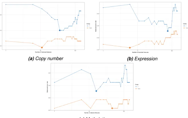
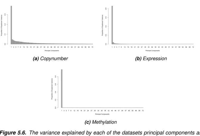
The lengths of the corresponding overlapping segments were used as weights to calculate the mean. Metadimensional integration of the data was done using R package mixOmics, which uses the sGCCA algorithm (2.14) for feature selection. First, the number of components to be used for the model was chosen by performing PCA on the individual datasets and the variance explained by each principal component was visualized to facilitate the decision.
The samples were divided into 10 subsets and in an iterative process each of these was used as validation data once and the model constructed with the rest. The copy number regions were annotated and the corresponding genes added to the list of genes selected from the expression and methylation blocks.
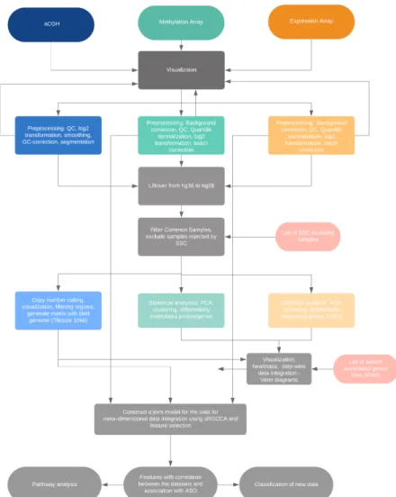
Overview of the workflow
Expression dataset
Methylation dataset
Copy number data
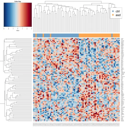
Heatmaps visualizing the genes closest to being DE in siblings (a) and unrelated samples (b) show that siblings do not form distinct clusters. The number of visualized genes was based on obtaining the clearest result with hierarchical clustering using average linkage with Pearson correlation as the distance function. Heatmaps of the closest DM genes from both the siblings and the unrelated samples show that there is some difference between the groups.
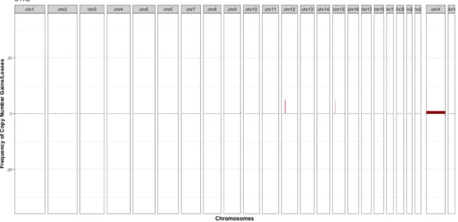
The number of genes to be visualized was based on the clearest result with hierarchical clustering using mean linkage and Pearson correlation. Frequency plots of the healthy siblings (a) and probands (b) from the paired data show some recurrent gains (depicted in red) in chromosomes 12 and 15. The loci in chromosome 15 are well established as risk loci for ASD, and the SFARI database (https ://gene.sfari.org/database/cnv/15q11.2, read had 83 articles associating it with ASD.
Step-wise data integration
Metadimensional data integration
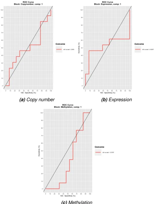
Overlap analysis of the most variable genes of expression (a, b) and methylation (c, d) data with the repetitive copy number regions between the aSD probands (a, c) and siblings (b, d) shows that not many overlaps occurred did not in these regions. The variance explained by each of the data sets' principal components as a histogram shows that only the first component is informative in the methylation (b) and expression (c) data sets. The ROC curves show specificity (x-axis) and sensitivity (y-axis) for first components of the three datasets in the model.
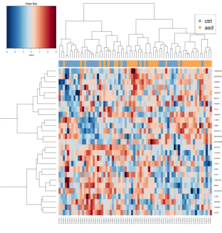
Heat map of the most distinctive features selected for the model by sGCCA shows that the samples (left) are not clustered into separate groups. To take the data integration further, path enrichment analysis can reveal the functionality of the features identified in the sGGCA algorithm. Surrounding the circle is the relative expression of the selected characteristics between the sample groups (ASD shown in orange and CTRL in blue).
This information may include the severity of the ASD and details of possible comorbidities. Due to the limited coverage of the expression and methylation datasets, some relevant information may have been missed. Indeed, the gene set enrichment analysis performed on the expression dataset (Supplementary Table 3) involved many immune-related pathways, and such were also present in the pathway enrichment analysis of the integrated data.
The process of constructing a model with the sGCCA algorithm involves choosing the number of features to be extracted from each data set, and this can greatly affect the performance of the model. The classification accuracy of the model was not good, and this could be due to the small differences observed between the sample groups, but also the small number of validation data. Small set of top results from the differential expression analysis shows that there were no significant genes after adjusting for FDR.
A small set of the top results of the differential methylation analysis shows that there were no significant genes after correction for FDR.
Workflow
Heatmaps of nearest to DE genes
Heatmaps of nearest to DM genes
Copy number frequencies
Venn diagrams of selected genes from methylation and expression arrays 40
Histogram of the explained variance of each principal component
Variable selection using cross-validation
ROC curves for integration model
Heatmap of the selected features
Feature correlation
Pathway analysis
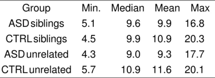
Age distribution of the subjects
Confusion matrix from predictions
Supplementary table 1
Supplementary table 2
Supplementary table 3
Supplementary table 4