HAL Id: tel-00969170
https://tel.archives-ouvertes.fr/tel-00969170
Submitted on 2 Apr 2014
HAL is a multi-disciplinary open access archive for the deposit and dissemination of sci- entific research documents, whether they are pub- lished or not. The documents may come from teaching and research institutions in France or abroad, or from public or private research centers.
L’archive ouverte pluridisciplinaire HAL, est destinée au dépôt et à la diffusion de documents scientifiques de niveau recherche, publiés ou non, émanant des établissements d’enseignement et de recherche français ou étrangers, des laboratoires publics ou privés.
Dashboards
Micheline Elias
To cite this version:
Micheline Elias. Enhancing User Interaction with Business Intelligence Dashboards. Other. Ecole Centrale Paris, 2012. English. �NNT : 2012ECAP0039�. �tel-00969170�
Enhancing User Interaction with Business Intelligence Dashboards
by
Micheline Elias
A thesis submitted in fulfilment of the requirements for the degree of
Doctor of Philosophy
Ecole Centrale Paris,MAS Laboratory SAP Research, Business Intelligence Practice
October 2012
Committee in charge:
Supervisors : Marie-Aude AUFAURE Professor at Ecole Centrale Paris
Anastasia BEZERIANOS Assistant Professor at Paris-Sud 11 University President : Jean-Daniel FEKETE Research director at INRIA Saclay
Reviewers : Mountaz HASCOËT Assistant Professor at Université Montpellier II
Margit POHL Associate Professor at Vienna University of Technology
All rights reserved.
Enhancing User Interaction with Business Intelligence Dashboards by Micheline Elias
Doctor of Philosophy Ecole Centrale Paris
MAS Laboratory
The goal of this thesis is to improve visualization dashboards in order to help decision making and Business Intelligence (BI) analysis, and make them accessible to a larger user audience. We identify current trends and use practices of visualization dashboards in the BI domain, and following a user-cantered design approach we provide enhancements and solutions. More specifically we address the following challenges: making dashboard con- struction and use accessible to visualization novices, enhancing dashboards with advanced annotation capabilities to help BI analysts in the analysis process, and add storytelling functionality to dashboards to help the communication between analysts and decision makers. Our user-centered approach consists of gathering user requirements (through background search, in-depth interviews or prototyping sessions with BI experts), iterative prototype development, and evaluation of our prototypes with representative users.
First, our work reports gathered insights regarding novice user practices on Exploration Views (EV), a system that allows novice visualization users to easily build and customize BI information dashboards, but also provides functionality needed by experts. We eval- uated EV with both expert and novice visualization users, and found differences in how experts and novice users interact with the interface. Based on those observations we pro- vide new guidelines that augment previous work on designing for visualization novices, in the context of interactive visualization systems in the form of dashboards.
BI analysts using dashboards (experts or novices) need support in record-keeping of their analysis, their data discoveries and gathered insights. This support is lacking in most dashboard visualization systems. We conducted in-depth interviews with BI experts that led to new annotation needs for multi-chart visualization systems (such as dashboards), on which we based the design of a dashboard prototype that supports data and context aware annotations, shared across visualizations and datasets. We focused particularly on novel annotation aspects, such as multi-target annotations, annotation transparency across charts, and annotations that can be shared among different data-sources and BI
annotations, notably issues arising when the annotation’s ”context” changes (e.g. anno- tated data are deleted or changed). Our prototype was evaluated with BI experts that were able to easily perform several tasks that they deemed important in their work.
To increase the value of an analysis, recorded insights and knowledge need to be orga- nized and communicated to others, and made available for future analysts to learn from.
This communication step is very important, as often the analyst of data and the decision maker are two different people. To achieve this we need an easy insight organization and sharing mechanism to facilitate the transfer of knowledge, experiences, and stories, to de- cision makers and other analysts. We interviewed BI analysis experts and collected new requirements related to BI visual storytelling. Based on these requirements we designed and implemented a storytelling prototype that is integrated in a dashboard analysis tool, and allows easy transition from analysis to story creation and sharing. Our system was identified by experts as having great potential for training other analysts. Moreover, it can help BI analysis authors organize and communicate their findings faster to decision mak- ers, and they can reach a broader audience since the results of a data analysis presented in the storytelling tool can be read with little to no training.
The main contributions of this work are:
(1)Report how novice users interact with the EV system and the differences in how novice and expert users react to EV dashboard system that targets both.
(2) Provide new design guidelines for practitioners building dashboard applications, on the needs of novice visualization users.
(3)Define a new set of requirements for annotations, targeting dashboards and other co- ordinated view visualization systems.
(4)The design and evaluation of a prototype dashboard that supports context-aware an- notations.
(5) Identify and provide solutions to challenges when using context aware annotations, such as issues arising when the ”context” changes (e.g. annotated data are deleted).
(6)Based on in-depth interviews with expert BI analysts, we derive and provide a better understanding of the actual practices in creating BI stories, and extract new requirements for enhancing BI visual analysis tools with storytelling capabilities.
(7) Following these requirements and using a user centered design approach, we design and implement a prototype storytelling tool that is fully incorporated in an existing visual analysis dashboard. We report on feedback from BI experts creating a story on the use- fulness of the prototype as a communication and teaching medium, and from BI novices reading a story on its effectiveness for story communication.
Keywords: Visualization Dashboard; Business Intelligence; Annotation; Sto- rytelling; User Experience.
Amélioration de l’interaction des utilisateurs avec des dashboards de Business Intelligence
par MichelineElias Docteur de Philisophy
Ecole Centrale Paris
Laboratoire MAS (Mathématiques Appliquées aux Systèmes)
L’objectif de cette thèse est d’améliorer les tableaux de bord (dashboard) de visualisation afin d’aider à la prise de décision et d’analyse BI, et les rendre accessibles à un public plus large. Nous identifions les tendances actuelles et pratiques d’utilisation des dashboards de visualisation dans le domaine BI, et après une approche de conception centreé, nous proposons des améliorations et des solutions. Plus précisément, nous relevons les défis suiv- ants: faire la construction du dashboard et d’utiliser accessible aux novices de visualisation, l’amélioration des dashboards avec des capacités d’annotation pour aider les analystes BI dans le processus d’analyse, et ajouter des fonctionnalités du storytelling pour aider à la communication entre les analystes et les décideurs. Notre approche centrée-utilisateur con- siste à recueillir les besoins des utilisateurs (grâce à la recherche de fond, des entrevues en profondeur ou des séances de prototypage avec des experts BI), le développement itératif des prototypes, et l’évaluation des prototypes issus avec des utilisateurs représentatifs.
Dans la première étape, notre travail rapporte idées recueillies au sujet des pratiques des utilisateurs novices sur Exploation Views (EV), un système qui permet aux utilisateurs novices de visualisation à créer facilement des dashboards et les personnaliser, mais fournit également des fonctionnalités nécessaires aux les experts. Nous avons évalué EV à la fois d’experts et des utilisateurs novices de visualisation, et constaté des différences dans la fac.on dont les experts et les utilisateurs novices interagissent avec l’interface. En se basant sur ces observations nous proposons de nouvelles lignes directrices, qui augmentent les travaux antérieurs, sur la conception pour les novices, dans le contexte des systèmes de visualisation interactifs sous forme de dashboard.
Les analystes BI utilisant des dashboards (experts ou novices) ont besoin d’aide dans la tenue des dossiers de leur analyse, de leurs découvertes et des idées recueillies des données.
Ce soutien fait défaut dans la plupart des systèmes de visualisation de dashboard. Nous avons effectué des entretiens approfondis avec des experts en analyse BI, qui ont révélé de
que des dashboard), sur lesquels nous avons basé la conception d’un prototype de tableau de bord qui gère les données et les annotations contextuels, qui peuvent être partagées à travers visualisations et des ensembles duel données. Nous nous sommes concentrés en particulier sur les aspects d’annotation innovantes, tels que les annotations multi-cibles, la transparence des annotations à travers des graphiques, ainsi que les annotations qui peuvent être partagées entre les différentes sources de données et des applications de BI.
Nous avons identifié et fourni des solutions aux problèmes en utilisant les annotations contextuels, notamment les questions qui se posent lorsque le contexte de l’annotation change (par exemple les données annotées sont supprimés ou modifiés). Notre prototype a été évaluée avec des experts, utilisateurs BI, qui ont réussi d’effectuer facilement plusieurs tâches qu’ils estiment importants dans leur travail.
Les analysis BI (experts ou novices) ont besoin d’enregistrer leurs idées et leurs connais- sances les organiser et communiquer aux autres, et les mis à disposition pour les futurs analystes. Cette étape de communication est très important, comme souvent l’analyste de données et le décideur sont deux personnes différentes. Pour atteindre cet objectif nous avons besoin d’une mécanisme de partage facile afin de faciliter le transfert des connais- sances, des expériences et des histoires avec les décideurs et d’autres analystes. Nous avons interviewé des experts en analyse BI et recueillies de nouvelles exigences liées à la narration visuelle BI. Sur la base de ces exigences, nous avons conc.u et mis en œuvre un prototype de narration (storytelling) qui est intégré dans un dashboard, et permet une transition facile entre l’analyse et la création d’une histoire visuel et son partage. Notre système a été identifié par les experts comme ayant un grand potentiel pour la formation d’autres analystes. En outre, il peut aider les auteurs à l’analyse BI d’organiser et de communiquer leurs conclusions rapidement aux décideurs, et les analyse peuvent atteindre un public plus large, puisque les résultats d’une analyse présenté dans l’outil de narration peut être lu avec peu ou pas de formation.
Les contributions principales de ce travail sont:
(1) Rapport de la fac.on dont les utilisateurs novices interagir avec le système EV, et les différences entre la fac.on dont les utilisateurs novices et les experts réagissent au système de dashboard EV.
(2) Fournir des lignes directrices de conception des applications de dashboad, liées aux besoins des utilisateurs novices de visualisation.
(3) Définir des exigences pour les annotations, sur les dashboard et autres systèmes de visualisation de vues coordonnées .
(4)La conception et l’évaluation d’un dashboard qui supporte des annotations contextuels.
textuels, comme les questions qui se posent lorsque le contexte change (par exemple don- nées annotées sont supprimées ou modifiées).
(6) Basé sur des entretiens avec des experts analystes BI, nous dérivons une meilleure compréhension des pratiques réelles dans la création d’histoires BI, et nous extrairons de nouvelles exigences pour améliorer les outils BI d’analyse visuelle avec les capacités de narration visuelle.
(7) En se base sur ces exigences et en utilisant une approche de conception centrée util- isateur, nous concevons et mettons en œuvre un outil de narration qui est entièrement incorporé dans un dashboard, pour transmettre fluidement entre l’analyse et la création d’une narration. Nous rapportons les commentaires des experts BI qui créent une narra- tion, sur l’utilité du prototype comme une moyenne de communication et d’enseignement.
Nous rapportons aussi sur l’utilisation du prototype par de novices BI qui lisent une nar- ration fait par notre prototype.
Dr.Emad ELIAS
vii
The acknowledgements and the people to thank go here, don’t forget to include your project advisor. . .
viii
Papers
1. Exploration Views: understanding dashboard creation & customization for vi- sualization novices. Micheline Elias & Anastasia Bezerianos. In Proceedings of INTERACT 2011, the 13th IFIP TC13 Conference on Human-Computer In- teraction, Volume Part IV, pages 274-291. Lisbon, Portugal, 5-9 September 2011.
2. Annotating BI Visualization Dashboards: Needs & Challenges. Micheline Elias
& Anastasia Bezerianos. In Proceedings of CHI 2012, the ACM SIGCHI Con- ference on Human Factors in Computing Systems, pages 1641-1650. Austin, Texas, USA, 5-10 May 2012.
3. Storytelling in Visual Analytics tools for Business Intelligence. Micheline Elias, Marie-Aude Aufaure & Anastasia Bezerianos. Submitted to the 16th ACM Conference on Computer Supported Cooperative Work and Social Computing (CSCW 2013) will be held February 23-27 in San Antonio, Texas, USA.
Patents
4. Data tracking visualization. Micheline Elias, Alexis Naibo, Christophe Favart
& Anastasia Bezerianos. 2010.
5. Context aware annotations in BI documents. Micheline Elias & Anastasia Bez- erianos. 2011.
6. Creating business storytelling from BI exploration/annotation systems. Miche- line Elias 2012.
ix
Abstract ii
French Abstract iv
Acknowledgements viii
Publications from this thesis ix
List of Figures xiv
List of Tables xvii
1 Introduction 1
1.1 Abstract . . . 1
1.2 Research context . . . 2
1.2.1 Business Intelligence Systems . . . 3
1.2.2 Data Visualization and Visual Analytics . . . 5
1.2.3 Dashboards . . . 7
1.2.4 Methodology . . . 8
1.3 Thesis Focus . . . 9
1.4 Thesis Contributions . . . 11
1.5 Thesis Outline . . . 11
1.6 Summary . . . 13
2 Related Work 14 2.1 Abstract . . . 14
2.2 Introduction . . . 15
2.3 Dashboards . . . 15
2.3.1 Dashboards creation . . . 15
2.3.2 Visualization creation . . . 16
2.3.3 Visualization for novices . . . 16
2.3.4 Novices in visualization . . . 18
2.4 Annotations . . . 20
2.4.1 Annotation of Textual data . . . 20
2.4.2 Annotation of Image Data . . . 21 x
2.4.3 Annotation of Visualizations . . . 22
2.4.4 Context-Aware Annotations in Visualizations . . . 22
2.5 Storytelling . . . 24
2.5.1 Stories in Business . . . 24
2.5.2 Stories in sense making . . . 25
2.5.3 Stories in data visualization . . . 25
2.6 Summary . . . 28
3 Understanding Dashboard Creation and Customization for Visualization Novices 29 3.1 Abstract . . . 29
3.2 Introduction . . . 30
3.3 Exploration Views (EV) Prototype . . . 31
3.3.1 Easy Creation. . . 32
3.3.2 Ease of Customization . . . 35
3.3.3 Supporting Visual Analytics Process . . . 36
3.4 Exploration Views Technical Platform . . . 40
3.5 Study Design . . . 41
3.5.1 Participants and Pilot Studies . . . 41
3.5.2 Procedure and Apparatus . . . 42
3.5.3 Tasks and Dataset . . . 42
3.5.4 Data Analysis . . . 44
3.6 Findings . . . 45
3.6.1 Discoverability and Ease of Use of Interface . . . 46
3.6.2 General Observations on Dashboards for Novices . . . 47
3.6.2.1 Chart Creation and Customization . . . 47
3.6.2.2 Interaction . . . 49
3.6.2.3 Design Tradeoffs . . . 52
3.7 Discussion and Design Guidelines . . . 52
3.8 Summary . . . 55
4 Annotating BI Visualization Dashboards 56 4.1 Abstract . . . 56
4.2 Introduction . . . 57
4.3 Approach . . . 58
4.4 Interview 1: Annotation Requirements & Needs . . . 59
4.4.1 BI Dashboards Annotation Practices . . . 59
4.4.2 BI Dashboards Annotation Needs . . . 59
4.4.2.1 Multiple Target Annotations . . . 61
4.4.2.2 Chart Transparent Annotations. . . 61
4.4.2.3 Visible Annotation Representation on the Dashboard . . 61
4.4.2.4 Granularity Transparent Annotations . . . 61
4.4.2.5 Annotation Validity & Lifetime . . . 62
4.4.2.6 Sharing BI Dashboard Annotations . . . 62
4.4.2.7 Formal Annotation Representation on Dashboards . . . . 62
4.4.3 Summary . . . 62
4.5 Context Aware Annotations Prototype . . . 63
4.5.1 Architecture. . . 64
4.5.2 Interface . . . 65
4.6 How to Use Context . . . 67
4.6.1 Transparency . . . 67
4.6.2 Chart linking . . . 69
4.6.3 Recommendations . . . 69
4.6.4 External search . . . 69
4.6.5 Automatic annotation . . . 70
4.7 Interview 2: Design Challenges & Solutions . . . 70
4.7.1 Dynamic context vs. dynamic annotations . . . 70
4.7.2 Granularity . . . 71
4.8 User Study . . . 75
4.8.1 Participants . . . 75
4.8.2 Procedure and Apparatus . . . 75
4.8.3 Tasks and datasets . . . 75
4.9 Results. . . 76
4.9.1 Supporting Analysis . . . 78
4.9.2 Visual Design . . . 80
4.10 Summary . . . 82
5 Storytelling in Visual Analytics tools for Business Intelligence 83 5.1 Abstract . . . 83
5.2 Introduction . . . 84
5.3 Interviews . . . 85
5.3.1 BI Reports . . . 85
5.3.2 What is a BI Story . . . 86
5.3.3 Teaching BI storytelling . . . 89
5.3.4 Creating a BI Story . . . 89
Interactivity . . . 90
Story templates . . . 91
5.4 Participatory design session . . . 92
5.5 Requirements for Creating BI stories . . . 92
5.6 BI Narrative Prototype. . . 96
5.6.1 Exploration/annotation dashboard (Figure 5.8) . . . 96
5.6.2 Narrative board (Figure 5.9) . . . 97
5.7 User Feedback. . . 100
5.7.1 Story creation by experts . . . 100
5.7.1.1 General feedback and recommendations . . . 100
5.7.1.2 Constraining and opening up the story . . . 101
5.7.2 Story reading by novices . . . 102
5.7.2.1 Reading the report . . . 103
5.7.2.2 Reading the story . . . 103
5.8 Summary . . . 106
6 Conclusions and Future Work 107 6.1 Review of Thesis Results and Contributions . . . 107
6.2 Limitations, Discussions and Future Work . . . 109
6.2.1 BI Dashboard Creation and Customization . . . 109 6.2.2 Context-Aware Annotations . . . 110 6.2.3 Storytelling . . . 111
Bibliography 113
1.1 OLAP database schema for Sales database . . . 4
1.2 OLAP data cube example . . . 5
1.3 ISO UCD . . . 8
2.1 Commercial BI dashboards . . . 17
2.2 Improvise . . . 18
2.3 Snap-Together . . . 19
2.4 Visual Analytics (VA) systems . . . 23
2.5 Types of Narrative Visualization proposed by Segel et al. [1] . . . 26
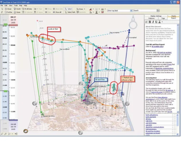
2.6 Geotime Interface . . . 27
3.1 Dashboard life-cycle . . . 30
3.2 Exploration Views . . . 32
3.3 Exploration Views creation dialog . . . 33
3.4 Exploration Views Chart Suggestion . . . 34
3.5 Exploration Views Data Category and measures selection. . . 35
3.6 Exploration Views Tool Bar . . . 35
3.7 Drag and Drop visualization . . . 37
3.8 Filters and Faceted navigation creation. . . 38
3.9 Filters and Faceted navigation creation, drag-and-drop.. . . 38
3.10 Active Filters . . . 39
3.11 Graphical explanations . . . 43
3.12 eFashion . . . 45
3.13 follow-up interview results . . . 46
3.14 An example of EV Filtering functionality . . . 49
3.15 Understanding Linking & coordinated views by novice and experts . . . . 50
4.1 Our dashboard prototype with context aware annotations. (a) The main dashboard contains icons with the number of annotations for each data- point (b). Bellow the list of all dashboard annotations in (c), is a set of recommended annotations (d) emphasizing their similarity.. . . 58
4.2 Three examples of the actual practice of annotating visualizations provided by our participants. (1) A dashboard represented in the middle, and as- sociated annotations on right and left. The left annotations represent the bad remarks, and the right side contains the good remarks. (2) and (3) are two slides from a report training powerpoint presentation, that contains annotations made on the presentation tool. . . 60
xiv
4.3 This figure shows the context-aware annotation structure followed in our prototype. An annotation can be attached to multiple targets, and each target is identified by its data context (dimensions and measures, names and values). The annotation saves with each target the dataset name, vi- sualization type and a snapshot at the time of annotating. Moreover, an annotation has different properties such as: author, creation date, annota- tion ranking, categorization and lifetime. Targets . . . 65 4.4 Detailed annotation view, including (a) all related data contexts & detailed
data context in text form, (b) content, (c) metadata, (e) discussion thread, and (d) annotation properties (lifetime, privacy, etc). . . 66 4.5 Chart Transparent Annotations . . . 68 4.6 This figure represents how our prototype distinguish invalid archived anno-
tations (grayed out and written in red ”Invalid”), from the valid annotations, in the annotation list. . . 72 4.7 Two variations of the dialog for creating a new annotation: (a) permanent
annotation that would be always valid, (b) periodic annotation in which the user has to identify the life time of the annotation in time periods. The user’s choice of ”permanent” or ”periodic” periods defines the view of the dialog. . . 73 4.8 Level Transparent Annotations . . . 74 4.9 An annotation example that the participant explored during performing
Task 3. (a) Radar chart presents the "50 Richest Americans in 2006". (b) Annotation icons that declares the existence of annotations attached to two data points on the chart. (c) In a new window we see the content of an annotation that says ”Second Rich man!”. (d) The original chart type (scatter plot) when the annotation was created. (e) Context of the data point, the annotations is attached to. (f) List of all existing annotations. . 78 4.10 Three designs linking annotations in the annotation list with their data
targets. Experts preferred the last design. . . 81 5.1 First page of a BI report given by an expert: a dashboard snapshot that
presents the bug status in a specific development project. (Used with the experts’ permission) . . . 86 5.2 An example of a BI report given by an expert that was used in the evalu-
ation of our system. This dashboard represents the ”technical backlog” &
”functional users stories” items status in different perspectives. (1) Green group, represents the status of the items per team. (2) Yellow group, shows the created items versus the completed ”done” items, and the category (crit- ical, major, etc) of each. (3) Pink visualization presents the remained items to be completed and its progression through time.. . . 87 5.3 An example of explanations included in a power point presentation used as
an introduction session to report readers. Example provided by one of our interviewed experts. . . 88 5.4 Genres of Narrative Visualization selected by BI experts from a group of
templates defined by Segel et al. . . 91 5.5 Participatory design session . . . 93 5.6 Story created by an expert during the design session. . . 94
5.7 The final story mockup created by an expert (fully annotated and sequenced story seen in Figure 5.6). It represents how a static story on a system should look like.. . . 94 5.8 Dashboard with visualizations on the left and list of annotations on the
right. . . 96 5.9 Narrative board (a), Sequence of entities (b), Relational (c) and Organiza-
tion (d) entities, and (e) Playback control. . . 97 5.10 Storytelling playback modes. . . 99
3.1 Tasks users performed during each session of the study, and their purpose. 44 3.2 Average ratings of EV for different attributes, by Novice and Expert users
(* sig: indicates significant difference between the 2 groups) . . . 47 4.1 Tasks users performed during the study of context-aware annotations on
dashboards. . . 77 4.2 Post-test (context-aware annotations tasks) questionnaire. . . 78 5.1 Users were asked this group of comprehension question related to the con-
tent of the story and charts, after reading first the report then the story. . 103
xvii
Introduction
1.1 Abstract
The explosive growth in the amount of data poses challenges in analyzing large data sets. Among the large number of available BI systems that help with large data set analysis, are BI dashboards. BI dashboards provide BI analysts with advanced visual analytics capabilities. But business users still spend too much time creating dashboards, analyzing their data, and preparing them for sharing findings with others. The motivation of our work is to improve the above processes. In this chapter we present the broad context of this work that flows between HCI, BI, and Data visualization, with a particular focus on dashboards, which are the main focus of this thesis. We present in this chapter the thesis motivation, approach, challenges that we address, as well as the content of the following chapters.
1
1.2 Research context
”There is nothing better than a picture for making you think of questions you had forgotten to ask (even mentally).”
— John W. Tukey (1985)
The amount of digital data in our world is growing at an incredibly quick rate according to research by the International Data Corporation (IDC)[2], and the increasing volume and detail of information captured by enterprises will fuel exponential growth in data for the foreseeable future. Therefore, analyzing large datasets is a key focus in business [3].
Extraction of hidden predictive information from large databases helps companies predict future trends and behaviors, and make decisions. This leads more people in every business to try to understand and exploit big data, not just managers that used to be the main target group of Business Intelligence systems. This emphasizes the need to reduce the cost of finding information as well as getting relevant answers to complex questions easily.
Business Intelligence (BI) deals with the collection of processes and software that supports organizations in understanding large business datasets, retrieving and analyzing informa- tion and making decisions. The value of visual presentation of data was identified early on in this field, and it usually takes the form of dashboards, interfaces resembling an au- tomobile’s dashboard that organize and present information in an easy to read manner [4]. BI visualization dashboards provide collections of multiple visual components, such as charts, on a single view so that information can be monitored at a glance [5].
The current life-cycle of a BI dashboard involves multiple actors [6], including end-users and business analysts. In user-centered BI [7] end-users intervene and provide feedback to the business analysts that create customized dashboards to meet the end-users needs.
This feedback comes at different stages of the dashboard design and setup, and involves a large amount of communication between business analysts and end-users. Thus there is an intrinsic delay introduced in any end-user requirement change or customization request.
When end-users needs are understood, the analysts conduct data analysis, and prepare their findings to present to their end-users or other analysts.
In this thesis we focus on enhancing and improving user interaction with BI dashboards in the different parts of a dashboard life cycle. Our work falls under the Human-Computer Interaction (HCI) field, that aims to improve the interactions between users and computers by making computers more usable and receptive to the user’s needs. Following a popular HCI methodology, we adopted a user-centered design approach to understand the users’
requirements toward dashboard creation and analysis, and propose solutions for each step in the life of a dashboard.
Successfully analyzing big data sets offers considerable benefits to companies and organi- zations (e.g. a competitive edge against competitors), but also to individual users (e.g. a better investment plan). Thus we have seen an increase of visualization platforms targeting visualization novices. Researchers are now focusing on gathering insights regarding novice user practices. But dashboards are still only created by experts due to a complex and long creation process, that often cannot be conducted by end-users, and that involves a large amount of communication between business analysts and end users. This long creation process that requires special expertise makes dashboards less popular with novice users, and less accessible to a broader audience; in our work we focused on making dashboard creation accessible to visualization novices, developing and testing a dashboard that is easy to create and customize.
While attempting to aid users in their analysis, we identified the need of annotation and organization of findings as of particular interest, as in other visual analysis domains.
Despite the growing use and research work on annotations for visual data analysis in general, related research on the domain of BI dashboards and other complex multi-chart visualization environments (coordinated views), has not equally progressed. Our work attempts to rectify that. Through user interviews we found out that users need more sophisticated solutions for annotating dashboards. Those requirements were implemented in a context-aware annotation dashboard prototype that was evaluated by BI experts.
In the last part of the dashboard’s life, the experts’ insights, knowledge and analysis stories need to be recorded in order to communicate them to others (e.g. end-users) more efficiently and make them available for future analysts to learn from. This communication step is very important, as often the analyst of data and the decision maker are two different people. Based on requirements from analysts we designed and implemented a storytelling prototype tool that is integrated in a dashboard analysis tool, and allows easy transition from analysis to story creation and sharing.
In the next sections we delve into each research field related to this thesis.
1.2.1 Business Intelligence Systems
”Business Intelligence is a set of methodologies, processes, architectures, and technologies that transform raw data into meaningful and useful information used to enable more effective strategic, tactical, and operational insights and decision-making.”[8]
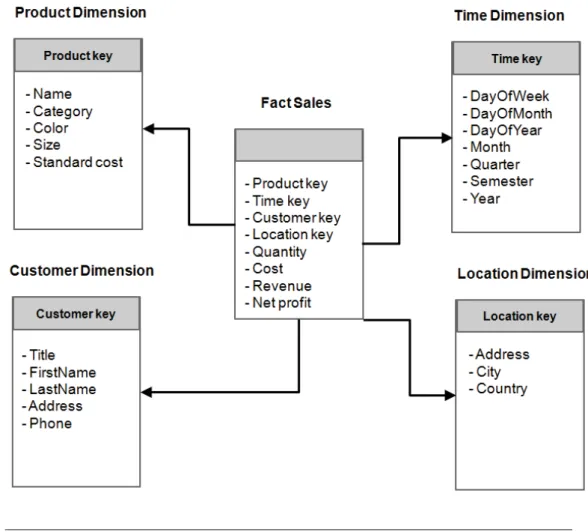
This thesis focuses on Business intelligence systems (BIS). BIS are interactive systems in- tended to help decision makers use communication technologies, data, documents, knowl- edge, and analytical models to identify and solve problems, thus a BI system can be called a decision support system (DSS)[9]. We focus on Online Analytical Processing (OLAP) tools, that enable users to interactively analyze multidimensional data from multiple per- spectives. The core of the OLAP technology is the data cube Figure 1.2, which is a multidimensional database model. The model consists of dimensions and measures. The measures are numerical data such as revenue, cost, sales and budget. Those are catego- rized by dimensions, which are used to group the data similar to the ”group by” operator in relational databases. Typical dimensions are time, location and product, and they are often organized in hierarchies. A hierarchy is a structure that defines levels of granularity of a dimension and the relationship between those levels. A time dimension can for ex- ample have hours as the finest granularity, and higher up the hierarchy can contain days, months, quarters and years.
Figure 1.1: Example of an OLAP database schema for Sales database. The fact table usually represents measures. In this example the fact table represents Sales which are categorized by dimensional tables (Product, Customer, Time and Location). Each di- mensional table needs to include a primary key that corresponds to a foreign key in the
fact table that represents the sales measures.
Figure 1.2: OLAP data cube example.
In the past, business intelligence systems were used to answer OLAP queries in table based reports that answered multiple queries separately. The new generation of BIS has two salient features: integration of multiple query answers and visualization of these answers (e.g. using visualization dashboards).
This work has been heavily influenced by the industrial environment in BI practice of SAP Research. SAP is one of the market leaders in enterprise application software, pro- viding important enterprise tools such as Enterprise Resource Planning (ERP), Customer Relationship Management (CRM), and BI systems such as SAP Crystal Reports, SAP BusinessObjects Dashboards, SAP BusinessObjects Explorer.
1.2.2 Data Visualization and Visual Analytics
Friendly [10] has identified data visualization as ”the study of the visual representation of data, meaning -information that has been abstracted in some schematic form, including attributes or variables for the units of information-.”
The main goal of data visualization is its ability to visualize data, com- municating information clearly and effectively. It doesn’t mean that data vi- sualization needs to look boring to be functional or extremely sophisticated to look beautiful. To convey ideas effectively, both aesthetic form and functionality need to go hand in hand, providing insights into a rather sparse and complex
data set by communicating its key-aspects in a more intuitive way.
— Vitaly Friedman[11]
Data visualization plays a major role in supporting data analysis and summarize the main characteristics of a data set in an easy-to-understand form, often with visual graphics or charts. It permits the analytical reasoning process to become faster and more focused [12].
Visualization research seeks to supplement human cognition by leveraging human visual capabilities to make sense of abstract information [13].
Visualizing multidimensional data is a challenging problem, because the human perceptual system is well equipped to process data presented in maximum three dimensions. Beyond this limit we cannot simply map the data into a graphical construction. Usually data is considered multidimensional if it has more than three dimensions. An important challenge in multidimensionality is the visualization of the relationships between data items across dimensions.
Nevertheless as explained by James et al. [14], specific types of visual representations and interaction techniques allow users to see, explore, and understand large amounts of information at once. In the domain of multidimensional visualization these include:
scatterplot matrices [15], multidimensional glyphs (such as StarGlyphs [16] [17] [18] and Chernoff Faces), parallel coordinates [19] [20] [21] or starplots, multidimensional scaling [22], tabular visualization techniques [23] [24] and coordinated and multiple views [25].
This thesis focuses on coordinated and multiple views such as dashboards, described next, as they are the most popular within the BI domain.
Coordinated and Multiple Views represent a highly interactive visualization environment that enables the user to see diverse datasets in various forms, to manipulate the visual presentation in different ways, and also interact and coordinate the interaction between the different views [25]. Coordinated and Multiple Views help users to generate new information and understand their data better by interacting with the presented information and viewing it through different representations, that are all visible at the same time.
Often the discussed visualization techniques are part of a larger set of visual analytics tools (VA). Visual Analytics has been identified as ”the science of analytical reasoning supported by highly interactive visual interfaces” [26]. VA combines automatic data analysis methods (e.g. data cleaning and data mining) and interactive visualizations. People use VA tools and techniques to derive insight from complex and large data and synthesize information into knowledge, that directly support assessment, planning, and decision making. There is a demand for VA support in different application areas where large information spaces have
to be processed and analysed, such as monitoring climate and weather, biology, medicine and business. Our work focus is Business Visual Analytics, that aids in analysing huge business data sets and permits taking right decisions. Nevertheless our focus is mainly on the interaction and visualization challenges, and less on the automatic analysis methods.
1.2.3 Dashboards
A dashboard is a visual display of the most important information needed to achieve one or more objectives; consolidated and arranged on a single screen so the information can be monitored at a glance.
— Stephen Few[27]
In the domain of business intelligence (BI) the main visualization tool is BI dashboards [28]. Dashboards can provide an effective solution to the overwhelming amount of data that business users experience every day [29]. Current market trends (seen in the Gartner Survey [3]), recognize dashboards and data analysis are one of the driving forces adding value to companies. This indicates a tendency for an expanding end-user population with diverse needs.
Dashboards can be classified according to their role. Few [30] has identified the following dashboard types: strategic, analytical, operational, or informational.
Most often, dashboards are used for strategic purposes [29], they provide a general and quick overview of the organization’s ”health”. They provide quick overviews and compar- isons to target values as well as simple performance evaluations (e.g. good or bad).
Theanalyticdashboard, is designed to help in data analysis. This can include making com- parisons, reviewing extensive histories, evaluating performance, and supports interactions with the data such as drilling down into different data levels.
Operational dashboards are for monitoring data, that needs real-time, and minute-by- minute attention, and has no statistics or analysis functionalities. The provide alerts and clear presentation of the appropriate response in an emergency event. They are generally used by those on a departmental, rather than executive level [31].
Dashboards are tailored to fit specific requirements, and a dashboard does not need to fit a single category in order to be successful. Rather, it needs to provide clear and immediate information in order to improve decision making and understanding of data[27]. In this thesis we kept the dashboard purpose open to meet different requirements of BI domain analysts.
1.2.4 Methodology
”Human-computer interaction is a discipline concerned with the design, evaluation and implementation of interactive computing systems for human use and with the study of major phenomena surrounding them.”
— Hewett, Baecker, Card, Carey, Gasen, Mantei, Perlman, Strong and Verplank [32]
The main goal of Human Computer Interaction HCI is to make computers more user- friendly by minimizing the barrier between the human’s goal of what they want to accom- plish and the computer’s understanding of the user’s task.
One of the most significant HCI design methodologies is User-centered design Figure1.3, in which users take center-stage in the design of any computer system, and is the design methodology we followed to understand our users’ needs and propose solutions in this work.
Figure 1.3: (ISO 13407: Human-centred design process) defines a general process for including human-centered activities throughout a development life-cycle. The four activ- ities are: (1)Specify the context of use: Identify the people who will use the product, what they will use it for, and under what conditions they will use it. (2)Specify re- quirements: Identify any business requirements or user goals that must be met for the product to be successful. (3)Create design solutions: This part of the process may be done in stages, building from a rough concept to a complete design. (4) Evaluate designs: The most important part of this process is that evaluation - ideally through usability testing with actual users - is as integral as quality testing is to good software
development.
A central concept in HCI is that of usability[33], ie ”The extent to which a product can be used by specified users to achieve specified goals with effectiveness, efficiency, and satisfaction in a specified context of use”. [ISO definition]
Many methods exist for studying usability, but the most basic and useful is user testing, which has 3 components as identified by Nielsen [34]:
- Get hold of some representative users, in our case Business Intelligence experts or novices.
- Ask the users to perform representative tasks with the design.
- Observe what the users do, where they succeed, and where they have difficulties with the user interface.
This is the method we have followed to improve the usability of the different prototypes implemented during this thesis.
1.3 Thesis Focus
This work followed a user centred design approach to enhance user interaction and ad- dress the challenges when creating, customizing and using dashboards or coordinated view systems, in the BI domain for expert and novice users. We intervene in all aspects of life cycle of a dashboard: creation, analysis and communication.
Creation: The tendency for expanding dashboard end-user population with diverse needs, requires users, who are often novices in information visualization, to get quick access to customizable and easy to build Business Intelligence information dashboards. This is reflected in advances in easily customizable dashboard visualization systems (e.g. [35][36]), it coincides with advances in easily accessible information visualization environments for novices (such as ManyEyes [37]), and is also reflected in the increasing focus of the InfoVis research community on how to support novice users [38][39]. Nevertheless, there are still many questions about how novice users interact with actual information visualization systems and more so with dashboards. In the BI analysis domain, software vendors focus usually on adding more features into the next dashboard release, with no time to do the research needed to discover what actually works, or even to step back and observe how their products are really being used.
To find out the answers to such questions we gathered insights regarding novice user practices on Exploration Views (EV), a system that allows novice visualization users to easily build and customize Business Intelligence information dashboards. EV provides an intuitive environment for dynamically creating, rearranging, searching and exploring multiple visual data representations from diverse data-sources. These aspects aid users
to better retrieve, experiment and familiarize themselves with their data. We provide new guidelines that augment previous work on designing for visualization novices, in the context of dashboards. We expand on this aspects in Chapter 3.
Analysis: Just collections of visual representations do not speak for themselves; to become meaningful they require interpretation and explanation. But because of the limits of human memory [40] remembering all reasoning details and milestones in the analysis process becomes challenging. We report dashboard limitations in analysis record-keeping, data discovery and gathering insights.
We conducted in-depth interviews with dashboard experts and reported the need of mak- ing sense of their visualizations by annotating them with their findings. This led to new annotation needs for multi-chart visualization systems, on which we based the design of a dashboard prototype that supports data and context aware annotations that can be shared across visualizations and datasets. We focused particularly on novel annotation aspects, such as multi-target annotations, annotation transparency across charts, as well as attach- ing annotations to a data layer shared among different data-sources and BI applications, allowing cross application annotations.
This prototype was evaluated by BI experts by performing several important tasks in their work. We also identified and provided solutions to challenges in using context aware an- notations, notably issues arising when the annotation’s ”context” changes (e.g. annotated data are deleted). We discuss this work in detail in Chapter 4.
Communication: Although the work practices of BI analysts’ may differ, in the end they all construct stories that include: collections of visual components (dashboards, charts or tables) to support their stories, verbal explanations during presentation(s), or detailed textual annotations and descriptions in the form of written reports and external resources such as wikis. This process remains cumbersome and requires frequent switching between different software (dashboard analysis tools, screen captures, text editors, presentation or drawing tools, etc). BI analysts need an easier mechanism to share their analysis results and tell stories with their data.
Our work aims to aid BI analysts with their storytelling needs, in order to develop a high analysis value. Our interviews indicates that their recorded insights and knowledge, need to be organized and transferred to others, as well as remain available for future users.
To achieve this we need a designing and sharing mechanism to facilitate the transfer of knowledge and experiences. We thus collected new requirements related to BI visual storytelling. Based on these requirements we designed and implemented a storytelling prototype tool that is integrated in a dashboard analysis tool and allows easy transition from analysis to story creation and sharing. Chapter 5 provides details on this work.
1.4 Thesis Contributions
The main contributions of this work are:
(1) Report of how novice users interact with the EV system and the differences in how novice and expert users react to EV dashboard system that targets both.
(2) New design guidelines for practitioners building dashboard applications, for novice visualization users.
(3)New set of requirements for annotations, targeting dashboards and other coordinated view visualization systems.
(4)Design and evaluation of a prototype dashboard that supports context-aware annota- tions. Using this system, we explain how annotations support advanced analysis function- ality such as: ”annotate once, see everywhere”, annotations for multi-chart visualizations, annotation recommendations to promote knowledge discovery, and the use of the common data model layer present in BI systems to link annotations with external data sources and enable cross application annotations and information foraging.
(5) Identification of challenges and possible solutions when using context aware annota- tions, such as issues arising when the ”context” changes (e.g. annotated data are deleted or changed at the data source).
(6)A better understanding of the actual practices in creating BI stories, based on in-depth interviews with expert BI analysts, and emphasize the need of BI storytelling support.
We extracted new requirements for enhancing BI visual analysis tools with storytelling capabilities.
(7)The design and implementation of a prototype storytelling tool that is fully incorpo- rated in an existing visual analysis dashboard, to fluidly transition between analysis and story creation. We report on feedback from BI experts creating a story on the usefulness of the prototype as a communication and teaching medium, and from BI novices reading a story on its effectiveness for story communication.
1.5 Thesis Outline
CHAPTER 2 begins by covering related work. The remainder of the thesis is organized into three areas: (1) Understanding Dashboard Creation and Customization for Visual- ization Novices, (2) Annotating BI Visualization Dashboards, followed by (3) Storytelling in Visual Analytics tools for Business Intelligence.
InCHAPTER3we introduce Exploration Views (EV) a dashboard prototype build specif- ically to empower end users, following guidelines from previous work on visualization novices, and evaluate its effectivness. Finally, we derived a set of additional design guide- lines for dashboards targeting novice users.
CHAPTER 4 investigates the use on annotations on data visualization, and present new annotation requirements for BI dashboards that are supported in our prototype of context- aware annotations. We discuss challenges in supporting context aware annotations in dashboards and other visualizations, and we report a user study and evaluation for the prototype, conducted with BI domain experts, and present faced challenges.
In CHAPTER 5 we discuss the importance of adding storytelling mechanisms in dash- boards. We report in-depth interviews with BI expert analysts and collect new require- ments related to BI visual storytelling. We design and implement a storytelling prototype tool that is integrated in a dashboard analysis tool based on BI experts requirements.
We present how his prototype that was evaluated by experts, helps BI analysis authors to organize and communicate their findings faster, and reach a broader audience (e.g. novices without any domain training).
1.6 Summary
The amount of data in our world has been exploding, and successfully analyzing large data gives an edge to both companies as well as individu- als. BI helps better analyze large data sets, and one of the more important tools available to BI analysts are visualization dashboards. Nevertheless, these dashboards remain hard to create and customize by individuals with little training. Moreover, they still fall short in supporting detailed analysis record keeping, and communication of analysis results to others. This thesis focuses on enhancing user interaction with BI dashboards, through (1) easy creation &
customization of dashboard for a broader user range, (2) adding novel annota- tion support for analysis, and (3) use of visual storytelling for communicating dashboard analysis results.
Related Work
2.1 Abstract
In this thesis we focus on three aspects of interaction with BI dashboards, begining with (1) dashboard creation and customization. Through the re- lated work we show the limited focus of research in supporting novice users, and how current dashboard creation practices requires an expert to create a suitable dashboard for a consumer user, involving multiple customization it- erations between the two, which limits dashboard use from reaching broader groups of users. (2) Second we show how annotations are considered as an important aid in record keeping and data discovery in different contexts such as text, image & data visualization, but how similar research for supporting BI visualization annotation, more specifically dashboard annotations, is lacking.
(3) Third we focus on communicating business analysis results to others, and how storytelling that has been used with other data visualization domains can inspire similar work in dashboards.
14
2.2 Introduction
This chapter reviews the background work related to this thesis, organized in the three main areas studied by this thesis: dashboard construction and customization, visualization annotation, and narrative visualizations (storytelling).
2.3 Dashboards
There are dozens of software packages that mine data repositories and present details on how a business is performing. Sometimes called analytics or business intelligence software, they aggregate data from disparate internal and external sources and display it in the form of customized views. The fash- ionable term for these views is digital dashboards.
— Jeffrey Schwartz[41]
In this section we will present related research in the fields of dashboard creation and visualization construction, especially in the context of novice visualization users.
2.3.1 Dashboards creation
Few [30] has identified the characteristics of a well-designed dashboard, that can be used to evaluate dashboards. Information should be
1. Well organized. Dashboards should help people to immediately recognize what needs their attention.
2. Condensed, primarily in the form of summaries and exceptions. Summaries represent a set of numbers (often a large set) as a single number such as sums and averages, while exceptions represent something unusual happening that could be a problem or an oppor- tunity. Thus, viewers don’t wade through hundreds of values when only one or two require attention.
3. Specific to, and customized for, the dashboard’s audience and objectives.
4. Displayed using concise and often small media that communicate the data and its message in the clearest and most direct way possible.
The majority of the commonly used commercial BI dashboards (e.g. Dundas [42], OracleBI 10g [43], SAP BusinessObjects dashboard [44], see (Figure 2.1)) assume that from the
end-user perspective the dashboard design will remain consistent, and focus more on easy report generation.
To create new or customize existing dashboards, end users need to either contact trained dashboard designers, or install separately provided dashboard design components and spend time to train themselves. There are some notable exceptions. Tableau [36] incorpo- rates the design functionality in the dashboard system. Spotfire [35] also accommodates novice users with a flexible drag-and-drop interface for customizing visualizations on the fly. Finally, the prototype Choosel environment [45] allows for easy visualization creation and further exploration of the visualized data, but does not yet provide advanced func- tionality (e.g. hierarchical data representation as in OLAP data models [46], with drill- up/down functions), required in real life business data analysis. Thus with few exceptions, dashboards are hard to create and customize.
2.3.2 Visualization creation
A variety of visualization toolkits allow the creation of sophisticated visualization charts and combinations of them (e.g. Flare1, Silverlight2, JavaScript InfoVis tk3 [47], ivtk4 [48], D3 [49]). These do not target novice visualization users, and usually require additional programming to create the visualizations, to synchronize them in dashboard views, and to connect them to data-sources.
Several environments allow the construction of highly customized, powerful and fully linked visualizations. For example Improvise [50] (Figure 2.2) provides dynamic queries where users can interactively explore and change parameters of representations. Snap-Together [51] (Figure2.3) allows the user to mix and match visualizations, load relations into visu- alizations then coordinate them based on the relational joins between them to construct custom exploration interfaces. (For a comprehensive and more detailed list of work on coordinated views see [25]). Nevertheless their setup cost and learning curve is usually high and they target visualization experts rather than novice users.
2.3.3 Visualization for novices
On the other hand, there is a set of visualization platforms that specifically target novice users. For instance, the Google analytics platform [28] provides a highly customizable dashboard with good default visualization charts for web-related data. Other web-based visualization platforms easily accessible to novice visualization users, like ManyEyes [37], Sense.us [52], or Polstar [53], usually restrict users to a viewing and sharing a single visible
(a) (b)
(c) (d)
(e) (f)
Figure 2.1: Commercial BI dashboards: (a)Dundas [42], (b)Spotfire [35], (c)Tableau [36], (d)SAP BusinessObjects dashboard [44], (e)Choosel [45], (f)OracleBI 10g [43].
Figure 2.2: Improvise [50]. The visualization represents the election results in Michigan from 1998 to 2002. (A) Selection of counties visualized in table view and a map. (B) When selecting a race from races visualization, the election results for that race will be loaded (from a file) and shown in the ”Results for selection candidates and counties” visualization.
(C) When selecting from the ”Candidates” table, the pie chart will be filtered to compare results for selected candidates only. (D) Selected counties in the scatterplot visualization are highlighted with gray bars. (E) A four-layer scatterplot colors counties by winning candidate party. (F) A semantic zoomed in ”state map” visualization labels counties with
nested bar plots.
chart at a time. Thus creating a dashboard is a laborious process performed outside the platform, and linking of multiple charts is no longer possible.
2.3.4 Novices in visualization
With the increase of visualization platforms targeting novices, researchers have started gathering insights into their practices and behaviors. Heer et al. [39] group different vi- sualization systems by how skilled their users have to be, and note that tools supporting detailed data exploration target mostly experts, whereas it is mostly communication/re- porting systems that accommodate novices.
They also suggest that visualization tools for novices should:
(G1) Allow user-friendly data input for common data formats.
(G2) Automatically provide visualizations or reasonable defaults based on data types.
(G3) Use contextual information to clarify the displayed data and encoding.
Figure 2.3: Snap-Together [51]. A coordinated visualization environment constructed using Snap-Together Visualization. This visualization represents the Census data of U.S.
states and counties. When selecting a state from the left side visualizations, displays detailed county and industry information for that state in the table and Treemap on the
right.
Grammel et al. [38] investigate how novices create single charts, using a human mediator to interact with the creation interface. They found that the main activities performed by novices (apart from communicating their specifications to the mediator) are data attribute selections, visual template selections, and viewing and refinements of the above.
They observed that subjects often had partial specifications for their desired visualization, and faced three major barriers: selecting correct data attributes, choosing appropriate visual mappings, and interpreting the visual results.
They also verified suggestions from [39], and provided additional guidelines, such as:
(G4) Facilitate searching of attributes.
(G5) Automatically create visualizations when possible.
(G6) Provide explanations.
(G7) Promote learning.
Our work follow the above seven guidelines from Grammel et al. [38] and Heer et al. [39], and extends those design guidelines for BI information dashboards, respecting Few’s [30]
dashboard creation guidelines:
- Fit a great deal of information into a small amount of space, resulting in a display that is easily and immediately understandable.
- Base efforts on a firm understanding of how people perceive and think, building inter- faces, visual displays, and methods of interaction that fit seamlessly with human ability.
- The ability to see everything you need at once in one view instead of multiple views, without fragmenting data.
- Try to present all within eye span. Something critical is lost when loosing sight of some data by scrolling or switching to another screen to see other data.
We build a fully functional dashboard visualization system, and observed how novice users use the interface to create dashboards (without a human mediator [38]). In CHAPTER3 we report our observations of novices and experts reactions, and derive additional design guidelines for visualization dashboards that target both user groups.
2.4 Annotations
An annotation is a commentary on an object, in order to add information. This information could be represented by text, link, photo, audio or a video. It is a common practice during long term human activities to take notes and annotate documents in order to indicate or highlight interesting items that need further investigation, mark items that have been completed or remain to be done or add explanations and insights to facts.
Current visualization and BI systems provide minimal (if at all) annotation capabilities in the form of simple text. As BI dashboards are highly visual in nature, there is a need to support annotations and comments on the visualizations.
In order to understand the challenges of annotating on dashboards, determine the best annotation suitable support, and ways to navigate through these annotations, we report on existing digital annotation scenarios in recent research.
2.4.1 Annotation of Textual data
An annotation is frequently used to support critical thinking and learning while reading, a process called ”active reading” by Adler at al. [54]. Marshall [55] has examined the prac- tice of annotation on textbooks to help designing annotation tools, specifically for readers working in a digital library tool. This study gave a clear identification of annotation usage, such as:
- Annotations as procedural signals: annotations are used in anticipation of future atten- tion, to designate reading assignments, responsibility for ”knowing”, and desire to reread.
- Annotations as place-markings and aids to memory: a way of remembering or remem- bering to remember.
- Annotations as in situ locations for problem-working: markings were used to indicate action (or to help visualize action) to take at a later date.
-Annotations as a record of interpretive activity: as notes of interpretations of unfamiliar language, interpretation of structures, or adding insights.
- Annotations as a visible trace of reader’s attention: when the material is difficult and in narrative form; attention is easier to maintain if the material is relatively accessible.
-Annotations as incidental reflections of the material circumstances: they reflect circum- stances that are entirely outside of the realm of the text.
Moreover, text annotations can be used to support feedback exchange through discussion threads, that can benefit Information Retrieval systems [56].
These important practices of text annotation for reading support, are translated to digital libraries using ”annotation systems” such as Annotea [57]. Digital annotations can persist throughout the lifetime of a document, and can easily be shared. But the variation of reading platforms poses a unique challenge in the adaptation of freeform pen-and-paper annotation to the digital domain: Each time the content of a digital document reflows to a new layout, any digital ink annotations must also reflow to keep up with it as done in Bargeron et al. work [58].
The annotated data in this context is text, so it will appear in the form of letters on lines only, while in chart visualization, data has different visual representations (visualization types) and different granularities.
2.4.2 Annotation of Image Data
Image annotation deals with annotating and commenting directly on an image. This means that the annotation is associated with a collection of pixels and is usually stored as a layer on top of images, such as in I2net [59]. When accessing annotations on large image corpa (in the form of images), one of the most important tasks is the need to find the images that have specific objects or to find keywords that best describe the image content [60]. Hence, this raises the possibility of several interesting applications such as image annotation with the semantics of the picture, to help in retrieving images in response to textual queries that correspond to its annotations semantics [61].
Libraries have traditionally used manual image annotation for indexing and then later retrieving their image collections. However, manual image annotation is an expensive and labor intensive procedure and hence there has been great interest in coming up with automatic ways to retrieve images based on content such as [62][63][64].
2.4.3 Annotation of Visualizations
To help analysts track their analysis process and findings, researchers have suggested the use of history tools (e.g. Aruvi [65], Tableau [66], CzSaw [67], Visage [68]) to review, re-visit and retrieve previous analysis steps [69]. Augmenting visual representations with annotations to record analysis details and findings has also been recommended by Heer et al.[52] and implemented in information visualization systems such as: Voyagers and voyeurs [52], HARVEST [70], and GeoTime[71], allowing analysts to re-visit their analysis and re-use previous findings [72].
Marshall [72] identified three main processing activities during analysis: searching, in- terpreting, and presenting. Pirolli and Card [73] refer to the first two activities as the information foraging and sense making loops. Annotations are traditionally used to sup- port interpretation (sense making). Visual Analytics (VA) systems like ManyEyes [37], sense.us [52], and CommentSpace [74] allow multiple users to annotate their insights on a single visualization, and search through them, encouraging peer learning and social sense making [75]. Others, like Sandbox [76] and VisualLinks [77], aid users to collect and group multiple discoveries and insights on a single visualization, and record them in the form of annotations. These support the sense making process of framing relevant information together, clarifying connections and information importance [78]. During analysis, frag- mented information pieced together often reveals connections and further opportunities for investigation [79], contributing to the searching (foraging) aspect of sense making. Thus annotation support is clearly important in visual analysis.
2.4.4 Context-Aware Annotations in Visualizations
Recent VA systems have moved beyond this simple information grouping. Annotations are no longer simply attached to visualizations or chart graphics, but to the data, moving towards more context aware annotations. These annotations can then be used explicitly to search (forage) for related visualizations or annotations. The sense.us [52] system provides doubly linked discussions, allowing users to move from visualizations to annotations and vice versa. Aruvi [65] allows users to arrange their annotations in a ”mind map”, a diagram linking related visualization views and their annotations. Users can access past analysis
(a)
(b)
Figure 2.4: Visual Analytics (VA) systems that supports annotating a single visualiza- tion: (a) sense.us [52] (b) ManyEyes [37]
views using keyword searches and text similarity metrics. Shrinivasan et al. [70] recom- mend related annotations based on the context of the current analysis. Finally, Chen et al. [80] use annotation context as a way to semi-automatically annotate facts belonging to the same analysis categories across visualizations.
Most existing VA work supports context aware annotations on a single visualization view.
Traditionally BI analysts conduct their analysis using complex visualization dashboards.
Dashboards visualize multi-dimensional datasets through a combination of linked charts [5], and are very widespread in BI (e.g. [42][43][44][35][36]). Annotations are supported in most dashboards, and are usually attached to data points (not the chart graphic).
Nevertheless, these systems do not adequately support several needs identified by BI ex- perts (detailed later in CHAPTER 4), such as annotations spanning multiple charts, or annotation transparency across data dimensions and visualizations (annotate once, see everywhere, as is done in text [81]). These advanced functionalities, such as multi-chart annotation, can be hard to achieve, as annotating multiple points is an involved process:
since only one visualization is shown at a time, an annotation can only be added to one query. To add more queries to an existing annotation, the user needs to continuously switch visualizations.
This body of research uses context aware annotations for different purposes. Our work extends it in two ways: based on expert users’ comments we identify desired behavior and possible uses of context aware annotations on visualization dashboards; and we explore challenges in their design and use, for example due to the dynamic nature of ”context”, discussed in CHAPTER 4 .
2.5 Storytelling
Stories are series of events and facts, with an order and connections between them (Oxford English Dictionary). In the domain of intelligence analysis, it is furthermore an abstraction used by analysts to conceptualize threats and understand patterns in the analytical process [82], and communicate their findings to others [83].
2.5.1 Stories in Business
In recent years, organizations and their leaders have identified the importance and value of narrative and anecdotal information conveyed in the form of stories [84], to present either complex ideas, the context and details of crucial information, or personal interpretation of that information [85].
Research conducted to date has demonstrated the value of storytelling to improve organi- zational structure [86] and collaboration quality [87, 88], socialization and adaptation of new employees [89–91], organizational and financial success [92,93], innovation and new product development [94], and teaching and learning [95].
The majority of this work is a meta-analysis of the effect of storytelling within an organi- zation, rather than the development of tools to enhance the storytelling process as is our case. Moreover, the stories themselves discussed in this work, relate to the transmission of inf
![Figure 2.1: Commercial BI dashboards: (a)Dundas [42], (b)Spotfire [35], (c)Tableau [36], (d)SAP BusinessObjects dashboard [44], (e)Choosel [45], (f)OracleBI 10g [43].](https://thumb-eu.123doks.com/thumbv2/1bibliocom/470521.74275/36.892.157.816.189.1015/commercial-dashboards-spotfire-tableau-businessobjects-dashboard-choosel-oraclebi.webp)
![Figure 2.2: Improvise [50]. The visualization represents the election results in Michigan from 1998 to 2002](https://thumb-eu.123doks.com/thumbv2/1bibliocom/470521.74275/37.892.146.787.122.489/figure-improvise-visualization-represents-election-results-michigan-1998.webp)
![Figure 2.3: Snap-Together [51]. A coordinated visualization environment constructed using Snap-Together Visualization](https://thumb-eu.123doks.com/thumbv2/1bibliocom/470521.74275/38.892.151.784.121.557/figure-snap-coordinated-visualization-environment-constructed-using-visualization.webp)
![Figure 2.4: Visual Analytics (VA) systems that supports annotating a single visualiza- visualiza-tion: (a) sense.us [52] (b) ManyEyes [37]](https://thumb-eu.123doks.com/thumbv2/1bibliocom/470521.74275/42.892.212.717.149.1057/figure-visual-analytics-supports-annotating-visualiza-visualiza-manyeyes.webp)
![Figure 2.5: Types of Narrative Visualization proposed by Segel et al. [1]](https://thumb-eu.123doks.com/thumbv2/1bibliocom/470521.74275/45.892.158.783.185.476/figure-types-narrative-visualization-proposed-segel-et-al.webp)