Pushback: Critical data designers
and pollution politics
Kim Fortun, Lindsay Poirier, Alli Morgan,
Brandon Costelloe-Kuehn and Mike Fortun
Abstract
In this paper, we describe how critical data designers have created projects that ‘push back’ against the eclipse of environmental problems by dominant orders: the pioneering pollution database Scorecard, released by the US NGO Environmental Defense Fund in 1997; the US Environmental Protection Agency’s EnviroAtlas that brings together numerous data sets and provides tools for valuing ecosystem services; and the Houston Clean Air Network’s maps of real-time ozone levels in Houston. Drawing on ethnographic observations and interviews, we analyse how critical data designers turn scientific data and findings into claims and visualisations that are meaningful in contemporary political terms. The skills of critical data designers cross scales and domains; they must identify problems calling for public consideration, and then locate, access, link, and create visualisations of data relevant to the problem. We conclude by describing hazards ahead in work to leverage Big Data to understand and address environmental problems. Critical data designers need to understand what counts as a societal problem in a particular context, what doesn’t, what is seen as connected and not, what is seen as ethically charged, and what is exonerated and discounted. Such recognition is produced through interpretive, ‘close reading’ of the historical moment in which they operate.
Keywords
Environmental data, pollution, critical data design, interpretation, ethnography, late industrialism
For many in the contemporary United States, ‘regula-tion’ is a dirty word, signalling excessive government and the end of liberty. The Center for Effective Government (CEG) has pushed back, insisting that regulations are ‘public protections’ and should be referred to in those terms (Center for Effective Government, 2015a). To do this, the CEG has also pushed back against data gaps that undercut recogni-tion of theneedfor public protections. Using data from the US Environmental Protection Agency (EPA), for example, CEG has mapped US schools in ‘danger zones’ around industrial facilities, helping people visu-alise the magnitude of the problem, and the need for laws requiring emergency planning and risk reduction (see Figure 1; Center for Effective Government, 2015b). CEG’s data visualisations exemplify the kind of ‘push-back’ by critical data designers we describe in this essay, highlighting how expansive and adept interpret-ive practice is integral to critical data design.1Critical
data designers draw on interpretive skill in finding, link-ing, visualislink-ing, and circulating available data; they pushback against entrenched ways of thinking about public problems through politically strategic and cre-ative data configurations. Our focus here is on critical data practice in environmental pollution politics. In concluding, we zoom back out to the general challenge of critical data practice and to possibilities for support-ing it through governance and education.
Work with pollution data provides particularly rich examples of critical data practice. Pollution data is remarkably heterogeneous, including data about a
Rensselaer Polytechnic Institute, USA
Corresponding author:
Mike Fortun, Department of Science and Technology Studies, Rensselaer Polytechnic Institute, 110 8th Street, Troy, NY 12180, USA.
Email: [email protected]
Big Data & Society July–December 2016: 1–14
!The Author(s) 2016 Reprints and permissions: sagepub.com/journalsPermissions.nav DOI: 10.1177/2053951716668903 bds.sagepub.com
huge array of substances, from many kinds of collec-tion devices, in many units of analysis, collected by many different organisations, for different purposes – and it needs to be linked or ‘networked’ (boyd and Crawford, 2012) to be meaningful and actionable. Pollution data can be overwhelmingly big in quantity, or frustratingly – and often politically – scarce. Recently (particularly since the financial crisis of 2008), in many settings, there have been notable reduc-tions in pollution data collection; too often, insistence on austerity and small government has legitimised clos-ure of monitoring stations and dismissal of technical staff.2 Without data, there can be no critical data design. Critical data design thus depends on continual advocacy for data collection.
Critical data design also involves management of time out of joint. Pollution data is especially complex temporally. Often, there are long lags between the time of monitoring and the time when data is available to researchers, regulators, and the public, complicated
further by lags between exposure to pollution and health effects. Sometimes exposure effects are immedi-ate; sometimes they emerge over days, sometimes over decades, sometimes across generations. Figuring out how to characterise the temporal dimension of pollu-tion data is also a critical dimension of critical data design.
Perhaps most basic are the challenges connecting pollution data to (human, ecosystem, and atmospheric) health data. Historically, pollution and health sciences have developed in largely separate domains; govern-ment agencies also tend to be organised in ways that make it difficult to interconnect health and pollution problems. As illustrated in the story of the Scorecard project (elaborated below), bringing health and pollu-tion together in an accessible way relevant to local con-texts in the United States took notable ingenuity and proved too expensive to sustain.
subject to commercial interests. One of the innovations of the Scorecard project is the way it leveragedexisting data known to be imperfect.Scorecard was built around pollution data from the US Toxic Release Inventory, which includes self-reported and largely unaudited emissions data from large industrial facilities. The data thus contains many errors (some argued to be intentional) but could still be used for environmental sense making with appropriate caveats. Identifying and articulating these kinds of caveats are an important part of critical data design.3
In this article, we discuss three projects that illustrate the challenges of pollution data and critical data design. We start with the pioneering pollution database Scorecard, released by the US NGO Environmental Defense Fund (EDF) in 1997. Described early on as an ‘Internet Bomb’ and as the ‘new gold standard’ in environmental information systems, Scorecard linked local pollution data to health data, providing users with risk profiles that helped them prioritise com-plaints. The other two projects we describe were also designed to be game changers, working to bring differ-ent kinds of data and people together in new ways, making environmental problems more visible and actionable. The US EPA’s EnviroAtlas brings together data sets produced and owned by various US govern-ment agencies, configured to make it easier for decision-makers (especially at the local level) to value ecosystem services (ESs) (recognising what would be lost if a road disrupted a wetland, for example, or what would be gained through urban greening). The Houston Clean Air Network (HCAN) publishes a map of real-time ozone levels in Houston, working with air quality moni-toring data obtained (with considerable effort) from the Texas Commission on Environmental Quality (TCEQ) – putting air pollution on the map in a city known for its investment in both its cars and freeways, and the petrochemical industry.4
The designers of these projects leveraged knowledge drawn from toxicology, ecology, air chemistry, and other scientific fields. They also leveraged the capacity to read and interpret the social, political, historical, and cultural context in which they worked, recognising and designing against problems with ways people habitually think and talk about problems, possibilities, and responsibilities. They thus linked scientific and tech-nical expertise with hermeneutic expertise, taking into account what things mean, to whom, why, and to what end – becoming what we call critical data designers.5
Before moving to our three examples, we briefly describe the methods and theoretical frames through which we have developed our conception of critical data design – as aprocess that can be followed ethno-graphically and cultivated pedagogically. We encourage
both further study and cultivation of critical data design in action, building a comparative body of work that can orient and inspire teaching and students.
Configuring critical data design
The pollution data projects we describe in this essay all push back against entrenched ways of thinking about the environment and its problems. Our reference to ‘the environment and its problems’ echoes John Dewey’s important 1927 work The Public and Its Problems. The book was an extended response to journalist and social critic Walter Lippmann, who contended that the publics on which democracy depended were often eclipsed by powerful forces (corporate capital or adver-tising, for example) that worked against publics recog-nising themselves and articulating their needs and criticisms. In Dewey’s formulation, publics could be, and needed to be, provoked into existence through col-lective recognition of the negative externalities of state, market, or other social action. Central to that radical democratic project for Dewey were new modes and tools of communication:
Only when there existssignsorsymbolsof activities and of their outcomes can the flux be viewed as from with-out, be arrested for consideration and esteem, and be regulated...As symbols are related to one another, the important relations of a course of events are recorded and are preserved as meanings. Recollection and fore-sight are possible; the new medium facilitates calcula-tion, planning, and a new kind of action which intervenes in what happens to direct its course in the interest of what is foreseen and desired...The work of conversion of the physical and organic phase of asso-ciated behavior into a community of action saturated and regulated by mutual interest in shared meanings, consequences which are translated into ideas and desired objects by means of symbols, does not occur all at once nor completely. At any given time, it sets a problem rather than marks a settled achievement. (Dewey 1984 [1927]: 330–331)
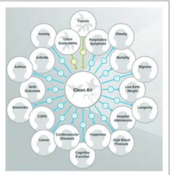
political terms, facilitating new kinds of planning and action (see Figure 2).
We came to this way of thinking about critical data designs through sustained work – in theory and practice – oriented by radical education thinkers such as Paulo Freire (1968), Gregory Bateson (1972), Gayatri Spivak (2012), and Shoshana Felman (1982).6Dewey’s concep-tion of ways ‘public problems’ take shape is just one touchstone, helping us crystallise the processof critical data design. Our understanding of this process also comes from our own effort to support critical data design among ethnographers7 and from long-running ethnographic study of data practices in different set-tings. One thread of our ethnographic work has focused on ways environment and health data has been used in governance of industrial disaster, both fast (as in Bhopal and Fukushima) and slow (in chronic air pol-lution at sites around the world, for example) (Fortun, 2004; Fortun and Morgan, 2015). Another thread of ethnographic work has focused on how practitioners in a range of communities (from genomics to data sci-ence to demography) are leveraging data infrastruc-tures to produce knowledge in new ways (Poirier, 2015).
In our three examples, we briefly (and far from thor-oughly) draw out the process of critical data design.
For each, we both interviewed the lead data designer (or designers) and became users of the systems they built.
Scorecard.goodguide.com
‘Informational strategies’ for dealing with environmen-tal risk became law in the United States in 1986 with passage of the ‘Community Right-to-Know Act’, Title III of the Superfund Amendments and Reauthorization Act (SARA).8 Widely regarded as the US legislative response to the 1984 chemical plant disaster in Bhopal, India (regarded as ‘the world’s worst industrial disaster’; Taylor, 2014), SARA Title III mandated a range of initiatives to support emergency planning and public access to information, including the Toxic Release Inventory (TRI), the first federal database that Congress required to be released to the public in a computer-readable format (Bass and MacLean, 1993; Young, 1994). The goal of the TRI was to allow the EPA as well as citizens to track and evaluate rou-tine, largely legal emissions from large industrial facilities.9
including many considered carcinogenic, developmen-tal hazards, or of ‘special concern’ because persistent and bioaccumulative.10 Led by Monsanto, prominent industrial leaders promised significant and immediate emissions reductions (Graedel and Howard-Grenville, 2005: 31; Hamilton, 2005: 225–226). Critics began to note ‘phantom reductions’ resulting from creative emis-sions accounting, and the way ‘delisting’ could be an emissions reductions strategy; if a chemical was taken off the list of reportable chemicals, the overall quantity of overall emissions reported would decrease; de-listing thus became subject to well-funded corporate lobbying. In the mid-2000s, efforts to weaken TRI reporting again provoked strong criticism, making clear that environmental politics are also data politics.11
TRI data mobilised both grassroots and national toxics activism. It also, however, provoked investment inmoredata – data pointing to the health consequences of exposure to TRI-reported chemicals. Bill Pease was at the centre of the storm. In the mid-1990s, Pease was lead toxicologist at the EDF, a leading US environmen-tal organisation already at the forefront of work on toxics. And he couldn’t handle the number of calls he was getting to help interpret TRI data. People in com-munities around the country – many with full-time jobs – were spending hours and days in libraries, knocking on the doors of government health agencies, and some-times in the ‘reading rooms’ of corporations to try to figure out what their exposures to TRI chemicals meant (Fortun, 2012: 319–320). Pease recognised a need for a shared resource. At the outset, Pease imagined a CD-ROM that he could send out on request by mail. A
meeting with MIT computer scientist Phillip
Greenspun turned the vision towards an online plat-form that would link TRI data to health inplat-formation available through the US National Institute of Health (NIH), Center for Disease Control (CDC), and other government agencies. The vision was not to produce new data, but to link existing data, configured in ways that enabled interpretation and directed action.
Greenspun had prior experience working to make environmental data meaningful. In 1986, the State of California has passed Proposition 65, which required industry to report both what they emitted and whether the substances emitted were carcinogens or reproduct-ive toxicants. The result was that California cut emis-sions covered by Proposition 65 by 25% – twice as much as the TRI at that point. What Greenspun learned from this is that ‘disclosure plus interpretation is more powerful than disclosure alone’ (Fortun, 2012: 320). Scorecard – http://scorecard.goodguide.com/ – was designed to support this kind of interpretation.
EDF launched Scorecard in 1998, saying that its purpose was ‘to make the local environment as easy to check on as the local weather’ (Krupp, 1999).
Chemical Week described the website as the ‘Internet Bomb’ because of its potential effect on the reputations of chemical companies (Foster et al., 1998). Greenpeace referred to Scorecard as the ‘gold standard’ of environ-mental information systems because it facilitated move-ment from information to collaborative action, and because it was partly built on open-source software, which in Greenpeace’s view operated according to the same tenets as radical environmentalism (Fitzgerald and Hickie, 2002).
Scorecard connects TRI emissions data to chemical toxicity data drawn from over 400 US government databases. Users could type in their zip code and pull up lists of specific chemicals emitted by a specific facil-ity, indicating whether the chemical was carcinogenic or a developmental toxin. Users can also evaluate prob-able risks based on a hazard ranking system based on proxy data that related all chemicals to the risk of ben-zene, a known carcinogen (to indicate ‘cancer poten-tial’) or to toluene, a developmental toxin (to indicate ‘non-cancer risk’). Users could also use Scorecard to communicate with the US EPA and with polluting companies.
Scorecard built in recognition of the limits of both the data it made available, and the risk profiles it enabled users to generate – noting, for example, that its maps do not cover non-TRI reporting pollution sources, and the TRI only accounts for approximately 650 chemicals and chemical categories. Importantly, these caveats were not presented in a way that paral-ysed data use. Instead, they produce a savvy data liter-acy that positions users to see data as an important but imperfect societal resource. Data is not cast as the simple truth of the matter. Responding in the early 2000s to debates about the character of good risk com-munication, Kim Fortun (2004) argued that:
[t]he experience of Scorecard can be dizzying. But Scorecard takes on some of the most recalcitrant prob-lems within environmental politics - the need to deal with too little, as well as too much, information; the need to deal with contested scientific findings and intractable uncertainty about long-term effects; the need to think locally, as well as comparatively and glo-bally. The high level of information literacy required by Scorecard can be cause for criticism. It can also be argued that the way Scorecard requires and supports high levels of information literacy makes it an appro-priate technology for contemporary environmentalism. (60–61)
Scorecard was not sustained by Environmental
working with Good Guide, a project founded to ‘fight greenwashing with data sent to your phone’ (Madrigal, 2008). Scorecard’s continuing success has thus depended on high technical and hermeneutic skill, and also on capacity to build and rebuild the collabora-tive relations that critical data projects depend on.
Scorecard.com leverages existing data by linking it. Scorecard also built in acknowledgement that the data and its meaning were far from straightforward. The goal was to advance insight, even without the promise of total accuracy. The genius of Scorecard was thus technical, as well as conceptual. It radically revamped
both the conception and practice of ‘risk
communication’.
https://www.epa.gov/enviroatlas
Ecologist Anne Neale was like a circuit rider, going from one U.S. government agency to another to spread her message. But there was a critical difference: Neale had to be communicatively persuasive because she wanted something from each agency she visited – their data. And she got it: water use data, crop yield data, carbon storage data, average daily potential kilo-watt hours of solar energy that could be harvested per square metre within a particular subwatershed, etc. She pulled it together to create the U.S. EPA’s EnviroAtlas (www.epa.gov/enviroatlas), a web platform where users can visualise and evaluate ESs for both research and practical decision making.
Released in May 2014 after years of development, the EnviroAtlas includes an open source GIS-based mapping application, an ‘eco-health relationship brow-ser’ that enables users to access relevant peer-reviewed research publications, and a suite of downloadable ana-lytic tools that, in the words of its designers, ‘enable information integration across the (bio-)geophysical spectrum, in concert with anthropogenic data such as demographics, suburbanisation, and changing policies, in order to fully explore the relationships among ES and human activities’ (Pickard et al., 2015: 45). The most basic goal is to demonstrate the value of ESs, pushing back against deeply entrenched tendencies to ignore how healthy ecosystems support human health and well-being – counting as zero, as Neale explains. ‘There is going to be a segment of the population that isn’t interested in nature for nature’s sake – the ducks and the bats that we environmentalists are concerned with’, says Neale, ‘so in documenting the ESs that may be lost we ask, ‘‘can it be reframed as mosquito reduc-tion services and quantify that into dollars or disease incidence?’’’
Another goal of the EnviroAtlas to support systems decision making, pushing back against problems being seen in isolation and decisions made without regard for
context or distributed impacts. ‘Taken in isolation’, the designers point out,
each disciplinary field (e.g., economic, social, or eco-logical) can address only a limited range of manage-ment and policy related questions. Yet, when multiple disciplinary fields are linked together through an easy-to-use interface, the result is a novel tool that has the potential to enable better decision making across mul-tiple sectors. (Pickard et al., 2015: 45)
Neale’s effort had many beginnings. As a landscape ecologist with decades of experience at the U.S. EPA (working on the Exxon Valdez Oil Spill Bioremediation project and the National Surface Water Survey, for example), she knew that even in ecology – a field with explicit commitments to systems thinking – data and findings from one study often remained unconnected to data and findings from other studies. A study of pollu-tion impacts in one stretch of stream, for example, could remain disconnected from studies made downstream or in adjacent forests. Neale knew that coordination just among ecologists, let alone across disciplines, remained a challenge. To address this, Neale was part of a broad effort at the EPA’s Office of Research and Development to pull its research and researchers together to advance ‘science for a sustainable future’ (US EPA, 2012). In this, Neale became ever more aware of the challenge of coordinating research within the EPA and even more so across government agencies. She knew that there was a wealth of data and research produced by agencies like the U.S. Geological Survey and the U.S. Forest Service that could be better leveraged to demonstrate the need for environmental protection.
The EnviroAtlas now draws in data from numerous federal and state agencies, as well as universities and NGOs, enabling mapping and analysis at many scales. For example, users can layer in demographic data sets from the ‘People and Built Spaces’ section (population under one year old, per cent population other than white, population with income below twice the poverty level, per cent linguistically isolated households, etc.), perhaps adding National or Community-Scale metrics on annual health costs avoided from pollutants being removed by tree cover, or the amount of carbon stored in tree biomass – supporting both local decisions (where to plant trees along a 1 mile stretch of roadway, for example) and national-scale deliberations (whether to approve a gas pipeline, for example). The EnviroAtlas also makes data sets available for download, streamlin-ing what used to be a massively time-consumstreamlin-ing task of gathering data produced and owned by different agen-cies and researchers.
value of planting trees in Durham, North Carolina (USA) is demonstrated, drawing in data locating homes, day care centres, and schools, showing how chil-dren move through the city and different air sheds at different times of the day (see Figure 3). Text explains that homes account for only about half of children’s whereabouts during the week, and that ‘the location of daycare centres is of particular importance because of the extra vulnerability of the youngest children to unhealthful environments’. Links describe how trees and green roofs provide important filtration services and can reduce building energy consumption, and thus polluting emissions (elsewhere, if the energy used is elec-trical). Users are also pointed to EnviroAtlas’ Eco-Health Relationship Browser, where they can access peer-reviewed, EPA-vetted scientific publications. The goal is to be able to see where and why planting trees could make a difference – supporting both city planners and community advocates (see Figure 4).
The EnviroAtlas turns data collected by an array of sources into a new societal resource, leveraging long-running data collection efforts, most funded with public monies. The interfaces and tools it provides make innovative use of Big Data, enabling users to see the world from different angles, problematised in different ways. But it doesn’t claim to be a stand-alone solution,
Figure 3. Prioritising tree planting in Durham, North Carolina (USA) to maximise health benefits for children. Image courtesy of US EPA Enviroatlas.
alerting users as they enter the system that ‘EnviroAtlas data will not replace ‘‘boots-on-the-ground measure-ments’’ or local knowledge’.
When asked what she hoped for with EnviroAtlas, Neale shared a story from about 15 years ago – a story that she would like to see replayed many times, with strong infrastructural support. Effluent from a sewage treatment plant had been warming a stream and signifi-cantly degrading fish habitat. The county was faced with huge costs for refrigeration units to cool the water before it went into the stream. Planners with training in ecology became involved and managed to convince the sewage authority to pay farmers along the stream to leave the portion of their land bordering the stream fallow. Trees were planted along the stream that filtered runoff and the temperature of the water dropped. The farmers were getting paid more than what the land was worth for agriculture, the county was saved from much higher refrigeration costs and the amount of phosphorous running into the stream from the agricultural runoff decreased significantly, improving the habitat for fish, birds, and the functioning of the ecosystem as a whole. This is the kind of success story Anne Neale and designers want to replay, supported by the EnviroAtlas.
The word ‘environment’ can evoke images of bucolic landscapes far from or even defined by the absence of humans and their urban spaces. Alternatively, reference to ‘the environment’ can evoke images of polluted water-ways, frogs with five legs, and coughing children. The EnviroAtlas works at the interstices of these alternatives, providing a way to think about and approach ‘the envir-onment’ that is more practical than sublime, offering possibilities for human activity that are protective and regenerative rather than destructive. Environmental protection becomes a proactive and positive venture.
http://houstoncleanairnetwork.com/
Houston has long had difficulty governing its air, repeatedly falling out of compliance with US federal air quality standards, particularly for ground-level ozone. And the difficulties are far from over. The United States EPA recently strengthened ozone stand-ards, pushing Houston ever farther from consistent ‘attainment’. Across the United States, the implications of the new standards are recognised as requiring radical transformation of the transportation sector in particu-lar. Stanford University civil and environmental engin-eering Mark Jacobson argues that the only possible solution for California is zero tailpipe emissions (Jacobson, 2015). Houston will have it even harder, needing to contend with pollution from its enormous industrial as well as transportation sector. The State of Texas is unhappy about these developments, leading
efforts to discredit the science supporting stricter ozone standards, disputing claims that there is clear epidemiological evidence linking smog and asthma (Grant et al., 2007). The arguments are about what counts as good science. They also pit industry against regulation, economic opportunity against public health, offering residents a devil’s bargain: if they want wealth, they must sacrifice health.
Philosopher Dan Price has pushed back, working to make air pollution and its health impacts in Houston more visible and actionable. Working with atmospheric scientist Barry Lefer, Price, and a new alliance of organisations, the HCAN, envisioned a way to turn routinely collected ozone data into a map showing dif-ferent and ever-changing ozone levels across the City of Houston in almost real time, in fine-grain detail. Previously, ozone data was only available as 1 h aver-ages, updated every half hour after the reading period (levels between 2:00 and 3:00 p.m. would only be avail-able at 3:30, for example), rendering it largely irrelevant to users making decisions about children playing out-side, or whether and where to go for a run, or to hold football practice outdoors. Like Environmental Defense in the 1990s with Scorecard, the goal of the HCAN (http://houstoncleanairnetwork.com/) was to make pollution data as easy to check as the weather – to provide accurate and usable information, in a way that provokedculturalchange in how people think and move about the environments in which they live (see Figure 5).
The data in the Houston Clear Air Network Ozone Map comes from 45 monitors across the City of Houston (about 1500 km2), operated by the TCEQ, Harris County, the City of Houston, and the University of Houston. Atmospheric scientist Barry Lefer had access to the data used in the Ozone Map because he operated some monitors in the network and had access to data from other monitors for purposes of comparison and validation. The data was fed to the US EPA in real time, but public release was subject to a 1 h delay. To gain access to the data in real time, for public viewing, Price and Lefer had to get the TCEQ on board, and this required involvement of someone who could ‘write a letter to the top’. The diplomacy required has been ongoing and not entirely successful; data access has decreased over time (since the project started in 2012), as TCEQ has cited security concerns and load on its servers. Price has also had ongoing negotiations with other stakeholders, including the Texas chapter of the American Lung Association, which had different ideas about the kind of information that should be available and envisioned a more traditional public edu-cation website, with little space for user engagement.
Similar sites may map the numerical value for ozone levels reported by a monitor at a given time (but 1 h later), but the visualisation Lefer and Price developed for HCAN takes the monitoring data, interpolates it to generate estimates of ozone levels for the immediate area around each monitor, then puts that data in time to generate almost real-time images of ozone clouds travelling across the region. By spatialising and tempor-alising the data in a unique way, the HCAN visualisa-tion made ‘checking the ozone’ just like one might check the radar for an approaching rainstorm. The ozone clouds were coloured to match the codes of the Air Quality Index, the now globally standard way to community air pollution hazards (even if what counts as hazardous is different in different places): a good air quality day is green, for example, developing into clouds of yellow, orange red, purple, and maroon as air quality worsens over time, in different parts of the city.
For Price, user engagement is not only about ‘empowerment’, but about a need to change the way sci-ence is produced and operates in society. Conventionally, science is done then pushed out to users, who are then supposed to act. This linearity leaves no space to leverage the experience and perspective of people variously situ-ated in the world science has been tasked to characterise. The HCAN site includes educational modules on the sci-ence and governance of ozone. Price envisions systems that allow users to engage their operational side, rather than simply being informed by their functional outputs; machine learning would be replaced by user-directed sys-tems. ‘The promise of automation with correct
categorisation as its endpoint, which the dominant Anglo-American tradition accepts as the role of science, has no place for decision’, Price explains, ‘The science merely performed its operations and we watched, some-times trying to gently guide from the sidelines’ (personal communication, 26 August 2015).
square currently supported – will provide a different, potentially transformative kind of user engagement with air quality. And even more so if connected to data on health outcomes, linking, for example, asthma-related emergency room visits to particular exposures. Price also wants to add pollen to the mix – because it is a notable asthma trigger, exacerbated by both pollution and warm-ing conditions, but also because it has a different political charge. Houston’s (petrochemical) political economy and culture make it especially difficult to address air pollution. Pollen is less threatening. But if people could come to be interested in and concerned about pollen, they would step towards greater concern about air quality overall. Pollen literacy would almost inevitably lead to pollution (and political) literacy. Price’s envisioning of this is a critical step in the critical data design process, coupling analysis of a cultural landscape to technological possibility.
Price has learned a great deal building and sustaining Houston’s Ozone Map – about air chemistry and the health effects of particular pollutants, about the limita-tions of using ozone as a proxy for overall air quality, about cross-disciplinary and cross-organisational col-laboration, and about the politics of data access and delivery. The problems seem endless, but – as Price insists – ‘interesting’, recognising operational challenges as cul-tural and conceptual challenges. This is key to critical data design. As Prices’s work illustrates, technical work itself becomes transformed when seen as cultural work and as pushback against entrenched knowledge systems.
Lessons of critical data design
New data practices are changing how problems of many kinds are recognised and addressed. But the link between data and problems is far from straightfor-ward, and not simply a technical outcome or challenge. Problems can emerge from data – as in ‘fourth para-digm’ science involving various non-hypothesis-driven techniques. Such approaches depend, however, on the availability of very large, carefully curated data sets, which in turn depends on entwined scientific and polit-ical vision and will – and a collective capacity to make data investment make sense to multiple stakeholders, with different ways of thinking about what is valuable and credible. Technical capacity alone is not sufficient for this.
Linking data and problems can also emerge from nascent awareness of problems that aren’t yet public problems (in Dewey’s sense), coupled with awareness of data sets that could help with the translation of problems into public problems. Here, too, combined technical and interpretive capacity is required, pushing back against entrenched ways of thinking (or not think-ing) about problems by locating and linking relevant data, then creating and circulating compelling data visualisations – knowing that what counts as compel-ling always depends on context. It is this mode of link-ing data and problems that we have called ‘critical data design’ (see Figure 6).
Critical data design depends on capacity to read and interpret historical, social, political, and economic land-scapes, attuned to how habitual representations and established programs miss or discount many problems. It also requires knowledge of data landscapes and the kind of diplomatic skill needed to gain access to many data sets. And it depends on the technical skill and creativity needed not only to make visualisations, but to craft them so that they speak to particular contexts and audiences.
In this article, we’ve begun to draw out the process of critical data design, arguing for greater recognition of how scientific and technical expertise are supple-mented by hermeneutic expertise (see Figure 6). Delineating the process of critical data design, and the different types of expertise involved, advances understanding of contemporary, ‘late industrial’ (Fortun, 2012) knowledge formation in comparison to knowledge formations in other historical and cultural contexts (see, e.g., Galison and Daston, 2007; Foucault, 1970; Hacking, 2012). Figuring out the processes and types of expertise involved in critical data design also advances capacity to teach it – beyond what is often taught as ‘data analytics’, beyond claims that the her-meneutic, interpretive dimension of knowledge produc-tion is ‘subjective’ or a matter of inspiraproduc-tion or even creativity. Interpretation is creative, but it is also a skill that can be cultivated, validated, and evaluated, drawing on a rich history and body of work in the humanities.
Interpretive or hermeneutic capacity is capacity to understand what things mean, to differently situated actors, why, and with what effect on what will follow. Such capacity is cultivated in philosophy, literature, cultural anthropology, and other fields often omitted from the way data analytics is usually conceived. But there is growing recognition of the need for greater inclusion, to address the types of problems that are difficult if not impossible to address through established approaches.12
Pollution problems are exemplary. Many people, variously situated, see pollution (of various kinds) as an increasingly urgent problem, with dramatically uneven and unjust impacts. But both culture and pol-itics in many settings work against recognising this, and addressing environmental pollution thus requires cre-ative pushback against entrenched ways of thinking and acting. As Dewey has argued, democracy as a pol-itical formation depends on this, and even more so in an era characterised by ‘wicked’ problems, made even more wicked by the ploys of actors like Exxon and Phillip Morris that actively muddy the waters, so to speak, making it more difficult than ever to make envir-onmental sense (Oreskes and Conway, 2011). Critical data designers are thus crucial figures, deserving greater
attention and analysis. Often eclipsed by the visualisa-tions they produce, critical data designers deserve to be pulled to the foreground, observed, analysed, and sup-ported, now and in the next generation. A growing need for critical data design as both a technical and inter-pretive process needs to be recognised as a public
problem.
Declaration of conflicting interests
The author(s) declared no potential conflicts of interest with respect to the research, authorship, and/or publication of this article.
Funding
The author(s) received no financial support for the research, authorship, and/or publication of this article.
Notes
1. Center for Effective Government (http://www.foreffective gov.org/) ceased to exist in March 2016, having folded into the Project on Government Oversight (http://www.pogo. org/about/ceg-joins-pogo.html) – raising important ques-tions about the sustainability of organisaques-tions working at the interface of data politics and environmental politics. CEG began in 1983 as OMB Watch – the watchdog to the US Office of Management and Budget, but with an ever expanding scope of activities.
2. Environmental Advocates of New York reports that the New York State Department of Environmental Conservation has 30% fewer staff and one-seventh of the budget it had 25 years ago (Moran, 2016).
3. Pollution data is Big Data in the sense outlined by boyd and Crawford because it depends on technically enabled processing to make any sense, and because it is powered by high faith in its capacity to provide insight and direction – particularly in the US context, where ‘transparency’ is a deeply rooted ideal. It must be recalled, however, that legislation in the 1980s that dramatically increased the availability of pollution data in the United States was also shaped by Reagan-era zeal not to regulate polluters; requirements to disclosure (as in the TRI) replaced ‘com-mand and control’ regulations.
4. Other pollution data projects also illustrate our arguments here, including EPA’s Environmental Justice Mapper, MyEnvironment, and the Energy Justice Network. 5. In describing critical data design as, in part, hermeneutic
structures and dynamics that produce figure, ground, momentum, sentiment, and other elements by which meaning-making systems work and develop. Inevitably, interpretation also leaves things out – producing margin-ality as an effect of meaning creation; critical hermen-eutics (represented especially well in feminist, critical race, and postcolonial theory) recognises and works with/against such omissions and marginalisations. Critical data designers in contemporary contexts need these traditional interpretive habits, but expanded to treat global, anthropogenic, neoliberal political order as a meaning-making system, and therefore also a margin-alising system that often excludes recognition of many environmental problems as problems.
6. There are many ways to situate contemporary analyses of data practice. Scholars in Science and Technology Studies, for example, have shown how citizens (as ‘lay experts’) draw on diverse types of evidence, often usefully supplementing and sometimes challenging forms of evi-dence developed by scientists or government agents (Brown, 1992; Wynne, 1992). More recent literature in this vein explores how, why, and to what effect citizens develop technical capability to produce their own data, often in response to concern about pollution threats (Hemmi and Graham, 2014; Kinchy et al., 2016; Ottinger, 2013; Wylie et al., 2014). Geographers have also developed methods and concepts focused on critical data practice, showing how techniques like counter map-ping (Peluso, 1995), critical cartography (Crampton and Krygier, 2005; Pickles, 2004), participatory GIS (Elwood, 2008), and neogeography (Haklay et al., 2008) can chal-lenge hegemonic representations of space.
7. Over the last decade or so, we have developed the Platform for Experimental Collaborative Ethnography, an open source research and publishing space that builds in critical theory.
8. For more on the history of the informating of environ-mentalism, see Fortun (2004).
9. Environmental researchers at INFORM called for TRI-like reporting in a 1985 New York Times editorial, Too Little Toxic Waste Data, New York Times, 7 October 1985, A31. See also US General Accounting Office (1987). 10. In 2013, there were 21,598 TRI reporting facilities, including (since 1993) federal facilities. See https://www. epa.gov/toxics-release-inventory-tri-program/ and http:// www.archives.gov/federal-register/executive-orders/pdf/ 12856.pdf.
11. Center for Effective Government (CEG) has long inter-preted environmental politics as data politics. In a 2007 blog post, CEG explained the weakened reporting requirements:
The rule increases the reporting threshold for the majority of the 650-plus TRI chemicals tenfold, from 500 lbs. to 5,000 lbs., with a restriction that only 2,000 lbs. of the chemical may be released dir-ectly to the environment. Also, for the first time in the 18-year history of TRI, EPA is permitting
reduced reporting for the most dangerous category of toxic chemicals, persistent bioaccumulative toxins (PBTs). These ill-conceived changes will leave more people in the dark about what chem-icals are in the air they breathe and water they drink. EPA officials have claimed that the proposed rule does not de-list chemicals from the TRI pro-gram, but, according to the agency’s own calcula-tions, a 2,000-lb. threshold would likely eliminate detailed reporting for at least 16 chemicals. (Madia, 2007)
12. See for example, the Data Studies Program offered by the Institute for Social Sciences at the University of California-Davis, and the DASH (Data Analytics in Students’ Hands) at the University of Houston (run by Dan Price, profiled here). Lindsay Poirier (co-author here) is also developing teaching in this vein, through a course at Rensselaer Polytechnic Institute titled ‘Critical Data Mapping’ – building on her combined education in web science and STS.
References
Bass GD and MacLean A (1993) Enhancing the public’s right-to-know about environmental issues. Villanova Environmental Law Journal4(2): 287–321. Available at: http://digitalcommons.law.villanova.edu/elj/vol4/iss2/2 (accessed 1 August 2016).
Bateson G (1972) Steps to an Ecology of Mind: Collected
Essays in Anthropology, Psychiatry, Evolution, and
Epistemology, 1st ed. Chicago: University of Chicago
Press.
boyd d and Crawford K (2012) Critical questions for Big Data. Information, Communication and Society 15: 662–679.
Brown P (1992) Popular epidemiology and toxic waste con-tamination: Lay and professional ways of knowing.
Journal of Health and Social Behavior33: 267–281. Center for Effective Government (2015a) 2016 public
protec-tions budget dashboard. Available at: http://www.foreffec-tivegov.org/public-protections-budget-dashboard-fy16 (accessed 8 February 16).
Center for Effective Government (2015b) Kids in danger zones. Available at: http://www.foreffectivegov.org/kids-in-danger-zones (accessed 8 February 16).
Clifford J and Marcus GE (1986) Writing Culture: The Poetics and Politics of Ethnography, 1st ed. Berkeley, CA: University of California Press.
Crampton J and Krygier J (2005) An introduction to critical cartography.ACME: An International Journal for Critical Geographies4: 11–33.
Dewey J (1984) John Dewey: The Later Works, 1925–1953:
1925–1927, Vol. 2. Carbondale, IL: Southern Illinois
University Press.
Edwards PN (2013) A Vast Machine: Computer Models,
Climate Data, and the Politics of Global Warming.
Elwood S (2008) Volunteered geographic information: Future research directions motivated by critical, participatory, and feminist GIS.GeoJournal72: 173–184.
Felman S (1982) Psychoanalysis and Education: Teaching Terminable and Interminable. Yale French Studies 63: 21–44.
Fitzgerald B and Hickie D (2002) Welcome to the new web-site: Homeworld to internet activism for the Earth.
Greenpeace. Available at: http://www.greenpeace.org/
international/en/news/features/welcome-to-the-new-web-site/ (accessed 1 August 2016).
Fortun K (2004) From Bhopal to the informating of envir-onmentalism: Risk communication in historical perspec-tive.Osiris19: 283–296.
Fortun K (2012) Ethnography in late industrialism.Cultural Anthropology27: 446–464. doi:10.1111/j.1548-1360.2012. 01153.x.
Fortun K and Morgan A (2015) Thinking across disaster. In: Shigemura J, Chhem RK and Yabe H (eds)Mental Health and Social Issues Following a Nuclear Accident – The Case of Fukushima.Japan: Springer, pp. 55–64.
Foster A, Fairley P and Mullin R (1998) Scorecard hits home: Web site confirms internet’s reach.Chemical Week160. Foucault M (1970)The Order of Things: An Archaeology of
the Human Sciences. New York: Pantheon.
Freire P (1968) Pedagogy of the Oppressed. New York: Continuum.
Galison P and Daston L (2007)Objectivity. Cambridge, MA: MIT Press.
Gori GB (1989) Epidemiology and the concept of causation in multifactorial diseases. Regulatory Toxicology and
Pharmacology9: 263–272.
Graedel T and Howard-Grenville J (2005) Greening the Industrial Facility: Perspectives, Approaches, and Tools. USA: Springer Science & Business Media.
Grant RL, Kadlubar BJ, Erraguntla NK, et al. (2007) Evaluation of acute inhalation toxicity for chemicals with limited toxicity information. Regulatory Toxicology
and Pharmacology47: 261–273.
Hacking I (2012) ‘Language, truth and reason’ 30 years later. Studies in History and Philosophy of Science Part A,Part Special Issue: Styles of Thinking 43(4): 599–609. doi:10.1016/j.shpsa.2012.07.002.
Haklay M, Singleton A and Parker C (2008) Web Mapping 2.0: The neogeography of the GeoWeb. Geography
Compass2: 2011–2039.
Hamilton J (2005) Regulation Through Revelation: The Origin, Politics, and Impacts of the Toxics Release Inventory. New York: Cambridge University Press. Hemmi A and Graham I (2014) Hacker science versus closed
science: Building environmental monitoring infrastructure.
Information, Communication and Society17: 830–842.
Jacobson M (2015) Written testimony to the United States House of Representatives, Committee on Energy and Commerce, Democratic Forum on Climate Change (19 November 2015). Available at: https://web.stanford.edu/ group/efmh/jacobson/Articles/I/15-11-19-HouseEEC-MZJTestimony.pdf (accessed 15 July 2016).
Kinchy A, Parks S and Jalbert K (2016) Fractured know-ledge: Mapping the gaps in public and private water moni-toring efforts in areas affected by shale gas development.
Environment and Planning: Government and Policy 34:
879–899.
Krupp F (1999) A letter from EDF’s Executive Director. Madia M (2007) EPA finalizes rules for toxic release
inven-tory.Center for Effective Government. Available at: http:// www.foreffectivegov.org/node/3126 (accessed 26 July 2016).
Madrigal A (2008) Startup fights greenwashing with data sent to your phone. Wired. Available at: http://www. wired.com/2008/09/website-launche (accessed 28 July 2016).
Marcus GE and Cushman D (1982) Ethnographies as Texts.
Annual Review of Anthropology11: 25–69.
Moran E (2016) Tapped out: New York’s clean water in peril. Report. Environmental Advocates of New York. Available at: http://www.eany.org/sites/default/files/docu-ments/tapped_out.pdf (accessed 3 August 2016).
Oreskes N and Conway E (2011) Merchants of Doubt. London: Bloomsbury.
Ottinger G (2013) Refining Expertise: How Responsible Engineers Subvert Environmental Justice Challenges. New York: NYU Press.
Peluso N (1995) Whose woods are these? Counter-mapping forest territories in Kalimantan, Indonesia. Antipode 4: 383–406.
Pickard BR, Daniel J, Mehaffey M, et al. (2015) EnviroAtlas: A new geospatial tool to foster ecosystem services science and resource management.Ecosystem Services14(August 2015): 45–55. doi:10.1016/j.ecoser.2015.04.005.
Poirier L (2015) Frames and the embedded epistemologies of semantic web languages. Paper presented at Annual Meeting for the Society for the Social Studies of Science, Denver, CO, 11–14 November 2015.
Pickles J (2004) A History of Spaces Cartographic Reason,
Mapping, and the Geo-coded World. Hove, UK:
Psychology Press.
Price D (2009)Touching Difficulty: Sacred Form from Plato to Derrida. Aurora: The Davies Group Publishers.
Spivak G (2012) An Aesthetic Education in the Era of Globalization. Cambridge, MA: Harvard University Press. Taylor A (2014) Bhopal: The world’s worst industrial disas-ter, 30 years later.The Atlantic. Available at: http://www. theatlantic.com/photo/2014/12/bhopal-the-worlds-worst-industrial-disaster-30-years-later/100864/ (accessed 29 July 2016).
United States Environmental Protection Agency (US EPA) (2012) Science for a sustainable future: EPA research pro-gram overview 2012–2016. Washington, DC. Available at: https://www.epa.gov/research/science-sustainable-future-epa-research-program-overview-2012-2016-0 (accessed 29 July 2016).
Operations, House of Representatives. Available at: http://www.gao.gov/assets/80/76324.pdf (accessed 30 July 2016).
Wylie SA, Jalbert K, Dosemagen S, et al. (2014) Institutions for civic technoscience: How critical making is transforming environmental research. The Information Society 30: 116–126.
Wynne B (1992) Misunderstood misunderstanding: Social identities and public uptake of science. Public Understanding of Science1: 281–304.
Young J (1994) Using computers for the environment. In: Brown LR (ed.) State of the World 1994. New York: Norton & Company, pp. 99–116.