Interactive Data Visualization for HIV
Cohorts: Leveraging Data Exchange
Standards to Share and Reuse Research Tools
Meridith Blevins1*, Firas H. Wehbe1¤, Peter F. Rebeiro1, Yanink Caro-Vega2, Catherine
C. McGowan1, Bryan E. Shepherd1, The Caribbean, Central, South America Network for
HIV Epidemiology (CCASAnet)
1Vanderbilt University School of Medicine, Nashville, Tennessee, United States of America,2Department of Infectious Diseases, Instituto Nacional de Ciencias Médicas y Nutrición Salvador Zubirán, Mexico City, Mexico
¤ Current address: Northwestern University Feinberg School of Medicine, Department of Preventive
Medicine, Chicago, Illinois, United States of America
¶ Membership of The Caribbean, Central and South America Network for HIV Epidemiology (CCASAnet) is provided in the Acknowledgments.
Abstract
Objective
To develop and disseminate tools for interactive visualization of HIV cohort data.
Design and Methods
If a picture is worth a thousand words, then an interactive video, composed of a long string of pictures, can produce an even richer presentation of HIV population dynamics. We devel-oped an HIV cohort data visualization tool using open-source software (R statistical lan-guage). The tool requires that the data structure conform to the HIV Cohort Data Exchange Protocol (HICDEP), and our implementation utilized Caribbean, Central and South America network (CCASAnet) data.
Results
This tool currently presents patient-level data in three classes of plots: (1) Longitudinal plots showing changes in measurements viewed alongside event probability curves allowing for simultaneous inspection of outcomes by relevant patient classes. (2) Bubble plots showing changes in indicators over time allowing for observation of group level dynamics. (3) Heat maps of levels of indicators changing over time allowing for observation of spatial-temporal dynamics. Examples of each class of plot are given using CCASAnet data investigating trends in CD4 count and AIDS at antiretroviral therapy (ART) initiation, CD4 trajectories after ART initiation, and mortality.
a11111
OPEN ACCESS
Citation:Blevins M, Wehbe FH, Rebeiro PF, Caro-Vega Y, McGowan CC, Shepherd BE, et al. (2016) Interactive Data Visualization for HIV Cohorts: Leveraging Data Exchange Standards to Share and Reuse Research Tools. PLoS ONE 11(3): e0151201. doi:10.1371/journal.pone.0151201
Editor:Scarlett L. Bellamy, University of Pennsylvania School of Medicine, UNITED STATES
Received:July 23, 2015
Accepted:February 24, 2016
Published:March 10, 2016
Copyright:© 2016 Blevins et al. This is an open access article distributed under the terms of the Creative Commons Attribution License, which permits unrestricted use, distribution, and reproduction in any medium, provided the original author and source are credited.
Conclusions
We invite researchers interested in this data visualization effort to use these tools and to suggest new classes of data visualization. We aim to contribute additional shareable tools in the spirit of open scientific collaboration and hope that these tools further the participation in open data standards like HICDEP by the HIV research community.
Introduction
In the practice of epidemiology, data visualization has been of great importance historically [1], whether for exploration of data structures preparatory to analysis [2], for interpreting patterns of events in populations over space and time [3], or for more clearly communicating inferences drawn from completed analyses [4]. Data visualization has also been important in our under-standing of the HIV epidemic [5,6]. Data animations can improve figures by allowing the dis-play of a temporal dimension [3]. In many static plots, the requisite data dimensions consume all the display space precluding the opportunity to add the temporal dimension without compromising the clarity and effectiveness of conveyed information. Static snapshots taken of plots at regular time intervals can be strung together to form frames in a video animation, the direction and speed of which can be altered by the user. For example, recent work elucidated the CD4 and viral load response to antiretroviral therapy using a dynamic visual display [7].
While various data visualization techniques in related domains, including geographic infor-mation systems [8,9], social networks [10], and bioinformatics [11] have been proposed and analyzed, they mostly require loading the data into tool-specific stores and formatting that data according to ad hoc syntax. A recent systematic review of data visualization tools for infectious diseases suggested that future developers focus on the broader contexts of available data, team collaboration, and interdisciplinary needs [12]. Existing tools attract users when they are free, interactive, transparent, and have a limited learning curve. We maintain that an open standard unifying syntactic and semantic definitions coupled with an open set of data analytic and visu-alization tools would provide sufficient incentive for the community to incrementally build and enhance such tools [12–16].
We describe a tool built with open access software and data exchange standards to promote visualization of HIV cohort data. We identified classes of regularly used plots for which an additional temporal dimension—displayed through interactive animation—can increase their appeal and explanatory power. We demonstrate the tool using HIV cohort data from the Caribbean, Central and South America network for HIV research (CCASAnet).
Methods
Cohort Description
CCASAnet is a shared repository of HIV cohort data from sites in Argentina, Brazil, Chile, Haiti, Honduras, Mexico and Peru. The collaboration was established in 2006 as part of the International Epidemiologic Databases to Evaluate AIDS (IeDEA;www.iedea.org) with the purpose of collecting retrospective clinical HIV data to describe the unique characteristics of the epidemic in the region [17]. The Vanderbilt University Medical Center Institutional Review Board approved this project. Local centers de-identified all data before transmitting it to the CCASAnet Data Coordinating Center at Vanderbilt University, so no informed consent was required.
datasets provided by CCASAnet are de-identified according to HIPAA Safe Harbor guidelines. Disclosure of a person’s HIV status can be highly stigmatizing, and since re-identification of de-identified datasets may be possible when they are combined with publicly available datasets (see work of Dr. Latanya Sweeney), CCASAnet promotes the signing of a Data Use Agreement before HIV clinical data can be released. To request data, readers may contact Dr. Catherine McGowan (c.
Funding:This work was supported by the National Institute of Allergy and Infectious Diseases (NIAID) as part of the International Epidemiologic Databases to Evaluate AIDS (IeDEA): U01 AI069923. Partial support was provided by TN-CFAR P30 AI110527 and R01 AI093234.
Data Exchange Standard
Cross cohort collaborations have long been hindered by utilizing different protocols for data exchange. In an effort to reduce the workload of data extraction and speed up the time to analy-sis, an HIV Cohort Data Exchange Protocol (HICDEP, available athttp://www.hicdep.org/) was developed and widely disseminated in 2004 [18]. In 2010, CCASAnet adopted a data trans-fer protocol based on HICDEP to support and streamline data harmonization between the multiple sites. The CCASAnet Data Coordinating Center has leveraged this open standard to build a suite of data visualization tools that can be shared with the HIV cohort community and beyond as open source tools. While the results in this paper use actual CCASAnet data, exam-ple datasets have been made available to readers in order to practice using the tools highlighted in this paper (http://biostat.mc.vanderbilt.edu/ArchivedAnalyses).
Data Visualization
Currently, there are three classes of plots requiring patient-level or country-level data (described below). The graphics are implemented using R statistical language and encoded using MEncoder. The R code may be downloaded from our GitHub repository (https://github. com/CCASANET/dataviz), applied to HICDEP compliant data, and customized as indicated in the written instructions or with the aide of an instructional video (http://biostat.mc. vanderbilt.edu/ccasanet/dataviz/instructions.htm). Current classes of plots are the following:
1. Longitudinal plots / event probability curves. This panel of graphics was motivated by com-mon figures used to describe HIV therapy outcomes, including spaghetti plots, density curves, and Kaplan-Meier plots [19–21]. Longitudinal measures (e.g., CD4 count) with smoothed curves are viewed alongside event probability curves allowing for simultaneous inspection of outcomes (e.g., mortality) stratified by patient classes (e.g., AIDS status at ART initiation). The smoothed LOESS curves are fit once over the whole time span using locally-weighted polynomial regression [22]. Density curves are shown in the margins dem-onstrating changes of the longitudinal measure as its trajectory grows in the frame; these changes in the density cannot be effectively visualized in a single static frame. Inputs per subject include: a longitudinal continuous measure and dates (e.g. CD4 count), an event indicator and corresponding date (e.g. death), a start date (e.g. combination antiretroviral therapy [cART] initiation), and a classifier (e.g. AIDS).
2. Bubble plots. Inspired by Hans Rosling’s popular TED talks on world population statistics and his Gapminder project [23], this graphic shows changes in indicators over time allowing for observation of group level dynamics. Bubble plots show three dimensions of data includ-ing the placement on each of two axes and the size of the bubble, and a fourth dimension is added by showing the change over time in video presentation. This graphic takes as input: two indicators (e.g. CD4+ count<200 cells/μL or AIDS diagnosis), one date (e.g.
enroll-ment into HIV care), and one classifier (e.g. study site).
3. Heat maps. World maps are commonly used to show the burden of global HIV disease [24,
The three classes of plot were tested independently from the developer (MB) by two CCA-SAnet members (YCV and MJG). The step-by-step instructions for users include:
1. Download ZIP files from the GitHub repository:https://github.com/CCASANET/dataviz
2. Unzip the downloaded files to project location
3. Copy HICDEP compliant HIV cohort data to the input folder
4. Download and install R 5. Download and install RStudio
6. Edit the input/panel1_specs.csv or input/panel1_specs.csv or input/map1_specs.csv specifi-cations to fit the project needs
7. Open code/panel1_graphic.R or code/panel2_graphic.R or code/map1.R code using R Studio
8. Change the working directory to the project location (i.e. the directory containing code, input, output), and source the file.
9. Results are viewable in output/_viewer.html.
10. The user may optionally compile the graphics written to output/scroll_images/panel_.
png as a video using MEncoder or other encoding programs.
Users may also view step-by-step video instructions at our website (http://biostat.mc. vanderbilt.edu/ccasanet/dataviz/instructions.htm).
Results
Examples of the output of three classes of plots based on CCASAnet data are summarized below; animations are best visualized at our website (http://biostat.mc.vanderbilt.edu/ccasanet/ dataviz/examples.htm) and frames from the example animations are provided inFig 1. All plots come with example user specifications as outlined inTable 1; users may directly edit the specifications in a CSV document to change the various inputs and parameters for the plots as detailed below.
Panel 1: Immunologic recovery and mortality following cART initiation,
stratified by clinical stage at ART initiation
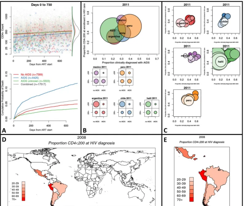
Fig 1. Featured frames from animated graphics (seehttp://biostat.mc.vanderbilt.edu/ccasanet/dataviz/examples.htm).Fig 1A,Example Panel 1: Immunologic recovery and mortality two years following cART initiation, stratified by clinical stage at ART initiation. Top panel: Time since ART initiation by CD4+ count. The dots mark observations and the Xs mark deceased patients at time of death and their last CD4+ count. Density curves show the two-year CD4+ count distribution by AIDS status. Bottom panel: Kaplan-Meier curves showing cumulative probability of death separated by AIDS status.Fig 1B,
Example Panel 2: Distribution of low CD4+ count and AIDS diagnosis at enrollment by region in 2011. Top panel: Bubble plot showing proportion of patients enrolled during 2011 who are clinical AIDS by the proportion with low CD4+ count; bubbles are proportional to the number of patients enrolled in 2011. Bottom panel: Marginal distributions of clinical AIDS by low CD4+ count for each country in 2011.Fig 1C,Example Panel 3: Distribution of low CD4+ count and AIDS diagnosis at enrollment by region in 2011. Bubble plot showing proportion of patients enrolled during 2011 who are clinical AIDS by the proportion with low CD4+ count. The top and lightest colored bubble is the current year (2011). The bubbles beneath represent prior years and darken as time passes.
Fig 1D,Example Map 1: World heat map showing proportion of newly diagnosed patients with low CD4 count in 2008. Countries with lightest shade of red have 20–29% of patients with low CD4+ count at HIV diagnosis. The CShapes dataset by Weidmann and Gleditsch is licensed under a Creative Commons
Attribution-NonCommercial-ShareAlike 4.0 International License [26].Fig 1E,Example Map 2: Country heat map showing proportion of newly diagnosed patients with low CD4 count in 2008. Countries with lightest shade of red have 20–29% of patients with low CD4+ count at HIV diagnosis. The CShapes
dataset by Weidmann and Gleditsch is licensed under a Creative Commons Attribution-NonCommercial-ShareAlike 4.0 International License [26].
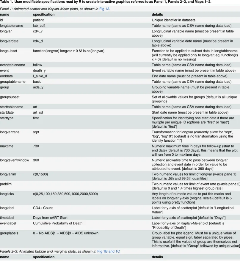
Table 1. User modifiable specifications read by R to create interactive graphics referred to as Panel 1, Panels 2–3, and Maps 1–2.
Panel 1:Animated scatter and Kaplan-Meier plots,as shown inFig 1A
name specification details
id patient Unique identifier in datasets
longtablename lab_cd4 Table name (same as CSV name during data load)
longvar cd4_v Longitudinal variable name (must be present in table
above)
longvardate cd4_d Longitudinal variable date name (must be present in
table above)
longsubset function(longvar) longvar>0 &! is.na(longvar) Function to be applied to subset data in longtablename (will currently be applied only to longvar; eg, function(x) x>0) [default is no missing]
eventtablename follow Table name (same as CSV name during data load)
event death_y Event variable name (must be present in table above)
enddate l_alive_d End date name (must be present in table above)
grouptablename basic Table name (same as CSV name during data load)
group aids_y Grouping variable name (must be present in table
above)
groupsubset Set of allowable values for groups [default is all unique
groupings]
starttablename art Table name (same as CSV name during data load)
startdate art_sd Start date name (must be present in table above)
starttype first Specification for identifying one start date if there are
multiple per unique ID (options are "first" or "last") [default is "first"]
longvartrans sqrt Transformation for longvar (currently allow for "sqrt",
"log", "log10") [default is no transformation using the identity function "I"]
maxtime 730 Numeric maximum time in days for follow-up (start to
end date) [default is 730 days]; this means that the plot will run from 0 to maxtime days.
long2eventwindow 360 Numeric allowable time to pass between longvar
collection and event date in order for value to be attributed to event. [default is 360 days]
longvarlim c(0,1500) Two numeric values for limit of longvar (y-axis pane 1)
[default is .5th and 99.5th quantiles]
problim Two numeric values for limit of event rate (y-axis pane 2)
[default is 0 and 1.4 times highest group rate] longticks c(0,25,100,150,350,500,1000,2000,5000) Any length of numeric values to put tick marks and
labels on longvar y-axis (original scale) [default is 5 points using pretty function]
longlabel CD4+ Count Label for y-axis of scatterplot [default is "Longitudinal
Value"]
timelabel Days from cART Start Label for y-axis of scatterplot [default is "Days"] eventlabel Cumulative Probability of Death Label for y-axis of Kaplan-Meier plot [default is
"Probability of Death"]
grouplabels 0 = No AIDS|1 = AIDS|9 = AIDS unknown Group label for plot legend. Must be a unique value of group variable, equal sign, label separated by pipes. This is useful if the values of group are themselves not informative. [default is "Group" followed by unique value]
Panels 2–3:Animated bubble and marginal plots,as shown inFig 1B and 1C
name specification details
vartable basic_cd4 table name (same as CSV name during data load)
Panels 2
–
3: Distribution of low CD4 count and AIDS diagnosis at
enrollment by region during 2000
–
2014
In our example (Fig 1B and 1C), each frame corresponds to calendar year of enrollment into HIV care. InFig 1B, the top panel is a bubble plot with bubbles representing regions, coordinate locations corresponding to observed proportions for each indicator, and bubble size proportion-ate to the number of newly enrolled individuals. The bottom panel includes contingency plots that show marginal allocations of both indicators within the classifier. InFig 1C, each region has a panel showing a trail of bubbles as time progresses, with coordinate locations corresponding to observed proportions for each indicator, and bubble size proportionate to the number of newly enrolled individuals. From the plots we can see that in most sites the proportions of new enrollees with low CD4 count (<200 cells/μL) and clinical AIDS has decreased over time. From
the bottom panel ofFig 1B, we observe that the marginal proportion of patients with an AIDS diagnosis and low CD4+ count represent a non-zero share of the country-level enrollment pop-ulation in 2011; this counter-intuitive result reveals the situation where subjective and objective measures do not always agree in the data. Informed by this visualization, a CCASAnet
researcher may next want to formally test whether patients seem to be entering HIV care and
Table 1. (Continued)
var1 basic_cd4$aids_cl_y = = 1 R code that creates an indicator variable using variables in vartable. Or use an indicator already appended to the existing dataset.
var2 basic_cd4$cd4_v_cmp<200 R code that creates an indicator variable using variables
in vartable. Or use an indicator already appended to the existing dataset.
vartablesubset format(convertdate(baseline_d,basic_cd4),"%Y")>1998 & format
(convertdate(baseline_d,basic_cd4),"%Y")<2016 & basic_cd4 $aids_cl_y %in% c(0,1) &! is.na(basic_cd4$aids_cl_y)
R code that creates an indicator variable that will be used to subset the original vartable using variables in vartable
eventdate baseline_d Date corresponding to relevant data collection (e.g., date
of enrollment).
eventperiod year How to discretize time for the different frames of the
bubbleplot. [default is year, allowable values are month, quarter, year, and missing]
group site Grouping variable in vartable for the different bubbles.
var1label1 AIDS Label of group for which var1 is 1 or TRUE.
var1label0 no AIDS Label of group for which var1 is 0 or FALSE.
var2label1 <200 Label of group for which var2 is 1 or TRUE.
var2label0 200+ Label of group for which var2 is 0 or FALSE.
var1label Proportion with clinical AIDS Axis label for var1.
var2label Proportion CD4<200 at enrollment in HIV care Axis label for var2.
minnum 10 Set minimum number of observed units for a bubble to
be drawn [default is 10].
Maps 1–2:Animated world and region heat maps,as shown inFig 1D and 1E
name specification details
countrytable basic_cd4_country Table with one row per country and time point—example
manipulation of existing DES tables in code/ cd4_base_country.R
var var1_prop Value of attribute to be mapped in Proportion (range:
0–1) or Percentage (range: 0–100)
country country Variable with ISO-3 country code
year year Time point for temporal connection of maps
varlabel Proportion CD4<200 at HIV diagnosis Label for attribute
treatment in earlier clinical stages as the epidemic response increases or as the program matures. Both panel graphics are created by the same set of input specifications and R code. For this example, it is necessary to calculate baseline CD4 count and merge with existing data; the crea-tion of this dataset may be opcrea-tionally aided using the example code in add_cd4_base.R. If derived variables such as baseline CD4 count are required, the user may employ our optional example code or instead add this derived variable using familiar data manipulation software.
Maps 1
–
2: Country heat maps showing proportion of newly diagnosed
patients with low CD4 count during 2000
–
2014
In our example (Fig 1D and 1E), the proportion plotted corresponds to patients diagnosed with CD4+ cell count<200 cells/μL. The first map (Fig 1D) shows the entire world to give
context to the countries in the cohort, and a second map (Fig 1E) is produced that highlights only those countries with data in any of the time periods. Both maps are created by the same set of input specifications and R code. It is necessary to input a dataset that has one record for country and time period; the creation of this dataset may be aided using the example code in cd4_base_country.R.
Discussion
Our goal is to enable HIV researchers to create interactive visualizations of large HIV cohort databases which inspire insight into and even awe at the dynamics of HIV outcomes. Longitu-dinal plots / survival curves can be used to view changes in CD4+ cell count, HIV viral load, hemoglobin, and other continuously varying measures and the probability of AIDS-defining events, loss to follow-up, death, and other endpoints. Bubble plots can be used to visualize movement in key indicators across relevant groupings over various time periods. Heat maps can be used to provide spatial and temporal context to HIV cohort data. Commonly used graphics in the field of HIV cohort research are made interactive and accessible using open source tools and data exchange standards.
Variations of these visualizations have been incorporated as supplemental figures in CCASA-net manuscripts [27,28]. Future directions include enhancing the suite of tools with additional classes of data visualization, such as the recently released dynamic visual display of treatment response [7]. While R has an arguably steep learning curve, we have mitigated this through the written and video instructions, hands-on dataset, and by allowing user-modified graphics with simple text file inputs versus editing R scripts. A logical next step in flattening the learning curve of R would be the design of a graphical user interface (GUI) that would allow the user to input the specifications interactively as opposed to editing the specifications in a CSV document. A GUI might also display descriptive statistics to supplement the visualization, or optionally allow for more comprehensive displays of uncertainty such as confidence intervals. Depending on the technical platform, further user interaction with these animations would include the ability to control the direction and speed of the time lapse animation, the ability to highlight and track elements of the plot, and the ability to control parameters that mask or compare alternate sce-narios. Researchers interested in this data visualization effort are encouraged to contact the authors and are invited to contribute ideas for additional interactive visualizations that may be openly implemented as part of this research tool set. Building on open standards like HICDEP, we aim to contribute additional shareable tools in the spirit of open scientific collaboration.
Acknowledgments
The Caribbean, Central and South America Network for HIV Epidemiology (CCASAnet) includes 7 sites: Fundación Huésped, Buenos Aires, Argentina, Principal Investigator (PI): Pedro Cahn, M.D., Ph.D.; Instituto Nacional de Infectologia Evandro Chagas-Fundação Oswaldo Cruz, Rio de Janeiro, Brazil, PI: Beatriz Grinsztejn, M.D., Ph.D.; Universidad de Chile, Santiago, Chile PI: Marcelo Wolff Reyes, M.D.; Le Groupe Haïtien d'Etude du Sarcome de Kaposi et des Infections Opportunistes (GHESKIO), Port-au-Prince, Haiti, PI: Jean W. Pape, M.D.; Instituto Hondureño de Seguridad Social and Hospital Escuela, Tegucigalpa, Hon-duras, PI: Denis Padgett, M.D.; Instituto Nacional de Ciencias Médicas y Nutrición, Mexico City, Mexico, PI: Juan Sierra Madero, M.D.; Instituto de Medicina Tropical Alexander von Humboldt, Lima, Peru, PI: Eduardo Gotuzzo, M.D.; and Vanderbilt University, Nashville, TN, USA, PI: Catherine McGowan, M.D.
Author Contributions
Conceived and designed the experiments: MB FHW PFR YCV CCM BES. Performed the experiments: MB FHW BES. Analyzed the data: MB YCV. Contributed reagents/materials/ analysis tools: MB FHW BES. Wrote the paper: MB FHW PFR YCV CCM BES.
References
1. Snow J. On the mode of communication of cholera: John Churchill; 1855.
2. Tukey JW. Exploratory data analysis. 1977.
3. Tufte ER, Graves-Morris P. The visual display of quantitative information: Graphics press Cheshire, CT; 1983.
4. Harrell FE. Regression modeling strategies: with applications to linear models, logistic regression, and survival analysis: Springer Science & Business Media; 2013.
5. Egger M, May M, Chêne G, Phillips AN, Ledergerber B, Dabis F, et al. Prognosis of HIV-1-infected
patients starting highly active antiretroviral therapy: a collaborative analysis of prospective studies. The Lancet. 2002; 360(9327):119–29.
6. Fauci AS, Pantaleo G, Stanley S, Weissman D. Immunopathogenic mechanisms of HIV infection. Annals of internal medicine. 1996; 124(7):654–63. PMID:8607594
7. Edwards JK, Cole SR, Martin JN, Moore R, Mathews WC, Kitahata M, et al. Dynamic visual display of treatment response in HIV-infected adults. Clinical Infectious Diseases. 2015:civ262.
8. Freifeld CC, Mandl KD, Reis BY, Brownstein JS. HealthMap: global infectious disease monitoring through automated classification and visualization of Internet media reports. Journal of the American Medical Informatics Association. 2008; 15(2):150–7. PMID:18096908
9. Gao S, Mioc D, Anton F, Yi X, Coleman DJ. Online GIS services for mapping and sharing disease infor-mation. International Journal of Health Geographics. 2008; 7(1):8.
10. Bastian M, Heymann S, Jacomy M. Gephi: an open source software for exploring and manipulating net-works. ICWSM. 2009; 8:361–2.
11. Gentleman RC, Carey VJ, Bates DM, Bolstad B, Dettling M, Dudoit S, et al. Bioconductor: open soft-ware development for computational biology and bioinformatics. Genome biology. 2004; 5(10):R80. PMID:15461798
12. Carroll LN, Au AP, Detwiler LT, Fu T-c, Painter IS, Abernethy NF. Visualization and analytics tools for infectious disease epidemiology: A systematic review. Journal of biomedical informatics. 2014; 51:287–98. doi:10.1016/j.jbi.2014.04.006PMID:24747356
13. Richards TB, Croner CM, Rushton G, Brown CK, Fowler L. Information technology: Geographic infor-mation systems and public health: Mapping the future. Public health reports. 1999; 114(4):359. PMID: 10501137
14. Robinson AC, MacEachren AM, Roth RE. Designing a web-based learning portal for geographic visual-ization and analysis in public health. Health informatics journal. 2011; 17(3):191–208. doi:10.1177/ 1460458211409718PMID:21937462
16. Harger JR, Crossno PJ, editors. Comparison of open-source visual analytics toolkits. IS&T/SPIE Elec-tronic Imaging; 2012: International Society for Optics and Photonics.
17. McGowan CC, Cahn P, Gotuzzo E, Padgett D, Pape JW, Wolff M, et al. Cohort profile: Caribbean, Cen-tral and South America Network for HIV research (CCASAnet) collaboration within the international Epi-demiologic databases to evaluate AIDS (IeDEA) programme. International journal of epidemiology. 2007; 36(5):969–76. PMID:17846055
18. Kjær J, Ledergerber B. Short communication HIV cohort collaborations: proposal for harmonization of data exchange. Antiviral therapy. 2004; 9:631–3.
19. Diggle P, Heagerty P, Liang K-Y, Zeger S. Analysis of longitudinal data: Oxford University Press; 2002.
20. Silverman BW. Density estimation for statistics and data analysis: CRC press; 1986.
21. Kaplan EL, Meier P. Nonparametric estimation from incomplete observations. Journal of the American statistical association. 1958; 53(282):457–81.
22. Cleveland WS. LOWESS: A program for smoothing scatterplots by robust locally weighted regression. American Statistician. 1981:54-.
23. Rosling H, Zhang Z. Health advocacy with Gapminder animated statistics. Journal of epidemiology and global health. 2011; 1(1):11–4. doi:10.1016/j.jegh.2011.07.001PMID:23856371
24. Mathers C, Fat DM, Boerma JT. The global burden of disease: 2004 update: World Health Organiza-tion; 2008.
25. Corbett EL, Watt CJ, Walker N, Maher D, Williams BG, Raviglione MC, et al. The growing burden of tuberculosis: global trends and interactions with the HIV epidemic. Archives of internal medicine. 2003; 163(9):1009–21. PMID:12742798
26. Weidmann NB, Kuse D, Gleditsch KS. The geography of the international system: The CShapes data-set. International Interactions. 2010; 36(1):86–106.
27. Carriquiry G, Fink V, Koethe J, Giganti M, Jayathilake K, Blevins M, et al. Mortality and loss to follow-up among HIV-infected persons on long-term antiretroviral therapy in Latin America and the Caribbean. JIAS. 2015;in press.