FERRAMENTAS DE LINHA DE PRODUTOS DE
SOFTWARE: VISUALIZAÇÃO DE DADOS
KATTIANA FERNANDES CONSTANTINO
FERRAMENTAS DE LINHA DE PRODUTOS DE
SOFTWARE: VISUALIZAÇÃO DE DADOS
EXPERIMENTAIS
Dissertação apresentada ao Programa de Pós-Graduação em Departamento de cia da Computação do Instituto de Ciên-cias Exatas da Universidade Federal de Mi-nas Gerais como requisito parcial para a obtenção do grau de Mestre em Departa-mento de Ciência da Computação.
Orientador: Eduardo Magno Lages Figueiredo
Coorientadora: Raquel Cardoso de Melo Minardi
Belo Horizonte
KATTIANA FERNANDES CONSTANTINO
SOFTWARE PRODUCT LINE TOOLS:
VISUALIZATION OF EXPERIMENTAL DATA
Dissertation presented to the Graduate Program in Department of Computer Sci-ence of the Federal University of Minas Gerais in partial fulfillment of the require-ments for the degree of Master in Depart-ment of Computer Science.
Advisor: Eduardo Magno Lages Figueiredo
Co-Advisor: Raquel Cardoso de Melo Minardi
Belo Horizonte
c
2015, Kattiana Fernandes Constantino.
Todos os direitos reservados.
Constantino, Kattiana Fernandes
C758s Software Product Line Tools: Visualization of Experimental Data / Kattiana Fernandes Constantino. — Belo Horizonte, 2015
xxiii, 81 f. : il. ; 29cm
Dissertação (mestrado) — Federal University of Minas Gerais
Orientador: Eduardo Magno Lages Figueiredo
1. Computação — Teses. 2. Engenharia de software. 3. Visualização de Informação. 4. Engenharia de linha de produto de software. I. Orientador. II. Título.
Dedico aos meus futuros filhos que ainda virão
Acknowledgments
Agradeço ao meu Deus pela misericórdia renovada a cada manhã. Pelo amor incondicional. Pela graça divina. Pela cruz. Pela paz, pela força, pelo dia, pela noite, pelo alimento diário, pela saúde, pela família, pelos amigos, pelos professores, pela instituição, por tudo, tudo, tudo, tudo. . . Obrigada Deus, a Ti toda honra e toda glória para todo sempre.
Agradeço aos meus pais, Edgar e Cícera, pelo amor incondicional, pelo incentivo total nesta fase e por cada palavra motivadora. Agradeço aos meus irmãos Kellen, Kássio e Kelbe, ao meu cunhado Moacir Júnior e a minha cunhada Daliane pelo amor, apoio e pelas palavras sempre incentivadoras. Como essas palavras motivadoras e incentivadoras são preciosas! Agradeço as minhas amadas sobrinhas, Bruna e Fernanda, pelos momentos sempre alegres e importante para meu descanso mental. Obrigada meus queridos, amo vocês todos.
Agradeço a todos os tios e primos da minha família pelo apoio dispensado, especialmente as minhas primas Amanda e Marina por terem aberto as primeiras portas desta fase em Belo Horizonte. Obrigada família.
Saudades eternas da tia Elenice. Como as suas palavras de incentivo, ao me parabenizar por ter sido aceita no mestrado, ecoaram ao longo desses dois anos. Que ótima lembrança guardarei da nossa penúltima conversa. Quão precioso foi cada incentivo, cada palavra. . . saudades, muitas saudades. Saudades eternas também da tia Nair (minha vó por 21 anos), tio João Lima (meu vô por adoção), tia Zilda, tia Nery e Idalina. 2014, que ano marcante e difícil. Descansem em paz com o Eterno.
Agradeço aos meus amigos de curta, média e longa jornada que estão perto ou distantes em outro estado ou país, mas que estão sempre por perto orando, incentivando, torcendo. Obrigada amigos.
Agradeço aos meus amigos da pós-graduação, colegas e funcionários do depar-tamento, pelos diversos momentos de conversas sobre o mestrado ou além dele, pelos incentivos, pelos conselhos e atenção nos momentos de angústias, pelos momentos de alegrias, pelos momentos de trabalho. Muitos contribuíram ou com uma sugestão de tema/trabalho, ou com uma dica mais técnica, ou com alguma motivação. Como eu sempre acreditei e disse, “mestrado não se faz sozinha!”. Não mesmo!!! Os amigos/-colegas de trabalho/estudo são imprescindíveis para a saudável conclusão de uma etapa tão árdua como um mestrado (ou doutorado). Preciso agradecer explicitamente ao Luís Damilton e Júlio Reis, por alguns vários momentos que vocês contribuiram diretamente no meu trabalho além, dos momentos de desabafos. Aos colegas do Laboratório de Engenharia de Software (LabSoft) que também participaram e deram sugestões preciosas. Aos queridos colegas da Laboratório Pensi pelo convívio diário, sugestões constantes, momentos de “relax”. Aos demais amigos da turma... Graças a Deus, são tantos os amigos. Obrigada meus queridos, cada um foi especial! O que seria de mim sem vocês?
Agradeço imensamente ao professor Eduardo Figueiredo, meu orientador, que além de me aceitar como orientanda, dedicou-se com sugestões e incentivos preciosos para a realização e conclusão desta etapa. Muito obrigada de coração. Também, agradeço a professora Raquel Minardi pela co-orientação e sugestões oportunas. Agradeço ainda, aos membros da banca, professor Glauco Carneiro e professor Marco Túlio Valente pela atenção dispensada na leitura e sugestões para a melhoria deste trabalho. Obrigada mestres.
Enfim, meu coração está repleto de alegria pela conclusão desta etapa tão almejada e batalhada. Também, estou muito agradecida, sobretudo, a todos que contribuiram, motivaram, incentivaram com palavras positivas ao longo destes dois anos. Como elas são preciosas e importantes para um estudante.
Obrigada Deus por mais essa vitória!
“Coração de estudante Há que se cuidar da vida Há que se cuidar do mundo Tomar conta da amizade Alegria e muito sonho Espalhados no caminho Verdes, planta e sentimento Folhas, coração Juventude e fé”
(Milton Nascimento e Wagner Tiso)
Abstract
Software Product Line (SPL) is becoming widely adopted in industry due to its capabil-ity of minimizing costs and improving qualcapabil-ity of software systems through systematic reuse of software artifacts. An SPL is a set of software systems sharing a common, managed set of features that satisfies the specific needs of a particular market segment. There are several tools to support variability management by modeling features in SPL. However, it is hard for a developer to choose the most appropriate tool due to several options available. In order to support this research, we developed the ViSPLatform.
It is a visual platform developed using Data Driven Documents (D3) to present and to favor the understanding of empirical data about SPL tools. We used ViSPLatform
in two research studies. First, we present and discuss the findings from a System-atic Literature Review (SLR) of SPL management tools. Based on the results of the SLR, we later designed and executed an empirical study. This empirical study com-pares and analyzes three SPL management tools, namely SPLOT, FeatureIDE, and pure::variants, based on data from 124 participants that used the analyzed tools. In this study, we performed a four-dimension quantitative and qualitative analysis with respect to common functionalities provided by SPL tools: (i) Feature Model Edition, (ii) Automated Feature Model Analysis, (iii) Product Configuration, and (iv) Feature Model Import/Export. Our aim with the ViSPLatform is to explore different data
types of our results and to provide visualization support to empirical data of SPL tools.
Keywords: software product line, variability management tools, SPLOT, FeatureIDE,
pure::variants, data visualization.
List of Figures
2.1 Visualization Reference Model [Card et al., 1999]. . . 7
2.2 Example of a feature model. . . 12
2.3 SPLOT interface view for creating and analyzing a feature model . . . 14
2.4 Feature model in FeatureIDE tool . . . 15
2.5 pure::variants interface . . . 16
3.1 Packages view of ViSPLatform . . . 20
3.2 Tools cited in the literature on a period of time . . . 21
3.3 Details on demand: data analyst selects a particular tool to get more infor-mation . . . 22
3.4 Participants grouped by tools. . . 23
3.5 Background of participants . . . 24
3.6 The map of the levels of knowledge versus result of the tasks for participants of an experimental study . . . 25
3.7 Background of participants impact on the use of each tools . . . 26
3.8 Background of participants with respect to one skill (a). Data analyst makes a combination of knowledge, selecting or deselecting some skill levels (b) . 27 3.9 The results for participants with some knowledge selected. . . 27
3.10 Diverging Stacked Bar Chart for presenting results of rating scales . . . 28
4.1 More information detailed about the SPL tool selected . . . 36
5.1 Each participant used only one tool, either SPLOT (pink) or FeatureIDE (blue) or pure::variants (yellow) tool . . . 46
5.2 Background of participants with respect to Object-Oriented Programming (OOP), Unified Modeling Language (UML), SPL, and Work Experience (WE) 47 5.3 Background of participants grouped by work experience in software devel-opment industry . . . 48
5.4 Percentage of problems reported by participants to complete their tasks . . 50
5.5 Overview of each level of knowledge versus results of the tasks performed by participants . . . 52 5.6 Strong and weak background of participants . . . 54 5.7 Strengths and weaknesses faced by participants during the tasks with SPLOT 56 5.8 Strengths and weaknesses faced by participants during the tasks with
Fea-tureIDE . . . 57 5.9 Strengths and weaknesses faced by participants during the tasks with
pure::variants . . . 57
List of Tables
4.1 Number Searched for Years 2000-2014 . . . 36
4.2 Explanation of functionalities evaluated . . . 38
4.3 Functionalities of SPL management tools . . . 39
5.1 Functionalities of SPLOT, FeatureIDE and pure::variants Tools . . . 45
Contents
Acknowledgments xi
Abstract xv
List of Figures xvii
List of Tables xix
1 Introduction 1
1.1 Motivation . . . 1
1.2 The Proposed Approach . . . 2
1.3 Goal and Contributions . . . 3
1.4 Dissertation Outline . . . 4
2 Background 5 2.1 Information Visualization . . . 6
2.1.1 Perception and Cognition . . . 7
2.1.2 Gestalt Theory . . . 8
2.1.3 Overcoming the Limits of Memory . . . 8
2.1.4 Choosing the Visualization Techniques . . . 9
2.1.5 Visual Support Tool . . . 10
2.2 Software Product Line Engineering . . . 11
2.3 Software Product Line Tools . . . 13
2.3.1 SPLOT . . . 13
2.3.2 FeatureIDE . . . 14
2.3.3 pure::variants . . . 15
2.4 Concluding Remarks . . . 17
3 The Visualization Platform 19
3.1 ViSPLatform Architecture . . . 20
3.2 Strip Plots . . . 21 3.3 Bubble Chart . . . 22 3.4 Heatmap . . . 24 3.5 Bar and Donut Charts . . . 25 3.6 Diverging Stacked Bar Chart . . . 28 3.7 Concluding Remarks . . . 29
4 Visualizing Systematic Literature Review Data 31
4.1 Study Settings . . . 31 4.1.1 Planning the review . . . 32 4.1.2 Conducting the review . . . 33 4.1.3 Reporting the review . . . 35 4.2 Results and Analysis . . . 35 4.2.1 Selected SPL Management Tools . . . 35 4.2.2 Main Functionalities of the Tools . . . 37 4.3 Threats to Validity . . . 40 4.4 Concluding Remarks . . . 41
5 Visualizing Empirical Study Data 43
5.1 Study Settings . . . 44 5.1.1 Research Questions . . . 44 5.1.2 Selected Software Product Line Tools . . . 44 5.1.3 Background of the Participants . . . 46 5.1.4 Training Session and Tasks . . . 48 5.2 Results and Analysis . . . 49 5.2.1 Problems Faced by Developers . . . 49 5.2.2 Background Influence . . . 51 5.2.3 Observed Strengths and Weaknesses in SPL Tools . . . 55 5.3 Threats to Validity . . . 58 5.4 Concluding Remarks . . . 59
6 Related Work 61
6.1 Information Visualization in SPL . . . 61 6.2 SLR of SPL tools . . . 62 6.3 Empirical Studies of SPL tools . . . 63 6.4 Concluding Remarks . . . 64
7 Conclusion and Future Work 67
Bibliography 71
Chapter 1
Introduction
Software Product Line (SPL) is becoming widely adopted in industry due to its capabil-ity of minimizing costs and improving qualcapabil-ity of software systems through systematic reuse of software artifacts. A SPL is a set of software systems sharing a common, managed set of features that satisfies the specific needs of a particular market segment or customer [Pohl et al., 2005]. The advantages with the adoption of SPL approach ensure competitiveness for organizations [Clements et al., 1999]. Large companies, such as Boeing, General Motors, Hewlett-Packard, Lucent, Nokia, Motorola, Philips, Siemens, and Toshiba have adopted SPL practices [SPL Hall of Fame, 2015]. To take full advantages of SPL practices, supporting tools are required. There are a variety of SPL tools to support variability management. However, it is hard for a stakeholder to choose the most appropriate tool due to several options available.
1.1
Motivation
The number of published experiments in software engineering has increased. A sub-stantial number of empirical studies about SPL tools has been published [Pereira et al., 2013; Simmonds et al., 2011; Šmite et al., 2010; Unphon, 2008; Sjøberg et al., 2008; Dybå and Dingsøyr, 2008; Djebbi et al., 2007]. Systematic literature review (SLR) and experiments in software engineering are a type of empirical studies that can involve too many empirical data. A SLR is a means of identifying, evaluating and interpret-ing all available research relevant to a particular research question, or topic area, or phenomenon of interest. Individual studies contributing to a systematic review are called primary studies; a systematic review is a form of secondary study [Keele, 2007]. SLR has gotten much attention lately in Software Engineering (SE) [Kitchenham et al., 2009a]. An experiment is a formal, rigorous, and controlled investigation. The
2 Chapter 1. Introduction
ical data can be complex, involving a high number of variables and possible crossings what could generate a high number of analyses. All these factors aforementioned con-firms that knowledge discovery is not a trivial task.
In this context, visualization techniques could be combined with other data anal-ysis techniques in order to favor the understanding of the results. Charts are illustrative and give a data set overview [Wohlin et al., 2012a]. However, chart design must take into account several principles for perception and cognition, which are the information visualization field’ goals. Information visualization is defined as the use of computer-supporting, interactive, and visual representations of abstract data to amplify cogni-tion [Card et al., 1999]. The design process of an informacogni-tion visualizacogni-tion technique consists of transforming data into images that are better comprehensible by perception and cognitive system of human beings [Spence, 2014]. The primary goal of visualization is to convey information in an understandable, effective, easy-to-remember way [Diehl, 2007].
1.2
The Proposed Approach
In order to support researchers and practitioners to choose or compare SPL manage-ment tools, we developed ViSPLatform. This visual platform is composed by five
different visualization techniques (or visual metaphors). This set of visualizations and analytical interaction techniques were projected to analyze the quantitative data and make possible to represent and explore empirical SPL tool data presented in this dis-sertation in order to make analysis and reach conclusions about the tools.
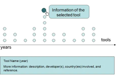
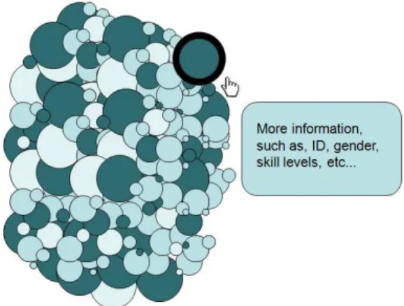
In the first visual metaphor, we use a strip plot chart to present in the time line the SPL management tools cited by literature since 2000. In addition, data analysts can interact with the visualization to explore detailed information about each tool, such as name, year, brief description, developers, country(ies) involved, and reference. The second visual metaphor consists of a bubble chart used to represent each participant of the empirical study. In this case, the data analyst can interact with the bubbles to have information about backgrounds of a specific participant. He/She also can sort the participants by gender, used tool, skill level, work experience or university that each participant is enrolled.
1.3. Goal and Contributions 3
four different answers concerning the level of difficulty in performing the tasks. With a similar propose, we create the fourth visual metaphor to detail this influence / impact. For that, we use a combination of bar and donut chart. Each bar represents different skill levels for each knowledge and work experience. Each donut represents the result of a particular task for a tool. Thereby, in this visual metaphor, the data analyst can combine different skill levels and compare the results of the tasks for each one of three tools. Finally, in the fifth visual metaphor, we use divergent stacked chart to present and explore problems faced by participants during the experiment in addition to strengths and weaknesses of each tool pointed by them.
1.3
Goal and Contributions
The main goal of this dissertation is to use the information visualization techniques to explore data from two empirical strategies and to provide analytical support to empirical SPL tools data exploration. To this end, we propose a visual platform composed by
five different visualizations techniques, called ViSPLatform. This set of visual
repre-sentations and analytical interaction techniques focused on empirical data analysis to help data analysts to comprehend and explore data from research methods in the SPL tool context. This kind of visual platform can help designers, data analysts, project managers, researchers, and other stakeholders to understand better their projects and make decisions.
This dissertation presents three main contributions. The first is ViSPLatform
which aims to help providing an understanding of data from research methods in the SPL tool context. The second is a systematic literature review focusing on SPL management tools. We give an overview about the SPL management tools available in the literature during a determined period of time, in order to find out how the available tools are providing support to SPL development. Finally, the third contribution of this dissertation is an empirical study of three SPL management tools, which identifies strengths and weaknesses of each tool.
The results presented in this dissertation are parts of the following papers:
• Constantino, K. ; Figueiredo, E. ; Carneiro, G. ; Melo-Minardi, R..
“Multi-ple View Interactive Environment to Analyze Software Product Line Tools”. In:
Brazilian Symposium on Information Systems (SBSI), 2016, Florianópolis/Brazil.
4 Chapter 1. Introduction
• Constantino, K. ; Pereira, J. ; Padilha, J. ; Vasconcelos, P. ; Figueiredo, E.. “An
Empirical Study of Two Software Product Line Tools”. In: International Con-ference on Evaluation of Novel Approaches to Software Engineering (ENASE),
2016, Rome. Proceedings of International Conference on Evaluation of Novel Approaches to Software Engineering (ENASE). Germany: Springer, 2016. v. 1. p. 1-8.
• Pereira, J. ; Constantino, K. ; Figueiredo, E.. “A Systematic Literature Review
of Software Product Line Management Tools”. In: 14th International Conference on Software Reuse (ICSR). Lecture Notes in Computer Science. 14ed.Miami:
Springer International Publishing, 2015, v. 8919, p. 73-89.
1.4
Dissertation Outline
This dissertation is organized as follows. Chapter 2 introduces background concepts about information visualization, software product line engineering (SPLE), and soft-ware product line (SPL) tools. Chapter 3 presents ViSPLatform, a visual platform
Chapter 2
Background
The process of designing an information visualization technique consists of transform-ing data into images that are better comprehensible by perceptive and cognitive system of human beings [Spence, 2014]. These visualization techniques can be used in the Software Engineering (SE) context in order to reveal and to better understand data, structures, and processes [Gotel et al., 2008]. In the SE domain, Software Product Line Engineering (SPLE) is a paradigm to develop a variety of similar software applications (software-intensive systems or software products) using a platform and mass customization [Pohl et al., 2005]. The adopting of SPLE by industry depends on adequate tool support.
In this chapter, we provide the background information necessary for reading this dissertation including information visualization, software product line engineering, and three SPL tools, namely SPLOT, FeatureIDE, and pure::variants. Section 2.1 defines information visualization and shows how it can help to explore and comprehend data from empirical research in SE. Section 2.2 introduces concepts about Software Prod-uct Line Engineering. Section 2.3 presents three tools to support SPL management. Finally, concluding remarks are discussed in Section 2.4.
6 Chapter 2. Background
2.1
Information Visualization
Visualization techniques can be combined with other data analysis techniques in order to favor the understanding of semantics of the data. Charts are much more illustrative than simple text and tables giving an important first overview of the data set opening up a starting point to further investigations [Wohlin et al., 2012a]. However, chart design must take into account several principles for perception and cognition that are goals of the information visualization field.
Information visualization is defined as the use of computer-supported, interactive, visual representations of abstract data to amplify cognition [Card et al., 1999]. Each of these characteristics is detailed below [Few, 2009].
• Computer-supported: the visualization is displayed by a computer.
• Interactive: the visualization can be manipulated simple and direct manner,
in-cluding actions such as filtering the data to focus on details.
• Visual representations: the information is presented in visual form using
at-tributes such as location, length, shape, color, and size of objects to form a image of the data. Thereby, we can see patterns, trends, and exceptions that might not otherwise be visible.
• Abstract data: Information such as quantitative data, processes, or relationships
is considered abstract. Because abstract information has no natural physical form, visualizations must map the data to visual characteristics, such as shapes and colors that represent the data in perceptible and meaningful ways.
• Amplify cognition: Interacting with these visualizations extends our ability to
reflect about information in ways that our brains can easily comprehend.
2.1. Information Visualization 7
Figure 2.1: Visualization Reference Model [Card et al., 1999].
The primary goal of visualization is to convey information in an understandable, effective, and easy-to-remember way [Diehl, 2007]. The process of visual data explo-ration usually follows the information seeking mantra: “Overview first, zoom and filter, and then details-on-demand” [Shneiderman, 1996]. First, the data analyst needs to get an overview of the data. In this phase, the data analyst identifies interesting patterns and decides which are more promising for the next steps and which questions can be asked to go further in the desired analysis as well as the hypothesis that can be for-mulated. For analyzing more deeply the patterns, the data analyst needs to drill down and access more details [Keim et al., 2002]. An appropriate visualization technique can be used to support each of these three steps.
2.1.1
Perception and Cognition
According to Few [2009], visual perception works as follows:
• Our eyes perceive the reflected light from the surfaces of objects in the world.
• An object is built up in our brains as a composite of several visual properties,
which are the building blocks of vision.
• Despite of human beings perceive this composite of properties as a whole object,
they can still recognize the properties which compose the object.
• These individual properties include two-dimension (2-D) location, length, width,
area, shape, color, and orientation, to name a few.
Moreover, there are a few facts about how we collect and process visual informa-tion [Few, 2009]. These facts can help us to create effective informainforma-tion visualizainforma-tion.
• Fact 1: Our visual perception is selective. Our attention is often drawn to
8 Chapter 2. Background
• Fact 2: We see what is familiar for us. Thereby, visualizations work best when
they present information as patterns that are both common and easy to recognize. For instance, when we represent quantitative information in visual form, our ability to think about it is better than when we see same information in the table.
• Fact 3: Memory plays an important role in human cognition, but working
mem-ory is extremely limited. Thereby, information visualization must provide an external support to augment working memory. For instance, it is easier compar-ing two figures (or charts) when they are side by side, than when they are in different places (or on other page, or on other screen).
Software can only support information visualization effectively if the software operates on principles that respect how visual perception and cognition work.
2.1.2
Gestalt Theory
Gestalt theory was originally described in 1910 [Köhler, 1938; Wertheimer, 1938; Kof-fka, 1935; Ellis, 1999]. Gestalt theory tries to explain how humans arrange individual elements into groups and how humans perceive and recognize patterns. Of particular relevance are the created rules of perceptual organization, also known as Gestalt laws of grouping, which, by explaining how humans perceive a well-organized pattern, can easily translate into brief design principles.
Three of the Gestalt laws - similarity, proximity, and common fate are particularly important. The law of similarity asserts that elements which are similar, either in terms of color, shape, or size. They are perceived to be more associated than elements that are dissimilar. The law of proximity is related to elements which are close together are perceived as being more associated than elements that are farther apart. Finally, the law of common fate declares that elements that move simultaneously in the same direction and at the same speed are perceived as being more related than elements that are static or that move in different directions [Lima, 2011].
2.1.3
Overcoming the Limits of Memory
2.1. Information Visualization 9
information and visual information. When you work with an information visualization, you use the visual working memory. However, this memory is very limited. Research has found that visual working memory can only handle about three chunks of informa-tion at a time [Few, 2009]. A chunk can be a mental representainforma-tion of an object, or a plan, or a group of objects, or a method for achieving some goal, or anything. [Ware, 2012].
For instance, most of the human beings might only be able to hold three to five numbers [Cowan, 2012]. If this same information is presented in a line chart, however, each line could be stored as a single chunk in visual memory. Therefore, this is one of the great advantages of visualization for exploring and analyzing data. When quantitative values are displayed as visual images, more information is chunked together in these images, thus we can deal with more information simultaneously than if we were relying only a tables of numbers. This greatly multiplies the number and complexity of insights that can appear [Few, 2009].
2.1.4
Choosing the Visualization Techniques
Different taxonomies and classification models have been proposed to describe data visualization techniques and possible data analyst interactions [Roth and Mattis, 1990; Zhou and Feiner, 1996; Morse et al., 2000; Fujishiro et al., 2000; Valiati et al., 2006; Nazemi et al., 2011]. Nonetheless, different models focus on distinct aspects according to the goal or context in which the visualization is being used. According to Barros [2015] which studied and proposed a taxonomy aimed to unify the main existing tax-onomies, most of the data visualization techniques could be characterized according to three main dimensions: Data,Analytical Tasks, andVisual Attributes. Each dimension
can be then subdivided into others. For instance, one of the sub-dimensions of Data is
the Data Type, that classifies the data asQuantitative orQualitative [Roth and
Mat-tis, 1990]. Knowing the type of data and the capabilities of visualization techniques is essential do encode data visual in an appropriate way.
The Analytical Tasks dimension, in its turn, describes actions that can be
per-formed by data analysts when interacting with an interactive data visualization as part of an analytical process. For example, User Interaction and Data Analysis [Fujishiro
et al., 2000]. User Interaction tasks describe a set of high-level tasks performed by data
analysts during their interaction with a data visualization system (overview, zoom, fil-ter, details-on-demand, relate, history and extract) [Shneiderman, 1996]. For instance,
Filter is the act of reducing the set of data. In other words, we select the
10 Chapter 2. Background
previously selected. Both of them are task of filtering. Data Analysis describes a set
of low-level tasks performed by data analysts during the data analysis. Knowing the possible analytical interaction techniques, with what visualization techniques they can be implemented and the type of questions they can answer is also very important to design appropriate interactive visualizations.
Finally, the Visual Attributes dimension represents a set of visual and normally
pre-attentive features used as primitives in the construction of data visualization tech-niques. One of its sub-dimension is theRetinal Variable which are the visual variables
related to depth perception defined by the experimental psychology (Size, Texture, Color Orientation, Form and Value) [Nazemi et al., 2011; Bertin, 1973]. This are pre-attentive attributes and knowing how to use them according to they are perceived by human beings is of great importance in visualization design. For instance, not every visual attribute can be precisely used to encode quantities. Color intensity for example can be used to encode quantitative values but are not as precise as the size of an object. That is why bar charts are so popular.
2.1.5
Visual Support Tool
The following functionalities are recommended for a tool in supporting data analy-sis [Few, 2015]:
• Effective charts. Analysts need a limited set of useful and well designed charts.
• Effective data interactions. Analysts need a limited set of useful, well designed,
and efficient interaction methods (filtering, sorting, annotating, etc.).
• Useful statistics. Proven statistical methods should be available and well
elabo-rated to produce reliable results.
• Effective human-computer interfaces. The interface should be easy for analysts
to efficiently interact with data without distraction.
2.2. Software Product Line Engineering 11
In this work we join the well-known and accepted principles about human per-ception and cognition together with knowledge about data types and the appropriate visualization techniques to each of them playing with visual attributes and finally ex-ploring how analytical interaction techniques could help us to depict, analyze and find conclusions about our data from empirical studies.
2.2
Software Product Line Engineering
The growing need for developing larger and more complex software systems demands better support for reusable software artifacts [Kang et al., 1998; Mendonça et al., 2009]. When artifacts are reused in several kinds of systems, this reuse implies a cost reduction for each system. In order to address these demands, Software Product Line Engineering (SPLE) has been increasingly adopted in software industry [SPL Hall of Fame, 2015]. SPLE is a paradigm to develop a variety of similar software applications (software-intensive systems or software products) using a platform and mass customization [Pohl et al., 2005].
Software Product Line (SPL) is a set of software systems sharing a common, managed set of features that satisfies the specific needs of a particular market seg-ment [Pohl et al., 2005]. A feature represents an increseg-ment in functionality or a system property relevant to some stakeholders [Batory, 2005b; Kang et al., 1990]. It may re-fer to functional requirements [Jarzabek et al., 2003], architecture decisions [Bernardo et al., 2002], or design patterns [Prehofer, 2001]. An important concept of an SPL is the feature model. Feature models are used to represent the common and variable features in SPL [Czarnecki and Eisenecker, 2000; Kang et al., 1990].
12 Chapter 2. Background
Figure 2.2: Example of a feature model.
The expected advantages in the adoption of SPL are: large-scale productivity, decreased time to market and product risk, ability to effect mass customization, in-creased product quality, more efficient use of human resources, ability to maintain market presence, and increased customer confidence and satisfaction. These advan-tages ensure competitiveness for organizations [Clements et al., 1999]. Experiences already show that SPL can allow companies to realize order-of-magnitude these im-provements [Clements and Northrop, 2001]. Large companies, such as Boeing, General Motors, Hewlett-Packard, Lucent, Nokia, Motorola, Philips, Siemens, and Toshiba have adopted SPL practices [SPL Hall of Fame, 2015].
2.3. Software Product Line Tools 13
2.3
Software Product Line Tools
In this section, we present a brief overview of main functionalities of three hetero-geneous SPL tools, relevant for this dissertation, namely SPLOT, FeatureIDE, and pure::variants. The criteria and reasons to select these three tools are presented in Chapter 5. Section 2.3.1 introduces SPLOT, a Web-based reasoning and configura-tion system for SPLs. Secconfigura-tion 2.3.2 presents FeatureIDE, an extensible framework for feature-oriented software development. Finally, Section 2.3.3 outlines pure::variants, a tool for variant management that supports developers of SPLs throughout the entire product lifecycle.
2.3.1
SPLOT
Software Product Lines Online Tools (SPLOT)1[Mendonça et al., 2009] is a Web-based tool for creating and sharing feature models and product configuration. It is a free and open source project. Figure 2.3 shows the view for creating, editing and analyzing a feature model in the SPLOT tool. First, this figure shows a directory-like tree format of feature model provided by SPLOT. Some information about the feature model is essential to better document, identify and, eventually, change the model. In addition, the figure also presents some statistics about the feature model, such as, the amount of features, feature mandatory, optional, alternative, constraints, and others. SPLOT also checks the consistency and validates the feature model.
Furthermore, SPLOT supports the notion of feature-based interactive configura-tion in which developers make configuraconfigura-tion decisions selecting or deselecting a feature of the model. For each decision, the configuration engine automatically checks the con-sistency. SPLOT uses a SAT Solver to support interactive configuration operations, such as configuring, resetting, undoing, toggling, and auto-completing. SPLOT does not provide means for code generation or integration with source. On the other hand, at the tool website, we can find a repository with hundreds of feature models created by the tool stakeholders since 2009. For that, the model must (i) be consistent, (ii) have at least 10 features, (iii) not have dead feature and (iv) have the information required by fields in the table.
1
14 Chapter 2. Background
Figure 2.3: SPLOT interface view for creating and analyzing a feature model
2.3.2
FeatureIDE
FeatureIDE2 [Thüm et al., 2014] is an open source framework of an IDE for software product line engineering based on Feature-Oriented Software Development (FOSD). It supports all phases of feature-oriented software development for the SPL development, starting with domain analysis and feature modeling [Czarnecki and Eisenecker, 2000], to covering requirements analysis, implementation, and code generation. Besides having feature model editors and configuration of products, it is integrated with several programming and composition languages with a focus on development for reuse.
FeatureIDE was developed to support both aspect-oriented [Kiczales et al., 1997] and feature-oriented programming (FOP) [Batory et al., 2004; Prehofer, 1997] in or-der to provide traceability between a feature model and the code base. This tool is implemented as an Eclipse plug-in and can be downloaded separately or in a package
2
2.3. Software Product Line Tools 15
with all dependencies needed for implementation. Figure 2.4 presents a feature model in FeatureIDE. This feature model editor allows different views of the feature model and the creation of cross-tree constraints [Thüm et al., 2014].
Figure 2.4: Feature model in FeatureIDE tool
For product configuration functionality, FeatureIDE receives as input the feature model and provides configuration options. Developers can select or deselect the fea-tures in the model and, automatically, a new product is configured and saved in a configuration file. The product configuration editor checks the new product configured to indicate whether it is a valid setting. FeatureIDE also provides export and import functionality in order to integrates with other feature modeling tools, for example, GUIDSL [Batory, 2005a], SPLOT, and others. The feature model created with Fea-tureIDE is stored in an XML format. Furthermore, the feature models can also be stored in several graphic formats or printed to a PDF file [Thüm et al., 2014].
2.3.3
pure::variants
pure::variants3 [Beuche, 2012] is a tool for variability management. It is developed by the pure-Systems GmbH, a company specialized in the development of reuse-based software. This tool supports SPL developers throughout the entire product lifecy-cle [Beuche, 2003] since requirements specification and test cases until the maintenance phase. Its user interface is based on Eclipse plug-in.
3
16 Chapter 2. Background
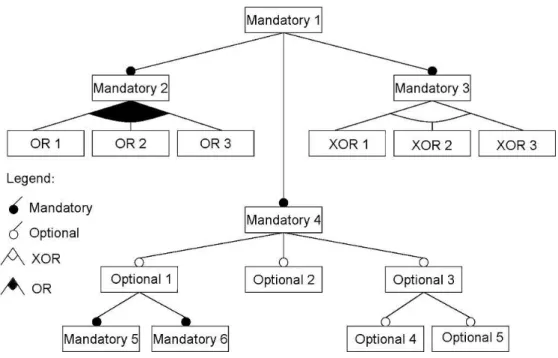
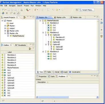
The pure::variants architecture follows the Feature-Oriented Domain Analysis (FODA) notation [Kang et al., 1998]. It has three different models: feature model, family model, and variant model. Feature model shows common features and variabil-ity of the product line. Family model describes the solution family in terms of software architectural elements/components. Finally, variant model defines an instance of the product line [Beuche, 2003]. Figure 2.5 presents requirements expressed in the form of feature models, which depict the individual products in the SPL. The design solu-tion of the feature model is performed and included in the family model which can be automatically processed by pure::variants. In Figure 2.5, each element with the icon “F” is a feature. This icon refers to its variation type, which describes depen-dencies between features. Four different variation types exist in pure::variants feature models: mandatory feature (represented by “!”), optional features (represented by “?”), alternative feature “xor” (represented by “<->”), and feature “or” (represented by “X”).
Figure 2.5: pure::variants interface
2.4. Concluding Remarks 17
2.4
Concluding Remarks
In this chapter, we introduced the primary goal of visualization that is to convey in-formation in an understandable, effective, and easy-to-remember way [Diehl, 2007]. Thereby, information visualization is defined as the use of computer-support, interac-tive, visual representations of abstract data to amplify cognition [Card et al., 1999]. In addition, we defined that Software Product Line Engineering as a paradigm to develop a variety of similar software applications (software-intensive systems or software prod-ucts) using platform and mass customization [Pohl et al., 2005]. Finally, we presented a brief overview of main functionalities of three SPL tools, relevant for this disser-tation, namely SPLOT, FeatureIDE, and pure::variants. The next chapter presents the Web-based visual platform, called ViSPLatform that is composed by
Chapter 3
The Visualization Platform
This chapter presents a Web-based visual platform, called ViSPLatform1. It is a tool developed to analyze the quantitative data and make possible to explore and to find vi-sual patterns, trends and anomalies in empirical data related to SPL tools. The vivi-sual platform supports several analyzes of empirical SPL data presented in this disserta-tion. The rest of this chapter depicts five visualizations presented in ViSPLatform. It is
organized as follows. Section 3.1 shows the architecture of ViSPLatform and
technolo-gies used. Section 3.2 presents the first visual technique which uses circles to represent quantitative data in a time series. Section 3.3 depicts the visual technique which uses bubbles to represent the participants and their background. Section 3.4 shows the third one which is a heatmap linked to a donut chart to illustrate the influence of a specific skill level in task execution success. Section 3.5 presents a visualization that combines different skills to evidence the impact of the combination in task execution. This visualization is a combination of bar and donut charts. Section 3.6 presents a di-verging stacked bar chart that illustrates some problems faced by participants and the strengths and weaknesses of each tool pointed out by participants. Finally, Section 3.7 concludes and presents final remarks.
1
http://homepages.dcc.ufmg.br/~kattiana/visplatform/
20 Chapter 3. The Visualization Platform
3.1
ViSPLatform Architecture
This section presents the architecture of ViSPLatform and technologies used in its
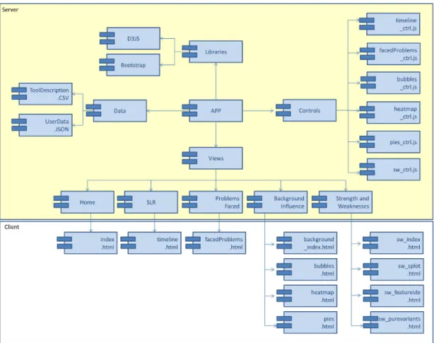
implementation. Figure 3.1 presents the packages view of ViSPLatform. The APP
module manages visual models for one or more data sets, separating visual attributes (location, size, color, etc) from the abstract data. One or more views provide a graph-ical display of the visualization, while control modules process user interaction in the ViSPLatform.
Figure 3.1: Packages view of ViSPLatform
We have designed and implemented a dynamic, analytical data visualization tool using Data-Driven Documents2 (D3) which is a JavaScript3 library for manipulating documents based on data. This library is a freely available extension of JavaScript and the basic idea behind D3 is to provide a way to join data with elements on a web page and then manipulate the elements based on that data. D3 library enables the developer to directly set the attributes of graphical elements in Scalable Vector Graphic (SVG),
2
http://d3js.org/
3
3.2. Strip Plots 21
which is a XML-based vector image format for two-dimensional graphics with support for interactivity and animation, according to data. Moreover, we used Cascading Style Sheets4 (CSS) that is a style sheet language used for describing the presentation of a document written in a markup language. Finally, we built our Web-based visual platform using some components provided by the Bootstrap Framework5, which comes several stylesheets and jQuery plugins for establishing interactive web sites or appli-cation user interfaces. All these technologies were employed for realizing a dynamic exploration and visualization experience.
3.2
Strip Plots
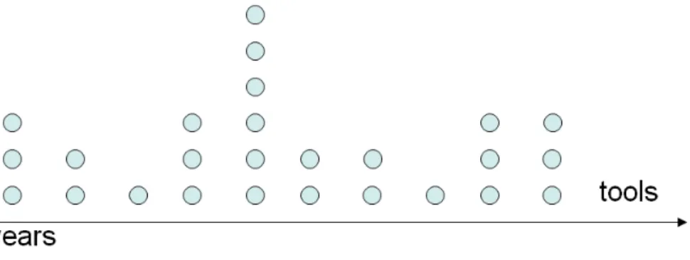
Figure 3.2 presents the visualization schema of Strip Plots. Our goal with this visual-ization is to show how many and what are the tools proposed during a determined time period. Strip plots are charts that depict the quantitative relationship distribution. In our implementation the X axis represents the time and each point is a particular pub-lication or a SPL tool. Notice that, all points are drawn in the same size and color as they represent objects of the same type. The vertical position of the points has no meaning.
Figure 3.2: Tools cited in the literature on a period of time
The chart, in Figure 3.2, first gives an overview of the tools and when (year) each of them was presented. However, data analysts can demand further details about the data points in the visualization by interacting through a mouse over event. Furthermore, to make the visualization more pleasurable, we used transformations as the chart is composed of two phases: when it is being plotted on screen and when the data analyst interacts with a particular point. In the first phase, the radius of the circles starts at 1 and grows to 7 in second fractions; the opacity starts at 0 and
4
http://www.w3.org/Style/CSS/#specs
5
22 Chapter 3. The Visualization Platform
goes to 1; circles appear in a chronological order in an interval of 500ms. The second phase starts with data analyst interacting with a specific circle by mouse over event. Figure 3.3 shows the data analyst interaction: the radius size changes to 12 and the opacity of all other circles change to 0.8 while the opacity of the current circle does not change to highlight the selected point. Moreover, a legend appears with the name, year and the country(ies) where the selected tool was developed. Besides, a brief description about the tool and other information such as name, year, university and/or industry and country(ies) involved appear below the chart. When the data analyst leaves the circle (mouse out event), the legend and all information about the tool disappear and size and opacity return to standard values as showed in Figure 3.2. We believe that this visualization is a visual index that helps the reader of the SLR to explore and to be involved with the results arousing his curiosity about the data and its specificities.
Figure 3.3: Details on demand: data analyst selects a particular tool to get more information
3.3
Bubble Chart
3.3. Bubble Chart 23
data about this background through a questionnaire. The information about each participant are: id, gender, tool used, level of different skills, and university that each participant is enrolled.
We have represented several possible background information of the different groups of people (genders, universities, etc) through a Bubble chart. Each bubble represent a participant and the areas of the circles encode levels of experience. Bubbles can then be grouped using different possible categorical attributes that segment the data. It is based on the Gestalt principle of proximity [Bertin, 1967] and what we want to verify is if the background of the participants is similar in each group. For instance, Figure 3.4 shows the participants grouped by tools. In our study each color encodes a tool. Each participant used only one tool and the size of the bubble encodes the work experience (WE) in software development industry. The radius are 5, 4, 3, 2 and 1 for more than 3 years of WE, 1 to 3 years, until 1 year, none WE and, no answers, respectively.
Figure 3.4: Participants grouped by tools.
24 Chapter 3. The Visualization Platform
Figure 3.5: Background of participants
3.4
Heatmap
A remarkable aspect of the empirical data is the possible correlations that can be established between the background of participants of an study and the quality of the tasks done, the level of difficulty faced or the number of mistakes. This aspect is one of the most interesting and, for this reason, we propose two different visualizations interactively linked. Figure 3.6 shows an example of the heatmap which is a matrix-based display that simultaneously reveals correlations between the values in a first attribute (encoded as rows) and the second (depicted as columns). The quantitative values of the attributes are encoded as colors in different intensities. In other words, it consists of a set of cells, each colored based on a quantitative scale corresponding to attributes of the matrix.
In a usual heatmap, cells are colored based on a real number scale or can be discretized if necessary. Instead, in our heatmap, we used a divergent color scale going from red to blue to encode failure and success in task completion. We also decided to combine the colors of the cells for the whole set of participants related to the specific cell to depict a summary of the results per cell. Notice that, for each cell we have a number of participants and four different possible levels of difficulty. For this reason, we linked a donut chart presenting the part-to-whole quantitative relationship of this variable. Hence, data analysts can not only have more information about the results represented by each cell but also have a general view about the results presented in all the combinations of tasks and background in the matrix.
3.5. Bar and Donut Charts 25
Figure 3.6: The map of the levels of knowledge versus result of the tasks for participants of an experimental study
the “task 4”, data analysts can move the mouse over a specific cell and a donut chart with the result task of these participants appears showing details about the proportions of each result. In addition, the center of the donut shows the percentage of answers of the participants that have this knowledge and perform this task using “tool 1”.
3.5
Bar and Donut Charts
The heatmap and donut charts provide a general view of the data set and the results obtained by an empirical study. However, a possible limitation is that they do not combine skills or tasks in an ad hoc manner and see how these variable can impact on
the results obtained by that participant in the performed test. With this objective, we proposed an interactive combination of bar and donut charts to show at a first glance both the distributions of the different backgrounds and the proportions of the results obtained in each task. Taking into account the human perceptual system and specially the memory limitations when charts to be compared are distant, we presented the whole set of charts organised in a dashboard where data analysts can compare and contrast results in a straightforward manner.
26 Chapter 3. The Visualization Platform
in each SPL tool. For instance, supposing that we want to evaluate only the results obtained by highly skilled participants, we can select this level in all possible categories (backgrounds) and analyze the results obtained by only this group on the respective donut charts.
Figure 3.7: Background of participants impact on the use of each tools
In Figure 3.8(a), each bar is intended to show the percentage of participants who claimed to have high, medium, low, or none knowledge in Object-Oriented Program-ming (OOP), Unified Modeling Language (UML), and Software Product Line (SPL). For Work Experience (WE), the qualitative scale is mapped to: more than 3 years, 1 to 3 years, up to 1 year, and never worked in software development industry. We used bars to encode the respective values (their distribution) and visually reinforce the independent nature of these knowledge and their levels. Figure 3.8(b) shows that the data analyst can interact by selecting and deselecting any bar representing each possible level of each of the possible types of knowledge.
Figure 3.9 shows donut charts which are later used to summarize the task re-sults. This figure depicts the percentage of participants who were unable to perform, performed with major problem, performed with minor problem, and had no problem to perform their tasks. Besides, each donut chart is intended to summarize the results of
one task in one specific tool. The legend in the center of each donut is to identify the matching tool. For instance,“T1” means “Tool 1" and “T2” means “Tool 2”.
3.5. Bar and Donut Charts 27
Figure 3.8: Background of participants with respect to one skill (a). Data analyst makes a combination of knowledge, selecting or deselecting some skill levels (b)
donuts are as less accurate than bar chats [Tufte and Graves-Morris, 1983]. Besides, we did not show the percentage in each slice to avoid visual pollution and too many information. Nevertheless, Figure 3.9 shows that the data analyst can interact with specific slices by mouse overing events to see tooltips with the result and its percentage.
28 Chapter 3. The Visualization Platform
3.6
Diverging Stacked Bar Chart
Figure 3.10 illustrates a diverging stacked bar chart. This chart provides an effec-tive way to communicate summaries of data collected with Likert and other rating scales [Robbins and Heiberger, 2011; Heiberger and Robbins, 2014]. In our study, we used this visualization to illustrate if two different scales correlate in our empirical study. First, we used the diverging stacked bar chart to present the results of tasks when we asked about the problems faced during the tasks performed by participants. For each task, the participant had four options as answers: (i)I was unable to perform,
(ii) I performed with major problem, (iii) I performed with minor problem, (iv) I had no problem performing the task. We considered (i) and (ii) as more difficult to perform
the task (negative percentage) and they are shown on the left of the zero line. We considered (iii) and (iv) as easier to perform the task (positive percentage) and they are shown on the right of the zero line.
3.7. Concluding Remarks 29
Second, we used the diverging stacked bar chart to present the participants’ answers about strengths and weaknesses of each tool. In our study the points were: (i)
automatic organization, (ii)automatic analysis, (iii)editor, (iv)examples available, (v) hot keys, (vi)integration with tools, (vii)interface, (viii)persistence models, (ix)product configuration, (x) tutorials and users guides, and others. We considered strengths as
positives and weaknesses as negatives points that the participants faced during the tasks with the SPL tools. The percentages of participants who considered the items as strengths are shown on the right of the zero line. The percentages who considered the items as weaknesses are shown on the left.
3.7
Concluding Remarks
In this chapter, we presented the ViSPLatform. It is a visual platform to present and
Chapter 4
Visualizing Systematic Literature
Review Data
This chapter uses visualizations of ViSPLatform to analyze data of a Systematic
Lit-erature Review (SLR). SLR is one study method that has obtained much attention lately in software engineering [Kitchenham et al., 2009a]. Our SLR represents a step forward in the state-of-the-art by examining many relevant tools for managing soft-ware product lines. The general propose of this study is to give a visual summary, by categorizing existing SPL tools. We search in journals and conference proceedings since 2000. Therefore, we have used a systematic and rigorous method to accomplish this study, identifying and selecting the reviewed primary studies. The next sections are organized as follows. Section 4.1 presents design details of the review. Section 4.2 reports and analyzes the results obtained, and contributes specifically with relevant information of the existing tools. Section 4.3 presents the threats to validity related for this SLR and how they were addressed prior of the study to minimize their impact. Finally, Section 4.4 concludes this chapter with some final remarks.
4.1
Study Settings
This section gives a detailed description of the review design, the search string used, and the research questions. Our systematic review was performed following guidelines proposed by Kitchenham et al. [2009a], which is divided in three main phases: planning the review, conducting the review, and reporting the review.
32 Chapter 4. Visualizing Systematic Literature Review Data
4.1.1
Planning the review
This phase has the goal of producing a review protocol and defining the basic review procedures to identify, assess, and collect evidences. ThePlanning step includes several
actions presented below.
Identification of the need for a review. Prior to undertaking an SLR,
re-searchers should ensure that a systematic review is necessary [Kitchenham et al., 2009a]. In this study, the need for a systematic review originates from increase in the number of SPL management tools made available. In this context, the choice of one tool that best fits practitioner needs in a specific context of SPL is far from trivial. Therefore, this systematic review aims to give a complete, comprehensive, and valid picture of the tools available in the literature, in order to find out how the available tools are providing support to manage variability.
Specifying the research questions. The goal of this study is to get an
overview of existing research on SPL management tools, focusing since the SPL conception, through out its development, maintenance, and evolution. The overall goal is to answer the main Research Question (RQ): How do the available tools for SPL support the management of variability? In order to answer this question, we
defined two research sub-questions:
RQ1. How many SPL management tools have been cited in the literature between 2000 and 2014? We want to identify the largest number of tools cited in the literature
since 2000. Further, we want to know which of them are discontinued and currently active.
RQ2. What are the main functionalities of the SPL management tools? We
concerned with how the tools support each stage of the development process, considering the phases of SPL conception, development, and maintenance. In particular, what SPL topics, contributions, and novelty they aggregate to. Hence, it is possible to map how tools are supporting the SPL management process and if the process is not fully supported, i.e., if there are gaps in the existing tools, or if there is a need of developing functionalities that are not available in existing tools.
Developing a review protocol. We conducted a SLR in journals and
con-ference proceedings published from January 1st 2000 to December 20141, by the fact that visibility provided by SPL in recent years has produced a higher concentration of
1
4.1. Study Settings 33
research [Lisboa et al., 2010]. Three researchers, with experience in software product line engineering, were involved in this process and all of them continuously discussed and refined the research questions, search strings, inclusion, and exclusion criteria.
4.1.2
Conducting the review
This phase is responsible for executing the protocol planned in the previous phase. It includes several actions, as discussed below.
Identification of research. Based on the research questions, some keywords
were extracted and used to search the primary study sources. The search string used was constructed using the strategy by Chen and Babar [2011]. Following this strategy, the search string addressed by this study is:
(“management tool”) AN D
(“feature modeling” OR “product configuration” OR “variability management”) AN D
(“product line” OR “product family” OR “system family”)
The search for primary studies was based on the following digital libraries: ACM Digital Library2, IEEE Xplore3, and ScienceDirect4. These libraries were chosen because they are some of the most relevant sources in software engineering [Keele, 2007]. The search was performed using the specific syntax of each database and considering only the title, keywords, and abstract. In addition, we used the technique called “snowballing” which refers to using the reference list of a paper or the citations to the paper to identify additional papers [Wohlin, 2014].
Selection of primary studies. The basis for the selection of primary studies
is the inclusion and exclusion criteria [Kitchenham et al., 2009b]. We defined two inclusion criteria (IC):
• IC1. The publications should be “journal” or “conference” and written in English.
• IC2. Primary studies about tools that manage one or more phases of the
34 Chapter 4. Visualizing Systematic Literature Review Data
We defined the following exclusion criteria (EC). The first three exclusion criteria were applied during the reading of titles and abstracts:
• EC1. Technical reports that present lessons learned, theses/dissertations, and
duplicate papers. If a primary study is published in more than one paper (for example, if a conference paper is extended to a journal version), only one instance should be counted as a primary study. Mostly, the journal version is preferred, as it is most complete.
• EC2. Studies that describe events, studies that are indexes or programming.
• EC3. Papers that present approaches, methods, and techniques, but do not focus
on SPL management tools.
After that, other exclusion criteria were applied for the set of papers selected:
• EC4. Tools that do not address the phases of development and maintenance of
SPLs.
• EC5. Tools without executable or documentation describing its functionalities
available. Moreover, the tools with written documentation that does not have us-able description about its functionalities were excluded, because it is not possible to describe how the tools work.
Each paper was included or rejected by three experts in software engineering: two M.Sc. students and a researcher. All they were responsible to applied each criterion and check the results for the inclusion and exclusion of all papers. This step was done in order to check that all relevant papers were selected.
Data extraction and monitoring. First, the researchers read the abstracts
and look for keywords and concepts that reflect the contribution of the paper. While doing so, the researchers also identified the context of the research. When abstracts are not enough, researchers also read the introduction and conclusion sections. When the researchers concluded that a paper is not relevant, they provided a short rationale why the paper should not be included in the study.
4.2. Results and Analysis 35
the communication with authors. However, during the data extraction, the exclusion criteria (EC4 and EC5) were verified. The data extraction is designed based on the
research questions. The data extracted from each selected tool were: (i) date of data extraction, (ii) primary studies (reference(s)), (iii) tool name, (iv) main reference, (iii) release year, (iv) tool website (if available), (v) main characteristics, (vii) where the tool was developed (academia or industry), and (vi) main functionalities each tool supports. The data extraction and monitoring are detailed in Section 4.2.
4.1.3
Reporting the review
This final phase is responsible for writing up the results of the review and circulating the results to community. Thereby, we published the detailed results in the project website5. The website also provides more detailed information about the results of the search protocol (with complete lists of included and excluded primary studies) and the chosen tools. Therefore, it is clear to others how the search was conducted, and how they can find the same documents.
4.2
Results and Analysis
This section presents and reports the results of this SLR to answer our research ques-tions. Section 4.2.1 aims to identify the tools cited in literature between 2000 and 2014 and Section 4.2.2 describes the functionalities available or not available in each existing tool.
4.2.1
Selected SPL Management Tools
Our goal in this section is to identify the tools cited in the literature since 2000. In other words, we want to answer the following research question:
RQ1. How many SPL management tools have been proposed in the literature between 2000 and 2014?
For this analysis, we applied the inclusion and exclusion criteria to identify the relevant papers about the tools. In the first stage, after applied inclusion and exclusion criteria, 35 papers were included and 110 papers were excluded. In the second stage, we included 4 papers [Asikainen et al., 2004; Dhungana et al., 2007; Simmonds et al.,
5
36 Chapter 4. Visualizing Systematic Literature Review Data
2011; Unphon, 2008] that also matched our inclusion criteria. These papers were mined from references of included papers (technique called “snowballing”). This technique was necessary in order to have a more complete set of information and references about tools. At the end of the search, 39 papers were included for extracting and analyzing the data. Table 4.1 summarizes the number of papers of our systematic review per year of publication.
Table 4.1: Number Searched for Years 2000-2014
Year 2000 2001 2002 2003 2004 2005 2006 2007 2008 2009 2010 2011 2012 2013 2014 All
Total 1 1 4 2 1 2 7 7 7 10 16 16 15 16 40 145
Total Selected 0 0 0 1 0 1 2 2 2 5 6 6 4 4 2 35
Total Snowballing 0 0 0 0 1 0 0 1 1 0 0 1 0 0 0 4
Total Included 0 0 0 1 1 1 2 3 3 5 6 7 4 4 2 39
After the papers inclusion process, 61 potentially relevant tools were selected for extracting and analyzing the data. Another search was performed on Web engines with the particular information of every tool cited by the papers in order to find more documentation about these tools. During data extraction, 18 tools were excluded, as a result of applying the detailed exclusion criteriaEC4 and EC5. Figure 4.1 presents
the 43 tools included and their brief description can be visualized in ViSPLatform.
4.2. Results and Analysis 37
Our goal with Figure 4.1 is to show how many and what are the SPL tools presented during a determined time period. Each circle appears in a chronological order, contributing to the realistic look of the time line. In addition, when the data analyst interacts with a specific circle a legend appears with the name, year of the tool and, the country(ies) where it was developed. Besides, a brief description about the tool and other information such as, name, year, university and/or industry and country(ies) involved appear below the chart.
Note that, the papers included also mentioned tools developed before 2000. Fur-ther, some paper presented the year of the first release of the tool. When this infor-mation was not clear, we decided to use the year of the conference/journal paper as the year of the presentation of the tool to academic/industry community. With this visualization, it is also possible to see that most tools were developed between 2005 and 2009 (22 tools). Although in our SLR there was no tool developed in 2010, the development of new tools is still a research subject after 2009, as showed in Figure 4.1.
4.2.2
Main Functionalities of the Tools
Our goal in this section is to map how tools are supporting the SPL management process and if there are gaps in the existing tools, or if there is a need of developing functionalities that are not available in existing tools. In other words, we aim to answer the following research question:
RQ2. What are the main functionalities of the SPL management tools?
In order to answer RQ2, our analysis extended an existing classification of re-search approaches [Lisboa et al., 2010], summarized in Table 4.2. These classification schema present a practical approach for analysis based on a well-defined set of guide-lines and metrics. We extend the previous classification [Lisboa et al., 2010] by new functionalities, such as source code generation and support for integration.
Based on Table 4.2, Table 4.3 shows which functionalities each tool supports. The numbers refer to the functionalities described in Table 4.2 and the column sepa-rate each group of functionalities: Planning, Modeling, Validation, and Product Con-figuration and Integration (PCI), respectively. The analysis of the results focuses on
![Figure 2.1: Visualization Reference Model [Card et al., 1999].](https://thumb-eu.123doks.com/thumbv2/123dok_br/15784470.131569/31.892.158.756.149.251/figure-visualization-reference-model-card-et-al.webp)