FUNDAÇÃO GETÚLIO VARGAS
ESCOLA BRASILEIRA DE ADMINISTRAÇÃO PÚBLICA E DE EMPRESAS
MESTRADO ACADÊMICO EM ADMINISTRAÇÃO
RODRIGO DE OLIVEIRA LEITE
AN ESSAY ON IMPRESSION MANAGEMENT: THREE
RANDOMIZED EXPERIMENTS WITH FINANCIAL
ANALYSTS
FUNDAÇÃO GETÚLIO VARGAS
ESCOLA BRASILEIRA DE ADMINISTRAÇÃO PÚBLICA E DE EMPRESAS
MESTRADO ACADÊMICO EM ADMINISTRAÇÃO
AN ESSAY ON IMPRESSION MANAGEMENT: THREE
RANDOMIZED EXPERIMENTS WITH FINANCIAL
ANALYSTS
R
ODRIGO DE OLIVEIRA LEITE
Dissertação apresentada ao Programa de Pós-Graduação em Administração da Escola Brasileira de Administração Pública e de Empresas da Fundação Getúlio Vargas, como parte dos requisitos para a obtenção do título de Mestre em Administração.
Orientador: Dr. Ricardo Lopes Cardoso
Rio de Janeiro – RJ
Ficha catalográfica elaborada pela Biblioteca Mario Henrique Simonsen/FGV
Leite, Rodrigo de Oliveira
An essay on impression management: three randomized experiments with financial analysis / Rodrigo de Oliveira Leite. – 2015.
32 f.
Dissertação (mestrado) - Escola Brasileira de Administração Pública e de Empresas, Centro de Formação Acadêmica e Pesquisa.
Orientador: Ricardo Lopes Cardoso. Inclui bibliografia.
1. Pessoal - Seleção. 2. Entrevistas (Seleção de pessoal). 3. Administração de pessoal. I. Cardoso, Ricardo Lopes, 1975-. II. Escola Brasileira de Administração Pública e de Empresas. Centro de Formação Acadêmica e Pesquisa. III. Título.
DEDICATÓRIA
A
GRADECIMENTOS
R
ESUMO
A
BSTRACT
This thesis aims to explore the concept of impression management from the financial analysts’ point of view. Impression management is the definition of the act of an agent manipulating an impression that another person have of this agent, in the context of this thesis it happens when a company make graphics to disclosure financial-accounting information in order to manipulate the market’s perception of their performance. Three types of impression management were analyzed: presentation enhancement (color manipulation), measurement distortion (scale manipulation) and selectivity (the disclosure of positive information only). While presentation enhancement improved only the most impulsive financial analysts’ perception of firm’s performance, the measurement distortion improved the perception of performance for both groups of financial analysts (impulsive and reflective). Finally, selectivity improved the financial analysts’ perception of firm’s performance for both groups (impulsive and reflective), although impulsive financial analysts assigned lower ratings when compared to their reflective peers, on average, to a hypothetical company.
1
Introduction
Imagine that you will go on to an interview for a job that you really want. You
start to think in what you should dress for this interview. What does pass in your mind?
You probably will not think in dressing in your favorite clothing, or the clothing that
you dress in your day-to-day life, but in a cloth that passes a good impression to the interviewer, since you want to make a good impression and be hired (Wilhelmy et al.,
2015).
Companies are not different. They want to pass a good image to the market, and
they will use different types of “clothing” in order to achieve this objective. One of these
is the use of graphics, that is widespread among the financial reports nowadays, since
modern annual reports contain graphs. For example, the International Accounting
Stan-dards Board (IASB) recently amended its accounting standard on financial instruments
disclosure (i.e., the International Financial Reporting Standard 7 (IFRS 7) - Financial
Instruments: Disclosures) requiring that “If the quantitative data disclosed as at the end
of the reporting period are unrepresentative of an entity’s exposure to risk during the
pe-riod, an entity shall provide further information that is representative” (IFRS 7 paragraph
35). Whether this is the case, the implementation guidance exhorts the presentation of
graphs: “[...] if an entity typically has a large exposure to a particular currency, but at
year-end unwinds the position, the entity might disclose a graph that shows the exposure
at various times during the period [...]” (IFRS 7 paragraph IG20).
However, no study has investigated the influence exercised by individual’s
char-acteristics on the effects of “impression management” on their perception of graphical
disclosure, and this paper fills this gap.
2
Literature Review and Hypothesis Development
Impression management can be described as “the process by which people
con-trol the impressions others form of them” (Leary & Kowalski,1990). However, companies
also use impression management, since they want to enhance their “respectability and
connected to signaling, since impression management consists in signals that are chosen to manipulate the impression that third parts have. And it is very well proved in the
literature that certain signals such as press announcements (Standish & Ung, 1982) and
dividend policies (Akhigbe et al., 1993) have an effect on the market’s perception of a
company.
Beattie & Jones(1992) already noted that in 1989 the average number of graphs
in annual reports by large UK companies was 5.9 graphs per report. Also they found
that, in average, 30% of graphs were distorted with data being exaggerate in about 10.7%.
Similar results were found by Godfrey et al. (2003) in Australia, concerning impression
management done shortly after a CEO change. This study found that new CEOs often
use impression management in graphs during the following year.
Herman Chernoff (1973) created a facial representation of multivariate data
(a.k.a. Chernoff faces), in which sad/worried faces would represent negative information
and happy faces would represent positive information. This graphical information report
innovation was applied in accounting by Moriarty(1979) andStock & Watson(1984), in
which sad/worried faces represented negative financial results and happy faces would
rep-resent positive financial results. Both studies showed that the use of this type of graphical
representation of financial reports changed their subjects’ judgment of companies. Smith
& Taffler(1996) showed that the same results consistently happens across undergraduate,
MBA students and academics. Carter(1947) showed that the different ways to represent
data in a graphical form alter the decision-making process of pilots and students.
Therefore we can see that the use of the graphical disclosure of information is
becoming even more important, since the new financial disclosure computer language
(XBRL) is growing in use and it affects the decision-making of individuals (Tang et al.,
2014).
Jones (2011) divides the impression management of graphs in three sub-groups:
presentation enhancement, measurement distortion and selectivity. Each one them
in-spired the three experiments carried out with financial analysts. Presentation
enhance-ment manipulates how a graph is presented, such as color and a 2-D vs. 3-D graph.
Measurement distortion defines the change of scale of a graph to give a better impression
to the market. Finally, selectivity defines the selecting only the data that conveys positive
information to be disclosed. However, there is a gap in the literature in which intrinsic
individual characteristics are not addressed in the impression management literature,
al-though those characteristics have a strong influence on the financial decision-making of
individuals (Oechssler et al., 2009).
In order to asses the effects of those manipulations on the financial analysts’
rating of a company, three different experiments were designed and applied in the form of
a web-based experiment presented to the financial analysts’. In order to “fill the gap” in
the impression management literature about intrinsic individual characteristics the CRT
scale (Frederick, 2005) was applied in order to classify the financial analysts in between
impulsive and reflective, or, according to Kahneman (2011), those in which System 1
preponderates System 2, and those in which System 2 preponderates System 1.
Daniel Kahneman also created the “Systems 1 and 2 Theory”, in which he
proposes that each and every one of us posses two “systems of thinking”: one that is
very impulsive (System 1) and the other that is more reflective (System 2) (Kahneman,
2011). While System 1 is always “turned on” and is “cognitively cheap” (requiring a
low amount of effort), System 2 needs to be activated and is “cognitively expensive”. As
an example: how much is 2×2? And 137×363? Although it is the same operation
(multiplication) the first question requires little effort, while the second requires a fairly
substantial amount of cognitive effort. That happens because we can answer the first
question with the System 1, while we need to activate System 2 to answer the second
question.
Frederick (2005) argued that there are people that are more reflective or more
impulsive by nature. He developed the Cognitive Reflection Test (CRT) in order to
quantify how impulsive or reflective a person is. The CRT score can go from 0 to 3 with
a 3 being fully reflective and a 0 being fully impulsive.
2.1
Cognitive Reflection Test
The test consists of three questions (as shown, in Portuguese, at the section
7.2.4). Each question has a wrong answer that is more intuitive, and a correct answer,
that is more counter-intuitive.
costs $100 more than the ball. How much does the ball cost?” The intuitive answer is
$10, but if the ball costs$10, then the bat costs$100, that is only$90 more than the ball.
Therefore the bat costs $105 and the ball costs $5. Therefore, the person that correctly
answered this question activated the System 2, while those that answered in the wrong
way did not activate the System 2 and used System 1 instead.
Cokely & Kelley(2009) measured impulsiveness using the CRT scale and showed
that impulsiveness harmed the decision-making of individuals. Similar results was found
by Koehler & James (2010) and by Toplak et al. (2011). In the behavioral economics
field Oechssler et al. (2009) showed that impulsiveness (measure with the CRT 3-items
scale) impacted in some cognitive biases that influenced economical decision-making.
Concerning the disclosure of information through graphics, Honda et al.(2015)
showed that impulsiveness (measured with the CRT scale) had a negative effect on the
experimental subjects decision-making regarding food. However, there is no study in how
impulsiveness may have an effect on the decision-making regarding graphical disclosure
of financial information.
2.2
The Effect of Colors
Colors do have an important role in the “psychological functioning in humans”
(Elliot & Maier,2014). Mehta & Zhu(2008) show that the red color (versus blue) creates
more a motivation of avoidance, what enhances negative information. Corroborating to
this result,Genschow et al. (2012) show that the red color do create a sense of avoidance
in real decision-making: red color diminished the snack food and soft drink consumption
on the participants’ choice. This “red vs. blue effect” is ostensibly used in marketing to
try to manipulate the decision-making of the consumers (Labrecque & Milne, 2012).
The color red, when compared to blue, is shown to harm the decision-making
in web-based tests of general knowledge (Gnambs et al.,2010). Even on animals the red
color is associated with negative signals, such as aggressiveness and intimidation (Pryke,
2009).
In the “corporate world” the red color has a negative connotation. In the
En-glish language, since the term “red ink” is often related to a negative performance by a
company, and the term “blue ink” (or “black ink”) is often related to a positive
mance. Since “red” have a negative connotation and “blue” have a positive connotation,
what is intuitive is to present a positive performance with a blue graph and to present
a negative performance with a red graph. To present a negative result in a blue graph
is counter-intuitive and is clearly showing an attempt to conceal a negative result with a
“positive” color.
Thus, if an impression management through graphical presentation
enhance-ment is considered to be efficient than it should have an effect in both impulsive and
reflective financial analysts. Therefore we hypothesize that:
H1: Presentation enhancement (color manipulation: blue vs. red) will have the same effect on impulsive and reflective financial analysts’ ratings.
2.3
Distorting Information
Beattie & Jones (1993) showed that companies often do use measurement
dis-tortion to enhance positive information and downplay the negative information. This is
done in order to portray a better image to the market. O’Reilly (1978) showed that, in
the organizational field, that the information gets distorted in order to present a better
image of the sender to the receiver. Also, the desire to show consistency is also a reason
to distort the information to others (Russo et al.,2008).
In an experiment with undergraduate students, Beattie & Jones (2002) showed
that measurement perceived a company whose graphic had received a measurement
dis-tortion as better than the same company, but in a graph that did not have any disdis-tortion,
this result replicated the one by Lawrence & O’Connor (1993). The results of
measure-ment manipulation have effects on different areas such as contract formulations (Allen &
Gale, 1992) and rating assignments (Beattie & Jones, 2002).
Using the same logic as was applied in the first hypothesis we hypothesize that:
2.4
Information Disclosure
The selection process of which information should be disclosed is an important
factor in the development of financial reports (Healy & Palepu, 2001). Beattie & Jones
(1996) showed that companies often present graphs for “positive” information, but rarely
present graphs for negative information.
If a graph does not show a negative information, only a positive one, then it
may change the counterfactual that an analyst may have. If, for example, a company
discloses that in the last 5 years performance has increases the analyst logically would
conclude that performance prior to that period was also smaller. However if a graph
shows that six years ago the company’s performance was better that it is today, than the
counterfactual will change and also the analyst’s conclusion, and this result could even be
amplified because people often neglect the duration of information (Liersch & McKenzie,
2009). Medvec et al. (1995) clearly showed the importance of counterfactual comparison
for Olympic medalists: those who were awarded the Silver medal were perceived as less
happy than the ones who were awarded the Bronze one. This occurs because the Silver
medalists compare themselves with the Gold ones, while the Bronze medalists compare
themselves with those who got no medal. This effect is analogous to the prior example: by
not disclosing negative information companies change the counterfactual of the analysts,
what changes their perception.
Therefore, as in the first two hypotheses, if this impression management
tech-nique is efficient, then it must alter the perception of both impulsive and reflective
finan-cial analysts in a similar manner. Than we hypothesize that:
H3: Selectivity (through the disclosure of positive information only) will have the same effect on impulsive and reflective financial analysts’ ratings.
3
Sample and procedures
The sample consists of 530 financial analysts that were regularly registered at
the CFC (Conselho Federal de Contabilidade, Brazilian Accounting Association) at the time of data collection. They responded, for this study, three web-based experiments,
and also the three CRT questions and their demographics (gender, age, place of residence
and monthly income). However, four participants did not inform their monthly income,
and one did not inform his age, hence they were excluded from the analysis. Therefore,
the final sample consists of 525 individuals.
3.1
Randomization test
Each experiment had two conditions, and those conditions were randomly
as-signed to the participants. The expected result of randomization is that both groups are
comparable, and the only difference is the treatment assignment. To test if randomization
worked in this study it was performed a series of t-tests in the demographic questions:
gender, age, place of residence and monthly income (low, medium and high). Results are
expressed in Table1.
However, since there are 18 tests across three experiments with the same sample,
I used the Bonferroni correction to avoid the Type I error, since a 95% confidence level
at each experiment produces only a 86% (.953) overall confidence level (across all three
experiments). Since the same comparison is done three times (one for each experiment),
and the sample is the same for all three experiments (although the sub-sample in each
condition is different due to randomization) the Bonferroni correction was adopted, and
the confidence interval adopted was 98.3% (100 - 5/3 = 98.3) instead of the usual 95%,
to secure a 95% (.9833 =.95) confidence level across all three experiments. The
Bonfer-roni correction is credited as being conservative, since it assumes there is no correlation
between the groups. However, this assumption is fulfilled in this case, since each one of
the groups is comprised of two random subgroups, the expected correlation between the
experiments assignment (control and treatment) is zero, and in practice it was very small
(r1,2 =.003, r1,3 =.016 and r2,3 =.027).
The results showed no significant difference in the corrected 95% overall
confi-dence level, and, therefore, I assume that the randomization worked in making the groups
comparable in the three experiments.
Another way to asses if there is randomization balance, is the rule of thumb that
the differences in means should be smaller than 1/4 of the Standard Deviation (
the threshold of .25, therefore showing that the groups in all three experiments have
randomization balance. Therefore I can claim exogeneity for this study.
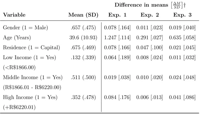
Table 1: Randomization tests
Difference in means ∆M
SD
†
Variable Mean (SD) Exp. 1 Exp. 2 Exp. 3
Gender (1 = Male) .657 (.475) 0.078 [.164] 0.011 [.023] 0.019 [.040]
Age (Years) 39.6 (10.93) 1.247 [.114] 0.291 [.027] 0.635 [.058]
Residence (1 = Capital) .675 (.469) 0.078 [.166] 0.047 [.100] 0.021 [.045]
Low Income (1 = Yes) .132 (.339) 0.064 [.189] 0.008 [.024] 0.011 [.032]
(<R$1866.00)
Middle Income (1 = Yes) .511 (.500) 0.019 [.038] 0.010 [.020] 0.024 [.048]
(R$1866.01 - R$6220.00)
High Income (1 = Yes) .352 (.478) 0.084 [.176] 0.006 [.013] 0.041 [.086]
(+R$6220.01)
Bonferroni correted p-values: *p < .05, **p < .01, *** p < .001. Std. Deviation in parenthesis.
†Values in brackets denote the mean difference divided by the std. deviation: |M eanc−M eant|
SD .
4
The Experiments
The tasks in all three experiments are the same: giving a rating (0-10 range) to
a hypothetical company based on a graph (a different graph in each condition) that
rep-resents its performance (net profit graphs). After the three experiments the participants
responded the 3-questions CRT designed by Frederick (2005).
4.1
First Experiment: Presentation Enhancement
4.1.1 Experimental Setup
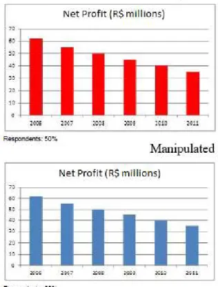
The first experiment consisted in randomly assigning the participants to one of
two different bar graphs showing a decrease in the profits for a given company each year.
The manipulation consisted in one graph being red, and the other being blue. Figure 1
shows both graphs that were presented to the subjects. Therefore it is expected that the
subjects that received a blue graph give a better rating than the those that received the
red graph. Impulsiveness was measured using a 3-questions test (CRT score), those that
correctly answered 2 or 3 questions were coded as 1 (reflective) and those that correctly
answered 0 or 1 of the questions were coded as 0 (impulsive).
This experiment explores the presentation enhancement sub-domain of
impres-sion management, as expressed byJones(2011). The red color in graphics is often related
to a sense of avoidance (Mehta & Zhu, 2008), what may enhance the negativity that is
already present in the graph (decrease in profits). Beattie & Jones (1993) showed that
companies often do use different colors to draw attention to the last year’s results.
Figure 1: First Experiment Conditions
4.1.2 Results
First, two t-tests were calculated in order to asses if gender was a confounder
significant difference between the rating assessed by both genders in regard to the red
graph (M eanW omen = 3.76, M eanM en = 3.61, t(259) = 0.52, p = .606) and the blue one (M eanW omen = 3.78, M eanM en = 3.75, t(267) = 0.09, p = .925). Thus gender is not a confounder in this study.
The results were estimated using an OLS regression. The OLS regression
re-quires continuous dependent variable, but rating is not continuous. However, since rating
is a linear variable and OLS regressions are simpler to interpret and gives a trueR2 they
are presented in text. Also, the OLS regression with dummies gives the same p-values as
the ANOVA test. Although the main effect of the color manipulation was not significant
(standardized β = .099, n.s.), being impulsive or reflective had a significant impact on
graph interpretation, with impulsive financial analysts giving a lower score (0.6 point
in average) than reflective ones (standardized β = .137, p=.026) in the not
manipu-lated graph. The interaction between the color manipulation and the CRT dummy was
marginally significant (standardized β =−.137, p=.053).
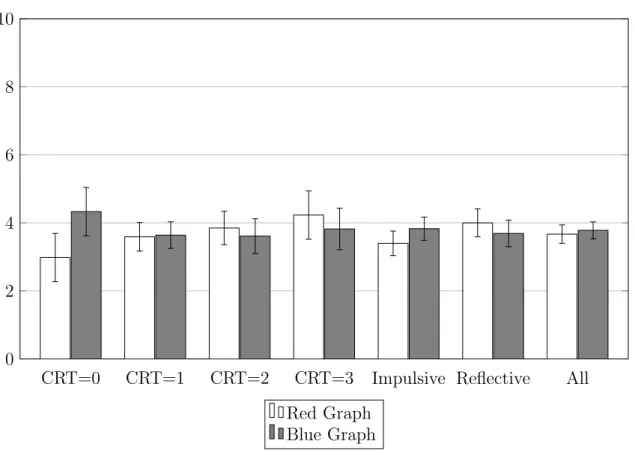
Figure 2: Rating results for Experiment 1
CRT=0 CRT=1 CRT=2 CRT=3 Impulsive Reflective All
0 2 4 6 8 10
Red Graph Blue Graph
Figure 2shows the difference in rating for the fully impulsive (CRT score = 0)
versus the fully reflective (CRT Score = 3). While the manipulation increased the rating of the fully impulsive (M eanRed = 2.98, M eanBlue = 4.33, t(87) = 2.75, p = .007), it did not affect the rating of the fully reflective (M eanRed = 4.23, M eanBlue = 3.82, t(84) =
−.87, n.s.). This gives evidence that an impression management of financial information
with color only have an effect on impulsive financial analysts, but not on reflective ones.
Therefore the first hypothesis is rejected, since the presentation enhancement only had
an effect on the fully impulsive group.
While this experiment only had a “soft” impression management (color
manip-ulation), the next experiment will have a “stronger” impression management: changing
the scales of a graph.
4.2
Second Experiment: Measurement Distortion
4.2.1 Experimental Setup
In the second experiment the participants were randomly assigned to one of two
different types of bar graphs of a time series from a given company’s profits that were
increasing, one with a large scale (0 - 30 million) and one with a small scale (0 - 15
million), as presented in Figure3. Compared to the large scale, the small scale graph had
bigger bars and a bigger slope. Then the participants were asked to rate the company’s
performance in a 0-10 range, in the same way as in the first experiment.
This second experiment explores the measurement distortion sub-domain (Jones,
2011). Therefore, in theory, a company would use a small scale graph to convey a positive
information, but a large scale graph to convey negative information.
4.2.2 Results
The results were estimated in the same way as in the first experiment, using
an OLS regression. The manipulation had a significant positive effect (1 point increase
in average) on the rating given by the analysts (standardized β = .258, p<.001), being
impulsive or reflective did not have an effect on the rating (standardizedβ =.032, n.s.),
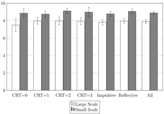
Figure 3: Second Experiment Conditions
Figure 4 shows the experiment’s results. Changing the scale of the graph had
a large impact in the overall rating, and successfully manipulated both impulsive and
reflective financial analysts. I theorize that this is the case because changing the scale
of the graph increased both bar height and the slope. Impulsive financial analysts may
be more influenced by the height of the bar, and the fact that the last bar reached the
top of the small-scale graph may give a sense of the company achieving its goal, while
in the large-scale graph the last bar reached only the middle of the graph in what may
be perceived as a failure in achieving the goal. For reflective financial analysts, however,
the slope increase may give an idea of greater progress of the company, and also a better
performance. Therefore the second hypothesis is supported.
In these two experiments the same information was present in both graphs, and
the manipulation only changed the way the information was disclosed. However, how do
financial analysts perceive graphs with different information being disclosed? This is the
objective of the third experiment.
Figure 4: Rating results from Experiment 2
CRT=0 CRT=1 CRT=2 CRT=3 Impulsive Reflective All
0 2 4 6 8 10
Large Scale Small Scale
4.3
Third Experiment: Selectivity
4.3.1 Experimental Setup
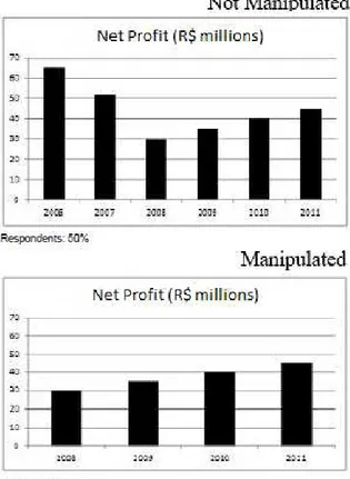
Participants were randomly assigned to one of the two graphical disclosures:
one showing a profit increase from 30 to 42 BRL millions (between 2008 and 2011), and
the other showing the same information from the previous graph, but with the pre-crisis
figures (2006 and 2007) of 62 and 51 BRL millions (much better than the performance
from 2008 to 2011), therefore the graph that had an impression management showed
less information to the financial analyst than the other, as denoted in Figure 5. Then participants were asked to rate the company’s performance in a 0-10 range scale, in the
same way as in prior experiments.
This third experiment explores the concept of selectivity, that defines the act
of a company selecting to disclosure only positive information in their graphs, as Jones
(2011) noted. In the case of this experiment a company selected only to disclosure positive
information, but the control had a negative (drastically reduction of profits in 2008) and
Figure 5: Third Experiment Conditions
4.3.2 Results
The results were estimated in the same way as in the first and second
exper-iments, using an OLS regression. The manipulation was successful in increasing (.89
point in average) the company’s rating (standardized β = .281, p<.001). There was a
significant effect of impulsiveness in the rating, with impulsive financial analysts giving a
lower rating (.538 point in average for the unmanipulated graph) for the company
(stan-dardized β =.169, p=.003). However, the interaction was not significant (standardized
β =−.076, n.s.).
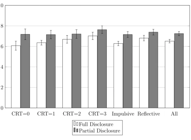
Figure 6 shows the comparison between the impulsive and reflective financial
analysts in both the treatment and control groups. It clearly shows the two main effects
as significant, while the interaction is not significant. Differently from the second
exper-iment, the third experiment had the main effect of the CRT dummy as significant, what
supports the theory that the manipulated graph from the second experiment suffered
Figure 6: Rating results from Experiment 3
CRT=0 CRT=1 CRT=2 CRT=3 Impulsive Reflective All
0 2 4 6 8 10
Full Disclosure Partial Disclosure
an impression management that manipulated both impulsive and reflective individuals.
Therefore the third hypothesis is partially supported, since the manipulation increased
the rating of both impulsive and reflective financial analysts, but impulsive financial
analysts still gave a smaller rating than reflective financial analysts.
Table 2summarizes the results of this study.
5
Conclusion
From the three experiments many conclusions can be drawn. The first is that,
although different ways of graphical disclosure and presentation have different effects on
the financial analysts’ perception of a company’s performance, not all types of
presen-tation and disclosure have the same effect. Changing the color of a graph had an effect
on the rating of a fully impulsive financial analyst, while it had no effect on the others.
Changing the scale of a graph was shown to have an effect on both impulsive and
re-flective financial analysts, while homogenizing the rating between both groups (no CRT
Table 2: Hypotheses Summary
Hypoth. Description Supported?
H1 Presentation enhancement will have the same effect No
on impulsive and reflective financial analysts’ ratings.
H2 Measurement distortion will have the same effect Yes
on impulsive and reflective financial analysts’ ratings.
H3 Selectivity will have the same effect on Partially
on impulsive and reflective financial analysts’ ratings.
to the disclosure of positive and negative information, but impulsive financial analysts
assigned a lower rating to the company when compared to their reflective peers.
The experimental approach used in this study allowed for analyzing different
ways of impression management with a high degree of internal validity. The sample
was comprised by professional financial analysts, what enhances the external validity of
this research. However, the ratings attributed by the analysts were theoretical, with no
consequence for the participants, what hinders the external validity of this study.
The effect of the manipulations were small (the R2 for the first experiment
was .08 in the fully impulsive subgroup and .07 for the AdjR2 of the second and third
experiments), however, since we only manipulated small graphical disclosure details, it is
expected that those manipulations do not have tremendous power of explanation.
This study analyzed three different ways of impression management with graphs,
however it was not tested how the interaction of these different ways of manipulation can
affect the financial analysts’ perception . Does color moderates the effect of scale changes?
How the scale may change the perception of different amounts of information that are
disclosed? Those are questions that this study did not answer and may be good topics
for further research.
6
References
Bibliography
Akhigbe, A., Borde, S. F., & Madura, J. (1993). Dividend policy and signaling by
insurance companies. Journal of Risk and Insurance, (pp. 413–428).
Allen, F. & Gale, D. (1992). Measurement distortion and missing contingencies in optimal
contracts. Economic Theory, 2(1), 1–26.
Beattie, V. & Jones, M. (1996). Financial graphs in corporate annual reports: A review
of practice in six countries. Institute of Chartered Accountants in England and Wales.
Beattie, V. & Jones, M. J. (1992). The Use and Abuse of Graphs in Annual Reports:
The-oretical Framework and Empirical Study. Accounting and Business Research, 22(88), 291–303.
Beattie, V. & Jones, M. J. (2002). Measurement distortion of graphs in corporate reports:
an experimental study.Accounting, Auditing & Accountability Journal, 15(4), 546–564.
Beattie, V. A. & Jones, M. J. (1993). Information design and manipulation: Financial
graphs in corporate annual reports. Information Design Journal, 7(3), 211–226.
Carter, L. F. (1947). An experiment on the design of tables and graphs used for presenting
numerical data. Journal of Applied Psychology, 31(6), 640.
Chernoff, H. (1973). The use of faces to represent points in k-dimensional space
graphi-cally. Journal of the American Statistical Association, 68(342), 361–368.
Cokely, E. T. & Kelley, C. M. (2009). Cognitive abilities and superior decision making
under risk: A protocol analysis and process model evaluation. Judgment and Decision Making, 4(1), 20–33.
Elliot, A. J. & Maier, M. A. (2014). Color psychology: Effects of perceiving color on
Frederick, S. (2005). Cognitive Reflection and Decision Making. Journal of Economic Perspectives, 19(4), 25–42.
Genschow, O., Reutner, L., & W¨anke, M. (2012). The color red reduces snack food and
soft drink intake. Appetite, 58(2), 699–702.
Gnambs, T., Appel, M., & Batinic, B. (2010). Color red in web-based knowledge testing.
Computers in Human Behavior, 26(6), 1625–1631.
Godfrey, J., Mather, P., & Ramsay, A. (2003). Earnings and Impression Management
in Financial Reports: The Case of CEO Changes. Abacus - A Journal of Accounting, Finance and Business Studies, 39(1), 95–123.
Healy, P. M. & Palepu, K. G. (2001). Information asymmetry, corporate disclosure,
and the capital markets: A review of the empirical disclosure literature. Journal of accounting and economics, 31(1), 405–440.
Highhouse, S., Brooks, M. E., & Gregarus, G. (2009). An Organizational Impression
Management Perspective on the Formation of Corporate Reputations.Journal of Man-agement, 35(6), 1481–1493.
Honda, H., Ogawa, M., Murakoshi, T., Masuda, T., Utsumi, K., Park, S., Kimura, A.,
Nei, D., & Wada, Y. (2015). Effect of visual aids and individual differences of cognitive
traits in judgments on food safety. Food Policy, 55, 33–40.
Jones, M. (2011). Impression Management. In Creative Accounting, Fraud and Interna-tional Accounting Scandals (pp. 97–114).
Kahneman, D. (2011). Thinking, fast and slow. Macmillan.
Koehler, D. J. & James, G. (2010). Probability matching and strategy availability. Mem-ory & Cognition, 38(6), 667–676.
Labrecque, L. I. & Milne, G. R. (2012). Exciting red and competent blue: the importance
of color in marketing. Journal of the Academy of Marketing Science, 40(5), 711–727.
Lawrence, M. & O’Connor, M. (1993). Scale, variability, and the calibration of judgmental
prediction intervals.Organizational behavior and human decision processes, 56(3), 441– 458.
Leary, M. R. & Kowalski, R. M. (1990). Impression management: A literature review
and two-component model. Psychological Bulletin, 107(1), 34–47.
Liersch, M. J. & McKenzie, C. R. (2009). Duration neglect by numbers—and its
elim-ination by graphs. Organizational Behavior and Human Decision Processes, 108(2), 303–314.
Medvec, V. H., Madey, S. F., & Gilovich, T. (1995). When less is more: counterfactual
thinking and satisfaction among Olympic medalists. Journal of Personality and Social Psychology, 69(4), 603–610.
Mehta, R. & Zhu, R. (2008). Blue or Red? Exploring the Effect of Color on Cognitive
Task Performances. Science, 323(February), 1226–1229.
Moriarty, S. (1979). Communicating Financial Information Through Multidimensional
Graphics. Journal of Accounting Research, 17(1), 205–224.
Oechssler, J., Roider, A., & Schmitz, P. W. (2009). Cognitive abilities and behavioral
biases. Journal of Economic Behavior & Organization, 72(1), 147–152.
O’Reilly, C. A. (1978). The intentional distortion of information in organizational
com-munication: A laboratory and field investigation. Human Relations, 31(2), 173–193.
Pryke, S. R. (2009). Is red an innate or learned signal of aggression and intimidation?
Animal Behaviour, 78(2), 393–398.
Rosenbaum, P. R. & Rubin, D. B. (1985). Constructing a control group using
multivari-ate matched sampling methods that incorpormultivari-ate the propensity score. The American Statistician, 39(1), 33–38.
Rubin, D. B. (2001). Using propensity scores to help design observational studies:
Russo, J. E., Carlson, K. A., Meloy, M. G., & Yong, K. (2008). The goal of consistency
as a cause of information distortion. Journal of Experimental Psychology: General, 137(3), 456.
Smith, M. & Taffler, R. (1996). Improving the communication of accounting information
through cartoon graphics. Accounting, Auditing & Accountability Journal, 9(2), 68–85.
Standish, P. E. & Ung, S.-I. (1982). Corporate signaling, asset revaluations and the stock
prices of british companies. Accounting Review, (pp. 701–715).
Stock, D. & Watson, C. J. (1984). Human judgment accuracy, multidimensional graphics,
and humans versus models. Journal of Accounting Research, 22(1), 192–206.
Tang, F., Hess, T. J., Valacich, J. S., & Sweeney, J. T. (2014). The Effects of Visualization
and Interactivity on Calibration in Financial Decision-Making. Behavioral Research in Accounting, 26(1), 25–58.
Toplak, M. E., West, R. F., & Stanovich, K. E. (2011). The cognitive reflection test as a
predictor of performance on heuristics-and-biases tasks. Memory & Cognition, 39(7), 1275–1289.
Wilhelmy, A., Kleinmann, M., K¨onig, C. J., Melchers, K. G., & Truxillo, D. M. (2015).
How and why do interviewers try to make impressions on applicants? a qualitative
study.
7
Appendix
7.1
OLS Results
Table 3: OLS Results for Experiment 1
Model 1 Model 2 Model 3
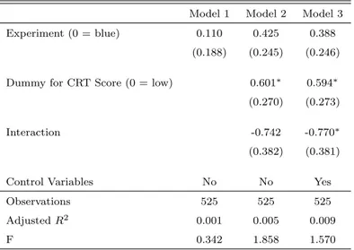
Experiment (0 = blue) 0.110 0.425 0.388 (0.188) (0.245) (0.246)
Dummy for CRT Score (0 = low) 0.601∗ 0.594∗
(0.270) (0.273)
Interaction -0.742 -0.770∗
(0.382) (0.381)
Control Variables No No Yes
Observations 525 525 525 AdjustedR2 0.001 0.005 0.009 F 0.342 1.858 1.570
Standard errors in parentheses
∗p <0.05,∗∗ p <0.01,∗∗∗ p <0.001
Table 4: OLS Results for Experiment 2
Model 1 Model 2 Model 3
Experiment (0 = large scale) 1.005∗∗∗ 0.950∗∗∗ 0.957∗∗∗
(0.155) (0.203) (0.204)
Dummy for CRT Score (0 = low) 0.121 0.118 (0.227) (0.234)
Interaction 0.161 0.138
(0.315) (0.319)
Control Variables No No Yes
Observations 525 525 525 AdjustedR2 0.073 0.073 0.073 F 42.176 14.708 6.143
Standard errors in parentheses
Table 5: OLS Results for Experiment 3
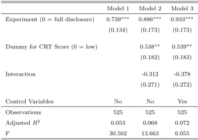
Model 1 Model 2 Model 3
Experiment (0 = full disclosure) 0.739∗∗∗ 0.886∗∗∗ 0.933∗∗∗
(0.134) (0.173) (0.173)
Dummy for CRT Score (0 = low) 0.538∗∗ 0.539∗∗
(0.182) (0.183)
Interaction -0.312 -0.378 (0.271) (0.272)
Control Variables No No Yes
Observations 525 525 525 AdjustedR2 0.053 0.068 0.072 F 30.502 13.663 6.055
Standard errors in parentheses
∗p <0.05,∗∗p <0.01,∗∗∗p <0.001
7.2
Experimental Assignments
7.2.1 First Experiment
7.2.2 Second Experiment
7.2.4 Cognitive Reflection Test