Representing transformation through
visual experimentation
Pia Pedersen Transformation, Isotype, Information Visualization, ExperimentationThe core concept of this visual experiment is “transformation”, an approach to the visualization of information, which was developed in the 1920s based on ISOTYPE (an acronym for International System Of TYpographic Picture Education). In the present on-going PhD-project—where research through design and design history are intertwined—visual experimentation is central for understanding what rests within original Isotype material. Two new visual experiments primarily based on Marie Neurath’s process have already been conducted each of them presenting a different angle towards widening the theory on transformation. This paper presents the third experiment that accumulates and extends the previous two experiments by reusing and revising both their visual methodologies and gained knowledge. The purpose is to go one step deeper into the material in order to understand how it is possible to work with transformation in the visualization of statistics. With a critical look at the earlier experiments, the notion of transformation is now presented again through revised visualizations revealing new details and principles in the work.
1 Introduction
Transformation was a way of thinking, an approach to the
visualization of information where statistics were converted through a multifaceted process of extracting, arranging and simplifying data into a visual, understandable form. It was developed in the 1920’s as part of the well known communicative work of Otto / Marie Neurath and their associates—today generally known as Isotype. Here the famous philosopher and sociologist Otto Neurath found it necessary to have a person— a ‘transformer’—who linked the worlds of the expert and the artist. Marie Neurath, the wife of Otto Neurath, was the principal transformer, and her sketches open a window into this process often hidden behind aesthetical pictograms.
Although obsolete, transformation presents an opportunity to show the advantages of visual communication within the visualization of statistics by acknowledging the skill and complexity of creating a meaningful visual message, a skill that goes further than oversimplifying and replacing numbers with perfunctory graphical tools such as
pictograms. Highlighting the process of transformation is not a new thought. MacDonald-Ross & Waller, 2000 and Kinross and M.
Neurath, 2009 for example have elaborated on the subject, but they have not focused on expanding and exemplifying how Marie Neurath transformed numbers into charts within the actual sketching process. This ongoing research project, on the other hand—positioned between research through design and design history—does focus on this issue. It examines the content of the process of transformation by investigating the original Isotype material attached to a project, the aim being to revive the notion of transformation within practice. The chosen
material from the Otto and Marie Neurath Isotype Collection housed at the Department of Typography & Graphic Communication, University of Reading, UK, was part of the preparations for creating an exhibition in 1946—containing 12 charts—on a possible housing development project in Bilston, a poor neighborhood in Staffordshire, England.
The overall purpose of the present paper is to acquire a deeper understanding of the process of transformation by presenting a new and third visual experiment based on Marie Neurath’s process. By taking a critical look at two earlier experiments the paper shows a refined method. In other words, the previous two experiments are combined and expanded by reusing and revising the visual methodologies used in experiment 1 and by incorporating the knowledge gained in experiment 2. The paper thus demonstrates how the picture of Marie Neurath’s process changes over the three experiments and finally reveals new details and patterns in the work.
2 Transformation Theory
The present research has its roots in Otto and Marie Neurath’s writings and elaborates on previous research that has touched upon transformation (i.e. Kinross, 1979; Kinross & neurath, 2009; Macdonald-ross & Waller, 2000). Marie Neurath’s voice, in the form of articles, essays and unpublished scripts, is the most direct source of the process of transformation. Her writings point towards the actual task of the transformer, and they partly informed the way of studying this material. For example, my way of categorizing the different moves and principles in the material was influenced by a statement where Marie Neurath describes two levels of decision making concerning raw material (i.e. extraction of essential facts) and picture form (i.e. the number and color of symbols) (neurath, M. 1974, 136). Marie Neurath’s writings also explain situations of the Isotype work and their history as she recalls it.
Both Otto and Marie Neurath strongly believed that Isotype would become a unified international pictorial language, and this vision brought them far in the building of a convincing and consistent visual language with a considerable legacy. Within this vision, in finding the best way to state something visually, the well-known pictograms and the role of the transformer arose. In International Picture Language
visual statistics, Otto Neurath puts forward the rules and ideas behind Isotype. Based on these concepts, it is clear that Marie Neurath was working within graphic uniformity and rules that could not be broken unless there was a good reason to do so (neurath, M. 1974, 131). For instance, Marie Neurath’s role was not to develop symbols (she might discover a need for new or refined symbols) but rather to create the rough version of the chart by applying the Isotype language.
Previous research has supplemented the background knowledge about Isotype. Robin Kinross’ thesis from 1979 (Kinross, 1979), familiar to Marie Neurath, provides a crucial framework for the study of the graphic work of Isotype; writings by Michael Twyman (e.g. tWyMan, 1975), Isotype revisited (e.g. BurKe, Kindel, & WalKer 2014), and specific research on the Bilston case (e.g. niKoloW, 2003; Whyte, i. B. 2007) have also facilitated the interpretation of the Bilston case.
When it comes to the detailed account of transformation, Robin Kinross’ book, The Transformer, with an essay by Marie Neurath, highlights transformation as an approach to design and as a way of thinking (Kinross & neurath 2009, 7). The process of transformation is not reduced to a set of principles, but rather explained through examples of final charts and important moments. He states that a more specific study can be conducted, not only by looking at the finished charts, but by including all the materials of the work (Kinross & neurath 2009, 78). Additionally Macdonald-Ross and Waller used the role of the transformer as a model for improving e.g. the Open University’s teaching material in the 1970s (see Macdonald-ross & Waller, 2000). Their research indicates ways in which the role of the
transformer can be applied as well as the effectiveness of the process of transformation on the final result. The present research elaborates on these sources by focusing on the actual sketching process and by closely studying the statistics, sketches, charts etc. of the same case.
3 Method
From the first examinations of the sketches at the archive it has been obvious that Marie Neurath’s work contained useful approaches, but exactly how remained unclear. In order to understand her process it was necessary to make a thorough exploration of all the vast amount of material that belonged to one case. Here the Bilston case appeared to be the most suitable to make such an investigation. The idea was to identify essential principles of transformation by investigating what happens in between the table, the sketches, and the final chart. However, this presented a conflicting agenda, because showing transformation as a set of principles or a list of rules would be misleading. The strength of transformation lies in the pattern of moves through the process, namely in the combination of principles and rules. In order to discover these combinations and patterns, it
was not enough to look at the material and take notes. Visualization methods and processes on the other hand are suitable, because they can comply with the complexity of investigating transformation. Information visualization is integrative and problem solving in its approach; it can organize complex information in an understandable manner.
Three visual experiments have now been conducted. Experiment 1 extended knowledge on transformation based on sketches; experiment 2 extended knowledge on transformation based on correspondence letters; and experiment 3, which is the focus of this paper, extends knowledge on transformation by combining the knowledge from the two previous experiments. All three experiments use theory on Isotype as basis for making the experiments. In other words, Otto and Marie Neurath’s reports and earlier research on Isotype and in particular Bilston are complementing the archive material with background knowledge on social and cultural aspects. The three experiments are contiguous as each experiment’s visualizations and knowledge output sets the ground for making the next experiment. For detailed information on the PhD project’s methodological position as well as the dialectics between the three experiments and their respective tools and methods, see Pedersen 2013.
3.1 Previously
The outcome of experiment 1 in the form of a mapping, descriptive diagrams and symbols elaborates what actually happened in Marie Neurath’s sketches. The visualizations enlighten the complexity of Marie Neurath’s transformation process and suggest a set of principles, their mutual relationship and how they where used (see Pedersen, 2012). In the course of experiment 1 correspondence letters were discovered. These letters formed the basis for experiment 2. Where experiment 1 focused on the principles and patterns of transformation the purpose with experiment 2 was to understand the role of the transformer by including the information from approximately 100 letters exchanged between Otto/Marie Neurath and Bilston Town Clerk. Another purpose with experiment 2 was to clarify how or if the knowledge from the letters would change the mapping of the process from experiment 1. The outcome of experiment 2 was a revised mapping and a letter timeline that further enlightened the connection between the collaboration and the sketching process. Experiment 2 uncovered the flow and the content of the collaboration. Furthermore as the mapping of the process had been reorganized, the process of transformation appeared even more complex process than first assumed.
3.2 Notes on the mapping process
In experiment 1, the 12 final Bilston charts, together with their respective blueprints (an instruction drawing that Marie Neurath). handed over to the artist doing the artwork finishing), were placed vertically from 1-12 in the right exhibition order. The process of transformation was then mapped by rewinding the material, as the blueprints were the starting points from which to move back in time (see also Pedersen, 2012, p. 7–8). The outcome was a map showing the process in the form of colored thumbnails of the different kinds of material: data in green, sketches in purple, blue prints in blue and final charts in yellow. In experiment 2 the map had undergone many changes because hints from the letters indicated that Marie Neurath had made a miniature exhibition in the form of 12 numbered sketches representing the exhibition produced for a meeting with the Town Clerk. It became evident that some sketches were produced before or after the miniature exhibition and in reorganizing the mapping again, new links and relationships between the sketches were sorted out. On the new mapping, now with miniature exhibition sketches in pink, the changes appeared as rearrangements of the charts and connecting lines that show a change in the exhibition order.
3.3 Experiment 3
Experiment 3 is a combination of the two previous experiments. In the course of experiment 2 a more complex mapping of the sketches was developed. This meant that the relationship between the sketches had changed and it was necessary to see how this affected the
recorded transformations from one sketch to another. Experiment 3 then focuses on the principles of transformation like experiment 1, and complements these with the new knowledge on the process from experiment 2 to see if new principles and patterns are revealed.
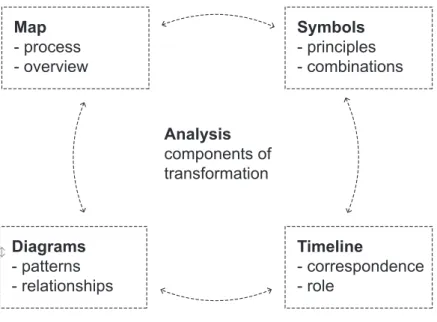
The tools from experiment 1 included a system of categorized composite symbols designed as a visual tool for understanding the complexity of Marie Neurath’s work from two overarching perspectives that span from the single sketch to the whole process. The reason for using symbols is that a map does not reveal what is going on in the sketches. By visualizing the content it is possible to understand the patterns and relationships in the material. Every time a transformation was observed from sketch to sketch a new symbol was designed. Every time a symbol could be reused, its signification was revised and refined. At the end the symbols of each sketch were placed on top of each other, now being a combined symbol, which was placed into a grid based on the mapping. The outcome, a diagram, was split into different categories. I could now analyze the relationship between the detailed transformations in their corresponding category from the single sketch the whole process landscape. As the symbols from
experiment 1 were reused these became a steppingstone for making an even more thorough analysis. When replacing the symbols below a sketch (in the new mapping), their meaning was verified to assure that it corresponded to what was actually happening in the material or whether new symbols were needed. Through this analysis it became evident that the map needed to be redesigned once again. At last, once all sketches were analyzed, the symbols were placed into a grid based on the new mapping. With the new map, diagrams and symbols a further analysis of the findings could proceed, like figure 1 shows.
Diagrams - patterns - relationships Map - process - overview Analysis components of transformation Timeline - correspondence - role Symbols - principles - combinations
3.4 Reflections
The symbols and visualizations from experiment 1 were a portal to rapidly stepping into the material. However, the knowledge outcome was also gathered through an explorative approach, where the material and personal design knowledge had been given much room to speak for itself. As a consequence, this work should be seen within its subjectivity. But with subjectivity self-criticism followed: If for example two different symbols could be used for the same act, the system was challenged. Consequently one has to have the whole process in mind to place the symbols. When something new was acknowledged in the sketches, and a new symbol thus needed to be designed, one had to go through all the material again to see if there was something missing. So the symbols are a vehicle for continuously discussing, self-criticizing, reflecting and producing knowledge regarding the material; thus the way these symbols were working was based on a comparison with surrounding sketches, the whole project and the first experiment.
Figure 1 Analyzing transformation through different visualizations Source: Pia Pedersen
As the map is the starting point for studying and recording transformations from chart to chart within the whole process, the knowledge outcome becomes dependent on it. Therefore, when questioning the map, different aspects had to be taken into consideration, e.g. rereading Marie Neurath’s correspondence or going back to older mappings, before a sketch could be repositioned. In this way the visualization process repositioned some sketches and improved the mapping of the material. Even though the mapping is a result of much reflection and takes into consideration social and cultural aspects for example, it is impossible, and not the intention either, to show all the connections and variables in order to give at true picture of the process. The process is too complex to produce e.g. a data visualization cookbook, but hopefully it is possible to produce new and useful insights on how to transform in design.
4 Outcome Exemplifications
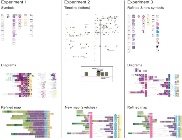
The purpose of this third experiment was to see how the detailed picture of the observed transformations within each sketch would change with the new mapping of the process based on Marie Neurath’s correspondence.
Experiment 1 Experiment 2 Experiment 3
Symbols Timeline (letters)
New map (sketches) Refined map
Diagrams Diagrams
Refined map
Refined & new symbols
Once more her process of transformation has turned out to be more complex than first assumed, and it is as if details are constantly emerging within the work, while the picture of a non-linear and multifaceted process is taking shape (see maps figure 2). Marie
Neurath was not only focused on the message within the single charts, but also on how the message was developed through all the charts seen as an entity. More aspects of the work, based on the suggestions from the letters, have surfaced, and an expanded view of the details within the sketches has grown.
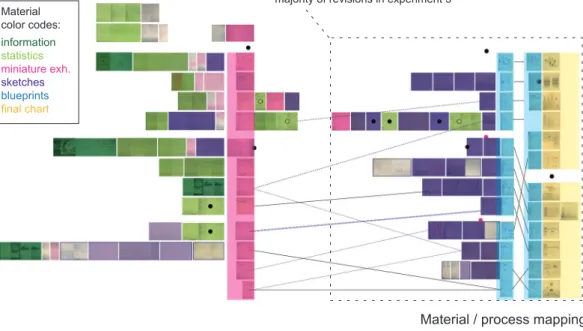
Based on a quick look at the general picture of the process, little seems to have changed except for the encircled area of the map in figure 3. The “miniature exhibition” in pink revealed that Marie
Neurath at some point after, had changed the order of the chart and on the map I assumed this happened right after the miniature exhibition. Through the new visualizations (figure 3-4), it became clear that the reason for Marie Neurath’s cross marks on several of the blueprint numbers was that she had changed the order of the charts, and not because a printed number on the blueprint booklet simply did not fit the exhibition number (as first assumed in experiment 1). Marie Neurath had, in fact, changed the order of the chart twice. Close to the opening day, the narrative of the exhibition was rethought and changed because the charts (as the letters revealed) would now be divided in groups of two instead of three. One can therefore assume that Marie Neurath was not only focusing on the argument within each chart, but how it develops from chart to chart and within the whole exhibition. This new knowledge had to fit the map, and hence some of the lines between the sketches were reorganized and missing links in the puzzle were found. The non-linear connection between the single sketch and the whole project was clearer. The blueprints were also split into two, the traced layer and the drawn layer (in earlier experiments they formed a unit). This highlighted how the drawn layer of the blueprint had often been subject to small adjustments.
Overall symbol landscape
Material / process mapping
Data layer Arrangement symbols layer
Material color codes: information statistics miniature exh. sketches blueprints final chart
majority of revisions in experiment 3
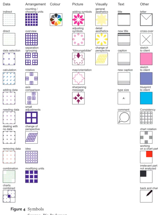
Figure 4 Symbols
Source: Pia Pedersen
Colour Picture map/orientation sharpening message adding symbols adjusting symbols “führungsbilder” Visually general aesthetics detail aesthetics change of perspective direct indirect data selection calculation adding data needing data dealing with no data removing data Data charts combined combination Other chart rotation sketch to client sketch to client letter cross-over blueprint to client working on a chart part Consistency irrelevant part not analyzed
back and change
Arrangement counting / choosing units overview separation /grouping rotation modifying units axis comparison small adjustments change of perspective idea Text title new title caption new caption type size comment
Like in experiment 1, the overall symbol landscape (in figure 3 middle) revealed that Marie Neurath transformed by reusing the same principles over and over, but applying them differently or in different combinations according to material or process. A closer examination of the details within the sketches in the new mapping has resulted in refined and new symbols (see figure 4). For instance the symbols that represented simplification were removed, as a simplification symbol does not explain what is happening in the sketches; furthermore transformation is largely a process of simplification. This resulted in new and refined symbols like the sharpening message symbol, which will be explained later. Many valuable details within the sketches can be highlighted; however, only some will be pointed out here to
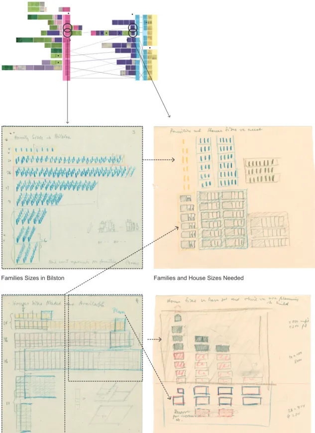
Families Sizes in Bilston Families and House Sizes Needed
House Sizes Needed and Available House Sizes we have got and which we are planning to build Figure 5 Marie Neurath combines different sketches. This transformation enables
to increase the information level and at the same time making the content more user-friendly. Source: Otto and Marie Neurath Isotype Collection, University of Reading (sketches) and Pia Pedersen.
– The selection of data
It is obvious, through her correspondence and also apparent in the present mapping, that Marie Neurath questioned and went back and forth on the data (see data layer, figure 3). Three new data symbols were added, for instance the ‘combination’ symbol, which often pops up in the diagram, indicates that Marie Neurath had done a thorough search process in order to come up with the right content. On a data sheet she pointed out what data would be relevant for an already chosen chart on air pollution, e.g. one of her notes says “// together with air pollution”. In order to do this she must have had an overview and idea of what she was looking for when reading the numbers.
The combination symbol resembles the combined charts symbol, which is deployed as it was discovered that the content from different sketches were mixed. After additional correspondence with Bilston Town Clerk in which Marie Neurath questions the data for chart no. 4 ‘House Sizes Needed and Available’, a meaningful way to make sense of the data is found. In doing so, Marie Neurath combines the content from charts no. 3 ‘Family Sizes in Bilston’ and no. 4 ‘House Sizes Needed and Available’, into
a new chart no. 3 ‘Family and House Sizes Needed’ and eventually chart no. 4 became ‘House Sizes Available and Planned’, see figure 5. Discussing the particular numbers with Bilston Town Clerk caused Marie Neurath to reorganize and give more substance to the content of the two charts, reflecting on both the detail and the whole.
Marie Neurath also dealt with subjects that simply had no statistics attached or were better shown without, hence the new symbol dealing
with no data. Generally, the data landscape has become more varied.
As it now appears, data is also added or removed late in the process, pointing to charts whose content is reconsidered in a constant process of simplification.
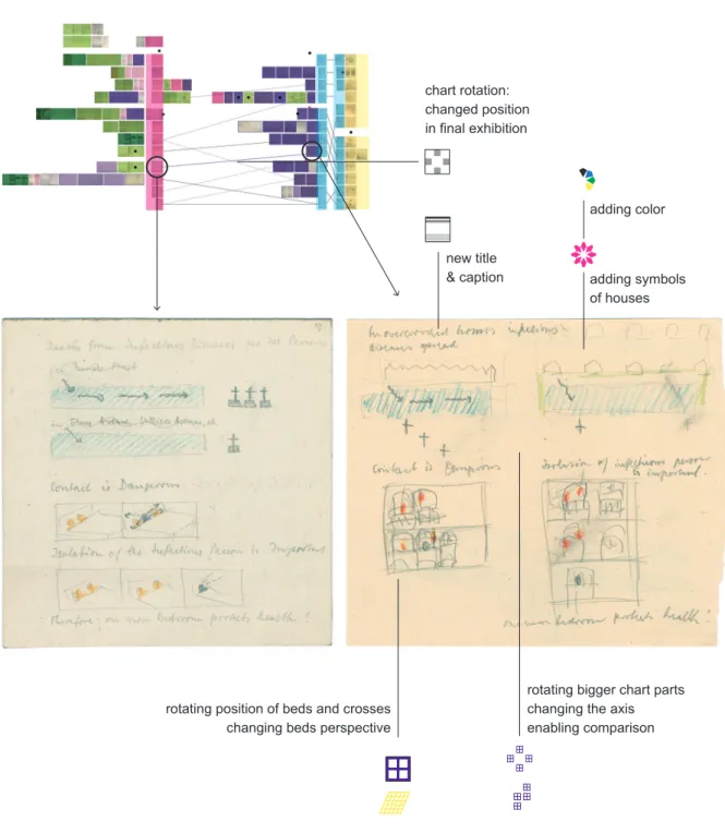
– Arranging the content
Other findings indicated that the meaning behind the rotating units symbol created in experiment 1 wasn’t specific enough, leading to two new symbols in arrangement: modifying units and axis/comparison. In figure 5 Marie Neurath is not only rotating the units but also modifying
the units in order to have more space and a simpler picture now the
charts are combined. In chart no 3, for instance, one symbol was changed from representing 100 families to 400 families.
Sometimes Marie Neurath was rotating the units to make an axis for the purpose of enabling direct comparison. Comparing the two sketches in figure 6 clarifies that Marie Neurath is making an axis with the purpose of facilitating the comparison between crowded and non-crowded areas. In order to create the axis she has to make a general rotation of the different components, but also detail rotations
top of each other and the crosses now placed below the houses. By rearranging the components of the chart in this way it is easier to see how non-crowded areas are healthier.
new title
& caption adding symbols of houses adding color
rotating position of beds and crosses changing beds perspective
rotating bigger chart parts changing the axis enabling comparison chart rotation:
changed position in final exhibition
Figure 6 Example of transformations from one sketch to another.
Source: Otto and Marie Neurath Isotype Collection, University of Reading (sketches) and Pia Pedersen
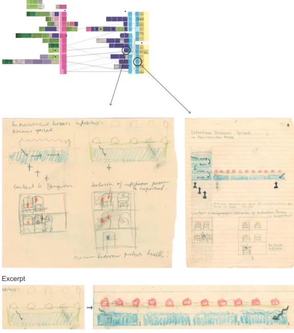
– The Pictorial Content
After making the different levels of rotation in figure 6 Marie Neurath precedes with the final sketch, figure 7. Here she sharpens
Figure 7 Sharpening message graphically. Source: Otto and Marie Neurath Isotype
Excerpt
the message by pictorial means, hence the new symbol sharpening
message. In the upper part of the chart, the crowded areas have been
given less space and the non-crowded more. She enforces the message graphically—if there is more space, then show it! Again this presents an act that cannot be explained by a rotation alone, as I originally did. This way of sharpening the message graphically often happened later in the transformation process when the configuration of the chart has been shaped. In figure 6, the beds point of view has changed from one sketch to the other, now acknowledged as a visual change of perspective and not as a configurative change of perspective like it was in experiment 1. The meaning behind the change of perspective symbol within the arrangement category has now been refined, implying that the change has a direct impact on the configuration.
Additionally, this third experiment has resulted in a whole new category labeled ‘Other’ that relates to more overall aspects of transformation, often bringing in the influence of the collaboration. For instance a letter symbol shows that Marie Neurath has been
given new material or asks Bilston Town Clerk questions in relation to the numbers (e.g. the example from charts no. 3 and 4). Here the correspondence also indicated that there were different kinds of sketches produced for Bilston Town Clerk: early exhibition proposals in pink (the miniature exhibition), sketches or tables that explain a question in purple and blueprints which are used as a final proposal in blue. This explains why more effort was put into improving their content and visual finish. In some sketches Marie Neurath focused on only one part of a chart, probably a part that needed further development in order for her to come up with a satisfactory solution. In other sketches she was working on several charts at the same time. In these situations a partly analyzed symbol, was used; thus some sketches can occasionally appear twice on the map. Few sketches were made to ensure a consistency within the exhibition, and generally these aspects within the sketches demonstrate that Marie Neurath approached a sketch in different ways throughout her process. Occasionally she even reverted to old sketches to make changes. In spite of the blueprints, this has become clear in some of the miniature exhibition sketches, where new data has caused Marie Neurath to go back and make changes. In figure 5 for instance, it was discovered that some corrections with blue pencil were made later.
5 Discussion
The experimental approach to archive material is a way to understand the essential relationships and components within the work. Once more the picture of the process has changed. Marie Neurath’s process of selecting data did not initially look like it was lined up, namely in the two steps: 1) select data and 2) find a way to show the data (Perdersen 2012, 4). They proved to be intertwined, as ideas sometimes came before the data, data was sometimes added or removed later, and data sets or contents of charts were sometimes mixed. Therefore it should be acknowledged that the two levels of decision-making are intertwined but certainly in a constant move towards a solution. It has become clearer how the different levels of rotations enforce the visual message, not only within the single chart but also over all 12 charts together. Marie Neurath had, in fact, changed the order of the charts a second time and consequently reframed the narrative of the exhibition. The message in the chart was constantly reframed by e.g. adding or removing data, making an axis for the purpose of comparison, rotating for the purpose of highlighting sections, and detailing rotation for the purpose of highlighting components or sharpening the message visually. The
sharpening message is similar to what Kinross has seen in the work: “This principle of finding an order that allows (and does not force)
significance to become visually evident is one that informed all the best Isotype work” (Kinross and neurath 2009, p. 80).
Small visual decisions, like the ones we’ve had a glimpse of here, show the particularities that lie in the transformation approach, namely that Marie Neurath’s moves were adapted to the specific circumstances and the content. Marie Neurath was able to work in a certain rhythm by going back and forth between data and sketches and by shifting between different levels of depth, focus and speed— clarifying that this is a non-automatic process. Her work was also filled with exceptional patience and a drive to constantly push the experiments and improve the situation. Even though Marie Neurath had two decades of experience at the time of this case it is clear that it was a learning sequence in which the particular moves enabled transformation. As pointed out by Kinross, the process cannot be boiled down to a set of rules (Kinross and neurath 2009, p. 104), as it is the way of applying them, the pattern of moves, the way of sketching, collaborating and insisting on progress that truly shows us the essence and the relevance of the work.
Affirmatively Marie Neurath’s process of transformation was extensive, which also presents a danger, namely making too big a transformation so that the simple message becomes unrecognizable. Such a claim requires a more thorough analysis of the final charts, but the feedback from the Bilstonians could indicate this: “…always there was the feeling that there must be something much more complicated behind it and which was beyond the capabilities of their intelligence and understanding.” – Mr. A. M. Williams to Marie Neurath, 24.5.47 (IC case 1/14-17).
Taking a step back from the material, transformation is a role, a team, a set of principles and a process. We can use Marie Neurath’s way of working as a mindset and inspiration towards creating and highlighting a meaningful message from complex information. It is the overall Isotype vision and the attention paid to small details like those depicted above that can teach us so much about making user-friendly information visualizations. Paralleled with the material, the visualizations from experiment 3 are therefore a step in understanding and exemplifying what is going on in Marie Neurath’s work. This could form the basis for the education of the visual communication designer by demonstrating how to work with transformation in information design and emphasizing an important step in the context of statistical visualization. Finally, Marie Neurath’s work enlightens that one should work with transformation exactly because every situation is different.
6 Conclusion
By accumulating the knowledge from two visual experiments into a third new moves within the work were exposed. For instance the different levels of rotation clarified how Marie Neurath was able to discover and highlight the visual message. We have also seen that the sketches enabled Marie Neurath to manage large amounts of information as data was combined, added or removed throughout the whole process. Consequently, working with transformation in design requires constant evaluation where the intertwining between different kinds of moves pushes the improvement of the visual message not only within each chart, but also from chart to chart and within the whole project.
7 Acknowledgements
Many thanks to “Isotype Revisited” (Sue Perks, Emma Minns, Sue Walker, Eric Kindel). Many thanks for funding to The Ministry of
Culture of Denmark and Danish Centre for Design Research.
References
christoPher, B.; Kindel, e. & WalKer. s. 2014. Isotype: Design and Contexts, 1925–1971. Hyphen Press.
Whyte, i. B. 2007. “Otto Neurath and the Sociology of Happiness.” In Man-Made Future. Planning, Education and Design in Mid-Twentieth-Century Britain, 16– 37. London & New York: Routlege.
roBin, K. 1979. “Otto Neurath’s Contribution to Visual Communication (1925-45): The History, Graphic Language and Theory of Isotype.” MPhil Thesis, UK: University of Reading, Department of Typography & Graphic Communication.
roBin, K. & neurath, M. 2009. The Transformer, Principles of Making Isotype Charts. Hyphen Press.
Macdonald-ross, Michael, and Waller. r. 2000. “The Transformer Revisited.” Information Design Journal, no. 9/2&3: 177–93.
neurath, M. 1974. “Isotype.” Instructional Science 3 (2): 127–50.
neurath, o. 1936. International Picture Language: The First Rules of Isotype. London: Kegan Paul, Trench, Trubner & Co., Ltd.
niKoloW, s. 2003. “Planning, Democratization and Popularization with ISOTYPE, Ca. 1945. A Study of Otto Neurath’s Pictorial Statistics on the Example of Bilston, England.” Vienna Circle Yearbook, Induction and Deduction in the Sciences, , no. 11: 299–32.
Pedersen, P. 2012. “Visualizing Transformation.” Proceedings of the 8th International Design Research Society Conference, Bangkok.
———. 2013. “3 Contiguous Experiments on a Design Historical Case.” Proceedings of Nordic Design Research Conference, Copenhagen-Malmö. tWyMan, M. 1975. “Graphic Communication through ISOTYPE.” In The Significance of Isotype, University of Reading, 7–18.
About the author
Pia Pedersen [email protected]Graphic Designer and PhD-student, Kolding Design School, Denmark. Pia Pedersen graduated as a graphic designer from Design School Kolding in 2005. She has been working as an information designer at the Danish Broadcasting Corporation, DR, and one of the biggest newspapers in Denmark, Morgenavisen Jyllands-Posten. Today she is a PhD-student at Design School Kolding in the Department of Communication Design writing about Marie Neurath and the process of transformation in relation to the visualization of statistics.
Artigo recebido em 09 out. 2014, aprovado em 10 dez. 2014.