Towards the Understanding of Interaction in Information Visualization
Ana Figueiras
FCSH - Universidade Nova de Lisboa
mail@anafigueiras.com
Abstract
Over the past few years the web has been responsible for the rise in popularity of visualizations and it seems that interactive or playable visualizations have become more popular and end up standing out more. The use of inter-activity and animation has been extensively discussed in information visualization research, but there has been some controversy in relation to its benefits. Additionally, there is still little empirical evidence about its efficacy in terms of improving understanding of the data and there is few research that points out guidelines of how to incorporate it successfully and that proves that playable visualizations are indeed more enjoyable and popular among users.
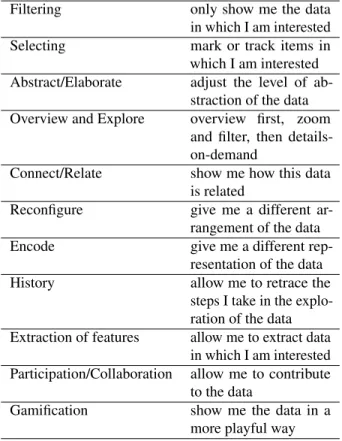
In order to guide future research on the actual benefits of interactivity in visualization it is important to understand what types of interactivity are currently being used in the field and to have a framework to help discuss and evaluate interaction techniques. After conducting an extensive review of popular visualizations and their interactive capabilities, we propose eleven categories of interaction techniques: fil-tering, selecting, abstract/elaborate, overview and explore, connect/relate, history, extraction of features,reconfigure, encode, participation/collaboration, and gamification.
Keywords—Visualization, interaction, taxonomy.
1
Introduction
If we interpret information visualization as “the use of computer-supported, interactive, visual representations of abstract data to amplify cognition” as does Card et al. [5], it is almost impossible to discard the role of interactivity. Nonetheless, many support a different definition that stands on the fact that interactivity is not always necessary to have a successful visualization and that interactivity can some-times negatively affect the understanding of the data. Few however would deny that interactivity has several benefits specially when the data sets are quite large. Moreover, taking into account that information visualization is deep-rooted in the computer science community it makes sense to approach interactivity as a key element.
Interactivity has been utilized in information visualiza-tion with several purposes. The more common are: 1)
making the data more engaging or playful and 2) showing the data in manageable portions. According to Keim [19] having the data in smaller portions is particularly important when exploring large data sets. Doing so facilitates both the understanding and the analysis of the data because the degree of complexity is reduced. By employing interactiv-ity techniques, visualization creators try to give the users the ability to properly explore the data and find appropriate answers to their questions. Providing ways for the users to independently find the answers (exploratory visualization) often seems to be a better option than presenting answers to what the creator believes are the users’ questions (explana-tory visualization), not only because it is difficult to predict what the questions will be but also because visualization is a discovery tool and limiting its potential to provide insights is a mistake.
In order to study the impact of interactivity in Infovis it is important to study and understand the possible interaction techniques, and most existing taxonomies do not include new interaction techniques such as gamification. Therefore, we propose a new taxonomy based on previous research.
2
Background
TheVisual Information-Seeking Mantraby Shneider-man [24] is the most well known general interaction tech-niques taxonomy. However when we seek for a more ex-tensive taxonomy for Infovis we find a multitude of stud-ies [1, 10, 19, 30] showing that there is not a taxonomy that is consensual. According to Yi et al. [30] defining a taxon-omy is challenging and they can easy get obsolete if a new interaction technique that does not fit any of the taxonomic units is discovered.
A careful analysis of recent visualizations reveals that current taxonomies do not include newer interaction tech-niques that are now being introduced such as participation or gamification. Therefore, we saw the necessity to evaluate the existing literature in order to propose a better taxonomy. Table 1 summarizes the studies that were taken into account while developing our proposed taxonomy, two that only concern interaction techniques for information visualiza-tion [19, 30] and a more general approach [24].
2015 19th International Conference on Information Visualisation
1550-6037/15 $31.00 © 2015 IEEE DOI 10.1109/iV.2015.34
140
2015 19th International Conference on Information Visualisation
1550-6037/15 $31.00 © 2015 IEEE DOI 10.1109/iV.2015.34
140
2015 19th International Conference on Information Visualisation
1550-6037/15 $31.00 © 2015 IEEE DOI 10.1109/iV.2015.34
140
2015 19th International Conference on Information Visualisation
1550-6037/15 $31.00 © 2015 IEEE DOI 10.1109/iV.2015.34
Shneiderman [24] Overview, zoom, filter, details-on-demand, relate, history, and extract
Keim [19] Dynamic projections, interactive filtering, interactive zooming, in-teractive distortion, and interac-tive linking and brushing Yi et al. [30] Select, explore , reconfigure,
en-code, abstract/elaborate, filter, and connect
Table 1: Interaction techniques taxonomies
3
Categories
In order to more systematically explore the purposes of interactivity in information visualization, we began with the goal of building a comprehensive list of interaction tech-niques. Backed up by the existing literature [19, 24, 30], we evaluated 232 visualizations that were popular on the web and studied the types of interaction they use. The visual-izations are available atwww.rethinkingvis.comand belong to the same corpus of visualizations studied on previous research[11]. From this study eleven categories emerged: filtering, selecting, abstract/elaborate, overview and explore, connect/relate, history, extraction of features, reconfigure, encode, participation/collaboration, and gamification.
Filtering only show me the data in which I am interested Selecting mark or track items in which I am interested Abstract/Elaborate adjust the level of
ab-straction of the data Overview and Explore overview first, zoom
and filter, then details-on-demand
Connect/Relate show me how this data is related
Reconfigure give me a different ar-rangement of the data Encode give me a different
rep-resentation of the data History allow me to retrace the
steps I take in the explo-ration of the data Extraction of features allow me to extract data
in which I am interested Participation/Collaboration allow me to contribute
to the data
Gamification show me the data in a more playful way
Table 2: Proposed taxonomy
Each type of interaction will be discussed in more detail in the following subsections.
3.1
Filtering and selecting
Reducing complexity is one of the major goals of intro-ducing interactivity in visualizations. A common way to achieve this effect is byfilteringthe data. Filtering out un-interesting items, either by specifying a range or a condition, is a natural method of requesting data.
The most successful way to filter data is through the use of dynamic filters that allow the users to quickly see how the data representation is affected when the items of no in-terest to him/her are eliminated or deemphasized. The data remains unchanged and can be shown whenever the users wishes by reseting the criteria [30]. Card et al. [5] found empirical evidence of the efficacy of dynamic queries refer-ring its advantages and disadvantages. In 1999 one of the disadvantages was that the dynamic queries approach was poorly matched with the hardware and software systems available back then. Nowadays this has been overcome and therefore dynamic queries have become extremely popular, not only in information visualization. The most successful filtering implementations are the ones that allow the imme-diate update of the display [6]. The advances in technology permitted improvements in terms of performance, and these filtering systems have become incredibly more responsive. A simplified way to filter data and selectively hide and reveal items is a way to aid cognition that enables users to quickly focus on what really matters to them. However, long delays between the user’s input and the system’s response can negatively affect the whole experience and inclusively the final interpretation of the visualization.
Selectfunctionalities can also be used to aid cognition. Being able to mark and track items or sets that are interest-ing becomes particularly useful when there is the possibility of changing the visual representation of the data [30] or when the data is dynamic and constantly updated. Accord-ing to Yi et al. [30] “rather than actAccord-ing as a standalone technique, Select interaction is coupled with other interac-tion techniques to enrich user explorainterac-tion and discovery.” Select techniques also act as a filter, which instead of hiding the remaining data puts in evidence the data of interest and allows the user to see it in contrast with the other items.
3.2
Abstract/Elaborate
Several abstract/elaborate interactivity techniques are used in information visualization. These interaction capabil-ities allow the user to easily adjust the level of abstraction of the data representation to his/her interpretation needs [30]. The user regulates the amount of stimuli that the visualiza-tion provides him/her by varying the amount of informavisualiza-tion that displayed or emphasized.
(a) Overview of the treemap (b) After click on the light green area
Figure 1: D3 zoomable treemap
Zoomingis a very common and well-known example of abstract/elaborate interactivity technique [30]. Often there is some confusion with the termzoomingdue to its use as a term for generic scalar changes, rather than adjustments of vantage point. According to Craft and Cairns [6] it “refers to the adjustment by the user of the size and position of data elements on the screen.” Zooming allows the user to see an overview of the visualization (through zoom-out) or to see a smaller, more detailed, view without fundamentally altering the representation(as it can be seen on Figure 1). This tech-nique acts as a kind of filter by navigation, allowing the user to apply the technique on items of interest, simultaneously removing from view or reducing the size of items that are not of interest. As it happens with filtering, zooming helps in reducing complexity.
The use of zooming techniques in visualizations facili-tate two distinct cognitive tasks:
• when zooming-in the user is being aided with the organization of the information into meaningful pat-terns, which is enabled by the removal of extraneous information from his/her visual field;
• when zooming-out the user is presented with hidden contextual information that was presented to him/her upon the start of the exploration but that he/she prob-ably cannot recall.
Although with different implications for cognition, these two actions are procedurally and visually symmetrical [6]. In other words the zooming-in action enlarges smaller data elements and the zooming-out action produces the opposite result (reduces larger data elements).Zooming-inenlarges small data elements in which the user is interested, remov-ing from view or reducremov-ing the size of large uninterestremov-ing data.Zooming outhas the opposite effect. The results are procedurally and visually symmetrical however the implica-tions to cognition are very different.
Specially when dealing with large sets of data, it is im-portant to provide the user with both representations. The highly compressed representation of the data [19] will pro-vide an overview that will reveal the position of the data he/she is interested within the whole information space, will
reveal outliers and patterns, etc. The more detailed view will provide the data in manageable inputs [6], without the noise of data that is not of interest for the user. Having zooming options allows the user to have the best of both types of representations in the same visualization. “The objects may, for example, be represented as single pixels on a low zoom level, as icons on an intermediate zoom level, and as labeled objects on a high resolution” [19].
However, zooming is only successful when it preserves the user’s sense of position and context. If there is not a smooth transition between levels of zooming or if the user’s input does not translate adequately his/her interpretation may be affected. According to Shneiderman [24] “a very satisfying way to zoom in is by pointing to a location and is-suing a zooming command, usually by clicking on a mouse button for as long as the user wishes.”
Details-on-demandis another type of abstract/elaborate interaction. This technique consists of getting additional details upon the selection of an item or group. As stated by Craft and Cairns [6] “the details-on-demand technique provides this additional information on a point-by-point basis, without requiring a change of view.”
There are several ways to provide the user details-on-demand on a visualization but one of the most common techniques is by providing drill-down options. Drill-down operations are very common in tree visualizations, to which they provide the functionality of only showing the levels or sub-trees that are of interest to the user (as seen in Figure 2). This functionality allows the limitations of screen space and visual complexity to be overcome, while maintaining the general representational context.
Another popular details-on-demand technique is the use of tool-tips or pop-ups. This interactivity technique, often provided on mouse-hover or click, allows the user to ac-cess detailed information about an item [30], which usually would not be easily shown in the visualization. Accord-ing to Segel and Heer [23], details-on-demand is one of the types of interactivity common in narrative visualization. These annotations, often overlooked in information visu-alization evaluation despite of its important role, can be textual, graphical, and even social/participatory [15]. They
(a) Tree with two levels (b) Tree with three levels (c) Tree with four levels
Figure 2: D3 collapsible tree
can provide backstories that not only help in the level of engagement of the user but also provide relevant details. Annotations are also useful to focus the users attention on a specific area of the visualization [15].
Linkingis a technique that is not often regarded as a details-on-demand operation. Linking can be used to give access to external information, as it is the case of hyperlinks (which reference data that the reader can access directly by clicking on it), or (as referenced by [19]) to give access to a different visualization method.
3.3
Overview and explore
Although it is useful to provide the user with detailed information it is also important to allow the user to have anoverviewof the entire collection. Actually, according to theVisual Information Seeking Mantra[24] it is better to overview first, because the overview gives the user the general context necessary to understand the data set as a whole. That will allow the user to more easily identify pat-terns and themes in the data [6]. According to Craft and Cairns [6] even the overall shape of the visualization can give insights about the information that is encoded. Further examination possibilities can be added by introducing any of the abstract/elaborate techniques cited in Section 3.2.
Due to the complexity and size of most data sets, visual-ization creators often opt for showing only a limited number of items at a time. View/screen limitations and fundamental perceptual and cognitive limitations in human information processing also force creators to reduce the amount of in-formation shown [30]. However, this inin-formation should still be available for exploration in order to enable users to examine a different subset of data and consequently get insights derived from the comparison of data.
Exploreinteractions provide this possibility. Accord-ing to Yi et al. [30] explore techniques show new data by making these enter the view and removing other, instead of making complete changes. As reported in the survey by Yi et al. [30], the most common type of explore interactions ispanning. This technique consists of the movement of
a camera across a scene or the opposite, and in computer assisted visualizations “is often achieved by a special mode where the user grabs the scene and moves it with a mouse or by simply altering the view via scrollbars” [30].
3.4
Connect/relate
Connect, also referred to as relate, is an interactivity tech-nique that enables viewing relationships between the data items. These relationships can be shown by highlighting links between the items that are already represented in the visualization or even by showing items that are relevant to an item that the user has interest in and that were previously hidden [30]. According to Craft and Cairns [6] “supporting discovery of relationships is particularly important where comparisons need to be made among the characteristics of different data objects in the display” [6].
In Figure 3a the user is able to compare the data of in-terest for him/her by selecting specific data items in the first scatter plot for example. The same data items will be highlighted in the other scatter plots and the items that were not selected will be deemphasized. Even though the color coding helps in finding the data of interest in the different views displayed, it would be difficult for the user to do com-parisons if he was not able to highlight the data of interest. There would be too much noise.
Connect interactions can also be applied in visualizations that consist of a single view [30]. For instance, in a chord diagram, such as the one in Figure 3b, connect interactions can be used to enable the user to highlight the connections that he/she is interested in and easily set them apart from other relationships in the matrix.
3.5
History and extraction of features
“Information exploration is inherently a process with many steps, so keeping the history of actions and allowing users to retrace their steps is important” [24]. Providing ways for the user to undo and replay his/her actions allows him/her to not only recover from mistakes in the data explo-ration, but also to progressively refine the exploration [6]. In
(a) D3 scatterplot (b) D3 hierarchical edge bundling
Figure 3: Examples of the use of the connect interaction technique
1996 Shneiderman [24] pointed this interaction technique as one that is frequently disregarded in information visu-alization. Thehistoryfeature is still often forgotten by visualization creators nowadays.
Another technique that is less common is the capability ofextractionof important findings. Exploring the data often becomes a lengthy and complex task, therefore al-lowing the users to extract the data so it can be shared, dissected, or even seen in other visual representations, can reduce that complexity and result in better insights [6, 24]. Allowing the query parameters to be extracted can also bene-fit the data exploration preventing the need to repeat actions.
3.6
Reconfigure and encode
Thereconfigureinteractive technique provides the users with different perspectives about the data set by changing the spatial arrangement of the representation [30]. This can be done, for instance, by allowing the user to rearrange the order of columns or the rows, or by allowing the change of the attributes presented on the axis of a graph.
For example, inAs the Oscars age, so do the nominees1
The Guardian plots the ages of Oscar winners and nominees on a series of charts for different Oscar categories, allow-ing the user to filter by age difference and actual age. It is possible to see that, in recent years, the Academy has rec-ognized an ever-broader range of ages as the gap between the youngest and oldest nominees has grown wider. The Guardian used the reconfigure technique to allow the user to choose between seeing the age difference plotted or the actual age. The first view allows to instantly perceive the trend of an ever-broader range of ages of nominees. The view by actual age allows to easily perceive the gap between the youngest and oldest nominees, which has grown wider in the last few years. The rearrangement of the data allows the user to have different perspectives that he/she probably would not have with a single representation.
Another way to provide different perspectives on the data is by providing completely new representations. According to Yi et al. [30] “in Infovis systems, visual elements serve an important role not only because they can affect pre-attentive cognition but also because they are directly related to how users understand relationships and distributions of the data items.” Therefore, providing encoding techniques that allow the user to fundamentally change the visual representation can facilitate the discovery of new insights about the data. The changes inencodecan be in terms of color, size, and even shape.
In Figure 4 it is possible to see the encode interaction technique applied in a visualization by the media company Bloomberg. The visualization entitledBloomberg Billion-aires2allows the user to see a rank view of the billionaires on a given date and the last change in their net worth (seen in Figure 4a) and the same data in a plot view (seen in Fig-ure 4b). While the rank view emphasizes the order of the rank, the plot view emphasizes the last change in their net worth, therefore the user will more easily see that Carlos Slim, for instance, lost a lot of money on May 23 2014 (-$520.3M). However, in this view it is more difficult to see small net worth losses or gains, such as the ones that Bill Gates had (+$110.1M). Without this technique it would be more difficult for the user to come across these insights.
The use of reconfigure and encoding techniques can be combined in the same visualization. An example can be seen in Figure 4a, where it is shown that, in theBloomberg Billionairesvisualization, the user is able to order each of the different columns by ascending or descending order, due to the use of the reconfigure interactive technique. The user can opt to see the net worth ordered by total, by last change in dollars, by last change in percentage, by year to date change (from January 1st of the current year up until the chosen date) in dollars, and by year to date change in percentage.
1http://www.theguardian.com/film/interactive/2014/mar/02/oscars-award-nominees-age-best-actress-actor 2http://www.bloomberg.com/billionaires/
(a) Rank view (b) Plot view
Figure 4: Encode interactive options inBloomberg Billionaires
3.7
More complex forms of interactivity
Participation and collaboration are relatively new trends in information visualization. Both build on the grow-ing will to empower users and buildgrow-ing on the participatory culture. This neologism, which was first explored by Henry Jenkins [17], opposes to the consumer culture by transform-ing the user in aproduser [4] who not only participates as a consumer of content but also as a contributor to the content they consume, shaping that content. Participatory culture began as an alternative phenomenon, often seen as a parallel subculture, however it is “anything but fringe or underground today” [17] and is being embraced by most institutions, from education and politics to media and ad-vertising. It grew out of the blogs, forums, and mailing lists and is now an integrated feature in different domains, visualization being one of them.
In Infovis research, this inclusion of participatory culture is referred to as participation or collaboration. Mostly the different terms converge more or less to the same defini-tion, however both terms can also be used to characterize slightly different types of interaction. The most common definitions center on the fact that there is more than one per-son (usually geographically separated [20]) contributing to the visualization interpretation/understanding, sharing their insights [16, 21]. A concept that usually accompanies these definitions issocial data analysis(SDA), which, according to Wattenberg [27], concerns the social interaction around data analysis. It is as version ofexploratory data analysis (EDA), which is a rich data analytical approach to analyzing data sets, recommended as a complement to confirmatory methods, that often relies on visual methods, based on the work of John Tukey. Similarly to EDA, SDA focus on the exploration of the data beyond the formal modeling and the confirmation of previous assumptions, but “relies on social interaction as source of inspiration and motivation” [28]. In the analysis of NameVoyager Wattenberg [27] found that its
success might have been related with the social nature of the exploration of the web-based visualization. NameVoyager plots historical trends in baby naming and cause a buzz even among who do not find the data interesting. The creators found that the users were engaging in an intense dialogue about the visualization deeply exploring the data, helping each other discovering outliers and making causal relations, and even challenging each other to find patterns in the data. Since sensemaking is often a social process [14] (done in person or resorting to telecommunication devices) and data interpretation is frequently a group activity, it was also to expect that data visualization exploration became a social activity if the means necessary to support data analysis as a social process are provided. Even if the visualization itself does not allow this sharing of insight, it might still occur separately in social networks, forums, chats, and even offline. According to Heer [13], “the immersive and com-pelling nature of many social visualizations arise not only from the nature and presentation of the data under consid-eration, but also from the social interactions, both implicit and explicit, surrounding the use of the visualization.”
This phenomenon of wanting to explore visualizations in a social, collaborative fashion (which has inclusively been an important factor for the adoption of visualization) has been identified by several other authors [14, 18, 23, 25, 26, 29]. They have pointed out various strategies that better allow social insights, for instance tags, links, bookmarks, doubly linked discussions, graphical annotations, the tradi-tional comments, etc. One of the biggest challenges with sharing insights specially about an interactive visualization is to share a specific state of the visualization, which is usually defined by a determined setting of filters or search parameters. Bookmarks for instance can identify a fixed state of the visualization [14, 25] so that the user can share directly with other users or even include it in their com-ments along with their insights. Another convenient feature is the possibility to do annotations on the visualization. This
can be done by adding textual annotations that feature inter-esting insights communicated by the users [14], which is a very familiar action since it resembles the activity of anno-tating paper documents [2], or by highlighting and selecting specific items to include in their comments (graphical anno-tations).
In spite of all the perceptual and cognitive benefits that better social interactions provide, most visualizations con-tinue to rely on simple text comments to allow users to share their insights [22]. According to Satyanarayan and Heer [22], although there is evidence that users are eager to share their own data stories most collaborative visualization tools provide minimal support for reusing visualizations and other types of more intense collaboration. Unfortunately, collaborative features that take full advantage of the oppor-tunities that the web brings tend to be harder to implement, therefore techniques such as user-generated annotations and bookmarks are rare.
Participation/collaboration can also have a bigger impact on the visualization itself. For example,Home and Away: Iraq and Afghanistan War Casualties3, the web-based visu-alization by CNN that maps the fallen soldiers in the wars in Afghanistan and Iraq, allows the users to add information about each soldier to their profile in the visualization. Using iReport, CNN’s citizen journalism tool that allows users to contribute pictures and videos of news stories, the users can add memories and messages about a certain soldier that they know. The fact that the users’ contributions are about a subject of the data set, and less about insights on the data as a whole or about the visual representation, makes this kind of contribution different from the ones cited above. This kind of participation/contribution becomes part of the visu-alization itself, shaping it in a permanent way with changes to the data that will be visible to other users.
Gamificationis one of the most complex interaction techniques that can be added to a visualization. According to Deterding et al. [8] this “is an informal umbrella term for the use of video game elements in non-gaming systems to improve user experience (UX) and user engagement” and comprises a panoply of elements such as narrative context, ranks and reputations, time constraints, levels, goals, etc. This type of interaction is the least common because its pro-duction is time consuming. Even if gamified visualizations do not need to be as complex as a commercial computer game (and according to Deterding et al. [7] this is what distinguishesgamificationfrom entertainment and serious games), nor does the data used need to be ever changing as it happened with Salubrious Nation by Diakopoulos et
al. [9], the time, effort and skills required to make them are stopping its spreading. Most of thegame-yinformation graphics, or playable infographics (the alike term coined by Bogost et al. [3]), have been produced by news media (Budget Hero4 by American Public Media,HeartSaver5 by ProPublica,World Data Cup6by La Stampa, etc.) or marketing initiatives (SPENT7 by McKinney), organiza-tions that depend on deadlines and usually cannot invest too much time developing these types of visualizations [12].
Although gamified visualizations can include most of the traditional interaction techniques that were discussed previ-ously, what makes them different is the inclusion of game mechanics or game design patterns. According to Deterding et al. [7] “neither game mechanics nor game design patterns refer to (prototypical) implemented solutions; both can be implemented with many different interface elements.”
Conclusions and Future work
In this paper, we proposed eleven different categories of interaction techniques, which resulted from the exhaus-tive analysis of a large corpus of 232 visualizations col-lected from specialized blogs, online journalism, advertis-ing, scientific research, etc. This profound analysis led to the identification of patterns that correspond to types of interactions. Its main contribution is a steeping stone to the future study of individual interaction techniques, which consequently will allow a deeper understanding of how in-teractivity should be used in information visualization and which techniques have a bigger impact both on enjoyability and understanding.
The claims that interactivity can augment the user’s un-derstanding of the data and overcome some of the limi-tations of the representation still lack concrete evidence. One of the reasons for this is the complexity generated by all of the different interaction techniques that can be used. Therefore, we need a solid base that allows us to guide future studies that hopefully will establish guidelines for the effective use of interactivity in visualization.
This paper also aims to renew the interest on interactivity as a complex component that should not be forgotten by the Infovis domain.
References
1. R. Amar, J. Eagan, and J. Stasko. Low-level components of analytic activity in information visualization. In Informa-tion VisualizaInforma-tion, 2005. INFOVIS 2005. IEEE Symposium on, pages 111–117, Oct 2005.
2. D. Bargeron and T. Moscovich. Reflowing digital ink annota-tions. InProceedings of the SIGCHI Conference on Human
3http://edition.cnn.com/SPECIALS/war.casualties/ 4http://www.publicinsightnetwork.org/budgethero/ 5http://projects.propublica.org/graphics/heartsaver
6http://www.lastampa.it/medialab/webdoc/la-stampa-academy/world-data-cup/eng 7http://playspent.org
Factors in Computing Systems, CHI ’03, pages 385–393, New York, NY, USA, 2003. ACM. ISBN 1-58113-630-7. 3. I. Bogost, S. Ferrari, and B. Schweizer. Newsgames. The
MIT Press, 2010.
4. A. Bruns. Blogs, Wikipedia, Second Life, and Beyond: From Production to Produsage. Digital formations. Peter Lang, 2008. ISBN 9780820488660.
5. S. K. Card, J. D. Mackinlay, and B. Shneiderman.Readings in information visualization: using vision to think. Morgan Kaufmann, 1999.
6. B. Craft and P. Cairns. Beyond guidelines: what can we learn from the visual information seeking mantra? In Informa-tion VisualisaInforma-tion, 2005. Proceedings. Ninth InternaInforma-tional Conference on, pages 110–118, July 2005.
7. S. Deterding, D. Dixon, R. Khaled, and L. Nacke. From game design elements to gamefulness: Defining "gamifica-tion". InProceedings of the 15th International Academic MindTrek Conference: Envisioning Future Media Environ-ments, MindTrek ’11, pages 9–15, New York, NY, USA, 2011. ACM. ISBN 978-1-4503-0816-8.
8. S. Deterding, M. Sicart, L. Nacke, K. O’Hara, and D. Dixon. Gamification. using game-design elements in non-gaming contexts. InCHI ’11 Extended Abstracts on Human Factors in Computing Systems, CHI EA ’11, pages 2425–2428, New York, NY, USA, 2011. ACM. ISBN 978-1-4503-0268-5. 9. N. Diakopoulos. Design challenges in playable data. InCHI
Workshop on Gamification, 2011.
10. A. Dix and G. Ellis. Starting simple: Adding value to static visualisation through simple interaction. InProceedings of the Working Conference on Advanced Visual Interfaces, AVI ’98, pages 124–134, New York, NY, USA, 1998. ACM. 11. A. Figueiras. A typology for data visualization on the web. In
Information Visualisation (IV), 2013 17th International Con-ference, pages 351–358, July 2013. doi: 10.1109/IV.2013.45. 12. A. Figueiras. How to tell stories using visualization. In Infor-mation Visualisation (IV), 2014 18th International Conference on, pages 18–18, July 2014.
13. J. Heer. Socializing visualization. InIn CHI 2006 Workshop on Social Visualization, 2006.
14. J. Heer, F. B. Viégas, and M. Wattenberg. Voyagers and voyeurs: Supporting asynchronous collaborative visualization.
Commun. ACM, 52(1):87–97, Jan. 2009. ISSN 0001-0782. 15. J. Hullman and N. Diakopoulos. Visualization rhetoric:
Fram-ing effects in narrative visualization.Visualization and Com-puter Graphics, IEEE Transactions on, 17(12):2231–2240, 2011. ISSN 1077-2626.
16. P. Isenberg, N. Elmqvist, J. Scholtz, D. Cernea, K.-L. Ma, and H. Hagen. Collaborative visualization: definition, chal-lenges, and research agenda. Information Visualization, 10 (4):310–326, 2011.
17. H. Jenkins.Fans, Bloggers, and Gamers: Exploring Partic-ipatory Culture. New York University Press, 2006. ISBN 9780814742853.
18. S. D. Kamvar and J. Harris. We feel fine and searching the emotional web. InProceedings of the Fourth ACM Interna-tional Conference on Web Search and Data Mining, WSDM ’11, pages 117–126, New York, NY, USA, 2011. ACM. ISBN
978-1-4503-0493-1.
19. D. Keim. Information visualization and visual data mining.
Visualization and Computer Graphics, IEEE Transactions on, 8(1):1–8, 2002. ISSN 1077-2626.
20. L. Li, F. Li, and R. Lau. A trajectory-preserving synchroniza-tion method for collaborative visualizasynchroniza-tion.Visualization and Computer Graphics, IEEE Transactions on, 12(5):989–996, Sept 2006. ISSN 1077-2626.
21. R. R. Raje, M. Boyles, and S. Fang. Cev: collaborative en-vironment for visualization using java rmi. Concurrency -Practice and Experience, 10(11-13):1079–1085, 1998. 22. A. Satyanarayan and J. Heer. Authoring narrative
visualiza-tions with ellipsis. Computer Graphics Forum, 33(3):361– 370, 2014. ISSN 1467-8659.
23. E. Segel and J. Heer. Narrative visualization: Telling sto-ries with data.Visualization and Computer Graphics, IEEE Transactions on, 16(6):1139–1148, 2010. ISSN 1077-2626. 24. B. Shneiderman. The eyes have it: A task by data type
tax-onomy for information visualizations. InVisual Languages, 1996. Proceedings., IEEE Symposium on, pages 336–343. IEEE, 1996.
25. F. Viegas, M. Wattenberg, F. van Ham, J. Kriss, and M. McK-eon. Manyeyes: a site for visualization at internet scale.
Visualization and Computer Graphics, IEEE Transactions on, 13(6):1121–1128, Nov 2007. ISSN 1077-2626.
26. F. Viegas, M. Wattenberg, and J. Feinberg. Participatory visu-alization with wordle.Visualization and Computer Graphics, IEEE Transactions on, 15(6):1137–1144, Nov 2009. ISSN 1077-2626.
27. M. Wattenberg. Baby names, visualization, and social data analysis. InInformation Visualization, 2005. INFOVIS 2005. IEEE Symposium on, pages 1–7, Oct 2005.
28. M. Wattenberg and J. Kriss. Designing for social data analysis.
Visualization and Computer Graphics, IEEE Transactions on, 12(4):549–557, July 2006. ISSN 1077-2626.
29. W. Willett, J. Heer, J. Hellerstein, and M. Agrawala. Com-mentspace: Structured support for collaborative visual anal-ysis. InProceedings of the SIGCHI Conference on Human Factors in Computing Systems, CHI ’11, pages 3131–3140, New York, NY, USA, 2011. ACM. ISBN 978-1-4503-0228-9. 30. J. S. Yi, Y. ah Kang, J. Stasko, and J. Jacko. Toward a deeper
understanding of the role of interaction in information vi-sualization. Visualization and Computer Graphics, IEEE Transactions on, 13(6):1224–1231, 2007. ISSN 1077-2626.