A Work Project, presented as part of the requirements for the Award of a Master’s degree in Management from the Nova School of Business and Economics.
THE INFLUENCE OF COMPLEMENTARY COLORS ON CONSUMER BEHAVIOR IN DIGITAL MEDIA:
AN APPLICATION TO AN INTERIOR DESIGN E-COMMERCE
KATHINKA JULIANA WEITZEL, 33244
Work project carried out under the supervision of:
Professor Luís F. Martinez (Nova SBE) and Professor Luisa M. Martinez (IPAM)
1 Abstract
The effects of color on consumer behavior have been widely studied. It is proven that color has a substantial impact on human psychology and behavior. However, little is known about the influence of complementary color schemes, specifically, applied to consumer behavior. This work aims to fill the research gap by conducting a study on the perception of complementary colors in a digital environment. Therefore, a survey with 100 participants was conducted, investigating the impact of complementary colors on product attractiveness, purchase intention and emotions. Within the scope of this study, the color characteristics hue and saturation were analyzed. Results of an ANOVA analysis as well as T-Tests partially support the hypotheses that complementary color schemes positively influence the variables. Findings suggest, that the saturation level yields significant results in favor of complementary colors, while the results for hue are mostly insignificant and lead to a rejection of the hypotheses.
Keywords: color, complementary colors, consumer behavior, e-commerce
Acknowledgments
I would like to thank my supervisors Luís F. Martinez (Nova SBE) and Luisa M. Martinez (IPAM) for supporting my endeavors and giving me knowledgeable input on the topic.
Further, I would like to mention my friends, who made this past year unforgettable and my family, who made it possible for me to pursue my master’s degree in beautiful Lisbon.
Funding
This work used infrastructure and resources funded by Fundação para a Ciência e a Tecnologia (UID/ECO/00124/2013, UID/ECO/00124/2019 and Social Sciences DataLab, Project 22209), POR Lisboa (LISBOA-01-0145-FEDER-007722 and Social Sciences DataLab, Project 22209) and POR Norte (Social Sciences DataLab, Project 22209).
2 1. Introduction
The influence of color on consumer behavior and its relevance as a tool for marketers has been studied extensively. Researchers have committed their time and efforts to prove its crucial effects on price perceptions (Puccinelli, Chandrashekaran, Grewal, & Suri, 2013), advertising perceptions (Wedel & Pieters, 2015) and purchase intention (Bellizi & Hite, 1992). Consequently, the choice of color plays a vital part in the retail environment with the objective to stimulate consumers and influence their shopping behavior, offline and online.
In the context of the digital age, e-commerce platforms are playing an increasingly important role in retail. Worldwide retail e-commerce sales are forecasted to reach $6.542 trillion by 2023 with current sales of $3.535 trillion, which corresponds to a total share of global sales of 14.1% (Lipsman, 2019). Within the global commerce industry, the home design e-commerce segment was chosen as an exemplary product category for this empirical work for two reasons. First, the global e-commerce furniture and appliance market is expected to exceed $278.3 billion in 2019 and is forecasted to reach $414.7 billion in revenue by 2023 with an average annual growth rate of 11% (Statista, 2019). Second, with respect to the importance of color, fashion merchandise, including indoor and outdoor furniture, depicts an especially color-sensitive product category, which leads to an increased significance of color presentation on such e-commerce platforms (Nitse, Parker, Krumwiede, & Ottaway, 2004).
In order to use the full potential of the online environment, merchants need to be able to encourage consumers to shop digitally by providing an attractive shopping environment. Therefore, companies must adapt their marketing measures to digital media. In the past, retailers simply tried to design the physical store environment, in which customers could see and feel the products, as appealing and attractive as possible. Today, however, digital platforms must also be considered as an additional retail channel and, consequently, need to be designed as attractive as possible as well in order to stimulate customers and offer them a unique experience.
3 For this reason, coloring among other factors is used as an atmospheric quality to create a pleasant and stimulating shopping environment. In line with this, research has shown that color acts as a tool for non-verbal communication, influencing consumers' attitudes towards products (Biers & Richards, 2005).
Researchers have acknowledged color and its influence on human psychology as a relevant topic and various authors have contributed to further investigate the subject matter. For example, research has shown that different colors cause diverse emotions and behaviors. Cool colors (e.g. blue and purple) are said to elicit more pleasant feelings and are more associated with happiness than warm colors (e.g. yellow and orange) (Babin, Hardesty, & Suter, 2003). Moreover, in a digital context, research has identified a relationship between the background color of a website and a consumer’s shopping behavior, including a product’s perceived attractiveness and its purchase intention (Ettis, 2017). However, while the impact of specific colors is studied thoroughly, little is known about the effect of color schemes, such as complementary colors, on consumer behavior in digital media.
Therefore, the aim of this work project is to close this research gap and examine the influence of complementary color schemes on consumer behavior in the digital environment by investigating their effects on product attractiveness, purchase intention and emotions. The study contributes to literature and practice as it examines the effect of complementary colors concerning the color characteristics hue and saturation on an e-commerce platform, which will allow for new insights for marketers on how to design a stimulating digital environment. It is hypothesized that a well thought out composition of complementary product and background colors will have a positive impact on product attractiveness and purchase intention, which in turn will lead to an increase in e-commerce sales and an enhancement of the user experience. Moreover, it is assumed that it will have a positive influence on a consumer’s mood in the shopping process, which promises positive shopping outcomes.
4 2. Literature Review
2.1 Color Theory
In order to fully understand the influence of color on human psychology, a brief definition of and an introduction to color theory will follow.
Color can be defined as a “sensation produced in the human brain through a combination of light and the human visual system” (Biers & Richards, 2005, p. 34). It consists of three different characteristics: hue, saturation and brightness (Wilms & Oberfeld, 2018). Hue describes the different colors such as blue, yellow or red, that correspond to different wavelengths, which are absorbed by the visual cortex and translated into color (Jonauskaite, et al., 2016). In addition to hue, saturation refers to the degree of pigments and a color’s intensity (Labrecque, Patrick, & Milne, 2013) and, lastly, brightness describes the perceived level of light or darkness (Wilms & Oberfeld, 2018). Each of the abovementioned characteristics is processed differently by individuals and therefore discrepancies in color perceptions arise.
Color perception is defined as “a product of the brain’s interpretation of the visual sensory information that it receives” (Suk & Irtel, 2010, p. 64). Based on this definition, color perception can be regarded as “essential to the human’s visual experience and […] the most powerful information channel among human senses” (Suk & Irtel, 2010, p. 64). Its impact can be observed in the daily life as color perception and subsequent choices emerge in all kinds of everyday situations, making it a crucial factor in a number of decision-making processes (Elliott & Maier, 2014).
Due to its ubiquitous relevance it is not surprising that literature, starting with Johann Wolfgang von Goethe in 1810 (Elliot, 2015), has explored the phenomenon of color and its impact on human beings. Thanks to the abundance of studies it has been proven that color conveys meaning and influences thoughts, emotions, and behavioral reactions (Labrecque,
5 Patrick, & Milne, 2013). Consequently, color presents an important marketing tool with the objective to influence the consumer’s decision-making.
2.2 Color in Digital Media
In terms of marketing, color is used in different contexts. Mostly, it serves as an aesthetic stimulus in traditional advertising, product packaging, brand image and store atmospherics (Labrecque, Patrick, & Milne, 2013). However, technological advancements additionally allow for a more innovative way to use color in marketing and the digital transformation carries vast opportunities for companies to apply color theory to online environments.
In recent years, the success of online shops has risen steadily (Lipsman, 2019). This development can be attributed to new opportunities that have emerged for both retailers and buyers. On the one hand, consumers have changed their attitude as well as shopping behavior and crave to make the shopping process more time efficient while having more information about the product and brand at hand. On the other hand, sellers seek advantages of online sales such as international reach, ongoing innovation, low cost, customer feedback and enhanced product presentation in terms of virtual color (Eroglu, Machleit, & Davis, 2001). As a result, companies increasingly consider doing business online in addition to or even instead of operating a physical store. Consequently, the design of digital retail environments needs to be carefully considered in order to influence a consumer’s mind and behavior in the shopping process.
Donovan and Rossiter (1982) pioneered in testing the influence of aesthetic factors in a retail store and concluded that environmental stimuli have an impact on a consumer’s emotional state and behavior (Donovan & Rossiter, 1982). Similar to the importance of store design in an offline environment, atmospheric qualities of the digital interface determine the experience and the outcome of the online shopping process (Eroglu, Machleit, & Davis, 2001). This development has allowed for color to be considered as a relevant factor of atmospheric qualities
6 in website design. According to Eroglu, Machleit and Davis (2003), design elements for an e-commerce platform can be divided into environmental elements, that either carry relevant or irrelevant information for the shopping process (Eroglu, Machleit, & Davis, 2003). Based on this distinction, color is to be categorized as non-relevant information as it does not carry crucial information regarding the shopping task such as price, product information, or merchandise visuals, but still effects the decision-making process. Walther (1992) used a similar distinction when examining media richness. His theory states that media can be divided into lean media, which carries unequivocal information directly related to the shopping task (e.g. price, fabric, size), and rich media, which concerns emotional, aesthetic and decorative features (e.g. graphics, background colors) to enhance the shopping experience (Walther, 1992). Thus, visual cues such as color, patterns and fonts are used in addition to detailed product and purchase information to set a mood and image for the website (Eroglu, Machleit, & Davis, 2001).
As previously discussed, theory has proven the relevance of color as an atmospheric stimulus in the digital environment. However, the restraints of virtual color presentation need to be taken into consideration. In virtual presentations, color perception is not only limited to subjective sensation but also to the processing capacities of computer or mobile screens. Thus, additional external factors such as a computer’s graphic card, operating system, and a display’s resolution in terms of levels of brightness and contrast cannot be disregarded (Nitse, Parker, Krumwiede, & Ottaway, 2004).
2.3 Color Schemes
Within color theory, colors are organized in different schemes. In his book, Pile (1997) defined six main color schemes: analogous colors, complementary colors, double complementary colors, triad complementary colors, tetrad complementary colors and monochromatic colors (Pile, 1997). The following chapter explains the complementary color scheme in detail. Other abovementioned color schemes are disregarded as a detailed description
7 exceeds the scope of this paper. Nevertheless, a brief definition of each color scheme is attached in the appendix (Appendix 1).
Complementary colors can be defined as “a pair of color stimuli of appropriate wavelengths and power ratio that admix a given white” (Pridmore, 2011, p. 394). According to the attribute contrast, complementary colors show the following contrasting visual attributes: The degree of saturation appears reciprocally to the amount of lightness (e.g. high saturation vs. low lightness) and a given color shows the same amount of attributes reciprocally to its complementary color (Pridmore, 2011). Due to these characteristics complementary colors cancel each other out and create a strong contrast, which allows them to stand out. In general, colors are subject to an effect known as simultaneous contrast, i.e. they are affected by their adjacent colors (Nitse, Parker, Krumwiede, & Ottaway, 2004). In practice, this effect can be observed with a color and its background color. For instance, a green object placed in front of a blue background will appear to have a yellow tinge (Nitse, Parker, Krumwiede, & Ottaway, 2004). However, in contrast to analogous color schemes, complementary color schemes are not affected by the simultaneous contrast due to the colors’ directly opposite position in the hue circle and, thus, do not influence each other’s tinge. Therefore, they do not temper with a color’s perception.
In terms of marketing efforts, complementary colors can be used strategically to create a visual tension and attract attention (Hauff, 2018). Although, based on research conducted by Hauff (2018), the use of complementary color schemes promises interesting implications for the success of marketing efforts, little is known about the effect of complementary colors on consumer behavior. Following, this study aims to understand the perception of complementary color schemes in digital environments by examining its influence on product attractiveness and purchase intention. In addition, this research investigates whether complementary colors evoke certain moods in consumers in comparison to randomly chosen color schemes.
8
2.4 Color and Consumer Behavior
As already discussed above, color has a far-reaching influence on various aspects of consumer behavior. In order to stay within the scope of the paper, the next subsections only focus on the impact of color on the following factors relevant for the shopping process: product attractiveness and purchase intention. The final paragraph covers semantic associations of colors and raises the question of whether complementary color schemes are associated with certain feelings.
2.4.1 Product Attractiveness
Various research papers have examined the effect of color on human psychology, especially attractiveness. To give an example, research findings point out that red is often considered to heighten attractiveness in a sexual context (Elliot & Maier, 2007). However, the impact of color on attractiveness cannot only be observed in relation to physical attraction but can also be transferred to product attractiveness. Eckman and Wagner (1994) investigated the effect of visual design attributes on consumers’ judgment of product attractiveness by examining visual elements such as light, color, patterns, and shape and concluded that aesthetics strongly impact consumer preferences (Eckman & Wagner, 1994).
Moreover, the influence of visual design cues on product attractiveness can also be observed in digital media. For instance, research indicates that a website’s design can change product preferences and the perception of attractiveness by influencing consumers’ attitudes in the decision-making process (Mandel & Johnson, 1999). Yet, not only the color characteristic hue impacts a consumer’s attitude towards a product but also saturation. According to a study conducted by Mead and Richerson (2018), less saturated packaging colors in the food industry are perceived as healthier in comparison to highly saturated packaging colors (Mead & Richerson, 2018). Furthermore, a British study revealed that different color saturation levels of the product have an influence on arousal, which plays a crucial role in the appraisal of product
9 design. Results show that arousal was induced by constantly increasing the level of saturation for the color of the product (Blijlevens, Carbon, Mugge, & Schoormans, 2012). Further, Nagy and Cone (1996) investigated the effects of saturated target stimuli and less saturated distractor stimuli on visual search and concluded that the search process is faster when the target stimulus is presented on a less saturated background (Nagy & Cone, 1996). In light of these findings, this study assumes that a highly saturated product is perceived as more attractive and its features as more easily visible when presented on a less saturated background color, as the product color stands out more easily in front of a subtle background.
Considering all research discussed in this subsection, a gap in literature concerning the investigation into effects of hue and saturation of color schemes on product attractiveness can be identified. Therefore, based on the findings of the abovementioned studies, the following hypotheses are derived:
H1a: Complementary color schemes increase product attractiveness.
H1b: Less saturated complementary colors used as a background color increase
product attractiveness. 2.4.2 Purchase Intention
As early as 1992, Bellizi and Hite proved that the color of the environment has an impact on shopping-related outcomes. As part of a study, they investigated the effect of red and blue coloring in a shopping environment on consumer behavior and determined that the color blue yields more positive outcomes in terms of purchase intention, purchase postponement and inclination to browse than the color red (Bellizi & Hite, 1992). According to the authors, the observed behavior can be attributed to the fact that blue elicits more positive feelings such as calmness and coolness than red, which increases arousal and tenseness (Bellizi & Hite, 1992). However, while in terms of shopping behavior red is said to negatively influence purchase
10 intention, it increases a consumer’s willingness to pay due to the inducement of arousal (Bagchi & Cheema, 2013).
With regard to a relationship between product attractiveness and purchase intention, research states that a buyer’s perception of the product influences the immediate shopping-related actions (Bagchi & Cheema, 2013). Accordingly, a connection can be drawn between a high product attractiveness and a high likelihood of purchase. Based on this theory, the following hypotheses considering purchase intention are raised:
H2a: Complementary color schemes increase purchase intention.
H2b: Less saturated complementary colors used as a background color increase
purchase intention.
2.4.3 Semantic Association with Emotions
It is widely acknowledged that the different characteristics of colors – hue, saturation and brightness – impact human emotions (Wilms & Oberfeld, 2018). Several studies on colors and their effect on psychological functioning have investigated general associations to specific colors and their corresponding influence on emotions and behavior (Elliot, 2015). For instance, the color red is said to enhance performance by eliciting feelings of aggression, danger and superiority and is, thus, often chosen as a tricot color in sport competitions (Hill & Barton, 2005).
Further, associations of colors with different sensory modalities such as taste or sound have been studied. To cite an example, research suggests that high pitched noises are associated with light colors (Hubbard, 1996), while heavy objects are connected to dark hues and low pitched sounds (Walker, Scallon, & Francis, 2017).
Semantic color associations can also be transferred to the retail environment. An early study by Schiller (1935) revealed that the perceived appropriateness of color combinations varies for different product categories. Schiller detected, for example, that a combination of
11 silver and black is mostly associated with cars, while a mixture of yellow and green is mostly suitable for breakfast food (Schiller, 1935).
With respect to home design, only few studies have examined attitudes towards colors. For example, research findings point to a preference of light wall colors (Jonauskaite, et al., 2016). This preference might be traced back to the fact that light ceiling or wall colors make a room appear to be more spacious to the observer than darker colors (Oberfeld & Hecht, 2011). In terms of choosing a hue for interior spaces, a Turkish study investigated a connection between the color selection for interior design and emotions associated with these colors. Results indicate that various colors indeed elicit different emotional responses and, thus, the choice of color for each room in a residence differs. For instance, nearly white and clean colors are preferred for bathroom, kitchen and stairways as they are associated with purity and hygiene. In contrast, blue is matched with calmness, relaxation as well as peace and is considered the preferred color for the living room. Further, the study revealed that not only hue but also brightness and saturation influence emotional responses to a color sample. In line with this observation, results point to a change in emotion for the same color sample if brightness and saturation are adjusted (Manav, 2007).
Even though researchers have studied the connection of colors and feelings, literature lacks information on emotional associations of specific color schemes. Hence, this study aims to close this gap by exploratorily investigating the existence of semantic associations of color schemes with emotional responses. Based on the formulated hypotheses in sections 2.4.1 and 2.4.2 and the underlying theoretical work on color, the following hypotheses regarding feelings of unbalance, balance, sadness and happiness are posited:
H3a: Complementary color schemes decrease feelings of unbalance.
H3b: Less saturated complementary background colors decrease feelings of unbalance. H4a: Complementary color schemes increase feelings of balance.
12 H4b: Less saturated complementary background colors increase feelings of balance. H5a: Complementary color schemes decrease feelings of sadness.
H5b: Less saturated complementary background colors decrease feelings of sadness. H6a: Complementary color schemes increase feelings of happiness.
H6b: Less saturated complementary background colors increase feelings of happiness.
3. Research Methodology
3.1 Research Design
This research project is based on and extends the scope of the study “White lie or true blue: Consumer’s packaging choices depend on color of retail environment” by Martinez, Rando, Agante, and Abreu presented at the European Association of Work and Organizational Psychology Congress (EAWOP) in Turin 2019. This research explores the relation between packaging and contextual colors, specifically investigating the effect of complementary colors. In line with this objective, four different contextual colors (orange, blue, red and beige) were chosen for the study (Martinez, Rando, Agante, & Abreu, 2019). Reasons for the selection of the colors can be found in the appendix (Appendix 2). As this study is an extension of the abovementioned work by applying the same assumptions to digital media in a quasi-experimental setup, a quantitative analysis approach is used. Therefore, questions, color schemes and dependent variables (product attractiveness and purchase intention) used in the questionnaire correspond to the ones used in the underlying research. The study is extended by the exploratory investigation into the association of color schemes with emotions.
3.2 Measures
To collect data for this study, a survey was conducted through Qualtrics. After introducing the participant to the scope of the research and the conditions for participation, a mandatory color blindness test in order to ensure accurate vision and reliable responses must be completed. The color blindness test, also known as the Ishihara test, consists of twelve
13 colored plates, which “make numbers out of dots that are a different color than the dots surrounding them” (Colormax, 2019). According to an expert’s statement and defined per Ishihara, color vision is regarded as normal when at least ten out of twelve plates are read normally (Azman, 2019).
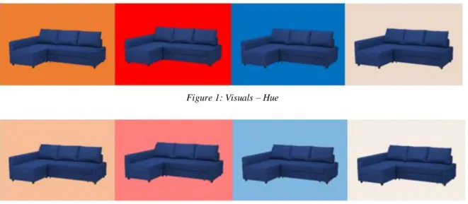
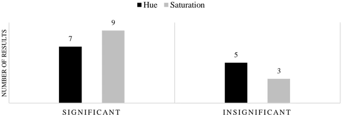
The main part of the questionnaire contains eight visuals: four visuals for background hues and four visuals for an adjusted saturation of the same hue (50% saturation level), which are split into two groups for the purpose of A/B testing. The visuals used are presented below:
Figure 1: Visuals – Hue
Figure 2: Visuals – Saturation
Participants are then asked to rate product attractiveness, purchase intention and feelings associated with the color schemes for each of the visuals. In order to test and compare the responses to different color combinations, the questionnaire was distributed using a randomizer, which evenly presents a set of visuals with a complementary color scheme or a random color scheme to participants. Due to this technique reliable responses for both conditions were retrieved and measured accordingly. An overview of the grouping for the A/B Testing is attached in the appendix (Appendix 3). The variables are measured as follows:
Product attractiveness. Product attractiveness for both hue and saturation were measured with an 11-point scale (0 = highly unattractive, 10 = highly attractive) (Page & Herr, 2002). Single item is “How would you rate this product in terms of attractiveness?”.
14 Purchase intention. Purchase intention for both hue and saturation were measured using a six-point scale (1 = highly unlikely, 6 = highly likely) (Cronin & Taylor, 1994). Single item is “How likely is it that you will buy this product?”.
Emotions. Four visual analogue scales (VAS) referring to emotional states of unbalance, balance, sadness and happiness were used to test for feelings associated with color schemes (Heller, Manuguerra, & Chow, 2016). Single item for each emotion is “How do you feel when looking at the visual?”.
Finally, demographic characteristics are questioned to retrieve insights about the participant. The survey ends with an acknowledgment of the respondent. The detailed questionnaire may be consulted in the appendix (Appendix 4).
3.3 Procedure and Sample
The survey was distributed via Facebook, WhatsApp and LinkedIn in order to obtain responses from a variety of people with different backgrounds. Moreover, the channels seemed appropriate as they represent relevant touching points with Millennials, who are chosen as the focus group for this study due to reasons of easy accessibility. Respondents were collected by using connections and the snowball sample approach. In total, 172 responses were collected from October 28th to November 18th. Of this sample, 45 participants did not pass the mandatory color blindness test and 27 did not finish the survey (total dropout rate of 41.86%). Thus, a total of 100 valid responses were used for the analysis of the data set. Of these 100 responses, 50 can be allocated to each testing condition, laying the groundwork for a valid statistical analysis of independent samples. The final sample is composed of 70.00% women, with the majority aged between 22 and 25 years (71.43%). Overall, 68.00% of the participants were aged between 22 and 25 years and 20,00% between 26 and 29 years, while only a minority was younger than the age of 22 (7.00%) or older than 29 (5.00%). Moreover, the majority of the sample was of German nationality (57.00%) followed by Portuguese (16.00%). In addition, 67.00% of the
15 participants stated to be enrolled as students of a university. The complete breakdown of demographic data can be consulted in the appendix (Appendix 5).
3.4 Data Analysis
The initial data set was collected in Qualtrics and then downloaded as an Excel file. The data file was then numerically coded for SPSS and uploaded for statistical analysis. In order to make a valid statement regarding the truth or falsity of the hypotheses, the dependent variables product attractiveness, purchase intention and associated emotions were analyzed concerning the influence of hue and saturation for both groups (in total 24 test procedures) using a One-Way ANOVA analysis and Independent Samples T-Test with a common confidence level of 95%.
4. Results
4.1 One-Way ANOVA Analysis
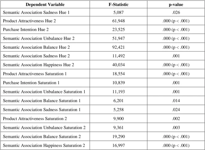
In order to verify the hypotheses, a One-Way ANOVA was employed to examine the effects of the color characteristics hue and saturation on the dependent variables, product attractiveness, purchase intention and associated feelings. Each variable was tested for significant differences in means between the two groups by taking into consideration the different background hues (Hue 1: blue vs. orange, Hue 2: beige vs. red) and the corresponding saturation level. The results of the One-Way ANOVA analysis for significance are presented in the chart below (Figure 3).
Figure 3: One-Way ANOVA Test for Significance
7 5 9 3 S I G N I F I C A N T I N S I G N I F I C A N T NU M B E R O F R E S UL T S Hue Saturation
16 Results of the One-Way ANOVA analysis show a significant difference in means between the two groups for both independent variables by meeting the condition for significance, p < α (confidence level .05), for 16 out of 24 test procedures. Eight results suggest insignificant statistical differences, i.e. the assumption that both means across groups are equal cannot be rejected for the corresponding dependent variable. The following table (Table 1) shows the F-statistic and p-value for each dependent variable with a significant result.
Dependent Variable F-Statistic p-value
Semantic Association Sadness Hue 1 5,087 .026
Product Attractiveness Hue 2 61,948 .000 (p < .001)
Purchase Intention Hue 2 23,525 .000 (p < .001)
Semantic Association Unbalance Hue 2 51,947 .000 (p < .001) Semantic Association Balance Hue 2 92,421 .000 (p < .001)
Semantic Association Sadness Hue 2 11,492 .001
Semantic Association Happiness Hue 2 40,034 .000 (p < .001) Product Attractiveness Saturation 1 18,554 .000 (p < .001)
Purchase Intention Saturation 1 10,839 .001
Semantic Association Unbalance Saturation 1 11,193 .001 Semantic Association Balance Saturation 1 6,201 .014 Semantic Association Sadness Saturation 1 5,258 .024
Product Attractiveness Saturation 2 9,900 .002
Semantic Association Unbalance Saturation 2 9,361 .003 Semantic Association Balance Saturation 2 19,290 .000 (p < .001) Semantic Association Happiness Saturation 2 16,997 .000 (p < .001)
Table 1: One-Way ANOVA Analysis
The complete One-Way ANOVA analysis conducted with SPSS can be consulted in the appendix (Appendix 6).
4.2 Independent Samples T-Tests
Independent Samples T-Tests based on Levene’s Test for equality of variances were employed for all dependent variables, that indicated statistically significant test results in the One-Way ANOVA analysis. The assumption of homogeneity of variances was met for 15 of
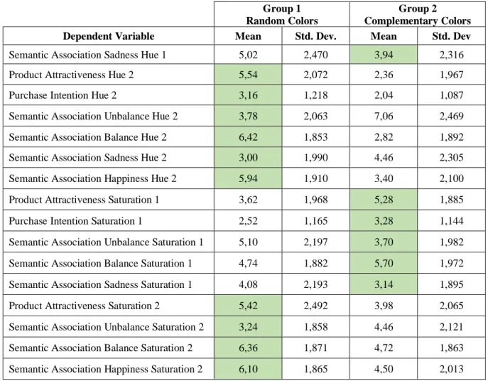
17 16 tests due to an insignificant result of Levene’s test (p > .05). However, equal variance can also be assumed for the single variable with a significant result (Product Attractiveness Saturation 2: .046 < .05) as the difference is marginal and the p-value is still close to the critical value. Accordingly, the test can be regarded as valid and robust as the F-statistic is not biased. Results of the T-Tests prove a significant difference in means by meeting the condition p < α for all dependent variables, therefore confirming the findings of the ANOVA analysis. Thus, the assumption that different color schemes influence product attractiveness, purchase intention and emotions can be supported for all abovementioned variables (Table 1). The analysis of the Independent Samples T-Tests is attached in the appendix (Appendix 7). An overview of group means provides insights on which group has scored a higher rating for each variable (Table 2).
Group 1 Random Colors
Group 2
Complementary Colors Dependent Variable Mean Std. Dev. Mean Std. Dev Semantic Association Sadness Hue 1 5,02 2,470 3,94 2,316
Product Attractiveness Hue 2 5,54 2,072 2,36 1,967
Purchase Intention Hue 2 3,16 1,218 2,04 1,087
Semantic Association Unbalance Hue 2 3,78 2,063 7,06 2,469 Semantic Association Balance Hue 2 6,42 1,853 2,82 1,892 Semantic Association Sadness Hue 2 3,00 1,990 4,46 2,305 Semantic Association Happiness Hue 2 5,94 1,910 3,40 2,100 Product Attractiveness Saturation 1 3,62 1,968 5,28 1,885 Purchase Intention Saturation 1 2,52 1,165 3,28 1,144 Semantic Association Unbalance Saturation 1 5,10 2,197 3,70 1,982 Semantic Association Balance Saturation 1 4,74 1,882 5,70 1,972 Semantic Association Sadness Saturation 1 4,08 2,193 3,14 1,895 Product Attractiveness Saturation 2 5,42 2,492 3,98 2,065 Semantic Association Unbalance Saturation 2 3,24 1,858 4,46 2,121 Semantic Association Balance Saturation 2 6,36 1,871 4,72 1,863 Semantic Association Happiness Saturation 2 6,10 1,865 4,50 2,013
18
4.3 Hypotheses Testing
Based on the results of the One-Way ANOVA, the Independent Samples T-Tests and the comparison of group means, the following conclusions can be drawn regarding the validity of the hypotheses for each hue and saturation group (Table 3):
Table 3: Summary of Hypotheses Testing
Contrary to previous assumptions, results of this study show that the use of complementary colors does not inevitably lead to a positive impact on product attractiveness, purchase intention and associated emotions. For instance, the different background colors for the Hue 1 color schemes (blue vs. orange) show only one significant difference in means according to the One-Way ANOVA analysis. As a result, the research hypothesis that complementary colors decrease feelings of sadness can be confirmed (H5a), while H1a, H2a, H3a, H4a, and H6a need to be rejected due to insignificant statistical results. Furthermore, results for the Hue 2 color schemes (beige vs. red) show a significant preference for the neutral color beige rather than red for all variables, contradicting the raised assumptions. Thus, all research hypotheses for Hue 2 color schemes need to be rejected.
When analyzing the results, it becomes evident that the saturation rather than the hue of background colors yields relevant statistical results, which lead to a confirmation of the research hypotheses. Particularly the adjustment of the saturation level for the Saturation 1 color schemes (blue vs. orange with a 50% saturation level) resulted in significant differences in means between groups for five of six dependent variables, leading to a confirmation of the raised
19 hypotheses H1b, H2b, H3b, H4b, and H5b. However, similar to Hue 2 color schemes, the results for Saturation 2 color schemes show a strong trend towards the neutral background color beige, resulting in a rejection of all raised hypotheses H1b, H2b, H3b, H4b, H5b and H6b.
5. Discussion
The purpose of this study was to investigate the influence of complementary color schemes on consumer behavior in an e-commerce environment, namely an interior design online store. For this reason, the impact of two specific color characteristics, hue and saturation, was examined for a complementary color scheme (blue product with orange and red background) and a random color scheme (blue product with blue and beige background). In line with this, six hypotheses for each color characteristic were raised based on prior research regarding color and psychological functioning. Contrary to previous assumptions, results of this study show that the use of complementary colors for the virtual product presentation does not inevitably lead to a positive impact on product attractiveness, purchase intention and emotions. Overall, the results disprove most of the hypotheses and only provide support for a few.
5.1 Theoretical Implications
The results of this study to some degree align with theoretical works, which were used as a groundwork for this research. In accordance with literature, significant findings provide support for the importance of color as an atmospheric element in the retail environment by influencing a consumer’s decision-making process related to the shopping task (Mandel & Johnson, 1999; Puccinelli, Chandrashekaran, Grewal, & Suri, 2013; Wedel & Pieters, 2015).
The empirical findings regarding the choice of hue as a background color reported insignificant differences between blue and orange. These results contradict previous findings that cool colors, such as blue, increase concentration, which in turn has a positive influence on a user’s purchase intention (Bellizi & Hite, 1992; Ettis, 2017). This study shows that contrary to prior research there is no significant difference between warm and cool colors used as a
20 background hue in a digital environment regarding their influence on product attractiveness and purchase intention. Moreover, literature stated that blue not only increases concentration but also elicits feelings of enjoyment (Babin, Hardesty, & Suter, 2003; Bellizi & Hite, 1992; Ettis, 2017). Additionally, Manav’s study (2007) indicated a preference for the color blue in an interior design context. According to his research, blue is often chosen as a living room color as it induces pleasent and calm feelings (Manav, 2007). As this empirical work uses an interior design and furniture e-commerce website as well as a living room product, it can be assumed that test outcomes confirm Manav’s theories. However, the findings of this research indicate otherwise. While the results for feelings of unbalance, balance and happiness can be considered insignificant, the analysis of the association with feelings of sadness comparing blue and orange yields a significant outcome. Contrary to previous research (Babin, Hardesty, & Suter, 2003; Bellizi & Hite, 1992; Ettis, 2017; Manav, 2007), the results of this study point to the fact that blue increases sadness instead of enjoyment when used as a background color. Considering the colors beige and red, findings support previous literature that red used as a background color has a negative effect on purchase decisions (Bagchi & Cheema, 2013; Bellizi & Hite, 1992; Ettis, 2017).
With respect to the findings on the influence of a color’s saturation, a less saturated orange background color yields more positive results than a blue color with the same saturation level. As these findings are significantly relevant, it can be confirmed that in line with previous research highly saturated products in front of a less saturated background increase attractiveness (Blijlevens, Carbon, Mugge, & Schoormans, 2012). While approving the relevance of the saturation level itself, findings of this study yet discredit the positive influence of cool colors on purchase decisions (Bellizi & Hite, 1992; Ettis, 2017).
Overall, the study has an impact on literature by challenging existing theories on the influence of specific colors. By confirming the importance of color research and its effect on
21 consumer behavior and purchase decisions, this study puts further emphasis on color to be considered as a crucial marketing tool. However, it also incites to think about the best color composition. So far, literature has extensively investigated the impact of single colors on human psychology and resulting behavioral actions but has disregarded the effect of color combinations. Thus, this work challenges and complements existing color theory by providing empirical research on the so far neglected relationship between color schemes, behavior and emotions.
5.2 Managerial Implications
In addition to theoretical implications, this work provides key implications from a managerial perspective. The predominant learning that can be derived from this study is that not only the choice of hue as a background color plays an important role but also the level of saturation. Therefore, marketers need to consider that color consists of different characteristics, which all significantly influence the perception of the color.
Going forward, this research has further contributed to the fact that color needs to be perceived as a crucial factor in a website’s design. As online stores are used on a daily basis, it is easy to focus primarily on urgent matters such as convenience, navigation, speed and ease of use, without taking atmospheric qualities into consideration. However, these qualities cannot be disregarded, even though consumers only shop in a virtual environment. Therefore, it is recommended that marketers consider color as a tool of non-verbal communication, which significantly influences the decision-making process, when designing the digital retail environment. In line with this, marketers need to remember that color harmony between design elements plays a vital role in creating an aesthetic environment.
By considering color characteristics and the effect of color schemes on consumer behavior, well thought out color combinations might lead to a competitive advantage compared to competing online stores as they influence purchase decisions, emotions and attitudes towards
22 the products and the website itself. Additionally, consumers will experience a more pleasant shopping experience, which might lead to an improvement of digital KPIs such as time spent on site, pages visited, bounce rate, retention rate as well as purchase and repurchase rate.
5.3 Limitations and Future Research
As with all empirical studies, this research yields several limitations that provide indications for future research.
First, the sample size and demographic data of the respondents restrict a representative result. As this study focuses on Millennials with 68.00% of participants aged between 22 and 25 years, findings might only represent color preferences of this generation. In addition, 83.00% of the sample group is European with a majority being of German nationality, which might also impact results as color preferences and perception are culturally different (Elliot & Maier, 2007). Hence, the validity of findings across cultures and generations must be considered questionable. Future research on this topic should be conducted in order to understand the effect of color schemes in digital media across generations and groups with a different cultural background.
Second, the survey was conducted online on each participant’s own device with access to the internet (presumably laptop, tablet or mobile device). As each device processes and displays color differently due to a discrepancy in graphic cards, operating systems or a display’s resolution, it can be suspected that each participant has viewed the color combinations under different conditions. Moreover, as each participant responded to the questionnaire individually, external factors such as lighting could not be controlled. Thus, future research is recommended to test color preferences under controlled conditions by using the same device and testing environment for all respondents.
Third, this research only tested the color schemes blue-orange, blue-red, blue-blue and blue-beige. Other colors and color combinations were disregarded. Also, only hue and
23 saturation were investigated, while the third color characteristic brightness was excluded as it would have exceeded the scope of this research. Consequently, other color combinations and characteristics of color should receive more attention in future work in order to make a representative statement.
Lastly, the study could be extended by applying the results of this paper to different product categories and media types. As the initial research paper “White lie or true blue: Consumer’s packaging choices depend on color of retail environment”, which functions as the basis for this study, has come to different conclusions regarding the influence of color schemes, the necessity to further test different product categories and media becomes evident.
6. Conclusion
Vast amounts of research on color and its influence on human behavior exists, however literature on the effect of complementary color schemes on consumers in a digital environment is scarce. Thus, this paper contributes to theory by closing the research gap and complementing existing literature. Results of this study partially support the hypotheses that hue and saturation of color schemes affect consumer behavior in an online environment in terms of attitudes towards product attractiveness, purchase intention and emotions. The analysis of the data set has shown that the greatest significant differences in favor of complementary color schemes are not to be found in the choice of hue but rather in its saturation. As these findings implicate the success of online shops, it is recommended to regard the choice of color in a website’s design as a crucial component in aesthetic factors, that influences the shopping behavior of consumers and finally increases e-commerce sales.
24 References
Azman, D. T. (2019, October 18). Information on Color Blindness Test. (K. Weitzel, Interviewer)
Babin, B. J., Hardesty, D. M., & Suter, T. A. (2003, July). Color and shopping intentions: The intervening effect of price fairness and perceived affect. Journal of Business Research,
56(7), pp. 541-551.
Bagchi, R., & Cheema, A. (2013, February). The Effect of Red Background Color on Willingness-to-Pay: The Moderating Role of Selling Mechanism. Journal of
Consumer Research, 39(5), pp. 947-960.
Bellizi, J. A., & Hite, R. E. (1992, September). Environmental Color, Consumer Feelings and Purchase Likelihood. Psychology & Marketing, 9(5), pp. 347-363.
Biers, K., & Richards, L. (2005). Color as A Factor of Product Choice In E-Commerce. The
Review of Business Information Systems, 9(4), pp. 33-40.
Blijlevens, J., Carbon, C.-C., Mugge, R., & Schoormans, J. P. (2012, February). Aesthetic appraisal of product designs:Independent effects of typicality and arousal. British
Journal of Psychology, 103(1), pp. 44-57.
Colormax. (2019). Color Blind Test. Retrieved October 24, 2019, from colormax.org: https://colormax.org/color-blind-test/
Cronin, J., & Taylor, S. A. (1994, January 1). Servperf versus Servqual: Reconciling Performance-Based and Perceptions-Minus-Expectations Measurement of Service Quality. Journal of Marketing, 58(1), pp. 125-131.
Donovan, R., & Rossiter, J. R. (1982, January). Store Atmosphere: An Environmental Psychology Approach. Journal of Retailing, 58(1), pp. 34-57.
Eckman, M., & Wagner, J. (1994). Judging the Attractiveness of Product Design: the Effect of Visual Attributes and Consumer Characteristics. Advances in Consumer Research,
21, pp. 560-564.
Elliot, A. J. (2015, April 2). Color and psychological functioning: a review of theoretical and empirical work. Frontiers in Psychology, 6(APR), pp. 1-8.
Elliot, A. J., & Maier, M. A. (2007). Color and psychological functioning. Current Directions
25 Elliott, A. J., & Maier, M. A. (2014). Color Psychology: Effects of Perceiving Color on
Psychological Functioning in Humans. Annual Review of Psychology, 65(1), pp. 95-120.
Eroglu, S. A., Machleit, K. A., & Davis, L. M. (2001). Atmospheric qualities of online retailing A conceptual model and implications. Journal of Business Research, 54, pp. 177-184.
Eroglu, S. A., Machleit, K. A., & Davis, L. M. (2003, February 1). Empirical Testing of a Model of Online Store Atmospherics and Shopper Responses. Psychology &
Marketing, 20, pp. 139-150.
Ettis, S. A. (2017, July). Examining the relationships between online store atmospheric color, flow experience and consumer behavior. Journal of Retailing and Consumer Services,
37(August 2016), pp. 43-55.
Hanada, M. (2019, April 8). Associations of visual forms with colors: The minor role ofemotion as the mediator. Color Research and Application, 44, pp. 568-580.
Hanss, D., Böhm, G., & Pfister, H.-R. (2008). Active red sports car and relaxed purple–blue van: affective qualities predict color appropriateness for car types. Journal of
Consumer Behavior, 50(May), pp. 35-50.
Hauff, A. (2018, August 29). The Know It All Guide To Color Psychology In Marketing +
The Best Hex Chart. Retrieved October 2, 2019, from CoSchedule Blog:
https://coschedule.com/blog/color-psychology-marketing/#combos
Heller, G. Z., Manuguerra, M., & Chow, R. (2016, October 1). How to analyze the Visual Analogue Scale: Myths, truths and clinical relevance. Scandinavian Journal of of
Pain, 13(1), pp. 67-75.
Hill, R., & Barton, R. (2005, May 19). Red enhances performance in contests. Nature, 435, p. 293.
Hubbard, T. L. (1996). Synesthesia-like Mappings of Lightness, Pitch, and Melodic Interval.
American Journal of Psychology, 109(2), pp. 219-238.
Jonauskaite, D., Mohr, C., Antonietti, J.-P., Spiers, P. M., Althaus, B., Anil, S., & Dael, N. (2016, March 29). Most and Least Preferred Colours Differ According to Object Context: New Insights from an Unrestricted Colour Range. PLOS ONE, 11(3), pp. 1-22.
26 Labrecque, L. I., Patrick, V. M., & Milne, G. R. (2013). The Marketers’ Prismatic Palette: A
Review of Color Research and Future Directions. Psychology & Marketing, 30(2), pp. 187-202.
Lipsman, A. (2019, June 27). Global Ecommerce 2019: Ecommerce Continues Strong Gains
Amid Global Economic Uncertainty. Retrieved October 1, 2019, from Statista:
https://www.emarketer.com/content/global-ecommerce-2019
Manav, B. (2007, February 26). Color-emotion associations and color preferences: A case study for residences. Color Research and Application, 2, pp. 144-150.
Mandel, N., & Johnson, E. J. (1999). Constructing Preferences Online: Can Web Pages
Change What We Want? Pennsylvania: The Wharton School, University of
Pennsylvania.
Martinez, L. M., Rando, B., Agante, L., & Abreu, A. M. (2019). White lie or true blue:.
EAWOP, (pp. 1-32). Turin.
Mead, J. A., & Richerson, R. (2018). Package color saturation and food healthfulness perceptions. Journal of Business Research, 82(January 2017), pp. 10-18.
Nagy, A., & Cone, S. (1996, September). Asymmetries in simple feature searches for color.
Vision Research, 36(18), pp. 2837-2847.
Nitse, P. S., Parker, K. R., Krumwiede, D., & Ottaway, T. (2004). The impact of color in the e-commerce marketing of fashions: an exploratory study. European Journal of
Marketing, 38(7), pp. 898-915.
Oberfeld, D., & Hecht, H. (2011, June 1). Fashion Versus Perception: The Impact of Surface Lightness on the Perceived Dimensions of Interior Space. Human Factors, 53(3), pp. 284-298.
Page, C., & Herr, P. M. (2002). An investigation of the processes by which product design and brand strength interact to determine initial affect and quality judgments. Journal
of Consumer Psychology(12), pp. 133-147.
Pile, J. F. (1997). Color in Interior Design. New York: McGraw-Hill.
Pridmore, R. W. (2011, December). Complementary colors theory of color vision:
Physiology, color mixture, color constancy and color perception. Color Research and
27 Puccinelli, N. M., Chandrashekaran, R., Grewal, D., & Suri, R. (2013, June). Are Men
Seduced by Red? The Effect of Red Versus Black Prices on Price Perceptions. Journal
Of Retailing, 89(2), pp. 115-125.
Schiller, G. (1935). An experimental study of the appropriateness of. Journal of Applied
Psychology, 6, pp. 652-664.
Statista. (2019, September). eCommerce Report 2019 - Furniture & Appliances. Retrieved October 1, 2019, from statista.com:
https://fesrvsd.fe.unl.pt:2058/outlook/255/100/furniture-homeware/worldwide#market-revenue
Suk, H.-J., & Irtel, H. (2010, February). Emotional Response to Color Across Media. Color
Research and Application, 35(1), pp. 64-77.
Walker, P., Scallon, G., & Francis, B. (2017). Cross-Sensory Correspondences: Heaviness is Dark and Low-Pitched. Perception, 7, pp. 772-792.
Walther, J. B. (1992, February). Interpersonal Effects in Computer-Mediated Interaction: A Relational Perspective. Communication Research, 19(1), pp. 52-90.
Wedel, M., & Pieters, R. (2015, January). The Buffer Effect: The Role of Color When
Advertising Exposures Are Brief and Blurred. Marketing Science, 34(1), pp. 134-143. Wilms, L., & Oberfeld, D. (2018). Color and emotion: effects of hue, saturation, and
28 Appendices
Appendix 1: Explanation of Color Schemes (Pile, 1997)
Analogous colors Adjacent colors in the hue circle Complementary colors Opposite colors in the hue circle
Double complementary colors Color with two sides of the opposite color in the hue circle
Triad complementary colors Equally placed colors that form an equilateral triangle in the hue circle
Tetrad complementary colors Mutual four colors Monochromatic Colors Same shades of a color
Appendix 2: Reasons for Color Selection (Martinez, Rando, Agante, & Abreu, 2019)
Orange Most suitable color (with red) to increase arousal, can often be found in store environments
Blue Complementary to orange Red Similar/analogous to orange Beige Neutral color
Appendix 3: Overview A/B Testing
Group 1 Group 2
Random Color Scheme Complementary Color Scheme
Hue 1 blue orange
Hue 2 beige red
Saturation 1 blue (50%) orange (50%)
Saturation 2 beige (50%) red (50%)
Appendix 4: Questionnaire
29 Color Blindness Test
Product Attractiveness, Purchase Intention & Semantic Association – Random Color Scheme
32 Product Attractiveness, Purchase Intention & Semantic Association
35 Demographics
36
37
Appendix 5: Demographic Data Breakdown
Appendix 6: One-Way ANOVA Analysis
ANOVA
Sum of Squares df Mean Square F Sig.
Product Attractiveness Hue 1
Between Groups 16,810 1 16,810 3,823 ,053
Within Groups 430,900 98 4,397
Total 447,710 99
Purchase Intention Hue 1 Between Groups 2,890 1 2,890 2,087 ,152
Within Groups 135,700 98 1,385 Total 138,590 99 Semantic Association - Unbalance Hue 1 Between Groups 12,250 1 12,250 1,984 ,162 Within Groups 605,060 98 6,174 Total 617,310 99 30% 70% Gender Male Female 7% 68% 20% 5% Age 18-21 22-25 26-29 >30 27% 1% 67% 5% Employment Employed Self-Employed Student
Looking for a job
57% 16% 4% 2% 2% 2% 6% 11% Nationality German Portuguese Italian Spanish French Scandinavian American Other 2% 65% 30% 2% 1% Education
High School Graduate Bachelor's Degree Master's Degree Doctorate Degree None
38 Semantic Association - Balance Hue 1 Between Groups 1,960 1 1,960 ,459 ,500 Within Groups 418,880 98 4,274 Total 420,840 99 Semantic Association - Sadness Hue 1 Between Groups 29,160 1 29,160 5,087 ,026 Within Groups 561,800 98 5,733 Total 590,960 99 Semantic Association - Happiness Hue 1 Between Groups 4,410 1 4,410 1,101 ,297 Within Groups 392,580 98 4,006 Total 396,990 99 Product Attractiveness Hue 2 Between Groups 252,810 1 252,810 61,948 ,000 Within Groups 399,940 98 4,081 Total 652,750 99
Purchase Intention Hue 2 Between Groups 31,360 1 31,360 23,525 ,000
Within Groups 130,640 98 1,333 Total 162,000 99 Semantic Association - Unbalance Hue 2 Between Groups 268,960 1 268,960 51,947 ,000 Within Groups 507,400 98 5,178 Total 776,360 99 Semantic Association - Balance Hue 2 Between Groups 324,000 1 324,000 92,421 ,000 Within Groups 343,560 98 3,506 Total 667,560 99 Semantic Association - Sadness Hue 2 Between Groups 53,290 1 53,290 11,492 ,001 Within Groups 454,420 98 4,637 Total 507,710 99 Semantic Association - Happiness Between Groups 161,290 1 161,290 40,034 ,000 Within Groups 394,820 98 4,029 Total 556,110 99 Product Attractiveness Saturation 1 Between Groups 68,890 1 68,890 18,554 ,000 Within Groups 363,860 98 3,713 Total 432,750 99 Purchase Intention Saturation 1 Between Groups 14,440 1 14,440 10,839 ,001 Within Groups 130,560 98 1,332 Total 145,000 99 Semantic Association - Unbalance Saturation 1 Between Groups 49,000 1 49,000 11,193 ,001 Within Groups 429,000 98 4,378 Total 478,000 99 Semantic Association - Balance Saturation 1 Between Groups 23,040 1 23,040 6,201 ,014 Within Groups 364,120 98 3,716 Total 387,160 99 Semantic Association - Sadness Saturation 1 Between Groups 22,090 1 22,090 5,258 ,024 Within Groups 411,700 98 4,201
39 Total 433,790 99 Semantic Association - Happiness Saturation 1 Between Groups 2,250 1 2,250 ,739 ,392 Within Groups 298,500 98 3,046 Total 300,750 99 Product Attractiveness Saturation 2 Between Groups 51,840 1 51,840 9,900 ,002 Within Groups 513,160 98 5,236 Total 565,000 99 Purchase Intention Saturation 2 Between Groups 3,240 1 3,240 2,173 ,144 Within Groups 146,120 98 1,491 Total 149,360 99 Semantic Association - Unbalance Saturation 2 Between Groups 37,210 1 37,210 9,361 ,003 Within Groups 389,540 98 3,975 Total 426,750 99 Semantic Association - Balance Saturation 2 Between Groups 67,240 1 67,240 19,290 ,000 Within Groups 341,600 98 3,486 Total 408,840 99 Semantic Association - Sadness Saturation 2 Between Groups 4,840 1 4,840 ,971 ,327 Within Groups 488,400 98 4,984 Total 493,240 99 Semantic Association - Happiness Saturation 2 Between Groups 64,000 1 64,000 16,997 ,000 Within Groups 369,000 98 3,765 Total 433,000 99
Appendix 7: Group Statistics and Independent Samples T-Tests
40 Product Attractiveness – Hue 2
Purchase Intention – Hue 2
Semantic Association – Unbalance Hue 2
41 Semantic Association – Sadness Hue 2
Semantic Association – Happiness Hue 2
Product Attractiveness – Saturation 1
42 Semantic Association – Unbalance Saturation 1
Semantic Association – Balance Saturation 1
Semantic Association – Sadness Saturation 1
43 Semantic Association – Unbalance Saturation 2
Semantic Association – Balance Saturation 2