UNIVERSIDADE DE LISBOA FACULDADE DE CIÊNCIAS DEPARTAMENTO DE INFORMÁTICA
VisuaLeague II - Animated Maps for Performance
Analysis in Games
Tiago Alexandre Orrico Moucho
Mestrado em Informática
Dissertação orientada por:
Prof.ª Dr.ª Ana Paula Pereira Afonso
e Prof.ª Dr.ª Maria Beatriz Duarte Pereira do Carmo
Acknowledgments
First and foremost, I would like to thank my professors, Dr. Ana Paula Afonso and Dr. Maria Beatriz Carmo, for their support throughout this project, one of the main moments of my life. I also want to thank Dr. Tiago Gonçalves for the sarcastic, but good, reviews and comments that have led to improving the quality of this project.
To my parents and sister for having supported and endured me in the most difficult moments, giving me the so needed motivation to continue. A special thank you to my beautiful niece for making me happy during the most tense moments, even though she had no idea.
To all my friends and colleagues. I appreciate the laughter, the night outs and the dinners, which made me relax and gain motivation to finish this stage. Thank you Inês Matos, Ana Espinheira, Carlos Duarte, Afonso Vicente, Ana Patrícia and Raquel Nabais for the support, company, evenings and feedback, as well as the patience they had to put up with me and to help me in this whole process.
Thank you, Inês Fernandes and Rita Capela, for always being there and never doubting me.
To all the participants in the user study. Thank you very much for your availability. All your help was extremely important to this project and, without it, it was not possible to finish.
Finally, I want to thank all the other people, friends and family who were not mentio-ned but who motivated me throughout this process.
Resumo
O fenómeno de eSports tem vindo a aumentar ao longo dos anos e, com este, também o interesse por videosjogos online, tanto por parte dos jogadores como treinadores e ana-listas. Um dos mais populares géneros destes jogos é o Multiplayer Online Battle Arena (MOBA) e durante uma partida existem vários tipos de eventos. Estes eventos, ou ações, podem variar desde a posição de um jogador num determinado instante de tempo ou o caminho que este percorreu de um ponto a outro, a eventos mais específicos do jogo, tais como a posição onde o jogador morreu ou o número de balas disparadas numa determi-nada área. Analisar este tipo de dados por jogadores, treinadores e analistas pode gerar o reconhecimento de padrões permitindo definir novas estratégias que ajudem os jogadores a melhorar o seu desempenho.
Com a evolução da tecnologia, tem-se tornado cada vez mais fácil utilizar técnicas de telemetria para registar eventos em jogos online o que, por sua vez, leva a um elevado volume de dados que pode ser recolhido ao longo do tempo. Para que se possa extrair informação relevante desses conjuntos de dados, por vezes volumosos, é fundamental explorar quais as técnicas de visualização mais adequadas.
O objetivo deste trabalho consiste em utilizar o conjunto de dados telemétricos re-colhidos pela Riot Games, provenientes de partidas de League of Legends (LoL), para redesenhar um protótipo onde se explora a técnica de visualização mapas animados, me-lhorando o desempenho computacional deste, resolvendo problemas como a sobreposição de eventos e a limitação de só suportar a análise até dois jogadores em simultâneo. Fo-ram aplicadas técnicas de visualização complementares para a mitigação dos problemas acima mencionados, assim como técnicas com o intuito de apresentar dados estáticos e estatísticos, complementando a análise do desempenho de jogadores feita com a principal técnica de visualização utilizada. Por fim, foi feita uma avaliação do sistema de forma a perceber se as técnicas de visualização em uso são adequadas a este tipo de análise, e de que forma a ferramenta desenvolvida compete com outras existentes no mercado, com o objetivo de fazer análises do desempenho de jogadores.
Este relatório apresenta o trabalho relacionado sobre dados espácio-temporais, assim como técnicas de visualização aplicadas aos mesmos e técnicas de visualização usadas em videojogos. É discutida a relevância dos eSports e a sua possível aplicação em áreas científicas, como visualização de estruturas moleculares, pelas técnicas de visualização
ser feita entre os géneros. É feita uma breve introdução à visualização, onde se enume-ram seis passos que se devem ter em conta no processo de desenho de uma visualização correta. Existindo diferentes tipos de visualização, sendo a explorada neste relatório a visualização de informação, é nesta onde recaem os tipos de dados que são analisados utilizando o protótipo desenvolvido. Para a visualização de dados espácio-temporais, são introduzidos várias técnicas, dando foco a dois métodos utilizados em projetos anteriores: o Cubo Espaço-Tempo e os Mapas Animados. Uma vez que se está a explorar técnicas de visualização adequadas para analisar jogos, são também introduzidas diferentes téc-nicas de visualização existentes, aplicadas diretamente dentro do jogo, como mini mapa, barras de vida e heatmaps, ou usadas por aplicações de terceiros para análise, como grá-ficos de barras e linhas. Ligando o trabalho já desenvolvido com o atual, são revistos dois protótipos anteriores onde já foram aplicadas as técnicas de Cubo Espaço-Tempo e Mapas Animados, referindo as vantagens e desvantagens de cada uma para a análise de desempenho de jogadores. Por fim, ainda dentro do trabalho relacionado, é efetuada uma apresentação ao jogo LoL, explicando a mecânica do jogo, cujos dados telemétricos foram utilizados para a análise e aplicação desenvolvida, explicitando que tipo de dados espácio-temporais oferece.
De seguida, é apresentado o protótipo desenvolvido juntamente com as vantagens de se construir uma aplicação web. A informação sobre a arquitetura desenvolvida é descrita em detalhe, assim como as tecnologias usadas, estando estas listadas tanto as do lado do cliente, como as do lado do servidor. Também é descrito como é que o processamento de dados foi realizado, mostrando excertos de pseudocódigo para melhor compreensão. Neste processamento de dados, é explicado como foi implementado o sistema de trajetos usado pela aplicação, assim como o tratamento efetuado sobre os dados, filtragem e reor-denação, para o fácil uso e análise feita pelos utilizadores. Exibindo as funcionalidades da aplicação, é feita uma ponte entre os dados que foram processados, como estes são mos-trados, e a sua possível interação com o utilizador, esclarecendo como foi realizada a sua implementação e o seu propósito. Algumas destas funcionalidades são fruto das soluções encontradas para os problemas do protótipo anterior. Outras fazem parte das técnicas de visualização utilizadas para complementar a técnica principal de visualização em uso.
Para testar a aplicação desenvolvida foram realizados dois tipos de avaliação: a pri-meira correspondendo a entrevistas informais e a segunda uma comparação entre a apli-cação desenvolvida com outras duas existentes no mercado, o OP.GG e o Replay do LoL. Estas ferramentas são apresentadas brevemente e utilizadas na avaliação da aplicação desenvolvida, tendo sido efetuada uma comparação direta entre elas, tanto ao nível dos dados apresentados, como ao nível das funcionalidades e técnicas de visualização que usam para apresentar estes dados. Para a segunda avaliação é explicada a metodologia e
aparelhos usados na sua concretização, o tipo de participantes (jogadores casuais e profis-sionais da área) e as tarefas definidas que foram executadas nas três diferentes ferramentas de análise. Os resultados são apresentados, onde é discutida a precisão do sistema de tra-jetórias desenvolvido para a aplicação, assim como a análise feita pelos participantes para as diferentes tarefas, comparando-a entre as diferentes ferramentas utilizadas. Foi feito um levantamento das respostas finais dos participantes, onde foi perguntado o quão útil e fácil de usar é VisuaLeague II em relação às outras duas ferramentas, juntamente com a capacidade de se efetuar uma análise mais rápida. Também foi pedido aos participan-tes que declarassem as vantagens e desvantagens de usar VisuaLeague II em relação ao OP.GG e ao Replay do LoL.
O estudo realizado pelos participantes sugere que os utilizadores preferem visuali-zar dados espácio-temporais dinamicamente, ou seja, visualizando mudanças ao longo do tempo, usando mapas animados. Além disso, a visualização de dados estáticos e es-tatísticos, juntamente com a visualização de dados espácio-temporais, melhora a análise do desempenho do jogador. Com a análise feita pelos participantes no estudo, é possível dividir a análise em dois tipos: as análises feitas por jogadores casuais e análises fei-tas por profissionais (tanto jogadores como treinadores/analisfei-tas). Os jogadores casuais simplesmente descrevem o que está a acontecer na visualização. No entanto, os profissi-onais elaboram teorias sobre o desempenho de um jogador, dando sugestões sobre como o jogador devia ter jogado em certas ocasiões.
No geral, os participantes demonstraram uma atitude mais positiva em relação ao uso do VisuaLeague II e do Replay do LoL do que o OP.GG como uma ferramenta de análise, simplesmente porque melhores técnicas de visualização estão a ser utilizadas para visualizar dados espácio-temporais.
Trabalho futuro também é mencionado onde se explicita vários pontos em que Visua-League II pode ser melhorado. Uma ideia é formulada com o propósito de ser possível a análise do desempenho do jogador não apenas em um jogo, mas ser possível expandir o protótipo de forma a analisar o desempenho do jogador ao longo de vários jogos.
Palavras-chave: Dados Espácio-Temporais, Mapas Animados, League of Legends
Abstract
The phenomenon of eSports has been increasing over the years as well as the interest in online video games by players, coaches and analysts. One of the most popular genres of these games is the Multiplayer Online Battle Arena (MOBA) and during a match there are several types of events. These events, or actions, can range from the path a player traveled from one point to another, to more specific events in the match, such as the position where the player died. Analyzing this type of data by these stakeholders can generate pattern recognition allowing them to define new strategies that help players improve their performance.
With the evolution of technology, it has become easier to use telemetry techniques to record events in online games, which leads to a high volume of data that can be collected over time.
The objective of this work is to use the telemetric data provided by Riot Games, from League of Legends (LoL) matches, to redesign a prototype that explores the animated maps visualization technique, improving its computational performance, solving prob-lems such as overlapping events and analysis only up to two players. Additional visual-ization techniques were applied to mitigate the above-mentioned problems, as well as the addition of other techniques to present static and statistical data.
Finally, a comparison between the developed tool (VisuaLeague II) and other exist-ing ones in the market (OP.GG and LoL’s Replay) was performed to understand if the visualization techniques implemented are adequate for analyzing player’s performance.
The study carried out suggests that participants demonstrated a more positive attitude towards using VisuaLeague II and LoL’s Replay rather than OP.GG as an analysis tool, simply because better visualization techniques are being used to visualize spatio-temporal data. In addition, viewing static and statistical data, along with displaying spatio-temporal data, improves the player’s performance analysis.
Keywords: Spatio-Temporal Data Visualization, Animated Maps, League of Legends
Contents
List of Figures xiii
List of Tables xv
List of Listings xvii
List of Acronyms xix
1 Introduction 1
1.1 Motivation . . . 1
1.2 Goals . . . 3
1.3 Contributions . . . 3
1.4 Document Structure . . . 4
2 Concepts and Related Work 5 2.1 Relevance of eSports . . . 6
2.2 Video Games Telemetry . . . 7
2.3 Visualization . . . 10
2.3.1 Spatio-Temporal Visualization Techniques . . . 12
2.3.2 Visualization Techniques Used in Video Games . . . 16
2.4 Previous Work . . . 21 2.5 League of Legends . . . 24 2.5.1 Game Description . . . 24 2.5.2 Telemetry Data . . . 26 2.6 Summary . . . 28 3 VisuaLeague II 29 3.1 Prototype Description . . . 29 3.2 Architecture . . . 31 3.3 Technologies . . . 32 3.4 Data Processing . . . 36 3.5 Prototype Features . . . 43 xi
4 Evaluation of VisuaLeague II 53
4.1 Informal Interviews . . . 53
4.2 Considered Applications for Comparison . . . 54
4.2.1 OP.GG . . . 54
4.2.2 League of Legends Replay System . . . 55
4.2.3 Comparison of VisuaLeague II with OP.GG and LoL’s Replay . . 56
4.3 User Study . . . 57
4.3.1 Methodology and Apparatus . . . 58
4.3.2 Participants . . . 58
4.3.3 Tasks . . . 60
4.4 Results . . . 61
4.4.1 Routing System Accuracy . . . 61
4.4.2 Participants Analysis . . . 63
4.4.3 Survey Answers . . . 65
4.5 Discussion . . . 69
5 Conclusion and Future Work 71 5.1 Conclusion . . . 71
5.2 Future Work . . . 72
A Evaluation Form 75
References 83
List of Figures
2.1 Indianapolis 500: The Simulation . . . 5
2.2 eSports cause-effect . . . 6
2.3 Jungle level heatmap representing player location . . . 9
2.4 Pathaways visualization system showing data from level 7 . . . 9
2.5 A Space-Time Cube visualization of Napoleon’s march in Russia . . . 14
2.6 HealthVisB application with an interactive map and a scatterplot . . . 15
2.7 Analysis of player paths and movement . . . 16
2.8 Health and armor (suit) displayed on the bottom left of the screen . . . 17
2.9 World of Warcraft health bar . . . 17
2.10 Hit heatmap in Black Ops and GTA San Andreas Gang Turf Choropleth . 18 2.11 Guild Wars 2 minimap . . . 19
2.12 League of Legends minimap over time . . . 19
2.13 Team match analysis and a line chart showing team gold earned . . . 20
2.14 Bar charts representing gold acquired and experience earned in a match . 20 2.15 Three kinds of visualization techniques in the GameVis application . . . . 21
2.16 2D map and STC showing players’ paths and events over a match’s length 22 2.17 Animated map at a certain time . . . 23
2.18 Lanes in Summoner’s Rift . . . 24
2.19 Summoner’s Rift detailed map . . . 25
3.1 Initial front page to fetch recent player matches . . . 30
3.2 VisuaLeague II Web Application . . . 30
3.3 MVC Architecture . . . 31
3.4 Neo4j nodes graph and nodes represented in Map . . . 34
3.5 VisuaLeague II Web Application . . . 43
3.6 Active tower and destroyed tower . . . 44
3.7 Skull shaped marker and its tooltip representing a champion kill . . . 44
3.8 Timeline’s design evolution . . . 45
3.9 VisuaLeague’s minimap . . . 46
3.10 VisuaLeague II types of notifications . . . 47
3.11 VisuaLeague II Filters Panel . . . 48
3.12 Filtered event’s timeline . . . 48 xiii
4.1 OP.GG Summoner Page with match view . . . 54
4.2 OP.GG’s team gold and experience charts . . . 55
4.3 OP.GG’s kill map and textual timeline . . . 55
4.4 LoL’s Replay System . . . 56
4.5 Pie charts of whether tools were used . . . 59
4.6 Bar chart of LoL’s Replay purpose . . . 59
4.7 Bar chart of OP.GG purpose . . . 60
4.8 Jungler’s path accuracy per match . . . 62
4.9 Usefulness of VisuaLeague II compared with LoL’s Replay and OP.GG . 65 4.10 Easiness of VisuaLeague II compared with LoL’s Replay and OP.GG . . . 66
4.11 Faster analysis with VisuaLeague II compared with LoL’s Replay and OP.GG . . . 66
4.12 Pros and cons of VisuaLeague II against LoL’s Replay . . . 67
4.13 Pros and cons of VisuaLeague II against OP.GG . . . 68
4.14 Pie chart showing whether people would use VisuaLeague II . . . 68
List of Tables
2.1 Participant Timeline . . . 26
2.2 Participant’s frame at a certain timestamp . . . 27
2.3 Types of Events . . . 27
4.1 Data Types Comparison . . . 57
4.2 Features Comparison . . . 57
4.3 Latin squaremodel example . . . 58
List of Listings
3.1 JSON file of recent matches’ list . . . 35
3.2 Prepare route function’s callback . . . 38
3.3 Match Data JSON content example . . . 39
3.4 Timeline Data JSON content example . . . 40
3.5 Prepare Timeline Data function . . . 42
List of Acronyms
AD Attack Damage. 25, 63 ADC AD Carry. 25
AI Artificial Intelligence. 5, 24 AP Ability Power. 25, 63
API Application Programming Interface. 2, 10, 26, 28, 32, 34, 36, 38, 40, 62, 68, 71 CS Counter-Strike. 7, 17
CSS Cascading Style Sheets. 29, 35
FPS First-Person Shooter. vi, 1, 4, 7–9, 18, 19 HCI Human-Computer Interaction. 6
HTTP Hypertext Transfer Protocol. 29, 33, 38 I/O Input/Output. 33
InfoVis Information Visualization. 11, 12, 28 JS JavaScript. 29, 33, 35, 36
JSON JavaScript Object Notation. 28, 32, 34, 35, 39, 40, 51 KDA Kills, Deaths, Assists. 40, 45, 48, 49, 54, 55, 63, 64, 67
LoL League of Legends. v–vii, ix, 1–4, 6, 10, 19, 21–25, 28, 29, 37, 43, 45, 47, 53, 54, 56–59, 63–72
MMO Massive Multiplayer Online. 19 MMR Match Making Ratio. 59, 60
MVC Model-View-Controller. 31, 33 NPC Non-Playable Character. 5, 8 RPG Role-Playing Game. 24
RTS Real-Time Strategy. vi, 4, 8–10, 24, 26 STC Space-Time Cube. 13, 14, 21, 22, 28 URL Uniform Resource Locator. 39 XP Experience Points. 24–26
Chapter 1
Introduction
This chapter introduces the main motivation of this work, particularly addressing the im-portance of video game analytics as a research subject. The goals and contributions of this thesis are also characterized, followed by the structure of this document.
1.1
Motivation
Competitive gaming, or most commonly known as eSports, is a worldwide phenomenon in which players compete between them in online tournaments, through the use of elec-tronic devices, mainly computers and consoles. It has become a real influence and fun-damental element in today’s young people culture (Wagner, 2006). Although eSports are only now being recognized as a sport, the term dates to the late nineties. It started with Doom1and Quake2, two First-Person Shooter (FPS) games which objective is to find the exit while annihilating monsters. In comparison, nowadays we have Paragon3and League of Legends (LoL)4, two Multiplayer Online Battle Arena (MOBA) games which objective is to destroy the enemy base to win the match. There are many other genres that take part in the eSports world which, in turn, contributed to a significant increase in the popularity of these events. With this growth, many necessities must be satisfied to improve the game or the gameplay, including the information given to players, coaches, and analysts, or to the developers’ community, if that applies.
Video games are becoming more complex and its audience is getting bigger. This increase is making the interest in analyzing the player’s behavior and the impact of de-sign decisions more relevant (Wallner and Kriglstein, 2013). In order to improve the game, developers need feedback from users, often acquired in the form of questionnaires, playtesting or videotaping, to mention a few (Gagné et al., 2011; Wallner and Kriglstein, 2013). However, this collected data sometimes is incomplete or subjective and
time-1https://bethesda.net/en/game/doom 2https://quake.bethesda.net/en
3https://www.unrealengine.com/en-US/paragon 4https://euw.leagueoflegends.com/en/
consuming. This leads us to find other techniques that help getting complementary data, such as resorting to the player’s direct gameplay (logging user actions). This process is called instrumentation giving, as outcome, telemetry data – a quantitative record of in-game player interactions (Loh et al., 2015; Moura et al., 2011). Telemetry data gathered can, however, be extensive, leading to a creation of big spatio-temporal datasets of in-formation. Spatio-temporal datasets include all datasets consisting of location and time (Shrestha, 2014).
To analyze that data, visualization techniques can be applied. In this case, spatio-temporal information can help players, coaches and analysts: for example, to know where more deaths occur in the game, in a specific point, improving the player’s performance and help defining new strategies; and developers: trying to find new ways to overcome issues associated with the gameplay, making improvements, implement new features based on the user’s feedback and balance the game. However, the focus of this study falls on players, coaches and analysts. Studying this type of data can provide a complete meaning of what happened in a certain match or game as we can access information such as the player’s position at a certain time, or even the path made from a point to another. We can also have specific events like when and/or where a player or an ability leveled up.
As a consequence of the increasing complexity in modern video games, the data asso-ciated with them is becoming increasingly more complex as well (Bowman et al., 2012). There is a lot of information to be processed and can be difficult to do such when using inappropriate visualization techniques. Therefore, it is extremely important to understand which visualization techniques are the most suitable when analyzing this type of spatio-temporal data, since the needs of players, coaches and analysts often diverge.
There is already previous experience in using animated maps to analyze spatio-temporal data. Vieira (2017) developed a prototype that supports the analysis of player’s performance, by displaying spatio-temporal information associated to a LoL match. LoL is characterized by being played by two teams, of five elements each, aiming to destroy the enemy’s base. There are specific events, such as player’s deaths and towers destruc-tion, and player’s trajectories along the game environment that define a player’s perfor-mance. Yet, the prototype had limitations: low performance, overlapping events, analysis only up to two players. Thus, this work intends to give continuity to the previous devel-oped prototype for the purpose of overcoming the existing limitations, as the animated maps visualization technique gave an assumption of being a good technique for analyzing spatio-temporal data. LoL will be used again as a case study because the Riot Games (LoL developers) have a publicly available Application Programming Interface (API)5 that provides information about player’s trajectories and relevant match’s events, being one of the few.
Chapter 1. Introduction 3
1.2
Goals
Using telemetry data collected from LoL, the primary goal of this project is to redesign the previous prototype to overcome its limitations, using animated maps to assist players, coaches and analysts in the analysis of player’s performance. Being LoL popular world-wide, this leads to large quantities of data being generated and collected for analysis. Regular game updates contribute to different and interesting data results which, per se, enable different types of player’s performance analysis.
To this end, the objectives are:
• Redesign of the VisuaLeague prototype in order to improve performance;
• Resolution of previous prototype limitations such as overlapping events and support for multi-champion analysis;
• System assessment with a tools comparison user study.
1.3
Contributions
The main contributions of this work can be summarized as follows:
• The study and discussion of previous research focused on the relevance of eSports and telemetry data gathered from them, applied to different visualization techniques in the context of video games, and how these subjects influence the type of analysis and the current state of video game analytics, in particular, the player’s performance analysis.
• VisuaLeague II, a redesign of a previous prototype that uses the animated maps visualization technique in conjunction with other techniques to visualize spatio-temporal and thematic data, with the purpose of analyzing player’s performance. • A user study that compares the developed prototype with two other analysis tools,
OP.GG and LoL’s Replay, reviewing the more adequate visualization techniques to visualize spatio-temporal data, and different types of analysis made by players, coaches and analysts.
• An article describing the previous developed prototype and its objectives for the international conference - The 22 International Conference Information Visualisa-tion (IV) 2018: Tiago Gonçalves, Pedro Vieira, Ana Paula Afonso, Maria Beat-riz Carmo, Tiago Moucho. Analysing player performance with animated maps (Gonçalves et al., 2018).
• A submitted article describing the developed prototype during this thesis and its objectives for the international conference - International Conference on Graphics and Interaction (ICGI) 2018: Tiago Moucho, Ana Paula Afonso, Maria Beatriz Carmo. Visualization Tool for League of Legends Matches Analysis.
1.4
Document Structure
The following document is organized as follows:
In Chapter 2, some research that has been done regarding visualization techniques ap-plied in the context of video games is presented. The relevance of eSports is discussed, focusing on fields of study they can have a meaning. The importance of telemetry data is presented, having three game genres as examples: FPS, RTS, and MOBA. The concept of visualization and information visualization is tackled, along with the visualization tech-niques used when analyzing spatio-temporal data and the visualization techtech-niques used in video games. Some previous work already done is mentioned, giving insight on the direc-tion this study should be going. Finally, an explanadirec-tion of the game LoL is characterized while showing the telemetry data that can be retrieved from it.
Next, in Chapter 3 is present the VisuaLeague II prototype, the technologies and ar-chitectures used, along with the data processing and the implemented features, and how these fields connect and interact with each other.
Chapter 4 presents the evaluation process carried out with VisuaLeague II. The con-ducted informal interviews are described and the user study is presented that compares the developed prototype with two analysis tools available on the market, OP.GG and LoL’s Replay, which are also explained.
The last one, Chapter 5, includes the main conclusions obtained through this work, the improvements that can be made to VisuaLeague II and new paths for future work.
Chapter 2
Concepts and Related Work
The application of visualization techniques is not new in the video games universe (Bow-man et al., 2012). Such information takes form as health and (Bow-mana bars, remaining ammu-nition, cooldown for certain abilities. This data is collected and presented to the players as they play the game, defining states in a time instant; it can also be shown to users through applications, such as web-based, without the need of being in-game and mostly data about a full match is represented by maps or plots. The data retrieved can be used to improve the player’s gameplay and performance, by letting players, coaches and analysts analyze that data or allowing the developers to change how the game works and even using it against the player in real-time. INDY 500 is a simulation car driving game (Figure 2.1) where the Non-Playable Character (NPC) cars are not Artificial Intelligence (AI) based but actually constructed on the actual telemetry data being transmitted from the player’s gameplay to the game platform, in real-time (Jutzi and Connelly, 2007).
Figure 2.1: Indianapolis 500: The Simulation1
There are other ways to analyze the players’ behavior. The actual use of eSports as a mean to analyze the players as they play the game can help understand how the player
1https://tinyurl.com/ycl9s2y6
plays it and define strategies or improvements to be made to the game. Usually this type of data is composed of spatio-temporal data and therefore, not only it is necessary to see the most adequate visualization techniques to visualize this type of data, but also what kind of visualization techniques are used in video games.
Thus, this chapter outlines the relevance of eSports and the different types of video games telemetry, along with an introduction to visualization and visualization techniques, both for spatio-temporal data and those used in video games. As this thesis is the continu-ation of two others, the work previously performed for the player’s performance analysis is described, presenting the game LoL as case study.
2.1
Relevance of eSports
Although not being completely accepted as a sport, eSports has been changing some minds in the “traditional” sports community. Many believe that eSports cannot be con-sidered as a sport because it doesn’t measure the players’ competence by their physical prowess, but that depends on the Human-Computer Interaction (HCI) applied to the game being played (Hamari and Sjöblom, 2017; Wagner, 2006). Based on this notion, Hamari and Sjöblom (2017) came up with the definition that eSports are “a form of sports where the primary aspects of the sport are facilitated by electronic systems; the input of play-ers and teams as well the output of the eSports system are mediated by human-computer interfaces”. Also, those same minds have been changing given the fact that eSports are building, each year, bigger and better tournaments, with many players declaring it as their career. Another way of analyzing, in real-time, strategies of players is watching them in a match’s key points which can be important to the player’s performance or even spectators, coaches and analysts. Spectators can watch the show and see how players play so they can mimic their strategies and improve their performance. Coaches and analysts can analyze how players and teams perform to help improve their own team, in professional contexts. If with certain movements and strategies they can analyze players, we can also use that data to visualize patterns and more information about how it was done, why he/she did it and what effect it had on him/her and the match.
Players watch eSports for different reasons: acquiring knowledge; appreciation of player skills; social interaction, among others (Hamari and Sjöblom, 2017). This has an impact on how much telemetry data is created (Figure 2.2):
Chapter 2. Concepts and Related Work 7
If a video game is being promoted by eSports, more players will want to play that game. Video game streamers and/or professional teams are capable of building an au-dience and they, mostly, play everything their favorite streamer plays. This generates a snowball, more viewers equal more players, and the more players, the more data that is created.
The relevance of eSports lies not merely whether it can increase volumes of telemetry data gathered but also as a field of study which allow us to advance other areas of interest, sociology for instance, that are not directly related to computer gaming (Wagner, 2006).
The relation between eSports and science is even a lesser subject that is referred to. There is a great potential in applying certain knowledge from eSports to other fields of study. One example of that is how a fast-paced FPS game, like Counter-Strike (CS), influences player communication and language (Wagner, 2006). Wright et al. (2002) explain how socialization between players can shape their behavior while playing the game and how it affects their performance.
Lv et al. (2013) suggest that visualization challenges in particular areas can be over-come by looking towards how video games implement certain visualization techniques. More specifically, in the molecular sciences, only a small number of experts know how to design interactive visualization techniques. Using a video game engine, they were able to produce a stand-alone viewer capable of displaying molecular structures with powerful, artistic and illustrative rendering methods, same techniques used when building a video game.
Seeing how video games implement certain visualization techniques to aid the player in the game, it can be perceived as a future path to be followed to help other fields develop new and easier visualization techniques to read big quantities of data that don’t require a large amount of programming or specific knowledge.
Section 2.3 will detail the visualization techniques that are used to transform big data into a more readable and adaptable data, focusing on the spatio-temporal type.
2.2
Video Games Telemetry
Telemetry data is collected with various instruments and sensors in real-time (Bowman et al., 2012). Game telemetry has become the name used when referring to all kinds of techniques that collect real-time data in video games. To analyze this data, there are ap-plications that use a visualization approach. Many companies use telemetry to discover system crashes and bugs while also allowing to assess the virtual economy and catch cheaters (Moura et al., 2011). Collecting this data, however, requires developers to in-clude in the source code some changes to trace and keep this information. Luckily, there are frameworks that help ease this process and when these frameworks don’t apply, de-velopers build custom solutions for game telemetry and analytics (Bowman et al., 2012).
Some of these are not available outside the game and the visualization and analysis of the data is constrained to it. Data retrieved through telemetry not only contains information about the game’s end results but also events that happen during the session. This helps capturing the in-game behavior of individual players. Developers, players, coaches and analysts can benefit from this type of data (Wallner and Kriglstein, 2015):
• Developers — telemetry data can aid them evaluating their own game in regard to game design aspects and pedagogical effectiveness. Usability, playability, balanc-ing, and difficulty are all aspects that can affect the player’s performance and the data gathered from the player.
• Players — opportunity to monitor their own progress and how they perform in cer-tain situations can help players improve the way they play the game and define new strategies, comparing them to other players as well. This can increase motivation, encourage competition and enable self-reflection.
• Coaches and Analysts — visualization of telemetry data can aid in monitoring and comparing the performance of their teams, helping to ensure that the players are focused or to improve the player’s performance.
Of course, telemetry data may change accordingly to the genre of the game. As an example, FPS, RTS, and MOBA are introduced.
First-Person Shooter
Using Halo 32 as a case of study, Thompson (2007) reported that Bungie3, a software developer company, built custom tools for extracting gameplay data from their game. Location of each player, when and where weapons were fired, vehicles, alien kills, and the player’s death were some of the content’s data. They found that certain types of NPC were far too powerful and a lava pit that many players fell into. Snapshots were taken at various points in time – five minutes, one hour, eight hours - to show the players’ progress. They concluded that if people were going slow, the game might be too hard in an area but going too fast and the game was easy enough. Depending on how a player died they could check if a particular alien or gun was overpowered and could balance them. At the Jungle level, players traveled randomly through the map and with that data retrieved they built, using visualization techniques, a map showing player location at five-second intervals, each colour being a new timestamp (Figure 2.3).
2https://www.halowaypoint.com/en-gb/games/halo-3 3https://www.bungie.net
Chapter 2. Concepts and Related Work 9
Figure 2.3: Jungle level heatmap representing player location (from Thompson, 2007) A solution to overcome this issue was to fix the terrain to keep players from back-tracking. With this example, we can see that for FPS games, getting the player and death locations can help the developers see where the game fails and how they can apply fixes to give the game a better design.
Real-Time Strategy
To see and analyze which kind of telemetry data is gathered in RTS games, Gagné et al. (2011) studied the game Pixel Legions4. They collected information about the game level, at the beginning and at the end of the level; base movement every five seconds; and death information, including the death’s location, the time it happened, the team the death belonged to and the killing team. They developed a system called Pathways to represent the data set (Figure 2.4).
Figure 2.4: Pathaways visualization system showing data from level 7 (from Gagné et al., 2011)
The circles represent areas that if moving team squads pass over them, it increases their power for a short period of time. On the right, for the matches that were won, it shows that players moved to those circles earlier (the visualization shows the first ten seconds of all matches). This helps answer questions proposed by Gagné et al. (2011) such as: Are the players doing what designers expected? Are there specific actions that can be associated with wins vs. losses? Are players learning how to play a level? With telemetry data, developers can see if their game works as intended and if players understand the meaning they want to demonstrate while playing the game. On the other hand, if this game were to have tournaments or a more professional context, coaches and analysts could use the telemetry data to study player’s performance and improve it.
Multiplayer Online Battle Arena
This genre is actually a sub-genre of RTS games (Yang et al., 2014) and as seen above, the location of players is essential when studying video game telemetry. It is important to know what the player is doing at a certain time and where, for this game genre. Four types of information can be registered when the player does or is affected, by something in a match: To whom is it happening? What is happening? Where is it happening? At what time is it happening? (Drachen and Schubert, 2013). Not only can we answer those ques-tions, but also identify patterns in combat, player behaviors and study of complex skill learning (Moura et al., 2011; Sifa et al., 2018; Thompson et al., 2013; Yang et al., 2014). LoL, being a MOBA game, falls under this type of information and Riot Games’ API of-fers this kind of data, although not being complete because it could compromise players’ strategies5. Subsection 2.5.2 details the type of telemetry data that can be gathered using Riot Games’ API.
2.3
Visualization
Humans live of information. It encourages new ways to think and evolve new advance-ment (Khan and Khan, 2011). This information is created from different sources, are of diverse types and stored in many formats. The issue, however, is how to represent this massive data so it can be perceptible to the user, so he/she can understand and extract knowledge. The collection of information is no longer a problem but extracting valuable knowledge is.
Visualization is considered as a mental image or visual representation of an object, or scene, or person, or abstraction that is similar to visual perception (Khan and Khan, 2011). It is a graphical representation that grants the best complex ideas clearly, precisely and efficiently. The goal of visualization is to analyze, explore, discover, illustrate and communicate information in a well comprehensible form.
Chapter 2. Concepts and Related Work 11
Designing well-disciplined visualizations must follow a process divided into six steps (Chittaro, 2006; Khan and Khan, 2011):
1. Mapping — meaning how to visualize information, mapping data must transform information into graphical form under the assumption of visual features.
2. Selection — make a selection of data according to the given task or job. This step is directly dependent on the aim to get through visual graphics.
3. Presentation — how to manage, organize information in the available space on the screen effectively is the meaning of perspective presentation in visualization. 4. Interactivity — provide facilities to organize, explore and rearrange visualization.
User-friendly interaction enables a better usage and interpretation of the data. 5. Human Factor — usability and accessibility are two broad categories that need to
be considered when building a visualization.
6. Evaluation — checking if the goal is achieved or not must be the final step. After creating the visualization interface, it needs to be evaluated for its effectiveness and if it can overcome the challenges and problems in visualization (Chen, 2005; Plaisant, 2004).
Seeing that visualization consists of a process to be built upon, visualization conjointly has categories which can be divided into, according to the kind of data it represents (Khan and Khan, 2011).
There are also different types of visualizations following the periodic table of visual-ization6. Although there are many representations visualization can take, the type of data to be studied belongs to Information Visualization (InfoVis).
The act of gaining insight into data is InfoVis (Spence, 2001). There is not one simple definition for this category since many authors have their own. However, the most popular InfoVis representations are always mentioned when talking about this category such as Napoleon’s March to Moscow or the Cholera Epidemic in London (Fekete et al., 2008; Spence, 2001). Many other examples can be found to demonstrate that in fact, InfoVis is effective and valuable (Fekete et al., 2008; Liu et al., 2014).
These helped explain how the process of InfoVis works: • Ask a question that interests people;
• Show the right presentation;
• Let the audience understand the representation;
• Answer the question and realize how many more unexpected findings as question arise.
There are some well-known visualization techniques for data exploration such as x-y plots, line plots, and histograms (Keim, 2002). These types are adequate when visualizing small amounts and low-dimension data sets. Over the years, new techniques have been developed allowing visualization of multidimensional data. There are different data types to be visualized such as one, two or multidimensional data, hierarchies and graphs, text, among others (Keim, 2002; Shneiderman, 1996).
What lacks about these techniques is the idea of missing opportunities of interaction and distortion techniques for complementing the visualization to help the users perceive better information or focusing only on what he/she seeks. Filtering data can help the users quickly focus on their interests by eliminating unwanted items. The application of zoom when dealing with large amounts of data can be useful, allowing a variable display of the data on different resolutions, giving even more detailed data if applicable. Using multiple views (overview and detail view) at the same time can help not losing context of the primary view, giving more detail within the information space. Creating relationships between items can also be proven convenient when in need to retrieve similar data to what is being presented. Distortion techniques offer the ability to show portions of the data with a high level of detail while others are shown with a lower level of detail (Keim, 2002; Khan and Khan, 2011; Shneiderman, 1996). The exploration of large data sets is an important, but difficult problem. InfoVis techniques may help solve the problem if applied correctly, keeping in mind other existing problems, i.a. scalability, prior knowledge, and usability, mentioned by Chen (2005). As this project is dealing with spatio-temporal data, the topic that follows presents some visualization techniques that help represent this type of data.
2.3.1
Spatio-Temporal Visualization Techniques
Spatio-temporal data, as the name suggests, is data that depends on both time and space. Time is normally visualized using two temporal primitives: time point or time interval (Shrestha, 2014). Time points are limited to whether two events took place at the same time or one before the other. As for time interval, its usefulness lies whether events overlapped or when they started/ended, including all the questions the prior temporal primitive could answer. Visualizing space information has always been dominated by maps. Maps are a theme based graphic representation of spatial concepts (Bagrow, 2017). Although applied in different contexts, the analysis of spatio-temporal data, such as the players’ trajectories in the virtual world is not completely different from the analysis of real-world human trajectories (Drachen and Schubert, 2013), and, therefore, the results from this research area should be considered.
Chapter 2. Concepts and Related Work 13
Several visualization techniques have been proposed to represent spatio-temporal data. Due to their simplicity, the most used techniques are based on static maps. One such approach is to use points and/or lines over the geographic area, in which each point can symbolize a visited location (Wallner and Kriglstein, 2013).
Choropleth and heatmaps are also common approaches, where maps are coloured ac-cording to certain metrics’ values, e.g. death rates and popular density. While choropleth maps associate a colour to a specific location (Bowman et al., 2012), heatmaps aggregate that information and represent it with a gradient (Wallner and Kriglstein, 2015). However, these approaches require a large amount of data to be useful, and can often conceal impor-tant information due to design constraints (Wallner and Kriglstein, 2013). For example, when a 3D environment is mapped into a 2D heatmap, information related to the height is hidden.
The application of visualization techniques into the area of sports is also highly rel-evant as it explores many approaches for spatio-temporal visualization and is often used by professional athletes and sports institutions. Overall, the tools developed to aid in the analysis of gameplay differ greatly based on each type of sport. Despite of that, the objec-tives regarding their usage share several similarities, including the player’s performance analysis through various metrics, e.g. points scored, number of passes; their trajectories, or the analysis and reconstruction of specific events. The application of visualization tech-niques enabling an in-depth data analysis was already introduced in sports, such as soccer (Perin et al., 2013; Gudmundsson and Wolle, 2014; Stein et al., 2018).
Gudmundsson and Horton (2017) provide a literature review of the most relevant works that use spatio-temporal data from team sports and identify several research ques-tions. A relevant challenge is the lack of user studies exploring analytical questions that experts need support for and which types of techniques can be understood by them. Our main objectives go in agreement with this challenge, by studying if players, coaches and analysts are capable of reaching meaningful conclusions when analyzing player’s perfor-mance using animated maps.
Consequently, Space-Time Cube (STC) and animated maps visualization techniques are introduced, as previous studies (Carreiro, 2016; Vieira, 2017) used these same tech-niques to analyze player’s performance (Section 2.4).
Space-Time Cube
A visual exploration of spatio-temporal data requires tools that can help users find an-swers to different types of questions. Hägerstraand (1970) suggested a three-dimensional diagram, nominated space-time cube, to show people’s life histories and how they interact in space and time (Gatalsky et al., 2004). The cube has on its base a geographic repre-sentation (along the x- and y-axis), while the z-axis, corresponding to the cube’s height, represents time (Andrienko et al., 2003; Gatalsky et al., 2004; Kraak, 2003; Shrestha,
2014).
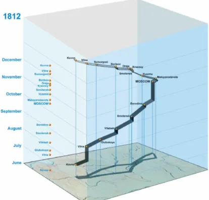
Figure 2.5 shows a STC visualization of Napoleon’s march to Moscow, having a por-tion of the geographical map at the bottom of the cube, the dates represented along the z-axis, points representing waypoints, and a line which its width represents the number of people.
Figure 2.5: A STC visualization of Napoleon’s march in Russia7
An important feature of the STC presentation is its dynamic linking with a map as well as graphical displays of other types. This kind of visualization could be connected with isosurfaces since it inherently supports three dimensions (Shrestha, 2014). Andrienko et al. (2003) discusses the existing techniques and the queries this visualization supports, such as filtering and labeling. The main advantage of using a 3D representation space is the possibility of integrating additional visual information into the representation. How-ever, the challenge when visualizing data with temporal dependencies is coping with large data sets, which may result in overlapping and cluttered information (Tominski et al., 2005).
Animated Maps
Animated maps, also called movie maps or change maps, are used to depict geographic change and processes over time, contrarily to static maps that present all of their infor-mation simultaneously (Harrower and Fabrikant, 2008). They display a sequence frames,
Chapter 2. Concepts and Related Work 15
usually in a single view, taking advantage of the computer’s capability to rapidly up-date its contents. One study showed that animated representation allows users to more often correctly identify if particular types of patterns were present than using static small-multiple representation (Griffin et al., 2006), this being a presentation of small-multiple static maps simultaneously.
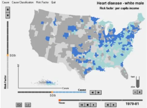
Figure 2.6: HealthVisB application with an interactive map and a scatterplot8
The Figure 2.6 presents the HealthVisB application with a full set of available con-trols – spatial, temporal and attribute features. On the map, blue is used to indicate higher mortality rates and dark shades correspond to higher values for the risk factor. The de-signing process should consider existing problems, and their solutions, for creating an effective animated map (Harrower, 2003). One point that must be mentioned is the use of additional information when using animated maps. Sometimes, animated maps are not enough to gain insights into highly complex data, so the usage of multi-component animated maps (additional diagrams and graphs) is a useful tactic (Opach et al., 2014). Figure 2.6 uses this multi-component approach, adding a scatterplot — risk factor by cause — to an animated map. Although animated maps sound like a good visualization technique to use when handling spatio-temporal data, there is still work to do in order to realize the full potential of animated maps; “we need to understand for what kinds of representational tasks are well suited and how variations in the design of animated maps impact our ability to communicate and learn”(Harrower and Fabrikant, 2008).
2.3.2
Visualization Techniques Used in Video Games
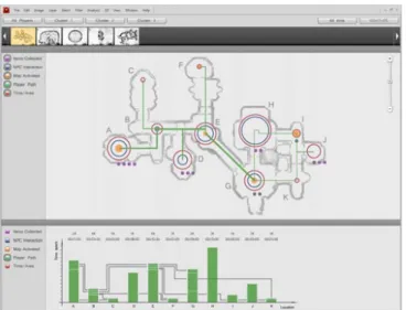
Video games are becoming more complex and are reaching a bigger audience. Conse-quently, there is an increasing interest in methods to analyze player behavior and the impact on game decisions (Wallner and Kriglstein, 2013). Such data would inform game and level designers of game design issues that need to be fixed or improved upon (Moura et al., 2011). While it is a good idea to analyze this data, correct visualization techniques should be picked to get the most valuable information. Moura et al. (2011) provided some insight about visualizations techniques proposed to represent players’ path (Figure 2.7) or specific events, such as death and spawn points, using heatmaps. They created an applica-tion to see many types of informaapplica-tion, by using circles to represent time spent in each area of a map, or interaction with characters, in the Dragon Age Origins9 game. All the map visualization went along with bar plots, complementing the information shown. Figure 2.7 represents a map of the game showing the circles mentioned before, while also show-ing the lines representshow-ing the paths taken by the players. Below the map is the location of a bar plot, showing connections between each location.
Figure 2.7: Analysis of player paths and movement (from Moura et al., 2011)
The last representation referred to visualization techniques applied outside the game, when they are the most common. However, some of them are actually used in-game. The most common one is representing visually information about health, stamina, and ammo states. Health is a critical information for the player, it determines how much room is left for mistakes (Zammitto, 2008). In the game Half-Life 210, a full heath status is represented by 100 and the yellow colour (Figure 2.8). When the user hits a lower health state, the colour turns red. This colour-coded technique corresponds to established conventions, meaning red for danger.
9http://dragonage.bioware.com/dao 10http://orange.half-life2.com
Chapter 2. Concepts and Related Work 17
Figure 2.8: Health and armor (suit) displayed on the bottom left of the screen (from Zammitto, 2008)
One other example of representing health stats is by using bars. In World of War-craft11, health bars do not use the colour-coding technique as many games do. The colour of the bar is always the same, green for health and yellow for energy, but a length bar cue is applied (Figure 2.9). This is a good technique as colour-blinded people may not perceive certain shades of green.
Figure 2.9: World of Warcraft health bar13
Being two-dimensional graphical representations of data, heatmaps show values of a variable as colours (Bojko, 2009). They can represent various types of data, such as usage (clicks, key presses), accuracy or visual attention. The intuitive nature of the colour as a scale relating to temperature minimizes the amount of learning necessary to understand it. As yellow is warmer than green, orange being warmer than yellow, and red representing hot, it is not difficult to figure out that the amount of heat is proportional to the level represented by the analyzed variable. Besides showing gaze interaction12, heatmaps can present information about the most occupied places in a stadium by the players or frequent walkways (Goldsberry, 2012; Pileggi et al., 2012), or show firing locations for each type of weapon in the game CS: Global Offensive13.
11https://worldofwarcraft.com/en-us/
12http://www.ionadas.com/research-google-places-heatmaps/ 13http://blog.counter-strike.net/science/maps.html
Bojko (2009) refers that even though heatmaps are very compelling and easy to un-derstand, they should be used with caution and follow the correct guidelines.
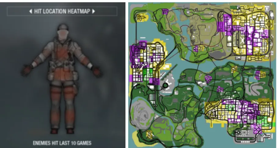
Heatmaps can also be applied in-game to convey more information to the player, FPS genre being the most common. Figure 2.10 (left) shows a hit location heatmap on a person’s body representing the most common spots shot with the red colour.
Figure 2.10: Hit heatmap in Black Ops14(left), GTA: San Andreas Gang Turf Choro-pleth15(right)
Figure 2.10 (right), shows a choropleth map representing gang turfs in the game GTA: San Andreas16. Purple represented the Ballas gang, green the Grove Street Families gang, and Yellow the Los Santos Vagos gang. The objective was to take over the enemy gang territories to give the player more respect and money17.
Minimaps are a common solution in video games to offer sense of direction in space and context over the world the user is playing. Normally the player is restricted by a view close to its character and has to resort to a bigger map visualization in order to check where to go next.
A minimap proposes a small solution to avoid the process of changing the view to a bigger map and stop the player from playing. Different minimaps representations are showed in Figure 2.11 and Figure 2.12, one representing context of a map’s portion and the other representing context of the full map, respectively.
15Adapted from https://tinyurl.com/y7blzgdh
16https://i.ytimg.com/vi/4DkWs81nNWE/maxresdefault.jpg 16http://www.rockstargames.com/sanandreas/
Chapter 2. Concepts and Related Work 19
Figure 2.11: Guild Wars 218minimap19
Figure 2.12: LoL minimap over time20
Certain visualization techniques differ between game genres. When in one case, a colour-coding technique might be enough in the FPS genre to state the player’s health, in the Massive Multiplayer Online (MMO) or MOBA games, a length bar is enough (Zammitto, 2008).
Whether or not visualization techniques are employed inside the game, there is al-ways a necessity of making applications that are game-independent. Some examples are OP.GG21 and LolKing22, web applications for visualization information about the player, their statistics in LoL, and champion build guides.
19https://www.guildwars2.com/en/
20Adapted from https://tinyurl.com/yaaph9ww
20Adapted from https://www.youtube.com/watch?v=jdmtRnH5VGE
21http://euw.op.gg 22http://www.lolking.net
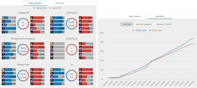
Figure 2.13: Left, a team match analysis based on various factors. Right, a line chart showing team gold earned23
Figure 2.13 show three different visualization techniques being used to represent statistic data. The first one is a variation of the bar plot; the second one, is a variation of the doughnut pie chart; and lastly, we have a typical line chart on the right. Figure 2.14 presents two bar charts indicating the gold acquired and experience earned in a match.
Figure 2.14: Bar charts representing gold acquired and experience earned in a match24
Most of the information presented is concerned to statistical data, where the player can see how he/she performed alongside his/her teammates or against his/her enemies.
23Adapted from http://euw.op.gg 24Adapted from http://www.lolking.net
Chapter 2. Concepts and Related Work 21
Figure 2.15: Three kinds of visualization techniques in the GameVis application (from Feitosa et al., 2015)
GameVis is also a web application for visualizing gameplay data, only in this case using Dota 225 as source, where the usage of different types of line charts, bar plots, and end match results offer good view points in visualizing game metadata (Feitosa et al., 2015).
The visualization of this type of data does not simply use one visualization technique to represent them. To get a rich and effective view of the information, some visualiza-tion techniques must be paired with each other to provide better insight over the data. However, the majority is focused on the display of aggregated statistics. This makes the detection of valuable spatio-temporal details difficult, if not impossible (Li et al., 2017) and thus, it is often necessary to combine them with map visualization techniques, pro-viding a more informative context (Drachen and Schubert, 2013).
2.4
Previous Work
This thesis follows the development of visualization techniques to study spatio-temporal data in order to understand if it can help in the analysis of player’s performance in games, using the game LoL as case study. Both STC and animated maps were studied in previous projects and are introduced in this section.
Space-Time Cube
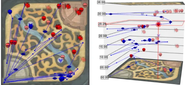
Carreiro (2016) developed a prototype where the users could choose to visualize a match of LoL in 2D, representing a map, or 3D, representing a STC. These representations de-picted players’ trajectories and the most relevant events in a LoL’s match. In Figure 2.16
we are able to visualize both representations, the STC, and the 2D map, while analyz-ing spatio-temporal data from a LoL match. Blue and red colours represent both teams, and their icons — skulls for player deaths and towers for tower destruction — match the events occurred in the match. The lines represent the path made by the player.
A user study was conducted to analyze a player’s performance using the developed prototype against the match-history, an official LoL web page analysis tool. The study showed that average gamers, who do not have experience with data analysis, were in-terested in viewing spatio-temporal data associated with their gameplay. This led to a personal motivation of players, inciting them to take time in analyzing their own behav-ior. The results of usability tests show that these techniques can be used by the average gamer as an adequate way of visualizing paths and player’s events.
Figure 2.16: 2D map (left) and STC (right) showing players’ paths and events over a match’s length (adapted from Carreiro, 2016)
The STC proved to be an interesting technique, although many users reported that they would prefer sticking to the 2D view. As players are used to relying on the minimap (sim-ilar to the 2D map) while in-game, it is normal they would favor a familiar visualization. Carreiro (2016) stated that a different visualization technique should be considered, like animated maps, since the preferred view was the 2D map. Also, they would help detect movement patterns and events inside the game. A more complex representation should be considered, giving more information simultaneously about more players and game events. Finally, more studies should be made in order to enrich the analysis obtained previously and to assert their veracity.
Animated Maps
In another project (Vieira, 2017), the animated maps visualization technique was explored to analyze player’s performance. Vieira (2017) developed a web application to visualize
Chapter 2. Concepts and Related Work 23
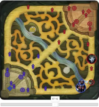
players’ trajectories, game events and thematic information in a LoL’s match to help users in the player’s performance analysis. Figure 2.17 presents information about two champions, at 17 minutes and 16 seconds in the match, while also showing a death event where the champion from the blue team killed an enemy. Some tower icons are missing, indicating that they were already destroyed at that time.
The results suggested that animated maps are highly adequate to convey spatio-temporal data to users in the context of player performance analysis in video games. Furthermore, incorporating the spatio-temporal components of data using visualization techniques is essential when evaluating player performance. Users demonstrated a pos-itive attitude towards the animated maps and wished to be able to continue using this approach to interact with spatio-temporal data during their analysis.
Figure 2.17: Animated map at a certain time26
Even though animated maps have been proven as a good technique to visualize spatio-temporal data in games, there were some issues. Overlapping events would occur and made it difficult to discern certain situations while analyzing the interaction. This appli-cation would only let visualize two champions simultaneously since it helped with the overlapping situation. The addition of other types of visualizations was recommended as players would like to analyze static and statistical information while interacting with the animated map. The application offered already some types of static information visual-ization, however, users felt like there should be more options. The future work mentions that for a good experience, the problems above should be fixed in a possible next iteration, adding to the study that, in fact, animated maps are really useful when analyzing player’s performance in games (Vieira, 2017).
2.5
League of Legends
LoL is a fast-paced, competitive online game that blends the speed and intensity of a RTS with Role-Playing Game (RPG) elements. Two teams, of five players each, compete with each other to defeat the opponent’s nexus. With many champions to choose from, frequent updates and tournaments, LoL offers endless replayability for players of every skill level.
2.5.1
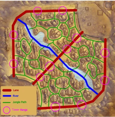
Game Description
There are three lanes, top, middle, and bottom (Figure 2.18), that connect the player’s base to the enemy’s. These roads serve as the means of engaging the enemy team. To win a game the player needs to push down their lane into the enemy base and destroy the main structure (nexus) at the center of their base.
Figure 2.18: Lanes in Summoner’s Rift27
Minions are AI-controlled soldiers that spawn at the nexus and march down each lane towards the enemy base, attacking enemies they encounter along the way. When minions die, they give champions Experience Points (XP). However, only giving the last hit on a minion rewards the champion with gold.
Turrets, or towers, are defensive structures that protect each lane at even intervals hitting enemies that come within range. Some other structures, known as inhibitors, are located where each lane meets the base on both sides of the map. Destroying an inhibitor
Chapter 2. Concepts and Related Work 25
creates more powerful minions and give players access to destroy the nexus and win the game. These inhibitors respawn after five minutes of being destroyed.
At the center of the each base lies the nexus. Surrounded by two turrets, the nexus is the structure each team needs to destroy from their opponent. Once a team has destroyed the enemy nexus, the game is over and that team wins (Figure 2.19).
LoL matches have no time limit, but they generally last between 30 to 45 minutes and can be divided into three-stages: early-game (until 15 minutes), mid-game (until 25 minutes) and late-game (until the end). However, these are not certain values as matches differ from each other.
Figure 2.19: Summoner’s Rift detailed map28
Between the lanes lies the jungle, an area filled with neutral monsters. These monsters won’t attack the enemy base, but they can be defeated for additional gold and special temporary buffs. A player may take on the role of Jungler — player role that plays in the jungle — and use these areas as his primary source of income. Junglers typically roam between the lanes, coming to the aid of allies in the lane when needed. There are also special monsters in the jungle, such as Baron Nashor and Dragons, that rewards teams with gold and bigger buffs.
Champions have specific classes, like Mage or Fighter, indicating the tendency of the champion’s abilities: magical, Ability Power (AP); or physical, Attack Damage (AD). Each player uses an unique champion to fulfill one of the five roles: Top, Jungler, Mid, AD Carry (ADC) and Support. The player’s champion earns gold and XP by taking down enemy units and structures. Killing a minion or champion, assisting in a champion kill,
and acquiring certain runes or items are some of the ways the player can earn gold and XP. The player can use his/her gold to purchase items from the shop located near the base. Items grant bonuses when they are purchased, improving the player’s champion abilities and stats.
The players can’t see the full map. They have, however, a minimap where they can follow their teammates but can’t see the enemy’s champions because of the fog of war. The fog of war is a common hallmark of the RTS genre which is represented visually as a dark shroud over the terrain. To give sight, players must put wards on the map or use certain abilities or items.
2.5.2
Telemetry Data
The information given by the Riot Games’ API consists of spatio-temporal and thematic data. They offer other types of data, but in this case, it is irrelevant, not complementing the primary data. Most of the spatio-temporal data is referred in the match endpoint. Data retrieved from a match can state, for example, the damage dealt to champions in a game (this damage can also be separated into true, physical and magical damage). An average of gold gained, minions killed, and damage taken all per minute can also be accessed in the participant timeline (Table 2.1).
Table 2.1: Participant Timeline
Name Description Example
csDiffPerMinDeltas Minions score difference per minute -2.44
goldPerMinDeltas Gold gained per minute 295
xpDiffPerMinDeltas Experience difference per minute -40.15
creepsPerMinDeltas Minions killed per minute 5.9
xpPerMinDeltas Experience gained per minute 335.3
damageTakenDiffPerMinDeltas Damage taken difference per minute 72.45 damageTakenPerMinDeltas Damage taken per minute 288.2
The fields where the difference is calculated is based on the player versus the enemy he/she is confronting. For example, xpDiffPerMinDeltas is obtained by subtracting the xpPerMinDeltasof the player with the enemy’s value, to give an insight of the advantage, or disadvantage, they have on one another.
Most importantly, when accessing the timeline in a match (not to be confused with participant timeline), for every 60 seconds (60000 milliseconds intervals) it is given the position of the player (spatial) per minute (temporal). Additionally, we can get details on how much gold a champion has, his/her level, minions killed, and experience gained with every interval (Table 2.2).
Chapter 2. Concepts and Related Work 27
Table 2.2: Participant’s frame at a certain timestamp
Name Description Example
totalGold Participant’s total gold 24809
teamScore Team score of the participant 0
participantId Participant ID 5
level Participant’s current level 18
currentGold Participant’s current gold 6041
minionsKilled Number of minions killed by the participant 451
position Participant’s position x: 5883,
y: 1085 xp Total of experience gained by the participant 30323 jungleMinionsKilled Number of jungle minions killed by the participant 39
Apart from this, there are certain events which are recorded in the data set, presenting specific timestamps of when and where those events occurred. Only three events contain the champion’s position given the timestamp. One example for omitting this value is when the champion buys an item, there is a restriction that he/she must be in his/her base to do it, so the position is not logged (Table 2.3).
Table 2.3: Types of Events
Event Type Description Extra fields
CHAMPION_KILL A champion was killed
killerId, victimId, assistingParticipants, position, type
WARD_PLACED A ward was placed type, creatorId, wardType WARD_KILL A ward was destroyed Type, killerId, wardType
BUILDING_KILL A building was destroyed
killerId, buildingType, towerType, teamId, assistingParticipants, position, type, laneType ELITE_MONSTER_KILL An elite monster was killed
killerId, position, monsterType,
monsterSubType, type ITEM_PURCHASED An item was bought itemId, type,
participan-tId
ITEM_SOLD An item was sold itemId, type,
participan-tId
ITEM_DESTROYED An item was destroyed itemId, type, participan-tId
ITEM_UNDO An item purchase was undone afterId, type, participantId, beforeId
SKILL_LEVEL_UP A skill was leveled up skillSlot, levelUpType, type, participantId