Catarina Alexandra da Quinta Silva Cavaco
Licenciada em Ciências de Engenharia BiomédicaNew Visualization Model for Large Scale
Biosignals Analysis
Dissertação para obtenção do Grau de Mestre em Engenharia Biomédica
Orientador :
Doutor Hugo Filipe Silveira Gamboa,
Prof. Auxiliar, Faculdade de Ciências e
Tecnolo-gias - Universidade Nova de Lisboa
Co-orientador :
Doutor Ricardo da Costa Branco Ribeiro Matias,
Prof. Adjunto, Escola Superior de Saúde -
Insti-tuto Politécnico de Setúbal
Júri:
Presidente: Doutora Carla Maria Quintão Pereira
Arguente: Doutor Vasco Miguel Moreira do Amaral
Vogais: Doutor Hugo Filipe Silveira Gamboa
iii
New Visualization Model for Large Scale Biosignals Analysis
Copyright cCatarina Alexandra da Quinta Silva Cavaco, Faculdade de Ciências e Tec-nologia, Universidade Nova de Lisboa
Acknowledgements
This chapter in my life would not have been possible without all the emotional and scien-tific support of many people who have accompanied my route through these last years.
First, I would like to demonstrate my sincere gratitude to my advisor, Professor Hugo Gamboa, for the opportunity he gave me. I am very grateful for his encouragement, guid-ance and for the opportunity of working with his research team. I am also very thankful to my co-adviser, Professor Ricardo Matias, for all the knowledge and enthusiasm which allowed me to achieve my goals.
The opportunity to participate in this project helped me growing and it is rewarding to know that I could contribute for the research in such an important area.
I would like to thank all the PLUX - Wireless Biosignals, S. A. team members for sharing the last months with me. Learning in such a dynamic and creative environment definitely motivated me and contributed to the achievements of this work. A special thanks to Ângela Pimentel for her support. I also would like to express my gratitude to Ricardo Gomes for his constant support, dedication, patience and interest which resulted in a great contribution to make this work move forward.
To my university colleagues Maria Inês Silva, Ricardo Eleutério, Pedro Ferreira, Ana Carolina Pádua, Inês Vale and David Branha, I want to thank you for sharing these years with me. Finally, a special thanks goes to my colleagues Marta Santos e Ana Luísa Gomes for all the support, motivation and knowledge exchanged over these last few months.
I would also like to show my gratitude to my friends Marta, Andreia, Ricardo, Raquel, Lara e Sara. Be assured that the meaning and space you fill in my life is quite bigger than this single paragraph. To Inês Oliveira and Daniela Azul I also thank for your support during this work.
Abstract
Benefits of long-term monitoring have drawn considerable attention in healthcare. Since the acquired data provides an important source of information to clinicians and researchers, the choice for long-term monitoring studies has become frequent.
However, long-term monitoring can result in massive datasets, which makes the anal-ysis of the acquired biosignals a challenge. In this case, visualization, which is a key point in signal analysis, presents several limitations and the annotations handling in which some machine learning algorithms depend on, turn out to be a complex task.
In order to overcome these problems a novel web-based application for biosignals visualization and annotation in a fast and user friendly way was developed. This was possible through the study and implementation of a visualization model. The main pro-cess of this model, the visualization propro-cess, comprised the constitution of the domain problem, the abstraction design, the development of a multilevel visualization and the study and choice of the visualization techniques that better communicate the information carried by the data. In a second process, the visual encoding variables were the study tar-get. Finally, the improved interaction exploration techniques were implemented where the annotation handling stands out.
Three case studies are presented and discussed and a usability study supports the reliability of the implemented work.
Keywords: Long-term Biosignals, Big Data, Biosignals Visualization, Biosignals
Resumo
Os benefícios da monitorização de longa duração têm recebido uma atenção conside-rável na área da saúde. Uma vez que os dados recolhidos constituem uma importante fonte de informação para médicos e investigadores, a escolha deste tipo de estudos tem--se tornado frequente.
No entanto, este tipo de monitorização pode resultar em conjuntos de dados de gran-des dimensões o que torna num gran-desafio a análise dos biosinais adquiridos. Neste caso, a visualização que é um ponto-chave na análise de sinais, apresenta muitas limitações e a manipulação de anotações da qual dependem alguns algoritmos de machine learning, torna-se uma tarefa complexa.
Por forma a superar estes problemas uma inovadora aplicação baseada nas tecnolo-giasWebpara a visualização e anotação de biosinais de um modo rápido euser friendly foi desenvolvida. Tal foi possível através do estudo e implementação de um modelo de visualização. O principal processo deste modelo, o processo de visualização, com-preendeu a determinação do domínio do problema, o desenho da abstração utilizada, o desenvolvimento de uma visualização em multiníveis, e o estudo e escolha das técnicas de visualização que melhor transmitem a informação transportada pelos dados. Num segundo processo, a escolha das variáveis de codificação visual foi alvo de estudo. Final-mente, as melhores técnicas de exploração interativa foram implementadas das quais se destaca a manipulação de anotações.
Neste trabalho são ainda apresentados e discutidos três estudos efetuados com a apli-cação desenvolvida. Por fim, é apresentado um estudo de usabilidade, o qual sustenta a confiança no trabalho implementado.
Palavras-chave: Biosinais de longa duração,Big Data, Visualização de Biosinais,
Contents
1 Introduction 1
1.1 Motivation . . . 1
1.2 State of the Art. . . 2
1.2.1 Visualization Techniques . . . 3
1.2.2 Visualization Toolboxes . . . 5
1.2.3 Visualization Applications. . . 6
1.2.4 Visualization Applications in Clinical Cases . . . 8
1.3 Objectives . . . 10
1.4 Thesis Overview . . . 10
2 Theoretical Background 13 2.1 Time Series . . . 13
2.1.1 Biosignals . . . 13
2.1.2 Time Series Processing and Data Mining . . . 16
2.2 Data Visualization . . . 17
2.2.1 Objectives . . . 17
2.2.2 Limitations . . . 17
2.2.3 Basic Model of Visualization . . . 18
2.2.4 The Visualization Process . . . 19
2.2.5 The Perception and Cognition Process . . . 20
2.2.6 The Interactive Exploration Process . . . 20
2.3 Graphics Fundamentals . . . 21
2.3.1 Object-Oriented Design . . . 21
2.3.2 Graphics Rendering . . . 21
3 Application Framework 23 3.1 System Requirements . . . 23
3.2 System Architecture. . . 24
3.2.2 Application Programming Interfaces (APIs) . . . 24
3.2.3 Visualization Platform . . . 25
3.3 Data Architecture . . . 25
4 Visualization Model 27 4.1 Visualization Process . . . 27
4.1.1 Domain Problem Characterization . . . 27
4.1.2 Abstraction Design . . . 28
4.1.3 Visualization in Layers . . . 29
4.1.4 Visualization Techniques . . . 31
4.2 Perception and Cognition Process. . . 32
4.3 Interactive Exploration Processes . . . 33
4.3.1 Basic Interaction . . . 33
4.3.2 Navigation. . . 34
4.3.3 Annotations . . . 34
4.3.4 Further Analysis . . . 36
5 Case Studies 39 5.1 Data Acquisition and Processing . . . 39
5.2 Electrocardiography (ECG) . . . 41
5.2.1 Events . . . 41
5.2.2 Features Selection. . . 41
5.2.3 Results . . . 41
5.3 Electromyography (EMG) . . . 42
5.3.1 Events . . . 42
5.3.2 Features Selection. . . 43
5.3.3 Results . . . 43
5.4 Accelerometry (ACC). . . 43
5.4.1 Events . . . 43
5.4.2 Features Selection. . . 44
5.4.3 Results . . . 44
6 Usability Evaluation 49 6.1 Usability Test Choice . . . 49
6.2 The System Usability Scale (SUS) Questionnaire and its Score System . . . 50
6.3 Performed Evaluation . . . 50
6.4 Results and Discussion . . . 51
7 Conclusions 53 7.1 General Contributions and Results . . . 53
CONTENTS xvii
List of Figures
1.1 Examples of data visualization techniques. . . 4
1.2 Interfaces of applications for time series visualization. . . 7
1.3 Interfaces of clinical applications. . . 9
1.4 Thesis Overview. . . 10
2.1 ECG basic waveform. . . 14
2.2 EMG signal record. . . 15
2.3 ACC signal record. . . 16
2.4 Views on visualization . . . 18
2.5 Simple model of visualization . . . 19
2.6 The visualization process. . . 20
3.1 Information Flow. . . 24
3.2 Files Organisation. . . 25
4.1 Overcrowded Display. . . 28
4.2 Layers Scheme. . . 29
4.3 Responsive Design . . . 32
4.4 Zoom, Pan and Tooltips. . . 33
4.5 Modal Dialog. . . 34
4.6 Navigation and Annotations. . . 35
4.7 Further Analysis Result. . . 36
5.1 Acquisition System. . . 40
5.2 ECG signal analysis result. . . 45
5.3 ECG signal analysis result (continuation). . . 46
5.4 EMG signal analysis result. . . 47
List of Tables
1.1 Summary of the presented visualization techniques. . . 5
1.2 Summary of the presented visualization toolboxes.. . . 6
3.1 Groups in the processed HDF5 file. . . 26
4.1 Possible Layers in the Visualization Model. . . 30
4.2 Layer keys perlayersdictionary in the biosignals JSON file. . . 30
4.3 Feature dictionary in features JSON file. . . 37
5.1 Performed Acquisitions. . . 40
5.2 ECG Features. . . 42
5.3 EMG Features. . . 43
5.4 ACC Features. . . 44
Listings
4.1 Excerpt of thelayersdictionary in biosignals JSON file. . . 30
Acronyms
ACC Accelerometry
API Application Programming Interface
CSS Cascading Style Sheets
D3 Data-Driven Documents
DOM Document Object Model
ECG Electrocardiography
EDA Electrodermal Activity
EEG Electroencephalography
EMG Electromyography
HDF5 Hierarchical Data Format 5
HRV Heart Rate Variability
HTML Hypertext Markup Language
JSON JavaScript Object Notation
OCD Obsessive-Compulsive Disorder
OOD Object-Oriented Design
OpenGL Open Graphics Library
RESP Respiratory
SAX Symbolic Aggregate Approximation
SUS System Usability Scale
SVG Scalable Vector Graphics
1
Introduction
1.1
Motivation
In the last years, the technological innovation and the interest in quality of life have been motivating the research and development of novel resources in the clinical field. How-ever, it is still evident the demand for the improvement in diagnosis and monitoring of some pathologies. This is the case, for example, of different neurological disorders, such as Obsessive-Compulsive Disorder (OCD) and Parkinson disease.
Therefore, the study, development and implementation of new solutions to monitor healthy and pathological conditions became increasingly imperative in biomedical re-search.
The data acquired will be an important source of information to clinicians, who will be able to make their clinical diagnosis and treatment plans relying on the extracted infor-mation. It also supports researchers decision-making, as well as, inform patients, helping in their recovery. For this reason, the analysis of the acquired biosignals has a significant part either in research or clinic applications. To perform this analysis a variety of con-cepts and methods are involved, from which data visualization and machine learning algorithms stand out in this work.
Data visualization consists in the integration of the human visual perception with the processing power of computers. Its basic idea is examining, understanding and transmit-ting information. Since humans main input sense is visual, data visualization is consid-ered essential and highly promising for signal analysis [32], [39]. However, data visual-ization presents some limitations such as the display capacity and the human perceptual and cognitive capacity [47].
a performance criterion. These algorithms can follow supervised, semi-supervised and unsupervised approaches [4]. However, the first two depend on the use of labelled data what implies that this task has to be the most accurately possible. Nevertheless, the annotation of the biosignals is a demanding task that depends on human subjective in-tervention and requires specific knowledge.
In some clinical cases, such as neuromuscular and sleep disorders, the required moni-toring of the patients results in large amounts of data. Although the analysis of biosignals is a key feature in many medical applications, in these cases difficulties become evident. This is due to the fact that we are dealing with big data - massive data sets that present problems when processed and analysed by standard tools [68]. In other words, both dif-ficulties previously described become more complex and the data processing will present several limitations [30], [50].
As a result, there is a high demand for novel visual exploration tools that achieve the better conjugation between processing and storage capabilities of computers and the visual, creative and knowledge capabilities of humans.
Considering the current needs described, this work introduces an innovating solution that allows the visualization and annotation of large scale biosignals. In order to over-come the problems introduced by the demand of big data acquisition, this work aimed to present a novel biosignals analysis platform which provides a useful experience to its users through an innovative inspection of the data. Consequently, the solution pre-sented represents an effective biosignals visualization and interaction approach that can be adapted to any type of biosignal.
In this work, the signal acquisition was done with the OpenSignals software [24]. The signal processing algorithms and the visualization code were respectively developed in Python [8] and JavaScript [17] Programming Languages. The layout of the platform was achieved with the use of Hypertext Markup Language (HTML)5 [16] and Cascading Style Sheets (CSS)3 [16].
This dissertation was developed at PLUX - wireless biosignals S.A.1.
1.2
State of the Art
The emergence of a variety of visualization tools, during the last years, has aimed to counter the gap verified between our ability to collect and store data and to process it. However, engineers and technicians who work with time series data daily (even in the medical field) face the difficulty of work with tools hard to learn, implement and manip-ulate [2].
1. INTRODUCTION 1.2. State of the Art
1.2.1 Visualization Techniques
Over 200 years later from the invention of the first and most common visualization tech-nique, the line graph, by William Playfair [33], the development of new and better visu-alization techniques continues to face the challenges of our days. The large number of well-known data visualization techniques existing today, despite useful for simple data and basic analysis tasks, present huge limitations in respect to analysis of large scale data sets.
Besides the standard techniques described in [69], more sophisticated visualization techniques can be found, which may be combined with the aim of developing a specific visualization system.
The axes-based visualizations techniques such as Parallel Coordinates [35] and Polar Parallel Coordinates [13] allow the analysis of multidimensional data sets. In [61] it was proposed the TimeWheel technique as an alternative to Parallel Coordinates for visual-izing time series with multiple dimensions. The basic idea of this representation is to present the time axis at centre and the encoding time-dependent attributes axes around it in a circular arrangement. Similar to Parallel Coordinates, lines make a connection be-tween each time point in the considered data and the corresponding points on each of the attribute axes. Figure1.1(a)presents an example of a TimeWheel representation. Never-theless intuitive to express multidimensional data, axes-based visualizations are limited by the length or width of the screen and the number of axes to be considered.
In [69] it was presented a different approach based on a spirally shaped time axis with the purpose of visualizing large data sets and detect patterns and periodic behaviours of data. The Spiral Graph also allows the comparison of different time series through the use of intertwined graphs and different visual encodings for each. However, there is a limited number of comparisons for each graph and this technique requires an appropriate parameterization in each use [2]. Figure1.1(b)represents an example of a Spiral Graph.
more techniques and higher numbers of time series, considering the previous recommen-dations. In this investigation the authors concluded that for comparisons in time series with a large visual span Horizon Graphs are generally more efficient.
A different approach arises with the use of Sparklines. A Sparkline is a word-sized graphic usually without axis or other scale. This technique enables, therefore, the visual display of a large amount of data in condensed charts in line with text [62]. In [54], it was suggested that Sparklines can help to reduce clinical diagnostic errors. Figure1.1(d)
represents an example of Sparklines.
(a) TimeWheel of a six variable data set containing several diseases statistics.
Adapted from [61].
(b) Spiral Graph showing the rela-tionship between two stock prices (differentiated by colour) in five
years. From [69].
(c) Horizon Graph representing the daily perfor-mance of 50 different stocks over a year. From [56].
(d) Sparklines usage in clinical analysis. From [62].
Figure 1.1: Examples of data visualization techniques.
1. INTRODUCTION 1.2. State of the Art
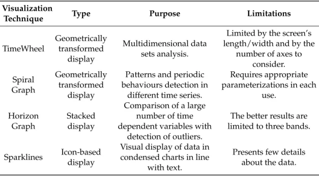
Table 1.1: Summary of the presented visualization techniques.
Visualization
Technique Type Purpose Limitations
TimeWheel Geometrically transformed display Multidimensional data sets analysis.
Limited by the screen’s length/width and by the
number of axes to consider. Spiral Graph Geometrically transformed display
Patterns and periodic behaviours detection in
different time series.
Requires appropriate parameterizations in each
use.
Horizon Graph
Stacked display
Comparison of a large number of time dependent variables with
detection of outliers.
The better results are limited to three bands.
Sparklines Icon-baseddisplay
Visual display of data in condensed charts in line
with text.
Presents few details about the data.
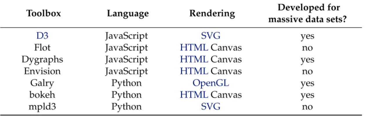
1.2.2 Visualization Toolboxes
Nowadays, a variety of toolboxes are available for creating data visualizations taking into account diverse techniques. With the aim of bringing data to life, there are different tools for different programming languages and most of them are free and open source. In [14] a considerable list of tools is presented, however, only some of them are suitable to time series visualization.
Data-Driven Documents (D3) is a promising JavaScript library developed by Michael Bostock for efficient manipulation of documents based on data in order to custom web based visualizations. D3operates by binding data to a Document Object Model (DOM) and then applies data-driven transformations to the document. In the end, the concept and rules are provided by the user forD3to execute. This fast library supports large data sets and dynamic behaviours and uses the full capabilities of HTML, Scalable Vector Graphics (SVG) andCSS. Still, it does not support older browsers. A diverse collection of toolkits and plugins built onD3can be used and improved in different conditions. From this list stands out the Cubism plugin used to visualize time series on horizon graphs and the Rickshaw toolkit used to create interactive time series graphs [48].
Flot 2 is a well-known plugin used in data visualization and built on JQuery [17],
the most popular JavaScript library. This plugin is focused on attractive and interactive visualization.
Two more JavaScript libraries excel in research, the dygraphs 3 and the Envision 4.
2http://www.flotcharts.org/
3http://dygraphs.com/
They produce fast, interactive and dynamic charts for time series data sets, where dy-graphs also supports massive data sets and has the ability to display error bars around the data.
One of the most recent libraries for data visualization was created by Cyrille Rossant. Galry [58] is a Python library for 2D plotting like matplotlib [31] (more popular). How-ever, by contrast to matplotlib, Galry provides an efficient way to visualize large data sets (up to 100 million data points) by using the Open Graphics Library (OpenGL).
As well as Galry, bokeh5, from Continuum Analytics, is a python library which
en-ables a high-performance interactive visualization over very large data sets. However, at this moment, it usesHTML5 canvas, instead of Web Graphics Library (WebGL) to display the data in the browser.
With the aim of bind the best features of two popular libraries, matplotlib andD3, arises the mpld3 project6. From this conjunction results an improved visualization of the
data in the browser.
Table1.2summarises the presented visualization toolboxes.
Table 1.2: Summary of the presented visualization toolboxes.
Toolbox Language Rendering Developed for
massive data sets?
D3 JavaScript SVG yes
Flot JavaScript HTMLCanvas no
Dygraphs JavaScript HTMLCanvas yes
Envision JavaScript HTMLCanvas no
Galry Python OpenGL yes
bokeh Python HTMLCanvas yes
mpld3 Python SVG no
1.2.3 Visualization Applications
Usually, visualization alone is not enough, particularly when dealing with large data sets and multiple entities. Therefore, applications for visualization and exploratory viewing of time series data sets have been arisen in the last years in order to enable an appropriate user interface and convenient results analysis. Today, several applications, considering different analytical methods, are available to commercial, academic or research use. In [2] is provided a survey of applications for different purposes.
Cluster and Calendar based Visualization tool [64] is probably one of the first and most popular systems for time series data visualization. The application clusters similar daily data patterns and then displays the average patterns as line plots as well as a calen-dar with each day coloured according to the cluster that it represents - this is also known as the temporal clustering method. Even though providing a good overview of multiple
5http://bokeh.pydata.org/
1. INTRODUCTION 1.2. State of the Art
time series data, the application is limited to calendar-based data and requires previous knowledge about patterns to identify.
Another common tool for time series visual exploration is TimeSearcher2 [10], an ex-tension of one previous work that allows users to visualize long time series of multiple heterogeneous variables by a combination of filter and pattern search capabilities. Here, the concept of timebox, a rectangular query region, already introduced in previous work is enhanced. While the original timebox is used to filter the data and reduce the scope of the search, an improved timebox, the searchbox, enables to perform a specific pattern search anywhere in the remaining data. Besides flexible, intuitive and interactive, this application presents some issues, particularly when dealing with extensive data sets. In this case the process becomes cumbersome, the application has limited scalability and the query model may be considered too simplistic. Figure1.2(a)presents an example of the TimeSearcher2 interface.
By contrast to the previously described concept of query-by-example, it was devel-oped the VizTree [42], a visualization system for massive time series data sets that discov-ers interesting patterns (frequently occurring or surprising patterns) without the need of a first example. This application is based on Symbolic Aggregate Approximation (SAX) [43]. The data is discretized into a fixed length of subsequences, converted to symbols and then the symbols are concatenated to form symbol strings. Finally, a modified suffix tree is built, where frequency and other properties of patterns can be differentiated by colours and other visual properties. VizTree benefits from the ability to scale very large databases and to discover non-trivial patterns. However, it is not very intuitive. Figure
1.2(b)illustrates an example of the VizTree interface.
(a) TimeSearcher2 interface. The box in red se-lects the pattern of interest. In the graph be-low the result of the search is displayed with red triangle markers under the horizontal axes. On the right side the result is shown in detail.
From [10].
(b) VizTree interface. At top is shown the the input time series. The bottom left panel shows the subsequence tree for the time series. The parameter setting area is on the top right. The bottom panel plots the actual subsequences
when the user clicks on a branch. From [42].
Figure 1.2: Interfaces of applications for time series visualization.
components. The PhysioNet offers free web access to a large biosignals database (the PhysioBank) and to a wide collection of software for viewing and analysing the signals (the PhysioToolkit). A particularity of the PhysioBank data sets is that these can include ground-truth information and, as stated before, the presence of annotations in data sets is a key feature in signal analysis. Besides the ground-truth information and the presen-tation of a wide variety of classic signal-processing functions, it works by command-line tools, which makes it lowly user friendly.
Notwithstanding the increasing in number of novel visualization applications for time series, it is verified that many of them are thought only for a specific domain [15] or focus on a limited number of tasks. Besides, some of the literature found presents tools that seem promising but are underexplored.
1.2.4 Visualization Applications in Clinical Cases
The high concern in clinical systems for improving the physical and psychological well-ness has resulted in the emergence of a variety of new and crucial systems to record, visualize and analyse different types of biosignals.
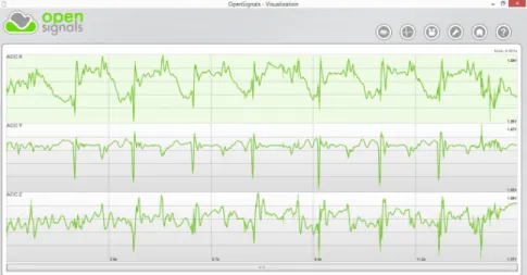
OpenSignals, developed by PLUX, is a software application which enables biosignals visualization in real-time or offline from a previously recorded data set, even large. In a user friendly interface, the entire signals are displayed. Then, an efficient navigation through the signals can be performed by zooming and panning. This tool also provides anEMGor Heart Rate Variability (HRV) analysis and has the possibility of open multiple channels, in other words, different biosignals from a recording [24]. Figure1.3(a)shows the OpenSignals interface. This application can integrate the biosignalsplux system 7,
an advanced biosignal monitoring platform for sports and biomedical research. Besides the OpenSignals, this system is also composed by a wearable hub and body sensors that provide the acquisition of ECG, Electrodermal Activity (EDA) orACC signals, among others.
ActiLife 6 [1] is a software application that enables the visualization of data acquired from an accelerometer, the ActiGraph monitor. The ActiLife 6 contains a selection of anal-ysis tools, including the calculation of sleep statistics or the identification of low activity periods, in order to provide a better and faster analysis of the data. Figure1.3(b)shows the ActiLife 6 interface. This software integrates the ActiGraph system, the most used actigraphy monitoring system in research and clinical trials involving physical activity and sleep assessment, even in long-term and real-time studies.
In cardiology, one of the most common examinations is the Holter, an ambulatory electrocardiography for a minimum 24-hour period, conducted with the purpose of screen-ing forECGdisturbances. The Welch Allyn Holter System Application, from Welch Allyn [70], is a software application used to analyseECGsignals in Holter examinations. The
1. INTRODUCTION 1.2. State of the Art
application interface, shown in Figure 1.3(c), allows the selection of specific tasks en-abling, for example, the review of the entire record with color-coded abnormal events or the conducting of specific assessments such as ST orHRVmeasurements. In the end, this software creates a report that includes selectedECGstrips, some measurements and technician’s comments. This application together with the Welch Allyn Holter Recorder constitute the Welch Allyn Holter System, one of many systems available to perform Holter examinations.
(a) OpenSignals interface displaying three signals acquired by different channels of the biosignalsplux hub.
(b) ActiLife 6 interface. From [1]. (c) Allyn Holter System Application
inter-face. From [70].
Figure 1.3: Interfaces of clinical applications.
1.3
Objectives
The main purpose of this work is to develop a novel application which enables the visu-alization and exploration of biosignals in a big data context. Its demand is sustained by the need of enhance the monitoring of health and pathological conditions and improve the biomedical research.
Therefore, investigation for algorithms that allow the visualization of biosignal fea-tures, in a fast and user friendly way for further analysis by users, will be performed. This will be a powerful tool which will enable hidden information and knowledge discovery from the data. The developed application will also allow the annotation of biosignals.
Different biosignals will be collected (ECG, EMG and ACC signals). Then these biosignals will be tested and analysed in the developed visualization system. The ap-plication will help finding patterns in the data, thereby improving, for example, the di-agnosis of several diseases.
In spite of this work only be applied toECG,EMGandACCsignals, it is also desired that this novel tool may be applied to another type of needs that wrap the visualization and analysis of big data in biological context.
In order to achieve these objectives the following steps were planed:
1. Identify the requirement for an interface and the challenges that will be faced.
2. Study about the end users and its goals.
3. Develop a technique that allows overcoming the stated problems.
4. Test the interface with different biosignals.
5. Present the interface developed to possible users in order to evaluate it.
1.4
Thesis Overview
The remainder of this thesis is organised as follows and schematically represented in Figure1.4.
BASE
Introduction Theoretical Background
IMPLEMENTED WORK
Application Fundamentals
Visualization
Model Case Studies
RESULTS
System
Evaluation Conclusions Publications
1. INTRODUCTION 1.4. Thesis Overview
The first two chapters comprise the thesis basis. While Chapter1presents the moti-vation and objectives of this work and also revises the related work, Chapter2provides the main theoretical concepts that fundament this work.
The following Chapters present the application development. In Chapter 3the fun-damentals of the application are discussed. Chapter4exposes the followed visualization model and Chapter5presents the case studies considered.
2
Theoretical Background
This chapter provides the most relevant base concepts for this work. A review on time series, focusing on biosignals, and its acquisition and processing is the first subject to approach. Then, data visualization is introduced. In the end, it is presented a brief review about convenient graphics concepts.
2.1
Time Series
A time series can be defined as a set of observations made in a chronological order and is a common form of recorded data.
The nature of time series can be assigned to a variety of fields, ranging from finance to science. In order to understand physiological mechanisms in humans, the analysis of time series in medicine, sports or research is one of utmost importance fields where these can be applied.
2.1.1 Biosignals
Biomedical signal, or simply biosignal, is a term used to characterize signals that can be measured from a biologic system. To address the extraction and storage of these signals, an acquisition system has to be applied to the human body.
Electrodermal Activity (EDA) signals which reflect the changes in the electrical prop-erties of the skin, Electroencephalography (EEG) signals which monitor the cerebral ac-tivity and Respiratory (RESP) signals which measure respiration rate and amplitude are some examples of biosignals that can be measured from the human body.
The following biosignals were applied in the developed visualization tool and will be later discussed. Therefore, they are here highlighted.
Electrocardiography (ECG)
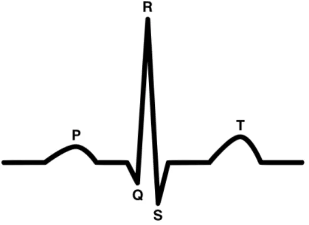
TheECGsignal is the most accessible and the most widely acquired bioelectric signal of the human body. It consists in the recording of the electrical activity of the heart. This is a cyclic signal and its basic waveform consists on a P wave, a QRS complex, a T wave and a U wave [37] (Figure2.1).
Figure 2.1: ECGbasic waveform. This consists on a P wave, a QRS complex, a T wave and a U wave (not represented). From [24].
Therefore, theECGanalysis provides a fundamental way of cardiac monitoring that allows the detection of cardiac abnormalities, called arrhythmias. Arrhythmias may oc-cur in healthy hearts with minimal consequences, but they may also indicate serious heart diseases [46].
Electromyography (EMG)
AnEMGsignal is an electrical signal that represents the neuromuscular activity. It is gen-erated in a muscle during its contraction, which enables the quantification of the neuro-muscular function. Although the resulting electrical potentials can be recorded through an invasive technique called intramuscular EMG, in this work the recording was per-formed from the skin surface through a technique called surface EMG [37], [57], [59]. Figure2.2represents anEMGsignal where is possible to observe an activation pattern of the gluteus maximus.
2. THEORETICALBACKGROUND 2.1. Time Series
n g
deviation of a random process with additive noise [33].
ݎ݉ݏሼ݉ሺݐሻሽ ൌ ቀͳܶ ௧ା்݉ଶሺݐሻ݀ݐ
௧ ቁ
ଵ ଶΤ
value
Figure 2.2: EMGsignal. In this figure is possible to observe an activation pattern of the gluteus maximus assessed during a hip extension with knee extension on prone position movement. Adapted from [60].
applied in diagnosis of neuromuscular diseases, muscle therapy and rehabilitation and in the sports field through the analysis of the human movement biomechanics [59]. These signals can also be analysed along with other biosignals to achieve better results in the study being performed [57].
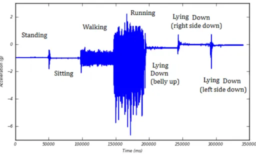
Accelerometry (ACC)
The ACC signal enables the performance of kinematic studies providing the measure-ment of the applied acceleration acting along a reference axis. Therefore, its analysis provides crucial information that can be used in functional status and monitor falling studies [34], [38], [40], sleep analysis [1] and in neuromuscular diseases diagnosis [44].
The study of the human movement is not recent, leading to the development of mo-tion sensors, like accelerometers. These can provide an objective method of measuring physical activity through the access of the rate and intensity of body movement in up to three plans. Their low cost when compared with other motion capturing systems, small size and the fact that it is not necessary to be used in laboratorial environment made them widely accepted as wearable devices to assess the motor behaviour [20]. The operating principle of accelerometers is based on a proof mass (a mechanical sensing element) at-tached to a mechanical suspension system. According to Newton’s Second Law, the iner-tial force resulting from acceleration or gravity will displace the proof mass. Acceleration may then be measured electrically, but its quantification depends on the accelerometer class and calibration is always needed in order to set the relationship between the out-put and the reference value [74]. The output of an accelerometer worn on the body will depend on important factors such as position and orientation of the accelerometer, the posture of the subject and the performed activity [44].
Figure 2.3: Recording from an accelerometer showing a subject’s motion. In this case the subject was asked to perform specific tasks for about one minute. From [44].
2.1.2 Time Series Processing and Data Mining
Usually in many biomedical applications, as in other fields, the acquisition itself is not enough. So it is required signal processing in order to get the relevant information hidden on it. Therefore, a variety of processing methods and algorithms may be applied to the data, always considering the goal that user wants to achieve [47].
Data mining consists in the application of algorithms in order to extract useful infor-mation from large and complex volumes of data [4].
The fundamental problem in data mining is how to represent time series data in order to reduce its dimension. This reduction is achieved by several methods such as Principal Component Analysis, Discrete Fourier Transforms orSAX, that transform the time series data to another domain, principal component space, frequency and symbolic domain, respectively [19].
This is the primary step to efficiently deal with the following data mining tasks. These tasks facilitate the exploration and analysis of massive time series data sets. These are the classic time series data mining tasks and may be combined to obtain more sophisticated data mining applications.
• Indexing or Query by Content.Search for the most similar time series considering
a specified query and a similarity/dissimilarity measure.
• Clustering.Group data into clusters based on a given similarity/dissimilarity
mea-sure.
• Classification.Determine which class a data set, sequence, or subsequence belongs
2. THEORETICALBACKGROUND 2.2. Data Visualization
• Prediction or Forecasting.Given a time series containing n data points, predict the
future behaviour at timen+ 1. This task can be regarded as a type of clustering or
classification, however in this case the focus is a future state whereas in clustering and classification is a current state.
• Segmentation. Construct a model withksegments from a given time series
con-tainingndata points (k << n). Segmentation may be performed to create a high
level representation of time series that supports indexing, clustering and classifica-tion.
• Summarization. Create an approximation of a given time series (extremely large)
retaining its essential features to fit on a single page or a computer screen for exam-ple. Anomaly detection is a special case of summarization where only surprising, interesting, unexpected or novel behaviours are reported [55].
In addition to being considered an important mechanism to present processed time series for further analysis, visualization is also a powerful tool to facilitate the mining tasks [19]. In fact, the approaches above are the basis of some visualization applications already presented in the state of the art [10], [42], [64].
2.2
Data Visualization
The human vision is highly sophisticated and specifically suited for supporting visual patterns. In fact, it has been frequently nominated as the ultimate data-mining tool.
From the integration of this human visual perception with the processing power of computers arises a novel concept of visualization. The concept of data visualization can be seen as a relationship between technology, art and science where the results on one view can stimulate the work in the others [63]. These three different views are schemati-cally depicted in Figure2.4.
2.2.1 Objectives
The integration of the human’s flexibility, creativity, and general knowledge with the massive computational capacities enables an improved data exploration.
The aim of data visualization is to support the analysis, understanding, and commu-nication of data, models and concepts. It allows generating and confirming hypotheses and it is a quick manner to be aware of large amounts of information.
The benefit of visual data exploration is allowing users to interact directly with the data mining process by getting insight into the data and making conclusions. [39].
2.2.2 Limitations
VISUALIZATION
technology
art science
Figure 2.4: Views on visualization. Data visualization can be seen as a relationship be-tween technology, art and science where the results on one view can stimulate the work in the others.
• Computation capacity: the memory and the time taken to run an algorithm are
limited resources in the computer side.
• Display capacity:the resolution of the screen is also a limitation.
• Human perceptual and cognitive capacity: on the man side, memory and
atten-tion are finite resources. Humans are also vulnerable to a phenomenon known by change blindness that occurs when a change, even if big, is not noticed by the ob-server [47].
2.2.3 Basic Model of Visualization
In [63], a generic model for visualization is proposed. The central process in this model is visualization, where data is transformed into a time varying image according to a spec-ification (this includes a specspec-ification of hardware, algorithms and parameters). In the following process, the image is perceived by a user resulting in an increase in knowledge (the gain depends on the image, the current knowledge of the user and the particular proprieties of the perception and cognition of the user). Then, the interactive exploration enables to adapt the specification of the visualization based on the current knowledge in order to explore the data further. Figure2.5represents schematically this model.
2. THEORETICALBACKGROUND 2.2. Data Visualization
Data Visualization Image
Specification
Visualization
Perception
Exploration
Knowledge
User
Figure 2.5: Simple model of visualization. The circles denote processes, while boxes denote containers. In visualization process, data is transformed into a time varying image according to a specification. In the following process, the image is perceived by a user resulting in an increase in knowledge. Then, the interactive exploration enables to adapt the specification of the visualization based on the current knowledge in order to explore the data further. Adapted from [63].
2.2.4 The Visualization Process
What, why and how are three questions that have to be answered when developing or choosing a visualization method [2].
Time series data is the answer this work gives to the first question and the need for a new visualization tool that enables the visualization of long term biosignals to help clinical diagnosis is the answer given to the second. The answer to the second question also encompasses the study about what specific tasks the user seeks to accomplish in order to get the better analysis of the biosignals. Allowing the user to make annotations in the biosignals visualization is one of the tasks to be taken in account and to be developed in this thesis.
After a specific domain problem has been identified, it has to be abstracted into a more generic representation. This process has become even more indispensable with the increasing on volumes of data to analyse [2]. The generic operations used in abstrac-tion include sorting, filtering or even finding anomalies. Often, abstracabstrac-tion also involves transforming data from the original raw data into derived dimensions that can be differ-ent from the original data type [47].
The answer to the third question, how, arises now and includes the choice of the visualization design and algorithm. It will also be investigated in this thesis.
Figure2.6represents schematically the visualization process discussed.
Abstraction design
Technique design Domain
problem characterization
Algorithm design
Figure 2.6: The visualization Process. The visualization process can be split into four levels where the output of one is the input of the other. Adapted from [47].
that any visualization should satisfy:
• Expressiveness: Showing exactly the information contained in the data.
• Effectiveness: Obtaining intuitively recognizable and interpretable visual
repre-sentations considering the capabilities of the human visual system and the applica-tion background.
• Appropriateness:Considering the benefit of the visualization process with respect
to achieving a given task, a cost-value ratio. The cost is assessed by the time effi-ciency (computation time spent) and the space effieffi-ciency (exploited screen space). In the display space the benefit of showing as much as possible at once minimizing the need for navigation should be balanced with the cost of overwhelming the user with visual clutter [2].
2.2.5 The Perception and Cognition Process
The graphical perception, already discussed in the state of the art, refers to the ability to decode the information encoded on graphs. Therefore, in order to facilitate the compres-sion of data sets, the visual encoding variables used in visualization, such as position, shape or colour, have to be assessed [27].
2.2.6 The Interactive Exploration Process
Data exploration enables the direct interaction of the user with the data in order to change the visualizations according to his exploration objectives. The following interaction and distortion techniques represent some examples that can be applied to the visualization process, allowing the user to focus on some details in the visualization:
• Projections: Changing the projections of the visualization is possible to explore a
multidimensional data set in a different way.
• Filtering:Selecting a desired subset enables the focus on a defined segment or
2. THEORETICALBACKGROUND 2.3. Graphics Fundamentals
• Zooming:Presenting the data in highly compressed form provides an overview of
it, and presenting the data in higher zoom levels enables to display more details of one part of the data [39].
2.3
Graphics Fundamentals
2.3.1 Object-Oriented Design
Object-Oriented Design (OOD) is a popular approach to analyse and design a system through a variety of techniques and principles. According to [71]OOD is the best way to work with graphics. Actually, graphics are objects, so this is a natural framework for them.
OODenables the development of flexible and reusable software inducing to abstrac-tion and hierarchy. Another advantage of this approach is that its components are rela-tively modular, so the system can continue to function even when parts of it are discarded or malfunction.
InOOD, objects are the basic components of the system. They are relatively simple, useful for a variety of purposes and often polymorphous. The objects can communicate with each other through simple encapsulated messages and also inherit attributes and behaviour from other objects [71].
2.3.2 Graphics Rendering
Nowadays, the best way to generate dynamic graphics involves modern browsers. They can load and render data incrementally and allow the following of the visual analytics mantra. Therefore, knowledge of web-standard technologies can also be convenient in this work.
On a web browser, a complex language is used to structure the content. This language is the HTML and its hierarchical structure is called DOM. CSSis the mechanism that defines how to style the visual presentation ofDOMelements. After parsing theHTML
and generating theDOM, the browser can apply visual rules to theDOMcontents and generate an image from a model. This process is called rendering.
AlthoughHTML enables specifying semantic structure or assigning hierarchy, rela-tionships, and meaning to content, it does not address the visual representation of the document. In HTML the Canvas element enables rendering graphics on a resolution-dependent bitmap canvas. However, it is necessary to use a script to actually draw the graphics. Usually the script used is JavaScript.
Another way of generating and manipulating visuals is theSVGelements which are more reliable and flexible than the canvas element [48].
from OpenGLand provides a similar rendering functionality, but in anHTMLcontext [72].
3
Application Framework
The architecture of the ideal tool to visualize big data in the context of biosignals was rig-orously studied. This chapter presents the fundamentals of the developed visualization tool.
Firstly, the main requirements of the application are enumerated. Then, the system architecture is presented, where the relationship between the data access and its visual-ization is explained. Finally, the choice of the Hierarchical Data Format 5 (HDF5) to store the data is justified and the file structure created for this work is presented.
3.1
System Requirements
The demand for a tool that enables the visualization of long-term biosignals (more than 24 hours of records) has been exposed. The limitations of the existing approaches were studied and the development of the novel visualization tool took into account some base requirements. Therefore, the developed tool has to:
• be applicable to all types of biosignals
• enable the possibility to explore up to 10 days of continuous acquisitions
• show the time lapses where the signal acquisition was interrupted
• allow the handling of annotations
Lastly, the proposed model has to represent a commitment between usability and per-formance, allowing the user (a clinician or a researcher) to analyse a long-term biosignal without having to deal with signal processing algorithms directly.
3.2
System Architecture
As previously mentioned and exemplified, the web standards currently available provide some of the best tools needed to the creation of a rich graphical user interface. In addition, a web-based platform also eliminates complex installation and configuration procedures. Therefore, the implemented visualization tool is a web-based platform.
Although it is possible to visualize localHTMLfiles directly in the web browser, for security reasons the browser cannot load local files via JavaScript [48]. For this reason, a client-server model was implemented. Since in the prototyping phase it is much faster to store and host everything locally, it was used a local web server instead of a remote one.
3.2.1 Web Server
The server was implemented in Python language and the communication between the visualization platform and the server is done with WebSockets [67].
As a result, the visualization platform, on the client side, sends request messages to the server, which responds by serving a message containing the requested informa-tion. This flow of information is schematically represented in Figure 3.1. The request and response messages are on JavaScript Object Notation (JSON) structure, a lightweight data-interchange format.
Visualization
Platform
request
response
Processing
Algorithms
server
Figure 3.1: The visualization platform, on the client side, sends request messages to the server program, which responds by serving a message containing the requested informa-tion.
Through the use of Python language to access and manipulate the data and JavaScript language to present the data and deal with the user-interface tasks, a higher performance is reached.
3.2.2 Application Programming Interfaces (APIs)
The requests sent by the browser intend to:
3. APPLICATIONFRAMEWORK 3.3. Data Architecture
• get specific data intervals
• handle annotations
• access a detailed analysis of a specific interval
Considering these requests, it was implemented different pythonAPIs with specific algorithms. According to the request done, a particularAPIis run and the processed data is returned in a string format. Then, this string is parsed as aJSONobject.
Some of the implemented algorithms need to load a specific JSON file previously created. This file contains the base variables needed for the algorithms.
The files organisation is presented in Figure3.2.
Get data API
CODE DOCUMENTATION
Annotations API
Analysis API
biosignals
features
Features API
Figure 3.2: Files Organisation. While the code folder contains all the processing algo-rithms, the documentation folder contains theJSONfiles with the base variables needed for the algorithms.
3.2.3 Visualization Platform
TheJSONobjects, sent as responses to the previous requests, are interpreted by a series of JavaScript libraries. Then, the results are dynamically displayed on the page.
WhileHTML5 andCSS3 allow the definition of the overall layout of the platform, the jQuery library enables to handle user interface events.
3.3
Data Architecture
Since the focus of this work involves the manipulation of very large amounts of data, a suitable data format for storage and accessibility had to be considered. Previous studies have already showed that although presenting some limitations, theHDF5format is the best option for the intended task [24].
• Datasets:multidimensional arrays of homogenous data type;
• Groups: container structures that hold an arbitrary number of other groups and
datasets.
This file format also includes file and/or group attributes.
To handle theHDF5files in the createdAPIs it was used the h5py python library [5]. The processingAPIto which each record file is submitted, before its visualization in the developed application, involves general processing that includes filtering, subsam-pling and event detection. The event detection algorithms are specific for each biosignal type and will be discussed later in Chapter 5. However, files from different biosignal types will present the same groups. These groups are presented in Table3.1.
In each one of these groups are createdn datasets, one for each day present in the
data.
Table 3.1: Groups in the processedHDF5file.
Group Description
Processed Filtered data.
Sub5max Maximums in a subsampled data for 5 minutes of biosignal. Sub5mean Means in a subsampled data for 5 minutes of biosignal.
Sub5min Minimums in a subsampled data for 5 minutes of biosignal. Sub1max Maximums in a subsampled data for 1 minute of biosignal. Sub1mean Means in a subsampled data for 1 minute of biosignal.
Sub1min Minimums in a subsampled data for 1 minute of biosignal. Events1 Data that represents a specific event in a biosignal. Events2 Data that represents a specific event in a biosignal.
AnnotMessages Annotations messages.
AnnotStart Start positions of the annotations messages.
4
Visualization Model
The visualization model followed in this work is presented in this chapter.
Firstly, it is described the core idea of the visualization process. The domain problem is characterized and the approaches followed, such as the abstraction implemented and the chosen multi-level visualization method, are here explained. Finally, the visualization techniques selected for this model are presented.
After the central process of the visualization model had been discussed, the visual encoding variables used in the model are exposed.
The perception of the image resulting from the visualization process results in a gain in knowledge that can be increased with its interactive exploration. Therefore, the inter-active visualization tools selected for the visualization model are also presented.
4.1
Visualization Process
4.1.1 Domain Problem Characterization
Benefits of long-term monitoring have drawn considerable attention in medicine and healthcare. Nowadays, biosignal monitoring in living environment with the aim of en-able emergency response and long-term health management has been attracting special importance. In addition, the choice for long-term monitoring studies has become fre-quent in cases such as, sleep and movement monitoring, control of cardiac problems and falls detection.
The issue of long-term monitoring arises when dealing with these massive sources of information, making the analysis of the signals acquired a big challenge.
Visualization, as already stated, is a key point in signal analysis. However, consider, for example, the case of modern Holter recorders, which use sampling rates of 1000Hz or higher to acquire ECGsignals over more than 24 hours [28]. Displaying a complete signal (24 hours) would result in drawing more than 80 million data points.
Since the standard computer’s screen has only some thousands of available pixels [51], representing the previous signals, not only exceeds the capabilities of the visual-ization device, but also results in a massive time and memory consuming rate. Even if, the visualization is possible, the representation of excessive data points will surpass the human perceptual capacity, resulting in incorrect interpretations of the data both in time and space. Figure4.1represents this last case.
Figure 4.1: Overcrowded Display. ECGsignal acquired during 1 hour with a sampling rate of 1000Hz (more than 3 million data points). It is possible to observe the over-crowded and cluttered display that does not give the proper information to the user.
4.1.2 Abstraction Design
After establishing the domain problem, this was abstracted into a more generic represen-tation. In fact, abstraction is an essential process in big data visualization.
The created abstraction took into account that during most of the time, the biosignals collected have no information of interest. The crucial information is contained in special situations – in cyclic or sporadic events. Hence, different types of events were defined considering different biosignal types. These events are described later in Chapter5.
The created abstraction allows to highlight the key information, contained in the events, and to suppress the irrelevant details. As a result, the visualization model de-veloped does not consider the whole signal, which considerably reduces the number of data points to plot.
4. VISUALIZATIONMODEL 4.1. Visualization Process
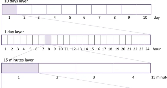
4.1.3 Visualization in Layers
The model proposed is also composed by a multi-level visualization architecture. This type of architecture enables a simple navigation through the biosignal in order to provide an easy search and focus in the regions of interest.
The developed visualization architecture presents seven standard information layers divided into a defined number of intervals. The choice of the standard information layers had to obey the following conditions:
i) The maximum interval of sequential acquisition considered was 10 days. This is a significant value considering the studies already referenced.
ii) Each layer should be divided into an integer number of intervals with the size of the layer immediately below.
The chosen layers and their number of intervals are described in Table4.1.
While the first layer displayed gives the user a global overview of the whole biosignal, the others provide a more detailed visualization of the selected interval of the above layer (by default the selected interval is the first one).
Figure4.2schematically represents the first three layers that can be displayed. Each layer is divided into a defined number of intervals, each one with the size of the next layer. In this figure is displayed the first fifteen minutes of the eighth hour of the first day.
1 2 3 4 5 6 7 8 9 10 day
1 2 3 4 5 6 7 8 9 10 11 12 13 14 15 16 17 18 19 20 21 22 23 24 hour
1 2 3 4 15 minutes 10 days layer
1 day layer
15 minutes layer
Figure 4.2: Layers Scheme. The three layers represented are the first ones that can be displayed. Each layer is divided into a defined number of intervals, each one with the size of the next layer. Here, the first fifteen minutes of the eighth hour of the first day are displayed.
interval by the subsampling technique discussed in [24]. The last layer represents the smaller interval with raw data. The type of data that each layer represents is also pre-sented in Table4.1.
Table 4.1: Possible Layers in the Visualization Model.
Layer Number of Intervals Data Representation
10 days 10 Events
1 day 24 Events
1 hour 4 Events
15 minutes 3 Events
5 minutes 5 Subsampled
1 minute 60 Subsampled
1 second 1 Raw
The total number of layers displayed in the platform depends on the total duration of the biosignal that is being analysed. The first layer to be displayed corresponds to the lowest layer that can represent the whole signal. All the layers below this one will also be displayed. For example, if the biosignal has 20 hours of total duration, the model will present only 6 layers where the 1 day layer (the lowest one that can represent the whole signal) will be the first to be displayed (Figure5.4).
In order to provide a better organisation of the variables needed to implement the different layers, it was created a layers dictionary in a pre-existingJSON file. This file contains the dictionaries of all biosignals considered in this work. Consequently, each biosignal contains alayersdictionary and other signal information dictionaries that will later be discussed. Eachlayersdictionary is composed of 7 different dictionaries, one per standard layer. The keys of these dictionaries are presented in Table4.2.
Table 4.2: Layer keys perlayersdictionary in the biosignalsJSONfile.
Key Description
Intervals Number Maximum number of intervals in which the layer can bedivided into. Total points Number of points that can be drawn in the layer.
Total Seconds Seconds represented by the layer.
Total in Day Number of complete layers that exist in one day. Function Name of the function used for getting the data that shouldbe represented here.
Key Key to use for getting the data from theHDF5file.
Chart Type of chart to be used in this layer.
Axis Axis labels of the chart represented in this layer.
Legend Legend of the chart represented in this layer.
4. VISUALIZATIONMODEL 4.1. Visualization Process
Listing 4.1: Excerpt of thelayersdictionary in biosignalsJSONfile.
1 {
2 "ECG": { 3 "layers": { 4 "10days": {
5 "Intervals Number": 10, 6 "Total points": 960, 7 "Total Seconds": 864000, 8 "Total in Day": 0.1,
9 "Function": "events_10days_data", 10 "Key": "events2",
11 "Chart": "3line_chart",
12 "Axis": {"x": "time (d)", "y": "Heart Rate (bpm)"},
13 "Legend": ["HR/15 min (Max)" , "HR/15 min (Mean)", "HR/15 min (Min)"]
14 },
15 "1day": {
4.1.4 Visualization Techniques
After designing the abstractions and the layout for the visualization process model, the natural next step is the choice of the visualization techniques that most efficiently com-municate the data information.
Three different visualization techniques were considered in this work. Besides line and bar graphs, two standard techniques in data visualization, horizon graphs, already described in Section1.2, were also considered. Other techniques, such as dots plots and heat maps, were also tested [23], however, it was selected only those that fitted better in the devised final result.
The main interface combines only the line and bar plots to show the data selected. While the bar graphs are used for the 1 hour layers the line graphs are used for the re-maining ones (Figures 5.2 and5.3). The presence of grey bars in any of the layers of the main interface indicates the time lapses where the acquisition was interrupted. This situation can be observed in the first layer of the Figure5.4.
In order to help the comprehension of the represented signals, in each layer there is a legend. With exception of the 1 hour layer, the presence of three tones of green represents, from the darker to the lighter green, the maximum, the mean and the minimum of the represented event. In the 1 hour layer the presence of different tones of green allows the distinction of different parts in the signal, for example, in theACCsignal, while the dark green represents the activity moments, the lighter represents the rest moments.
The horizon plots are used in the analysis page, later discussed, enabling the compar-ison of a variety of features in a restricted space (Figure4.7).
WebGL provides a similar rendering functionality in a faster way, it could be used in-stead of the SVG. However, the toolboxes currently available to perform this type of rendering are still too complex or not stable enough to provide a suitable visualization.
4.2
Perception and Cognition Process
To better support the analysis tasks, the visual encoding of the developed platform had a crucial part in the process. In order to enhance the graphical perception, some variables, such as positions, shapes and colours, were carefully studied.
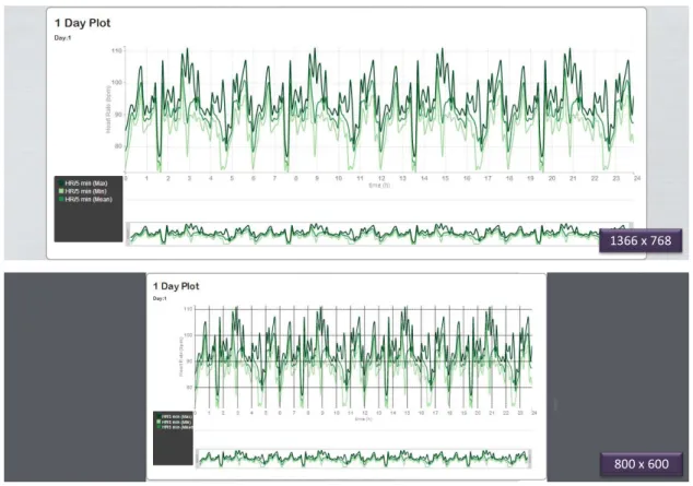
A fast and responsive design was assumed and enabled by the Foundation Frame-work developed by ZURB 1. Figure4.3 represents the response to a simulation of two
different screen resolutions.
The platform also includes thoughtful default colours [26] that avoid the colour-blind effect.
1366 x 768
800 x 600
Figure 4.3: Response to a simulation of two different screen resolutions. While the first image represents the response to a screen resolution of 1366 x 768, the second one repre-sents the response to a screen resolution of 800x600. It is possible to observe the resizing of the chart.
4. VISUALIZATIONMODEL 4.3. Interactive Exploration Processes
4.3
Interactive Exploration Processes
4.3.1 Basic Interaction
The basic interaction techniques selected for the interactive exploration process are now presented. Since they improve the visualization exploration and can be adapted to differ-ent types of platform, these techniques are often used. For these reasons and for the fact that the majority of users are used to these tools and know how to use them, they were also selected for the developed platform.
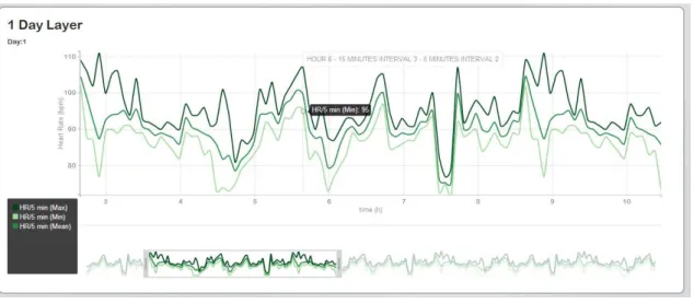
• Zoom and Pan:The dynamic change and view of the mapped data allows the focus
on some parts of interest. Figure4.4 shows an example of a zoomed and panned graph in the platform.
• Tooltips:Support the visualization showing the instant of time and the amplitude
value that the hovered point represents. Figure4.4shows an example of a tooltip in the platform.
• Modal Dialogs:Enabling the dialog between the interface and the user allows the
user guidance in some tasks, alerts of possible errors and presents same useful in-formation. Figure4.5represents an example of a modal dialog used in the platform.
• Save: Saving the exploration carried out on a pdf format represents an usual way
of presenting results.
Figure 4.5: Example of a modal dialog present in the developed platform.
4.3.2 Navigation
Considering the core of the visualization process in this work, an interactive visualization technique to support the navigation between the different layers was implemented.
As explained before, the default data to be displayed in the different layers (with exception of the first one) corresponds to the data of the first interval in the layer above. Hence, an appropriate navigation technique was required.
The technique implemented enables the switch of the displayed data through a dou-ble click inside an interval of one layer. This will switch the layers below with data from the selected interval.
This innovative type of browsing through the time axis is exemplified in Figure4.6. The selection of the sixth interval in the 1 day layer, i.e., the sixth hour of that day will switch the data in the 1 hour layer in order to correspond to the data of the sixth hour. This switch continues until the last layer.
4.3.3 Annotations
The demand and importance of annotations has already been exposed. Therefore, the developed platform enables the annotations handling, thereby improving the biosignal interpretation through the notes made by the user in the relevant biosignal regions.