The SciDAVis Handbook
Ion Vasilief, Roger Gadiou, and Knut Franke
Contents
1 Introduction 1
1.1 What is SciDAVis? . . . 1
1.2 Command Line Parameters . . . 2
1.2.1 Specify a File . . . 2
1.2.2 Command Line Options . . . 3
1.3 General Concepts and Terms . . . 3
1.3.1 Tables . . . 6
1.3.2 Matrix. . . 7
1.3.3 Plot Window . . . 7
1.3.4 Note. . . 8
1.3.5 Log Window . . . 9
1.3.6 The Project Explorer . . . 9
2 Drawing plots with SciDAVis 11 2.1 2D plots . . . 11
2.1.1 2D plot from data. . . 11
2.1.2 2D plot from function. . . 14
2.1.2.1 Direct plot of a function. . . 15
2.1.2.2 Filling of a table with the values of a function. . . . 15
2.2 3D plots . . . 16
2.2.1 Direct 3D plot from a function . . . 17
2.2.2 3D plot from a matrix . . . 19
2.3 Multilayer Plots . . . 20
2.3.1 Building a multilayer plot panel . . . 20
2.3.2 Building a multilayer plot step by step . . . 21
3 Command Reference 24 3.1 The File Menu. . . 24
3.2 The Edit Menu . . . 30
3.3 The View Menu . . . 30
3.4 The Graph Menu . . . 31
3.5 The Plot Menu . . . 32
3.8 The Analysis Menu . . . 43
3.8.1 Commands for the analysis of data in tables . . . 43
3.8.2 Commands for the analysis of curves in plots . . . 45
3.9 The Table Menu . . . 49
3.10 The Matrix Menu . . . 51
3.11 The Format Menu . . . 51
3.12 The Window Menu . . . 52
3.13 Customization of 3D plots . . . 53
4 The Toolbars 55 4.1 The Edit Toolbar . . . 55
4.2 The File Toolbar. . . 55
4.3 The Plot Toolbar. . . 56
4.4 The Table Toolbar. . . 56
4.5 The Plot 3D Toolbar. . . 60
5 The Dialogs 62 5.1 Add Error bars . . . 62
5.2 Add Function . . . 63
5.3 Add Layer . . . 65
5.4 Add/Remove curves. . . 65
5.5 Add Text . . . 66
5.6 Arrange Layers . . . 67
5.7 Add Arrow . . . 68
5.8 Column Options. . . 69
5.9 Contour Curves Options . . . 70
5.10 Custom Curves . . . 72
5.10.1 Custom curves for lines and scatter plots . . . 73
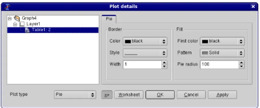
5.10.2 Custom curves for pie plots . . . 73
5.10.3 Custom curves for box plots . . . 74
5.10.4 Custom curves for pie histogram . . . 75
5.11 Define surface plot . . . 77
5.12 Export ASCII . . . 77
5.13 Fast Fourier Transform . . . 78
5.14 Integrate dialog . . . 79
5.15 Non linear curve fit . . . 79
5.16 General Plot Options . . . 81
5.17 Plot Wizard . . . 84
5.18 Project Explorer. . . 85
5.19 Preferences Dialog . . . 86
5.20 Printer-setup. . . 91
5.21 Set Column Values . . . 92
5.22 Set Dimensions... . . 92
5.23 ASCII Import options . . . 93
5.24 Set Properties... . . 94
5.26 Surface plot options . . . 95
5.27 Text options . . . 97
6 Analysis of data and curves 99 6.1 Fast Fourier Transform . . . 99
6.2 Correlation . . . 100
6.3 Convolution . . . 101
6.4 Deconvolution. . . 101
6.5 Non Linear Curve Fit . . . 101
6.6 Fitting to specific curves . . . 102
6.6.1 Fitting to a line . . . 102
6.6.2 Fitting to a polynome . . . 103
6.6.3 Fitting to a Bolzmann function . . . 104
6.6.4 Fitting to a Gauss function . . . 105
6.6.5 Fitting to a Lorentz function . . . 106
6.7 Multi-Peaks fitting . . . 106
6.8 Filtering of data curves . . . 107
6.8.1 FFT low pass filter . . . 108
6.8.2 FFT high pass filter . . . 109
6.8.3 FFT band pass filter . . . 110
6.8.4 FFT block band filter . . . 111
6.9 Interpolation. . . 112
7 Mathematical Expressions and Scripting 114 7.1 muParser . . . 114
7.2 Python . . . 116
7.2.1 Getting Started . . . 116
7.2.2 Python Basics. . . 117
7.2.2.1 Expressions . . . 117
7.2.2.2 Statements . . . 117
7.2.3 Evaluation Reloaded . . . 119
7.2.4 Mathematical Functions . . . 119
7.2.5 Accessing SciDAVis’s functions from Python . . . 121
7.2.5.1 Establishing contact . . . 121
7.2.5.2 Working with Tables. . . 122
7.2.5.3 Working with Matrices . . . 123
7.2.5.4 Plotting and Working with Graphs . . . 123
7.2.5.5 Fitting . . . 125
7.2.6 The Initialization File. . . 127
A Appendix 128 A.1 Credits and License . . . 128
A.1.1 GNU Free Documentation License. . . 128
A.1.1.1 Preamble . . . 128
A.1.1.4 Copying In Quantity. . . 130
A.1.1.5 Modifications . . . 131
A.1.1.6 Combining Documents . . . 132
A.1.1.7 Collections Of Documents . . . 132
A.1.1.8 Aggregation With Independent Works . . . 133
A.1.1.9 Translation. . . 133
A.1.1.10 Termination . . . 133
A.1.1.11 Future Revisions Of This License . . . 133
A.2 How to obtain SciDAVis . . . 134
A.3 Requirements . . . 134
A.4 Installation from binary packages. . . 135
A.5 Compilation and Installation from sources . . . 135
List of Figures
1.1 A typical SciDAVis session . . . 4
1.2 The SciDAVis table . . . 6
1.3 The SciDAVis matrix . . . 7
1.4 An example of SciDAVis 2D graph . . . 8
1.5 The SciDAVis Note Window . . . 9
1.6 The SciDAVis Log window . . . 9
1.7 The SciDAVis Project Explorer . . . 10
2.1 A simple 2D plot: the table.. . . 12
2.2 A simple 2D plot: the default plot. . . 13
2.3 A simple 2D plot: the plot finished. . . 13
2.4 A 2D plot with two Y axis. . . 14
2.5 Direct plot of a function. . . 15
2.6 Function plot: filling of the X column. . . 16
2.7 Function plot: filling of the Y column. . . 16
2.8 Example of a 3D Plots. . . 17
2.9 Definition of a new surface 3D plot. . . 18
2.10 The 3D surface plot created by default . . . 18
2.11 The 3D surface plot after customizations . . . 19
3.1 TheSmooth -> Moving Window Average... dialog. . . 46
3.2 TheSmooth -> Moving Window Average... dialog. . . 46
3.3 TheFFT Filter -> Low Pass...dialog. . . 46
3.4 TheFFT Filter -> High Pass...dialog. . . 47
3.5 TheFFT Filter -> Band Pass...dialog. . . 47
3.6 TheFFT Filter -> Band Block...dialog. . . 48
3.7 TheInterpolate...dialog.. . . 48
4.1 The SciDAVis Edit Toolbar . . . 55
4.2 The SciDAVis File Toolbar . . . 55
4.3 The SciDAVis Plot Toolbar . . . 56
4.4 The SciDAVis Table Toolbar . . . 56
5.2 A plot with X and Y Error Bars. . . 63
5.3 TheAdd Function...dialog box: cartesian coordinates. . . 64
5.4 TheAdd Function...dialog box: parametric coordinates. . . 64
5.5 TheAdd Function...dialog box: polar coordinates. . . 65
5.6 TheAdd Layerdialog box.. . . 65
5.7 TheAdd/Remove Curves...dialog box. . . 66
5.8 TheAdd Textdialog box. . . 67
5.9 TheArrange Layersdialog . . . 67
5.10 TheArrow optionsdialog: first tab . . . 68
5.11 TheArrow optionsdialog: second tab . . . 68
5.12 TheGeometrydialog: third tab . . . 69
5.13 TheColumn Options...dialog. . . 69
5.14 The Contour Options dialog. . . 70
5.15 The Custom Curves Dialog: Line formatting. . . 72
5.16 The Custom Curves Dialog: Plot Associations. . . 72
5.17 The Custom Curves Dialog: Line formatting. . . 73
5.18 The Custom Curves Dialog: Symbol formatting.. . . 73
5.19 The Custom Curves Dialog for pies: pie segment formatting. . . 74
5.20 The Custom Curves Dialog for box: pattern formatting. . . 74
5.21 The Custom Curves Dialog for box: whiskers formatting. . . 75
5.22 The Custom Curves Dialog for box: percentile formatting. . . 75
5.23 The Custom Curves Dialog for histogram: pattern formatting. . . 76
5.24 The Custom Curves Dialog for histogram: spacing formatting. . . 76
5.25 The Custom Curves Dialog for histogram: data formatting. . . 76
5.26 TheNew -> New Surface 3D Plotdialog box. . . 77
5.27 Export of a selection in a table to an ASCII file. . . 77
5.28 TheFFT...dialog box for a curve. . . 78
5.29 TheFFT...dialog box for a table. . . 78
5.30 TheIntegrate...dialog box. . . 79
5.31 The first step of theNon Linear Curve Fit...dialog box. . . 80
5.32 The second step of theNon Linear Curve Fit...dialog box. . . 81
5.33 General plot options dialog: the scale tab. . . 82
5.34 General plot options dialog: the grid tab. . . 83
5.35 General plot options dialog: the axis tab. . . 83
5.36 General plot options dialog: General settings. . . 84
5.37 The plot wizard dialog box. . . 85
5.38 The project explorer panel. . . 85
5.39 The preferences dialog: general parameters for the application. . . 86
5.40 The preferences dialog: table options. . . 88
5.41 The preferences dialog: 2D plot options. . . 88
5.42 The preferences dialog: 3D plot options. . . 90
5.43 The preferences dialog: fitting options. . . 91
5.44 ThePrintdialog. . . 91
5.45 TheSet Column Values...dialog. . . 92
5.46 TheSet Dimensions...dialog for matrix.. . . 93
5.48 TheSet Properties...dialog for matrix. . . 94
5.49 TheSet Values...dialog for matrix. . . 94
5.50 The surface plot options dialog box. . . 95
5.51 The surface plot options dialog box with tab 5: aspect ratio.. . . 97
5.52 The text options dialog. . . 97
6.1 An example of a inverse FFT. . . 100
6.2 An example of a correlation between two sinus functions. . . 101
6.3 The results of theNon Linear Curve Fit.... . . 102
6.4 The results of aFit Linear. . . 103
6.5 The results of aFit Polynomial..., showing the initial data, the curve added to the plot, and the results in the log panel. . . 104
6.6 The results of aFit Bolzmann (sigmoidal). . . 105
6.7 The results of aFit Gaussian. . . 105
6.8 The results of aFit Lorentzian. . . 106
6.9 The results of aFit Multi-peak ->Gaussian.... . . 107
6.10 Signal after a FFT low pass filter . . . 108
6.11 Signal after a FFT high pass filter. . . 109
6.12 Signal after a FFT band pass filter . . . 110
6.13 Signal after a FFT block band filter. . . 111
List of Tables
4.1 Edit toolbar commands. . . 56
4.2 File toolbar commands. . . 57
4.3 Plot toolbar commands . . . 58
4.4 Table toolbar commands. . . 59
4.5 3D Plot toolbar commands. . . 61
7.1 Supported Mathematical Operators . . . 114
7.2 Mathematical Functions. . . 115
7.3 Non-Mathematical Functions . . . 116
Abstract
This document is a handbook for using SciDAVis, a program for two- and three-dimensional graphical presentation of data sets and for data analysis.
This manual is organized in several chapters:
-Thefirst onedescribes the main concepts and terms which are used in SciDAVis. - Thesecond chapteris a tutorial on how to obtain plots from different data sets. It is the one you need to read first to understand the basics of SciDAVis and to be able to draw plots.
- The three following chapters are descriptions of all thecommands,buttonsand
Chapter 1
Introduction
1.1
What is SciDAVis?
SciDAVis stands for Scientific Data Analysis and Visualization. It is a free cross-platform program for two- and three-dimensional graphical presentation of data sets and for data analysis. The plots can be produced from data sets stored intablesor from analytical functions.
The SciDAVis project started as a fork of QtiPlot with the aim of introducing some changes in design as well as project structure. The QtiPlot development was initiated in 2004 by Ion Vasilief. He was the only programmer until May 2006 when Knut Franke and Tilman Hoener zu Siederdissen joined the project. Not much later, Roger Gadiou officially joined as the main documentation writer. In June 2007, insuperable disagreements among the developers lead to the fork and the creation of the SciDAVis project by Knut Franke and Tilman Hoener zu Siederdissen, soon followed by Roger Gadiou. The project is hosted atSourceforge.
SciDAVis aims to be a tool for analysis and graphical representation of data, allow-ing powerfull mathematical treatment and visualization of scientific data while keepallow-ing a user-friendly graphical user interface. Another keypoint for the SciDAVis project is to be a multi-system software, it should work on Windows, Linux, and OS-X systems. SciDAVis is a dynamic tool, the plots created from data sets and the spreadsheets owing the data are interconected. When the spreadsheets are modified, all the objects in the depending plots (curves, axes scales, legends) are automatically updated. For example, deleting a spreadsheet or only some columns will automatically remove all the corresponding curves from the depending plots.
All settings of a complete set of tables, matrix and plots can be saved in project files, having the extention ".sciprj". These project files may be opened using thecommand line, or using theFile menu, or by using theOpen projecticon from theFile toolbar.
The plots can be exported to several graphic formats such as JPEG or PNG and inserted as images in documents or presentations.
operations are also stored in the project files. They can be visualized at any moment using theResults log commandand can be deleted from the project file via theClear Log Informations command.
When the application is launched, a new project file is created consisting of a grey main window (the workspace) which contains an empty table. In order to be opera-tional, this workspace must be populated with tables storing data sets, either by creating empty tables first (New -> New Table command) and then filling them with data, or by importing ASCII files (Import ASCII -> Single File... command), which automatically creates new tables.
The user can easily navigate through the objects of a project file using the project explorer or the Windows menu. The project explorer also allows the user to perform various operations on the windows (tables and plots) in the workspace: hiding, mini-mazing, closing, renaming, printing, etc...
1.2
Command Line Parameters
1.2.1
Specify a File
When starting SciDAVis from the command prompt, you can supply the name of a project file:
SciDAVis file_name.sciprj
Other file format are also accepted: .opj, .ogm, .ogw, .oggfor Origin projects, and
.qti, qti.gzfor Qtiplot projects.
The name can also refer to an ASCII file:
SciDAVis ASCII_file_name
In this latter case a new "untitled" project will be created, containing a spreadsheet with the ASCII data in the file and a 2D plot of all columns as a function of the first column in the file. You must take care of the format of the ASCII file because it will be read with the current values of theSet Import Options... commanddialog. These default values are:
• the default field separator is ; but it can be changed in thePreferences... command
dialog,
• all lines are read,
• the first line is used to name the columns,
• the spaces at the end of the lines are not removed,
1.2.2
Command Line Options
Valid options are:
• -a or --about: show about dialog and exit
• -h or --help: show command line options
• -l=XX or --lang=XX: start SciDAVis in language XX (’en’, ’fr’, ’de’, ...)
• -m or --manual: show SciDAVis manual in a standalone window
• -v or --version: print SciDAVis version and release date
• -x or --execute: execute the script file given as argument
1.3
General Concepts and Terms
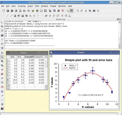
Figure 1.1: A typical SciDAVis session
There are numerous commands available in SciDAVis depending on the element which is selected. Therefore, the main menu bar changes when you select a particular element of the project. Moreover, you can access to the set of commands relevant of an element by activating the context menu with the right button of the mouse.
In a project, the containers which can be used are:
A Table A table is a spreadsheet which can be used to store the datas you are entering. It can also be used to do some calculations and statistical analysis of datas. In each table, columns can be labelled as X-values or Y-values for 2D-plotting, or Z-values if you plan to build a 3D-plot.
last way to enter your data is to fill the table with the results of a mathematical function (Set Column Values... commandfrom theTable menu)
A Matrix A matrix is a special table which is used to store the data points for surface 3D plots. It contains Z-values and doesn’t include any column or row which could be designed as X-values or Y-values. Nevertheless, you can specify the X-values and the Y-values with theSet Dimensions... commandcommand from theMatrix menu.
A matrix can be created by theNew -> New Matrix command. If you want to read a matrix from an ASCII file, you can import the data of the file to a table with theImport ASCII -> Single File... commandand then convert this table to a matrix with theConvert to Matrix command. In the same way as for tables, you can also fill matrix with the results of a function z=(i,j) in which i and j are row and column numbers (Set Values... commandfrom theMatrix menu)
A Graph A graph can contain one or several plots. Each of these plots is contained in a differentlayer, these layers can be arranged in many ways to build matrix of plots.
A new layer can be added to an existing graph with the Add Layer command
from theGraph menu. you can also remove an existing layer with theRemove Layer command, but if you remove a layer, the plot will be deleted. You can also copy a layer from one graph to another. You can also copy an existing graph into another, the window will be added as a new layer (see the section onMultilayer Plotsfor more details).
Plots can be created in several ways. You can select data in tables or matrix and build a plot, or create new plots from functions of one or two variables (see sections2D plotsand3D plots).
A Note This window is a text container which can simply be used to insert comments into a project, but is really far more powerfull than that. It can be used as a calculator, for executing single commands and for writing scripts.
The Log Window This window is used to store the results of all the calculations which have been done. If this window is not visible, you can find it with the
Project Exploreror with theResults log command.
The text in the log window is also saved in the project file, so that when you load a previously saved project, the results-log panel is re-filled with the results of the calculations.
The Project Explorer This window is used to list all the windows contained in a pro-jet. TheProject Explorergives a quick access to all elements of a project, hidden or visibles. It can be used to do some operations on the windows related to these items such as hidding a window, renaming windows, etc.
1.3.1
Tables
The table is the main part of SciDAVis when working with data. For controlling and converting data the spreadsheet contains a highly customizable table: all colors and font preferences can be set using thePreferences... commandof theView menu. You can resize a table in terms of rows and columns using theTable menuwithRows command
orColumns command.
Figure 1.2: The SciDAVis table
Every column of the table has a label and can be assigned a format: numeric, text, date or time. In a spreadsheet, columns can have the following flags: X, Y, Z, X-error, Y-error or can be simple columns without any special flag. The X columns are abscissae columns while the Y columns are ordinates columns used when creating a 2D plot from data. The X-error and Y-error columns can be used in order to add error bars to 2D plots. These flags can be changed using theColumn options dialog. To reach this dialog you simply have to double-click on the column label or to use theColumn Options... commandof theTable menu.
You can select all the columns of the spreadsheet (Ctrl+A) or only some of them by clicking on the column label while keeping the Ctrl key pressed, or by moving the mouse over the column label. This also allows you to deselect columns.
On the selected columns you can perform various operations: fill with data, nor-malize, sort, view statistics and finally make plots out of your data. All these functions can be reached by right clicking on the column label or by using theTable menu.
Any other spreadsheet function: rename, duplicate, export, print, close can be reached via the context menu (right click anywhere in the table outside the column labels area).
from theFile menu. The file import options can be changed via theSet Import Op-tions... command. Of course you can export the data from the spreadsheet to a text file using theExport ASCII command.
1.3.2
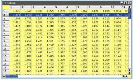
Matrix
The matrix is a special table which is used for data which depends on two variables. This special table is used to store data for 3D-plots. The difference between a table and a matrix is that there is no special column nor special row for X or Y labels or values. Nevertheless, you can specify an X-scale and an Y-scale with theSet Dimensions... command.
Figure 1.3: The SciDAVis matrix
The values which are stored in a matrix can be obtained from a function of the form z=(i,j) with theSet Values... command, i and j beeing the column and row numbers. They can also be read from a file with theImport ASCII commandwhich allows to read a file in a table, then the table can be converted to a matrix with theConvert to Matrix commandof theMatrix menu.
The operations which can be done on a matrix are limited changes in number pre-sentation and matrix size. The data of a matrix can be used to build a 3D plot with the commands present in thePlot3d menuand in3d plot toolbar.
1.3.3
Plot Window
Figure 1.4: An example of SciDAVis 2D graph
Each layer can be activated by clicking on the corresponding gray button in the top-left corner of the window.
The elements which can be accessed by a double click in a layer are:
• the graph itself: this will open theCustom Curve Dialog. You can then add new curves to the plot, or change the way the curves are plotted.
• The axes or the axes labels: this will open theGeneral Plot Options Dialog. It is used to customize the axes, the numbers and labels of the axes, and the grid.
• Any other text item, including the legend of the plot: this will open the Text Options Dialogwhich allows to customize the font of the label and the frame in which it is drawn.
1.3.4
Note
A note can simply be used to insert text (comments, notes, etc) into a project, but is really far more powerfull than that. It can be used as a calculator, for executing single commands and for writing scripts.
Evaluation of mathematical expressions and execution of code is done via a note’s context menu, the Scripting menu or the convenient keyboard shortcuts.
Figure 1.5: The SciDAVis Note Window
You can also change the text input method. Simple Composing Input Method is the standard method to enter text in QT applications. Ximis the X input method, it is the legacy system of the X window environment to support localized text input. The default choice is the second one, it allows to enter special characters and accents from your localised environment.
1.3.5
Log Window
This window keeps a history of all analysis which have been done in the project. This panel contains the results of all the correlations, fittings, etc.
Figure 1.6: The SciDAVis Log window
1.3.6
The Project Explorer
Figure 1.7: The SciDAVis Project Explorer
It gives an overview of the structure of a project and allows the user to perform various operations on the windows (tables and plots) in the workspace: hiding, min-imazing, closing, renaming, printing, etc... These functions can be reached via the context menu, by right-clicking on an item in the explorer.
By double-clicking on an item, the corresponding window is shown maximized in the workspace, even if it was hidden before.
Chapter 2
Drawing plots with SciDAVis
2.1
2D plots
A 2D plot is based on curves which are defined by Y values as functions of X values. There are two ways to obtain a 2D plot depending on the way the (X,Y) values are defined:
• You can have your (X,Y) values in atable. You need to select at least one column as X values and one column as Y values. This is specified with theColumn Options... command. Then you can select the columns and use one command of thePlot menuto plot the data.
• If you want to plot a function, you don’t need a table. You can use directly the
New -> New Function Plot command. This will open the correspondingdialog boxand you will be able to define the mathematical expression of your function.
• The combined way is to define atable, and then to fill in the table with the results of functions. This can be done with theSet Column Values... command. Then you can select the columns and use one command of thePlot menuto plot the data.
SciDAVis will create a new plot window, and the plot will be inserted in a new layer Once the plot is created, you can customize all the graphic items of the plot with the commands of theFormat Menu. You can add new items (text labels, lines or arrows, new legend, images) on the plot with the commands of theGraph Menu.
2.1.1
2D plot from data.
The first step is to create an empty project with theNew -> New Project command
from theFile menu, you can also use the key Ctrl-N or the icon from theFile toolbar. Then create a new table with theNew -> New Table commandfrom theFile menuor with the Ctrl-T or with the icon from theFile toolbar.
At its creation, the table has two column (one for X and one for Y) and 32 rows. You can add rows and columns by selecting a row or a column and using the right button of the mouse, you can also modify the number of rows and columns with the
Rows commandandColumns commandfrom theTable menu. You enter your values, and obtain this table:
Figure 2.1: A simple 2D plot: the table.
Figure 2.2: A simple 2D plot: the default plot.
You can then customize your plot. By double clicking on the points, you open the
Custom curves dialogwhich is used to modify the symbols. Then a double-click on the axes opens thegeneral plot options dialog, and you can change the scales, the fonts for the axes labels, etc. You can also add grid lines on X or Y axes, etc. Finally, a double click on each text item (X title, Y title, plot title) allows to change the text and the presentation of these elements. The final plot is:
Figure 2.3: A simple 2D plot: the plot finished.
com-mand from theFile menuor with the Ctrl-S or with the icon from theFile toolbar. Depending on your application, you can export your plot to a standard image file with the commandExport Graph -> Current commandfrom theFile menu(or with the Alt-G keycode).
There are several types of plots which can be built from a table. They are presented in thePlot menu
It is possible to use up to four axes for the data:
Figure 2.4: A 2D plot with two Y axis.
In addition to the customization which has been already described, the axes which are used for each curve were defined with theCustom CurvesDialog, and two arrows were added with theDraw Arrow command.
2.1.2
2D plot from function.
2.1.2.1 Direct plot of a function.
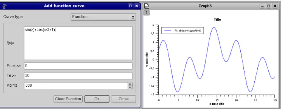
If you just want to plot a function, you can use theNew -> New Function Plot command
from theFile menuor with the Ctrl-F or with the icon from theFile toolbar. This command will open theAdd Function Curve dialog. You can then enter the expression of your mathematical function, the X range used for the plot, and the number of points used in this X range. Beside classical Y=f(X) functions, parametric and polar functions can be defined.
Figure 2.5: Direct plot of a function.
2.1.2.2 Filling of a table with the values of a function.
If you just want to work not only with the plot but also with the data, you can create a new table as explained in theprevious section. Then you can fill this table with the values of a function with theSet Column Values... command.
To obtain the same plot as in the previous example, you need to create a new table (key Ctrl-T), then select the first column and use the commandSet Column Values... commandfrom the context menu, or from theTable menu. The row number symbol is
Figure 2.6: Function plot: filling of the X column.
The second step is to select the second column and use the same command. The expression is a function of the X values, that is the first column namedcol(1).
Figure 2.7: Function plot: filling of the Y column.
Once the table is ready, you just have to build the plot as explained in the previous section.
2.2
3D plots
3D plot are generated from data defined as Z=f(X,Y). As for 2D plots, there are two ways to obtain a 3D plot depending on the way the (X,Y,Z) values are defined:
– one by one from the keyboard,
– by reading an ascii file in a table and converting the table into a matrix,
– by setting the values with a function.
• If you want to plot a function, you don’t need a matrix. You can use directly theNew -> New Surface 3D Plot command. This will open the corresponding
dialog boxand you will be able to define the mathematical expression of your function.
There are several kinds of 3D plots which can be selected, see the Plot3d menu
section of thereference chapterfor a list of the availables plots.
Figure 2.8: Example of a 3D Plots.
The 3D plots use OpenGL so you can easily rotate, scale and shift them with the mouse. Via the 3D plot settings dialog or via the Surface 3D Toolbar you can change all the predefined settings of a three dimensional plot: grids, scales, axes, title, legend and colors for the different elements.
There are several types of plots which can be built from a matrix. They are pre-sented in thePlot3d menu
2.2.1
Direct 3D plot from a function
Figure 2.9: Definition of a new surface 3D plot
You can enter the function z=f(x,y) and the ranges for X, Y and Z. Then SciDAVis will create a default 3d plot:
Figure 2.10: The 3D surface plot created by default
Figure 2.11: The 3D surface plot after customizations
If you want to modify the function itself, you can use thesurface... command which can be activated from the context menu with a right click on the 3D plot. This will re-open thedefine surface function dialog box.
2.2.2
3D plot from a matrix
The second way to obtain a 3D plot is to use amatrix. Therefore, the first step is to fill the matrix.This can be done by defining a function.
TheNew -> New Matrix commandcreate a default empty matrix with 32x32 cells. Then use theSet Dimensions... commandto modify the number of rows and columns of the matrix. Thisdialog boxis also used to define the X and Y ranges.
Then use theSet Values... commandto fill the cells with numbers. The ranges of X and Y defined in the previous step are not known by this dialog box, then the function is defined with the row and column numbers (i and j) as entry parameters (see the section
set-valuesfor details).
The other way to obtain a matrix is to import an ASCII file into a table with the
transformed in a matrix with the commandConvert to Matrix commandfrom theTable menu.
You can then use this matrix to build a 3D plot with one of the command of thePlot menu.
2.3
Multilayer Plots
The multilayer windows can contain multiple plots (layers) with different characteris-tics. Each layer has a corresponding button, which displays a number and is pressed when the layer is the currently active layer. There is only one active layer at a time, and the plot tools (zoom, cursors, drawing tools, delete and move points) can only operate on this layer. Each plot can be made active by clicking on it or on its corresponding button.
To arrange the layers use theArrange Layers dialog. You can add or remove layers with theAdd Layer commandandRemove Layer commandor copy/paste layers from one multilayer window to another. All these functions can be reached via theGraph menu, by using thePlot toolbaror via the context menu (right click in the multilayer window anywhere outside a plot area).
You can resize and move a layer using the Layer geometry dialog. You can also arrange and resize the plots by hand. A whole plot can be moved by drag and drop: click on the plot and keep the left mouse button pressed.
By keeping the Shift key pressed and dragging the border of a plot you can scale a plot as needed. When moving the mouse over the borders of a plot, you will see the corresponding arrows.
You can also use the mouse wheel in order to resize the layers: keeping the Ctrl key pressed and scrolling will resize the hight of the plot canvas, while keeping the Alt key pressed and scrolling will resize its width. By keeping the Shift key pressed and scrolling you can resize the plot in both dimensions.
2.3.1
Building a multilayer plot panel
This is the simplest way to obtain a multilayer plot. It can be used if you want to build a panel of plots with a simple arrangement: 2 plot in a row or in a column, or 4 plots in 2 rows and 2 columns.
You can select two columns with Y-values in a table, and then use one of thePanel
You can then customize the two plots, if you want to change the arrangement of the panel, you can use theArrange Layers commandfrom theGraph menu. It must be reminded in this case that each plot is in a layer with a surface which is the half or the quarter of the window surface area. So, if you want to share an element between the two plots (for example a text label), you need to add it in a new layer (see theAdd Text commandfor more detaile).
2.3.2
Building a multilayer plot step by step
If you need to build a more complex multilayer plot, you can define it step by step. The first step is to build your first plot, for example from two columns of a table. We obtain a standard plot window:
a panel with two columns, if you choose "corner" you will obtain two superposed layers, you can then modify these two layers.
If you want to build a panel with two rows, you can use theArrange Layers com-mandto convert this panel.
Chapter 3
Command Reference
The active items in the menus depend on the active window in the project. If the active window is a spreadsheet, then all the items linked to table functions are enabled and the others are automatically disabled.
3.1
The File Menu
These commands can also be done by clicking on theNew Projecticon from theFile Toolbar
File-> New ->
New -> New Project (Ctrl-N) Creates a new SciDAVis project file. If a project is open and saved, it will be closed. If a project is open is not saved, a dialog will be open to ask if the current project has to be saved.
New -> New Table (Ctrl-T) Creates a new spreadsheet into the project. This empty table will have 30 rows and 2 columns. This number of rows and columns can be changed with theRows commandandColumns command
of theTable menu.
New -> New Matrix Creates a new Matrix into the project. The empty matrix will have 32x32 cells, these dimensions can be changed by theSet Dimen-sions... commandof theMatrix menu
See thematrix sectionfor more details.
New -> New Note Creates a new note window in the project. A note is a simple text window which can be used to add comments to the current project.
New -> New Graph Creates a new empty 2D plot in the project. This default graph is just a framework in which you can add curves with the Add/Re-move Curves... command.
New -> New Function Plot (Ctrl-F) Opens adialog allowing to create a plot by specifying an analytical function. See the2D plot sectionof the tutorial for a general overview of this function.
This function can be defined in cartesian, parametric or polar coordinates, see theAdd Function... commandfor more details.
File -> Open (Ctrl-O) Opens an existing SciDAVis project file (default file extension .sciprj). If your project has been save in a compressed format, you must select the.sciprj.gzfile format.
This command can also be used to open projects which have been built with the
Originsoftware.
File-> Recent Projects Opens a list of the most recently used SciDAVis project files. You can open one of these files by selecting it from the list. If the file doesn’t exist anymore an error message will pop-out and the file will be automatically deleted from the list.
File-> Open Image File This command loads an image file in a SciDAVis project. This image can be resized and then inserted in another 2D plot. It is in this case similar to theAdd Image command. This image can also be used to generate an intensity matrix (see theImport Image... command).
File-> Import Image... With this command, an image is loaded in the SciDAVis project and converted to an intensity matrix. For each pixel, an intensity between 0 and 255 is computed from the intensities of the three colors red, green and blue.
This example shows the 3D plot which has been drawn from the matrix obtained with the SciDAVis logo.
File-> Save Project (Ctrl-S) Saves the actual project. If the project hasn’t been saved yet ("untitled" project), a dialog will open, allowing to save the project to a spe-cific location.In a project file all settings and all plots are stored in ASCII format.
If the project include large tables, it may be usefull to save the project in a com-pressed file format. The free zlib library is used to build files in gzip formats ( .sciprj.gz ).
File-> Save Project as... Saves the actual project under a file name different from the current one.
The first figure is the initial plot saved as a template, and the second one is the empty plot created by theOpen Template.
You just have to add curves with theAdd/Remove Curves... command, but the style used to draw the curves is not kept in the template.
File -> Save as Template Save the active plot as a SciDAVis template file (.qpt). In this template, the graphical parameters of the plot, together with the text labels (axis, etc) are restored, but the style used to draw the curves and the scales are not saved.
File -> Export Graph The plot can be exported into several different image formats. You can define some parameters to customize your image file by checking the
show optionscheck box. Depending on the chosen image format, the available options are not the same.
Forpngandxpm, you can choose to use a transparent background.
Forepsfile format, the option dialog is different. The parameters availables are: the size of the paper which is used to draw the plot, and the orientation of the paper sheet. The plot aspect ratio will be adapted to the sheet size and orientation.
The last format which can be selected is the Scalable Vector Graphic format. With this format, the files can be modified in vector drawing software such as
Sodipodi.
Export Graph -> Current (Alt-G) Here you have the possibility to save the active plot under different image formats.
Export Graph -> All (Alt-X) Here you have the possibility to save all plots of the project under different image formats.
File-> Print (Ctrl-P) Prints the active plot. A printdialog is opened where you can select the printer, different paper sizes, etc.
File-> Print All Plots Prints all plots of the projects. A print dialog is opened where you can select the printer, different paper sizes, etc.
File -> Export ASCII Opens theExport ASCII dialogallowing to save the data from the active spreadsheet to an ASCII file.
File -> Import ASCII -> The options for the importation of ASCII datas are set by theImport dialogwhich is activated by theSet Import Options...command.
Import ASCII -> Single File... Imports a single ASCII file into the project by creating a new spreadsheet storing the data from the file.
Import ASCII -> Multiple Files... Imports several ASCII files into the project by creating a new spreadsheet for each file. The new spreadsheets are au-tomatically arranged in a cascade style.
You can choose to put each data file in a separate table, or join all the data files in one table. Remind that if you choose this last solution, only one column can be selected as X values.
Set Import Options... Opens theImport dialogallowing to change import op-tions like: the column separator or the number of first lines to be ignored.
3.2
The Edit Menu
Edit -> Undo (Ctrl-Z) Restores the last modified table at the state it had after the last "Save Project" operation. Not available for plot windows.
Edit -> Redo (Ctrl-R) Restores the modifications in a table after a "Undo" operation. Function not available for plot windows.
Edit -> Cut Selection (Ctrl-X) Copies the current selection to the clipboard and deletes the selection. It currently works for spreadsheets and for 2D plots objects.
Edit -> Copy Selection (Ctrl-C) Copies the current selection to the clipboard. It cur-rently works for spreadsheets and for 2D plots objects.
Edit -> Paste Selection (Ctrl-V) Pastes the content of the clipboard to the active win-dow.
Edit -> Delete Selection () Cleares the current selection. It currently works for spread-sheets and for 2D plots objects.
Edit -> Delete Fit Tables Each time yo do a fit of your data with some mathematical model, a new table is created to put the results of the fit (i.e. the values computed by the model). These tables can be used to plot comparisons of experimental and fitted values.
If you have done several fitting tentatives, a number of unused table may be present in your project. This command allows to remove the results of all the differents fits that you have tested.
Edit -> Clear Log Informations Deletes from the project file all the history informa-tion about the analysis operainforma-tions performed by the user. Thelog panelis then empty.
3.3
The View Menu
View -> Plot Wizard (Ctrl-Alt-W) Opens thePlot Wizard dialog.
View -> Project Explorer (Ctrl-E) Opens/Close theProject Explorer, which gives an overview of the structure of a project and allows the user to perform various operations on the windows (tables and plots) in the workspace.
View -> Results log Opens/Close apaneldisplaying the historic of the data analysis operations performed by the user.
3.4
The Graph Menu
This menu is only active when a plot window is selected.
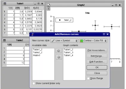
Graph -> Add/Remove Curves... (Alt-C) Opens theAdd/Remove Curves... dialog, allowing to easily add or remove curves from the active plot layer. This dialog can also be used to modify a curve which is already plotted by changing the columns which are used as X or Y values.
Graph -> Add Error Bars... (Ctrl-B) Opens theAdd Error Bars... dialog. You can add error bars on X and/or on Y values on an existing plot.
Graph -> Add Function... (Ctrl-Alt-F) Opens theAdd Function... dialog. This com-mand allows to add a a new curve on an existing plot.
Graph -> New Legend (Ctrl-L) Adds a new legend object to the active plot layer. You can have more than one legend on a plot. These legends can then be cus-tomized by double clicking on a given legend.
Graph -> Add Text (Alt-T) Opens adialogallowing you to select whether the text is to be added to the active plot layer or on a new layer. The cursor changes to an edit text cursor. Next, you must click in the plot window to specify the position of the new text box. A text dialog will pop-up allowing you to type the new text to be displayed and all its properties (color, font, etc...)
Graph -> Draw Arrow (Ctrl-Alt-A) Changes the active layer operation mode to the drawing mode. You must click on the layer canvas in order to specify the starting point for the new arrow, and then click once more to specify its ending point. You can edit the new arrow using the Arrow dialog. You can swith back to the normal operating mode by clicking the "Pointer" icon in the Plot toolbar.
Graph -> Draw Line (Ctrl-Alt-L) Changes the active layer operation mode to the drawing mode. You must click on the layer canvas in order to specify the starting point for the new arrow, and then click once more to specify its ending point. You can edit the new arrow using the line dialog. You can swith back to the normal operating mode by clicking the "Pointer" icon in the Plot toolbar.
Graph -> Add Time Stamp (Ctrl-Alt-T) This command is used to add a special la-bel in the current plot which contains the current date and time. The properties of this label can be customized like any other label that is added by theAdd Text command.
A timestamp label is not modified if the plot is modified, saved, etc.
Graph -> Add Layer (Alt-L) Opens adialogallowing you to select whether the new layer is to be added to the left-top corner of the plot window or to a best-guess position (based on a layer positioning algorithm in columns and rows).
Graph -> Remove Layer (Alt-R) Deletes the active layer and prompts out a question dialog allowing you to choose whether the remaining layers should be automati-cally re-arranged or not.
Graph -> Arrange Layers (Alt-A) Opens theArrange layers dialog, allowing you to custom the layout of the active 2D plot window.
3.5
The Plot Menu
This menu is active only when a table is selected. These commands allow to plot the data selected in the active table.
Line Plots the selected data columns in the active table window using the "Line" style. This command can also be activated by clinking on the icon of theTable toolbar. Once the plot is created, the drawing of the data series can be customized with theCustom curves dialog.
Scatter Plots the selected data columns in the active table window using the "Scatter" style. This command can also be activated by clinking on the icon of the
Line+Symbol Plots the selected data columns in the active table window using the "Line + Symbol" style.This command can also be activated by clinking on the icon of theTable toolbar. Once the plot is created, the drawing of the data series can be customized with theCustom curves dialog.
Special Line+Symbol -> Vertical Drop Lines Plots the selected data columns in the active table window using the "Vertical drop lines" style. Once the plot is created, the drawing of the data series can be customized with theCustom curves dialog.
Vertical Steps Plots the selected data columns in the active table window using the "Vertical Steps" style. Once the plot is created, the drawing of the data series can be customized with theCustom curves dialog.
Horizontal Steps Plots the selected data columns in the active table window using the "Horizontal Steps" style. Once the plot is created, the drawing of the data series can be customized with theCustom curves dialog.
Area Plots the selected data columns in the active table window using the "Area" style.
Pie Creates a 2D Pie plot of the selected column in the active table window (only one column allowed).
Vectors XYAM Creates a vectors plot of the selected column in the active table win-dow. You must select four columns for this particular type of plot. The two first columns give the coordinates for the starting points of the vectors, the two last columns giving the angle (in radians) and the magnitude of the vectors.
Statistical Graphs -> Statistical plot will not give a direct drawing of the data selected in the table, but they will give a representation of the frequency distribution of the Y-values.
Statistical Graphs -> Box Plot Creates a box plot of the selected data columns in the active table window. This type of plot is used to give a graphical representation of the some classical parameters of the frequency distribu-tion such as the mean of data, the min and max values, the posidistribu-tion of the 95 and 5 percentiles, etc. The choice of the statistical parameters and the graphical parameters can be modified with theCustom curves dialog.
Statistical Graphs -> Histogram Creates a frequency histograms of the selected data columns in the active table window. The default binning uses 10 steps between the max and the min of Y-values. This can be modified with the
With this command, a frequency distribution is computed from your data. If you want to draw an histogram directly from values, use theBars.
Statistical Graphs -> Stacked Histogram Creates vertically stacked layers dis-playing the histograms of the selected data columns in the active table win-dow (one histogram per layer) See thePanel -> Vertical 2 Layers command
for more details.
Panel -> These commands can be used to obtain quickly some classical arrangements of multiple plot.
Panel -> Vertical 2 Layers Creates 2 vertically stacked layers displaying the selected data columns in the active table window (one curve per layer).
Panel -> Horizontal 2 Layers Creates 2 horizontally stacked layers displaying the selected data columns in the active table window (one curve per layer).
Panel -> 4 Layers Creates 4 layers on a 2x2 grid, displaying the selected data columns in the active table window (one curve per layer).
Panel -> Stacked Layers Creates vertically stacked layers displaying the se-lected data columns in the active table window (one curve per layer).
Bars Makes a 3D plot of the selected data column in the active table window (only one column allowed) using the "3D Bars" style.
Scatter Makes a 3D plot of the selected data column in the active table window (only one column allowed) using the "3D Dots" style. The 3D point symbol style can be changed via the 3D Plots Settings dialog.
With scatter plots, you can choose the kind of graphic item which is used to plot the data points. The example above is done with cross hairs, but you can also select points or cones. This can be done either with the corre-sponding icons of the3d plot toolbar(respectively and for cross-hairs, dots and cones) or with thecustom-curves dialog.
3.6
The Plot 3D menu
This menu is only active when a matrix is selected.
3D Wire Frame Makes a 3D plot of the selected matrix using the "3D mesh" style.
3D Hidden Lines Makes a 3D plot of the matrix using the "3D mesh" style with hid-den lines.
3D Wire Surface Makes a 3D plot of the matrix using the "3D polygons" style with the mesh drawn.
Bars Makes a 3D plot of the selected data column in the active table window (only one column allowed) using the "3D Bars" style.
Contour+Color Fill Makes a color map plot of the data in the active matrix window. The contour lines and the colormap settings may be changed by clicking on the plotting area, this will active theContour Options Dialog.
Countour Lines Makes a contour plot of the data in the active matrix window. The contour lines and the colormap settings may be changed by clicking on the plot-ting area, this will active theContour Options Dialog.
3.7
The Data Menu
This menu is active only when a plot is selected.
Data -> Disable tools When you are using a command which modify the pointer such as theData Reader, this command can be used to exit this special mode, and go back to the normal pointer behaviour.
Data -> Zoom in (Ctrl-+) Switches the active plot layer to the zoom mode. The mouse cursor shape changes to a magnifying lens only inside the active plot canvas. You can select a window in the current plot which will be used as the new plotting window.
Data -> Zoom out (Ctrl--) This command cancel the previous zooming, a history of the zoom is kept so that you can do multiple zoom out commands.
Data -> Rescale To Show All (Ctrl-Shift-R) Rescale the active plot layer after a zoom operation.
Data -> Data Reader (Ctrl-D) Shows a red cross cursor and opens the Data Display toolbar giving easy and fast access to the values of the data points. You can select data points by moving the cursor with the Left and Right arrow keys or faster by clicking on them with the mouse. You can navigate through the curves on the plot layer using the Up and Down arrow keys.
Data -> Select Data Range (Alt-S) Shows two rectangular cursors that can be used for selecting the data range when performing analysis operations. The mouse cursor shape changes to a rectangular target only inside the active plot canvas. The active cursor is red, the other is black.You can move the active cursor with the arrows keys while keeping the Ctrl key pressed or faster by clicking on a curve point. You can change the active cursor using the Left and Right arrow keys. You can navigate through the curves on the plot layer using the Up and Down arrow keys.
Data -> Move Data points (Ctrl-Alt-M) Allows you to modify the position of data points in the active plot layer by simple drag-and-drop. It opens the Data Display toolbar, for a better visualisation of the new coordinates. The changes you make automatically modify the data into the corresponding tables and all the plots depending on those data sets.
Data -> Remove Bad Data Points (Alt-B) Allows you to remove data points from the active plot layer by double-clicking on them. The coordinates of the points selected for removal are shown in the Data Display toolbar. The changes you make automatically modify the data into the corresponding tables and all the plots depending on those data sets.
3.8
The Analysis Menu
The commands which are available in this menu are not the same if a table or a plot is selected.
3.8.1
Commands for the analysis of data in tables
Statistics on Columns Creates a new table providing basic statistical information about the selected columns in the active table: average, variance, standard deviation, max value, etc...
You can select several columns in one table, one line will be created for each column. You can’t select columns in different tables to obtain one single table of statistics.
Statistics on Rows Creates a new table providing basic statistical information about the selected rows in the active table: average, variance, standard deviation, max value, etc...
See theStatistics on Columns commandcommand for more details.
Sort Column Sorts the columns selected. If more than one column is selected, you can sort them:
• together: the column selected asleading columnwill be sorted in ascending or descending order, and the others column selected will be sorted in order to keep the rows unchanged.
Sort Table This is the same command asSort Columnbut it operate on all columns of the active table.
Normalize Normalizes the columns selected, that is modify the data in order to obtain a range of 0 to 1. All columns selected are normalized separately. This command doesn’t create new normalized columns but replace the values of the selected columns.
Normalize -> Columns Normalizes the selected column.
Normalize -> Table Normalizes all the columns of the table, it is not a global normalization of all values of the table: each column is normalized sepa-rately.
FFT... Computes a direct or inverse Fast Fourier Transform. The parameters used can be set with theFFT dialog. See thefft sectionof theAnalysis chapterfor more details.
Correlate Does a cross-correlation of the two columns which are selected. See the
correlate sectionof theAnalysis chapterfor more details.
Convolute Does a convolution of the two columns which are selected. The first one being the response and the second the signal. See theconvolution sectionof the
Analysis chapterfor more details.
Deconvolute Does a deconvolution of the two columns which are selected. The first one being the response and the second the signal. See thedeconvolution section
of theAnalysis chapterfor more details.
3.8.2
Commands for the analysis of curves in plots
The following items are enabled only if the active window is a 2D Multilayer Plot Window. If the active plot layer contains more than one curve, and the Data Range Selectors are not enabled, a dialog window will pop-out allowing you to select the curve you want to analyse.
In most of the cases (except for integration), a new red curve is added to the active plot layer and a a new table containing the data used to plot this curve is added to the workspace. Useful information about the operation performed will be showed in the Results Log display.
The commands FFT... andNon Linear Curve Fit... are presented in theTable Analysis Menu.
Analysis -> Differentiate Creates a new plot displaying the resulting curve of the nu-merical differentiation. The computation of the derivative is done by centered finite diferences.
This command creates a new table which contains one column for X-values and one column for derivatives of Y-values. It also creates a new plot of the deriva-tive.
Analysis -> Integrate... Opens theIntegration dialog, allowing to choose the curve to integrate and the integration method.
This command can’t be used to obtain a cumulative curve from a selected curve, it can only compute the integral of the data between two limits. The result is given in theLog Panel.
Analysis -> Smooth .
Savitski-Golay This command performs a smoothing of the selected curve with the Savitzky-Golay method. The formula used to smooth the curve defined by the points yi=f(xi) is:
The fivalues are computed by fitting the data points to a polynome, they
Figure 3.1: TheSmooth -> Moving Window Average...dialog.
Moving Window Average... This command performs a smoothing of the se-lected curve with the moving window average method. The formula used to smooth the curve defined by the points yi=f(xi) is:
The greater the number of pointsn, the smoother the resulting curve zi=f(xi)
is. The dialog allows to specify the curve which will be smoothed, the value ofnand the color used to draw the smoothed curve. A new table will be created to store the data points xi, zi.
Figure 3.2: TheSmooth -> Moving Window Average...dialog.
Analysis -> FFT Filter Low Pass... This command allows to filter the high frequen-cies of a signal. See thefiltering sectionfor more details. A dialog box will be opened in which you can select the curve to filter and the cut-off frequency of the filter.
Figure 3.3: TheFFT Filter -> Low Pass...dialog.
High Pass... This command allows to filter the low frequencies of a signal. See thefiltering sectionfor more details. A dialog box will be opened in which you can select the curve to filter and the cut-off frequency of the filter.
Figure 3.4: TheFFT Filter -> High Pass...dialog.
This command creates a new table with the filtered data, and a new curve will be added on the current plot.
Band Pass... This command allows to filter the low and high frequencies of a signal. See the filtering section for more details. A dialog box will be opened in which you can select the curve to filter and the cut-off frequency of the filter.
Figure 3.5: TheFFT Filter -> Band Pass...dialog.
This command creates a new table with the filtered data, and a new curve will be added on the current plot.
Figure 3.6: TheFFT Filter -> Band Block...dialog.
This command creates a new table with the filtered data, and a new curve will be added on the current plot.
Analysis -> Interpolate... Performs an interpolation. The curve must have enough data points to compute the interpolated points, if not a warning message will be prompted out.
The methods available to perform the interpolation areLinear(the curve must contain at least 3 points),Cubic Spline(the curve you analyse must contain at least 4 points, if not a warning message will be prompted out, Non-rounded Akime spline(the curve you analyse must contain at least 5 points). See the
Analysis chapterfor a comparison of the differents methods.
Figure 3.7: TheInterpolate...dialog.
This command creates a new curve on the current plot, and a new table.
Analysis -> FFT... Performs aforward or inverse FFTtransform of the selected curve. The parameters used can be set with theFFT dialog.
The inverse FFT transform of a forward transform will result in a data set iden-tical to that used for the forward transform.
Analysis -> Fit Polynomial... Opens the Polynomial Fit dialog, allowing you to choose the curve to fit, the order of the polynomial function to use, the number of points of the resulting curve and the abscissae limits for the fit.
Analysis -> Fit Exponential Decay
First Order... Opens the Exponential Fit dialog, allowing you to choose the curve to fit and the initial guesses for the fit parameters.
Second Order... Opens a dialog, allowing you to choose the curve to fit and the initial guesses for the fit parameters.
Third Order... Opens a dialog, allowing you to choose the curve to fit and the initial guesses for the fit parameters.
Analysis -> Fit Exponential Growth... Performs an exponential growth fit of the se-lected curve.
Analysis -> Fit Lorentzian Performs a lorentzian fit of the selected curve. It can be used to obtain a correlation equation of abell shaped data set.
Analysis -> Fit Gaussian Performs a gaussian fit of the selected curve.It can be used to obtain a correlation equation of abell shaped data set.
Analysis -> Fit Bolzmann (sigmoidal) Performs a fit to abolzmann functionof the selected curve. It can be used to obtain a correlation equation of aS shaped data set.
Analysis -> Fit Multi-peak ->Gaussian... Performs a fit to asum of N gaussian func-tionsof the selected curve.
Analysis -> Fit Multi-peak -> Lorentzian... Performs a fit to asum of N lorentz func-tionsof the selected curve.
3.9
The Table Menu
This menu is only active when a table is selected.
Set Column As These commands are used to define the kind of data which is stored in the different columns of a table.
Set Column As -> X Define the selected column as abscissae for the plots. You can define more than one column as X-values in a tables, they will be ref-erenced as X1, X2, etc.
Set Column As -> Y In the case of 2D plots, this command defines the selected column as Y-values for the plots. In the case of 3D plots, Y columns can be used as the second abscissae.
Set Column As -> X error Define the selected column for use as error bars width for abscissae.
Set Column As -> Y error Define the selected column for use as error bars for Y-values.
Set Column As -> None The selected column can be used in different ways in several plots (as X values, Y values, etc).
Column Options... This command is used to define the global parameters of each column such as numeric format, column name, etc. See thecorresponding dialog box sectionfor more details.
Set Column Values... This command is used to fill the selected column with the values resulting from a mathematical formula. See thecorresponding dialog box section
for more details.
Recalculate When you fill a column (named for example ’C1’) with the results of a formula (by using theSet Column Values... command), the values of the column are calculated only once when you define the formula. If your formula depends on values of another column (name for example ’C2’), the values of ’C1’ are not updated if you modify the values in ’C2’. This command is used to recalculate the values of the selected column.
Fill column with This command is used to fill the selected column with special val-ues:
Fill Column With -> Row Numbers The filling is done with the number of the corresponding rows.
Fill Column With -> Random Numbers The filling is done with random val-ues between 0 and 1.
Clear Removes all the values of the selected column
Add Column Adds a new column in the table. Whatever the selected column, the new one will be inserted at the right of the table after the left column.
Columns Allows to define the number of columns in the table. Be carefull if you decrease the number of columns in a table, a number of columns will be removed and the data will be lost.
Rows Allows to define the number of rows in the table. Be carefull if you decrease the number of rows in a table, a number of rows will be removed and the data will be lost.
Go to Row... Defines the active line in the selected table.
3.10
The Matrix Menu
This menu is only active when a matrix is selected.
Set Properties... This command opens adialog windowwhich is used to specify some view parameters of the matrix (cell width, format of numbers).
Set Dimensions... This command opens adialog windowwhich is used to specify the size of a matrix. It can also be used to specify the X and Y ranges which will be used as axis ranges for a 3D-plot of the matrix data.
Set Values... This command opens adialog windowwhich is used to fill in a matrix with the result of a function z=f(i,j) in which i and j stand for the row and column numbers.
Transpose Transpose the selected matrix.
Invert Inverse the selected matrix.
Determinant Compute the determinant of the selected matrix.
Convert to Spreadsheet Convert the selected matrix in a table.
3.11
The Format Menu
This menu is only active when a plot is selected.
Plot... In the case of a classical 2D plot, opens theformat plot dialogwith the general plot options tab selected. It allows to customize the line styles and colors of plot frame, etc.
In the case of a surface plot, this command opens thesurface plot optionswith the general plot options tab selected. In this case the aspect ratio of the plot can also be modified.
Curves... Opens theCustom Curves dialog. It allows to customize the line style and colors used to draw curves.
If the selected plot is a surface plot, this menu item is not showed.
Scales... Opens theformat plot dialogwith the scales tab selected. It allows to cus-tomize the ranges of the differents axes. It must be reminded that any modifica-tion in the table or in the plotted curves will result in a reset of these scales to the default values.
In the case of a surface plot, this command opens thesurface plot optionswith the scales options tab selected.
In the case of a surface plot, this command opens thesurface plot optionswith the axis options tab selected.
Grid... Opens theformat plot dialogwith the grid tab selected. It allows to add and customize grid lines on the different axes.
If the selected plot is a surface plot, this menu item is not showed.
Title... Opens atext options dialog, allowing you to modify the title of the plot and its properties (color, font, alignement).
In the case of a surface plot, this command opens thesurface plot optionswith the title options tab selected.
3.12
The Window Menu
Additionaly to the items listed bellow, this menu will also display a list with the first ten windows created in the workspace. These windows can be made active or can be shown if they are hidden, by selecting their name from the list. If your project contains more then ten windows, you must use the Project explorer in order to perform these operations.
Cascade Arranges the visible windows in the project in a cascading style.
Tile Tiles the visible windows in the project.
Next (F5) Makes the next visible window in the workspace stack the active window.
Previous (F6) Makes the previous visible window in the workspace stack the active window.
Rename Window Opens a dialog allowing to change the title of the active window.
Duplicate Clonates the active window.
Window Geometry... Opens a dialog allowing to change the size and the position of the active window. The size of the plot will be adapted to the new window size.
Hide Window Hides the active window. A hidden window can be made visible again via the Project explorer.
3.13
Customization of 3D plots
Theses commands are not available through any menu nor by any keyboard shortcut. They can be accessed through the3D toolbar.
Frame This command can be accessed by a click on the
Draws only the three axis on the active 3D plot.
Box This command can be accessed by a click on the
Draws the three axis on the active 3D plot, and a box around it.
No axes This command can be accessed by a click on the
Doesn’t draw the three axis nor the box on the active 3D plot.
Front Grid This command can be accessed by a click on the
Draws a grid on the front panel of the active 3D plot. The position of this grid is the plan defined by y=ymin.
Back Grid This command can be accessed by a click on the
Draws a grid on the back panel of the active 3D plot. The position of this grid is the plan defined by y=ymax.
Left Grid This command can be accessed by a click on the
Draws a grid on the left panel of the active 3D plot. The position of this grid is the plan defined by x=xmin.
Right Grid This command can be accessed by a click on the
Draws a grid on the right panel of the active 3D plot. The position of this grid is the plan defined by x=xmax.
Ceiling Grid This command can be accessed by a click on the
Draws a grid on the top panel of the active 3D plot. The position of this grid is the plan defined by z=zmax.
Floor Grid This command can be accessed by a click on the
Draws a grid on the floor panel of the active 3D plot. The position of this grid is the plan defined by z=zmin.
Enable perspective This command can be accessed by a click on the
Enables/Disables the 3D perspective mode.
Reset rotation This command can be accessed by a click on the
Resets the rotation of the 3D plot to the default values.
Fit frame to window This command can be accessed by a click on the