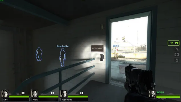
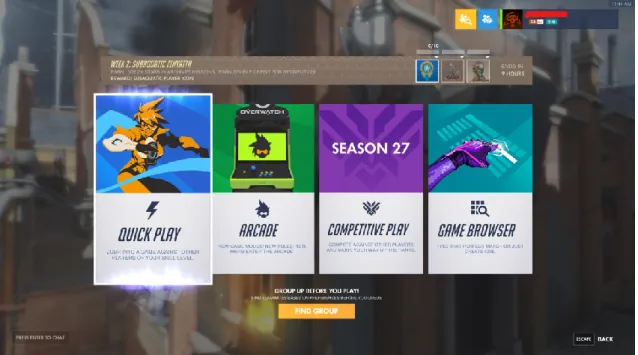
User interfaces in video games can be heavily stylized to represent the feel of the game's world, especially in role-playing games where thematics are often the top priority. Diegetic UI that can be interacted with or seen by the game's characters and the player (Fig. 7). Non-diegetic UI that cannot interact with or see the game's characters, but the player can (Fig. 6).
They can be, but are not required to interact with or be seen by the game characters. Non-diegetic UI elements and typed meta are placed on a 2D overlay plane between the game camera and the world behind it. UI elements can be images or even 3D models with animations, whatever enhances the feel and theme of the game the most.
In Kilta, most of the management takes place in the game's menus outside of battle, but the menu systems still provide a large amount of information, and its flow needs to be adjusted to improve the player's experience. If the player has an actual background in something relevant to the game setting or theme, they unconsciously support the immersion. So, when the player becomes more immersed, they start to behave according to the game's setting, which is what we want as game designers.
Metagames like this can reduce player engagement and cause problems if the game is trying to create emotional responses.
3 USER EXPERIENCE DESIGN
One of the more common challenges in game UX design is first noticing if there is too much screen clutter, and then finding ways to reduce it while still providing enough information for the player to act on. A dialogue window that pops up during an action scene can have unnecessary words in it, or closing parts of a HUD like windows with opaque backgrounds can cover up too much of the important gameplay behind it. Basically, the key is to remove or change any parts that prevent players from achieving the game's point and its intended experience.
If we imagine this example scene with many more objects in it than a notebook - we approach one of the fundamental challenges of immersive user interface. On the flip side, a player who puts in too many or simply too many interesting items may end up looking for answers in the wrong places and may feel irritated and lost. Depending on the type of game being developed, these methods can vary from adjusting information and gameplay to adding feedback for player actions, such as sound or visual effects.
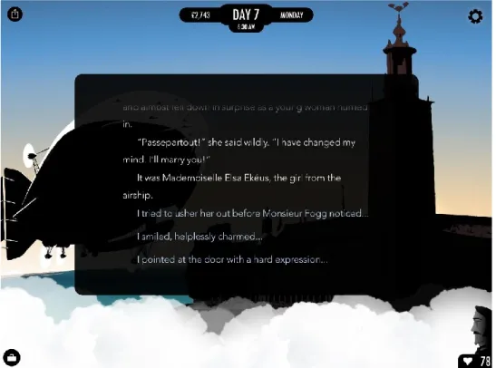
A game designer might plan to have the game rules as a wall of text for the player to read all at once. But since not all players are fast readers or enjoy reading in general, this may cause the player to experience negative feelings from the reading task. In the text game called 80 Days (Fig. 11), UX design was prioritized to compete with other games on the market that required less effort from the player to compensate for the investment of time in the game.
It is very important to set and agree common terms when communicating with other parts of the team, because the theoretical terms in UX are sometimes non-descriptive and can create misunderstandings. With the perspective of the audience, designers can find more ways to satisfy the end user. This shows roughly how many people know about the game and how it appeals to the current audience.
Each member can express opposing opinions and ultimately it is up to the developers to balance these and decide what is relevant and applicable to the original vision of the game. When a game's design wants the player to behave in a specific way, it needs to introduce something relevant to the player's controlled character that catches the eye but doesn't split the current focus. On the contrary, if unnecessary features like in-game money management and an all-or-nothing mentality were added to this design, it could repel some players who enjoy the game but are only lightly invested.
4 THE PROCESS FROM DESIGN TO ART
The hypothesis was that by creating menu graphics that support the aesthetics of the game world, a player is more likely to enjoy the experience—perhaps even to the point where a common in-game activity is viewed in a positive rather than neutral light. Since game development was previously focused on the mechanics and appeal of the fighting game, there was some freedom in making decisions regarding the direction of the menu graphics. This led to some more research into game graphics development, to see what the current best practices were, what was trending in visual styles, and different plugins to use in the Unity game engine.
In the end, new technologies were not used and a traditional workflow was used to avoid unknown problems. The game's message can be expressed through the music, the visuals, the mechanics or the dialogue. As said earlier in the writing, each player is an individual with different backgrounds, experiences and preferences, so they can experience the game in a way that the designers didn't even think of.
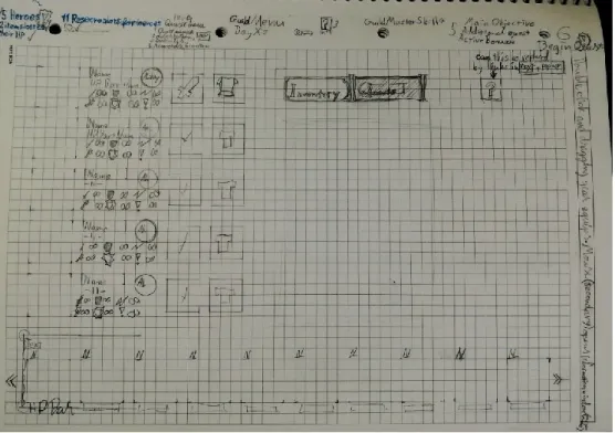
In the case of Kilta, there is not a clear focus on the message from a narrative point of view. The player acts as the guild master and in the guild menu their activities include:. In the first guild menu sketches (Figs 13 and 14) a non-diegetic approach was taken in the layout design and the existing buttons and images were arranged so that they were all pleasantly spaced in the same scene without the player having to open others make menu scenes.
One problem with this was that a background image of the guild's main hall could not be used to build a nice warm atmosphere, which was preferred to be preserved in the new design as well. Because a smooth background condition was not performed, the menu buttons do not have name tags completed on them in these images. They were made in collaboration with another artist from the team while discussing the atmosphere of the guild and the positioning of the objects.
At the top of the menu screens, shortcuts were provided as an option for players to move between scenes. In order to reflect the previous style of graphics made for this game, the textures in the user interface had to be softened in terms of the level of detail and high-contrast colors. In Figure 22, there are additional empty slots for inventory next to the hero's stats and a third tab above the inventory grid to show how the menu can be expanded later in development.
The layout of the previous questboard matched well with the new one, and it mostly needed visual changes. A small pendant was added in the lower right corner for the guildmaster skill options, but the team may have other plans for that in the future.
5 CONCLUSION