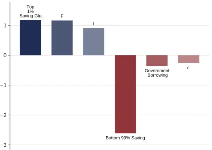
There has been a significant increase in savings by Americans in the top 1% of the income or wealth distribution since the early 1980s. The increase in savings by the top 1% of the wealth distribution since the early 1980s has been driven by an increase in the accumulation of financial assets.
The income less consumption approach
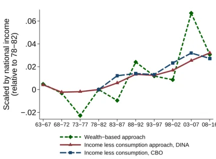
The average consumption share of the top 1% of the income distribution using the Fisher et al. Figure 1 plots the consumption share of the top 1% of the income distribution using this methodology.

The wealth-based approach
For the income less consumption approach, savings in a given year are calculated as the savings by individuals who are in the top 1% in the same year. For example, consider the group of individuals who are in the top 1% of the income distribution.
3 Magnitude and Absorption of Top 1% Savings
- Magnitude
- Absorbtion through traditional channels
- Dissaving by the bottom 90%
- Breaking down savings: asset accumulation and borrowing
In contrast, there is a large drop in savings by the bottom 90% of the income distribution. The wealth-based measure uses the wealth-based approach to measure savings by the bottom 90% of the wealth distribution.

4 Unveiling the Financial System to Measure Saving in Debt
- Unveiling the financial system
- Saving in debt across the wealth distribution
- Net household debt positions
- Financing the rise in government and household debt
This figure shows government and household debt in the United States over time, scaled by national income. The end result in the right-hand column is the holding of household debt as a financial asset by the U.S. Households increased their holdings of household debt by 7 percentage points of national income through these funds from 1982 to 2007.
The net household debt position is scaled by national income and the 1982 level is subtracted. Almost 40% of the increase in net household debt owed by the bottom 90% was financed by the top 1%.

5 Top Income Shares and the Saving Glut of the Rich
Measuring shares of wealth at the state level
First, state-level information is available from 1979 to 2008, meaning that the state-level analysis must be completed in 2008. 30Given that financial markets are well integrated across the United States, the state-level variation in the increase in top income shares is related only to asset accumulation by those at the top of the income distribution. As a result, a state-level analysis is unable to reveal whether the increase in top income shares is responsible for borrowing and saving by those outside the top of the income distribution.
As a result, the top 6% is selected as the main “highest income” category in the state-level analysis.31 The SOI data for the group of individuals in each state's observation year with AGI above $200,000 allows us to use the capitalization methodology to estimate the wealth of the top 6% in each state.32 More details are available in section C of the appendix. 32 Note the key difference in the country-level analysis is that instead of wealth shares in the wealth distribution, wealth shares in the income distribution are used.

Estimation strategy
Both equations 12 and 14 allow for estimation of the effect of an increase in top income shares on saving by a specific income group.
State-level results
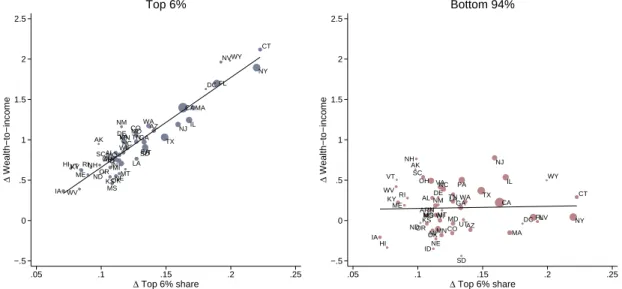
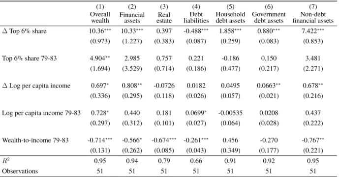
The results are similar: An increase in shares in the highest incomes is associated with a substantial increase in a state's wealth-to-income ratio over time. 34Table A6 in the appendix shows how the increase in the top income share is related to these four controls. Both techniques reveal similar quantitative effects of top income stocks on the savings of the top 6%.
Furthermore, about 25% to 35% of the increase in savings associated with the increase in top income shares is driven by an increase in the accumulation of assets directly linked to household and government debt. Overall, the state-level results help tie the increase in top income shares to the increase in savings by those at the top of the income distribution.
6 Conclusion and Future Directions
An advantage of the state-level analysis is that it allows us to control for other secular trends that may be responsible for both the rise in the shares of the highest incomes and the rise in the wealth of the wealthy. This suggests that factors related to demographic changes or changes in the industrial structure of employment are unlikely to explain the close relationship between the increase in the stocks of the highest incomes and the increase in the savings of the wealthy. Both tables show that the rise in stocks in the highest income brackets is associated with a large increase in financial asset accumulation, as opposed to real estate accumulation or a reduction in debt.
The increase in the savings abundance of the wealthy is closely related to the well-documented increase in income inequality in the United States since the 1980s. A recent speech by Haldane (2020) shows a large increase in the savings rate of high income individuals in the UK.
Guvenen, Fatih, Fatih Karahan, Serdar Ozkan, and Jae Song, "What do data on millions of American workers reveal about life-cycle income risk?", Technical Report, National Bureau of Economic Research 2019. Greg Kaplan, Jae Song, and Justin Weidner, "Lifetime Income in the United States," National Report of Economic Research, United States Technical Report 1010. D and James X Sullivan, "U.S. Consumption and Income Inequality Since the 1960s," Technical Report, National Bureau of Economic Research 2017.
Owen M Zidar and Eric Zwick, “Top Wealth in the United States: New Estimates and Implications for Taxing the Rich,” Technical Report, Working Paper 2020. Wolff, Edward N, “Household wealth trends in the United States, 1962 to 2016: Has middle-class wealth recovered?”, Technical Report, National Bureau of Economic Research 2017.
A Appendix for Sections 2 and 3
- Fixed income asset return for the top 1%
- Income and wealth shares for the top 1%
- More details on wealth-based approach to measuring savings
- Mapping for wealth-based approach
- Implied saving rate for the top 1%
- Decomposing saving for the next 9%
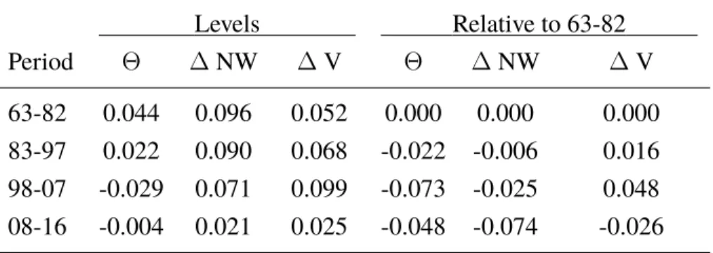
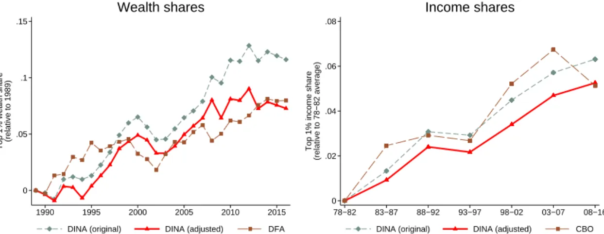
The left panel shows the wealth share of the top 1% of the wealth distribution using three data sets. Once we have the annual net amortization rate on mortgage and non-mortgage debt, we calculate how much of the debt amortization was on borrowed debt by the top 10% versus the bottom 90%. The best estimates of the savings rate of the top 1% of the income distribution come from the Survey of Consumer Finances.
Formally, suppose that the savings rate of the top 1% estimated in survey data is φtop1ˆ = ΘYtop1. In addition, let ψtop1 be missing income in surveys of the top 1% who have a 100% savings rate.
B Appendix for Section 4
Further details on unveiling
In words, this equation captures that the household debt share of asset classes is equal to its directly held shareηjHHD plus the indirectly held share through other asset classes, PJ. An unfunded DB pension cannot be a claim on the household's debt, because there is no actual financial asset that supports the uncovered part of the pension. The lack of this adjustment means that the current method overestimates the amount of household debt as a financial asset with the bottom 90% of the income distribution through pensions.
The Financial Accounts do not include an estimate of the equity of private depository institutions, which must be taken into account when distributing the household debt held by these institutions to other entities. Taking these equity holdings into account would boost the share of household debt held by the top of the income distribution, as the top of the income distribution hold a larger share of equity than other asset classes.
Additional graphs for Section 4
Estimates of private depository institution capital come from publicly traded banks through CRSP data. Finally, the disclosure process currently ignores stock holdings in other financial intermediaries such as the Agency's GSEs and life insurance companies.
C Appendix for State-Level Analysis in Section 5
More details on state-level data
As noted above, we obtain the average interest, dividend, and taxable pension income for units with AGI above $200,000 from the SOI aggregate data. To use these data in the Saez and Zucman (2016) capitalization technique, we also need the average estate income and non-taxable pension income for these same units. Indeed, we know Esy[I] thanks to the total state income group level data from the SOI - it is simply the average AGI for units with income above $200,000.
We then have the average corporate and municipal bond wealth for this income bracket in each state. We use the average interest, dividend and taxable pension income from the SOI aggregates in combination with the average property income and non-taxable pension income obtained through this procedure to obtain the capitalized measures of fixed income, equity and pension wealth.
State-level analysis: additional tables and figures
By doing this and comparing the values to the true SOI aggregate data, we obtain a correlation of 0.99 and a cross-sectional R2 of 0.98 between the mean values in the SOI aggregates and in our sampling. No imputation is required for wage earners under $200,000 and for all households in 1982—data for these wage earners, with state identifiers, are contained in the public use tax files. From these capitalized measures of total fixed income, equity, business and pension wealth, and their subcomponents, we construct a data set that contains, for different income groups in a state and year and for all the asset classes described in Section 2.4, that group's share of U.S.
With this, we apply the same disclosure process used at the national level to construct a measure of how much household and government debt is held as an asset for various income groups in a state and year. The dependent variable in column 1 is ∆wealth-to-income, the change in net wealth of top 6% in states scaled by state national income.
D Results using the DFA
It is important to note that this does not necessarily mean that the savings glut of the rich was reduced using DFA asset shares. Average annual borrowing (D) to the bottom 90% is similar using DFA or DINA asset ratios. However, DFA wealth shares indicate a lower rate of financial wealth accumulation (ΘF A) for the top 1% than DINA wealth shares from 1989 to 2016.
This translates into a smaller build-up of household debt (ΘHHD) and government debt (ΘGOV D) by the top 1% using DFA wealth stocks compared to DINA wealth stocks. In fact, DINA wealth shares imply the accumulation of financial assets of the top 1% of 2.7 percentage points of national income from 1963 to 1982.