Matrix Reordering Based on PQR Trees, Binarization and Smoothing
Bruno Figueiredo Medina*, Celmar Guimarães da Silva** School of Technology - University of Campinas
ABSTRACT
Providing good permutations of rows and columns of a matrix is necessary in order to enable users to understand underlying patterns hidden on its data. A previous work provided a preliminary version of an algorithm based on matrix binarization and PQR trees for reordering quantitative data matrices. This work proposes an improved version of this algorithm. It uses smoothing as an intermediary step for enhancing the capability of finding good permutations, without modifying original matrix data. The work exemplifies the potential of this technique by reordering scrambled synthetic matrices with underlying patterns.
Keywords: Matrix reordering, Smoothing, PQR Tree, Reordering Algorithms.
1 INTRODUCTION
Several areas use matrix reordering in order to highlight patterns and/or to facilitate analyses of a data set [3]. Being the permutation of rows and columns of factorial order, some reordering algorithms were created in order to speed up this process, such as 2D Sort [7], Barycenter Heuristic [4], Hierarchical Clustering [1], Multidimensional Scaling [10], among others.
Our research team developed two reordering algorithms based in PQR trees [9] for reordering binary matrices: PQR Sort [8] and PQR Sort with Sorted Restrictions [6] (or PQR Sort SR, for short). Recently, we presented an algorithm called Multiple Binarization that uses some steps of these two algorithms for quantitative matrix reordering [5]. This paper presents how smoothing techniques and a slight adjust on the use of PQR trees may be applied to Multiple Binarization for improving reordering quality of its output.
The paper is organized as follow: Section 2 presents briefly concepts of PQR tree, noise smoothing and Multiple Binarization algorithm; Section 3 presents our developed method; and Section 4 concludes the paper and presents future works.
2 RELATED WORKS
Our work is based in a data structure called PQR tree and reordering algorithms. Furthermore, it is related with noise smoothing. These issues are explained hereafter.
2.1 PQR Tree
PQR tree is a rooted tree that represents possible permutations of a universe set U. These permutations obey an input restriction set, where a restriction is a set of elements which should be consecutive on the resultant permutations. This tree has four node types: P, Q, R and leaves, as follow [9]:
Leaves are the elements of U;
A P node enables any permutation of its children; A Q node enables only reversal of its children;
An R node is similar to P node, but occurs only when its children may not be permuted in order to obey simultaneously all restrictions.
For example, Figure 1:a shows a PQR tree representing all permutations of the universe set U={a,b,c,d,e}. Figure 1:b to 1e show how this tree changes after adding sequentially the restrictions {a,b}, {c,d}, {a,c,d} and {b,d}. Until adding restriction {a,c,d} (Figure 1:d), all restrictions are being obeyed, i.e., the elements of any restriction of the restriction set are consecutive. After adding the last restriction on the tree (Figure 1:e), we can observe that this was not obeyed ("b" and "d" are not consecutive); therefore, an R node occurs.
Figure 1: Example of adding restrictions iteratively to a PQR tree. Also note that the tree frontier (i.e., its leaves, read from left to right) is the easiest permutation to be obtained from the tree, given that no permutation should be done in order to get it.
It is important highlighting that a PQR tree does not change when one adds to it a restriction whose elements are leaves with a common R node as their ancestor. For example, if we add the restriction {a, d} to the tree at Figure 1:e, the resulting tree would be exactly the same.
Besides, note that even after creating the R node, the frontier still obeys some of the previous restrictions inserted in the tree
and related to this node. This indicates that restrictions’ insertion
order may affect how many restrictions the frontier obeys.
2.2 Multiple Binarization Algorithm
Multiple Binarization [5] is a method created to reorder quantitative matrices. Its name is related to one of its steps, which consists on creating multiple binary matrices used to obtain restrictions sets and to create two PQR trees (one for rows and one for columns).
Therefore, taking as input a data quantitative matrix M, to be reordered, and a set of delimiter values , the reordering is made as following:
1. Create k binary matrices , where
= 1 if M(r,c)> , otherwise = 0; 2. For each , create two restriction sets: one
representing row restrictions and other column restrictions. A row restriction contains row labels
r1,r2,…,rn if there is at least one possible value of c such as M(ri,c)=1 for all 1 ≤ i ≤ n. A column restriction may be defined similarly to a row restriction.
3. Define two union sets, one for rows and other for columns. Row union set have all row restrictions of each binary matrix obtained in Step 2, without repetition. Column union set have all column restrictions of each binary matrix obtained in Step 2, without repetition.
______________________________________________________ * E-mail address: bruno.medina@pos.ft.unicamp.br
4. Sort row union set and column union set in ascending order of restriction size, generating two ordered lists. 5. Create two PQR trees, one for rows and other for
columns, using as input the row and column restriction lists (Step 4), respectively.
6. Reorder rows and columns of M according to the frontier of both PQR trees.
7. Return the reordered version of M created in the previous step.
In this algorithm, Steps 2 and 4 belong to the intermediate process of the PQR Sort and PQR Sort SR algorithms, respectively.
2.3 Smoothing
Smoothing is an Image Processing technique which aims to reduce noise and enhance image quality. Gonzalez and Woods [2] present some smoothing techniques, from which we used the mean filter with a 3 × 3 box filter as a first approach to our problem. Briefly, it consists on creating a new matrix S such as
;
i.e., it calculates S(r,c) as the mean value of a 3 × 3 neighborhood centered on M(r,c). In this formulation, values outside M borders, when consulted, should be considered as 0.
3 WORK IN PROGRESS
We perceived that Multiple Binarization algorithm has some difficulties in producing “good” reordered matrices in presence of noise, but returns good results where noise level is low or absent. Therefore, we present a new reordering algorithm which mixes Multiple Binarization method and mean filter in order to overcome this difficulty. We propose to remove noises (with mean filter) that become visible after a first reordering process, and then to reorder the smoothed matrix. After that, we reorder the original matrix according to row and column ordering of the smoothed one.
Additionally, we observed that the early creation of R nodes in the PQR trees of this method potentially hampers to find a matrix reordering that evidences an implicit pattern in the data set. In this sense, we opted for discarding restrictions whose insertion at a PQR tree creates an R node.
Our new algorithm (which we call Smoothed Multiple Binarization (or SMB)) has the following steps:
1. Reorder the input matrix by Multiple Binarization algorithm, with a slight difference in its Step 5: if adding a restriction to the tree results in a new R node, then discard this tree and use the last tree, which has no R nodes.
2. Smooth the reordering matrix with a mean filter; 3. Repeat Step 1 in the smoothed matrix.
4. Use rows and columns order generated by Step 3 to reorder input matrix, and return it as the result. Figure 2 exemplifies these steps.
Figure 2: Example of reordering by Smoothed Multiple Binarization.
Figure 3 presents examples of the outputs of SMB and Multiple Binarization (MB) algorithms. We compared them to the output of
other two algorithms: classical Multidimensional Scaling (MDS) (which Wilkinson points out as a good reordering algorithm [10]) and Barycenter Heuristic (BH) [4]. This figure shows matrices created according to canonical data patterns [10], with size 650 × 1000, cells with real values between 0 and 100 and noise ratio of 1% in the data set. We used the following delimiter values:
For MB and SMB: Circumplex: {45, 50, 55, 60, 99}, Band: {50, 80}, Equi: {10, 15, 20, 25, 30, 35, 40, 45, 50, 60, 70, 80, 90, 95}, Simplex: {50, 40};
For BH: Circumplex: {99}, Band: {80}, Equi:{50}, Simplex: {50}.
Comparing these images, we observed that SMB was the unique to evidence Circumplex pattern, while MDS and BH try to create a Band pattern in this case. In Band and Simplex patterns, MDS and BH produced the best results; MB and SMB returned poor results. For Equi, SMB and MDS provided the best images, at a cost of defining many delimiters for SMB (which impacts SMB performance).
Figure 3: Reordering of the canonical Pattern by algorithms Smoothed Multiple Binarization (SMB), Multiple Binarization (MB), Multidimensional Scaling (MDS) and Barycenter Heuristic (BH).
4 CONCLUSION
We conclude that “Smoothed Multiple Binarization” has a potential to produce better results than our previous proposal. We also conclude that its result on reordering Circumplex pattern was closer to the original matrix than the result of other methods; MDS and BH results could lead to misinterpretation of the dataset.
Future works include comparing our new algorithm with other reordering algorithms, in terms of statistically measured output qualities and execution time, using MRA tool [8].
REFERENCES
[1] Z. Bar-Joseph et al. Fast Optimal Leaf Ordering for Hierarchical Clustering. BioInformatics, volume 17, pages 22–29, 2001. [2] R.C. Gonzales and R.E. Woods. Digital Image Processing. 3ª
Edition, Prentice Hall, 2010.
[3] I. Liiv. Seriation and Matrix Reordering: An Historical Overview. Wiley Interscience, 2010.
[4] E. Mäkinen and H. Siirtola. The Barycenter Heuristic and the Reorderable matrix. Informaton Visualization, pages 32-48, 2005. [5] B. F. Medina and C. G. Silva. Using PQR trees for reordering
quantitative matrix. Proceedings of Computer Graphics, Visualization, Computer Vision and Image Processing - MCCSIS, July 2014.
[6] M. F. Melo. Improvement of PQR-Sort algorithm for binary matrices reordering. Master's thesis. School of Technology, University of Campinas, 2012.
[7] H. Siirtola and E. Mäkinen. Reordering the reorderable matrix as an algorithmic problem. Lecture Notes in Computer Science - LNCS, volume 1889, pages 453-468, 2000.
[8] C. G. Silva et al. PQR-Sort - Using PQR-Tree for binary matrix reorganization. Journal of the Brazilian Computer Society, 20:3, January 2014.
[9] G.P. Telles and J. Meidanis. Building PQR-Tree in almost-linear time. Eletronic Notes in Discrete Mathematics, 19:33-39, January 2005.
WISE: A web environment for visualization and
insights on weather data
Igor Oliveira, Vin´ıcius Segura, Marcelo Nery, Kiran Mantripragada, Jo˜ao Paulo Ramirez, Renato Cerqueira IBM Research Brazil
Av Pasteur, 138/146 - Rio de Janeiro RJ, 22296-903, Brazil
Fig. 1. Screenshot of WISE portal with example forecast for April 14th, 2014. Main panel show forecasted precipitation map (colours) and observed rain gauge data (circles).
Abstract—Weather-oriented operations usually consume large amounts of data produced by numerical weather predictions (NWP). The visualization of such data is usually based on static charts, plots and sometimes video-based animations that tries to cover spatial and temporal dynamics of atmospheric conditions. This standard visualization may serve climate agencies and skilled meteorologists, but it often does not provide enough insights for organizations that have their processes oriented by weather events. In order to support complex operations of a city, we developed WISE (Weather InSights Environment), a visual-ization platform that combines the numerical data generated by a NWP with the sensor network, and presents the data in a web interactive interface. WISE users reported that it provides much better and summarized information to be consumed in the daily operations of a city.
I. INTRODUCTION
Weather forecast information is a valuable asset in opera-tions driven by atmospheric condiopera-tions. The decision makers, responsible for managing complex systems such as cities and large companies, must analyze several weather variables during the daily routines or in case of emergency situations. Numerical weather prediction (NWP) produces most of the weather data that are consumed by them. Moreover, a well-designed visualization system is crucial, adding vital informa-tion to the numerical results that allows the user to interpret get insights about the data.
The majority of existing visualization tools available are converters of model raw data to some form of static output. Atmospheric models, in general, produce data in GRIB1 or
NetCDF [1] formats and users refer to several community tools for the manipulation of this data. Some of these tools can produce very simple plots, like GrADS [2] or NCL2 (which has a more complex scripting language). There are also more sophisticated ones that can generate high quality 3D output, like VAPOR [3]. Although these are consolidated tools in the meteorological community, they lack interactivity and they do not allow comparison with the real-world data.
In this work, we present WISE (Weather Insights Environ-ment), a platform that improves insightful analysis over the weather information, taking full advantage of data. In the next section, we discuss the motivation behind WISE’s develop-ment. Later, section III introduces the layered architecture of the platform. The following section details the insightful web interface and its data visualizations. Finally, we conclude with some final remarks and potential future works.
II. MOTIVATION
WISE was initially developed to read data produced by IBM Deep Thunder3 (DT), a weather system based on a regional atmospheric model (WRF-ARW [4]). Currently, many locations around the world run and use the DT system.
The city of Rio de Janeiro is one of these locations, where it is used in the city’s center for command and control (named Centro de Operac¸˜oes Rio - COR). COR coordinates several agencies that operate within the city limits – from traffic management to urban cleaning and security departments. Dur-ing emergencies, COR orchestrates a coordinated effort to mitigate the impacts. In COR’s application, DT provides high resolution (1km grid) rainfall estimates and flood forecasts to support COR’s main role of managing weather-related emergencies in the city, mostly caused by extreme weather conditions (such as storms and long-term precipitations).
Before the development of WISE, the users of DT in COR had access to the weather information in the form of videos, plots, and tables delivered through a web portal. They observed a need for a visualization tool that provides more interactivity and improved exploration of the data, establishing an environment that stimulates insights over the forecast data. In addition, we also observed a need to integrate with COR’s operational workflow and data collected by the sensor network (rain gauges and weather stations). Those fronts were the main motivations behind WISE.
III. ARCHITECTURE AND IMPLEMENTATION
WISE platform was envisioned to support multiple cus-tomers and real time data consumption from multiple sources. Currently, WISE is able to store and present data from DT and also from CPTEC4 forecasts. Both systems produce geospatial forecast data for multiple properties – including scalar (e.g. precipitation and temperature) and vectorial (e.g. wind). Regarding real-time data, WISE is able to store and
2http://www.ncl.ucar.edu/
3http://www-03.ibm.com/ibm/history/ibm100/us/en/icons/deepthunder/
4http://www.cptec.inpe.br/
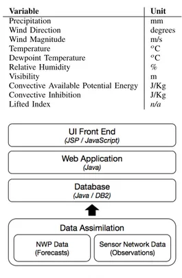
TABLE I
METEOROLOGICALVARIABLES
Variable Unit
Precipitation mm
Wind Direction degrees
Wind Magnitude m/s
Temperature o
C
Dewpoint Temperature o
C
Relative Humidity %
Visibility m
Convective Available Potential Energy J/Kg
Convective Inhibition J/Kg
Lifted Index n/a
Fig. 2. Architecture.
present data from devices deployed on a particular area, like a rain gauge network.
In COR’s application, DT generates data twice a day with many forecasted variables. To effectively support the opera-tions in COR, we selected the variables shown in Table I to be handled by WISE.
The system is divided into layers (figure 2), each one with a distinct role. The UI Front End layer is responsible for providing the end-user data visualization and runs on the user’s browser. TheWeb Applicationlayer acts as a bridge exposing an API to organize in a better way the access to the underlying Database layer. The Data Assimilation layer is responsible for populating the database regularly.
A. UI Front End
The visualization layer is a composition of JSP (Java Server Pages) and JavaScript. For the data visualization, we use the d3.js [5] framework and the Google Maps API for the geolocalization and map features. The combination of these two javascript technologies results in SVGs elements overlaying the map and composing charts and tables for data. Every piece of data required to build the UI is pulled from the Web Application layer by asynchronous calls. Several call are made simultaneously, enhancing WISE’s loading time.
B. Web Application
layer using the parameters specified by the UI and packs the result to send it back to the UI.
The response is sent in a JSON or CSV format, depending on the request. As the generated response can include a large list of items, the JSON format proved to increase considerably the response size, since the property names are replicated for every data point (as opposed to a single header line in the CSV format). Hence, in some cases, the CSV format is preferable to optimize the communication traffic involving the UI layer and Web Application layer. We also considered to use binary formats for further optimization, but the CSV format seemed to be enough for the communication currently taking place.
C. Database
The Database layer consists of a Java API built to expose an IBM DB2 entity-relational database. The database schema was designed to fulfill the needs of multiple customers, so that the location being presented on the UI is fully defined by the data that gets loaded into the database, and not by its schema or any constants defined in code. Each particular forecast can have multiple grids associated with it, with its own bounding boxes and other parameters.
Besides the “forecast” schema, there is also an “observed” schema which holds the data regarding the sensor network, such as rain precipitation for given locations and timestamps. Finally, there are also tables helping to compute the accuracy of the forecast system according to the actual rain fall observed by the sensor network.
D. Data Assimilation
The NWP generates the forecast variables in NetCDF for-mat. Then a post-processing script filters out some particular properties (table I) and makes it available in a way that it can be stored in the relational database. For the experiment with the city of Rio de Janeiro, the sensor network data is obtained as an XML file that is parsed and stored on the database. Both of these processes are executed regularly, since new forecasts can be produced multiple times a day and the sensor network data is usually available on intervals of about 15 minutes.
IV. INSIGHFUL WEB INTERFACE
We created the WISE UI (figure 1) by keeping in mind the visual information-seeking mantra “overview first, zoom and filter, then details-on-demand” [6]. We also planned to provide a valuable interaction environment for the weather experts professionals in COR, specially designed for the daily operations and emergency situations as well.
A. Portal
The main view (figure 1) is composed of a map showing the forecast data for a given parameter (the meteorological variable produced by NWP). For some parameters, the ob-served data (supplied by the sensor network) is also rendered as circles, allowing quick comparison between forecasted and observed data.
Fig. 3. Precipitation profile detail, showing distributions of precipitation categories for a given timestep.
Below the map, we present the precipitation profiles for the forecasted and observed data. This visualization component has three main functions:
• provide a quick overview of the rain rate distribution across the whole forecast duration
• work as a timeline to control the data being currently viewed on the map
• highlight the instants where an operational alert would be triggered according to defined criteria
The x-axis is the traditional time axis, covering all the forecast. The y-axis is a percentage axis, ranging between 0 and 1. The data is organized according to 7 rain rate categories (as defined in [7]), shown in figure 3 and figure 4 with their names and colors.
The width of each column is related to the timestep be-ing viewed. For example, the observed data come from the sensor network with a 15 minute refresh rate. Therefore, in the observed precipitation profile, each column has width proportional to 15 minutes. If all data points in a timestep are in the “No Rain” category, the whole column is colored with the “No Rain” category color. Grey columns show timesteps where we don’t have data to display (for example, if there is no observed data due to being a time in the future).
If the data show some rain, we display the rain rate dis-tribution. The line shows the percentage of data points which are in a category different than the “No Rain” (in figure 3, for the blue highlighted column – also indicated by the arrow for clarity purpose –, the mouse over text details the value 30.43%). Each column is divided according to the percentage of each rain category in that timestep. For example, in figure 3, the “Weak” category has 68.19% of rain observations.
Inside the precipitation profile there is a black rectangle contour showing the current time being displayed on the map. If the user clicks in any place in the precipitation profile, the map will be updated to show the adjusted time.
Fig. 4. Verification Metric view, with contingency tables and metric statistics.
is displayed.
When the user clicks on a cell in the map, we display in the right panel the meteograms associated with the chosen cell. To allow comparisons between different cells, the y-axis of the meteograms are predefined. If the data falls outside the predefined range, we update the range and highlight it with a red color (for example, the meteogram in the bottom of figure 1). Hovering the mouse displays the values in every meteogram for that given time. Clicking the mouse changes the current time in the main map view.
B. Forecast verification metrics
The Forecasts Metrics view (figure 4) plays an important part in WISE UI. The metrics are summarized in [8]. It brings a column chart with the overall score for the available forecasts (top part of figure 4). A red column indicates a forecast which has not been received by WISE, due to the lack of computational resources, missing data, or any other error. The user can select a subset of forecasts presented in the column chart and the metric displayed concerns all the existing forecasts within the chosen range, allowing the user to be aware of the system performance. The metric visualization consists in the contingency matrix, the underestimated, hits and overestimated count, and the weighted CSI, SR and POD values.
In addition, there is a column chart formed by each forecast within the user selected range and the associated overall score. Below each column, there is the corresponding contingency matrix miniaturized as shown in figure 5.
The colors inside the contingency matrix cells indicate underestimated, hits and overestimated events as magenta, green and yellow respectively. The transparency factor is given due to the influence the cell has when computing the score – the more opaque the color, the higher the influence.
V. CONCLUSIONS ANDFUTUREWORK
This work presented the WISE platform, an integrated web interface designed to visualize weather data. It combines data
Fig. 5. Selected range metric column chart.
from NWP and sensor network, providing better insights and interpretation of the data. Users of the WISE platform reported that this approach provides much better and summarized information to be used in the daily operations of a city.
Since this is still a work in progress, we are envisioning to improve some aspects of the platform. Considering that is virtually impossible to cover the geographic area with an in-situ sensor network, it should be interesting to consider some interpolation method in order to provide comparable observed versus predicted precipitation data. Another aspect of improvement is the collection of observed data. Nowadays, The sensor network comprises 88 rain gauge devices, but we are studying ways to integrate data from other agencies what would increase this number to around 110. Regarding visualization improvements, we are investigating techniques in order to present comparison between different forecast simulations for the same time range.
REFERENCES
[1] R. Rew and G. Davis, “NetCDF: an interface for scientific data access,” Computer Graphics and Applications, IEEE, vol. 10, no. 4, pp. 76–82, 1990.
[2] P. Tsai and B. Doty, “A Prototype Java Interface for the Grid Analysis and Display System (GrADS),” in Proc. 14th Int’l Conf. Interactive Information and Processing Systems for Meteorology, Oceanography, and Hydrology, 1998, pp. 11–16.
[3] J. Clyne, P. Mininni, A. Norton, and M. Rast, “Interactive desktop analysis of high resolution simulations: application to turbulent plume dynamics and current sheet formation,”New Journal of Physics, vol. 9, no. 8, p. 301, 2007.
[4] W. C. Skamarock, J. B. Klemp, J. Dudhia, D. O. Gill, D. M. Barker, M. G. Duda, X.-Y. Huang, W. Wang, and J. G. Powers, “A Description of the Advanced Research WRF Version 3,” Tech. Rep., 2008. [5] M. Bostock, V. Ogievetsky, and J. Heer, “D3; Data-Driven Documents,”
Visualization and Computer Graphics, IEEE Transactions on, vol. 17, no. 12, pp. 2301–2309, Dec 2011.
[6] B. Shneiderman, “The eyes have it: a task by data type taxonomy for information visualizations,” in Visual Languages, 1996. Proceedings., IEEE Symposium on, Sep 1996, pp. 336–343.
[7] J. P. Cipriani, L. A. Treinish, A. P. Praino, R. Cerqueira, M. N. Santos, V. C. Segura, I. C. Oliveira, K. Mantripragada, and P. Jourdan, “Customized Verification Applied to High-Resolution WRF-ARW Forecasts for Rio de Janeiro,” Abstract, Feb 2014. [Online]. Available: https://ams.confex.com/ams/94Annual/webprogram/Paper240128.html [8] L. A. Treinish, J. P. Cipriani, A. P. Praino, R. Cerqueira, M. N. D.
Visualizing sparsity in probabilistic topic models
Bruno Schneider EMAp – FGV Rio de Janeiro, Brasil Email: bruno.sch@gmail.com
Asla Medeiros e S´a EMAp – FGV Rio de Janeiro, Brasil Email: asla.sa@fgv.br
Abstract—In probabilistic topic modeling, documents are clas-sified accordingly to categories previously modeled, which are the topics itself. Each document is commonly associated to more than one topic and the number of topics that a particular document will present is something that depends on the parameters of the topic model. In this context, it is useful to have visualization tools that could show the distribution of topics over documents in respect to different choices of the model parameters. Those parameters make the correspondent topic distribution vectors more or less sparse. This work presents an application of visu-alization to support text categorization tasks using probabilistic topic models.
Keywords-Latent Dirichlet Allocation (LDA); Topic Modeling; Visualization;
I. INTRODUCTION
As part of the results obtained from a Master’s dissertation on topic flow visualization, here we present an application of visualization to show topic distribution over time in a modeled corpus. More specifically, the main objective of this work is to show how much concentrated is the distribution in a small number of major topics or a larger number of them. This kind of view from the collection – which shows the sparsity of the document vectors being represented – leads to an immediate recognition of the main topics of each document, for any document represented. Somehow, we do not intend to substitute visualization techniques like the one described in [1], but to complement them. The algorithms [2] used for topic discovery came from an open source version of a Latent Dirichlet Allocation (LDA) topic modeling package1.
II. THEORETICAL BACKGROUND A. Latent Dirichlet Allocation (LDA)
The probabilistic topic model used in this work is an unsupervised method for topic discovery. The intuition behind the model is that any document has multiple topics [3]. The observed variables are the words in the documents. From those variables, the topics and their proportion in each document are inferred. LDA is a representative of Bayesian inference mod-els. Just for curiosity, the topics themselves are distributions over words from a fixed relevant vocabulary extracted from the observed corpus.
In the inference process, the a priori distribution used to represent the uncertainty about the topic proportions of a document is a Dirichlet distribution [4]. This distribution has a
1http://radimrehurek.com/gensim/ (accessed on June 10, 2014).
concentration parameter called alpha. For text categorization purposes, alpha is typically set to give a small number of topics associated to each document of the modeled corpus. The small alpha values penalize documents that talk about a lot of subjects, but this is better than having every text of the collection associated to many topics. In this later case, it would be difficult to use the topic categorization for document clustering applications, for example.
B. Pixel-matrix displays
The Pixel-matrix2 visualization is a technique that permits the exhibition of multidimensional / multi-categorical data in an ordered way. In those graphics, for multi-categorical data we could have each category of the dataset represented in a different row, and each pixel3 represents a single data value. Different colors are chosen to discriminate categories and, for each pixel, every data value is mapped to a colormap.
Scalability is one issue related to Pixel-matrix displays. Depending on the size of the dataset, it could be impossible to display all the data in the same graphic. However, for appli-cations in which data could be transformed (e.g. aggregated), the scalability restrictions are attenuated.
III. VISUALIZATION TECHNIQUES APPLIED TO TOPIC MODELING TASKS
The Pixel-matrix visualization implemented to show topic distribution over time was adapted for better displaying the main topics and the concentration over them along a corpus. This result was achieved by simply reordering each column of the pixel matrix from the most present topic in a document (or an aggregate of documents) to the less present.
Describing in more detail the output obtained in Figure 1, in the vertical dimension are the topics (one for each row) and in the horizontal dimension are the documents, ordered by time. For each document (which corresponds to one column in the pixel matrix), its topic proportions could be read by observing which topics are presented in this document. Any individual topic is represented by a different color in the graphic and the variation in saturation for each color represents more or less presence of each topic in a document.
On the other hand, in Figure 2 we have the same result obtained in the previous figure, but this time each column
2The Pixel-Matrix Display is better presented in [5]
Fig. 1. Topic flow visualization from messages published in eletronic forums, sorted by date and modeled with 50 topics. Top-ics are represented in the vertical dimension and their evolution over time is represented into horizontal dimension (20newsgroups dataset; http://people.csail.mit.edu/jrennie/20Newsgroups/20news-bydate.tar.gz)
was reordered from the most to the less present topic. The last row (from top to bottom) have been named as themain topic bar. Considering that the matrices representing a collection of document vectors (with their respective proportions) are very sparse, the effect obtained by reordering the rows is a much clearer view of the corpus main topics. This last view could not be obtained without reordering as we have seen in Figure 2, and the sparsity partially accounts for this impossibility. Somehow, the presence of few topics associated to each document is intentional as described before, because of the advantages that this choice brings to text categorization applications.
IV. CONCLUSION
As part of a broader research on visualization of topic flow over time, the Pixel-matrix displays presented here could be used as a useful tool for researchers involved in the topic modeling fine-tuning issues. Furthermore, the visualization technique previously described gave a by product, which we have called the main topic bar. From this bar, anyone can quickly access the evolution of the most present topic onto a corpus. This component could also be isolated and give room for the development of other views of the collection focusing on the main theme evolution of the corpus.
REFERENCES
[1] S. Havre, E. Hetzler, P. Whitney, and L. Nowell, “Themeriver: Visual-izing thematic changes in large document collections,”Visualization and Computer Graphics, IEEE Transactions on, vol. 8, no. 1, pp. 9–20, 2002. [2] R. ˇReh˚uˇrek and P. Sojka, “Software Framework for Topic Modelling with Large Corpora,” inProceedings of the LREC 2010 Workshop on New Challenges for NLP Frameworks. Valletta, Malta: ELRA, May 2010, pp. 45–50, http://is.muni.cz/publication/884893/en.
[3] D. M. Blei, “Probabilistic topic models,”Communications of the ACM, vol. 55, no. 4, pp. 77–84, 2012.
[4] D. M. Blei, A. Y. Ng, and M. I. Jordan, “Latent dirichlet allocation,”the Journal of machine Learning research, vol. 3, pp. 993–1022, 2003. [5] M. C. Hao, U. Dayal, D. A. Keim, and T. Schreck, “A Visual Analysis
CivisAnalysis: Unveiling Representatives’ Policies
Through Roll Call Data Visualization
Francisco G. de Borja Instituto de Inform´atica, UFRGS
Porto Alegre, Brazil www.inf.ufrgs.br/∼fgborja
Carla M. D. S. Freitas Instituto de Inform´atica, UFRGS
Porto Alegre, Brazil www.inf.ufrgs.br/∼carla
Fig. 1. CivisAnalysis main interface showing the political spectrum of deputies (A), the political spectrum of roll calls (B), the graph of deputies vote correlation (C), the states infographic (D), parties infographic (E) and the timeline (F) with a selected time frame (1999-2000) of roll calls from the Brazilian Chamber of Deputies.
Abstract—The democratic process relies on active and knowl-edgeable citizens; without information about laws and public policies approved by representatives, citizens fail to oversight the government. The aim of this work is to assist the gathering of political information, by providing an investigative tool for roll call analysis of the Brazilian Chamber of Deputies. More than 20 years of recorded votes and electoral alliances can be explored through different roll call analysis techniques. A novel approach for detecting voting patterns is also presented, the political spectrum of roll calls.
Keywords-Information Visualization; Voting Analysis; Roll Call Analysis; Political Information.
I. INTRODUCTION
of their public life: speeches, interviews, meetings, etc. One stands out for having a direct impact in society: their votes in congress.
In roll calls, each representative explicitly chooses for an option on a policy (Yay,Nay, Absence,...). So, roll call votes are a reliable data set for understanding the representatives’ policies.
This work focuses on roll calls which have taken place in the Brazilian Chamber of Deputies (lower house). The chamber comprises 513 deputies, who are elected by proportional rep-resentation to serve four years terms. The current legislature, since February of 2011, has voted in 352 roll calls (with a total of 114,994 votes). These data increase in complexity if the content of each roll call is relevant to the analysis. So, to assimilate this information citizens need assistance to keep track of their representatives voting record.
With the raise of Internet and open government initiatives, political data became available and is easily shared, allowing the dissemination of information among many. However, the huge volume of unorganized and highly biased information spread over the Internet may cause a negative impact on the assimilation of information, the effect commonly called information overload. The challenge is to retrieve cohesive information from the political big data and communicate it to the common citizen.
Using the open data from the Brazilian Chamber of Deputies, we developed a visualization tool, which is designed to reduce the level of complexity and time required to discover and comprehend congressional voting patterns. The data set covers voting records of 6 legislatures (24 years), 914 par-liamentary motions voted through 2,458 roll calls (853,952 votes), plus the information of 6 presidential elections, the alliances and outcome. The possibility of exploring arbitrary time frames across legislatures, visualizing the voting pattern of each roll call over deputies and vice versa, comparing the electoral alliances and parliamentary coalitions, makes our system a powerful tool to discover political information.
Contributions: This work integrates new visualization techniques of roll call analysis with techniques from related works. The tools and data available, roll calls of 6 parliamen-tary legislatures of the Brazilian chamber of deputies and 6 presidential elections, offer an unique view of the Brazilian political history. Our main contributions are: (1) visualization of roll call votes as a n-dimensional space, coupling the votes of a roll calls set with the spectrum of deputies and, vice versa, the votes of a set of deputies on the roll call spectrum. (2) integration of electoral data in the roll call analysis visualization, outcome and alliances.
We address background and related work in the next section; then, we present our tool, which is called CivisAnalysis. Finally, from a user’s viewpoint, we discuss the importance of such data for the analysis of the Brazilian Chamber of Deputies, and, from the computational viewpoint, we address the improvements we foresee as future work.
II. BACKGROUND ANDRELATEDWORK
Alliances and Legislatures in Brazil: In Brazil, every four years a general election is held: the Presidency of the Republic, all 513 Chamber of Deputies seats and two-thirds of 81 Federal Senate seats are contested along with governorships and state legislatures of all 27 states. Executives are elected by simple majority; Representatives are elected by open-list proportional representation (parties choose the candidates, voters choose the party and preferred candidate), the seats are allocated through a variant of the d’Hondt method [1]. Electoral alliances are counted as a single party, votes are distributed inside the alliances to the leading candidates without considering the parties. Thus, electoral alliances do not respect the citizen preference of vote regarding party.
In Brazil, post-election alliances (coalitions) are formed in order to set a multiparty pro-government majority (in favor of elected government) and the opposition base. The ideological spectrum of parties in the Brazilian legislature term is partially reduced to a government-opposition dimension. Studies of Brazilian legislatures and coalitions cite the important role of presidential elections and electoral alliances on the patterns of legislative behavior [2], [3], [4].
Roll Call Analysis: Most theories of campaigns, legisla-tures, and elections today are based, explicitly or implicitly, on the spatial model of politics. Studies aim at positioning each political player at its ideal point on a spectrum [5]. This produces techniques with results that can be interpreted both in probabilistic and in geometric terms. Works estimate congressional spaces from transcripts of hearings, bill co-sponsorships, public opinion surveys, committees seats, cam-paign contributions, and roll call votes [6], [7]. Roll calls are commonly used in spatial models due to their reliable nature to express the policy of each representative. The Spatial Theory of Voting put into practice with roll call analysis was concisely highlighted by Clinton [8]: In short, roll call analysis makes conjectures about legislative behavior amenable to quantitative analysis, helping make the study of legislative politics an empirically grounded, cumulative body of scientific knowledge.
Poole and Rosenthal algorithms [9], the NOMINATE fam-ily, are widely used in roll call analysis and compares favorably to more modern algorithms [10]. In contrast to the complexity of previous methods, fast and less accurate techniques are used, as for example, Principal Component Analysis (PCA). PCA or Karhunen-Loeve transformation [11] reduce the number of dimensions, while retaining the variance of the data. These dimension reduction techniques try not to crush different points together, but remove correlations. The remaining subset of dimensions are a compact summary of the variation in the original data. Despite the relative inaccuracy of PCA to find ideal points on the roll call space, the voting patterns formed are quite similar to those obtained with other more complex methods [12].
in one or more geometric axes that symbolize independent political dimensions. Such systems try to provide ways of solving the problem of how to describe the political variation. Early systems were usually built around questionnaires and regression analysis, and often referred as highly biased because constant adaptation was needed to represent political contexts [13].
In order to reduce bias, modern systems tend to use only quantitative information from Representatives, especially from recorded votes. Social Action [14] represents the correlation of votes between U.S. Senators creating a force-directed graph. Filters and statistical tools can be applied interactively by the user to discover the patterns among voting groups at a single point in time. In contrast, Friggeri’s [15] visualization shows the paths of U.S. Senators through agreement groups for the last eight Congresses providing a long-term political overview, but without details on demand.
Connect 2 Congress (C2C) [16] creates a two-dimensional political spectrum (through NOMINATE scores and Leaders-Followers) for arbitrary time frames within two years (2007-2008), and implements a window that can be enlarged and translated along time, providing an animation where repre-sentatives are repositioned according to their behavior over the newly selected period. C2C does not have inter-legislature analysis.
For the Brazilian Congress, Marino’s work [17] and Ba-sometro [18] create a two-dimensional spectrum, and adjust the scales along a diagonal axis according to government coalition and opposition in way similar to Rosenthal’s NOM-INATE analysis of France legislatures (anti/pro-regime axis) [19]. Marino’s work is based on a year by year animation of PCA analysis. Basometro, from Estad˜ao newspaper, uses two criteria ofgovernment supportand implements deputy tracking on a growing window animation.
III. CIVISANALYSIS
Our software, named from Latincivis(citizen) plusanalysis, is implemented as a web application (MongoDB, Node.js, JavaScript) capable of running in any modern browser. All the data come from open web services of the Brazilian Cham-ber of Deputies (www.camara.gov.br). All roll call analysis techniques run at the client side.
The system consists mainly of four visual components: a timeline to select time frames (Fig. 1F) and three roll call analysis visualizations: a two-dimensional spectrum of deputies (Fig. 1A), a two-dimensional spectrum of roll calls (Fig. 1B) and a graph representing the vote correlation between deputies (Fig. 1C). To enhance the roll call analysis we added infographics of the electoral districts, the Brazilian states (Fig. 1D), and parties (Fig. 1E).
In the following paragraphs, we describe each component and interaction possibility.
Timeline: The timeline component, at the bottom of the application interface, allows the users to query roll calls that occurred between selected dates. Fig. 1 shows the selection from the beginning of the 51st legislature to the end of
2000. Along the top of the timeline the density of roll calls per week is displayed as a histogram. The user can select arbitrary date ranges or presets of date ranges by clicking on buttons (aligned with the timeline) representing years, legislatures and presidential terms. Icons to query general elections are displayed below the respective election date, and allow the display of selected information about the election. Each deputy symbol is colored according to the leading party of the electoral alliance his/her party belongs to.
Once a date range is selected the respective roll calls are retrieved. The deputies who have not attended to at least one-third of the roll calls are discarded. The parties of deputies are set as the party informed in their last vote. From these data, we build the roll call matrixX (M x N), with M deputies, N
roll calls, where each cell X(m,n) represents the vote of the
mth deputy in thenthroll call. The value of each vote is set as: 1 forSim(Yay), -1 forN˜ao(Nay). In case of missing data, vote abstention or obstruction the cell is set to 0.
Graph of Deputies: Each node in the graph represents a deputy. The deputies are linked if they have at least a per-centage of roll calls with the same vote value. This perper-centage is defined by the user through the slider above the graph. By default each deputy in the graph is colored with the respective party color.
Spectrum of Deputies: The deputies positions in the two-dimensional spectrum is calculated through PCA applying Singular Value Decomposition (SVD) algorithm [20] in the
X matrix. The two largest singular values found in SVD are multiplied by the left-singular vectors of X. The spectrum is presented as a scatterplot, where each deputy point is represented as a circle. By default the deputies circles are colored with their respective party color.
Spectrum of Roll Calls: The spectrum is presented as a scatterplot, where each roll call point is represented as a circle. The roll call points are calculated by the multiplication of the two largest singular values found in SVD by the right-singular vectors of X. The colors represent the scale of agreement [100% Yay to 100% Nay] of the selected deputies in each roll call. The application starts with all deputies selected.
Hovering over a deputy symbol: Hovering over a deputy circle (in the graph or spectrum) causes the deputy name to be displayed, and the party, state and the roll calls in the spectrum change their color to represent the vote of the deputy: ’N˜ao’
in red and’Sim’ in green.
Hovering over a roll call: Hovering over a roll call circle causes the color of deputies (in graph and spectrum) to change for representing their votes in that roll call, deputies in red voted ’N˜ao’, in green ’Sim’. In Fig. 2 the voting pattern of deputies is shown in the deputies spectrum and states infographic.
Fig. 2. Hovering the roll call PL 4895/1999 (changes in rural credit), each deputy is colored by his/her vote and the states by the average of the representatives’ votes, revealing a disagreement in the political spectrum and between north and south states.
Selecting sub-set of roll calls: When a sub-set of roll calls is selected in the same form above, the deputies and states change their colors to express their scale of agreement regarding their votes in the selected roll calls. See Fig. 3.
Fig. 3. Pattern created by the selection of the roll calls in the 3rd (bottom-left) quadrant of the roll call spectrum in Fig. 1 . The spectrum of deputies shows a diagonal color transition between deputies who fully agree with the selected roll calls (in dark green) and disagree (in dark red).
IV. CONCLUSIONS
Civis Analysis offers an unique view of the Brazilian Cham-ber of Deputies political history. Several roll call analysis tasks are supported. One can explore and compare voting patterns of different legislatures, observe party behavior over time, investigate party or electoral district patterns, relate the pre-and post-election alliances with government pre-and opposition, coalitions, etc.
Deputies political spectrum and the graph showing the agreement in voting between deputies are implicitly rep-resented in the roll call spectrum, which also enables the identifying of roll calls with similar outcome.
CivisAnalysis is a useful tool for citizens obtaining political information about the Congress, reducing the overhead that would be created in performing complex investigations. We
might say that it improves the transparency between citizens and the Representatives.
Clearly our system still needs improvements for inves-tigative purposes: behavioral tracking over time, overview of parties and deputies for more than one legislature, navigation over tabular data, etc. The roll call spectrum will be the focus of our future research and validation. We will develop advanced tools to emphasize information in this spectrum: ad-vanced infographics for a selected roll call, finding and relating (historically) roll calls of the same proposition (amendments in a bill), and searching and analysis of roll calls by subject.
REFERENCES
[1] V. d’Hondt, “La repr´esentation proportionnelle des partis par un ´electeur,” Ghent.(1882). Systdme pratique et raisonng de repre’-sentation proportionnelle. Brussels: Muquardt, 1878.
[2] C. J. Zucco, “Ideology or what? legislative behavior in multiparty presidential settings,”The Journal of Politics, vol. 71, pp. 1076–1092, 7 2009.
[3] S. Krause and R. Schmitt,Partidos e coligac¸˜oes eleitorais no Brasil. Unesp, 2005.
[4] S. Morgenstern,Patterns of legislative politics: Roll-call voting in Latin America and the United States. Cambridge University Press, 2004. [5] J. M. Enelow and M. J. Hinich, The spatial theory of voting: An
introduction. CUP Archive, 1984.
[6] D. R. Fisher, P. Leifeld, and Y. Iwaki, “Mapping the ideological networks of american climate politics,” Climatic change, vol. 116, no. 3-4, pp. 523–545, 2013.
[7] S. W. Desposato, “Parties for rent? ambition, ideology, and party switching in brazil’s chamber of deputies,”American Journal of Political Science, vol. 50, no. 1, pp. 62–80, 2006.
[8] J. Clinton, S. Jackman, and D. Rivers, “The statistical analysis of roll call data,”American Political Science Review, vol. 98, no. 02, pp. 355– 370, 2004.
[9] K. T. Poole and H. Rosenthal, “A spatial model for legislative roll call analysis,”American Journal of Political Science, pp. 357–384, 1985. [10] R. Carroll, J. B. Lewis, J. Lo, K. T. Poole, and H. Rosenthal,
“Com-paring nominate and ideal: Points of difference and monte carlo tests,” Legislative Studies Quarterly, vol. 34, no. 4, pp. 555–591, 2009. [11] R. Dony, “Karhunen-loeve transform,”The transform and data
compres-sion handbook, 2001.
[12] A. Jakulin and W. Buntine, “Analyzing the us senate in 2003: Similari-ties, networks, clusters and blocs,” 2004.
[13] J. Lester, “The evolution of the political compass (and why libertarianism is not right-wing),”Journal of Social and Evolutionary Systems, vol. 17, no. 3, pp. 231–241, 1994.
[14] A. Perer and B. Shneiderman, “Integrating statistics and visualization for exploratory power,” 2009.
[15] A. Friggeri and E. Fleury, “Agreement Groups in the United States Senate,” inIOGDC - International Open Government Data Conference, 2012. [Online]. Available: http://hal.inria.fr/hal-00705682
[16] P. Kinnaird, M. Romero, and G. Abowd, “Connect 2 congress: visual analytics for civic oversight,” inCHI’10 Extended Abstracts on Human Factors in Computing Systems. ACM, 2010, pp. 2853–2862. [17] R. Marino, “A valsa dos partidos, de collor a dilma,” 2014.
[Online]. Available: http://www.todasasconfiguracoes.com/2014/04/24/ a-valsa-dos-partidos/
[18] E. de So Paulo, “Basmetro,” 2013. [Online]. Available: http: //estadaodados.com/basometro/
[19] H. Rosenthal and E. Voeten, “Analyzing roll calls with perfect spatial voting: France 1946–1958,” American Journal of Political Science, vol. 48, no. 3, pp. 620–632, 2004.
VisPublica: an application to assist the publication of
governmental data using visualization techniques
Fernanda C. Ribeiro
1, Bárbara P. Caetano
2, Melise M. V. de Paula
2, Miriam B. F. Chaves
3, Sergio A. Rodrigues
1, Jano
M. de Souza
11
COPPE - Graduate School and Research in Engineering Federal University of Rio de Janeiro (UFRJ)
Rio de Janeiro, Brazil
{fernandafcrk}@gmail.com, {sergio, jano}@cos.ufrj.br
2
IMC – Institute of Mathematics and Computer Federal University of Itajubá (UNIFEI)
Itajubá, Brazil
{bpimentacaetano, melisepaula}@gmail.com
3
MPOG – Brazilian Ministry of Planning, Budget and Management Brasília, Brazil
{miriambfc}@gmail.com
Abstract—The current global scenario is marked by an increase in the amount of data available to users in various contexts, including the governmental. Analyzing this amount of data is not an easy task. Visualization techniques may be used to support the understanding of that data. The goal of this paper is to present a model to facilitate the analysis and publication process of governmental data with the aid of visualization techniques. Based on this model an application called VisPublica was built. This model is described in conjunction with layers and functional modules that make up the architecture of the application. Furthermore, the experiment conducted will be described to evaluate the interaction between users and application.
Index Terms—Information Visualization, Government Data
Visualization
I.INTRODUCTION
According to some studies, in 2012, there were 2.72 zettabytes (1021 bytes) of data available. The prevision to 2015 is that this volume of data reaches 8 zettabytes [1]. This excess of data that characterizes the current scenario has created opportunities and challenges. According to Graves and Hendler [2], an example of opportunity is to use and consume this big
amount of data to attend the target user’s needs and purposes. The challenges are related to communication, analysis, comprehension and the discovery of new findings from that volume of data [3].
To Graves and Hendler [2], the challenges and opportunities mentioned above also characterize the governmental scenario due to the increase of initiatives for opening data. Mostly, the main goal is to provide greater transparency in all governmental actions [2]. The opening of data is part of the Electronic Government (e-Gov) strategies. A lot of governments have adopted e-Gov strategies and stimulated the involvement of society in public policy.
To Bico et. al [4], before the applications are developed, it is necessary that developers analyze the data format and technology (or tool) that transforms this data into information. Although data is available, in some cases, users encounter
different obstacles to analysis and effective utilization. The Information Visualization (InfoVis) can be used to minimize problems originated in the interpretation of data.
An example that can be mentioned is the project DataViz, whose goal is to analyze the potential of views for the public sector. The web application DataViz provides examples and case studies of visualization that can assist the public sector in decision making [5]. Another example is the website DataViva that provides data related to the Brazilian economy. Eight visualization techniques are used to present data visually [6].
In Brazil, through a Federal Government initiative, an application called VisPublica is being developed to facilitate the governmental data publication process using visualization techniques. This application is part of the eponymous project (VisPublica - Visualization of Public Data) that has been carried out since 2011 its goal is to analyze visualization techniques that facilitate the understanding of governmental data, promoting its transparency [7].
The first version of VisPublica was presented in Ribeiro et. al [7], in which the authors present an utilization example. From the results obtained in previous works [7], [8], it was possible to define a model to facilitate the choice of the most suitable visualization technique for publishing a particular data set. With the elaboration of the model, it was necessary to develop the application in order to meet new functional requirements identified.
The purpose of this article is to present this model in conjunction with layers and functional modules that compose the application architecture. To evaluate some aspects of the application usability and utility an experiment was conducted. In this experiment, participants used VisPublica and the proposed model to analyze the process of publishing governmental data. It is worth mentioning that the application was developed for users with some technical knowledge in computing. Besides that, this was the profile of the participants of the experiment.
and functional modules. The third section describes the experiment conducted for validation. Besides that, in this section the results obtained from the experiment are presented. Finally, in section 4, are the final considerations and future works.
II.VISPUBLICA VISUALIZATION MODEL
This proposal results from an initiative of the Federal Government in developing an application to facilitate the choice and validation of visualization techniques to support the publication of sets of data inserted in the governmental context. The elaboration of the proposed model was carried out from the specification of layers that formed the basis for the definition of functional modules of VisPublica application. As depicted in Figure 1, the model has four layers: Documentation Layer, Assessment Layer, Collaboration Layer and Publication Layer. The layers are described in the following subsections.
Fig. 1. Application Layers.
A.Documentation Layer
The purpose of this layer is to allow the analysis of information related to a technique or a set of visualization techniques and to formalize the knowledge obtained through the documentation of information collected. In VisPublica, the documentation layer is represented by the Catalog functional module. To simplify the search for information, the techniques available in the Catalog were categorized into 7 classes: Columns and Bars; Lines; Pie; Hierarchical Data; Maps; Multidimensional and Text.
The Catalog documentation was structured into five topics, exemplified in Figure 2. In the example, the Sunburst documentation technique is presented. The first topic, Figure 2.a, describes the utilization contexts of the visualization technique, that is, cases in which the technique can be used. Main characteristics and how the visualization is built are presented in the second topic, Figure 2.b. The third topic, Figure 2.c, explains the different manners of interaction with the visualization. Examples of data in which the analyzed technique can be used are in the fourth topic, Figure 2.d. Finally, the fifth topic, Figure 2.e, contains extra information, for example: technical details.
B.Assessment Layer
In this layer, techniques investigated in the documentation layer can be evaluated. The purpose is to verify how the
technique represents visually the user’s data set. In VisPublica, the assessment layer is represent by the functional module Create Your Graphic. In this functional module, the user has access to ten techniques.
Three steps are proposed for user interaction with the application layer of assessment. Such steps are represented on
Figure 3. On Figure 3.a, after selecting one of the available techniques, the user is directed to the data upload page. The upload can be done using RTF, CSV, XLS or XLSX format files (Figure 3.b). By the end of the upload, the view is presented for the user to manipulate and analyze the results. On Figure 3.c, the example presented utilizes the Treemap technique.
Fig. 2. Example of the documentation layer structure.
Fig. 3. Stages of the assessment layer.
C.Collaboration Layer
On VisPublica, this layer is represented by the functional module Wiki. This module is an environment that allows the collaborative edition of documents related to InfoVis techniques. Through the creation and edition of pages, users can insert details about the use of the techniques, using texts and images. Each page edition generates a modification history, fomenting the continuous study of the techniques.
Documents related to the Treemaptechnique, for example, were shared and discussed on Wiki. From this discussion, the documentation of the Treemap technique was drafted and made available on the Catalog, in other words, by the discussion in the collaboration layer, it was possible to include the technique in the documentation layer. It is worth mentioning that the inclusion of new explicit knowledge is validated by the application administrator. Figure 4 depicts the edition page of the Treemap technique documentation on Wiki. The tool allows the insertion of links, text and images, as well as many other types of content formatting, incrementally.
Fig. 4. Stages of the assessment layer.
D.Publication Layer
With the study conducted in the other layers, it is expected that the user is able to decide on the best visualization technique to be used and, therefore, publish their data. This is the purpose of the publication layer in the model.
In the application, the user can utilize the views statically or dynamically. To use the static view, in documents, for example, it is possible to download images of generated views; whereas dynamic views can be incorporated to an external application through VisPublica Library.
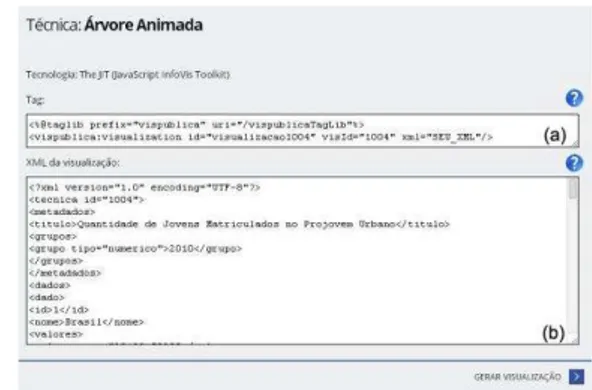
VisPublica Library is an API developed in Java that converts XML files (eXtensible Markup Language) in entry scripts for visualization techniques. Its goal is to assist technical users on the publication of data in their applications, using visualization techniques. The Library concentrates most part of the Catalog techniques from VisPublica application.
Figure 5 depicts the demonstration page of the Animated Tree technique in the Library. Figure 5.a illustrates an example
of the tag that should be included in the user’s application
source code, in which the field “YOUR_XML” is replaced by the XML file that must contain the desired data. An example of the structure of the XML file is shown in Figure 5.b. It is possible to edit the file online for performing tests.
Fig. 5. Demonstration page of the publication layer.
III.EXPERIMENT
The purpose of the experiment is to validate VisPublica, which implements the model described in this paper. VisPublica was presented to a group of participants in order to get the user's perception about the usefulness and usability of the application. It was expected that at the end of the experiment, the developed application was considered useful for the publication of data.
Participants accessed VisPublica through a link sent by email. In this email, instructions for the experiment which was divided into four stages were presented. In the first stage, the participant was informed about the scenario created. In this scenario, the participant would work in a government agency and would be responsible for the publication of public data using visualization techniques. To accomplish this task, the participant was told to utilize VisPublica.
In the second stage, the participant analyzed the documentation of Motion Chart and Treemap. The third stage consisted on the evaluation of the visualization techniques, that is, the participant tested how Motion Chart and Treemap represented visually certain data sets (sent as an attachment in the email). Lastly, the participant answered a questionnaire.
The questionnaire was divided into two parts. On the first one, data concerning participants’ profiles were collected. On the second part, sentences related to the application were presented. The experiment was conducted with 15 people, being 8 men e 7 women, with ages between 19 and 45 years old. About 87% of the participants were attending a degree course. In addition, all of them somehow worked in the IT field.
Chart has long stretches that can lead to misunderstanding of the topic.
On sentence 3, as shown on Figure 6, to 67% of the people, the instructions of use of the functional module Create Your Graph were not enough to assist the creation of view. About 20% of the participants stated that the instructions were confusing to people with little technical knowledge. In relation to this statement, it is worth mentioning that the target audience of the application described in this article is not the ordinary citizen. Results and other comments related to sentence 3 indicate that the usability of the function module Create Your Graph needs to be improved. Concerning the fourth sentence, all the participants considered helpful the collaboration of information towards visualization techniques.
According to Figure 7, regarding sentence 5, around 87% of VisPublica users claimed that they were able to navigate through the application and to easily find the information desired. As to restrictions related to sentence 5, 7% of the participants commented that the purpose the functional module Create Your Graph needs to be presented more clearly.
Roughly 87% of the participants agreed with sentence 6, in other words, these participants alleged that VisPublica aids the publication of data. In regard to sentence 7, around 80% asserted that they would use VisPublica again. Among the purposes mentioned by the participants are: the creation of views for personal use in presentations to clients and to assist in the understanding of governmental data.
Lastly, on the last sentence, the participants were asked whether they would use VisPublica Library to publish data sets. Over 82% declared they would utilize it. About 7% of the participants affirmed that “a VisPublica Library presents modules of data publication more dynamic than those which are used nowadays”.
IV.FINAL CONSIDERATIONS
E-Gov strategies are being utilized by several governments to provide services to society and information about public policy. Visualization techniques can assist the analysis, communication and understanding of governmental data.
In this paper was presented a model for publication of governmental data using visualization techniques. The layers of the model served as a basis for the definition of the functional
modules that compose VisPublica’s architecture. To validate the usability and utility of the application, an experiment was conducted. The hypothesis that justified this research is that the implementation of the proposed model through VisPublica application facilitates the choice of visualization techniques that best represent a particular data set and allows the sharing of acquired knowledge in process of selection and utilization of the technique.
The results of the experiment suggest that VisPublica can be used to aid the choice of the most suited visualization technique and publish data. Furthermore, it is possible to identify a need for improvements on the interface, mostly on the module Create Your Graph. Another significant result for the evolution of the application refers to the Wiki. Most users recognized the possibility of collaboration in this scenario through the tool.
As future work, two lines of evolution are being developed: (a) improvement and adaptation of the interface in order to allow use by non-technical users and (b) development of mechanisms for automating the selection of visualization techniques from a metadata set.
Fig. 6. Result of sentences 1, 2, 3 e 4.
Fig. 7. Result of sentences 5, 6, 7 e 8.
REFERENCES
[1] Intel IT Center, “Planning Guide Getting Started with Big
Data,” 2013. [Online]. Available:
http://www.intel.com/content/dam/www/public/us/en/document s/guides/getting-started-with-hadoop-planning-guide.pdf. [Accessed: 07-Jul-2014].
[2] A. Graves and J. Hendler, “Visualization Tools for Open
Government Data,” in Proceedings of the 14th Annual International Conference on Digital Government Research, New York, NY, USA, 2013, pp. 136–145.
[3] A. Labrinidis and H. V. Jagadish, “Challenges and
Opportunities with Big Data,” Proc VLDB Endow, vol. 5, no. 12, pp. 2032–2033, Aug. 2012.
[4] F. C. Bico, L. N. Trindade, R. A. R. Caracciolo, R. J. S. Paiva
Jr, and S. M. Peres, “Legibilidade em Dados Abertos: uma
Experiência com os Dados da Câmara Municipal de São Paulo,” VIII Simpósio Bras. Sist. Informação, 2012.
[5] “Improving data visualisation for the public sector,” 2009. [Online]. Available: http://www.improving-visualisation.org/. [Accessed: 23-Jul-2014].
[6] “DataViva.” [Online]. Available: http://dataviva.info/. [Accessed: 23-Jul-2014].
[7] F. C. Ribeiro, T. P. Ferreira, M. M. V. de Paula, M. B. F. Chaves, S. A. Rodrigues, J. M. de Souza, E. M. Franzosi, and L.
F. S. Oliveira, “VisPublica: uma proposta para aprimorar a
transparência de dados públicos,” VIII Simpósio Bras. Sist. Informação, 2012.
[8] M. M. V. de Paula, F. C. Ribeiro, S. A. Rodrigues, and J. M. de