Integrated Analysis and Visualization of
Group Differences in Structural and
Functional Brain Connectivity: Applications in
Typical Ageing and Schizophrenia
Carolyn D. Langen1*, Tonya White2,5☯, M. Arfan Ikram4,5, Meike W. Vernooij4,5, Wiro
J. Niessen1,3☯
1Biomedical Imaging Group Rotterdam, Departments of Radiology & Medical Informatics, Erasmus MC, Rotterdam, The Netherlands,2Department of Child and Adolescent Psychiatry, Erasmus Medical Centre, Rotterdam, Netherlands,3Imaging Physics, Faculty of Applied Sciences, Delft University of Technology, Delft, The Netherlands,4Department of Epidemiology, Erasmus MC, Rotterdam, The Netherlands, 5Department of Radiology, Erasmus MC, Rotterdam, The Netherlands
☯These authors contributed equally to this work. *[email protected]
Abstract
Structural and functional brain connectivity are increasingly used to identify and analyze group differences in studies of brain disease. This study presents methods to analyze uni-and bi-modal brain connectivity uni-and evaluate their ability to identify differences. Novel visu-alizations of significantly different connections comparing multiple metrics are presented. On the global level,“bi-modal comparison plots”show the distribution of uni- and bi-modal group differences and the relationship between structure and function. Differences between brain lobes are visualized using“worm plots”. Group differences in connections are exam-ined with an existing visualization, the“connectogram”. These visualizations were evalu-ated in two proof-of-concept studies: (1) middle-aged versus elderly subjects; and (2) patients with schizophrenia versus controls. Each included two measures derived from dif-fusion weighted images and two from functional magnetic resonance images. The structural measures were minimum cost path between two anatomical regions according to the“ Sta-tistical Analysis of Minimum cost path based Structural Connectivity”method and the aver-age fractional anisotropy along the fiber. The functional measures were Pearson’s
correlation and partial correlation of mean regional time series. The relationship between structure and function was similar in both studies. Uni-modal group differences varied greatly between connectivity types. Group differences were identified in both studies glob-ally, within brain lobes and between regions. In the aging study, minimum cost path was highly effective in identifying group differences on all levels; fractional anisotropy and mean correlation showed smaller differences on the brain lobe and regional levels. In the schizo-phrenia study, minimum cost path and fractional anisotropy showed differences on the global level and within brain lobes; mean correlation showed small differences on the lobe level. Only fractional anisotropy and mean correlation showed regional differences. The OPEN ACCESS
Citation:Langen CD, White T, Ikram MA, Vernooij MW, Niessen WJ (2015) Integrated Analysis and Visualization of Group Differences in Structural and Functional Brain Connectivity: Applications in Typical Ageing and Schizophrenia. PLoS ONE 10(9): e0137484. doi:10.1371/journal.pone.0137484
Editor:Xi-Nian Zuo, Institute of Psychology, Chinese Academy of Sciences, CHINA
Received:March 30, 2015
Accepted:August 16, 2015
Published:September 2, 2015
Copyright:© 2015 Langen et al. This is an open access article distributed under the terms of the Creative Commons Attribution License, which permits unrestricted use, distribution, and reproduction in any medium, provided the original author and source are credited.
presented visualizations were helpful in comparing and evaluating connectivity measures on multiple levels in both studies.
Introduction
Brain connectivity is an area of research receiving increasing attention. In the brain, regions communicate through networks of structural and functional links, which is termed connectiv-ity. Connectivity can be studied non-invasively using advanced imaging techniques such as magnetic resonance imaging (MRI). Relationships between regions of interest (ROIs) are
extracted from MRI’s and used to define a network. Variations in MRI acquisition and analysis
have resulted in several types of connectivity. With ever increasing choices, comparing connec-tivity types becomes an important first step in addressing a given research question.
Structural connectivityrefers to the anatomical connectivity of the brain. It can be extracted from diffusion weighted images (DWI). DWI is a type of MRI that estimates the movement of water in each voxel of the image. Water diffuses along white matter tracts. From DWI, path-ways travelled by water molecules (and thus the orientation of nerve fibers) can be
approxi-mated. These pathways are referred to as streamlines [1]. Measures of microstructure along the
length of streamlines, such as fractional anisotropy (FA), which is the degree of diffusion
directedness, can be collected and used to define structural connectivity [2]. Structural
connec-tivity measures have also been derived without using streamlines, such as in estimating
mini-mum cost to travel between regions [3,4].
It is believed that structural connections enable communication between regions, resulting infunctional connectivity[5], characterized by regions having similar neural dynamics. Func-tional connectivity can be quantified using funcFunc-tional MRI (fMRI). Several methods of defining
functional connectivity exist, such as using Pearson’s correlation, partial correlation or mutual
information of time patterns [1], which are typically calculated between the mean time series
of brain regions.
In the last few years, DWI and fMRI data have been combined to study multimodal aspects
of brain connectivity [6]. DWI is typically used to study white matter, whereas fMRI focuses on
grey matter. The roles of grey and white matter in the brain have long been studied separately, but their interaction with each other is essential in the function of the brain. The study of func-tional and structural connectivity, and especially how they relate to each other, could help to better understand the roles and interaction of grey and white matter. Structural and functional
connectivity have been combined both to model their relationship [7] and to derive new types
of connectivity [8]. Wee et al. (2012) [9] built a machine learning model using structural and
functional connectivity to determine which subjects would develop mild cognitive impairment. With an increased interest in multimodal brain connectivity analysis, it is likely that many more publications on the subject will appear in the coming years.
As the study of multimodal group comparisons progresses and new types of connectivity are developed, researchers require methods to evaluate which connectivity metric is best suited to their research question, e.g. to make an informed decision about which network types to include in their study, or to study the relation between different network types and make infer-ences about potential biological explanations for the observed differinfer-ences and similarities. There is a need for methods of comparing functional and structural connectivity with respect to their suitability for group analyses, both uni-modally, and bi-modally.
An integral component of such analyses is visualization of results. Margulies et al. (2013)
[10] conducted an in-depth review of uni- and multi-modal visualizations used in brain
con-nectivity research, including an explanation of the benefits and drawbacks of each. Networks of
for approving data requests. Because of restrictions based on privacy regulations and informed consent of the participants, data cannot be made freely available in a public repository. The Rotterdam Study has been approved by the medical ethics committee according to the Wet Bevolkingsonderzoek ERGO (Population Study Act Rotterdam Study), executed by the Ministry of Health, Welfare and Sports of the Netherlands.
Funding:This study is financially supported through ZonMw TOP project number: 91211021, awarded to TW. The funders had no role in study design, data collection and analysis, decision to publish, or preparation of the manuscript.
connections between ROIs are often depicted in a matrix representation [11–13], where each row and column correspond to an ROI, and each element in the matrix represents a connection
between the two (seeS1A Fig). The same information can be displayed in a connectogram
[10,14], which is a circular representation in which nodes are aligned along the edge of a circle
and connections are represented by lines between them (seeS1B Fig). Both representations
have benefits and drawbacks. For example, the matrix representation is able to show all possi-ble connections simultaneously, however they are an abstract way of representing connectivity and the focus on connections may result in understating or not detecting important individual ROIs. Connectograms, on the other hand, are well-suited to draw attention to important nodes and they represent connections in an intuitive way, namely by connecting two ROIs by a line; however they are limited in the number of connections that they can effectively show at the same time. Connectivity is also frequently shown within a three-dimensional (3D)
representa-tion of the brain [7,12,13,15,16], where each ROI is represented as a point in 3D space and a
connection is depicted as a line between two points (seeS1C Fig). While these visualizations
can be impressive, they are also limited by the number of connections that they can display
without obscuring valuable connectivity information [10] and the depiction of these 3D objects
in two-dimensional images results in ambiguity about the position of each node in the third dimension. Relationships between structural and functional connectivity have previously been
presented using scatter plots [7] (seeS1D Fig). However, a network often contains hundreds or
thousands of connections. When displayed together in the same scatter plot, overlapping points make it difficult or impossible to know the density of points at given position in the plot. Additionally, when two groups are displayed within the same scatter plot, the points of one group may obscure the view of points from the other group, making it impossible to know where the groups overlap and where they do not.
The aim of this study is to enable multi-level comparison, integrated analysis and visualiza-tion of multiple funcvisualiza-tional and structural connectivity types, where connectivity is defined between pairs of ROIs. Our contribution is three-fold. First, we propose a method to enable both uni- and bi-modal analysis of structural and functional data. Second, we present two proof-of-concept studies by comparing groups of middle-aged to elderly subjects and patients with schizophrenia to controls. Third, we propose a set of visualizations that address some of the above-mentioned issues in the context of an analysis of group differences in structural and functional connectivity.
Material and Methods
The proposed method to perform integrated analysis of functional and structural connectivity
is illustrated inFig 1. Each subject requires a DWI, fMRI and structural T1-weighted image.
First the T1 image is segmented into a set of regions using FreeSurfer [17], after which
struc-tural and functional connectivity maps are extracted. The connectivity maps of each subject are compared uni- and bi-modally for their utility in group-wise analysis as well as identification of connections that contribute to group differences and similarities. The methods are applied to two proof-of-concept studies, one that compares groups of middle-age and elderly subjects, and the second that compares patients with schizophrenia to controls. More details of these steps are provided below.
Segmentation of cortical ROIs
Cortical reconstruction and volumetric segmentation of each subject’s T1 image to produce an
http://surfer.nmr.mgh.harvard.edu. The atlas was registered with 12 degrees of freedom to
both the DWI’s b0 image and a mean fMRI, also using FSL’s FLIRT algorithm.
Extraction of structural connectivity
The DWI's were preprocessed using AFNI and FSL tools [18]. First they were corrected for
motion and Eddy currents and the brain extraction tool was used for skull stripping of the Eddy-corrected DWI. Duplicate b0 volumes were merged into a single volume by taking the median across duplicate images at each voxel. FA and mean diffusivity (MD) images were gen-erated from the skull-stripped DWI using DTIFit. All three images (DWI, FA and MD) were masked using a mask generated from the registered FreeSurfer image, including cortex, white matter and subcortical regions.
The network extraction step of the“Statistical Analysis of Minimum cost path based
Struc-tural Connectivity”(SAMSCo) framework [4] was used to define structural connectivity
because it minimizes the influence of directional uncertainty while finding globally optimal paths. A minimum cost path network (DMC) was extracted, with nodes defined by ROIs in the registered atlas and edges defined as minimum cumulative cost to travel between ROIs. A sec-ond metric of structural connectivity, the average fractional anisotropy (DFA) network, was produced by dividing the sum of fractional anisotropy along a minimum cost path by the Euclidean distance of the path. SAMSCo produces two values per connection, one from the seed to target region and the other from the target to seed region. Therefore, the SAMSCo net-works were symmetrized by choosing the minimum of the two costs (and corresponding DFA values) to represent the edge between each pair of regions. It is important to note that SAMSCo is a less traditional choice of structural connectivity measure, an aspect which is discussed in
more detail in the“Image preprocessing and network generation”subsection of the Discussion
section.
Extraction of functional connectivity
Preprocessing of the fMRI's was accomplished using ANFI and FSL tools [18,19]. The fMRI
images were slice-timing and motion-corrected, both using AFNI tools. The first four TRs were removed to allow for equilibration and a temporal 0.01Hz high pass filter was applied to remove low frequency signals. Global mean, mean cerebral spinal fluid, and mean white matter time series as well as the six motion parameters resulting from motion correction were
regressed out from the image. Finally, an 8mm full-width-half-maximum Gaussian spatial filter
[20] was applied to increase the signal to noise ratio.
We defined two atlas-based metrics for defining functional connectivity. Typically, func-tional connectivity studies include a preprocessing step where fMRI images are spatially nor-malized to a common reference space and blurred to account for differences in structural and functional variability. However, anatomical and functional variation between subjects can be
large [20], and thus the deformations involved in spatial normalization may stretch or contract
parts of the brain for some subjects more than others. In this study, spatial normalization was not performed. Rather, the FreeSurfer ROIs were registered to the fMRI image for each subject Fig 1. Schematic of method.Networks are extracted for each individual (upper panel) by extracting brain regions from the T1 image using FreeSurfer, and extracting structural and functional connectivity between these regions from preprocessed DWI and fMRI, respectively. Subsequently, integrated analysis of group differences in structural and functional connectivity is performed (lower panel). Group differences are visualized on a global level using bi-modal distribution plots, on an individual connection level using
connectograms and on a mid-level using worm plots, where connections are grouped by location in the brain.
separately, and then used to define connectivity. This reduced the effects of structural variability.
The average time series for each ROI was calculated. For the first network type, connectivity between two ROIs was defined as the Pearson correlation coefficient between each ROI's mean time series (fMT). For the other type of connectivity we used partial correlation (fPC), which
was calculated for every ROI pair with the influence of all other ROI’s removed according to
the formularij¼ pij=
ffiffiffiffiffiffiffiffiffi piipjj
p [21], wherep
ijis the(i,j)th element of the inverted covariance
matrix from the mean time-series data of all ROIs.
Integrated analysis and visualization of structural and functional
networks
An ordinary least squares linear regression model was estimated for each connection including group membership, modeled as a single variable containing zeros and ones, and covariates as variables, along with a constant term to model the mean of the data. The t-statistic and p-values
associated with group membership were used to determine whether a connection’s weight
dif-fers significantly between groups. The group mean of each connection was also computed for each group of subjects. The t-statistic and group means were visualized using three types of
visualizations, illustrated in the lower panel ofFig 1. These include bi-modal network
compari-son plots of group mean networks and t-statistic networks, worm plots and connectograms. This section provides an explanation of each. All of the visualizations presented in this manu-script can also be used to study continuous variables rather than group differences, which is discussed in more detail in the Discussion section.
Bi-modal network comparison plots enable simultaneous evaluation of multiple network
types on a global level, both uni- and bi-modally. As seen inFig 1, they can show distributions
of group mean connection weights from two groups simultaneously, or distributions of t-statis-tics, which illustrates degree of group differences on a global level. Each type of connectivity is represented by a column or row, where rows represent the functional measures and columns represent structural measures. Each connectivity type is evaluated uni-modally in one-dimen-sional (1D) histograms. The relationship between structure and function is shown in two-dimensional (2D) histograms for each pair of structural/functional network types, which is dis-played in the center of the plots. In the case of the group mean networks, colors are used to dif-ferentiate between groups, where blue represents one group and red represents the other. In the 2D histograms of group mean networks, magenta indicates group overlap. In the plot of the t-statistics, green is used to represent group differences.
Worm plots show the connection t-statistics grouped by the location of the associated ROIs. Even when very few connections are individually identified as significant, the worm plot may show clusters of connections that have significant group differences when considered together (regional shifts in connectivity between multiple ROIs). Significance is thus evaluated on two scales, namely on the level of individual connections and on the level of groups of connections. Worm plots are a derivative of Manhattan plots, which are scatter plots used to show signifi-cance of a large number of tests, most of which have very large p-values. They are frequently
used in genetic studies [22], where genomic coordinates are on the x-axis and colors of points
simultaneous plotting and comparison of multiple network measures. Normally the y-axis of a
Manhattan Plot is−log10(p) wherepis the p-value corresponding to a statistical test. We
instead used log10ðpÞ signðtÞ s0:05;Meff;G, wheretis the t-statistic of a given connection,pis
the corresponding p-value andsa;Meff;G¼log10ðaÞ=log10ðaMeff;GÞis a scaling factor used to ensure
that the reference line corresponding to the adjusted significance threshold,a
Meff;G(see below
for details of its derivation), is the same for all networksG.sign(t) adds information about
whether an observed association is positive or negative. This, combined with ordering
connec-tions, resulted in clusters of points with a worm-shape, hence the nameWorm Plot. The
dis-tance of the mean of each cluster from zero indicates the degree to which the associated parts of the brain play a role in the relationship being tested.
Significant connections for each network were also plotted in a connectogram, which was
originally used to study brain connectivity by van Horn et al. (2012) [14]. The 2D circular
representation in a connectogram provides a cleaner view of brain connectivity than 3D rep-resentations. While 3D representations can provide spatial information about ROIs
[7,12,13,15,16], viewing them requires projections onto a 2D space. The loss of one
dimen-sion results in ROIs appearing spatially closer than they actually are. For example, when viewing a 3D representation axially, the frontal pole and lingual gyrus appear to be located beside each other, when in reality they are on opposite sides of the brain. This also presents difficulties in interpreting region groupings, since groups which are spatially separate will likely appear to overlap in the projected view. The connectogram removes these complica-tions by disregarding 3D spatial information. In the circular representation, ROIs are arranged on the edge of the circle, grouped into the same clusters as in the worm plots. Each cluster is assigned a color, and the concentration of color is adjusted according to node degree. Significant connections are represented as lines between ROIs. The color of each sig-nificant connection is determined by the sign of the t-statistic and the opacity indicates the degree of significance.
Both worm plots and connectograms require a threshold of test significance. Given that a t-statistic is computed for each connection, some form of multiple testing correction must be
used. In the case of a symmetric networkGwithrregions, the total number of tests isMG=
r(r−1)/2. Traditional methods, such as the Bonferroni andŠidák methods, assume
indepen-dence of tests and calculate a new significance threshold from the total number of tests. How-ever, the connected nature of brain networks implies dependence between connections. As such, traditional methods are overly conservative for connectivity analysis. To address this, we
used a method proposed by Li et al (2012) [23], where an“effective number of independent
tests”for networkG,Meff,G, is calculated.Meff,GreplacesMGin the traditional methods.Meff,G
was applied to the Bonferroni correction to calculate an adjusted p-value threshold, a
Meff;G¼
a=M
eff;G. We usedα= 0.05 as the uncorrected threshold.
Proof-of-concept
Two proof-of-concept studies were performed using the analysis described above. The first
compared middle-age and elderly subjects from the Rotterdam Scan Study (RSS) [24,25]. The
second compared patients with schizophrenia to healthy controls from the Massachusetts
Gen-eral Hospital (MGH) in the MIND Clinical Imaging Consortium data collection [26], which is
an open-access multi-site collaborative study of patients with schizophrenia. The original
MGH imaging data and subject meta-data is available for download viahttp://coins.mrn.org/
dataexchange. The networks calculated for each subject and the regression results calculated as
There were 84 and 82 cortical and subcortical regions chosen for network construction for the MGH and RSS studies, respectively. The cerebellum was excluded in the RSS sample because it was only partially scanned. After registration of the FreeSurfer segmentation to the diffusion image space, which required up-sampling of the data, two regions of one subject in the RSS study did not have any voxels remaining. Regional statistical tests involving these
regions were computed by substituting group means for the missing values. SeeS1 Tablefor a
list of regions used in these studies.
In the RSS data, after registration and down-sampling of the FreeSurfer atlas to the fMRI-space, in two regions of one subject no voxels survived the down-sampling (the left entorhinal cortex and the right temporal pole). All analyses did not include the missing values.
Participants. In the RSS study, non-demented subjects with T1, rs-fMRI and DWI scans were divided into two groups (middle-aged and elderly) based on age. Age ranges were 74 to 95 in the elderly group and 51 to 53 in the middle-aged group. They were selected such that the gender ratio in each group was the same. Subjects with mild cognitive impairment (as
deter-mined by the Mini-Mental State Examination [27], MMSE), large infarcts, and gliomas were
excluded from the study. The MMSE score is a derived measure of a subject’s global cognitive
functioning with a total possible score of 30 [27].
In the MGH study, groups of patients with schizophrenia were compared to controls. Exclu-sion criteria included an intelligence quotient less than 70, a history of significant head injury and a contraindication for MRI scanning. Only subjects who had DWI, fMRI and pre-computed Free-Surfer segmentations were included. Parental socio-economic status (P-SES) was defined by the
Hollingshead-Redlich scale [28], in which a score of one defines the highest status and five defines
the lowest. P-SES is often used as an estimate of what the socio-economic status of patients would have been if they did not have schizophrenia. Years of education is defined as the total number of years that a subject pursued elementary, secondary and post-secondary education.
In both studies, subjects with more than 4mm of head movement were excluded. All partici-pants gave written informed consent and the original studies were approved by the medical ethics committee of the Erasmus MC, University Medical Center Rotterdam (for the RSS study) and the institutional review board of the Massachusetts General Hospital (for the MGH
study).Table 1describes the demographics of each group for the subjects that were included.
Table 1. Subject demographics.
Study RSS MGH
Group
Middle-aged
Elderly Group difference p-values
Patient Control Group difference p-values
No. of subjects 37 37 23 21
Gender (M/F) 13 M / 24 F 13 M / 24
F
0χ
17 M / 6 F
12 M / 9 F 0.9χ
Age (mean±SD) 52.3±0.6 81.1±4.4 <0.0001t 34.8±9.8 38.7±8.7 0.2t
MMSE (mean±SD) 28.9±1.1* 27.1±1.7* 0.002t n/a n/a n/a
Years of education (mean±SD) n/a n/a n/a 11.5±2.2 15.9±2.0* <0.0001*t
P-SES (mean±SD) n/a n/a n/a 3.3±1.0 3.0±1.0 0.9χ
fMRI absolute head motion in mm (mean±SD)
1.0±1.0 1.0±0.9 0.9t 0.4±0.4 0.6±0.6 0.4t
*One subject was missing this information, statistics computed over the remaining subjects tCalculated using Welch
’s t-test χ
Calculated usingχ2test
Image acquisition. All subjects from the RSS were scanned on the same 1.5 Tesla GE scanner with an 8-channel head coil. A research physician visually inspected each scan to ensure good quality. The T1-weighted protocol included a 3D fast RF spoiled gradient recalled acquisition in steady state with an inversion recovery prepulse sequence (TR = 13.8
ms, TE = 2.8 ms, TI = 400 ms, FOV = 21 × 21 cm2, matrix = 416 × 256, zero-padded
to = 512 × 512, flip angle = 20°, NEX = 1, bandwidth = 12.50 kHz) with 96 contiguous slices with slice thickness of 1.6 mm zero-padded to 0.8mm. The final voxel size was 0.49 × 0.49 × 0.8 mm. The DWI protocol utilized a single shot, diffusion-weighted spin echo-planar
sequence (TR = 8000 ms, TE = 68.7 ms, FOV = 21 × 21 cm2, matrix = 96 × 64, zero-padded
to 256 × 256, NEX = 1) with 36 contiguous slices with 3.5 mm slice thickness. The maximum
b-value was 1000 s/mm2in 25 non-collinear directions. Volumes were also acquired without
diffusion weighting (b0). The final voxel size was 0.8 × 0.8 × 3.5 mm. The rs-fMRI protocol included a gradient-echo BOLD sequence, (TR = 2900 ms, TE = 60 ms, matrix = 64 × 64, flip angle = 90°) with 35 contiguous 3.3 mm slices and 160 volumes (total scan length = 464 s). The voxel size was 3.3 × 3.3 × 3.3 mm.
The MGH subjects were scanned on a 3 Tesla Siemens Trio scanner with an 8-channel head coil. The imaging parameters of the T1-weighted sequence were TR = 2530 ms, TE = 3.79 ms, TI = 1100 ms, FOV = 16 mm, matrix = 256×256×128 cm, flip angle = 7°, bandwidth = 181, 0.625×0.625 mm voxel size and slice thickness 1.5 mm. The DWI scan parameters were TR = 10,500 ms, TE = 98 ms, NEX = 2, bandwidth = 1342, 64 slices, thickness = 2 mm, 2×2
mm voxel size. The maximum b-value was 1000 s/mm2in 12 directions. The fMRI parameters
were TR = 2000 ms, TE = 30 ms, flip angle = 90°, FOV = 22 cm, bandwidth = 3126Hz/pixel, 27 slices, slice thickness = 4 mm with 1 mm skip, 3.4 mm in plane resolution and 177 volumes
(total scan length = 354 s). Three runs of the Sternberg item recognition paradigm (SIRP) [29]
were collected. SIRP is a task-based fMRI sequence with a block design that measures working memory. The run with the least amount of motion was selected for connectivity analysis.
Covariates. Covariates were included in the regression model to control for their influ-ence. In the RSS study covariates included MMSE and gender. In the MGH study covariates included age and gender.
Results
The chosen connectivity metrics were evaluated both uni- and bi-modally described in the methods section. The resulting figures and tables are described below for both the MGH and RSS studies.
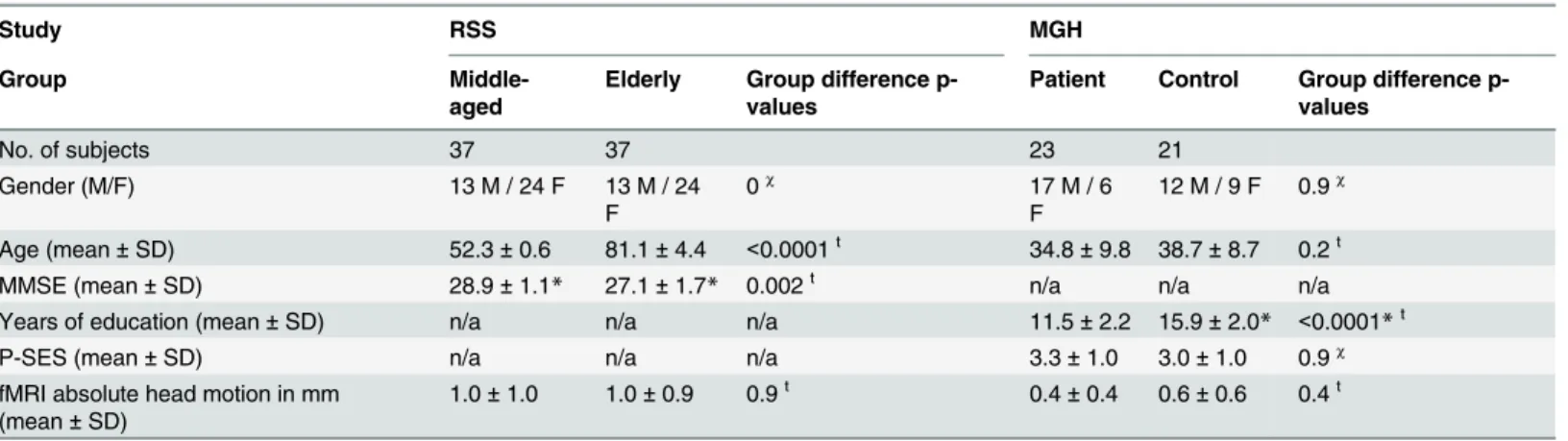
The bi-modal network comparison plots inFig 2show the structure-function relationship
for the mean networks and t-statistic distributions for each study. 2D histogram opacity indi-cates number of connections, and in the mean network plots, color indiindi-cates the proportion of each group involved. Along the axes, distributions of connection weights for each individual connectivity type are plotted.
In the RSS study, group differences are easily visible in the mean network histograms of DMC, which is also reflected in the t-statistic distributions. Global group differences are not obvious in the mean network plots or the t-statistic plots for fPC and fMT in both groups and DFA in the RSS. In the MGH study, global group differences are not obvious in the mean net-work plots, but do show in the t-statistic plots for DMC and DFA.
In the unimodal t-statistic histograms, all types of connectivity appear to be approximately normally distributed. The positive shift in t-statistic of DMC in the RSS study indicate a global increase in minimum cost in the elderly population. In the MGH study, there is a global Fig 2. Bi-modal network comparison plots.Structure-function relationships are shown for the mean connectivity network of each group in (a) and (c), and the distribution of t-statistics in (b) and (d). (a) and (b) correspond to RSS, where in (a) blue represents the elderly group and red indicates the middle-aged group. (c) and (d) correspond to MGH, where in (c) blue represents the patients with schizophrenia and red represents controls. In the 2D structure-function histograms, magenta indicates overlap of the two groups. In the t-statistic histograms, green shows group differences, where positive values indicate elderly>middle-aged in RSS and schizophrenia>control in MGH.
decrease in DMC and DFA. It is interesting to note that both fMT and fPC mean network val-ues were centered around zero and the standard deviation of fPC was much smaller than fMT in both studies, but the t-statistic indicated similar levels of group differences. The 2D t-statistic histograms show no significant correlation between structural and functional t-statistics.
A worm plot of the p-values corresponding to the t-statistics of each connection is shown in
Fig 3. The regions of the brain are divided anatomically into groups corresponding to different parts of the brain, including subcortical, occipital, parietal, temporal, frontal and the cerebel-lum. The cerebellum was not included in the RSS study because it was only partially scanned. In the RSS study, DMC has many highly significant connections, with values well above the
significance level for the majority of connections in all regions (Fig 3A). In the MGH study,
very few connections show significant group differences. In both studies, some networks are
shifted away from−log10(p) = 0 for some clusters. T-tests were done on the t-statistic values of
the connections in each worm inFig 2to determine the degree to which they were shifted away
fromt= 0, which is visualized inS2 Fig.
In the RSS worm plot, it is obvious that all clusters except Fro/Temp have highly significant positive DMC associations with age. The shifts in DFA and fMT are weaker than those of DMC and are mixed between positive and negative connections. Several significant cluster shifts appear in both. There were no significant fPC cluster shifts.
In the MGH study, DMC and DFA had the most significant associations with schizophre-nia, all of which were exclusively negative. fMT and fPC had a mixture of positive and negative associations which were much weaker than the structural connectivity associations. fPC had particularly weak associations.
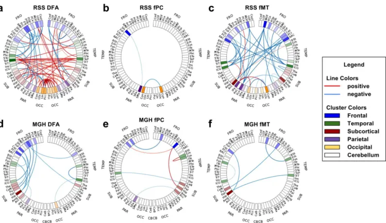
The connectograms inFig 4show the significant connections of some of the networks for
each study. Red indicates significant connections with positive association (in the MGH this
implies schizophrenia>control, in the RSS old>young), and blue indicates negative
associa-tion. The opacity of the lines indicates the level of significance and the saturation of each region indicates the number of significant connections involving that region. In the RSS study, DMC is not shown because it had too many connections to extract meaningful conclusions. In the
MGH study DMC is not shown because it had no connections withp<a
Meff:G.
In the RSS study, the DFA network had several significant connections with both positive and negative associations with age. The positive associations were concentrated in the temporal and occipital lobes. The left temporal pole had many more significant connections than the other regions. The right temporal pole also had several significant connections. Inter-hemi-spheric significant DFA connections were exclusively positive, indicating an increase in the older group. Decreases in DFA were exclusively intra-hemispheric, many of which involved left frontal regions. There were three significant RSS fPC connections, all of which were intra-hemispheric. The RSS fMT connectogram shows exclusively negative associations, many of which involved the right medial orbitofrontal cortex.
In the MGH study, all significant DFA connections indicated negative associations with schizophrenia, most of which involved only the left hemisphere and especially frontal and tem-poral regions. MGH fPC connections were both positive and negative. All three negative fPC significant connections were inter-hemispheric. All five significant fMT connections were neg-ative. Three of them involved frontal regions.
Discussion
for their ability to explain group differences. The t-statistic based analysis of each connection identified which network types contribute most to group differences, and between which areas of the brain these differences occur.
There are a growing number of types of structural and functional brain connectivity avail-able. The methods described in this paper can be used to compare multiple types of connectiv-ity, both in uni-modal studies and for integrated analyses. Visualizations of significance of connections help to identify important connections and groups of connections and compare them to existing knowledge of group differences. With the proposed framework two proof of concept studies were conducted comparing structural and functional connectivity.
Bi-modal network comparison plots
The bi-modal network comparison plots inFig 2give important insights into the investigated
network types and the relationships between them. They simultaneously show both uni- and bi-modal distributions, which makes it easy to consider both at the same time. Viewing all con-nectivity types in the same plot consolidates the information, making comparisons easier.
Global group differences can sometimes be seen in the 1D histograms of each network type. For example, in the mean-network plot of the RSS, DMC obviously has group differences, indi-cating that elderly subjects have higher cost paths than middle-aged subjects. Even when global group differences were not obvious in the mean-network plots, differences were sometimes Fig 4. Connectograms of significant connections.Red connections have significantly positive t-statistic values corrected for multiple testing, blue are negative (in the MGH schizophrenia>control, in the RSS old>young). Degree of significance is indicated by the opacity of the lines. Color saturation of regions shows the number of connections involving that region. For the RSS (a) DFA, (b) fPC and (c) fMT are shown. RSS DMC is not shown because there were too many significant connections to visualize. For the MGH (d) DFA (e) fPC and (f) fMT are shown. MGH DMC is not shown because there were no significant connections.
found using the t-statistic plots. For example, in the MGH, DMC and DFA showed no obvious group differences in the mean-network plots, but did show global negative shifts in the t-statis-tic plots, suggesting that patients with schizophrenia have lower cost paths with reduced FA.
The decrease in DFA is consistent with previously observed white matter abnormalities [30]
and decreased DFA [31] in patients with schizophrenia. The decrease in minimum cost in the
schizophrenia group is unexpected, but might be explained by the inclusion of age as a covari-ate. As can be seen in the RSS DMC histograms, DMC is highly influenced by age. Patients with schizophrenia were on average older than controls. Including age as a covariate would have removed the effect of age differences, but it is possible that the regression overcompen-sated for this variable and that the global decrease is not representative of the true role of mini-mum cost in schizophrenia. To determine the true effects of schizophrenia on DMC, the analyses should be repeated on an age-matched sample. Both mean-network and t-statistic plots provide useful information when examining connectivity metrics in relation to group differences.
The 2D part of the mean-network plots show bi-modal relationships between connectivity types. In both studies, the patterns seen in the mean-network plot show a similar pattern, indi-cating that the mechanism governing the global functional and structural differences may be inherent to the connectivity metrics themselves, and not related to the subject groups being studied. For example, both fPC and fMT are increased where DMC is near zero. DMC is usu-ally near zero between adjacent regions because there is no distance between them, and hence minimal travel costs. This close proximity may also explain the increase in functional connec-tion weight, since adjacent regions likely have similar blood-oxygen dynamics near their border and hence greater correlation.
The bi-modal view can also be used to make inferences about differences in connection types from the same modality. For example, global group differences are much lower in magni-tude in fPC than in fMT. The difference in the derivation of fPC and fMT is that fPC uses
par-tial correlation to estimate the direct connection between specific regions [32], whereas fMT
uses full Pearson correlation. Thus, global group differences are greater in indirect connections than in direct connections, which may affect sensitivity of the metric to specific effects. fPC and fMT are both well-established widely used connectivity metrics, and the choice of which to
use depends on the research question one wishes to answer [21].
We decided to represent the bi-modal part of the network comparison plots with 2D histo-grams. The relationship between structure and function can also be visualized using scatter
plots [7]. While the same general trends can be seen in histograms and scatter plots, in places
with high density, points in scatter plots will overlap and thus be not differentiable, in which case scatter plots are unable to show differences in density. By using a histogram, differences in density can be shown using color density. Another disadvantage of scatter plots is that overlap of points makes seeing group differences difficult. When points from one group cover points from another group, it may appear as though only one group is important. 2D histograms can
better represent the degree of each group’s influence by representing each group by a given
simply make 1D and 2D histograms of structural and functional weights over all subjects, but color each part of the histogram according to the mean age associated with all points in a given connection weight range. If a gradient of color is seen, then this indicates that connectivity changes globally with age. Rather than plot the t-statistic related to group differences, one could plot the regression coefficient associated with age.
The data presented here indicated no global functional group differences, neither in 1D nor in 2D. However, with other data the 2D histograms might be useful in identifying important group differences involving both functional and structural connectivity. It is possible that little or no group differences are obvious uni-modally, but that they become obvious when viewed bi-modally. The connectivity types used here also did not show an obvious relationship between functional and structural t-statistics, however if such a relationship did exist, the 2D representations would help to see it. Such relationship would indicate that connections with significant structural differences tend also to have strong functional differences.
Worm plots
The worm plots inFig 3give important insights into regional changes in connectivity. Worm
plots reflect global changes in connectivity, but often also show cluster level changes. The global changes in DMC in both studies and in DFA in the MGH study were also seen in the worm plots by the uni-directional shifts of each group of connections. All clusters in the worm plots were shifted to different degrees, indicating a relative importance of each cluster. Even when global network changes were not observed, shifts in regional groupings of connections became apparent in the worm plots. fPC and fMT had positive and negative shifts for both studies, as did DFA in the RSS. fMT and DFA both had large shifts, whereas fPC cluster shifts were mini-mal. This suggests that fPC is less sensitive to group differences than the other metrics. As in the bi-modal network comparison plots, this reflects the removal of the influence of other regions in a given correlation. A thorough psychological analysis of group differences identified in the worm plots is beyond the scope of this study and is limited by small sample sizes. How-ever, we believe that epidemiological studies with high statistical power would benefit from analysis using worm plots.
As with the bi-modal network comparison plots, the worm plot can be used to represent continuous variables rather than groups. For example, if age was modeled continuously, one could simply replace the sign of the t-statistic in the y-axis with the sign of the coefficient asso-ciated with age. As with age groups, the continuous version of the plot would show the associa-tion of age with grouped connecassocia-tions.
If one was to judge a network’s ability to separate groups purely based on global network
differences and individual significant connections, it would be easy to dismiss a network as insensitive to group differences. However when looking at regional groupings of connections it may become apparent that group differences do exist. The worm plot provides a mid-level analysis, more specific than the global differences seen in the bi-modal network comparison plots, but more general than looking only at specific significant connections. The worm plot extracts important relationships that are otherwise invisible to global or individual connection based analysis.
Connectograms
The connectograms inFig 4visualize significant differences in specific connections in a 2D
connectograms provided a clear and easily interpretable representation of significant connec-tions in the DFA, fPC and fMT networks. Again, similar to the bi-modal network comparison plots and worm plots, one can use connectograms to visualize the association of connections with a continuous variable by determining the color of a connection by the sign of the coeffi-cient associated with it.
Nodes with many significant connections are immediately obvious in connectograms. For example the left and right temporal poles (TeP) in the RSS DFA connectogram and the right medial orbitofrontal cortex (MOf) in the RSS fMT connectogram are easy to spot because they have several highly significant connections associated with them. The left hippocampus (Hip) in the RSS DFA also has several significant connections associated with it, which can be spotted
by the region’s increased color saturation, however it is less obvious because crossing
connec-tions make it difficult to see how many connecconnec-tions are coming from that region. Regions with many significant connections might be less obvious in a 3D representation of brain connectiv-ity, depending on from which angle it is viewed. This would arise because a 3D representation must be viewed as a 2D projection, which might result in an important region being sur-rounded by unrelated connections and regions that are spatially far away, but appear in that orientation to be nearby. Additionally, 3D representations can potentially misrepresent the data. For example, if two nodes overlap in a specific orientation, they may be interpreted as a single node, with connections from both nodes extending from the same spot. This confusion can be avoided by using connectograms.
The use of connectograms also made it easy to spot networks that have many significant connections that are primarily uni- or bi-lateral. For example, most significant connections in the MGH DFA network are uni-lateral negative associations with schizophrenia in the left hemisphere, which is consistent with the reduction of left hemisphere dominance seen in
schizophrenia [33]. Also, the RSS DFA network has an abundance of positive
inter-hemi-spheric connections and negative intra-hemiinter-hemi-spheric connections, suggesting that aging is asso-ciated with increased FA along inter-hemispheric minimum cost paths and decreased FA along intra-hemispheric minimum cost paths. An interesting avenue of future research might be to reconstruct the minimum cost paths found by SAMSCo to see if this unexpected increase can be explained by differing minimum cost paths in the old and young subjects.
A limitation of the connectogram is that there is an upper limit to the number of significant connections that it can show. The RSS DMC network had so many significant connections that useful inferences could no longer be made using a connectogram. This issue is also a limitation of 3D representations of brain connectivity. In such cases, one might consider using a matrix
representation [11–13]. In this representation the connections never overlap, and thus all
con-nections can be shown simultaneously. The disadvantage of a matrix representation, however, is that regions with several significant connections might be less obvious, since to identify them one must scan an entire row or column of a matrix and count the number of significant connections.
Methodological considerations
Image preprocessing and network generation. Subject motion is an important issue to address in any neuro-imaging study. This is especially so in functional connectivity studies. Head motion has a significant effect on connectivity. It increases connectivity estimates over short distances, decreases them over long distances, reduces modularity and can inflate the
effect of age on connectivity [34]. When preprocessing our fMRI data, we addressed subject
component analysis, all of which are thoroughly evaluated by Pruim et al. (2015) [35] for their ability to both remove motion-related artifacts and to preserve the signal of interest. Compared to other approaches, regressing out either six or 24 motion parameters only minimally reduced the impact of motion artifacts and was not very reproducible. However, using six parameters had minimal loss of temporal degrees of freedom. They also examined data scrubbing, which is
a widely-used approach that removes volumes affected by motion [36]. Although this approach
is effective in removing variations induced by motion, it also results in a significant loss of tem-poral degrees of freedom and is less reproducible than many of the methods based on
indepen-dent component analysis [35]. Given that subject motion can confound studies by inducing
group differences, it is important to carefully choose an appropriate method of dealing with motion. Global signal regression, which was employed in this study, can reduce motion-related
group difference [36]. It can remove false variance present in resting-state functional
connec-tivity data, but it has also been linked to a negative bias in correlations computed from fMRI
data [36]. Because of this, its use in functional connectivity studies is controversial and future
studies must carefully examine the risks and benefits before deciding whether to use it or not. Regarding choice of structural connectivity measures, it is important to note that both mea-sures (DMC and DFA) are products of the SAMSCo framework, which always produces a fully connected graph in which each pair of regions has an associated connection weight, even when no physical connection is present. This reflects the possibility that regions may communicate
with each other by sending signalsviaintermediate regions. On the other hand, more
tradi-tional definitions of structural connectivity, such as those based on streamline tractography, represent direct connections only and as such result in sparse matrices where only direct
con-nections have non-zero values [37]. It is important to keep in mind whether a structural or
functional network measure represents direct or indirect connectivity, since this can have a profound impact on the interpretation of the results.
Defining regions of interest. An important consideration when building brain
connectiv-ity networks is the method used to segment the cortex and sub-cortex [38]. Segmentations are
a macroscopic representation of microscopic neuronal architecture, the relationship between which is not fully understood. This makes the choice of scale and algorithm complex. This study used an anatomical segmentation of the cortex and sub-cortex into anatomical regions,
which has also been done in previous studies [4,39,40]. It is important to note that anatomical
segmentations are one of many potential segmentation strategies. Zalesky et al. (2010) [41]
used random segmentations to show that the scale of segmentation (i.e. the size and number of segmented regions) and the angular resolution of DWI data affect the topological attributes of structural networks. Randomly segmented regions do not generally correspond to specific ana-tomical or functional regions, and thus may not be suitable to answer questions where regions
should represent known areas of functional specialization. Cammoun et al. (2012) [42] found a
compromise between anatomic and random segmentation by subdividing FreeSurfer regions
into smaller regions on multiple scales. Both Zalesky et al. (2010) [41] and Cammoun et al.
(2012) [42] acknowledge that while segmentation scale affects the outcome of network studies,
both coarse and fine segmentations have benefits and drawbacks, and thus choice of scale should be made depending on the research question.
The segmentations discussed thus far do not use fMRI to delineate borders between regions. This may result in regions which are not functionally distinct. Several groups are working on methods of using functional data to segment grey matter. For example, Blumensath et al.
(2013) [43] uses region-growing in fMRI data to find subject-specific functionally
homoge-neous parcels which are spatially contiguous and disjoint. The method was reproducible within
subjects, however there was no correspondence between subjects’segmentations, which
et al. (2013) [44] used a group-wise clustering algorithm to produce functionally homogeneous and non-overlapping parcels that correspond across subjects, thus allowing between-subject comparisons. These methods, unlike the anatomical methods, produce segmentations that esti-mate functionally segregated regions.
The anatomical methods and the two functional methods discussed above produce‘hard
parcellations’[45], where regions are represented by non-overlapping groups of contiguous
voxels. In some cases, hard parcellations may not be an appropriate representation of true functional parcellations and connectivity patterns. Previous studies have suggested that
multi-ple overlapping functional networks exist [32]. Thus a brain region might be involved in
multi-ple networks, in which case the time series of that region would be a mixture of signals. In such cases, hard parcellations are unable to adequately address the mixture of signals, since all voxels within a region are assigned the same weight. High-dimensional independent component anal-ysis, on the other hand, takes signal mixtures into account by defining nodes as (potentially
overlapping) spatial maps of functionally related voxels [45,46]. Overlapping spatial maps can
also be produced using seed-based functional connectivity maps [47] and temporal functional
modes [48]. Because spatial maps are often composed of multiple groups of contiguous voxels,
and spatial maps often overlap with each other, each network typically describes non-contigu-ous and overlapping parts of the brain. Depending on the research question, one could repre-sent graph nodes by individual networks. If contiguous regions are desired, each contiguous portion of a network could be described by a separate node. In either case, connectivity can then be estimated between pairs of regions and represented as a graph. The graph could subse-quently be analyzed using the methods described in this paper.
Another potential concern related to segmentation is regions with unique internal
connec-tivity patterns. Van den Heuvel and Hulshoff Pol (2010) [47] have shown that voxels in one
hemisphere of the motor strip have maximum correlation with voxels in approximately the same location in the contralateral hemisphere. Previous studies have shown that connectivity
gradients exist in some parts of the brain [32]. These unique connectivity features are poorly
represented by distinct regions that assume uniform intra-region connectivity. It is important to keep this in mind when interpreting the results of connectivity analyses.
The question of segmentation strategy is not trivial and must be considered with great care. Choice of segmentation method and resolution can have a profound influence on network
characteristics [49]. It is essential to realize that a poor segmentation can inappropriately group
functionally unrelated voxels into the same region, or can split voxels with homogeneous sig-nals into multiple regions.
Whether using a‘hard parcellation’or a non-contiguous and overlapping segmentation, if
one wishes to analyze multiple subjects simultaneously, it is essential that segmentations
corre-spond across subjects [32,45]. If this basic requirement is met, then the visualizations methods
presented in this paper can be applied to graphs produced with the discussed segmentations, provided that a logical grouping of nodes is provided. That being said, it is essential to realize that even though the visualizations may show interesting results, poor segmentations can obscure true connectivity patterns and interpretation of results.
Grouping regions of interest. Another issue related to segmentation is how to group
regions. Regions can be grouped anatomically [39], which was the strategy used in this study.
Regions can also be parcellated using graph-theory based methods. For example, Betzel et al.
(2013) [50] used a Markov process to group nodes on multiple scales based on connectivity
obtained from diffusion data and evaluated each scaled based on several metrics derived from
structural or functional connectivity. In another study, Yeo et al. (2011) [51] used a clustering
networks are highly interpretable and are reproducible across sessions [52] as well as across
sites and datasets [53], and as such may provide a reliable parcellation to be used in
graph-based brain connectivity studies. The cortical parcellation from Yeo et al. (2011) [51] was used
by Betzel et al. (2014) [11] to assess changes in functional an structural connectivity across the
lifespan and Sripada et al. (2014) [54] to determine whether attention-deficit/hyperactive
dis-order causes developmental lag within the connectome as children grow older. In both cases, the borders of ROIs within each group corresponded well with the borders of each of the par-cellations. A functionally defined parcellation could be used to group regions from a segmenta-tion that does not have corresponding borders, such as an anatomically-defined segmentasegmenta-tion. However, this may not be the best option if one or more ROIs have significant overlap with two networks.
It is important to note that applying an existing cluster-based parcellation to a new dataset assumes that the parcellation is representative of the new data set. It is possible that the compo-sition of node groups changes with age or in different psychiatric states. In the case of task-based fMRI, such as in the MGH data set, it is questionable whether resting-state-network-like groupings are an appropriate choice. To circumvent these issues, study-specific node groups could be computed. However, there is the question of what sample size is required to obtain a reliable estimate of parcellations. Additionally, multiple scales may offer feasible node groups, the use of which likely requires justification in the context of the research question being asked. In spite of the uncertainty that is involved in using data-driven groupings of regions, their func-tional basis makes them worthy of consideration in future studies assuming that these uncer-tainties are taken into account when interpreting results.
Whether region groups are decided anatomically, in a data-driven manner, or in another manner, the groupings can easily be used in worm plots and Connectograms to draw conclu-sions about within- and between-group connectivity. While these figures cannot simulta-neously represent node groups of different scales and compositions, they can be used on each scale separately.
Multiple testing correction. The methods in this paper used mass univariate testing [12] to look for group differences in brain connectivity on global, lobe-level and individual connec-tion levels. The large amount of tests involved in this approach must be addressed by using
some form of multiple testing correction. We addressed this by calculating an“effective
num-ber of independent tests”and using that number in a Bonferroni correction [23]. Several
simi-lar methods exist [55], along with alternatives such as permutation testing [56].
Even with a liberal method of multiple testing correction, few or no significant tests may be found. While this is largely due to the large number of tests involved, the problem can be mag-nified by low signal-to-noise ratios in data, which will weaken observed statistical relationships. In these cases, a coarser level of analysis can increase statistical power. For example, the net-work-based statistic method thresholds individual test statistics of a network, identifies result-ing connected components and calculates a p-value for each component. By considerresult-ing sub-networks rather than individual connections, the network-based statistic gains statistical power, especially when signal-to-noise ratios are low.
Another alternative to mass univariate testing is to use graph theoretical measures [57,58],
which can also be used to study group differences and associations with continuous variables,
such as age and neurological test scores [11,16,39,59,60]. While the use of graph theoretical
difficult to determine whether observed associations are due to true changes in connectivity or
due to confounds [32].
Yet another alternative to mass univariate testing is“seed partial least squares correlation”
[61], which combines the ROI correlation matrices of all subjects and performs singular value
decomposition to produce new matrices that can provide information about which seed region contributes most to group differences. It is important to note two differences between the cor-relation matrices from the partial least square method and those used in this study. Firstly, it
works with correlations of voxels, and thus requires that all subjects’brain scans are in the
same space, which ignores the individual anatomical and functional differences that exist
between subjects [20]. This can be overcome by considering regional time-series instead of
voxel time-series, in which case subjects do not need to be in the same space. The second differ-ence is that the partial least squares method considers correlations between two mutually exclusive sets of time-series, and thus correlations between some pairs of time-series are not considered.
The three alternatives to mass univariate testing described here, namely the network-based statistic, graph theory measures and seed partial least squares correlation, are viable alternatives that one might consider when there is a concern about statistical power or signal to noise ratio. They are, however, incapable of identifying individual significant connections. Both univariate testing and methods on a coarser scale are worth considering when feasible and appropriate.
Along with mass univariate testing, the methods presented in this paper might be affected by the effects of multiple testing when considering multiple connectivity metrics. In this study we did not control for multiple comparisons of connectivity metrics because the connectivity metrics that we used are likely highly dependent. That combined with the fact that we only compared four metrics would result in minimal effects of multiple testing correction. However, it is important to realize that not correcting for multiple tests might inflate the false positive rate. Future studies that aim to compare multiple connectivity metrics should evaluate the degree of dependence that exists between metrics and choose an appropriate method of multi-ple testing correction, especially if the comparisons are used to decide on a metric that best suits their research question.
Alternatives to graph-based connectivity. This paper was primarily concerned with con-nectivity modelled by graphs, where ROIs define nodes and relations between nodes define edges. There are, however, other ways of defining connectivity. For example, functional
con-nectivity is often examined using independent component analysis [62], (fractional) amplitude
of low-frequency fluctuation [63] and dual regression [64]. These methods produce spatial
maps of voxels with similar dynamics. Spatial maps of FA and MD can also be created from diffusion MRI data. Both measures are used to assess the health of the white matter tracts that
are at the core of brain connectivity [65–69]. White et al (2009) [65] discovered white matter
“potholes”, which are FA hypo-intensities that are spatially unique to each subject. While
pot-hole locations often do not overlap between subjects, the occurrence of potpot-holes tends to be
higher in subject groups than in controls [65,67,68].
between functionally connected grey matter regions and the white matter tracts that connect them. One could use the bi-modal plots to show relationships between spatial maps originating from the same modality, although this then becomes a uni-modal comparison. For example, one could plot the relationship between z-scores from FA pothole analysis and z-scores of
radial diffusivity or mean diffusivity to determine whether a subject group’s FA potholes have
corresponding drops in other measures of white matter integrity. Unlike the worm and bi-modal network plots, the connectogram cannot be used with voxel-wise data since it is inher-ently meant to represent data that is represented as a graph. Of course, one could use the spatial maps from voxel-wise analysis to define regions of interest and subsequently use them to derive graphs, which could then be visualized using all of the presented graphs, but this would then no longer be a voxel-wise analysis.
Whether examining connectivity via graph-based methods or using a voxel-wise approach, an important consideration is whether to use spatial normalization. Spatial normalization requires non-linear registration to a common reference space, thus potentially losing important
information related to subjects’unique anatomical features. The use of spatial normalization
assumes spatial overlap of functional activation or white matter abnormalities across subjects.
This assumption is often not the case [20,65]. An advantage of graph-based connectivity is that
a common set of nodes is the basic requirement to be able to compare subjects. Thus spatial normalization is not a requirement, even though it is sometimes still used. Some voxel-wise methods such as amplitude of low-frequency fluctuation and dual regression are also capable of generating subject specific connectivity maps in subject space. Group voxel-wise compari-sons would still need to be carried out in standard space, but the registration can then be done on the subject-specific maps. In this case, connectivity estimation is not affected by normaliza-tion. Whether using spatial normalization or not, both spatial map methods and graph-based methods are invaluable tools in the study of brain connectivity.
Future directions
This paper focused on methods for integrated analysis and visualization of structural and func-tional connectivity, and provided a proof of concept in rather small pilot studies. In the future we will apply the methodology to larger samples, and will use it to evaluate new methods of defining connectivity.
Conclusions
A method for integrated analysis and visualization of structural and functional connectivity differences has been proposed. In two pilot studies it could be shown that the approach enabled analysis of group differences, namely between elderly and middle-aged subjects as well as between patients with schizophrenia and controls. The method provides a way to evaluate con-nectivity metrics against each other for use both uni- and bi-modally.
Supporting Information
S1 Fig. Illustration of figures previously used in connectivity studies.Each sub-figure was generated from data used in this study. Matrix representation (a) can be used to show the
con-tents of a network [11–13]. Each row and column represents an ROI, and each element in the
matrix represents a connection between the ROIs in the corresponding row and column. Con-nectograms (b) show connectivity by arranging ROIs on the outer edge of a circle and
repre-senting connections as lines between them [10,14]. 3-dimensional representations (c) represent
ROIs as points positioned at their location within the brain, which are connected by lines
2-dimensional space. Scatter plots (d) show relationships between structural and functional
connectivity [7], where each point represents a connection and in this case color is used to
rep-resent groups. (TIF)
S2 Fig. Bar plot of worm plot shifts.One-sample, two-sided t-tests were used to determine the degree to which each worm in the worm plot is shifted away from zero in the (a) RSS and (b) MGH studies for all pairs of region clusters. Groupings include subcortical (Sub), occipital (Occ), parietal (Par), temporal (Temp), frontal (Fro) and the cerebellum (Cb). Cb was not included in the RSS study. On the y-axis is the negative log of the p-value, multiplied by the sign of the corresponding t-test and scaled such that the line indicating p = 0.05 is at the same position for all plots.
(TIF)
S1 Table. Regions involved in the proof-of-concept studies, grouped by location in the brain.
(DOCX)
Acknowledgments
We would like to offer our sincerest thanks to all those involved in the collection of the RSS and MGH datasets. Hazel Zonneveld was a great help in assembling the RSS data used in this study. Ryan Muetzel provided valuable input in various analysis steps.
Author Contributions
Conceived and designed the experiments: CDL TW WJN MWV MAI. Performed the experi-ments: CDL. Analyzed the data: CDL. Contributed reagents/materials/analysis tools: MWV MAI. Wrote the paper: CDL TW WJN MWV MAI.
References
1. Craddock RC, Jbabdi S, Yan C-G, Vogelstein JT, Castellanos FX, Di Martino A, et al. Imaging human connectomes at the macroscale. Nat Methods. 2013; 10: 524–39. doi:10.1038/nmeth.2482PMID:
23722212
2. Robinson EC, Hammers A, Ericsson A, Edwards AD, Rueckert D. Identifying population differences in whole-brain structural networks: a machine learning approach. Neuroimage. 2010; 50: 910–919. doi:
10.1016/j.neuroimage.2010.01.019PMID:20079440
3. Jbabdi S, Bellec P, Toro R, Daunizeau J, Pélégrini-Issac M, Benali H. Accurate anisotropic fast march-ing for diffusion-based geodesic tractography. Int J Biomed Imagmarch-ing. 2008; 2008: 320195. doi:10. 1155/2008/320195PMID:18299703
4. De Boer R, Schaap M, Van Der Lijn F, Vrooman HA, De Groot M, Van Der Lugt A, et al. Statistical anal-ysis of minimum cost path based structural brain connectivity. Neuroimage. 2011; 55: 557–565. doi:10. 1016/j.neuroimage.2010.12.012PMID:21147237
5. Honey CJ, Thivierge J-P, Sporns O. Can structure predict function in the human brain? Neuroimage. Elsevier Inc.; 2010; 52: 766–76. doi:10.1016/j.neuroimage.2010.01.071PMID:20116438
6. Zhu D, Zhang T, Jiang X, Hu X, Chen H, Yang N, et al. Fusing DTI and FMRI Data: A Survey of Methods and Applications. Neuroimage. 2013; doi:10.1016/j.neuroimage.2013.09.071
7. Honey CJ, Sporns O, Cammoun L, Gigandet X, Thiran JP, Meuli R, et al. Predicting human resting-state functional connectivity from structural connectivity. Proc Natl Acad Sci U S A. 2009; 106: 2035– 2040. doi:10.1073/pnas.0811168106PMID:19188601