Enhancing User Experience for Mobile Applications
- a case study of a Retail Company
Pedro José Cardão Pinto
Master’s Dissertation
Supervisor at FEUP: Prof. Maria Teresa Galvão Dias Supervisor at Sonae MC: Fernanda Vasconcelos
Faculda de de Engenharia da Universidade do Porto
”Design is not just what it looks like and feels like. Design is how it works.” Steve Jobs
Resumo
Nos negócios, em casa ou em qualquer outro lugar, a mobilidade alterou a forma como vivemos, trabalhamos, e até mesmo nos entretemos. Quem entre nós nunca se dirigiu a um lugar sem saber a sua localização? Contamos sempre com o nosso smart phone para obter rapidamente uma resposta. Ou quando estamos perante um marco importante, pegamos no nosso dispositivo móvel para registar o momento, podendo até mesmo partilhar o momento quase que instantaneamente numa rede social.
Na última década, a maioria das empresas têm optado por uma abordagem "preparar, apontar, disparar“ no que toca ao ataque ao mercado móvel. Estes esforços tendem a ser estratégicos, e em resposta à proliferação rápida dos dispositivos e aplicações móveis. É notório que as empresas começam a investir o seu tempo e recursos necessários para restruturar e transformar a sua estratégia na área das tecnologias móveis.
Este desafio surge como uma oportunidade para estabelecer uma nova ideologia estratégica, com base em estudos realizados com clientes na aplicação móvel do Continente e com a intenção de implementar regras que aumentem de uma forma simples e homogénea a experiência do utilizador quando utiliza qualquer aplicação móvel Sonae MC.
É inegável que as tecnologias móveis estão cada vez mais em foco. O mundo do “mobile” está aqui para ficar e a verdade é que só agora começamos realmente a explorar todo o seu potencial. Verdadeiramente, nesta área de negócio não existe uma resposta absoluta, e a resposta que se obtém pode não se aplicar a cada caso de uso. Para complicar ainda mais as coisas, o que pode estar certo hoje pode precisar ser alterado amanhã, e o que poderá ser certo amanhã pode eventualmente precisar de ser alterado no futuro. Sendo assim, é de uma importância vital definir uma estratégia que permite colmatar as necessidades de hoje e ser suficientemente flexível para suportar as necessidades do amanhã.
Abstract
In business, at home or anywhere, mobility has altered the way we live, work, and play. Who among us hasn’t headed to a place without knowing its location? We rely on our smartphone to quickly get the answer. Or when we capture a milestone, we grab our mobile device, record the moment and we can even share the moment almost instantly.
For the past decade, most companies took a “ready, fire, aim” approach to the mobile market. These efforts tended to be strategic, coming in response to the fast proliferating of mobile devices and applications. However, companies are investing the time and resources necessary to redefine a mobile strategy that enables them to transform themselves.
This challenge comes as an opportunity to establish a new strategic ideology, based on studies conducted on Continente mobile application with real customers and with the intention to implement rules that will increase their user experience in an easier and homogeneous way throughout the usage of each Sonae Mc mobile application.
It is a fact, mobile is becoming core. Mobile is here to stay and truly we are only starting to tap into its potential. Bottom line there is no right answer, and the answer you chose may not apply to every use case. To further complicate things what might be right today may need to be changed for tomorrow, and what might be right tomorrow may need to be changed in the future. So it is vital to set a strategy that allows you to address your needs today and get as flexible enough to support your needs tomorrow.
Acknowledgments
First of all I would like to say thank you to the entire team at E-Commerce Sonae MC for the sensational work environment and for welcoming me with open arms. I would like to leave a special thank you to my company advisor Fernanda Vasconcelos, firstly for the great opportunity granted and for the joy with which guidance, support and teachings throughout the project were always provided, but also for my fully integrating on the mobility team projects.
I am truly thankful to my colleagues Sara Cunha, Regina Cerqueira, Márcia Carvalho, Renata Sousa for the experiences we exchange and for the friendship we accomplished. I am also deeply grateful to all my other colleagues for all the teachings and for the enjoyable working environment we had the opportunity to establish.
I am also extremely grateful to Professor Teresa Galvão for her confidence, motivation, and continuous support. This work truly benefited from all her teachings on the Human computer Interaction course and from our conversations about mobility and mobile applications. I extend my gratitude to all the Professors and to the board of the Master in Services Engineering and Management, and to all the people that helped me on my academic and personal growth.
To my family and to all my friends for being always present in the good and bad moment also a special thank you. However, words cannot describe how grateful I am especially to my parents and to my brother, for all the familiar atmosphere, support, and guidance and for always cheering me up when I need the most.
Index
1 Introduction ... 1
1.1 Sonae’s Empire ... 2
1.2 Project Contextualization and Goals ... 3
2 Literature review on Mobile ... 5
2.1 Mobile User Experience ... 5
2.2 User interface Design trends and mobile requirements ... 7
2.2.1 Navigation and Information Architecture ... 8
2.2.2 Language and text ... 8
2.2.3 Interaction and system status ... 8
2.2.4 Layout Design and Aesthetics ... 8
2.3 Mobile Human Computer Interaction... 9
2.4 Mobile prototyping ... 10
2.5 Usability testing on Mobile Applications ... 11
3 State of the Art of Application Continente ... 14
3.1 Mobility at Sonae MC ... 14
3.2 Overview APP Continente ... 15
3.3 Benchmarks ... 16
3.4 Preliminary Questionnaire ... 18
3.5 Requirements ... 23
3.6 Mock ups ... 24
4 Testing with real Customers ... 26
4.1 Test preparation ... 26
4.2 Test results and analysis ... 30
5 UX Book Mobile ... 41
5.1 Objectives ... 41
5.2 New features APP Continente ... 42
5.3 Expand requirements to the remaining Sonae MC applications ... 43
6 Conclusions and Future work ... 47
References ... 49
ATTACHMENT A: Maria’s customer journey in Continente APP ... 51
ATTACHMENT B: Preliminary questionnaire ... 58
ATTACHMENT C: Mock ups App Continente ... 61
ATTACHMENT D: Script for the tests with clients ... 65
Index of pictures
Figure 1 - Document´s structure ... 1
Figure 2 – Sonae’s areas of business ... 3
Figure 3 – Elements of mobile User Experience ... 5
Figure 4 – Mobile “clickable” wireframe ... 11
Figure 5 – APP’s Sonae MC available on the Stores ... 15
Figure 6 – International Benchmark Conclusions ... 17
Figure 7 - National Benchmark Conclusions ... 17
Figure 8 – Questionnaire Data Analysis, APP Utilization ... 19
Figure 9 – Questionnaire Data Analysis, Frequency of use ... 19
Figure 10 - Questionnaire Data Analysis, Reasons to use ... 20
Figure 11 - Questionnaire Data Analysis, Interaction with the current menu ... 20
Figure 12 - Questionnaire Data Analysis, Complementary Features ... 21
Figure 13 - Questionnaire Data Analysis, APP Evaluation ... 21
Figure 14 - Questionnaire Data Analysis, Possible Improvements ... 22
Figure 15 –Mock ups, Two distinct APP landing pages ... 24
Figure 16– Testing Lab ... 29
Figure 17 – Prototype, Inbox screen ... 38
Figure 18 – Mobile Eco-system ... 42
Figure 19 – More common mobile gestures ... 44
Figure 20 – Top navigation bar ... 44
Figure 21 – Example of Call to Action buttons ... 45
Index of tables
Table 1 – Test participans Characteristics ... 28
Table 2 – Comments made by the participants regarding their user interface preferences ... 31
Table 3 - Comments made by the participants regarding their user experience preferences ... 32
Table 4 - Comments made by the participants regarding “Coupons” screens ... 34
Table 5 - Comments made by the participants regarding “Definitions” screens... 35
Table 6 - Comments made by the participants regarding “Stores” screens and search... 37
Glossary
APP Mobile Application
UX User Experience
UI User Interface
HCI Human Computer Interaction
MHCI Mobile Human Computer Interaction
ISO International Organization for Standardization POS Point of sale
1 Introduction
High demand from users and the increase of fast resolution to their needs are driving a boom in mobile applications – but how can organizations take the best advantage of this in order to develop the APPs necessary to improve their efficiency and meet customer’s requirements? As the uptake of mobile applications grows, most organizations are putting mobile strategies in place. This evolution is giving them the chance to look into new additional revenue channels while they improve staff productivity, customer experience and satisfaction, such opportunities mean mobile applications simply cannot be ignored and are becoming more than a trend, they are becoming a transformation necessity. Mobile applications are the new reality of how our society is engaged, this already has changed many sectors of business, meaning pretty much everyone is up to grab this mobile opportunity.
Thus, in this context, the challenge of enhancing the User Experience for the mobile applications of the organization rises. This seeks to standardize the experience journey provided to the customer through all the length of mobile applications owned by the company. The benchmark analysis, literature review and the chosen methodology of testing with clients were vital to obtain the insight to approach and complete the task at hands.
Figure 1 - Document´s structure
The figure 1 above mirrors the structural approach of this document. The first chapter, Introduction contains a brief description of the business environment where this work was developed as well as a contextualization of the project and its goals.
The second chapter, Literature Review on Mobile, structures the insight needed in terms of research material about themes of interest for the conduction of this project. These subjects, manly related with mobile user experience and user interface, are of extremely importance to the work developed. Such as mobile requirements and mobile human-computer interaction and especially usability and usability testing.
On the third section, the theme of mobility in the company’s environment is introduced, by doing an overall study on App Continente, the resource under study. The process was developed to understand and evaluate it, as well as the first steps towards APP’s possible improvements and consequently the enhancement of the user experience for the APPs.
Chapter four is crucial for the success of the project, is where it is mirrored all the phases of the testing process with real users. It explains why the tests were conducted and the results obtained.
The final result, which is the enhancement of the user experience that will culminate on the normalization of an UX book, will be further explained on chapter 5. The information gathered, the results obtained and the possibility to use this research on all the APPs of the company is also explained in this chapter.
This is the structure that is held to report all the work done in a business environment at Sonae MC, under the Master in Services Engineering and Management of the Faculty of Engineering of Porto University.
1.1 Sonae’s Empire
"Create economic and social value in the long run bringing the benefits of progress and innovation to an increasing number of people" is the mission behind Sonae’s empire. Established in 1959, had is primary business in the producing of decorative wood, but from the early years it was well latent that innovation and expansion were aspects of its strategic business. The beginning of the 80’s proved to be the starting point into Sonae’s diversification of business, from a joint venture with Promodés resulted the great opening of the first hypermarket in Portugal, the well know Continente of Matosinhos.
Today, Sonae, with a range of forty thousand collaborators, is the biggest private company in Portugal and describes itself as a retail company acting in two major areas: food and specialized retail. A part from this it also has a strong force in the shopping centers business and telecom sector.
Its business are structured as presented in the following figure 2, where the core business is detained by the two most known sub-holdings, SonaeMC and SonaeSR, both operating in the retail sector. Sonae MC, the place where this project was held, is responsible for the food retail area. Currently is leading the food retail market in Portugal presenting its customers with a wide range of services spread across innumerous brands such as: Continente (hypermarkets) , Modelo (supermarkets), Bom Bocado (coffee shop/ restaurant), Well’s (heath care) and Note! (book shop).
The related business is represented by SonaeRP and SonaeIM, the first manages retail properties and the second, manages investments. Finally, core partnerships are represented Sonae Sierra and NOS, acting respectively in shopping centers and telecom business.
Figure 2 – Sonae’s areas of business
Innovation in the service sustainability is a priority for Sonae, through promoting the creativity, the ability to cultivate a strong appetite for change, dynamism and the capabilities of its collaborators. The results are very positive, since many of the innovations implemented have an important impact on the organization, both financially and socially, and have been recognized through the winning of many national and international awards.
1.2 Project Contextualization and Goals
In a time like today, where mobility achieved worldwide levels with people permanently interacting with mobile devices anytime and anywhere, more and more companies are starting to focus their vision on mobile and its potential. Enhancing customer experience amongst all its channels it’s a great challenge and one of Sonae’s major concerns for the near future. Worried with its customer journey experience and satisfaction, and wanting to always be on the forefront of customer value provision, Sonae MC is attacking the mobile market with strength, expressing the need to normalize the development of its mobile applications in terms of usability design and user experience. This practical work is the answer to resolve this particular requirement.
Sonae MC is already one of the leading companies in the world of mobile with already ten applications developed. Having a strategy for the mobile ensures the maintenance in the market’s leadership position, which it already occupies. Future plans include the launch of new APPs and also the restructure of some of the existing APPs.
In order to accomplish the enhancement of the user experience of the company APPs, an UX Book of Sonae MC mobile applications rules, using as basis the tests conducted on APP Continente is to be developed. This UX Book should also take under consideration the leading international trends of APP design, mainly established by companies like Apple and Google.
Thus, making an exhaustive survey of user experience rules is one of the main goals of this thesis. This survey aims to be applied, not only in the APPs that are already developed but also in the ones to come, so that it will be possible to provide the customers with the best experience in a multichannel environment.
Consequently, in order to achieve this, an approach was established by an extensive analysis of the application Continente, the core APP of the organization, followed by wide benchmark research. These two analysis, combined, led to the rise of the requirements and to a list of alternatives that will be prototyped and, then, tested with real users in a controlled environment.
The topics to be addressed in UX Book will be as diverse as, for instance, the shape and colors of the buttons, the rules for filling mobile forms and the best practices of sharing content in social networks. It will also address all the aspects that might impact the experience of using the company APPs, which is the main goal of this practical research.
2 Literature review on Mobile
It’s practically mandatory to say that the so fashionable mobile devices and mobile applications came to conquer and they did it strongly. We live in a mobile era, where companies try to take advantage of the immense potential of mobile devices to provide users with tools for a huge range of day-to-day activities. There are mobile applications for almost everything. From shopping, to games, from the possibility to obtain directions, to APPs used as sports assistant, even to monitor health conditions, and, of course, to send text messages and phone calls, the intrinsic mobile actions that nowadays were set a part to the background, and that for some even came to disuse. For many, the mobility characteristics and the funny moments it offers becomes a basic necessity, something that people cannot live without. This chapter covers an essential literature review on themes related to mobile, such as, User Experience, User Interface, Mobile requirements and Mobile Human Computer Interaction. Finally, it ends with some notions about Usability and Usability testing that links all the areas presented and establishes the bridge that can be connected to the practical part of the work developed.
2.1 Mobile User Experience
Throughout the past decade, smartphones and mobile applications have become one of the most, if not the most popular kind of services provided. But to achieve this popularity the mobile business has to deal with challenges of increasing functionality requirements of the users as well as their request for high quality. In order to persevere in the extremely competitive market store, mobile development companies not only should satisfy the requirements of users but also provide a so called: satisfying user experience (Tan, Rönkkö, & Gencel, 2013). However, achieving this is not so simple since you have to take into consideration many aspects, such as the ones shown in the figure 3, which might influence the user’s perception of a good experience.
Companies are constantly searching for a wider range of knowledge and to understand the consumer’s usage behaviors as a starting point to developing new technologies and services. This is indeed the case of User Experience, once defined by the ISO standard 9241-210 as “a person's perceptions and responses that result from the use or anticipated use of a product, system or service" (ISO 9241-210, 2008).
UX highlights non-function aspects like interactions, shifting the focus to user touch and perception. Since UX is subjective and focuses on the user interaction, it may not matter how good a product is objectively, its quality should be acknowledged subjectively in order to have an impact. Consequently, several aspects can influence how people perceive quality during the interaction with the product (Tan, Rönkkö, & Gencel, 2013). The user experience is the personal mental impressions and perceptions, so it is instable, subjective, complex, and hard to comprehend (Chen & Zhu, 2011).
Therefore, in order to provide a good user experience, user satisfaction and ultimately to lead to a product success, it is crucial that the user has a positive emotional reaction to the experiences delivered. However, the path from emotional experiences to product evaluation may not be direct, as emotions fluctuate over time, and some experiences are easier to recall than others. So it is vital to understand how emotions and memories are related to the overall evaluation of a product in terms of usability, behavioral intentions and, most of all, in terms of user experience.
It’s well known that both emotions and how people remember them have a strong unique role in the appreciation of a product. In the early stages of use this might be overestimated but, after, in a second or third stage, positive emotions are mostly related to good user experience. This means that if you obtain a good experience, not only you will recall it, as well as you will try to achieve it once again, which increases positive emotions importance over time (Kujala & Miron-Shatz, 2013).
However, the way people consume and use mobile applications as a product differ in many ways. Nowadays, people interact with different devices and screen sizes, as well as even holding the smartphone with different hands, and interact with different fingers.
As Kuusinen and Mikkonen(2014) appointed, the way people interact with mobile devices powers APPs to have a special domain for designing UX (Kuusinen & Mikkonen, 2014), the time users interact with an APP is substantially shorter, therefore the users want to perform fast and focused actions instead of long-lasting sessions. In other words, actions should be simple yet focused, and they should be accomplished with easiness, using only a minimal number of finger presses or keystrokes. This is very important, since these actions are often executed while the user is performing daily life actions such as walking, running, and even driving a car or any other kind of activities that might be distracting (Kuusinen & Mikkonen, 2013). At the same time, the new larger screens presented nowadays led to platform specific restrictions and guidelines regarding how UX should be addressed in devices with this characteristics (Kuusinen & Mikkonen, 2014).
In real life, the connection between a user and a product is enhanced over months or even years. Users have a substantial amount of emotional experiences with a product – both positive and negative – and emotions may change from day to day, from minute to minute and from the initial learning and eagerness of trying something new, to the part that it becomes part of the quotidian. When establishing an overall experience of interaction with a product, people do not purely tap into the emotional experience at the moment. Rather, they base their overall evaluation on the long time user experience stored in their memory, that is what makes
people to continue to use a product and even recommend it to others users (Kujala & Miron-Shatz, 2013; Kujala, Roto, Väänänen-Vainio-Mattila, Karapanos, & Sinnelä, 2011).
2.2 User interface Design trends and mobile requirements
Designing user's expectations is quite a challenging job. Users that are different from each other, consequently have different usability requirements basis. That can be based on, for instance, their needs, age and experience. This makes it very stimulating to gather and implement the diverse nature of expectations against different users.
That’s why user interface and requirements must be approached with precaution and that’s why UI as the main interaction hub in mobile environments attracts plenty of attention. The success or disaster of an APP is often related to its user interface, especially because users often demand the same user experience on different platforms.
Some basic usability requirements like trying to avoid too much keyboard inputs, interaction with menus, provide feedback, allow rollback options and give helpful hints, use adequate icons and language, are some key factors that should be taken under consideration and that might help improving the quality of the mobile application developed.
Nowadays mobile device leaders, such as Apple and Google have been reinforcing themselves in the market, establishing a set of well know requirements that have been seen by minor players as global trend.
Apple introduced the Apple iOS Human Interface Guidelines (Apple Inc., 2015), where it shows the iOS platform characteristics that should be taken under consideration throughout an application development process, such as: UI Design basics like navigation, feedback, animation, layout, icons and colors. Also, design strategies based on principles like aesthetic, consistency, interaction with Multi-Touch screen and user control and freedom, all the iOS Technologies like notifications, multitasking, iCloud or apple pay, Device orientation changes and Gestures such as tap, flick, and pinch, UI elements, icons and image design. In addition to this, Apple review the applications submitted for the App Store based on these characteristics they established. Thus, when someone is developing for iOS and wants to add the APP to the App Store, all of these characteristics should be taken under consideration.
Similarly to Apple, Google has developed Android user interface guidelines, as known as material design, which is also a visual language that combines classic principles of good design with the innovation of new technologies in order to try to develop a unified experience across platforms and devices. This support guides developers to take under consideration characteristics such as: touch gestures, size, design and location of icons, buttons and all design components, contextual menus, simplicity, size, and format of text, as well as certain aspects of usability. These guidelines also explain how these characteristics should be considered during the development and testing of Android applications (Google Inc., 2015). By making an analysis of the Android and iOS design guidelines, it becomes perfectly clear the identification of the user interface elements which are core characteristic for the current generation of mobile applications and that are essential for usability evaluation. These so called requirements for a user-friendly design of mobile applications outcome from usability theories and user interface guidelines (Wich & Kramer, 2015). Therefore, is imperative to clarify the requirements for the user interface design of mobile applications. Requirements such as the following:
2.2.1 Navigation and Information Architecture
This deals with how a mobile application should be structured in terms of information and with how the screens of the application should be displayed to create a pleasant user experience. The application has to be designed so that the user can get the required information with minimal effort. To reach this, the navigation concept has to be intuitive, the differences between navigation and content elements have to be clear and the information has to be presented in a way that supports recognition rather than recalling. Also, the user should always be able to undo the last steps (Nielsen & Budiu, 2012) .
2.2.2 Language and text
The way words are put to use in an APP are another critical part of the design requirements, since the majority of the communication in an APP occurs via texts, the way you carefully choose what is to say and how, may have an impact in the image of the brand and what the company plans to provide to its users. Therefore, the text used in a mobile application should be clear, concise, familiar to the target users and, obviously, well written in terms of orthography and grammar. The text should always be used to provide the users with critical and helpful information (Wich & Kramer, 2015).
2.2.3 Interaction and system status
These days and due to the technological advancements, mobile applications can make use of elaborate animations and transitions. Still, they should only be used to support the user’s interaction with the device. The same principle should be applied to the utilization of gestures. These, should be clear, easy to learn and intuitive to use. Besides this, the user should always be informed on what he is conducting on the application: “do you really want to perform this action?” Also the option to cancel or to do a rollback on an action should always be given. This gives the user the feeling of staying in control through the usage of the application. Another component that should be addressed are messages that interrupt the normal interaction of the user with the app, like, for instance, notifications. They should be well considered before being used and, if used, communicate something that will actually offer value to the user, too much communication or communication that the user perceives as not important might lead the user to abandon the usage of the app (Apple Inc., 2015; Google Inc., 2015; Nielsen & Budiu, 2012).
2.2.4 Layout Design and Aesthetics
According to worldwide establishers, like Apple and Google, an APP will suffer a boost on its usability just by applying a powerfully aesthetic appearance. To create an aesthetic user interface, several requirements should be carefully taken under consideration.
To start with, the design should indicate signals of consistency and prioritize features that will enhanced the user’s recognition instead of forcing recollection, and provide clear purpose and direction throughout the APP. Layout structure, in terms of components positioning, color scheme and APP navigation should be planned according to the context of the application and due to mobile devices characteristics, like display screens (Apple Inc., 2015).
The same happens with components such as the size of the images and, especially, with icons. “Icons are the visual expression of a brand’s products, services, and tools. Simple, bold and friendly” (Google Inc., 2015), they are a vital mean of communication, often used to present to the user the core idea and intent of a product or function.
But it has to be ensured that all the design components, like buttons, images and icons are easy to understand and interact, and that they will reflect the brand’s identity. Although, safeguard that, too much branding might damage usability since the user may lose its focus on the APP business context (Nielsen & Budiu, 2012; Apple Inc., 2015).
These indicate that a good requirements approach has to be considered on mobile applications, and the follow up of trends is more and more common nowadays in the mobile development process.
2.3 Mobile Human Computer Interaction
For start, it’s vital to understand what Human Computer Interaction is. HCI studies how people interact with computers . It focuses on discovering methods and techniques that support people upon these interactions. HCI uses productivity, safety and entertainment to study, support and fulfill human-computer interactions and it can be applied to various types of computer systems, including for instance, computer gaming and mobile applications. HCI systems should be easy, effective, safe and pleasant to use, in order to capture, emerge and hold the users.
However, one key factor of HCI is that all users are different from each other, so they form different conceptions or mental models about their interactions and have different ways to perceive, learn and keep knowledge and skills. In addition, cultural and national differences might play a big part in such factors (Wich & Kramer, 2015).
Another consideration in studying or designing HCI is that the user interface technology changes rapidly, offering new interaction possibilities to previous research findings may not apply. Finally, user preferences change as they gradually master new interfaces.
Attention to human machine interaction is important, because a poor interface can make it hard for users to benefit even from the simplest systems.
According to Botha, Greunen and Herselman (2010), the interdisciplinary nature of HCI allows Mobile Human Computer Interaction to feature as a sub-field of HCI. Despite of the natural sharing of commonalities, there is a fast difference between these two disciplines. MHCI is an evolving discipline which has deep roots and applications in computer science and HCI, as is often the case in similar young research fields, has had focus primarily on the production of solutions. It is suggested that the definition of MHCI should be tailored to the emphasis of the field and the appropriation of the technology in the same field.
This line of thought is applied to mobile and mobile interaction with users. Mobile Human Computer Interaction is the study of the interaction between people and mobile systems and applications that they use on a daily basis. In MHCI is crucial to understand the users and what tasks do they want to perform using a mobile device and its applications (Botha, Greunen, & Herselman, 2010).
Specific mobile features such as availability, computational power, or high-resolution screens make these devices very useful, which enhance the role usability plays when it comes to software design for human-computer interaction with mobile devices.
As Wich and Kramer (2015) state, over the last few years mobile technology has revealed enormous growth in the field of human-computer interaction as it started to have a crucial role on society’s ordinary life. This resulted in a worldwide fact, people started to use mobile devices more and more extensively, mainly due to the high user-friendly devices and to its degree of usability. This notorious trend had an impact on the development process of the products as well. To achieve this extraordinary level of usability it is inevitable to gather future user’s needs as soon as possible in the development process. An essential aspect in this process is the feedback obtained from the involved users. In order to make this involvement efficient it is necessary to have valuable evaluation methods, which for mobile applications there is still a lack of well-verified methods that support the usability procedure in order to improve this human-computer interaction.
Therefore, it is vital to consider MHCI during the usability development process in order to achieve its main aim, to provide the user with a satisfying experience that he will never forget.
2.4 Mobile prototyping
Great design is about taking a step back and knowing when to simplify things. Sometimes less is more. This is where prototypes come in, so that the user’s needs can be met and simplified from an early phase in the development process.
According to Sá and Carriço (2007), mobile devices have exceptional capabilities that distinguish them from common technologies. Size, weight, portability, and its unique interaction modalities and innovative features allow them to be used universally on a wide range of situations and contexts for a diverse set of purposes. However, these same potentialities, together with the normal hardware limitations that comes with is portability characteristics like small screens, battery life and input capabilities present colossal challenges when designing specific applications targeting these kind of devices. The goal is to provide users with applications that enhance their tasks, maintaining the same usability levels that users now demand.
Upon sketching or prototyping, several evident problems can be retracted. However, low-fidelity prototypes are, as they are being used, poorly suited to the particularities of mobile devices and their peculiar usage scenarios.
Once more, according to Sá and Carriço (2007), low-fidelity prototyping for mobile devices use classic prototyping approaches, with simple cards or paper sheets, and low accuracy regarding the screen dimensions and available components such as drop boxes, text fields, amongst others. This might introduce a set of problems on the evaluation of these prototypes. Components and their size misguided users and resulted in less realistic and unfeasible prototypes. Moreover, together with the design fidelity details like size and components, more credible tools than post-its or cards were necessary. These started to mislead users, which according to Sá et. Al. on a “Mixed-Fidelity Prototyping Tool for Mobile Devices” (Sá, Carriço, Duarte, & Reis, 2008) led to a stage where the degree and complexity of functionality of the prototype should be shaped. Wireframes with “clickable” areas like is shown in the figure 4 below, can be produced, generally over an element with which it is possible to interact, like for instance list, and dropdown.
Figure 4 – Mobile “clickable” wireframe
Then again, on a higher fidelity prototype, elements of the screen such as drop-box, contains a number of items Text-field receives an amount of characters that can be activated or de-activated and used merely for screen arrangement demands, enabling testing in quite a few scopes. For instance, it’s possible to compare different elements or evaluate its location. Thus, it is also possible to add or eradicate functions to some point or just use the prototype for screen navigation, color, or button size tests.
2.5 Usability testing on Mobile Applications
For starting it is important to understand the concept of usability. In common terms, usability can be understood has the simplest way which a user can perceive and learn to interact with a product human based developed. In a more technical term, ISO standard 9241-11 defines
usability as “the extent to which a product can be used by specified users to achieve specified goals with effectiveness, efficiency and satisfaction in a specified context of use” (ISO 9241-11, 1998).
Usability testing has a specific and clear purpose, evaluate the user interface and guarantee the quality of the system provided. It has a specific and clear purpose, to help detect usability problems and to reach a solution to these problems by gathering feedback from the point of view of the user (Bandi & Heeler, 2013). This means it is also a powerful tool to better understand and improve the user experience. A large number of studies have shown that, performing this kind of tests with a range from 5 to 7 people can discover up to 80 percent of points that need modifications, just by observation and communication (Haiyan & Baozhu, 2011).
Although, in order for this to occur in an effective and innovative way, some research framework might be followed, like dividing the tests in three phases(Isa, Lokman, Wahid, & Sulaiman, 2014):
Pre-study
Experiment
And, Post-Study
The first phase is done in order to specify the goals for the test and to capture the participants for the test.
On the second phase, the actual testing part is performed, in which the participants will perform real task and where the researcher will observe and record the interactions and inputs provided during the test.
Finally, on the last phase, the results will be analyzed in order to diagnose problems founded and to overcome those problems with recommendations of possible improvements.
Since we have been entering into the mobile space and living in the age of its incredible boom, with more and more powerful devices and the release of new apps every, is important to internalize that companies are almost forced to invest in superior quality so they can compete. Knowing that mobile devices and applications provide significant advantages to the users, in terms of portability, location awareness, and accessibility (Nayebi, Desharnais, & Abran, 2012), understanding that mobile learning is possible anytime, anywhere and that it can be customized with a simple click in a mobile device, is the first step to know how to display information and how to interact with limited inputs, is a key point of mobile usability. Thus, taking usability and user experience into consideration not only at the beginning of the design phase but through all the development, is the most effective way to meet users requirements and needs (Li, Wang, Wang, & Li, 2011).
Conducting mobile usability testing includes, as Zhang and Adipat introduced (Zhang & Adipat, 2005), some of the new mobility-related challenges, such as: Mobile Context, Connectivity, Small Screen Size, Different Display Resolutions, Limited Processing Capability and Power, and Data Entry Methods.
Likewise, Nayebi, Desharnais and Abran present the state of the art of mobile applications evaluation, (Nayebi, Desharnais, & Abran, 2012) appointing three distinct methods that are currently used in mobile usability testing. They are as following:
1. Laboratory experiments, which take place in a controlled laboratory where human participants interact with a mobile application.
With this controlled environment it’s possible to test all the usability aspects and isolate users from conditions that can affect the relevancy of them. Plus, this makes it possible to compare different mobile designs and interfaces, while recording the interaction the user has with it. However, setting the users apart from environmental factors that might affect usability may impact their user experience, since these factors are always present in the real world.
2. Field studies, which is a more general method, where it is possible to collect information about users, user needs and product requirements.
It is useful in mobile app usability since you can measure the human participant performing real tasks in a real environment, still is harder to have control over users during this tests.
3. Hands-on measurement, which is method based more on standard measures, like safety, accuracy and simplicity.
It is important to safeguard that all these methodologies have positive and negative aspects, for instance in the first methodology, laboratory experiments, there is the possibility of controlling the environment but, due to the equipment needed it might become expensive On the other hand in field studies you can observe the users in the real world but is the chance of loosing control of what is meant to be tested.
It is safe to say that learnability, the help and problem solving capability, emotional aspects and multimedia properties, commands and minimal memory load, control and efficiency, and typical mobile phone tasks are aspects that influence mobile usability and its goals.
Common practices normally fall on just one of these methods. Nonetheless, a field study, together with the hands-on approach, might be more conclusive in mobile usability testing, since it combines the user experience testing of field studies with the professional measurement of the hands-on method.
3 State of the Art of Application Continente
Some indications for the upcoming years, based on an internal study conducted by Accenture, reveal that mobility will represent between 15-20% of the global market in terms of food and non-food retailing.
Current customer behaviour in more mature markets is starting to reflect this trend. Customers are heavily adopting mobile technology in many parts of the purchase process like lists, browsing and price checking among competitors. Smartphone customers have higher probability to become in-store mobile shoppers that non-smartphone customers.
Mobile customers or shoppers, as they can also be called, are becoming more and more relevant in the market and with potential to grow significantly.
The investment in customer mobility is almost inevitable in order to improve customer loyalty. This is done by leveraging new, engaging tools, reinforcing the brand’s image and taking advantage of the mobile channel capabilities. This, not only enhances the physical store experience but also, potentially leverages e-commerce and m-commerce business.
Customer mobility is also becoming increasingly relevant for the Portuguese market and, especially, for Sonae MC, a major national player in terms of mobility tools and currently placed in the vanguard of mobile APPs offered to its customers.
3.1 Mobility at Sonae MC
Mobility at Sonae MC started to grasp potential and to show some pain points back in 2010. A pilot trial was conducted to properly approach customer mobility and all its complexity. Done in a sufficiently systematic way, this lead to the need to define a structure customer mobility strategy, with a vision clearly expressed: “Be with our customer wherever he/she is!” and a set of objectives identified to properly addressed customers brand recognition, awareness and experience through a multichannel integration.
During this trial, the key customer experience stages were mapped, with the achievement of a group of retail mobility main requirements, which were the genesis of the mobility initiative. Therefore, mobility main challenges, as a strategic driver for leveraging value into Sonae MC’s organization is to increase expertise and knowledge in a leading and innovative new field, while increasing customer recurrence out or in stores and consequently leverage customer average spending and customer retention through the enhancement of satisfaction. Another challenge that occurred was the increase customer recurrence to the e-commerce experience. Basically, mobility is the last piece of an Omni-channel journey, aiming to truly change the customer’s buying experience through a constant and genuine mobile presence. All of this led to the mobility strategy implemented which conducted to the development of Sonae MC core mobile application and the main subject of this practical research, the “APP Continente”.
Figure 5 – APP’s Sonae MC available on the Stores
The effectiveness of mobility was proven by the development of a dozen new apps in just four years. Currently, Sonae MC mobile eco-system is built upon nine apps, as presented by the figure 5 above, available at Apple store and Google play, and with ongoing innovative and leading new projects.
3.2 Overview APP Continente
As it was presented before, the business strategy for mobility is very peculiar It settles down in a central APP, focused on the physical loyalty card of the company, which turns to be surrounded by other APPs called complementary.
The Continente APP provides customers with an outstanding help upon the shopping process in brand stores, such as Continente hypermarkets and supermarkets stores, Bom Bocado coffee shop, and Well’s.
Basically, this application allows customers to use their virtual loyalty card at the physical store. Being able to leave the card at home and still be capable to accumulate cash balance or check coupons availability, or even, use the cards on all the transactions, can be a considerable plus in the costumer’s experience. Other options are, for instance:
Check the purchases made in stores in the last 30 days and seeing the promotional values accumulated with those purchases.
Create your own shopping list and transform them into real products when using the APP in Continente stores.
Search products by name or simply by scanning its barcodes.
Check the nearest store or the complete list of stores
All of these, are part of an enormous potential in the hand of customer, accessible with a simple touch.
To go deeper into the process of understanding the APP’s usability and user experience, and based on a persona approach, “Maria” was created, through the observation of real customers in a real environment.
A customer journey on Continente APP was conducted. Maria represents a particular segment of the Continente APP users. She is 34 years old, born and raised in Porto, married, mother of a little girl and she is a math teacher. Due to the current situation of the country her main professional goal is to keep teaching. Personally she would like to have another child and buy
a new car. Jogging is one of her favorite hobbies, an activity that she practices three or four times a week while listening to a good rock music playlist. She also loves to read and to eat healthy, but she is addicted to Coca-Cola.
Recently, Maria began to use the APP Continente. She likes the experience, especially in the purchase phase. However, despite of this, she thinks the APP can still improve in some aspects.
This journey goes from the first moment Maria enters the application until the very moment she does a purchase, and it is illustrated widely in Attachment A.
3.3 Benchmarks
After a wide range analysis on the Sonae MC mobile APP’s eco-system and, more specificly on APP Continente, which is the main resource under study, some benchmarks were conducted, in order to question the current market situation in terms of what competitors are providing to their customers and how they are doing it. This aims to identify which functionalities might be more crucial in this threatening process of capturing the customers into mobile, and holding them embedded by offering them a complete and unforgettable mobile journey experience.
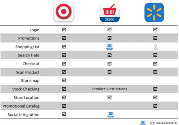
The benchmark was made, firstly based on international players already well positioned in the mobile retail market, such as Tesco, Walmart and Target. The last one, Target, carries a familiar mobile business strategy with one key APP and complementary ones that enhance the value of the main one.
The result of this market research can be seen in the figure 6, below. The figure shows a list of the main functionalities that these APPs provide to their customers.
It’s important to safeguard that in terms of “shopping list” Walmart only offers this in the iOS version of the APP, and that Tesco’s APP includes a deep link between this and its clubcard APP.
Another important conclusion is that Target’s APP provided all the major functionalities identified, and it’s the only one providing an in –store map with in-store location of cataloged products. In terms of stocking control, while Target and Walmart choose to offer this option, Tesco offers a different mechanism by presenting the possibility to substitute disrupt products for others in stock.
Figure 6 – International Benchmark Conclusions
Since this analysis is crucial to overcome competitors and to maintain a competitive advantage, some national players and players with businesses in Portugal, were, also taken into consideration,. The research was conducted on the APPs offered by Pingo Doce, Nespresso, Ikea, McDonalds, El Corte Ingles, Lidl, MiniPreço and Intermarché. None of this players offer an APP with the same context of Continente’s APP, since their main focus is brand building with special emphases on promotional awareness, as it is shown in figure 7. The only exception is Nespresso that helps the customer in a purchase context, during in the order process, where it is possible to make reservations and collect the products later in a physical store.
In short, the retailers under research have chosen to join the purchases support features of physical and online store in the same APP. However, by developing them with a specific scope, and focusing on the features, the look and feel of the APP isn’t very appealing. It is noteworthy that the majority of these APPs guide themselves through UX pattern designs established by the so-called “trenders”, like Apple and Google.
Back in Portugal, the retailers with mobile market have elected more branding APPs with special emphases in features such as promotional catalogs.
3.4 Preliminary Questionnaire
Understand what users really want and what they really expect is a key factor to obtain success. The APP was developed to generate value for the users, surprising their needs and make them satisfied. If this isn’t the main purpose, the app doesn’t have many reason to exist. Therefore, in order to identify possible points of pain and collect point to improve, it’s crucial to ask users and really understand their demands.
For this it was decided to conduct questionnaires, which can be seen in attachment B. These questionnaires were made with real customers, the Continente customers, on a real environment, the hypermarket Continente of Matosinhos.
Continente of Matosinhos was the selected store because it is the one with more usage of the APP in store, in other words, it is the biggest store in terms of mobile adhesion.
The intended goals for this action was to observe customers in a real life situation, while gathering their feedback in terms of usability, design and user experience of APP Continente Also, we aimed to understand the frequency and purpose of its utilization, according to the following approach:
- If the respondent has never used it, then he/she would not complete the questionnaire, but would receive some insight about the APP and would be encouraged to download it and try it.
- If the response was positive in terms of usage, then the questionnaire would be addressed completely.
The results were as following:
Participants
Altogether, about 83 different persons, with ages between 21 and 42, were approached to take part of our questionnaire. As we can see from the following figure 8, 69% of the participants never used the APP at all.
Figure 8 – Questionnaire Data Analysis, APP Utilization
After filtering out the people who never used Continente mobile application, only 26 participants remained (31%).
The majority of users were female, with 65%, one possible explanation is that women are the gender that still does most of the shopping purchases. In terms of smartphones usage, 62% of the participants hold an Android device.
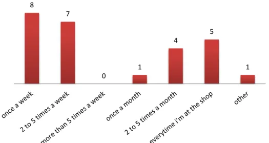
How often is the application used?
In the figure 9, bellow, it’s possible to see how often the application is used by the testers. About 31% use the application once a week and 27% uses it from 2 to 5 times a week; 19% of the participants use it every time he/she is at a store.
Figure 9 – Questionnaire Data Analysis, Frequency of use 8 7 0 1 4 5 1
26
57
Uses the APP?
Sim Não
Why is the application used?
As proven by the figure 10, the application is used mostly to check card balance (81%) and to check coupons availability (77%). Checking the promotional catalog is also an appreciated feature with almost 38% of the participants responding affirmative to this.
Figure 10 - Questionnaire Data Analysis, Reasons to use
How is the interaction with the sliding menu?
Figure 11, below, shows us the level of interaction regarding the current menu of the APP. Almost 62% of the participants feel that the slide menu is navigable, which still mean that is possible to improve.
Figure 11 - Questionnaire Data Analysis, Interaction with the current menu 21 20 8 9 10 4 0 0 1 6 16 2 1 1 Easy to navigate, clear and intuitive
Navigable Navigable after a "learning" period
Difficult to navigate and unintuitive
Difficult to navigate and not very
Evaluation of the application in terms of complementary functionalities
In the figure 12, it is possible to see the evaluation of complementary functionalities. The parameters go from “never used”, displayed on the left side, to “did not know it existed”, “not useful”, “uses casually” to “uses regularly”, which is on the right side.
With the exception of the search for products that is used casually by about 38% of the participants, the other functions all almost “never used” with special focus on the FAQ’s, about 81%, logout and list of stores, with proximally 62%.
Figure 12 - Questionnaire Data Analysis, Complementary Features
Evaluation of the application
Below, in figure 13, it is possible to see the evaluation of the application by the participants.
The values go from “very bad”, on the left side, to “bad”, “acceptable”, “good” to “fantastic” on the right side. The overall evaluation, in terms of global satisfaction differs between acceptable and good.
It is important to safeguard that the usability is the most appreciated characteristic, from those under study.
Figure 13 - Questionnaire Data Analysis, APP Evaluation
What can be improved?
0 5 10 15 20 Design Color scheme
Interaction Usability Usage experience Global satisfaction Very bad Bad Acceptable Good Fantastic
Don't know/ Didn't Answer 0 5 10 15 20 25 Never used Didn't know it existed Not useful Uses casually Uses regularly Don't know/ Didn't Answer
It’s important to ask the customers their needs and what they want to be provided. Therefore, the figure 14 below, illustrates the voting about what could be rethought and maybe improved. The three main aspects that customers would like to be improved are the features offered, optimize existent functions and add new ones (65%), the overall design of the app (35% think it could be more clean and appealing) and about 27% think the promotional highlights could also suffer a rearrangement. These results show clearly that the application has a lot of space for improvements.
Figure 14 - Questionnaire Data Analysis, Possible Improvements
Some important comments retrieved from the questionnaires:
-“Integrate APP Listas and APP Tira-vez within the APP Continente” -“Optimize in-store mapping”
-“Integrate the remaining APPs from the brand and have the option to choose which one you intend to use”
-”More interaction between the APP and the website www.Continente.pt”
-“A place where I can check the notifications I have received”
-“I would like to easily have access to the top promotions of my top purchases”
It is important to safeguard that almost 70% of overall customers that were approached did not used the APP or even had knowledge of its existence.
As taken from the results displayed above, the APP is mostly used to check card balance and coupons, to use them at the store, and to check the promotional catalogs. In general, customers think the APP is quite navigable, although about 20% think that a learning period is needed to better understand its utility. Complementary functions such as shopping list, search products and locate stores are almost not used by the customers, that simply don’t see interest on them or don’t even know that they are provided. The optimization or the addiction of new features are what most customers would like to be improved, 65% responded affirmative to this, while 35% believes that design might suffer some improvements too.
Broadly the APP is well accepted by the customers.
9 6 4 17 7 3 7
Design Navigation Menus Features Promotional highlights
3.5 Requirements
As it was already mentioned, APP Continente is a physical store auxiliary context based mobile application, which incorporates the power of the physical customer card and the discount coupons, so it can be used in store purchases.
Speed, convenience and simplicity in consulting the card balance and available coupons as well as the purchase history and assets flyers are some of the features offered by this unique and innovative service.
After the analysis of the results acquired with the questionnaires, some crucial insight was gathered in order to specify de requirements for the new version of the APP Continente that would be the object of test. It will also, probably, lead to the enhancement of the user experience provided via APP and that will be mirrored on the UX Book, which will serve as a starting point for all the APP implementations of the organization.
This said, and based on the results obtained, the requirements were catalog in two dimensions of functionalities: core and complementary.
The core functionality, are the ones with most appeal to the customer, the ones that call their attention, giving value and grabbing them. They can be requirements related to the card and coupons usage and with the consultation of the promotional catalog.
Concerning the second dimension, complementary, the main goal is to enhance the user experience through the interaction with the APP. These, are the ones that makes the user to choose one APP over another. Therefore, and regarding the APP Continente, the requirements about the user account and definitions were taken into consideration, as well as search and interaction with stores and products.
It was specified that the card and coupons functionalities will be aggregated and tested as just one, and would be called coupons maintaining features from both, checking and store usage. The promotion aspect of the APP is also something to be taken care of. A non-logged home page with more promotional matters and communication is also required, and is something that will grab the user instantly.
On the subject of stores and products, as they are practically unknown or unused, trying to enhance their value is also a aspect to consider. To do this, the introduction of new features in both as well as a filter that will help during the search process, it was proposed.
A completely new functionality that was suggested, is the inbox, which will keep all the communications, made from the brand to the user. This inbox will also provide related interactions such as, for instance, a redirect link to the promotional catalog when a promotion is received. This might be a small detail but that might be of extremely importance, and as is well known less sometimes is more.
Introduction of gestures, like swipes, slides and double tapping, as well as social network sync is also something relevant and nowadays, a mobile must.
All of these requirements plus the APP renovated look and feel will be more explored in the next topic, about low-fidelity prototyping.
3.6 Mock ups
Planning a reliable mock up is one very essential aspect of successful design, is one of the first steps in the APP development process. It expands functionality and brings forth better ideas. It’s a great way to get a feeling of what the app’s functionalities are and which parts need further clarification.
The elaboration of mock ups was also the method used in this process to elaborate the UX Book and enhance user experience. Based on the requirements previously defined and since the APP already existed, a more graphical mock up approach was selected for this structuring and designing process.
The main goals for these mock ups were to allow the test of two different models, in terms of user experience and usability, having as basis different navigation menus, so it will enable us to understand what might be standardize among the development or restructure of the APPs of the organization.
For the development of these mock-ups, the Balsamiq software was used.
Figure 15 –Mock ups, Two distinct APP landing pages
As illustrated above in figure 15, two models were elaborated having as basis two distinct navigation interactions, and presenting different but light designs for both of them, in terms of layout structure, color scheme, and the different positioning in app of UI elements.
The model presented on the left is based on a sliding menu, while the other presents a fixed navigation menu on the bottom of the screen.
All the mock-ups follow this methodology and will be further illustrated on attachment C. This will also lead to the development of two distinct prototypes that will be tested and further explained on the next chapter.
4 Testing with real Customers
It is a fact that UX is important. However, when it comes to sell UX work, it can frequently feel like nobody else seems to get its importance. Clients and even colleagues often seem completely intractable to ideas when we present them. This is where testing comes around and becomes absolutely vital to sell an idea and improve the development process and consequently enhance user experience.
Ask more, speak less. The more you listen to your clients and potential clients the more likely you are to truly understand them. Questioning is good but, knowing when to be quiet and let the clients do the talking is extremely important.
As you start working on designs, check how they come across to users. You should test your visual designs before they have even been animated, to be certain that users can understand them with a simple peek. Test button and icon designs, and any interactive widgets you have created. Often this is the stage where the team will debate about design details. The tests are a crucial tool to quickly settle those debates.
The purpose of these tests is to understand which problems the users face when they use the service provided by the application Continente. The tests were structured based on the results obtained in the preliminary questionnaires conducted in an action on the hypermarket Continente of Matosinhos and also in some ideas the team wanted to test, as a result of an analysis on the current APP.
Therefore, this was the approach used in APP Continente and that will be further explored in this chapter 4, starting with the preparation of the test, in which it will be explain the methodology in use and its execution, and consequently exploit the results obtained.
4.1 Test preparation
Normally the best results come from testing a particular “journey”, the process of using a specific APP characteristic. The key is the correctly choose the journeys, and start by testing them. By focusing the test, you will get more actionable feedback.
As we are trying to redesign APP Continente and use its core features to normalize the development of the remaining company APPs a question might surface: How far should we go in changing the look of an existing APP?
Changing the look of an APP can create intense dissatisfaction among your client base, the ones that are familiarized with it but, it can also attract new ones. So, it is strongly recommended that the tests are to be run on major UI changes before they are pushed into the market.
Two factors that are critical to the success of a mobile APP and that were object of study are: Usability and Emotional Engagement.
Usability means the capability of a common user to easily figure out how to use an APP. Mobile users are notoriously impatient, if an APP is complicated to use, they will probably move on to another one. This is one point we want to prevent, so, we can never assume that it will work. To test is the way!
Early in the process you should test the basic flow and key features of your APP. Do users understand what they are supposed to do? Have you made the most important features easy to find?
It can be very hard to decide which features to prioritize on mobile. User testing can help you answer that question.
Later in the process, you should focus on perfecting navigation and user flow. Do all the buttons and icons make sense? Does your help system work properly? Yes, a helping mechanism is needed in any mobile application, provide the user with adequate feedback is a crucial mobile aspect.
Also, the objective is not to test the functionality but to test the experience provided by that functionality, so it is possible to identify bugs as well as experience issues.
Regarding the subjects under study, normally as few as five users will be enough to allow you to detect most of the problem you would find in an APP. But, for many, between five and ten users is the perfect range for testing purposes. If you sense this analysis is not enough, it is better to do multiple rounds over time, rather than to group them all together.
Taking all of the above under scrutiny, a base of ten Continente customers were selected for this study, it was wanted that the users were already familiarized with the brand. For demographic reasons the clients selected were from the metropolitan area of Lisbon. The main differentiator factor was the client previous experience with the APP, meaning if they already had contact with the APP or not. This said and from this range of ten, two categories of five clients were established, users that already use the APP and users that never had contact with it. The table 1 below shows some major characteristics of the participants.