Inspædia: [almost] everything about simplicity,
playfulness and inspiration
Paulo Maldonado1,2,3, Fábio Teixeira3, José Pinto Duarte2, António Câmara4, Nuno Correia5, Leonor Ferrão1,2, Pablo Ermida1,3, Maria Passos1
1 Universidades Lusíada, Centro de Investigação em Território, Arquitectura e Design, Rua
da Junqueira (CITAD), Rua da Junqueira, 188-198, 1349-001 Lisboa, Portugal
2 Universidade de Lisboa, Faculdade de Arquitetura, Centro de Investigação em Arquitetura,
Urbanismo e Design (CIAUD), Rua Sá Nogueira, Pólo Universitário do Alto da Ajuda, 1349-055 Lisboa, Portugal
3 Universidade Federal do Rio Grande do Sul, Pós-Graduação em Design, Avenida Oswaldo
Aranha, nº 99, 6º andar - sala 607, CEP 90035-190 Porto Alegre – RS, Brazil
4 Universidade Nova de Lisboa, Faculdade de Ciências e Tecnologia, Departamento de
Ciências e Engenharia do Ambiente, Campus de Caparica 2829-516 Caparica, Portugal
5 Universidade Nova de Lisboa, Faculdade de Ciências e Tecnologia, Nova Lincs – Laboratory
for Computer Science and Informatics, Departamento de Informática, Quinta da Torre P 2829-516 Caparica, Portugal
{paulomaldonado, pabloermida, mariapassos}@inspaedia.com, [email protected], {jduarte, lferrao}@fa.ulisboa.pt, [email protected], [email protected]
Abstract. The aim of this paper is to disclose the new research developments
and the results from the systematization of experience and user interaction with the Inspædia (a new web knowledge “Agora”), to inspire a dynamic, collaborative, and interactive intelligence among the inspædiers. We will explain in detail and describe the design process and discuss the ultimate design interaction concept & development regarding (almost everything about) simplicity and playfulness of the inspædiers’ experience to transform relevant information (related > meanfull > useful) in productive knowledge (inspiration > insight > foresight) in a very easy and quick way (usability: learnability; understandability; operability; attractiveness…), with a smile in the face (satisfaction) and a wow in the mind (or in the soul).
Keywords: Interaction design · User experience design · Productive thinking
1
Inspædia UXD concept context
The ambitious objective of offering inspædiers a simple, intuitive, meaningful and highly inspirational experience for the processes of design and innovation was present at every stage of the inspædia research and development process, from the research for the doctorate degree in Design, including the final document of the thesis entitled
Inovação, design et cetera (Innovation, design, et cetera), until the present [1], [2],
[3], [4], [5]. Although we consider that the inspædia platform, due to its underlying philosophy, cannot find similar alternatives on the web, it was fundamental to invent a
unique and memorable concept that would “takeoff” from the visualization and interaction concepts proposed by other platforms. We wanted to achieve more, with the least possible, a task that we knew to be everything but simple. The complexity inherent to the inspædia concept should not, nor could it, transpire to the user experience so that it would not diminish the playfulness of the experience – another objective that we aimed for continuously. We know that the simplicity/playfulness pairing is non-dissociable and, for that reason, it is indispensable to reach a higher level of inspiration − an ultimate objective of inspædia (whether for the process or for the results of the posterior application and implementation of inspiration). The complexity on the platform, deliberately “hidden”, would serve (only) to feed and enrich (with suggestions) relations and unexpected leaps, the processes of productive thought, amplifying them through the discovery of new meanings and significations and by the possibility to access a new type of perception of the information now made available by inspædia to the World that may want to be a part of it [6].
At the origin of the concept of inspædia user experience design (UXD) and interaction design (IxD) were, as sources of inspiration, among many other references [7], [8], [9], [10], [11], [12], [13], [14], [15], [16], [17], [18], the TEN LAWS and the THREE KEYS of SIMPLICITY [10], the aphorism FORM FOLLOWS FUNCTION [19], the TEN PRINCIPLES FOR GOOD DESIGN [20] and the aphorism FORM FOLLOWS EMOTION [21]. The importance of these references for the inspædia concept is, in itself, sufficient to justify the proposed title – «Inspædia: [almost] everything about simplicity, playfulness and inspiration» and the article that gives it breadth. Our subtitle will serve, lastly, but not least, to give meaning to the argumentation that we now present and that sustains the essence of the “thing” and the primary “functional” requirement of Inspædia, and for which effect we start by calling, chronologically, some of our favorite authors.
In 1896, Louis Sullivan (1846-1924), concerning the article “The Tall Office Building Artistically Considered” announced the law FORM FOLLOWS FUNCTION that found many followers, particularly, among the modernist architects and designers, «Whether it be the sweeping eagle in his flight, or the open apple-blossom, the toiling work-horse, the blithe swan, the branching oak, the winding stream at its base, the drifting clouds, over all the coursing sun, form ever follows function, and this is the law. [...] It is the pervading law of all things organic and inorganic, of all things physical and metaphysical, of all things human and all things superhuman, of all true manifestations of the head, of the heart, of the soul, that the life is recognizable in its expression, that form ever follows function. This is the law» [19].
Sullivan’s maxima FORM FOLLOWS FUNCTION may have been in the spirit of Dieter Rams (b. 1932) as well as of EVER (meanwhile omitted) and may have been sufficiently inspirational for his reflection on the ethical and conceptual principles that rule (good) design. His TEN PRINCIPLES FOR “GOOD DESIGN” marked (and still mark) the principles that rule the conduct and the professional activity for many designers: “Good design is… innovative; makes a product useful; is aesthetic; makes a product understandable; is unobtrusive; is honest; is long-lasting; is thorough down to the last detail; is environmentally friendly; is as little design as possible” [20]. In sum, the design ethos of Dieter Rams – LESS but MORE that we also pursued and incorporated in the UXD inspædia. But Hartmut Esslinger (b.1944) affirms that the aphorism FORM FOLLOWS FUNCTION «was a simplistic and misunderstood
reduction of Sullivan’s wider description» and amplifies it to FORM FOLLOWS EMOTION, which evokes other notes non-dissociable from form and use – the seduction and the empathy transform the use and the usufruct of a simple experience in a total experience; playfulness [21]
John Maeda (b. 1966) identifies and defends the TEN LAWS and the THREE KEYS of SIMPLICITY. He starts by arguing that «“SIMPLICITY = SANITY (Technology has made our lives more full, yet at the same time we’ve become uncomfortably “full”)». To this purpose we undertook the TEN LAWS that we have tried to integrate in the concept of the inspædia platform, compelled by the mission to reinforce the interaction, the meaning and the experience with a lot of «sense and simplicity»: «REDUCE – the simplest way to achieve simplicity is through thoughtful reduction; [...] ORGANIZE − Organization makes a system of many appear fewer; TIME – Savings in time feel like simplicity; [...] LEARN – Knowledge makes everything simpler; [...] DIFFERENCES – Simplicity and complexity need each other; [...] CONTEXT – What lies in the periphery is definitely not peripheral; [...] EMOTION – More emotions are better than less; [...] TRUST – In simplicity we trust; [...] FAILURE – Some things can never be simple; [...] and THE ONE – Simplicity is about subtracting the obvious, and adding the meaningful». Maeda concludes with the following affirmation that complements the TEN LAWS: «THREE KEYS are important technology makers for the future of simplicity: AWAY – More appears like less by simply moving it far, far away; OPEN – Openness simplifies complexity; POWER – Use less, gain more» [10].
In the following section we argue in what way we applied the concept of simplicity to attain playfulness and inspiration.
2.
Simplicity, playfulness and inspiration
GET INSPIRED (Fig. 1.2) is the provocative and motivational message of action that appears when inspædiers (collaborative visual storytellers) access the online platform <www.inspaedia.com> (Fig. 1.1). This if the possible future that we envision and the purpose that moves us (personally) and that moves the community of collaborative intelligence – the inspædiers, who, when using the platform, feed it with new contents, new relations between contents, collections of favorite things and navigation trails, contributing to generating, collaboratively, the (individual and collective) inspiration, as well as potentiating new knowledge, by proactively contributing to “BE innovation”.
In spite of the access to the platform for non-registered users allowing the exploration of some suggestions of randomized contents (contents with a bigger number of relations and, potentially, more inspirational) (Fig. 1.3), registration is suggested. The new user immediately receives her/his access password via email. Registration allows her/him to access, without limitations, the inspædia platform using either of the two modes of visualization and interaction: MAP (Fig. 1.5) e TIME LINE (Fig. 1.22). These two visualization modes, as we will see ahead, through the images that illustrate and support the discourse (Fig. 1.), constitute a kind of revolution in perception, because they make possible a new kind of visualization of related contents, of navigation and of interaction. They promote non-linear thought,
productive thought (high creativity) and inspiration: MAP, centered exclusively in related images, is organized in concentric circles from the centre to the periphery (by proximity levels that stem from the number of tags common among the contents); TIME LINE, makes apparent the proximity of the contents in a certain time period and organizes and relates the information (in a timeline) through FACTS (relevant occurrences) and ET CETERA (material and immaterial culture, that is, everything that is not facts, but artifacts). The interaction allows the user to jump between the two visualization modes, diversifying and complementing the information, allowing the exploration of the more or less unexpected and obvious relations between the contents (through serendipity or through the text, in a more fine and filtered search – SEARCH).
When one accesses the inspædia platform, the information is organized, on the screen, from the centre to the periphery, the centre being (in its totality) destined to the contents that are related by levels of proximity (MAP) and the periphery destined to operations/actions LOG IN, ABOUT (about inspædia), YOU (inspædier profile), WE (inspædiers collections and trails), SEARCH (through the text), MAP and TIME LINE (for alteration of the mode of visualization and organization of contents), MY TRAIL (i.e. personal navigation history), ZOOM IN, ZOOM OUT (of the contents so as to allow visualizing , simultaneously, a bigger number of related contents) and CENTRE (a certain selected contents) (Fig. 1.6). As we have seen, it is possible to go from the MAP mode of visualization to the TIME LINE mode, bearing in mind that the organization of these two modes of content visualization is distinct. In simplification, the TIME LINE mode of visualization is organized in the two horizontal halves of the screen (Fig. 1.22). In the bottom half of the screen we have the scale of time (pinpointing the years) and the representation, through dots, of all the
inspædia contents (in this case inscribed and classified as FACTS or ET CETERA)
and localized in the corresponding data. Its is possible the interaction, whether with the timescale or with the contents through ZOOM IN, ZOOM OUT and PAN, to move the timescale to a particular year and, thus, to visualize more quickly the contents that are close to it. By doing “mouse through” over a content (dot) an image of that content appears. By clicking on a content one can visualize, in the upper part of the screen, the corresponding image and the brief description of that content. Still in the upper part of the screen it is possible to move forward or to go back from content to content (following a sequential and uninterrupted time line) or to access the content (by clicking the content or the title).
The process of simplification of the visualization of contents, of the relation they establish among themselves and of the navigation and interaction, entailed the definition of the chromatic palette to be used, as neutral as possible so as not to create noise and not overcome what is important (to explore, to visualize and to interact). For the background of the screen we have opted for a simpler and less intrusive solution – the use of gray (15% black, for being neutral and less tiring to the eyesight, leaving the perception more free to what’s essential). For the contents we have opted for their inscription in circles defined by a contouring line, in white. For the buttons and text messages the option was to use the rectangle (with rounded corners), black background (70% opacity in the buttons) and open white text. We opted for the use of a monochrome palette for all the information that was not contents, so as to minimize the noise. The chromatic (uncontrollable) profusion of the contents was determinant
for making this decision. We opted for the differentiation of the geometric figures used for the contents (the circle) and for the buttons (the rectangle with rounded corners). The formal (and chromatic) differentiation is fundamental to activate the perception mechanisms in relation to the identification of, and distinction between, content and secondary action/operation (the interaction reduction for only two types of form simplifies and makes easier the learning and the more intuitive operations). Several tests were made regarding the organization of the contents in concentric circles, with the objective of minimizing the visual and intellectual fatigue brought about by prolonged used. The process of simplification entailed also finding the most adequate geometry, the harmony and visual coherencies and by the definition of the number of contents in each concentric circle, facilitating the perception of the relation of the contents by the proximity among them. It entailed also the dimension of the circles where the contents are inscribed, by the thickness of the content circles’ white contour line and by the distance of the content circles among them. We used a white line that unites visually the levels of the contents, so that when one does pan, one does not loose the centre. We have tried to find a visual balance between the cluster of contents and the background (interstices) that works, independently of the number of visualized contents simultaneously (in consequence of the zoom in or zoom out) and the dimension of the screen, that may be situated between 7,9” (iPad Mini 2) and 15” (MacBook Pro) (most used range of screen dimensions), without setting aside the possibility of attaining 65” (Smart Kapp IQ). We also had under consideration the dimension of the circle where the content is inscribed so that the perception of the content’s image may be easily understood and the content magnification may be more correct when one does “mouse through”, so as to not overlap the contiguous contents. With the magnification of the content, a text window (full black rectangle with open text in white) appears simultaneously, corresponding to a first level of information that answers a first level of curiosity about a particular content. Any of each mode of visualization – MAP or TIME LINE – gives the possibility to access the complete information about a particular content and that information (content file) (Fig. 1.10) appears as a result of clicking over the content that aroused the curiosity of the
inspædier. The selection of contents, relations between contents and elaboration of the
content file is the responsibility of the CONTENT CONSTRUCTORS, and all the
inspædiers that gather a competencies profile that is sufficiently distinctive to
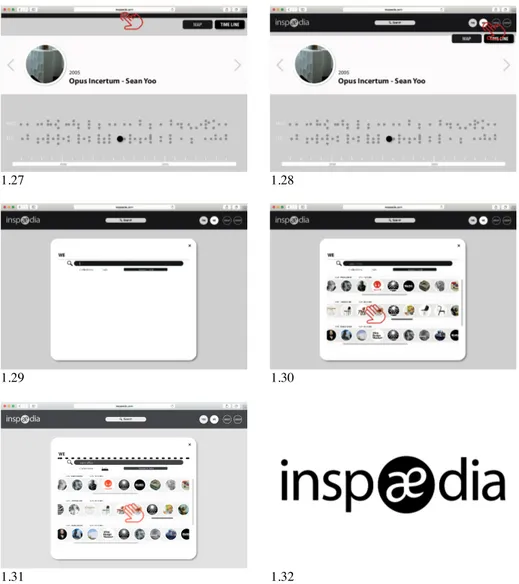
identify, relate and produce the content description, may be a part of this community, essential for the success of the platform. The content file contains a descriptive text, a list of related contents, a list of tags, links and sources as well as the name of the constructor of that content. By clicking in one of the related contents, or one of the tags, one establishes a new connection and, consequently, one accesses that content in the MAP visualization mode. The navigation and interaction in the content file departs from the same logic of navigation of, and interaction with, the platform, which allows for three possibilities: to send it with added comments, by email, to another inspædier, to add that content to a COLLECTION (new or existing) of that inspædier (Fig. 1.13) and to share that content on social networks. COLLECTIONS and TRAILS (Fig. 1.29) by the inspædiers who may want to share them with the community – an underlying principle of inspædia – can be accessed from the YOU and SEARCH buttons (from the SEARCH button it is possible to choose to do an advanced research by using the available filters). From this search, a visual listing of the
COLLECTIONS will result if we introduce the name of an inspædier, or of a content, or of all TRAILS that include the name of the content on which the search was based. That is the starting point for accessing and exploring the selected COLLECTIONS and TRAILS. We may start at any content of the COLLECTIONS or TRAILS to access the visualization of that content and of all those contents with which it established relations, in any of the modes, MAP or TIME LINE. The existence of MY TRAIL (Fig. 1.16) allows the user to access, at any moment, his or her navigation history in the platform (Fig. 1.17). By navigating in MY TRAIL it is possible, through the navigation and direct interaction with the contents or through the calendar that shows the days in which we have used inspædia, to access the previously visualized contents and to erase contents from MY TRAIL. In principle, the MY TRAIL(s), for being inspirational in themselves, can be visualized by any inspædier.
The concepts of simplicity and of playfulness were also determining when it was necessary to take decisions regarding typographic sources, icons and the inspædia logo. We have used Helvetica type font (Neue Condensed Bold or Helvetica Bold or Regular) for its formal simplicity and good readability. The profusion of icons in the web and the difficulty of identification and memorization bring about enormous confusion and therefore we prefer to opt for very short texts (two words, maximum, to describe an action/operation). In relation to the logotype, we would like to emphasize that the word inspædia is a neologism. It is a word composed by ins(piration) + (encyclo)pædia. From this neologism we have drawn a new logotype (Fig. 1.32) with the presupposition that it should fulfill, entirely, the principles of good design previously enunciated. We have sought to explore the graphic characteristic more distinctive of the brand inspædia (æ), by transforming it into a memorable symbol inscribed in a circle (chromatically contrasting with the word), that can be used on the web in the most varied scales. We have elected the typographic font Myriad Pro: without serif, it is balanced, harmonious and presents good readability. This font has allowed, also, personalize the “e” because the detail, as minute as it may be, is always perceivable. We folllowed Moogridge advice: «prototype early and often, making each iterative step a little more realistic. At some point you are likely to experience that wonderful “Ah ha!” feeling that comes with a creative leap, but that is only an indication that you have moved forward in the detail of the aspect of the design that you are focusing on right then. You will only know that the design is good when you have tried it out with the people who will use it and found that they are pleased, excited, motivated, and satisfied with the result» [22].
1.3 1.4 1.5 1.6 1.7 1.8 1.9 1.10
1.11 l.12 1.13 1.14 1.15 1.16 1.17 1.18
1.19 1.20 1.21 1.22 1.23 1.24 1.25 1.26
1.27 1.28 1.29 1.30 www.inspaedia.com WE
Collections Trails Research Tools
eams office
USER : PABLO ERMIDA DATE: 14.11.2015
USER : JUYOUNG KIM DATE: 03.11.2015
USER : MARIA PASSOS DATE: 01.11.2015
1.31 1.32
Fig. 1. Inspædia User Experience. (1.1) www.inspaedia.com (1.2) GET INPIRED message (1.3) Clicking for more suggestions (1.4) Mouse through and first level of information (1.5) MAP visualization mode and MENU view (1.6) MENU options: SEARCH, YOU, WE, ABOUT, LOGOUT and MAP, TIME LINE visualization modes buttons, MY TRAIL, ZOOM IN, ZOOM OUT and CENTRE buttons (1.7) Mouse through over a content and first level of information (1.8) Clicking over a content (1.9) After clicking over a content that content becomes the center of the MAP (1.10) Content file complete information (1.11) Interacting with the content file (1.12, 1.13, 1.14) Add a content to a COLLECTION (1.15) Go back the the content file (1.16, 1.17) MY TRAIL button, view and interaction (1.18) ZOOM OUT button (1.19) PAN (1.20) CENTRE button (1.21) Centred content (1.22, 1.23) TIME LINE visualization mode (1.24) TIME LINE mouse through and click over a content (1.25) Content file (1.26) Go back by clicking (1.27) Go to MENU (1.28) WE button (1.29, 1.30, 1.31) SEARCH and interacting with COLLECTIONS (1.32) inspædia logotype
3.
By the way…
Inspædia is the natural consequence and development of the prototype resulting from
the research in Design PhD thesis Innovation, design et cetera (FA/UTL, 2012). Therefore, it is being developed with the Science Without Borders Program (2013-2016) with a Special Visiting Researcher fellowship grant of CAPES (Brazil), and under the post-doctoral in Design at the Faculty of Architecture, University of Lisbon (FA/UL); CIAUD – Reseach Centre of Architecture, Urbanism and Design (FA/UL); Faculty of Sciences and Technology, Nova University of Lisbon (FCT/UNL); NOVA-LINCS (FCT/UNL) and CITAD - Research Centre for Territory, Architecture and Design (FAA/ULL). The Inspædia research project was ranked in first place in Design scientific area and obtained a post-doctoral fellowship by FCT – Foundation for Science and Technology (Portugal). The project has been internationally disseminated at international Design conferences with indexed publications. It was presented and published both at AHFE 2014 (Krakow) and AHFE 2015 (Las Vegas). It was part of the biennial Experimentadesign tangential events in 2013 (EXD'13), 2015 (EXD'15) and was presented, by invitation, at the International Congress DESIGN I-CON (2015). During the last year we prototyped and tested (usability testing) with some inspædiers different approaches to achieve users’ needs > desires > expectations) in a challenging way, in order to provide the most powerful and memorable user experience.
The launch of the book "Inspædia: innovation, design et cetera" will take place in 2016. The paper and particularly the viva presentation of the Inspædia web platform aspires to get from the scientific community the necessary feedback for the final touches (user experience, interaction design and attractiveness bias) before the online implementation that will happen in September 2016. We hope it will become a viral “social belonging”.
Acknowledgements. CITAD – Centro de Investigação em Território, Arquitectura e Design, Universidades Lusíada, Lisbon, Portugal; CAPES, Programa Ciência sem Fronteiras, Brazil; PGDesign UFRGS – Universidade Federal do Rio Grande do Sul, Brazil; CIAUD – Centro de Investigação em Arquitectura, Urbanismo e Design, Faculdade de Arquitetura, Universidade de Lisboa, Lisbon, Portugal; This research is financed by CAPES (Fellowship by CAPES/Brazil Ref. A025_2013); This research is also financed by National Funds by FCT – Fundação para a Ciência e a Tecnologia, in the scope of the project (UID/AUR/04026/2013).
References
1. Maldonado, P.: Strategic Design: an Innovation and Design Process Flowchart. CIPED VI Congresso Internacional de Pesquisa em Design Livro de Resumos. CIPED VI Congresso Internacional de Pesquisa em Design, pp. 292-293. CIAUD, Lisbon (2011).
2. Maldonado, P.: Inovação, Design et cetera (Innovation, Design and so on). PhD Thesis, Faculdade de Arquitectura, Universidade Técnica de Lisboa. [S.n.], Lisbon (2012)
3. Maldonado, P., Ferrão, L.: Inspædia: uma Rede de Inteligência Colaborativa Inspiradora (Inspaedia: a Collaborative Intelligence Network). Actas de Diseño – III Congreso
Latinoamericano de Enseñanza del Diseño, Año VIII, Vol. 15, pp. 193-197. Universidad de Palermo, Buenos Aires (2013)
4. Maldonado, P., Silva, F.M., Gonçalves, F.: Inspædia, Inspiring a Collaborative Intelligence Network: Designing the User Experience. 5th International Conference on Applied Human Factors and Ergonomics 20 Volume Set, pp. 463-472: Proceedings of the 5th AHFE Conference 19-23 July (2014)
5. Maldonado, P., Teixeira, F., Silva, F.M., Ferrão, L., Ermida, P., Passos, M.: Inspædia user experience design (UXD), Procedia Manufactoring, 6th International Conference on Applied Human Factors and Ergonomics (AHFE 2015) and the Affiliated Conferences, vol. 3, pp. 6044-6051 (2015)
6. Colborne, G.: Simple and Usable Web, Mobile and Interaction Design. New Riders, Berkeley, CA (2011)
7. Buurman, G.M.: Total Interaction: Theory and Practice of a New Paradigm for the Design Disciplines. Birkhäuser, Basel (2005)
8. Sterling, B.: Shaping Things. MIT Press, Cambridge, MA (2005)
9. Chaoui, C.: Encyplopedia of Human Computer Interaction. Idea Group Reference, Hershey, PA (2006)
10. Maeda, J.: The Laws of Simplicity, MIT Press, Cambridge, MA (2006)
11. Tapscott, D., Williams, A.D.: Wikinomics: How Mass Collaboration Changes Everything. Portfolio, New York (2006)
12.Tidwell, J.: Designing Interfaces. O’Reilly, Sebastopol, CA (2006)
13.Buxton, B.: Sketching User Experiences: Getting the Design Right and the Right Design. Morgan Kaufmann, San Francisco, CA (2007)
14.Anderson, S.: Seductive Interaction Design: Creating Playful, Fun and Effective User Experience. New Riders, Berkeley, CA (2011)
15.Hoekman, R.: Designing the Obvious: a Common Sense Approach to Web and Mobile Application Design. New Riders, Berkeley, CA (2011)
16.Mathis, L.: Designed for Use: Create Usable Interfaces for Applications and the Eeb. The Pragmatic Bookshelf, Raleigh, NC (2011)
17.Weinschenk, S.: 100 Things Every Designer Needs to Know about People. New Riders, Berkeley, CA (2011)
18.Lima, M.: Visual Complexity: Mapping Patterns of Information, Princeton Architectural Press, New York (2013)
19.Sullivan, L.H.: The Tall Office Building Artistically Considered. Lippincott's Magazine, pp. 403–409 (1896)
20.Rams, D.: Ten Principles for Good Design (2016), https://www.vitsoe.com/eu/about/good-design
21.Esslinger, H.: Design and Emotion (2006),
http://www.design-emotion.com/2006/08/15/getting-emotional-with-hartmut-esslinger/