Using Learning Analytics and Visualization Techniques to
Evaluate the Structure of Higher Education Curricula
Artur Mesquita Barbosa1
, Antonio Nilo de Araujo Neto1 , Emanuele Santos1
, Jo˜ao Paulo P. Gomes1
1
Departamento de Computac¸˜ao
Universidade Federal do Cear´a (UFC) – Fortaleza – CE – Brazil
{artur,nilo,emanuele,jpaulo}@lia.ufc.br
Abstract. In this paper, we propose a data mining technique that evaluates a
curriculum’s structure based on academic data collected from Computer Sci-ence students from 2005 to 2016. Our approach is based on the Synthetic Con-trol Method (SCM), which builds a linear model describing the relation between courses based on student performance information. The proposed model is com-pared to a linear regression model with positive coefficients. In addition to pro-viding the relation between courses, it can also be used to predict students’ grades in a specific course based on their previous grades. The results are visu-alized in a user-friendly tool, which allows for contrast and comparison between the official structure and the structure found based on the data.
1. Introduction
One of the most difficult challenges that educators and leaders in higher education face today is reducing the high student dropout rates in their institutions. In re-cent years, there has been an increase in the number of approaches that apply Learn-ing Analytics techniques tryLearn-ing to solve this problem [Anuradha and Velmurugan 2015, Kantorski et al. 2016, Badr et al. 2014, de Brito et al. 2014]. These approaches use aca-demic and socioeconomic data collected from students to early diagnose the students prone to evasion and then take appropriate measures for preventing it.
However, the structure of the curriculum also plays a big role in the development of students’ knowledge and their performance [Anuradha and Velmurugan 2015]. Despite this fact, research using learning analytics to analyze curricula, pointing out strengths and weaknesses, are not very common in the literature. Additionally, there is also a significant demand for tools to assist educators in using data and evidence to build better curricula.
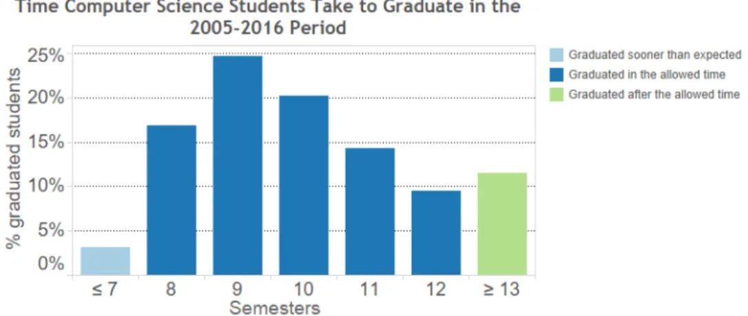
Figure 1. Distribution of graduation time in semesters for Computer Science students. The observed period is from 2005 to 2016. Most of the students take more time than the standard time suggested to graduate (8 semesters).
We verified the feasibility of our approach by applying it to a dataset collected from more than 800 Computer Science students enrolled in the same curriculum along a 10-year period. We compared our results to a linear regression model with positive coefficients. Our tests showed that our approach produces more interpretable results that led to several important insights regarding the structure of the computer science program in analysis. We also use the same dataset to describe how our proposed visualization tool can be used by educators to analyze the results and to compare with the official structure of the curriculum and find hidden relations between courses.
The remainder of this paper is organized as follows. In Section 2, we explain the collected dataset and the SCM Method. In Section 3, we describe our experiments and our results. In Section 4, we provide a short description of the developed visualization tool before discussing our results in more detail in Section 5. In Section 6, we review the related work and finally, in Section 7, we conclude our paper and outline directions for future work.
2. Methodology
In this section we describe the learning model used to evaluate the structure of a curricu-lum. We start by describing the dataset used in our experiments and then, we present the Synthetic Control Method (SCM) and explain how it is used in our analysis. Roughly speaking, SCM builds a linear model that tries to predict the grades of students in a given course based on their grades in previous courses. The coefficients of the linear model reveal the courses that are used to predict the grade. Using this result, we can infer a possible dependency relation between courses.
2.1. Dataset description
Table 1. Description of the attributes collected for each mandatory course taken by the Computer Science students in the dataset.
Attribute Type Description
Course ID int A unique number identifying the course. Grade float Final grade for the course.
Attendance float Percentage of attendance (0 to 100) for the course. Semester float Semester when the course was taken.
GPA float Partial GPA of the most recent semester before the course was taken, 0 if it was taken in the first semester (GPA is the weighted grade point average, where the weights are the courses’ credits).
than the suggested 8-semester time: the average time is 9 semesters, and as we can see in Figure 1, there is a large concentration in 9 to 12 semesters. These numbers may in-dicate that the structure of the curriculum could be playing a part on this behavior and so we would like to know the answer for the following question: is there any relationship between the courses’ grades and their prerequisites?
In order to graduate, the students in this curriculum are required to take 31 manda-tory courses (they must also take a certain number of elective courses, but these were not considered in this work). The provided dataset contained information about the manda-tory courses taken by each student and it is described in Table 1.
Notice that for the students still active or the students that dropped out, we have the information only for the courses taken until then. Besides, there were a few cases when the student was able to take a course without fulfilling its prerequisites (this is allowed in some specific situations by the program). When this occurred, we left that course out of the analysis.
2.2. Synthetic Control Method
The Synthetic Control Method (SCM) was first introduced in the seminal pa-per [Abadie and Gardeazabal 2003]. In order to try to estimate the impact of terrorism in the Basque Country’s economy in the 70’s, the authors used regions in Spain to find a counterfactual group to represent a synthetic Basque Country, where the terrorism has never happened and, in this way, they would measure the differences between the real Basque Country and its synthetic counterpart. To do so, the work finds a convex combi-nation of the Spanish regions that best represent the data describing the Basque Country in the pre-terrorism period.
This approach could also be used to infer the impact of a specific measure in a undergraduate course, like changing its instructor, or changing the methods used in the classroom. In our work, however, we are interested in the convex combination produced by the method, from which we can extract some information about the relations between different courses in the curriculum.
We now describe the method used in this work. We first assume we have a matrix
Yn×m, where each row represents the grades of a student, and each column represents the
grades obtained by all the students in a given course. For now, we assume there is no missing data. Also, letXk×m be a predictor matrix, which containskdifferent measures
of students with final grade above 7 (hereby named as A grades, or B otherwise) in that course, average grade of B graded students, average grades overall, average attendance of A graded students, average attendance of B graded students, average attendance overall, average GPA from A graded students at the moment they enroll in that course, average GPA from B graded students, average number of A graded students in that course, average number of B graded students.
Our goal is to find a combination of course grades that best represent a certain target course. Consider that the last column in theXandY matrices, denoted byX1and
Y1, contain the data related to our target unit (treatment unit, in Abadie and Gardeazabal’s
original work). The rest of the matrices,X0andY0, comprehend data from the rest of the courses, hereby named control units.
Let Wm−1×1 be a vector where 0 ≤ wi ≤ 1 and
Pm−1
0 wi = 1. Our purpose is thereby to find such a vector, where the synthetic group, Y0W, best represents the
target unit output Y1. To measure this representation, we use aVk×k diagonal matrix in
which each element vi,i accounts for the relative importance of the i-th predictor when
comparing the difference between the synthetic group and the target unit. We arrive at an iterative optimization loop of the form:
V = arg min V
(|Y1−Y0W(V)|) (1)
W(V) = arg min W
((X1−X0W)TV(X1−X0W)) (2)
To obtain the desired output, we apply this method considering one course as the target unit at a time. In addition, we only use courses as control units for a certain target if they occur before that target in the curriculum; i. e. for a target unit in theM-th semester, M >1, only the courses in semesterM −1or earlier are used as controls.
3. Experiments and results
The first part of the experiments consists in using only grades from students that eventu-ally graduated the program. This way, we maintain the number of samples for each target unit constant, avoiding missing data. We then compare the SCM’s results with those obtained from linear regression with positive weights. We decided to use constrained lin-ear regression (positive weights) because negative relations between grades of different courses do not seem to make sense.
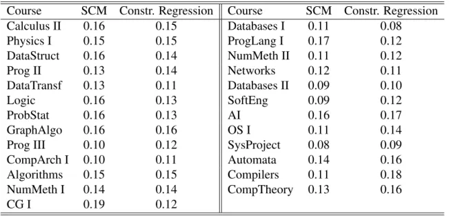
To quantify the performance of each method we computed the error between the predicted and the real grades. This result was averaged for all courses and all students of the dataset. The results for both methods can be seen in Table 2. Both models had a good performance in the grade prediction task. There is no course with an error greater than
19%and both methods achieved an average error of13%. It is important to mention that this is a remarkable result for SCM, since the linear regression is designed to minimize the error between the model and the real grades, while SCM is designed not only to accurately predict the grades but also to provide models with limited non-zero coefficients.
Table 2. Relative mean errors of each course for graduated students.
Course SCM Constr. Regression Course SCM Constr. Regression
Calculus II 0.16 0.15 Databases I 0.11 0.08
Physics I 0.15 0.15 ProgLang I 0.17 0.12
DataStruct 0.16 0.14 NumMeth II 0.11 0.12
Prog II 0.13 0.14 Networks 0.12 0.11
DataTransf 0.13 0.11 Databases II 0.09 0.10
Logic 0.16 0.13 SoftEng 0.09 0.12
ProbStat 0.16 0.13 AI 0.16 0.17
GraphAlgo 0.16 0.16 OS I 0.11 0.14
Prog III 0.10 0.12 SysProject 0.08 0.09
CompArch I 0.10 0.11 Automata 0.14 0.16
Algorithms 0.15 0.15 Compilers 0.11 0.18
NumMeth I 0.14 0.14 CompTheory 0.13 0.16
CG I 0.19 0.12
Table 3. Average Error and F1 Score for SCM and Linear Regression.
Synthetic Control Method Linear Constrained Regression
Average Error 0.13 0.13
F1 Score 0.27 0.20
setup, each possible required course is classified as being part of the prerequisites or not being part of the prerequisites. By using this framework, we can assess the performance of the methods using the standard F1 score. For both SCM and linear regression, we considered a course as a prerequisite if its associated coefficient is greater than 0.1. In Table 3, we present the average results for the error and the F1 score metrics.
The results in Table 3 show that SCM achieved a F1 score greater than the lin-ear regression’s. That performance indicates that SCM’s predicted dependency between courses is closer to the official curriculum. It is also important to notice that both methods had low F1 scores (F1 scores range from 0 to 1). This fact is expected because we con-sidered a simplified scenario in which we wish to infer the dependency of courses only using the performance of the students. Although using this simplified assumption, several interesting insights are generated by our method. In the next section, we describe our developed visualization tool and then, in Section 5, we explain our insights and how we used this tool to find them.
4. Visualization tool
Figure 2. Visualization tool’s overview. The curriculum’s mandatory courses are displayed in chronological order. Each course is colored in shades of blue (the saturation increases according to its F1 score).
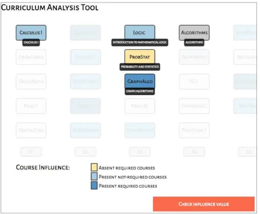
The visualization tool is composed of three main views: the overview, the course influence view and the influence value view. When the analysts load the tool on the browser, the first view they see is the overview (see Figure 2). In this view, the cur-riculum’s mandatory courses are displayed in chronological order, each semester is rep-resented by a column and each course is depicted by a box labeled with its code or a nickname provided by the analyst (the full name of the course is shown as a tooltip when passing the mouse over it). Also, each course is colored in shades of blue, and the darker the shade is, the larger is the course’s F1 score. The scale of these values is shown in the legend at the bottom-left of the page. The analyst can also click on the legend’s boxes to create a threshold for this value and filter only the courses that satisfy the selected threshold. The main purpose of this view is to show the differences between the official curriculum’s structure and the structured acquired from the data at a single glance and without displaying too much detail [Munzner 2014, Chapter 5]. In the first versions of this tool, we also considered showing the courses’ prerequisites by connecting them with edges but we soon decided not doing so to avoid clutter.
Figure 3. Course influence view. The courses that influence the selected Al-gorithms shown in gray are displayed in shades of blue (all the other courses are faded out). The prerequisite the model considered to influenceAlgorithms is shown in dark blue, and the real prerequisite considered not to influence it shown in yellow.
the influence rate. In this colormap, the saturation increases according to the influence rate. Similarly as the legend boxes in the overview, the legend boxes in this view also allow filtering courses based on a threshold value. The user can still perceive the official required courses because they have a thicker border around their boxes (seeDatabases I
in Figure 4). By clicking anywhere on the background, the users are brought back to the overview.
This tool allows the users to see how different the official curriculum is from the model built from the data, exploring different levels of detail. In the next section, we describe how we used this tool to gain some insights about the SCM results.
5. Discussion
Figure 4. Influence value view forDatabases II, in which the saturation increases according to the influence rate. In the model.Databases II is more influenced by Databases I, being consistent with the official curriculum.
of courses have the darkest shades of blue, which means that few courses in the official curriculum matched well with the model. For example,Databases II in semester 5, has only Databases I as a prerequisite in the official curriculum. If we see the influence value view ofDatabases II, as shown in Figure 4, we can conclude that although other courses were considered to influenceDatabases II, the model assigned a higher value to
Databases I.
Going back to the overview in Figure 2, we notice that most of the courses fit an intermediary value for the F1 score. In general, this is when the model does not include some of the prerequisites present in the official curriculum. In the case ofAlgorithms, for example, the model did not include the prerequisite ProbStat (see Figure 3). However, this case was very interesting because in a recent update of the curriculum in 2016, this prerequisite was removed from the list ofAlgorithms’ prerequisites and so, in the end, the model agreed with reality.
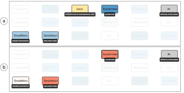
Another interesting case is when the model considered other courses to influence a certain course, outside the list of its prerequisites, also causing a low F1 Score. Take for example,AI (Artificial Intelligence) in Figure 5. In this case, the model included Discr-MathandDataStructin the courses that influenceAI, but that are not direct prerequisites. However, by inspecting other courses’ prerequisites we will discover that they are indeed indirect prerequisites and the student must have attended those courses before takingAI.
6. Related Work
Figure 5. Inspecting the courses influencingAI: a) Course influence view and b) Influence value view forAI.
techniques [Pechenizkiy et al. 2012, Wang and Za¨ıane 2015] with the goal of finding frequent paths. Another work also provided recommendations to the students’ career in the program [Campagni et al. 2015]. Our work focused on finding the relationships between courses, grades and prerequisites. Finally, another work provided an interactive visualization of academic trajectory patterns using nodes representing courses connected by edges to show students’ path [Jord˜ao et al. 2014]. The thicker the edges, the more students follow the same path. However, there is no Machine Learning algorithm being applied. Our work integrates Machine Learning and Visualization.
7. Conclusions
References
Abadie, A., Diamond, A., and Hainmueller, J. (2010). Synthetic control methods for comparative case studies: Estimating the effect of california’s tobacco control program.
Journal of the American Statistical Association, 105(490):493–505.
Abadie, A. and Gardeazabal, J. (2003). The economic costs of conflict: A case study of the basque country. American Economic Review 93. 113-132.
Anuradha, C. and Velmurugan, T. (2015). A data mining based survey on student per-formance evaluation system. 5th IEEE International Conference on Computational Intelligence and Computing Research, IEEE ICCIC 2014, (December 2014):43–47. Badr, A., Din, E., and Elaraby, I. S. (2014). Data Mining: A prediction for Student’s
Performance Using Classification Method. World Journal of Computer Application and Technology, 2(2):43–47.
Baradwaj, B. K. (2011). Mining Educational Data to Analyze Students’ Performance.
IJACSA) International Journal of Advanced Computer Science and Applications, 2(6).
Campagni, R., Merlini, D., Sprugnoli, R., and Verri, M. C. (2015). Data mining models for student careers. Expert Systems with Applications, 42(13):5508–5521.
de Brito, D. M., J´unior, I. A. d. A., Queiroga, E. V., and do Rˆego, T. G. (2014). Predic¸˜ao de desempenho de alunos do primeiro per´ıodo baseado nas notas de ingresso utilizando m´etodos de aprendizagem de m´aquina. Anais do Simp´osio Brasileiro de Inform´atica na Educac¸˜ao, 25(1):882–890.
Hinrichs, P. (2012). The effects of affirmative action bans on college enrollment, edu-cational attainment, and the demographic composition of universities. The Review of Economics and Statistics, 94(3):712–722.
Jord˜ao, V., Gama, S., and Gonc¸alves, D. (2014). EduVis: Visualizing educational in-formation. 8th Nordic Conference on Human-Computer Interaction, NordiCHI 2014, pages 1011–1014.
Kantorski, G., Flores, E. G., Schmitt, J., Hoffmann, I., and Barbosa, F. (2016). Predic¸˜ao da Evas˜ao em Cursos de Graduac¸˜ao em Instituic¸˜oes P´ublicas. Brazilian Symposium on Computers in Education (Simp´osio Brasileiro de Inform´atica na Educac¸˜ao - SBIE), 27(1):906.
Munzner, T. (2014). Visualization Analysis & Design. A K Peters Visualization Series. CRC Press - Taylor & Francis Group, Boca Raton, FL, 1 edition.
Ogunde and Ajibade (2014). A Data Mining System for Predicting University Students’ Graduation Grades Using ID3 Decision Tree Algorithm Ogunde A. O 1 . and Ajibade D. A 1 . Computer Science and Information Technology, 2(1):21–46.
Pechenizkiy, M., Trcka, N., De Bra, P., and Toledo, P. (2012). CurriM: Curriculum Min-ing. Proceedings of the 5th International Conference on Educational Data Mining, (i):1–4.