0
A Work Project presented as part of the requirements for the Award of a Master’s degree in Management with major in Accounting and Auditing from Nova School of Business and
Economics.
The (mis)use of graphs
Insights into the Portuguese companies’ annual reports
Written by
Filipe Ricardo D’ Assunção Mascarenhas de Almeirim e Bravo
Work Project carried out in the Accounting and Auditing area under the supervision of: Professor Leonor Ferreira
1
Abstract
Graphs are a suitable format for summarizing and disclosing information in annual reports given
that investors, and other addressees of graphs, may lack of the time required to fully analyse the
information. Therefore, graphs should be reliable, accurate and free from material distortions. This
Work Project aims to make aware of the importance that graphs have both for the report’s users
and the companies themselves. Moreover, this project investigates the potential roots of graphical
distortions. The findings suggest that the correlation between the level of graph distortion in
Portugal and the Board of Directors is moderate, although not significant.
Key Words: Company’s annual reports; Graph Distortions; Board of Directors; Portugal
1- INTRODUCTION
Companies communicate relevant information to stakeholders through the annual reports, and
often display it in visual formats, such as graphs. Citing the definition of graph, by the Cambridge
dictionary1, a graph can be defined as “a picture that shows how two set of information or variables (amounts that can change) are related, usually by lines or curves”. On the other hand, “graphs can
also reveal patterns, cycles and underlying trends that may not be obvious from tables” (Courtis, 1997).
Given that users are very busy persons who lack of time and ability (Vázquez & Trombetta,
2007), required to obtain a full and correct picture of the company, they desire a summary form.
1 Cambridge Dictionary. 2019. “Graph”. https://dictionary.cambridge.org/pt/dicionario/ingles/graph (accessed December 15th, 2019).
2
Graphs serve that purpose, providing a summary which facilitates the understanding of a
company’s position or performance, as they allow users to save time, but are also visually appealing, facilitate the memory recall, highlight trends and different relationships between
variables and breakdown language barriers (Courtis, 1997). However, it should not substitute a
small narrative to explain data – that’s what differ “friendly graphics” from “unfriendly graphs”
(Tuft, 1986).
While financial information is important for investors and has being constantly displayed by
companies, as exemplified by Ianniello (2009) and Chekkar and Martinez (2011), recent studies,
such as Guddal (2016) and Núñez (2016) have shown that non-financial information is becoming
visible due to corporate social responsibility issues.
The Management Board prepares the management report and decides about its contents and
format of presentation. They can also exploit the good (or bad) performance of managers, as
measured by the company’s financial results. Annual reports are not just a financial document anymore, but also a way of communicating the corporate image and brand name (Beattie & Jones,
1999).
Auditors do not have any formal procedures in order to audit graphs2. Their main responsibility
is to get significant evidence on whether the financial statements are correct or not regarding the
level of materiality3.
Despite the advantages that graphs might have, this Work Project provides evidence about the
use and misuse of graphs in annual reporting, based on the most recent data available for Portugal
2 Auditors do not have to audit “Other Information”, which includes graphs (ISA, 2016)]. Instead, they only audit financial statements.
3 “Information is material if omitting, misstating or obscuring it could reasonably be expected to influence decisions that the primary users of general-purpose financial statements make on the basis of those financial statements which provide financial information about a specific reporting entity.” – IFRS. 2018. “IASB clarifies its definition of ‘material’.” https://www.ifrs.org/news-and-events/2018/10/iasb-clarifies-its-definition-of-material/ (accessed November 30th, 2019).
3
and respective largest companies. For instance, are these distortions pure accident or are they
intentional?
This study contributes to the literature by alerting both regulators and the users of annual reports
for distortions graphs may have and for the potential effects of such distortions. This study
addresses for those who can be the possible roots of those graphical distortions. For instance, is
there any association between the company’s level of graphical distortion and the company’s Board of Directors, who may want to portray a more favourable picture of the company’s financial
position or performance as a sign of the Board’s good management?
This paper proceeds as follows. Section 2 introduces the main concepts required to understand
the full paper, namely rules for a proper graph design and its possible distortions. Section 3 reviews
the empirical literature about graph disclosures in annual reporting. Section 4 outlines the research
questions and hypothesis to be tested considering a specific sample. Section 5 presents and
discusses the main results. Section 6, lastly, summarizes the main conclusions taken from this Work
Project and provides practical implications of the findings, recommendations to solve the problem
and how future research may complement this paper.
2) NORMATIVE REVIEW
2.1) PRINCIPLES OF PROPER GRAPH CONSTRUCTION
There are many formats of graphs available for graph designers and their utility varies regarding
the situation and the information one wants to display. While line charts are more suitable to
represent trends, pie charts are preferable if a company wants to show the shares in relation to a
whole (e.g. composition of sales per product). (see Appendix 1 for more detailed information).
Before stating what are the types of graphical distortions that arise, rules for proper graph design
are reviewed. They should be applied by graph designers, who are responsible for the construction
4
The main rules, developed during the last decade of the last century, are summarized in table 1.
Table 1: Rules for Proper Graphical Construction
2.2) MISREPRESENTATION OF GRAPHS: TYPES OF DISTORTIONS
There are four types of distortions in graphs: Selectivity; Measurement Distortion; Orientation
Distortion and Presentational Enhancement. These distortions, displayed on graphs, aim to portray
a favourable picture of the company’s “financial health” or Corporate Social Responsibility. Selectivity occurs when the choice of the variables to be displayed on graphs depends on the company’s performance regarding those or other variables (Beattie & Jones, 2008). That is, in order to give a favourable picture of the company, if it is performing well, companies choose to
display them; if the company is poorly performing, the opposite usually happens.
Measurement distortion occurs when the physical size of the graph does not vary proportionally to the underlying numbers (Beattie & Jones, 2008) (see Appendix 2 as an example). Those
distortions may be favourable to the company in the sense that companies that are performing well
exaggerate those positive results and the ones who have negative results tend to understate the
negative/unfavourable trend. The opposite may also happen, that is, an exaggeration of negative
results or understatement of positive results, representing unfavourable Measurement Distortions.
Measurement Distortion arises from a misrepresentation of graphs, portraying an unreal
financial position or performance by the company (Beattie & Jones, 1999). While the other types
Author Rule(s)
Beattie & Jones (1997, 1998) ▪ The axis that form the framework should start from zero;
▪ When displaying time series, time should go from the left to the right; ▪ Graph designers should avoid three-dimensional graphs;
▪ Backgrounds shouldn’t be obtrusive;
Courtis (1998) ▪ The size of the symbols (e.g. columns) should vary proportionally to the numerical values; ▪ Multiple scales or nonarithmetic scales shouldn’t be used;
▪ Pie charts should have up to “five slices” and presented in a descending clockwise, from the largest to the thinnest sector.
Jarret & Babad (1981) ▪ A maximum of six colours should be used, with a proper legend.
5
of distortions are technically accurate, this distortion is not accurate and deceive people. Three
measures have been developed by different authors, as outlined on the following table:
Table 2: Formulas for Measurement Distortion
Presentational Enhancement occurs when there is a violation of any principles regarding the formatting and construction of the graph that may lead to some distraction or lack of accuracy when
analysing the graph. It may happen through the colour, scale, emphasis of some graphs (Penrose,
2008) and other treatments such as visual effects from three dimensional graphs and shading of
data markers (Courtis, 1997).
A problem arises when it makes it difficult to decipher data and alter the real message of it,
which affects the communication effectiveness (Courtis, 1997).
Orientation Distortion, on the other hand, appears when the slope parameter of the graphs diverges from 45 degrees4. Although the graph is “technically accurate”, it “does not facilitate the
accuracy of judgements upon it” (Beattie & Jones, 1997) (e.g. a great slope may be used to enhance
4 Orientation Distortions can only be measured on graphs that have rectangles (bar, columns, stacked column or stacked bar). For that, one needs to measure the angle between the rectangle of given variable on time N-1 and the rectangle of the same variable on time N using a protractor. There is Orientation Distortion if the angle diverges from 45º.
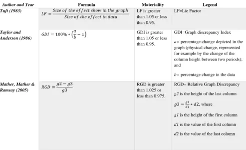
Author and Year Formula Materiality Legend
Tuft (1983) 𝐿𝐹 =𝑆𝑖𝑧𝑒 𝑜𝑓 𝑡ℎ𝑒 𝑒𝑓𝑓𝑒𝑐𝑡 𝑠ℎ𝑜𝑤 𝑖𝑛 𝑡ℎ𝑒 𝑔𝑟𝑎𝑝ℎ 𝑆𝑖𝑧𝑒 𝑜𝑓 𝑡ℎ𝑒 𝑒𝑓𝑓𝑒𝑐𝑡 𝑖𝑛 𝑑𝑎𝑡𝑎 LF is greater than 1.05 or less than 0.95. LF=Lie Factor Taylor and Anderson (1986) 𝐺𝐷𝐼 = 100% ∗ 𝑎 𝑏− 1 GDI is greater than 1.05 or less than 0.95.
GDI=Graph discrepancy Index a= percentage change depicted in the graph (physical change, represented for example by the change of the column height between two periods); and
b= percentage change in the data
Mather, Mather & Ramsay (2005) 𝑅𝐺𝐷 = 𝑔2 − 𝑔3 𝑔3 RGD is greater than 1.025 or less than 0.975.
RGD= Relative Graph Discrepancy g2 is the height of the last column 𝑔3 =𝑔1𝑑1∗ 𝑑2, where
g1 is the height of the first column d1 is the value of the first column d2 is the value of the last column
6
the positive growth of the results. Regarding, the optimal angle, it should be around 45º [Cleveland
& McGill (1987)].
2.3.) IMPRESSION MANAGEMENT
Impression Management is the Management’s manipulation of company’s data in a favourable
way. It is associated to the Management Board’s attempt to convince the shareholders that they are
running the company very efficiently (Goundar, 2009).
The various types of distortions may be associated to Impression Management. Companies may
select the graphs that are favourable for them through Selectivity; they can overstate the positive
results and/or understate the negative results by Measurement Distortion or Orientation Distortion;
or mislead the user by adopting other design techniques, with Presentational Enhancement through
the use of certain colours, multiple scales, among others. The several types of distortions are
different aspects of Impression Management, portraying a favourable picture of the financial
position of the company or of its performance. The users of annual reports should be aware of
them.
3) PRIOR EMPIRICAL RESEARCH
Empirical studies about graphs disclosures in annual reports cover the period from 1965 to 2014
and with samples from the five continents5 (see Appendix 3.1). Those studies characterize the usage
of graphs, describing aspects such as location, span of time type, and colours of graphs. An
important topic researched is the identification of key financial variables (KFVs), which is found
to be more frequently graphed than non-financial ones. Moreover, distortions were found in graphs
5 In Africa, only South Africa was studied; in Oceania, both Australia and New Zealand were covered , in America, Brazil, Canada, Mexico and U.S. make part of the analysis; in Asia, both Hong Kong, Israel, Malaysia, Philippines and Turkey were covered; finally, in Europe (the most analysed continent), Denmark, France, Germany, Ireland, Italy, Netherlands, Norway, Portugal, Spain and U.K. were also studied.
7
presented in the annual reports, namely Selectivity, Measurement Distortion, Presentational
Enhancement and Orientation Distortion, although not every study covered all these points.
3.1) USAGE OF GRAPHS AND KEY FINANCIAL VARIABLES GRAPHED (KFV)
Regarding the usage of graphs, South Africa, analysed for the period of 1984-1994, and Asian
companies [Frownfelter-Lohrke & Fulkerson (2001) for Hong-Kong and Israel in 1984-1994]
disclosed a relatively low quantity of graphs for the periods of analysis. The percentage of
companies disclosing graphs varies from 35.47% found for Hong-Kong (Courtis, 1997) to 75%
found by Uyar (2011), for Turkey.
The average number of graphs disclosed per annual report ranged from one-point five percent
in Malaysia, in the year 1984 [Rahman, Hamdan & Ibrahim (2014)] to ten, later in 1984-1994,
found for Hong-Kong (Frownfelter-Lohrke & Fulkerson, 2001).
Elsewhere, graph usage is much greater. Regarding the percentage of companies displaying
graphs, it ranges from 50% in 2009, evidenced by Nascimento, Rodrigues, Albuquerque and Silva
(2013) in Brazil to 94% in 2013 for Portugal, concluded by Bastardo (2015).
Regarding the format of graph adopted to display information, column graph is the dominant
format. For instance, Nascimento et al. (2013) and Núñez (2016), both for Brazil; Courtis (1997)
for Hong-Kong; Ianniello (2009) for Italy, among others, concluded that column graph was the
most adopted one in their researches.
In what regards the contents of the graphs, overall, the most disclosed variables are KFVs, such
as Sales, Earnings per share (EPS) and Dividends per share (DPS)6. Four studies show all these
variables to be KFVs in company’s annual reports, in samples from Australia (Beattie & Jones,
1999), France (Beattie & Jones, 2000a), U.K. (Beattie & Jones, 1997) and the U.S. (Beattie &
8
Jones, 1997)]. Many other studies found evidence of disclosure in graphs of at least one of the
KFVs above mentioned, as for example Courtis (1997); Beattie and Jones (1999, 2000a); Benau,
Miralles and Martínez (2009). It is worth noticing that studies based in samples from Latin
countries, apart from Spain (Benau et al. 2009), do not present graphs for any of the said KFVs,
for example in Brazil (Nascimento et al. 2013; Miranda, Vieira, Lagioia & Vasconcelos, 2008;
Núñez, 2016); Italy (Ianniello, 2009) and Portugal (Wozniak, 2011; Bastardo, 2015).
3.2) DISTORTIONS IN GRAPHS
The findings about Selectivity Distortion are not consensual. On one side, evidence of
Selectivity Distortion was found in several annual reports, such as in Australian companies for the
years 1991 and 1992 (Beattie & Jones, 1999; 2000a), in the U.S., for 1990-1991 and 1992 (Beattie
& Jones, 1997; 2000a); for 1986 (Steinbart, 1989) and more recently in 2005 (Dilla & Janvrin,
2010). In Europe, evidence of Selectivity Distortion was found in Spain (Benau et al. 2009) for the
reports of 2003; in the U.K. for the 1965-2004 period (Beattie, Dhanani & Jones, 2008) and again
for 1989, 1990-1991 and 1992, respectively (Beattie & Jones, 1992; 1997; 2000a). On contrary,
Guddal (2016) did not conclude about the existence of Selectivity Distortion in the 2014 annual
reports of Norwegian companies. In Portugal, contradictory results were found for two different
periods: Wozniak (2011) concluded that there is evidence of Selectivity for 2009 whereas Bastardo
(2015), four years later, concluded the opposite based on the annual reports of 2013, thus being
possible that in Portugal, the situation regarding this type of distortion had improved. This
contradictory result justifies the insistence in studying this country.
Concerning performance of a variable as a cause of Selectivity, the inclusion of a given financial
graph displayed by the company was highly associated to the financial performance, represented
9
1997,2000b); Beattie et al. (2000) and Dilla and Janvrin (2010); Earnings, evidenced by Beattie
and Jones (2000b) and even Earnings Before Taxes (EBT) and Net Income reported by Dilla and
Janvrin (2010). On the other hand, the inclusion of a given graph for a particular variable also
depended on the performance of those variables. That is the case of Sales and EPS, both concluded
by Benau et al. (2009); Net Income, as found by Benau et al. (2009) and Wozniak (2011) and
Earnings Before Interest Taxes Depreciation and Amortization (EBITDA) evidenced by Wozniak
(2001).
Despite rare inconsistencies in some variables such as Net Income (Bastardo, 2015)], companies
are more likely to display more graphs if the situation is favourable rather than unfavourable. In
those cases, companies may want to present graphs in order to justify the decrease of the results
(Miranda et al. 2008). Again, Impression Management stresses here.
Regarding Measurement Distortion, the studies provide evidence of misleading graph
constructions.
The percentage of companies that show evidence of Measurement Distortion, Courtis (1997)
found that 72% of the companies in Hong Kong had at least one misleading graph for 1992-1993
and 1994-1995. In a study of companies in Italy,Ianniello (2009), concluded that 17.3% of them
had at least one graph with a material KFV distortion for 2005.
The percentage of graphs with material distortions varies very much across countries. It ranges
from 19.4% evidenced in Norway (Guddal, 2016) for 2014 to 73% found in Portugal (Wozniak,
2011) for 2009. In between, only studies regarding U.K. for 1980 (Beattie & Jones, 1992) and
1990-1991 (Beattie & Jones, 1997) provide evidence of material Measurement Distortions in less
than 35% of graphs, while for U.K. in 1980 (Beattie & Jones, 1992); Spain in 2003 (Benau et al.
2009); Hong Kong in 1992-1993 (Courtis, 1997) and Brazil in 2014 (Núñez, 2016) , more than
10
The level of Measurement Distortion is diverse when comparing different countries and periods
of time. Comparing the average Measurement Distortion between countries, while in the U.K. for
1990-1991, it was six-point nine percent (Beattie & Jones, 1997), in the U.S., on the other hand,
presented a much greater level of distortion level in the decade of 1984-1994 for financial graphs
(81%), as evidenced by Frownfelter-Lohrke & Fulkerson (2001).
Like in Selectivity, with the only exception of Norway for 2014 (Guddal, 2016), also
Measurement Distortions suggest the pretension to give a favourable portray of the company rather
than an unfavourable one. Again, Impression Management stresses here.
There are several studies regarding Presentational Enhancement, although it is the least studied
type of distortion of graphs. The conclusions are regarding the average of unconformities per graph
and the most common violated graphing rules. Comparing results between different studies, it
ranges from 1.4 found for Norway in 2014 (Guddal, 2016) to 1.9 found for Portugal in 2013
(Bastardo, 2015). The most common violated graphing rules varies between the lack of proper
guidelines; three dimensional graphs; no zero-base line; a different colour to the highlight the last
year and the presence of multiple scales. Regarding the level of Orientation Distortion, on the other
hand, only Beattie and Jones (1997) studied the deviation from the optimal angle for U.S. and U.K.
for 1990-1991. The mean deviation was 16.4%.
As a conclusion remark, there is no consensus in the literature regarding the existence of graph
distortions. Different countries and their respective companies, under diverse environments, may
try to portray distorted realities in graphs. On the other hand, evolution and learning happens over
time, and that may explain differences found in distortions in the same country over time. In
Portugal for instance, different conclusions were taken by Wozniak (2011) and Bastardo (2015)
11
graphs. However, Wozniak (2011) concluded, for 2009, that there was no Selectivity, while
Bastardo proved the opposite, four years later. Regarding the Measurement Distortion, although
the percentage of material distortions has decreased from 73% (Wozniak, 2011) to 56% (Bastardo,
2015), the level of favourable cases have increased very much, from 56% to 73%, which evidences
greater levels of Selectivity and favorable Measurement Distortions observed in this country.
Therefore, it is relevant to study the country again.
Preparers and users of annual reporting should be aware of the characteristics of graphs
disclosure in the annual reporting, the distortions they may have and how and why they mislead,
pointing out what are the possible roots behind such distortions.
4) RESEARCH DESIGN
4.1) RESEARCH QUESTIONS, HYPOTHESES AND METHODOLOGY
This Work Project investigates the graph disclosures in the annual reports of Portuguese listed
companies, with the purpose to describe the characteristics of graphs disclosure and to find out
which distortions are present on graphs, whether they are significant or not, and why do they occur.
The research is both descriptive and explanatory and has two parts. First, it obtains evidence about
the formats of graphs that are used, and content displayed. Moreover, the distortions are quantified
per company, in order to find the main roots of such graph distortions (based on the company’s
characteristics) for the second part of the statistical section of this research.
Three exploratory research questions in this Work Project help to portraying use and misuse of
graphs in the annual reports of the Portuguese listed companies, stating whether companies used
graphs, the characteristics of such disclosures, namely the format of graphs disclosed (RQ1), the
12
Table 3: Research Questions
Additionally, some hypotheses were outlined, to know whether companies misuse graphs. If
they were distorted, the study aims to explain those distortions.
As an auxiliary to define the roots of graphical distortions, four hypotheses were developed, as
follows.
Table 4: Hypotheses
Univariate analysis is used to answer to RQ1 and RQ2, whereas for RQ3, a bivariate analysis
was conducted. In order to conclude about the existence of graph distortions on RQ3, it was
conducted a Z-Score test7, considering a 95% confidence interval8.
To answer to the hypotheses stated above, a matrix was designed in order to find out which
variables that are behind those hypotheses are correlated to the number of significant Measurement
Distortions per graph. The following explanatory variables that were considered regard the
7 A Z-score is a way to compare results in a normal distribution. In this case, it is not possible to prove that the level of distortion is normally distributed, but since the N (number of graphs analysed) is greater than 30, the Central Limit Theorem can be applied, which means that the sample mean is normally distributed and therefore, the necessary statistical tests can be performed. Since zero is the centre of a normal distribution, the greater the z-score, the greater will be the probability of rejecting a null hypothesis that one defines.
8 A confidence interval is the probability that one does not reject a null hypothesis when it is actually true. The greater the confidence interval, the greater will be the level of assurance – strength of the statistical results. 95% is the most common confidence interval used on statistical studies.
H1 The more resources (i.e. assets) the company has, the lower the number of distortions per graph. H2 PSI-20 companies provide more distortions per graph.
H3 The greater the Time-Length graphed the greater the level of graph distortions.
H4 The lower the time until a Board of Directors is about to change, the lower the number of graph distortions.
RQ1 Which formats of graphs are used? RQ2 What content is displayed graphically?
RQ3 Are graphs constructed properly, based on the guidelines above mentioned in the study? RQ3.1. Is there evidence of Selectivity Distortion?
RQ3.2. Is there evidence of Measurement Distortion?
13
company size, namely Total assets (in million euros); whether the company is a PSI-20 9(dummy
variable); the average Time-Length displayed per graph and per company, on average; and number
of years to terminate the mandate of the current Board of Directors. The variable to be correlated
to, is the number of favorable Measurement Distortions per graph. 10Regarding the type of
distortions used, only the Measurement Distortion is tested11. For each coefficient of correlation
between those variables, a p-value was computed, to measure the strength of those correlations.
4.2) SAMPLE AND DATA COLLECTION
The initial sample is compounded by all the 56 companies listed on the Euronext Lisbon on June
30, 2019. In order to analyze the graphs disclosed by these companies, the most recent annual
reports provided by this “population” were gathered from two sources of data: the Stock Market
Authority (Comissão de Mercado dos Valores Mobiliários, CMVM) and the company’s website,
depending on their availability. Due to annual report unavailability, not reporting in euro currency,
not disclosing the external audit report and not being headquartered in Portugal, six companies
were eliminated 12. Additionally, ten other companies were excluded from the sample because they
did not display graphs in their annual reports. Therefore, 40 companies compound the final sample.
9 PSI-20 or Portuguese Stock Index is composed by the companies with largest market capitalisation [(Capital.com “Psi 20 Index”. https://capital.com/psi-20-index-definition. (Accessed on December 22, 2019)]. Although it was composed by 20 companies in the past, today, PSI-20 is composed by only 18 companies [Euronext. “PSI 20”. https://live.euronext.com/pt/product/indices/PTING0200002-XLIS/market-information. (Accessed on December 22, 2019)].
10 The Measurement Distortion was computed with a ruler, comparing the growth of the size of the column with the growth of the real value (growth rate). It is only considered the material distortions, as suggested in prior studies, since they’re more likely to influence investment decisions.
11 It is the most critical type of distortion, that results from a mistake when constructing the graph. That’s the distortion that is technically inaccurate, hence the choice.
12 MULTI24did not have the annual report available and FLEXDEAL did not provide consolidated accounts; ISA provided results in Colombian pesos, rather than in euro currency; RAIZE is a very recent company to be considered for this analysis; OREY did not provided an audited report and EDP RENOVÁVEIS is headquartered in Madrid (Spain).
14
These companies belong to several sectors, namely Industrial Goods & Services; Banks;
Utilities, among others; they have different sizes13, which ranges from circa €15 million by LISGRAFICA to €76.000 million by BANCOCOMERCIALPORTUGUÊS and the larger of them some are part of
PSI-2014.
4.3) DATA ANALYSIS
The total number of graphs analyzed is 786, with an average of 19.65 graphs and a median of
13 (i.e. 50% of the companies displayed up to 13 graphs). Two companies (NEXPONOR and SONAE
COM) display the minimum number of graphs (only one graph), and the maximum is 85 (NOS). The standard deviation, on the other hand, is 18, which shows a great dispersion regarding the usage of
graphs. In fact, among industries, there are clear differences regarding the usage of graphs. If in
the one hand “Basic Materials”, provided seven graphs in the annual report, the “Utilities” sector, on the other hand, represented by EDP and REN, display 37 and 49 graphs, respectively.
Comparing PSI-20 with non-PSI-20 companies, there is a great discrepancy regarding the usage
of graphs. While PSI-20 companies display an average of 32.75 graphs per company, the average
of graphs displayed by non-PSI-20 companies is much lower (10.92). This may be explained by
the fact that PSI-20 companies are larger than the remaining ones, as size (proxied by Total Assets)
is highly correlated with the number of graphs (coefficient of correlation of 0.49 (p-value=0.0013,
approximately). Net income and Revenues, on the other hand, are also highly correlated to the
usage of graphs (coefficients of correlation of 0.39 (p-value=0.01) and 0.48 (p-value=0.0017),
respectively).
15
Comparing past studies done for the Portuguese case and regarding the usage of graphs, the
average of graphs per company has been decreasing. In companies common to this study and the
one previously done by Wozniak (2011), the average decrease from 23.59 graphs per company to
20.49 graphs per company. Moreover, the standard variation decreased from 26.30 to 18.96 graphs
per company, which means that the dispersion regarding the number of graphs per company
displayed on annual reports decreased.
Regarding the location of graphs, the results show that most of graphs are in the Management
Report. In fact, 72.23% of graphs analyzed are in the Management Report. Furthermore,
considering the percentage of companies displaying graphs in the Management Report, only 15%
of the graphs analyzed do not display any graph in this section of the company’s annual report.
Although the report considers the current financial year, it is noticeable that companies display
in graphs several years to show the evolution regarding a given variable (E.g.: Sales). In in the one
hand many graphs consider only one year, on the other hand, 66% of the total graphs analyzed
display data for more than one year (see Appendix 4).
5) RESULTS
5.1. FORMAT (RQ1)
As mentioned in Section 2, different formats of graphs have different uses. In this research, RQ1
can assume the following formats: column; doughnut; stacked (column; bar); line; mixed (column
+ line; stacked column + line); bar; pie; area and others (see Appendix 5).
The most used format of graph is the column one, with circa 35.11% of all the graphs disclosed,
as shown in Appendix 6. This difference becomes even more evident regarding the percentage of
companies using these two formats of graphs, as 87.50%15 uses at least one column graph.
16
Comparing these findings with prior studies conducted for Portugal, it became evident that the
prevalence of column graphs persists since, like in this study, column graph was also found to the
most frequent format for Portugal in 2013 (Bastardo, 2015) and in 2009 (Wozniak, 2011). On the
other hand, the doughnut chart is becoming more popular [16.54% of graphs versus 6% evidenced
by Bastardo (2015)], which shows that companies are diversifying towards more sophisticated
formats of graphs when displaying information. Besides the sophisticated formats, companies are
also adopting sophisticated backgrounds throughout the usage of colors. For instance, in this study,
the average of colors per graph is 1.77 (see Appendix 7.1 for detailed information).
5.2) CONTENT (RQ2)
The content of graphs was grouped into 12 categories: HR & Safety; Revenues;
Operations/Strategy; EBITDA; Capital Market Data; Sustainability & CSR;
Industry/Macroenvironment; Debt; Net Income; Corporative; Residual Financial Information and
Others (see Appendix 8). The information classified as “Residual financial information16”, represent 18.19% of the graphs analyzed. However, individually, HR & Safety and Revenues are
the most displayed variables, accounting for 14.12% and 11.07%, respectively, of the total graphs
analyzed. Regrouping information content of graphs into the two categories (Financial and
Non-Financial),17 the financial information is the most displayed content. In fact, 90% of the companies
include at least one graphic displaying financial information. Due to the importance of such
information, shareholders of companies hire auditors to be their “eyes” in the company and that is
why companies, in this sample18, paid an average of 484,544.00 euros to be audited, in 2018.
16 It includes all the remaining financial variables that were not enumerated individually.
17 The non-financial category includes six of the 12 types of content displayed on Appendix 8: HR & Safety; Operations/Strategy; Sustainability & CSR; Industry/Macroenvironment; Corporative and Others.
18 FARMINVESTE, FUTEBOLCLUBEDOPORTO,NEXPONOR,PATRIS and SPORTINGDEBRAGA, did not display the amounts paid on auditing. Therefore, this average considers 35 companies rather than 40.
17
Additionally, companies disclose non-financial information in graph formats, namely about
Human Resources (HR) & Safety and Sustainability & Corporate Social Responsibility (CSR),
representing 14.12% and 9.50%, respectively, of total graphs. These are “fashionable” topics, and
indeed more and more important topics and it is not by chance that 25 (62.5%) companies provide
at least one graph displaying one of these two variables. While in 2013, Human Resources and
Sustainability represented 13% of the graphs (Bastardo, 2015), in this study, this percentage
increased to 22.77% in 2018.
Looking more in depth into the financial information, which is the core topic of most19 annual
reports20, five financial topics are highly displayed on graphs: Revenues; EBITDA; Debt; Capital
Market Data and Net Income, which are variables of performance and financial position. More than
48%21 of companies present at least one graph for each of the mentioned topics. On the other hand,
only 7.3%22 of companies do not display any of these five topics. More detailed information is
shown in Appendixes 8 and 9.
5.3) DISTORTIONS (RQ3) RQ3.1) SELECTIVITY
The analysis of Selectivity was done regarding variables that represent performance, rather than
graphs23. The total number of variables (can be repeated in the same graph)24 analyzed was 226,
19 Note that, 26.09% of the companies provide more financial than non-financial information. That’s the case of ALTRI; CONDURIL; CTT; FARMINVESTE; MARTIFER; MEDIACAPITAL; NEXPONOR; PATRIS;REN; SAG; SONAEINDÚSTRIA and VISTA ALEGRE.
20In this section of the Work Project, variables related to the defined KFVs were also considered and studied regarding Selectivity and Measurement Distortions. E.g.: Debt/EBITDA.
21 For RQ3, only the companies that present financial information, are analysed. That is the case of 36 companies - CONDURIL, INAPA, NEXPONOR and VISTA ALEGRE were, for these reasons, excluded.
22 Three companies (out of 40) do not provide any of these KFVs. They are MEDIACAPITAL; THENAVIGATOR and TOYOTACAETANO.
23 Note that one graph can be displaying two categories of data (when a graph has two multiple scales, for example). 24 For example, Revenues per Segment. If a graph displays the Revenues for four segments, we have a graph with four sorts of data representing Revenues.
18
displayed in 153 graphs, which gives an average of 1.48 variables per graph (excluding the graphs
with only one variable, this average increases to 3.21 variables per graph).
In order to compute Selectivity, two steps were taken for every variable about the KFV displayed
on graphs (Debt; Revenues; Net Income; EBITDA and Market Capital Data).
(i) To select the variables that represent performance and to measure their variation, which
defines its own performance (favorable if there is a positive variation or unfavorable in case of a
negative variation).25
(ii) To classify the distortion into favorable or unfavorable.
The results are as follows:
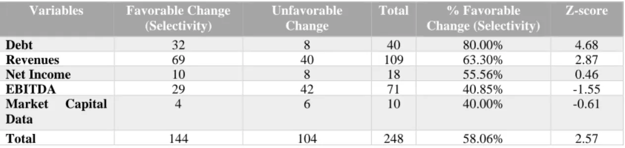
Table 5: Selectivity Distortion
Looking at the results, more specifically at the Z-score, it is concluded that there is statistical
evidence of Selectivity Distortion (considering a confidence interval of 95%) since Z>1.96
(Z=2.57) and therefore, the hypothesis that the percentage of variables which display favorable
changes is not greater than the ones which display unfavorable change, is rejected. In other words,
the result suggests that companies have the intention to select (exclusively) the variables which
portrays a more positive picture of the current financial situation. This may be explained by the
method used on Management performance’s evaluation. For instance, it is largely dependent on
25 This is only the case for Profit variables.
Variables Favorable Change
(Selectivity) Unfavorable Change Total % Favorable Change (Selectivity) Z-score Debt 32 8 40 80.00% 4.68 Revenues 69 40 109 63.30% 2.87 Net Income 10 8 18 55.56% 0.46 EBITDA 29 42 71 40.85% -1.55 Market Capital Data 4 6 10 40.00% -0.61 Total 144 104 248 58.06% 2.57
19
the firm’s performance and therefore managers may attempt to manipulate the data, portraying a more favorable picture of the company (Impression Management) (Goundar, 2009).
Looking at each variable individually, EBITDA, Net Income and Market Capital Data, there is
no evidence of Selectivity Distortion regarding these variables. These results confirmed previous
results obtained by Beattie and Jones (1999) for Australia in 1991,and Benau et al. (2009) for Spain
in 2003, and moreover by Wozniak (2011), for Portugal in 2009, but contradicted more recent
results obtained by Bastardo (2015), for Portugal in 2013 and Guddal (2016), for Norway in 2014.
It is evidenced that Selectivity Distortion exists in the graphs displayed by Portuguese listed
companies in the 2018 annual reports. It is, therefore, quite important that the users of the annual
reports are aware of that and pay attention to relevant variables that are not displayed on graphs,
given that normally, companies only display the variables that are favorable to the company,
stressing, once again, the importance that Impression Management has for company’s managers. RQ3.2) MEASUREMENT DISTORTION
In order to analyze Measurement Distortion, this study uses RGD26 instead and the calculation
is done for the same variables referred previously, when detecting Selectivity. Prior studies, as
Beattie et al. (2008) for U.K. and Steinbart (1989) for U.K., used GDI instead of RGD. However,
the later has advantages over the former (GDI)27.
For the Measurement Distortion, two analysis were done. First, finding out the percentage of
variables that are significantly distorted and then split it into favourable (overstating favourable
trends and understating negative ones) and unfavourable distortions (understatement of a
26 The reference value was two-point five percent, to separated material distortions from non-material ones [(Mather, Mather & Ramsay, (2005)]
27 The upside of RGD is that it is not so sensitive to small changes in data; it automatically distinguishes different nature of distortion, without having to analyse the trend of data to check if the distortion is favourable or not, contrarily to GDI (Mather, Mather & Ramsay, 2005).
20
favourable trend and overstating a negative one). The first part of the analysis is summarized on
Table 6 and the second one on Appendix 10.
Table 6: Percentage of Material Measurement Distortions
Great part of graphs is materially distorted, mainly Net Income. On the other hand, the
hypothesis that the percentage of distorted variables is equal or below to that of non-distorted ones
cannot be rejected (Z-score<1.96), meaning that there is no significant evidence of Measurement
Distortion. This result may be explained by the companies’ intention of granting a better public
perception of companies’ traded securities, achieved through more accurate and reliable information (Barako, Hancock & Izan, 2006).
Considering this part of the analysis and having the material distorted variables identified, it is
relevant to find out if these distortions are either favorable or unfavorable to the company.
Looking at Table 6, it is possible to conclude from the variables which are materially distorted,
most of distortions are favorable to the company. However, to conclude whether this is pure
accident or intentional, the following statistical test (Z-Score) must be performed:
𝐻𝑂: 𝑈𝐹 ≤ 0.5 versus 𝐻1: 𝑈𝐹> 0.5, 𝑈𝐹= % 𝑜𝑓 𝑓𝑎𝑣𝑜𝑢𝑟𝑎𝑏𝑙𝑒 𝑐𝑎𝑠𝑒𝑠 [1]
Table 7: Number of Favorable versus Unfavorable Distortions
Variables/Significant Distortions Overstating favorable trends Understating unfavorable trends No. of favorable distortions Understating favorable trends Overstating unfavorable trends No. of unfavorable distortions EBITDA 12 16 28 5 6 11 Revenues 12 8 20 9 7 16 Debt 13 2 15 6 1 7 Net Income 3 2 5 5 2 7
Market Capital Data 2 1 3 0 1 1
Total 42 29 71 25 17 42
Variables/Significant Distortions # Variables Displayed % Material Distortions Z-Score
Revenues 38 113 33.63% -3.32 EBITDA 39 75 52.00% 0.71 Debt 22 40 55.00% 0.99 Net Income 12 18 66.67% 1.86 Shares 4 10 40.00% -0.65 Total 115 256 44.92% 1.17
21
Performing this test, the Z-Score obtained was 2.3128. If these Measurement Distortions were
unintentional, there should be as many unfavorable distortions as favorable ones or more
unfavorable distortions than favorable ones. However, the opposite happens, and that difference is
significant. Therefore, although there is not statistical evidence of Measurement Distortion, when
it happens it is, most of the times, favorable to the company. This result goes against the
“innocence” or lack of knowledge from companies that could explain the absence of Measurement Distortion concluded previously, since, in this point, companies seem to know very well how to
portray a favorable picture of their financial reality.
On the other hand, more and more variables have been portraying a favorable picture of the
companies’ financial reality. For instance, if in 2009, the percentage of favorable distortions was 59% (Wozniak, 2011) and in 2013 it decreased to 53%, in this study, this percentage was 62.61
percent in the last financial year (2018).
The users of annual reports should, therefore, pay more attention to numbers rather than the
graphs. At least, both should be taken into consideration.
RQ3.3) PRESENTATIONAL ENHANCEMENT AND ORIENTATION DISTORTIONS There is a great evidence of the existence of Presentational Enhancement. In this analysis, it was
detected 354 violations of this type of distortions in 277 graphs, which translates into an average
of 1.19 violations per graph (see Appendix 11.1). Comparing the result obtained with previous
studies, such as Bastardo (2015), Guddal (2016) and Núñez (2016), for Portugal, Norway and
Brazil in 2013, 2014 and 2014, respectively, this value is the lowest one. The most common
violation was the lack of a Zero-Base line, responsible for 49% of all the Presentational
Enhancement Distortions.
22
Orientation Distortion is also evidence in this research. For instance, only 9.52% of the graphs analyzed have a difference up to 10º from the optimal angle (45º). On the other hand, 71.90% of
the graphs analyzed display an angle, whose difference is at least 20º greater than the optimal angle
(see Appendix 12.1).
5.4) CORRELATION ANALYSIS (H1 – H4)
Looking at the correlation matrix in Appendix 13.1, it is evidenced that there are two important
variables that may explain the existence of graph distortions, namely the Board of Directors and
the Time-Length (number of periods) displayed on graphs.
The correlation between the Board of Directors (BoD) and the number of Measurement
Distortions per graph is positive and moderate (0.409). The signal means that the higher the number
of years until a change on the Board of Directors29 occurs, the higher the number of Measurement
Distortions per graph. This fact is supported by the Impression Management theory. The logic
behind it is that directors must perform well (based on financial results) in order to keep the
position; if they are close to the end of the mandate, they do not need to work hard/show good
results (they will leave the company anyway). However, looking at the p-value of the correlation
between the variable BoD and the number of significant Measurement Distortions per graph, the
p-value (regarding the beta of BoD) is not low enough (16.52%) to reject the following hypothesis: r=0.30
On the other hand, there is also a substantial positive correlation (0.517) between the number of
Measurement Distortions per graph and the average Time-Length displayed on graphs. It means
29 The group and the company’s financial statements are prepared by directors, who have the responsibility to check whether the annual report includes a fair review of the company’s financial position. HomeServe. “Director’s Responsibilities”. https://www.homeserveplc.com/investors/annual-report-2019/governance/directors-responsibilities.aspx (accessed November 11, 2019).
30 The hypothesis being tested is r (coefficient of correlation) between the BoD and the number of significant Measurement Distortion per graph.
23
that graphs that display a greater number of years on graphs, tend to be more distorted. The rationale
behind this result is that graphs which display data about a greater number of periods are the ones
who were performing worse and now are performing better or the ones who were performing well
and now are performing even better. Not only companies want to show that, but also distort data
in order to enhance the evolution. This is also evidence of Presentational Enhancement!
Therefore, the stakeholders to whom the annual report address should pay attention if a graph
display a great Time-Length and if the Board of Directors just has started the mandate. In such
context, graphs are more likely to distort!
6- CONCLUSION
This Work Projects analyzed the use and misuse of graphs, based on a sample of the 2018 annual
reports from 40 Portuguese companies with shares listed on Euronext Lisbon, with the aim at
exploring the characteristics of the graphs and the existence of graphical distortions. Overall, 786
graphs were analyzed!
This study adds to the literature of voluntary disclosure in annual reports, with data for a country
whose Selectivity Distortion and percentage of favorable Measurement Distortion have risen.
Moreover, the last study was conducted five years ago.
The results suggest that graphs are very common forms of communicating information in the
annual reports by Portuguese listed companies, although the average of graphs per company has
slightly decreased, comparing to 10 years ago. Companies mostly disclose column graphs and
provide mainly financial but also non-financial information (e.g. Human resources thematic and
environment) which shows that the company is acting in a socially responsible matter.
The existence of a misuse of graphs is excessive in Portugal. In fact, this study found evidence
24
performance of the variables, yet there is not statistical evidence of Measurement Distortion.
However, in the cases in which Relative Graph Discrepancy (RGD) is significant, the graphs
disclose more favorable than unfavorable information to the company and the difference is
significant, affecting further investment decisions.
Trying to explain those distortions, only Time-Length and Board of Directors were found to be
correlated to them. That’s Impression Management. While Board of Directors are more likely to
show good results in the beginning of the mandate, greater Time-Lengths are frequently in order
to show a greater financial performance, mainly when past results were shameful.
For future research, given the greater importance that non-financial variables have had, it is
important to compute the RGD or GDI for those graphs. For instance, do companies want to look
more socially responsible than what they are in the reality? Furthermore, more studies and more
data could be collected regarding the Board of Directors in order to explain and find the causes for
graphical distortions. For this case, a small database for the number of years until a change on the
Board of Directors occurs is a limitation of this study.
The research addresses to regulators. It is recommended that proper guidelines are developed in
order to prepare and audit the graphs. On the other hand, in view of reducing the level of distortions,
one prize could be provided to the company with the best annual report regarding the level of
distortions (the company with the least number of favorable distortions per graph could be prized).
Alternatively, negative incentives for companies with higher level of distortions in annual reports
should be acknowledged.
25
BIBLIOGRAPHY
Arunachalam, V., Pei, B. K., and Steinbart, P.J. (2002). “Impression management with graphs: Effects on choices.” Journal of Information Systems 16 (2): 205-228
Barako, D. G., P. Hancock, and H. Y. Izan. 2006. "Factors Influencing Voluntary Corporate Disclosures by Kenyan Companies." Journal compilation 14 (2): 107-125.
Bastardo, A. C., and Ferreira, L. 2015. “Graph usage in financial reports: Evidence from Portuguese Listed Companies”. Master Thesis. Nova SBE.
Beattie, V, and M. J. Jones. 2000a. "Impression Management: The Case of Inter-country Financial Graphs." Journal of International Accounting, Auditing & Taxation 9 (2): 159-183.
Beattie, V. A., and M. J. Jones. 2000b. "Changing Graph Use in Corporate Annual Reports: A Time-Series Analysis." In Contemporay Accounting Research 17 (2): 213-226.
Beattie, V., A. Dhanani, and M. Jones. 2008. "Investigating Presentational Change in U.K. Annual Reports A Longitudinal Perspective." Journal of Business Communication 25 (2): 181-222.
Beattie, V., and M. J. Jones. 1997. "A Comparative Study of the Use of Financial Graphs in the Corporate Annual Reports of Major U.S.
and U.K. Companies." Journal of International Financial Management and Accounting 8 (1): 33-68.
Beattie, V., and M. J. Jones. 1999. "Australian Financial Graphs: An Empirical Study." In ABACUS 35 (1): 46-76.
Beattie, V., and M. J. Jones. 1992. "The Use and Abuse of Graphs in Annual Reports: Theoretical Framework and Empirical Study." In Accounting and Business Research 22 (88): 291-303.
Beattie, V., and M. Jones. 2008. "Corporate reporting using graphs: a review synthesis." Journal of Accounting Literature 27: 71-110. Chekkar, R., and I. Martinez. 2011. "The Characteristics and Determinants of Voluntary Graphical Disclosure in France”. Paper presented
at European Accounting Association: 34th Annual Congress, Rome-Siena, April.
Cleveland, W. S., and R. McGill. 1985. "Graphical Perception and Graphical Methods for Analyzing Scientific Data." In Science, New Series 229 (4716): 828-833.
Cleveland, W. S., and R. McGill. 1987. "Graphical Perception: The Visual Decoding of Quantitative Information on Graphical Displays of
Data." Journal of the Royal Statistical Society Series A (General) 150 (3): 192-229.
Cooke, T. E. 1993. "Disclosure in Japanese Corporate Annual Reports." Journal of Business Finance & Accounting 20 (4): 521-535. Cooke, T. E. 1989. "Voluntary Corporate Disclosure by Swedish Companies." Journal of International Financial Management and Accounting 1 (2): 171-195.
Courtis, J. 1997. "Corporate Annual Report Graphical Communication in Hong Kong: Effective or Misleading." The Journal of Business Communication 34 (3): 269-288.
Dilla, W. N., and D. J. Janvrin. 2010. "Voluntary Disclosure in Annual Reports: The Association between Magnitude and Direction of
Change in Corporate Financial Performance and Graph Use." In Accounting Horizons 24 (2): 257-278.
Frownfelter-Lohrke, C., and C. L. Fulkerson. 2001. "The Incidence and Quality of Graphics in Annual Reports: An International
Comparison." The Journal of Business Communication 38 (3): 337-358.
G., Benau. M. A., P. G. Miralles, and A. V. Martínez. 2009. "Estudio empírico sobre la fiabilidad de los gráficos financieiros publicados
por las empresas españolas." Revista Europea de Direccion y Economia de la Empresa 18 (1): 73-84.
Goundar, N. 2009. "Impression Management in Financial Reports surrounding CEO Turnover." Master dissertation. Unitec New Zealand. Guddal, T. 2016. “Graph Usage in Annual Reports: Evidence from Norwegian Listed Companies”. Master Thesis. Nova SBE.
Ianniello, G. 2009. "The use of graphs in annual reports of major Italian companies." Int. J. Accounting, Auditing and Performance Evaluation 5 (4): 442-462.
IAASB. 2016. "International Standard On Auditing 720 (Revised): The Auditor's Responsibilities Relating To Other Information." 901-952. Jarret, I. 1981. "Computer Graphics: A Reporting Revolution?" Journal of Accountancy 151 (5): 49-57.
Kosslyn, S. M. 1989. "Understanding Charts and Graphs."Applied Cognitive Psychology 3: 185-226.
Miranda, L. C., and A. D. S. Vieira. 2008. "Utilização de Gráficos Em Demonstrações Contábeis." Revista de Educação e Pesquisa em Contabilidade 2 (3): 16-35.
Nascimento, M. D., F. F. Rodrigues, P. H. M. Albuquerque, and C. A. T. S. Silva. 2013. "Administração, Gerenciamento da
Apresentação: Uma Análise da Utilização de Gráficos nos Relatórios da." Revista Universo Contábil 9 (1): 46-64.
Núñez, B. L., Ferreira, L., and Schiozer, R. 2016. The Use and Misuse of Graphs in Stand-alone Annual Reports. Evidence from Brazilian Listed Companies. Double Master Degree Thesis. Nova SBE.
Pany, K., and L. Pringle. 2010. "Reporting on Other and Required Supplementary Information in Documents Containing Audited Financial
Statements." The CPA Journal: 36-39.
Penrose, J. M. 2008. "Annual Report Graphic Use. A Review of the Literature." Journal of Business Communication 45 (2): 158-180. Rahman, A. A. 2014. "The use of graphs in Malaysian companies’ corporate reports: A longitudinal study." In Procedia- Social and Behavioral Sciences 164: 653-666.
Rouf, A., and A. Harun. 2011. "Ownership Structure and Voluntary Disclosure in Annual Reports of Bangladesh." Park. J. Commer. Soc. Sci., 5 (1): 129-139.
Steinbart, P. J. 1989. "The Auditor's Responsibility for the Accuracy of Graphs in Annual Reports: Some Evidence of the Need for
Additional Guidelines." In Accounting Horizons 3 (3): 60-70.
Taylor, B. G., and L. K. Anderson. 1986. "Misleading Graphs: Guidelines for the Accountant." Journal of Accountancy 162 (4): 126-135.
Tuft, Edwards R. 1986. “The Visual Display of Quantitative Information”. Cheshire, CT. Graphic Press edition.
Uyar, A. 2011. "Firm characteristics and voluntary disclosure of graphs in annual reports of Turkish listed companies." African Journal of Business Management 5 (17): 7651-7657.
Vázquez, F. M., and M. Trombetta. 2007. "Does Graph Disclosure Bias Reduce the Cost of Equity?"Universidad Carlos III de Madrid.
Faculty Working Paper 07-30.
1
Table of Contents
Appendix 1: Other graphical Rules ... 2 Appendix 2: Example of a graph with Measurement Distortion ... 2 Appendix 3.2: Methods used by the Authors – Selectivity and Measurement Distortions ... 13 Appendix 4: Time-Length ... 15 Appendix 5: Types of Graphs and respective suitability ... 15 Appendix 6: Graph Format Overview ... 15 Appendix 7.1: Number of colors used per graph ... 16 Appendix 7.2: Association between the graph color and the company’s logo ... 16 Appendix 8: Graph content ... 17 Appendix 10: Favorable versus Unfavorable Measurement Distortions (in percentage) ... 18 Appendix 11.1: Presentational Enhancement (violations per type) ... 19 Appendix 11.2: Summary of the Results for Presentational Enhancement ... 19 Appendix 12.1: Orientation Distortion ... 20 Appendix 12.2: Summary of the results of Orientation Distortion ... 20 Appendix 13.1: Matrix of correlation between variables ... 20 Appendix 13.2: Coefficients of correlation ... 21 Appendix 14: Number of Graphs: general ... 21 Appendix 15: List of companies from Euronext Lisbon – final sample ... 22 Appendix 16: Number of graphs: PSI-20 VS Non-PSI 20 ... 23 Appendix 17.1: Example of classification of Graphs ... 23 Appendix 17.2: Example of a logo’s format on Graphs ... 24 Appendix 17.3: Example of a Graph without Measurement Distortion ... 24 Appendix 17.4: Example of a Graph with Presentational Enhancement and Orientation Distortion ... 25 Appendix 17.5: Example of a Graph without Orientation Distortion ... 25 Appendix 17.6: Example of a Graph with Presentational Enhancement: Doughnut graph ... 26 Appendix 17.7: Example of a Presentational enhancement – Graph with Multiple-Scale ... 26 Appendix 17.8: Example of a Graph with Presentational Enhancement – Different Color ... 27 Appendix 17.9: Example of a Graph with Presentational Enhancement – Lack of a Zero-Base Line ... 27 Appendix 18: Distortions per type and company ... 28 Appendix 19: Summary of the existence of significant distortions ... 28 Appendix 20: Dependent Variable – Significant Measurement Distortions per graph (Total) ... 29 Appendix 21: Descriptive Statistics of significant Measurement distortions on Graphs ... 29 Appendix 22: Location of Graphs ... 30 Appendix 23: Descriptive Statistics of Significant Measurement Distortions per graph ... 31
2
Appendix 1: Other graphical Rules
Appendix 2: Example of a graph with Measurement Distortion
Picture 2- Measurement Distortion, where the column 2018* was created Source (1st graph): Mota Engil, Annual report 2018, p:24
Legend: This picture portrays a case of measurement distortion. The increase of the column’s height is much higher than the increase of the value, representing a favourable distortion for the company
Author Year Rule(s)
Beattie & Jones (1997; 1998) ▪ The axis that form the framework should be perpendicular (form a 90º slope).
▪ The gridlines should be thin;
▪ When displaying time series, time should be displayed in the horizontal axis. ▪ The width of specifiers and spaces between them should be uniform; ▪ The choice of colours should be done carefully.
▪ Graph titles, descriptive and numeric axis labels should be meaningful and properly indicated;
▪ Numeric labels should be close to the axis and horizontally; ▪ The slope parameter of the axes’ scales should be close to 45º.
Courtis 1998 ▪ Time series should be properly labelled due to the cultural differences across the
world regarding the pattern of reading behaviour.
▪ The scale intervals should be round and familiar numbers such as 10 and 100.
Kosslyn 1989 ▪ Unfamiliar graph types should be avoided
Taylor & Anderson 1986 ▪ Rate-of-change graphs should be avoided
RGD calculation: 𝑔1 = 1.6 𝑔2 = 4 𝑑1 = 164 𝑑2 = 192 𝑔3 = 1.6 ∗192 164= 1.873 𝑅𝐺𝐷 =4 − 1.873 1.873 = 113.54%
3
Country/Continent Author/Sample
and Year analysed
Usage of graphs KFVs Selectivity Orientation
Distortion Measurement Distortion Presentational Enhancement Colours
Australia; Oceania Frownfelter-Lohrke & Fulkerson (2001) ;270; 1984-1994
Mean of 15.69 graphs
per company N.A. N.A. N.A. N.A. N.A. N.A.
Australia; Oceania Beattie & Jones (1999); 89; 1991
89% of companies use graphs;
Mean of 9.4 graphs per company or 10.5 if only the companies using graphs are considered). The most popular graph format is the column one, mainly for KFVs
Sales, Profit, EPS and DPS. There is evidence of selectivity. The overall mean positive slope was 31.2º. The is no evidence of orientation distortion. Material measurement distortions in 34% of the KFV graphs. Most of the cases were favourable to the companies (mainly regarding Profit and DPS). There is evidence of presentational enhancement. One common example is the lack of proper gridlines. N.A.
Australia; Oceania Beattie & Jones
(2000a); 50; 1992 N.A.
Earnings, Sales, EPS and DPS.
High evidence of
selectivity. N.A. N.A. N.A. N.A.
Brazil; America Nascimento (2013); 203; 1997-2009
50% of companies displayed graphs. Column is the main format of graphs (70.78% in 2005).
N.A. N.A. N.A. N.A.
Some evidence of presentational enhancement (1.62 graphs with distortion per report, mainly due
to three
dimensional graphs and no zero-base line).
N.A.
4
Country/Continent Author/Sample
and Year analysed
Usage of graphs KFVs Selectivity Orientation
Distortion Measurement Distortion Presentational Enhancement Colours
Brazil; America Miranda, Vieira, Lagioia & Vasconcelos (2008); 37; 2000-2007
27.03% of companies did no present graphs. The mean of graphs per annual report is 8.23 for profitable companies and 2.93 per non-profitable companies. Bar graphs are highly used. Profitable company: Revenues, sales in volume, EBITDA, expenses Non-profitable company: revenues, EBITDA and market share in case of a non-profitable company. Profitable companies display more graphs than non-profitable companies. On the other hand, variables with good financial
performance are displayed in greater quantities than the remaining ones.
N.A. N.A. N.A. N.A.
Brazil; America Núñez (2016); 57; 2014
Average of 18.98 graphs per company (n=62) and 20.65 graphs per company (n=57).
Column graphs is the main format (52.8% of total graphs). Net Income, revenue, EBITDA and value added. Evidence of Selectivity
(EBITDA and net income are more displayed in companies with a favorable performance than unfavorable). Overall, the inclusion of a given graph is not, significantly, correlated to its performance. Strong and positive correlation between the increase in EPS and the inclusion of at least one KFV graph. N.A. 58.9% and 43.04% of the graphs have evidence of measurement distortion, considering the GDI measure and RGD,
respectively.
Average of 1.7 unconformities per graph and 16.9 per company. The most frequent violated rules were the lack of scale of the financial variable axis (33.5%) and lack of the zero-base line (28.2% of the cases).
23%, 28% and 25% of graphs use two, three and four colours, respectively.
89.5% of companies use at least one graph related to the company’s logo.
5
Country/Continent Author/Sample
and Year analysed
Usage of graphs KFVs Selectivity Orientation
Distortion Measurement Distortion Presentational Enhancement Colours
Canada; America CICA (1993); 200; 1991
83% of companies depicted graphs; the mean of graphs was 10.1 per company.
N.A. N.A. N.A. N.A. N.A. N.A.
Denmark; Europe Frownfelter-Lohrke & Fulkerson (2001); 270; 1984-1994
Mean of 26 graphs per
annual report N.A. N.A. N.A. N.A. N.A. N.A.
France; Europe Beattie & Jones
(2000a); 50; 1992 N.A.
Earnings, sales, EPS, DPS and cash flow
N.A. N.A. N.A. N.A. N.A.
France; Europe Chekkar & Martinez (2011); 38; 2009 90% of companies display graphs on annual reports Sales, earnings, profitabilit y and stock performan ce
N.A. N.A. N.A. N.A. N.A.
Germany; Europe Beattie & Jones (2000a); 50; 1992
N.A. EPS N.A. N.A. N.A. N.A. N.A.
Hong Kong; Asia Frownfelter-Lohrke & Fulkerson (2001); 270; 1984-1994
Mean of 10 graphs per
annual report. N.A. N.A. N.A. N.A. N.A. N.A.
Hong-Kong; Asia Courtis (1997); 691; 1992-1993 and 1994-1995
1992-1993: 38.46% of companies displayed graphs; mean of 5.3 graphs per annual report.
1994-1995: 35.47% of companies displayed graphs; mean of 4.8 graphs per company. Column graphs are the main format.
N.A. N.A. N.A.
52% of graph graphics were misleading in 1994-1995. Evidence of presentational enhancement. The most common violation was the lack of balance scales (38% of the cases); creative visual effects (25% of the cases). 97% of graphs were presented in colour by the companies in 1992-1993. Similar conclusions are taken to the 1994-1995 period.