Quality & Quantity 32: 327–353, 1998.
© 1998 Kluwer Academic Publishers. Printed in the Netherlands. 327
Formulating Hypotheses Graphically
in Social Research
RICARDO F. BEZERRA1, SULLAIMAN JALLOH1& JANET STEVENSON2
1University of Nottingham, Department of Urban Planning, University Park, Nottingham, U.K.; 2Loughborough University, U.K.
Abstract. This article explores the proposition that the appropriate use of suitable forms of graphic communication can improve the formulation and presentation of hypotheses in quantitative social sci-ence research. The creative nature of scientific diagrams is discussed and the technological advances in computer graphic media are seen as part of a ‘visual revolution’ which is markedly changing not only the way we see things but also the way we think and do things today. Brief historical views on the use of hypotheses and diagrammatic languages in science are given. The restricted use of graphic communication tools in social research academic documents is discussed and the importance of using well-designed data graphics in the production and transmission of scientific knowledge is highlighted. Hypotheses are conceptualised and their importance within social research is emphasised. A methodological approach for formulating hypotheses graphically is proposed based on the use of three types of language: notation, statement (ordinary language) and diagram. Some criteria are suggested for the selection of diagram type dependent on the related variables. Several examples are given covering the different models proposed.
The invention of a new kind of diagram acts as a catalyst for effective thought in a problem domain
(Macdonald-Ross, 1979)
1. Introduction
theologians struggled by this method to reconcile reason and faith until St Thomas Aquinas, in his work Summa Theologica in 1273, established by questioning cause and effect that everything must have a cause. The investigation of social structure was then moved forward by the great reformation thinkers such as Erasmus (1466– 1536) and Luther (1483–1546) who believed that men should think for themselves in religious matters and translated the Bible into the vernacular. However, it was not until Francis Bacon in the later 16th century established modern procedures for science that the idea of a hypothesis was clearly stated. In a series of books he claimed that the scientist must work by observation to form a theory that links certain facts together and provides a reasonable explanation for them; from this hypothesis he deduces further facts which he then constantly subjects to checks or experiments. Trained as a lawyer, Bacon applied to science the laws of evidence and the burden of proof. The written forms of social research hypothesis-making were further developed out of the work of the pure scientists such as Newton and Pasteur and became more like statements to be tested by questioning as the western world moved into the age of enlightenment throughout the second half of the l8th century. During the 17th and 18th centuries hypotheses were variously described by Blount (1656) as ‘a proposition or principle put forth merely as a basis for reasoning or argument’ or by Burke (1794) as ‘an actual or possible condition as a basis for action’ (Encyclopaedia Americana, 1978: 683).
This hypothetico-deductive method came to be used by the modern social sci-entists who adapted it by developing appropriate measuring tools for a less precise discipline. This lack of precision has led to somewhat elaborate written attempts to express hypotheses. However, advances in technology have always had a pro-found effect on the way people think. The advent of printing gave the power of distribution to the written word, and whereas the scientists, mathematicians and statisticians continued to explore their ideas in both verbal and visual form, the philosophers developed their theses with increasing verbal complexity. The development in the second half of the 20th century of the technology for visual communication such as television and computer graphics is having a considerable effect on the expectations of readers. The ability to grasp ideas from lengthy written texts is developing a visual concomitant.
2. Graphic Communication and Science
FORMULATING HYPOTHESES GRAPHICALLY IN SOCIAL RESEARCH 329
However, the techniques of graphic communication have passed, in recent his-tory, through significant technological advances. The main ones have been made possible through the invention and development of, among others, colour TV, offset printing, photocopying, personal computers and fax machines. Using this equip-ment we can produce or reproduce, transmit and/or receive very diverse and so-phisticated forms of graphic communication. That ‘visual revolution’ has markedly changed not only the way we see things but also the way we think and do things today.
The main forms of graphic communication – charts, graphs, tables, maps, draw-ings, computer simulations and photos – are fundamental instruments in transmit-ting most types of information including scientific data. Most scientists, mainly in the technical fields, make constant use of the graphic languages to formulate their ideas and concepts and to present facts and phenomena. It is not quite the same in the social sciences but the need is beginning to be felt in the more verbal disciplines as Keller and Keller (1993: 5) say ‘all researchers are beginning to recognise that visualisation greatly enhances their efforts to gain support for research and (even) to help them get much needed funding’.
2.1. A BRIEF HISTORICAL PERSPECTIVE
The development of science has relied significantly on the use of graphic com-munication or to be more specific, the use of diagrams, attempting to demonstrate and explain physical and social phenomena in visual form. According to Reid-haar (1984: 25) the use of diagrammatic information to present statistical data is just over three centuries old. However, he cites previous examples which can be traced back to near 3000 BC such as Chinese maps used as taxation records and Babylonian clay tablets in cuneiform recording harvest yields. Reidhaar (op.cit.), in fact, raises the supposition that the ‘activity of visually storing data might then be a cause for the development of writing’.
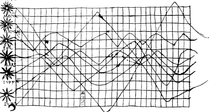
An early example of a diagram used in history is an anonymous time-series plot, dated from the 10th (or 11th) century (Figure 1), depicting the inclination of the orbit of several planets (Tufte, 1983: 20, 28; Wildbur, 1989: 45). Around five hundred years later, another example of graphic representation, also a time-series, is found in one of da Vinci’s famous notebooks. There that Renaissance genius recorded diagrammatically ‘a falling body against a time frame’ (Holmes, 1984: 12).
RICARDO
F
.
B
E
Z
E
RRA
E
T
AL
.
FORMULATING HYPOTHESES GRAPHICALLY IN SOCIAL RESEARCH 331
best and the brightest toward a theoretically mechanistic, rather than statistical em-piricist orientation . . . ’ thus delaying the application of the graphic representation of statistics.
Nevertheless, it was not until the end of the 18th century that graphs and charts appeared in print as a way of reproducing statistical data. As Tufte (1983: 29, 32) affirms, J. H. Lambert, a Swiss-German scientist and mathematician, with his studies on soil temperature (published in 1779) and the Scottish William Playfair with his famous Commercial and Political Atlas (published in 1786) (Figure 2) are considered the ‘great inventors of modern graphical designs’ (see also Holmes, 1984: 13–17; Schmid and Schmid, 1979: 1–2; Tufte, 1983: 32–34; Wildbur, 1989: 45–48).
Although Playfair is considered the inventor of modern bar and circle graphs and pie charts, other previous works from the last quarter of the 17th century, such as the graphical recording of barometric observations, done by Robert Plot, and Newton’s kinematic diagrams, already used some principles which would be taken up by Playfair almost only a century later (Biderman, 1990: 6, 8). Another impor-tant predecessor of Playfair’s graphing techniques (the only one acknowledged by him) was J. B. Priestley who two decades before, had developed biographical and historical charts (op.cit.: 7).
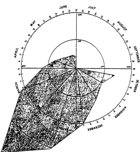
Furthermore, three other scientists must also be remembered for their pioneer works in the 19th century. They are the French engineer Charles Joseph Minard with his figurative charts; Florence Nightingale with her polar-area diagrams re-lated to public health and sanitary conditions in the British army in the Crimean War (Figure 3) and finally Adolph Quetelet with his climatic records where line and bar graphs are combined with a calendar (Reidhaar, 1984: 28; Tufte, 1983: 40– 41; Wildbur, 1989: 48–49). In statistical maps, also in the 19th century, the works of Balbi and Guerry, Fletcher, Lalanne and Vauthier should also be highlighted (Biderman, 1990: 18–19).
It can be seen that visual representation of information is not a new idea. It has been used extensively to present data in a variety of fields from mathematics to management or biography, but most frequently for the statistical representation of scientific facts. It is then sensible to take these ideas and move them on to take advantage of the technological revolution in order to extend the scope of human thinking and to use visualisation as a working tool at the very beginning of conceptualising an idea.
2.2. THE VIEW TODAY
F
igur
e
2.
Pa
rt
FORMUL
A
T
ING
HYPO
T
HE
SE
S
G
RAPHICAL
L
Y
IN
SOCIAL
RE
SE
ARCH
333
Part 2.
Figure 2. Examples of graphical design of William Playfair’s Commercial and Political Atlas, published in 1786. (Reproduced with permission of Graphics
Figure 3. Example of ‘polar-area diagram’, developed by Florence Nightingale (in the
19th century), related to public health and sanitary conditions in the British army in the Crimean War. (Permission to reproduce this typographical arrangement requested from Trefoil Publications Ltd.)
(see Keller & Keller, 1993: 5; Schmid & Schmid, 1979: 276; Wildbur, 1989: 5; Witzling & Greenstreet, 1989: 234).
FORMULATING HYPOTHESES GRAPHICALLY IN SOCIAL RESEARCH 335
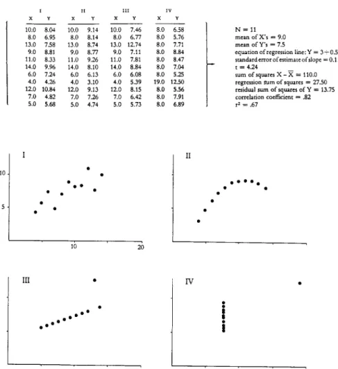
Figure 4. Anscombe’s quartet showing four different sets of numerical data which have
sev-eral identical statistical figures although their graphical presentation is completely distinct. (Reproduced with permission of Graphics Press.)
the equation of regression line and the correlation coefficient, among others. Only by plotting those points in scatter graphs can one clearly visualise how completely different the four sets of numbers are (Figure 4).
Another tradition that emphasises the value of diagrams as a means of formu-lating and presenting ideas is exploratory data analysis. A prominent scholar in this tradition is John W. Tukey who has stated that ‘graphs are friendly’ and that ‘they force us to note the unexpected’ (1977: 157).
comple-Box 1. The importance of well-designed data graphics.
ment and emphasise them. The items listed in Box 1 are intended to outline the importance of graphic communication instruments in the development of scientific investigation. These points, some of which may overlap, have been based on the works of Enrick (1972), Tukey (1977), Holmes (1984), Keller & Keller (1993), Macdonald-Ross (1979), Schmid & Schmid (1979), Tufte (1983) and Witzling (1989). All these qualities can be useful in any field of research and show that graphic communication need not be limited to the diagrammatic representation of data in any one field. However, in this paper we have looked specifically at their application to the formulation of hypotheses in social research.
3. Social Research and Graphic Communication
FORMULATING HYPOTHESES GRAPHICALLY IN SOCIAL RESEARCH 337
In most researches in technical fields, graphic communication instruments – graphs, charts, tables, maps, drawings and photos – have always played an impor-tant role within the entire context of the work. The same, however, does not apply to most SSR studies. By and large SSR makes more use of graphic communication only in the presentation of statistical treatment and analyses of quantitative research data. The other parts, besides a few tables and figures, are commonly vast bodies of plain text. In fact, most of these are said to be read by very few people, besides the author and those who are usually obliged to read them by the circumstance of being supervisors or members of examination boards.
In considering the question of wider readership, there are two relevant points addressed by Macdonald-Ross (1979: 229–230). Firstly ‘how working scientists use diagrams as crucial tools in the reformation and solution of difficult conceptual problems’ and secondly ‘the limited cases (where) the form and function of a diagram fit together so perfectly that there is just no way the same notion could be conveyed in prose or in a notation’. In fact the proper and more intensive use of graphic communication tools in social science theses and dissertations would certainly bring a significant contribution to the methodology of SSR. Besides en-abling social scientists to develop a more dynamic and creative approach in the development of their theories and hypotheses testing, the greater support of graphic communication tools would also raise their level of comprehensibility. This would turn those usually massive volumes into more ‘digestible’ written works providing the means for those studies to reach a larger audience. The Social Sciences, in general, would gain much from this research being more widely read by other interested scholars.
It is our view that parts of quantitative social science research such as the formulation of hypotheses could also gain significantly if they incorporated the appropriate use of graphic communication tools. We intend to discuss and propose some examples for exploring the use of graphic communication in situations which are normally presented in textual form. The immediate goal is to provide, within the structure of the research design, a more efficient and flexible way of clearly defining the fundamental issue of a research question. The final intention is to provide social scientists with a new working tool which would give them, and by extension their readers, the opportunity to ‘visualise’ the research question by ‘visualising’ its related hypotheses.
4. Conceptualising Hypotheses
of the word ‘hypothesis’. They are:
– assumption – inference – prediction
– conjectural statement – informed judgement – relational proposition – educated guess – opinion – shrewd guess
– hunch – preconception – supposition
Mauch and Birch (1983: 61) give two definitions for the term: ‘. . . a suggested solution to a problem or the relation of specified variables’; and ‘. . . a supposition, proposition or unproved theory tentatively advanced to explain observed facts or phenomena’. Verma and Beard (1981: 184) cited in Bell (1993: 18) go further, defining a hypothesis as: ‘. . . a tentative proposition which is subject to verification through subsequent investigation’; Kerlinger (1986: 17) in his turn, gives a straight forward definition: ‘. . . a hypothesis is a conjectural statement of the relationship between two or more variables’ (see also Bryman, 1990: 3–4). A variable, as de-fined by de Vaus (1991: 27) is: ‘a characteristic which has more than one category (or value)’.
To be workable, hypotheses must meet some basic criteria. They should:
• be directly connected to and generated from the research question;
• have construct validity, which means hypotheses should be supported by past practical experiences, established theories and/or earlier research findings; and • be testable, which implies hypotheses must have their variables clearly de-fined and be capable of being measured through recognised methods of data collection and analysis (see Kerlinger, 1986: 20; Mauch and Birch: 1983: 63).
Summarising the definitions given above, for the purposes of this study, hy-potheses in social research can be defined as conjectural statements about social facts and phenomena, derived from the research question, which suggest a re-lationship between at least two variables. One called the independent variable, represents the cause and the other, the dependent variable, represents the effect. It is important to note at this point that independent variables may embody two or more related variables which de Vaus (1991: 309) calls ‘composite variables’, indicating in that case a multivariate relationship. In fact, Kerlinger (1986: 22–23) has called attention, in the case of social research, to the multivariate nature of problems and hypotheses as they are stated by social scientists today.
4.1. THE IMPORTANCE OF HYPOTHESES
Social Research is an elaborate process that must follow a well defined method-ology in order to produce scientific knowledge. It should start with a ‘question’ which is usually expressed as an interrogative sentence, which also inquires into the relationship between variables.
hy-FORMULATING HYPOTHESES GRAPHICALLY IN SOCIAL RESEARCH 339
potheses which can then be tested properly through empirical research, in order to prove or disprove theory (see Kerlinger, 1986: 19). According to Zeisel (1981: 26) ‘Testing hypotheses leads to their replacement, improvement, and refinement and to reformulating them for further testing’.
In some cases hypotheses are not confirmed by data which has been collected. Even in those situations hypotheses can be relevant. As Kerlinger (1986: 23) states ‘Negative findings are sometimes as important as positive ones, since they cut down the total universe of ignorance and sometimes point up fruitful further hypotheses and lines of investigation’.
The formulation of hypotheses can certainly be one of the most important parts of SSR. It guides researchers directing their investigations to avoid the collection of unnecessary data and consequent waste of time. Hypotheses can be seen as the linking elements within the research process. They can transform the research prob-lem into scientific knowledge, bridging theory and empirical inquiry (Kerlinger, 1986: 19–20; Mauch and Beard, 1983: 61; Verma and Beard, 1981: 184). Kerlinger (1986: 23) goes further, affirming that ‘it is hard to conceive modern science in all its rigorous and disciplined fertility without the guiding power of hypotheses’.
In fact, it is in the formulation of research questions and their related hypotheses that scientists need to be most creative. A fundamental tool here is not only logical thinking but also what Macdonald-Ross (1979: 225) calls paralogical reasoning referring to ‘this world of apparently logical notions which are not linguistic or notational’. Diagrams are then ‘the means whereby the scientist assesses and uses his paralogical apparatus’ (op. cit.: 226). In his article, epitomising ideas from the important work of the philosopher Charles S. Peirce (1834–1914), Macdonald-Ross (op. cit.: 227–228) outlines some points which are relevant to mention here, in concluding this part.
First, as Peirce said, ‘All valid reasoning is . . . diagrammatic’. (A hypothe-sis could be understood here as a valid reasoning). Second, Peirce observed that ‘diagrams have a creative function’ which means that they are not ‘simple re-descriptions of known facts’, and the third point is related to Peirce’s ‘insight into the generative role played by diagrams in the origination of “unexpected truths” ’. These points, we could say, form the theoretical framework for this study. The next step, which we expect to be our main contribution, is the proposal for a basic model for a graphical structure for formulating and presenting hypotheses, intending to bring those principles into the practical world of social research.
5. The Process of Formulating Hypotheses Graphically
Table I. Basic elements for the graphic formulation of hypotheses
Element Description
Notation (1) • Presented in form of fraction where the dependent variable is assigned as the numerator and the independent variable as the denominator.
• In the case of combined variables they should be joined by a + sign
Statement (2) • Written text in ordinary language, identifying the dependent and independent variables and specifying verbally their relationship.
Diagram • Graphic pattern in the form of graphs, charts, maps or a combi-nation of those, depicting diagrammatically the relation between variables.
Notes:
1. This element, given its conciseness, should come before the statement to function as a title for the immediate identification of the hypothesis. For this reason variables should be written in bold face or in capital letters, and when necessary, in abbreviated form.
2. In cases where source(s) for the hypotheses are external, they should be written after the statement in smaller typeface.
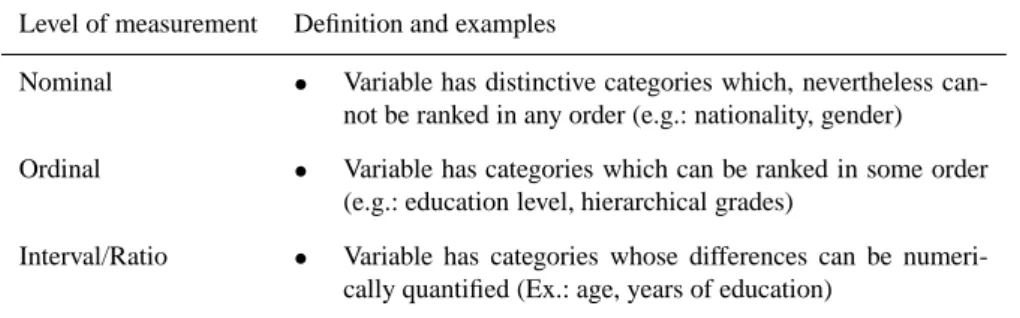
Table II. Main levels of measurement of variables
Level of measurement Definition and examples
Nominal • Variable has distinctive categories which, nevertheless can-not be ranked in any order (e.g.: nationality, gender)
Ordinal • Variable has categories which can be ranked in some order (e.g.: education level, hierarchical grades)
Interval/Ratio • Variable has categories whose differences can be numeri-cally quantified (Ex.: age, years of education)
Source: de Vaus, 1991: 130–131.
ways, each one of those ‘languages’ has its special functions in communicating ideas, concepts and phenomena. By using all three languages in the formulation of a hypothesis one will certainly bring more coherence to that important part in the methodology of social research. In Table I the three basic elements, notation, statement and diagram, are defined and suggestions are given about how they can be presented.
The first two elements, notation and statement, offer no difficulties related to their presentation insofar as they are
• readable – proper use of words and sentence construction, and
FORMULATING HYPOTHESES GRAPHICALLY IN SOCIAL RESEARCH 341
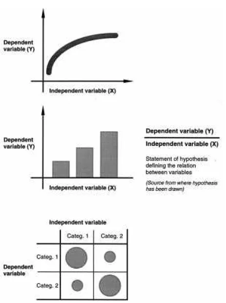
Figure 5. Basic models proposed for the graphic representation of hypotheses are shown in
the following order (from top to bottom): line graphs, bar graphs, and graphical matrices.
Diagrams, however, because they can be expressed in many different graphic pat-terns, need explanations about their use and representation.
Table III. Guide to the selection of diagrams, according to the level of measurement of the
dependent and independent variables in the hypotheses
Level of measurement of independent variable
Level of Nominal Ordinal Combination Interval/ More complex
measurement of of Ordinal + Ratio combinations
dependent variable Nominal (ff)
Nominal Graphical matrix1 Graphical matrix2
Ordinal Graphical matrix1 Graphical matrix2
Interval/Ratio Bar graph3 Compound Line graph5 Multiple line
bar graph4 graph6
(ff)In those cases two independent variables are combined. Four alternatives are possible: (inteval + ordinal or nominal) and (ratio + ordinal or nominal). See Figures 10 and 11.
1See Figure 11.
2In those cases the interval/ratio variable should be converted to a nominal or ordinal variable
and the use of a graphical matrix would be appropriate as in the previous case. See Figure 11. For further information about the use of graphical matrices see Adams (1989: 235–45).
3See Figures 6, 7, 8, and 12. 4See Figure 7.
5See Figures 8, 9, 10 and 12. 6See Figures 10.
beneficial. However, it is important to note that complementary graphic processes using ‘symbol forms, colours and perspectives’ have been integrated with those traditional patterns, multiplying their variety, but as Reidhaar (1984: 33) notes they do not ‘constitute new formulas’. In fact Garland (1979: 20) warns against the use of pictographic elements which in some cases ‘rather than increase information content, may unwittingly impede or even reduce the intake of information’. Daru (1989: 192) in her turn cautions against the ‘invasion of inadequate business graph-ics (computer) programs’ which may seduce users by what Tufte (1983: 107–121) appropriately calls chartjunk.
The diagrammatic languages proposed for this work are among those conven-tional ones which are tradiconven-tionally used in the presentation of statistical data of social research. This is important because it makes possible and easier a further analysis comparing the proposed hypotheses diagrams with the results found. Thus, the diagrams proposed for this study are basically: bar graphs, compound bar graphs, line graphs, multiple line graphs and graphical matrices. The examples provided at the end of this section will clarify the proposed structure, the basic models of which are shown in Figure 5.
It-FORMULATING HYPOTHESES GRAPHICALLY IN SOCIAL RESEARCH 343
Box 2. Structural elements for the presentation of graphs.
telson, Rivlin and Proshansky (1970). This, however, could comprise a subsequent investigation, justifying a further study on the subject.
5.1. SELECTING DIAGRAM TYPE
Box 3. Structural elements for the presentation of graphical matrices.
Having defined the level of measurement of each one of the variables in the hypothesis, the next step is to select the type of diagram to be used. At this point we must emphasise that although we are presenting some alternatives, researchers can propose their own models if they find them more appropriate. It is important, how-ever, to keep the graphical language as simple as possible avoiding non-essential information.
Table III indicates how the different types of diagram can be selected according to the level of measurement of the independent and dependent variables. In Boxes 2 and 3 the basic structural elements in the presentation of graphs and graphical matrices, respectively, are defined.
FORMULATING HYPOTHESES GRAPHICALLY IN SOCIAL RESEARCH 345
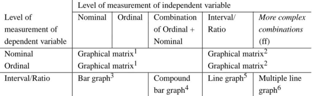
Figure 6. Two examples using bar graph. The main difference in these two examples is on the
level of measurement of the independent variable: nominal (top) and ordinal (bottom). In both cases, the independent variables are dichotomies (two categories).
in a graph or an area in a graphical matrix can be of significance because it can emphasise the relationships which the hypothesis wants to establish.
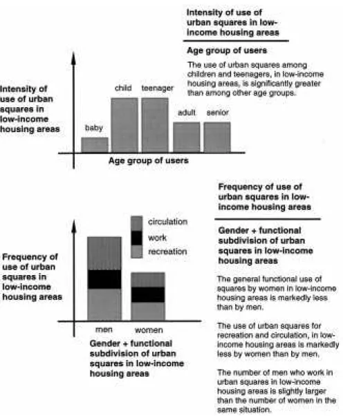
Figure 7. In the first example (top) the independent variable – user age – has been converted
from a continuous measurement to a polytomy (several categories) suggesting in this case the use of a bar graph. In the second example (bottom), since the independent variable is a
composite (of two nominal variables) the use of a compound bar graph is more adequate.
6. Examples
FORMULATING HYPOTHESES GRAPHICALLY IN SOCIAL RESEARCH 347
Figure 8. The two diagrams are representing the same hypothesis. The difference is on the
level of measurement of the independent variable: interval on the top example and ordinal on the bottom example. The decision to use one or the other will depend on the intended statistical treatment to be given to that variable.
Most of the hypotheses presented here have been selected from scattered ex-amples in the academic literature. However, some have been specially formulated in order to cover the graphic patterns proposed in this article. The ones which have been selected from the literature have their sources acknowledged after the statement of each hypothesis.
When analysing the following examples it is important to notice the following points:
Figure 9. Two examples using the line graph. The top one depicts a cyclical phenomenon
(elections) which is represented by the dashed lines. The example on the bottom represents a positive relation between the two variables however, the curve is important to show that for a further increase of the independent variable, the level of the dependent variable tends to level.
• some hypotheses can involve an intervening variable (see de Vaus, 1991: 28) and in those cases two diagrams can be used (Figure 12);
• most interval/ratio variables can be converted to dichotomies (two categories) (Figure 8) or polytomies (several categories); this choice will depend on the selected statistical treatment of the data (see Kerlinger, 1986: 27–28).
FORMULATING HYPOTHESES GRAPHICALLY IN SOCIAL RESEARCH 349
Figure 10. The line graph above is the graphic representation of a null hypotheses. The
hy-pothesis presented on the bottom establishes the relationship of a composite (nominal + ratio) independent variable with an interval variable. In this case the use of a multiple line graph is the most indicated.
7. Conclusions
Figure 11. The first example shows a simple graphical matrix representing the relation
be-tween two nominal variables. The second example shows a more complex matrix where two independent ordinal variables are related to one dependent nominal variable.
which in a certain way is intended to provide social scientists with a new working tool for their investigation routines. It is far from finished but is a suggestion for a new way to enrich methodology in a field which is traditionally inclined to the written word.
hypothe-FORMULATING HYPOTHESES GRAPHICALLY IN SOCIAL RESEARCH 351
Figure 12. This last example presents in hypothesis form the idea proposed in this article. In
this case an intervening variable has been indicated and two graphs are necessary to express the relation between the three variables.
ses could be conceived and new analytical concepts could arise from graphically comparing related hypotheses.
Acknowledgements
We would like to thank CNPq (Brazil) for providing financial support for the study on which this paper is partly based and Dr Alan Bryman and Dr Nelson Stradiotto for helpful suggestions.
References
Adams, W. (1989). An ergonomic approach to Bertin’s method of graphically displaying multivariate data. Information Design Journal 5: 235–245.
Banck, G. (1985). Poverty, politics and the shaping of urban space: a Brazilian example. MS presented at the 45th Congress of Americanistas, Bogota, 1–7 July (cited in Ward & Chant, 1987).
Bell, J. (1993). Doing Your Research Project (2nd edn). Buckingham: Open University Press. Biderman, A. D. (1990). The Playfair enigma: the development of the schematic representation of
statistics. Information Design Journal 6: 3–25.
Blalock, H. M. (1970). An Introduction to Social Research. Englewood Cliffs, N.J.: Prentice Hall. Bryman, A. & Duncan, C. (1990). Quantitative Data Analysis for Social Scientists. London and New
York: Routledge, Chapman and Hall.
Daru, M. (1989). The culture of quantitative graphicacy. Information Design Journal 5: 191–208. de Vaus, D. A. (1991). Surveys in Social Research (3rd edn). London: UCL Press.
de Vaus, D. A. & McAllister, I. (1987). Gender differences in religion: a test of structural location theory. American Sociological Review 52: 472–481.
Eckstein, S. (1977). The Poverty of Revolution: The State and the Urban Poor in Mexico. Princeton: Princeton University Press (cited in Ward & Chant, 1987).
Encyclopaedia Americana (1978). Vol 14. Danbury, Conn.: Americana Corporation. Enrick, N. L. (1972). Effective Graphic Communication. Princeton: Auerbach.
Garland, K. (1979). Some general characteristics present in diagrams denoting activity, event and relationship. Information Design Journal 1: 15–22.
Grush, J., Clore, G. & Costin, F. (1975). Dissimilarity and attraction: when difference makes a difference. Journal of Personality and Social Psychology 32: 783–789 (cited in Kerlinger, 1986). Holmes, N. (1984). Designer’s Guide to Creating Charts and Diagrams. New York: Watson-Guptill. Ittelson, W. H., Rivlin, L. & Proshansky, H. M. (1970). The use of behavioral maps in environmental psychology. In: H. M. Proshansky, W. H. Ittelson & L. Rivlin (eds), Environmental Psychology:
Man and His Physical Setting. New York: Holt, Rinehart & Winston.
Keller, P. R. & Keller, M. M. (1993). Visual Cues – Practical Data Visualisation. Piscataway, NJ: IEEE Press.
Kerlinger, F. N. (1986). Foundations of Behavioural Research (3rd edn). New York: CBS College Publishing.
Klare, G. (1979). Writing to inform: making it readable. Information Design Journal 1: 98–105. Lockwood, A. (1969). Diagrams – A Visual Survey of Graphs, Maps, Charts and Diagrams for the
Graphic Designer. London: Studio Vista.
Macdonald-Ross, M. (1979). Scientific diagrams and the generation of plausible hypotheses: an essay in the history of ideas. Instructional Science 8: 223–234.
Mackinlay, N. J. (1994). Culture Shock: International Students and the Psychological Effects of a Change in Cultural Environment. B.Sc. final year report, Loughborough University of Technology.
Mauch, J. E. & Birch, J. W. (1983). Guide to the Successful Thesis and Dissertation. New York: Marcel Dekker.
Montano, J. (1976). Los Pobres de la Ciudad de Mexico en los Asentamientos Espontaneos. Mexico, DF: Siglo XXI (cited in Ward & Chant, 1987).
Olesen, A. (1984). A study of slums and slum improvement in Madras. Report from a study period in Madras. Aalborg, Denmark: Institute of Development and Planning. (Mimeo) (cited in Ward & Chant, 1987).
Reidhaar, J. W. (1984). An overview of nontabular methods for statistical presentation of data before this century. Information Design Journal 4: 25–35.
Schmid, C. F. & Schmid, S. E. (1979). Handbook of Graphic Presentation (2nd edn). New York: Wiley.
FORMULATING HYPOTHESES GRAPHICALLY IN SOCIAL RESEARCH 353
Tufte, E. R. (1983). The Visual Display of Quantitative Information. Cheshire, Conn.: Graphic Press. Tukey, J. W. (1977). Exploratory Data Analysis. Reading, Mass.: Addison-Wesley.
Verma, G. K. & Beard, R. M. (1981). What Is Educational Research? Perspectives on Techniques of
Research. Aldershot: Gower (cited in Bell, 1993).
Waller, R. H. W. (1979). Four aspects of graphic communication – An introduction to this issue.
Instructional Science 8: 213–222.
Ward, P. & Chant, S. (1987). Community leadership and self-help housing. Progress in Planning 27: 69–136.
Wildbur, P. (1989). Information Graphics – A Survey of Typographic, Diagrammatic and
Carto-graphic Communication. London: Trefoil.
Witzling, L. P. & Greenstreet, R. C. (1989). Presenting Statistics – A Manager’s Guide to the
Persuasive Use of Statistics. New York: Wiley.