THE INFLUENCE OF ROOM COLORS
IN A HOUSE FOR ITS OCCUPANTS
Dila Hendrassukma
Department of Interior Design, School of Design, Bina Nusantara University Jl. K.H. Syahdan No.9, Palmerah, Jakarta Barat 11480
ABSTRACT
Home was a place where each individual could go after doing various routine activities. Residential interior design would support the quality of life of its occupants. The majority of the population of Indonesia, especially in Jakarta, had been aware of the importance of design interior of their homes properly. However, the selection of interior elements of color that was supporting the smoothness of the activities in a room was not considered as whole. The research objective was to analyze a great color for every room in the home based on the theory and the psychology of color. This article was expected to be a guide for those who will design an interior room. The method used was qualitative method in the form of observation and study of literature. Results of the study is the choice of a suitable color that fit in any room home, such as the living room, bedroom, kitchen, and bathroom can maximize the function of the room for the occupants.
Keywords: color theory, impact of color, interior design
INTRODUCTION
Element of color in a room is no less important than the other interior elements such as materials, lighting, or furniture. It can be said that an interior designer work, time and money they spent would be useless when they not put serious thought about the color will be use in the design work. It also applies when a designer has to design a room using the best materials, the latest lighting techniques, as well as the most incredible detailed design elements. It is because of color is an element that visually captured beforehand by the user of the room. The influence of color generated in an interior space is the key to enjoying and successful functioning of a space. A color plays a major role in creating the ambience of a room and can affect the mood of the occupant. If the color elements of the room designed properly, then the interior designers can also create an atmosphere of space corresponding to the function of the room. This writing will attempt to analyze the colors that are good for every room in a residential based on the theory and the psychology of colors. With the existence of this paper, it is expected to be a guide for those who will design an interior of a room.
METHODS
RESULTS AND DISCUSSIONS
Colors that are around us not only serve as an aesthetic element, but also serve as one of the determining factors of emotions in ourselves. Therefore, when arranging an interior space, the color becomes an important consideration. Each color has a psychological effect that is different. The psychological effect can be advantageous if using the right colors for the right activity. Conversely, it can be detrimental if you use the wrong color for a particular activity, or mood that we want is not reached. Color is also an element that is most easily changed if we want to create a new atmosphere in the interior of a room. Based on this, the introduction about color is required in advance.
Figure 1 Warm Colors and Cool Colors in Color Wheel (Source: http://www.homeworkshop.com)
Broadly speaking, the grouping of colors divided into two. The first group is a group of warm colors, and the second is a group of cool colors. Both of these color groups joined in a circle of color. Color circle is the development of three basic colors: red, yellow, and blue. The development of color in the color circle consists of 12 colors. The first group is incorporated in warm colors consisting of red, red-orange, orange, yellow-orange, yellow, and yellow-green. The second group was incorporated in cool colors are green, blue-green, blue, blue-violet, purple, and red-purple.
In the context of the psychology of color, warm colors have an effect that can cause vulnerable emotions of comfort, anger, up to a sense of spirit. Cool color groups, such as a series of blue, purple, and green have the opposite effect with warm colors. Cool colors can lower metabolism, and even used in hospitals to help calm the patients (Chijiwa, 1987).
Figure 2 Color Circle
Other than psychologically, the color combination and composition of the interior space can also affect the space users. After knowing the color circle, we will know that there are several kinds of colors in the color circle. The first type of color is certainly the three basic colors as stated before, red, yellow, and blue. This three colors are referred to as primary colors. Mixing of these three basic colors will form 9 other colors. The primary color is a powerful color that is easily recognizable. Therefore, toddlers who are just learning about the color will be easily attracted by the three colors so that the combination of primary colors often used as color toys toddlers (Akmal, 2006).
Figure 3 Primary Colors
(Source: http://www.homeworkshop.com)
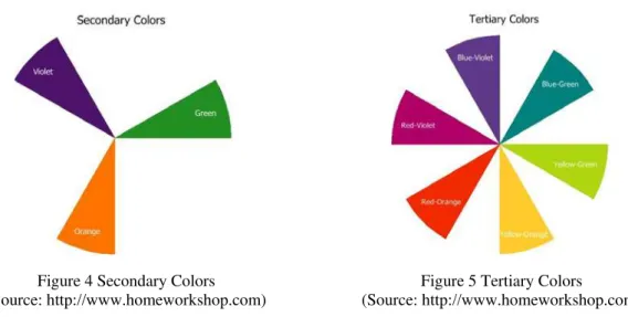
The second kind of color is a secondary color. Secondary color is the blending of two primary colors. Red mixed with yellow produces orange, red mixed with blue produces purple, yellow mixed with blue produce green. The third type of color is tertiary colors. Tertiary color is the result of a mixture of secondary colors with primary colors that are next to them. Yellow mixed with green produces yellow-green, or also called lime green. Blue mixed with purple produce blue-purple, or often also called indigo color. Mix blue with green produce turquoise color, and so on. So, in one color circle has six tertiary colors.
Figure 4 Secondary Colors (Source: http://www.homeworkshop.com)
Figure 5 Tertiary Colors
(Source: http://www.homeworkshop.com)
This will influence the color effect that used by space occupants. For example, red color that has strong and aggressive character, if the occupant applied to the entire plane of the bedroom walls, it is hard for the occupant to rest because unconsciously he/she will remain lackluster. However, if the proportion of red color is only a fraction and combined with cool colors, it will produce different effects for its occupants. Next, it will be discussed in more detail on the character of the spaces contained in residences in general, and the best colors to be applied to each space.
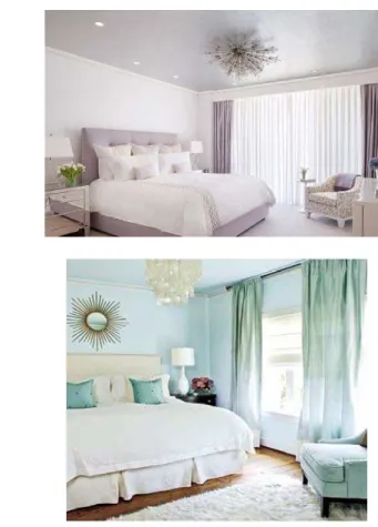
Every rooms in a house has own function for its occupants. First, the bedroom for adults or parents has the primary function for relaxing activity, such as resting or sleeping. In order to maximize the productivity of these activities, color groups that have a calming effect can help it. That kind of colors are widely available in groups of cold colors such as purple and blue. Blue is the color that has a calming effect for individuals who see it (Harini, 2013). But, we must pay attention to intensity of the darkness of the cool colors that will be selected. This is due to the different intensity will give different effects to the results. For example, the darker of blue color that is used, the better effect that can calm the occupant. While the darker purple may give different feelings form darker blue, it gives vibes of sadness or grief. But, coat the entire wall of the room with a dark color will produce depression feeling, especially if the bedroom is not too large in size. Applying a dark blue color in the artwork can solve this problem.
If you want to apply the favorite color that belonging to warm colors, you can use shades of brown color. Red, yellow, or orange should not dominate because these colors can raise blood pressure and heart rate, so it cannot maximize the real function of bedroom for relaxing and sleeping. Bold colors such as red, yellow or orange can be applied on soft furnishings, such as bed linen, upholstery fabric headboard, or beds-idetable lampshade.
Then, family room is the center of activity in a house. In this room, all family members get together doing various activities, such as watching television, reading, sewing, or just chatting. The interior design in the living room is very important to support the togetherness and comfort in working on daily activities. Warm colors like orange with set in brown, and also beige can work well in the living room. It is because of these colors provide a sense of comfort, warmth, and can stimulate conversation (Freeman, 2010). These colors can be use side by side or on their own. Due to the color brown and beige are fairly neutral and will not give bad effect to eyes or nerve racking, so the colors can be applied to the whole room.
Picture 7 The Use of Color Derived from Brown and Combinatiom with Light Gray
In addition to the living room, the dining room is another room for gathering people in one house. It is not only to accommodate the activities of eating, but also accommodate the casual thing like chatting. The colors that are required for the dining room are the colors that can arouse eating appetite and can encourage conversation among family members or with the guests. Warm colors like red, has character that can stimulate appetite. And yellow can also increase starveling.
The important thing is the intensity in using red and yellow colors should not too bright that could blind the eyes. Because of that, red or yellow color should not be used in the whole room. Red or yellow can be applied only in one part of the wall or just on the dinning table accessories, such as tablecloth, napkins, or backrest cushion of the dining chair. It could be completed by adding color that can give the impression of comfort and natural sucha as brown or neutral color such as white.
Until some time ago, a residential kitchen design is not an important thing because the kitchen is located at the rear of the house. But, along with the reducing land for residence, the kitchen is often placed in the same zone with dining area, and sometimes with the family room. The result is that the kitchen should be designed to have a look no less good and interesting as other adjoining areas.
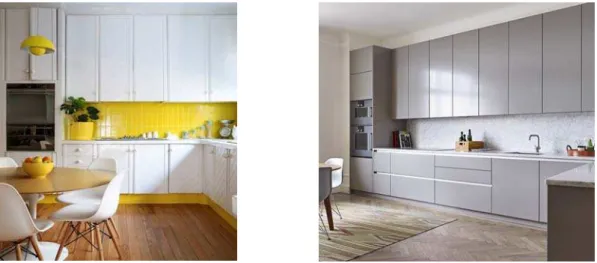
Activities that usually occur in the kitchen are preparing and processing food. For kitchen that placed together with dining room, kitchen also works as a banquet hall. If the kitchen separated with the dining room, the colors used in the kitchen can be completely different from the dining room. However, if the kitchen adjoined with dining room, the kitchen’s colors should support dining room’s color. Preferably, the colors used in the kitchen is a light color to prevent accidents during food processing and prevents moisture that can cause damage to the food supply. In addition, the color that has a clean impression can also evoke passion during food processing, because knowing the food that will eat is not contaminated by dirt in the room. Cool colors like gray which gives the impression of practical, white which gives hygienic impression, and yellow from the group of warm colors which can evoke the good mood can be applied on the walls of the kitchen or the kitchen cabinet.
Figure 9 Kitchen with Mixture of White and Yellow and Light Gray Color
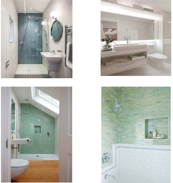
Figure 10 Application of Blue and White Colors in Bathroom
CONCLUSIONS
REFERENCES
Akmal, I. (2006). Menata Rumah Dengan Warna. Jakarta: PT. Gramedia Pustaka Utama.
Art Theraphy. (2015). Color Psychology: The Emotional Effects of Colors. Retrieved Februari 20th 2015 from http://www.arttherapyblog.com/
BBC. (2014). Psychology of Colour. Retrieved Februari 20th 2015 from http://www.bbc.co.uk/
Chijiwa, H. (1987). COLOR HARMONY – A Guide to Creative Color Combination. Massachusetts: Rockport Publisher.
Freeman, D. (2010). Color Psychology: How To Make Your Home Feel Good. Retrieved February 25th 2015 from http://www.webmd.com.
Harini. (2013). Terapi Warna Untuk Mengurangi Kecemasan. Jurnal Ilmiah Psikologi Terapan, 1(2). Retrieved May 25th 2015 from http://ejournal.umm.ac.id/
Home Workshop. (2009). Color wheel 101. Retrieved May 20th 2015 from http://www.homeworkshop.com/2009/03/27/color-wheel-101/