Portuguese sport posters: a view
through design between 1882-1991
Helena Barbosa
Portuguese sports, poster, design, visual narratives
Little is known about Portuguese production in the context of graphic design related to sports posters. Very few examples can be found dispersed in books or in the World Wide Web, and the existing material is normally resumed to a legend. In order to contribute to a deeper knowledge about the sports and the design of the posters, this paper presents a narrative based in a methodological approach using four axes of contents: the historical context; authorship; programme (brief); and technology as a tool to discover more information about the subject. This model permits to achieve the aims of this paper: to understand how different moments in history led to changes of the visual communication in posters; identify and give data about the designers that were involved in the process; reveal what were the constrains of the programme and how designers resolved their graphic proposals; and explain the printing processes and their impact in the graphic design of posters.
1 Introduction
From two of the largest national archives,1 cultural thematic posters focused on sports have been selected for study. At this level there were specificities disclosures in this area, whose details reveals the cultural interests of the Portuguese society over time. The paper refers to facts that happened in a country, in some ways peripheral to modern developments, yet through sport also bound into a wider international public world. In a number of ways, the poster becomes
1 The archives of
Portuguese National Library (BNP) and Madeira Luís/University of Aveiro (ML/UA)
the visual mediator of these contradictory developments, sometimes obscuring, sometimes highlighting and dramatizing tensions between official and public views of sport. At the same time the development of printing technologies and the education of artistic areas had an impact on graphic design.
2 The poster for sports in the 19th century
The main reason that led to the emergence of the art academies in the 19th century, is connected with earlier attempts, which consisted in the creation of educational institutions related to this field, and also by the manifest interest of the political power of the Septembrist Revolution2, by implementing a series of reforms towards which the artistic education was not indifferent. Despite the failure of most actions taken by Septembrism, it could be said that the constitution of the Fine Arts Academies (1836), in Lisbon and Porto, would become a reference in the teaching of Arts in Portugal3. However, teaching about the industrial arts on one side mirrored the lack of modernity, while on the other, the graphic arts-related education followed with greater proximity aesthetic innovations of the time, without a direct transposition, except in exceptional cases. In this sense, the graphic design managed to draw a distinguished pathway in relation to industrial design, with a great proximity of international visual communication production and so revealing these influences that can be seen in the sports posters.
In this century, there were a few sports organisations mainly focused on nautical sports, gymnastics, cycling and football, being these sporting organisations and actions promoted essentially by the aristocracy and bourgeoisie (Crespo, 1991). However, most of the concepts related to sports and its regulation originated in other countries, influencing the sports culture in Portugal (Carvalho, 2007, p. 25).
The cultural posters of this period not only mirror the growing of interest for different activities of sport, but also present programmes that, in part, approached the international ones. Consequently, they show a reduced amount of content in terms of text, used coloured paper and were illustrated not just by resorting to typographical features making them more attractive when compared to commercial and political posters from the same era (Barbosa, 2011).
Despite having only one poster of sport from the 19th century found in the archives consulted (Figure 1), whose theme is a mix between a set of sports activities and varieties related to the world of spectacle, this example shows that the poster in question is allocated to two different audiences. The poster announces several public spaces where activities took place and, therefore, could be seen by the general public. In turn, the end of the event was reserved to a physical space, where it was necessary to buy ticket, aimed at a social class
2 A historic event that
took place in Lisbon (1836) which was based on a revolt by the people in order to publish the constitution.
3 At the same time
gives an outbreak of periodicals with the appearance of 66 newspapers and the information is transmitted quickly with regard to the dissemination of artistic activities (França, 1990, vol. I, p. 227).
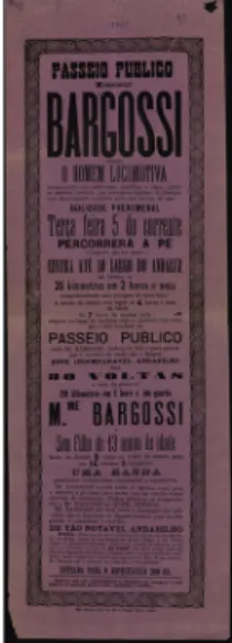
with greater economic power. In part, the poster reflects the society of the time, whose sporting activities were still associated with an elite. This poster is also an example how programme valorised the use of text in detriment of the use of the image, where the contents are not advertised succinctly in terms of context, and the information given is detailed, showing a degree of very exhaustive description. The presence of these conditions, in terms of the order to the author of the poster, associated with the lack of reprographic resources, somehow prevented the use of the image on a large scale, giving to the poster a strong typographic nature. The print shop, who printed the poster of 1882, was named Lallemant Frères, Typ. (186?) and became known for is typographic variation using constantly different types made of metal in the same poster and by the use of typographical ornaments made of wood. The poster is of greater interest from the point of view of authorship, since, although it does not display the name of an author, it is possible to conclude that the design of the posters was made by printers. The Lallemant Frères, Typ., feature one graphic characteristic that allow to define an identity, or uniqueness, within a given style with roots in Victorian influences. This was possible due to the use of a large number of different types, their variation in terms of dimensions, in addition to the constant presence of different designs of frames and ornaments.
These were the graphic arguments that were normally used to announce the information. But the disclosure made through this form of visual communication, prevented the immediate perception of the theme of the poster, and, just from their reading, it is possible to perceive what were the sports involved. In order to make the poster even more attractive, one of the strategies of Lallemant Frères, Typ., was the selection of coloured paper. Possibly this poster stands out from the others when was posted in public places, sought to circumvent the problem of colour printing.
Figure 1 Anonym. 1882 . Bargossi. (20 cm X 59 cm). Poster printed at the
3 The poster for sport of 20th Century
Political instability continued to prevent, at the beginning of the 20th century, the existence of a plan reflected on the significance of academies. Given the ineffectiveness of the system, several initiatives related to the teaching of design practice emerged, initially, in private, in the atelier of António Soares (1894-1978), possibly from the decade of 10. Despite the fall of the monarchy in 1910, it’s not very clear how this political change affected the graphic design. At the same time international influences continued to play a vital role in the design of sports posters.
From the beginning of the 20th century, Portugal had a set of sporting activities, in addition to the mentioned above, stood the athletics, hunting, canoeing, horseback riding, fencing, traditional games, wrestling, swimming, river tours, ice skating, tennis and shooting (Ferreira & Ferreira, 2001, p. 58). During this period, periodic publications, disclosed in a timely manner, the sports announcing “(...) competitions, demonstrations, and physical practices, whether it concerned the evidence of the competitions, entertainment and sports materials or even the news of meetings of clubs and sports associations” (Ferreira & Ferreira, 2001, p. 57). Beside publications and posters, aroused in the course of this century, other public and private initiatives promoted the sport4.
By comparing the posters of the 20th century with the previous it is possible to perceive the rupture in the visual communication, provided not only by the small number of contents of text, where the image predominates. The awareness of the importance of the image, whose value gives it a significant force not only at the level of interpretation as memorization, provided a new understanding of the modern concept of the poster. Based on this assumption, it is possible to conclude that the allocation of that valorisation was one of the requirements of those who previously ordered the work, and at the same time, a desire of valorisation of the authorship.
The authors while cultural interpreters, act as mediators between the political, social and technological knowledge. The presence of their identification on the posters happened slowly, given the absence of a valorisation of artistic areas in the area of graphic design. The importance of signature in the sports posters only was given in the 20th century5, leaving the 19th century with a production that falls on anonymity, which, in large part, also verifies in the 20th century. The identified sports posters are usually from authors who have acquired a status and social recognition of their activity.
With a graphic design completely separate from the previous example, the presence of the image on a large scale was possible by the use of lithography. Some print shops stand out among the others. For the use of this technology: The Lithografia de Portugal (1893-), the ETP (1914-1923) of Raul de Caldevilla, later known as Gráfica do
4 The recognition and the legislation applied to professional sport emerged only in the 60’s, suffering significant changes in 1990 (Carvalho, 2007, pp. 40-41).
5 In the selection of 37
posters, only 11 are identified with the name of the designer, though, there are 22 posters identified with the name of the printer.
Bolhão (1923-) all known not only by the quality of printing of posters, as well as for printing large posters.
The box poster with only two colours (Figure. 2) is an example that reveals the technological domain of the lithographer draughtsman and of the printer. The design features modernist influences with the use of geometric elements. At the centre, the designer put the athlete having as background the black square whose dimension and dynamism promote a certain tension in the composition. The idea of this compositional strength is enhanced by the movement, position and physical details of the athlete, whose place on poster indicate a rising line, leaving the right space below to include the text information whose typography is made through the drawing, using uppercase without serifs with a white outline, showing traces of modernity and simplicity. The colours, and the geometric abstraction represented at the central element and that appears in the frame of the poster reveals some inspirations in Suprematism and Constructivism.
Figure 2 Anonym. [1915] . Max Fredo. (78,1 cm X 110,5 cm). Poster printed at the
Lith. Salles (Lisbon) in lithography using two colours. Source: BNP. In a similar perspective, although differentiated, the football poster (c.1916) (Figure 3), who despite being cut on the top, is more descriptive in terms of image with the detail of the representation of various military columns placed at the background. The visual characteristics are more realistic and the use of five colours provide an image that contextualizes the event, despite the almost absence of text. Possibly it was a meritorious poster to support the fighters of World War I.
Figure 3 Anonym. [1916] . (90 cm X 124 cm). Poster printed at the A Editora, Lda.
(Lisbon) in lithography using five colours. Source: BNP.
The collective authorship football posters of the ETP (Figure 4) and Gráfica do Bolhão (Figure 5), stands out, whose designs have been created by the lithographer draughtsman belonging to these print houses, and possibly people with greater aesthetic sensibility (Barbosa, 2009, p. 27). However, and in some cases, these print houses resorted to external authors (Barbosa, 2009, p. 29), or as a form of ‘renewal’ aesthetics, or by the imposition of who carried out the order of the poster. Nevertheless, they continued to hold the mark or the name of the printing company in conjunction with the name of the designer on the poster. By including both names at the same time, they took advantage of the opportunity to advertise their services with the public sphere and could worked as a sponsorship. That situation happened from the 30’s, arose from time to time, a set of companies that commercially supported clubs and athletes until the end of the 20th century (Carvalho, 2007, pp. 27-28).
Figure 4 ETP – Empreza Tachnica Publicitária. [1918] .Foot-ball. (52,8 cm X 75
cm). Poster printed at the ETP – Raul de Caldevilla (Porto) in lithography using two colours. Source: BNP.
Figure 5 Gráfica do Bolhão. [1927] . (Without title). (67,5 cm X 90 cm). Poster
printed at the Gráfica do Bolhão (Porto) in lithography using three colours. Source: BNP.
Another football and handball poster (1934) (Figure 6) reveals the creativity of the designer with the draw of the outline of the soccer player, whose cut features a flat figure, losing the idea of three-dimensionality giving rise of two merging representation plans between image and text. This concept is reinforced by the three colours who are dispersed in three moments, in the vertical direction. This printing process was faster by avoiding the hits and the reserved areas that would need to be created to avoid colour overlapping. The designer opted for a more simplified solution in terms of printing, making use of overprint, managed highlight the shapes and colours in relationship to the other posters who used the technique of lithographic printing in its more conventional way.
Figure 6 Anonym. 1934. Football. (50,7 cm X 70,2 cm). Poster printed at the Tip.
A Desportiva (Porto) in lithography using three colours. Source: BNP.
The same poster presents Art Déco influences that were divulged mainly by António Soares, who was in part responsible for promoting
the modernism in Portugal. The journalist António Ferro6, sensible to the modernism and conscientious of the importance of the artist’s decide to interview the dictator Oliveira Salazar (1889-1970)7 in December of 1932, saying “there are dozens of boys full of talent and young people that are waiting anxiously to be useful to their country, if the State wanted to look after them (…)”, and Salazar answered “tell those boys that have confidence and learn how to wait (…)” (França, 1991, p. 201). The interview was published in the newspaper “Diário de Lisboa” and animated the artists and the journalist Ferro with the creation of SPN (Secretariat of National Propaganda) in 1933. But this alliance had strange results.
To promote sports activities the Government policies carried out during the dictatorship, several initiatives, such as the creation of FNAT8, the implementation of the National Education Program (1936) whose project was the Mocidade Portuguesa (Portuguese Youth)9 and the creation of the National Institute of Physical Education (1940)10. Nevertheless, some constraints were felted from the beginning.
The sports posters produced between 40 and 70, under the sphere of competence of the “Estado Novo” (New State), reveal that the political power with the course of time sought to show an image less ideological and more modern, limiting in part the author with respect to the use of symbolic in force. From that set stands out the poster with several sports activities (1941) (Figure 7), where it is noticeable presence of female figure, whose body position can be interpreted in two ways. On the one hand, the association with the Roman salute adopted by the fascist regime, whose iconography of the scheme is clearly taken with the aesthetics of the fascist posters made in Germany and Italy, assuming political connotations that are mingled with physical activity, on the other hand, the woman’s body features a discreet position, whose muscular body seeks to annul her sensuality, being this highlighted only by the delicacy of the position of the foot, hand, pose, and clothing, whose style reports to a conservative uniform.
Figure 7 Anonym. 1941 . F.N.A.T. (60 cm X 90 cm). Poster printed at Lito. de
Portugal. (Lisbon) in lithography using one colour. Source: BNP.
6 Since the 1920s, he
was always close to the modernists, he was too modern journalistic, the fact that he interviewed celebrities and
promoted modernism in Portugal, became the unanimous figure among artists. His political approach with Estado Novo was taken over by the Secretariat of National Propaganda in 1933.
7 Minister of Finance
since 1926.
8 The National
Foundation for Joy at Work, was established in 1935 and was intended to foster the free times of the workers, at the same time wanted to shape them ideologically from the point of view of their intellectually and morality.
9 Adopted as a symbol
the flag of D. João I, and those who joined the Portuguese Youth had to carry out certain procedures, such as the physical exercises and use the Roman salute adopted later by the Fascist regimes.
10 Educational institution
that trained physical education teachers. There is an exception that existed teacher training initiatives with the establishment of the Republic in 1910, but whose results were not as expected, in the same way as happened with the artistic areas.
The opposite example occurs with the poster of water-polo of 1947 (Figure 8), printed with four colours. This poster features a distinct visual speech from the previous poster, in which the author opted to represent flags and a swimming pool with a drawing of geometric nature, conferring to the poster some subtlety and certain simplicity. From the point of view of typography, the serif letters are designed with influences of Didone, and the san serif letters, are closer to the ‘linear’ group, which are based on a geometric design with Art Deco
influences, revealing this style still was a reference at the time.
Figure 8 Anonymous. 1947. Natação . Water-Polo . (30 cm X 44 cm). Poster
printed at Lito. De Portugal, in lithography using four colours. Source: BNP. From the 50’s and the next decades, there were found brands of clubs, agencies, and institutions (Figure 9 and 10), highlighting again the posters of the New State, with the use of an ideological iconography based on history of Portugal, using the design of the flag of the reign of D. João I (1357-1433), as insignia used to some sports activities, like the poster of 1963 (Figure 11). This poster feature references related to a historicist and nostalgic attitude related to the identity of Portugal in the age of Discoveries (Barbosa & Calvera & Branco, 2011, p. 4). The poster of 1963, which celebrates the Day of Portugal with the Festival of Physical Education, represents the cross of Christ on a modular scheme giving to the poster printed in offset a modernized idea of the historicist concept, in conjunction with the solarized image of Luís Vaz de Camões (c. 1524-1580)11. Strangely, this poster shows no image related to the sport. The absence of this information will have been conditioned by the regime that sought to continue to elevate and celebrate the history of Portugal, avoiding addressing the theme of sport that is referred to the background.
11 Illustrious figure of
Portuguese literature in the context of poetry, who died on 10th June, whom was dedicated a holiday to celebrate the day of Portugal in homage to the poet.
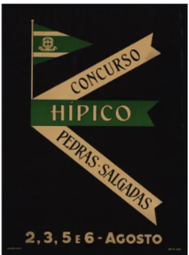
Figure 9 Anonymous. 1950. Concurso hípico Pedras Salgadas. (44,9 cm X 66,8
cm). Poster printed at Bolhão, in lithography using two colours. Source: BNP.
Figure 10 Anonym. 1955 . CFB. (44,9 cm X 66,8 cm). Poster printed in
lithography using three colours. Source: BNP.
Figure 11 Anonym. 1963 . Physical Education Festival. (29 cm X 22 cm). Poster
printed in offset using three colours. Source: BNP.
The poster of 1968 (Figure 12), has not been printed in any of these print houses, it is possible to perceive that this technology was also available in other places. The poster announces the XX International Games, where the representation of the sportsman is discreet, confusing with the background, although represented with a high-contrast graphic language, influenced not only by the use of photography but also by the Pop language to which the designer
Rodil Garcia (19--) seems not to have been indifferent, creating a composition for the background based on the rectangle. Both results provided a break with the previous posters. Yet, there are some remnants of the imposition of the programme of the New State with the author, like the integration of symbol and the written name of the Portuguese Youth.
Figure 12 Rodil Garcia. 1968. FISEC. (40 cm X 57,5 cm). Poster printed at E. M.,
Lda., in offset. BNP.
Still under the tutelage of the regime, the poster of 1971 (Figure 13), was initiative of the State of Secretary of Information and Tourism, whose event despite having been organized by the Portuguese Federation of Motor boating doesn’t offer any ideological image of the regime, using photography to promote the motor boating tournament. The only association that can be made to the regime relates with the typology of tourism posters that were printed in the late 50’s until the 70’s (Figure 14). They used a graphic composition very close to this poster, which consists in the presence of the photographic image in 2/3 of the poster, and the white bottom bar permitted the insertion of information. The motor boating poster once again defeats the presence of the human figure, but now perhaps justified by the concept of water. The use of photography in sports posters is scarce, it was found only two examples, mainly because draw was still considered, by the authors, the representation of excellence. The utilization of this technology is not very common for two reasons. The first implied the use of offset that become vulgar in large format mainly from the 60s, and the second, leads to believe that the authors didn’t used photography by not having easy access to this technology and not know its application related with printing, continuing to find more interesting graphics solutions on drawing.
Figure 13 Rodil Garcia. 1971. II Torneio nacional das barragens de motonáutica.
(63 cm X 100 cm). Poster printed at Lito. Of. Artistas Reunidos (Porto) in offset. Source: BNP.
Figure 14 Anonymous. 1963. Porto. (62,9 cm X 99,4 cm). Poster printed at Lito.
Of. Artistas Reunidos (Porto) in offset. Source: BNP.
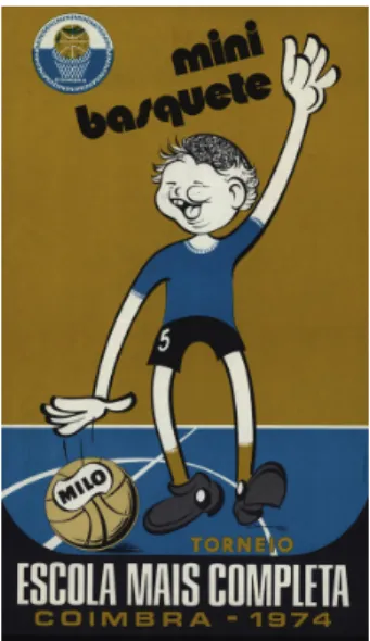
In the 70’s, stands out the posters of various sports of Fernando Coroado (19--) (Figure 15) with a personal interpretation, with some conceptual influences of pictograms. However, it was found several variations (Figure 16 and 17) of its representations that reveal distinct styles prevent the characterization of its production in aesthetic terms.
Figure 15 Fernando Coroado. 1972. Desporto escolar. (54 cm X 82 cm). Poster
printed at Lito. Coimbra in offset using two colours. Source: BNP.
Figure 16 Fernando Coroado. 1973. Xadrez. (39 cm X 63 cm). Poster printed in
offset using three colours. Source: BNP.
Figure 17 Fernando Coroado. 1974. Mini basquet. (36 cm X 60 cm). Poster
After the Revolution of 1974, several changes of Governments succeeded, consequently, the programmes relating to professional sports until the end of the century altered successively.
Simultaneously, public and private educational institutions promoted sports activities giving rise to the growing interest and development of the sport at a national level. The participation of artists (Figure 18) on the design of posters become more regular, such was the case of the artist Marcelino Vespeira (1925-2002) whose representations fall in the geometric abstractionism, in terms of geometric shapes for image and typography, inspired in the posters from East.
Figure 18 Marcelino Vespeira. 1976. Bulgáris Portugal. (63,7 cm X 95,8 cm).
Poster printed at Imprensa Nacional Casa da Moeda (Lisbon) in offset using three colours. Source: ML/UA.
Like Marcelino Vespeira, Jorge Trindade (1950-) (Figure 19) presents a graphic design, which is identifiable because it follows a simplified language and a certain laconic style. The representations of the poster of cycling feature stylized figures, using the concept of two-dimensional nature to communicate. Possibly inspired by the pictograms used in the 1972 Munich Olympics, created by Otl Aicher, the Portuguese author presents cyclists duly reinterpreted. The remaining elements reflect the uniqueness of its representations. The photo appears in high contrast discreetly at the bottom of the poster, and the use of Helvetica shows its intention of neutrality that contrasts with the newspaper mark Comércio do Porto represented in a Gothic style. In terms of composition, the innovative way as Jorge Trindade worked the various flags allowed him to print a chromatic and a greater dynamic motion to the set. Is the first sports poster in which an author uses the word design to describe his professional activity, deducing that the popularization of the term and the appreciation and valorisation of the discipline was provided also through this artefact.
Figure 19 Jorge Trindade. 1981. O Comércio do Porto. (49,7 cm X 70 cm). Poster
printed at Tipave (Aveiro) in offset. Source: ML/UA.
The poster of 5th Lisbon Game (Figure 20) is the last selected sample of collective authoring, known as Olho de Boi Design. This poster contrasts graphically with the other, using the concept of offset printing to define separate areas, between the background and the shapes that appear clipped, being this idea marked by the presence of the four colours of the offset. The use of this visual rhetoric illustrates an innovative graphic expression, perhaps by the access to design publications that have become increasingly widespread, especially in the Decade of 90, and also by the use of the computer.
Figure 20 Olho-de-Boi Design 1991. 5 Jogos de Lisboa. (57,4 cm X 77,4 cm).
Poster printed at Heska Portuguesa (Lisbon) in offset. Source: ML/UA. The last decades were marked by the presence of offset and the most important print shop’s that printed sports poster were Lithografia de Coimbra (1937-), Lit. Of. Artists Reunidos (195-) and the Imprensa Nacional da Casa da Moeda (1833-), their work became
known not only by the print quality, but also of the large number of printed copies. The growing number of printed posters allowed the modification of the public spaces. There are few sports posters that make reference to the number of posters printed. However, their presence in public spaces should have been reduced, when compared with the commercial and political posters. Despite the scarce information about this low representatively, it seems that the poster of sport when compared with other posters that belong to the same category of cultural poster12, does not differentiate significantly compared to other subcategories, with the exception of the tourist poster that features a large number of copies, revealing that the sport continued to be a focus of interest in society. Based on the only the two archives, it was found an order for a private sports club that ordered the printing of 500 copies (while the New State ranged between 500 and 1000), revealing that the public orders aimed a wider audience. Although unknown information regarding the latest print runs, it is assumed that their number increased by the end of the 20th century.
4 Conclusions
The analisis of Portuguese 20th century sports posters reveals a great democratisation of the public sphere access in the events advertised. In general terms, it is possible to state that, regardless of the sport to be announced, public and private entities showed no constraints, from an aesthetic point of view, in relation to images used to identify the events, excluding the use of brands, with the exception of the New State.
Posters were used par excellence for the dissemination of sports events in Portugal, monitoring and adapting to the realities of the development of the discipline of sports. It was noticed that there were a set of confluences and influences from various quadrants, which had an effect on the resulting visual communication of posters. Such influences came from a diversity of related contexts for the development of the sports area, such as culture, society, the public, and from existing policies that took place during these two centuries, which implicitly or explicitly dictated the programmatic needs of the posters. In spite of these constraints imposed by those realities, the technologies involved in the design project and in the reproduction of posters, also played a key role in the transformation of these artefacts in the communicational level and in its final presentation to the public sphere. The small narrative of these subjects that illustrate the sport history through poster, reveals one strong association with the history of Portuguese design, enabling to expand the knowledge in this field.
12 Some examples of subcategories: cinema, theatre, exhibitions and shows.
5 Acknowledgment
This work is financed by national funds through the FCT – Fundação para a Ciência e a Tecnologia, I.P., in the ambit of the grant PD/ BD/150509/2019 and the project UID/DES/04057/2019.
References
Barbosa, H. (2009). Portugal’s first advertising agency: Raul de Caldevilla and the ETP, 1914-1923. Design Issues, v. 25, n.1, Winter: 22-35.
Barbosa, H. (2011). Uma história do design do cartaz português do século XVII ao
século XX. Aveiro: Universidade de Aveiro. Tese de Doutoramento.
Barbosa, H & Calvera, A. & Branco, V. (2011). ‘The design of Portuguese political poster: two politics, two discourses’, In FHD – Fundación Historia del Diseño and DHS - Design History Society, Annual Conference proceedings: 1-12. http://www.historiadeldisseny.org/congres/
Carvalho, M. (2007) Os elementos estruturantes do regime jurídico do desporto
em Portugal. Porto: Faculdade de Desporto da Universidade do Porto. Tese
de Doutoramento.
Crespo, J. (1991). A educação física em Portugal: génese da formação de professors. Boletim da S. P. E. F., n. 1: 11-19.
Ferreira, J. & Ferreira, A. (2001). As actividades desportivas no Porto de 1900,
Revista Portuguesa de Ciências e Desporto, v.1, n.2: 56-61.
França, J. (1990). A arte em Portugal no século XIX. 3 ed. Vol. I. Lisboa: Bertrand Editora.
França, J. (1991). A arte em Portugal no século XX. Vol. III. Lisboa: Bertrand Editora.
Providência, F. (2003). Algo más que una hélice. In Calvera, Anna (ed.). Arte¿?
Diseño. Barcelona: Gustavo Gili. p. 195-213.
About the authors
Helena Barbosa
<helenab@ua.pt> Universidade de Aveiro
Departamento de Comunicação e Arte
ID+ Instituto de Investigação em Design Media e Cultura Paper submitted on 06/04/2019,
![Figure 2 Anonym. [1915] . Max Fredo. (78,1 cm X 110,5 cm). Poster printed at the Lith](https://thumb-eu.123doks.com/thumbv2/123dok_br/17196731.784445/5.892.305.508.473.765/figure-anonym-max-fredo-cm-poster-printed-lith.webp)
![Figure 4 ETP – Empreza Tachnica Publicitária. [1918] .Foot-ball. (52,8 cm X 75 cm). Poster printed at the ETP – Raul de Caldevilla (Porto) in lithography using two colours](https://thumb-eu.123doks.com/thumbv2/123dok_br/17196731.784445/6.892.304.469.830.1057/figure-empreza-tachnica-publicitária-poster-printed-caldevilla-lithography.webp)
![Figure 5 Gráfica do Bolhão. [1927] . (Without title). (67,5 cm X 90 cm). Poster printed at the Gráfica do Bolhão (Porto) in lithography using three colours](https://thumb-eu.123doks.com/thumbv2/123dok_br/17196731.784445/7.892.303.490.114.363/figure-gráfica-bolhão-poster-printed-gráfica-bolhão-lithography.webp)