2016 Escola Superior de Design
OLGA GALEEVA
Project Lisbon Olympic Games 2028
JURY
Presidente Doutora Maria Emilia Capucho Duarte
Professora Auxiliar do Instituto de Arte, Design e Empresa Universitario
Vogais Doutor Daniel Raposo Martins
Professor Adjunto da Escola Superior de Artes Aplicadas do Instituto Politécnico de Castelo Branco
Doutor Carlos Miguel Lopes Rosa
AKNOWLEDGEMENTS
First of all, I would like to express my deepest gratitude to all of my family, my parents, my husband and my daughter and to all of my friends for their incredible support, love and help throughout my education and life, especially over the last two years. I want to give a special thanks to my supervisor Professor Carlos Miguel Lopes Rosa, Professor Armando Jorge Gomes Vilas-Boas and Professor Fernando Fernando António de Oliveira Carvalho Rodrigues for their huge help and support during this project, I would not be here it without it.
A special thank is due to Professor at the Faculty of Beautiful Arts, Porto University and creator of The White Studio, and Manuela Teles, Head of Communication of White Studio for their participation in this study.
A special thanks to Jose Cerqueira (Ex- Brandia Central Brand Voice) for participation and help with my research.
Last but not least, to those who directly or indirectly contributed and were present in this important step of my life.
Palavras-chave
Resumo
Jogos Olimpicos, Lisboa, Identidade Visual, Design, City branding, Azulejo, Portugal
Os Jogos Olímpicos são um megaevento durante o qual as maiores cidades do mundo competem umas com as outras para obterem estatuto e reconhecimento. Nos últimos anos, os Jogos Olímpicos assumiram maior importância em termos económicos, principalmente devido ao aumento da comercialização na área do desporto. Receber os Jogos Olímpicos constitui uma oportunidade de melhoria para a cidade, uma ocasião para remodelar a paisagem urbana, para se afirmar mais fortemente no cenário mundial e se tornar apetecível aos olhos dos investidores, dos viajantes, dos trabalhadores criativos e das empresas mundiais em busca de novos mercados. Tornaram-se também num símbolo óbvio da cidade global. Atletas do mundo inteiro juntam-se num local e competem uns contra os outros em inúmeras modalidades desportivas para realizarem o seu sonho de se tornaram Campeões Olímpicos.
Estes tipos de eventos são sempre associados a uma forte identidade visual que os torna facilmente reconhecíveis. Em cada edição dos Jogos, a cidade anfitriã desenvolve o seu próprio logotipo e um conjunto de pictogramas.
O projeto é criado, com o fim de alcançar dois objetivos muito específicos: para funcionar como uma ferramenta de 'Wayfinder' para os espectadores e ao mesmo tempo, representando a cultura local.
Keywords
Abstract
The Olympic Games, Lisbon, Visual Identity, Design, City branding, Azulejo,
The Olympic Games are a mega-event that make the world s largest cities compete for recognition and status. In recent years the Olympic Games have become economically significant, primarily as a result of the increasing commercialisation of sports. Hosting the Olympic Games is the opportunity for the city to improve itself, reshape the urban landscape, create a new statement on the world stage and make the city become desirable to investors, travellers, creative workers and global corporations seeking for new locations. It has also become one of the most obvious symbols of a global city. Athletes from all around the world gather together in one city and compete against each other in a variety of sports to realize their dreams of becoming Olympic champions.
It has long been an axiom of mine that the little things are infinitely the most important .
Sir “rthur Conan Doyle, The “dventures of Sherlock Holmes .
TABLE OF CONTENTS
Abstract List of Figures
CHAPTER I
1. Introduction 25
1.1. Motivation 25
1.2. Objectives 25
1.3. Problem 26
1.4. Methodology 26
CHAPTER II 2. Literature review
2.1. Design project methodology and theory 27
2.2. Communication design 32
2.3. Information design 34
2.3.1. Isotype 35
2.3.2. Semiotics. The study of signs 40
2.4. Branding 41
2.4.1. Visual identity and brand language 43
2.4.1.1. Visual identity definition 48
2.4.1.2. Brand language definition 50
2.4.1.3. Process of designing or approach brand language and visual identity 50
2.4.2. History of the Visual identity programs 51
2.5. Creative thinking 53
2.6. Portuguese culture 53
2.6.1. Aspects of Portuguese culture 53
2.6.1.1. Lusitania 53
2.6.1.2. History of azulejo tiles as a symbol of Portuguese culture 54
2.6.1.3. Calçada 58
2.6.1.4. Portuguese flag 59
2.6.2. Design in Portugal 60
CHAPTER III
3. Study cases. The Olympic Games.
3.1. History of the Olympic Games and Olympic rings 64
3.1.1. The Olympic symbols 64
3.1.2. The Olympic flag 65
3.1.3. The Olympic motto 65
3.1.4. Olympic emblem 66
3.1.5. The Olympic flame and the torch relay 66
3.3. Study cases: Visual identity programs of The Summer Olympic Games of modern times 69
3.3.1. Tokyo 1964 70
3.3.2. Mexico 1968 75
3.3.3. Munique 1972 81
3.3.4. Montreal 1976 88
3.3.5. Moscow 1980 89
3.3.6. Los-Angeles1984 96
3.3.7. Seoul 1988 102
3.3.8. Barcelona 1992 104
3.3.9. Atlanta 1996 107
3.3.10. Sidney 2000 109
3.3.11. Athens 2004 111
3.3.12. Beijing 2008 113
3.3.13. London 2012 116
3.3.14. Rio De Janeiro 2016 121
CHAPTER IV 4. Project
4.1. Context of Portugal in the Olympics 125
Portugal in world sports nowadays.
4.2. Visual identity of Lisbon Olympics 125
4.3. Elements of the Lisbon 2028 visual identity system 128
4.3.1. Basic elements 128
4.3.1.1. Name 128
4.3.1.2. Typography 128
4.3.1.3. Colour 131
4.3.1.4. Pictograms 134
4.3.2. Logo 139
4.3.3. Complementary elements 143
4.3.3.1. Imagery 143
4.3.3.2. Form 143
4.3.3.3. Movement 143
4.4. Applications 143
4.5. Brand language 144
CHAPTER V
5.1. Conclusions. Recommendations for future thesis 152
CHAPTER VI
Bibliography and references 153
Articles 157
Webgraphy 158
Videography 158
Apendix 159
InterviewA. New identity of Porto. Interview with White Studio Porto. InterviewB. Portugal in world sports nowadays. Interview: Fifa Portugal. Interview with Miguel Viana and Jose Cerqueira (Ex. Brandia Central) Mind map 1
Mind map 2
LIST OF FIGURES
Figure 1. Broken circle. Source: BUZAN, T., 1984, p. 129 Figure 2. Initial design methodology model by Matt Cooke. Source: NOBLE IAN/ RUSSEL BESTLEY, 2005, pp.032-033
Figure 3. Paul Rand, poster for the film No Way Out, 1950.Story . Source: MEGGS, Philip B, 1988, p.391
Figure 4. Less noise , public awareness poster by Josef Muller-Brockmann, 1960. Source: MEGGS, Philip B, 1988, p.382
Figure 5. Ladislav Sutnar, section divider page from Catalog Design Progress, 1950. Source: www.pinterest.com
Figure 6. Chart from Gesellschaft und Wirtschaft Society and Economy . . Titled Economic forms of the Earth . Source www.designhistory.org
Figure 7. Example of bad system. Signs of different sizes. Source: NEURATH, O., 1936, p.75;
Figure 8. Men getting married in Germany in a year. Source: NEURATH, O., 1936, p.76;
Figure 9. Otto Neurath map. Atlas Neurath Gesellschaft und Wirtschaft. Source: www.designhistory.org
Figure 10. Otto Neurath map. Atlas Neurath Gesellschaft und Wirtschaft. Source: www.designhistory.org
Figure 11. Gerd Arntz pictogram. Source: www.designhistory.org
Figure 12. Representative scheme. The four vectors through which brand emerges. Source: OLINS, W., 2008, p.29;
Figure 13. Design process by Alina Wheeler. Source: WHEELER, A. 2009, p.7
Figure 14. Final Linear Model of the process of Creation of the Visual Identity System sintetized version. OLIVEIRA, F. (OLIVEIRA, 2015, p.364)
Figure 15. Linear model of Visual Identity System representation
(used for Diagnostic synthetized version. Source: OLIVEIRA, F. (2015, p.366)
Figure 16. Corporate, or monolithic the single business identity. Author´s diagram. Source: OLINS, W. (2008, p.45)
Figure 17. Endorsed the multiple business identity. Author´s diagram. Source: OLINS, W. (2008, p.45)
Figure 18. Branded the brand-based identity. Author´s Diagram. Source: OLINS, W. (2010, p.45) Figure 19. Giovanni Pintori, poster for the Olivetti Elettrosumma 22, 1956.
Source: MEGGS, Philip B., 1988, p. 413;
Figure 20. Azulejo Alicatado. Source: www.moorishtiles.com
Figure 21. Corda seca technique. XV century. Source: www.moorishtiles.com Figure 22. Aresta tile. Source: www.moorishtiles.com
Figure 23. Cuenca tile. Source: www.moorishtiles.com
Figure 24. Portuguese stone pavement. Source: photo made by me
Figure 25. Portuguese flag. Authors: Columbano Bordalo Pinheiro, João Chagas and Abel Botelho. Source: www.pinterest.com
Figure 26.Sebastião Rodrigues, Visitez le Portugal Visit Portugal poster, 1953. Source: Source: MEGGS, Philip B., 1988, p.514;
Figure 27. João Machado, stamps for commemorating Cascais 2007 ISAF Sailing World Championships, 2006. Source: MEGGS, Philip B., 1988, p. 515;
Figure 28. Alva (Diogo Potes), visual identity for Lisboa ao Carmo, 2008. Lisboa ao Carmo is a store in a historical neighborhood in Lisbon. Source: MEGGS, Philip B., 1988, p. 516;
Figure 29. Icons for New Porto Identity created by White Studio, Porto. Source: http://www.underconsideration.com/
Figure 30. The Olympic Games logo. Source: www.olympic.org Figure 31. The Olympic flag.
Source: http://pt.dreamstime.com/imagem-de-stock-bandeira-ol%C3%ADmpica-image26015261 Figure 32.The Olympic motto Citius Altius Fortius . Source: https://olympicvalues.wikispaces.com
Figure 33. The Olympic torch and flame. Source: www.olympic.org Figure 34. Linear model of Visual Identity System representation (used for Diagnostic synthetized version. Source: OLIVEIRA, F. (2015, p.366)
Figure 35. Office Design Exhibition, 1970, poster by Yusaku Kamekura. Source: www.pinterest.com
Figure 36. Yusaku Kamekura logo for the 1964 Tokyo Olympics. Source: www.olympic.org Figure 37. Yusaku Kamekura posters for the 1964 Tokyo Olympics.
Source: www.designishistory.com
Figure 38. Yusaku Kamekura, poster of the Osaka World Exposition, 1970. Source: www.pinterest.com
Figure 39. Masaru Katsumi´s pictograms for the Tokyo Olympics 1964. Source: www.olympic.org
Figure 40. Mexico 1968, Visual Identity Diagram. Created in relation to Oliveira F. linear model Figure 41. Lance Wyman´s Mexico 1968 Olympics Logo.
Source: www. graphicambient.com
Figure 42. Typeface for the Mexico 1968 Olympic Games. Source: www. graphicambient.com
Figure 43. Modular components assembled into units through the city, for Mexico Olympics 1968. Source: www.segd.org
Figure 44. Mexico 1968 pictograms by Lance Wyman, Eduardo Terrazas, and Manuel Villazón. Source: www.segd.org
Figure 45. Commemorative postage stamps, for Mexico Olympics 1968. Source: www. graphicambient.com/
Figure 46. Munich 1972, Visual Identity Diagram. Created in relation to Oliveira F. linear model Figure 47. Otl Aicher´s Munich 1972 Olympics logo. Source: www.brandsoftheworld.com
Figure 48. Otl Aicher, grid for the Munich 1972 Olympic pictograms. Source: http://fau3110.pbworks.com/
Figure 49. Otl Aicher´s Munich 1972 Olympic pictograms. Source: www.olympic.org
Figure 51. Covers for the Munich Olympiad bulletin. Source: www.pinterest.com
Figure 52. Poster for the Munich Olympiad, 1972. Source: www.pinterest.com Figure 53. A mascot Dachshund Waldi by Otl Aicher.
Source: www.olympic.org
Figure 54. Montreal 1976 Olympic logo by Georges Huel. Source: https://colorlib.com
Figure 55. Mascot beaver Amik by Graphics and Design Directorate Montreal. Source: www.olympic.org
Figure 56. Moscow 1980, Visual Identity Diagram. Created in relation to Oliveira F. linear model Figure 57. Moscow 1980 Olympic logo by Vladimir Arsentyev.
Source: www.sportslogos.net
Figure 58. Moscow 1980 Olympic poster. Source: https://www.pinterest.com Figure 59. Moscow 1980 Olympic poster. Source: https://www.pinterest.com
Figure 60. Pictograms by Nikolai Belikov for Moscow 1980 Olympic Games. Source: www.olympic.org
Figure 61. System for designing pictograms for 1980 Olympic Games. Source: www.olympic-museum.de
Figure 62. Mascot Misha the bear by a famous children´s illustrator Viktor Chizhikov. Source: www.olympic.org
Figure 63. Los Angeles 1984, Visual Identity Diagram. Created in relation to Oliveira F. linear model Figure 64. Logo by Robert Miles Runyan for the 1984 Olympic Games.
Source: www.olympic.org
Figure 65. Colour palette for 1984 Los Angeles Olympic Games. Source: www.library.la84.org
Figure 66. 1984 Olympics identity guidelines by Deborah Sussman.
Source: http://www.designboom.com/design/deborah-sussman-loves-la-12-18-2013/ Figure 67. 1984 Olympics environmental graphics program (Sussman/Prejza with the Jerde Partnership, inc.)
Source: http://www.designboom.com/design/deborah-sussman-loves-la-12-18-2013/ Figure 68. Keith Bright and Associates pictograms for the 1984 Olympic Games. Source: www.olympic.org
Figure 69. Mascot Sam the eagle by C. Robert Moore, Walt Disney Productions. Source: www.olympic.org
Figure 70. Seoul 1988 Olympic Games official logo by Yang Seung-Choon. Source: www.olympic.org
Figure 71. Pictographs for Seoul 1988 Olympic Games by Buyong Hwang. Source: www.olympic.org
Figure 72. An official mascot of the 1988 Seoul Olympics Hodori by Kim Hyun. Source: www.olympic.org
Figure 73. Barcelona 1992 Olympic Games official emblem by Josep Maria Trias. Source: www.olympic.org
Figure 74. Pictograms for 1992 Olympic Games in Barcelona by Josep Maria Trias. Source: www.olympic.org
Figure 75. Mascot Cobi for the Olympic Games in Barcelona 1992 by Javier Mariscal. Source: www.olympic.org
Figure 76. Official logo of the Centennial Olympic Games in Atlanta 1996. Source: www.olympic.org
Figure 77. Basic colour palette for the Olympic Games in Atlanta, 1996. Source: www.olympic.org
Figure 78. Pictograms for Atlanta 1996 Olympic Games by Malcom Grear. Source: www.olympic.org
Figure 79. The mascot Izzy of the Olympic Games 1996 in Atlanta by John Ryan, DESIGNefx. Source: www.olympic.org
Figure 80. Logo for Sydney 2000 Olympic Games by Mauricio Reyes. Source: www.olympic.org
Figure 81. Pictograms for Sydney 2000 Olympic Games by Saunders Design. Source: www.olympic.org
Figure 82. Official Games mascots by Matthew Hatton of Warner Bros. for the Sydney 2000 Olympic. Source: www.olympic.org
Figure 83. 2004 Athens Olympic logo by Wolff Olins. Sourse: www.olympic.org
Figure 84. Pictograms for 2004 Atnes Olympic Games by ATHOC 2004 Image & Identity Department. Source: www.olympic.orgs
Figure 85. Phevos and Athena mascots for the 2004 Olympic Games in Athens by Spiros Gogos, Paragraph Design. Source: www.olympic.org
Figure 86. Beijing 2008 Olympic Games Logo by Ming Wang. Sourse: www.olympic.org
Figure 87. The Pictograms for Beijing 2008 Olympic Games. Source: www.olympic.org
Figure 88. Cover and sample spreads from Dancing Colours: Beijing Olympic Games: The Colours, a visual identity manual specifying colour usage for the 2008 Olympic Games advertising and promotional materials. Source: www.flickr.com
Figure 89. Beibei, Jingjing, Huanhuan, Yingying, Nini.Official mascots by Han Meilin for the Beijing 2008 Olympic Games. Source: www.olympic.org
Figure 90. London 2012, Visual Identity Diagram. Created in relation to Oliveira F. linear model Figure 91. The London 2012 Olympic Games logo by Wolf Ollins.
Source: www.olympic.org
Figure 92. Flexible grid that derived from Wolf Olin's "energy pattern" concept for the 2012 emblem also used in defining the "Look and Feel" of the London 2012 Games.
Source: TRAGANOU, (2016), p.60
Figure 93. Pictograms for London 2012 Olympic Games by SomeOne Design agency. Source: www.olympic.org
Figure 94. The official London 2012 Olympic mascot Wenlock by Iris design agency. Source: www.olympic.org
Figure 95. Rio de Janeiro 2016, Visual Identity Diagram. Created in relation to Oliveira F. linear model Figure 96. The official Rio De Janeiro 2016 Olympic Games logo by Tátil agency.
Figure 97. Typography for Rio 2016 Olympic Games. Source: http://www.rio2016.com
Figure 98. Pictograms for Rio 2016 Olympic Games by Rio 2016 Organising Committee for the Olympic and Paralympic Game. Source: www.olympic.org
Figure 99. Vinicius. The official Rio De Janeiro 2016 Olympic Games mascot by Birdo Produções. Source: www.olympic.org/2016
Figure 100. Lisbon Moodboard. Creative research Figure 101. Study of typography
Figure 102. Colour mood board. Crated upon research studies addressing the significance of colours. The colours used are those we see in Lisbon single colours and combinations.
Figure 103. Colours of the brand Lisbon 2028 Figure 104. Grid, skeleton and modular elements.
Source: ROSA, Carlos Miguel Lopes, (2010), Pictografia olímpica. Historia e estilo gráfico Figure 105. Process of creation of pictograms
Figure 106. Pictograms
Figure 107. Elements used for the creation of the logo Figure 108. Process of logo creation
Figure 109. Final logo
Figure 110. Logo Inverted version Figure 111. Black and White version
Figure 112. Logo Miniature version. 15x20mm Figure 113. Logo on a photography image Figure 114. Logo on a photography image Figure 115. Logo on a photography image Figure 116. Logo on a photography image
Figure 117. Elements of visual language construction Figure 118. Visual Language ornamental element Figure 119. Visual language Pattern
Figure 120. Visual language Pattern - seamless Figure 121. Tshirt application
Figure 122. Tshirt application Figure 123. Application outdoors Figure 124 Application outdoors Figure 125. Application Iphone
Figure 126. Application brand identity
1.
INTRODUCTION
The Olympics are a leading international sporting event, held every four years, in which over 200 countries from all over the world participate. Therefore, there are numerous languages and cultures surrounding the event, and as we all know, each year it is held somewhere new in the world. Because of this, designers are faced with the challenge of creating a design system that is readable to a multilingual international audience.
The Olympics have already became a global phenomenon that is more than just a sports event. They offer to a host city a global stage and boost the image of a country to a more attractive and positive one.
This project was written and developed during a 45 weeks period at IADE University and is a part of our course Design and Visual culture. The project is entitled Lisbon Olympic Games 2028. It has been 45 weeks of challenge, containing frustration and a lot of stress. I have gained a deeper knowledge in the field of Design and the history of the Olympics and a philosophy of Olympism. I hope that this work will be interesting and useful for other students, researchers and people who want to know more about the chosen area.
1.1.
MOTIVATION
The motivation for this project is enlightened by an idea to create something catchy and innovative that would express the philosophy of Olympism and transmit the cultural heritage of Portugal and its capital. For this purpose I used a theoretical framing focused on Olympic visual culture as well as Portuguese visual culture in order to interconnect them through graphic design, visual communication and culture.
1.2.
OBJECTIVES
The general purpose of this Master project was to create a visual identity for a speculative organization of the Olympics to be held in Lisbon, the capital of Portugal in the year 2028, as the candidates to host the Olympics for the 2020 Games has already been chosen and is commonly known as Tokyo 2020; also the bidding for the Games in 2024 has started in 2015 and the winner will be announced in 2017.
Creating a visual identity for such an important event means taking in account the cultural aspects of the city and reflect the philosophy of the Olympism1. The Olympic Games are considered the biggest sports event in the world,
That attracts hundreds of millions of spectators. They promote the spirit of mutual understanding, friendship, and fair play among athletes from around the world it is an event designed to unite people from different cultures.
So the aim of this present project was to design a unique visual identity system of the Olympic brand Lisbon 2028 and using graphic design and visual communication design to express the Olympic concepts.
1„Olympism‟ is the main characteristic of the Olympic ideal an ideological position that stems from antiquity and has been
1.3.
PROBLEM
The main question of the present project is: What are the main elements of a successful visual identity? What do we need to know to create a visual identity system? “s designers, we re responsible for delivering not just the visuals as a jpg, pdf, psd, also for delivering the intangible associations with those visuals. It was very important to understand the factors that influence the making of a visual identity project and essential components of the Olympics culture, specific elements of visual culture such as logo, branding, typography, shape, colour.
1.4.
METHODOLOGY
I believe selecting and discussing theoretical and critical material best suits the question so the first method used to approach the question of this paper was literature analysis. The main question of this study is the Olympic Games 2028 event.
The methodology that guides us through the project goes from the literature review research, articles to other relevant media means, concerning this subject.
For the development of visual identity were adopted fragments of the specific method of Alina Wheeler and a linear model by Fernando Oliveira.
This paper further illustrates case studies of the previous Olympic Games starting from Tokyo 1964 to Rio de Janeiro 2016 that have complete visual identity systems and continue exploring what is branding and how to create a unique visual identity for a positive brand.
2.1. DESIGN PROJECT METHODOLOGY AND THEORY
The word design entered English from the Renaissance French word dessiner and the later Italian word disegno, which meant drawing, planning, sketching and designing. (BARNARD, 2005, p.10) Richard Hollis in his book Graphic Design: A Concise History, suggests that graphic design is a form of
visual communication . HOLLIS, , p. Further he explains the main differences between graphic design and art and says of the role of the graphic designer, The meaning that images and alphabetic signs convey has little to do with who made or chose them: they do not express their designers ideas.
The designer´s message serves the expressed need of the client who´s paying for it. Although the form of graphic design may be determined or modified by the designer´s aesthetic preferences or prejudice, the message has to be put in a language recognized and understood by its intended audience. HOLLIS, , p.
Tibor Kalman proposes a very broad definition of graphic design. He says it is a medium…a means of communication consisting in the use of words and images on more or less everything, more or less everywhere . ”“RN“RD, , p.
Frascara in his article Graphic Design Fine “rt or Social Science argues that graphic design is the activity that organizes visual communication in society. […] and it is concerned with the efficiency of communication. HELLER, / ”ENNETT, , p. In addition he says that, the need for communicative efficiency is a response to the main reason for the existence of any piece of graphic design: someone has something to communicate to someone else. This involves, to a greater or lesser extent, a perceptual and a behavioral concern. (HELLER/ BENNETT, 2006, p.28) According to Armando Vilas ”oas first rule of design is this. The more people read the more types of letter designers produce. We may live in the world of image but we are currently piling fonts . (VILAS BOAS, 2006, p.105)
Lawson and Dorst (2009, p.28) see design as a way of thinking , but it is not only one way of thinking, but several. In particular it is a mix of rational, analytical thinking and creativity. The authors see design as a fundamental human activity which encompasses a broad range of activities across many professional fields and perhaps designing is one of the most complicated things we humans do. (LAWSON/ DORST, 2009, p. 24) They also notice, that one of the difficulties in understanding design, is its multifaceted nature and there is no single way of looking at design that captures the 'essence without missing some other salient aspect. (LAWSON/ DORST, 2009, p. 26)
Kees Dorst states that most thinking about design, and indeed most research into design, has focused on what happens within design projects. (DORST, 2009, p.157)
Although graphic design can be defined as a tool of visual expression, a process whereby ideas and products are given concrete forms through the often conceptual manipulation of type and imagery. […] Like painting and sculpture, graphic design is influenced by myriad movements, ideologies, and
aesthetic points of view that derive from well over a century of modern practice. (HELLER/ FERNANDES, 2002, p. 12) “ccording to Ellen Lupton graphic design as a category
encompassing any form of communication in which signs are scratched, carved, drawn, printed, pasted, projected, or otherwise inscribed onto surfaces . LUPTON, 1996, p. 10)
found and the initial expression of design problems may often be quite misleading . IBID, p.56) Moreover, Lawson describes design as a negotiation between problem and solution through the activities of analysis, synthesis and evaluation. IBID, p.271) The author also provides an excellent insight on early design principles and methodologies and how they evolved with time.
Classifying design by its end product seems to be rather putting the cart before the horse, for the
solution is something which is formed by the design process and has not existed in advance of it. (IBID, p.11)
One of the essential difficulties and fascinations of designing is the need to embrace so many different kinds of thought and knowledge. (IBID, p.13) For many of the kinds of design we are considering, it is important not just to be technically competent but also to have a well developed aesthetic appreciation. (IBID, p.12) Design is a highly complex and sophisticated skill. It is not a mystical ability given only to those with recondite powers but a skill which, for many, must be learnt and practised rather like the playing of a sport or a musical instrument. (IBID, p.14)
As a profession, graphic design has existed only since the middle of the twentieth century. (HOLLIS, 1994, p.8) The institution of graphic design emerged out of the modern art movement in the early twentieth century and was consolidated into a profession over the last fifty years. Its theoretical base comes out of avant-garde movements and organizations such as Constructivism, de Stijl, and the Bauhaus. (LUPTON/ MILLER, 1996, p.62)
Lawson describes designers as futurologists because the very essence of their job is to create the future, or at least some features of it. The designer has a prescriptive rather than descriptive job. Unlike scientists who describe how the world is, designers suggest how it might be. (LAWSON, 2005, p. 112)
Steven Heller says, that design is a process in which problem and solution emerge together. (HELLER /VIENNE, 2012, p. 79)
Malkolm Barnard in his book Graphic Design as Communication says that fine art and graphic design are different from each other because art is culturally more significant than graphic design. (BARNARD, 2005, p. 165)
It is sometimes difficult to separate design from art, says Bryan Lawson. The products of design are frequently seen by the public as artistic, even sometimes actually as works of art , and designers themselves are indeed also often artists. (LAWSON, 2005, p. 87)
According to Jorge Frascara, graphic design has existed long enough for its role in society to be easily understood. (HELLER/ BENNETT, 2006, p.26) Frascara says that graphic design is both a rational and an artistic activity. The decision making process in graphic design alternates between the consideration of objective information and intuitive leaps. (HELLER/ BENNETT, 2006, p.32)
Frascara defines graphic design as the activity that organizes visual communication in society and it is concerned with the efficiency of communication. The need for communicative efficiency is a response to a main reason for the existence of any piece of graphic design: someone has something to communicate to someone else. (HELLER/ BENNETT, 2006, p.28) This involves, Frascara affirms, a perceptual and behavioural concern, visual detection problems and communication problems.
According to Ellen Lupton, the Bauhaus in Germany explored design as a universal, perceptually based "language of vision," a concept that continues to shape design education today around the world. (LUPTON /COLE PHILLIPS, 2008, p.8)
Design theory is molded from some very specific disciplines that include facets of psychology specifically cognitive psychology and principles such as Gestalt2. (HELLER/ BENNETT, 2006, p.74) Design is, at bottom, an abstract formal activity; text is secondary, added only after the mastery of form. A theory of design that isolates visual perception from linguistic interpretation encourages indifference to cultural meaning. Although the study of abstract composition is unobjectionable in itself, design's linguistic and social aspects are trivialized or ignored when abstraction is made the primary focus of design thinking. (LUPTON/ MILLER, 1996, p. 62)
Gestalt offers an effective way of approaching the notion of process that lies at the heart of contemporary discourse around creative endeavour, and could assist in the process of communicating memorable, figural experiences for audiences. (DAVIES, 2009¸ p.132) The Gestalt Psychologists, says Buzan, (1984¸ p. 128) discovered that the human brain has a very strong tendency to complete things. For example on (Fig.1) the 'circle' is not a circle but a 'broken circle'. Many actually see this broken circle as a circle. Others see it as a broken circle but assume that the artist intended to complete it.
Fig. . ”roken circle from Tony ”uzan´s book Use your head
Source: BUZAN, 1984, p.129
According to Bryan Lawson (2005, p. 132) Gestalt theories of thinking concentrate on processes and organisation rather than mechanisms. Thus chess masters can play so many games simultaneously simply because each time they see a board they are able to recognise the pattern of the game. This schooled and highly specific way of perceiving combined with a system of reproductively available methods in memory De Groot produces a rapid and inscrutable response which, to the uninitiated observer, looks like an intuitive flash of genius. Paradoxically, chess masters may also spend far longer examining a situation than their less experienced counterparts simply because they can see more problems, perhaps further ahead, than the average player. (LAWSON, 2005, p. 133)
The Gestalt psychologists paid particular attention to the way we represent the external world inside our heads. “ccording to Ian Noble, Gestalt is the organization of a whole that is more than sum of its parts. The implication of meaning is communicated through the use of a part of an image or object, rather than the whole. NOBLE, 2005, p. 24)
“nd as Wolf Olins , p. puts it Every kind of service that we buy is behaviourally driven or influenced .
Jorge Frascara highlighted the importance of design methods in the successful practice of design. Having the right methods for the right situation is critical to the success of design. […] The design of the design method and the design of the research method are tasks of a higher order than the design of the communications. Methods create frames, paradigms within which design decisions take place. (FRASCARA, 1997, p. 33)
A professional designer Matt Cooke proposed a new approach to Design Methodology during his collaboration with UK based cancer awareness charity.
Matt Cooke says from a semiotic prospective that, the thought of strictly following a process goes against our perception of design as an instinctive, intuitive and artistic practice. But the truth is, however informally, the majority of us follow methodology when designing. D“VIES, , p. His method consists of four steps: Definition, Divergence, Transformation and Convergence (Fig.2).
The first stage of the design process called Definition and it is an outline if the project in its initial form. This stage covers a range of activities that can help designers to identify and define the design problem to be solved. Stage one of the process involves analysis of the problem and defining the target audience, including aims and objectives, defining the target audience, leading to refinement of the brief and clear set of objectives for the project. (HELLER/ BENNETT, 2006, p. 132)
Stage two of the process, Divergence, outlines a range of contextual researches into the areas within which the intended project will operate, including an analysis of visual material competing with the same space. (NOBLE/BESTLEY, 2005, p. 34) The divergent research is where the majority of the background research took place. At this stage all the initial assumptions about the way the final project might look should be put aside.
Fig.2. Initial design methodology model by Matt Cooke
The aim of the divergent search is to de-structure, or to destroy the original brief while identifying those features of the design situation that will permit a valuable and feasible degree of change. NO”LE/”ESTLEY, , p.
The third section, Transformation, describes the development and testing of a range of potential visual solutions. (NOBLE/BESTLEY, 2005, p. 38) This stage centres on the range of visual experiments and focus group research conducted in the project in order to generate feedback on a range of criteria: the use of colour, choice of typeface and imagery, clarity and legibility of the information. The designer is testing each of these elements separately.
The fourth and final stage in the design process, Convergence, details the production of the final design at full size, its implementation in the public arena and the measurement of its effectiveness within this target environment. (NOBLE/BESTLEY, 2005, p. 38) At this phase the correlation of the results of all research and experimentation conducted through each of the previous stages in order to create an appropriate and functional outcome. (IBID, p.38)
2.2. COMMUNICATION DESIGN
Historically, graphic and advertising design, fields within communication design, have oriented around clients and deliverables and have maintained a focus on translating written or spoken messages into visual communication. Designers of visual communications have largely relied on their intuition and training to create appropriate visual messages. (HELLER/ BENNETT, 2006 p. 51) But nowadays relying solely on designer´s intuition is no longer an effective approach. Designers must create empathy with the audiences for which they are designing. (HELLER/ BENNETT, 2006, p. 51)
In its more powerful form, communication design can inspire a behavioural change in viewers by generating knowledge, taking action, or creating experience. (IBID, p.51) “ccording to “nn Tyler a designed message possesses a great potential for affecting viewers. Communication design, she says in its most powerful form, can inspire a behavioural change in viewers by generating knowledge, taking action or creating an experience. (HELLER/ BENNETT, 2006, p. 52)
The author outlines that communication design allows designers and viewers to actively co-construct meaning through the visual message, resulting in new interactions between designer, viewer and message. (HELLER/ BENNETT, 2006, p. 53)
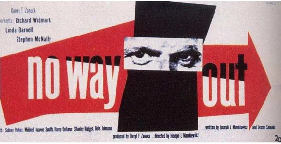
According to Jorge Frascara, the 1950s and 1960s saw a growing interest in communication throughout the field. The works of Paul Rand (Fig.3) and Josef Muller-Brockmann (Fig.4) are two different expressions of this concern. (IBID, p. 30)
Fig.3. Paul Rand, poster for the film No Way Out, 1950. Source: MEGGS, Philip B, 1988, p.391
According to Meggs, Rand understood the value of ordinary, universally understood signs and symbols as tools for translating ideas into visual communications. (MEGGS/ PURVIS, 2011, p. 391) Jodi Forlizzi and Cherie Lebbon in their article From Formalism to Social Significance in Communication design say that By creating empathy with viewers, designers are freely empowered to become active agents in the communication of the message. HELLER/ ”ENNETT, , p.
2.3. INFORMATION DESIGN
In 1961 the Czech designer Ladislav Sutnar3 defined informational design as a synthesis of function, flow, and form. Function is utilitarian need with a definite purpose: to make information easy to find, read, comprehend, and recall. Flow means the logical sequence of information. (MEGGS/ PURVIS, 2011, p.366)
Sutnar used shape, line, and colour as functional elements to direct the eye as it moved through the design seeking information. The format of Catalog Design Progress itself has a coding system (Fig.5) of signs, numbers, and words, with a triangle at the bottom of title pages pointing the reader forward. Signs and shapes declare part one, section two, topics four, five, and six structural features. (MEGGS/ PURVIS, 2011, p. 366)
Fig.5. Ladislav Sutnar, section divider page from Catalog Design Progress, 1950. Source: www.pinterest.com
Through innovative, allusive, and engaging diagrams, charts, graphs, iconography, and illustration or photography, information design visually presents facts, figures, events, and data that aid in the understanding of any given topic. (GOMES-PALACIO/ VIT, 2009, p. 36)
3 Ladislav Sutnar (1897-1976) a Czech designer and one of the first designers to actively practice the field of information design.
2.3.1. ISOTYPE
The International System of Typographic Picture Education (ISOTYPE) is a technique of displaying facts and quantitive information that was developed at the beginning of the 1920s by Viennese political economist and museum director Otto Neurath4, his wife, Marie Reidemeister and their star artist Gerd Arntz5. (ANNINK/ BRUINSMA, 2013, p. 86)
The system uses simplified pictures to convey social and economic information to a general public and has been applied to sociological museums and to books, posters, and pedagogical materials. Neurath hoped to establish a global standard for education and to unite humanity through one ordered, universally readable language of vision. (LUPTON, 1989, p.47) Apart from being acronym, Isotype is also a Greek for `the same sign´. (ANNINK/ BRUINSMA, 2013, p.123) According to Steven Heller, the method was originally designed as an alternative to text (HELLER/VIENNE, 2012, p. 96) and first known as the Vienna method of pictorial statistics.
Neurath recognized that Arntz´s talent for capturing the essence of an object with such economy of form could help his effort to explain things to readers with the help of an iconic picture language.
(ANNINK/ BRUINSMA, 2013, p. 91) Gerd Arntz was an artist first, and a designer second. (IBID, p. 91)
The prime motive behind Isotype was an education by the eye and Neurath hoped to establish a global standard for education and to unite humanity through one ordered, universally readable language of vision. (NEURATH, 1936 p. 22) Neurath believed that Isotype formed of pictograms, icons or symbols, could as world´s first universal pictorial language, transcend national borders. (HELLER/ VIENNE, 2012, p. 96) This world language without words started in s, continued into 40s, and still has important influences today. (MEGGS/ PURVIS, 2011, p. 341)
In 1925 Neurath, was the founder and the director of Gesellschafts- und Wirtschaftsmuseum in Wien (The Museum of Society and Economy). The museum had a mission to enlighten the social and economic situation and to educate the general public about post-war housing and to transfer social and scientific events in graphics for easy understanding (Fig.6). www.isotyperevisited.org 2016)
4 Otto Neurath (1882-1945) - was an Austrian philosopher of science, sociologist, and political economist and creator of
ISOTYPE system.
5 Gerd Arntz (1902-1988) was a German Modernist artist renowned for his black and white woodcuts. He worked at the
Fig.6. Chart from Gesellschaft und Wirtschaft Society and Economy . . Titled Economic forms of the Earth . Source
www.designhistory.org
Otto Neurath, described his visual work as a helping language , not one that could convey all meaning by itself, to the total exclusion of words. (HELLER, 2006, p. 13) He was suggesting what today is taken for granted in this field: words and pictures together make better explanations than words alone, or pictures alone. (ANNINK/ BRUINSMA, 2013, p. 86) We have made an international picture language as a helping language into which statements may be put from all the normal languages of the earth. (NEURATH, 1936, p. 17)
He wanted the people of Vienna to be interested in their social conditions, housing, etc., and realized they would more likely understand these things if the information was approachable and human, not to mention, artistically elegant, instead of cold and abstract . HELLER, 2006, p. 12)
The principal rule of Isotype is that a greater quantities should not be represented by an enlarging the same picture (or symbol) (Fig.7), but instead by a greater number of symbols repeated at the same size (Fig.8). (NEURATH, 1936, p. 74) The order of signs has to be made in such a way that some simple statement which is a help to the memory will be clear. (NEURATH, 1936, p. 78) In this manner, relations can be read more easily and exactly. (ANNINK/ BRUINSMA, 2013, p. 123)
Fig.7. Example of bad system. Signs of different sizes Source: NEURATH, O., 1936, p.75
Fig.8. Men getting married in Germany in a year Source: NEURATH, O., 1936, p.76
One of the most significant and the first large publication of the Museum of Society and Economy was the atlas project called Society and Economy Fig. -10). The idea of atlas was first brought by the Leipziger Bibliographisches Institut, which is one of the most important publishing houses requesting a special prestige book that can be presented to the international market on the Institut's 100th anniversary. Society and Economy is a collection of a pictorial charts and text tables. This atlas accepts that the design language of the method is standardized ”y analysing sketches, notes, and other sources, it is clear that the makers of the Society and Economy attempted to standardize not only the atlas's symbols, but its entire design, including its colours, maps, format, and typography (www.isotyperevisited.org/ 2016) As a model for visual statistics, the atlas was a success. In 1931, Neurath and Arntz were invited to apply their method in a new institute for visual statistics in the Soviet Union: Isostat.
Fig. 9. Otto Neurath map. Atlas Neurath Gesellschaft und Wirtschaft.. Source: www.designhistory.org
Fig.10. Otto Neurath map. Atlas Neurath Gesellschaft und Wirtschaft. Source: www.designhistory.org
Neurath explained the intention of Isotype thus “t the first look you see the most important points; at the second, the less important points; at the third, the details; at the fourth, nothing more if you see more, the teaching-picture is bad. NEURATH, 1936, p. 27)
This system of charting statistics is much more than a dictionary of visual symbols. It has strict principles concerning how to arrange the pictorial icons into charts. They are almost always linked up horizontally, rarely stacked vertically. (ANNINK/ BRUINSMA, 2013, p. 86)
Fig.11. Gerd Arntz pictogram. Source: www.designhistory.org
The pictograms designed by Arntz were systematically employed, in combination with maps and diagrams. Neurath and Arntz made extensive collections of visual statistics in this manner, and their system became a world-wide emulated example of what we now call: infographics. “rntz pictograms formed a pictorial system of knowledge transfer, one that revolutionised the way we look at information, statistics and data information and made it available to everyone, according to Neurath s phrase Words make division, Pictures make connection . ANNINK/ BRUINSMA, 2013, p. 86)
From its beginnings in Vienna of the 1920s, Isotype spread to the Netherlands, Britain, the Soviet Union, the United States and elsewhere. Its potential for communicating with people of all ages and nationalities was explored in a wide range of projects and publications through the s (www.isotyperevisited.org /2016).
Otto Neurath and Gerd Antz were a big influence for a Japanese team of designers led by Masaru Katsumi in the process of creation of 1964 Tokyo Olympics pictograms, for Otl Aicher, the designer of the pictograms and information graphics for the 1972 Munich Olympics, in Keith Bright´s symbols for the 1984 Los Angeles Summer Olympics. (ANNINK/ BRUINSMA, 2013, p. 86)
2.3.2. SEMIOTICS. THE STUDY OF SIGNS
Semiotics is a study of how signs work. Semiotics (also called semiology) was conceived at the turn of the twentieth century as an analytical tool for use by linguists, anthropologists, and cultural critics. (LUPTON, 2011, p. 92)
The study of semiotics according to Philip B. Meggs is the general theory of signs and symbols which has three branches: semantics, the study of the meaning of signs and symbols; syntatics, the study of how signs and symbols are connected and ordered into a structural whole; and pragmatics, the study of the relation of signs and symbols to their users. (MEGGS, 1988, p. The meaning of sign, says Ellen Lupton, comes only from its relationship to other signs in a system. This principle is the basis of structuralism, which focuses on patterns or structures that generate meaning rather than on the content of a given code or custom.[…] The sign has no inherent meaning, it is, taken by itself, empty, void, absent. The sign has no life apart from the system or structure that frames it. (LUPTON, 1996, p. 11)
Indeed, according to Ellen Lupton and J. Abbott Miller, the identity of sign rests not in the sign itself, but solely in its relation to other signs. […] The meaning of sign doesn´t belong to the individual
sign, but is generated by the surrounding system. The sign taken by itself is empty. (BIERUT/ DRENTTEL/ HELLER, 1994, p. 21)
Ian Noble defines semiotics as the study of signs and symbols, especially the relationship between
written or spoken signs and their referents in the physical world or the world of ideas. (NOBLE, 2005, p.19)
Designers can use semiotics, Ellen Lupton says, to generate meaningful forms as well as to study existing signs and communications. For example when creating a logo or a system of icons, designers can look at basic categories of visual sign in order to generate ideas with various degrees of abstraction or familiarity. LUPTON, 2011, p.92) Mihai Nadin, a semiotic researcher, says that all design principles are semiotic by nature. ((NADIN, 1988, p. 9)
2.4. BRANDING
For better understanding of what contemporary branding is, Naomi Klein (1999, p.27) suggests to go back briefly and look at where the idea of branding first began. […] The first mass-marketing campaigns, starting in the second half of the nineteenth century, had more to do with advertising than with branding as we understand it today, Klein says.
However, faced with a range of recently invented products the radio, phonograph, car, light bulb and so on - advertisers had more pressing tasks than creating a brand identity for any given corporation […] These products were themselves news that was almost advertisement enough. (KLEIN, 1999, p.27)
With time, Klein (1999, p.28) says, the role of advertising changed from delivering product news bulletins to building an image around a particular brand-name version of a product.
“ccording to Wolf Olins until ´s a brand was a fast-moving consumer product on a supermarket shelf that essentially appealed to only one audience of the organization, the customer. (OLINS, 2008, pp. 20-21) The brand, Olins says, seems to consist of a few elements- some colours, some typefaces, a strapline or slogan, all topped off with a logo or symbol, sometimes of an apparently allegorical nature but frequently consisting of a simple typeface. Sometimes a brand also embraces sound or music, and even smells. All of these ingredients seem to be mixed up and then plastered apparently more or less at random over everything that the organization owns or influences. (OLINS, 2008, pp. 24-25) Branding embraces and is associated with marketing, design, internal and external communication and human resources. It becomes the channel through which the organization presents itself to itself and to its various external worlds. It influences every part of the organization and every audience of the organization - all the time, everywhere. (OLINS, 2008, pp. 24-25)
Fig.12. Representative scheme. The four vectors through which brand emerges. Source: OLINS,W. (2010, p.29)
Together, the core idea and the visual elements mark out the brand territory. But to be really effective you have to be able to sense the brand. You may even be able to touch it and feel it so that it manifests the core idea. (OLINS, 2008, pp.30-31)
The classic example of a brand in which all four vectors are more or less equal and totally intertwined is a theme park. In Walt Disney World or Disneyland the four vectors of branding are so inextricably linked that it's almost impossible to tell where one begins and the other ends. (OLINS, 2008, pp.30-31)
“lina Wheeler , p. defines branding as a disciplined process used to build awareness and extend customer loyalty. It requires a mandate from the top and readiness to invest in the future. Branding is about seizing every opportunity to express why people should choose one brand over another.
According to Wheeler, a universal brand identity process is an easy to understand, logical process that takes into consideration the various steps necessary to develop outstanding brand identity programs regardless of the project s complexity and “lina Wheeler answers the question Why does it take so long? The process is divided in 5 distinct phases, each with specific tasks that must be completed before moving on to the next phase. This is a process to build trust and you must trust in the process. (WHEELER, 2009, p. 9)
Wheeler (2009, p. 6) outlines in her book five essential steps to the branding process: 1.
Conducting research; 2. Clarifying strategy; 3. Designing identity; 4. Creating touchpoints; 5. Managing assets. (Fig.13)
Fig.13. Branding process by Alina Wheeler. Source: Wheeler, 2009, p.7
“ccording to Raposo , p. , if the brand is not used in a coherent and consistent manner, or if the other elements of identity are not a unit, you end up losing the logic of graphic discourse that allows its recognition .
As Naomi Klein (KLEIN, 1999, p.43) puts it, if a brand was not a product, it could be anything! […] ”rand, she continues, is not a product, it is an attitude, a set of values, a look, an idea.
Richard Branson (cited by KLEIN, 1999, p.46) explains the idea to "build brands not around products but around reputation. The great Asian names imply quality, price and innovation rather than a specific item. I call these 'attribute' brands: They do not relate directly to one product such as a Mars bar or a Coca-Cola but instead to a set of values."
2.4.1. VISUAL IDENTITY AND BRAND LANGUAGE
Manuel Castells , p. says that, identity, as it refers to social actors, is the process of construction of meaning on the basis of a cultural attribute, or a related set of cultural attributes, that is given priority over other sources of meaning.
The construction of identities uses building materials from history, from geography, from biology, from productive and reproductive institutions, from collective memory and from personal fantasies, from power apparatuses and religious revelations. C“STELLS, , p.
Olins (2008, pp. 18-19) believes that identity in its various manifestations has grabbed our hearts and minds, because we are desperate to express our need to belong but also overtly to differentiate ourselves and our aspirations from those around us.
Identity programs range from the sparingly simple, defining a small range of colours and applications of the logo, to infinitely expandable systems with multiple versions of a logo or a comprehensive library of imagery and graphics. (Ibid, p. 339)
By the end of 1950s, however, professionally designed identity programs had been adopted by diverse industries. (LUPTON/ MILLER, 1996, p. 194)
If identity is the idea that marks the twenty-first century, then branding operates at its point of delivery. (OLINS, 2008, p.18)
The idea of developing a unified design scheme was unheard of until 1907, when the German architect and graphic designer Peter Behrens changed the face of business identity forever by creating the first corporate identity system. (HELLER/ VIENNE, 2012, p.79)
Professor Fernando Oliveira (2015) developed a linear model characterized by a structured logic for construction and analysis of Visual Identity Systems.
The Model consists of various phases that include components of the System. The Model consists of 3 main groups that are essential for the Visual discourse of the Brand: a Strategic Indication of the brand, Visual language of the Brand and Explanation of the Visual Language of the Brand. Then within each group there are representative Elements. All the System is incorporated in a big group which is a field of Ambient of the Design of the Visual discourse of the brand (OLIVEIRA, 2015, p. 355) The author explains that all the Groups and Elements of the System have connections and influence each other in direct or indirect way. The process itself should not be totally linear but permits the process to move forward and to go back to any of its steps. (OLIVEIRA, 2015, p. 355)
The approaches of the present Model can incorporate different methods and techniques including those linear, non linear ones and mixed. In this situation it is possible to include individual processes and stimulate a major acceptance of the method (OLIVEIRA, 2015, p. 353).
Oliveira refers to Olins (OLINS, 1995, pp.60-61) that a Visual Language of the Brand is a System of Visual Identity that has an intersection with a Strategic Indication and with the document that combines the visual style . The author (Oliveira, 2015) presents two models: «one for Construction of the visual identity (Fig.14) and another for Analysis» (Fig.15).
The Fig.14 represents a system developed by the author which permits to make a distinct analysis of all the elements.
Fig.14. Final Linear Model of the process of Creation of the Visual Identity System sintetized version. OLIVEIRA, F. (OLIVEIRA, 2015, p.364)
The «Creative Orientation» is a component related to a process and it is responsible for the transaction from the strategy to the visual system, Wheeler and Olins (OLIVEIRA, 2015, p. 356) confirm that strategy is a component that determines the «visualisation» and the thoughts of the brand. According to Oliveira OLIVEIR“, , p. , a Visual Language consists of Four basic elements Name, Symbol, Typography s , Color es , th Element which is not always a part of the system … and is related to a recognition phenomenon and a cult phenomenon. The Logo is a graphic representation of a certain company, institution or a product and join symbol and typography or only one of this elements. The Complementary elements [...] that include Imagery, Form, Movement and Sound or tone of Voice , and “pplications that are supported by bi-dimensional, three-dimensional or animated forms.
This model (Fig.15), excludes the «Creative Orientation». The user only combines «visual information in confront with DNA of the Brand» and projects the «significance of the variables running the syntax of the brand». Organizing all elements in one diagram is relevant to clarify the Personality of the brand and the connection with the elements of the system (OLIVEIRA, 2015, p. 360).
Fig. 15. Linear model of Visual Identity System representation (used for Diagnostic synthetized version. Source: OLIVEIRA, F. (2015, p.366)
BASIC ELEMENTS
Basic Elements are the basis of the system. They include: Name, Symbol, Typography, Color. A Name is a verbal identification of the identity that intends to be in comport with the vision. It emerges out of a strategic will. A Symbol enforces the meaning and gives certain attributes to the brand. It must
have some emotional characteristics but to represent an original idea in a synthesized way. Typography is important for communicating a written message and to maintain the main associations
to the Brand. Normally it is thought as official Typography used for Graphic Brand and aims to help and enforce visual communication of the Identity thanks to its plurality. In some cases the only one Typographic family responds to all the needs of Visual Identity. There can be one or two main colours but also some complementary colours. A Colour enables emotional connection, provokes reactions and stimulates empathy. Actually, it more correct to talk about one chromatic component since modern Brands live among different colour palettes. Brands across all industries have built moats of colour to define and defend their brand identity.
NAME
“ccording to “lina Wheeler , p. The right name is timeless, tireless, easy to say and remember; it stands for something, and facilitates brand extensions. […] The right name captures the imagination
and connects with the people you want to reach. Danny “ltman, Founder + Creative Director “ Hundred Monkeys (WHEELER, 2009, p.20)
TYPOGRAPHY
Words originated as gestures of the body. The first typefaces were directly modelled on the forms of calligraphy. Typefaces, however, are not bodily gestures they are manufactured images designed for infinite repetition. (LUPTON, 2006, p. 13) The history of typography reflects a continual tension between the hand and the machine, the organic and geometric, the human body and the abstract system. These tensions which marked the birth of printed letters over five hundred years ago, continue to energize typography today. (LUPTON, 2006, p.13)
COLOUR
Eva Heller says in her book Psychology of colours , that the colour is much more than an optical phenomena or a technical mean. HELLER, , p. She also notices that, when symbolism of colours is referred to men, the meaning is particularly cultural. (HELLER, 2009, p.16)
Adams, Stone and Marioka (2008, p.24) say that The human eye and brain experience colour physically, mentally, and emotionally. As a result, colours themselves have meanings. Colour has the ability to evoke a response, create a mood, symbolize an idea, and express an emotion. […] Differences in particular aspects of colour, such as a change in value or intensity, can further refine a colour s tone and meaning. (ADAMS/ STONE/ MORIOKA, 2008, p.34)
Colour symbolism is often a cultural agreement, and opinions about the associations are varied and sometimes conflicting. “D“MS/ STONE/ MORIOK“, , p.
Every colour has its own set of connections that convey information, with the colour itself acting as a signifier of ideas both positive and negative. (ADAMS/ STONE/ MORIOKA, 2008, p.34)
SYMBOL
Symbol is a letter or sign designed to represent an activity, idea or object. Symbols can be pictorial or abstract and can be utilized within a cultural, social, political or commercial context. Effective symbols work across national boundaries. For example: Otto Neurath´s ISOTYPE system and Otl Aicher´s symbols for the 1972 Munich Olympic Games. (LIVINGSTON, 1992, p.187)
LOGO
According to Wolf Olins, the prime identifier for almost all brands is the symbol or logo. The other tangible elements - colours, typefaces, straplines or slogans, tone of voice and style of expression (sometimes called 'look and feel') are also very important, and collectively form the visible recognition pattern. But the central element of that visible recognition pattern is the logo itself. This usually lies at the heart of a branding programme. Its prime purpose is to present the core idea of the organization with impact, brevity and immediacy. The logo encapsulates the brand. (OLLINS, 2008, p.30-31)
A Logo is a graphic representation of a certain company, institution or a product. It has to synthetize a personality of the Brand, visually materialize it combining Typography and Symbol or only one of two elements. Originally it has to be bi-dimensional but it can also have different visual characteristics.
COMPLEMENTARY ELEMENTS
Complementary elements are necessary notion of systems complementarity. In our case it is a Visual Identity System and the Complementary elements here include: Image Type, Form, Movement and Sound.
An Image complements the system by giving it a visual diversity. It is related to everything that has to do with visual characteristics that belong to a specific brand.
IMAGERY
Imagery is everything related to an image (photos and iconography) is a complementary element that assigns a brand its visual diversity. It is related to everything that has to do with visual aspects of the specific Brand.
FORM
A Form is related to emotional aspects and can be seen in three-dimensional perspective as it helps the Visual Identity Expansion.
MOVEMENT
A movement is related to a contemporary perspective and use of like new technologies which requires an adaptation of the Visual Language to the new situations with locomotion.
SOUND
5TH ELEMENT
A 5th element is related to a development of a brand into recognition phenomenon and a cult phenomenon. There´s not always a determined Visual Identity. It is not obligatory to have a certain associations with a symbology of the Logo or with any other formal aspect of the Visual System even if there´s a connection related to particular aspects of a product, object or Architecture and Ambience
representing a Brand. For example, Adidas three stripes, which is a characteristic element of the brand but it wasn´t
always the Brand´s symbol; a front grid of the BMW, an element of the characteristic design that have formed the unmistakeable BMW without any presence of logo or other aspects of Visual System.
APPLICATIONS
Applications play a significant role in a Visual Identity because they are responsible for the Image of the brand. They represent possible solutions of the visual language concreting a unique Visual Style. They unfold through bi-dimensional, three-dimensional and animated supports and combine fully or partially all the 4 Basic elements, 5th element (if exists), Graphic Brand and Complementary elements.
BRAND PERSONALITY AND LANGUAGE
The main focus of the present Model is concerned with the Elements of the Visual Language of a certain Brand, or a Visual System which appears a combination of the main Elements. It has to be structured by Brand Personality and consist of four Basic Elements, Logo, 5 elements (if exist), Complementary Elements and Applications (all the elements are further explained). In some situations the Visual System does not use all the elements.
According to Matthew Healley a brand can be anything from products, services, organizations to even people. It is a "promise of satisfaction" and "an unwritten contract between a manufacturer, a consumer, a seller, and a buyer. (HEALLEY, 2008, p.6)
2.4.1.1. VISUAL IDENTITY DEFINITION
A major role in the brand or corporate image of a company plays its identity, that´s why it is very important to understand a structure of visual identity.
“ccording to Rita Clifton, Visual identity comprises the graphic components that together provide a system for identifying and representing a brand. CLIFTON, , p.
“lina Wheeler says, that Brand awareness and recognition are facilitated by a visual identity that is easy to remember and immediately recognizable. Visual identity triggers perceptions and unlocks associations of the brand. WHEELER, , p.
Both Wheeler (2009) and Olins (2008) consider brand architecture a foundation for all the other components of the brand.
Wheeler believes, that ”rand architecture refers to the hierarchy of brands within a single company. It is the interrelationship of the parent company, subsidiary companies, products, and services, and should mirror the marketing strategy. (WHEELER, 2009, p.22)
According to Olins (2008, p.45), every organization needs to create a framework into which its brands fall. This is called brand architecture. The architecture should be clear, easy to comprehend and consistent. […] The brand architecture falls broadly into one of three categories.
Corporate, or Monolithic (Fig.16) The single business identity
The organisation uses one name and one visual system throughout (e.g. Yamaha, Virgin, HSBC, Easy)
Fig. 16. Corporate, or monolithic the single business identity. Author´s diagram. Source: OLINS, W. (2008, p.45)
Endorsed (Fig.17 ) The multiple business identity, is when the organisation owns a variety of brands, each of which is endorsed by a group name or visual style (e.g. Nestle, United Technologies, Banco Santander)