AUTOMATIC PROGRAM REPORTS Lígia Ribeiro1 and Gabriel David2
1 U.PORTO/IRICUP Praça Gomes Teixeira, 4099-002 Porto Portugal - 2 U.PORTO / FEUP /
INESC Porto Rua Dr. Roberto Frias 4200-465 Porto Portugal lmr@reit.up.pt, gtd@fe.up.pt
To profit from the data collected by the SIGARRA academic IS, a systematic set of graphs and statistics has been added to it and are available on-line. This analytic information can be automatically included in a flexible yearly report for each program as well as in a synthesis report for the whole school. Some difficulties in the interpretation of some graphs led to the definition of new key indicators and the development of a data warehouse across the university where effective data consolidation is obtained.
The University of Porto is operating since 1996 a Web-based academic information system, developed in-house and now called SIGARRA. It has progressively covered many aspects of the academic information needs. Among many others, all the steps in the pedagogic process are automated, since the creation of new programs, curricula establishment, and teaching service distribution to the preparation of timetables, student registration, syllabus definition, summaries, course repositories, mark recording and several course and program statistics and reports. In the paper we will present systematically this set of statistics and the way they are automatically incorporated in a yearly program report.
The working model views SIGARRA as an information hub to which many entities contribute, to the benefit of every task in the mission of the University. This is the case of the academic service, the professors and the students, among others. The consolidation of all the data and the production of consistent views are thus very important.
A coherent set of statistics
The paper describes an extensive set of statistics, graphs and analysis on the main phases of the academic process.
At the single program level these are classified in seven areas (admission, population, progression, results, graduation, mobility, faculty) each with several graphs.
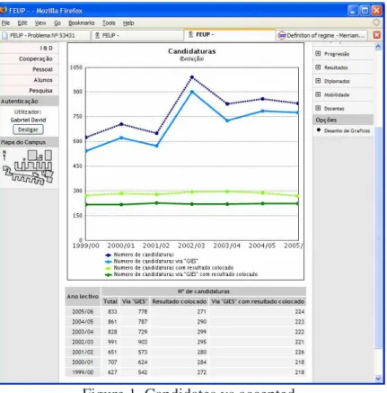
The first area, devoted to the admission of students, includes the following graphics: • Evolution of candidates versus accepted (see figure 1);
• Number of candidates indicating the program as first choice versus numerus clausus; • Choice number of accepted students;
• Evolution of enrolled students versus numerus clausus; • Enrolled students by admission regime;
• Previous grades of enrolled students; • Regional origin of students;
• Evolution of the admission results (average grade, last student grade, number of accepted students).
The program and university management get from these graphs information on the trends in external seek, previous performance of enrolled students and their regional distribution.
Figure 1. Candidates vs accepted.
There is the policy of presenting the data supporting a specific graph along with it, so other people may reuse the same data to build different views.
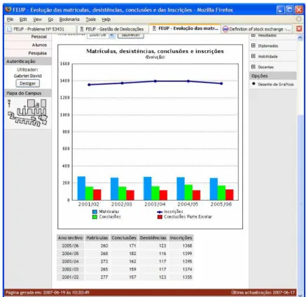
The second area puts together a set of indicators on the program population: • Duration of the enrollment;
• Evolution of admission, dropout, graduation and enrollments (see figure 2); • Gender distribution;
• Kind of enrollment.
The appropriate choice of graph style is crucial to the readability of the conveyed information. In figure 2 there is a combination of line and bar graphs to visually separate two different aspects of correlated data.
The next group elucidates the management about the students’ behavior along the program and their progression:
• Number of courses from previous years that the students are taking (see figure 3); • Choice of branches in the program;
• Age of students by year;
• Average number of courses the students are taking per year; • Gender distribution per year.
The graphic in figure 3 is especially significant. There was a belief that the students were leaving behind a significant number of courses which they had failed and into which they were force to enroll again the next year. Dividing the total number of course enrollments by the typical number of courses in one year, one gets the number of student equivalents these enrollments represent. This graphic shows the significant impact students enrolled in the last years actually represent in the first years (60% increase in the first year).
Figure 2. Admission, dropout, graduation and enrollments.
Figure 3. Student distribution highlighting courses from previous years. The purpose of the next group is to analyze the results obtained:
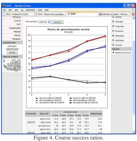
• Course success ratios approved/enrolled and approved/assessed (see figure 4); • Ten worst courses in success ratios;
• Average grade per year;
• Accumulated number of successful courses students got; • Detailed table of results.
Figure 4. Course success ratios.
Three ratios are considered: approved/enrolled expresses the overall efficiency but is not enough to understand what is really happening in the course; approved/assessed measures the success among those who tried to show their knowledge; and not assessed/enrolled indicates the magnitude of students who gave up.
The fifth group concerns graduations and includes three graphs: • Distribution of effective program duration until graduation;
• Distribution of final grades including the limits of ECTS percentiles (see figure 5); • Distribution of final grades (%).
The limits of ECTS percentiles seen on figure 5 are the basis for the comparability between grades obtained in different scales and classification systems. In this case, students with 16-19 all got an A, the 10% better. In other programs or schools the A may correspond to other limits. To get some stability, without betraying the spirit of classification by percentiles, the limits are calculated based on the results of the three previous years. So, the current year is not used to set the limits but just to identify the appropriate ECTS result. The current year will be used to set the limits for next year, and the two after that.
Figure 5. Distribution of final grades.
The group on mobility presents data on students going out of the faculty to study abroad for a period and on students coming in exchange:
• Institutions where foreign students come from; • Student mobility in and out;
• Institutions where local students go to.
This group has been the last one to be added to the set of statistics, accompanying the increased awareness of the importance of internationalization.
The last group gives details on the professors in charge of courses in the program:
• Evolution of the responsibility on the program by department or other unit (see figure 6); • Repartition of the program students, transformed into FTE teachers, by the different units. Figure 6 shows the evolution of the teaching service in the program assigned to each departmental unit.
Consolidation at the school level
Several above mentioned graphs are still meaningful at the school or at the university levels. There are also specific statistics at the school level, comparing or aggregating data from several programs at once.
As an example, figure 7 presents the grades of all the students enrolled for the first time on 2005/2006, in every undergraduate program. Each line corresponds to one program. As the numerus clausus is different for each program, indicators like the average grade or the grade of the last student admitted are relatively poor. Figure 7 is a lot more expressive, enabling the reader to get the overall picture in a glimpse: it shows the magnitude of the freshmen groups
in each program, how they compare in the high, mid and low ranges, and the sudden breakdown corresponding to special regimes of admission.
Figure 6. Distribution of program professors by department.
Figure 7. Grades of students enrolled in the several programs.
The main source of budget for the universities is the central government. This budget depends closely of the number of students enrolled in the program. There is a ratio (RP) to convert
students into full time equivalent teachers (FTET). For example, in engineering it is 11 students per teacher. So, it is very important to be able to determine the level of engagement of each unit (faculty, department, etc…) in each program to share the FTE teachers. The way this is being done is to calculate the total number of hours required by the program on one year (TH), the total number of students in the program on the same year (TS), the number of hours the unit provides to the program (UH) and then calculate the number of FTET credited to the unit using FTET= (UH/TH)*(TS/RP). These figures (see figure 8), added up to all the
programs, are then used on next year budget determination at several levels.
Figure 8. Distribution of FTE teachers by department and departmental units. Building automatic program reports
The graphs presented can be consulted on-line in a specific statistics page attached to each program. However, to help program directors on their yearly reporting task, some of those graphs have been collected in a single document where the program director is invited to add comments to each section or graph. The whole document starts with a table of contents and can be read on-line or recorded on file for future reference.
This kind of reports must combine a high level of automation in the inclusion of standard graphs (in the limit, the report could be completely automatic, compensating from non-cooperation of the program director), with flexibility enough to adapt a specific report to the goals and style of the director. This is accomplished through report templates and instance copy.
When preparing a new report, typically the program director starts with an already existing report which is copied to a new instance. Then, the table of contents can be edited, adding, deleting or simply hiding components. Each component can be a text, a link or a graph. There is a set of canned graphs but it is possible to write a new SQL query against the database and
change the graph parameters. This step may require technical help. The result can then be frozen and distributed. And it can be used as a template for future editions. The flexibility of the approach has been demonstrated by using it to produce different types of reports, for instance for accreditation purposes.
Figure 9. Yearly program report. Improving key indicators
An analysis of some flaws in the interpretation of some graphs led to the development of a newer version of some of them and especially to a better definition of some key indicators like success rate, mean time to program conclusion, etc.. These are now based on the notion of class, a group of students starting a program in the same year. The class behaviour is then studied along the years, through a new set of monitoring tables.
Other aspects requiring improvement is data consistency and the facility to query it. For these reasons and to make the consolidation at the level of the university feasible, a data warehouse project has been set up.
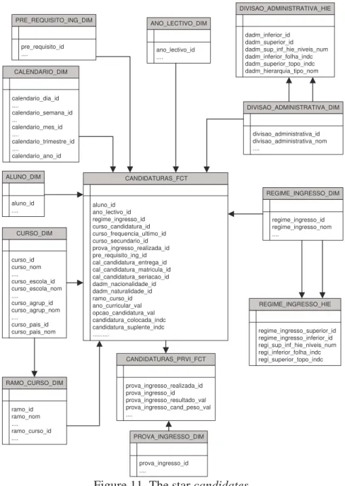
The project of the data warehouse identified two main to processes to automate, Admissions and the Academic Process. The Admissions process is subdivided in two stars, candidates and enrollment. The Academic Process comprehends five stars: study plans, course enrollment, results, fees, and progression.
According to the development methodology adopted, after the definition of the main stars, a data warehouse bus including all the relevant dimensions has been established. These dimensions correspond to the main concepts involved in the chosen processes and are typically complex so to include all the attributes that may be required from the user viewpoint. Figure 10 shows the crossing between the bus of dimensions and each of the stars.
! " # ### # # # ### # # ## # # ## # # # # # # # # # # # # # # # # ## # ## # # # # # # # # # # # # ## # ## ## # # # # # # # # # # # # # # # # # # # ## ## ## # # # # #
Student All the identification and demographic data of a student
program Details about a program, including a hierarchy for the school, university and country of the program admission regime Variable depth hierarchy of ways to be admitted to a program
admission grade Each of the examinations which may be required as a pre-requisite
pre-requisite Other specific pre-requisites
class* Set of students admitted to the first year on the same academic year or equivalent
calendar Time dimension to control the days
academic year Academic year
course period Period with academic significance, eg, semester
candidate option* Order of preference assigned by the student to a program administrative division Hierarchy of district, region, country
exam period Examination period
course A course in its scientific area
kind of attending Hierarchy with the different ways of following a course course result status* Different possible status of a course result
course result type* Types of course results
course result The course result
course enrollment status* Possible status of the enrollment in a course course enrollment type* Types of enrollment in a course
program branch Branches of programs
curricular year* Curricular year
study plan Specific study plan
student status Student status
scientific area Scientific areas of courses and programs
student type Types of students
Some of the dimensions (* in the table above) are very simple and are implemented as a single attribute in the fact table that is the center of a star. For that reason they are called degenerate dimensions.
The significance of each star becomes more evident by looking at the intervening dimensions and at the granularity of the central fact table. The attributes in the dimensions are the criteria to query the data warehouse. The granularity of the fact table states the level of detail with which facts are recorded.
Star candidate – keeps one record per each candidature of a student, coming from an administrative region, to a program, on one academic year, using an admission regime and a grade, expressing a preference, on a certain date; the candidature may be to a branch of the program on a curricular year (see figure 11).
Star enrollment – the granularity is one record per program per year which contains several indicators (also called measures) like number of places, percentage filled, minimum, average and maximum access grades, etc.
Star study plan – a record is one slot in the study plan that the student must pass; a slot corresponds to a single course or to a set of optional courses; the measures include the minimum number of ECTS required in the slot. (Second priority.)
Star course enrollment – contains one record per each course a student enrolls in, and the corresponding result.
CANDIDATURAS_FCT aluno_id ano_lectivo_id regime_ingresso_id curso_candidatura_id curso_frequencia_ultimo_id curso_secundario_id prova_ingresso_realizada_id pre_requisito_ing_id cal_candidatura_entrega_id cal_candidatura_matricula_id cal_candidatura_seriacao_id dadm_nacionalidade_id dadm_naturalidade_id ramo_curso_id ano_curricular_val opcao_candidatura_val candidatura_colocada_indc candidatura_suplente_indc ... CURSO_DIM curso_id curso_nom .... curso_escola_id curso_escola_nom .... curso_agrup_id curso_agrup_nom .... curso_pais_id curso_pais_nom ALUNO_DIM aluno_id .... ANO_LECTIVO_DIM ano_lectivo_id .... REGIME_INGRESSO_DIM regime_ingresso_id regime_ingresso_nom .... PROVA_INGRESSO_DIM prova_ingresso_id .... PRE_REQUISITO_ING_DIM pre_requisito_id .... CALENDARIO_DIM calendario_dia_id .... calendario_semana_id ... calendario_mes_id .... calendario_trimestre_id .... calendario_ano_id DIVISAO_ADMINISTRATIVA_DIM divisao_administrativa_id divisao_administrativa_nom .... DIVISAO_ADMINISTRATIVA_HIE dadm_inferior_id dadm_superior_id dadm_sup_inf_hie_niveis_num dadm_inferior_folha_indc dadm_superior_topo_indc dadm_hierarquia_tipo_nom REGIME_INGRESSO_HIE regime_ingresso_superior_id regime_ingresso_inferior_id regi_sup_inf_hie_niveis_num regi_inferior_folha_indc regi_superior_topo_indc RAMO_CURSO_DIM ramo_id ramo_nom .... ramo_curso_id .... CANDIDATURAS_PRVI_FCT prova_ingresso_realizada_id prova_ingresso_id prova_ingresso_resultado_val prova_ingresso_cand_peso_val ....
Figure 11. The star candidates.
Star results – this star goes down to the level of a single exam and its classification. Star fees – devoted to recording all the payments and due fees.
Star progression – contains one record per student per year with several relevant measures about the student behavior on that year.
The design of this data warehouse, though carefully performed, was done within the schedule. Querying the dimensional model, using a business intelligence tool or some pre canned queries, turns out to be an easy task. In fact, this is the goal data warehouses are all about. The main difficulty of this project lies in the intermediate phase, when data is extracted from the operational database SIGARRA of each faculty, it is cleaned and transformed to overcome consistency and incompleteness problems, and then loaded into the single data warehouse of the university. This step has taken a lot more time than planned. However the increased confidence in the data and the diversity and flexibility of the querying largely compensates this drawback.