Identifying the urban
communities of New York
City using bikeshare data
from NYC CitiBike
Institutions
Supervisors
Mark Padgham, PhD. (WWU)
Marco Painho, PhD. (UNL)
Oscar Belmonte, PhD. (UJI)
Dissertation submitted 26th February
2015 to Institut für Geoinformatik,
Westfälische Wilhelms-Universität
Münster (WWU), Germany in partial
fulfillment of requirements for Degree
of Master of Science in Geospatial
Technologies.
“Identifying the urban
communities of New York
City using bikeshare data
from NYC CitiBike”
Colin Broderick [email protected] 26th February 2015
Supervisors
Mark Padgham, PhD. (WWU) Marco Painho, PhD. (UNL) Oscar Belmonte, PhD. (UJI)
Dissertation submitted 26th February 2015 to Institut für Geoinformatik, Westfälische WilhelmsUniversität Münster (WWU), Germany in partial fulfillment of requirements for Degree of Master of Science in Geospatial Technologies.
Institutions
Institut für Geoinformatik, Westfälische WilhelmsUniversität Münster (WWU), Germany. NOVA Information Management School, Universidade Nova de Lisboa (UNL), Portugal. Universitat Jaume I (UJI), Castellón, Dept. Lenguajes y Sistemas Informaticos, Castellón, Spain
Date Version Distributed To
22/01/2015 PRELIM. DRAFT MP, MaP, OB, IG, EP
Declaration
I, __________________________, hereby declare that I have written this thesis independently, unless where clearly stated otherwise. I have used only the sources, the data and the support that I have clearly mentioned. This thesis has not been submitted for conferral of degree elsewhere.
Signature ______________________________________________________
Muenster,
February 26, 2015
CB
Acknowledgement
I would like to thank everyone who helped me reach this final stage, you too deserve a pat on the back for putting up with my half finished drafts and sentences that go nowhere.
I would like to especially thank my parents, Yasmin Hamed, Ciaran Staunton and my supervisor, Mark Padgham for your inspiration, support and above all else your endless patience as I slowly pieced this work together.
Abstract
Keywords
GISCities Open Data City Study R
Python
Bikeshare Schemes Walkability
Urban Planning Mapping Geospatial
Table of Contents
Page
1. Introduction. 13
2. Research Objectives. 15
3. Theory. 15
3.1. Correlations. 16
3.2. Distance Decay Models. 17
3.3. What does the Kvalue mean? 20
3.4. Urban Community Hubs. 22
4. Data Sources. 23
4.1. Station Data. 23
4.2. CitiBike OriginDestination Trip Data. 25
4.3. Neighborhoods of New York. 27
4.4. OpenStreetMap Data New York City. 28
4.5. NYC Dept. Planning PLUTO Database. 29
5. Methods. 30
5.1. Overview of complete procedure. 31 5.2. Gather the Data. 32 5.3. Extract the data. 32 5.4. Get Interstation Distances. 32 5.5. Calculate the number of trips between stations. 36 5.6. Pairwise Correlations. 40 5.7. Make Distance Matrix. 41 5.8. Combine coefficients with distances. 42 5.9. Map Kvalue Results. 45 5.9.1. Bubble Plots. 45 5.9.2. Interpolation / Heat Map. 47 5.10. Map Kvalues and Land Uses. 49
6. Results & Discussion. 50
6.1. Distance Decay Model Fits. 50
6.2. Complete Trip Dataset 51
7. Future Research. 64
8. Conclusions. 65
Limitations 66
Bibliography / References. 67
Appendices 73
Figures
Figure 1 How interstation correlations are calculated.
Figure 2 Distribution of correlations and distances for Station 1 and Station 2.
Figure 3 Distance decay model examples.
Figure 4 Gaussian fitted to distribution of correlations and distances from an example station (Left). Gaussian fitted to a number of stations and their respective Kvalues indicated (Right).
Figure 5 What high and low Kvalues signify.
Figure 6 Single use zoning vs. multi use mixed zoning.
Figure 7 NYC Bike Station Locations (CitiBike, 2015).
Figure 8 Map of Neighbourhoods covering bike share scheme area.
Figure 9 Extract of data from NYC MapPLUTO dataset with colours categorising the landuse of that parcel.
Figure 10 Overview of processes used to extract KValues.
Figure 11 Routino quickest.html routing file output.
Figure 12 Example bubble plot for all trips made in New York City on Tuesdays.
Figure 13 Interpolated Map of New York K Values.
Figure 14 Comparison of fitted distance decay models on two sample stations and resulting sum of squared residuals.
Figure 15 NYC Trips From and Trips To KValues.
Figure 16 Total Trips per weekday. Number of trips grouped by journey trip duration per day
Figure 17 NYC KValues for the 90% and 100% quantiles.
Figure 19 New York KValues on Weekdays (Monday Friday) with high kvalue communities identified
Figure 20 New York KValues on Weekends (Saturday Sunday) with high kvalue communities identified
Tables
Table 1 Summary Statistics for NYC CitiBike bike share scheme
Table 2 Result of running count query for trips from the first five stations.
Table 3 Result of unstacking count for trips from first five stations.
Table 4 Starting Parameters used for nls.mod
Table 5 PLUTO Land Use classes
Table 6 Complete Trip Dataset Key Statistics
Acronyms
CRAN Comprehensive R Archive Network
CSV Comma Separated Value
EPSG European Petroleum Survey Group
HTML HyperText Markup Language
JSON JavaScript Object Notation
NLS Nonlinear Least Squared model
Numpy Numerical Python
NYC New York City
OSM OpenStreetMap
Pandas Python Data Analysis Library
PLUTO Property Land Use Tax lot Output
SQL Standard Query Language
SSR Sum of Squared Residuals
XML Extensible Markup Language
UTM Universal Transverse Mercator
1. Introduction
The spatial structure of cities is changing and as such, transport has to adapt to this new structure. In the past it had been argued (Park et al. 1925) that cities emulated an ecosystem, similar to those studied by ecologists, in that, like plants, they would grow from the centre outwards in graduated rings. The oldest and least desirable parts of the city were at its core, while the most prosperous areas were around the edges. This theory is known as Concentric Zone Theory which was developed by the father of modern planning Robert E. Park. (Park et al. 1925)
In this postParkian era we have seen that cities are no longer of the monocentric form in which employment is located in one place and in which the majority of commuting trips radiate from this location. Due to the change in economic practices from heavy industry to that of the services industry, it is now possible to live and work in the same area. Cities have moved from this monocentric structure to a more polycentric structure in which commuting is much more evenly distributed making it more challenging to serve these areas with public transport. Many trips now comprise short direct distances to access services and work. (Anas et al., 1998; Kloosterman and Musterd, 2001)
We are now on the cusp of the age of the socalled “smart city”, which is characterised by lowcarbon and lowpollution transportation, integration of sensing technologies, shared societal resources, and significant benefits to public health. (Midgley, 2009) Bikeshare systems are rapidly becoming a newold solution to mass transportation within the close confines of city centres. At present there are over 450 of these systems in operation worldwide (Meddin and DeMaio, 2014) including implementations in New York, London, and my home city of Dublin. These systems comprise of bike stations which include a number of stands where a user can check in and check out a bike as part of their journey.
These systems have been described previously as networks which display distinct communities which were identified by the spatiotemporal characteristics of all journeys within the system. Clustering methods were used to identify these communities. (Austwick et al., 2013; Lathia et al., 2012).
Padgham (2014, unpublished) proposes a theory on how urban spaces become partitioned into distinct clusters by using hierarchical clustering techniques to derive this structure using bike share data from London.
It is intended that this thesis will build upon the methodologies of both Pagham (2012 and 2014) and Austwick et al. (2013) to identify the communities of New York City. New York City has a bike system comprising of 332 bike stations and users have made over fifteen million trips since the system opened on 27th May 2013. (CitiBikeNYC, 2014). All models of monocentric cities assume a single measure of the similar of movement which radiates to and from a single centre. This thesis measures this similarity of movement for every monocentric center of the city represented by the stations of the CitiBike scheme.
This research makes best use of both open source data and open source software. All of the analysis and preparatory code is available for reuse openly through github , the links to 1 which are available in Appendix 1.
As such, this dissertation takes the following structure: ● Section 8 describes the theory and models used; ● Section 9 details the data sources used;
● Section 10 contains the methods, written in a firstperson user manual type style in the spirit of open and reproducible research;
● Section 11 contains both results and discussion; and ● Followed finally by conclusions at Section 12.
2. Research Objectives
The role of the spatial planner is to attempt to control space and how that space is used especially within urban areas. In the past various models have been proposed to describe how urban areas develop. These models have been implemented without little thought for testing their underlying assumptions. This is particularly true when it comes to assumptions based around the movement of people throughout urban areas. This research aims in part to help measure these movements at a fine scale so that in the future these models can be tested. The following are the research objectives of this
research:
1. To Identify a measure of cultural importance for each point in transport system. 2. To develop a method which can be used and repeated on other cities which uses
open source tools and data sources.
3. To arrive at an understanding of transit behaviour as a cultural and community aspect within a City.
4. To arrive at an understanding of how this transit behaviour is related to the mix of land use types within a City.
3. Theory
The principal aim of this research is to study the relationship between bike stations in the New York City using origindestination data. Statistical Analysis provides certain measures which allow us to study the relationships between things and these are called correlations. A correlation is a single number which describes the relationship between two or more things.
Examining this mutual relationship between two or more things has allowed the study of many types of spatial phenomena such as the spread of disease throughout a population (Bolker et al. 1996), the relationship between the the types of crime committed and the dominant land use in an area (Lockwood, D. 2007) and the study of land use and transport dynamics within cities (Batty, M. 2013).
These bike stations act as the nodes which anchor movement within the city. It is generally assumed that human movement, especially in cities, is due to the desire to move from one origin to a destination (JukkaPekka, et al., 2011). The 332 bike stations act as these origins and destinations. All movements begin and end at one of these stations.
3.1. Correlations
One way to study the similarities of each station to the others is to construct/calculate a correlation from the number of trips made to and from that station to another, and to repeat for each and every other station pair.
To explain this process, it is helpful firstly to examine a simple example: the stations labelled 1 and 2 in Figure 1 below. These two stations while nearby in space may not be similar to each other in any other way. The red points represent stations between which correlations will be made. Thicker lines represent higher volumes of trips. Pairwise correlations between each red point are the correlation between the thickness of all black lines and corresponding dashed grey lines. The correlation is a the direct measure of the overlap in variance of trip numbers between the two stations.
Figure 1 How interstation correlations are calculated.
Within other scientific disciplines which study the dynamics of movement such as ecology, engineering and economics, it has been shown that this relationship between things generally decreases with distance. (Nekola et al., 1999)
According to Tobler's first law of geography “everything is related to everything else, but
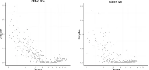
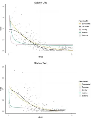
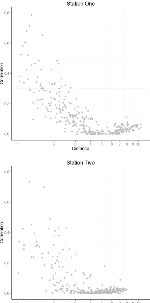
near things are more related than distant things” . (Tobler, 1970) Therefore, these correlations between stations should be related to distance in some way. The following distributions are likely to be expected where the correlation generally decreases with distance:
Figure 2 Example distribution of correlations and distances for Station One and
Station Two.
3.2. Distance Decay Models
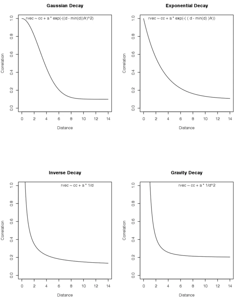
The principal aim of this research is to study the spatial structure of this distance decay and relate it to the current structure of the city. Given this aim, a number of distance decay models must be fitted to the distributions in order to ascertain the best decay model.
A nonlinear least squared model (NLS) will be used to fit a function to the station distance and correlation data. NLS is a “mathematical procedure for finding the bestfitting curve to
a given set of points by minimizing the sum of the squares of the offsets (‘the residuals’) of the points from the curve”. (Weisstein, 2014)
Gravity (Power Law). Each of these models determines the weight to attribute to distance in a different way. This is best explained visually with a diagram, see Figure 3 below. As can be seen, the Gaussian takes the form of an “S” shaped curve. The difference is that in the Gravity model distance is squared which results in a curve which decays much faster with distance.
Economic Gravity based decay models are traditionally used when examining the spatial relationships at play in cities, such as the segmentation in urban housing markets (Schnare and Raymond, 1976), commuting patterns and hospital patients (Cheng and Howard, 1999). Each of the four models discussed above were tested on the data from two sample stations from the New York CitiBike data. The results of these tests determined the best model to use for fitting to the other stations.
Figure 3 Distance decay model examples.
The statistical measure, the sum of squared residuals (SSR), is used to quantitatively compare each model. This is a measure of the variance of the real data and grey points to that of the fitted values of the model. These fitted values are represented by the respective line. The lower this value is the better fit the model is to the data as the squares are minimized.
Padgham (2012) showed that the distribution of trips and distance follows a Gaussian distribution. From here on it assumed that the Gaussian distance decay model is the best fit for the resulting station correlations and inter station distances.
The Gaussian function is fitted to the correlations between each station and the shortest distance between them as follows:
The formula for the function is as follows:
R2 ~ e-(d/k)2 Where:
● R2 is the correlation between each station pair, for example station 1 and every
other station.
● d is the distance between that station and every other.
● k is the width of Gaussian decay.
The focal point of this whole body of research is to derive the Kvalue for each station. High kvalues describe stations at which movement to/from is similar to the movement to/from nearby stations. These nearby stations will also have similarly elevated Kvalues. The kvalue quantifies the spatial range at which movement towards and away from each point is similar or highly coordinated throughout the entire system. Thus high kvalue stations can be interpreted as having a large scale importance whereas stations with low Kvalues are relatively less important.
Using NLS to model this function is an iterative process and as such, the model’s parameters will be adjusted until convergence is achieved; when the squares have been minimized.
This function is fitted for every station in the network, so that a Kvalue can be derived for every single station. This is represented graphically below, Figure 4. The left side shows the fitted Gaussian and the right side, different derived Gaussians for other stations. All station correlations are positive, and as such each ranges between 0 and 1.
Figure 4 Gaussian fitted to distribution of correlations and distances from an
example station. (Left) Gaussians fitted to a number of stations and their respective
Kvalues indicated. (Right)
These resulting Kvalues can then be used to describe the strength of the relationship of one station when compared to its surrounding stations.
3.3. What does the K-value mean?
The results can then be overlaid on the New York City in order to identify any prevailing spatial patterns in the resulting Kvalues. Consider Figure 5 where the size of each point represents the magnitude of the Kvalue.
Figure 5 What high Kvalues and low Kvalues signify.
As can be seen there are a number of stations which show high Kvalues, and these generally are nearby each other. Meanwhile, as one moves farther from the area of high Kvalues, the station Kvalues decrease. The stations that have little broadscale importance and/or no relationship with surrounding points have low Kvalues.
Figure 5 illustrates the phenomenon which arises in areas of high Kvalues. The stations nearby the high Kvalue stations will be clustered together with nearby stations of similar Kvalues. It is understood that people often orientate themselves towards places of significance within transport systems, and their movements can be directed both to/from these places (Padgham, 2012).
Movement from anywhere in the city towards/away from a hotspot of high Kvalue stations remains very similar in regard to all stations in the vicinity of that hotspot. A high Kvalue may thus be interpreted as reflecting the globalscale cultural or geographical, importance of the station. Conversely a low Kvalue should be interpreted as a station which is of local importance only and not strongly related to the other stations within its vicinity.
It is widely known that large cities are not simply made up of a single urban conurbation with one centre to which everybody moves to and from (Kloosterman and Musterd, 2001). The area within a city which people are from or live is central to the cultural desirability of destinations they may choose. Whether they are morphologically or functionally polycentric as observed by Berger and Meijers (2012), certain areas within a city have better/diverse services compared to others, or specialize in particular things which cannot be found in other areas. This leads to promoting higher levels of desirability of one area over another. The urban community hubs of a city are the places where people live, work, study, leisure. They provide the essential functions to sustain people with work and resources.
Evidence from Saelens et al. (2003) shows that neighbourhoods of “higher density, greater
connectivity, and diverse land use mix report higher rates of walking/cycling for utilitarian purposes than those of lowdensity, poorly connected, and single land use neighborhoods”.
These are the areas of high desirability, which are characterised by having high Kvalues. Given this phenomenon urban community hubs can then be identified as the areas in the vicinity of high kvalues as proposed in the theory section. Land use patterns within these areas would be expected to be classified as predominantly mixed use.
3.4. Urban Community Hubs
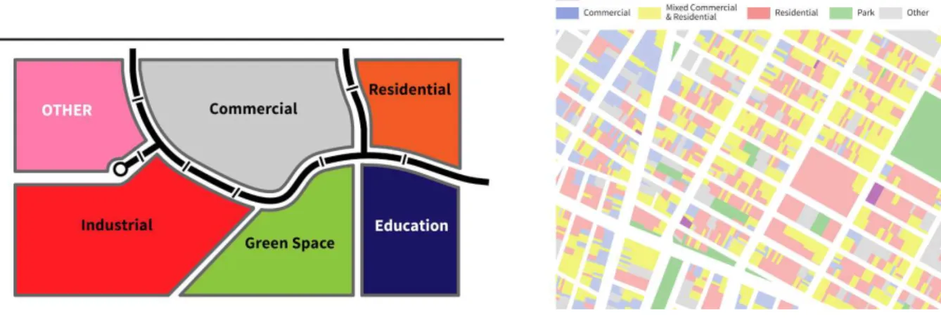
City planning emerged as a profession primarily as a response to the polluted inner cities filled with the vast polluting factories spawned by the industrialisation in 1920s (Brantz and Dümpelmann, 2011). It is clear that there is a link between the layout and uses of our city and human health. Planners set about separating these polluting and damaging industries from the places people lived (Taylor, 1998).
Figure 6 Single use zoning vs multi use mixed zoning.
However, this kind of planning which promoted single use zones proved to be poor at creating walkable communities and disastrous for providing efficient transport (Winkelman et al. 2010) and promoted the car to the primary transport mode. Jane Jacobs is most famous for her attack on this planning style and its segregationist principals. Her writings were driven by an objection to the regeneration plans being laid out by New York’s then Transport Commissioner, Robert Moses (Flint. 2009).
Jacob’s argued for the neighbourhoods of New York City, where she observed a socially diverse and mixed land use. It was these which she argued (Jacobs, 1961) are what shape vibrant communities. In Life and Death of Great American Cities (Jacobs, 1961) she detailed the key characteristics of vibrant neighbourhoods. The main themes which influence this are, Economic & Social Vitality, the power of physical design, which included the provision of narrow crowded multiuse streets, higher densities of people, the removal of single use zoning, and the redesign of streets for people not cars (Wickersham, 2001).
More recently urban theory has shifted towards the sustainable city, with a renewed focus on ‘the walkable city’ (Southworth, 2005). The same factors which can create vibrant neighbourhoods also work towards the more sustainable city. Transportation is a key part of achieving this. “Every journey in a city begins and ends with a walk” (Speck, 2014) this also holds true for any trip using the bike system.
New York City is ranked as the most walkable city in America according to Walkscore (2014). The city of New York presents an ideal opportunity to compare the results of relationship strength to identify communities within a city. It contains many diverse neighbourhoods comprising various mixes of land uses, varying densities, urban design, economy and people. Primarily it should be noted that “what is barely hinted at in other
American cities is condensed and enlarged in New York.” (Bellow, 1970/1994) This along with the availability of large and open datasets were key considerations in choosing New York City for this study.
4. Data Sources
The New York City bike share system operator CitiBike publishes a number of datasets on their website. The data which will be used in the study will comprise of the monthly origindestination trip data from July 2013 August 2014 (CitiBike, 2014) relating to the ridership, station location and capacity in addition to the station locations feed.
4.1. Station Data
Figure 7 NYC Bike Station Locations (CitiBike, 2015)
The station data feed is published as a JSON (ECMA, 2013) (JavaScript Object Notation) feed. It contains the the following fields for each station, along with sample values:
"id": 72,
"stationName": "W 52 St & 11 Ave", "availableDocks": 34,
"totalDocks": 38,
"latitude": 40.76727216, "longitude": -73.99392888, "statusValue": "In Service", "statusKey": 1,
"availableBikes": 3,
"stAddress1": "W 52 St & 11 Ave", "stAddress2": "", "city": "", "postalCode": "", "location": "", "altitude": "", "testStation": false, "lastCommunicationTime": null, "landMark": ""
This is a live feed and as such one can see the number of bikes which are available at the station at this moment. For the purposes of this study only the id, station name,
latitude and longitude fields were used. Each station has a unique id number.
The station data feed can be accessed at http://www.citibikenyc.com/stations/json.
(CitiBike, 2015)
4.2. CitiBike Origin-Destination Trip Data
CitiBike also publishes data relating to all of trips made by people using the bikes since the system opened in May 2013. It publishes this data under an open license which is fairly uncommon. This data is the main data source for this dissertation.
This data is published in CSV (Comma Separated Value) format at the end of each month. Each file contains all the trips made within the period of one month. For the purposes of this study trips from July 2013 August 2014 have been used. This amounted to some 10, 407, 546 (CitiBike, 2014) individual bike trips during this period.
The structure of the data fields is as follows:
● Trip Duration (seconds)
● Start Time and Date
● Stop Time and Date
● Start Station Name
● End Station Name
● Start / End Station ID
● Start / End Station Lat/Long
● Bike ID
● User Type (Customer = 24-hour pass or 7-day pass user; Subscriber = Annual Member)
● Gender (Zero=unknown; 1=male; 2=female)
● Year of Birth
The main fields of interest for use in this study are start time, end time , and the start
and end station ids.
This origindestination data can be accessed at http://www.citibikenyc.com/systemdata.
(CitiBike, 2014)
The table below shows some summary statistics relating to the origindestination trip data.
Number of Trips 10,407,546
Time Period July 2013 31 August 2014
Max Distance Interstation (Quickest Route)
14.66 km
Longest Trip 72 Days
(151) Cleveland Pl & Spring St
(501) FDR Drive & E 35 St
Start: 20130708 16:51:40 End: 20130919 01:10:53
Shortest Trip 1,471 trips of 1 minute or less.
Table 1 Summary Statistics for NYC CitiBike bike share scheme
4.3. Neighborhoods of New York
The New York City Department of City Planning each year publishes a map detailing the different neighbourhoods of the city. The city is divided into “5 boroughs, 59 community
districts and hundreds of neighborhoods” . (Department of City Planning, 2014) These boundaries are developed by combining census parcels to form neighbourhood tabulation areas. An extract of the map can be seen below with the bike stations layered on top for context.
Figure 8 Map of Neighbourhoods covering bike share scheme area.
This data is delivered in a shapefile format and contains the following fields:
BoroCode - Borough Reference Number BoroName - Borough Name
CountyFIPS - County Reference Number
NTACode - Neighborhood Tabulation Area Code NTAName - Neighborhood Tabulation Area Name Shape_Leng - Perimeter in feet
Shape_Area - Area in square feet
This shapefile can be downloaded at the following link
http://www.nyc.gov/html/dcp/html/bytes/dwn_nynta.shtml (Department of City Planning,
2014)
4.4. OpenStreetMap Data - New York City
acquired through the “Metro Extracts” tool by Mapzen which outputs weekly extracts of many cities throughout the world. (Mapzen, 2015)
The data is provided in a number of different formats. The format used in this research is the “OSM” format. This provides the data in a zipped file containing an .osm planet file.
This is an XML file which “contains a list of instances of [OSM] data primitives (nodes,
ways, and relations) that are the architecture of the OSM model.” (OpenStreetMap Wiki, 2015)
The daily updated planet file can be accessed here
https://s3.amazonaws.com/metroextracts.mapzen.com/newyork_newyork.osm.bz2 (Mapzen, 2015)
4.5. NYC Dept. Planning PLUTO Database
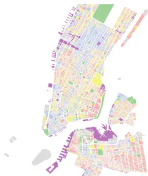
Given the evidence by Saelens et al. (2003) and the overall contribution of mixed land uses to creating higher desirability and community in different parts of the city, it is considered extremely important to consider the land uses types in the vicinity of the bikeshare stations. To do this the Property Land Use Tax Lot Output (PLUTO) dataset from NYC Department of City Planning is used.
The PLUTO dataset contains geographical features which are “ derived from the Tax Lot
Polygon feature class which is part of the Department of Finance's Digital Tax Map (DTM).” (NYC Department of City Planning, 2014) The dataset features a number of attributes derived from the planning departments PLUTO database which include, information on current land use, number of floors, current zoning designation, etc. The current land use for each parcel is of primary interest as it will then be possible to identify if the area within the immediate vicinity of a bike share station is dominated by a single land use or is highly mixed.
The data is provided in a number of shapefiles. The entire database is disaggregated to the boroughs of New York for ease of distribution. The files used by this research are those which cover both Brooklyn and Manhattan.
Figure 9 Extract of data from NYC MapPLUTO dataset with colours categorising
the landuse of that parcel.
5. Methods
As mentioned previously, all data used in this study is available open source and with open licenses. In the spirit of “open research” or “open science” (Woelfle, 2011) all of the
code developed to complete this study is open and freely available for reuse through Github.
Given this approach to open research, it was felt appropriate to write the methods section of this dissertation in a similar style to a user manual. This will allow any researcher to simply follow the steps as set out below to reproduce or build upon this research.
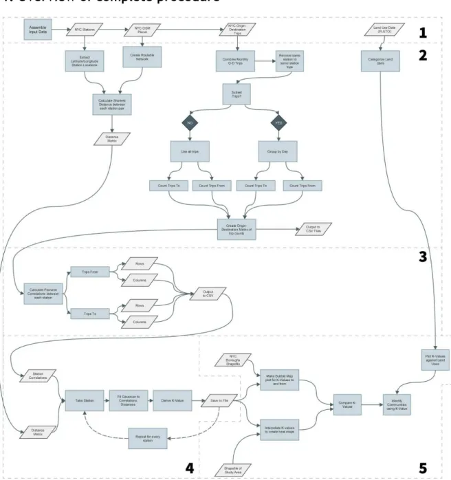
5.1. Overview of complete procedure
Figure 10 Overview of processes used to extract KValues. (Large format version
located at Appendix 2)
The overall procedure for conducting this research can be viewed in process diagram form at Figure 10 above. A large format version of the procedure is provided at Appendix
2 for clearer readability. The procedure can be broken down into five key parts.
The third part extracts the correlations for each station. The correlations and distance matrix are then combined, the distance decay function fitted, and then KValues are derived for each station. Finally in the fifth part these KValues are mapped, compared against land uses in their vicinity, and analysed.
5.2. Gather the Data
The first step is to gather all of the required data by downloading the following: ● Clone the github repository containing the code used to perform the analysis. ● The repository contains the bike stations file including longitude and latitude
coordinates.
● OriginDestination data for required period of time from Citibike. ● Obtain a copy of the most recent OSM Planet File for New York. ● Download shapefile of NYC from repository.
5.3. Extract the data
Each of the origindestination trips files YYYYMM-citibike-tripdata.zip must be extracted to a folder of your choice. The only requirement for running the later scripts is that these trip files are all contained within the same folder. For example to
../data/citibike
5.4. Get Interstation Distances
Given that the main aim is to extract intrastation pairwise linear correlations for each station pair and relate this to distance, it is imperative to get the distance between each station pair.
For the sake of speed in reproducing this research these distances have been provided in the research repository in the file station_dists_nyc.txt. This is a CSV file containing
the start_station_id, end_station_id and distance.
To complete this step you require two data sources, which are as follows:
1. ./data/new-york_new-york.osm.bz2
2. ./data/station_latlons_nyc.txt (id,lat,long,name)
The scripts used by this step are as follows: 1. ./src/getStDists.py 2. ./src/router.py
We only need to run ./src/getStDists.pyas this calls router.py to get the distance.
> getStDists city = nyc <city=london/nyc>
The script will then check to see if the OSM planet file has been split. This checks that the XML OSM planet file has been converted into a format which can be used for routing.
Router.py first extracts the .osm file from zip file. It then proceeds to prepare the file for use with Routino for finding the shortest path between each station pair. “Routino is an
application for finding a route between two points using the dataset of topographical information collected by http://www.OpenStreetMap.org.” (Bishop, 2014)
In OpenStreetMap, roads and paths are stored as ways , which are referenced with the tag
higway=*. Using the planetsplitter function of Routino, we can create a network graph
which will be used by Routino for getting the shortest path between each station by traversing the street network (edges).
A configuration file is used to tell planetsplitter which highway tags should be
The next function call is router.getAllNodes(nyc) . This function reads the .osm planet
file and extracts all of the nodes contained within it. This is used later as an input for the routing function.
The next step is to get the geographical bounds of the .osm file. As part of the schema of
the planet file, this is included in a section tagged bounds . This contains two tuples which
reference the min and max values of the bounding box as follows: (minlat, minlon) and (maxlat, maxlon).
> getLatLons (city="nyc")
This will read in the latitude and longitude values of the bike stations from
../data/station_latlons_nyc.txt. and return these as an array containing the fields
id, lat, lon.
A check is then done to make sure that the station latitude and longitude values are within the bounds of the .osm file. If this is the case, the function .writeDMat() is called to
calculate the distances for each station pair.
> writeDMat (latlons, nodes, city)
The results are written to ../results/station_dists_nyc.txt
This will take each pair of station latitude & longitude coordinates and find the “quickest” route between them. This makes use of the router function of Routino. The router function can be customised by options set in two configuration files..
routino-profiles.xml
This file contains the configuration relating to how Routino will weight each edge of the graph. This contains a number of different profiles for different modes of transport such as foot, bicycle, wheelchair, motorcar, hgv, etc. Each profile specifies maximum speeds and types of highway which can be traversed using the specified mode.
routino-translations.xml
This file is used by Routino to provide language translations for turn directions, highway tag description, etc. It is also used to configure which output files are generated by routing.
The router is passed the following switches: transport = bicycle
quickest (find the quickest route between two latlong coordinates) lon1 = first longitude coordinate lat1 = first latitude coordinate
lon2 = second longitude coordinate lat2 = second latitude coordinate
The router will take roughly 1 2 seconds to return a route between the two points. It will then generate five files containing information relating to the “quickest” route. The files are
as follows:
● quickest.html
● quickest-track.gpx
● quickest-route.gpx
● quickest.txt
● quickest-all.txt
Once the router is called it will generate a HTML file called quickest.html . This file
contains a map, a list of directions waypoint by waypoint from the first station to the second station, and the total distance of the route. A web scraper is then used to read the distance from this file.
Figure 11 Routino quickest.html routing file output
The start_station_id, end_station_id, and distance are then written to the output file
../results/station_dists_nyc.txt.
This process is then repeated for each station pair so that a distance is calculated from each station to every other station. For efficiency the script will find the distance between each pair only once in one direction.
5.5. Calculate the number of trips between stations
The number of trips between each station will be used as the value for which to calculate the pairwise correlations between each and every station, so a method to extract the counts from the trip files is provided in the script get_trip_counts.py.
> python ./python/get_trip_counts.py -city -directory-of-trips-files -stations-file -period
This script makes use of the features provided by the pandas (Python Data Analysis
Library) library for Python.
1. ../data/nyc_usage_stats/ (location of extracted origin-destination trips files) 2. ../data/nyc_station_latlons.txt When running this script a number of options can be provided:
city specifies which city to use for the counts. currently nyc or london
period specifies the time period on which to perform the counts. currently total & weekday
All of the trip files contained in the specified directory will be read in one at a time and checked for consistency. The start_id , end_id, start_time, and end_time will be
read from each of the trip files.
Once they have been read in, they will then all be combined into a single
pandas.dataframe. This single data frame is then indexed by the start_time . This
allows us to use pandas inbuilt functions for querying data frames by a time index which is useful for extracting the daily counts.
Pandas allows the use of SQL (Standard Query Language) style queries to subset data. There are a number of requirements when counting the trips. These are as follows: 1. To exclude trips which start and end at the same station; 2. To group the results by the start and end stations; 3. To return counts for the number of trips beginning (from) each station; 4. And, to return counts for the number of trips ending at each station (to).
The df.query() function is used to make SQL like queries. Next the df.groupby()
function is used to group the results by a certain column. This returns the data frame with a multi array index. Finally of the group.size() function is used, which will aggregate the
results of the grouping by counting the number of rows in each. One row is one trip. To do this use the query below:
For instance as an example one can take the first 5 stations, and the results will be returned as follows:
start_id end_id count
79 72 182
79 82 25
79 83 4
79 116 140
82 72 16
82 79 35
82 83 7
82 116 6
83 72 20
83 79 35
83 82 12
83 116 90
116 72 105
116 79 221
116 82 5
116 83 43
Table 2 Result of running count query for trips from the first five stations.
Next this flat data frame is transformed into a square matrix by using the .unstack()
function. The square matrix will have the station_ids as both columns names and row
names, like an origin destination matrix. It should be noted that there are no values for trips from the same station to the same station.
start_id 72 79 82 83 116
72
79 182
82 16 35
83 20 35 12
116 105 221 5 43
Table 3 Result of unstacking count for trips from first five stations.
Once unstacked, one is only interested in the lower triangular of the counts from and the counts to. We use the Python Numpy (Numpy developers, 2014) library to extract the
lower.triangular() of each data frame and copy this to the upper triangular so that the
matrices returned are square. The columns and rows are then indexed by station_ids.
The same process is used to get the counts of specific subsets of the data. As indicated above, we can subset the counts by weekday. We do this by adding an extra column to the data frame indicating the day of the week the trip took place, ranging from 0 to 6.
Pandas has inbuilt functions for indexing time series. As mentioned above we indexed the data frame containing all the trips by start time of each trip. This allows the use of the
index.weekday() function from pandas to insert an integer into the new interval column
of our data frame. This indicates the day of the week using the following index from 0 6:
0 = Monday 1 = Tuesday 2 = Wednesday 3 = Thursday 4 = Friday 5 = Saturday 6 = Sunday
counts_from_each = df.query('interval >= %s and interval <= %s and start_id != end_id and
end_id != start_id' % 0).groupby(['start_id',"end_id"]).size()
In both cases two data frames are returned from the counting function, one containing counts of trips from, and the other counts of trips to each station. These are then written to two CSV files: ../results/nyc_total_from.csv ../results/nyc_total_to.csv These two files will then be used for calculating the pairwise correlations.
5.6. Pairwise Correlations
The next step is to calculate the pairwise correlations for each station using the results from the previous step which returned trip counts.
> python ./python/reg1.py -city nyc
This script will read in the trip counts and calculate the pairwise linear correlations.
The data files required to run this script are as follows:
1. ../results/nyc_total_from.csv or nyc_weekday_total_from.csv (mon, tue, wed, etc.)
2. ../results/nyc_total_to.csv or nyc_weekday_total_to.csv (mon, tue, wed, etc.)
The -city argument used to call the script is simply used to indicate which prefix to use when reading in the CSV files. nyc_trips_from.csv and the nyc_trips_to.csv files are
first read into pandas as separate data frames.
This script makes use of functions from the python library SciPy, which is “a collection of
“computes a leastsquares regression for two sets of measurements” . (SciPy community, 2014)
The correlation is calculated by running scipy.stats.linregress() using a row and the
next row. This is repeated with the same row and each other row. The same process is then repeated for each and every other row. A correlation coefficient (r_value) is
returned, which is then squared. This is repeated for every row in the matrix. This is also completed against columns.
This results in two square matrices, one for the row correlations, and the other for the columns. These matrices have their columns and rows indexed by the station ids. The coefficient calculation is performed for both the trips_from and trips_to. The results are saved to the following files: ● ../results/nyc_total_from_cols.csv ● ../results/nyc_total_from_rows.csv ● ../results/nyc_total_to_cols.csv ● ../results/nyc_total_to_rows.csv
This script can also be run against the trip counts resulting from using the period argument.
All correlations computed are positive between 0 < r < 1.
5.7. Make Distance Matrix
In order to perform the analysis in the next step, which is to get the maximum distance of the correlation. First the nyc_station_dists.txt file is transformed into a square matrix.
72,119,10.252 72,120,12.78
Table 4 Extract from station distances file
> python make_dist_matrix.py
Using python pandas library, the script reads in the list and sets a multi index using the
start_id and end_id.
Then again using df.unstack() the data frame is transformed/pivoted into a square
matrix.
This is then saved to a CSV file: ../data/nyc_d_matrix.csv
5.8. Combine coefficients with distances
For the final steps in the analysis we will move from python to R. For the next stage we need to combine the coefficients with the distance between each station. It will also fit a function to the distribution of each stations coefficient in order to predict at what distance that correlation will have dissipated.
> R -f ./python/nyc1.R
This script will first read in each of the correlation CSV files which were outputted in the last step. ● ../results/nyc_total_from_cols.csv ● ../results/nyc_total_from_rows.csv ● ../results/nyc_total_to_cols.csv ● ../results/nyc_total_to_rows.csv
We then read in the station distance file as an R data.frame , nyc_station_dists.csv.
Next a check is made to make sure that the lower triangular of the matrix is the same as the upper triangular. This should be a square distance matrix, so both triangulars should match.
The Nonlinear Least Squares ( nls ) function from the R stats library will be used to fit a
function to the correlations and distances.
The distance matrix and correlation matrix are first transformed to the vectors ndm, rvec .
Both vectors are then compared to remove any missing values. The distance vector is then transformed using a logarithmic scale of base 10.
k is defined as the value of the distance at which the maximum distance for which the station is correlated to any other station. This is not a gravity based model as is traditionally used by the field of economics but rather a distance decay model.
The nls model formula is defined as follows with two constants, cc and a. It is expected that when cc = 0 , so that rvec -> 0 as d also becomes very large as a result. In all
cases cc < 1.
rvec ~ cc + a * exp(-((d - min(d))/k)^2)
rvec = correlations as vector d = distance vector
cc = constant a = constant k = K-value
It should be noted that the above formula is somewhat modified because the main aim of the research is to discern differences between areas/community hubs, to a “logGaussian” distance decay model because it yields more pronounced spatial variation.
Since we know that the from_columns, from_rows, to_columns and to_rows files are
pairwise correlations, the lower triangular and the upper triangular of the matrices are the same. We can run the nls model against either the rows or the columns of each file and expect the same results for either to or from file.
Given the sensitivity of nls to starting parameters, the R function TryCatch{} is used to
allow for different values to be used as starting parameters.
get_mod <- function(rvec, d, as, kss, tr) {
tryCatch(nls (rvec ~ cc + a * exp(-((d - min(d)/k)^2)),
start=list(cc=0, a=as,k=kss), trace=tr), error=function(e) NULL) }
If the model returns NULL , this means it will stop if the model does not converge or produces an error. It will then try the next set of start parameters. The different values used by the model are detailed below.
cc a k
0 1 2
0 0.2 2
0 1.76 0.38
0 0.8 0.5
0 0.8 0.6
0 0.8 0.3
0 0.187 2.505
0 0.8 1.2
0 2 1
0 1 mean(d)
0 0.2 1
Table 4 Starting Parameters used for nls.mod
The resulting K-values are merged into a data.frame containing the station names and
latitude longitude coordinates. Once merged these are then saved to CSV files as follows:
● ../results/kvals/nyc_tc_k.csv
● ../results/kvals/nyc_tr_k.csv
● ../results/kvals/nyc_fc_k.csv
● ../results/kvals/nyc_fr_k.csv
5.9. Map K-value Results
This final step is to designed to make visual plots of the results of the various analyses performed above. There are two types of visualizations which can be produced: bubble plots and kriging interpolations.
5.9.1. Bubble Plots
> R get_bubbles.R
Bubble maps showing the magnitude of Kvalues at the stations throughout the city are created using the functions contained in the get_bubbles.R script. This script makes use
of the ggplot2 graphics package for R. The files required for this script are as follows: ● ../data/study_area/study_area_neighbourhood_boundaries.shp ● ../results/kvals/nyc_mon_tc_k.csv ● ../results/kvals/nyc_mon_fc_k.csv ● ../results/kvals/nyc_tue_fc_k.csv ● ...etc.
The Kvalues are read in from the CSV files for both to and from trips for the period specified. For instance the Monday Kvalues to and Monday Kvalues from are read in as mon and monf variables.
The boundaries file containing the neighbourhoods in the study area are read into a
spatial.data.frame and assigned a map projection. Using the fortify() function from
ggplot2 (Wickham, 2009), the spatial.data.frame is coerced into a data.frame of
The plots are outputted with both the to and from values on the same graphic. As such both to and from variables must be passed to the make_plot function as follows:
> make_plot(mon, monf, '1_Monday', kvals)
This function takes the input data.frame containing the stations file with latitude, longitude coordinates and Kvalues. It creates two ggplot() graphics in which the size and colour
of the points representing Kvalues are determined by binned Kvalues.
k_size <- scale_size_continuous(
name="K-Value (km)", range=c(1,10), limits=c(0,25), breaks = c(0,3, 5, 7, 9, 11,13, 20, 25),
labels=c(0,"< 3", 5, 7, 9, 11,13, 20, "25 +") )
k_colour <- scale_color_gradient(
name="K-Value (km)", high="darkorchid3",low = "orange", limits=c(0,25),
breaks = c(0,3, 5, 7, 9, 11,13, 20, 25), labels=c(0,"< 3", 5, 7, 9, 11,13, 20, "25 +") )
A standard legend and scale are used for the graphics to allow for results to be compared between the overall results and those for each day of the week. Limits , is used to mask
the outlier values of k that result over the weekends. Breaks , bins the values of Kvalues
into 9 ranges, and labels simply gives names to these ranges for use in the plotting of the legend. Range, is the sequence of numbers that ggplot uses to set the size of each point
Figure 12 Example bubble plot for all trips made in New York City on Tuesdays.
5.9.2. Interpolation / Heat Map
The other method of mapping the Kvalue results was to use a method to estimate the values of k across the study area.
An outline shape for the island of manhattan and the brooklyn were extracted from openstreetmap data. This shape is then used to mask the kriging area.
This step uses R’s spatial (sp) package once again. The stations data.frame is then converted to a SpatialPointsDataFrame. The study area polygon is also converted to a SpatialPolygonDataFrame.
UTM zone 18N (EPSG:26918). The main reason for this is so that we can set up our interpolation grid in units of meters rather than degrees.
A grid upon which to interpolate estimated values to is created with 50m x 50m cells. This grid is then clipped to the shape of Manhattan and the study area using polygons from OSM data. shape/nyc1.shp is included in the repository. This was chosen as the smallest
distance between two stations is 131m.
The actual kriging is done using the autoKrige() function from the R package automap
(ordinary kriging). (Hiemstra et al., 2008) The formula supplied to this function is as follows:
> autoKrige(log10(kval)~1, ks_proj, clip_grid)
ks_proj: SpatialPointsDataframe of station Kvalues
clip_grid: the polygon grid to interpolate to
The predicted values are then plotted using the spplot() function from the sp package.
The resulting interpolated maps are similar to the following, Figure 13 . The main aim of
this step is to help the visual interpretation of the resulting Kvalues. This will help in identifying the hotspots of high Kvalues.
5.10. Map K-values and Land Uses
For this step a suitable GIS such as QGIS should be used. The two shapefiles containing the PLUTO data should be loaded first into a suitable database such as a geoenabled PostgreSQL database using the POSTGIS extension. This will allow the easy generalization of land uses classifications. The commands for loading this data can be found in commands_to_run.md file of the repository.
The field of interest from the PLUTO dataset is called landuse . This field contains an
integer ranging from 1 11. The number references the primary land use on each tax parcel area.
Code Land Use Generalised To
01 One and Two Family Buildings
Residential 02 MultiFamily Walkup
03 MultiFamily with Elevator
04 Mixed Residential & Commercial Mixed Residential & Commercial
05 Commercial & Office
Commercial 06 Industrial & Manufacturing
07 Transport & utility Transport
08 Public Facilities & Institutions NA
09 Open Space & Recreation Open Space & Recreation
10 Parking Facilities NA
11 Vacant Land NA
Table 5 PLUTO Land Use classes
class. The most important classes being Residential, Mixed Residential & Commercial, and Commercial.
6. Results & Discussion
The methods described in the previous section were applied to the New York City bike share data, which is subsetted by a number of time periods. The complete analysis was run for each day of the week as well as the complete dataset.
It is considered appropriate to describe and discuss the results for each time period separately in order to highlight the resulting patterns from each time period or subset. Finally the results will be analysed together to identify any patterns which are represented through the different subsets.
The resulting maps will then be overlaid with the Neighbourhoods of New York City boundaries map to determine whether any of the communities present from the cycling patterns are aligned with those as identified by the city. Finally, the same process will be completed by overlaying the Kvalues for trips over the PLUTO land use map.
It should be noted that from here forward when using the word community or hotspot, refers to an area in which there are a number of stations with the similar Kvalues.
6.1. Distance Decay Model Fits
Figure 14 Comparison of fitted distance decay models on two sample stations and
resulting sum of squared residuals.
As can be seen in the table Figure 14 above, the Gaussian function is the one which shows the lowest sum of squared residuals, closely followed by the exponential decay model. For both stations the inverse and gravity models perform poorly in terms of their respective fits to the real data. These results further demonstrate that a Gaussian decay model is more suited for short distance trips as found by Padgham (2012) than those of traditional economic decay or power law models.
Furthermore a comparison was made to ascertain whether a “logGaussian” distance decay model, the model formula implemented in the methods section, would further help in discerning the differences between areas. Kvalues were derived using both direct and logdistances for both trips to and trips from. The comparison used to test the spatial variation was SD/mean. Logdistances showed a higher variation (0.393) meanwhile
directdistances showed a lower variation (0.201).
6.2. Complete Trip Dataset
Period of Data July 2013 August 2014
Total Number of Trips 10, 134, 537 (excl. same
station/same station)
Trips From 10, 134, 537
Trips To 10, 134, 537
No. of Bike Stations 332
Table 6 Complete Trip Dataset Key Statistics
This first run of the data produced a number of interesting results. Principal among these findings is that, non intuitively, none of what one would consider as the key destinations to visit in New York emerged as hotspots, such as major transport nodes or business districts as was the case in previous studies (Austwick et al. 2013, Padgham, 2012).
The resulting Kvalues for each station are plotted at Figure 15, below. As can be seen, the two areas which are identified with the largest filled circles, representing the Kvalues (strength of relationship to stations in vicinity), are located on the South Western part of Manhattan adjacent to a large social housing area, and to the West where the Williamsburg Bridge joins to Manhattan.
For every step the trips are split between trips to each station from every other station, and trips from each station to every other station. You can clearly see that the pattern of the trips doesn’t really change depending on whether the trips are either “from” or “to”. A paired ttest was performed and although the two datasets (trips from, trips to) were significantly different (pvalue: 0.00651) mean differences in kvalues were in fact very small (mean: 2.027) corresponding to only 1% of mean values. This is further evidence that the kvalues for trips from do differ significantly from trips to as was observed by Padgham (2012) in relation to fixed spatial pattern in London.