Rebalancing Citi Bike
A geospatial analysis of bike share redistribution in New York City
Rebalancing Citi Bike
A geospatial analysis of bike share redistribution in New York
City
Alexander Tedeschi
Supervisors
Roberto Henriques, PhD. (UNL) Edzer Pebesma, PhD. (WWU)
Mateu Jorge, PhD. (UJI)
Institutions
Institut für Geoinformatik, Westfälische Wilhelms-Universität Münster (WWU), Germany. NOVA Information Management School, Universidade Nova de Lisboa (UNL), Portugal. Universitat
Declaration
I, _____________________ , hereby declare that I have written this thesis
independently, unless where clearly stated otherwise. I have used only
the sources, the data, and the support that I have clearly mentioned. This
thesis has not been submitted for conferral of degree elsewhere.
Signature
_____________________________________________________________
Lisbon,
ACKNOWLEDGEMENTS
I would like to thank all who motivated me throughout the project, which involved huge amounts of data and a comparable amount of brainpower and patience.
At the beginning stage of the project, the valuable feedback provided by Dr. Pebesma in the context of R programming at the Institute of Geoinformatics (ifgi) in Münster helped me to grasp the data and what was possible to do with it.
Likewise, I would like to extend my gratitude to my thesis supervisor Dr. Henriques for helping me to develop a feasible methodology despite my lack of an academic background in operations research.
Chris Heydt from CitiBikeNYC Hackers kindly provided access to the accumulated station feed data, which was critical to investigating the availability element. Andrey Karmatsky at Urbica advised me on visualization techniques using CartoDB, Leaflet, and Mapbox.
Rebalancing Citi Bike
A geospatial analysis of bike share redistribution in New York City
ABSTRACT
KEYWORDS
Bikesharing
Citi Bike
Open Data
Geospatial
Rebalancing
Mapbox
Clustering
K-means
Time series
QGIS
ACRONYMS
BSS Sum of Squares Between Groups
CRAN Comprehensive R Archive Network
CSV Comma Separated Value
HTML HyperText Markup Language
JSON JavaScript Object Notation
NYC New York City
MTA Metro Transit Authority
OSM OpenStreetMap
OSRM Open Source Routing Machine
TSS Total Sum of Squares
UTM Universal Transverse Mercator
INDEX OF THE TEXT
ACKNOWLEDGEMENTS ii
ABSTRACT iii
KEYWORDS iv
ACRONYMS v
INDEX OF FIGURES vii
INDEX OF TABLES viii
1.Intoduction 1
1.1 Rebalancing 2
1.2 The story of Citi Bike 2
1.3 Accessibility 4
1.4 Literature review 7
2.Research Objectives 9
3. Theory 10
3.1 Demand 10
3.2 Availability / Emptiness 11
3.3 Rebalancing 11
3.4 Clustering 12
3.4.1 K-means clustering 12
3.4.2 Marker clustering 13
3.5 Visualization 13
4.Data Sources 14
4.1 Trip Data 15
4.2 JSON data 15
4.3 New York City geography 16
4.4 Interstation distances 16
4.5 Leaflet JavaScript library 18
5. Methods 18
5.1 Data download 18
5.2 Extract rebalancing trips 18
5.3 Rebalancing Windows 20
5.4 Extracting interstation distances 22
5.5 Create an availability matrix 22
5.6 Clustering 24
5.6 Station ratings 25
5.7 Consecutively empty stations 27
5.8 Path of bikes in one day 28
5.9 Overnight rebalancing 29
6.Results and Discussion 31
6.2 Paired stations 34
6.2 Distance and duration of movements 40
6.3 Clusters 44
6.3.1 Changes in cluster types 48
6.4 Station ratings 52
6.5 Consecutively empty stations 54
6.6 Consecutively full stations 56
6.7 Visualization 58
6.7.1 CartoDB 58
6.7.2 Leaflet/Mapbox 59
7.Future Directions 59
8.Conclusions 60
9.Limitations 61
BIBLIOGRAPHIC REFERENCES 62
Appendices 64
Appendix A 64
Appendix B 76
Appendix C 80
INDEX OF FIGURES
Figure 1. Example of a 3-bike trailer 3
Figure 22. Cluster map of station availability in October 2013 47 Figure 23. Stations clustered differently in 2013 and 2014 49 Figure 24. Average demand per hour at station 447 (West 41st St & 8th Ave) during October 2013/14 50 Figure 25. Average rebalancing per hour at station 447 during October 2013/13 50 Figure 26. Stations clustered differently in 2014 and 2015 52
Figure 27. Station ratings 2013-15 53
Figure 28. Total empty instants at top-10 stations 54 Figure 29. Heat maps of consecutively empty stations 55 Figure 30. Heat maps of consecutively full stations 57
Figure 31. Overall trends 60
Figure 32. Monthly plot of bike trips vs. rebalanced bikes 66 Figure 33. Bar plots of most frequent trip pairs 74
Figure 34. Study area by neighborhood 75
Figure 35. Plots of WSS (left) and recommended number of clusters by number of criteria (right) (2014) 76 Figure 36. Availability factor vs. mean centers per cluster (2014) 76 Figure 37.Plots of WSS (left) and recommended number of clusters by number of criteria (right) (2015) 77 Figure 38. Figure 29. Availability factor vs. mean centers per cluster (2015) 77 Figure 39. Cluster map of station availability (2014) 78 Figure 40. Cluster map of station availability (2015) 79
INDEX OF TABLES
Table 1. Example of raw data of one bike id 19 Table 2. Fragment of output from rebalancing extraction 20
Table 3. Fragment of distance matrix 22
Table 4. Fragment of melted distance matrix 22
Table 5. Fragment of raw JSON .csv 23
Table 6. Fragment of availability matrix 24 Table 7. Fragment of consecutively empty stations 27 Table 8. Fragment of JSON overnight bike status matrix 30 Table 9. Fragment of matrix of differences between interval and previous interval 30 Table 10. Fragment of incoming ride matrix 31 Table 11. Top 5 stations that received bike via rebalancing (2013) 37 Table 12. Station rating means and medians 53 Table 13. Total empty instants among top-10 stations 54 Table 14. Average empty times of stations 56 Table 15. Average full times of stations 56 Table 16. Rebalancing trips as a percentage of total trips 65 Table 17. Total outgoing trips per top-10 demand stations 66
Table 18. Fragment of raw trip data 67
1.Intoduction
Bike sharing systems (bike-shares) have experienced the fastest growth of any mode of public transport and have expanded exponentially since white bikes were first introduced in Amsterdam in 1965. In Europe and North America, bike-shares are sprouting in new cities every year as sustainable mobility plays an increasingly crucial role in political agendas. In developing regions, bike-shares receive less public investment yet are flourishing in countries like China and Brazil. A general consensus among city planners is that bike sharing enhances connectivity and integrates well with other modes of public transport (Shaheen, Martin, & Cohen, 2013). Locating bike-share docks at transport hubs is believed to benefit both. In New York, 74% of stations are within a five-minute walk of a subway station entrance, which experts say is an environmentally-friendly solution to the “last mile” problem - the distance between home and an area with public transit that may be too far to comfortably walk (Shaheen, Stacey , & Hua, 2010). With the potential to bridge gaps in existing networks and encourage citizens to use multiple transportation modes, it is important to ask how can bikesharing systems be improved so as to provide a sustainable and reliable mode of public transport.
to ride. Many studies in the growing body of literature have addressed this subject1. The freedom of mobility that bikeshares offer by allowing users to leave bikes at any station also comes at a cost. Apart from variables that are not under human control, the ability of a system to redistribute or rebalance its bikes is arguably the most critical factor that affects usage and the capacity of a bikeshare to serve as legitmate and reliable form of public transportation.
1.1 Rebalancing
Rebalancing refers to the practice of bikeshare operators moving bicycles across the network in order to maintain a reasonable distribution across docking stations. The need for this process is a result of bike flows that cluster in certain areas of the city, typically following a pattern in which residential zones receive the most bikes in the evening whereas commercial zones receive the most bikes at the start of the workday in the morning. Sometimes, uneven distribution is caused by topography, such as in the hilly city of Barcelona, where bikes tend to accumulate at the bottom (Midgley, 2011). Most of the time, asymmetrical distribution is a matter of traffic – bikes are subject to rush hour just like cars and buses, and move to certain areas all at once. Rebalancing is a complex task of not only making sure that bikes are available, but also making sure that there are enough empty docks to for bikes to park. An unbalanced system means an unreliable form of transportation. When a station is too full, riders cannot return a bike there, and when a station is too empty, potential riders cannot rent from there. Therefore, rebalancing is a reality for every bike sharing program, whether in Barcelona, Paris, or New York.
1.2 The story of Citi Bike
Citi Bike was chosen as a case study firstly for its novelty as the largest bike sharing system in the United States with publicly available records of rider data, and secondly, because of its intractable problem of unbalanced stations. The system, now a part of the fabric of the city, generates unprecedented transit data from which one can build an accurate portrait of human movement. Origins and destinations of every single ride are logged, including time, dock
1
availability, and information about the user, which can help illuminate public transit usage patterns. The open data initiative offers excellent raw material for analysis and invites urban community members to give feedback to the system.
Citi Bike was launched in May 2013 with 332 stations in Manhattan and Brooklyn and by August 2014 had surpassed 20 million miles of total distance travelled by its users (CitiBIke). In 2015 alone, there were over 10 million rides taken (Schneider, 2016). Any given bike is ridden an average of 8.3 times per day (Hawkins, 2016). However, the numeric abundance of rides obscures underlying problems in the system that became apparent by 2014. In reality, Citi Bike had a poor record of maintenance and software, failed to replace damaged equipment, and was seeking new investment to resolve its financial troubles (Kessler, 2015). The number of annual members had dropped significantly by October 2014.
The issues were manifold. Unlike other systems such as Capital Bikeshare in Washington D.C., Citi Bike had no access to government subsidies as both mayors Bloomberg and DeBlasio have prevented it (Koebler, 2014). The dynamics of New York traffic made it difficult for the trucks to get from Station A to Station B in time, especially during rush hour, which was exacerbated by nonsystematic routing and lack of analysis. As a countermeasure, in 2014 Citi Bike began employing small bike trailers with a 3-bike capacity in order to weave more adeptly through
traffic (Jaffe, 2014). That same year, the company also began collaboration with David Shmoys at Cornell University’s Department of Computer Science in order to develop prediction algorithms for more efficient operations (Jaffe, 2014). Faced with overwhelming debt, Motivate – the company managing operations – also decided to hire a new CEO. Jay Walder, a former manager at New York City’s MTA and Hong Kong’s MTR, promised to overhaul the system (Kessler, 2015). Walder took measures to build the system out. Since then, Citi Bike has increased its annual membership fee, installed more stations, expanded the technology team from 2 to 10 people, launched an application, given docking stations new software, decreased the time spent to fix issues at stations, and cut the number of customer service calls in half (Kessler, 2015). The list of improvements is certainly impressive, but the question remains as to what impact Citi Bike’s new operations has had on its subscriber base. It is clear that bike sharing is now a firmly rooted into the urban landscape, but whom is the system servicing and is does the system offer bikes when they are needed?
1.3 Accessibility
Bikeshares are in some ways the opposite of public transit from the perspective of demographics. Whereas public transit is disproportionately used by low income individuals, the majority of bikeshare users are young, male, and well within the upper income bracket (Fanelli, 2013). That said, the people who arguably need the system the most are the ones that have the least access to them. Citi Bike is no exception. The annual membership cost is now at $149 (whereas it used to be $ 95 in 2013-14), which includes an unlimited amount of 45-minute trips (CitiBike). Those trips that last longer have an overtime fee of $2.50 for an additional half hour, and $9.00 for each additional half-hour after that. Weekly passes cost $25 and 24-hour passes cost $9.95 (CitiBike). At that rate, longer trips become very expensive and may prevent residents of lower-income neighborhoods outside of Manhattan from reaching downtown without paying hefty fees. The question of whom Citi Bike serves has also drawn attention in the press. Some have argued that the biggest obstacle to equality of access is the lack of stations in low-income neighborhoods (Palmer, 2013). By overlaying stations with 2010 census data2, a simple geospatial analysis illustrates that in terms of geographic location, Citi Bike is
2
Figure 3. MHI boxplots for first and second phase census tracts of Citi Bike
1.4 Literature review
programming models, suggesting that their formulations would perform well if applied to a real life bikeshare (Raviv, Tzur, & Forma, 2013 ).
Bike share research has also encompassed comparative study, documenting the variation in availability between different cities through data mining in an effort to determine factors that influence availability (O'Brien, Cheshire, & Batty, 2014). In a study that included 38 separate systems located in Europe, the Middle East, Asia, the Americas and Australia, O’Brien et al. developed a method for classifying bike shares based on geographical footprint and diurnal, day-of-week, and spatial variations in occupancy rates (O'Brien, Cheshire, & Batty, 2014). They found that the load factor – the proportion of docks in each station that currently have bicycles to hire-
is typically 45-50%, with European bike shares closer to 45% and American bike shares closer to 50% (O'Brien, Cheshire, & Batty, 2014). Other research has examined the factors associated with higher and lower levels of station activity. Rudolf and Lackner modeled demand for bikes and return boxes for Citybike Wien in Vienna Austria against weather variables (2014). In a related study, Rixey conducted a geospatial study of demographics surrounding bike stations and investigated their ridership (2013). He found that the proximity to a greater number of other bike sharing station exhibited a positive correlation with ridership in a variety of models, indicating that access to a network of stations is important to promoting bikeshare usage (Rixey, 2013).
2.Research Objectives
The starting point of this project is the anomaly that is observed over time between the amount of trips taken by individual users and the amount of bikes that are rebalanced. In the spring of 2015, the ratio of bikes rebalanced to the total bike trips taken dramatically decreased and continued on a downward trend for the remainder of the year (Figure 4). This cannot be explained by the gradual increase in the number of trips taken over time (see Figure 30 – Appendix A). There are a number of possible explanations for this: a reduced budget, more effective availability prediction techniques, shifts in commuter patterns that make stations more “self-balanced” which would require less transfer of bikes, etc. While an investigation into the internal strategy of Citi Bike is outside the scope of this research project, publicly available data may contain the answers as to whether Citi Bike has managed to deliver bikes to empty stations despite their reduction in rebalancing. The aim of the current study is therefore to:
1. Examine the overall spatial patterns of rebalanced bicycles
2. Compare the availability of bicycles over time using the same month over three consecutive years of operation.
3. Compare the delivery of bicycles during empty intervals in the same month over three consecutive years of operation.
4. Simulate rebalancing trips and availability patterns over time as a time series 5. Compare the average durations of full and empty time from year to year 6. Observe the geospatial patterns in bicycle transfer over the course of one night 7. Simulate the overnight path taken of a rebalancing truck
8. Promote reproducible information by providing codes used in the analysis
channels bikes from overflowing stations to empty stations, and maintains the flow of bikes in such a way that stations do not stay completely full or completely empty.
Figure 4. Transported bike: Total Trip ratio over time
3. Theory
3.1 Demand
In this study, the demand factor will be treated as the number of outgoing trips per station (demand = d). Demand will be measured on an hourly basis as the number of bikes that leave х station. Hourly demand will also be applied as a weighting function for emptiness. Within any given timeframe, some stations are more in demand than others. Therefore, the weighted average of emptiness will be influenced by the demand factor - demand d divided by the median for that time interval ( 𝑑 / 𝑛+1
2 ) . By applying this formula, a station’s emptiness
the logic being that it is worse for a higher demand station to be empty than it is for a lower demand station to be empty.
3.2 Availability / Emptiness
Availability has been referred to in other literature as load factor, which is equal to 𝐵𝑚𝑎𝑥
𝐷 ,
where 𝐵𝑚𝑎𝑥 represents the amount of bicycles present at a station and 𝐷 represents the total amount of docks at that station (O'Brien, Cheshire, & Batty, 2014). In this study the load factor will be referred to as the availability factor. 𝐵𝑚𝑎𝑥 and 𝐷 are contained in the JSON feed (see Section 4.2). Emptiness will be calculated as 𝐼𝑒
𝐼𝑡𝑜𝑡𝑎𝑙 , where 𝐼𝑒represents the number of empty
instants (when available bikes = 0) and 𝐼𝑡𝑜𝑡𝑎𝑙 represents the total number of instants in the measured in a given time frame. It should be noted that the JSON feed is collected every 10 minutes, which means that in a 24-hour period, there are 144 instants of that station’s status. For example, if Station A is empty 4 times within a 24-hour period, its emptiness rating will be 4/144 or 2.77%. Although full stations are also considered, it is not within the scope of this study to determine if bikes were taken from full stations for rebalancing.
3.3 Rebalancing
Figure 5. Vehicles used to rebalance (left: truck, right: 3-bike trailer)
3.4 Clustering
A cluster analysis or clustering is the task of grouping a set of objects in such a way that objects
in the same group are more similar to each other than to those in other groups (clusters).
3.4.1 K-means clustering
In order to identify clusters of stations exhibiting the same behavior in terms of availability, the K-means algorithm was applied. K-means is an unsupervised learning method to solve known clustering issues, and was chosen because it is a simple algorithm and works well with large datasets. The format of the K-means function is kmeans (x, centers) where x represents the numeric dataset (such as a matrix) and centers represents the number of clusters selected to extract (Galili, 2013).
Conceptually, the K-means algorithm is performed in the following steps: 1. Selects K centroids (K rows chosen at random)
2. Assigns each data point to its closest centroid
3. Recalculates the centroids as the average of all data points in a cluster (i.e., the centroids are p-length mean vectors, where p is the number of variables) 4. Assigns data points to their closest centroids
Figure 6. K-means clustering of five data points. The centroids are represented as dark circles and data points as letters
3.4.2 Marker clustering
In order to visualize the geospatial clustering of stations in Manhattan and Brooklyn geographically, this study utilized the marker clustering function from the Leaflet Java Script library. Although this did not include a preliminary analysis, it could serve as a useful tool for those interested in researching Citi Bike. This technique groups markers that are close to each other together on each zoom level3.
3.5 Visualization
For this study the, Leaflet open-source JavaScript Library has been tapped as a resource for interactive visualization of the results4. Leaflet was developed by Vladimir Agafonkin in May 2011 and was designed for simplicity and usability (Bacinger). Along with OpenLayers and Google Maps API, it is one of the most popular JavaScript mapping libraries and is used by major websites. It is free, mobile-friendly, and lightweight, with many examples of source code that are available on GitHub5. Another resource used was CartoDB6 and the Torque engine, which allows one to create animated visualizations with large temporal datasets by bundling HTML5 browser rendering technologies with an efficient temporal data transfer format created using the CartoDB SQL API (Data Driven Journalism, 2012). As a full open source geospatial
3 http://leafletjs.com/2012/08/20/guest-post-markerclusterer-0-1-released.html 4 See http://leafletjs.com
database, CartoDB allows users to visualize millions of records while at the same time enabling one to freely style maps.
Figure 7. Snapshots of the Mapbox platform
4.Data Sources
All data sources and software used in the current study are open to the public and freely downloadable. All codes developed during this study are available on GitHub.7
With the 2015 Citi Bike expansion, there are now a total of 471 stations in New York, but this study will only take into account the 332 original ones for the sake of consistency across all 3 years. In August 2015, the company installed 91 new stations in Long Island City, Greenpoint (Brooklyn), Williamsburg (Brooklyn), and Bed-Stuy (Brooklyn) and added 48 new stations on the Upper East and Upper West Sides (Manhattan), all the way up to 86th street (Furfaro & Shuldman, 2015).
4.1 Trip Data
Citi Bike publishes monthly datasets in CSV format containing every trip made by all users which can be accessed at https://www.citibikenyc.com/system-data. For this study, data from July 2013 – December 2015 was used. All in all, this consists of 23, 056, 397 individual trips. The data was already processed by Citi Bike to remove trips that were taken by staff for maintenance and inspection (Citi Bike).
Trip data in its raw form consists of the following columns:
Trip duration
Start time and date
Stop time and date
Start station name
End station name
Station ID
Station Lat/Lon
Bike ID
User Type (Customer = 24-hour pass or 7-day pass user; Subscriber = annual member)
Gender(0 = unknown; 1 = male; 2 = female)
4.2 JSON data
Data from Citi Bike’s JSON feed was collected and made available by members of the Google Groups BikeNYC and CitibikeNYC Hackers8. The JSON feed contains the following data:
Station name
Number of available bikes
Number of available docks
Total docks
Latitude
Longitude
Status (either Active or Inactive)
Status key (unique value for each station status)
Available bikes
Street address
In total, there are 29, 646, 938 records when the station ids outside of the study area are removed. However, there is one caveat – a huge gap of data between February and September 2015. The gap appeared due to an unknown technical issue that arose while collecting the JSON feed. As October is the only month that is consistently complete in the JSON dataset across all three years of Citi Bike’s operation, it was selected for comparison between years.
4.3 New York City geography
Data related to New York City geography were obtained from BYTES of the Big Apple, the NYC Department of City Planning open data portal9. The layers contained within the spatialite geodatabase include: boroughs, greenspace, hospitals, path stations, subway complexes, census tracts, train stations, water bodies, subway stations, roads, and counties (NYC Geodatabase in Spatialite ). The study area containing bike stations comprises the lower half of the island of Manhattan and the borough of Brooklyn to the southeast (Figure 8).
4.4 Interstation distances
Station-to-station distances were obtained by extracting data from a distance matrix provided on GitHub by a related study (Broderick, 2015). The values in the dataset were derived by Routino, an application that finds the quickest route between any two given points by using the topographical information of OpenStreetMap. All possible combinations of station pairs and their distances are contained within the matrix.
4.5 Leaflet JavaScript library
The leaflet JavaScript library10 API reference list was consulted as a resource for visualizing the results of the current study. Leaftlet’s website contains a repository of instructions and tutorials on how to call maps, draw layers, create imgage overlays, popups, etc.
5. Methods
Methodology can be divided into five key sections: data collection and cleaning, extraction, analysis, and visualization. R code has been integrated in order to elucidate the procedure. First, data were gathered from sources listed in the previous section and imported into R Studio. After installing the necessary packages from CRAN, the data were cleaned in order remove NULL values and inactive stations in the JSON feed. In the extraction phase, all rebalancing trips were filtered from the trip data. In the analysis phase, availability data was combined with rebalancing data, which were then analyzed for clusters, the most frequently occurring station pairs, transfer of bikes during times of demand, and consecutively empty stations. Finally, the results of the current study were exported to QGIS for cartographic visualization, and input into CartoDB and HTML for interactive visualization.
5.1 Data download
First, all raw monthly trip data was downloaded from Citi Bike’s System Data web page11, unzipped, and read into R as CSV files.
>data(jsondata)
>temp <- tempfile()
>download.file( "http://s3.amazonaws.com/tripdata/201307-citibike-tripdata.zip",temp, mode="wb")
>unzip(temp, "2013-07 - Citi Bike trip data.csv")
>Jul_2013 <- read.csv("2013-07 - Citi Bike trip data.csv")
>data <- rbind(Jul_2013, Aug_2013,…)
5.2 Extract rebalancing trips
Next, all trips taken by one bike were isolated by subsetting the data by bikeid. It can be clearly observed that some trips started at different stations than they ended (see the highlighted cells in the table below). The transfer of the bikes – rebalancing - occurs in between the stoptime of its previous trip and the starttime of the subsequent trip.
one_bike <- data[data$bikeid == 24737,]
tripduratio
n starttime stoptime start.station.id end.station.id bikeid
611 10/1/15 9:57 10/1/15 10:07 3230 462 24737
435 10/3/15 15:50 10/3/15 15:57 498 536 24737
41271 10/5/15 7:32 10/5/15 19:00 3146 477 24737
1858 10/5/15 20:25 10/5/15 20:56 477 432 24737
1086 10/6/15 9:26 10/6/15 9:44 432 519 24737
13427 10/6/15 14:06 10/6/15 17:50 519 3147 24737
1234 10/7/15 8:17 10/7/15 8:38 3147 359 24737
817 10/7/15 10:08 10/7/15 10:21 359 513 24737
846 10/7/15 10:23 10/7/15 10:37 513 465 24737
494 10/7/15 17:06 10/7/15 17:15 465 492 24737
680 10/7/15 17:40 10/7/15 17:51 492 3230 24737
923 10/8/15 8:51 10/8/15 9:07 3230 426 24737
749
10/10/15
15:26 10/10/15 15:38 309 248 24737
Table 1. Example of raw data of one bike id
The next step was to bind stoptime and startime together, find the difference in time between them, and loop over all bikeids in order to produce a record of all rebalancing events. The following code was developed in order to extract all rebalancing trips per month:
> raw_data = Jul2013
> unique_id = unique(raw_data$bikeid)
> output1 <- data.frame("bikeid"= integer(0), "end.station.id"=
integer(0), "start.station.id" = integer(0), "diff.time" = numeric(0), "stoptime" = character(),"starttime" = character(),
stringsAsFactors=FALSE)
for (bikeid in unique_id) {
onebike <- raw_data[ which(raw_data$bikeid== bikeid), ]
onebike <- onebike[order(onebike$starttime, decreasing = FALSE),] onebike$starttime <- as.factor(as.character(onebike$starttime)) onebike$stoptime <- as.factor(as.character(onebike$stoptime))
if(nrow(onebike) >=2 ){
for(i in 2:nrow(onebike )) {
if(is.integer(onebike[i-1,"end.station.id"]) & is.integer(onebike[i,"start.station.id"]) & onebike[i-1,"end.station.id"] != onebike[i,"start.station.id"]){ diff_time <- as.double(difftime(strptime(onebike[i,"starttime"], "%Y-%m-%d %H:%M:%S", tz = "EST"),
strptime(onebike[i-1,"stoptime"], "%m/%d/%Y %H:%M", tz = "EST")
,units = "secs")) new_row <- c(bikeid, onebike[i-1,"end.station.id"], onebike[i,"start.station.id"], diff_time, as.character(onebike[i-1,"stoptime"]), as.character(onebike[i,"starttime"]))
output1[nrow(output1) + 1,] = new_row }
} } }
5.3 Rebalancing Windows
The nature of the output data is that instead of obtaining a specific time when rebalancing occurred, we are left with a timeframe within which the bicycle must have been transferred.
bikeid end.station.id start.station.id diff.time stoptime starttime
23694 414 430 268 10/5/15 12:50 10/5/15 12:54
23344 530 422 271 10/14/15 7:32 10/14/15 7:36
23798 253 345 278 10/27/15 14:10 10/27/15 14:15
23001 348 161 279 10/11/15 13:07 10/11/15 13:11
24272 509 463 290 10/5/15 16:16 10/5/15 16:21
Table 2. Fragment of output from rebalancing extraction
windows in terms of number and duration. The data was subset by rebalancing times that fell under 1-hour, 2-hour, 4-hour, 6-hour, 12-hour, and 24-hour time frames. Their midtimes were grouped by hour and plotted for visualization (Figure 16).
require(reshape2) require(lubridate)
>data$midtime <- as.POSIXct((as.numeric(data$stoptime) + as.numeric(data$starttime)) / 2, origin = '1970-01-01') >data$hour <- hour(data$midtime)
>data_1hr <- data[data$difftime < 3600,] >data_2hr <- data[data$difftime < 7200,] >data_4hr <- data[data$diff.time < 14400,] >data_6hr <- data[data$diff.time < 21600,] >data_12hr <- data[data$diff.time < 43200,] >data_24hr <- data[data$diff.time < 86400,]
5.4 Extracting interstation distances
Next, interstation distances were extracted from the 332 x 332 distance matrix to create a database of all possible pairs of stations and the distances between them.
station.id 72 79 82 83 116
72 NA 6.43 7.458 11.546 3.784
79 NA NA 1.406 5.442 2.956
82 NA NA NA 5.656 4.101
83 NA NA NA NA 8.447
116 NA NA NA NA NA
Table 3. Fragment of distance matrix
Using the reshape2 package, the matrix was melted, flipped, and melted again to find all possible pairs of distances.
> require(reshape2) > melt(data)
> melt(t(data))
This procedure results in a dataframe of all possible station pairs and their distances.
Var1 Var2 value
72 79 6.43
72 82 7.458
79 82 1.406
72 83 11.546
79 83 5.442
82 83 5.656
Table 4. Fragment of melted distance matrix
Next, these pairs were merged with the station pairs in both the trip dataset and rebalanced trip dataset.
>merge(data, distance_matrix, by.x=c("start.station.id", "end.station.id"), by.y=c("Var1", "Var2"))
>mean(data...$value)
5.5 Create an availability matrix
The raw JSON feed contains some 30 million records was first cleaned: inactive stations were removed.
id status bike_count dock_count created_at summary_id tot_docks
1 Active 12 23 10/1/14 0:00 64087 35
2 Active 1 32 10/1/14 0:00 64087 33
3 Active 8 17 10/1/14 0:00 64087 25
4 Active 23 39 10/1/14 0:00 64087 62
5 Active 6 31 10/1/14 0:00 64087 37
Table 5. Fragment of raw JSON .csv
Times were converted into POSIXct format for easier manipulation and abbreviation using the
lubridate package. Availability factor (load factor) was calculated for each record.
>require(lubridate)
>json$created_at <-strptime(json$created_at, "%Y-%m-%d %H:%M:%S", tz = "EST")
>json$year <- year(json$created_at) >json$month <- month(json$created_at) >json$hour <- hour(json$created_at)
>json$lf <- json$bike_count/json$tot_docks
The JSON dataset was then subset into weekdays of October 2013, October 2014, and October 2015, and merged with the station key (the official Citi Bike station ids do not appear in the raw JSON feed).
>json_2013 <- json_2013[json2013$year == 2013 & json2013$day
>json_2013 <- merge(Json_2013, stations, by.x = "station_id", by.y= "id")
The availability factor was then averaged across hour and station to create an availability matrix:
>require(tidyr) >require(dplyr)
>matrix <- Json_2013 %>%
group_by(citibike_station_id, hour) %>%
summarise(mean_perc_full = mean(perc_full)) %>% spread(hour, mean_perc_full)
cb_id 0 1 2 3 4 5
72 0.4600 0.5628 0.5941 0.5584 0.5076 0.5095
79 0.2487 0.1989 0.1675 0.1468 0.142 0.1441
82 0.4035 0.4319 0.4643 0.5140 0.5749 0.5883
83 0.2664 0.2801 0.2824 0.2595 0.2669 0.2716
116 0.1438 0.1282 0.1505 0.1525 0.1645 0.1806
Table 6. Fragment of availability matrix: rows represent station id and columns represent hour intervals
5.6 Clustering
Proceeding from the previous step, we begin with a matrix of 332 stations by 24 one-hour intervals, with one extra column representing station id.
> dim(matrix) [1] 332 25
K-means clustering analysis begins with k randomly chosen centroids, which means that a different solution can be obtained each time the function is applied. To begin the analysis, we will need to first install the NbClust package12. This package provides 30 different indices for determining the best number of clusters and recommends an ideal number of clusters based on the majority rule (Charrad, Ghazzali, Boiteau, & Niknafs, 2015).
> data <- matrix
First, the function is created where nc is the number of clusters to consider and seed is a random number seed.
>library(NbClust) >set.seed(1234)
>wssplot <- function(data, nc=15, seed=1234){ wss <- (nrow(data)-1)*sum(apply(data,2,var)) for (i in 2:nc){
set.seed(seed)
wss[i] <- sum(kmeans(data, centers=i)$withinss)} plot(1:nc, wss, type="b", xlab="Number of Clusters", ylab="Within groups sum of squares")}
Because the all of the data is within a range of 0 to 1, it does not need to be standardized. The next step is to determine the number of using the wwsplot() and NbClust() functions. What
should be observed is a sudden bend in the graph, indicating that the within group sum of squares is no longer changing with cluster number. At the bend, the number of clusters may be a good fit. Creating a table and plot will help to visualize the results of suggested number of clusters.
>wssplot(data)
>clusters <- NbClust(data, min.nc=2, max.nc=15, method = “kmeans”) >table(nc$Best.n[1,]
Next, the ratio of between sum of squares (BSS) to total sum of squares (TSS) will be calculated. BSS/TSS is essentially a measure of the goodness of the classification that k-means has found. BSS measures the variation between the group means while TSS is the total variation in Y (an interval-scaled variable) over the sample – it measures the variations in the values of Y around the total mean (the sum of squared deviations).
>fit.km <- kmeans(df, 3, nstart=25) >fit.km$centers
>ggplot(centers..)
5.6 Station ratings
Station ratings were calculated with 3 matrices: an emptiness matrix, a demand matrix, and a rebalancing matrix. First the emptiness matrix was created by taking the average empty instants per hour per station over the month of October.
>empty2013 <- json[json$year == 2013 & json$available_bike_count == 0,]
> emp2013_mat <- empty2013 %>%
+ group_by(citibike_station_id, hour)%>% + summarize(sum = n()) %>%
+ spread(citibike_station_id, sum)
The demand matrix was then created in a similar fashion (casting a matrix from the average amount of outgoing bikes per station per hour) and each value was divided by the medians for each hour. This gives us a matrix of demand factors that will influence the emptiness matrix.
> medians <- apply(demand_matrix, 2, FUN = median) > head(medians)
X0 X1 X2 X3 X4 X5 0.8064516 0.4193548 0.2580645 0.1290323 0.1290323 0.3225806
>demand_factor <- as.data.frame(sweep(demand_matrix, 2, medians, "/")) > head(demand_factor[1:5])
1 1.00 0.6923077 1.750 0.75 2.50 2 1.44 1.3076923 1.125 0.75 0.50 3 0.40 0.2307692 0.625 2.50 0.00 4 0.96 1.1538462 1.250 1.25 0.75 5 1.60 3.4615385 1.875 2.25 4.00 6 0.00 0.0000000 0.125 0.50 0.00
Note that according to this formula, stations that have zero demand are considered to be unimportant because not a single bike left that station during that particular hour. For example, in the table above we can see that between the hours of 12:00 and 1:00 and between 1:00 and 2:00, station 6 had zero demand. Therefore, its emptiness factor (the total amount of empty instants) is considered meaningless (this study consider emptiness a non-issue if there is no demand) and will be converted to zero when the demand factor is multiplied by the emptiness factor. Also, stations that have zero empty instants within a given hourly interval have a zero-value in the emptiness matrix (this study is only concerned with completely empty stations).
> head(weighted_2013[1:5])
X0 X1 X2 X3 X4 1 1.00 0.000000 0.000 0.00 0.0 2 31.68 52.307692 47.250 26.25 10.5 3 0.00 0.000000 0.000 0.00 0.0 4 4.80 1.153846 0.000 3.75 4.5 5 30.40 62.307692 43.125 27.00 48.0 6 0.00 0.000000 0.000 2.50 0.0
After multiplication, the weighted matrix contains many zeroes, but this is to be expected as it is likely for less-used stations to have either zero demand, especially in the morning hours, or to have at least some bikes (meaning there is no emptiness). Next, the rebalancing matrix (the total amount of bikes delivered via rebalancing to any given station per hour) is divided by weighted empty matrix to give a final rating of bikes delivered per empty instant. NA values were created when 0 was divided by 0 (for example when 0 bikes are delivered for 0 empty instants) or when a positive integer is divided by 0, and infinite values were created as well, but these were removed in the next step. The median and mean of all station ratings was then calculated.
rating2013<- do.call(data.frame,lapply(rating2013, function(x) replace(x, is.infinite(x),NA)))
5.7 Consecutively empty stations
While the sum total of empty instants of any given station is an important way to rate its functioning, a no less important indicator is how long any given station remained empty on average. In order to calculate the average amount of time a station remained empty, we need to take the mean of consecutive 10-minute intervals where the number of available bikes was equal to zero. This was done in the following manner:
First, the JSON data was filtered for instants where available bikes is equal to zero, then the data frame was reduced to two columns for the sake of simplicity: the left column representing station ID and the right column representing the station summary ID, which I have relabeled as
moment. Station summary id is simply a unique ID given to each moment that the JSON feed was tapped for data. For example, if at 12:00 the station summary id was 1, then at 12:10 the station summary id would be 2, at 12:20 - 3, at 12:40 - 4, and so on.
id moment
1 11725
1 11726
1 11739
1 11740
1 11861
1 11862
1 11865
1 11869
1 11914
1 12088
2 11644
2 11646
2 11647
2 11648
2 11649
2 11650
2 11652
2 11653
2 11657
2 11658
In the above table, the right column contains increasing integers, some that are consecutive, and some that are not. The number of increasing consecutive integers represents the length of time that station was empty, so if we take the above fragment as an example:
Id 1 has the following number of consecutive integers in
moment
- 2, 2, 2, 1, 1, 1, 1 - so the average would be 1.428 or 14.28 minutes.Id 2 has the following number of consecutive integers in
moment
- 1, 5, 2, 2 - so the average would be 2.5 or 25 minutes.
First the difference was taken, then the numbers that are not consecutive are found (diff(x)!=1). Then the inverse of the difference was taken (diffinv) to go back to the original length. We are left with a vector that increments when at non-consecutive numbers. Then rle (run length encoding) was used to count lengths, and finally mean was applied.
>aggregate(data$moment,list(data$id), function(x) mean (rle(diffinv(diff(x)!=1))$lengths))
5.8 Path of bikes in one day
In order to simulate the path of all rebalanced bikes in one day using CartoDB, the data first had to be subset by one day – August 19th, 2014. This day was chosen for a few reasons. Firstly, according to the data, it featured the highest number of bikes transferred in the entire year (1371 trips that occurred within a 1-hour window). Not only does this provide an abundance of trips, but also accuracy on account of the small window. Secondly, at that time, the second phase of Citi Bike expansion had not yet taken place, which is consistent with this study’s analysis of the initial 332 stations. It should be noted that only rebalancing events that took place within a 1-hour window were visualized. This was done in order to retain as much accuracy as possible.
Ten points along each line were created and the longitude and latitude values calculated for each. The attribute table was then exported as a CSV file and read into R. Next, the 1371 timeframes associated with each record needed to be divided into ten equal parts, which would then be “assigned” their corresponding point.
one_day$first = one_day$stoptime + 0.1 * difftime(one_day$starttime, one_day$stoptime, units = "secs")
one_day$second = one_day$stoptime + 0.2 * difftime(one_day$starttime, one_day$stoptime, units = "secs")...
This way, two different segmented dataframes were merged together – the first dataset a containing the points along polylines in QGIS and the second dataset containing the time intervals. This was essential because in order for CartoDB to produce an animated time series, each point must have a corresponding date or time object.
Figure 10. Lines to points using QChainage
5.9 Overnight rebalancing
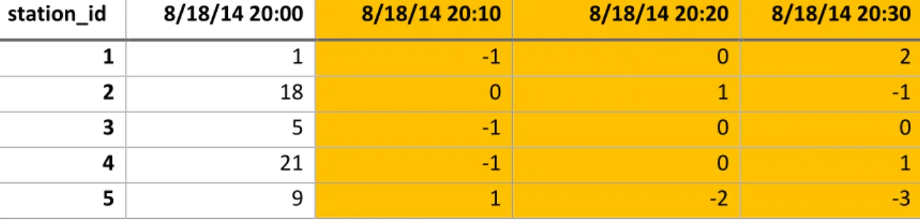
a rebalancing truck overnight, first one night was chosen. August 18th-19th 2014 was selected as the highest concentration of rebalancing events in 2014 occurred on those days, which means there was an abundance of data. Next, the JSON data was subset to a period of 12 hours: beginning at 20:00 on August 18th and ending at 8:00 on August 19th.
>data <- json[json$created_at > “08-18-2014 20:00:00” &
json[json$created_at < “08-19-2014 08:00:00” ,]
The data were then reshaped into a matrix using the packages tidyr and plyr, producing the following result:
station_id 8/18/14 20:00 8/18/14 20:10 8/18/14 20:20 8/18/14 20:30
1 1 0 0 2
2 18 18 19 18
3 5 4 4 4
4 21 20 20 21
5 9 10 8 5
Table 8. Fragment of JSON overnight bike status matrix
The next step calculated the difference between time intervals to receive a matrix of differences:
> dataB = data
> for(i in 3:ncol(dataB)) dataB[,i] = data[,i]-data[,(i-1)]
station_id 8/18/14 20:00 8/18/14 20:10 8/18/14 20:20 8/18/14 20:30
1 1 -1 0 2
2 18 0 1 -1
3 5 -1 0 0
4 21 -1 0 1
5 9 1 -2 -3
Table 9. Fragment of matrix of differences between interval and previous interval
station_id 8/18/14 20:00 8/18/14 20:10 8/18/14 20:20 8/18/14 20:30
1 2 2 1 2
2 1 NA NA 3
3 NA NA NA NA
4 NA 1 NA NA
5 4 4 2 3
Table 10. Fragment of incoming ride matrix
In the example above, the matrix was created by grouping incoming rides into 10-minute time intervals to fit the JSON data:
library(lubridate) library(dplyr)
start_times <- as.POSIXlt(
c("2014-08-18 20:06:49"
,"2014-08-18 20:08:05"
,"2014-08-18 20:09:57"
,"2014-08-18 20:11:30"
,"2014-08-18 20:12:00"
,"2014-08-18 20:13:49")
)
tripduration <- floor(runif(6) * 1000)
time_reduce <- start_times - minutes(minute(start_times) %% 10) - seconds(second(start_times))
df <- data.frame(tripduration, start_times, time_reduce) summarized <- df %>%
group_by(time_reduce) %>% summarize(trip_count = n())
Finally, after the matrix of differences was modified, all values above or below 3 were filtered and aggregated to produce a list of possible stations that were rebalanced. Station latitudes and longitudes from this list were then input into the Open Source Routing Machine (OSRM) to create a map of shortest paths, which were then mapped.
6.Results and Discussion
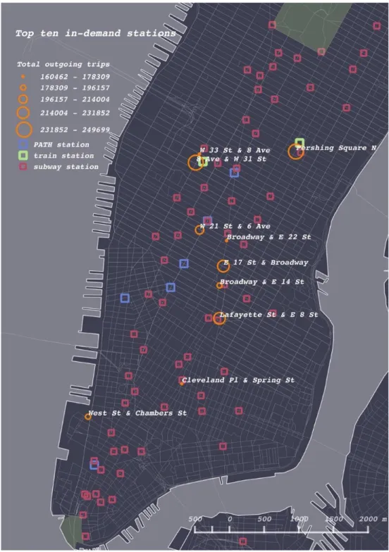
6.1 In-demand stations
6.2 Paired stations
Figure 12. Rebalancing paired stations vs. trip paired stations (2013)
In the above maps we notice several distinct differences in the patterns of rebalancing trips and regular bike trip pairs. A high number of regular trips started and ended in the near vicinity of Central Park. The two most frequently occurring regular trip pairs start and end at Central Park South (see Figure 32). This appears to be for a few reasons. Firstly, there are 4 stations on the perimeter of the park, and secondly, it is an attraction visited every year by tens of millions of tourists. That trend is directly reflected in the data:
Central_park <- a2013[a2013$end.station.id == 2006 & a2013$start.station.id == 2006,]
> table(Central_park$usertype)
Customer Subscriber 6203 1580
either a 24-hour pass or a 7-day pass. In the following years, Central Park retains its status as the most popular starting and ending point (in 2015, the percentage of customers was 90%). There is another notable same-station pair (labeled orange), such as the Vesey Place & River Terrace to West Thames St, located in the neighborhood of Battery Park and Lower Manhattan (Figure 12). This phenomenon may also be explained by tourism, as the former station is located within 350 m of the World Trade Center and the latter is within 500 m of Battery Park, a key attraction and the port from which ferries depart for Ellis Island and the Statue of Liberty. Two other notable trip pairs are in the West and East Village – between Washington Square Park (NYU) and Union Square, and between Astor Place and Tompkins Square Park.
By contrast, the 2013 rebalancing pairs are almost exclusively located in midtown Manhattan. One notable is the pair near the bank of the East River connecting FDR Drive & East 35th St with 1st Ave & East 44th St (Figure 12). The FDR drive station is located directly at the East River ferry, which transports commuters back and forth over the river between Brooklyn, Queens, and Manhattan. It is a start point, which means that it receives many bikes through rebalancing; a total of 542 bikes came from the 1st Ave station alone in 2013 (Table 21). In total the East River ferry station received a 3745 bikes by rebalancing in 2013, almost twice the average for that year. This pattern shows that commuters coming into Manhattan on the ferry likely took bicycles following their cross-river journey, as the next leg of their trip.
> times_square <- a2013[a2013$start.station.id == 465,] > nrow(times_square)
[1] 24469
> table(times_square$usertype)
Customer Subscriber 2710 21759
Unlike Central Park, the majority of users that begin their journeys at Times Square are annual subscribers. Only 11% of the total outgoing trips were taken by customers – the short-term users who are very likely to be tourists. Subscribers, unlike customers, are far more likely to use Citi Bike for their daily commute, which means they will probably not be returning their bike at the end of a joyride. Therefore, the station experiences a sizable net loss (calculated below as 4,375 bikes). Due to the sheer demand of bicycles (a total of 24,469 outgoing trips in 2013), Times Square must be constantly supplied by a nearby station. Interestingly, the supplier station – Port Authority – is also a net loss station, having experienced a net loss of 3,150 bikes in 2013. Essentially, a net loss station supplies another net loss station, but in order for such a scheme to work, Port Authority must itself receive many bikes through rebalancing. An analysis of the data shows that indeed this is true: Port Authority is the in the top three stations in terms of receiving bikes through rebalancing (Table 11). In 2013, it received 12,064 bikes which is the only way it can supply Times Square.
> PAin <- a2013[a2013$end.station.id == 477,] > PAout <- a2013[a2013$start.station.id == 477,] > nrow(PAin)
[1] 33515 > nrow(PAout) [1] 36665
> PAnet_loss <- nrow(PAout)-nrow(PAin) > PAnet_loss
[1] 3150
> TSin <- a2013[a2013$end.station.id == 465,] > TSout<- a2013[a2013$start.station.id == 465,] > nrow(TSin)
[1] 20094 > nrow(TSout) [1] 24469
[1] 4375
Id Freq
519 14656
521 13114
477 12064
490 11881
517 10665
Figure 13. Rebalancing paired stations vs. trip paired stations (2014)
Trip pairs in 2014 (right side of Figure 12) exhibit both similar and different patterns when compared to trip pairs in 2013 (right side of Figure 11). Stations around Central Park remain the most popular start-and-end stations and are contained as a cluster on their own. The same stations remained popular in downtown Manhattan, although the Vesey Place & River Terrace and West Thames St stations are no longer start-and-end points.
disused New York Central Railroad spur – attracted more bicyclists in 2014 than in 2013. In 2015, the same trip pairs appear in the 2015 map (Figure 14). The map of rebalancing pairs shows new transfers, such as the connection between Greenwich Village and East 47th St and 2nd Avenue (nearby to Grand Central Station).
Figure 14. Rebalancing paired stations vs. trip paired stations (2015)
The further expansion of rebalancing operations southward is also apparent in the 2015 map. We can see clear mutual connections between stations in the East Village (E 7th St & Avenue A, and E 14th St & Avenue B) as well as a longer distance connection with Lower Manhattan (Pearl St. & Hanover Square). In addition, the map suggests that there was a higher demand for bicycles in the Lower East Side because bikes were transferred there all the way from 12 Avenue & 40th St. Such a long journey suggests that the Henry St. & Grand St. station needed constant resupply. If considered part of a broader expansion into Brooklyn, this development makes sense because the station is located adjacent to the Williamsburg bridge (connecting Manhattan and Brooklyn). These rebalancing pairs were not previously seen, suggesting that the East Village gained traction with Citi Bike usage. This trend further solidifies the claim that the Citi Bike has become more popular among residents of Brooklyn.
6.2 Distance and duration of movements
Figure 15. Comparison of median rebalancing "windows" over time
9). We only know when the bike was dropped off and picked up, but we do not know when it was moved. The median was considered as a more representative sample than the mean because the data contains a large number of extremes, i.e., windows that are long in duration, and that do not follow a normal distribution pattern. Why then, has the median jumped so much in between 2014 and 2015?
Figure 16. Sum of all rebalancing movements using different time windows
In terms of distance, it was found that bikes transferred by trucks actually moved further distances on average than did bicyclists (Figure 17). In 2013, the average distance that any given bike was moved was nearly 3 km. This operational feat may have been unsustainable, explaining the drop in distances the following year. Although it may seem counterintuitive that bikes are transferred further distances than they are ridden, it actually makes sense because firstly, trucks are not physically limited to move longer distances and secondly, because underserved stations that require bicycles tend to be on the periphery of the study area.
6.3 Clusters
Station availability was clustered for the months of October 2013, October 2014, and October 2015. The input variables were the stations’ monthly averages of availability per hourly interval. 14 criteria recommended three as the ideal number of clusters, which was used for the analysis. The BSS/TSS ratio of 78.8% indicates a decent fit.
Figure 18. Plots of within groups sum of squares(left) and recommended number of clusters by number of criteria (right) (2013)
Within cluster sum of squares by cluster: [1] 59.60310 47.66644 46.72941
(between_SS / total_SS = 78.8 %)
By plotting the clusters by two variables (Figure 20), creating a heat map of the k-means (Figure 21), and showing a line plot of the mean centers of the 3-clusters (Figure 22), the results of k-means are visualized. The line plot clearly demonstrates that each cluster of stations exhibits a distinct pattern of availability behavior throughout the average weekday (Figure 21).
Cluster type 2: stations exhibit the opposite pattern, showing very low availability until about 10:00 when it begins to rise, reaching its peak at 15:00 and remaining high until 19:00 when it drops again.
Cluster type 3: stations exhibit consistently low availability with a small peak at 9:00
Figure 20. Availability factor vs. mean centers per cluster (2013)
6.3.1 Changes in cluster types
An analysis of the map in Figure 22 reveals the spatial patterns of the three clusters identified by k-means in 2013. The city can clearly be partitioned into areas that correspond to each cluster.
There is a high concentration of type 1 clusters (red) in the Lower East Side, East Village, and Gramercy within Manhattan, and in the South Side of Brooklyn. Likewise, there is a high concentration of type 2 clusters (green) in the neighborhoods of Lower Manhattan, SoHo-Tribeca, and East Midtown. Type 3 clusters (blue) are concentrated most in Midtown, Murray Hill – Kips Bay, and Clinton Hill (Brooklyn). The neighborhoods of Chelsea – Union Square, West Village, East Midtown, and Dumbo (Brooklyn) are mixed. Cluster maps for 2014 and 2015, as well as results of the k-means analyses, can be found in Appendix B.
Between 2013 and 2014, we can see that at a total of 40 stations changed their cluster type (Figure 24). In other words, 40 stations exhibited a different pattern of availability on average from October 2013 to October 2014. Based on the map, we can make a number of observations:
Figure 24. Average demand per hour at station 447 (West 41st St & 8th Ave) during October 2013/14
The question as to why station 447 changed its type is now partially answered – we know from Figure 25 that there was less demand in the morning hours – particularly at 7:00, which may have resulted in the station falling into the type 1 category. But a look at the total bikes delivered to station 477 through rebalancing leads us to intuitively assume that there would be higher availability in 2013. That is not not the case, as the demand in 2013 was high enough to keep the availability factor below consistently below 0.3.
2. In Kips Bay, one station changed from type 1 to type 2, which means that it essentially switched from being highly available in the morning to being highly available in the afternoon and evening
3. A number of stations in the South Side, Fort Greene, and Chinatown changed from type 1 to type 3, which means they went from being highly available in the morning to a constant state of low availability. This pattern may be reflective of increasing demand in Brooklyn, which also resonates in Chinatown because as that is where the commuters cross the bridge into Manhattan.
4. Scattered about are stations that changed from type 3 to type 2, meaning these stations went from a constant state of low availability to a high availability in the afternoon and evening.
Cluster type changes from 2014 to 2015 exhibits a different pattern that in the previous year, likely due to the expansion of the system in 2015 and the addition of new bicycles.
1. From 2014 to 2015, a large number of stations in Midtown changed from type 3 to type 2, which coincides with Citi Bike’s addition of 1,400 bikes to the system in the
latter half of 2015. This infusion of bikes is likely to have increased the availability factor at the most in demand stations, particularly around Central Park and Grand Central Station.
Figure 26. Stations clustered differently in 2014 and 2015
6.4 Station ratings
Figure 27. Station ratings 2013-15
Year Mean Median
2013 1.24 0.82
2014 1.48 0.57
2015 1.17 0.37
Table 12. Station rating means and medians
Year Empty instants
2013 3840
2014 2078
2015 3138
Table 13. Total empty instants among top-10 stations
Figure 28. Total empty instants at top-10 stations
6.5 Consecutively empty stations
year median average empty time 2013 4.548399 45.5 minutes
2014 3.469965 34.7 minutes
2015 5.96311 59.6 minutes Table 14. Average empty times of stations
6.6 Consecutively full stations
The analysis of consecutively full stations found that the median empty time increased overall from 2013 to 2015. These results are also consistent with mean station ratings, indicating that on average, stations were full for longer periods of time in October 2015 when compared to October 2014 and October 2013. Similar to the consecutive empty stations, the median score was taken as opposed to the mean in order to avoid the distortion of extreme values. Heat maps in Figure 29 show that in 2015, far less stations were empty in Midtown Manhattan as compared to previous year. In 2015, the worst performing stations in terms of mean empty time were located in Gramercy, Dumbo (Brooklyn) and Williamsburg (Brooklyn), with poor performing patches at the tip of Lower Manhattan and Brooklyn Heights. By contrast, in 2014 the worst performing patches were located in East Midtown and the Lower East Side.
year median average full time 2013 2.941176 29.4 minutes
2014 1.474937 14.7 minutes
6.7 Visualization
In order to make the results of this study more accessible and in order to visualize the pattern of rebalancing and bicycle movements over time, some of the data was prepared for input into CartoDB and Leaflet. August 19th 2014 was selected as a sample for its abundant rebalancing trips.
6.7.1 CartoDB
CartoDB was used as a platform on which to build the time series of all rebalancing trips in one day, within a 1-hour window13. The time series shows that a high number of rebalancing trips occured from 12:00 -14:00 and 21:00 to 23:00, indicating that there is a daily scramble to balance stations just following the peak rush hours.
A separate set of 4 time-series display all instants where the bike availability count is equal to zero (empty) or where dock availability count is equal to zero (full). In all of the maps, empty stations are colored red where as full stations are colored blue. The visualizations clearly show a recurring pattern during the day in which stations in Alphabet City and the Lower East side become full in the morning and empty in the evenings. The yellow circles in the first map indicate the top 10 in-demand stations and help to visualize whether or not the empty and full instants occur where there is the most demand. This map could serve as a useful tool for pinpointing the most problematic stations.