Creating an Infographic
to Explain a Scientific Concept
PATRÍCIA MIGUEL MARQUES PIRES
TRABALHO DE PROJETO SUBMETIDO COMO REQUISITO PARCIAL PARA OBTENÇÃO DO GRAU DE MESTRE EM AUDIOVISUAL E MULTIMÉDIA
Orientador:
Prof. Doutor Filipe Montargil Escola Superior de Comunicação Social
Coorientadora:
Prof.ª Mestre Cátia Mendonça Escola Superior de Comunicação Social
Í
NDEX CONTENT INDEX DECLARAÇÃO ... III RESUMO ... IV PALAVRAS-CHAVE ... IV ABSTRACT ... V KEYWORDS ... V ACKNOWLEDGEMENTS ... VI INTRODUCTION ... 1 1. INFOGRAPHICS ... 51.1. THE EVOLUTION OF THE CONCEPT ... 5
1.2. APPROACHES TO INFOGRAPHICS ... 12
1.4. FEATURES OF INFOGRAPHICS ... 18
1.5. INFOGRAPHICS AS A COMMUNICATION TOOL ... 27
2. CITIZEN OBSERVATORIES ... 34
2.1. CONTEXTUALIZATION ... 34
2.2. DEFINITION ... 39
2.3. WHY IS IT IMPORTANT? ... 43
3. THE PROJECT ... 46
3.1. JUSTIFICATION OF THE IDEA ... 46
3.2. OBJECTIVES ... 47 3.3. METHODOLOGY ... 48 3.4. RESULTS ... 51 3.5. FINAL REMARKS ... 59 REFERENCES ... 62 Bibliography ... 62 ANNEXES ... 68 Annex I – Emails ... 68 Annex II – Surveys ... 73
ÍNDEX OF TABLES
Table 1. Behavioral Patterns and Interaction Techniques (an adaptation of Behrens,
Rogers et al’s and Figueiras, elaborated by the author) ... 24
ÍNDEX OF FIGURES Figure 1. Illustration and annotations on the arms’ bones, Leonardo da Vinci, 1510.... 6
Figure 2. Diagram of the Causes of Mortality in the Army in the East, Florence Nightingale, 1858 ... 8
Figure 3. Carte figurative des pertes successives en hommes de l'armée française dans la Campagne de Russie 1812-13, Charles Joseph Minard, 1861 ... 10
Figure 4. Infographic “You vs John Paulson” (frontpage) ... 25
Figure 5. Infographic “You vs John Paulson” (output of the dynamic infographic) ... 25
Figure 6. Fundamental preattentive variables predominantly used in information design (Behrens, 2008) ... 29
Figure 7. What Makes a Good Visualization? (McCandless) ... 32
Figure 8. The two dimensions and four types of innovation (Norman & Verganti, 2014: 12) ... 37
Figure 9. Citizen Observatories' innovation process ... 38
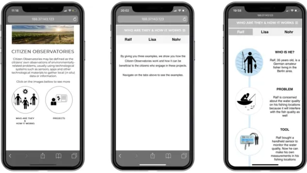
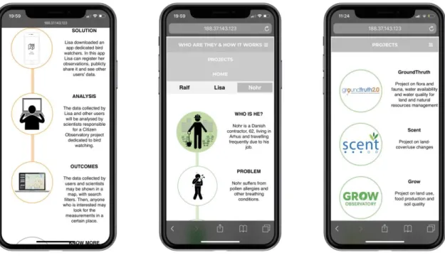
Figure 10. Mockups of the mobile version: homepage, personas front page, example of a persona ... 51
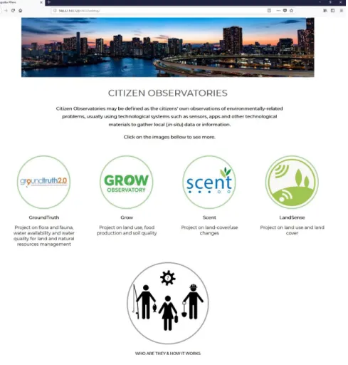
Figure 11. Mockups of the mobile version: persona page, drop menu, projects page 52 Figure 12. Print screen of the desktop homepage ... 52
Figure 13. Projects page on the desktop version ... 53
Figure 14. Personas page on the desktop version ... 54
Figure 15. Survey on the desktop version of the infographics ... 73
DECLARAÇÃO
Declaro ser autora do presente trabalho de investigação, parte integrante das condições exigidas para a obtenção do grau de Mestre em Audiovisual e Multimédia. Declaro ainda ser este um trabalho original, nunca submetido (no seu todo ou em qualquer uma das suas partes) a uma instituição de ensino superior para obtenção de um grau académico ou de outra habilitação. Afirmo também que todas as citações aqui incluídas estão devidamente identificadas, e acrescento ter plena consciência de que o plágio poderá levar à anulação do estudo agora apresentado.
Lisboa,
RESUMO
Palavras-chave
Infografia, Interação, Comunicação Visual, Observatórios de Cidadãos, Comissão Europeia
A comunicação visual tem estado presente na vida do ser humano já há vários séculos. Desde as pinturas rupestres até à inteligência artificial, a forma como o Homem comunica tem vindo a evoluir de acordo, também, com a evolução das tecnologias. Hoje em dia vivemos numa sociedade submetida constantemente a uma quantidade avassaladora de informação, ao ponto de já não ser possível ao ser humano absorvê-la toda. Neste sentido, são necessárias novas estratégias de comunicação, tornando a informação apelativa e destacando-a de tudo o resto. É aqui que a infografia adquire um papel extraordinário. Com recurso a imagens, a elementos de interação e a outros efeitos, a infografia consegue cativar o utilizador ao ponto de o envolver na própria informação. Tendo isto em mente, desenvolvemos uma infografia para explicar e disseminar um conceito científico, apoiado e financiado pela Comissão Europeia: os Observatórios de Cidadãos.
ABSTRACT
KeywordsInfographics, Interaction, Visual Communication, Citizen Observatories, European Commission
Visual communication has been present in human life for several centuries. From cave paintings to artificial intelligence, the way human beings communicate has evolved also according to the evolution of technologies. Today we live in a society constantly subjected to an overwhelming amount of information, to the point that it is no longer possible for the human being to absorb it all. Having that, new communication strategies are necessary, especially to make the information appealing and highlighting it from everything else. This is where the infographics take on an extraordinary role. Using images, interaction elements and other effects, infographics captivate the user to the point of engaging him in the information itself. With this in mind, we developed an infographic to explain and disseminate a scientific concept, supported and funded by the European Commission: Citizen Observatories.
ACKNOWLEDGEMENTS
I would like to thank the teachers of this Master degree, especially for all the knowledge and techniques they taught my colleagues and I. Specifically, I would like to give a special thank you to my two supervisors, Professor Filipe Montargil and Professor Cátia Mendonça, for the tireless support and encouragement of becoming and doing the best I could.
To Professor Filipe Montargil, thank you for introducing me to the concept of Citizen Observatories and for the endless discussions we had throughout the development of this project. To Professor Cátia Mendonça, thank you for all the tips to improve the design and interactions of the project. Without the support of both of you this project would not be the same.
To my closest friends, thank you for supporting me and this crazy idea of doing a second master. Believing in me from the very beginning was the biggest motivation you could have given me.
To my mother and brother, thank you for always being there and for supporting me no matter what. I am who I am today because of you, and I know dad would be proud, just as I know you are as well.
Last but not the least, thank you to my partner in crime: Pedro. For your unconditional help, motivation, support and love, thank you.
INTRODUCTION
Tell me and I’ll forget; show me and I may remember; involve me and I’ll understand
Chinese proverb
This Chinese proverb was first used by Xun Kuang, a Chinese Confucian philosopher that lived from 312-230 BC. It is originated in the book of Xunzi, one of the main contributions to the Hundred Schools of Thought (Schwartz, 1985). Xun Kuang was a teacher who believed knowledge would be much more effective when put into practice (Goldin, 2018).
Nowadays we live in a time where we get so overwhelmed with information that it turns out to be very difficult to keep up with everything. Making information visually appealing is one strategy to catch viewers’ attention but making them engage with information may as well be another powerful way. As we will see, people who engage with information will retain it much longer than others who don’t.
Infographics have been used for a long time now, in different contexts and for different purposes, to communicate about a given topic. The one area where this has been used probably the most is journalism. The simplicity of a lot of infographics allows journalists to communicate more easily about complicated themes, allowing anyone with or without knowledge to understand those themes.
When looking for academic works on infographics, most of what we can find is on the application of infographics to journalism, and most of them are thesis and theoretical works. This gave me an opportunity to think of a different work to present as my final one in this master’s degree.
I knew from the beginning that I wanted to develop an infographic project. However, if I wanted to pursue it, I needed to have a theme to work on. That was when I was introduced to the concept of Citizen Observatories (CO). I already knew what Citizen Science was, but I did not know what CO were. Besides that, it was not easy for me to understand how it worked. My academic background is in life sciences, so I thought that if I was having trouble understanding what CO were, people without any knowledge could face the same problem and lose interest to it. As we will see, a key factor for the success of a CO project is the mass volunteer participation from citizens, so having people not only not knowing what it is but also having no interest in knowing about it is halfway for these projects to not having the expected success.
As soon as I understood what CO were, how they worked and how important they are, I knew this master final work would be an amazing opportunity to fill two gaps: the lack of projects on infographics (not related to journalism) in the academic world, and the lack of knowledge from the general population on Citizen Observatories. These were the main reasons why I wanted to do this project in the first place. However, personal and professional reasons joined in, as I will further explain on this document.
This project consists of two main parts: this document and a functional online infographic. In this document you will find the theory that supports my work as well as the description of the methodology it was used to develop the web infographic.
This document is organised in three chapters. The first is entirely dedicated to the main theme of this thesis: Infographics. We begin by looking at the origins of infographics and how this concept evolved over the years. This is important to understand the different needs and purposes this tool has satisfied.
From journalism to design, infographics have been used in such different contexts that we found it hard to get a single definition for it. Naturally, infographics will have specific features for specific purposes. In this first chapter, we also discuss the different types of infographics, its purposes and the similarities that may or may not exist between all of them. Last but not least, we end the chapter by explaining how infographics can be a powerful communication tool and how it can make a difference in a communication strategy plan.
The second chapter is dedicated to the theme we will approach on the infographics: Citizen Observatories. This is a quite new concept in Citizen Science that, in order to work and be successful, needs mass volunteer participation from citizens. The European Commission has already invested in four CO projects, which ended by 2016. In 2017, the EU invested in four more projects that will end by 2019. In this chapter we explore this concept, its origins and how it can benefit from a better communication strategy.
And this leads us to the final chapter. This is where I explain in detail why I wanted to do a project as a final work for this master, how this idea came to life and how I developed the infographics from the start to the very end. The methodology will be described and the final mock-ups will be presented in this chapter.
With this project I also wanted to practice and improve my skills in design and code, so it was only fair that I would go beyond mock-ups and develop the infographic for the web. We decided to extend the project to the point of having something final to work and to present to the community: a functional online infographic both in a desktop and a mobile version.
I strongly believe in the quote with which I began this introduction. I believe that practice leads to a deeper knowledge, so, as a master student, I wanted to take the most out of this degree and bind together
the knowledge I acquired during this degree with my own personal interests and with the opportunity to improve my skills in design and code. With it I also wanted to bring something new to the academy, regarding infographics.
Furthermore, I was hoping I could do something that could be used (and shared) by anyone to learn about this new concept in a fun and practical way. I know now how important Citizen Observatories are, both for society and for the scientific community, so I hope that with this project I can somehow contribute to the success of this concept, through an efficient communication resource.
1. I
NFOGRAPHICSThis chapter aims to offer an overview of the main subject of this project: infographics. We will analyse its origin and definition and explore the reasons why this is such a powerful tool for communication in science and, also, in our day-to-day activity. And as this is a project on multimedia and interactive infographics, we will also overview some good practices to create infographics.
1.1. THE EVOLUTION OF THE CONCEPT
For about 32.000 years that the human being has been drawing and it is thought that cave men were the first to communicate through pictures in cave walls, where they drew everyday life elements such as animals, plants and even other people (Giovanninni, 1987; de Pablos, 1999; Cairo, 2005).
As human beings evolved, so have its capabilities of (re)presenting information. From geography to science and music, there are several examples on how the representation of data evolved until today. The oldest known map is dated 3,800 BC. It is engraved on a clay tablet and represents a region of Northern Mesopotamia (Beniger & Robyn, 1978). In 3,200 BC the Egyptian surveyors used coordinate systems to locate points in space (idem). It was also during the year 3,000 BC that Egyptians created their own system of communication, using symbols and icons, called hieroglyph. It was widely used, for centuries, to tell about everyday-life situations. Musical notation surfaced around 700 BC with the usage of about 300 symbols based on contemporary alphabet (idem).
However, probably the most outstanding breakthroughs of representing information occurred in the scientific world. Even though
there are records of earlier milestones in quantitative graphs, the first proto-bar graph for theoretical function was done by Nicole Oresme, a French mathematician, in the year of 1350 (Beniger & Robyn, 1978; Smiciklas, 2012). He created these graphs so that he was able to explain how to measure a moving object (Smiciklas, 2012). To Oresme followed Leonard da Vinci (1500, he combined written instructions with illustrations to create comprehensive and accurate illustrations on human and animal anatomy and his own mechanical inventions), René Descartes (who established the relationship between graphed line and equation, 1637), William Playfair (who invented the bar chart, 1786, the pie chart and the circle graph, 1801), and so on (idem).
The representation of data became more complex over time, especially when combining several different variables and data into only one illustration. In 1858, nurse Florence Nightingale created the Diagram of
the Causes of Mortality in the Army in the East (
Figure 2), where she illustrated the causes of the British Army’s
mortality during the Crimean War (Lankow et al., 2012). This diagram was published in the report Notes on Matters Affecting the Health,
Efficiency and Hospitality Administration of the British Army and
presented to the Parliament. It is said that Nightingale used this illustration to convince Queen Victoria to improve conditions in military hospitals (Smiciklas, 2012).
A few years later, in 1861, French engineer Charles Joseph Minard designed a diagram (
Figure 3), using flow charts to demonstrate the “successive losses of
men of the French army during the French invasion of Russia in 1812” (Tufte, 2006: 123). This seemingly complex diagram is no more than a combination of data that depicts the losses suffered in Napoleon’s army during the campaign of the invasion of Russia, in 1812. The map represents the size of the army during the conflict, its location over time, the direction of the army’s movement and the temperatures registered on various dates during the retreat from Moscow (Tufte, 2001). Tufte describes this infographic saying that “vivid historical content and brilliant design combine to make this one of the best statistical graphics ever” (Tufte, 2006: 122). This infographic ended up being the basis of Tufte’s explanation of his six essential principles for the development of a good analytical design.
Figure 3. Carte figurative des pertes successives en hommes de l'armée française dans la Campagne de Russie 1812-13, Charles Joseph
These types of diagrams began to be popular for editorial use during the decade of 1930 (Lankow et al., 2012), but it wasn’t until the Gulf War, in the early 90’s, that the revolution of infographics really began (Cairo, 2008). It was very difficult, during this specific conflict, for journalists to share information on what was happening in the war zone. The television coverage was poor, and journalists had little to no access to some of the most important and central regions of the conflict (Cairo, 2008; Rodrigues, 2013). Facing this situation, journalists had to rely on illustrations to share information on the war, especially maps and explanations of the armoury and war strategies (de Pablos, 1999; Cairo, 2008). These infographics were published in the journal USA Today and, from that day on, the journal invested in producing more and better infographics, constantly adapting to the new computer and software resources, and hiring a good team of infographers (Cairo, 2008).
Even though the usage of illustrations in the war situation was a necessity to inform, it was not enough for infographics to stand out. In fact, the breakthrough of these schematics and illustrations in the newspapers was only possible because of the emergence of the first computers and graphical softwares (Schmitt, 2006; Silva, 2010). According to Sancho (2001), the new digital era that appeared in the late 1980’s and beginning of the 1990’s opened a new phase for infographics, which took advantage of computers and new, sophisticated software for image edition. Basically, informatisation not only facilitated the production of infographics, it also made it much easier to be distributed online.
The evolution of those technologies also allowed infographics to develop into something more complex, adaptable to the new demands of an increasingly digital society. Rodrigues (2013) distinguishes three main development stages of infographics:
Linear infographics – the first web infographics, in a sequential static form, which worked better on printed journals and could be compared to storyboards or even slideshows of images with little visual narrative;
Multimedia infographics – introduction of motion pictures, sound recording, illustrations, videos and other interactive materials. Here multimedia software platform Flash is used to create pictures with movement and infographics are interactive;
Database infographics – the current stage of infographics on the web. This is characterized by the introduction of databases and a greater interactivity on the infographics, exploring Web 2.0 apps like Google Maps.
As we can see, infographics have a long history and have profited with the digital era. Nowadays we are constantly overwhelmed with new information in a lot of different formats. And while this is an opportunity for most companies to share information, it is also a big challenge for them to stand out and be able to get the consumers/users’ attention. We will see why infographics are so important and how they make a difference in sharing information in this digital era.
1.2. APPROACHES TO INFOGRAPHICS
We have seen that infographics have evolved from simple cave drawings to diagrams, data-maps and then into more complex illustrations of wars and military strategies. Tufte was a pioneer studying graphical displays and, in his book, The Visual Display of Quantitative
Information, he listed the conditions for what graphical displays should
- Show data;
- Induce the viewer to think about the substance rather than methodology;
- Avoid the distortion of significance of the data; - Show many numbers in a small space;
- Make large data sets coherent;
- Encourage comparisons to different data sets; - Reveal data from a broad view to a detailed one;
- Serve a purpose: description, exploration, tabulation or decoration; - Be closely integrated with both the statistical and verbal
descriptions of data set.
A few years later, and inspired by Minard’s data-map, he improved these conditions into six “fundamental principles for analytical design” (Tufte, 2006).
The first principle is comparison: “Whether we are evaluating changes over space or time, searching big data bases (…), the essential point is to make intelligent and appropriate comparisons. Thus, visual displays, if they are to assist thinking, should show comparisons” (Tufte, 2006: 127). Only then can we spot contrasts and differences between variables.
The second principle is causality, mechanism, structure and explanation. In Minard’s map there is no explicit explanation for the causes of death for the Napoleon army. However, the presence of the temperature graph during the withdrawal may be presented as a cause for the deaths: “simply collecting data may provoke thoughts about cause and effect: measurements are inherently comparative, and comparisons promptly lead to reasoning about various sources of differences and variability” (idem: 128).
A third principle is multivariate analysis. The six variables shown in Minard’s map explain, all together, the war of 1812: “reasoning about evidence should not be stuck in 2 dimensions, for the world we seek to understand is profoundly multivariate. Strategies of design should make multivariateness routine, nothing out of the ordinary” (idem: 130). In fact, be it the biological, physical, human or even imaginary worlds we look for to understand, they are inevitably multivariate.
A fourth principle is the integration of evidence. The map’s author gathers different types of information to describe the troop movements and the consequences of the war: “a paragraph of words, a map with narrating flow-lines, and a statistical graphic dangling from the map” (idem: ibidem). According to Tufte, words, numbers, pictures, diagrams, graphics, line-art, grids and measurement scales belong together, especially in excellent analytical graphs: “a deeper understanding of human behaviour may well result from integrating a diversity of evidence, whatever it takes to explain something. Like good information displays, explanatory investigations, if they are to be honest and genuine, must seek out and present all relevant evidence regardless of mode” (idem: 131).
The fifth principle proposed by Tufte is documentation. Both the quality and the integrity of the authors and their data sources will influence the credibility of a presentation of an evidence: “documentation is an essential mechanism of quality control for displays of evidence. Thus, authors must be named, sponsors revealed, their interests and agendas unveiled, sources described, scales labelled, details enumerated” (idem: 132).
According to the sixth principle, content counts most of all. Even though Minard’s map never mentions the word “Napoleon”, its content focuses on the human costs and not on the human survivors, which
reveals a good knowledge and caring from the author about the substance.
With these six principles, Tufte implies that graphics are meant to reveal data and that they can be more precise than “conventional statistical computations”. For this author, if all graphic elements of a given design do not communicate a specific information, then they should be omitted.
The principles enunciated by Tufte are very important for any graphical designer or infographer, however these principles are not enough, for example, for the journalists’ purposes. Tufte has a scientific approach to information visualization, where graphics and diagrams should speak for themselves. However, there are other authors that emphasize aesthetics instead. Nigel Holmes is one of those authors that stands on the opposite end of Tufte’s. He supports the use of illustration and decoration to make information design more appealing to the viewer. Both approaches (scientific and aesthetic) are valid and should be used accordingly to the objective of the design. On one hand, people with technical backgrounds such as statistics, computer scientists or engineers will naturally use the scientific approach to infographics. In this approach, information is shown in the most neutral way, encouraging the viewers to analyse and explore the data. On the other hand, designers and journalists (Cairo, 2013) will give a major importance to aesthetics. In this approach, information is embellished, and most times even organized in such a way that a narrative is built around it, easily catching the viewers’ attention to the message.
Having two alternatives does not mean that a given professional must stand by only one approach. See, for example, the illustrations on scientific papers. Whenever necessary, scientists must include in their papers graphics with results, but also illustrations that show the
procedures and methodologies used during the research. It all comes down to the goal that the communicator wants to achieve.
1.3. DEFINITION
Because infographics were mainly popularized in the journalistic context, (i) most definitions emphasize the journalistic use and (ii) there is no consensus on the best word(s) to use to name “infographics”: data visualization, graphic information, information visualization and visual storytelling.
Just like technology has evolved through times, so have infographics (as we have seen from the main stages of infographics). Depending on the format, on the support and on the objective of the communication, different perspectives on what infographics are will emerge. For some people it will be a simple graph. For other people, it will be a set of elements that combine to inform a given message. And for others, it will be the story and narrative that those elements will tell all together.
For de Pablos (1999), for example, infographic is the use of the binomial image and text (I+T) in any communication. For this author, infographics always existed, however they must be distinguished from the draws of the cave men because these had no support in a real medium of communication, as today’s have in a newspaper, for example. Furthermore, to de Pablos, “infographics” is not the same as “graphic information” because journalism has always included graphics, diagrams, maps, illustrations and images in their articles, and infographics allow to explain, through images and small texts, details that would be unnoticed otherwise. This made the author distinguish general infographics from journalistic infographics, a product of info journalism.
Alberto Cairo uses “information visualization” as a synonym to “infographics” and defines it as “any information presented as a diagram that shows the relationship between all parts of a system” (2008: 21), used with communicational purposes. In concordance with this definition of Cairo is also the definition of the Oxford Dictionary, which indicates that an infographic is “a visual representation of information or data, e.g. as a chart or diagram”1. However, for Figueiras (2014), “information
visualization is much more than the visual representation of data. It is rather the process of dissecting raw data, which by itself has little meaning and presenting it in a way that it is no longer complex” (Figueiras, 2014: 19).
Other terms have also appeared in some “how-to” books such as
Infographics: The Power of Visual Storytelling by Lankow et al. (2012),
or The Power of Visual Storytelling: How to Use Visuals, Videos, and
Social Media to Market Your Brand by Walter & Gioglio (2014). On the
former, the authors distinguish data visualization – a visual representation of data or the practice of visualizing data, using pie charts, bar graphs, line charts, etc. (Lankow et al., 2012) – from infographic – an abbreviation of information graphics – from editorial infographic – “an infographic for use in print, an online publication or a blog” (Lankow et
al., 2012). On the latter, Walter and Gioglio define infographic as visual
representations of information, bringing together the data and visuals to tell a story; but they also introduce the concept of visual storytelling: “defined as the use of images, videos, infographics, presentations, and other visuals on social media platforms to craft a graphical story around key brand values and offerings” (Walter & Gioglio, 2014).
Having all these different definitions to the same word and having all these terms can be confusing, especially when there is scarce academic
work on the subject. As we can see, all these different authors stand by their own definitions of infographics, some of them even giving it a different word. However, we can also see that they all agree in one thing: infographics are a little more than the visual representation of information.
It is the dissection of raw data and information into something simpler and easier to understand for the regular public, like diagrams, charts, schematics, images and little pieces of text. For authors like Tufte, de Pablos, Figueiras and even Cairo (for whom infographics and information visualization are the same), this is what infographics are all about, as long as the connections between all data and information can be perceived by anyone who reads and interprets the infographics. Authors like Lankow and Walter and Gioglio go a little further, introducing a narrative component to the infographics. The latter authors stand for a more editorial/aesthetic approach of infographics while the former stand for a more scientific approach.
This project aims to build an infographic that may be published in a specific website and shared online. And for this reason, during this whole project we will be using infographics with an editorial/aesthetics approach.
1.4. FEATURES OF INFOGRAPHICS
We have seen before in this project that Tufte was a pioneer in identifying the main features for a good graphic design and, later on, he even enunciated the six fundamental principles for analytical design (2006). And even though these principles remain true to these days and are used by many graphic designers, they are also mainly important in infographics that stand in the scientific approach. Regarding the
aesthetics/editorial approach, we have also seen that having a good narrative is also a must-have feature for any infographic.
A common thing among all infographics is their structure: a good infographic should have a title, a small introductory description of the theme, the illustration itself (with subtitles, preferably), conclusions (if necessary) and the sources. These items provide guidance on how to read the infographic, contextualizing the reader on the theme. The sources are relevant to give credibility to the information.
Infographics may have other features that make them more appealing and engaging, especially when used in an editorial/aesthetics approach. Animations, for example, can do such a good work catching the users’ attention. Buttons, search engines, actions giving the opportunity for the user to change, insert, select, choose, reveal or hide information, they can also do such work. These features allow the user to interact with the infographics but also to engage with it, at the same time they give the user an opportunity to explore more freely the data at his/her own pace. Those interactive features are a result of the evolution of infographics. Linear infographics (mostly static images for print purposes) and some multimedia infographics (animations and videos) only require the viewer to see and absorb the information that is being presented to him/her. This is a linear (or one-way) form of communication and the user is passive towards it. Nowadays, database infographics and some multimedia infographics allow the user to be active towards it, by clicking, inserting data, changing the dynamics of the infographics, and so on.
To understand what interaction and interactivity are, is to understand how these features are used in infographics to make them more engaging and a more powerful communication tool (Figueiras, 2015). Interaction is defined by Wagner as “reciprocal events requiring two objects and two actions” (1997: 20) that happen when “objects and events mutually influence one another” (idem: ibidem). Interactivity is defined as the
technological capability for making connections from one point to another in real time. This author employs “interactivity” in a context of distance learning experience and “interaction” as the behaviour from one individual or group of individuals that influence one another (idem).
Interaction, therefore, requires agents between which the action takes place. In this context of distance learning, the actions can take place between (i) learner and instructor, (ii) learners and (iii) learners and the medium they are learning from (idem). However, they can be extended to all contexts: (i) user and designer, (ii) users and (iii) users and the viewing medium (web page, print page).
Interactions have several outcomes, amongst which are changing learners/users and move them towards an action that allows them to achieve a certain goal (idem). In fact, Wagner classifies interactions into 12 different types, according to their objectives, all in the learning context, even though they can also be applied to any other context:
interaction to increase participation (related with the individual willingness to engage in the learning process);
to develop communication (ability to exchange information without the fear of being misjudged);
to receive feedback (feedback is defined here as “any information that allows learners to judge the quality of their performance” (idem: 23));
to enhance elaboration and retention (ability to find alternative examples to explain one idea, making new information more meaningful);
to support learner control/self-regulation (capability of staying focused on a task and recognizing when it needs more or when it is a completed task);
to increase motivation (interaction here in the sense that it allows the learner to find the answers to his/her questions or to clarify subjects);
for negotiation of understanding (ability to use the learner’s understanding to make decisions);
for team building (ensures that individuals support the objectives of the group);
for discovery (when people argue with each other in order to reach a conclusion);
for exploration (this leads to the interaction for discovery as it helps define parameters that will differentiate new and old knowledge);
of clarification of understanding (ability to know if what one person is saying is what she intended to say in the first place);
for closure (ability to know when the learning process is over).
A good infographic that uses interaction features may seek for more than just one of those objectives. An infographic may (and should) have interaction features to increase participation, to enhance elaboration and retention and to increase motivation, at the same time it urges the user, who seeks for clarification of understanding, to discover and explore the contents of the infographic.
To achieve those goals, interaction makes use of some features like buttons, filling fields, search boxes, etc. These features may be organized in different styles (Rogers et al., 2011), categories (Behrens, 2008) and techniques (Figueiras, 2015).
Rogers, Sharp and Preece (2011) have a broader view of interaction and define four different styles of interaction:
- Instruction: the simplest type of interaction in which the user tells the infographics to do something, whether through buttons, commands or clicking on the mouse;
- Conversation: a “futuristic” style with which the user will be able to change the parameters of the infographics by speaking to the phone instead of typing;
- Manipulation: “we allow manipulation when we let readers change the structure and appearance of what is presented to them, so they can achieve certain goals” (Cairo, 2013). An example of this could be the IKEA software that allows the user to build their own room with the types of furniture they choose;
- Exploration: the tool that allows the user to navigate inside graphics, especially used in 3D models.
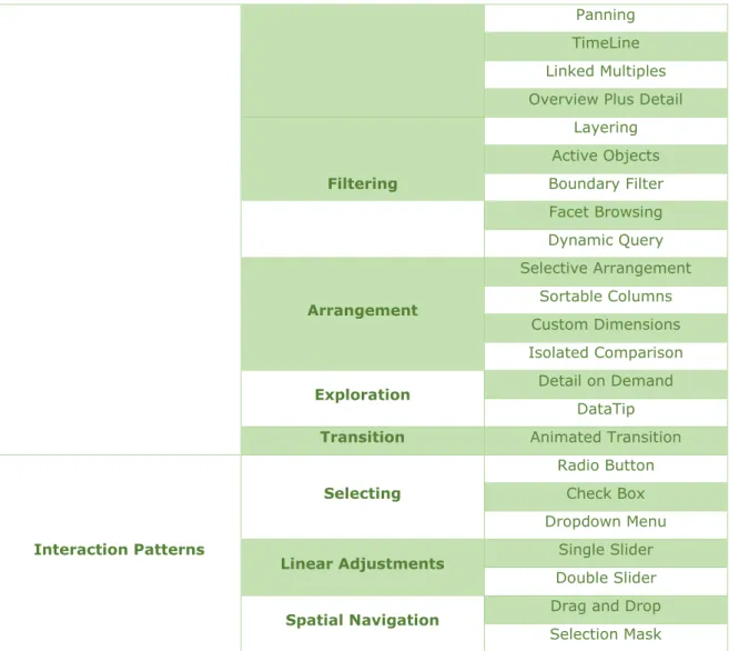
Behrens is more specific and introduced a collection of design patterns for interactive information visualization that “provides a fundamental overview of tools and methods for data visualization in different contexts” (2008: 36). Each of those patterns have a fixed position within a hierarchical order structure that allows the user to select the subset that fits best his/her specific needs (idem).
On the top level of the hierarchy are display patterns, which describe “how information is depicted in the context of certain data material and usage purposes” and includes correlations, proportions, hierarchies and networks, for example; following display patterns we can find behavior patterns that deal with the features that provide dynamism to the interactive infographics (i.e.: functionalities that allow to navigate a map or filter data on a chart); and finally we have interaction patterns that includes the essential elements of the interface that let the user give
On one hand, on the behavioral pattern, the user can navigate, filter, arrange, explore and transition the data. On the other hand, the interaction patterns allow the user to interact with an infographic in the Boolean language: “either he selects an element, or he doesn’t” (idem: 171); allow the user to explore large data based on intervals; and to navigate within a spatial display. Within these patterns, we can find interaction techniques such as those proposed by Figueiras (2015): filtering and selecting, abstract/elaborating, overview and exploring, connect/relating, reconfiguring, encoding, history, extraction of figures, participation/collaboration and gamification.
We summarized the patterns and their techniques on Table 1.
Display Patterns
Correlations Scatterplot
Bubble chart
Continuous Quantities
Simple line chart Multiset line chart Stacked Area Chart
Sparklines
Discrete Quantities
Simple bar chart Multiset bar chart
Dot matrix
Proportions Simple pie chart
Ring chart
Flows Sankey diagram
Thread arcs
Hierarchies Tree diagram
Tree map
Networks
Tree diagram Relation circle
Pearl necklet
Space Topographic map
Thematic map
Behavioral Patterns Navigation Simple zoom
Panning TimeLine Linked Multiples Overview Plus Detail
Filtering Layering Active Objects Boundary Filter Facet Browsing Dynamic Query Arrangement Selective Arrangement Sortable Columns Custom Dimensions Isolated Comparison
Exploration Detail on Demand
DataTip
Transition Animated Transition
Interaction Patterns
Selecting
Radio Button Check Box Dropdown Menu
Linear Adjustments Single Slider
Double Slider
Spatial Navigation Drag and Drop
Selection Mask
Table 1. Behavioral Patterns and Interaction Techniques (an adaptation of Behrens, Rogers et al’s and Figueiras, elaborated by the author)
Even though this table is an adaptation of Behrens’ classification, the styles of Rogers et al. and the taxonomy proposed by Figueiras are also included. For example, Behrens navigation and arrangement includes Figueiras filtering, selection, overview and exploring, which are all included in the instruction style of Rogers et al..
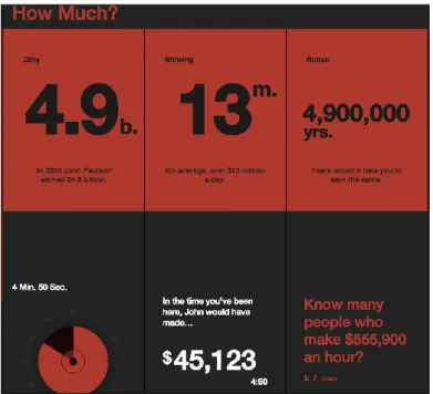
Even though the classification of Behrens is very accurate, it does not seem to include an option of data input. This is a recent feature, result of the emergence of data-based infographics, which allow the user to insert
example, the infographic called “You vs John Paulson”2 (online) requests
the user to introduce his/her salary and calculates how long it takes John Paulson, a super-trader, to earn his/her salary. The results are then shown in a dynamic infographic (Figure 4 and Figure 5).
Figure 4. Infographic “You vs John Paulson” (front page)
Figure 5. Infographic “You vs John Paulson” (output of thedynamic infographic)
Other features are slowly emerging, such as what Rogers et al. call
conversation and Figueiras calls participation and collaboration.
The former is simply a different way for the user to give information/data to the infographics, however, the latter goes even further, by allowing anyone to contribute to the visualization, interpretation or understanding and sharing of their own insights. This concept of participation and collaboration rose from blogs and forums and is now being applied to visualization. Take as an example the Home and
Away: Iraq and Afghanistan War Casualties3 infographics. This is a
web-based visualization by CNN that maps the fallen soldiers in Afghanistan and Iraq wars. It allows the users to add information (memoirs, videos, photos) about each soldier on their profile visualization.
Interactivity has been used in information visualization mostly to make data more engaging or playful. It gives infographics, in this case, a more engaging way to absorb knowledge and to learn. If an infographic has interactivity displays and allows interaction with the user, it becomes an even more powerful tool than it has been. Just like Figueiras (2015) claims, employing interactive techniques gives “users the ability to properly explore the data and find appropriate answers to their questions” (idem: 140), making visualization an exploratory activity rather than an explanatory one. If an infographic really takes advantage of this technique, it should not be considered a linear form of communication, but a non-linear (or two-way) one.
Considering the definitions of both interactivity and interaction, we propose a classification of infographics by type of interaction:
- Linear infographics: infographics for editorial use or for web publication that includes static photographs or illustrations, accompanied or not by small parts of texts. All the information the user needs to understand the communication is available, so it is expected that the user only observes the information and will be able to take conclusions;
- Non-linear infographics: infographics for the web that have interactivity displays and allow interaction between the presented information and the user. This type of infographics allows the user to explore it and find new information, through several different types of mechanisms that give the user a feedback on his/her actions on the infographics. It can be:
o Explorative infographics: which include all the simple actions like clicking on buttons, scrolling the page and all navigation settings such as zooms, panning’s and arrangements; o Limited Manipulative infographics: infographics that change
the information according to an existing database. In these infographics the user is allowed to filter information (either by layering, check boxing or adjusting with sliders) and to select types or categories of pre-existing categories;
o Unlimited Manipulative Infographics: infographics that allow the user to introduce any values and that show information accordingly.
1.5. INFOGRAPHICS AS A COMMUNICATION TOOL
We live in a society that has been transformed by the Information Age, which made it possible to produce and share large amounts of information much faster than ever before. However, this production is so large that human beings are now living overwhelmed with information
(Figueiras, 2013). “As a result, it is increasingly difficult to get people’s attention, since they’re constantly bombarded with various stimuli throughout the day...” (Lankow, et al., 2012: 40). Considering this situation, making information look appealing “makes it easier to understand, to scheme, to recognize patterns and to make inferences upon the data” (Figueiras, 2013: 351), which is why we believe it is so important to use infographics. Furthermore, the growing use of ICT and social media made it easier to share contents on Internet (idem).
As Ware points out:
“(...) some visual languages are easier to “read” than others. But why? Perhaps it is simply that we have more experience with the kind of pictorial image shown in the cave painting and less with the mathematical notation. Perhaps the concepts expressed in the cave painting are more familiar than those in the equation.” (2004: 6).
There are a few reasons for why humans find it easier to process visual information, with biology being the most important.
The human brain processes visual information much faster than any other type of information because half of it is dedicated to visual activities (Sheth et al., 1996). When reading a text, the brain interprets letters as symbols, which means that to read something, the brain needs to decode those symbols and give them a meaning. Therefore, it is physically easier for the brain to read pictures instead of words.
Besides, the human brain filters most of the sensory information received, however every new (or unusual) information that is perceived catches the brain's attention (Wolfe, 2001, in Smiciklas, 2012). This is related with the principles of Gestalt psychology, formulated in 1980’s by cognitive scientists. They described human perception of visual elements
on a low cognitive level in relation to visual qualities of a given object (Julesz, 1981 in Behrens, 2008).
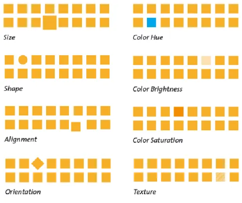
These visual elements, or attributes, of graphic objects are noticed unconsciously, or preattentively, by human perception, which is why they are called “preattentive variables”. Colour hue, brightness, shape, size, orientation and texture are some of the first variables to be identified and that have been used in information design (Behrens, 2008).
As seen in Figure 6, within a matrix of yellow squares, a circle or a blue square would stand out at first glance. In the real world, this happens when, for example, we look at a street with a lot of traffic and identify the lights of an ambulance or of a police car.
Figure 6. Fundamental preattentive variables predominantly used in information design
(Behrens, 2008)
These preattentive variables are very important for designers to create a good infographic. Steve Krug, usability expert, underlines this
dimension: “a fundamental requirement for web interfaces that equally applies to any successful infographic: Don’t make me think!” (Behrens, 2008: 25). As Behrens claims, “Information Design is the practice of enabling communication between unequal partners: data (complex, professional, condensed) on one side, and the user (unexperienced, impatient, inattentive) on the other” (idem: ibidem).
Fleming & Mills (1992) created the VARK Model of Learning which states that human beings use four styles to process information: visual (charts, maps, and diagrams), auditory (listening), read and write, and kinesthetics (by experiencing). “Fortunately, connections have been made recently between the illustrative elements of graphics and the retention rates of the information displayed – and these connections can help us all figure out how to have people remember our material” (Lankow et al., 2012: 30).
Having the VARK model in mind we can see that infographics not only inform but they can also teach more effectively than other types of mediums alone, especially when they effectively combine different types of mediums in one single infographic.
“The visualization of information is enabling us to gain insight and understanding quickly and efficiently, utilizing the incredible processing power of the human visual system” (idem: 12). As Finke et al. put it, infographics…
“(...) can be useful to employ a visual, symbolic metaphor to clarify the context of the graphic and rouse the viewer interest. For example, bank accounts can be represented by piggy banks, making the graphic more inviting without changing the content. It is important that the metaphor be appropriate to the statement and familiar to the target audience for the graphic to avoid misunderstandings.” (2012: 96).
For an infographic to communicate any subject, it must present the data efficiently, allow the free exploration of the data, be visually appealing, enable understanding of the information and make the knowledge memorable (Figueiras, 2013; Cairo, 2013; Lankow et al., 2012).
Graphics should not simplify messages but instead they should clarify them, highlighting trends, uncovering patterns and revealing information that was not visible before (Cairo, 2013). It is important, though, that infographics don’t fall on what Edward Tufte called a chartjunk, that is, a beautiful chart with no meaning nor information.
We have also seen that a narrative is an important part of infographics, especially when used for editorial purposes. David McCandless, author of the book Knowledge is Beautiful, wonderfully summarizes the components necessary for a good information visualization (Figure 7).
Figure 7. What Makes a Good Visualization? (McCandless)
As we can see in Figure 7, McCandless highlights information, story, goal and visual form as the main elements for a good information visualization, which is only successful when all components are combined. Otherwise they can easily be boring or useless: “Something that looks good but isn’t that interesting” (McCandless, 2014)4.
As we have seen by now, infographics can be a powerful tool to communicate data, a subject, an idea or even a concept. As Cairo (2013) claims, “an infographic is a tool for the designer to communicate with readers, and a tool for readers to analyse what’s being presented to them”. Having that, infographics bring important benefits when it comes to the learning processes: enhances the ability to think critically and to
develop and organize ideas; improves comprehension, retention and recall of information; helps reduce the cognitive load, leaving space to learn more new material.
They have the power to amuse the viewer at the same time it informs, teaches and even raises awareness. With that power, it helps solving analysis and comprehension problems.
2. CITIZEN OBSERVATORIES
In this chapter we will make a brief contextualization of the concept of Citizen Observatories, mentioning Citizen Science projects that have resorted it. We will explore its origins, define it and highlight the importance of this concept both to science and society.
2.1. CONTEXTUALIZATION
Nowadays there is plenty information on Citizen Science (CS) (Cohn, J., 2008; Bonney et al, 2009; Silvertown, 2009; Conrad & Hilchey, 2010; Bonter & Cooper, 2012; Hunter et al., 2012; Jordan et al. 2012; Bonney
et al., 2014; Socientize Consortium, 2014; Jordan et al., 2015; Liu et al.,
2017) that explain what it is, its origins and how it works.
On Citizen Observatories (CO), however, there is little information, maybe because it is a quite recent concept that began to make its firsts steps a few years ago (Liu et al., 2017; Montargil & Santos, 2017). However, the European Union (EU) has already been investing significantly in Citizen Observatories’ projects.
Citizen Science is a “partnership between those involved with science and the public in which authentic data are collected, shared and analysed” (Jordan et al. 2012: 307), that is, the "activities of non-scientist citizens that contribute to scientific research" (Liu et al., 2017: 352).
These activities are very important because they allow scientists that lack time, resources and/or money to collect big amounts of data or to cover large geographic areas (Dickinson et al., 2010; Tulloch et al., 2013) while it raises awareness to scientific and societal problems.
According to Liu et al. (2017), there are three reasons for the expansion of CS in these last decades: (i) fast changes within Information and Communication Technologies (ICT's), such as easy Internet access,
management and storage of data; (ii) societal changes; and (iii) the scientists’ increasing awareness of the benefits that come from the public engagement in the scientific work (data gathering, for example).
Before all this technology was available, the production of geographical information was a responsibility of national agencies, usually under the supervision of military control (Goodchild, 2007). These agencies conducted surveys and interviews to citizens to establish, for example, names of streets. The results of such interviews and questionnaires were then published in printed maps and, a few years later, on digital data sets (idem). However, these processes of getting information were too expensive for the governments to carry on, which allowed partnerships between the government and the private sector to come up with solutions that would be a lot more viable to proceed with the production of geographical information (ibidem).
Among these solutions emerged the concept of Community-Based Environmental Monitoring (CBM) system, which is “an organized way of collecting household level information at the local level for evidence-based policy making by local government units in partnership with national government agencies, NGOs and civil society for planning, program implementation and monitoring” (CBMS Network)5.
A few years later, and motivated by the emergence of Web 2.0 technologies, the concept of CBM evolved to Volunteered Geographic Information (VGI). VGI is the exploitation of tools to create, organize and disseminate geographic data by volunteers (Goodchild, 2007). Take as an example Google Earth, which service is used by millions of people and which Application Program Interface (API) “allows any user to create and publish new content, in the form of layers that can be viewed over the
5http://siteresources.worldbank.org/PSGLP/Resources/CommunityBasedMonitoringSystem.pdf
https://www.pep-net.org/sites/pep-net.org/files/typo3doc/pdf/CBMS-GRB/METHODOLOGY_WORKSHOPS/Tool_fight.pdf
Google Earth imagery base” (Goodchild, 2007: 8). Other similar examples include Flickr and OpenStreetMap.
While CBM emerged as an answer to a problem - the gap of information between local and national government agencies -, VGI came to light because there was a sudden development of new technologies that allowed anyone, with or without specific knowledge, to take advantage of those technologies at the same time that provided important geographic information.
Citizen Observatories, as we will explain in detail on the next chapter, are used by the EU as a subsystem of Citizen Science that uses mostly smartphones to gather in situ information from an earth observation system (Montargil & Santos, 2017). The EU requires the cooperation of citizen observatories with global repositories of information from earth observation systems (such as the European Copernicus satellite program) and the Global Earth Observation System of Systems (GEOSS), where all data should be made available (European Commission, 2014).
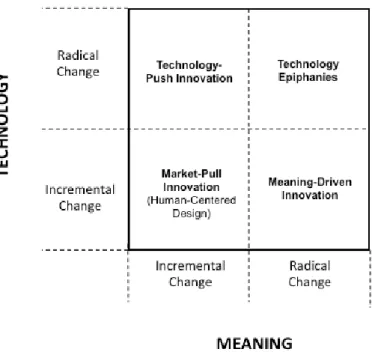
Norman and Verganti, in their paper Incremental and Radical
Innovation: Design Research vs. Technology and Meaning Change,
explore the evolution of innovation. They introduce two dimensions and four types of innovation (Figure 8) - Technology and Meaning dictate if an innovation is considered a Market-Pull, a Technology-Push, a Technology Epiphany or a Meaning-Driven Innovation:
“HCD [Human-Centred Design] leads to incremental change, and although it allows for local, linear changes in technology and meaning, basically it keeps the product within the lower left quadrant. Radical changes in technology can lead to radical technology-driven innovation: for example, the introduction of colour TV. Radical changes in meaning can lead to radical meaning-driven innovation, as in the switch from
new technology and new meaning to radically change the space of video games. This dual change is rare and more dangerous: consumers tend to resist massive changes.” (Norman & Verganti, 2014: 12)
Figure 8. The two dimensions and four types of innovation (Norman & Verganti, 2014: 12)
According to Norman and Verganti (2014), these types of innovation can be defined as:
Technology-Push: this innovation comes from radical changes in technology but without change in the meaning of a product, nor with any influence of the user. Color TV is an example. Meaning-driven innovation: changes in socio-cultural models
lead to radical changes in meanings and products, “often implying a change in socio-cultural regimes” (idem: 13), but without the interference of new technology. The mini-skirt in the 60’s is an example because the skirt was completely different from what was common, and became a symbol of women’s freedom (ibidem).
Technology Epiphany: this type of innovation does not come from users because it does not satisfy a user’s need. This occurs when a new technology emerges and brings with it a radical change in meaning. The Wii video game console is an example, because with new sensor technology, it allowed non-experts to play games controlled by body movements, in a time when Massively Multiplayer Role-Playing Online Games dominated the video games industry.
Market-Pull: the analysis of users’ needs leads to the development of new products that satisfy those needs.
Attending to the history and evolution of Citizen Observatories, we could see the innovation process as in the
Figure 9:
All in all, Citizen Observatories can be considered a process of technology push. That is, there was a change in the meaning of how to take advantage of the already existing technology. However, it was the emergence of Web 2.0 technologies that allowed VGI come to life. And then occurred another meaning change, which allowed ultimately the emergence of Citizen Science and Citizen Observatories.
However, as Montargil & Santos (2017) put it, CO cannot be only considered a process of technology-push innovation. Because CO depend so much on users’ participation, “users’ needs and expectations must be a central component from an early stage” (Montargil & Santos, 2017). This is why CO should (and must) have a strong market-pull innovation component as well (idem).
2.2. DEFINITION
Citizen Observatory is a relatively new concept. It was created in the follow up of the EU SOCIENTIZE project (2012-2014) and introduced in the project "Eye on Earth" (Liu et al., 2014). However, this concept was only allowed to emerge because of the development of community-based environmental monitoring and volunteered geographic information (Montargil & Santos, 2017).
There are two main approaches to define Citizen Observatories: the one that focuses on citizens and the one that focuses on science. Both approaches are interesting and useful, however while the former worries about the understanding of citizens on environmentally-related problems, the latter worries about their contributions to gather more in situ information. Authors such as Liu, Kobernus, Broday and Bartonova stand for the societal approach. The European Commission, however, gives great relevance to the second.
Liu et al. (2014) define Citizen Observatories as "the citizens' own observations and understanding of environmentally-related problems, and particularly as reporting and commenting them" (Liu et al., 2014: 4), usually using technological systems such as sensors, apps and other technological materials to promote communication and share data.
The European Union (EU), who started to invest on CO’s in 2012, adopts a definition for CO’s directly related to Earth Observation Systems (Montargil & Santos, 2017): “a citizen observatory is a subsystem that uses devices (mostly smartphones) operated by citizens to gather information used as in situ input from an earth observation system” (idem: 169; European Commission, 2014).
Earth Observation Systems use satellites for the observation of earth-related variables in a long-term perspective (Montargil & Santos, 2017), as well as use and integrate in situ information. For example, Copernicus is the European Earth Observation program (in partnership with the European Space Agency), designed specifically to collect data, through a specific set of systems, regarding six thematic areas: land, marine and atmosphere monitoring, climate change, emergency management and security. In 2018, this program celebrates its 20th birthday with seven
satellites (called sentinels) in orbit that provide access to thousands of terabytes of free data. Its satellites are complemented by in situ sensors such as ground stations and ship- or buoy- sensors. The information collected by these sensors will help calibrate, validate and fill the information gaps provided by the satellites.
To increase the importance of citizen participation on environmental issues as well as raise awareness on decision-making policies, the EU developed five projects under the FP7 (Framework Programme 7) topic ENV.2016.6.5-1 Developing community-based environmental monitoring
Citclops - Citizens' Observatory for Coast and Ocean Optical Monitoring. This project intended to develop “systems to retrieve and use data on seawater colour, transparency and fluorescence, using low-cost sensors combined with contextual information and a community-based Internet platform” (European Commission, 2014: 4). From October 2012 to September 2016;
CITI-SENSE - Development of Sensor-based Citizens' Observatory Community for Improving Quality of Life in Cities. The purpose of this project was to develop and test “an environmental monitoring and information system focused on atmospheric pollution in cities and agglomerations” (European Commission, 2014: 4). From November 2012 to October 2016;
COBWEB - Citizen Observatory Web. Development of a CO’s framework to enable citizens “living in the UNESCO World Network of Biosphere Reserves (WNBR) to collect environmental information on a range of parameters including species distribution, flooding and land cover and use, giving them the opportunity to participate in environmental governance” (European Commission, 2014: 4). From November 2012 to October 2016;
OMNISCIENTIS - Odour Monitoring and Information System based on Citizen and Technology Innovative Sensors. In this project citizens acted as human sensors to odour perception, discomfort and nuisance (European Commission, 2014). From October 2012 to September 2014;
WeSenseIt - Citizen Observatory of Water. Addressed the “entire hydrologic cycle with a major focus on variables responsible for floods and drought occurrences” (European Commission, 2014: 5). From October 2012 to September 2016.
When these four FP7 projects finished, the EU funded a new set of four projects, under the Horizon 2020 programme. These projects started in 2016 and will run until 2019:
Ground Truth 2.0 - “Environmental knowledge discovery of human sensed data”. This is a three-year project that debuted on September 1st, 2016 and that is setting up and validating six citizen
observatories in real conditions: four in Europe (Belgium, Netherlands, Spain and Sweden) and two in Africa (Kenia and Zambia). The focus of this CO project is on flora and fauna, water availability and water quality for land and natural resources management;
LandSense - “Citizen Observatory and Innovation Marketplace for Land Use and Land Cover Monitoring”. This project is building an innovative citizen observatory in the field of Land Use Land Cover (LULC), which collects data both actively (through citizens) and passively (from authoritative, and open access sources) and integrates them to provide valuable quality-assured in-situ data for SMEs, larger businesses, government agencies, NGOs and researchers;
Scent. Running between 2016 and 2019, this project will engage citizens in environmental monitoring. It is intended that the citizens will support the monitoring of land-cover or use changes using their own smartphones and tablets and a toolbox developed specifically for this purpose;
Grow Observatory. This project aims to engage thousands of growers, scientists and others passionate about the land, creating a sustainable ownership of land and soil, whilst meeting the
prepare for climate events by validating the detection of soil moisture from a technology assisted by satellites.
2.3. WHY IS IT IMPORTANT?
“Every human is able to act as an intelligent sensor, perhaps equipped with such simple aids as GPS or even the means of taking measurements of environmental variables” (Goodchild, 2007: 9). CO's allow anyone interested to participate actively in observations and monitoring activities.
This brings a few advantages for science and community: it raises citizens' perception for the environmental and governmental issues; it enables dialog among scientists, the population and policy-makers which leads to a gain on economic value as it also raises the low or zero cost acquisition of data (Liu et al., 2014; European Commission, 2014). Indeed, the cost-benefit ratio seems to be the most expected impact for the EU:
Lowered cost and extension of the in-situ component of the GEOSS and Copernicus initiatives. Better decision-making through the empowerment and active role of citizens and citizen's associations in environmental monitoring, co-operative planning and environmental stewardship, with special impact on land resources management. Enhanced implementation of governance and global policy objectives. Increased deployment and market uptake of innovative in-situ monitoring techniques. Increased European role in the business of in-situ monitoring of the environment.6