A Survey of Usability Issues in Mobile
Map-based Systems
Sadegh Karampanah
Supervisor: Prof. Dr. Christian Kray
Co-supervisors: Dr. Morin Ostkamp and Dr. Sven Casteleyn
Submitted in partial fulfilment of the requirements for the degree of Master of Science in Geospatial Technologies
Institute for Geoinformatics (ifgi) University of Münster
ACKNOWLEDGEMENTS
First, thanks to GOD, the main source of love and energy, then thanks to Prof. Dr. Christian Kray for teaching us how to convey our love and energy to the knowledge and for his kindness that always during his supervision was helping and even during holidays and the times he was travelling.
Thanks to my co-supervisor, Dr. Morin Ostkamp for his constructive criticisms always was helpful and many thanks to my second co-supervisor Dr. Sven Casteleyn from University of Jaime I.
My thanks to all academic and administrative staffs of institute for geoinformatics (ifgi) in University of Muenster.
ABSTRACT
How geospatial information could be represented in map or other forms of communication to display in mobile phones to convey spatial knowledge to users more effective and efficient with less ambiguity? This triggering question stems from the usability problems available in mobile map-based systems, that made using mobile navigation services and applications for pedestrians, a tedious and complicated task which is rather confusing to be helpful. Problems such as; losing the spatial overview of the area, overload of information in small screens of mobile phones, visibility issue of off-screen entities, weaknesses in orienting users with real environment, too much engagement of users with interface which causes environment distraction and so on. There are a lot of solutions have proposed to mitigate these available issues in mobile map-based systems, but each one has its pros and cons that is not complete enough to tackle above mentioned issues alone, and most of the time a combination of them is proposing. We tried with systematic literature review (SLR) that is more reliable, replicable and valid [1], find the most frequently applied usability evaluation method in the available studies to detect the usability issues in mobile map-based systems (MMSs), then find the most frequently usability issues that detected among the reviewed literatures and how to categorize them, in what contexts they mostly happened and what solutions proposed so far to resolve them.
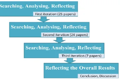
We operated tree iterations of systematic literature review (SLR) with totally 8667 identified publications (within 6 relevant databases and a search engine with priority of 4 most prominent and relevant journals and conferences in the field of mobile HCI and
location based services), that 196 one of them included in first screening1, were thoroughly read in order to check with predefined inclusion criteria and overall, 56 papers (between those 196 papers) that qualified with our well-defined and updated inclusion criteria properties read in-depth at least two times to extract the data. In the first iteration 25 papers have reviewed and relevant data with considering our research questions has extracted and reflected in the first iteration table. In the second iteration, 24 papers which had adjusted inclusion criteria parameters have included to data extraction for filling the updated table. The last iteration according to the scarcity of publications in this realm and time limitation, has operated only with 7 literatures and relevant data extracted to fill in the last updated table.
Results of the SLR showed the most frequently usability evaluation method was “Questionnaire” to achieve effectiveness and efficiency of the system, and the most frequently usability issue that detected within available literatures was “losing the spatial overview” which followed by “too much zooming and panning operations by users” that stems from the same problem; small screen size of mobile devices. We categorized the issues into two main groups of technological and spatial issues, which we only here focused on the usability issues relevant to map interfaces in mobile phones (spatial issues), not the technological problems relevant to the server or the hardware perspective (sensors, connectivity, battery drainage, GPS accuracy etc.). We have noticed the most frequently usability issue has happened in the mobile phone with average screen size of 3.83 inches, 87% of the cases in the laboratory environment, with users (not experts) with
average age of 26 years old that 64.2% of them had relevant knowledge (GI2 knowledge).
1 First screening only done by scanning the title, keywords, abstract and in some cases the conclusion
section
2 Geospatial information (recruited from students, alumni or authorities of GIScience field that had at
The low amount of field-based studies highlights the lack of considering real context in available case studies that in usability evaluation of location based mobile systems is highly important. Some traditional solutions have proposed to address the most frequently occurred usability problem in mobile map-based systems such as the techniques for visualizing the off-screen objects (such as Overview&Detail, Scaled Arrows, Wedge etc.) and some techniques for enhancing the zoom and pan operations (such as vario-scale maps, semi-automatic zooming (SAZ), tilt zooming, content zooming, anchored zoom etc.) that none of them were not completely suitable enough to be applied in these systems and the most famous systems such as Google Maps still working without taking advantage of such approaches, techniques and widgets, with a lot of usability issues.
TABLE OF CONTENTS
Acknowledgements ... i
Abstract ... ii
Table of Contents ... v
List of Abbreviations ... vii
List of Figures ... viii
List of Tables ... ix
Chapter 1: Introduction ... 11
1.1 Introduction ... 11
1.1.1 Aim and Objective ... 12
1.1.2 Theoretical Framework and Background ... 13
1.1.2.1 Mobile Map-based Systems (MMSs) ... 13
1.1.2.2 Usability evaluation ... 14
1.1.2.3 Systematic Literature Review (SLR) ... 16
1.1.3 Research Questions ... 18
1.2 Methodology ... 19
1.3 Thesis Outline ... 20
Chapter 2: First iteration ... 22
2.1 Searching... 22
2.1.1 Search priorities ... 23
2.1.2 Search Strings and their Results ... 24
2.1.3 Inclusion Criteria ... 25
2.2 Analysing ... 26
2.3 Reflecting the Results ... 27
2.3.1 Spatial issues ... 34
2.3.2 Technological issues ... 44
2.4 Conclusion on the first iteration ... 45
Chapter 3: Second iteration ... 50
3.1 Searching... 50
3.1.1 Search priorities ... 52
3.1.2 Search Strings and their Results ... 53
3.2 Analysing ... 55
3.3 Reflecting the Results ... 55
3.4 Conclusion on the second iteration ... 66
Chapter 4: Third iteration (Last one) ... 68
4.1 Searching... 68
4.1.1 Search Strings and their Results ... 69
4.2 Analysing ... 70
4.3 Reflecting the Results ... 72
Chapter 5: Results ... 78
Chapter 6: Discussion... 89
Chapter 7: Conclusion ... 95
Chapter 8: Bibliography ... 98
LIST OF ABBREVIATIONS
UCD User-centered design
UX User Experience
HCI Human Computer Interaction
SLR Systematic Literature Review
LBS Location Based Services
GIS Geographic Information System
LIST OF FIGURES
Figure 1-1: software development process of ergonomics of human-cantred design
(ISO 9241-210) ... 15
Figure 1-2: outline of the methodology ... 20
Figure 2-1: The time distribution of the included papers in first iteration ... 27
Figure 2-2: The context that the most frequently usability issue has happened in the first iteration ... 31
Figure 2-3: (a) Scaled Arrows, (b) Wedge, (c) Overview + Detail [22]. ... 38
Figure 2-4: Reversed overview + detail mobile map [13]. ... 39
Figure 3-1: The time distribution of the second iteration publications. ... 55
Figure 3-2: The context that the most frequently usability issue has happened in the second iteration. ... 66
Figure 4-1: The time distribution of the third iteration publications. ... 70
Figure 4-2: Usability metrics with measurable criteria ... 72
Figure 4-3: Map view, Map with route view, satellite view, text view, map and street view, street view [54]. ... 74
Figure 5-1: losing overview and too much zooming and panning operations ... 79
Figure 5-2: the overall context that the most frequent usability issue happened ... 80
Figure 5-3: Time distribution of all 56 reviewed papers ... 83
Figure 5-4: all types of questionnaire have used in the SLR. (Colourful and highlighted ones are the most frequently used and common between different methods) ... 84
LIST OF TABLES
Table 2-1: Keywords ... 22
Table 2-2: Search strings and their corresponding results – First iteration ... 24
Table 3-1: keywords for the second iteration ... 53
Table 3-2: Search strings and their corresponding results - second iteration ... 54
Table 4-1: keywords for the last iteration ... 68
Table 4-2: Search strings and their corresponding results - third iteration ... 69
Chapter 1: Introduction
1.1 Introduction
Today, the use of mobile devices is growing, and mobile phones have become an important inseparable part of the people’s life. People are using their mobile phones to do many daily tasks and sometimes they are facing some problems in working with applications or websites, especially when their tasks are spatial. According to some limitations and difficulties that these touch-based and small screen devices have, performing some tasks that related to maps can be challenging for the mobile users. Some of these common challenges are for example successive zooming and panning interactions which arising from smallness of the screen of such mobile devices, bothers users and confuse them in term of acquiring the spatial knowledge of the geographic area and also some issues around map representations such as the level of details that should be represented to mobile users and landmarks and other representation hints that need to be reviewed carefully. According to Jiamsanguanwong et al. [2] usability test is an evaluation method to identify user experiences and errors from the interface design. They believed that, with usability test not only the problems can identify, but also the high concern problems can be separated. They added, without usability test, the applications would have a complexity. This complexity in mobile touch-based interfaces and especially in map services, might cause avoidance of use of such devices and services by old users or people with low technology affinity or low “Sense-of-Direction” [3]. Despite a tons of studies in developing and implementing mobile map-based systems, there is not enough attention paying to the map-based usability evaluation in industry and academia in context of mobile devices to address them and most of the available mobile map-based systems (MMSs) still have some usability issues that these problems might be the reason
that interacting and using them are not easy to everyone (mostly for people with poor technological affinity).
1.1.1 Aim and Objective
We are conducting a systematic literature-based review in order to overview the usability issues that have detected in map-based mobile systems (MMSs) and reported in the scientific publications to achieve a deeper insight and be noticed of some available trends through carefully studying and analysing the empirical works have done so far that reflected in those reviewed literatures and find some possible gaps and shortages in their studies. The outcomes of this review can contribute in providing producers, designers and researchers in this realm, a broader view about the most common map interaction and technological issues related to the concept of map, the available methods for detecting these issues (usability evaluation methods), the solutions that proposed to tackle them so far, and might also looking for the reasons behind them to occur to finally with a deep knowledge that we are gaining from the available issues and barriers in the way of representing the spatial information in mobile devices, to have some useful recommendations for designers and researchers to enhance the usability of mobile map-based systems (MMSs).
All in all, these struggles lead the designing, producing and evaluating the mobile map-based systems, according to user-centered design (UCD) principles, to a direction that could help mobile users, which because of ubiquitousness nature of mobile devices,
almost are novice in GIS3, with minimum time and effort, easily achieve better spatial
3 Today the “USER” role in GIS has changed in comparison to previous decades. Before, users of these
systems were only GIS experts, but now, GIS has become ubiquitous, and a wide range of the people in society is dealing with maps (e.g. mobile maps) that has an explicit effect on people’s daily tasks (e.g. navigation).
understanding to execute their spatial tasks more effective (e.g. one of the most common spatial tasks is navigation).
1.1.2 Theoretical Framework and Background
1.1.2.1 Mobile Map-based Systems(MMSs)
According to Elzakker et al. [4] Mobile Map-based Systems contain Positioning, GeoData and Mobile Maps that differentiated this realm from other GI systems. The first component, Positioning, refers to the way that the position of the mobile device (user) is representing on a coordinate system by some technologies such as RFID, Bluetooth, Laser, Ultrasound, Global Positioning System (GPS) etc. The position of the mobile device (user) is representing by means of the second component, GeoData as a 2-dimension or 3-2-dimension or with considering time, that could be 4-2-dimension, usually representing with geographical features (spatial entities) with different formats. The last component (Mobile Maps) makes the domain exclusively different than desktop GIS. The model of reality needs to represent on a small screen of mobile devices in a form of Augmented Reality, Photorealistic or Panorama views, textual or verbal guidance, Vibro/gaze-based interactions or Cartographic map displays, which the latter one is the most prominent form of representation on MMSs. The Geospatial information usually is showing in a static or dynamic form with raster or vector formats. But something that making the cartographic design for such systems completely different than paper maps or desktop GIS is the limitations that such systems have such as small screens, which induces users to do a lot of zooming and panning (scrolling in desktop applications) operations to acquire overall and detail understanding of Geospatial information at the same time. Here the representing map needs special sophistication in design with using some cartographic techniques such as generalization, colour codding, size, form, and taking advantages of some important entities to link between reality, mobile maps and mental map.
1.1.2.2 Usability evaluation
ISO4 (International Organization for Standardization) defines usability as the
“extend to which a product can be used by specific users to achieve specified goals with effectiveness, efficiency and satisfaction in a specific context of use”.
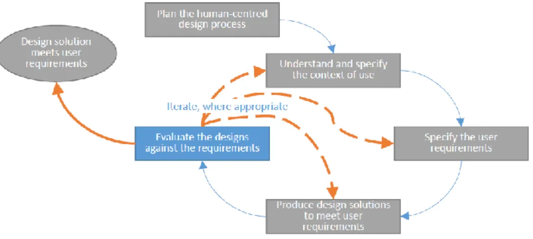
Usability evaluation of mobile devices should be different than the way of evaluating desktop systems. In evaluation of Mobile Map-based Systems (MMSs), since users mostly are in moving in the real environment with real-time positioning and
exposing to the natural outdoor conditions5 with small screen sizes, the user’s context
plays an important role. Although, according to Elzakker et al. [5], [4] most of the studies (81%) on the usability evaluation of mobile geo-applications are executed in the laboratory, which a big part of contextual information cannot be investigated and real behavior of user and activities may not sufficiently be understood [5]. They argument that the reason for executing a greater number of the user studies in lab might be the high cost of human and material resources that need for operating field studies. It is not easy to categorize the usability evaluation methods, for example in the lab or in the field or by end users or experts (which latter one calls heuristic evaluation) and in which stages of system development they are conducting. As shows in figure 1-1, the usability evaluation in the software development procedure can be held at the last stage of requirement analysis that [4] believes most often in this stage quantitative methods are using and qualitative research will be executed more in the earlier stages of UCD process, although this important stage of human-centred design has an iterative manner in the ISO’s
4 ISO 9241‐11 (1998)
5 The different context that interaction with such devices has such as weather situation (daily sunlight,
precipitation etc.), environmental distractions in crowed cities, incoming calls and messages etc. making some interruptions.
ergonomics, i.e. whenever the design solutions does not meet the user requirements, this stage is going back to the first stage.
Figure 1-1: software development process of ergonomics of human-cantred design (ISO 9241-210)
Elzakker in 2004, categorized the evaluation tools for collecting qualitative and quantitative data from representative users in four groups; interview, questionnaire, observation and product analysis [5].
Interview can be in-depth or unstructured that questions are formulated spontaneously, albeit within an interview framework. The advantage of this kinds of interview is a lot of in-depth information can be achieved but comparing the answers of different respondents is difficult [5] [4].
Questionnaire, according to Wikipedia is one of the most frequently used method for subjective usability evaluation that is cheap, without a need for verbal or other efforts, with standardized answer that is simple to compile and compare and analyse. It has also some drawbacks that has too few options to answer (users are limited to questions, except open-ended), people might have really positive or really negative viewpoint or who are most likely unbiased, typically don’t respond because they might think it is not worth their time. The most usable types of questionnaire are; NASA TLX (measuring
workload), USE (measuring ease of use, learnability, satisfaction, usefulness), SUS (measuring effectiveness, efficiency and satisfaction).
In observation method, investigator might in simple cases watch the subjects and take some notes or with some equipment record the observations or with “logged data” (screen recording through some injected proxies to the system) or “eye tracking” might record some data.
When users need to execute task(s) with an existing application or a prototype, it calls product analysis.
Flink et al. [6] claimed with thinking aloud and questionnaire they were achieving results for concrete input for the design process of a map service. Think aloud is a usability evaluation method that when users performing designated tasks with the system, all the time verbalizing their thoughts out loud, and the evaluator is recording the voice for the data analysis.
1.1.2.3 Systematic Literature Review (SLR)
Literature review is a kind of secondary study (i.e. studies that are based on analysing previous research) [7] that overviewing some primary studies in order to achieve some insights, statistics, results, trends and gaps out of aggregating the results from those conducted studies. Conducting literature review systematically, can better lead researchers to achieve the outcomes of the literature review and every stage of the review should be documented transparently. As Xiao et al. [1] said, with systematic literature review the quality, replicability, reliability and validity of review can enhance. The process of literature review can be iterative. During conducting the review, unforeseeable problems may appear that needs modifying the research questions and even the topic and consequently the inclusion criteria to find relevant studies [1], therefore our approach is conducting systematic literature review (SLR) in an iterative manner. In fact, the literature
review using to aggregate the experiences gained from different studies (that such studies may employ very different experimental forms and contexts) in order to answering the research question(s) [1].
Conducting SLR in different realms are following different approaches, for example, in the field of medicine, medical guidelines for performing SLRs recommend a kind of broad search procedures including automated searching which includes any
relevant grey literatures6 that is different than the approach that the researchers follow for
example in software engineering (SE) [8].
Schoen et al. [9] executed a SLR with 27 papers within 10 months in order to derive deep insights to some aspects of requirement engineering (RE) of AGILE software development. They used some specific places to search for their literature with considering some inclusion and exclusion criteria.
Yusop et al. [10] conducted a SLR with 57 papers (published from the year 2000 to 2016) in the domain of software engineering to make some recommendations to improve usability defect reporting. They used 5 electronic database resources with some search strings that in their first screening only the title and abstract were analysing and the second stage of analysis were done by reading full papers that were considering some inclusion and exclusion criteria.
Lacerda et al. [11] performed a SLR proposed by Kitchenham et al with totally 15 papers (published from the year 1993 to 2017) that found them in only two defined repositories (Google Scholar and SCOPUS) in usability engineering. They ordered the results of Google Scholar by relevance and only screened the first 150 results. Their first
6 Gray literature refers to papers that have not been published in a source with full peer review process
screening was according to quickly reviewing the title, abstract and keywords to identify if the papers matched the inclusion/exclusion criteria.
1.1.3 Research Questions
After conducting some preliminary researches in the field of mobile map-based
applications and achieve the necessity and importance of the research in this realm7, an
approximate broad view of the topic attained, and the research questions formulated. Investigating the problems that are available in maps that are presenting in mobile devices, first needs a deep evaluation of available methods that researchers applied so far to detect them, which methods have used more frequently, which methods are suitable for detecting a special kinds of usability problems (the most reoccurring ones) and so on. How these usability problems can be categorized in terms of their importance and their nature. How, where and when they might happen and what possible factors might provoke them to happen. In reviewing the available empirical scientific works, we can recognize what solutions have applied to tackle these usability issues in mobile map-based systems (MMSs) and how much they have been successful so far. To address these ambiguities, we have formulated the following research questions that the study is trying to answer them with operating an iterative systematic literature review (SLR).
• RQ1: What usability evaluation method is more frequently used to detect usability defects (issues) in mobile map-based systems (MMSs) according to available studies?
• RQ2: What are the most frequent usability issues in mobile map-based systems (MMSs) that reported in the relevant literature?
7 There are a few numbers of works have done in this realm in comparison to works in the GI desktop
a. How to categorize them?
b. In what contexts they are happening?
c. What methods have developed so far for resolving them according to the
available literature?
1.2 Methodology
According to Xiao et al. [1] “Literature review is an essential feature of academic research.” With literature review the researchers can understand the “breadth and depth” of the existing body of work and also be familiar with their methodologies and identify the gaps and then according to those works, can come up with new methodologies to operate their research [1]. According to Kitchenham et al. [7] a successful review involves three major stages: planning the review, conducting the review and reporting the review. In planning stage, researchers first identify the need for a review, then specify research questions and finally develop a review protocol. Here, before start to conduct the review (as described in the previous section), with some preliminary studies some primary keywords extracted to input to the first stage of our SLR that we called this stage, searching. In conducting stage, after identifying primary studies to review they should extract, analyse and synthesize data (Analysing stage). Here, we constructed a big table (Appendix B) with a primary list of criteria to extract the data in the analysing stage. The last but not the least, within reporting stage, researchers write the report to publicize their findings from the literature review (we call it reflecting stage here) [7]. In the last stage we here, reflecting the results of the SLR. These stages in our work has an iterative manner, which means after fulfilling those above mentioned three stages, the next iteration will be started with same structure (searching, analysing and reflecting) again (with doing calibration of the search terms, inclusion and extraction criteria) and so on. Whenever no new (or repetitive) results achieved, or the time schedule limited us to
continue, the process of iteration can be stopped. The reason why this iterative method applied is, with gaining new knowledge about the topic after the first iteration, the criteria for extracting new data will be updated to extract more relevant information to achieve the more relevant goals and objectives. This flow is also repeating for the next iterations. Here, we have conducted systematic literature review with three iterations according to our time limitation (from October 2018, the first round of iteration to February 2019 the last round of the iteration) for reviewing 56 papers (25 papers for first and 24 papers for the second iteration, and 7 papers for the last one). All of the studies retrieved from relevant and valid sources (one search engine and five databases with a priority of selecting the papers from four of the most prominent journals and conferences in location based services and mobileHCI fields). Figure 1-2 shows the outline of the procedure of the systematic literature review.
Figure 1-2: outline of the methodology
1.3 Thesis Outline
This thesis is organized as follow; In the next chapter (chapter 2) the process of the first iteration of the SLR with the achieving results and some initial conclusions will be presented. Chapter 3 discusses about the second iteration of the SLR with corresponding results and conclusions. Chapter 4 is about the last (third) round of the SLR iteration and
the reflected results and conclusions of that. In chapter 5 we have discussion section and finally chapter 6 draws the overall conclusions.
Chapter 2: First iteration
The procedure of the our SLR in each iteration involves three main stages; searching, analysing and reflecting.
2.1 Searching
According to the research questions (RQs) that has formulated before which described in previous chapter and the knowledge that achieved through preliminary studies (with studying some SLR studies in usability evaluation of software/requirement
engineering and the material of the two courses8 that have passed in the University of
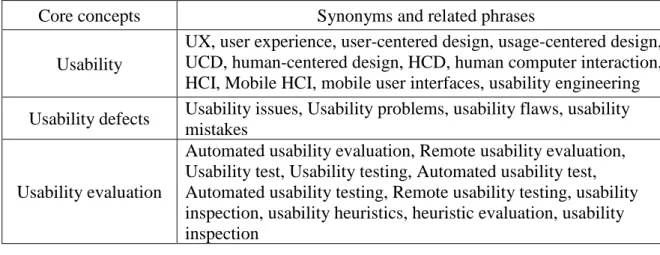
Muenster at the previous semester and the previous experiences and educations of the author), some keywords with their corresponding synonyms have been extracted through reviewing the available works in our first round of the iteration (Table 2-1). Initially, some of the most common usability evaluation methods such as “think aloud” and “SUS” (System Usability Scale) questionnaire etc. also inputted to usability evaluation method
keywords to achieve at least a few usability evaluation methods in the expected results9.
Table 2-1: Keywords
Core concepts Synonyms and related phrases
Usability
UX, user experience, user-centered design, usage-centered design, UCD, human-centered design, HCD, human computer interaction, HCI, Mobile HCI, mobile user interfaces, usability engineering
Usability defects Usability issues, Usability problems, usability flaws, usability
mistakes
Usability evaluation
Automated usability evaluation, Remote usability evaluation, Usability test, Usability testing, Automated usability test, Automated usability testing, Remote usability testing, usability inspection, usability heuristics, heuristic evaluation, usability inspection
8 Location Based Services and Usage Centered Design courses
Mobile GIS
Map-based Mobile applications, Mobile map applications, MMAs, Mobile maps, Mobile devices, Mobile phones, haptic systems, Location Based Services
Usability evaluation method
Automated usability evaluation method, Usability testing method, Automated usability testing method, Usability inspection method, Usability heuristics method, Heuristic evaluation method,
Usability inspection method, User study, Field study, Elicitation study, Think aloud, NASA TLX, SUS, USE
According to these comprehensive keywords, the search strings have calibrated for executing the search in the first iteration. The selection of the search terms for the search was in a systematic way of excerption of some of the combinations that whenever we got a huge number of papers, we have tried to narrowing down the search terms to achieve more specific papers (fewer) that would be more relevant to mobile map-based systems (MMSs). Search string number one is the most probability state of search strings, which other search strings are the systematic excerpts of that (Appendix A). Putting this huge list of the search terms in the search engines and databases is not possible since most of them accepting a limit number of the search strings. We bring them as an example of combining the search strings with “AND” and “OR” conditions. But obviously every search engine or database has a specific search strategy that same search string is not necessarily working well everywhere.
2.1.1 Search priorities
Other search strings created and the search for the first iteration has conducted in the October of 2018 in the following 4 databases and search engine. The search engine and databases that used for searching were Google scholar, Scopus, ACM digital
library, dblp and Science direct. In addition, some of the most relevant and prominent
journals and conferences in domains of human-computer interaction (HCI), mobile GIS and location based services such as Conference on Human Factors in Computing
Services, conference on Human-computer Interaction with Mobile Devices and Services (MobileHCI) have considered as a priority in executing the search.
2.1.2 Search Strings and their Results
Here, there are search strings and their corresponding results (Table 2-2). Because of the formula function possibility of the Microsoft excel that we used in the table, here we avoid plus signs at the beginning of some search strings, that the software might recognize them as a formula.
This is one of the random search strings sample that can be extracted from the main search string: “user-centered design” OR ucd OR “usability engineering” AND “usability issues” OR “usability flaws” AND “remote usability evaluation” AND “Map-based mobile applications” OR “mobile map applications” OR MMAs AND “Automated usability evaluation method” OR “Automated usability testing method”
Table 2-2: Search strings and their corresponding results – First iteration
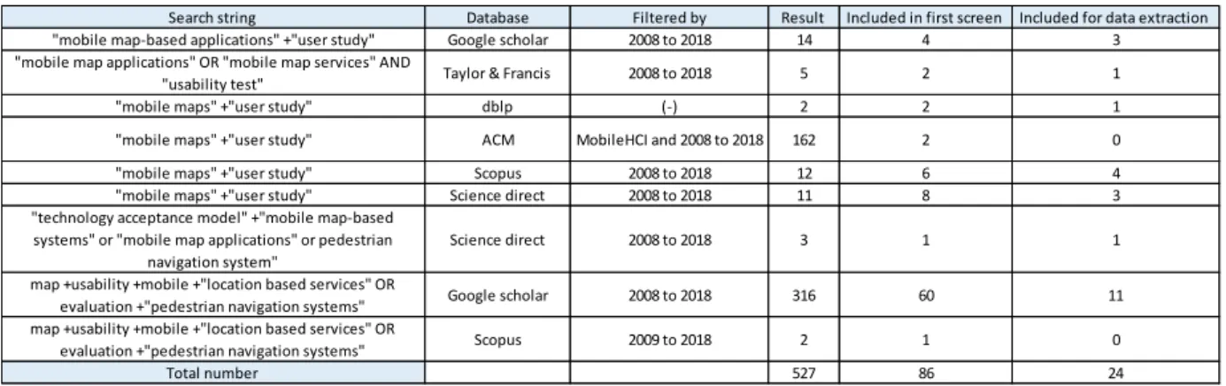
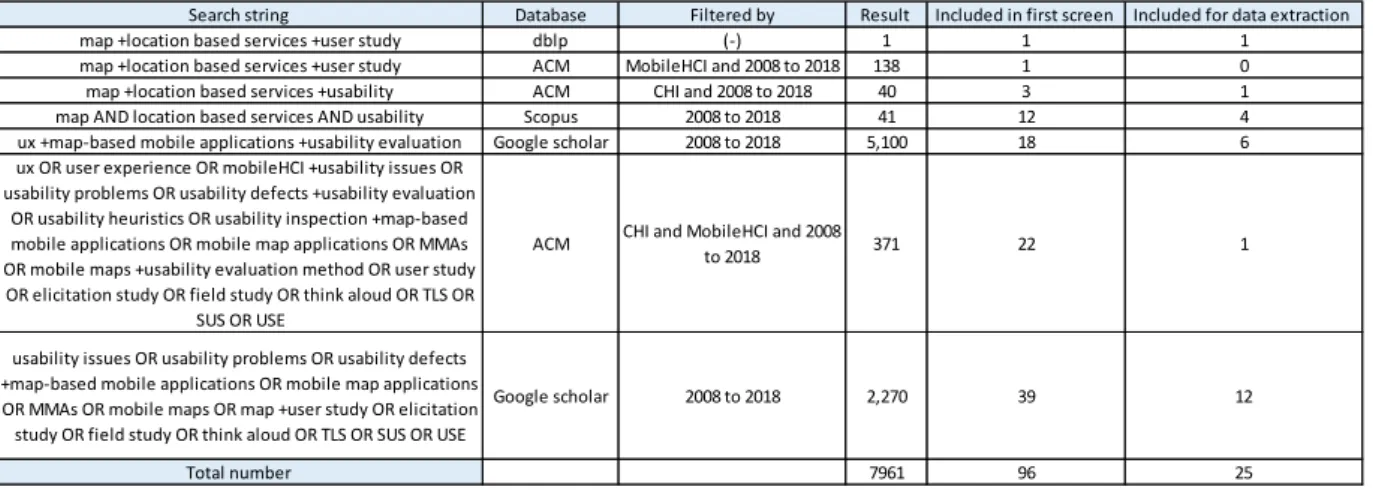
In the first round of the search 7961 papers found, between them, 96 papers with the first screening selected. The first initial screening procedure have done according to reading the title, keywords, abstract and in some cases the conclusion section. The procedure of the first screening was in this way that at first, if the title seemed relevant (with the experience that the author had in the field of GIS, subjectively if the title had a
Search string Database Filtered by Result Included in first screen Included for data extraction
map +location based services +user study dblp (-) 1 1 1
map +location based services +user study ACM MobileHCI and 2008 to 2018 138 1 0
map +location based services +usability ACM CHI and 2008 to 2018 40 3 1
map AND location based services AND usability Scopus 2008 to 2018 41 12 4
ux +map-based mobile applications +usability evaluation Google scholar 2008 to 2018 5,100 18 6
ux OR user experience OR mobileHCI +usability issues OR usability problems OR usability defects +usability evaluation
OR usability heuristics OR usability inspection +map-based mobile applications OR mobile map applications OR MMAs OR mobile maps +usability evaluation method OR user study OR elicitation study OR field study OR think aloud OR TLS OR
SUS OR USE
ACM CHI and MobileHCI and 2008
to 2018 371 22 1
usability issues OR usability problems OR usability defects +map-based mobile applications OR mobile map applications OR MMAs OR mobile maps OR map +user study OR elicitation study OR field study OR think aloud OR TLS OR SUS OR USE
Google scholar 2008 to 2018 2,270 39 12
common point with mobile maps and was relevant to usability evaluation and LBS, proceeded to the next stage, otherwise excluded) the keywords was checking, if the keywords have terms such as Mobile, Map, LBS, user study, user experience or a kind of usability evaluation methods or terms, then the abstract section was checking and if the abstract seemed not completely relevant, the conclusion section was reading carefully to try to as possible as not missing any relevant paper. We also used Web Mendeley in order to manage the papers and citation.
2.1.3 Inclusion Criteria
For quality and eligibility assessment, we include papers for data extraction and analysis that:
1. Have at least one usability evaluation method 2. Evaluated a mobile map-based application
3. Within the recent eleven years (from 2008 to 2018) 4. Written in English
In order to answer the first RQ we defined the first inclusion criterion to qualify the included papers. The studies that had usability evaluation method for mobile devices, but without map or GIS aspects (there are a lot of studies that only evaluated the mobile-user interactions that are irrelevant to map and geo applications) and also the literatures with usability evaluation method in GI Systems or map-based desktop systems, which are not about mobile devices, have excluded from the review, since the usability evaluation conditions of mobile map-based applications are different than other above-mentioned domains. We also excluded grey literatures. For the third criterion, we decided to include the papers from last 11 years that before this period the mobile devices were different
than today’s tough based form and these years were coincide with the first iPhon’s
inauguration10 that mobile phones have changed drastically.
In order to weed out the papers that do not have the specified inclusion criteria, in the second screening, the entire of each paper (full content) studied (reading stage) with considering inclusion criteria.
The number of 29 papers for the first data extraction and analysis have been selected. During the data extraction, we have found that four more papers should be excluded because of the lack of enough quality and repetitiveness. Therefore, finally 25 papers inputted in the first round of data extraction that 72% of them was achieved in Google Scholar search engine (advanced search), since this search engine covered some of the results of some of the defined databases too.
2.2 Analysing
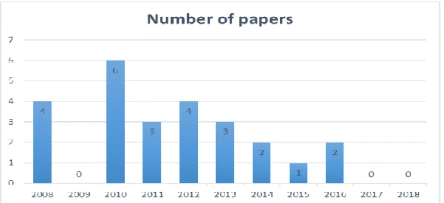
The initial table with initial criteria (columns) for extracting the data for those 25 papers has created. The table includes 20 columns (criteria or field) and 25 rows (each paper is one record in the table) has showed in Appendix B. The papers in table have ordered according to the date that had published (descending). Figure 2-1 shows the time distribution of the included papers, which the lack of enough studies during the recent years is noticeable, but since there is not enough papers in the review so far, is too soon to deduce any conclusion. Most of the papers (24% of the papers) in the first round of the iteration between these 11 years, are from the year 2010, and surprisingly, in the year 2017 and 2018 (2 recent years), there is not any study to review.
Figure 2-1: The time distribution of the included papers in first iteration
At the end of each analysing stage, the search strings should be modified (calibration) according to the knowledge that gain from the review, and the analysis must be updated for the next iterations to extract new desired data. After reflecting the findings, insights and results from the first analysis, in second round of the search, the first-round papers (25 papers for the first iteration) might need to be review again in order to extract new and more data and reflect the updated analysis (same for each round of iteration).
2.3 Reflecting the Results
In order to answer the first research question (RQ 1), the column “Usability
evaluation method” in the table (Appendix B) has analysed. Totally 12 distinct method
was recognized in the first round of the review. These methods ordered according to their higher frequency occurrences (descending order):
1- Questionnaire (all the different kinds) (31 times)
2- Synchronized video and audio recording (10 times)
3- Think aloud (8 times)
4- Interview (post-session, post-task or post-test) (7 times)
5- Logged data (screen logging and so on) (6 times)
7- Spatial memory task (least frequency)
8- User comments (least frequency)
9- Average traversal speed (least frequency)
10- Users’ task performance (user workload) (least frequency)
11- Multicamera recording (least frequency)
12- User interface actions and accuracy (least frequency)
Between these 12 extracted usability evaluation methods, “questionnaire” was the most frequently used method in the first round of the review, followed by “synchronized video and audio recording” which was only 13%, and “thinking aloud” method with 10% of the all methods that were used in the available studies of the first round of iteration to detect usability issues in mobile map-based systems.
According to [12], for detection of critical and serious problems, the “thinking aloud” method is most effective, and then they came up with a conclusion that a combination of “thinking aloud” method and video recording with eyewear are most suitable for the evaluation of mobile devices in the field.
Usability evaluation methods, in term of the environment that they operate, can be categorized in two major groups; field-based or laboratory-based methods. For the domain of mobile map-based systems, this criterion is extremely important since the user’s physical environment context in detecting the usability issues is playing a significant role when mobile users are not always sitting behind the desk like desktop users, and in interacting with map-based systems (e.g. way finding tasks) most of the time are in moving status. In the reviewed papers (first round of iteration), approximately both kinds of these two group of methods have used equally (53% field-based methods). Burghardt et al. [12] subdivided field-based usability methods to observation methods
and survey methods. According to them, observation methods are thinking aloud and audio and video recording, while survey methods are questionnaires and interviews.
According to ISO 9241 standard, part 11, context in usability evaluation is related to users, tasks, equipment (hardware, software and materials), and the physical and social environments in which a product is used. Screen size, wireless data transfer, daylight exposure, touch interaction etc. are some equipment differences in mobile domain with desktop computer environment, but there are other user characteristic’s such as their information needs and their age and computer literacy, that are also very important in consideration of design process of the geo-applications [13] and after implementation phase, especially mobile map-based applications, since more wider range of users using
them11.
Here according to extracted data in the first iteration table in appendix B, the size of the devices’ screen can be derived from the “Tested device” column, and the age and computer literacy or relevant GI knowledge of participants (i.e. Geo students), (“TPs number with relevant knowledge” column) of the users in the studies has already identified and reflected in the table.
About the age groups of the participants in a user study, Burghardt et al. [12] believed that the senior test persons identify in an empiric usability analysis the most critical problems and can say the high-quality mistakes, when the middle age group is suitable for the refinement of a product and young group seems to be inappropriate for this kinds of evaluation, because they are difficult to recruit, they also tolerate a lot of errors and are often not self-confident enough to “blame” the tested device.
11 Some of the commercially current available mobile map-based systems such as Google Maps still have
Beul-Leusmann et al. [14] believed that their participants were young with high-technology-affinity, that might overlook the usability problems.
Here, opposite to previous thinking about the age, the most frequently usability issue (losing the overview) was detected by the age group 20 to 26 which is belong to
young age group12. According to extracted data from the table in Appendix B, this
usability issue was occurred among the age groups of 16 to 37, 17 to 2713, 18 to 26, 18 to
60, 19 to 47, 20 to 32 and 20 to 59, which the pick range was the above-mentioned range (20 to 26).
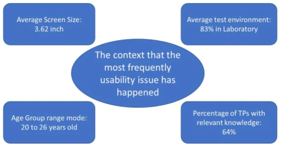
64% of the participants that referred to this issue, had relevant knowledge (but not experts) and the issue in 83% of the user studies has found in the laboratory environment which is not a proper method to expose subjects to the real environment of real mobile users that most of the time they are not behind a desk like desktop users.
The most frequent usability issue (the problem of losing the overview) has detected in studies that operated with mobile phones with the average screen size of 3.62 inch, which in comparison to mobile phone screens’ today, is too small. One reason for that can be, since most of the studies in the first round of the review operated on the year 2010, which the mobile technology has characteristically changed during these recent years that none of the papers were from these two recent years (2017 and 2018), the size of the screens that the issue has detected is too small. Another reason can be, the screen sizes of iPhone mobile phones until September 2014, were smaller than 4 inches (which we had only 3 papers to review after this time). It needs more investigation that the issue of losing
12 According to UN, persons between 15 to 24 year consider as young.
13 They reported only the college students had recruited for their user study, which according to Statistics
Canada, Postsecondary Student Information System, over 75% of students were between 17 and 27 years of age in the college. (https://www150.statcan.gc.ca/n1/en/subjects?MM=1)
the overview of the map in mobile map-based systems is still remained with the new generation of mobile phones (with bigger screens) or not.
The issue of losing the overview has mainly detected by “questionnaire” method. Therefore, we can conclude that questionnaire could possibly be a suitable method to detect these kinds of reoccurring issues in mobile map-based systems.
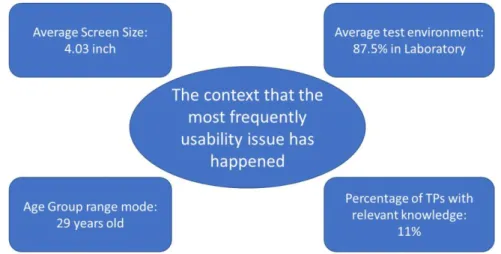
Therefore, for the sub Research Question 2.b we have found the most frequent usability defects in mobile map-based application among our studies that reviewed, in the context that showed in the figure 2-2.
Figure 2-2: The context that the most frequently usability issue has happened in the first iteration
About the gender differences in user studies, Coluccia et al. [15] found that in wayfinding tasks, males generally outperform females. There is well stablished research about gender differences in spatial ability and navigation behaviour. Males and females employ different strategies in navigation and spatial orientation. For example, men use more directions and distances in navigation, females on the other hand use landmarks to orient themselves in navigation tasks [16]. In their study, they have found that male
participants performed better than females. In addition, women relayed more on landmark knowledge than the overview that provided by map.
In the first round of the SLR, 58% of all the participants, in all the studies were male, but for the group of the participants that referred to the most frequently issue, the distribution on the gender was 50% for male and 50% for female. Therefore, we cannot deduce any conclusion about the gender differences in our first round of the iteration.
Since the number of the studies that has reviewed is not enough in the first round of the iteration, we cannot deduce any conclusion yet.
Among all the literature that have reviewed in the first round of the iteration only 36% of them evaluated the real mobile map services or online map services that are available in the market which the most well-known and the most famous one of them is Google Maps, and others evaluated only their prototypes or some software that they implemented for mobile users and tried to do usability evaluation for them. Actually, with studying the mobile map-based applications that are not completely designed or implemented also can notify some usability issues that are available in map interactions in mobile devices, but we tried to achieve the papers that evaluated the usability issues of the commercially current available mobile map-based systems that still have a lot of problems and not ease to use for so many people.
Flink et al. [6] categorized the usability issues in mobile map-based applications in an interesting way. They grouped the results of evaluation of the mobile map application into three main groups:
1. Hardware
2. Contents
The hardware group contains all the technical issues such as internet connectivity and the issues with the iPhone itself and downloading the maps.
The ‘contents’ includes various observations pertaining to visualizing the content of the maps, such as text and icons. E.g. Users argued that the usefulness of different background maps and additional features such as sound, video and photo landscapes on the mobile maps need to be clarified and geotagged.
The ‘User interface’ group is that the number of actions the user needs to perform a task should be minimized. Meaning that for example the map applications should have a search field or a function to choose from a list that this would be more usable and time saving for users. Our focus here, is around these two last categories.
For the second research question (RQ 2.b), first we can categorize the usability defects in mobile map-based systems in two major groups:
1- Spatial
2- Technological
The spatial issues are all the usability problems which are related to mobile map itself and mobile map interactions that make using of maps, difficult for the users, such as the algorithms that are behind the navigation services (such as routing algorithms), the functionalities that the different maps used, and the different kinds of map interactions and displays and so on.
The technological problems are all the issues relevant to the technology itself, such as sensor inaccuracies, battery drainage, internet connectivity etc. which is out of our focus in this work.
2.3.1 Spatial issues
Delikostidis et al. [61] in 2010 and 2016 [18] referred to lack of automatic rotation of the North-up map in Google Maps to the actual direction of the user. Wen et al. [17] also detected this problem in directional orientation with simple north-up map. Elzakker et al. [5] pointed out the inability of the mobile map to be oriented toward the actual view point of the user.
For the third sub research question (RQ 2.c), there are some solutions that proposed in the first round of reviewed literatures. Wen et al. [17] proposed a forward-up map, which shows the direction of the device during the navigation. Delikostidis et al. [18, 61] and Elzakker et al. [13] to overcome the problem of the user direction of the North-up map, proposed a rotating map and a compass-based heading-up (rotating) map.
Delikostidis et al. [61], detected icon overlapping in particular zoom levels. They proposed some methods such as: landmark pop-up information, multi-perceptive photos and landmark symbology for dealing with the above-mentioned issue and some other solutions such as; vertical scale bar with the combination of distance and time needed, landmark filtering and dual map to enhance the usability of the mobile map-based systems.
Rehrl et al. [18] found difficulties in readability of the name of the streets on the
map (upside down), because they used standard OSM14 tiles that were align to the north.
For tackling this issue, they proposed different map tiles for the four cardinal directions that were rendered in their prototype. Ramsay et al. [19] also found significant delay
14 Open StreetMap
during scrolling while new map tiles were downloaded from the remote server. In order to overcome this issue, they propose catching the tiles covering the area.
One of the most significant and well-known issues in mobile map-based systems, that arise from smallness of the screen size of mobile devices, and in our first round of
systematic literature review (SLR) was also the most frequently issue15 that happened in
the user studies, is losing the overview of the area and orientation because of continues user’s zooming and panning. When users zoom and pan continuously, it might be confusing to get the overall view of the region they are viewing. When they zoom in, they only can see a small area of the region, and when they try to have an overall view of the region, they usually doing zoom-out operation, but at the same time they can’t distinguish some detail information [20] (such as the street names or other spatial details on the map that might be generalized or might be because of the smallness of the screen). That is why mobile map users doing a lot of zooming and panning that causes the losing overview problem.
Typically, when the spatial information is displayed in the mobile screens entirety, users obtain an overview without sufficient detail (e.g., they are unable to read the texts). By zooming in, users may obtain needed details but at the same time lost the overall view of the spatial information that display the area outside of the screen. If the essential point of interest (or any entity of the map) located in the off-screen area, users need further zooming and panning to see them. These extra struggles for visualizing the desire detail level make the experience of the user of mobile devices more difficult and time consuming and decrease user satisfaction of work with the map applications and also according to [21] hinders the creation of cognitive map of the explored spatial area. In
15 Research question number 2
addition, since the mobile users most of the time are not in a stable situation because of mobility feature, it is very important for them to gain suitable spatial information awareness by glancing at the screen [22]. Burigat et al. [23], Delikostidis et al. [24], Burigat et al. [22], Polino et al. [20] Hooten et al. [25] Burigat et al. [26], Bouwer et al. [21] all referred to this issue in their works.
Dünser et al. [16] operated a user study to compare navigation task with augmented reality (AR) interface and a simple digital map and a combined map and AR condition. They found no overall difference in task completion time, but they found evidence that AR browsers are less useful in navigation at some environmental conditions. One of the usability issues that they detected was the losing of the overview in AR interface, which users didn’t recognize the dead ends routs.
In terms of the available methods and solutions to deal with this issue, there are several approaches that one of the common and prominent ones provides users both overview and detail simultaneously, calls “Overview&Detail” approach. In this approach when users zoom to a specific level of detail on the map, one or multiple overviews of the space (usually with smaller scales) are representing in a small portion of the screen, around 10 percent of the full screen size (in a thumbnail) [26].
This method has proposed by Burigat et al. [23] as a solution to avoid users’ extra zooming and panning when they lose the overview of the space during the navigation. Burigat et al. [26] in another study proposed ZEN (Zoom-Enhanced Navigator), which is an adaptation of Overview&Detail approaches to mobile devices. In this method panning and zooming is integrated in a same interaction and only an outline of the overview is showing to user, thus the screen space can be saved in comparison to other methods of Overview&Detail which a new smaller window (with usually smaller scale) occupying a part of the screen space.
Hooten et al. [25] suggested the “paper maps” when users losing the overview of the space. Paolino et al. [20] proposed a new method for off-screen visualization which called Framy. The off-screen visualization approach followed by CityLights concept, which proposed by Mackinlay et al in 2003 [20], that compact graphical representations such as points, lines or arcs which are located along the margins of the screen to hint off-screen objects located in their direction [26]. Framy is a kind of off-off-screen visualization method that uses a cornice semi-transparent shape that resembles the off-screen objects (POIs) according to their distance to the map focus with using colour intensity [20]. This method provides a situation for user to simultaneously with focusing of a subset of selected data, getting an insight on what is around too [20].
Burigat et al. [22] compared the effectiveness of tree off-screen visualization techniques (Scaled arrows, Wedge, and Overview + Detail) in their experimental evaluation. Wedge that proposed by Gustafson et al in 2008 is a visualization technique to convey the location of off-screen objects through triangles, that the base and partially two legs of the triangles are shown on the screen which that two legs point towards the off-screen object. Users should estimate the location of that off-screen objects (POIs) according to the direction and the size of those triangles. Scaled Arrows that proposed by Burigat et al in 2006, is another technique for visualization of off-screen objects with using the different size arrows that the larger the arrow, the closer to the screen is the off-screen object. Therefore, users can estimate the distance and direction of the off-off-screen objects when they are in a specific zoom level of the map. In Overview&Detail visualization, the overview of the space is showing as a small thumbnail that cover about 10% of the screen at the bottom right corner of the detail view. Figure 2-3 shows the tree visualization techniques that they considered in their study.
Figure 2-3: (a) Scaled Arrows, (b) Wedge, (c) Overview + Detail [22].
They found, totally, there is no single best solution to support users in carrying out different spatial tasks on mobile devices when relevant objects are off-screen, but in some of their tests results, the Overview&Detail technique showed superiority.
Delikostidis et al. [24] and Elzakker et al. [13] proposed reversed Overview&Detail that is a new approach which is opposite of the Overview&Detail approach in showing the overview and detail views, in order to reduce continues zooming and panning, which is presenting the detail view of the space in a smaller window (thumbnail) inside the overview map in the full screen (figure 2-4). In previous approach (Overview&Detail), we had the detail view of the region on full screen and the overall view on the small thumbnail, but in the reversed Overview&Detail approach, this is reverse.
There are not enough researches about the effects of the limitations of mobile devices on design and use of overview + detail visualizations. Most of the time the overview thumbnail is too small to users’ eyes to recognize the spatial information [22] and since the overview map usually is in a small scale that add more difficulty to recognize spatial information.
Figure 2-4: Reversed overview + detail mobile map [13].
Elzakker et al. [13] proposed two possible solution to overcome the problem of
disorientation and spatial confusion of mobile users in navigation, when they have to zoom and pan a lot, because of smallness of the screen. Their solutions were to keep particular landmarks visible in all zoom levels and applying smooth zooming instead of discrete zooming.
Flink et al [6] found that interpretation of some background maps were difficult for the participants and they proposed legend to overcome this issue. This issue can be an important topic in map interfaces of mobile map-based systems (MMSs), where designers and producers should take it to account at the initial stages of the design procedure. And also, they have noticed with their study that the map interface doesn’t have search function and to address it, they proposed search field or choosing from a list.
Another study in 2010 by Van Tonder et al. [27] proposed a new way of user interaction with map-based applications which calls “Tilt interaction”. This technique has proposed to tackle the issue of big finger in mobile phone interactions that the display can be obscured by user’s hand, specifically in map interactions. They compared two interaction methods, namely: tilt and keypad on a prototype mobile map-based
application (MapExplorer) in a laboratory to measure the user performances of the three tasks (locating, navigating and checking tasks), and they have found that “Tilt interaction” only in navigation tasks performed better.
According to Nielsen (1989) and Virzi (1992), minimum required number of the test persons are between 5 to 6 that reveals the approximately 80 percent of usability problems [12]. In our first round of the literature review, more than a half of the user studies have conducted with 18 to 24 participants.
Thanachan et al. [2] did an interesting usability test to compare two map applications (NOSTRA map and Google map) with only 5 novice participants (around 21% of the user studies have operated by less than 10 test persons) in laboratory to measure 5 usability attributes of Nielsen and ISO 9241-11 such as learnability, efficiency, effectiveness, memorability and satisfaction through video recording and Post-Study System Usability Questionnaire (PSSUQ) methods. They have found a lot of user-software interaction usability problems encounter of NOSTRA Map application and Google Maps from a path analysis task with iPone 5 that most of the issues were related to the design of the icons and their location in both applications. The usability problems were: words used on interface were misinterpreted by users, users cannot find category and need to search, icon sub-category was not easily noticeable, cannot save the favourite places, function finding route was complicated, cannot open the list of favourite places, unable to show detail result page, didn’t see current location button, cannot chose to Hybrid Map, get lost into Measurement Tools function, the overall problems founded were related to the design of the icons and their location in both apps which inappropriately presented. And they also proposed some solutions to dealing with those issues such as: redesign of icons and change their location on screen, words use in apps
should be minimized and according to individual user, comprehension should be confirmed, the more menu should be integrated into main menu to reduce user confusions. They have found Google Maps had better design in term of learnability (the time duration to work successfully for the first time) than NOSTRA application.
Beul-Leusmann et al. [14] investigated a usability evaluation of an intermodal passenger information system (a prototype) and tested in comparison with the leading mobility application in Germany (DB Navigator). They detected several usability issues by the subjective comments of the participants such as: Lack of auto-completing in the text fields and lack of overall view and small screen, lack of automatically selection of surrounding bus stops, lack of arrival/departure time, problem in deleting the texts in the text fields, lack of information about the overall progress during the trip, absence of properly placed landmarks, color code and some technical problems of the location-based service.
Burigat et al. [26] noticed occupying the screen with hand or stylus when users interact with mobile map application, and to solve this problem, proposed DoubleScrollBar technique. This method allows users to perform scrolling operation by using separate horizontal and vertical scrollbars. And provide users some predefined zoom levels to choose a specific zoom level directly.
Noguera et al. [28] in evaluating a prototype found that the map should have the possibility to switch from the 3D to the 2D interface and vice versa. And the map also can be integrated with social networks.
Delikostidis et al. [29] in their evaluation study found stacking in the previous position in Google Maps when user has moved to a new position and they also noticed some big landmarks in reality that didn’t represent in Google Maps.
Elzakker et al. [13] pointed to simplicity of the map that should not be overloaded with many symbols or 3D landmarks. They have found that landmark photos that pop-up when clicking on them, were more preferable. And also, by presenting landmarks in successive scales, the frequent zooming and panning can be avoided by users. They deduce that the spatial information on the map should be represented in a way that users spend more time to observe surrounding to develop mental maps than looking at the mobile map. They pointed out that more choices for pedestrians should be provided to freely select any possible routes (flow channels) to the destination. They proposed automatic landmark recognition with using integrated digital camera with GPS position and heading information with landmark visibility map data on image recognition algorithm.
Kuparinen et al. [30] measured the suitability of a domain specific heuristic evaluation (HE) for mobile map applications (MMAs) in comparison to Nielsen’s Heuristic, and found that more usability problems were found with the proposed HE for MMA. They found that the applicability of Nielsen’s heuristics (1994) are not only too general, but also limited to be applicable for evaluating MMAs [30].
In the first round of iteration of our SLR, only 8% of the studies hired experts to operate heuristic evaluation (HE) in order to evaluate the usability of mobile map-based systems. The main difference between heuristic evaluation and empirical user testing is, with HE, identifying the errors is on the centre of the focus, since user testing is determined by effectiveness, efficiency and user satisfaction [30].
These three components (effectiveness, efficiency and satisfaction) that mentioned in the definition of usability by ISO 9241-11 in 1998, were the basis of most of the reviewed literatures in our first iteration to evaluate usability of mobile map-based systems. A lot of them, [4, 5, 7, 9, 64, 13, 14, 20, 21, 23, 25] measured the task completion
time in their user studies to evaluate effectiveness, efficiency or overall efficiency and effectiveness of the mobile map-based systems (MMSs). Some of them, to evaluate satisfaction and ease of use, measured error rates in their empirical user studies [13, 25]. Other studies to evaluate satisfaction and ease of use, operated questionnaire and interview [6, 7, 9, 13, 14, 15, 16, 18, 19, 20, 22, 23, 25, 26, 27].
Thanachan et al. [2] measured The time duration to work successfully for the first time to evaluate learnability, and the time duration to work successfully after avoid using system for 5 days in order to evaluate memorability (rememberability) of the evaluated the usability of two mobile map-based services in their comparative user study. Kratz et al. [31] used USE questionnaire in order to evaluate perceived learnability, ease, satisfaction and usefulness of users.
Technology acceptance model (TAM) introduced by Davis and his colleagues at 1989, “is widely regarded as the most successful model for explaining how people form their opinions, use and accept particular services or technologies” [32].
Park et al. [32] in addition to use two psychological beliefs of TAM (perceived usefulness and ease-of-use) in their study, also have measured five usability variables such as perceived location accuracy (PLA), satisfaction, service and display quality
(SDQ), perceived mobility and flow state16 by in-depth interview (they believed these
factors may significantly contribute in users’ intention to use) with two groups of individuals: a user group (users of mobile map services) and a professional expert group (developers, engineers, and designers in the field of mobile map services) and conducted an online survey (questionnaire) about three mobile application sites and three mobile
16 “Flow state” is a mental state of user, when he/she is fully immersed in something that he/she is doing,
specified by an energetic focus and full involved manner that not enough aware of his/her surroundings and success in the operation of the task [27].
services sites by 1109 respondents who had at least 6 months of experience with mobile map services. Their study contributed in deeper and more comprehensive insight about users’ behaviour toward using mobile map services.
They have found that service and display quality (SDQ) and perceived location accuracy (PLA) are the notable determinants of attitude toward mobile map services acceptance and also SDQ had a more powerful effect on attitude than PLA did, showed that users are more affected by factors related to the user interface than by technical factors.
Service and display quality (SDQ), is defined as “the degree of general performance of an information system and related services” [32].
Perceived location accuracy (PLA), which explained by Park et al. [32] is the degree of awareness of mobile map services’ users of their exact locations on the displayed maps on their screen.
Perceived mobility (PM) is the degree of user’s awareness, satisfaction and perceived usefulness of the portability of the services and systems. The questions such as; it is convenient to access mobile map services anywhere at any time [27].
2.3.2 Technological issues
Since the aim of our work in this study is not investigating the impact of issues that resulting from hardware limitations (from the mobile devices and servers to the positioning systems), these kinds of technological problems are not in the centre of the focus.
Delikostidis et al. [66] and Dünser et al. [16] referred to GPS and compass inaccuracy and Rehrl et al. [18] pointed to sensor inaccuracies in augmented reality (AR). Park et al. [32] found some problems such as location accuracy, processing speed, display
![Figure 2-4: Reversed overview + detail mobile map [13].](https://thumb-eu.123doks.com/thumbv2/123dok_br/15798935.1079053/41.892.357.580.127.424/figure-reversed-overview-detail-mobile-map.webp)