Density and Scattered Development: A Tale of 10 Cities
Ciro Biderman Introduction
Themes such as sprawl, compact city, leapfrogging, have been out of the economics literature for a long time despite the great interest of urban planners and citizens in general. This is changing fast since the 2000s. The Lincoln Institute has been playing a major role in the growth of this new agenda of research. One of the most relevant papers in the economics of sprawl (Buchfield et al, 2006) was first issued as a Lincoln Institute Working Paper in 2002. The Lincoln's Policy Focus Report by Angel et al (2011) represents the summary of a long run research pioneering in making a global sample with a very fine definition.
The former literature on density confuses causes and consequences. In part this is related to the fact that this phenomenon is very difficult to measure. The alternative envisioned in Clawson (1962) and applied in Bruchfield et al (2006) and Angel1 (2011) uses satellite images and its possibilities as a source of information for creating meaningful indicators of sprawl and density. The main assumption is that a clear conceptual and operational definition can
facilitate research on the causes and consequences of sprawl and under or over density. This working paper build upon this new tradition of research and focus first on Latin America in the 1990s and then on 10 large metropolitan areas in Brazil in the last 15 years or so.
The use of satellite images allows at the same time to improve density indicators and, most important, to create an indicator that was never used in the literature at this scale2. Using satellite images it is possible to analyze 30mX30m pixels and, based on the reflection rate of the 3 color bands, determine if it is water, built-‐up, or open space. This measure permits the
analysis of the spatial pattern of urban development. More specifically, it allows for measuring if new development is compact or not; if the urban development is scattered or not.
Notice that this is a very different measurement not necessarily correlated with density, the traditional measurement of sprawl in the early 2000s. Furthermore, density cannot tell you if the development leapfrog the urban footprint or not, for instance. Consequently, density
1 The team that has been working with this data since early 2000s, produced many papers during the research period. Angel et al (2005) is probably the first one. The bulk of the production, however, happened in 2010 see Angel et al (2010 a, b, c, d and e). Some applications for Ecuador appeared in Angel (2008 a and b).
cannot measure if the development is compact or not. We know that densities have been decreasing in most cities in the world. In North America, despite the very low level, it is still decreasing but this is not the rule. Cities that have very low densities are stabilizing and some of them (around 17%) are rebounding and actually increasing densities.
But what do we know about compactness? Burchfield et al (2006) show that cities are more compact if they concentrate in sectors such as business services that tend to be centralized. Cities built around the public transportation are also more compact than cities built around the automobile. Cities with higher historical population growth tend to be more compact as well as cities with less historical uncertainty. But geography matters a lot; geography explains almost one forth of the cross-‐city variance. Aquifers, hills, small-‐scale terrain irregularities, and a temperate climate increase sprawl. High mountains favor compactness. Finally they find that developers leapfrog out of municipal zoning and that there is more sprawl in places relying more on transfers than local taxes since the beneficiary does not have to pay for the whole cost of the infrastructure.
Glaeser and Kahn (2004) argue that the decline in density is ubiquitous and the main cause of such trend is the event of the automobile. As a matter of fact, Angel et al (2011) using a long run series (100+ years) analyzing 30 cases of large cities around the world show that densities have been declining since the late XIX century, exactly when the automobile was introduced. The rate of decrease is also decreasing up to the 1950s. Since the 1950s, however, densities were still decreasing but at a lower absolute rate each year. The automobile argument works well with the stylized data from this small sample observed for a long period. After automobile is universalized its gains might be vanishing. This process may be going towards a steady state with densities stabilizing around some level.
The automobile as the main cause of sprawl could also explain the differences between North America and Europe since the relative price of the private mode vis a vis the public mode are quite different in these regions. However, those two regions are not different in terms of compactness. Furthermore, Burchfield et al (2006) show that the level of openness in the US has been quite stable during the 1980s. Using Angel et al (2011) sample we can see that the level of openness is decreasing in the 1990s for all countries in the world including the US. So, density and openness have a totally different behavior in a cross section of cities and in time. This is puzzling since all potential causes for a scattered development may apply for density. The flexibility of the automobile (for instance) should be favoring more openness as much as it favors low-‐dense development. Since we do not have a long run series for the measure of openness, we do not know if cities were much more compact before. It may be the case that compactness is on the rebound but not density (yet?). This is a question that did not receive
enough attention so far and one of the goals of this paper is showing the differences in those two indices across cities and in time.
LAC countries have a different dynamic in terms of density than land-‐rich developed countries. LAC was reducing density at a slower pace; and the rhythm of decrease was much more
compatible with convergence of density to a certain level than observed in North America. LAC is slightly more compact than Europe, Japan, North America and Australia. Actually, those 3 groups have a very similar pattern in terms of openness. In other words, although the
automobile historically is able to explain some differences in sprawl, measured as the level of openness, it is not helping very much in explaining the current pattern. It is also puzzling why LAC has such a low level of openness.
The second goal of the paper is carefully describing the specificities of LAC cities pattern of urban development. After describing positioning the pattern of urban development of LAC cities in the sample of world cities we move to our sample of 10 large metropolitan areas in Brazil. Although this cannot be taken as representative of Brazil since smaller areas are not represented, it represents a considerable share of Brazilian population. We do know that large cities (or metropolitan areas, in this case) have a specific behavior. We will explore this
specificities and show that densities may not be on the rebound but openness certainly is. Furthermore, density seem to be moving to a steady state that might be different for each region.
Measuring Sprawl and Density
When we talk about sprawl there are usually three main (operational) concepts involved: density (of population or employment); centralization (of population or employment); and continuity (in jobs or housing)3. Sprawl is generally related to low levels of any of these concepts. Decentralization is an attempt to measure how population and employment are spread throughout the metropolitan area. Density measures how population and employment are centered in high-‐density areas. And continuity attempts to check if population and
employment are surrounded by people and/or jobs. In principle there could be decentralized, continuous dense urban areas; centralized discontinues dense urban areas; etc.
In any index we may need measures of population and/or employment; an area definition; and the geographical location of the Center Business District (CBD). Some indices may need just one of those measure while others may need two or even all three measures. Evidently we always need some way to normalize the measures. We do not want to say that São Paulo is more
3 Galster et al (2001) propose eight dimensions of the phenomenon (density, continuity, concentration, clustering, centrality, nuclearity, mixed uses, and proximity) with measures associated with each dimension. In this paper we attempt to narrow the definition for the sake of parsimoniousness.
sprawled than Campinas because the former urban area is larger than the later since São Paulo Metropolitan Area has 20 million inhabitants while Campinas Metropolitan Area has 3 millions. Density, in principle, is the natural measure of sprawl: less dense metropolitan areas would be considered sprawled. As a matter of fact, average or median density of the metropolitan area is the most widely used indicator of sprawl (Gailster et al 2001). The most straightforward
measure would be the total population (or employment) over the metropolitan area. One natural improvement is to look at a lower level (zip code or census blocks) and weight the average by the share of the sub-‐unit in total metropolitan area population. This is equivalent to asking at what density does the average member of the city live or work.
A not straightforward improvement to this measure is considering in the denominator just the “developable land” defined as land that has no physical or institutional barriers to its
development. A precise measure of this denominator, however, is very difficult to obtain. We would need accurate maps of land use for each region. Besides, in developing countries it is usual to have informal occupation of land in illegal sites of the city. A more feasible
denominator for a density measure is the built-‐up area. Using this denominator, the density would be measuring building density instead of neighborhood density. But we are usually more interested in measuring neighborhood densities. To measure neighborhood densities it is necessary to define a way to close the area of interest. The usual way to close the area is using the administrative boundaries.
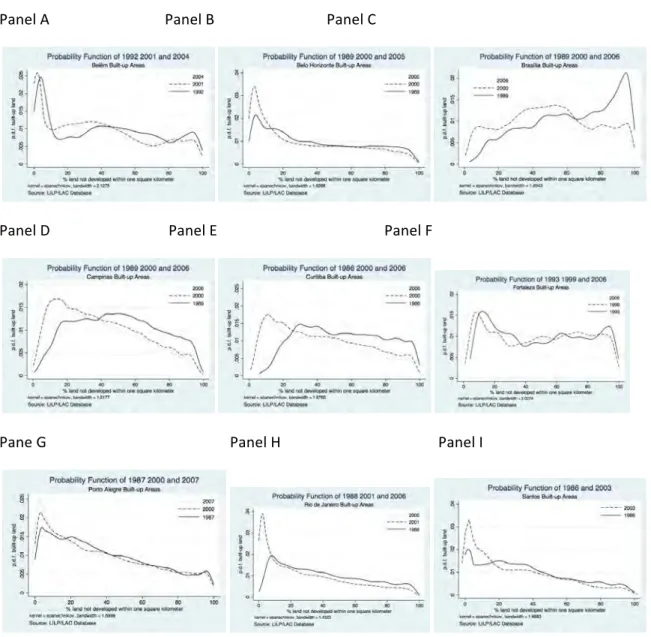
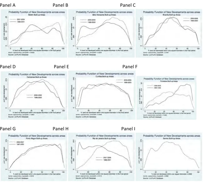
In this paper to determine the developable land, following Angel et al (2011), we used Landsat satellite images. We have chosen images according to availability and the quality of the picture but attempting to have 3 main dates to compare the pattern of growth in the selected cities4. Each pixel was classified as built-‐up, non built-‐up or water. Based on the classification of the Landsat imagery we can find the built-‐up area of the city5 as the total area that is classified as built-‐up6. It is possible to calculate the density on just built-‐up areas and the proportion of open space (non built-‐up area) in the city. The density could be also calculated as the population (or employment) over the built-‐up plus non built-‐up area and consequently we would exclude water from the denominator. In both cases we could weight the data using the share of the census block on total population or employment.
4 We could not find reasonable images for three years just for Santos. We have three years of information for all other 9 cities and 4 years for Belém.
5 The unit of analysis is the metropolitan area but we will call it “city” interchangeably for the sake of (syntax) simplicity.
6 This is the number of pixels classified as built-‐up times the area of each pixel that is approximately 28.5x28.5m2. Such classification is evidently done with errors (as almost any data) since we have to interpret the 4 bands to determine the pixel type.
With such improvements in the measurement we can have a better idea of the density pattern. The trivial density measure (population over administrative area) would not be able to
differentiate cities where the bulk of the population live in very dense skyscraper surrounded by vacant land from cities where the typical dweller lives in single families at a very low density. We would expect that those two stylized cities would have similar densities when the
denominator is the total non-‐water land but the skyscraper city will be denser when the denominator is just the built-‐up area. We will work with two operational definitions of
boundaries respecting the urban form instead of the administrative division. We will come back to this point later.
Another ingenious way to use this fine-‐resolution data set was envisioned by Clawson (1962) and implemented by Burchfield et al (2006). Using the fact that residential development almost never leapfrogs over more than one kilometer, they define one kilometer as the relevant spatial scale to conduct their analysis7. Angel et al (2011) add another rationale to the 1 km as a
"walking distance". The proposed index estimates the level of fragmentation as the percentage of "open space" (non-‐built, non-‐water pixels) in the immediate surrounding square kilometer and then average it across all residential developments in each metropolitan area. Notice that this is a good measure of how scattered the development is. It is not computationally trivial to make this procedure but it is probably the only way to have an indicator at such small scale. Each pixel has an associated proportion of open space in the immediate square kilometer. Interesting enough, the "scattered index" taken at the pixel scale is a very good tool to define urban, and rural. Angel et al (2011) come up with a definition for those two concepts and also add an intermediate concept – suburban – based on the scattered index at the pixel level. They define as “urban” pixels for which the land within a 564 meter radius is 50 - 100% up; “suburban” as pixels for which the land within a 564 meter radius is 10 - 50% built-up; and “rural” as pixels for which the land within a 564 meter radius is 0 - 10% built-up. The definition of urban is somehow similar to Burchfield et al (2006) that defined “most
developed areas” as those pixels where over 50 percent of the immediate square kilometer was built-‐up8. These definitions are important since they will define the fringe of the metropolitan area. Burchfield et al (2006) on the other hand define the fringe as “those parts of the
metropolitan area that were mostly undeveloped in 1976 but are located within 20 kilometers of areas that were mostly developed in 1976”.
Defining the fringe we can have the boundaries that do not depend upon administrative divisions but rather on urban form. Angel et al (2011) propose two ways of closing the urban area. The first is called “Urbanized Areas” while the second is called “Urban Footprint”. The
7 More precisely they define a grid that has 33x33 pixels around each pixel.
urbanized areas are defined as urban, suburban, “Urbanized Open Space” and “Captured Urbanized Open Space”. The two concepts of open space are defined, respectively, as non-‐ built-‐up, non-‐water pixels for which the land within a 564 meter radius is 50 -‐ 100% built-‐up and non-‐built-‐up, non-‐water pixels that are completely enclosed by Urban, Suburban, and Urbanized Open Space pixels and have a contiguous patch size of less than 200 hectares. The “Urban Footprint” add to the urbanized area, “Peripheral” and “Captured Peripheral Open Space” defined, respectively as non-‐built-‐up, non-‐water pixels that are within 100 meters of Urban and Suburban built-‐up pixels and non-‐built-‐up, non-‐water pixels that are completely enclosed by Urban, Suburban, and Peripheral Open Space pixels and have a contiguous patch size of less than 200 hectares. Using these concepts we can estimate the neighborhood density by using either the urbanized area or the footprint area as the denominator in the index. For analyzing the dynamics of the development defining the fringe is also a must. In a dynamic analysis we are concerned with the pixels that were classified as open space in the first period of analysis but were built-‐up in the second period. Angel et al (2011) define three types of new developments consistent with the literature on sprawl: infill, extension and leapfrog. A new development will be considered as infill if it took place in a pixel that was an urbanized open space or a captured open space in the first period of analysis; a new development will be considered as an extension if it intersects the “urban footprint” in the first period; and it will be considered as leapfrog if it does not intersect the urban footprint in the first period.
Yet density at the building level, density at the neighborhood level or the “scattered index” proposed above do not measure how concentrated the metropolitan area is. For instance, a metropolitan area that is not fragmented around the CBD but have a large fragmentation in the suburbs may have the same average fragmentation index of another metropolitan area that is relatively fragmented in and around the central district but have medium fragmentation on edge cities. It is also possible to have a centralized, low-‐density development in some metropolitan areas.
A usual measure of centralization is the percentage of employment or population within a certain distance from the CBD. Glaeser and Kahn (2004), for instance, use two different threshold distances: 3 miles and 5 miles. One alternative measure is the median or average person’s (worker’s) distance from the CBD. Angel et al (2011) use the average distance of all points in the shape to the Central Business District that is similar to the average distance except that, in this case, the unit of analysis is the pixel while the more traditional index usually uses some census division or zip codes as the unit of analysis. They also propose other measures such as average distance to the CBD.
In brief, we can find very many metrics of urban sprawl in the literature. Gailster et al (2001) proposes 8 metrics with more than one operational definition for each; Angel et al (2011) offer
dozens of operational metrics in different themes. As discussed before, sprawl is difficult to measure since it includes different concepts. The concept has been often treated in the literature using density imprecisely measured since the denominator has been (usually) the administrative area. Sprawl has been also historically associated with a bad outcome. We do know that excessive density is certainly a problem at least in terms of health. However, it is not clear why low-‐density is necessarily a bad outcome. Can we assume that too much
fragmentation might be also bad? Is there a minimum and maximum "acceptable"
fragmentation? The answer to these questions is also not clear for the centralization measure. In this paper we work with two metrics proposed by Angel et al (2011) first with the database generated by the author himself with 120 metropolitan areas randomly selected around the world enhanced by 9 metropolitan areas in Brazil (hereafter "120+9 Sample" or "World Sample") that were taken out of 10 classified by our team following exactly the same
methodology proposed by Angel et al9. We will look at the general figures of the world sample focusing in Latin America and the Caribbean (hereafter LAC). We then analyze the 10
metropolitan areas in Brazil looking at the information at its unit, the pixel. In other words, we look at the distribution of the scattered development metric and its spatial distribution. Instead of attempting to define lower and upper bounds for each of the measurement, we are more interested in observing patterns for the distribution of density and scattered development on those mega cities.
The World Trend: Undensifyed Infill
In this paper we focus in 2 dimensions of what has been generally called "sprawl": density and scattered development. The former is an index very recently introduced in the economic literature10 while the first is the traditional way to measure sprawl. There is also a third way to measure "anti-‐sprawl" that ultimately is (the negative of) a sprawl measure, called
centralization as discussed before. Having multi-‐dimensions is a problem since one dimension is not necessarily correlated with each other.
If the indices were quite correlated, the multidimensionality of the phenomenon would not be a relevant issue; no matter how it is measured it would lead to the same causes or
consequences. This is not the case for sprawl indices, however. The percentage of population or employment within inner 3-‐mile ring or the median distance to the CBD (of workers or people) is not correlated to different measures of density (Glaeser and Kahn 2004). Burchfield et all
9 We would like to thank Soly Angel that kindly provided the data on 120 cities and Jason Parente for sharing the codes. We add information for all metropolitan areas analyzed in this research but São Paulo that was already included in the original sample so we end up with 129 observation.
10 The index was formally introduced by Clark (1962) in the geography literature but its implementation cost at the scale of 30mX30m was so high that it was virtually impossible to actually implement it. Burchfield et al (2006) were probably the first to implement it at large.
(2006) show that their sprawl index, defined as the percentage of undeveloped land in the square kilometer surrounding an average residential development is uncorrelated with the percentage of employment over 3 miles from CBD.
Using the 120+9 Sample, the “openness” index defined as the average percent of non-‐urban land within a 564 meter radius of all built-‐up pixels does not correlate with density or to the proximity index, defined as the average distance of all points in the shape to the Central Business District, is also uncorrelated with density metrics. Table 1 presents the correlation between 6 indices proposed by Angel et al (2011). The first 3 indices are attempting to measure density in different ways as discussed in the previous section; they were followed by two different measures of centrality (proximity and average distance) and finally by the openness index measuring how scattered is the urban terrain. Table 2 furnishes some definitions to make it easier to follow the argument.
<Insert Table 1 around here> <Insert Table 2 around here>
Potentially, each measure of density might be quite different. A city might be very dense in its built-‐up area yet have a lot of open space and consequently a (relative) lower density in the urbanized area that includes open space. A similar argument could be made regarding the footprint vis a vis other area measures. However, that is not what we observe. All density measures are highly correlated. We would expect some correlation but maybe not that high. On the other hand (and more surprisingly) the two measures of centrality are very weakly correlated. Considering this result it is not relevant which measure we use for density. They will be all similar. We will use the urbanized area density in what follows and just ignore other measures.
In any case, an important result is that the different dimensions are weakly correlated. There is a policy consequence from this lack of correlations: we do not know if the trends in each measure are going in the same direction. The urban fabric may be getting more scattered and yet denser or vice-‐versa. We argue in this paper that those two measures reveal different aspects on the trends in the urban form with different public policies behind them. Before moving to the policy implications let us look at the trends in the urban form in the 120+9
Sample in terms of openness and density. We will not focus on the measures for centrality since centralization is not in the scope of the paper. However we will come back to the matter of monocentrism versus polycentrism latter.
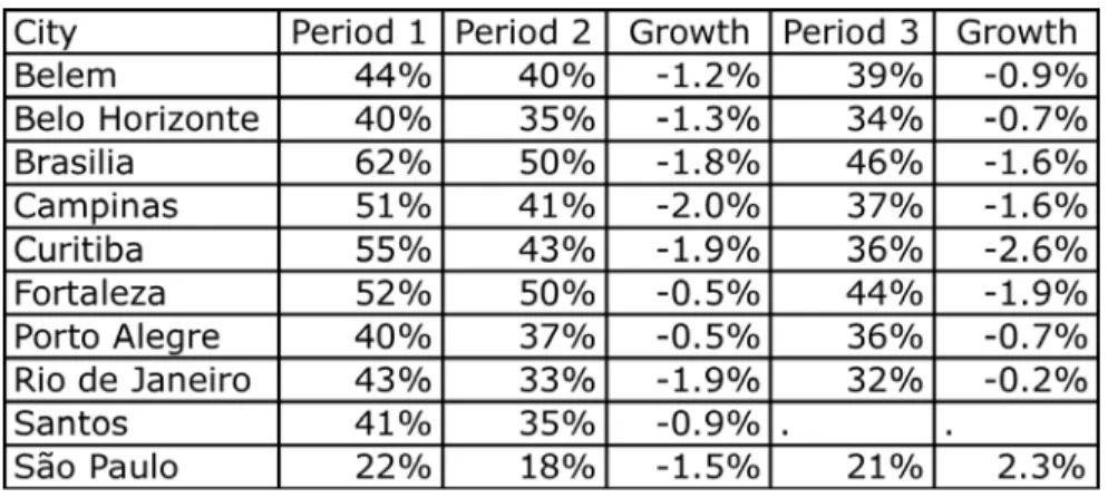
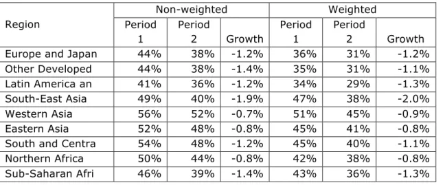
On Table 3 we look at density in the urbanized area for 9 regions around the world for two periods (circa 1990 and circa 2000). It is clear that densities have been decreasing for all regions in the world. As a matter of fact, in the 120 sample of cities randomly selected around the world just 21 cities have increased density levels in the 1990s. Adding 9 cities would increase this number to 22 since Belo Horizonte in Brazil has also increased its density in this decade. That is, less than 20% of the cities have increased density in this period.
<Insert Table 3 around here>
However it is important to notice that the rate of decrease was much slower for large cities. When we weight the sample by city population (last three columns on Table 3) we can see that the rate of growth is slower for all regions but Northern Africa. For developed countries, in land-‐rich countries, in Europe or in Japan, the rate of growth when weighting the sample by population is almost half the rate of growth observed for the non-‐weighted counterpart. The difference is not so large when comparing the other regions except for Sub-‐Saharan Africa where densities in the non-‐weighted average were decreasing at 1.2% per year and dropped to 0.5% per year in the weighted counterpart.
It is important to keep in mind that the weighted averages are evidently closer to the world total. This result is showing that the population of the world is indeed occupying more land (in average) but the decrease in density has not been so pronounced as revealed by a simple average. The decrease in density, weighting by population, is not very high considering the initial density of the fast declining regions. Furthermore the weighted averages are typically higher than the non-‐weighted counterpart. Average densities are still reasonably high not considering the land-‐rich developed countries.
The rate of decline in density for the weighted sample is more or less consistent with initial density. The rate of decrease is larger in regions that were originally denser. Asian countries have been decreasing densities at the fastest rates, followed by Europe and Japan and finally by Land-‐rich developed countries. Based on this rationale, Northern African countries should be decreasing densities at a rate close to the Asian countries but its rate of decrease is slightly above the European and Japan weighted average. Based on initial level, Sub-‐Saharan and Latin American countries should be decreasing densities faster than Land-‐rich developed countries but Latin America is decreasing densities at the same rate as land-‐rich developed countries and Sub-‐Saharan Africa is decreasing density at the slowest rate observed in the World.
To look more carefully at the relationship between density's rate of decrease and initial density, we mapped those variables on Graph 1 for the whole sample. We also add a logarithm trend. If density were converging, the exponential decay would determine the number of years needed for all cities to converge to a steady state. In other words, part of the decline in density is just reversion to the mean: too dense cities converging to average densities.
<Graph 1 around here>
At a first look, the distribution of density growth does not fit very well the convergence hypothesis. Looking more carefully at the Graph, we can notice that there are many cities in developed countries that are decreasing densities while they were supposed to be increasing if there were convergence. Evidently this group is concentrated in the land-‐rich developed countries. For the 11 cities in developed countries decreasing density at a much higher pace than expected, just 3 of them are from Europe. All other cities are from North America (US or Canada). Curiously enough, the two cities that are farthest away, Leipzig and Wien, are European11.
There are two Latin American cities that are decreasing densities "too fast" (relative to the world trend), three from Asia and 1 from Africa. In this sense the rhythm observed for Latin America is not "too low" as Table 3 might have suggested; the comparison group (land-‐rich developed countries) is the one that is decreasing densities "too fast" given its initial level. In any case, there are almost twice more outliers growing slower than it would be expected for the density standards to converge: two from Latin America, 6 from Africa and 22 from Asia. We do have "too low" densities in North America compared to the world standards but we have relatively high persistent densities in Asia and in part of Africa.
In Africa the problem is mainly in Northern Africa. The 3 cities in the sample from Egypt (Alexandria, Aswan and Cairo) were decreasing densities at relative slow pace given its initial level (above 200 persons per Hectare for Alexandria and Cairo). Algiers, in Algeria and Casablanca in Morocco were also in this situation. Out of 8 cities randomly selected from Northern Africa, 5 of them were decreasing density at a very slow rate given its initial level. The only case in Sub-‐Saharan Africa, out of 12 cities selected, was in Addis Ababa, Ethiopia.
In Asia the problem is also very concentrated in South-‐Central Asia. In India, 7 out of 9 cities selected were decreasing densities; super dense cities such as Mumbai (400 persons per
hectare) was decreasing densities at just 0.5% per year. The 3 super dense cities selected from Bangladesh (Dhaka, Rajshahi and Saidpur) were also growing at a relative slow pace. Dhaka, with 480 persons per hectare, was decreasing density at 0.5% per year. The problem was definitely not in the East part of the continent. China has just one outlier in mainland (Anqing) besides Hong Kong, the highest density in the sample. We are not saying that densities in China are low. But some dense cities in China were decreasing densities very fast. This is the case of Yiyang, for instance that had 208 persons per hectare in 1990 but was decreasing densities at 11% per year. In the Republic of Korea 2 (Pusan and Seoul) out of 5 cities were decreasing densities at a slow pace. We can say the same about Southeast and West Asia. The problem is concentrated in the South-‐ Central part of the continent.
Although we may have some signs of persistent low densities in North America and some signs of persistent high densities in Northern Africa and South-‐Central Asia, most of the cities in the sample are changing densities at rates relatively compatible with its initial level. Almost two thirds of the cities in the sample are close enough from the exponential trend. All in all the decrease in density observed for most cities in the sample randomly selected does not seem to be really worrisome. The problem in North America is very likely connected to the low price of gasoline associated with an extensive network or roads12. The problems in Northern Africa and South-‐Central Asia are probably connected with income distribution and the way urban
development is taken place.
The fact that China is performing "as expected" may distort the general statistics about urban footprint growth in the world. China represents a large part of the world population and a larger part of the urban population growth. Urban footprint in China is expected to grow at a faster pace than its urban population since its initial level is relatively high. This is not the case in Latin America and the Caribbean. It is not a surprise that Latin America was behaving quite differently from Asia in the last decade of the XX century. First, Latin America has mainly finished the rural-‐urban transition with levels of urbanization similar to Europe (around 80% of the population). Second, Latin America in general had a modest growth in the GDP (after the 1980s lost decade) while many countries in Asia experimented a fast economic growth in the same period.
<Graph 2 around here>
Latin American and Caribbean countries are behaving very much like the average, giving their initial density. The cities selected in the continent are performing as expected. We have to be careful when using this data since 9 cities in Brazil were added to the original sample making Brazil over represented in the "120+9 Sample". For instance, the Latin America and Caribbean average might be distorted towards Brazilian standards. However, the only Brazilian cities that were not performing as expected, compared to the whole sample, are Ilheus and Jequié, both from the original sample. The large metropolitan areas chosen in this research are changing their density level in a way very similar to other Latin American countries.
Looking at Graph 2, we can notice that except for Ilheus and Jequié, there is almost always a city from another Latin American country very close to a Brazilian city. The average density of the original sample (i.e. not considering the 9 cities added) is higher since Brazilian cities are typically less dense than their Latin American counterpart. In 1990 the density of 3 out of 5 cities selected in Brazil were among the 5 less dense in the continent (out of 16). São Paulo, the densest Brazilian city in the original sample (88 Persons per Hectare), was much less dense than Mexico City (150 Persons per Hectare), San Salvador (130) or Santiago (114). Evidently the 9 cities added to the sample are denser than the ones selected in the original sample because we arbitrarily focus on larger metropolitan areas. However, we can see from Graph 2 that Brazilian cities compared with cities with similar initial densities in other LAC countries usually have a similar growth rate in density.
Looking at the dynamics of density around the world one might be tempted to say that sprawl is "ubiquitous and expanding" (Glaeser and Kahn [2004]). Although we have to qualify the differences by country. It is true that less than 20% of the cities in a random sample around the world have increased densities in the period. So, if sprawl is defined as reducing densities, it is correct that it was persistent in the 1990s. If you define sprawl as "excessive" decrease in density and excessive is defined as decreasing densities at rates larger than the convergence rate, we would say that this assertion is true just for the US. It is not the standard in any other part of the world. Actually, we can see the opposite problem (densities decreasing "too slow") in Northern Africa and in South-‐Central Asia.
If we redefine sprawl as a measure on how scattered the development is, as discussed in the previous section, the conclusion would be exactly the opposite. Just 7 cities in the world sample have increased the average proportion of open space in a 1 square kilometer radius. Open space (defined as non built-‐up, non water pixels in Landsat Imagery) proportion has been decreasing in almost all cities (but 6) in the world and in all regions. Furthermore, the rate of decrease in open spaces in large cities is close to the rate of decrease in smaller cities. The average growth rate for the weighted sample is very similar to the average growth in the non-‐ weighted counterpart.
<Insert Table 4 around here>
As expected, larger cities have less open space than smaller. The average open space in the weighted average is always lower than the non-‐weighted counterpart but their relative change was similar in average. Except for South-‐East Asia where open space has been decreasing at a faster pace, we cannot notice significant differences among regions in terms of growth rate. What is more surprising is that Asia, that has the highest density among continents, has also the largest index of openness. And LAC, Europe, Japan and other developed countries, that have the lowest density, have the lowest index. Looking at aggregate data, it seems that density and openness are negatively correlated what is puzzling.
<Insert Graph 3 around here>
When we look at the convergence pattern for the openness index we can notice that it is not converging at all. Cities are clearly not following an exponential decline. And there is no clear standard by region. In Graph 3 we mapped the annual growth in openness against the initial level. We can see a cloud of cities with no clear trend. One might suspect that this index is not the most appropriate. However, the index makes a lot of sense as argued bellow. Furthermore, Burschfield et al (2006) shows that the usual suspects for causing sprawl indeed causes
fragmentation as measured by the openness index.
LAC pattern is very similar to the world pattern. There is no sign of exponential decrease. The city with less open space in the whole sample (São Paulo, Brazil) is still decreasing its openness when it was expected to be increasing it. Buenos Aires that was similar to São Paulo in terms of openness and density is, at least, keeping it constant at 22%. Once again Jequié and Ilheus are outliers but this time each one on a different side. Ilheus is keeping its openness index constant but it has started from a very large level (74%). Jequie started at a level above LAC average (50%) but not so far. However, it is decreasing the openness at a very fast pace, at 3.5% per year more than twice the growth rate of LAC.
<Insert Graph 4 around here>
How can we reconcile those apparently contradictory results? One alternative would be claiming that one index is more appropriate than the other. In order to define if a measure is appropriate or not, we have to think about what are we trying to measure. So, the first question to be asked is, what can be considered sprawl? The decrease in density is almost tautologically associated with an increase in land consumption. If income is increasing, we expect consumption to increase at a faster rate than population growth. The problem here is that sprawl has been always related to a bad outcome. Density decline cannot be necessarily associated with a bad outcome. In some slums in India, for instance, a reduction in density may be quite desirable. So, to accept density as a measure of sprawl we have to define when a decrease in density is bad or disconnect sprawl from a bad outcome.
The same problem might appear with the open space measure: how much open space is too much? Glaeser and Kahn (2004) argue that sprawl is mainly a consequence of the automobile dominance over other modes of transport. Burschfield et al (2006) furnish evidence that automobile cause sprawl measured by an index totally equivalent to the openness index presented above. As a matter of fact, one characteristic of the automobile is that it is quite flexible. So, it would be expected that one consequence would be a more scattered
development. However, this is not what we observed in the 1990s. The reduction in scattered development was quite strong around the world in the last decade of the millennium. Actually, the evidence that openness have been reducing in the world is stronger than the evidence that densities have been falling.
Are those results indeed contradictory? Is it possible to have density and open space decreasing at the same time? A trivial anecdote can show that this is indeed possible. Imagine that you have two (and just two) small houses side by side in the same zip code (A). The owner of one house buys out his or her neighbor's house. The neighbor sells his or her house and buys land in another zip code (B) that is currently non-‐built (open space). Density in zip code A has just doubled and open space has been reduced. If our measurement of density is weighted by population in the zip code, zip code B would not be counted before this transaction takes place. If the lot in zip code B is larger than the lot he or she used to have on zip code A, the density of the city will increase.
Maybe the devils of sprawl were associated not with the reduction in density but with the increase in open space. As a matter of fact, a trivial application of the Alonso (1964) model can show that, under some hypothesis, the perfect timing for developing the land is exactly when the urban fringe reach it. So, leaving open spaces and leapfrogging to remote sites would be generating inefficiencies that might be connected to households not internalizing the cost of sprawl. So, the fact that Glaeser and Kahn (2004) find that average commute time rises with
population density13 may be due to the very measure they use (density). It is possible that commute time would rise with more leapfrog (that is not measured by density).
The main conclusion is that we end up with decreasing densities but with a lot of infill. As a matter of fact, leapfrogging is rare in the world sample. Most of new development is now taking place inside the urban footprint infilling urban or suburban areas. Since sprawl in the US was much more intense in the 1950s, when automobile ownership was rising at a very fast pace, we do not know if we had a lot of leapfrog at that point that is now already reversing. We also do not know how this movement towards a more compact city observed in the
metropolitan areas as whole works within the metropolitan area, i.e. how is it working when we reduce the scale of analysis? We cannot say anything about the past since we do not have data before mid 1970s. The next two sections will deal with a smaller scale exploring the database generated for that research for 10 large metropolitan areas in Brazil.
References
Alonso, W. (1964). Location and Land Use. Harvard Univ. Press, Cambridge, MA.
Angel, S. J. Parent, D.L. Civco, and A.M. Blei (2011) Making Room for a Planet of Cities. Lincoln Institute of Land Policy Policy Focus Report.
Baum-‐Snow, N. (2007) "Did Highways Cause Suburbanization?". The Quarterly Journal of Economics, May: 775-‐805.
Burchfield, M., H.G. Overman, D. Puga and M.A. Turner (2006) "Causes Of Sprawl: A Portrait From Space". The Quarterly Journal of Economics, May: 587-‐633.
Clawson, M. (1962) "Urban Sprawl and Speculation in Suburban Land". Land Economics 38(2): 99-‐ 111. Ewing, R., R. Pendall, and D. Chen (2002) Measuring Sprawl and Its Impact. Washington, DC: Smart Growth America.
Fujita, M. and H. Ogawa (1982) "Multiple Equilibria and Structural Transition of Non-Monocentric Urban Configurations." Regional Science and Urban Economics 12 :16 1 -196.
Glaeser, E.L. and M.E. Kahn (2004) "Sprawl And Urban Growth" In Handbook of Regional and Urban
Economics, Volume 4. Edited by J. V Henderson and J.E Thisse
Galster, G., R. Hanson, M.R. Ratcliffe, H. Wolman, S. Coleman and J. Freihage (2001) "Wrestling Sprawl to the Ground: Defining and measuring an elusive concept". Housing Policy Debate, 12(4): 681-‐717 Harvey, R.O., and W.A.V. Clark. (1965) The Nature and Economics of Urban Sprawl". Land Economics 41(l): 1-‐9.
Henderson, J.V., Mitra, A. (1996). "The new urban landscape developers and edge cities". Regional
Science and Urban Economics 26, 613-643.
Lessinger, J. (1962) "The Case for Scatterization". Journal of the American Institute of Planners 28(3): 159-‐69.
Mills, E.S. (1967) “An Aggregate Model of Resource Allocation in Metropolitan Areas”. American
Economic Review, 57:197-200
Muth, R. (1969) Cities and Housing. Chicago: Chicago University Press.
Wheaton, W. (1974) “A Comparative Static Analysis of Consumer Demand for Location” American
Economic Review, 67:620-31.
Table 1: Correlation among sprawl indices
den_bu den_urb den_fpnt proxim avg_dist openn
den_bu 1.00 den_urb 1.00 1.00 den_fpnt 0.96 0.96 1.00 proxim -0.07 -0.10 -0.01 1.00 avg_dist -0.23 -0.24 -0.18 -0.04 1.00 openn 0.12 0.14 -0.06 -0.63 -0.28 1.00
Table 2: Relevant Definitions
Concept Definition
Built-up Area Impervious surface pixels as identified from Landsat imagery
Urban Built-up pixels for which the land within a 564 meter radius is 50 - 100% built-up Suburban Built-up pixels for which the land within a 564 meter radius is 10 - 50% built-up Urbanized Open
Space
Non-built-up, non-water pixels for which the land within a 564 meter radius is 50 - 100% built-up
Captured Urbanized Open Space
Non-built-up, non-water pixels that are completely enclosed by Urban, Suburban, and Urbanized Open Space pixels and have a contiguous patch size of less than 200 hectares.
Urbanized Area Urban, Suburban, Urbanized Open Space, and Captured Open Spacel pixels Peripheral Open
Space
Non-built-up, non-water pixels that are within 100 meters of Urban and Suburban built-up pixels
Captured Peripheral Open Space
Non-built-up, non-water pixels that are completely enclosed by Urban, Suburban, and Peripheral Open Space pixels and have a contiguous patch size of less than 200 hectares.
Urban Footprint Urban, Suburban, Peripheral Open Space, and Captured Open Spacel pixels Proximity Index The average distance of all points in the shape to the Central Business District Average Distance Average distance from CBD to urbanized OS pixels (km)
Openness Index The average percent of non-urban land within a 564 meter radius of all built-up pixels