Escola das Artes da Universidade Católica Portuguesa Mestrado em Gestão de Indústrias Criativas
The Design of Nutrition Labels
2012/2013
Cátia Cecília Delgado Lages
Professor Orientador: Prof. Doutora Cristina Sá Professor Co-Orientador: Prof. Doutora Ana Gomes
Dedication
I dedicate my dissertation to my family and friends.
To my parents, for their unconditional support and incentive along the academic, professional and personal life.
And especially to my husband, for his patient over these two years, but most of all for his amazing ability to motivate me during the hardest paths.
Acknowledgements
I would like to thank to my advisor Professor Cristina Sá for her excellent and caring guidance during the research. I would like to thank as well to my co-advisor Professor Ana Gomes, for providing the research with scientific insight. I would like to thank MoveLife's team for the constant support and for extending this challenge to me first. And at last, I would like to thank to my cousin Sara do Paco Stevens who revised the English.
Abstract
The main objective of this dissertation was to expose the process involved in the design and the actual design of a nutrition label for restaurant’s menus.
The increasing overweight and obesity rates are a major concern for health organizations and governments. In order to fight this epidemic, the Commission of the European Communities outlined a Strategy for Europe on Nutrition, Overweight and Obesity related to health issues determining, among others, that providing nutritional information to consumers is a critical factor that may influence healthier food choices. Since the habit of eating out-of-home is related to the increasing overweight and obesity rates as well, the disclosure of nutritional information in restaurants (or mass caterers in general) can provide guidance to consumers while choosing their food.
The process of designing a nutrition label for restaurant’s menu was divided in to parts. The first part addressed research on communication, infographics and on the state-of-the-art of nutrition labels. The second part, and supported in the collected information and case studies’ analysis, was related with determining the type of information to include in the label and the nutritional criteria in which it was going to be based. It also included the actual design decisions related to the model of a nutrition label for restaurants’ menus, to be software generated.
As future work it was pointed the necessity of testing it within the market and consumers and to develop an interactive solution for providing customized nutritional guidance.
Resumo
O principal objectivo desta dissertação consistia em expor o processo envolvido no design de um rótulo nutricional assim como desenvolver o seu próprio design.
O aumento das taxas de excesso de peso e de obesidade são uma das grandes preocupações das organizações de saúde e dos governos. De forma a combater esta epidemia, a Comissão Europeia delineou o documento Strategy for Europe on Nutrition, Overweight and Obesity related to health issues que determina, entre outras decisões, que a provisão de informação nutricional aos consumidores é um factor crítico para influenciar a escolha de alimentos mais saudáveis. Dado que o hábito de consumir refeições fora de casa também está relacionado com o aumento das taxas de excesso de peso e de obesidade, a provisão de informação nutricional em restaurantes (ou estabelecimentos de restauração colectiva) pode orientar os consumidores na escolha das suas refeições.
O processo de desenhar um rótulo nutricional para incluir no menu de restaurantes foi divido em duas partes. A primeira parte envolveu pesquisa nas áreas de comunicação, infografia e do estado da arte da rotulagem nutricional. Na segunda parte, e com base na informação reunida e análise de casos de estudo, foi determinado o tipo de informação a incluir no rótulo e os critérios nutricionais em que se fundamentaram. Incluiu também as decisões relativas ao design do modelo de rótulo nutricional para menus, que será gerado digitalmente.
Como trabalho futuro foi apontada a necessidade de testar o rótulo nutricional no mercado e juntos dos consumidores e também a de desenvolvimento de uma solução interactiva para a provisão de orientação nutricional personalizada.
Table of Contents
Table of Figures ... viii
Abbreviation List ...x
1 Introduction ... 1
1.1 Dissertation’s objectives ...1
1.2 Overall organization...3
2 Areas of interest concerning the design of nutrition labels and state-of-the-art of nutritional labelling... 4
2.1 Communication or the ability to convey messages ...4
2.2 Information Visualization and knowledge ...7
An overview on infographics history ...10
2.3 Origin of Nutrition Labels ...17
2.4 Technology trends within the nutrition area...26
3 Methodology ... 29
3.1 Approach to literature review...29
3.2 Case studies’ selection...31
3.3 Methodology for designing the nutrition label ...32
4 A model for a restaurant’s menu nutritional labelling system including nutritional criteria to select and evaluate nutrients ... 34
4.1 Objectives for disclosing nutritional information ...34
4.2 Critical success factors for disclosing nutritional information and different formats of nutrition labels ...35
4.3 Selecting the nutritional information ...37
4.4 Nutritional Criteria and disclosure of substances causing allergies and intolerances ...38
Nutritional criteria for the summary indicator system...40
Nutritional criteria for the nutrient-specific system ...42
A system for organizing substances / products causing allergies and intolerances ...46
Conclusions ...48
4.5 A model of a restaurant’s menu nutrition labelling system ...48
A visual representation of the summary rating system ...50
A visual representation of the nutrient-specific system...51
Representing visually substances / products causing allergies and intolerances ...54
Composing the standard nutrition label ...59
4.6 Conclusion...62
5 Conclusions from the developed research and future work... 64
6 Bibliography ... 68
APPENDIX A ... 73
APPENDIX B ... 74
APPENDIX C ... 76
Table of Figures
Figure 2.1 - “Their first Murder” by Weegee (Arthur Felling), New York City, October 9,
1941 ...6
Figure 2.2 – “All types of cancer, white females; age adjusted rate by county, 1950-1969” ...7
Figure 2.3 - Obesity System Influence Diagram, by ShiftN, 2008 ...8
Figure 2.4 - Carbs are Killing You, designed by Column Five to Massive Health, 2012...9
Figure 2.5– “Orbis sensualium pictus”, by Johann Amos Comenius, 1658...10
Figure 2.6 “Chart Shewing the Value of the Quarter of Wheat in Shillings & in Days Wages of a Good Mechanic from 1565 to 1821.”, William Playfair, 1821 ...10
Figure 2.7– “Railways”, by Michael George Mulhall, 1884...11
Figure 2.8– “Gesellschafts- und Wirtschaftsmuseum”, by Otto Neurath, 1925...13
Figure 2.9– “Wohndichte in Großstädten” (Population Density in the Metropolis). Otto Neurath, 1930 ...14
Figure 2.10– “Machte der Erde” (Powers of the Earth). Otto Neurath, 1930 )...14
Figure 2.11- Weather Map by George Rorick, USA Today, 1982...16
Figure 2.12– Example of a European Nutrition Label, 2012 ...18
Figure 2.13– Example of an American Nutrition Facts table, 2012...19
Figure 2.14 - Menu board displaying information about energy (in calories) ...22
Figure 2.15 - Keyhole Symbol FOP label, by the Swedish National Food Agency, 1989 ...24
Figure 2.16 – Traffic Light System FOP label, by Food Standards Agency and adapted for Continente...25
Figure 2.17– Guideline Daily Amount FOP label...25
Figure 2.18 – Fooducate app screenshot ...27
Figure 2.19 – ShopWell app running and screenshot...27
Figure 4.1 – Guiding Stars nutrition rating system ...40
Figure 4.2 - Example of a food that is ineligible for getting stars...40
Figure 4.3 – Different options for star qualification or no qualification ...41
Figure 4.4 – Individual criteria for colour attribution ...44
Figure 4.5 – Organization of products or substances causing allergies and intolerances by taxonomic group ...47
Figure 4.6 – Visual representation of a food that was ineligible for qualifying for stars...50
Figure 4.7 – Visual representation from the star-rating system ...50
Figure 4.9 – Colour specification for green, amber and red according to FSA...52
Figure 4.10 – Test 1 regarding the nutrient-specific individual indicators ...52
Figure 4.11 –Test 2 regarding regarding the nutrient-specific individual indicators ...53
Figure 4.12 - Group of the three nutrients from test 2 in green and amber...53
Figure 4.13 – Group of the three nutrients from test 2 in green and red. ...53
Figure 4.14 – Icon from Mac OS X Mountain Lion...54
Figure 4.15 – Periodic Table of Elements (from Wikipedia) ...55
Figure 4.16 – Colour attribution and tests in the iconic representation of substances causing allergies or intolerances. ...56
Figure 4.17 – Possible graphic representation of the substances causing allergies and intolerances, based on the periodic table. ...57
Figure 4.18 – The different elements possible conjugations ...59
Figure 4.19 – First test on vertical and horizontal arrangements ...59
Figure 4.20 – Vertical and horizontal arrangements after general lightning of elements ...60
Figure 4.21 – Possible example of association with the dish’s name...61
Figure 4.22 – Grey scale and high contrast versions...61
Figure 4.23 – Summary label ...61
Figure 4.24 – Simple label...62
Abbreviation List
APPS - Applications
DRV - Daily Reference Value EU – European Union
EUFIC - European Food Information Council FDA - Food and Drugs Administration
FLABEL – Food Labelling to Advance Better Education for Life FOP - Front of Pack
FSA - Food Standards Agency GDA - Guideline Daily Amounts
NLEA - Nuttition Labeling and Education Act
OECD - Organisation for Economic Co-Operation and Development) UK - United Kingdom
US - United States of America WHO - World Health Organization
1 Introduction
This dissertation is made on the context of the Creative Industries Management Master and specifically within the area of infographics, with a focus on nutrition label design.
1.1 Dissertation’s objectives
The increase of overweight individuals and obesity in the world’s population has lead several health organizations to strengthen and enlarge the means of communication used to promote a healthier diet, and to create policies related to food nutrition labelling. The European Union (EU) has been analysing statistical data and afterwards outlining several policies in order to reduce the dramatic rise of overweight levels and obesity. These rising levels are especially prevalent among children, where the estimated rate of obesity was 30% in 2006 (Comission of the European Communities;, 2007). This high value means, most of all, that the population’s diet is becoming increasingly poor and the level of physical activity is decreasing. This leads to the growth of chronic conditions, such as cardiovascular disease, hypertension, type II diabetes, stroke, certain cancers, musculo-skeletal disorders and even some mental health conditions. According to the World Health Organization (2010) noncommunicable diseases are the primary global causes of death. In the long term, this translates in a significant reduction in the quality of life of European inhabitants. (Comission of the European Communities;, 2007)
To fight against this trend and following the outlined Strategy for Europe on Nutrition, Overweight and Obesity related to health issues (Comission of the European Communities;, 2007), the EU published a regulation on the 25th of October 2011 in regards to the supply of food information to consumers. The regulation states the demanding need to provide clear and understandable information through food labelling to protect consumer's health, thus assuring consumer's food choices are properly informed.
This regulation is applicable to “food business operators at all stages of food chain” (European Union;, 2011), though this dissertation is focused only on the mass caterers. That is, “any establishment (including a vehicle of a fixed or mobile stall), such as restaurants, canteens, schools, hospitals and catering enterprises in which, in the course of a business, food is prepared to be ready for consumption by the final consumer;” (European Union;, 2011). The main goal of this research is to expose the development process, its study and actual development, of nutrition labels for mass caterers menus in Europe. In order to better achieve it, it is important to enhance the collaboration with the project MoveLife that, among other members, has in its team nutritionists from whom it was possible to get the expertise.
MoveLife’s software is able to automatically provide the nutritional profile of a restaurant’s recipes, both in detailed information and in the form of the nutrition label proposed in this dissertation.
The nutrition facts label, or as defined by the EU, the nutrition declaration (European Union;, 2011), can vary with each food and it contains the following information as mandatory: energy value (kcal), the amounts of fat, saturates, carbohydrate, sugars, protein and salt, all referring to 100g or 100ml amounts and, in addition and if applicable, to portions.
This is intended to make the consumer easily understand the major importance that food choice has on the energy value and nutritious content of a diet, and therefore to influence them, the nutrition declaration must be clear and objective in its graphic expression. Taking into account Barnard’s (2008) enumeration of some of the functions of design, namely information and persuasion, it is possible to assume that design is the right field of action to give an answer to this need.
Taking as reference the study on The Economy of Culture in Europe (KEA European Affairs;, 2006) the Creative Industries field is related to the use of creativity as an essential skill to the performances and innovation factor on sectors like design (graphic design, fashion design, interior design and product design), architecture and advertisement. By adding cultural elements to their production, these sectors are innovating and therefore creating a competitive advantage.
More specifically, design as “a key example of how cultural resources are used in an indirect way to contribute to innovation in non-cultural activities” (KEA European Affairs;, 2006), can play a relevant role in responding to European Union to transform nutrition information into meaningful, graphical forms or symbols that, as a result of their design, are able to convey an information – infographics.
Infographics is an abbreviation of “information graphic” and it consists of the use of visual cues in order to communicate information, independently of its complexity, amount of data or level of analysis (Lankow, Ritchie, & Crooks, 2012).
For Jason Lankow (2012) it is possible to point to three types of infographics:
Static: fixed information in which user interaction is limited to viewing and reading and the output is a still image. Because of its efficiency related to time of development and allied costs, it is the most common used type of infographics, especially for time-sensitive information;
Motion: fixed information in which user interaction stands for viewing, listening and reading in an animated output:
Interactive: fixed or dynamic information and the user interaction consist of “clicking, searching for specific data, actively shaping the content displayed, and choosing which information is accessed and visualized” (Lankow, Ritchie, & Crooks, 2012).
Accordingly, the object of this research is how to create, through static infographics, a nutrition label widely understandable by the general population to be added specifically in mass caterers’ menus in order to fight the increasing rates of overweight and obesity and related chronic diseases.
1.2 Overall organization
In chapter number 2 it is possible to find information about communication and more specifically about semiotics’ theory on codes, an overview on infographics’ evolution throughout time, the state of the art of nutrition labelling in Europe and United States, and an indication of some technologic solutions related with nutrition.
In chapter number 3, it is revealed the methodological approach designed for literature review, case study’s selection and the processes to analyse the collected information. It is as well included the methodology for the actual design of the nutrition label.
The fourth chapter refers to the development of the nutrition label for restaurants. The first part includes the decisions regarding the elements to incorporate in the label and the criteria in which they are based. The second part is specifically addressed to the graphic decisions related with each element that constitutes the label.
Chapter number 5 is the conclusion of the research around the design of nutrition labels for restaurant menus.
2 Areas of interest concerning the design of nutrition labels and state-of-the-art of nutritional labelling
The aim of this dissertation is to expose the development process and further design of a nutrition label for restaurant menus. In order to achieve this, it is necessary to understand: (1) the importance of the right communication to convey a message from sender to receiver; (2) viewing information design as a way to democratize knowledge; (3) the evolution of nutrition labels, its regulations and real impact on consumers.
In the first point it is addressed the semiotics’ field of study in order to provide an insight on the relation between signs, codes and culture.
The second point approaches the history of infographics and especially the ISOTYPE pictorial system.
At last, the third point includes a synthetic version from the nutrition label’s history and its legal framework in Europe and US, although giving more emphasis to the European context.
2.1 Communication or the ability to convey messages
When answering the question “what is communication?” Fiske (1990) first determines that all communication requires signs and codes: signs as signifying constructs, since they refer to something other than themselves, and codes as the systems in which the signs are arranged and how signs relate to each other. Letters are an example of signs and words or a language an example of code.
The author also assumes that social relationships are about transmitting and receiving signs / codes, envisioning communication as a focal point for any culture since it allows its transmission. Consequently, Fiske’s definition of communication is a “social interaction through messages” (Fiske, 1990).
Given that it is the science of signs and meanings, the semiotics field of communication study is considered in this context the more relevant for the purpose of this research. It allows the study of communication as the production and exchange of meanings, or how messages interact with people to create meaning (Fiske, 1990), which is extremely relevant given that the final objective of this research is to create a nutrition label that might influence people’s eating behaviour.
Semiotics has its foundations in two thinkers: the American logician and philosopher C.S. Pierce and the Swiss linguist Ferdinand Saussure. Both models differ mainly in their focus: while Pierce is more interested in the meaning, Saussure is concentrated on the sign in itself.
Fiske (1990) is an author that is concerned with providing some coherence to the study of communication, its main models and theories and he therefore approaches both Pierce and Saussure theories. He defends that the three main areas of study addressed by semiotics are: (1) the signs, their variety, how they transmit meaning and their relation to the people who use them; (2) the codes, their creation in order to
satisfy socio-cultural needs and the available channels of communication for their transmission; and (3) the culture in which signs and codes function, and culture’s reliance on them to exist in its form.
The message receiver is perceived as a reader, enhancing his importance on the message decoding: it is through reader’s interaction that text acquires its meaning (Fiske, 1990).
Codes can be divided into two categories: codes of behaviour and signifying codes. The use of a code by the members of a community, for example traffic lights, depends on the knowledge that those members have of the rules by which the code is driven. The Highway Code or Traffic Code, in which the traffic light colour’s convention is included, it is considered in this context a code of behaviour. On the other hand, signifying codes are systems of signs, and can be characterized as: having a number of units (or just one unit) with shared features that determine they belong together (ex. M is an alphabet sign); conveying meaning; depending on an agreement between users with common cultural experience; having and identifiable social and communicative function; and as having the ability to be transmitted through the right communication channels (Fiske, 1990).
In this research the focus is on signifying codes, not only because the nutrition label is a system of signs that convey the food’s nutritional profile, but also because they depend on an agreement about the kind of information they convey. Depending on the audience for whom they are designed, the codes can be classified as broadcast or narrowcast. Broadcast codes are simple to understand and don’t require a highly educated audience to convey their meaning. Driven for the masses, broadcast codes are adjusted with general concerns, emphasizing what people have in common and connecting them to their own society (ex. television). The audience for broadcast codes is expecting confirmation and guarantees. Narrowcast codes are somehow elitist or socially divisive as they are created for small and specialized audiences that most of the times, choose to learn the codes (ex. medical language). The narrowcast codes audience expects to be enriched or transformed by the communication (Fiske, 1990).
Infographics, as it will be confirmed further, were in the beginning of their history narrowcast codes. Nowadays, with computer technologies and easy access to information, infographics have outburst, becoming broadcast codes.
What both codes have in common is the agreement between its users on their basic elements: the units, the way units can be combined, their meanings and their social or communicative function. According to Fiske (1990), there are three ways in which the agreements can be established.
Convention and use is the agreement resulting from shared experiences by members
of a culture, framing the limits in which each member is expected to act or behave. Most of the times codes resulting from convention and use aren’t formally stated, which often leads to misunderstandings based on reader’s different cultural experiences, and his use of a different code to decode the initial message. Dress codes are an example from this category.
Arbitrary codes can be simple and clearly understood by any culture’s member who
has decided to learn it. They are symbolic, denotative, impersonal and static, like maths or traffic lights. Their meaning can’t be changed unless there is a new set agreement amongst its users. It is probably the closest to a universal language.
And at last, the Aesthetic codes can be identified by their fleeting nature, since they are truly affected by their cultural context. They can either be conventional, because they acquired agreement amongst their users (a fashion trend that has many followers), or innovative, if there is a need for gradual learning of new codes (the appearance of conceptual art).
The meaning given to a code depends on the reader’s interaction with it. Connotation and denotation values of meaning can be attributed to the codes. Connotation is the type of meaning that relates the individual with a certain culture, and it is through his values and beliefs that a message is decoded. It requires a high “level of cultural knowledge in order to be constructed or understood” (Barnard, 2008, p. 36). Denotation, on the other hand, corresponds to the literal meaning. A photograph is firstly identified as a photograph – denotation meaning - and afterwards within a deeper analysis, the reader searches for what it stands for – connotation meaning. In order to generate a more accurate meaning, some photographs need to rely on language. According to Fisk, Anchorage is the term used by Roland Barthes, Saussure’s follower, to describe the words used as captions for photographs, arguing that the polysemous origin of visual images can lead the reader to choose some signifieds and to ignore others (Fiske, 1990). In this context, words can help in fixing the photograph meaning but they can also narrow its connotation (figure1). If in some cases this narrowing may seem castrating, in another cases, as in a map's captions, it can be extremely relevant so as to avoid misunderstandings or getting lost.
Figure 2.1 - “Their first Murder” by Weegee (Arthur Felling), New York City, October 9, 19411
1 Retrieved from: http://www.worcesterart.org/Exhibitions/Past/weegees_world.html
2.2 Information Visualization and knowledge
The design of a map probably resulted from someone’s need to register and define a certain course in order to be able to repeat it or to leave it as a legacy, like explorers did. The common tourist maps available in tourist information centres, were most likely designed for travellers to see the city’s very best without getting lost or missing important spots. In both cases the map stands for the visual solution given to answer the need of navigation.
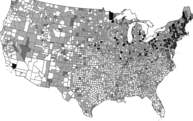
By giving the example of data maps, like the maps reporting deaths from cancer in the different regions of the United States (figure 2.2), Tufte (2001) shows that the visual display of data can lead to a better understanding into the causes, and therefore the avoidance, of cancer. The visual display of data is capable of transmitting valid knowledge. Data refers to a collection of details that result from experiments, measurements and observations of a set of variables. As complex systems consisting of numbers, words or visuals, the information designer has to organize data in a meaningful way (Petterson, 2012).
Figure 2.2 – “All types of cancer, white females; age adjusted rate by county, 1950-1969”2
Information visualization is a research field where the objective is to improve cognition of “patterns and trends in abstract datasets, by developing effective mapping techniques for representing values in visual forms” (Mol, 2011, p. 21). That is a system of visual representations that help humans to understand and analyse complex, abstract data.
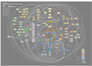
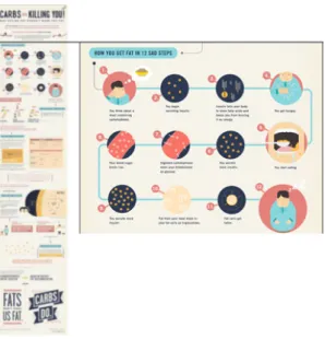
Data visualizations (figure 2.3) and infographics (figure 2.4) are two different types of information visualization, but there is a lack of consensus on what distinguishes them.
2 Maps from Atlas of Cancer Mortality for U.S. Counties; designed by Thomas J. Mason, Frank W.
McKay, Robert Hoover, William J. Blot, and Joseph F. Fraumeni, Jr. (Washington, D.C.: Public Health Service, National Institutes of Health, 1975). Redesigned and redrawn by Lawrence Fahey and Edward Tufte. (retrieved from: Tufte, Edward R. (2001) The Visual Display of Quantitative Information. Connecticut: Graphics Press LLC)
In a post by Alex Williams in the blog ReadWrite3, there is part of a discussion around what might differentiate data visualization from infographics. Benjamin Wiederkehr of Datavisualization.ch4 (a resource for news and knowledge on data visualization and infographics) considerers that their difference stands mainly on the objective. That is, while information graphics rely on a context and are used to tell a story or answer a question, data visualizations display measured quantities through the combined use of a coordination system, points, lines, shapes, digits, letters quantified by visual attributes. Hjalmar Gislason, founder and CEO of DataMarket.com5, agrees with the previous definition of data visualization but concerning infographics, he considers them as graphic representations that can combine one or more data visualizations with other type of information, like graphics or text, in order to establish relationships or tell a story. Normally, data visualization is a representation more abstract than infographics.
Figure 2.3 - Obesity System Influence Diagram, by ShiftN, 20086
3
http://readwrite.com/2011/01/07/difference-between-datavisualization-infographics?&_suid=1359584475167006085395812988281
4 http://datavisualization.ch/ 5 http://datamarket.com/
Figure 2.4 - Carbs are Killing You, designed by Column Five to Massive Health, 20127 Since the purpose of this investigation is the study and analysis involved in the design of a nutrition label, infographics seem to be the type of information visualization that betters fit the nutrition label purpose: besides providing accurate information about the food’s nutritious profile, it also has to establish associations – tell a story – between the different elements included in the label in order to influence people’s behaviour when choosing their foods.
7 Retrieved from: http://blog.massivehealth.com/infographics/Carbs_are_killing_you/
An overview on infographics history
Educating (and persuading) through pictures goes back to 1658 when Johann Amos Comenius published Orbis sensualium pictus (figure 2.5), an atlas consisting on illustrations of the visible world. Transforming society features into pictorial statistics has been, since then, a major concern for several authors (Jansen, 2009).
Figure 2.5– “Orbis sensualium pictus”, by Johann Amos Comenius, 16588
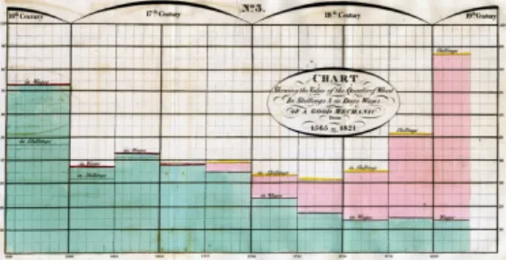
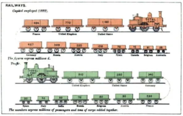
In the XVIII century William Playfair detached his graphics from the physical world and invented different types of graphs and charts, popularizing their use through his writings on political and economic topics (figure 2.6). The rise of infographics, or information graphics, was seen some years later, when the Irish writer, journalist and statistician Michael George Mulhall, published the Dictionary of Statistics, illustrating quantities through smaller or larger pictograms (figure 2.7) (Jansen, 2009).
Figure 2.6 “Chart Shewing the Value of the Quarter of Wheat in Shillings & in Days Wages of a Good Mechanic from 1565 to 1821.”, William Playfair, 18219
8 Retrieved from: http://commons.wikimedia.org/wiki/File:Orbis-pictus-004.jpg
[accessed: 13-02-2013])
9 Retrieved from:
http://libweb5.princeton.edu/visual_materials/maps/websites/thematic-maps/quantitative/sociology-economics/sociology-economics.html [accessed in: 13-02-2013])
Figure 2.7– “Railways”, by Michael George Mulhall, 188410
But it wasn’t until the 1920’s that it was developed a methodology for displaying statistic effectively: ISOTYPE. The system was created by Otto Neurath, an Austrian social scientist that can be considered the father of infographics.
Born in Vienna in 1882, Otto Neurath was a sociologist, mathematician, philosopher and urban-planner. During and after the First World War, Vienna was demanding a social rebuild after gipsy occupation. Otto Neurath along with his peers Hans Kampffmeyer, Adolf Loos, Gustav Scheu and Max Ermers were the major exponents of self-help urbanism. They believed that urban reform through communal efforts was the only possible way to transform life in the modern city. Neurath also understood that the only meaningful way to do it was by fostering the ability that Vienna had to communicate with its people (Vossoughian, 2008).
His economic philosophy was based on the concept of Global-Polis, a collectivity based on an economy-in-kind where knowledge was to be democratized and globalize. The industrialized city, on the other hand, was to be guilty of diffusing dehumanization among workers, of encouraging natural resources’ over-exploitation and of objectifying “human ties and relationships” (Vossoughian, 2008, p. 11). Somewhere along his way, Neurath directed his interest to museum education and exhibition design. Through these areas he could create some fuss around social and economic hierarchies. If in the past the museum was for the erudite to see rare artefacts, for Neurath, the modern museum spotlight should be the everyday expression in order to promote democracy and scientific literacy: museums should be the interface where the masses could see and understand their aspirations and achievements.
When nominated as the director of Museum of War and Economy in 1918, Neurath’s main goal was to show the masses how a market economy turned into a centralized economy-in-kind during the war period. In order to make the information easy to understand, he was going to use visual media like lantern slides, chats, photographs and models (Vossoughian, 2008).
10 Retrieved from: http://euclid.psych.yorku.ca/SCS/Gallery/images/mulhall1884-pictogram-p379.jpg
Neurath believed that knowledge was only available through symbols: he saw verbal language as a disfiguring medium for knowledge related to its lack of consistency in structure and vocabulary (Lupton, 1986).
Throughout the museums existence it only sponsored one exhibition that took place in Germany in 1918. The show explained city policies to local citizens through the illustration of the impact that the blockade measures set against Germany trade, considerations on the role that in-kind transactions, recyclable materials, folk know-how and local technologies played during war, etc. (Vossoughian, 2008).
With the end of the war in the same year, the museum closed its doors. Despite his constant connection with museum education, it wasn’t until 1923 that Neurath established the Vienna’s Museum of Settlement and Town Planning, afterwards renaming it to the Museum of Society and Economy. According to Vossoughian, the Museum objective set by Neurath was to educate “the working-class masses about production, emigration, mortality, interior furnishing, unemployment, the fight against tuberculosis and alcoholism, diet, the meaning of sport, physical and mental development, schooling… [and] the state of industry” (Vossoughian, 2008, p. 57). The museum included a skilled work group of researchers constituted from mathematicians to artists, aiming to include science in daily life, which was a clear result of the Logical Positivism, a philosophical theory that Neurath helped to found. This school of thought joined two positions that were previously seen as contraries: the rationalism, that studies reality through logic, geometry, and mathematics disregarding observation; and empiricism (or positivism), which declares direct human observation as the only way to access knowledge (Lupton, 1986).
When talking about the Museum of Society and Economy on Vossoughian’s (2008), Neurath highlights that modern man is used to the comfort of getting educated in their leisure time through cinema and illustrations. So, in order to spread socio-scientific education, he enhances the need to use similar ways of representation. This is a clear statement of his intentions to use mass media in order to reach a broader audience As previously mentioned about the semiotics approach about codes, Neurath’s communication intent is a perfect fit on the broadcast type of codes, which are simple to understand and don’t require a highly educated audience to convey their meaning. Turning into visuals “invisible phenomena” was a problem that Neurath faced when designing the exhibitions. To solve it, he established a “Department of Transformation” were the transformer (the worker responsible for the transformation) had to organize the information to be presented in the most effective way. Neurath resorted on statistical data to provide a more complete knowledge to be understood by the masses. To represent this data and worried with the gap between reading and seeing, he felt that iconic signs were a better, more effective way to convey information. Not only they could stimulate imagination more than text, but they could be understood by different classes and nationalities.
On Vossoughian’s book (2008) there is a quote from Neurath that stresses the importance of pictorial language: “A man coming into a strange country without a knowledge of a the language is uncertain where to get his ticket at the station on the
harbour, where to go in the post office. But if he sees pictures by the side of the strange words, they will put him on the right way” (Vossoughian, 2008, p. 61).
And so was born the Vienna Method of Pictorial Statistics, which in 1935 was renamed as a System of Typographic Picture Education (ISOTYPE), and was inspired by military cartography, innovations on information graphics and the New Typography movement (Vossoughian, 2008). For Lupton (Reading Isotype, 1986), ISOTYPE is a popular version of logical positivism: an ISOTYPE symbol “is positive because, as a picture, it claims a base in observation; it is logical because it concentrates experienced detail into a schematic, repeatable sign” (Lupton, 1986, p. 49).
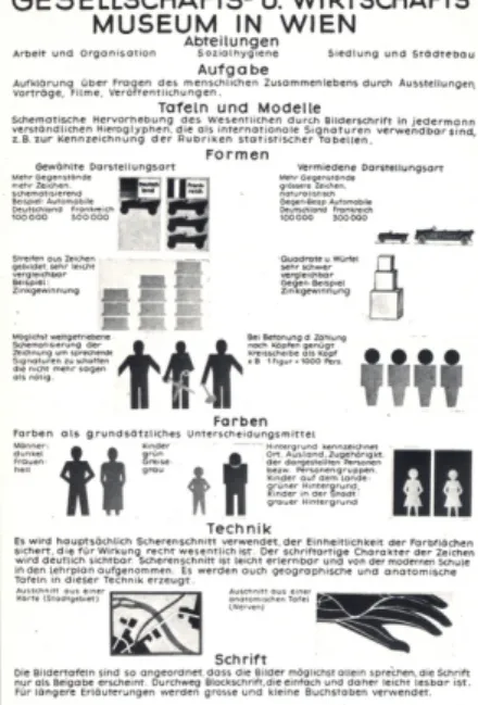
Figure 2.8– “Gesellschafts- und Wirtschaftsmuseum”, by Otto Neurath, 192511
With the intention to make his communication techniques easier to imitate, in 1925 Neurath made a diagram (figure 2.8) listing the goals and representational techniques of the Museum of Society and Economy. The first rule is “more objects, more symbols” (Vossoughian, 2008, p. 63), that is, if one symbol represents a certain quantity, increasing that quantity has a proportional increase on the number of symbols. Consistency in form and meaning, besides simplifying the design process, allowed the reading of pictures as information, enhancing their ability to be universally legible (Lupton, 1986). Every sign should be reduced to its simplest expression “in order to create speaking signs that say no more than necessary” (Vossoughian, 2008, p. 63), opting for two-dimensional, flat signs (like silhouettes), as the third dimension is distracting. And “colour should be used as a fundamental tool for differentiation” (Vossoughian, 2008, p. 63). The alphabetic quality of
11 Retrieved from: Vossoughian, Nader (2008). Otto Neurath - The Language of the Global Polis.
ISOTYPE is enhanced by the elimination of perspective and superfluous details, and like in writing, “the size, scale, or position of a given sign relative to other signs is not meant to be interpreted spatially” (Lupton, 1986, p. 54). Later, also Tufte (2001) pointed the use of two or three dimensions as “a weak and inefficient technique, capable of handling only very small data sets, often with error in design and ambiguity in perception” (Tufte, 2001, p. 71).
The diagram shows ISOTYPE similarity to a scientific formula by turning direct experience into a concise, repeatable and generalized scheme. In the light of semiotics theory, ISOTYPE charts stand for a code made of signs (pictograms) that relate to each other in a meaningful way. ISOTYPE symbols are replacing abstract numbers by figures. And because the symbol stands for a number those charts have scientific value (Lupton, 1986).
Otto Neurath believed that through ISOTYPE, knowledge could be easily spread across different cultures since it relied in the objectivity of vision rather in the interpretation mediated through culture.
Figure 2.9– “Wohndichte in Großstädten” (Population Density in the Metropolis). Otto Neurath, 193012
Figure 2.10– “Machte der Erde” (Powers of the Earth). Otto Neurath, 1930 13)
12 Retrieved from: Vossoughian, Nader (2008). Otto Neurath - The Language of the Global Polis.
Rotterdam: NAi Publishers
Although ISOTYPE is considered by many as overrated, strongly attached to the Soviet Propaganda, obsolete in the internet era (Jansen, 2009), Neurath left to modern design theory one of its deepest principles: the concept of vision as an autonomous and universal faculty of perception (Lupton, 1986). “Seeing comes before words” (Berger, 1972, p. 7).
The main goal of information visualization is to provide knowledge through viewer’s understanding of abstract information. But what are the main reasons why information visualization is so meaningful in providing knowledge?
According to Laura Mol (2011) it is the human perceptual and cognitive system that makes visual information efficient in knowledge transmission. The human eye is the one mainly responsible for its effectiveness. When in the presence of some visual stimuli, like bright colours or movements, the eye will automatically focus on that. Another pointed reason is related with Gestalt’s theory of perception, where the whole is different from its parts. That is, the way the whole is perceived is substantially different from each individual element. This theory includes concepts like proximity, similarity, connectedness, enclosure and continuity, which won’t be taken into deeper analysis in this investigation. At last, Mol (2011) defends that seeing in colour is a human capacity that needs to be leveraged. Colour can make information easier to understand through its contrasts, and turn it more appealing and attractive as well. Through information visualization, it is possible to make instantly available large amounts of data, enabling the perception of possible cause-effect connections, or even to understand if the data collection was made properly.
Mol (2011) quotes J. Thomas and A. Cook to explain that information visualization assumes that “visual representations and [interaction techniques] take advantage of the human eye’s broad bandwidth pathway into the mind to allow users to see, explore, and understand large amounts of information at once. Information visualization focused on the creation of approaches for conveying abstract information in intuitive ways” (Mol, 2011, p. 21).
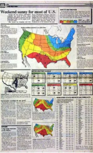
It was before computer technologies appeared that George Rorick set the tone to modern infographics. He was the creator of the modern weather map launched in 1982 in the American newspaper USA Today (fig. 11). To Rorick, infographics play a very important role in news presentation to the public. His main objective is to help readers understand a part of a story in a fast, concise and clear way (El Mundo;, 1999).
Figure 2.11- Weather Map by George Rorick, USA Today, 198214
With the rise of digital technologies, the creation of infographics was made easier and with the Internet they became fairly popular. Data became open to everyone with access to the Internet. Newspapers keep using infographics as an essential part of news communication, especially in their online versions, where some interactivity can be added. The online version of The Guardian has a section fully dedicated to infographics: Data Store15
. The New York Times16
online has a section on learning and teaching where infographics are used as a tool to spread knowledge.
Since the individual's experience of the world has become more complex, infographics tend to also show higher levels of information based on increasingly complex data.
Straightforward information, like the charts produced by Excel, are no longer enough to generate interest. Nowadays, pretty much everything has been turned into a graph: from social network and communication habits to a spider courtship dance. Infographics tend to use visual metaphors, sometimes focusing on the aesthetic side: “if we can show data as blocks, spheres, rivers nets or landscapes, we open up a new and rich visual language through which the external world is brought into our internal world of understanding” (Klanten, Bourquin, Tissot, & Ehmann, 2008, p. 7).
For Tufte (2001), most of the graphics produced in the last years would be proficient in providing redundant data-ink. To the author, everything that is not the core of a graphic (data-ink) is redundant, therefore erasable. Tufte’s concept of ‘graphic excellence’ consists in the ability to communicate complex ideas in a clear, precise and efficient way, giving the viewer the “greatest number of ideas in the shortest time with the least ink in the smallest space” (Tufte, 2001, p. 51). Achieving ‘graphic excellence’ also requires, among others things, showing actual data, making the
14 Retrieved from: http://www.datavis.ca/milestones/index.php?group=1975%2B
[accessed in: 15-02-2013]
15 http://www.guardian.co.uk/data
viewer think about the content rather than the methodology or graphic design, encouraging comparisons, turning coherent great amounts of data, avoiding data distortion and providing different levels of reading. He defends that graphical decoration results in chartjunk, defined as redundant representations of the simplest data. He points moiré vibration, the use of dark grid lines, and self-promoting graphics (that enhance the technology instead of the data), as the main causers for chartjunk.
Andrew Vande Moere, on the other hand, has detected some relation between the aesthetic qualities of an infographics and how well it is understood (Klanten, Bourquin, Tissot, & Ehmann, 2010).
Independently of the visual representation of information, making it visible, easily understandable and enjoyable to use, are major steps in order to change people’s behaviour.
Like infographics are visual representations of a story in a certain context, according to Barnard (Graphic Design as Communication, 2008), graphic design is the response of a society and culture, “a mirror or indicator of something going elsewhere, in ‘society’ and ‘culture’” (Barnard, 2008, p. 58). If there wasn’t an obesity problem, was food labelling so necessary?
2.3 Origin of Nutrition Labels
When food labels were first introduced, their goal was to inform consumers about food nature and composition, enabling a better understanding about the consequences of certain product consumption. The emergence of food labelling as it is known today came along with mass industrial food production, the spread of low temperature and other preservation technologies and, as well, with the development of packaging materials and techniques (Cheftel, 2005).
Recently, the paradigm of food labelling has become more focused in consumer’s health protection and his right to access information “on ingredients and additives, philosophical or ethical concerns (mode of production, absence/presence of given ingredients, including genetically modified foods); nutrition information, and declaration of potential allergens” (Cheftel, 2005, p. 531). Plus, in a market soaked in pre-packaged food, with a great amount of new and multinational products appearing every week, with high levels of competition between food producers and the use of new preparation methods, more than ever, food labels play a critical role in the consumer’s buying experience. These changes in the food industry and consequently in consumers’ habits, has resulted in the increase of obesity rates and other chronic diseases, which are central concerns for health organizations and policy makers. For example the document “White paper on: A Strategy for Europe on Nutrition, Overweight and Obesity related issues” by the Commission of the European Communities (2007) there are established four priority measures that can be utilised by the European Union (EU) Member State to prevent the increase of overweight, obesity and other chronic conditions like cardiovascular diseases, hypertension, type II diabetes, stroke, certain cancers, musculo-skeletal disorders and some mental health conditions.
These actions have to (1) address the origin causes of the health related risks, like excess weight; (2) to work across government policy areas, engaging private sector and civil society; (3) consider as essential actors the food industry and civil society, schools and community; fourthly (4) monitoring all the activities promoting healthier habits in order to understand what works and what has to be improved or changed (Comission of the European Communities;, 2007).
Food labels in EU are particularly relevant in order to allow the free circulation of products and therefore it was necessary to adopt common guides regarding mandatory requirements for safety and quality, origin of ingredients, expiration dates, food names and composition, ingredients, etc (Cheftel, 2005).
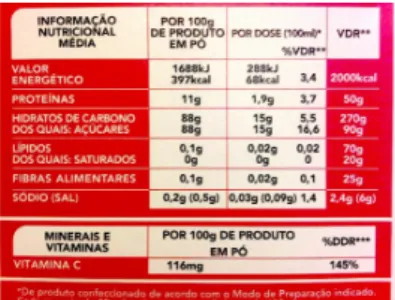
Figure 2.12– Example of a European Nutrition Label, 201217
In the EU the establishment of a legislation consisting of “Regulations (which are directly applicable to all Member States) and Directives (which require transposition and implementation into national legislations, thus imposing delays and possible inconsistencies in interpretation, application and/or enforcement)” (Cheftel, 2005, p. 532), took effect as of 1st
of January of 1993 (The Council of the European Communities;, 1990) and initially stated, among other things, that when packaged food advertised nutrition claims such as "low fat, "high fibre" or health claims such as "reducing blood cholesterol”, had to include a nutrition label in order to inform the consumer the serving size, and the servings per package or container. According to the claim, the percentage of daily values of either a group of four nutrients (energy, protein, carbohydrate, and fat) or the group of eight (the previous four plus sugar, saturated fat, fibber, and sodium) had to be stated (Bonsmann & Wills, 2012). Though the fact that the nutrition information wasn’t compulsory lead to several years of negotiations for a new food regulation that would make nutrition labelling mandatory for all packaged food. This came to happen in 2011 with the release of Regulation (EU) No 1169/2011 of the European Parliament and of the Council of 25 of October 2011, setting that food manufacturers must provide information on energy value and on the amounts of fat, saturates, carbohydrate, sugars, protein and salt, expressed per 100g or per 100ml of product. Food producers who already include nutrition labels in their products have until December 2014 to re-implement it according to the new
17 Retrieved from:
rules, those who have yet to introduce the labels are given 2 extra years to introduce it (European Union;, 2011).
The nutrition labelling, through the provision of information, is seen as a way to support healthy decision making related with food and drinks (Comission of the European Communities;, 2007) and to provide incentive for food manufacturers to use healthier nutrients in packaged food. The Global Strategy on Diet, Physical Activity and Health by World Health Organization (WHO) recognizes that “consumers require accurate, standardized and comprehensible information on the content of food items in order to make healthy choices” (World Health Organization;, 2004, p. 7). Similarly, for the Organization for Economic Co-operation and Development (OECD) “nutritional labelling is a main tool for preventing increasing rates of obesity and unhealthy diets in OECD countries” (Organisation for Economic Co-Operation and Development;, 2008, p. 10).
In the United States of America (US), it was in 1972 that the Food and Drugs Administration (FDA) proposed a set of regulations to provide nutritional information on packaged food to be voluntarily applied except when in presence of nutrition claims, where its application was mandatory (Wartella, Lichtenstein, & Boon, 2010). Right after 1973, American consumers started demanding more detailed nutrition information especially on processed and packaged food, coinciding with the spread of scientific knowledge about the relation between diet and health. Nevertheless, it wasn't until 1990 that a revision of the food label was started, which would later be presented by the FDA in the same year. The publication consisted of the proposed rules for the mandatory nutrition labelling for almost all packaged food. The result was the most significant food labelling legislation in 50 years (Wartella, Lichtenstein, & Boon, 2010).
Figure 2.13– Example of an American Nutrition Facts table, 201218
18 Retrieved from: http://www.boomboomenergy.com/blog/wp-
The Nutrition Labeling and Education Act (NLEA) (Food and Drug Administration;, 1990), compiles all the rules and specifications that most of the American food packages must fulfil. Mandatory information that must be included in a nutrition label is the presence and amounts of certain nutrients (fat, total fat, saturated fat, cholesterol, sodium, total carbohydrate, dietary fibber, sugars, protein, vitamins A and C, calcium, and iron – in 2003 FDA also included trans fat to the list), and the amount of calories. The quantities of both have to be specified in serving sizes, or the size in which the amount of product is usually consumed (for example, teaspoons – tsp – is the baking soda serving size because it is a common household measure) in the form of a Nutrition Facts table. However for consumers to understand food consumption in the context of their total daily diet and compare nutritional values across products, NLEA established that the Nutrition Facts panel information has to be in relation to a daily reference value (DRV), set as percentage, for each nutrient (Food and Drug Administration;, 1990).
Similar regulations were outlined and implemented in several other countries like Australia and New Zealand, Canada, Hong Kong, etc. For this dissertation the focus is mainly the EU and US, where the amount of studies centred in these regions is superior and with direct relation to the context in which its being developed.
As previously referred, nutrition labelling allows consumers to select food according to their needs and, hopefully, towards healthier diets, where the excess of energy intake over energy expenditure can be more easily controlled.
A global study taken by The Nielsen Company about Healthy Eating trends Around the World (2012) shows that 53% of consumers over the world are overweight, and that in Europe the value is 5% over the global average with a 58% rate of incidence. Half of the respondents are trying to lose weight, and 78% of these perceive diet changes as the most effective way to lose extra weight, followed by physical exercise. Another research taken by FLABEL (Food Labelling to Advance Better Education for Life), “a pan-European project which has explored the impact of food labelling among consumers in Europe” (Food Labelling to Advance Better Education for Life, 2012), confirms that in Europe, 85% of the evaluated products do have nutrition information. But do consumers understand or make any use of it? According to Nielsen’s study, only 7% of the global average do not understand at all the nutrition labels on food packaging, 52% understand it in part, and 41% understand most of it. Portuguese consumers have the highest knowledge on nutrition labels in Europe, with 60% of consumers claiming to largely understand them (The Nielsen Company;, 2012).
What is then the real impact that food labelling has among Europeans, their dietary choices, consumer habits and food-related issues? The FLABEL consortium focused mostly on giving an answer to this question, but instead of getting a direct response, the conclusions showed that food choice based on nutrition labels depends mostly on consumers’ attention and their understanding of it, emphasizing as main obstacles the lack of motivation and attention: “consumers need to be motivated to engage with nutrition information – for instance, by having a health goal - in order to pay greater attention to labels” (Food Labelling to Advance Better Education for Life, 2012). If a
consumer, at the point of purchase (POP), is driven by health concerns, he is more likely to pay attention to nutrition labels. On the other hand, if consumers solely follow their preferences, little or no attention is given to nutrition labels.
An in-store observation with shoppers from the United Kingdom (UK), Sweden, France, Germany, Poland and Hungary, aiming to investigate the use of nutrition information on food labels showed that 16,8% of shoppers said they look for nutrition information, especially the consumers originally from the UK. UK consumers were early adopters of nutrition labelling, and due to this prolonged adaptation, they emphasize the importance of exposing the public to debates around nutrition labelling so that it may affect people's thinking and behaviour. (Grunert, Fernández-Celemín, Wills, Bonsmann, & Nureeva, 2010). In the same study, when the shopper was asked to declare the main reason for choosing a certain product, taste (52%) came in first place followed by ‘this is what my family wants’ (13.4%), price/special offer (10.7%) and health/nutrition (8%). If 16,8% of shoppers said they look at nutrition labels, it is not clear whether they used it or not on food choice, as only 8% of respondents said to be health/nutrition driven when shopping for food. Once again, it is not people’s capacity to understand nutritional information but the lack of motivation to use it when it comes to choosing healthier food, giving strength to the theory that is through public education that it is possible to raise awareness and therefore have actual impact on the beliefs and motives related to food consumption (Hieke & Willis, 2012).
Nevertheless, if people do have the means to make informed choices on pre-packaged food, the same doesn’t happen when it comes to food selection in restaurants.
Obesity rates have increased and so has the “away-from-home” food consumption, causing a debate around the nutritious quality of food prepared in restaurants and consumers’ knowledge about its influence on weight maintenance and weight-loss attempts, having fast-food restaurants being pointed out as the main responsible in contributing to obesity high levels (Burton, Howlett, & Tangari, Food for Thought: How Will the Nutrition Labeling of Quick Service Restaurant Menu Items Influence Consumers’ Product Evaluations, Purchase Intentions, and Choices?, 2009).
In the European Union the new regulation on the provision of food information to consumers (European Union;, 2011), covers all “foods delivered by mass caterers”. Nevertheless, the compulsory information for mass caterers is a declaration on the presence of ingredients responsible for allergic reactions (EUFIC - European Food Information Council;, 2012). That is applicable unless Member States adopt national measures in order to provide the information on the no.1 Article 9 (i.e. nutrition declaration) (European Union;, 2011).
The UK has been prominent in raising public discussion around nutrition labelling resulting, for example, in the Public Health Responsibility Deal (Department of Health;, 2012) that, among others, includes a pledge for out-of-home calorie labelling asking “catering businesses, who sell food in out of home settings, to provide calorie information for customers on menus or menu boards, to help people make healthier choices” (Department of Health;, 2012).
In the USA, despite being advised by NLEA that “restaurant foods must comply with the various established definitions and many requirements for nutrient content claims”
(Food and Drug Administration;, 1990), FDA did not require full nutrition labelling for restaurant foods, nor did require that nutrition information should be presented in the Nutrition Facts format. However, some State and local jurisdictions have enacted regulations requiring “calorie declaration for food offered for sale at restaurants and other establishments” (Food and Drug Administration;, 2011), but with very diverse requirements between them. Patient Protection and Affordable Care Act of 2010 (“Affordable Care Act”), which was signed into law on March 23, 2010, establishes requirements for nutrition labelling of standard menu items for chain restaurants, similar retail food establishments, and chain vending machine operators (Food and Drug Administration;, 2010). But cannot constitute legal requirements since some provisions depend on FDA to issue rules before they can be required. In conclusion, the mandatory information to be provided by chain retail food establishments is the number of calories in each standard menu item on menus and menu boards, written nutrition information upon request, and a clear statement on menu boards about this information availability (Food and Drug Administration;, 2010).
Figure 2.14 - Menu board displaying information about energy (in calories)19
Nielsen’s study (2012) shows that diners around the world see calorie disclosure on restaurant menus as important data to support their decision, though the significance given to this information is higher for fast-food restaurants (49%) and less for privately-owned restaurants (31%). Nevertheless, researches prove that there is a gap between what consumers say they do and what they actually do (Hieke & Willis, 2012).
Focused on the demand for nutrition information in full-service restaurants, Josiam and Foster (Nutritional information on restaurant menus: Who cares and why restauranteurs should bother, 2009) research’s conclusions illustrate that if nutritional information had to be available, a “substantial segment” of consumers would use it and probably would dine out more often, especially people who typically eat healthier food at home. The older and wealthier consumers with higher levels of education are the most concerned about nutritional information disclosure in restaurants. Another interesting conclusion is related with obligation: those who resort to restaurants as a
19 Retrieved from:
http://www.mlive.com/news/usworld/index.ssf/2011/04/fda_proposes_calorie_counts_on.html [accessed in: 25-03-2013]
necessity, are more likely to use nutrition information, in opposition to people who go to restaurants as a pleasure, who are less likely to use it. The authors envision these conclusions as a marketing opportunity, a competitive advantage for restaurants capable to implement the nutrition information into their menus according to their business goals, and their targets.
Regarding now a research on the impact nutrition labels have on people when buying food in quick-service restaurants, most consumers tend to underestimate calorie, fat and salt consumption (Burton, Howlett, & Tangari, 2009). One important conclusion is related to what it is called “deviation from consumer expectations”. That is, “the percentage of consumers choosing the less healthful menu items decreased when actual calories were disclosed and exceeded expected levels, and the percentage of consumers choosing the more healthful items increased when actual calories were disclosed and levels were less than expected” (Burton, Howlett, & Tangari, 2009, p. 270). The “positive disconfirmation”, when consumers realize that they overestimate the actual calorie level, can increase sales for that menu item. On the contrary, “negative disconfirmation” or when the actual calorie level exceeds the expected, results on sales decrease. By making nutritional information available, restaurants can take a major part in changing consumer’s habits either by reducing serving sizes or by improving the nutritional profile of their food. The “positive disconfirmation” factor can be here the common motivation for restaurants and consumers: the first might increase sales, and the second can eat healthier food away-from-home, resulting in a win-win situation.
Transversal to several studies about whether nutrition labels influence consumers diets, is the deduction that consumers’ behaviour is a complex topic and their food choices are mostly driven by knowledge, motivation and education (Hieke & Taylor, 2012) Nutritional information disclosure is just one aspect when talking about diminishing the obesity rates and chronic diseases. The lack of motivation to use that information when choosing food has to be countered with education campaigns and public debates, as it shows to be efficient when it comes to the relation between recognition and knowledge, well demonstrated by the UK case.
This research aims to take a step further regarding food labelling in EU restaurants’ menus by offering, along with the mandatory information regarding the allergens disclosure, a nutrition label that is visually appealing, provides a clear and reliable information on the most important nutrients and energy values and, most of all, that can influence consumers to decide on healthier food.
The novelty regarding the application of nutrition labelling on restaurant menus, and consequent lack of studies about the efficiency of the graphic forms assumed to convey this information, lead this research to rely on readings about the different front-of-pack (FOP) labels used for pre-packaged food. This option is based mainly in the similarity on label size and amount of information present in packaged food and what is reasonable to expect to show on a restaurant menu. As it is a methodological decision, it will be taken in deeper analysis in the Methodology chapter.
In order to help consumers understand and make real use of nutritional information there have been developed, on a voluntary basis, several front-of-pack graphic
solutions. Bringing the essential information to the front-of-pack would help the consumer in selecting healthier food at the point of purchase, and the combination of both front-of-pack and back-of-pack information leads consumers to better understand nutritional information and increase the its credibility (Kleef, Trijp, Paeps, & Fernández-Celemín, 2007). These labels can either assume the form of a simple health logo or, by disclosing detailed information about nutrient and calorie values result in a more complex format.
FLABEL consortium (2012) distinguished three types of labels based in the concepts of directiveness, or how explicit is the provided guidance (to eat /not to eat), and information content, to distinguish the degree of information given to the consumer. The directive labels correspond to those not including any nutritional information, as for example, the health logos. Health logos characterize food’s healthfulness: if a product has nutritional quality, according to the legally established reference intakes, it is assigned with a health logo. No nutritional quality corresponds to the absence of a health logo.
An example of this kind is the keyhole symbol. Created in 1989 by the Swedish National Food Agency, after adopted by Denmark and Norway, the keyhole symbol indentifies the healthiest options in each food category.
Figure 2.15 - Keyhole Symbol FOP label, by the Swedish National Food Agency, 198920 Semi-directive labels contain nutrition-based information, therefore have higher information content, but it also provides some directiveness by guiding consumers through colour, for example.
These more complex FOP labels can include additional information like nutrient and calorie quantity per 100g/100ml and a percentage on the guideline daily amounts (GDAs), which are reference values to how many calories and nutrients people can consume each day for a healthy, balanced diet (Food and Drink Federation;, 2012). The traffic light system developed by Food Standards Agency (FSA) in the UK is probably the most familiar of its kind among the European and perhaps Portuguese consumers, as it can be found in every Continente’s food product, the biggest retail company in Portugal.