Julio Cesar de Azevedo Vieira
Forecast dengue fever cases using time
series models with exogenous covariates:
climate, effective reproduction number, and
twitter data.
Rio de Janeiro - RJ, Brasil Abril 2018
Forecast dengue fever cases using time series
models with exogenous covariates: climate,
effective reproduction number, and twitter
data.
Trabalho de Disserta¸c˜ao
Disserta¸c˜ao submetida `a Escola de Matem´atica Aplicada como requisito parcial para obten¸c˜ao do grau de Mestre em Modelagem Matem´atica da Informa¸c˜ao pela Funda¸c˜ao Get´ulio Vargas.
Orientador: Prof. Eduardo Fonseca Mendes
Rio de Janeiro - RJ, Brasil Abril 2018
Resumo
Dengue ´e uma doen¸ca infecciosa que afeta pa´ıses subtropicais. Autoridades de sa´ude locais utilizam informa¸c˜oes sobre o n´umero de notifica¸c˜oes para monitorar e prever epidemias. Este trabalho foca na modelagem do n´umero de casos de dengue
semanal em quatro cidades do estado do Rio de Janeiro: Rio de Janeiro, S˜ao
Gon¸calo, Campos dos Goytacazes, and Petr´opolis. Modelos de s´eries temporais s˜ao frequentemente utilizados para prever o n´umero de casos de dengue nos pr´oximos ciclos (semanas ou meses), particularmente, modelos SARIMA (Modelo Sazonal Autorregressivo Integrado de M´edias M´oveis) apresentam uma boa performance em situa¸c˜oes distintas. Modelagens alternativas ainda incluem informa¸c˜ao sobre o clima da regi˜ao para melhorar a performance preditiva. Apesar disso, modelos que usam apenas dados hist´oricos e de clima podem n˜ao possuir informa¸c˜oes suficientes para capturar mudan¸cas entre os regimes de n˜ao-epidemia e epidemia. Duas raz˜oes para isso s˜ao o atraso na notifica¸c˜ao dos casos e que poss´ıvelmente n˜ao houveram epidemias nos anos anteriores. Baseando-se no sistema de monitoramento InfoDengue, esperasse que incluindo dados sobre ”numero de reprodu¸c˜ao efetiva dos mosquitos”(RT) e ”n´umero de tweets se referindo a dengue”(tweets) possam melhorar a qualidade das previs˜oes no curto (1 semana) e longo (8 semanas) prazo. Foi poss´ıvel mostrar que modelos de s´eries temporais incluindo RT e informa¸c˜oes clim´aticas frequentemente performam melhor do que o modelo SARIMA em termos do erro preditivo quadr´atico m´edio (RMSE). Incluir a vari´avel sobre o twitter n˜ao mostrou uma melhora no RMSE.
Dengue fever is an infectious disease affecting subtropical countries. Local health departments use the number of notified cases to monitor and predict epidemics. This work focus on modeling weekly number of dengue fever cases in four cities of the state of Rio de Janeiro: Rio de Janeiro, S˜ao Gon¸calo, Campos dos Goytacazes, and Petr´opolis. Time series models are often used to predict the number of cases in the next cycles (weeks, months), in particular, SARIMA (Seazonal Auto-Regressive Integrated Moving Average) models are shown to perform well in distinct settings. Alternative models also include climate covariates to improve the quality of the forecasts. However, models that only use historical and climate data may no have sufficient information to capture changes from non-epidemic to an epidemic regime. Two reasons are that there is a delay in the notification of cases and there might not have had epidemics in the previous years. Based on the InfoDengue monitoring system we argue data including the ”effective reproduction number of mosquitoes”(RT) and ”number tweets referring to dengue”(tweets) may improve the quality of forecasts in the short (1 week) to long (8 weeks) range. We show that time series models including RT and climate information often outperform SARIMA models in terms of mean squared predictive error (RMSE). Inclusion of twitter did not improve the RMSE.
Dedicat´
oria
’ ´O profundidade das riquezas, tanto da sabedoria, como da ciˆencia de Deus! Qu˜ao insond´aveis s˜ao os seus ju´ızos, e qu˜ao inescrut´aveis os seus caminhos! Por que quem compreendeu a mente do Senhor? ou quem foi seu conselheiro? Ou quem lhe deu primeiro a ele, para que lhe seja recompensado? Porque dele e por ele, e para ele, s˜ao todas as coisas; gl´oria, pois, a ele eternamente. Am´em!” (Romanos 11:33-36)
First of all, I would like to thank God because without him none of this could have been happened, in second, to my family for all support that they gave me in these years, for the friends that I made and those who were already with me, to my adviser for all support and help in these two years, to teacher Flavio who giving me the data to work with and finally to IBRE and SAINF for the financial support.
Sum´
ario
Lista de Figuras Lista de Tabelas 1 Introduction p. 16 2 Objectives p. 20 3 Justification p. 214 Materials and methods p. 22
4.1 Data and Exploratory Analysis . . . p. 22 4.2 Methods . . . p. 30 4.2.1 Exponential Smoothing . . . p. 33 4.2.2 Holt’s linear method . . . p. 33 4.2.3 Damped Holt . . . p. 34 4.2.4 SARIMA . . . p. 34 4.2.5 Covariate time series models . . . p. 38 4.2.6 SARIMAX . . . p. 38 4.2.7 Selection methods . . . p. 38 4.2.8 Evaluating forecast accuracy . . . p. 39 4.2.9 Rolling Window . . . p. 41 4.2.10 Fitting process . . . p. 41
5.1.2 S˜ao Gon¸calo . . . p. 52 5.1.3 Campos dos Goytacazes . . . p. 54 5.1.4 Petropolis . . . p. 57 5.2 Covariate models analysis . . . p. 59 5.3 Rolling window analysis . . . p. 64
6 Conclusion p. 89
Referˆencias p. 91
Apˆendice A -- Residuals Analysis p. 94
A.1 Rio de Janeiro . . . p. 94 A.2 S˜ao Gon¸calo . . . p. 98 A.3 Campos dos Goytacazes . . . p. 101 A.4 Petr´opolis . . . p. 104
Lista de Figuras
1 Number of dengue fever cases in Rio de Janeiro city. . . p. 23 2 Number of dengue fever cases in S˜ao Gon¸calo city. . . p. 24 3 Number of dengue fever cases in Campos dos Goytacazes city. . . p. 24 4 Number of dengue fever cases in Petr´opolis city. . . p. 25 5 Probability of Rt> 1 for each week in Rio de Janeiro city. . . p. 26
6 Number of tweets cases for each in for Rio de Janeiro city. . . p. 27 7 Climate variables series per week in Rio de Janeiro city. . . p. 28 8 Decomposition of logarithm dengue cases of Rio de Janeiro city. . . p. 31 9 Number of cases per year at Rio de Janeiro city. . . p. 32 10 Differecenced, ACF and PACF of the log dengue series for Rio de Janeiro
city. . . p. 37 11 Sample size of rolling window. . . p. 41 12 Forecast of the ES method until time T + 8|T . . . p. 43 13 Forecast of the Holt method until time T + 8|T . . . p. 44 14 Forecast of the DH method until time T + 8|T . . . p. 45
15 MAE, RMSE and MAPE for the ES, DH and Holt methods from 1 to 8
weeks ahead. . . p. 46 16 Difference series, ACF and PACF of difference log series. . . p. 47 17 Forecast of 8 weeks of log dengue fever series to the four SARIMA models
in Rio de Janeiro. . . p. 50
18 Plot of residual series, ACF and histogram of the
20 DH forecast from 1 to 8 weeks ahead for S˜ao Gon¸calo city. . . p. 53 21 SARIMA forecast from 1 to 8 weeks ahead for S˜ao Gon¸calo. . . p. 54 22 Assess performance of the time series models analysis of the Campos dos
Goytacazes city. . . p. 55 23 Holt forecast from 1 to 8 weeks ahead for Campos dos Goytacazes city. p. 56 24 SARIMA forecast from 1 to 8 weeks ahead for Campos dos Goytacazes. p. 56 25 Assess performance of the time series models analysis of the Petropolis
city. . . p. 57 26 DH forecast from 1 to 8 weeks ahead for Petropolis city. . . p. 58 27 SARIMA forecast from 1 to 8 ahead for Petropolis. . . p. 58 28 SARIMA (4, 1, 4)(0, 0, 0)52 Climate RT forecast for 8 weeks ahead in Rio
de Janeiro. . . p. 60 29 SARIMA (1, 1, 3)(0, 0, 0)52 CLIMATE RT forecast for 8 weeks ahead in
S˜ao Gon¸calo. . . p. 61 30 SARIMA (1, 1, 3)(0, 0, 1)52 CLIMATE RT forecast for 8 weeks ahead in
Campos dos Goytacazes. . . p. 62 31 SARIMA (2, 1, 2)(0, 0, 0)52 CLIMATE forecast for 8 weeks ahead in
Petropolis. . . p. 64 32 MAE of the forecast in 8 steps ahead for each city in four different
windows at time SARIMA model without covariate. . . p. 66 33 RMSE of the forecast in 8 steps ahead for each city in four different
windows at time SARIMA model without covariates. . . p. 67 34 MAPE of the forecast in 8 steps ahead for each city in four different
windows at time SARIMA model without covariates. . . p. 68 35 MAE of the forecast in 8 steps ahead for each city in four different
36 RMSE of the forecast in 8 steps ahead for each city in four different
windows at time SARIMA model with Climate as covariates. . . p. 71 37 MAPE of the forecast in 8 steps ahead for each city in four different
windows at time SARIMA model with Climate as covariates. . . p. 72 38 MAE of the forecast in 8 steps ahead for each city in four different
windows at time SARIMA model with RT as covariate. . . p. 74 39 RMSE of the forecast in 8 steps ahead for each city in four different
windows at time SARIMA model with RT as covariate. . . p. 75 40 MAPE of the forecast in 8 steps ahead for each city in four different
windows at time SARIMA model with RT as covariate. . . p. 76 41 MAE of the forecast in 8 steps ahead for each city in four different
windows at time SARIMA model with Twitter data as covariate. . . p. 78 42 RMSE of the forecast in 8 steps ahead for each city in four different
windows at time SARIMA model with Twitter data as covariate. . . p. 79 43 MAPE of the forecast in 8 steps ahead for each city in four different
windows at time SARIMA model with Twitter data as covariate. . . p. 80 44 MAE of the forecast in 8 steps ahead for each city in four different
windows at time SARIMA model with Climate and RT covariates. . . . p. 82 45 RMSE of the forecast in 8 steps ahead for each city in four different
windows at time SARIMA model with Climate and RT covariates. . . . p. 83 46 MAPE of the forecast in 8 steps ahead for each city in four different
windows at time SARIMA model with Climate and RT covariates. . . . p. 84 47 MAE of the forecast in 8 steps ahead for each city in four different
windows at time SARIMA model with Climate, RT and Twitter covariates. p. 86 48 RMSE of the forecast in 8 steps ahead for each city in four different
windows at time SARIMA model with Climate, RT and Twitter covariates. p. 87 49 MAPE of the forecast in 8 steps ahead for each city in four different
windows at time SARIMA model with Climate, RT and Twitter covariates. p. 88 50 Residuals of SARIMA (3, 1, 3)(0, 0, 1)52 in Rio de Janeiro. . . p. 94
54 Residuals of SARIMA (4, 1, 4)(0, 0, 0)52 Climate RT in Rio de Janeiro. . p. 96
55 Residuals of SARIMA (3, 1, 5)(0, 0, 0)52 Climate RT Twitter in Rio de
Janeiro. . . p. 97 56 Residuals of SARIMA (3, 1, 3)(0, 0, 1)52 in S˜ao Gon¸calo. . . p. 98
57 Residuals of SARIMA (1, 1, 3)(0, 0, 0)52 Climate in S˜ao Gon¸calo. . . p. 98
58 Residuals of SARIMA (5, 1, 3)(0, 0, 0)52 RT in S˜ao Gon¸calo. . . p. 99
59 Residuals of SARIMA (1, 1, 3)(0, 0, 0)52 Twitter in S˜ao Gon¸calo. . . p. 99
60 Residuals of SARIMA (4, 1, 4)(0, 0, 0)52 Climate RT in S˜ao Gon¸calo. . . p. 100
61 Residuals of SARIMA (3, 1, 5)(0, 0, 0)52 Climate RT Twitter in S˜ao
Gon¸calo. . . p. 100 62 Residuals of SARIMA (3, 1, 3)(0, 0, 1)52 in Campos dos Goytacazes. . . p. 101
63 Residuals of SARIMA (1, 1, 3)(0, 0, 0)52Climate in Campos dos Goytacazes.p. 101
64 Residuals of SARIMA (5, 1, 3)(0, 0, 0)52 RT in Campos dos Goytacazes. p. 102
65 Residuals of SARIMA (1, 1, 3)(0, 0, 0)52Twitter in Campos dos Goytacazes.p. 102
66 Residuals of SARIMA (4, 1, 4)(0, 0, 0)52 Climate RT in Campos dos
Goytacazes. . . p. 103 67 Residuals of SARIMA (3, 1, 5)(0, 0, 0)52 Climate RT Twitter in Campos
dos Goytacazes. . . p. 103 68 Residuals of SARIMA (3, 1, 3)(0, 0, 1)52 in Petr´opolis. . . p. 104
69 Residuals of SARIMA (1, 1, 3)(0, 0, 0)52 Climate in Petr´opolis. . . p. 104
70 Residuals of SARIMA (5, 1, 3)(0, 0, 0)52 RT in Petr´opolis. . . p. 105
71 Residuals of SARIMA (1, 1, 3)(0, 0, 0)52 Twitter in Petr´opolis. . . p. 105
72 Residuals of SARIMA (4, 1, 4)(0, 0, 0)52 Climate RT in Petr´opolis. . . . p. 106
Lista de Tabelas
1 Total number of dengue fever cases per year in each city. . . p. 25 2 Correlation matrix of the covariate and log dengue series for each city. . p. 29 3 AIC, AICc and BIC for the SARIMA models tested for Rio de Janeiro. p. 48 4 MAE, RMSE and MAPE for SARIMA models in a test set for time series
models in Rio de Janeiro. . . p. 49 5 Selection criterion measures for ES, Holt and DH using only time series
methods to each city. . . p. 59 6 Assess predictive performance for each SARIMA modeling of the Rio de
Janeiro city. . . p. 60 7 Assess predictive performance for each SARIMA modeling of the S˜ao
Gon¸calo city. . . p. 61 8 Assess predictive performance for each SARIMA modeling of the Campos
dos Goytacazes city. . . p. 62
9 Assess predictive performance for each SARIMA modeling of the
Petropolis city. . . p. 63 10 Best predictive performance and their standard deviation for each city in
4 different window size of rolling window in a SARIMA with no covariate. p. 65 11 Best predictive performance and their standard deviation for each city
in 4 different windows size of rolling window in a SARIMA with Climate
as covariate. . . p. 69 12 Best predictive performance and their standard deviation for each city
in 4 different windows size of rolling window in a SARIMA with RT as
14 Best predictive performance and their standard deviation for each city in 4 different windows size of rolling window in a SARIMA with Climate
and RT as covariate. . . p. 81 15 Best predictive performance and their standard deviation for each city in
4 different windows size of rolling window in a SARIMA with Climate,
16
1
Introduction
Dengue fever is an infectious disease caused by an arbovirus that occurs in subtropical countries with higher incidence of cases in summer when the Aedes Aegypti, the mosquitoes that transmit this disease, is more active. The Aedes Aegypti have its origin in Egypt coming to Brazil on ships carrying slave trade in the 16th century.1
Every year, million of dollars are invested in education and prevention mechanisms. Only in Brazil, in 2015 occurred the biggest outbreak of dengue in the country with 1.7 million notified cases and 986 deaths. In 2016 1.5 million cases notified and 642 deaths, in state of Rio de Janeiro, in the same year, there were 85.2 thousand notified cases and 17 deaths.2
Martinelli et al. (2015)[1] observed that in 2013, the estimated cost with dengue was US$ 1,228 million after adjusting for under reporting. 65 million was the cost with fatal cases. In both cases the cost was estimated with reported cases of dengue between September 2012 and August 2013. This value was calculated using the average cost in some capitals and multiplying by number of cases reported in the country (2 million cases).
There are references to epidemics in the 19th century in Brazil, but first documented by exams occurred in between 1981 and 1982 in Boa Vista capital of the state of Roraima caused by serotypes 1 and 4. Between 2002 and 2011 dengue fever has become one of the greatest public health challenges in Brazil.3 In Brazil, dengue fever has a seasonal pattern with higher incidence in the first 5 months of the year when the climate is warmer and wetter than in tropical climates.[2]
The National Disease Notification System (SINAN) is the system used in Brazil to gather information about the notification of diseases and injuries that appear on the
1http://auladengue.ioc.fiocruz.br/?p=68 accessed in February 3rd of 2018.
2SES/SINAN - http://portalms.saude.gov.br/saude-de-a-z/dengue/situacao-epidemiologica-dados
accessed in February 3rd of 2018.
3Health Ministry - http://portalms.saude.gov.br/saude-de-a-z/dengue/descricao-da-doenca accessed
the occurrence of events in the population. Dengue fever is a disease that requires of notification of suspicious or confirmed cases.
New cases of dengue are monitored by the health departments in order to avoid outbreaks. However, the delay in the notification affects the prevention of new cases. Therefore, investing on a system that provides alerts about epidemics helps avoiding outbreaks.
InfoDengue4 is a nowcasting system for surveillance of dengue fever transmission. In order to improve the continuous monitoring of dengue fever[3], the system collects information about the weekly number of dengue fever cases per municipalities. It started on 2015 with data about Rio de Janeiro informed by the municipal health secretary in order to make the decision-making process faster.
Beyond the nowcasting system it would be good to have a system that anticipates counts of new dengue fever cases. Forecasting dengue cases is one way to anticipate it and help public governments to deal with possible outbreaks before it starts.
There is an worldwide effort to forecast new cases of dengue fever.[4] Much of this effort is concentrated on univariate dengue fever time series [5, 6, 7, 8, 9, 10]. The same holds for other disease such as typhoid fever [11], malaria [12], influenza [13], etc.
Silawan et al (2008) [6] used a seasonal autorregressive integrated moving average (SARIMA) model to forecast monthly dengue incidence for the northwest part of Thailand. They identified that epidemics of dengue occur every two years and lasts about three years per epidemics period and that if a month increase, the ratio for dengue infection is expected to decrease.
Besides it, [5, 7, 8, 9, 10, 11] used a SARIMA model to modeling and forecast dengue fever, dengue hemorrhagic fever, dengue shock syndrome and typhoid fever. Their results showed that the SARIMA model is good to forecast incidence of cases, but they do not have exogenous variables to help in their modeling process.
Few works use exogenous variables to explain the process of the transmission of dengue fever. Hopp and Foley (2003) [14] modeled the response of aedes aegypti as a function of climatic variations around the world. They observed that climate variations induce variations on mosquito populations. These variables are also correlated to cases of dengue and dengue hemorrhagic fever reported in Central America and southeast of Asia.
1 Introduction 18
Luz et al. (2008) [15] analyzed the monthly incidence dengue fever with ARIMA model, they showed that 1-step ahead forecast improves significantly the accuracy of predict values in comparison with 12-steps ahead. They found that including climate variables as maximum temperature and accumulated rainfall with 1 lag were statistically supported and improved predict power of their model.
Gharbi et al. (2011) [16] worked with weekly data and showed that relativity humidity lag-7 weeks, minimum temperature lag-5 weeks and mean temperature lag-11 weeks were positively correlated despite relativity humidity was not significant on the model. They also show that humidity and rainfall improve are less important than temperature to forecast dengue fever outbreaks.
Around the world, dengue has been associated with meteorological data. Some works have used climate variations and rainfall as auxiliary variables to help forecasting new cases[17, 18, 19]. Many countries have suffered with dengue fever and have some effort to predict new cases, for example, in Bangladesh [9], in Singapore [18, 5], in Thailand [6, 8], in Taiwan [20], in Guadeloupe-French West Indies- [16], in China [11] and in Brazil [7, 21, 15].
Despite this effort, some countries do not use weather information or any others variables, to help in their predictive models for new cases of dengue fever. These countries have only the series of dengue cases counts reported, that are used to model and predict incidence of dengue cases. [5, 6, 7, 8, 9, 10, 11]
This work aims, based on the InfoDengue monitoring system, argue data including the ”effective reproduction number of mosquitoes”(RT) and ”number tweets referring to dengue”(tweets) may improve the quality of forecasts in the short (1 week) to long (8 weeks) range.
As defined in Coelho and Carvalho (2015)[22], Rt, is an estimate of fluctuation of the
number of cases and it can provide probability of epidemic expanding. It was used[23] to model different scenarios on the influence of Ebola outbreak, and to compare the pattern of different epidemics. [24]
Codeco et al. (2016)[25] showed that Twitter data about dengue fever cases is linearly associated with dengue incidence reported with Pearson’s correlation of 0.75 (p < 0.001) in Rio de Janeiro. The Twitter for being a free micro-blog social network that allows users to publish any information has been used as source of real time data about events around the world. Signorini et al.[26] use information about the tweets and sentiment
information about predefined terms in order to achieve their goal. Twitter data was used to improve forecast of influenza significantly reducing the error about 17-30% compared to only historical data [13].
This work is organized as follows. The second chapter has the objectives of this work. The third chapter has a description of the data and the methodological tools to forecast and evaluate the accuracy of the prediction. The fourth chapter presents the results. The fifth chapter is the conclusion of this work.
20
2
Objectives
The main objective of this work is to compare different time series methods to forecast weekly dengue fever cases with or without the inclusion of covariates to improve the forecast accuracy.
The secondary objectives are:
1 Compare different time series methods to forecast weekly dengue fever cases. 2 Study the inclusion of different exogenous variables to improve the forecast accuracy:
a Compare the inclusion of the log Rt in the baseline model.
b Compare different models for each group of variables, between them, Rt,
climate variables and twitter data.
3 Compare the use of model selection methods like AIC, AICc and BIC to forecast weekly dengue fever cases
4 Compare effectiveness of the inclusion of covariate to forecast time series by using MAE, RMSE and MAPE.
3
Justification
One of the most important things in forecast is being accurate. The forecast of only dengue fever and the dengue fever with inclusion of the climate covariates have been used in many works around the world. The first comes from the relevance and need to anticipate epidemics of dengue fever. The second, the one with climate covariates, has been shown as an important variable in order to reduce the prediction error. This work intent to use the logarithm of the growth of the dengue rate, log Rt, in order to
use the fluctuations of dengue fever cases to reduce the forecast error. This variable is a calculation of the notified cases in each week over the sum of the last three weeks. The tweets about dengue fever is a real time source of information about this disease and can be useful to anticipate under reported cases. This anticipation can be helpful to decrease the forecast error. Therefore, this work aims to use besides climate variables, the logarithm of the growth of the dengue rate and twitter data to improve the accuracy of the forecast prediction made.
22
4
Materials and methods
In this chapter we will present, in the following order, the data, an exploratory analysis of this data and all methods that will be used in this work to produce the results in the next chapter. The software used to perform all the exploratory analysis and the analysis showed in the results chapter were made with R Core Team (2017) [27].
4.1
Data and Exploratory Analysis
The data used in this work and the exploratory analysis will be presented in this section. First, the data of the interest - time series of dengue fever cases - in each city that we will analyze, and then, the data that we expect to improve our analysis. The exploratory analysis, whether its graphic or not, will succeed the presentation of the data. The number of dengue fever cases is reported weekly starting from January 2010 to March 2017 was obtained from the InfoDengue project. The system has weekly data, organized by epidemiological week, about reported number of cases which is provided for the municipalities in order to monitor the situation of the spread of dengue fever. On the top of number cases, InfoDengue has data about the fluctuation of cases (Rt), mention of
cases on Twitter and climate data.
The data is the number of the reported cases (count) in each week for each municipality. This data is reported for the municipalities of 6 states of Brazil (Rio de Janeiro, Esp´ırito Santo, Cear´a, Minas Gerais, Paran´a and S˜ao Paulo)1. The data used
in this work is the number of dengue fever (count) for the Rio de Janeiro, S˜ao Gon¸calo, Campos dos Goytacazes and Petr´opolis cities of the state of Rio de Janeiro.
Rio de Janeiro city is located at 22◦54’ 10”S and 43◦12’ 27”W has over 6.5 million estimated people and occupies an area of 1.200 km2. S˜ao Gon¸calo city is located 22◦49’
37”S and 43◦03’ 14”W has over 1.05 million estimated people and occupies an area of 247 1https://info.dengue.mat.br/ - accessed in 27/03/2018.
thousand estimated people and occupies an area of 4.026 km2. Petr´opolis city is located at 22◦30’ 18”S and 43◦10’ 43”W has over 298 thousand estimated people and occupies an area of 793 km2. 2.
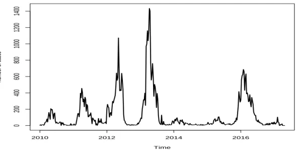
Figure 1 shows the number of cases reported of the Rio de Janeiro city which appear to have a seasonal pattern at the beginning of the year. The highest peak of dengue fever cases was on the epidemiological week 22nd April 2012 which registered 14.9 thousand of notified cases. The series also show that in 2010 and 2014 were years off epidemic in dengue fever. Time Number of cases 2010 2012 2014 2016 0 5000 10000 15000
Figura 1: Number of dengue fever cases in Rio de Janeiro city.
The highest peak of dengue in S˜ao Gon¸calo was registered on the epidemiological week of 7th April 2013 with 1.4 thousand. The years of 2014 and 2015 are off years as can be seen at Figure 2.
4.1 Data and Exploratory Analysis 24 Time Number of cases 2010 2012 2014 2016 0 200 400 600 800 1000 1200 1400
Figura 2: Number of dengue fever cases in S˜ao Gon¸calo city.
The highest peak of dengue in Campos dos Goytacazes was registered on epidemiological week of 3rd April 2011 with 403 cases. The number of cases was 0 in 33 weeks of during the entire series as can be seen at Figure 3.
Time Number of cases 2010 2012 2014 2016 0 100 200 300 400
Figura 3: Number of dengue fever cases in Campos dos Goytacazes city.
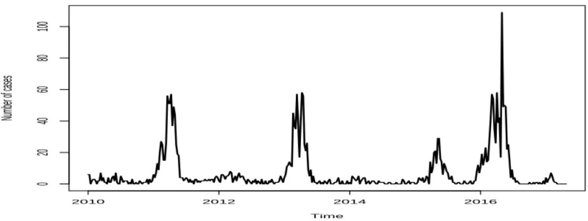
The highest peak of dengue in Petr´opolis was registered in 24th April 2016 with 109
cases. The number of cases was 0 in 91 weeks of during the entire series as can be seen at Figure 4.
Time Number of cases 2010 2012 2014 2016 0 20 40 60 80 100
Figura 4: Number of dengue fever cases in Petr´opolis city.
The total number of cases per year it is on the Table 1. The highest total number of cases for Rio de Janeiro was registered in 2012 with 181,036, in S˜ao Gon¸calo was 16,789 cases on 2013, Campos dos Goytacazes was 6,900 cases on 2010 and Petr´opolis on 2016 registered 850 cases.
Tabela 1: Total number of dengue fever cases per year in each city. Anos Rio de Janeiro S˜ao Gon¸calo Campos dos Goytacazes Petr´opolis
2010 4,510 2,433 6,900 101 2011 81,909 6,316 6,466 653 2012 181,036 10,869 5,408 141 2013 69,590 16,786 218 577 2014 3,865 1,317 1,565 64 2015 21,521 3,483 5,262 307 2016 33,646 9,665 3,328 850 2017 2,015 343 494 24 Total 398,092 51,212 29,641 2,717
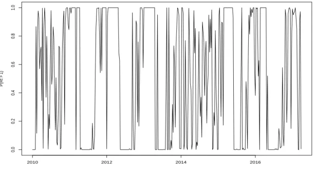
The effective reproductive number, Rt, shows the transmission on each week based
on the previous weeks and is given by,
Rt = Pt+1 i=t−1yi Pt i=t−2yi (4.1)
where yi is the number of cases (count) in each week.
The effective reproduction number is calculated by comparing the number of cases 3-weeks acumulated at week t + 1 by the sum of the cases in the 3 previous weeks (t − 3) acumulated at week t. [22, 28]
4.1 Data and Exploratory Analysis 26
If the Rt > 1 it means that there is a sustained transmission, otherwise, there is a
retraction on the transmission of dengue fever cases. InfoDengue calculates the probability P (Rt > 1) of transmission for each municipality in each week starting at the beginning
of the series and can be defined between 0 ≤ P (Rt> 1) ≤ 1.
P(Rt > 1) 2010 2012 2014 2016 0.0 0.2 0.4 0.6 0.8 1.0
Figura 5: Probability of Rt> 1 for each week in Rio de Janeiro city.
Figure 5 shows the probability of transmission, (P (Rt > 1)), for each week. It is
possible see that in the years 2010 and 2014 the P (Rt> 1) was consistent smaller than 1
and in weeks of the years which have high peaks of dengue fever cases has the P (Rt > 1)
equal 1.
Instead of using the odds of RT, was chosen to use the log of RT to help the forecast made. The calculation was performed by using the function on Claudia Code¸co github3.
The idea to support this usage is to capture the growth trend in the number of cases. To avoid problems in cities that have 0 in number of cases in sequence was imputed 1 every 3 consecutive weeks of 0.
The Twitter data is the number of tweets per day about dengue fever cases. It gives the real time information about the transmission. Twitter data starts on August 2012. Twitter number of cases is obtained by from the tweeted information of dengue in each locality in order to obtain a series more linearly dependent with the number of dengue fever cases.
3https://github.com/claudia-codeco/AlertTools/blob/master/R/Rt functions.R accessed in
number of tw eets 2013 2014 2015 2016 2017 0 200 400 600 800 1000 1200 1400
Figura 6: Number of tweets cases for each in for Rio de Janeiro city.
Despite the series of Twitter starts after the dengue fever cases, the number of cases on twitter shows a relation in peaks with the number of dengue cases (Figure 1) at Figure 6.
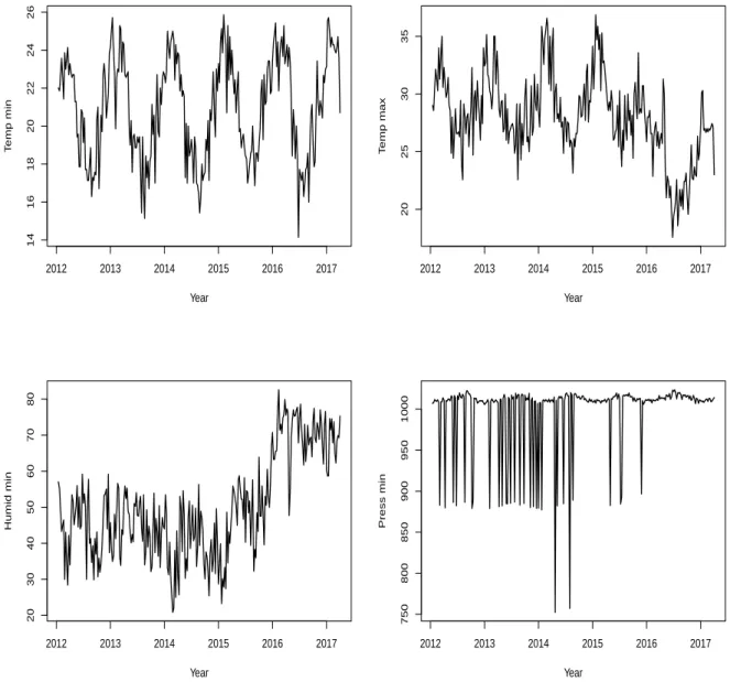
The climate data is a set of weather measures that could be related with the number of dengue cases. The data are mean minimum temperature, mean maximum temperature, mean minimum humidity and mean minimum pressure. Climate data starts on January 2012.
The temperature time series (mean minimum and mean maximum for each week) is measure in Celsius and shows annual seasonality, the humidity presents a trend of growth with level change starting in 2016 and the pressure is always high.
At Table 2 the Spearman correlation matrix of each one of the variables and the log dengue series from 2013 to 2016. For Rio de Janeiro, S˜ao Gon¸calo and Petropolis, the highest correlation with the log dengue is twitter data with 0.767, 0.464 and 0.559, respectively. For Campos dos Goytacazes, the highest correlation with the log dengue is with temp min 0.278. The choice for Spearman correlation is due to the non exclusively linear relation between the variables.
4.1 Data and Exploratory Analysis 28 Year T emp min 2012 2013 2014 2015 2016 2017 14 16 18 20 22 24 26 Year T emp max 2012 2013 2014 2015 2016 2017 20 25 30 35 Year Humid min 2012 2013 2014 2015 2016 2017 20 30 40 50 60 70 80 Year Press min 2012 2013 2014 2015 2016 2017 750 800 850 900 950 1000
Tabela 2: Correlation matrix of the covariate and log dengue series for each city.
Log dengue Temp min Temp max Umid min Press min Twitter RT Rio de Janeiro Log dengue 1.000 Temp min 0.246 1.000 Temp max 0.013 0.621 1.000 Umid min 0.344 -0.065 -0.727 1.000 Press min -0.064 -0.571 -0.501 0.153 1.000 Twitter 0.767 0.331 0.249 0.062 -0.175 1.000 RT 0.204 0.455 0.271 0.009 -0.262 0.245 1.000 S˜ao Gon¸calo Log dengue 1.000 Temp min 0.377 1.000 Temp max 0.056 0.600 1.000 Umid min 0.315 -0.042 -0.731 1.000 Press min -0.189 -0.559 -0.474 0.156 1.000 Twitter 0.464 0.174 0.090 0.113 -0.091 1.000 RT 0.274 0.341 0.282 -0.043 -0.269 0.119 1.000
Campos dos Goytacazes Log dengue 1.000 Temp min 0.278 1.000 Temp max 0.089 0.464 1.000 Umid min 0.033 0.009 -0.781 1.000 Press min -0.023 -0.680 -0.593 0.198 1.000 Twitter 0.266 0.190 0.168 0.019 -0.216 1.000 RT 0.246 0.230 0.234 -0.088 -0.283 -0.025 1.000 Petropolis Log dengue 1.000 Temp min 0.340 1.000 Temp max 0.076 0.600 1.000 Umid min 0.232 -0.042 -0.731 1.000 Press min -0.122 -0.559 -0.474 0.156 1.000 Twitter 0.559 0.217 -0.054 0.252 0.000 1.000 RT 0.393 0.264 0.141 0.020 -0.207 0.163 1.000
4.2 Methods 30
4.2
Methods
The dengue data is a time series with the number of dengue fever cases per week. Each week is an observation in time {yt} t = 1, 2, ..., T which provides a complete history
the cases in some city. Despite the series of the number of dengue cases reported on that week. For being counting data it is possible to use a log transformation on the time series in order to stabilize the variance and use SARIMA methods. As, the number of dengue fever cases reported could be 0, will be used log(yt+ 1) to perform the analysis.
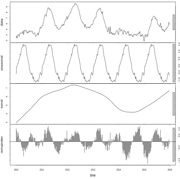
A time series is composed of trend, seasonality, cycle and remainder. It is possible use Seasonal and Trend decomposition using Loess (STL) as a technique to decompose time series to assess the temporal patterns of the dengue fever cases[6]. This filtering procedure decomposes a time series splitting it into a trend (Tt), seasonal (St) and remainder (ut)
components. The trend term is responsible for the direction of increase or decrease of the series, the seasonality term occurs through time with patterns on the series and the remainder are the patterns not constant that cannot be explained by trend and seasonality. Considering t = 1, ..., T , then
Yt= Tt+ St+ ut (4.2)
The STL uses filter techniques as loess regression curve [29] to make the decomposition. This procedure is used to produce a better understanding of the number of dengue fever cases. Figure 8 shows the original log series at the top, and then, in sequence, are presented the seasonal, trend and remainder components. The magnitude of the decomposition is given in the seasonal part explain between -1.3 and 1.6, in the trend between 2.9 and 7.3, and in the remainder, between -1.8 and 1.3. It is also possible to see some kind of seasonality on the remainder graph at the bottom of figure which may indicate that the estimates made was greater than necessary.
3 4 5 6 7 8 9 data −1.0 −0.5 0.0 0.5 1.0 1.5 seasonal 3 4 5 6 7 trend −1.5 −0.5 0.5 1.0 2010 2011 2012 2013 2014 2015 2016 remainder time
Figura 8: Decomposition of logarithm dengue cases of Rio de Janeiro city.
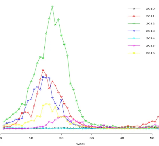
This decomposition helps to use others methods to identify and understand the seasonality of the dengue fever cases. To evaluate the seasonality of dengue fever cases we plotted the annual log number of dengue cases super imposed in Figure 9. Each line represents a year from 2010 to 2016. Every year, with exception to 2014, had high number of cases between week 5 and 25 which is evidence of seasonality of dengue cases. The high peak in 2012 could be explained by trend on number of cases starting in week 46 on 2011. The decomposition and plot at Figure 9 indicates that is necessary to use seasonal models to fit the dengue fever cases. Methods that use seasonal patterns were used to try to explain and forecast the number of dengue cases.
4.2 Methods 32
week
Number of dengue cases
0 10 20 30 40 50 2010 2011 2012 2013 2014 2015 2016
Figura 9: Number of cases per year at Rio de Janeiro city.
There are a lot of models used to forecast time series. The idea is to use past information in order to predict its future behavior. There are two ways to conduct this analysis. Using models based only in past information or models with covariates, those that use variables combined with past information. The analysis without covariates will be presented at first, and then, the ones with the inclusion of the covariates. The analysis without covariates is going to be called as time series analysis and the analysis with covariates as covariate analysis.
On the time series models they use only past information to predict the future, already in covariate models, they use besides past information, other covariates to help explain and forecast the series. The models chosen were exponential smoothing (ES), Holt’s linear method (Holt), damped Holt (DH) and seasonal autorregressive integrated moving average (SARIMA).
Smoothing methods try to identify patterns of time series taking extreme values as random in order to smooth this behavior, and then, provide a reasonable forecast steps ahead. The ES is similarly to a weighted average which gives greater weights to recent observations plus the most recent forecast. The forecast form at time t + 1 as defined in Hyndman and Athanasopoulos (2013) [30] is,
b yT +1|T = T −1 X j=0 α(1 − α)jyT −j + (1 − α)T`0, 0 ≤ α ≤ 1 (4.3)
where α is the smoothing parameter, yT −j is the series at time T − j and `0 is the first
forecast made for y1. How less was the value α more stable will be the forecasts because
bigger weights will be associated to observed values.
4.2.2
Holt’s linear method
In order to improve ES to deal with trend data, Holt (1957) [31], creates a method that has two smooth functions that provides a trend forecast based on the previous values. The formula, as defined in Hyndman and Athanasopoulos (2013) [30] is given by,
b
yt+h|t = lt+ hbt
lt = αyt+ (1 − α)(lt−1+ bt−1) (4.4)
bt = β (lt− lt−1) + (1 − β )bt−1
where lt is an estimate of the level of the series at time t, bt is an estimate of the trend
at time t, α is the smoothing parameter of the level defined between 0 ≤ α ≤ 1 and β is the smoothing parameter of the trend term defined between 0 ≤ β ≤ 1.
4.2 Methods 34
4.2.3
Damped Holt
To avoid a constant trend for long horizon Gardner Jr and McKenzie (1985) [32] introduced a parameter that damp the trend to provide better forecast. The forecast formula adapted from 4.5 as defined in Hyndman and Athanasopoulos (2013) [30] is given by,
b
yt+h|t = lt+ (φ + φ2+ · · · + φh)bt
lt = αyt+ (1 − α)(lt−1+ φbt−1) (4.5)
bt = β (lt− lt−1) + (1 − β )φbt−1
where φ is the damped parameter defined between 0 ≤ φ ≤ 1 and φ = 1 is identical to Holt’s linear method.
4.2.4
SARIMA
Different of the smoothing methods, SARIMA searches the autocorrelations in the series. SARIMA is a parametric method that could use Box Jenkins (1970) [33] approach to guide a better fit. This approach is made by an interactive method using observed data. It is possible to define three steps to use this approach. First, the identification of the model based on autocorrelations, second, the estimation of the parameters of the identified model, third, the diagnosis of the model that was adjusted in order to evaluate its adequacy, and thus ensure good prediction. If this adequacy does not work, return to the step one until you get a good model.
Stationary and Differencing
A stationary time series does not depend on time, it means, if {yt} is stationary, then
∀s, the distribution of (yt, ...yt+s) does not depend on t. In order to obtain a stationary
time series it is possible to take differences at the original series to make the differenced time series stationary. This procedure works because when you take differences its stabilize
T − 1 values and can be written as,
yt0 = yt− yt−1, (4.6)
It is possible to take seasonal differences which will be a difference between an observation and the same observation at seasonal period latter and it can be written as,
y0t= yt− yt−m, (4.7)
where m is the seasonal term indicating which season will be taken the observed value to make the difference.
To determine stationarity of a time series, we can use autocorrelation function (ACF) and look for the stationary decay pattern or use the unit root tests to determine more precisely.
The Augmented Dickey-Fuller (ADF) test estimate a regression model to identify whether the series is stationary or not. The regression model can be written as,
yt0 = α + βt + φyt−1+ γ1y 0 t−1+ γ2y 0 t−2+ · · · + γky 0 t−k, (4.8)
where y0t is the first differenced series and k is the number of lags to include in the regression.
To identify the order of the seasonal difference of the model is possible to use the Osborn-Chui-Smith-Birchenhall (OCSB) test [34] which gives the unit root of seasonal frequency.
Autocorrelation Function
The identification step of the ARIMA modeling process is made by using the ACF and the partial autocorrelation function (PACF). The lags to be used will be identifying
4.2 Methods 36
using both plots ACF and PACF which is built using the autocorrelation measure. This measure is a version of the correlation measure of time series and can be written as,
rk = PT t=k+1(yt− y)(yt−k− y) PT t=1(yt− y)2 , (4.9)
where T and rk is the autocorrelation between yk and yk−1
The PACF differ from ACF by removing the effects of lags 1, 2, 3, · · · , k−1 on measure the relation between yt and yt−k. That difference is made because yt and yt−2 are both
related to yt−1 and not because they are related.
To use these functions to identifying the order of the seasonal components of the SARIMA model is necessary look whether there is a spike at the seasonal lag, which in weekly dengue fever case is 52.
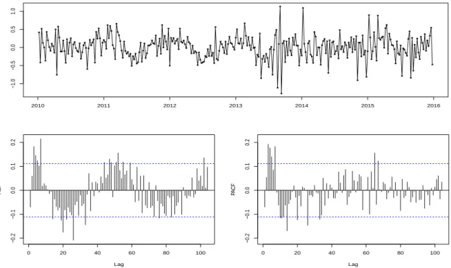
Figure 10 shows at top the the differenced log time series for the Rio de Janeiro, at bottom, in left the ACF series, and at right, PACF series. In the ACF series, at the beginning of the series, the lag peek suggests the order of the nonseasonal moving average lag and lag peeks in the seasonal pattern, that is, multiple of 52 means seasonal moving average lag. PACF follows the same pattern, lag peeks at beginning is referred to non seasonal part, and multiple of 52, shows the seasonal part, both of the autorregressive models.
Backshift notation
The backward shift operator B is used to denote that the data is shifted back one period as Byt = yt−1. This operator can be used to describe differenced series as y
0
t =
(1 − B)yt. In general, a dth-order difference can be defined as (1 − B)dyt.
The SARIMA model notation is defined as SARIMA(p, d, q)(P, D, Q)m where p is
the lag of the autorregressive (AR) part of the model, d is the difference of the model corresponding to the integrated (I(d)) non-seasonal part, q is the lag referent to the moving average (MA) part of the model, P is the lag referent to the seasonal autorregressive (SAR) part of the model, D is the seasonal difference of the model corresponding to the integrated (I(D)) part and Q is the lag referent to the seasonal moving average (SMA) part of the model.
2010 2011 2012 2013 2014 2015 2016 −1.0 −0.5 0.0 0.5 1.0 0 20 40 60 80 100 −0.2 −0.1 0.0 0.1 0.2 Lag A CF 0 20 40 60 80 100 −0.2 −0.1 0.0 0.1 0.2 Lag PA CF
Figura 10: Differecenced, ACF and PACF of the log dengue series for Rio de Janeiro city. With the terminology above it is possible to understand the notation on the SARIMA models. If was adjusted a SARIM A(1, 0, 0)(0, 0, 0)0 than it means an AR(1) model, if
SARIM A(0, 0, 1)(0, 0, 0)0than it means a M A(1) model and if SARIM A(1, 0, 1)(0, 0, 0)0
than it means an ARM A(1, 1) model.
The SARIMA model using backshift operator [30] can be written as,
(1 − B)d(1 − Bm)Dyt= c +
θ(B)θm(Bm)et
φ(B)φm(Bm)
, (4.10)
where
c : is the constant term
et : is the white noise
φ(B) = 1 − φ1B − · · · − φpBp : is the AR with backshift operator
θ(B) = 1 + θ1B + · · · + θqBq : is the MA with backshift operator
φm(Bm) = 1 − φm,1Bm− · · · − φs,PBm,P : is the SAR with backshift operator
4.2 Methods 38
4.2.5
Covariate time series models
It is possible to adapt this methodology of time series to include covariate. The modification on Formula 4.2 in order to conduct the inclusion of variables. In this way, covariate analysis can be conducted to improve the fitting process. The covariate time series can be written as,
Yt= Yt− x
0
tβ, (4.11)
where Yt is the original time series, x
0
t is the time series matrix of the covariates which
could be at least 1 and β which is the parameter vector to be estimated.
4.2.6
SARIMAX
On the covariate analysis is going to be used the seasonal autorregressive moving average with covariates (SARIMAX) which is the SARIMA model with covariates. In order to estimate a matrix of covariates that relate with the dengue fever cases. The SARIMAX can be written as,
yt = βxt+
θ(B)θm(Bm)et
φ(B)φm(Bm)
, (4.12)
where β is the vector of parameter to the covariate to be estimated xt is the matrix with
the time series covariates.
4.2.7
Selection methods
The selection methods are widely known and used to find the best model. The models chosen were the Bayesian information criterion (BIC) [9, 10, 12] Akaike’s information criterion (AIC) and the corrected Akaike’s information criterion (AICc) [35].
To select the best fitted model were used some criterion methods that penalize the likelihood function in order to make the model parsimonious. All of these information criteria below are useful to SARIMA model selection and to select the predictors
of SARIMA model and the AIC for SARIMA model can be written as,
AIC = −2 log(L) + 2(p + q + k + 1), (4.13)
where L is the likelihood of the data, if c 6= 0 then k = 1 otherwise k = 0 and p and q are the orders of the model fitted.
The corrected AIC for SARIMA models can be written as,
AICc = −2 log(L) + 2(p + q + k + 1) +2(p + q + k + 1)(p + q + k + 2)
T − p − q − k − 2 , (4.14)
And the BIC for SARIMA models can be written as,
BIC = −2 log(L) + 2(p + q + k + 1) + [log(T ) − 2](p + q + k + 1), (4.15)
The good model is obtained by minimizing the AIC, AICc and BIC because they search for parsimony. As indicated in [30], between these three, the AICc is preferable.
4.2.8
Evaluating forecast accuracy
After fitting models the goal is to forecast dengue fever cases, to do this is necessary to use accuracy measures to determine whether the forecast is good. One way to do this is by separating the data into two parts, the train data and the test data. The first one is used to fit the model to make a forecast and the second one is used to evaluate the accuracy of the model fitted and because the test set was not used to fit the model the errors of forecast will provide a reliable measure of the quality of the forecast.
The way to do this is use measures based on the errors to assess which forecast is better. Between the time series models, the measures are going to be used as way to identify the best forecast method. On the covariate models are going to be used to identify which SARIMAX model is the best to forecast. The measures are mean absolute error (MAE), root mean squared error (RMSE) and the mean absolute percentage
4.2 Methods 40
error (MAPE).
The errors are calculated in function of the real data and the adjusted values and can be expressed as et= yt−byt.
MAE
The mean absolute error takes the absolute error to compute the scale dependent measure and it can be written as,
M AEt+k = 1 n n X j=1 |ej|, (4.16) RMSE
The squared mean error is a measure that compare the squared sum of the errors to assess the forecast. The root is made to have the measure at the same scale of the data and make it comparable. The RMSE can be written as,
RM SEt+k = 1 T T X j=1 e2j, (4.17) MAPE
The percentage errors is a measure that have scale independent and can be useful to compare forecasts of different data sets. The percentage error is expressed as pt = 100et/yt
and the measure can be written as,
M AP Et+k = 1 n n X j=1 |pj|, (4.18)
One way to use this measures to choose the best forecast model is to look at the smaller between the forecast models fitted for each measure.
To evaluate the fixation of the fitting model it is possible to use the rolling window (RW) and calculate these measures above to analyze the stability of the forecast at the time series over time [36]. RW consists of re-fit the model using different windows on time based in your original series. If samples of the same size are taken over time as exemplified in Figure 11, this should provide estimates not too different when assess through time.
Figura 11: Sample size of rolling window.
This procedure helps to evaluate the stability and check the predictive accuracy of the model by looking to the measures through time. The measures used to assess this are the ones listed in Section 4.2.8. Each series is modeled and evaluated in order to obtain the fixed error in the sample then a general measure is taken to evaluate the stability through time.
4.2.10
Fitting process
How the modeling process was made to estimate each group of the models will be presented here.
The fit of the time series model was made by using the Box-Jenkins approach defined in the Section 4.2.4.
The model with covariate was fitted by taking the first difference of the dengue series using each group of the covariate, and then, analyzing the residuals. Taking look at the residuals if still have lags at ACF and PACF that does not lie in the confidence region, this lags is going to be used to estimate the lags of the SARIMA model for dengue fever and were compared with the selection criterion of others specification models to define the best one for each group of covariate. The final model was the one who presented the lowest information criterion.
4.2 Methods 42
The forecast path was performed for each group of variable. The value of each covariate was calculated from the model for this covariate and these values were used in the time series model for dengue cases to thereby predict the number of dengue cases. The methodology was presented for SARIMA models. In the covariate model, the seasonal dependence can be captured by the covariate not being necessary estimate the seasonal lags, even in this case, was defined to call SARIMA model this is SARIM A(p, d, q)(0, 0, 0)52 when only the p, d and q terms are estimated.
5
Results
In this chapter will be presented all the analysis and results founded in this work. The goal of this analysis were to find a better method to forecast dengue fever cases in Rio de Janeiro city using assess metrics to evaluate the accuracy. First is going to present different results using only time series, second, the covariate models in a different window at time, and finally, different window in rolling window to assess the fit of the time series.
5.1
Time series models without covariate analysis
Here the analysis is on the time series models considering the horizon from 2010 to 2015 to model and forecast for ES, Holt, DH and SARIMA. For all forecast plot is going to be presented the original series starting on 2015, and on 2016, the forecast made, in a blue line, two confidence shadows 80% and 95% respectively and the real value of 2016 in a dashed line.
5.1.1
Rio de Janeiro
Forecasts from Simple exponential smoothing
2015.0 2015.2 2015.4 2015.6 2015.8 2016.0 2016.2 3 4 5 6 7
5.1 Time series models without covariate analysis 44
At Figure 12 is possible to see the ES forecast for the horizon of 8 weeks ahead. As the forecast made for ES do not change over time the real value plotted in a dashed line is far from the forecast in blue.
Forecasts from Holt's method
2015.0 2015.2 2015.4 2015.6 2015.8 2016.0 2016.2 3 4 5 6 7 8 9
Figura 13: Forecast of the Holt method until time T + 8|T .
At Figure 13 is possible to see the Holt forecast for the horizon of the 8 weeks ahead. For having a constant trend, the forecast made do not fit well with the real value, but its better than the forecast made by ES.
At Figure 14 is possible to see the DH forecast for the horizon of the 8 weeks ahead and for having a damped trend its more capable to fit the forecast oscillation fitting better than the ES and Holt.
2015.0 2015.2 2015.4 2015.6 2015.8 2016.0 2016.2 3 4 5 6 7 8
Figura 14: Forecast of the DH method until time T + 8|T .
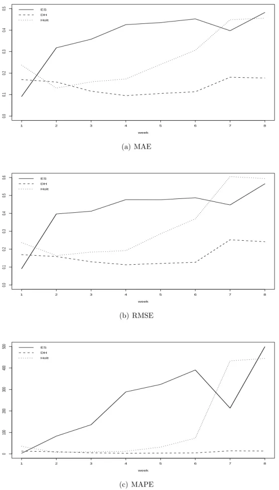
Between the three methods the best is to choose Damped Holt method for having the lowest information criterion as is possible to see at Table 5.
To validate the better choice of forecast method is going to be used assess metrics to choose between them. At Figure 15 is possible to see at 1 step ahead ES method is smaller (which means better) in all three assess metrics, at 2 steps ahead, Holt method is better in MAE and MAPE, and from 3 to 8 steps ahead and 2 steps ahead in RMSE, the Damped Holt method perform better than the others which is consistent with the theory.
5.1 Time series models without covariate analysis 46 1 2 3 4 5 6 7 8 0.0 0.1 0.2 0.3 0.4 0.5 week ES DH Holt (a) MAE 1 2 3 4 5 6 7 8 0.0 0.1 0.2 0.3 0.4 0.5 0.6 week ES DH Holt (b) RMSE 1 2 3 4 5 6 7 8 0 100 200 300 400 500 week ES DH Holt (c) MAPE
Figura 15: MAE, RMSE and MAPE for the ES, DH and Holt methods from 1 to 8 weeks ahead.
4.2.4. The ADF for log dengue series was not significant (p = 0.572), but the first difference of the log transformed series was significant (p < 0.01) by rejecting the hypothesis of non stationary. The OCSB test results in the number of the seasonal differences which is 0 for the log dengue fever time series.
At Figure 16 is possible to see at top the difference log series lies in -1 and 1 which two exceptions for each side, at bottom the ACF and PACF to help identify the order of the SARIMA. The ACF and PACF have significant peek after lag two suggesting lags up to 3 for the MA and AR nonseasonal part of the model and a peek in ACF at lag 52 suggesting seasonal MA part on the model which does not occur in the PACF.
Difference of log(dengue) 2010 2011 2012 2013 2014 2015 2016 −1.0 −0.5 0.0 0.5 1.0 0 20 40 60 80 100 120 −0.2 −0.1 0.0 0.1 0.2 Lag A CF 0 20 40 60 80 100 120 −0.2 −0.1 0.0 0.1 0.2 Lag P A CF
5.1 Time series models without covariate analysis 48
At the Table 3 were presented the values of the information criterion for the models tested. For AIC and AICc the best model is (3, 1, 5)(0, 0, 1)52 in bold. The best BIC
model is (1, 1, 3)(0, 0, 1)52 which is the model selected by the auto.arima function in R.
The third model in bold is a possible choice using BIC because the tiny difference with the auto.arima. To perform the forecast on the train and test set is going to be used the selected by AICc and BIC criterion.
Tabela 3: AIC, AICc and BIC for the SARIMA models tested for Rio de Janeiro.
Models AIC AICc BIC
(0, 1, 1)(0, 0, 1)52 185.080 185,158 196,299 (1, 1, 1)(0, 0, 1)52 186.666 186.797 201.625 (2, 1, 1)(0, 0, 1)52 172.277 172.473 190.976 (3, 1, 1)(0, 0, 1)52 162.159 162.435 184.598 (4, 1, 1)(0, 0, 1)52 162.180 162.550 188.359 (1, 1, 0)(0, 0, 1)52 184.730 184.808 195.949 (1, 1, 2)(0, 0, 1)52 160.317 160.514 179.016 (1, 1, 3)(0, 0, 1)52 148.777 149.053 171.216 (1, 1, 4)(0, 0, 1)52 148.884 149.254 175.063 (4, 1, 4)(0, 0, 1)52 141.694 142.427 179.092 (5, 1, 3)(0, 0, 1)52 143.621 144.354 181.019 (6, 1, 3)(0, 0, 1)52 141.643 142.526 182.781 (7, 1, 3)(0, 0, 1)52 143.174 144.221 188.052 (3, 1, 5)(0, 0, 1)52 134.802 135.535 172.200 (3, 1, 6)(0, 0, 1)52 136.189 137.072 177.326 (4, 1, 3)(0, 0, 1)52 139.060 139.658 172.718 (3, 1, 4)(0, 0, 1)52 141.927 142.525 175.585 (7, 1, 7)(0, 0, 1)52 151.481 153.332 211.318 (5, 1, 5)(0, 0, 1)52 147.104 148.151 191.982 (6, 1, 6)(0, 0, 1)52 144.398 145.817 196.756 (3, 1, 3)(0, 0, 1)52 141.308 141.785 171.227 (3, 1, 7)(0, 0, 1)52 149.353 150.400 194.231 (3, 1, 5)(1, 0, 2)52 136.239 137.286 181.116 (3, 1, 5)(2, 0, 2)52 152.980 154.205 201.597 (3, 1, 5)(0, 0, 2)52 135.246 136.129 176.384 (3, 1, 5)(0, 0, 3)52 135.945 136.992 180.823
presented the error measures for the SARIMA models proposed based in the time series models. For all of 8 weeks of forecast the error of prediction its smaller for SARIMA (1, 1, 3)(0, 0, 1)52 than the two others.
Tabela 4: MAE, RMSE and MAPE for SARIMA models in a test set for time series models in Rio de Janeiro.
Model Test set
MAE RMSE MAPE
SARIMA (3, 1, 5)(0, 0, 1)52 yT +1|T 0.1993 0.1993 20.5874 yT +2|T 0.1247 0.1433 6.0908 yT +3|T 0.2294 0.2808 28.2345 yT +4|T 0.2496 0.2888 35.7544 yT +5|T 0.3291 0.3890 97.7399 yT +6|T 0.3954 0.4642 212.2044 yT +7|T 0.5373 0.6825 1130.1970 yT +8|T 0.5050 0.6409 765.9456 SARIMA (1, 1, 3)(0, 0, 1)52 auto yT +1|T 0.0602 0.0602 1.6865 yT +2|T 0.0325 0.0424 0.7135 yT +3|T 0.1097 0.1587 4.4471 yT +4|T 0.1242 0.1613 5.6000 yT +5|T 0.1757 0.2249 12.5629 yT +6|T 0.2283 0.2887 26.1752 yT +7|T 0.3389 0.4705 118.0193 yT +8|T 0.3084 0.4372 79.1566 SARIMA (3, 1, 3)(0, 0, 1)52 yT +1|T 0.1971 0.1971 19.9185 yT +2|T 0.1068 0.1368 4.4900 yT +3|T 0.1995 0.2510 18.6963 yT +4|T 0.2060 0.2449 19.8922 yT +5|T 0.2657 0.3153 44.1720 yT +6|T 0.3097 0.3610 76.4245 yT +7|T 0.4227 0.5363 320.1472 yT +8|T 0.3756 0.4959 181.5801
At Figure 17 were presented the forecast of the SARIMA models for the horizon of 8 weeks ahead. It is possible see that the forecast made by SARIM A(1, 1, 3)(0, 0, 1)52 on
subfigure 17(b) seems to be more closed to the original value (plotted in dashed line) in the first two weeks. Looking the Table 4 is possible to confirm that the same model has the lowest errors measure for each week making it the best fitted SARIMA model.
5.1 Time series models without covariate analysis 50
Forecasts from ARIMA(3,1,5)(0,0,1)[52]
2015.0 2015.2 2015.4 2015.6 2015.8 2016.0 2016.2 3 4 5 6 7 8
(a) SARIM A(3, 1, 5)(0, 0, 1)52 Forecasts from ARIMA(1,1,3)(0,0,1)[52]
2015.0 2015.2 2015.4 2015.6 2015.8 2016.0 2016.2 3 4 5 6 7 8 (b) SARIM A(1, 1, 3)(0, 0, 1)52
Forecasts from ARIMA(3,1,3)(0,0,1)[52]
2015.0 2015.2 2015.4 2015.6 2015.8 2016.0 2016.2 3 4 5 6 7 8 (c) SARIM A(3, 1, 3)(0, 0, 1)52
Figura 17: Forecast of 8 weeks of log dengue fever series to the four SARIMA models in Rio de Janeiro.
at bottom left may suggest the residual series could not be white noise because the ACF at lag 7 is out of the threshold limit even the residual seems to have normal distribution with 1 standard deviation (bottom right). The Ljung-Box test in the residuals series returns p-value 0.2372 also suggesting the residuals are white noise because high p-values suggest that there is no evidence for reject the normality hypothesis. The residuals analysis for SARIM A(3, 1, 3)(0, 0, 1)52 appears that the residuals are white noise with ACF peek up
to lag 19 and p-value 0.3334. The SARIM A(3, 1, 5)(0, 0, 1)52 has all correlations between
the threshold limits and p-value 0.5393.
−1.0 −0.5 0.0 0.5 1.0 2010 2012 2014 2016
Residuals from ARIMA(1,1,3)(0,0,1)[52]
−0.15 −0.10 −0.05 0.00 0.05 0.10 0.15 0 52 104 Lag A CF 0 10 20 30 40 −1.0 −0.5 0.0 0.5 1.0 residuals count
5.1 Time series models without covariate analysis 52
In order to compare between the time series models only, the SARIMA models present information criterion smaller than ES, Holt and DH methods. Based in assess measures the SARIMA model it will be chosen the one that present has less error in the two first week of forecast, after assess this, the DH does better. Despite DH having the better performance between the methods presented, the SARIMA model seems to adjust better to the data.
For the others cities is going to be presented assess measure for the time series models in each city and will present the best forecast method for each one.
5.1.2
S˜
ao Gon¸
calo
Assess measure of S˜ao Gon¸calo city are at Figure 19. For all measures the ES method perform better for the first week ahead, but from 2 to 8 weeks ahead is the DH method.
1 2 3 4 5 6 7 8 0.0 0.2 0.4 0.6 0.8 1.0 weeks ahead MAE ES DH Holt (a) MAE 1 2 3 4 5 6 7 8 0.0 0.5 1.0 1.5 weeks ahead RMSE ES DH Holt (b) RMSE
1 2 3 4 5 6 7 8 0 2 4 6 8 10 12 weeks ahead log MAPE ES DH Holt (c) MAPE
Figura 19: Assess performance of the time series models analysis of the S˜ao Gon¸calo city. The forecast for DH method for the S˜ao Gon¸calo city is presented at Figure 20. For DH present damped trend, the forecast to further horizon is better.
Forecasts from Damped Holt's method
2015.0 2015.2 2015.4 2015.6 2015.8 2016.0 2016.2 2 3 4 5 6 7 8 9
Figura 20: DH forecast from 1 to 8 weeks ahead for S˜ao Gon¸calo city.
5.1 Time series models without covariate analysis 54
Forecasts from ARIMA(3,1,3)(0,0,1)[52]
2015.0 2015.2 2015.4 2015.6 2015.8 2016.0 2016.2 2 3 4 5 6 7 8
(a) SARIM A(3, 1, 3)(0, 0, 1)52
Forecasts from ARIMA(1,0,1)(1,0,0)[52] with non−zero mean
2015.0 2015.2 2015.4 2015.6 2015.8 2016.0 2016.2 2 3 4 5 6 7 (b) SARIM A(1, 0, 1)(1, 0, 0)52
Figura 21: SARIMA forecast from 1 to 8 weeks ahead for S˜ao Gon¸calo.
5.1.3
Campos dos Goytacazes
Assess measure of Campos dos Goytacazes city show that the three methods are quite similar to each other with Holt perform a lite better for the most distant weeks as is possible to see at Figure 22.
1 2 3 4 5 6 7 8 0.0 0.2 0.4 0.6 0.8 1.0 1.2 1.4 weeks ahead MAE ES DH Holt (a) MAE 1 2 3 4 5 6 7 8 0.5 1.0 1.5 weeks ahead RMSE ES DH Holt (b) RMSE 1 2 3 4 5 6 7 8 6 8 10 12 14 16 weeks ahead log MAPE ES DH Holt (c) MAPE
Figura 22: Assess performance of the time series models analysis of the Campos dos Goytacazes city.
5.1 Time series models without covariate analysis 56
The Holt forecast for the Campos dos Goytacazes is presented at Figure 23 and the forecasts are bad and do not follow the behavior of the observed data.
Forecasts from Holt's method
2015.0 2015.2 2015.4 2015.6 2015.8 2016.0 2016.2 2 3 4 5 6 7
Figura 23: Holt forecast from 1 to 8 weeks ahead for Campos dos Goytacazes city.
The forecast of the two best time series models for the Campos dos Goytacazes are at Figure 24.
Forecasts from ARIMA(1,1,1)(1,0,1)[52]
2015.0 2015.2 2015.4 2015.6 2015.8 2016.0 2016.2 2 3 4 5 6
(a) SARIM A(1, 1, 1)(1, 0, 1)52
Forecasts from ARIMA(0,1,1)(0,0,2)[52]
2015.0 2015.2 2015.4 2015.6 2015.8 2016.0 2016.2 2 3 4 5 6 (b) SARIM A(0, 1, 1)(0, 0, 2)52
Asses measure of Petropolis city are at Figure 25. For all measures the Holt method perform better for the first 5 weeks ahead, but from 6 to 8 weeks ahead is the DH method.
1 2 3 4 5 6 7 8 0.0 0.2 0.4 0.6 0.8 1.0 1.2 1.4 weeks ahead MAE ES DH Holt (a) MAE 1 2 3 4 5 6 7 8 0.0 0.5 1.0 1.5 weeks ahead RMSE ES DH Holt (b) RMSE 1 2 3 4 5 6 7 8 5 10 15 20 25 weeks ahead log MAPE ES DH Holt (c) MAPE
5.1 Time series models without covariate analysis 58
The forecast of Holt method for the Petropolis is presented at Figure 26 and the better forecast at first weeks is more close to the real value (dashed line).
Forecasts from Damped Holt's method
2015.0 2015.2 2015.4 2015.6 2015.8 2016.0 2016.2 0 1 2 3 4 5
Figura 26: DH forecast from 1 to 8 weeks ahead for Petropolis city.
The forecast of the two best time series models for the Petropolis are at Figure 27 Forecasts from ARIMA(2,1,1)(1,0,0)[52]
2015.0 2015.2 2015.4 2015.6 2015.8 2016.0 2016.2 0 1 2 3 4
(a) SARIM A(2, 1, 1)(1, 0, 0)52
Forecasts from ARIMA(1,0,1)(1,0,0)[52] with non−zero mean
2015.0 2015.2 2015.4 2015.6 2015.8 2016.0 2016.2 0 1 2 3 (b) SARIM A(1, 0, 1)(1, 0, 0)52
to each city.
Method AIC AICc BIC
Rio de Janeiro ES 1100,447 1100,525 1111,676 Holt Damped 1074,999 1075,275 1097,457 Holt 1087,290 1087,486 1106,005 S˜ao Gon¸calo ES 1553,412 1553,490 1564,641 Holt Damped 1547,713 1547,989 1570,171 Holt 1560,757 1560,953 1579,472 Campos dos Goytacazes
ES 1508,530 1508,608 1519,759 Holt Damped 1505,398 1505,673 1527,856 Holt 1522,898 1523,094 1541,613 Petropolis ES 1508,530 1508,608 1519,759 Holt Damped 1505,398 1505,673 1527,856 Holt 1522,898 1523,094 1541,613
5.2
Covariate models analysis
The analysis here is on the covariate models time series. Is going to be presented assess measures made by using the RT, Climate variables and Twitter as covariate to model SARIMA. The time horizon is from 2013 to 2015 because the covariate series start after the dengue cases. The residuals analysis of each model for each city is on Appendix A.
To compare the analysis with the approach existent on the literature, will be performed the SARIMA model with each group of covariate for then introduce this work proposal and compare with the baseline models. The baseline model is a SARIMA model with Climate.
The Rio de Janeiro analysis are at Table 6. In 1 and 2 steps ahead SARIMA Climate RT perform better than the others. SARIMA Climate perform well in general. The inclusion of the RT in comparison with baseline model shows that the RT can improve the forecast. The fit made with only the RT shows small forecast errors. The model with Twitter data also present small measures despite being greater than with Climate and RT. In comparison with the time series model only, all covariate models are better in every week except at week 2 for the models with only RT and Twitter. The SARIMA CLIMA RT forecast will be presented at Figure 28
5.2 Covariate models analysis 60
Tabela 6: Assess predictive performance for each SARIMA modeling of the Rio de Janeiro city. yT +1|T yT +2|T yT +3|T yT +4|T yT +5|T yT +6|T yT +7|T yT +8|T SARIMA (3, 1, 3)(0, 0, 1)52 MAE 0.149 0.116 0.217 0.245 0.311 0.376 0.499 0.455 RMSE 0.149 0.121 0.262 0.280 0.360 0.437 0.621 0.577 MAPE 9.537 5.167 23.636 33.112 77.113 168.590 743.858 441.621 SARIMA (1, 1, 3)(0, 0, 0)52 Climate MAE 0.016 0.095 0.064 0.082 0.070 0.061 0.104 0.137 RMSE 0.016 0.124 0.100 0.111 0.100 0.091 0.163 0.202 MAPE 0.312 3.242 1.696 2.526 1.958 1.551 4.034 6.703 SARIMA (5, 1, 3)(0, 0, 0)52 RT MAE 0.039 0.140 0.108 0.116 0.102 0.087 0.118 0.154 RMSE 0.039 0.173 0.142 0.142 0.128 0.116 0.158 0.209 MAPE 0.923 7.131 4.193 4.762 3.740 2.797 5.135 8.822 SARIMA (1, 1, 3)(0, 0, 0)52 Twitter MAE 0.056 0.148 0.125 0.140 0.117 0.106 0.138 0.175 RMSE 0.056 0.175 0.149 0.160 0.143 0.131 0.175 0.225 MAPE 1.528 8.238 5.629 7.197 4.916 4.012 7.216 12.034 SARIMA (4, 1, 4)(0, 0, 0)52 Climate RT MAE 0.002 0.091 0.070 0.075 0.085 0.083 0.128 0.146 RMSE 0.002 0.129 0.106 0.102 0.107 0.102 0.178 0.194 MAPE 0.030 2.973 1.953 2.146 2.678 2.556 6.117 7.952 SARIMA (3, 1, 5)(0, 0, 0)52 Climate RT Twitter
MAE 0.047 0.111 0.083 0.070 0.091 0.095 0.151 0.159 RMSE 0.047 0.128 0.105 0.092 0.114 0.113 0.215 0.215 MAPE 1.171 4.425 2.608 1.978 3.068 3.268 9.089 9.902
Forecasts from Regression with ARIMA(4,1,4) errors
2015.0 2015.2 2015.4 2015.6 2015.8 2016.0 2016.2 3 4 5 6 7 8
Figura 28: SARIMA (4, 1, 4)(0, 0, 0)52 Climate RT forecast for 8 weeks ahead in Rio de
city. yT +1|T yT +2|T yT +3|T yT +4|T yT +5|T yT +6|T yT +7|T yT +8|T SARIMA (1, 1, 3)(0, 0, 1)52 MAE 0.459 0.262 0.170 0.140 0.112 0.116 0.211 0.228 RMSE 0.459 0.316 0.251 0.216 0.192 0.183 0.352 0.352 MAPE 721.280 52.647 13.675 8.250 5.062 5.174 22.796 28.003 SARIMA (1, 1, 1)(0, 0, 1)52 Climate MAE 0.054 0.285 0.480 0.642 0.770 0.849 0.785 0.828 RMSE 0.054 0.377 0.598 0.773 0.902 0.971 0.903 0.936 MAPE 1.506 54.073 479.395 2363.660 7156.072 13854.730 8463.643 12405.560 SARIMA (3, 1, 5)(1, 0, 0)52 RT MAE 0.496 0.227 0.168 0.211 0.183 0.175 0.190 0.197 RMSE 0.496 0.329 0.265 0.287 0.257 0.239 0.247 0.246 MAPE 1108.767 34.223 13.380 22.579 14.883 12.745 16.226 17.423 SARIMA (1, 1, 2)(0, 0, 1)52 Twitter MAE 0.400 0.198 0.179 0.195 0.197 0.176 0.230 0.210 RMSE 0.400 0.270 0.233 0.236 0.230 0.211 0.287 0.268 MAPE 350.750 21.674 14.980 17.779 17.371 12.773 27.931 21.148 SARIMA (1, 1, 3)(0, 0, 0)52 Climate RT MAE 0.318 0.191 0.144 0.179 0.195 0.207 0.200 0.209 RMSE 0.318 0.224 0.183 0.214 0.223 0.232 0.223 0.229 MAPE 121.840 18.862 8.625 13.838 16.455 19.108 17.491 19.619 SARIMA (3, 1, 4)(0, 0, 0)52 Climate RT Twitter
MAE 0.374 0.193 0.183 0.141 0.140 0.148 0.229 0.239
RMSE 0.374 0.254 0.226 0.194 0.183 0.184 0.324 0.322
MAPE 252.268 20.067 15.627 8.035 7.583 8.374 27.995 31.527
The S˜ao Gon¸calo analysis at Table 7 in 1 week SARIMA Climate is better than the others, but in general SARIMA Climate RT is better than the SARIMA Climate. The time series model without covariate perform better than some covariate models in a few weeks. In distant forecasts the SARIMA RT perform better than the others. The SARIMA Twitter despite bad forecast at 1 step ahead perform well from 2 to 8 weeks ahead. The SARIMA Climate RT forecast is presented at Figure 29.
Forecasts from Regression with ARIMA(1,1,3) errors
2015.0 2015.2 2015.4 2015.6 2015.8 2016.0 2016.2 2 3 4 5 6 7 8
Figura 29: SARIMA (1, 1, 3)(0, 0, 0)52 CLIMATE RT forecast for 8 weeks ahead in S˜ao