How to tell stories using visualization:
strategies towards Narrative Visualization
Ana Raquel de Ponte Figueiras
Doctorate Dissertation in Digital Media
Thesis submitted in accordance with the requirements for the degree of Doctor of Philosophy in Digital Media, under scientific supervision of Prof. António Granado.
Tese apresentada para cumprimento dos requisitos necessários à obtenção do grau de Doutor em Media Digitais, realizada sob a orientação científica de Prof. António Granado.
Declaro que esta tese é o resultado da minha investigação pessoal e independente. O seu conteúdo é original e todas as fontes consultadas estão devidamente mencionadas no texto, nas notas e na bibliografia.
O candidato,
Lisboa, de de
Declaro que esta tese se encontra em condições de ser apreciada pelo júri a designar.
O orientador,
How to tell stories using visualization: strategies towards Narrative Visualization
Copyright © Ana Raquel de Ponte Figueiras, Faculdade de Ciências Sociais e Humanas, Uni-versidade NOVA de Lisboa.
The Faculdade de Ciências Sociais e Humanas and the Universidade NOVA de Lisboa have the right, perpetual and without geographical boundaries, to file and publish this dissertation through printed copies reproduced on paper or on digital form, or by any other means known or that may be invented, and to disseminate through scientific repositories and admit its copy-ing and distribution for non-commercial, educational or research purposes, as long as credit is given to the author and editor.
Acknowledgements
Completing a thesis is a great challenge and thanking all those who contributed to it is an even greater one. Many people influenced me, shaped my thinking, and my work. Some of them are well aware of it and some are not, either way I want to thank all of them, including those not mentioned here by name.
First, I would like to thank Professor António Granado from the Department of Com-munication Sciences for being my thesis supervisor: thank you for reviewing my work and always pushing me to do better. Second, I would like to thank Fundação para a Ciência e a Tecnologia and the UT Austin|Portugal Program for funding my research and giving me the opportunity to spend a semester at UT Austin (SFRH / BD / 51739 / 2011). I also have to thank Professor Rui Cádima for, in 2010, encouraging me in my plans to enroll in this PhD program; Professor Sharon Strover, Professor Nuno Correia, Professor Peter Hall, Professor Riley Triggs, and Professor Carol King for the feedback on my research; my colleagues; all the people that reviewed my work; and the focus group participants for their helpful insights and for accommodating this study in their deadline-driven schedules, without them this research would not be possible. I also need to thank Professor Bruno Giesteira, from Universidade do Porto, for being the jury of my research project proposal and for his valuable comments on my initial work.
I also have to thank my mother for encouraging me to continue my studies, always giving me the support I needed, never doubting I was going to succeed, and being a role model of strength and character. To my father for teaching me the importance of hard work and my grandmother for being a great role model of resilience. Their support all these years was essential. I would also like to thank my extended family and my close friends (the ones that have known me forever and the ones that I made later in life): thank you all for everything.
Abstract
The benefits of storytelling are long-known and its potential to simplify concepts, convey cultural values and experiences, create emotional connection, and capacity to help retain information has been explored in different areas, such as journalism, education, marketing, and others. Narratives not only have been the main way people make sense of the world, but also the easiest way humans found out to share complex information.
Due to its potential narratives have also recently been approached in the area of Infor-mation and Knowledge Visualization, several times being referred to asNarrative Visualization. This matter is also particularly important for news media, one of the areas that has been pushing the research onNarrative Visualization. The necessity to incorporate storytelling in visualiza-tions arises from the need to share complex data in a way that is engaging. Nowadays we also have the challenge of the high amount of information available, which can be hard to cope with. Advances in technology have enabled us to go beyond the traditional forms of storytelling and representing data, giving us more attractive and sophisticated means to tell stories.
In this dissertation, I explore the benefits of infusing visualizations with narratives. In addition I also present ways of combining storytelling with visualization and efficient methods to represent and make sense of data in a way that allows people to relate with the information. This research is closely related to journalism, but these techniques can be applied to completely different areas (education, scientific visualization, etc.). To further explore this topic a mixed-method evaluation that consists of a typology, several case studies and a focus group study was chosen, as well as design studies and techniques review. This dissertation is intended to contribute to the evolving understanding of the field of narrative visualization.
Resumo
Os benefícios da utilização das narrativas são desde há muito conhecidos e o seu poten-cial para simplificar conceitos, transmitir valores culturais e experiências, criar ligações emo-cionais e capacidade para ajudar a reter a informação tem sido explorado em diferentes áreas. As narrativas não são só a principal forma como as pessoas obtêm o sentido do mundo, mas também a forma mais fácil que encontrámos para partilhar informações complexas.
Devido ao seu potencial, as narrativas foram recentemente abordadas na área da Visua-lização de Informação e do Conhecimento, muitas vezes apelidada deVisualização Narrativa. Esta questão é particularmente importante para os media, uma das áreas que tem impulsionado a investigação emVisualização Narrativa. A necessidade de incorporar histórias nas visualiza-ções surge da necessidade de partilhar dados complexos de um modo envolvente. Hoje em dia somos confrontados com a elevada quantidade de informação disponível, um desafio difícil de resolver. Os avanços da tecnologia permitiram ir além das formas tradicionais de narrativa e de representação de dados, dando-nos meios mais atraentes e sofisticados para contar histórias.
Nesta tese, exploro os benefícios da introdução de narrativas nas visualizações. Adi-cionalmente também exploro formas de combinar histórias com a visualizações e métodos eficientes para representar e dar sentido aos dados de uma forma que permite que as pessoas se relacionem com a informação. Esta investigação está bastante próxima da área do jornalismo, no entanto estas técnicas podem ser aplicadas em diferente áreas (educação, visualização cien-tífica, etc.). Para explorar ainda mais este tema foi adotada um avaliação que utiliza diferentes metodologias como a tipologia, vários casos de estudo, um estudo com grupos de foco, e ainda estudos de design e análise de técnicas.
Contents
List of Figures xxiii
List of Tables xxvii
Glossary xxix
Acronyms xlv
1 Introduction 1
1.1 Motivation . . . 3
1.2 Approach . . . 7
1.3 Research questions . . . 8
1.4 Methodology . . . 9
1.5 Overview . . . 10
1.6 Contributions. . . 11
2 Visualization analysis 13 2.1 Visualization history and its most influential examples. . . 15
2.1.1 War Mortality – Florence Nightingale. . . 16
2.1.2 Figurative Map of the successive losses in men of the French Army in the Russian campaign 1812-1813 - Charles Minard . . . 17
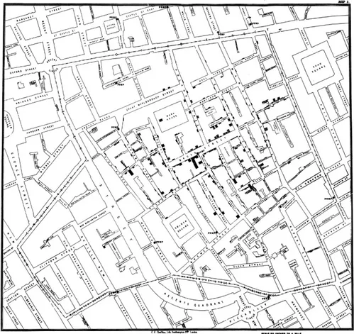
2.1.3 London Cholera Map – John Snow. . . 19
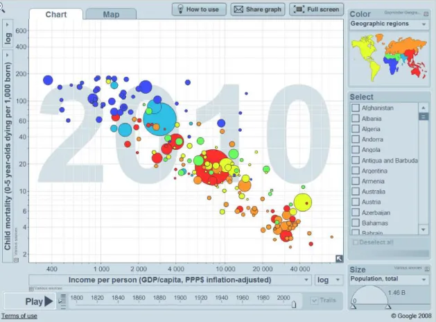
2.1.4 Gapminder – Rosling . . . 20
2.1.5 Visualization on the Web . . . 22
2.1.6 Wikileaks and open government data . . . 24
2.2 The present and future of visualization . . . 25
2.2.1 Principles borrowed from other areas . . . 27
2.2.2 The importance of the insights and knowledge . . . 34
2.2.3 The importance of function, user engagement, and target audience . . 41
2.3 Chapter Summary . . . 48
3 The many names of visualization 51 3.1 Defining Data, Information, and Knowledge . . . 53
3.2 Visualization of Data, Information, Knowledge, and everything in between . 54 3.2.1 Scientific visualization . . . 54
3.2.2 Visual analytics. . . 56
3.2.3 Data visualization . . . 56
3.2.4 Knowledge visualization . . . 57
3.2.5 Casual, social, collaborative, and artistic visualization . . . 58
3.3 Chapter Summary . . . 64
4 The role of interactivity 67 4.1 Interactivity versus interaction . . . 68
4.2 Previous interaction techniques taxonomies . . . 69
4.3 A new Interaction Techniques Taxonomy . . . 70
4.3.1 Filtering and selecting . . . 71
4.3.2 Abstract/Elaborate: Zoom, details-on-demand, and linking . . . 71
4.3.3 Overview and explore . . . 74
4.3.4 Connect/relate . . . 75
4.3.5 History and extraction of features . . . 75
4.3.6 Reconfigure and encode. . . 76
4.3.7 Complex forms of interaction: participation/collaboration and gamifi-cation . . . 78
4.4 Animation . . . 80
4.4.1 Arguments in favor and against of the use of animation . . . 84
4.5 Chapter Summary . . . 86
5 A new Visualization Typology 89 5.1 Existing Typologies . . . 90
5.2 The proposed Typology . . . 91
5.2.1 Sequential Graphic. . . 93
5.2.2 Slide Show . . . 93
5.2.3 Chart/Diagram. . . 94
5.2.4 Map . . . 94
5.2.5 Tag Clouds . . . 95
5.2.6 Model. . . 95
5.2.7 Drawing . . . 96
5.2.8 Video/Animation . . . 96
5.2.9 Photograph. . . 97
5.2.10 Poster . . . 97
5.2.11 Game . . . 98
5.3 ReThinking Visualization . . . 98
CONT ENTS
6 Typology Case Studies 105
6.1 England Riots. . . 105
6.2 The World of Seven Billion . . . 107
6.3 Death penalty statistics, country by country . . . 108
6.4 Home and Away: Iraq and Afghanistan War Casualties . . . 110
6.5 What Does China Censor Online? . . . 112
6.6 Ground Zero Now . . . 113
6.7 How Many Households Are Like Yours? . . . 115
6.8 A Week of Check-ins on the Path to One Billion . . . 117
6.9 100 Years of World Cuisine . . . 118
6.10 How Local News Is Going Mobile Infographic . . . 119
6.11 SPENT . . . 120
6.12 Chapter Summary . . . 121
7 Focus group study 123 7.1 Procedures . . . 123
7.2 Results. . . 126
7.2.1 The most discussed . . . 126
7.2.2 Links as context . . . 128
7.2.3 Non-playable. . . 131
7.3 Chapter Summary . . . 131
8 Using visualization to tell stories 133 8.1 Narratives and New Forms of Storytelling . . . 136
8.1.1 Narrative visualization. . . 138
8.1.2 History of storytelling in information/knowledge visualization . . . . 138
8.2 Chapter Summary . . . 141
9 Narrative strategies 143 9.1 Interactivity and its relation with context . . . 144
9.2 Empathy . . . 146
9.3 The Relation Between Time and Narrative . . . 146
9.4 Gamification as a Way to Have Storytelling in Visualizations . . . 147
9.5 Case Study . . . 151
9.5.1 How Many Households are Like Yours?enhanced with empathy . . . 152
9.5.2 What Does China Censor Online?enhanced with context . . . 153
9.5.3 Death Penalty Statistics, Country by Countryenhanced with time . . . . 154
9.6 Chapter Summary . . . 155
10 Techniques for visualization on the web 157 10.1 Tools for information visualization . . . 159
10.1.1 Tableau . . . 160
10.1.2 D3.js . . . 161
10.1.4 Other tools: Many Eyes, Google Charts, and Gephi . . . 164 10.2 Choosing the right visualization for a given function . . . 170 10.2.1 A visualization selection matrix . . . 174 10.3 Chapter Summary . . . 177
11 Conclusions 179
11.1 Thesis contributions . . . 180 11.1.1 Research objectives . . . 181 11.1.2 Summary of major contributions . . . 185 11.1.3 Summary of minor contributions . . . 186 11.2 Future work . . . 186 11.2.1 Work on narrative visualization evaluation . . . 187 11.3 Closing remarks . . . 190
Bibliography 193
I Publications 209
II Typology initial tables 243
III Focus group rating sheet 249
List of Figures
2.1 Playfair’s time-series chart ofExports and Imports to and from Denmark and Norway from 1700 to 1780, published in his Commercial and Political Atlas . . . 15 2.2 Florence Nightingale’s coxcomb diagram on mortality in the British army . . . . 16 2.3 Minard’sCarte figurative des pertes successives en hommes de l’Armée Française dans la
campagne de Russie 1812-1813 . . . 17 2.4 John Snow’s map of the clusters of cholera cases in the epidemic of 1854 . . . 19 2.5 Hans Rosling’s Trendalyzer, the information visualization software for animation
of statistics . . . 21 2.6 Gestalt laws referenced by Ware (2004) and Nesbitt and Friedrich (2002) . . . 27 2.7 Example of proximity in a bar chart . . . 28 2.8 Example of similarity and connectedness in a flowchart . . . 29 2.9 Example of continuity in a line chart . . . 29 2.10 Example of symmetry in a pyramid bar chart . . . 30 2.11 Example of closure in a bar chart . . . 31 2.12 Example of common fate inTrendalyzer . . . 32 2.13 Example of simplicity in a bar chart. . . 33 2.14 Example of familiarity in a bar chart . . . 34 2.15 Example of Semantic Zoom . . . 36 2.16 Evaluation levels for Visual Analytics (Figure 6.1 (Cook and Thomas, 2005)) . . . 38 2.17 Scale (Figure 1 (Kosara, 2007)) . . . 44 2.18 Model of information aesthetics (Figure 4 and 5 (Lau and Vande Moere, 2007)) . 45
3.6 Taxonomies comparison . . . 64
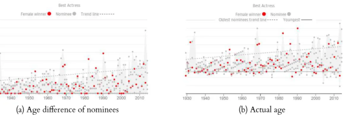
4.1 D3 zoomable treemap . . . 72 4.2 D3 collapsible tree . . . 73 4.3 The view from the Shard: a new and expanded panorama of London . . . 74 4.4 Examples of the use of the connect interaction technique . . . 75 4.5 Encode interactive options inAs the Oscars age, so do the nominees. . . 76 4.6 Encode interactive options inBloomberg Billionaires . . . 77 4.7 Examples of gamification in news media . . . 80 4.8 Bloomberg Millionairesmap view . . . 81 4.9 Taxonomies comparison . . . 87
5.1 Notes about categories and the visual and interactive elements . . . 92 5.2 Examples of a Sequential Graphic visualization and a Slide Show visualization . . 93 5.3 Examples of a Chart/Diagram visualization and a Map visualization . . . 94 5.4 Examples of a Tag Cloud visualization and a Model visualization. . . 95 5.5 Examples of a Drawing visualization and a Video/Animation visualization . . . . 96 5.6 Examples of a Photograph visualization and a Poster visualization . . . 97 5.7 Examples of Game visualizations . . . 98 5.8 Filtering onReThinking Visualizationhomepage . . . 99 5.9 ReThinking Visualizationvisualization page . . . 100 5.10 Typologies comparison . . . 102
6.1 England Riotstimeline byThe Guardian . . . 106 6.2 The World of Seven BillionbyNational Geographic . . . 107 6.3 Death penalty statistics, country by countrybyThe Guardian . . . 108 6.4 Home and AwaybyCNN . . . 110 6.5 What Does China Censor Online?by David McCandless . . . 112 6.6 Ground Zero NowbyThe New York Times . . . 114 6.7 How Many Households Are Like Yours?byThe New York Times . . . 115 6.8 A Week of Check-ins on the Path to One BillionbyFoursquare . . . 117 6.9 100 Years of World Cuisineby100 Years of World Cuisine . . . 118 6.10 How Local News Is Going Mobileinfographic byColumn Five . . . 119 6.11 SPENTbyMcKinney . . . 120
7.1 Characteristics of the visualizations presented to the participants of the focus groups 125 7.2 Visualizations used in the focus group study and the elements that compose them
radial matrix . . . 125 7.3 Ranking of the average ratings for each visualization in terms of comprehension,
likability, and navigation . . . 126 7.4 Scores given by the participants to each visualization in terms of comprehension,
LIST OF FIGURES
7.7 Faces of the deadbyThe New York Times . . . 129
7.8 British troops killed in AfghanistanbyThe Guardian . . . 130
7.9 Evolution of the WebbyGoogle . . . 130
8.1 Examples of early storytelling . . . 134 8.2 Snow FallbyThe New York Times . . . 137
9.1 Two systems for narrative visualization annotation . . . 145 9.2 Two screens ofGauging Your DistractionbyThe New York Times . . . 148 9.3 Two systems for narrative visualization annotation . . . 150 9.4 How many households are like yours?enhanced with storytelling . . . 152 9.5 What does China censor online?enhanced with storytelling. . . 153 9.6 Death penalty statistics, country by countryenhanced with storytelling . . . 154
10.1 Storytelling process (Figure 2 (Lee et al., 2015)) . . . 158 10.2 Visualization tools (D3, Google Charts, Ellipsis, Tableau, Gephi, and Many Eyes) 160 10.3 Visualization with Tableau. . . 161 10.4 Visualization with D3 . . . 162 10.5 Ellipsis . . . 164 10.6 Many Eyes . . . 165 10.7 Gephi . . . 166 10.8 Google Charts . . . 167 10.9 Chart selector guide (Figure 7.1 (Abela, 2008, p. 99)) . . . 171 10.10Jason Davies’s D3 example of parallel sets . . . 173
List of Tables
1.1 Table of contents . . . 10
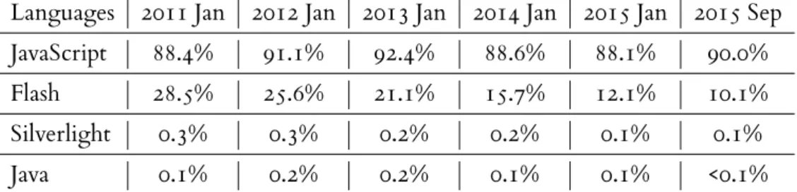
2.1 Trends in the usage of client-side programming languages for websites . . . 22
4.1 Interaction techniques taxonomies . . . 70 4.2 Proposed taxonomy . . . 70
5.1 Existing visualization typologies . . . 90
6.1 England Riotsgenre, elements, and reading/viewing order . . . 106 6.2 The World of Seven Billiongenre, elements, and reading/viewing order . . . 108 6.3 Death penalty statistics, country by countrygenre, elements, and reading/viewing order 109 6.4 Home and Awaygenre, elements, and reading/viewing order . . . 111 6.5 What Does China Censor Online?genre, elements, and reading/viewing order . . 113 6.6 Ground Zero Nowgenre, elements, and reading/viewing order . . . 114 6.7 How Many Households Are Like Yours?genre, elements, and reading/viewing order 116 6.8 A Week of Check-ins on the Path to One Billiongenre, elements, and reading/viewing
order . . . 117 6.9 100 Years of World Cuisinegenre, elements, and reading/viewing order . . . 118 6.10 How Local News Is Going Mobilegenre, elements, and reading/viewing order . . . 120 6.11 SPENTgenre, elements, and reading/viewing order . . . 121 6.12 Typology case studies and respective typology categories . . . 122
10.1 Visualization selection suggestion matrix (at least one quantitative variable) . . . . 175 10.2 Visualization selection suggestion matrix (only categorical data) . . . 177
11.1 Published papers on the topic of information visualization and storytelling . . . . 180
Glossary
accompanying article Anarticle that was written to support a visualization or that has the visualization as supporting information. It is usually presented in a separate page and can be accessed through a link.
Adobe Flash A software platform used for creating animated content, vector graphics, web browser games, and other web applications.
aesthetics A branch of philosophy that gives a set of principles concerned with the nature of art, beauty, and taste, and with the creation and appreciation of beauty.
ambient visualization A field closely related to information aesthetics that aims to commu-nicate information in the periphery of attention, resorting to engaging displays. These are “information visualization applications that do not reside on the screen of a desktop computer, but in the environment or periphery of the user” (Skog et al.,2003, p. 234).
animation Animation is the change of a visual representation over time through the rapid display of sequential static images that minimally differ from each other, resulting in an illusion of movement or shape change.
annotations Annotations are bits of textual information that are presented as a support for the information presented in the visualization. Annotations are a promising way to complement articles since they have the capacity to add context that otherwise would be very difficult to provide.
Apple Keynote A presentation software that is part of Apple’s productivity suite, iWork.
application In computing, an application (app) is a program or piece of software designed to fulfill a particular purpose (a group of coordinated functions, tasks, or activities). Applications are designed to run on computers, on mobile devices such as smartphones and tablet computers (known as mobile apps), or in a web browser (known as web apps).
area chart Achart that is based on the line chart. The area between axis and line are commonly emphasized with colors, textures and hatchings. Commonly one compares with an area chart two or more quantities.
artistic information visualization Seeartistic visualization.
artistic visualization “Artistic visualizations are visualizations of data done by artists with the intent of making art” (Viégas and Wattenberg, 2007, p. 183). It is also known as information or data art and it is an area on the edges ofinformation visualizationmore concerned with aesthetics and thesublime. An example are the weather data LEGO pieces of sculptor Nathalie Miebach (available athttp://nathaliemiebach.com/gulf.html).
audio narration An audible content usually in the form of a story or a description of events that acts as support information for the visualization.
bar graph Seebar chart.
bar chart A chart or graph that uses narrow columns of different heights to show and compare different amounts.
Bejeweled A series of tile-matching online skill-based games created by PopCap Games. It was first developed in 2001 as a web-based Flash game named Diamond Mine.
big data Extremely large data sets that may be analyzed computationally to reveal patterns, trends, and associations, especially relating to human behaviour and interactions.
Bokeh APythoninteractive visualization library that intends to be thePythonalternative to D3. More in Subsection10.1.4.1.
box plot Also known as a box and whisker diagram, this is a way to display graphically groups of numerical data through their quartiles. The vertical lines (or whiskers) indicate variability outside the upper and lower quartiles.
bubble map A map where the quantity of a variable for a specific geographic location is represented by the size of a bubble.
bubble chart A variation of the scatter plot that uses Cartesian coordinates to display values for two variables and in which a third variable is represented by the size of the bubble.
calendar A chart that presents the register of days according to a particular system.
canvas element An element consisting of a drawable region with height and width attributes available in HTML5, which allows for dynamic, scriptable rendering of 2D shapes and bitmap images, and can be accessed byJavaScriptthrough a set of drawing functions.
GLOSSARY
cartogram A mapin which some thematic variable is mapped on a geographic map, but the geometry or space of the map is distorted in order to convey the information of a quan-titative variable. For instance, when mapping world population data by country, more populated countries such as China would appear larger than less populated countries.
casual information visualization Seecasual visualization.
casual visualization According to Pousman et al. (2007, p. 1149) it is “the use of computer mediated tools to depict personally meaningful information in visual ways that support everyday users in both everyday work and non-work situations”.
chart A graphical representation of data. The term is used for diagrams or graphs, that or-ganize and represent numerical or qualitative data; sheets giving information in tabular form; and maps that contain extra information, such as nautical or aeronautical charts.
Chart/Diagram A genre that only comprises visualizations in which the chart or diagram is the main focus of the visualization. It includes every type of chart/diagram, from the common bar charts to Venn diagrams.
chord diagram A type of diagram used to display relationships between data in a matrix. These relationships are represented by arranging the data as nodes around a circle and connecting the data points that share a relationship with a ribbon. The thickness of the ribbon represents the value assigned to that connection, and color can be used to group data points into categories.
Chrome A freeware web browser developed by Google and available since 2008. It is available for Windows, Mac OS, and Linux operating systems and there is a mobile version for Android devices. It is currently the most popular web browser for desktop computers and smartphones.
circle graph In the mathematical area of graph theory, it is an intersection graph that repre-sents the pattern of intersections of a family of sets on a circle. This term is also often used in relation to several different circular charts such aspie chartsanddoughnut charts (and their respective exploded versions),sunburst charts, andpolar-area charts.
circular bar chart Abar chart, also known as radial bar chart, plotted on a polar coordinate system, rather than on a cartesian one. Although more visually appealing, it is often misleading because the outside bars take up more area than the bars on the inside.
click highlight The interactive action of highlighting or emphasizing a content (text, image, pictogram, etc.) when a computer user moves the pointer to a certain location on a screen and presses a button on a mouse, usually the left button (click), or other pointing device.
cloropleth A map in which areas are shaded or patterned in proportion to the value of a variable that corresponds to each geographical location.
color matrix It is similar to amatrix(a rectangular arrangement of elements into rows and columns), but instead of each cell having a number, symbol, or expression, it has a color that was previously assigned to a variable.
combo box A combo box is a commonly used graphical user interface widget or control. Traditionally, it is a combination of a drop-down list or list box and a single-line editable textbox, allowing the user to either type a value directly into the control or choose from a list of existing options by scrolling.
concept map A diagram that depicts suggested relationships between concepts. It is used to organize and represent knowledge, linking concepts, usually enclosed in a circle or box. The relationships between concepts are indicated by a line links the concepts and there can also be words associated to the connecting lines, which specify the relationship between the two concepts.
coxcomb diagram Seepolar-area chart.
cycle graph It is a graph that consists of a number of vertices connected in a closed chain. It is very common in graph theory.
D3 A JavaScript library to create SVG graphics from data. More in Subsection10.1.2.
data A collection of qualitative or quantitative information that can be used to calculate, report, and/or analyze. The word data has generated considerable controversy on whether it is singular, plural of datum, or an uncountable noun. Nowadays, despite the complaints of traditionalists, who consider it to be the plural of datum, data is considered a mass noun, similar to information, therefore not having a plural and taking a singular verb. The concept of data is defined in more detail in Section3.1.
data visualization See Subsection3.2.3.
decision tree This is a type of visualization that supports decision making. Decision trees use a tree-like graph to present scenarios and their possible consequences and are commonly used in research, specifically in decision analysis, to help choosing between several courses of action.
diagram Seechart.
dot plot Also known as a dot chart, strip chart or stripplot, this chart consists of data points plotted on a fairly simple scale, typically using filled in circles. The number of dots represented for each variable on the scale represent the value for that variable. Its most common use is to display distribution/frequency.
GLOSSARY
doughnut chart Achart similar to apie chart, with the exception of a blank center and the ability to support multiple statistics at once.
drag objects In computer graphical user interfaces, drag and drop is a pointing device gesture in which the user selects a virtual object by grabbingit and dragging it to a different location or onto another virtual object.
Drawing This is a type of visualization that combines information and illustration. In order to be effective and become a visualization and not a mere drawing, it has to combine the illustration with another type of visualization such as a chart or a map.
Ellipsis “A system that combines a domain-specific language for storytelling with a graph-ical interface for story authoring” Satyanarayan and J. Heer (2014, p. 361). More in Subsection10.1.3.
exploded view A diagram, picture, or technical drawing of an object, that shows the rela-tionship or order of assembly of various parts.
external link An external link is a link in another page or another website that can be clicked in order to access extra information that supports the visualization.
filtering Filtering is a function that processes a data structure (typically a list) in order to produce a new data structure containing exactly those elements of the original data structure which have in common the characteristic that was chosen in the filter.
Firefox A free and open source web browser developed by the Mozilla Foundation and the Mozilla Corporation since 2003. It is available not only for Windows and Mac OS but also for Linux operating systems. There are also mobile versions available for Android and Firefox OS.
flowchart A type of diagram that represents an algorithm, workflow or process, showing the steps as boxes of various kinds, and their order by connecting them with arrows. Flowcharts are used in analyzing, designing, documenting or managing a process or program in various fields.
Fusion Tables A data management web service provided by Google very similar to Google Spreadsheets. More in Subsection10.1.4.
Game This genre is the least common. It comprises visualizations that use formal elements of games such as rules, goals, scores, competition, and the notion of winning.
Gephi Avisualization and data analysis software written in Java. More in Subsection10.1.4.
Gestaltism From the German wordGestalt, which means form, this is a theory of mind of the Berlin School of experimental psychology developed in the 1900s that, among other things, deals with the study of perception.
ggplot2 One of the manyRpackages and is widely known for making it easier to useRfor creating statistical graphics while still taking advantage of its power. More in Subsec-tion10.1.4.1.
Google Scholar A freely accessible web search engine by Google that indexes scholarly lit-erature from several different publications, publishing formats, and disciplines..
Google Charts A library provided by Google that allows users to create charts and embed them in a web page. It contains prebuilt and ready to use charts, ranging from the very basicbar chart to the more complextreemap, which can be customized to the user’s needs.
graph A graph is a representation of a set of objects where some pairs of objects are connected by links.
grouped political map In opposition to physical maps, which focus on the geography of the area, these were designed to show governmental boundaries of countries and states. They can also indicate the location of major cities, and they usually include significant bodies of water.
grouped bar chart Abar chartwhere, for each categorical group, there are two or more bars colored to represent a particular grouping.
heat map A geographical map that uses color to represent quantities. It differs from a cloro-plethby not having a well defined path and representing the areas in a free form. It is commonly used to visualize weather phenomena.
heat map matrix A graphical representation of data where the individual values contained in a matrix are represented as colors.
histogram A representation of a frequency distribution by means of rectangles whose widths represent class intervals (continuous variables) and whose areas are proportional to the corresponding frequencies.
hover highlight This is the action of highlighting or emphasizing a content (text, image, pictogram, etc.) on mouseover or mouse hover (raised when the user moves orhoversthe pointer over a particular area).
hover details Extra bits of information that pop up on mouseover or mouse hover (raised when the user moves orhoversthe pointer over a particular area).
GLOSSARY
hyperlink Incomputing, it is a highlighted word or picture in a document or Web page providing direct access to a whole document or to a specific element within a document.
illustration A visualization or a depiction, such as a drawing, sketch, or painting. It uses examples in order to make something easier to understand. An illustration can be used to elucidate, decorate or represent scientific images, processes or technical information on how to use something.
information art Seeartistic visualization.
information visualization See Section3.2.
input box A text field or text box is a widget (or control) that has the purpose of allowing the user to input text information to be used by the visualization. Text boxes usually display a text cursor (commonly a blinking vertical line), indicating the current region of text being edited.
interactivity In computing, it is the dialog that occurs between the user and a computer. Interactive applications are designed to respond to the actions/commands of the user and not to run automatically without immediate user involvement. Particularly in vi-sualization interactivity refers to the quality of interaction among the components that comprise the visualization.
Internet Explorer A series of web browsers developed by Microsoft, included as part of the Windows operating systems since 1995.
introductory text A short text that explains what will follow in the visualization or states the purpose and goals of the visualization.
JavaScript JavaScript is a high-level, dynamic, object-oriented, lightweight, interpreted pro-gramming language. It is one of the world’s most popular propro-gramming languages and, although JavaScript is a general-purpose programming language, it is most well-known as the scripting language for the Web.
knowledge A collection of facts, information, and skills acquired either by experience, edu-cation, or transmission from another who has it, by instruction, or by extracting it from experience. The concept of knowledge is defined in more detail in Section3.1.
knowledge visualization See Subsection3.2.4.
library In software, a library is a collection of functions and methods used to add or implement functionality to a software.
frequentlytonever), likelihood (fromalmost always truetoalmost never true), or importance (fromvery importanttounimportant).
line graph Seeline chart.
line chart A graph, also known as line graph, in which points representing values of a variable for suitable values of an independent variable are connected by a broken line.
link to the raw data A link to the raw data allows the reader to see the original data that gave origin to the visualization. This data can be in provided in the same page of the visualization, in another page of the same website or even in another website. This raw data can be provided in a spreadsheet, a JSON, etc.
link to external article A link to an external article allows the reader to directly follow an article in another page or even another website by clicking. This hyperlink can point to a whole document or to a specific element within a document.
logo A graphic mark or emblem commonly used by commercial enterprises, organizations and even individuals to aid and promote instant public recognition.
Machine Learning A subfield of computer science that develops algorithms to provide com-puters the ability to learn from and make predictions on data.
Many Eyes “A public web site where users may upload data, create interactive visualizations, and carry on discussions” (Viégas, Wattenberg, Ham, et al.,2007, p. 1121). More in Subsection10.1.4.
map A symbolic depiction highlighting relationships between elements of a space. It can be tangible, mimicking the world as truthfully as it can, or as Minard’s flow map of Napoleon’s March an intangible map, representing the physical place in a way that accentuates other information about it.
Map A classic type of visualization that can be tangible (it represents where things are placed and tries to mimic as truthfully as it cans the real world) or intangible (it represents not only information about physical places but also about events that occurred on those places).
matplotlib It is the most popular option for visualizing data in Python. More in Subsec-tion10.1.4.1.
matrix A rectangular array of numbers, symbols, or expressions, that are arranged in rows and columns.
Microsoft Powerpoint A presentation software that is part of the Microsoft Office suite.
Microsoft Excel A spreadsheet software that is part of the Microsoft Office suite.
GLOSSARY
model Astructural design; a miniature representation of something; a pattern of something to be made.
Model This is a more technical visualization and particularly good to show projects of build-ings or to describe complex processes.
Mosaic A discontinued early web browser, produced in 1993 by NCSA, which was later renamed Netscape Navigator.
narrative An account of connected events that is transmitted either by being spoken, written, or visually represented. It can be fictional or non-fictional.
narrative visualization See Subsection8.1.1.
Natural Language Processing A field of computer science that researches strategies for com-puters to process and make sense of written and spoken words. It is a computer science field, integrated in the domain of artificial intelligence.
navigation button A user interface element that provides the user a simple way to trigger an navigation event. These buttons allow the user to navigate the information back and forward in a certain order.
Netscape Navigator The dominant web browser in terms of usage share in the 1990s. It was discontinued in 2008 because the user base declined in the late 90s, partly because of Internet Explorer web browser’s popularity and partly because of the lack of innovation.
network diagram A drawing of a graph or network diagram is a pictorial representation of the vertices and edges of a graph.
non-ribbon chord diagram Similarly to thechord diagram, it is a type of diagram used to display relationships between data in a matrix, with the data arranged as nodes around a circle and with the data points that share a relationship connected with a line (instead of a ribbon of which the thickness represents the value assigned to that connection).
object size Seesize representing quantity.
object react to mouse movement This interaction happens when the mouse movement provided by the user influences the objects on the visualization. For instance, when the mouse approaches the objects these are repelled like if the mouse was pushing the objects.
open data Datathat can be freely used and distributed by anyone without restrictions from copyright, patents or other control mechanisms. Usually the use of this data is subject to the requirement to attribute authorship and permit re-use/redistribution.
parallel sets A ways to visualize multivariate categorical data with a layout similar toparallel coordinates, that instead of having individual data points substitutes them by a frequency-based representation.
parallel coordinates A type ofvisualizationfor multivariate data, that usually consists of a set of axis parallel to each other and equally spaced (typically vertical). Each line that connects the different axis is a data point that has a corresponding value for each axis.
perception The process by which humans translate sensory information in order to represent and understand the world around them. Perception is influenced by the stimulation of physical or chemical of the sense organs, which are then translated into signals in the nervous system and interpreted according to the individuals education, memories, and expectations. The concept of perception is defined in more detail in Subsection2.2.1.
photograph An image produced by the action of radiant energy and especially light on a sensitive surface, usually photographic film or an electronic medium such as a CCD or a CMOS chip. It depicts or records visual perception with a similar appearance to the subject photographed.
Photograph This genre comprises the visualizations in which one or more photographs are the main part of the visualization.
pictogram Also called a pictogramme, pictograph, or icon. It is an ideogram that conveys its meaning through its pictorial resemblance to a physical object.
pie chart A chart consisting of a circle that is divided into parts to show the size of the different amounts that are a part of a whole amount.
platform A technology infrastructure that can be customized by outside developers or users, having the possibility to be adapted to different needs that platform’s original developers did not previously contemplated.
player controls Player or media controls are user interface elements typically associated with media such as video and sound. These controls are used to enact and change or adjust the process of watching film or listening to audio and commonly consist of buttons such asplay,pause,stop, etc.
Plotly A web-based tool that combines both analytics and visualization. More in Subsec-tion10.1.4.
polar grid A grid plotted on polar coordinates. A well known example of a polar grid is David McCandless’Colours in cultureavailable athttp://www.informationisbeautiful.net/ visualizations/colours-in-cultures/.
GLOSSARY
population pyramid Also known an age pyramid or age picture diagram, it is a chart that represents the distribution of various age groups in a population through horizontal bars, usually separated by sex, forming the shape of a pyramid when the population is growing.
Poster These visualizations are generally static mimicking the structure of a vertical poster so common on magazines and marketing campaigns. It conjugates information and graphic elements in order to be appealing and eye-catching and charts and diagrams play an important part of the visualization.
pragmatic visualization According to Kosara (2007, p. 633) it is “what we term the technical application of visualization techniques to analyze data.” The comprehension of the data is the main goal of these visualizations.
Processing A programming language andintegrated development environment (IDE)built for visual arts. More in Subsection10.1.4.1.
Processing.js AJavaScriptversion of the popularProcessingvisual programming language. It not only allows users to create visualizations but also any type of interactive content (including games). It is only supported on browsers that implemented the canvas element.
programming language A formal constructed language used to communicate a set of de-tailed instructions to a machine.
pyramid It is used to show proportional, interconnected, or hierarchical relationships with the largest component on the bottom and narrowing up.
Python A general-purpose, interpreted, object-oriented, dynamic programming language.
R A programming language and software environment for statistical computing and graphics. More in Subsection10.1.4.1.
radar chart Aline chartorarea chartplotted on polar coordinates, on which the y-axis is the radius and the x-axis the angle. Although it is a common method to display multivariate data, it is difficult to interpret.
radial tree A type oftree diagramthat expands outwards, radially.
Safari A web browser developed by Apple, based on the WebKit engine, first released in 2003 with the Mac OS operating system. A mobile version has been included in iOS devices since 2007, when the first iOS device, the iPhone, was released.
sankey arc A visualization based on arc diagrams, proposed by Nagel et al. (2012), “which extends the arc diagram technique by laying out the weighted edges of a node adjacent to each other”.
scalability The capability of a computer application or product (hardware or software) to handle the growth of the volume of work. It includes not only the ability to function well, but also to take full advantage of the rescaled situation.
scale Commonly used in physics, geography, and other sciences, a scale is something gradu-ated used as a measure or rule. It has a series of marks at known intervals used to measure distances (as the height of the mercury in a thermometer) or used as a scheme of rank or order (a scale of taxation).
scatter plot Also known as scatterplot or scattergraph, it is a type of mathematical diagram using Cartesian coordinates to display values for two variables for a set of data.
scenario matrix A matrix divided in four quadrants where the beginning and the end of both axis represent two opposed qualitative variables. Concepts are placed in either of the quadrants according to how they would be placed along each axis.
scientific visualization See Subsection3.2.1.
scroll activated animations This is a relatively new trend in web design. These consist on animations or effects that unfold and slide across the screen triggered by touchscreen, computer mouse motion or a keypress.
scrollbar An object in a graphical user interface with which continuous text, pictures or anything else can be scrolled and viewed even if it does not fit into the space in the display, window, or viewport.
search A search box or search field is a common GUI element. It is usually a single-line text box with the dedicated function of accepting user input to be searched for in a database. It helps the user to find the information he is looking for by allowing him/her to introduce the terms.
sensemaking This is the process by which people give meaning to experience and under-standing in high complexity or uncertain situations.
sensor A device that measures or detects a physical property and then records or converts them into signals which can be read by the user. It can also respond to what was detected. Some well known examples of sensors are: thermometers, pressure sensors, barometer, acceleration sensors, motion sensors, etc.
Sequential Graphic Graphics with a chronological order of events, for example timelines.
size representing quantity This visual representation usually consists on an object of a geo-metrical shape or a pictogram which its size represents a quantity. There are commonly more than one and are used for comparing quantities.
GLOSSARY
Slide Show Astructure that follows a typical slide show format. It can incorporate interaction within the confines of each slide, allowing the user to explore particular points before moving ahead to the next stage. It has an order imposed by the author but it is not necessarily a chronological sequence.
social visualization See Subsection3.2.5.
span chart This chart is used to display ranges between a minimum value and a maximum value, focusing the attention on the extreme values. It is similar tobox plotin appearance but it does not include the additional lines. the It is ideal for making comparisons of ranges labeled with categories.
speech balloon A graphic convention used most commonly in comic books, comic strips and cartoons to allow words to be understood as representing the speech or thoughts.
stacked bar chart Abar chartwith different groups represented on top of each other.
stacked area chart A chart based on thearea chart, with the different areas represented on top of each other in order for the final shape to represent the overall total.
storytelling The transmission of events/occurrences in words, sound and/or images, com-prising a story/narrative . Stories/narratives have been shared in every culture as a means of entertainment, to educate, and to instill moral values. It is deeply rooted in oral tra-dition, in other words, in the information that is passed down through the generations by word of mouth.
streamgraph A type ofstacked area chart, on which the areas are displaced around a central axis. This visualization type was created by Lee Byron and later analyzed in detail by its author in the paperStacked Graphs – Geometry & Aesthetics(Byron and Wattenberg, 2008).
streaming In computing, it is the transmission of data in a continuous stream while earlier parts are being used.
sublime In aesthetics, or the philosophy of art, the sublime is the quality of greatness. The term refers to what “inspires awe, grandeur, and evokes a deep emotional and/or intellectual response” (Kosara,2007, p. 633).
sunburst chart Also known as a multilevel pie chart, it is used to visualize hierarchical data, depicted by concentric circles. The circle in the center represents the root node, with the hierarchy moving outward from the center.
Tableau It is one of the most popular visualization products and includes both data analysis and visualization tools. Its popularity probably comes from the fact that is such an easy tool to use, requiring no programming skills. More in Subsection10.1.1.
Tag Cloud This type of visualization is a representation for text data, more specifically key-words or tags. Tag Clouds are useful to show which key-words occur more often, the size of the word being the differentiating factor.
tag cloud Typically represented by the ordering of tags or words inline, in alphabetical or-der or randomly, and usually manipulated so the the font size represents number of occurrences.
text It is usually a larger information than the annotations. It is commonly more descriptive and more story like. The term text is also used for unstructured text, mere disconnected words.
timeline A way of displaying a list of events in chronological order. It is typically represented by a long bar labelled with dates alongside itself and usually events labelled on points where they would have happened.
timetable A representation of a plan that sets out the times at which events are intended to occur. A example of a timetable is a schedule that shows the times when transport (such as a bus or train) is expected to leave and/or arrive.
title The name given to the visualization. Almost every visualization has it.
toolkit A set of software tools that are used to develop other applications.
tooltip A common graphical user interface element used in conjunction with a cursor. A small box with information that appears when the user hovers or clicks a certain point or item.
transit map A kind of topological map (a simplified map where all the unnecessary detail has been removed and only vital information remains) used to represent the routes and stations of a transport system. It is a schematic diagram with color coded lines to indicate each line or service and named icons to indicate stops.
tree diagram A way of representing the hierarchical nature of a structure. It resembles a tree, even though the chart is generally upside down compared to an actual tree, with theroot at the top and theleavesat the bottom.
treemap A treemap is a display of hierarchical data by using nested rectangles. Each branch is given a rectangle, tiled with smaller rectangles representing sub-branches. A leaf node’s rectangle has an area proportional to a specified dimension on the data and is often colored to show a separate dimension.
GLOSSARY
user contribution When a visualization allows user contribution it allows the user to enter information that will be displayed and become part of the visualization.
venn diagram A graph that employs closed curves and especially circles to represent logical relations between and operations on sets and the terms of propositions by the inclusion, exclusion, or intersection of the curves.
vernacular The term vernacular is commonly used to refer to the use of a nonstandard lan-guage or a dialect from a region in opposition to the use of a formal or official lanlan-guage. It is also used to refer to the normal spoken form of a language.
video A video consists of moving images that have been recorded. It can be a movie, television show, event, etc., that has been recorded onto a analogical or digital support so that it can be watched on a television or computer screen.
video narration Video narration is an audible content usually in the form of a story or a description of events that acts as support information for the visualization and is included in the form of video. This video can be the visualization itself or a separate media that is part of the visualization.
Video/Animation This genre comprises the visualizations in which a video or animation is the main part of the visualization. It also depends on other types of visualizations in other to be considered a Video/Animation visualization.
virtual reality The computer-generated simulation of a three-dimensional image or envi-ronment that can be interacted with by a person using special electronic equipment, such as Oculus Rift, Samsung Gear, or with a mobile phone and Google Cardboard (a set of goggles made from cardboard, with plastic lenses).
visual analytics A field of information and scientific visualization that focuses on the use of automated analysis techniques combined with interactive visual interfaces to promote understanding, reasoning, and facilitate decision making.
visualization The process of representing abstract data or information graphically, in a way that can aid in understanding the meaning of the data or information.
weighted network Anetwork diagramwhere the edges among the vertices have weights assigned.
wheel A wheel chart is a circular chart divided into sectors, similar to a pie chart, on which the size of the sectors is always the same and does not represent a numerical proportion. It is commonly composed of several rings that can have the same size or represent a numerical proportion.
Acronyms
API Application Program Interface.
CSS Cascading Stylesheets.
D3 Data Driven Documents.
DIKW Data/Information/Knowledge/Wisdom.
DOM Document Object Model.
DSL domain-specific language.
EDA exploratory data analysis.
HCI Human Computer Interaction.
IDE integrated development environment.
InfoVis IEEE Information Visualization.
SDA social data analysis.
SUM Single Usability Metric.
SVG Scalable Vector Graphics.
TED Technology, Entertainment, Design.
VAST IEEE Visual Analytics Science and Technology.
VDSP visual data storytelling process.
VML Vector Markup Language.
Chapter 1
Introduction
The digital revolution has created new media and transformed the field of commu-nication. This revolution presents challenges not only for these new media that are born in cyberspace, but also for traditional media such as newspapers, radio stations and television channels. The Web is stimulating the worldwide dissemination of information. Therefore, traditional media are now trying to take advantage of the possibilities of the Web in order to become true online media. This migration of traditional media to the online environment has been slow and difficult. Although the media are moving each day farther way from the simple reproduction of pages of the printed version of a newspaper on a Web adapted layout, journalists are not yet using the full capabilities of the Web. At least, most online newspaper-s/radio stations/television channels now produce news using a new syntax consisting of words, sounds, videos, graphics andhyperlinks, all combined for the user to choose their own path of scanning information. This, however, is not enough. It is imperative for media to find new ways ofstorytellingthat are appealing to the public.
One valuable option for the area of journalism is the visualization of information, which lately has become an essential tool fordatacomprehension, analysis, and exploration. With the explosion of the amount of information available (fromsensors, governmentalopen data, etc.) “gathering,filtering, and visualizing what is happening beyond what the eye can see has a growing value” (Gray et al.,2012). Specially when we are talking about digital information, the increase was from scarce to superabundant, however the ability to extract wisdom and insight of the data is still low.
“As the eye is the best judge of proportion, being able to estimate it with more quickness and accuracy than any other of our organs, it follows that wherever relative quantities are in question, a gradual increase or decrease of any revenue, receipt or expenditure of money, or other value, is to be stated, this mode of representing it is peculiarly applicable; it gives a simple, accurate, and permanent idea, by giving form and shape to a number of separate ideas, which are otherwise abstract and unconnected” (Playfair,1801). Since the processing power of the human visual system is immense,information visualizationhas revealed to be an amazing tool for understanding and retaining large amounts of complex information. Visualization also facilitates the recognition of patterns, reduces search times, and aids hypothesis formulation. Its power has long been proven (Card, Mackinlay, and Shneiderman,1999; C. Chen and Yu, 2000; Lankow et al.,2012; Ware,2004) and it has been taken advantage of since the man felt the urge to communicate.
There are several examples of some kind ofdata visualizationin early 16th century. However only in the 18th century, after the birth of the probability theory and demographic statistics, we begin to see more formal visualizations (Friendly,2008). The most well-known examples must be William Playfair’s earlyline graphsandbar charts, and more elaborate visual-izations such as Florence Nightingale’spolar-area chartsand Charles Minard’schartdisplaying flows. The last is also a pretty good example (and the actual pioneer) of the introduction of storytelling in visualizations.
In this thesis I depart from the premise raised with Minard’sCarte figurative des pertes successives en hommes de l’Armée Française dans la campagne de Russie 1812-1813, that visualiza-tions are able to tell stories, and explore what strategies can be used to introduce storytelling in visualizations. These strategies range from adding short stories or narrative elements using annotations and using time to introduce the feeling of storytelling or story-flow, to more complex strategies such asgamification. In this thesis the focus will be online visualizations that can include or not some degree of interactivity.
1.1. MOTI VATION
With the qualities associated with information visualization and storytelling, narrative visualization can become very successful. However, establishing a correct balance between narrative and visualization is vital. We have to maintain the rigor and accuracy associated with visualization and not introduce narrative elements that could hamper the apprehension and assimilation of the information.
1.1 Motivation
Due to the explosion of information andknowledgewe have been witnessing in the last few years, potentially sparked by the blooming of the open data movement, it is imperative that we discover better ways to understand information and to reduce the complexity of the information available. This boom of information also contributed to the crescent need of more appealing ways to represent the data, otherwise the public will not be interested in the point that the data is meant to illustrate.
This research started with the goal to understand what new types of news articles could be created for online media, how traditional narratives could be fused with sophisticated techniques from different fields, and which kinds of techniques the public likes best. Towards these goals, in early stages of the research, I started to see visualization popping out among the several strategies as a viable option. And the idea of having visualizations as a stand alone medium to do storytelling seemed appealing.
The challenge here is not only discovering ways to highlight the potential stories that exist within the data, but also to transform visualizations in such a way that they adopt several narrative characteristics and eventually become a form of storytelling itself. If visualizations get successfully infused with narrative we can overcome both the limitations of textual and visual representation.
The benefits in using visualization for supporting users in coping with the complexity in knowledge- and information-rich scenarios has already been proven (Keller and Tergan, 2005). However there are still opportunities to make a contribution, specially in the sub-genre of narrative visualization (visualizations intended to convey stories (Segel and J. Heer, 2010)). Another problem in information visualization research where there is also room for new contributions, and that can be closely related with narrative visualization, is the visual metaphors that shape the way the information is structured (Ziemkiewicz and Kosara,2008). Visual metaphors have long been a concern, for information visualization researchers as well as for the creators of visualizations, because their interpretation depends too much on the user’s internal knowledge representations. The question about “how can visualization systems be tailored to accommodate humanperceptionand information processing” (Gershon and Page, 2001) continues to be one of the problems in the field of information visualization that has not yet been entirely solved.
This thesis was driven by questions such as:
• How do we balance the narrative flow without disturbing the experience of discovery?
• What elements of design and interactivity help us to better tell these data-driven stories?
Having this in mind I examine the benefits of adding storytelling to visualizations and explore possible strategies to do so. Achieving an answer to these questions is important because the answers could be the starting point for building a set of guidelines for narrative visualization. Working towards the establishment of these guidelines would benefit both researchers and visualization creators, enabling new synergies.
This research aims to contribute to the field of information visualization not by pre-senting new visual representations but by transforming visual representations that already exist in a way that allows these visualizations to serve as better means of storytelling. I believe that this topic is greatly relevant and the questions posed are important not only for the information visualization community but also to every area that wishes to elevate visualizations to a more complex form of dissemination of information/data. Empirical study is much needed for the field to move forward.
Problems and needs in the research area of Information Visualization
Nowadays, most research on visualizations is still based on the time it takes to complete a task (Kosara and Mackinlay, 2013). However this makes little sense when the goal is to produce engaging visualizations, that people spend time on. This does not mean that functional visualizations which have the sole purpose of conveying the data as simply and clearly as possible will cease to exist, it only means that a new kind of visualizations is blooming and that its goals may differ slightly from the goals of traditional visualizations.
This new kind of visualization has recently gained a world-wide popularity boost by the fact that technology provided us with new tools to convey information, inclusively in a story-like fashion (Gershon and Page,2001). People get excited with good visualizations and the proof of this fact is that people are sharing these visualizations online, often not even caring if they have an article associated with it.
For people to get engaged with the visualizations these must be both appealing and informative. However there is a fine balance between functionality andaestheticsthat should by all means be preserved. According to C. Chen (2010), information visualization is close to science and has to maintain patterns of rigor, accuracy, and faithfulness. Nevertheless, nowadays there is a misunderstanding about what visualization should be and sometimes the creators spend too much time on looks and forget the real purpose of a visualization. Although it is important to have aesthetically appealing visualizations their main purpose is to inform and it is only when they excel at their main purpose that they reach true beauty. Visualizations that are not successful in providing access to the information are failed visualizations (Steele and Iliinsky,2010).
1.1. MOTI VATION
education and training; intrinsic quality measures;scalability; aesthetics; paradigm shift from structures to dynamics; causality, visual inference, and predictions; and knowledge domain visualization. Some of these problems even cross to other areas such asvisual analytics(Keim, Mansmann, et al.,2008), which, like visualization, is built upon methods from scientific ana-lytics, geospatial analytics and information analytics.
Other concerns approached by researchers in the field of information visualization are the development of new visual representations and new interaction techniques. These are not, however, the approaches taken in this dissertation. Although this research skims through some of these issues that are relevant for the area of information visualization, such as aesthetics and quality measures the focus is really on the users comprehension and satisfaction. Having this in mind this research also tries to shed a light on possible visual encodings for certain types of information. Although I also try to shed a light on what types of visualizations work for narrative visualization I believe that trying to find specific types of visual encoding for a kind of information is not the approach that should be taken in information visualization research. This is because every data set is different and the stories within the data must be highlighted according to the targeted audience. Furthermore the visualization will always be affected by the quality of the data representation (Thomas and Cook,2006).
This area of research is still very new and there is still little information on how to introduce storytelling in visualizations and even less research on what techniques work for the audience. It would benefit from rigorously studying and measuring the impact of visual-izations. According to Keim, Mansmann, et al. (2008), in the area of visual analytics “user acceptability is a further challenge; many novel visualization techniques have been presented, yet their wide-spread deployment has not taken place, primarily due to the users’ refusal to change their working routines”. However, what it has been seen lately in the field of infor-mation visualization is that the users are getting more and more familiar with most types of visualizations due to its heavy use in the media, and their visualization literacy is improving.
Problems and needs in Online Journalism
The impact of the Information Age on traditional mass media was massive. The news-paper industry, television and radio were completely transformed by this revolution, specially by its most iconic breakthrough: the Internet. In a way it is possible to say that the old media have undergone a process of metamorphosis. This is a phenomenon that Fidler (1997) named as mediamorphosis: “The transformation of communication media, usually brought about by the complex interplay of perceived needs, competitive and political pressures, and social and technological innovations.” However, this transformation was not a complete rupture with old mass media, instead the new and the old media coexist in a sometimes difficult relationship.