FUNDAÇÃO GETULIO VARGAS
ESCOLA DE ADMINISTRAÇÃO DE EMPRESAS DE SÃO PAULO
BEATRIZ ADRIANA LÓPEZ NUÑEZ
THE USE AND MISUSE OF GRAPHS IN STANDALONE ANNUAL REPORTS EVIDENCE FROM BRAZILIAN LISTED COMPANIES
SÃO PAULO 2016
FUNDAÇÃO GETULIO VARGAS
ESCOLA DE ADMINISTRAÇÃO DE EMPRESAS DE SÃO PAULO
BEATRIZ ADRIANA LÓPEZ NUÑEZ
THE USE AND MISUSE OF GRAPHS IN STANDALONE ANNUAL REPORTS EVIDENCE FROM BRAZILIAN LISTED COMPANIES
Thesis presented to Escola de
Administração de Empresas de São
Paulo of Fundação Getulio Vargas, as a
requirement to obtain the title of Master in
International Management (MPGI).
Knowledge Field: ACCOUNTING AND AUDITION
Adviser: Prof. Dr. RAFAEL SCHIOZER
Lopez Nuñez, Beatriz.
The use and misuse of graphs in standalone annual reports: evidence of Brazilian listed companies / Beatriz Lopes Nuñez. 2016.
58 f.
Orientador: Rafael Felipe Schiozer
Dissertação (MPGI) Escola de Administração de Empresas de São Paulo.
1. Empresas – Brasil Indicadores. 2. Empresas Avaliação. 3.
Amostragem (Estatística). 4. Métodos gráficos. 5.Bolsa de valores – Índices. I. Schiozer, Rafael Felipe. II. Dissertação (MPGI) Escola de Administração de Empresas de São Paulo. III. Título.
BEATRIZ ADRIANA LÓPEZ NÚÑEZ
THE USE AND MISUSE OF GRAPHS IN STANDALONE ANNUAL REPORTS
EVIDENCE FROM BRAZILIAN LISTED COMPANIES
Thesis presented to Escola de
Administração de Empresas de São
Paulo of Fundação Getulio Vargas, as a
requirement to obtain the title of Master in
International Management (MPGI).
Knowledge Field: Accounting and Auditing
Approval Date ____/____/_____
Committee members:
_______________________________ Prof. Dr. Rafael Schiozer
_______________________________ Prof. Dr. Joelson Sampaio
Acknowledgement
To my two advisors, Leonor Ferreira from Nova School of Business and Economics and Rafael Schiozer from Fundaçao Getulio Vargas, whose motivation, support and willingness were sometimes all what kept me going. Thank you for your advices and for being always there when I needed a hand.
To my parents, who have encouraged my academic interests since always. Thank you for standing me during stressful times and for the ongoing incentive and inspiration over the years.
Abstract
Previous studies have proven that graphs are often manipulated to feign a better and sometimes unreal image of the company to investors and other users of annual reports, who rely on graphical disclosure in their decision-making process. This paper uses hand collected data from the reports of a representative sample of 57 Brazilian companies that belong to the Bovespa Index in 2014, and presents an empirical analysis of the use and misuse of graphs in their annual reports. Results not only reveal that the usage of graphs in annual reports is very important to Brazilian companies, but also that there is evidence of measurement distortion
(favorable deviations for the companies) and presentational enhancement. In addition, the study shows that the lower the corporate’s performance and governance, the higher the probability of measurement distortion. Although there is no evidence of selectivity, the study proves that companies with worse corporate governance are more likely to present this type of distortion. This paper expects to address this issue to preparers and users of annual reports in the country, and to draw attention of accounting regulatory institutions to formulate standard guidelines of graphical disclosure to avoid misleading information through graphs.
Keywords: Use of Graphs, Misuse of Graphs, Graphical Distortion, Brazilian Listed
Resumo
Estudos anteriores já provaram que os gráficos são frequentemente manipulados para aparentar uma imagem melhor – e muitas vezes irreal – da empresa para investidores e outros usuários dos relatórios anuais, que dependem da divulgação gráfica em seu processo de decisão. Esta investigação se baseia em dados coligidos a mão dos relatórios de uma amostra de 57 empresas pertencentes ao Índice Bovespa em 2014, e apresenta uma análise empírica do uso e abuso dos gráficos em seus relatórios anuais. Os resultados deste estudo não só revelam que o uso de gráficos em relatórios é de extrema importância para as empresas Brasileiras, mas também evidencia nos gráficos distorção de medida (divergências a favor das empresas) e a violação de princípios em sua construção. Além disso, o estudo demonstra que quanto pior o desempenho e a governança corporativa da empresa, maior a probabilidade de distorção de medida nos gráficos. Apesar de não haver evidência de seletividade, o trabalho prova que é mais provável que exista este tipo de distorção nos gráficos dos relatórios das empresas com pior governança corporativa. Este estudo pretende abordar esta questão aos preparadores e usuários brasileiros de relatórios anuais e chamar atenção das instituições reguladores contábeis para que formulem diretrizes padrões para a divulgação gráfica com o objetivo de evitar informação enganosa através de gráficos.
Palavras chave: Uso de Gráficos, Abuso de Gráficos, Distorçao de Gráficos, Empresas
Table of Content
1. Introduction ... 9
1.1 Background ... 9
1.2 Relevance of the problem ... 9
1.3 Purpose and motivation ... 10
1.4 Structure of the project ... 11
2. Literature Review ... 11
2.1 Key concepts ... 11
2.3 Impression management and graphical distortion ... 13
2.4 Previous empirical research ... 15
3. Research Design ... 18
3.1 Hypotheses ... 18
3.2 Methodology ... 21
3.3 Sample and data ... 21
3.3.1 Level of graphical disclosure ... 23
3.3.2 Location of graphs ... 24
3.3.3 Information graphed ... 24
4. Results ... 29
4.1. Selectivity and performance ... 29
4.2. Selectivity and governance ... 32
4.3. Measurement distortion ... 33
4.4. Presentational enhancement ... 36
5. Conclusion ... 38
1. Introduction
1.1 Background
The volume of information required by the capital markets’ environment has increased in the last decades. This fact, merged with the evolution of technology, has given rise to new ways of disclosing organizational data (International Federation of Accountants, 2011). Annual reports1, considered to be among the most valuable information vehicles that explain the current situation of a company to investors, have evolved from a rather small publication in the mid-nineteenth century to an elaborated and lengthy e-book (Harvard Business School, 2016). In addition, corporate report has also changed its role over the years – from a formal and mainly financial statutory document focused to meet shareholder’s interests and formal regulation to a more marketing and public relations oriented document whose audience spread also to other stakeholders, such as employees, costumers, creditors, lenders and financial analysts (Squiers, 1989; Hanson, 1989; Lee, 1994; Hopwood, 1996; David, 2001; Beattie & Jones, 2008; Uyar, 2011).
Throughout the years, voluntary information has gained more importance in the annual report given its ability to highlight different managerial attitudes and behaviors (Beattie & Jones, 1997; 2002). This study examines one particular voluntary disclosure feature: the graphical usage.2 Although the tendency over the years has been to increase annuals report’s length due to new and revised regulations, it is clear that organizations are making effort to optimize as much as possible the size of their reports; and graphs are one perfect tool for it (Deloitte, 2015).
1.2 Relevance of the problem
The debate about the use and misuse of financial and non-financial information disclosed by companies, and the role carried out by auditors, whose function is to oversee the preparation process of corporate reporting, has been intensified by the economic crisis (Arcay et al.,
1
In this study three “Annual Reports” are deeply analyzed: Annual Reports, Sustainability Reports (sometimes published together and sometimes separately), Financial Statements Reports and Management Reports (always published together).
2
2013). Auditors give more importance to mandatory than to voluntary information. Graphs do not go through the same austere accounting regulation and standards as mandatory information does, and therefore, there is room for possible manipulation and discretion in the choice of the information presented (Beattie & Jones, 1997, 2002, 2008). The strong incentives of managers to portray a better image of the company’s results may encourage the omission of relevant bad information and the exaggeration of relevant information. However, users of annual reports rely greatly on this information to make important investment decisions (Pennington & Tutle, 2009; Falschlunger et al., 2015). It is sometimes difficult for readers of reports to understand the key message transmitted by the company, given the increasing number of pages in the corporate reporting. Therefore, most of them optimize their time spent on each report to approximately 15 minutes and make judgments based mainly on graphs or charts and tables (Fisher & Hu, 1989; Zweig, 2000; David, 2001; Penrose, 2008). 1.3 Purpose and motivation
The purpose of this study is to analyze the usage of graphs in corporate annual reports of Brazilian listed companies by describing graphical disclosure practices and identifying evidence of graph distortion. The three types of distortions covered are: selectivity, measurement distortion and presentational enhancement.3
Although there are a few studies that analyze the use of graphs in financial reports in Brazil4 , there are no previous studies with the same focus and distortion measurement calculations in the country, to our best knowledge. Firstly, no preceding research has analyzed financial selectivity with statistical tools or even developed a distortion index that comprises all companies in order to evaluate its association with other variables, as it is done in this research. Measurement distortion and presentational enhancement were also not covered in Brazil yet. Secondly, Brazil is currently a country under the spotlight. Its deep political crisis given the corruption scandals, affects directly the country’s economy and therefore many of the organization’s performances. The most updated similar studies with respect to Brazil collects data based on convenience (depending on the performance of the company) and up to 2009 (Miranda et al., 2008; Nascimento et al., 2013) what represents a country with a boosting economy, opposite to the one analyzed in this research. While Miranda et al. (2008) have only analyzed one type of distortion (selectivity) through observation and the association
3
A detailed explanation of selectivity, measurement distortion and presentational enhancement is presented in section 2.3.
4
between company performance and level of graphical disclosure, Nascimento et al. (2013) have focused on identifying the extent and nature of usage of all visual resources (graphs, tables, photos etc.) in Brazilian’s management reports. Thirdly, no study in the country has analyzed all stand-alone reports (Annual Reports, Sustainability Reports, Financial Statements Reports and Management Reports) as it is done in this study. Finally, none of the already existent researches of the same nature carried out in Brazil are in English, which limits international access and comparison.
1.4 Structure of the project
The remainder of this research is divided into four sections. Section two describes the literature review, starting with the key concepts, going through the requirements of appropriate graph construction and the explanation of theories on voluntary disclosure – focusing specially on impression management, and reviewing the prior empirical research. Section three outlines the hypotheses tested throughout the study and the methodology, it describes in detail the sample and data and comments about limitations encountered during the collection of data. The results are presented and discussed in section four and, finally, section five defines the conclusion of the research together with suggestions for future studies.
2. Literature Review
Experts in the area trace the origin of graphic design to more than 200 years ago (Beattie & Jones, 1992; Tufte, 1983; Penrose, 2008). Throughout the years, guidelines and construction principles have been created though best practice (Schmid & Schmid, 1979; Schmid , 1983; Tufte, 1983). However, attention to inadequately design and misrepresentative graphs is comparatively recent (Beattie & Jones, 1992). This section describes the normative literature on the appropriate construction of graphs, theories related to graphical distortion and previous empirical research done across the globe.
2.1 Key concepts
identification of patterns, trends and anomalies; help with the retention of content – since people tend to memorize easier pictorial and graphical representations than numbers or words; enhance the presentation of information; and shorten the barriers between cultures and languages (Ackerman, 1991; Tufte, 1997; Beattie & Jones, 1997, 2002; Horton, 1993). This can explain why voluntary graphic presentation is taking more space in large companies’ disclosures from all over the world (Beattie & Jones, 1997, 2002).
2.2 Graph construction guidelines
A common measure to process and assimilate complicated information is to simplify, summarize and restrict the available data. Graphical disclosure is a very useful tool to pursue this goal; however, when poorly constructed, they may portray data inaccurately, and distort readers’ perceptions.
Although the presence of graphs in annual reports is voluntary, a considerable amount of literature concerns the principles of graph construction in order to avoid that creativity fosters misleading information (Tufte, 1983; Cleveland, 1985; Kosslyn, 1989, Courtis, 1997; Arunachalam et al., 2002).
Tufte (1983), one of the most popular authors in graphical construction, introduced six design principles:
• The representation of the graph should be directly proportionate to any variations of the numerical values portrayed;
• The data variation should be shown, and not the design variation;
• Distractions through visual effects should be avoided (columns or bars with figure designs, strong backgrounds, non-consistent lines);
• Graphs should include a meaningful title, appropriate numeric description on variable axis and clear specification of variables;
• When depicting the change of variables, the number of dimensions used cannot surpass the number of dimensions in the data;
• Graphs should not quote data out of context.
Arunachalam et al. (2002) identify the most common violations to those guidelines, and summarize them in four groups:
• Exaggeration of an increasing trend: using broken axes, axes without zero origin, axes in reversed order or indicating a discontinuity in the scale (Steinbart, 1989; Cleveland, 1985);
• Masking a declining trend: including in the same graph two variables that significantly vary in terms of magnitude under one vertical scale;
• Reverse chronological order: graphs are expected to be written from left to right given the tendency from most of the population to read in this direction (Gillian et al., 1998). It is easy to misunderstand financial data if the sequence of years is displayed in reverse;
• Omission of negative values: hiding information that proves that the company has or had a negative performance.
2.3 Impression management and graphical distortion
The concept of misleading published information to improve the image of the company is known as Impression Management. Given the fact that graphs have the power to manipulate the perception of underlying data and that their communication function depicts more impact than narratives on readers (Dilla & Janvrin, 2010), they represent a strong portion of this theory (Falschlunger et al., 2015). Their purpose directly contradicts with the one of accounting, which is to disclose in a trustworthy and unbiased approach the performance of a company (Beattie & Jones, 2000a). According to experiments carried out by Arunachalam et al. (2002) and Stanton et al. (2004) there is evidence that impression management applied to graphical design influences the readers’ judgment and decision making, especially those with limited financial knowledge (Falschlunger et al., 2015).
According to Beattie & Jones (2008), there are three relevant impression management strategies related to graphs: selectivity, measurement distortion and presentational enhancement.
financial variables (KFV) graphs. Additionally, Schrand & Walther (2000) prove that in order to depict graphs with an increasing trend rather than a decreasing one, managers select as comparative benchmark a lower number of previous periods.
Measurement Distortion refers to the violation of proportionality between the numbers displayed in a graph and the numerical quantities portrayed, a fundamental principle of graph construction (Tufte, 2001). When looking at column, and bar graphs, for example, this implies non-zero axes, broken axes, and non-arithmetic scales (Schmid & Schmid, 1979; Kosslyn, 1989, Beattie & Jones, 1997). Two metrics are often used to identify whether there is evidence of distortion and to measure the size of such distortion: The Graph Discrepancy Index (GDI) and the Relative Graph Discrepancy Index (RGD).The GDI - originated from the lie factor5 introduced by Tufte (1983, p.57) - is essential to the financial graphics literature, however, it has been criticized due to its inconsistency and lack of meaningfulness6 in many instances (Mather, et al., 2005) As an alternative, the RGD was introduced.
According to Beattie & Jones (2008), the GDI is defined as:
��� = �
�− 1 ∗ 100%
where,
a = the percentage change depicted in the graph, (i.e. height of last column minus height of first column / height of first column); and
b = the percentage change in the data over the same period.
Following Mather et al. (2005), the RGD is defined as:
��� =�. − �/ �3
where,
�2 = value of first data point (first column); �.= value of last data point (last column);
�2= height of first column (graph);
�.= height of last column (graph); �/=
45
65∗ �. ; the correct height of last column (if depicted properly)
5 Lie Factor = the size of effect shown in graph / the size of effect in data 6
Presentational Enhancement occurs when violation of design and construction principles exists in the graph (Beattie & Jones, 1992a). The use of visual effects and three dimensions, the wrong use of colors and the lack of proper labels, among others, can lead to a presentational enhancement distortion (Beattie & Jones, 1997).
2.4 Previous empirical research
Many attempts to improve graphical disclosure have emerged all over the world, since Steinbart (1989) introduced the issue of misleading information through graphs. The appropriate auditing of graphs is still an underdeveloped area and has proved to be ineffective in several countries throughout the years. However, the usage and distortion of graphs tend to vary among countries (Penrose, 2008) As to date and to the best of our knowledge, studies with this regard have been undertaken for countries of all continents.
Among these countries many comparative studies have taken place: between the UK and the US (Beattie & Jones, 1997), between the US and other countries (Frownfelter-Lohrke & Fulkerson, 2001) and between Australia, France, Germany, the Netherlands and the UK (Beattie & Jones, 2000; 2001). A table in appendix 1 provides a summary of the main characteristics and results of all previous studies covering the five continents to the best of our knowledge.
As can be observed, not all of them cover the usage and possible misuse of graphs in the same extent. Therefore, studies for some counties have been re-analyzed over the years in order to improve the understanding of graph usage in this certain country; complete the previous research with different approaches and additional information; and monitor the graph auditing progress in the country.
Frownfelter-Lohrke & Fulerson, 2001; Beattie, Dhanani & Jones, 2008; Ianniello, 2009; Chekkar and Martinez, 2011; Nascimento et al., 2013; Bastardo, 2015; Guddal, 2016).
Steinbart (1989) and Beattie & Jones’s (1992) studies are the seminal studies of the mislead issue, since they were the first to prove evidence of inconsistent data in graphs. Specifically, Beattie & Jones are considered experts with respect to graph usage, given their extensive contribution to the topic (1992, 1997, 1999, 2000a, 2000b, 2001, 2002, 2008).
Steinbart (1989) found that in a sample of 319 American companies for the year 1986, the variables selected to be presented on graphs when the company performance was positive, were not the ones presented when the company had a negative performance.7 Beattie & Jones (1992) confirmed the same for 240 large UK companies some years later.8 Both studies have come to this conclusion by performing chi-squared tests of independence between the use of graphs and the directional change of the company performance indicator. Apart from the US (Steinbart, 1989; Beattie & Jones, 1997, 2000b; Dilla & Jarvin, 2010) and UK (Beattie & Jones, 1992, 1997, 2000a, 2000b, 2001, 2008) countries that also evidenced selectivity are Australia (Beattie & Jones, 1999, 2000b, 2001), Spain9 (García, Garrido & Vico, 2009) and Brazil (Miranda et al., 2008)10.
For Brazilian firms, Miranda et al. (2008) concluded from a convenience sample11 of 37 annual reports, that companies with favorable performance tend to include different variables than companies with unfavorable performance, meaning that companies would try to highlight graphs about variables with positive directional change and avoid those illustrating variables with negative directional change. However, this conclusion was based solely on observation, since according to the authors, they did not establish a statistical test in order to assess this issue in particular.
Most of the studies that cover impression management refer to evidence of measurement
7
In this research (Steinbart 1989), company performance was measured through net income. Seventy-four per cent of the companies that experienced a positive directional change in net income, included graphs presenting the KFVs (while only 53% of the companies that experienced a negative directional in net income included graphs presenting the KFVs.
8
Beattie & Jones (1992) measured company performance through the directional change of earnings per share (EPS) and the KFV graphed over the current year. 73% of the companies with favorable EPS included graphs of the KFVs, while only 41% of the companies with unfavorable EPS included them.
9
The tendency of the sales, net income and EPS was associated with their inclusion in annual reports. This was not the case for dividends per share (DPS).
10
By observation, the research concludes that profitable companies tend to include different variables than non-profitable companies.
distortion. At least 11 studies (see appendix 1) have investigated measurement distortions in detail. The countries evidencing this misrepresentation are:
• Portugal where 56% of the graphs analyzed were materially distorted (Bastardo, 2015);
• UK where 30% of KFV graphs show material discrepancy (Beattie & Jones, 1992) and it rises to 60% in the study pursued in 2008 by the same authors (Beattie & Jones, 2008),
• US where 26% of KFV graphs were material distorted (Steinbart, 1989) and 27% of all graphs were distorted a few years later (Beattie & Jones, 1997),
• Australia where 30% of graphs were distorted (based only non-profit organizations) (Mather et al., 1996) and 34% (based on all large Australian companies) (Beattie & Jones, 1999), both for the fiscal year 1991,
• Germany and Netherlands (these two do not provide specifically the percentage of graphs distorted but there is evidence of presentational distortion) (Beattie & Jones 2000b),
• Italy where 46% of all KFV graphs contain material distortions (Ianniello, 2009) and,
• Norway where 17% of KFV graphs were materially distorted (Guddal, 2016).
Additionally, in some countries the non-compliance with the principles of graph construction is identified among the graphs presented. These studies cover presentational enhancement and find evidence of distortion report in Portugal (Wozniak, 2011; Bastardo, 2015), Norway (Guddal, 2016), UK (Beattie & Jones, 1997), US (Beattie & Jones, 1997; Frownfelter-Lohrke & Fulkerson, 2001), Australia (Beattie & Jones, 1999) and Hong Kong (Courtis, 1997). Overall, it can be observed from the previous studies that presentational enhancement is very common in graphs illustrated in annual reports from all over the world, especially to show more esthetic and promising information than reality.
frequency of impression management in annual reports.
Past studies have covered a large number of countries, including Brazil. However, as mentioned before, not all of them analyzed the same concepts or studied the field at the same level. This study contributes to the literature by providing for the first time evidence about the use and misuse of graphs in Brazil. Measurement distortion and presentational enhancement have never been covered in the country and selectivity has not been statistically tested. In addition, this study includes the insertion of the key financial variables (net income, EBITDA, revenue and value added) and stands out from most of the previous researches by adding new variables such as corporate governance, performance and distortion. Finally, a deep analysis is done in terms of level of graphical disclosure, location of graphs in annual reports, information graphed, type of graphs, period of projection and colors in the most recent period for which data is available, which differs politically and economically from the ones studied before.
3. Research Design
This research aims at understanding how large Brazilian listed companies choose to use graphs in their annual reports, and testing if there is evidence of misuse in their financial graphical representation. This section states the hypotheses tested in the paper, describes the sampling and collecting procedures, and provides the data analysis, which is essential for obtaining a feeling of the data.
3.1 Hypotheses
The purpose of this study is to examine the usage of graphs in corporate annual reports of Brazilian listed companies by describing graphical disclosure practices and identifying evidence of graph distortion. All hypotheses are related to graphical distortions. The first hypothesis tests the existence of selectivity in two distinct ways: one associated with company performance and the other with corporate governance. The second hypothesis refers to measurement distortion and the third relates to presentational enhancement.
Selectivity
This hypothesis tests the company’s selection of specific KFV to be graphed depending on its performance.
H10.A: There is no relationship between a favorable change in a given firm performance
indicator and the existence of at least one graph depicting a KFV.
H1A: There is a relationship between a favorable change in a given firm performance
indicator and the existence of at least one graph depicting a KFV.
Performance is classified as favorable when the directional change in a given performance indicator from 2013 and 2014 increased. Three performance indicators are used in this study:
(i) the direction of change in earnings per share in the current year; (ii) the direction of change in EBITDA in the current year;
(iii) the direction of change of each specific key financial variable graphed in the current year.
Using earnings per share as a performance proxy is consistent with previous studies as it is considered a benchmark performance indicator (Beattie & Jones, 1992, 2000a; Rahman, Hamdan & Ibrahim, 2014; Guddal, 2016). According to Malvessi & Lins (2015), Brazilian companies, on the other hand, have a preference for using indicators linked with profitability, specifically the use of EBITDA as a performance indicator.
These proxies are used to evaluate selectivity in relation to the inclusion of: at least one key financial variable graph, a net income graph, a revenue graph, an EBITDA graph; and a value added graph.
To prove this hypothesis, a series of Chi-squared tests of independence between the use of graphs and the classification of performance as favorable or unfavorable are used.
To verify the association between selectivity and corporate governance, the following hypothesis is stated:
H10.B: Firms with worse corporate governance are not more likely to present selectivity
bias in their graphs.
H1B: Firms with worse corporate governance are more likely to present selectivity bias in
their graphs
To test it, a simple linear regression is done:
Where:
• Selectivityi: comprises a number between 0 and 2.
0 = if company “i” does not experience selectivity in any of its four KFV “j”; 1= if company “i” experiences selectivity sometimes (in one, two or three KFVs); 2 = if company “i” detects selectivity in all of the four KFV “j”.12
• Governance: 1= the company is included in any of the levels “New Market, Level 1, Level 2” (outstanding governance); 0 otherwise.
The “New Market”, “Level 1 and 2” were established in Brazil as a differentiated listing segment for trading shares issued by companies committed to the adoption of corporate governance practices beyond those required by law (BM&FBovespa, 2016).
Measurement Distortion
The hypothesis H2 is formulated by using the GDI and the RGD obtained from all key financial graphs as distortion variable, the corporate governance variable and the directional change of each key financial variable:
H20: There is no relationship between a favorable change in a given firm performance
indicator of a firm, its corporate governance and the existence of measurement distortion.
H2A: There is a relationship between a favorable change in a given firm performance
indicator of a firm, its corporate governance and the existence of measurement distortion.
To test the association between measurement distortion, corporate governance and firm performance, a multiple regression is used:
���������� �, � = �@+ �2���������� �, � + �.����������� + �� [2]
Where:
• Distortion i,j = 1 if firm “i” presents any measurement distortion in its KFVs “j”; 0 otherwise.
• Performance i,j = 1 if firm “i” presents favorable variation in the KFV “j” in the current year; 0 otherwise.
• Governance = 1 if the company is included in any of the levels “New Market, Level 1, Level 2” (outstanding governance); 0 otherwise.
Presentational Enhancement
This hypothesis refers to the appropriate construction of the KFV graphs:
H30: Presentational enhancement is not used in the annual reports of Brazilian
companies
H3A: Presentational enhancement is used in the annual reports of Brazilian companies
3.2 Methodology
This study is on one side descriptive and on the other side exploratory. The descriptive part examines the nature of the graphs, displaying certain common features of the sample through a univariate analysis. On the other hand, the exploratory analysis establishes correlations among variables in order to “explore” the existence of graph distortion through a bivariate and multivariate analysis. Given the fact that the researcher manipulates and controls independent variables to analyze the impact on dependent ones, this research adopts a quantitative methodological approach (Vergara, 2005)
The descriptive analysis is developed in the next section 3.3 “Sample and Data” while the exploratory one is detailed in section 4 “Results”.
3.3 Sample and data
The sampling technique used is purpose or criterion sampling, where companies are selected according to some pre-existing characteristics (Ibrahim, 2011). The initial sample comprises 62 companies with shares listed in the BOVESPA Index (Ibovespa) as of 31st December 201413. The Ibovespa is of great importance for investors since it includes the most actively traded companies and better representative stocks of the year in the Brazilian Stock Market.14 The final sample sums up to 57 companies, considering that four companies were excluded because they did not present graphs in their annual reports and one company was withdrawn
13
The sample is taken from a population, which in this case is represented by all Brazilian listed companies from the BM&FBovespa (the stock exchange located in Sao Paulo).
14
The Ibovespa is the main indicator of the average performance of the BM&FBovespa exchange, covering more than 80 per cent of the trades and 70 per cent of the market capitalization of the exchange
from the sample for being listed in two share classes.15 Appendix 3 presents a complete description of the companies from Bovespa Index considered as final simple.
Data was hand collected from two sources: firstly, the list of companies included in Ibovespa, their industries and sectors were retrieved from the Thomson One database. Following, the actual data was retrieved from the companies’ annual reports for the fiscal year 2014, namely annual, sustainability, financial statements and management reports. All these reports were downloaded from the firm’s webpage or directly requested to companies. While collecting data, just a few companies had already published the financial statements for 2015, therefore the reports from 2014 were considered.
It is worth to mention that not all companies publish the same type of reports and therefore, there is a lack of consistency among the formats of published information. Some of them prepare a stand-alone report called “Annual and Sustainability Report” with financial and non-financial information. Others opt to name it “Annual report”, “Sustainability Report” or even “Integrated Report”16 and also present both financial and non-financial data. Finally, there are those who only publish financial information or non-financial information and name it “Annual Report” or “Sustainability Report”. This inconsistency of names and published data proves that there are no strict guidelines to transmit certain information to stakeholders in the country. All companies, thought, publish the “Financial Statements Report” together with the “Management Report” with the same name. This can be explained by the Rule No. 457 of the Securities and Exchange Commission of Brazil, which requires listed companies to publish their consolidated financial statements according to the International Financial Reporting Standards / International Accounting Standards (IFRS / IAS) since 2010 (Deloitte Brazil, 2010)
Apart from different industries and sectors (see appendix 3), companies in the sample significantly differ in size. Both total assets as well as total revenues were considered to measure the company’s size. Respectively, the average company size is R$ 108,073,475.53 and R$ 17,758,105.2217. The largest company, both in terms of total assets and total revenue, is BANCO DO BRASIL, with a total value of R$ 1,437,485,512 and R$ 147,026,911.
The one hundred eleven annual reports analyzed consist of a total number of 11,095 pages, with an average number per company of 194.65, and range from 59 to 444 pages.
15
These companies were: BR PROPERTIES, COSAN, GAFISA, METALÚRGICA GERDAU (Gerdau’s participations company – consolidated in Gerdau) and ROSSI.
16Integrated Report
is “a process founded on integrated thinking that results in a periodic integrated report by an organization about value creation over time and related communications regarding aspects of value creation.” (International Integrated Reporting Council,2016)
In order to collect the data from the annual reports, a content analysis was used18. The content analysis enables to filter large amounts of data into fewer content categories, allowing interpretations to be made from a sample (Ibrahim, 2011). To do so, a data collection database was built in Microsoft Excel19 analyzing each single graph by level of graphical disclosure, location of graph, type of information, type of graph, specification of variable, color and period of projection.
3.3.1 Level of graphical disclosure
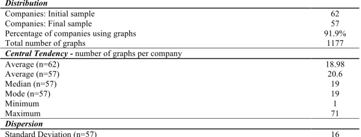
The totalnumber of graphs published by companies within the final sample amounts to 1,177, with an average of 18.98 per company, if considering the initial sample (n=62), and an average 20.65 graphs per company, if taking into account the final one (n=57). Given the fact that five companies were excluded from the initial sample, it can be concluded that 91.9% of the Brazilian companies in the Ibovespa present graphs in their annual reports. However, the usage of graphs differs among Brazilian firms, ranging from one (three companies depict one graph)20 to 71 graphs.21 Table 1 shows the descriptive statistics about the number of graphs disclosed. Companies in the financials, telecommunication services and utilities display the highest average number of graphs, 33.9; 33 and 30.1, respectively. On the other hand, companies in the information technology, health care and consumer staples industries display the lowest number of graphs on average. For more information with regard to graphs analyzed per industries, see appendix 4.
Table 1: Descriptive statistics of graphs: distribution, central tendency and dispersion Descriptive Statistics
Distribution
Companies: Initial sample 62
Companies: Final sample 57
Percentage of companies using graphs 91.9%
Total number of graphs 1177
Central Tendency - number of graphs per company
Average (n=62) Average (n=57)
18.98 20.6
Median (n=57) 19
Mode (n=57) 19
Minimum 1
Maximum 71
Dispersion
Standard Deviation (n=57) 16
18
This adoption is consistent with previous literature that uses content analysis for data collection in the annual reports. See Zeghal and Ahmed (1990); Hackston and Milne (1996); Beattie & Jones (1992, 2000a 2000b 2002a 2002b, 2008); Ibrahim (2011).
19 The database is composed of 76 sheets (a total number of 43,363 cells).
3.3.2 Location of graphs
The most frequent sections to illustrate graphs within the annual reports are firstly the “Financial and Economic Performance” section, followed by the “Human Resources” section and the “Operations” section. Respectively, 40% of the graphs are shown in the first mentioned one, 12% in the second and 11% in the third section. For detailed information with regard to graphs analyzed per sections of the annual report, please see appendix 5.
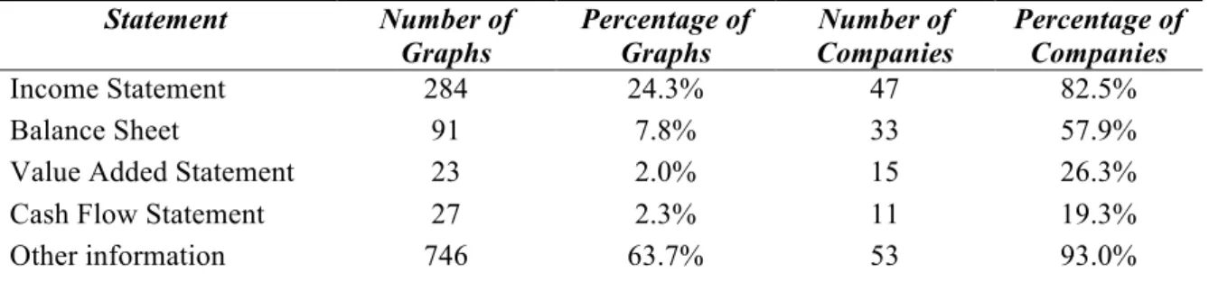
It is observed that 82.5% of the companies disclose graphs with variables which are presented in the income statement, being these the most frequent graphs used among the financial graphs. Variables from the balance sheet are the second more graphed, followed by the value added statement and cash flow statement, respectively.
In Brazil, there is a peculiarity when compared to international financial reporting standards: the value added statement is required to listed companies (Silva et al., 2014), which explains why value added is one of the most depicted variables.
Table 2: Origin of variables graphed in annual reports
Statement Number of
Graphs
Percentage of Graphs
Number of Companies
Percentage of Companies
Income Statement 284 24.3% 47 82.5%
Balance Sheet 91 7.8% 33 57.9%
Value Added Statement 23 2.0% 15 26.3%
Cash Flow Statement 27 2.3% 11 19.3%
Other information 746 63.7% 53 93.0%
3.3.3 Information graphed
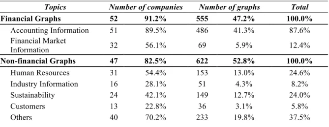
information explains only the 12.4%. From the non-financial point of view, human resource’s topics are the most graphed ones, both in numbers of companies (54.4%) and number of graphs (24.6%), followed by sustainability, industry information, and customer items.
Table 3 – Type of information communicated through graphs
Topics Number of companies Number of graphs Total
Financial Graphs 52 91.2% 555 47.2% 100.0%
Accounting Information 51 89.5% 486 41.3% 87.6%
Financial Market
Information 32 56.1% 69 5.9% 12.4%
Non-financial Graphs 47 82.5% 622 52.8% 100.0%
Human Resources 31 54.4% 153 13.0% 24.6%
Industry Information 16 28.1% 51 4.3% 8.2%
Sustainability 24 42.1% 149 12.7% 24.0%
Customers 13 22.8% 36 3.1% 5.8%
Others 40 70.2% 233 19.8% 37.5%
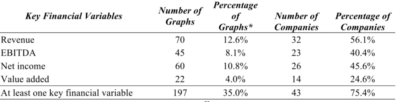
Concerning the variables graphed, 74% of the companies display at least one of the four most frequently graphed KFV. Graphs displaying KFV account 35.5% of all financial graphs. The most common variables graphed among Brazilian companies are: revenue, EBITDA, net income and value added. Specifically, 56% of the companies depict revenue, followed by 46% who graph net income, and 40% illustrate EBITDA.
It is worth notice that the Brazilian companies include a list of KFV which differs from previous research about graph usage in reporting in other countries, such as earnings per share (EPS) and dividends per share (DPS), apart from sales (revenues) and earnings (net income) (Beattie & Jones, 2001).
Specific to Brazilian companies is the fact that 25% of the companies present graphs about value added, being this flow reported in a compulsory statement in Brazil. (Silva et al., 2014). Table 4 summarizes information about KFV’s graphs.
Table 4 – Key financial variables graphed in annual reports
Key Financial Variables Number of Graphs
Percentage of Graphs*
Number of Companies
Percentage of Companies
Revenue 70 12.6% 32 56.1%
EBITDA 45 8.1% 23 40.4%
Net income 60 10.8% 26 45.6%
Value added 22 4.0% 14 24.6%
At least one key financial variable 197 35.0% 43 75.4%
* Using as base the total number of financial graphs (555)22
3.3.4 Types of graphs
Different types of graphs are used to communicate financial information, such as column, bar, pie, doughnut, line, area and the combination of column and line formats. In this sample of Brazilian companies, column graphs are the most frequent published; they are used by 82% of the firms and they account for 52.8% of total graphs. Doughnuts and line graphs are the other types most commonly used: doughnut graphs are used by 54% of the companies and correspond to 15.9% of total graphs, while line graphs are used by 21% of the companies and represents 8.2% of total graphs. Other formats of graphs less used respect the following descending order: bars, pies, mixed and areas graphs.
Different type of information should be illustrated with specific types of graphs. According to Ianniello (2009), columns and lines should be used to exhibit the magnitude of a certain variable, while pies and doughnuts are more appropriate to present the composition of a variable. Therefore, companies tend to publish several types of graphs in their annual reports, with 63% of the companies presenting three or more types of graphs. Table 5 shows detailed information about type of depicted graphs.
22
Table 5 – Type of graphs depicted in annual reports
Type of Graphs Number of Graphs
Percentage of Graphs
Number of Companies
Percentage of Companies
Column 622 52.8% 48 84.2%
Bar 92 7.8% 19 33.3%
Pie 84 7.1% 22 38.6%
Line 96 8.2% 32 56.1%
Area 15 1.3% 5 8.8%
Doughnut 187 15.9% 35 61.4%
Mix 81 6.9% 24 42.1%
3.3.5 Period of projection
Depending on the type of variable graphed as well as its performance over the years, companies might be encouraged to illustrate longer time-series or avoid giving a long projection of the variable. As can be observed in table 6, there is no significant pattern difference between the number of years presented in financial or non-financial graphs. In both groups, the highest amount of graphs depicted present one or two years of time projection – 66% of financial graphs and 62% of non-financial graphs. This projection is followed in both cases by the range between three and five years – 23% for financial graphs and 30% for non-financial graphs. Graphs projecting more than six years present 10% for non-financial graphs and 8% for non-financial graphs. Finally, only 1% of the total amount of graphs illustrates future projection, depicting information such as amortization and debt.
Table 6 – Period of projection of graphs: span of six years or more
Financial Graphs Non-Financial Graphs
Years Number of Graphs
Percentage of Graphs
Number of Graphs
Percentage of Graphs
1 - 2 368 66.3% 386 62.1%
3 - 5 130 23.4% 185 29.7%
> 6 57 10.3% 51 8.2%
3.3.6 Colors
1990). Nevertheless, some colors may transmit different effects to readers. According to Mehta & Zhu (2009), for example, red is a color that incentives avoidance in the decision-making process and gives a negative connotation. On the other hand, blue is often related to positive performance; and therefore this may explain why blue is the most recurrently used color in Brazilian’s annual reports. Seventy-four per cent of the companies use blue in their graphs and this color is found in 30.7% of all graphs. Red is used by only 37.0% of the companies and it is found in 9.9% of the total number of graphs. Most of the companies that use the red color in graphs, have this color in their logo.
In fact, there is a strong connection between the colors of the graphs and the companies’ logo, since 89.5% of the companies use at some point of their annual reports graph colors based on their logo image. Specifically, 60.6% of the total graphs are related to the companies’ logos. Most of the graphs present more than one color, 23% of them show two colors, 28% include three colors and 25% four colors. For more results regarding colors, see appendix 6.
3.3.7 Limitations for collection of data
As previously mentioned, an inconsistency was observed in the reports published by companies.
In order to have an idea of how many graphs are published in each type of report, the following was considered: voluntary reports that publish both financial and non-financial information are taken into account in this study as “Annual Reports”. They present an average of 17 graphs per report and are published by 58% of the companies. Those that publish only non-financial information are seen as “Sustainability Reports”. They depict on average 13 graphs per report and are published by 35% of the companies. The “Financial Statement Report” focuses mainly on financial statements and has no graphs. As most of the time this report is published together with the management report (in the same pdf file) that usually contains graphs, an average of nine graphs per report was calculated and 100% of the final sample (n=57) publish it.
Another limitation faced during the period of hand data collection was the lack of information in some of the companies’ webpages. Specific emails were sent to companies to make aware that some annual reports were not updated or translated.23
23
4. Results
This section describes the outcomes resulted from the hypotheses tested, which relate to impression management - the three types of distortion introduced in section 2.3: selectivity, measurement distortion and presentational enhancement.
4.1. Selectivity and performance
This study firstly investigates if Brazilian listed companies decide to include or exclude KFV graphs in their annual reports according to the company’s performance. Three proxies were used as alternative measures for performance indicators, all for the fiscal year 2014: (i) the direction of change in EPS; (ii) the direction of change of EBITDA and (iii) the direction of change of each particular KFV graphed, Performance was classified as “favorable” and “unfavorable” depending if the indicator increased or decreased from 2013 to 2014.
Several chi-squared tests of independence were conducted individually to determine the association between the enclosure or the omission of at least one KFV graph and each KFV
graph and the directional change in EPS and EBITDA (used as performance indicators); and the association between a favorable change in a given KFV and the existence of at least one graph depicting this KFV.
EPS as performance indicator
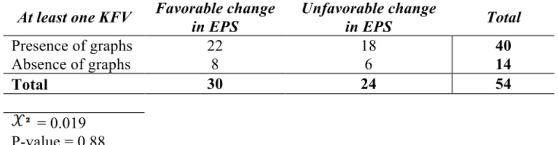
The graphs that show EBITDA and net income are more frequent in companies that present a favorable performance, rather than an unfavorable one. This is not the case for value added, which shows to be graphed more often by companies with unfavorable performance. Testing the hypothesis using total revenue as a proxy, the same number of companies with favorable and unfavorable performance graphically illustrates this variable. Overall, 73.3% of the companies with an increase in EPS from 2013 to 2014 include at least one KFV in their annual reports. Statistically, there is no evidence that there exist an association between a favorable change in EPS and the appearance of at least one KFV or each specific KFV graph, since all p-values > 0.0524. Below, table 7 shows the association between EPS as company performance and the presence or absence of at least one KFV. The remaining results of the association between changes in EPS and all KFV graphs are presented in appendix 7.
24
Table 7 – Association between changes in EPS and at least one KFV graph At least one KFV Favorable change
in EPS
Unfavorable change
in EPS Total
Presence of graphs 22 18 40
Absence of graphs 8 6 14
Total 30 24 54
= 0.019 P-value = 0.88
EBITDA as performance indicator
When using EBITDA as company performance indicator, revenue, EBITDA and net income graphs are present more often by companies with a favorable change in EBITDA, rather than by companies with an unfavorable change. Value added, on the other hand is graphically disclosed more times by companies with a negative company performance. While 77.4% of the companies with positive performance include at least one KFV in their annual reports, 73.0% of the companies with unfavorable performance do the same. There is still no evidence that there exist an association between a favorable change in EBITDA and the inclusion of at least one KFV or each specific KFV, since p-values > 0.05. Table 8 associates EBITDA and at least one KFV graph and appendix 8 shows the association between EBITDA and the other KFV graphs.
Table 8 - Association between changes in EBIDA and at least one KFV graph
At least one KFV Favorable change in EBITDA
Unfavorable change
in EBITDA Total
Presence of graphs 24 19 43
Absence of graphs 7 7 14
Total 31 26 57
= 0.14 P-value = 0.70
Each KFV as performance indicators
added for the current year, show to present at least one value added graph as companies with a negative performance in value added. Table 9 presents all the results.
Table 9: Association between changes each KFV and KFV graphs Revenue Favorable change
in Revenue
Unfavorable change
in Revenue Total
Presence of graphs 24 8 32
Absence of graphs 17 8 25
Total 41 16 57
= 0.55 P-value = 0.34
EBITDA Favorable change in EBITDA
Unfavorable change
in EBITDA Total
Presence of graphs 15 9 24
Absence of graphs 16 17 33
Total 31 26 57
= 1.10 P-value = 0.29
Net Income Favorable change in Net income
Unfavorable change
in Net income Total
Presence of graphs 17 9 26
Absence of graphs 15 16 31
Total 32 25 57
= 1.66 P-value = 0.19
Value Added Favorable change in Value added
Unfavorable change
in Value added Total
Presence of graphs 7 7 14
Absence of graphs 24 19 43
Total 31 26 57
= 0.14 P-value = 0.70
The results indicate that, in general, there is no association between presentation of graphs with KFV and performance of the company. Therefore, it can be concluded that the null hypothesis H10.A: “There is no relationship between a favorable change in a given firm
performance indicator and the existence of at least one graph depicting a KFV” should be
contradicts what was concluded (without statistical support) by Miranda et al. (2008) in Brazil. This suggests that impression management related to selectivity in graph disclosures has improved significantly throughout the years in the country.
4.2. Selectivity and governance
This study explores, also in terms of selectivity, if from a global level, Brazilian companies with worse corporate governance tend to - consciously - include or exclude KFV graphs depending on the change of direction of the variable depicted. For the purpose of proving this statement, the following simple regression model is set up:
������������ = �@+ �2����������� +εi [3] Where:
• Selectivity i,j: comprises a number between 0 and 2.
0 = if company “i” does not experience selectivity in any of its four KFV “j”; 1= if company “i” experiences selectivity sometimes (in one, two or three KFVs); 2 = if company “i” detects selectivity in all of the four KFV “j”.25
• Governance: 1= the company is included in any of the levels “New Market, Level 1, Level 2” (outstanding governance); 0 otherwise.
As can be observed in table 10, with a level of significance at 0.05, the variable governance proves to be significant (P < 0.05), indicating that firms with worse corporate governance are more likely to present selectivity bias in their graphs. Thus, there is evidence that the null hypothesis H10.B should be rejected.
Table 10 – Simple regression: selectivity and governance
Variable Coefficient Standard Error t P > t
GOVERNANCE -0.35 0.17 -2.10 0.04
Constant 1.22 0.16 8.40 0.00
Number of
observations 57
Prob > F R-squared
0.04
0.075
Selectivity (S) is the dependent variable which assumes values 0, 1 or 2, as follows: S=0 if the company does not experience selectivity in any of its four KFVs; S=1 if the company experiences selectivity in one, two or three KFVs; S=2 if the company experiences selectivity in all of the four KFVs.)
Governance (G) is a binary variable used to measure the level of corporate governance of each firm. If the
company is classified as "outstanding governance" according to the classification of the BM&FBOVESPA - level 1, level 2, or new market, thus G=1; otherwise G=0).
4.3. Measurement distortion
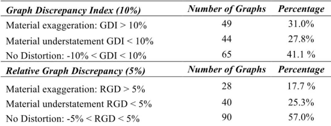
Measurement distortion is present in annual reports from all over the world as could be detected in section 2.5. The incentive for managers to distort graphs to transmit a better image to stakeholders has resulted in substantial number of researches, which focuses on measuring those distortions from various perspectives (magnitude and nature26). The GDI is the conventional measure used in the literature of usage of graphs, to determine whether there is distortion and to quantify the level of such distortion (Mather et al., 2005). Throughout the years, it has been proved that GDI is not the most appropriate tool to measure it, since it may present inconsistencies and meaningless results. An alternative measure was presented by Mather et al. (2005) to overcome these irregularities: the RGD. Appendix 9 shows two examples of measurement distortion calculations where results differ using GDI and RGD. Most previous studies27 have followed Tufte’s28 original recommendation, which is to use a materiality level of 5%, instead of 10% to distinguish material distortion when calculating it. However, according to Beattie & Jones (2002), a distortion of 5% is barely noticed by users when using GDI and only a 10% level of materiality or more would cause impression management. This would not be the case for the calculation of RGD. Mather et al. (2005) conclude that for this specific measurement, an excess of 5% materiality level is enough to distort users’ perception and it is considered the equivalent of 10% for GDI29. Thus, this research descriptively analyzes and compares measurement distortion using GDI with a 10% materiality level and RGD with a 5% materiality level for each KFV graph illustrated by each company.30 While Table 11 shows the analyzed results, appendix 10 displays the calculation and comparison for both measures and materiality levels.
According to GDI31, out of the 15832 graphs analyzed, 41.1% of the graphs have no evidence of distortion. Ninety-three graphs present measurement distortion. While 49 graphs (31.0%)
26 if favorable or unfavorable. 27
UK (Beattie & Jones, 1992), Australia (Mather et al, 1996; Beattie & Jones, 1999), as well as country- comparison studies such as US versus UK (Beattie & Jones, 1997), six countries (Beattie & Jones, 2000), and twelve countries (Frownfelter & Fulkerson, 2001).
28 Tufte (1983) introduced the GDI. 29
Mather et al. (2005, p.157) states that ‘the slope coefficient from a regression analysis between the GDI (for positive values only) and the RGD was found to be approximately 0.5’.
30
If the measure shows a value equal to zero, there is no distortion. A positive value implies the exaggeration of the trend, which represents a distortion to the company’s favour if the trend is favourable. A negative value (also in terms of the materiality level) indicates an understatement of the trend, which represents a distortion to the company’s disadvantage if the trend is unfavourable (Beattie & Jones, 2008).
exaggerate, and 44 (27.8%) underestimate the trend of the variables depicted. 41.1% of the graphs have no evidence of distortion.
Under the RGD33 measure, the total number of distorted graphs is reduced to 68, out of which 28 (17.7%) exaggerate and 40 (25.3%) underestimate the trend of the analyzed variables. Comparing both measures, there are 25 graphs that the GDI considers as distorted while the RGD does not. This difference could be explained by the sensitivity to changes in the trend of the GDI. According to Mather et al. (2005), the GDI calculation is based on changes in the trend and therefore a graph with a very small change in data and a very small discrepancy in the trend could result with the same high GDI value than a graph with a moderate change in data and a large discrepancy in the trend. Appendix 11 illustrates two examples showing this inconsistency.
Table 11 – Equivalent distortions in GDI and RGD measures Graph Discrepancy Index (10%) Number of Graphs Percentage
Material exaggeration: GDI > 10% 49 31.0%
Material understatement GDI < 10% 44 27.8%
No Distortion: -10% < GDI < 10% 65 41.1 %
Relative Graph Discrepancy (5%) Number of Graphs Percentage
Material exaggeration: RGD > 5% 28 17.7 %
Material understatement RGD < 5% 40 25.3%
No Distortion: -5% < RGD < 5% 90 57.0%
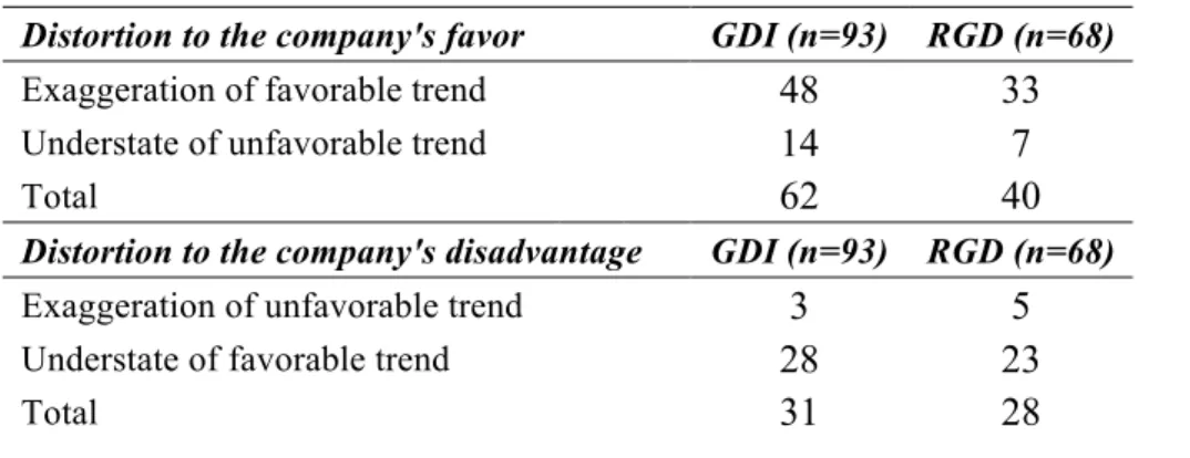
Once calculating the magnitude of each distorted graph, the examination of their nature is done. Table 12 shows that out of the 93 distorted graphs, under the GDI measure, 62 (66.7%) represent a distortion to the company’s favor, while 31 (33.3%) are unfavorable to the company. On the other hand, undertaking the RGD measure, out of the 68 distorted graphs, 40 (58.8%) represent a distortion to the company’s favor and 28 (41.2%) denote a disadvantage to the company.
32
For the analysis of measurement distortion only the column and bar graphs depicting KFVs are considered. In total, the sample sums up to 158 graphs.
Table 12 – Distortion’s nature: exaggeration or understatement Distortion to the company's favor GDI (n=93) RGD (n=68)
Exaggeration of favorable trend 48 33
Understate of unfavorable trend 14 7
Total 62 40
Distortion to the company's disadvantage GDI (n=93) RGD (n=68)
Exaggeration of unfavorable trend 3 5
Understate of favorable trend 28 23
Total 31 28
To ensure accuracy, only the RGD results are taken into account to examine if there is evidence of measurement distortion among graphs depicted by Brazilian listed companies. Sixty-eight (43.0%) of the column and bar graphs that depict KFVs, are distorted. Among the 57 companies analyzed, 24 companies (42.1%) present material measurement distortion in their KFV graphs. In the sample, there are more incidences of graphs distorted in favor to the company than in disadvantage to the company.
To prove if these distortions tend to be intentional or they are just driven by a lack of knowledge from the ones preparing the graphs about properly construction of graphs, this study tests whether there is a relationship between performance34, corporate governance and the existence of measurement distortion. To analyze it, the following regression was conducted:
���������� �, � = �@+ �2����������� �, � + �.���������� � +ε� [4]
Where:
• Distortion i,j = 1 if firm “i” presents any measurement distortion in its KFVs “j”; 0 otherwise. (“i” comprises a number between 1 and 57 and “j” varies from 1 to 4”)
• Performance i,j = 1 if the KFV “j” presented favorable variation in the current year; 0 otherwise. (“i” comprises a number between 1 and 57 and “j” varies from 1 to 4”)
• Governanceis defined as in equation (3).
As can be observed in table 13, results indicate that both variables (performance and governance) are statistically significant with a p-value < 0.05. Therefore, it is confirmed that
there is a relationship between the directional change in a given firm performance indicator, its corporate governance and the existence of measurement distortion. The null hypothesis
H20 should be rejected.
The presence of measurement distortion in the graphs disclosed by Brazilian listed companies may mean two things: managers distort graphs consciously to provide a better impression of the company to stakeholders – misrepresenting reality, or there is a lack of knowledge among the ones preparing graphical disclosure in annual reports, causing impression management. However, the coefficients for both variables indicate that the lower the performance and the corporate governance, the higher the tendency to have measurement distortion among Brazilian companies, and therefore it can be suggested that most of the times the distortion is intentional. This is also supported by looking at the intercept (constant), which indicates that when the variables performance and governance are zero, the distortion results to be 0.99. Thus, it is recommended that preparers and users of annual reports pay special attention to possible misleading information through graphs and that accounting regulatory institutions establish proper accounting guidance to standardize graphical information disclosure.
Table 13 – Multivariate analysis: distortion, performance and governance
Variable Coefficient Standard Error t P > t
PERFORMANCE GOVERNANCE
-0.49 -0.40
0.11 0.18
-4.14 -2.26
0.00 0.03
Constant 0.99 0.20 4.86 0.00
Number of
observations 157
Prob > F R-squared
0.00
0.26
Distortion i,j(D) is the dependent variable. It is measured using the RGD under a materiality level of 5% and it is a binary variable (that is, 1 if the firm “i” presents any distortion in the KFV “j”, and 0 otherwise.35
Performance (P) is a binary variable (that is, 1 if the KFV graphically presented has a favorable variation, and 0 otherwise)
Governance (G) is a binary variable used to measure the level of corporate governance of each firm (that is, 1 if the company is considered as "outstanding governance" by the classification of the BM&FBOVESPA - level 1, level 2 or new market; and 0 otherwise.)
4.4. Presentational enhancement
There exists presentational enhancement every time graph design exacerbates or weakens certain characteristics of the information graphed, violating graph construction guidelines
35