A Work Project, presented as part of the requirements for the Award of a Master Degree in
Management from the NOVA – School of Business and Economics
Graph Usage in Annual Reports,
Evidence from Norwegian Listed Companies
Tina Guddal, No. 2432
A Project carried out in the Accounting and Auditing Area, with the supervision of:
Professor Leonor Ferreira
Title: Graph Usage in Annual Reports, Evidence from Norwegian Listed Companies
Abstract:
As investors and other users of annual reports often focus their attention on graphs, it is
important that they portray accurate and reliable information. However, previous studies show
that graphs often distort information and mislead users. This study analyses graph usage in
annual reports from the 52 most traded Norwegian companies. The findings suggest that
Norwegian companies commonly use graphs, and that the graph distortions, presentational
enhancement and measurement distortion, are present. No evidence of selectivity was found.
This study recommends development of guidelines for graphical disclosure, and advises
preparers and users of annual reports to be aware of misleading graphs.
1. INTRODUCTION
Over the last decades, the annual report has shifted from a financially statutory document to a
design and marketing oriented document (Beattie, Dhanani & Jones, 2008; Lee, 1994).
Companies now commonly use images, colors and charts in their annual reports to
communicate information. Between 80 and 90 percent of companies in the western world
include graphs in their annual reports (e.g. Beattie & Jones, 1992; 1997; 2001; Ianniello,
2009). The length of the annual report has increased significantly, mainly due to an increasing
narrative part. A study of large UK listed companies found that the mean number of pages has
increased from 26 pages in 1965 to 75 in 2004 (Beattie et al., 2008). More recently, in 2010,
annual reports from FTSE100 companies averaged 175 pages (ACCA, 2012). Despite the
increasing size of the narrative part, with frequent use of graphs, information included in the
narrative part of the annual report is not subject to the same strict regulations and accounting
standards as the financial1 part. Auditors of annual reports in Norwegian companies are
required to examine both the narrative and the financial sections, but the guidelines for the
narrative section are brief, with no specific regulations for graphical presentation
(Finanstilsynet, 2015, pp. 10-11). Notwithstanding, companies commonly use graphs to
communicate information. Graphs, when used accurately, have several benefits: they have the
ability to focus and attract the readers’ attention, facilitate understanding, highlight patterns
and trends, help memory recall and break down language barriers (Courtis, 1997). However,
as graphs are usually not subject to regulation and accounting standards, they also have the
potential to mislead the reader and manipulate the perception of the information portrayed, as
several studies have shown (e.g. Beattie & Jones, 1997; 1999; 2000a; 2000b; Courtis, 1997;
Ianniello, 2009). Annual reports are one of the primary sources of information for investors,
and are often used when assessing whether to buy, keep or sell stocks in a company (Penrose,
2008). Investors use a limited amount of time reading annual reports, and often rely only on
1
information portrayed in graphs when making a decision (Zweig, 2000). Due to the increasing
size of annual reports, the high usage of graphs and investors’ tendency to focus on them,
accurate graph use becomes very important.
The purpose of this paper is to analyze the nature, extent and possible misleading distortions
of graph usage in Norwegian listed companies. This paper contributes to the existing
literature by documenting graphical reporting practices and presenting evidence of graphical
distortions in Norwegian listed companies. The use of graphs in annual reports has, to the best
of our knowledge, not been studied in Norway yet. This paper also contributes to an extension
of the literature on graphical disclosure in annual reports.
This paper is divided into six sections. Following this introduction, section 2 summarizes the
principles for proper graph construction and describes the main graphical distortions. Section
3 summarizes prior empirical research, and section 4 outlines the research questions, the
methodology, the sample and descriptive data. The results are presented and discussed in
section 5. Finally, section 6 presents the main conclusions of the study and suggestions for
future research.
2. NORMATIVE LITERATURE
A graph2 can be described as a visual display of quantitative information. Several different
types of graphs exist, such as column, bar, line and pie, where some are more suitable than
others to communicate certain type of data. Despite the variety in graph types, graphs are
generally used with two different motives, to analyze data and to communicate information.
Annual reports typically use graphs to communicate information (Beattie & Jones, 2008).
This section describes existing normative literature on proper graph construction and
graphical distortions.
2 Oxford dictionary defines a graph as: “a diagram showing the relation between variable quantities, typically of
2.1 Principles for Proper Graph Construction
Although graph design is not an exact science, and allows for great creativity and choice,
there is extensive literature suggesting characteristics of accurately constructed graphs and
principles for proper graph construction. These characteristics and principles can be
summarized as an effort to provide to graph viewers the exact same information as the
underlying numerical values. Two works from the 1980s by Edward R. Tufte (1983) and
Stephen M. Kosslyn (1989) are seen especially important for accurate graph construction.
Tufte examines in detail how to achieve graphic excellence and integrity, and describes
graphical excellence as well-designed presentations of interesting data. Furthermore, he
highlights the importance of the interplay between aesthetics and information density.
Kosslyn examines how to reveal design flaws in graphs and suggests certain acceptability
principles for graph construction. Summarizing the conclusions from Kosslyn (1989) and
Tufte (1983), the following six principles are essential for proper graph construction:
1. The representation of numbers in a graph should be directly proportional to the numerical
quantities portrayed (Tufte, 2001, p. 77). Hereunder, avoiding the use of non-zero axis and
broken axis (Steinbart, 1989).
2. Graphs should use clear, detailed, and thorough labeling to avoid graphical distortion and
ambiguity (Tufte, 2001, p. 77). The use of labels includes a meaningful title, an alpha label
on each axis, and numeric labels to indicate values of each scale (Beattie & Jones, 2008).
3. Visual effects, colors, weights of line, the size of a bar/column and the background should
be used to emphasize the message, not distract from it (Kosslyn, 1989).
4. The number of dimensions used to depict change should not exceed the number of
dimensions in the data (Tufte, 2001, p. 77). Thus, three-dimensional graphs should not be
used to portray changes in a single variable (Arunachalam, Pei & Steinbart, 2002).
5. Graph construction should follow cultural norms. Thus, in Western countries, time should
6. Pie/doughnut graphs should contain up to five sections, presented in clockwise descending
order (Courtis, 1997).
When properly constructed, graphs are useful to summarize information and highlight trends
(Fulkerson, Pitman & Frownfelter-Lohrke, 1999). Following the principles for proper graph
construction is essential to avoid graphic distortions, which can manipulate the information
portrayed and mislead the reader.
2.2 Graph Distortion
Beattie et al. (2008) classify graphical distortions into three categories: selectivity,
measurement distortion and presentational enhancement. Selectivity involves whether or not to use graphs and what variables to graph. This distortion occurs when the decision to include
a graph and the choice of variables graphed is influenced by company performance (Beattie &
Jones, 2000a). Measurement distortion refers to the construction of the graph and occurs when the representation of the numbers on the graph is not proportional to the underlying
numbers. Thus, measurement distortion arises when the first principle for proper graph
construction is violated. One example of measurement distortion is the use of a non-zero
vertical axis. Graphs with non-zero vertical axis exaggerate the trend, and can therefore give a
false impression of the underlying data. The graph discrepancy index (GDI)3 can be used to
identify and quantify the level of measurement distortion used in graphs. The GDI originates
from Tufte’s (2001, p. 57) lie factor, and was developed by Taylor and Anderson (1986).
Mather, Mather and Ramsay (2005) criticize the GDI for being discontinuous4 and
inconsistent, and presented the relative graph discrepancy index (RGDI) 5 as an alternative
measure. The RGDI measures the height of the last column as it is graphed relative to the
3𝐺𝐷𝐼
=!!−1, where a = percentage change depicted in graph, and b = percentage change in data.
4 When the denominator, b=0, it is not possible to calculate the GDI. If the first and the last data points are the
same, but the height of the columns are not the same, the graph contain measurement distortion but it is not possible to calculate the GDI.
5𝑅𝐺𝐷𝐼
= !!!!!!! Where: g1=height of the fist column, g2=height of the last column, g3=
!!
!!× 𝑑
height at which it should have been graphed. For graphs with no distortions, both the GDI and
the RGDI takes a zero index value. As for the GDI, positive values represent exaggeration
and negative values represent understatement of the underlying data. For the RGDI, positive
values represent exaggeration of an increasing trend and understatement of a decreasing trend,
and negative values represent understatement of an increasing trend and exaggeration of a
decreasing trend (Mather et al., 2005). Finally, presentational enhancement involves the choice of construction and design features for a graph and occurs when one or more of the
graphical components enhances or degrades the information portrayed (Beattie & Jones,
2008). This distortion can arise from, among other, the use of visual effects,
three-dimensional elements, or the lack of title. For example, the color red, which is perceived to be
the most dominant color, can be used to emphasize a trend in an otherwise black and white
graphic, attracting the attention to the red trend line (Courtis, 2004).
3. PREVIOUS EMIPIRICAL RESEARCH
Since 1989, a number of studies have examined graph use in annual reports in several
countries. Penrose (2008) provides an extensive review on this subject, and concludes that
there is widespread disregard for accurate and non-misleading graphical guidelines, across all
countries studied. Studies on individual countries have been undertaken in the UK (Beattie &
Jones, 1992; 2000a; Beattie et al., 2008), the US (Dilla & Janvrin, 2010; Steinbart, 1989),
Australia (Beattie & Jones, 1999; Mather, Ramsay & Serry, 1996), France (Chekkar &
Martinez, 2011), Hong Kong (Courtis, 1997), Italy (Ianniello, 2009), and Portugal (Wozniak
& Ferreira 2011; Bastardo, 2015). International comparative studies cover the UK and the US
(Beattie & Jones, 1997), Australia, France, Germany, the Netherlands, the UK and the UK
(Beattie & Jones, 2000b; 2001), and US and non-US companies (Frownfelter-Lohrke &
Fulkerson, 2001). The key findings from these studies are summarized below6.
6
Overall, earlier studies find consistently high and increasing use of graphs in annual reports
during the last decades. Steinbart (1989) found that in 1986, 79 percent of US companies use
graphs in their annual reports. Beattie and Jones (2001) found consistently high graph usage
in Australia, France, Germany, the Netherlands, the UK and the US, ranging from 82 percent
in the UK to 92 percent in Australia. In 2004, Beattie et al. (2008) found that graph use in the
UK is almost universal, 99 percent of the companies in their sample included graphs in their
annual report. Regarding content, financial variables are more likely to be displayed in graphs
than non-financial variables (Chekkar & Martinez, 2011; Frownfelter-Lohrke & Fulkerson,
2001). The most commonly graphed financial variables differ slightly from study to study and
between countries. However, four variables - sales, earnings, earnings per share (EPS) and
dividends per share (DPS) - are identified among the most frequently graphed financial
variables across several studies and countries.
A key element in earlier studies has been the relationship between graphs and company
performance7. Steinbart (1989) and Beattie and Jones (1992) represent two early studies in the
US and the UK, which both found evidence of selectivity. In a sample of 319 companies,
Steinbart (1989) found that 74 percent of companies that experienced an increase in net
income included graphs of sales, income, or dividends, while only 53 percent of the
companies who experienced a decrease in net income included graphs of those variables in
their annual reports8. A few years later, Beattie and Jones (1992) investigated 240 annual
reports in the UK and found that 73 percent of the companies with an increase in EPS
included graphs of turnover, profit, EPS or DPS, while only 41 percent of the companies with
a decrease in EPS did so. Beattie and Jones (1992) concluded that there is a highly significant
association between the incidence of graph use and a favorable recent performance. These
findings have later been supported in a number of studies (e.g. Beattie & Jones, 1999; 2000b;
7 Various performance indicators have been used across different studies, including directional change in EPS,
net income, and specific key financial variables identified. 8
Beattie et al., 2008; Dilla & Janvrin, 2010). There are, however, examples of studies on
French, Italian and Portuguese companies, which have not found significant evidence of
selectivity distortion (Ianniello, 2009; Chekkar & Martinez, 2011; Bastardo, 2015). This
could entail differences between countries, or differences in how selectivity was measured in
the studies.
Several studies have investigated the incidence and degree of measurement distortion in
different countries. Steinbart (1989) found a mean GDI value of 11 percent in the US, and
that almost 26 percent of the graphs distorted the data by more than 10 percent. Beattie and
Jones (1992) found that, in the UK, 30 percent of key financial variable (KFV) graphs show
material discrepancies9. Furthermore, Beattie and Jones (1992) found a mean GDI value of
10.7 percent across the whole sample10, this value increases to 34.3 percent when based only
on material distortions. These findings have later been supported in other studies, and overall,
previous studies indicate a high prevalence of measurement distortion (e.g. Beattie & Jones,
1999; 2000b; Frownfelter-Lohrke & Fulkerson, 2001; Ianniello, 2009).
Violation of graph construction principles, referred to as presentational enhancement, has
been identified and documented by across studies. Beattie and Jones (1997) found in their
study that UK and US companies frequently use a range of presentational devices to enhance
information portrayed, including the use of non-scaled axes, no gridlines and
three-dimensional elements. These findings have been supported in other studies (Beattie & Jones,
1999; Beattie et al., 2008; Courtis, 1997; Frownfelter-Lohrke and Fulkerson, 2001). In
summary, previous research indicates that presentational enhancement is commonly present
in graphs, mainly to show the underlying data more favorable than is warranted.
Based on the high frequency of graphical distortions found in previous studies, there is a clear
need to develop formal guidelines for graphical disclosure. Formal graphical guidelines
9 Based on a five percent materiality level. 10
would give preparers of annual reports increased knowledge about the subject and could, to
some extent, prevent graphical distortions. Prior literature is focused on a limited number of
countries, and, to the best of our knowledge, evidence from graph usage in annual reports of
Norwegian companies has not yet been studied. Thus, this paper contributes to the literature
by adding a country to the stream of literature about graph usage in annual reports and
examines if graphical distortions in Norwegian companies occur more or less frequently than
what is reported in previous research on other countries. In addition, this paper provides
recommendations for accurate graph construction and use, thus contributing to better
information regarding graph use in financial reporting.
4. RESEARCH DESIGN
The purpose of this research is to analyze graphical disclosure practices in annual reports
from Norwegian listed companies and examine whether financial information is presented
accurately through graphs. This section outlines the specific research questions to be
answered. The first four research questions concern the nature and extent of graph use:
RQ1: Where in the annual reports are graphs displayed?
RQ2: What kinds of information variables are communicated through graphs? RQ3: What types of graphs are used?
RQ4: Which colors are used in graphs? Is there an association between graph color and logo color?
The next three research questions are focused on key financial variables (KFV) and concern
graph distortions, hereunder selectivity, measurement distortion and presentational
enhancement:
RQ5: Is there a relationship between the inclusion of KFV graphs and company performance? RQ6: Is the graphical distance portrayed in KFV graph proportional to the underlying
numbers?
4.1 Methodology
A data collection database11 was designed in excel, where data about graph usage12, company
performance and graph construction were collected. The data collection sheet was pilot-tested
on 12 companies, and subsequently revised13, to ensure completeness. RQ1 to RQ4 was
answered based on univariate analysis of the data about graph usage and construction. To
answer RQ5, several chi-square tests of independence were conducted. For RQ6, the GDI and
RGDI were calculated and evaluated. Figure 1 summarizes the research design according to
the research questions and relevant variables.
Figure 1: Research Design
4.2 Sample and Data
This research uses criterion sampling, where the sample is determined according to frequency
of trading. Oslo Stock Exchange Benchmark Index (OSEBX) consists of the most traded
shares on the Oslo Stock Exchange and was therefore used as the sampling criterion. The
index is semiannually revised, and consisted of 53 shares at the end of 2014, but one of the
companies on OSEBX is listed with two share classes. This gives a final sample of 52
11 The database is composed by 55 sheets and a total of approximately 61,000 cells.
12 Number of graphs, pages in annual report, type of graphs (column, bar, pie, line, area, doughnut or mix),
location of graph, type of information graphed (share information, financial, human resources, industry, sustainability or share information), and color used in graphs.
13 Based on the data collected for the 12 companies, the RQs were checked against the data to see if any
additional information should be added. Based on the revision, more specific information for color use was added, as well as more variables in terms of variables graphed.
RQ1 RQ2 RQ3 RQ4 RQ5 RQ6 RQ7
Location Content Graph type Color Graphical distortions
Management report Sustainability report Financial section
Other reports
Column Bar Line Area Pie Doughnut Combined
Black & white Color
Selectivity Measurement Presentational enhancement Financial
Non-financial
companies14. The sample is based on the most traded companies because of their high
importance to both investors and to the Norwegian stock market. The 52 companies analyzed
represents 70 percent of the total volume of trade in 2014 (Oslo Børs, 2015)15. Data is
collected from companies’ annual reports for the fiscal year 2014, which were downloaded
from the companies’ websites. The 2014 annual reports are used since it is the most recent
data available, and the reports are still relevant and currently used by investors and other
parties. The average number of pages of the annual reports is 120, with the maximum and
minimum number of pages being 250 and 47. The average size of the companies, measured as
total assets and revenue, is €11,760 millions and €3,439 millions. DNB is the largest company
in terms of total assets, with a total asset value of €312,357 millions, and STATOIL is the
largest company in terms of revenue, which totaled €71,542 millions in 2014.
The majority of companies examined, 43 out of 52 (82.7%), use graphs in their annual
reports. Hence, nine out of 52 (17.3%) companies do not include graphs. These findings
suggest that graph use in annual reports is very common in Norway, and the level is in line
with previous studies (Beattie & Jones, 2008). A total number of 656 graphs are identified,
which gives an average number of 12.6 graphs per annual report. This figure rises to 15.3
when based only on the companies using graphs. There is high variability in the number of
graphs used among companies. Based only on graph using companies, the number of graphs
varies from one to 53. Two companies, PROSAFE and SUBSEA7, display only one graph, while
one company, NORSK HYDRO, displays a total of 53 graphs. Analyzing across industries,
companies within the basic materials industry, followed by the consumer goods industry,
display the highest average number of graphs, with 34.5 and 17.7 graphs per annual report16.
Table 1 summarizes the descriptive statistics for the level of graphical disclosure.
14
Please see appendix 2 for a complete list of the companies.
15 In terms of number of companies, there were 185 companies listed on Oslo Stock Exchange at the end of
2014, hence the sample analyzed represents 28 percent of the total number of companies (Oslo Børs, 2014, p. 3). 16
Table 1 – Descriptive statistics for the level of graphical disclosure
Significant correlations exist between the number of graphs and the number of pages in the
annual report (p-value=0.00 and R2=0.48) and between the number of graphs in the annual
report and total asset value of the company (p-value=0.01 and R2=0.13). Hence, the number
of graphs disclosed increases with the number of pages in the annual report and the assets
value of the company. There is, however, no significant correlation between the number of
graphs and the number of shares (p-value=0.13 and R2=0.04), nor between the number of
graphs and the volume of trade (p-value=0.69 and R2=0.00)17.
5. RESULTS
5.1 The Nature and Extent of Graph Usage Graphical Disclosure Location (RQ1)
The annual report consists of a financial section with financial statements and accompanying
notes and a narrative section. The narrative section normally includes a management report
and occasionally a sustainability report and other reports. The great majority (98.2%) of
graphs appear in the management report. Here, the four most frequently used sections for
graph use are: the key figures section (23.5%), the board of directors’ report (14%), the
shareholder information section (11.6%) and the company overview section (9.1%).
Seventy-two point one percent of all companies include graphs in the key figures section, and 9.3
percent of all companies only include graphs in this section. This section is usually within the
17 For more details on correlations between the number of graphs, the number of pages, asset value, revenue,
market value, number of shares and volume of trade, please see appendix 4. Companies
Total sample 52
Number of companies using graphs 43
Percentage of companies using graphs 82.7%
Annual reports
Total number of graphs 656
Average number of graphs
based on all companies (n=52) 12.6
based only on companies using graphs (n=43) 15.3
Minimum number of graphs, based only on companies using graphs (n=43) 1
first ten pages of the report, and is used to highlight information and give an impression and
overview of the company and last year’s results.
Topics Graphed (RQ2)
The total number of financial and non-financial graphs is 341 (52%) and 315 (48%),
respectively. The information graphed can be further divided into six broad categories,
namely accounting information, capital markets, industry information, human resources,
sustainability and customer information. Table 2 shows descriptive statistics about topics
graphed. Accounting and capital market variables are the most commonly graphed variables.
Thirty-nine (90.7%) companies include graphs that display accounting information,
corresponding to 42.2 percent of all graphs. Thirty (69.8%) companies use graphs that display
capital market information, including share price, share volume and total stock return. The
reason why a large percentage of companies choose to graph accounting and capital market
variables might be because these variables are of importance and interest to shareholders.
With regards to non-financial variables, information concerning human resources is most
commonly graphed in terms of number of companies. Thirty-nine point five percent of
companies include at least one graph displaying human resources (e.g. number of employees,
employees gender and age). However, industry information is most commonly graphed in
terms of number of graphs. Twelve point five percent of all graphs display industry
information, compared to 8.1 percent that display human resources variables.
Table 2 – Information variables communicated through graphs
Variable Number of companies (n=43) Number of graphs (n=656)
Financial variables 40 93.0% 341 52.0%
Accounting information 39 90.7% 277 42.2%
Capital markets 30 69.8% 64 9.8%
Non-financial variables 35 81.4% 315 48.0%
Human resources 17 39.5% 53 8.1%
Industry information 14 32.6% 82 12.5%
Sustainability 9 20.9% 46 7.0%
Customers 5 11.6% 21 3.2%
Other* 27 62.8% 113 17.2%
Following Beattie and Jones (1992), key financial variables (KFV) graphs are defined as the
four most frequently graphed financial variables. This resulted in the following KFVs:
Revenue, EBITDA, EBIT and net income. Eighty-one point four percent of all companies
graph at least one KFV, and the total number of KFV graphs accounts for 46.3 percent of all
financial graphs. The most commonly graphed KFV is revenue, graphed by 76.6 percent of
companies, followed by EBITDA, which is graphed by 27.9 percent of companies. Net
income and EBIT are graphed by 23.3 and 25.6 percent of companies, and account for 7.6 and
5.6 percent of all financial graphs, respectively. All four KFV are variables that are present in
the income statement and that are related to company performance. Companies often choose
to present them graphically in order to repeat and highlight this information. Table 3
summarizes the use of KFV graphs.
Table 3 – Key Financial Variables Graphs
Earnings, sales, EPS and DPS have been defined as KFV in previous studies (Beattie &
Jones, 1997; 1999; 2000b). While earnings (net income) and sales (revenues) graphs are
frequently found in the sample of Norwegian companies, EPS and DPS receive less graphical
attention. Only nine (2.6%) out of 341 financial graphs display EPS and 10 (2.9%) financial
graphs display DPS, even though the majority (71.2%) of the companies paid dividends in
2014. When looking at the number of companies graphing these financial variables, EPS and
DPS graphs are more present. Twenty point nine percent of companies using graphs include
at least one graph displaying EPS, and 18.6 percent include at least one graph displaying
DPS. A low number of EPS and DPS graphs included in each company’s annual report Variable Number of companies (n=43) Number of graphs (n=341)
At least one key financial variable 35 81.4% 158 46.3%
Specific key financial graphs
Revenue 33 76.7% 95 27.9%
EBITDA 12 27.9% 18 5.3%
EBIT 11 25.6% 19 5.6%
explains the difference between the low percentage of EPS and DPS graphs and the higher
percentage of companies displaying these graphs18.
Graph Type Used (RQ3)
The 43 graph-using companies use seven different types of graphs: column, bar, line, area,
pie, doughnut and combined. Seventeen (39.5%) companies use four or more types of graphs
in their annual report. Details regarding graph types used are shown in table 4. Column graph
is the most frequently used graph type, used by 95.3 percent of companies, and accounts for
52.7 percent of all graphs. This is consistent with previous research (e.g. Beattie & Jones,
1999; Chekkar & Martinez, 2011; Bastardo, 2015). Line and doughnut graphs are also
commonly used graph types. Sixty-five point one percent of companies using graphs include
at least one line graph, and 53.5 percent include at least one doughnut graph. Forty-three out
of 565 (6.6%) graphs are termed combined graphs, where all are a mix of column and line.
Table 4 – Graph type overview
Type of graph Number of companies (n=43) Number of graphs (n=565)
Column 41 95.3% 346 52.7 %
Line 28 65.1% 61 9.3 %
Doughnut 23 53.5% 124 18.9 %
Combined (Line + Column) 18 41.9% 43 6.6 %
Bar 10 23.3% 23 3.5 %
Pie 8 18.6% 48 7.3 %
Area 7 16.3% 11 1.7 %
Total 43 - 656 100 %
Color Use in Graphs (RQ4)
All companies use color19 in at least one of their graphs. The level of non-colored graphs is
minimal. Four companies include a total of nine non-colored graphs, corresponding to only
1.4 percent of all graphs. Blue is the most frequently used color, found in 55.8 percent of all
graphs, and used by 83.7 percent of companies. The majority of graphs contain more than one
color, 49.7 percent of all graphs include two colors and 14 percent include three colors20.
18 All of the companies graphing EPS and DPS only include one or two EPS or DPS graphs.
19 Color is here defined as all colors except black and white; non-color is defined as black and white. 20
Studies have shown that color improves communication: color facilitates quicker information
acquisition and allows information to be extracted more accurately from the graphical
presentations (Hoadley, 1990). The high use of color indicates more effective communication,
compared to the use of non-colored graphs. There exist a relationship between the graph color
and logo color, 67.4 percent of companies use a color theme based on the company’s’ logo
color(s) in their graphs. This practice is likely common due to design, marketing and brand
image considerations.
5.2 Graph Distortions
The three distortions introduced in part 2.2, Selectivity, Measurement Distortion and
Presentational Enhancement, are analyzed in the following sections. For all three distortions, the sample consists of the key financial variable (KFV) graphs. The KFV graphs are used as
sample because they are the most graphically displayed financial variables in the sample, they
are closely related to company performance and relevant variables for investors. The four
KFVs are all displayed in the income statement and are audited variables.
Selectivity in the Use of Graphs (RQ5)
Consistent with earlier research (Beattie & Jones, 1992; 1999; 2000a; 2000b; Marther et al,
1996) selectivity21 is investigated by testing the association between KFV graphs and
company performance. Two alternative performance proxies were used, EPS22 and the
specific KFV graphed. Favorable and unfavorable financial performance was measured as the
directional change in the performance indicator from 2013 to 2014. Increases in the
performance indicator were classified as favorable performance, and decreases in the
performance indicator were classified as unfavorable performance. Selectivity was tested both
cumulative and individually, as the association between the presence or absence of at least
21
For the analysis on selectivity, one company, REC SOLAR, was excluded from the sample. REC SOLAR was established in mid 2013, and does only provide financial statements for the period 2013-2014 as a whole. Thus, the final sample is 51 companies.
22
one KFV graph and company performance (directional change in EPS), and as the association
between the presence or absence of each individual KFV graph and company performance
(directional change in the specific KFV).
For three of the individual variables - revenue, EBITDA and net income -, there is a higher
incidence of companies with favorable, rather than unfavorable, performance who display
these variables graphically. Sixty-five point nine percent of companies with favorable
performance include at least one graph displaying revenue, while 60 percent of companies
with unfavorable performance do so. However, for the individual variable EBIT and the
cumulative testing of any KFV, the situation is reverse. There is a higher incidence of
companies with unfavorable, rather than favorable, performance who display EBIT or at least
one of the KFV graphically. Seventy-three point one percent of companies with unfavorable
performance include at least one KFV graphically, while 64 percent of companies with
favorable performance do so23. This suggests that companies’ decision to use graphs is not
associated with company performance. To further investigate the association between KFV
graphs and company performance a series of chi-square tests of independence were
undertaken. The results are shown in table 5. According to the results, no significant
association is found, neither between the inclusion of at least one KFV graph and company
performance, nor between the inclusion of individual KFV graphs and company performance
(p-values > 0.05). Consequently, there is no evidence of selectivity distortion. This finding
contrasts with most of earlier studies, which found evidence of selectivity distortion (e.g.
Beattie & Jones, 1992; 1999; 2000b; Beattie et al, 2008; Dilla & Janvrin, 2010; Bastardo,
2015). Thus, compared to earlier studies, there is a great improvement in graph usage with
regards to selectivity.
23 For more details on the inclusion of graphs and the specific variables (any KFV, revenue, EBITDA, EBIT and
Table 5 – Association between KFV graph and company performance
Measurement Distortion (RQ6)
Following previous literature (Beattie & Jones, 1992; 1997; 1999; Marther et al, 1996;
Steinbart, 1989) measurement distortion is calculated using the graph discrepancy index
(GDI). The GDI is the traditional measure for measurement distortion, commonly used in
previous studies, and thereby allows for comparisons. In addition, Mather et al. (2005)
alternative measure, the relative graph discrepancy index (RGDI), is used to support a
potential new measure for measurement distortion, and to compare the results from the GDI24.
A materiality level25 of 10 percent is used for the GDI, based on the conclusions of the
experimental study of Beattie and Jones (2002). Based on Mather et al. (2005) conclusions26
24
Two examples of GDI and RGDI calculations are shown in appendix 7 and appendix 8.
25 The majority of previous studies have used a materiality level of 5% to define material distorted graphs (e.g.
Beattie & Jones, 1992; 1999; Mather et al., 1996). According to Tufte (2001, p. 57), a GDI in excess of 5% indicates substantial distortion. However, there is little empirical evidence regarding what level of distortion triggers a change in the readers’ perception. An experimental study of Beattie and Jones (2002) investigated this, and found that the majority of users would not notice a 5% level of measurement distortion. Their study
concludes that measurement distortion in excess of 10% can distort the readers’ perception.
26 Mather et al. (2005) conclude that the slope coefficient from a regression analysis between the GDI and RGDI
is approximately 0.5, hence, the equivalent RGDI value for a 10% GDI value is 5%. Any KFV Increase in EPS Decrease in EPS Total
Present graphs 16 19 35 X2=0.49
Do not present graphs 9 7 16 Critical value=3.84
Total 25 26 51 P-value=0.48
REVENUE Increase in revenue Decrease in revenue Total
Present graphs 27 6 33 X2=0.12
Do not present graphs 14 4 18 Critical value=3.84
Total 41 10 51 P-value=0.73
EBITDA Increase in EBIDTA Decrease in EBITDA Total
Present graphs 9 3 12 X2=0.30
Do not present graphs 26 13 39 Critical value=3.84
Total 35 16 51 P-value=0.59
EBIT Increase in EBIT Decrease in EBIT Total
Present graphs 6 5 11 X2=0.63
Do not present graphs 27 13 40 Critical value=3.84
Total 33 18 51 P-value=0.43
NET INCOME Increase in net income Decrease in net income Total
Present graphs 7 3 10 X2=1.45
Do not present graphs 20 21 41 Critical value=3.84
the equivalent materiality level for the RGDI is five percent. The sample in this analysis is
based on the four KFV graphs (revenue, EBITDA, EBIT and net income)27.
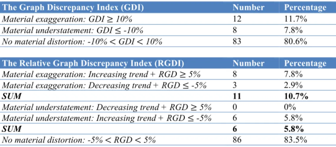
The incidence of materially distorted graphs is shown in table 6. According to the GDI,
material distortions are present in 20 (19.4%) of the graphs analyzed, out of which 12
exaggerate and eight understate the trend of the underlying data28. Using the RGDI, material
distortions are present in 17 (16.5%) of the graphs analyzed, where 11 exaggerate and six
understate the trend. Three of the graphs considered materially distorted according to the GDI
are not considered materially distorted according to the RGDI. The difference of three graphs
between the two proxies is due to the sensitivity of the GDI when the change in data is small
(less than five percent between the percentage change in the graph and the percentage change
in the underlying numbers)29. None of the graphs were considered materially distorted by the
RGDI, and not by the GDI, which supports the use of the RGDI as an additional measure for
measurement distortion. The use of two different measures, both supporting the same result,
also increases the validity of the result. The rest of the analyses on measurement distortion are
based on the 17 graphs that are considered materially distorted by the RGDI.
Table 6 - Incidence of material distorted graphs
27 For this analysis only column and bar graphs were considered. Out of the total of 112 column/bar graphs that
were identified, nine were excluded because they did not present at least one of the required values (scale or absolute value). This gave a final sample of 103 graphs.
28 When applying a 5% level of materiality, distortions are present in 26 (25.2%) graphs, out of which 15
exaggerate the trend of the underlying data, while 11 understate it. 29
Appendix 9 provides one example where the GDI overestimates the distortion.
The Graph Discrepancy Index (GDI) Number Percentage
Material exaggeration: GDI ≥ 10% 12 11.7%
Material understatement: GDI ≤ -10% 8 7.8%
No material distortion: -10% < GDI < 10% 83 80.6%
The Relative Graph Discrepancy Index (RGDI) Number Percentage
Material exaggeration: Increasing trend + RGD ≥ 5% 8 7.8%
Material exaggeration: Decreasing trend + RGD ≤ -5% 3 2.9%
SUM 11 10.7%
Material understatement: Decreasing trend + RGD ≥ 5% 0 0%
Material understatement: Increasing trend + RGD ≤ -5% 6 5.8%
SUM 6 5.8%
Materially distorted graphs are present in 1030 (23.3%) out of 43 companies, ranging from one
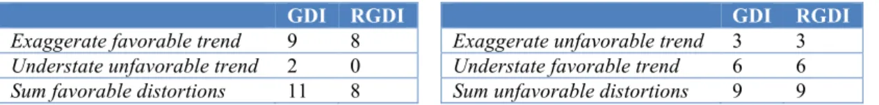
to three materially distorted graphs per company. Table 7 shows the nature of measurement
distortions. Among the 17 graphs that are materially distorted, eight (47.1%) are favorable
and nine (52.9%) are unfavorable to the company31. Two underlying reasons for material
discrepancies are found. Material discrepancies are attributable to either; the graphical
distance portrayed not being proportional to the underlying numbers or the use of a non-zero
axis. Out of the 1732 materially distorted graphs, nine33 show the graphic distance
non-proportionally to the underlying values and eight use a non-zero axis.
Table 7 - Nature of measurement distortions
In summary, there is evidence of measurement distortion, 16.5% of the graphs analyzed are
materially distorted. Ten (23.3%) out of the 43 companies analyzed include KFV graphs with
material measurement distortions in their annual report. However, the distortion is more often
unfavorable than favorable to the company, suggesting that there is no intention to mislead,
and that measurement distortion may result from companies’ lack of knowledge on the
subject.
Presentational Enhancement (RQ7)
Presentational enhancement is closely tied with the principles for proper graph construction
(discussed in part 2.1), and occurs when these principles are violated. For this analysis, all
KFV graphs were considered, which gave a final sample of 158 graphs from 35 companies34.
30When using the RGDI as a proxy for measurement distortion. Using the GDI as a proxy for measurement
distortion, distorted graphs are present in 11 (25.6%) out of 43 companies, ranging from one to four materially distorted graphs per company.
31 Using the GDI as a proxy for measurement distortion, from the 20 graphs that were materially distorted, 11
(55%) are favorable and nine (45%) are unfavorable to the company. 32
Under the GDI, the equivalent number is 20 graphs. 33
Under the GDI, the equivalent number is 12 graphs.
34 The sample was divided into three groups according to graph type, the first one contains all KFV graphs
(n=158), the second contains only column, bar, area, line and combined graphs (n=116), and the third contains only pie and doughnut graphs (n=42).
GDI RGDI GDI RGDI
Exaggerate favorable trend 9 8 Exaggerate unfavorable trend 3 3
Understate unfavorable trend 2 0 Understate favorable trend 6 6
Overall, there are 21935 violations36, corresponding to an average of 1.4 violations per graph.
This suggests that presentational enhancement is highly present in Norwegian companies.
One violation among all graph types related to labeling is the use of graph title, 12 (7.6%) out
of 158 graphs do not include an effective graph title. A relevant and useful title is important to
help the reader focus attention on specific matters and relationships, and the omission of an
effective title may mislead and confuse the reader (Courtis, 1997). Only three (1.9%) out of
158 graphs exhibit obtrusive visual effects, two (1.3%) graphs exhibit obtrusive background,
and two (1.3%) graphs use three-dimensional effects.
A common violation among column, bar, area, line and combined graphs is the absence of
gridlines. In the sample analyzed, 59 (50.9%) out of 116 graphs do not use gridlines, which
can make it more difficult for the users to identify data values. In addition, 65 (56%) out of
116 graphs use color to highlight the most recent year’s performance, either by using a darker
or a different color in the last year. By highlighting the most recent year’s performance, the
message in the graph may be distracting. Twenty-six (22.4%) of all KFV graphs do not
include a financial variable axis, and 11 (9.5%) combine two different scales and baselines.
Both violations can easily cause misunderstandings for the reader. Graphs with multiple
scales are often complex and difficult to understand. All graphs in the sample follow the
recommended time orientation, from left to right or bottom to top.
For clarity, pie/doughnut graphs should include up to five sections, presented in a descending
order. There are few violations related to the maximum sections that should be included in a
pie/doughnut graph; only two (4.8%) pie/doughnut graphs do so. However, 21 pie/doughnut
graphs do not present the sections in a descending order, accounting for 50 percent of all pie
/doughnut graphs analyzed.
35 For a detailed overview on violations of proper graph construction principles, please see appendix 10. 36
Although presentational enhancement is highly present in graphs in Norwegian annual
reports, the severity of the violations varies. Severe violations, such as the use of multiple
scales and baselines and the absence of a financial variable axis are more likely to affect the
perception by the viewer than less severe violations, such as the absence of gridlines. All
graphs follow the recommended time orientation, from left to right or bottom to top.
Violations of this principle are often intended by the graph designer, and can be seen as an
attempt to mislead. Violations related to labeling or highlighting of a specific year however,
can be seen as violations where there is not necessarily intention to mislead. There is
generally a higher incidence of what can be called non-intentional violations, compared to
intentional violations. This suggests that, as with measurement distortion, presentational
enhancement may occur due to a lack of knowledge by graph designers.
6. CONCLUSION
This paper examined the nature, extent and possible distortions of graph use in Norway, based
on a sample of the 52 most traded companies listed on Oslo Stock Exchange. This study
contributes to an extension of literature on graphical disclosure in annual reports by
documenting graphical reporting practices and presenting evidence of graphical distortions for
the first time in Norway. In addition, this study provides recommendations for accurate graph
construction and use for both preparers and users of graphs, contributing to better information
regarding graph use in financial reporting.
The results suggest that graphical disclosure is very common in Norway. Eighty-three percent
of companies included graphs in their annual reports, with an average number of 15 graphs
per company. Significant correlations were found between the number of graphs and the
number of pages in the annual report and between the number of graphs and the total asset
value of the company. The great majority (98.2%) of graphs appeared in the management
number of graphs (23.5%). Financial variables were slightly more graphed (52%) than
non-financial variables (48%), and the four most widely graphed non-financial variables were revenue,
EBIT, EBITDA and net income. The most used graph type were column graph, both by
number of graphs (53%) and by number of companies (95%). All companies used colors in
graphs and 67 percent of all graphs used the company’s logo color.
Unlike most previous studies, no evidence of selectivity distortion was found. However, there
was evidence of measurement distortion. Seventeen percent of all key financial variable
graphs were materially distorted. The graphical distortions were more often unfavorable, than
favorable, to the company. This suggested that there was no intention to mislead and that
measurement distortion may result from lack of knowledge on the subject. A high degree of
presentational enhancement was found, with a total of 219 violations, corresponding to 1.4
violations per graph. However, there was variation in severity and many of the violations
could be considered non-intentional.
The use of graphs in annual reports has been studied in several countries by now. However, to
the best of our knowledge, it has not been studied in Norwegian listed companies before.
Thus, there was a need to analyze this subject in Norway. This study was based on a sample
from Oslo Stock Exchange. Future research could investigate all companies listed on the Oslo
Stock Exchange, and international comparative studies within the Scandinavian countries
could also be considered. In addition, to get more insight on the evolution of graphical
disclosure in Norwegian companies, longitudinal studies could be performed.
Based on the findings in this study, as well as previous research, it is advisable that specific
formal accounting guidelines for graphical disclosure of financial information are developed.
This would benefit both preparers and users of annual reports by increasing knowledge and
awareness on the subject. In addition, both preparers and users of graphs in annual reports
REFERENCES:
Arunachalam, V., Pei, B. K., & Steinbart, P. J. 2002. “Impression management with graphs: Effects on choices.”
Journal of Information Systems, 16(2): 183-202
Association of Chartered Certified Accountants (ACCA). 2012. Global body for professional accountants.
Retrieved September 10, 2015, from http://www.accaglobal.com/content/dam/acca/global/PDF-technical/financial-reporting/reassessing-value.pdf
Bastardo, A. C. 2015. “Graph usage in financial reports: Evidence from Portuguese listed companies.” Master’s Thesis. NOVA school of Business and Economics.
Beattie, V., & Jones, M. J. 1992. “The use and abuse of graphs in annual reports: theoretical framework and empirical study.” Accounting and Business Research, 22(88): 291-303
Beattie, V., & Jones, M. J.1997. “A comparative study of the use of financial graphs in the corporate annual reports of major US and UK companies.” Journal of International Financial Management and Accounting,8(1): 33-68 Beattie, V., & Jones, M. J. 1999. “Australian financial graphs: an empirical study.” Abacus, 35(1): 46-76
Beattie, V., & Jones, M. J. 2000a. “Changing graph use in corporate annual reports: A time-series analysis.”
Contemporary Accounting Research, 17(2): 213-226
Beattie, V., & Jones, M. J. 2000b. “Impression management: the case of the inter-country financial graphs.” Journal
of International Accounting, Auditing & Taxation, 9(2): 159-183
Beattie, V., & Jones, M. J. 2001. “A six-country comparison of the use of graphs in annual reports.” International
journal of accounting, 36(2): 195-222
Beattie, V., & Jones, M. J. 2002. “Measurement distortion of graphs in corporate reports: an experimental study.”
Accounting, Auditing & Accountability Journal, 15(4): 546-564
Beattie, V., & Jones, M. J. 2008. “Corporate reporting using graphs: A review and synthesis.” Journal of Accounting
Literature, 27: 71-110
Beattie, V., Dhanani, A., & Jones, M. J. 2008. “Investigating presentational change in UK annual reports: A longitudinal perspective.” Journal of Business Communication, 45(2): 181-222
Chekkar, R., & Martinez, I. 2011. “The characteristics and determinants of voluntary graphical disclosure in France.” 34th Annual Congress of the European Accounting Association, April 2011, Rome
Courtis, J. K. 1997. “Corporate annual report graphical communication in Hong Kong: Effective or Misleading?” The
Journal of Business Communication, 34(3): 269-288
Courtis, J. K. 2004. “Colour as visual rhetoric in financial reporting.” Accounting Forum, 28: 265-281
Dilla, W. N., & Janvrin, D. J. 2010. “Voluntary disclosure in annual reports: The association between magnitude and direction of change in corporate financial performance and graph use.” Accounting Horizons, 24(2): 257-278 Finanstilsynet (The financial supervisory authority of Norway). 2015. “Act on auditing and auditors (Auditors
Act).” Retrieved October 7, 2014, from
http://www.finanstilsynet.no/global/english/laws_and_regulations/auditing/auditors_act.pdf
Frownfelter-Lohrke, C., & Fulkerson, C. L. 2001. “The incidence and quality of graphics in annual reports: An international comparison.” The Journal of Business Communication, 38(3): 337-358
Fulkerson, C. L., Pitman, M. K., & Frownfelter-Lohrke, C. 1999. “Preparing financial graphics: Principles to make your presentations more effective.” The CPA Journal, 69(6): 28-33
Hoadley, E. 1990. “Investigating the effects of color.” Communications of the ACM, 33(2): 120-139
Ianniello, G. 2009. “The use of graphs in annual reports of major Italian companies.” Auditing and Performance
Evaluation, 5(4): 442-462
Kosslyn, S. M. 1989. “Understanding charts and graphs.” Applied Cognitive Psychology, 3:185-226
Lee, T. 1994. “The changing form of the corporate annual report.” The Accounting Historians Journal, 21(1): 215-232 Mather, P., Ramsay, A., & Serry, A. 1996. “The use and representational faithfulness of graphs in annual reports:
Australian evidence.” Australian Accounting Review, 6(2): 56-63
Mather, D., Mather, P., & Ramsay , A. 2005. “An investigation into the measurement of graph distortion in financial reports.” Accounting and Business Research, 35(2): 147-159
Oslo Børs (Oslo Stock Exchange). 2014. “Annual Report 2014, Oslo Stock Exchange.” Retrieved October 13, 2015, from http://www.osloborsvps.no/obvps_eng/Oslo-Boers-VPS/Financial-information/2014/Annual-Report-2014 Oslo Børs (Oslo Stock Exchange). 2015. “Annual statistics, Key figures – Shares.” Retrieved October 17, 2015, from
http://www.oslobors.no/ob_eng/Oslo-Boers/Statistics/Annual-statistics/(index)/0/(year)/2014
Penrose, J. M. 2008. “Annual report graphic use: A review of the literature.” Journal of Business Communication,
45(2): 158-180
Steinbart, P. J. 1989. “The auditor's responsibility for the accuracy of graphs in annual reports: some evidence of the need for additional guidance.” Accounting Horizons, September: 60-70
Taylor, B., & Anderson, L. K. 1986. “Misleading graphs: Guidelines for the accountant.” Journal of Accounting,
162(4): 126-135
Tufte, E. R. 1983. The visual display of quantitative information. Cheshire, Connecticut: Graphics Press
Tufte, E. R. 2001. The visual display of quantitative information (2nd ed.). Cheshire, Connecticut: Graphics Press Wozniak, A., & Ferreira, L. 2011. “The use of graphs in financial reporting by Portuguese companies.” Paper