Work Project, presented as part of the requirements for the Award of a Master’s Degree in
Management from the NOVA – School of Business and Economics.
Graph Usage in Financial Reports:
Evidence from Portuguese Listed Companies
Ana Clara Lopes Beato Balça Bastardo, No.1487
A Project carried out on the Accounting & Financial Reporting course, under the
supervision of:
Professor Leonor Ferreira
Graph Usage in Financial Reports: Evidence from Portuguese Listed Companies
Abstract
When assessing investment options, investors focus on the graphs of annual reports, despite
lack of auditing. If poorly constructed, graphs distort perceptions and lead to inaccurate
decisions. This study examines graph usage in all the companies listed on Euronext Lisbon
in 2013. The findings suggest that graphs are common in the annual reports of Portuguese
companies and that, while there is no evidence of Selectivity Distortion, both Measurement
and Orientation Distortions are pervasive. The study recommends the auditing of financial
graphs, and urges preparers and users of annual reports to be wary of the possibility of
graph distortion.
1. INTRODUCTION
Corporate annual reports are important documents and investors rely heavily on them when
making investment decisions (Penrose, 2008). Despite the complexity and importance of
annual reports, they are not subject to homogenous regulation principles. Addressing the
need for accurate information when assessing investment possibilities, the financial section
is subject to auditing, following governmental and professional standards (Penrose, 2008).
On the other hand, although it is arguably the one which most influences the readers’
perception of a company’s financial situation (Canniffe, 2003), the narrative section is not
subject to auditing by independent accountants and its contents are not strictly regulated
(Fisher & Hu, 1989). In an attempt to enhance the external perception of their financial
position, companies may alter the amount and type of voluntary disclosed information
(Penrose, 2008). Some of this voluntary information is presented graphically.
Graphs provide an interesting case because, even though they often present audited values,
the graphs themselves are exempt from appropriate regulation, which would ensure a
truthful correspondence between graph construction and the underlying financial
information (Steinbart, 1989). As the graphs are not audited, there is margin for misleading
representation of data, as several studies have shown (Beattie & Jones, 1992; Chekkar &
Martinez, 2011; Courtis, 1997; Ianniello, 2009; Wozniak & Ferreira, 2011).
In 2010, the average annual report of FTSE100 companies was 175 pages long, with 6
spreading for more than 300 pages (ACCA, 2012). Faced with such lengthy annual reports,
many investors disregard the texts and base their decisions solely on the graphs (Zweig,
2000). As investors spend on average 15 minutes per report (David, 2001), relying on visual
Provided that graphs are present in the annual reports and that readers prioritize them when
reading and making investment decisions, it is crucial to analyze how companies make use
of graphs and whether or not these present a distorted view of the companies’ final position.
The purpose of this research is to analyze the usage of graphs in the annual reports of
Portuguese listed companies, contributing to the extension of literature on the subject.
This research is composed by five sections. After the Introduction, Section 2 describes key
concepts and provides a summary of previous studies regarding usage of graphs in annual
reports, principles of graphic construction and accounting regulation. Section 3 introduces
the methodology, the research questions (hereafter RQ), the model of analysis, the sample
and selection criteria, and exploratory data. Section 4 analyses and interprets the data
collected and answers to the research questions. Finally, Section 5 compiles the conclusions
of the study, presents suggestions for future research and provides recommendations for
regulators and preparers, and caution to users of annual reports.
2. LITERATURE REVIEW 2.1 Normative studies:
What is a graph?
Graphs1 are visual displays which express and summarize quantitative data and relations
among discrete values (Frownfelter-Lohrke & Fulkerson, 2001; Kosslyn, 1989) through a
combination of abstract marks. There are several types of graphs, such as line, bar/column,
pie and pictorial, being each graph variety better suited to display a specific kind of
information (Beattie & Jones, 1992). In spite of their variety, graphs have two main
functions: to analyze data and to communicate information. The graphs present in annual
reports generally serve the purpose of communicating financial information (Beattie &
Jones, 2008; Frownfelter-Lohrke & Fulkerson, 2001). Graphs are better than tables at
highlighting trends and relations between the different values (Vessey & Galletta, 1991). In
addition, while color in tables hinders information extraction, color in graphs improves
accuracy in comprehension and learning tasks (Hoadley, 1990).
Principles of Graph Construction
There is a limit to the amount of information humans can process, thus, when solving a
problem, people attempt to diminish the effort they exert in processing information (Newell
& Simon, 1972). Forced to face complex scenarios, people tend to use simplifying
strategies, being more restrictive in the use of the information available. These strategies are
a good option, considering people want to achieve both accuracy and economy of effort
(Payne et al, 1993). This tendency makes one prone to be misled by visual information, as
graphs provide a more instantaneous overview of the relations between data. Adding to this
concern, experiments show that most people do not detect subtle biases in data presentation
(Ricketts, 1990). Out of plausibility, incorrect values remain unnoticed. This situation is
aggravated by the perceived credibility of annual reports, as the users of companies’ annual
reports regard those documents as highly credible (Moskowtiz, 2000). Despite this aura of
reliability, graphs are often built in a way that makes them portray data inaccurately, even
when reporting on serious issues of public interest (Tufte, 1983).
When well-constructed, graphs display data accurately, hold the readers’ attention, have a
straightforward interpretation (Kosslyn, 1989; Schmid & Schmid, 1979) and facilitate the
communication and understanding of quantitative information. However, when poorly
designed, graphs may provide distorted data displays, manipulating the reader’s perception
perceptions have been shown to actually alter the choices of their users, diminishing
decision accuracy (Arunachalam et al, 2002). Nevertheless, regulation on graphs is scarce
or inexistent and several studies have provided evidence for the existence of inadequately
constructed graphs, replete of distortions (Beattie & Jones, 1992; Frownfelter-Lohrke &
Fulkerson, 2001; Tufte, 1983).
Living in an increasingly visual society, with a large proportion of the population immersed
in visual stimuli, such as television and advertisement (Courtis, 1997), it is easy to take for
granted one’s ability to construct and read graphs. However, graph construction is no so
straightforward. Throughout the years, studies have analyzed and synthesized the
characteristics of a well-designed graph, which would ensure accurate data disclosure
independently from the users and their different levels of proficiency. Summarizing the
conclusions of previous studies, the acceptable principles for proper graph construction are
the following:
The representation of numbers, as physically measured on the graph’s surface ought to
be directly proportional to the numerical values represented (Tufte, 1983, p.56);
To avoid ambiguity and distortion, titles, labels, key and data explanations should be
clearly written on the graph itself (Kosslyn, 1989; Tufte, 1983, p.56);
Any mark variation must be easily noticed (Kosslyn, 1989);
Sharp contrasts and excessive coloring should be avoided, as to highlight the
information conveyed and not disturb the correct analysis of the graph (Kosslyn, 1989);
Graph construction should follow cultural conventions and thus time should increase
The axis should both have their origin in the same point, values on the vertical axis
should increase going upwards and values on the horizontal axis should increase
towards the right (Kosslyn, 1989);
Truncated axis and transformed scales should be avoided (Kosslyn, 1989).
Graphic Distortion
There are four types of graphic distortion: Selectivity Distortion, Measurement Distortion,
Orientation Distortion and Presentational Enhancement.
Selectivity Distortion reflects the decision to include graphs in the annual report. Additionally, whenever a graph is included, there can be further selectivity in the choice of
which variables to present (Beattie & Jones, 1992). Bias in this selection may portray the
company in a light that does not reflect the truth. Selectivity Distortion may be a symptom
of impression management (Godfrey et al., 2003).2
Measurement Distortion relates to graph construction. Whenever the graphic representation of numbers is not directly proportional to their numeric value, there is an instance of
Measurement Distortion (Beattie & Jones, 1992). This kind of distortion may arise from the
existence of a “non-zero axis, a broken axis or a non-arithmetic scale” (Beattie & Jones,
1992). However, the distortion does not have to necessarily result from a particular cause;
providing the graph does not display a direct proportion between surface and the numerical
value represented, there is Measurement Distortion (Beattie & Jones, 1992). Measurement
Distortion can be objectively quantified through the Graph Discrepancy Index3, (hereafter,
2Impression managementis the effort to depict a company’s performance as being better than it is in reality. (Godfrey & Ramsay, 2003)
GDI) which Taylor & Anderson (1986) adapted from Tufte’s “lie factor”.4 An
interpretation standard states that graphs whose GDI exceeds the absolute value of five per
cent are materially distorted (Tufte, 1983, p.57). Furthermore, Arunachalanm et al. (2002)
found that distorted graphs can, not only alter perceptions, but also significantly affect the
decisions of the users of annual reports, even when accompanied by accurate numeric labels.
Orientation Distortion is related to the slope of graphs. If the slope of a graph is not an optimal 45º angle or close, the readers’ judgment accuracy is negatively affected (Beattie &
Jones, 1997), since whenever line segments are close to vertical or horizontal, evaluations
of slope are deemed inaccurate, resulting in faulty judgments (Cleveland & McGill, 1985).
Finally, Presentational Enhancement occurs whenever one or more elements of a graph
impede an accurate understanding of the data displayed. This distortion arises from, among
other things, three-dimensional elements, lack of tittles, ambiguous labels and colors whose
intensity is associated with numeric values (Beattie & Jones, 1997).
2.2 Empirical Studies
Various studies have been developed on the use of graphs in the annual reports of
companies from several countries.5 Penrose (2008) provides an extensive review on this
subject and concludes that factors, such as country of origin, firm size and exchange listing
influence the voluntary disclosure of companies.
The vast majority of companies feature graphs in their annual reports. Studies based on the
UK, the US and a group of 11 countries found that 79% of companies include at least one
graph in their annual report (Beattie & Jones, 1992; Frownfelter-Lohrke & Fulkerson, 2001;
4 There is also an alternative formula to calculate graph distortion, the Relative Graph Discrepancy index (RGD). (Mather et al, 2005) Since subsequent studies continue using the GDI, with one using both the GDI and the RGD, for comparison purposes in this study the use of the GDI formula was favored.
Steinbart (1989). Examining the reports of 52 Italian companies6, Ianiello (2009) found that
85% of them used graphs, with an average of nine graphs per report. Australian and French
companies display a higher incidence of graphs, with 89% of companies showing at least
one graph (Beattie & Jones, 1999; Chekkar & Martinez, 2011). Focusing on Hong Kong,
Courtis (1997) reported the lowest percentage7, as only approximately 35% of all public
listed companies included graphs in their annual report, with graphs averaging 5.3 per
report. Results obtained for Portugal provide a sharp contrast with Hong Kong, since 91%
of listed companies display at least one graph in their 2009 annual report, with the average
number of graphs per annual report being 26 (Wozniak & Ferreira, 2011). When comparing
the extent of graph usage by US and non-US (and non-Canadian) companies listed on major
US stock exchanges, Frownfelter-Lohrke & Fulkerson (2001) found that, on average,
non-US companies relied significantly more on graphs than their non-US counterparts.
Regarding content, companies are more likely to use graphs to present financial data, rather
than non-financial information (Frownfelter-Lohrke & Fulkerson, 2001). In the US,
Steinbart (1989) concludes that the most displayed variables are sales, income and
dividends, with 27.5% of graphs presenting one of these variables. Beattie & Jones (1992;
1997) find that 65% of 240 UK listed companies and 72% of Australian companies graphed
at least one key financial variable (hereafter, KFV). Similarly, Chekkar & Martinez (2011)
conclude that French companies display 64% of graphs with financial information.
Considering distortions, a significantly large proportion of graph inaccuracies appear to be
selective, suggesting they are actively designed to enhance the company’s financial position
and performance (Beattie & Jones, 1992). Steinbart (1989) found companies whose net
6 Largest by market capitalization as of 31 December 2005.
income had increased significantly to be more prone to graph one KFV than companies
whose net income had decreased, 74% in contrast to 53% of companies.
Further analysis shows that 52% of graphs are not properly constructed and are misleading,
with up to 72% companies presenting at least one misleading graph (Courtis, 1997).
Calculating the GDI, the graphs of US companies are, on average, distorted 81%, while
their non-US counterparts display higher levels of distortion, 173% (Frownfelter-Lohrke &
Fulkerson, 2001). In Italy, Ianiello (2009) concludes that approximately 25% of the graphs
are materially distorted, with distortions favorable to the company being more frequent than
the unfavorable, although there is no significant evidence of selectivity. Beattie & Jones
(1992) report that in Australia, 34% of graphs in annual reports present material distortions.
In 2009, Portuguese listed companies display measurement distortion in 73% of graphs,
selectivity distortion and presentational enhancement (Wozniak & Ferreira, 2011).
From the literature, it is clearly urgent to develop formal guidelines and protocols, as to
ensure both preparers of annual reports and auditors are able to prevent and detect graphic
distortions. This work project contributes to the literature by adding the most recent year to
the study of graph usage by Portuguese listed companies and examine if errors diminished
or modified.
3. RESEARCH DESIGN 3.1 Research Questions
This research analyzes the use of graphs in the annual reports of all the companies listed in
the Euronext Lisbon in 2013, which is the most recent period of publicly available data. In
order to do so, specific exploratory and research questions are detailed below:
This is an exploratory question and, bearing in mind a previous made by Wozniak &
Ferreira (2011), it is expected that Portuguese companies display information graphically.
RQ2:What types of graph are present in the annual reports?
Graph types studied are: bar, column, line, pie, area, doughnut, bubble, radar and combined.
RQ3:What are the colors used in graphs? Are the colors of the graphs being actively used for communication purposes?
RQ4: What kind of information is communicated through graphs in annual reports? Is financial information more prevalent than non-financial information?
RQ5: Are the graphs designed according to recommended guidelines? If they are not, is the distortion significant?
RQ6:Does company performance relate to the distribution of KFV graphs?
3.2 Methodology
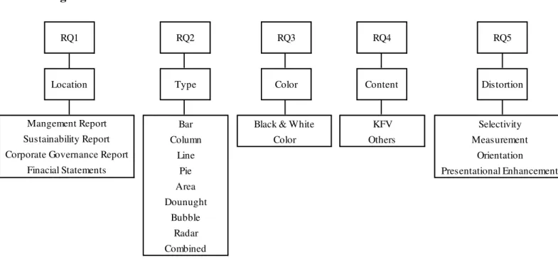
In order to answer to the research questions, an Excel database8 was created to systemically
analyze graphs through five variables: type, color, location, content and distortion. 9 Each of
these five variables was further divided10 into several smaller categories.11 This univariate
analysis answers to the research questions from RQ1 to RQ5. To better answer RQ5, the
GDI of graphs is calculated and evaluated according to the criteria proposed by Tuffte
(1983), which rules that graphs whose GDI is above five per cent are materially distorted.
To answer RQ6, a test for independence was conducted, to test whether or not the
information presented is independent from company performance. Figure 1 shows a
summary of the research design, its variables and RQ.
8 The database is composed by five sheets for a total of approximately 20,500 cells of data.
9 There is some degree of subjectivity in this analysis as color perception is inherently subjective. Furthermore, because annual reports do not all follow the same structure, the variable location is subject to some systemization in order to accommodate every company’s circumstances.
10 Since the categories for evaluation were proposed a priori, it was necessary to reevaluate them during the analytic process, such as including a risk management category in the content analysis.
Figure 1: Research Model and Variables
3.3 Sample and Data
This research considers the entire population of companies listed on the NYSE Euronext
Lisbon as of 30 of December of 201312, for an initial sample of 51 reports.13 In order to
analyze these companies’ graph usage in financial reporting, their consolidated annual
reports for the year of 201314 were extracted either, from their websites or from CMVM’s15
website, according to their availability, and sometimes from both for validity reasons. These
annual reports provided the hand collected data which was then analyzed and codified
through the above mentioned Excel database.
12 Please refer to Appendix 1 for the complete list of companies considered in this work.
13In the initial sample of 51 companies, annual reports have 11,898 pages, for an average of 233.29 pages and a median of 220. NEXPONOR SICAFI S.A. has the minimum, 27, while BANIF S.A. has the maximum, 529.
14 Three companies, BENFICA – FUTEBOL SAD, SPORTING CLUBE DE PORTUGAL – FUTEBOL SAD and FUTEBOL
CLUBE DO PORTO – FUTEBOL SAD, have a different reporting period, coinciding with their operating cycle, and ending on June 30th. For the purpose of providing more timely and relevant information in the study, the most recent reports, from 2013/2014, ending on June 30th, 2014, were considered.
15Comissão do Mercado de Valores Mobiliários, Stock Market Commission.
Orientation Presentational Enhancement RQ4 Content KFV Others RQ5 Distortion Selectivity Measurement Radar Combined RQ2 RQ3 Color
Black & White Color RQ1 Type Bar Column Line Pie Area Dounught Bubble Location Mangement Report Sustainability Report Corporate Governance Report
Following a preliminary analysis, three companies did not include any graph in their
consolidated annual report and were thus excluded from the final sample.16 Consequently,
the final sample is composed of 48 companies, corresponding to 94% of the entire
population of listed companies. The total number of graphs is 1,104, for an average number
of 23 graphs per report and a median of 16.5.17 The minimum number of graphs is one, by
the company IMOBILIÁRIA CONSTRUTORA GRÃO PARÁ S.A. and the maximum is 98, by
BANCO BPI S.A. This broad range and a standard deviation of 23.7, suggest the existence of very disparate approaches to graph usage. Companies in the PSI2018 have an average of
39.8 graphs per annual report, and the remaining companies have an average of 11 graphs
per annual report.
Analyzing through industries, companies in the “Utilities” display the highest average
number of graphs per annual report, 52, followed by “Financials” with 49.8. These two
industries have also the highest average number of pages per annual report, 324 and 320.9,
respectively, and the highest average value for Total Assets.19Nevertheless, “Oil & Gas” is
the industry featuring the highest average of graphs per page, 0.24.
Comparing to results from graph disclosures by Portuguese listed companies in 2009
(Wozniak & Ferreira, 2011), there has been an increase in the prevalence of graphs, from
91% to 94% of companies, despite a decrease in number, from 1,262 to 1,104 graphs.20
16 The excluded companies are Grupo MEDIA CAPITAL, SGPS, SA; NEXPONOR - SOCIEDADE ESPECIAL DE
INVESTIMENTO IMOBILIÁRIO DE CAPITAL FIXO, SICAFI, S.A. and VAA - VISTA ALEGRE ATLANTIS - SGPS, SA. 17 The mean and the median were calculated from the final sample of 48 companies which utilize graphs. For values referring to the initial sample please consult Appendix 2.
18 PS1 20, Portuguese Stock Index, is the group of the 20 biggest companies listed on the Euronext Lisbon. 19 According to three regressions run, with a significance level of 5%, there is no significant correlation between the number of graphs and the number of pages per annual report, nor between the number of graphs and the Total Assets of a company. (The p-value is 4.09 and 3.12, respectively.) There is, however, a significant correlation of 11% R2 between the Total Assets of a company and the number of pages of its annual report. (The p-value is 0.0193.)
The vast majority of graphs appear in the Management Report, with particular incidence in
the business and financial overview sections, 248 (22%) and 212 (19%), respectively. The
key highlight section contains 182 (16%) graphs and some companies, such as
SUMOL+COMPAL S.A., only include graphs in this section. There are more graphs in the human resources and social responsibility section, 146 (13%), than in the macroeconomic
section, 115 (10%).21
4. RESULTS
4.1 Graph Construction
Format (RQ 2)
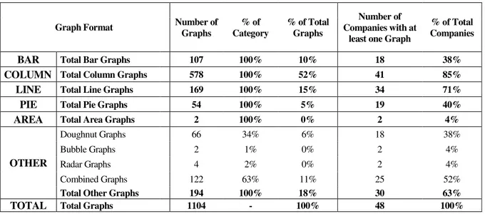
The analyzed companies consistently display in their annual reports nine types of graphs:
area, bar, bubble, column, combined, doughnut, line, pie and radar.22 Out of the companies
analyzed 11 (23%) use four types of graph.23
Column graphs are the most numerous, 578 (52%), and the most prevalent, as 41 (85%)
companies display at least one column graph, a small increase from their prevalence in 83%
of annual reports in 2009. 24 (Wozniak & Ferreira, 2011) Line graphs follow, being present
in 34 (71%) annual reports. Comparing with data from 2009, when 92% of companies
featured at least one line graph in their report (Wozniak & Ferreira, 2011), it is possible to
notice a decrease of 23% in the prevalence of line graphs. Pie graphs also decreased, going
from being present in 77% (Wozniak & Ferreira, 2011) of annual reports to merely 40%.
21 The possible reasons behind graphs distribution among sections of the annual report are beyond the scope of this research.
22 In order to facilitate comparisons with previous studies, four types of graphs, namely combined, bubble, doughnut and radar, were also categorized and analyzed under the broader category “other”. Bar and column graphs are also considered categories for the purpose of this study and both further fragmented into simple, stacked and clustered.
23 The company using the maximum variety of graphs is BANCO COMERCIAL PORTUGUÊS S.A., with seven types of graph.
Other types of graph and line graphs are also significantly present, corresponding to 18%
and 15% of all graphs featured. More traditional formats, such as column and line, are
predominant, perhaps to favor a more direct interpretation. Table 1 summarizes this analysis.
Table 1: Graph Format Overview
GraphFormat Number of
Graphs
% of Category
% of Total Graphs
Number of Companies with at
least one Graph
% of Total Companies
BAR Total Bar Graphs 107 100% 10% 18 38%
COLUMN Total Column Graphs 578 100% 52% 41 85% LINE Total Line Graphs 169 100% 15% 34 71%
PIE Total Pie Graphs 54 100% 5% 19 40%
AREA Total Area Graphs 2 100% 0% 2 4%
OTHER
Doughnut Graphs 66 34% 6% 18 38%
Bubble Graphs 2 1% 0% 2 4%
Radar Graphs 4 2% 0% 2 4%
Combined Graphs 122 63% 11% 25 52%
Total Other Graphs 194 100% 18% 30 63%
TOTAL Total Graphs 1104 - 100% 48 100%
Usage of Color (RQ 3)
The entire sample of companies analyzed use color, as opposed to black and white, in at
least one of their graphs. Two companies25 present black and white graphs, but these
correspond to only 0.27% of the total graph sample. Comparing with data from 2009, when
7% of graphs were colored in black and white (Wozniak & Ferreira, 2011) there is evidence
of an increasing preference for the usage of color. Studies have shown color to be a
performance enhancer in comprehension and learning tasks (Hoadley, 1990), thus an
increase in the usage of color points towards a more effective communication. When
selecting which colors to use, 38 (79%) companies opted towards the colors of their logo,
possibly for a coherent display of brand image and to blend harmoniously with the general
aesthetic of the report. Furthermore, repetition enhances understanding and assimilation,
thus continuously using the same colors may help reinforce information.26
4.2 Content (RQ 4)
Most information presented graphically can be included in one of five categories: capital
markets, financial information, macroeconomic data, human resources, and sustainability.
Information on capital markets, such as share price, is the most prevalent among companies,
with 36 (75%) of them presenting at least one graph on it.27 The annual report is approved
by the shareholders and information on capital markets is of great interest to them, which
might explain why so many companies highlight it through graphs.
Following, 30 (63%) companies display graphically information on turnover, corresponding
to 16% of all graphs.28 Column graphs are responsible for 71% of these displays.
A considerable percentage of companies, 44%, 31% and 42% choose to display information
on EBITDA, EBIT and Net Income, respectively. Information related to these three
variables is present in 15% of all graphs.29 Out of these components, EBITDA is the most
displayed, corresponding to 53% of the sum of the three. These indicators are 67% of the
time displayed through column graphs. Companies might seek to highlight this information
by presenting it graphically, as it is already present in the income statement. This type of
information hints on company performance, and is relevant for different categories of users,
such as the Net Income for shareholders and the EBIT for managers.
26 For a more detailed overview of color usage, by graph format and color, please refer to Appendix 4.
27 The industries which most display information on shares are Telecommunications, 19%, and Consumer Goods, 17%.
28 The industries most focused on turnover information are Healthcare, Technologies and Basic Materials, where it corresponds, respectively, to 39%, 32% and 31% of all graphs used by those industries.
Companies presenting macroeconomic information graphically amount to 42%, being
displayed in 14% of all graphs.30 This information is most commonly expressed through
line graphs, 56%, and column graphs, 29%.
Companies also present information on Human Resources31 and Sustainability32, 48% and
27%, respectively, adding up to 7% and 6% of all graphs. In Human Resources, employee
number and health, safety and satisfaction both amount to 22% of graphs. Country
distribution and mobility corresponds to 13% of this category, followed by age and training,
each with 9%.33 Considering Sustainability, it is featured in 11% of graphs of both the
Utilities industry and, perhaps not surprisingly, the Industrials industry.
Comparing to 2009, when only 29% of companies showed graphs on Human Resources
and Sustainability (Wozniak & Ferreira, 2011), more companies are using graphs to
disclose this information, 52%. There was also an increase in the number of graphs
dedicated to this information, from only five per cent in 2009 (Wozniak & Ferreira, 2011)
to 13% in 2013, for a 62% increase. Simultaneously, there are less companies presenting
information on capital markets, 75% now and 85% in 2009, and on turnover, 63% now and
75% in 2009 (Wozniak & Ferreira, 2011). From 2009, companies moved towards a more
multifaceted overview of their activities, possibly due to decreasing financial performance
or due to an increase in the demand for social responsibility by the public.34
30 As much as 75% of all graphs shown by companies operating in the Telecommunications industry display some form of macroeconomic information. Companies in the Financials and Utilities industry also devote, respectively, 18% and 15% of their graphs to this kind of data.
31 Information on Human Resources covers a broad range of issues: employee number, age, gender, salary, education, seniority, country distribution and mobility, absenteeism, health, safety and satisfaction, and training. 32 Information on Sustainability issues includes mainly water, energy and wood consumption, as well as waste production and emissions of CO2 and other gases.
33 Companies in the Oil & Gas, Industrials and Technology industries are those who display more information on human resources, corresponding to 16%, 12% and 10% of all the graphs used.
4.3 Distortion (RQ 5 and 6)
The analysis concentrates on the four different types of graph distortion introduced in the
Literature Review: Selectivity Distortion, Measurement Distortion, Orientation Distortion
and Presentational Enhancement.
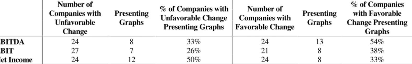
Selectivity Distortion
Selectivity Distortion is closely related to impression management (Godfrey et al, 2003), and reflects the choice of whether or not to include graphs for a specific parameter. If
Selectivity Distortion is present, the company will be portrayed more favorably than its performance justifies. (Beattie & Jones, 1992) For the purpose of this study, performance
was evaluated as favorable or unfavorable, depending on whether the parameters analyzed
increased or decreased from 2012 to 2013. The variables chosen were EBITDA, EBIT and
Net Income, three of the variables graphed by the largest number of companies. These
variables are also related to company performance and essential to shareholders, being also
audited and displayed in the income statement. The results are summarized in Table 2.
Table 2: EBITDA, EBIT and Net Income Selectivity Distortion
Number of Companies with
Unfavorable Change
Presenting Graphs
% of Companies with Unfavorable Change
Presenting Graphs
Number of Companies with Favorable Change
Presenting Graphs
% of Companies with Favorable Change Presenting
Graphs
EBITDA 24 8 33% 24 13 54%
EBIT 27 7 26% 21 8 38%
Net Income 24 12 50% 24 8 33%
Conforming to previous studies, only 33% of companies with an unfavorable EBITDA
change chose to display that information graphically, as opposed to 54% of companies with
favorable changes who chose to do so. Similarly, only 26% of companies with unfavorable
EBIT change showed that information, as opposed to 38% of companies with a favorable
unfavorable Net Income change opted to disclose this information graphically, contrary to
only 33% of companies with a more favorable performance.
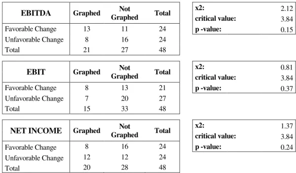
In order to verify if there is evidence of manipulation and therefore of Selectivity Distortion,
a test for independence was undertaken. This test aimed to determine if the decision to
present this type of information graphically was independent form the company’s
performance. Table 3 summarizes the results of the test.
Table 3: Relation between Company Performance and KFV Graph Display
EBITDA Graphed Not
Graphed Total
x2: 2.12
critical value: 3.84
Favorable Change 13 11 24 p -value: 0.15
Unfavorable Change 8 16 24
Total 21 27 48
EBIT Graphed Not
Graphed Total
x2: 0.81
critical value: 3.84
Favorable Change 8 13 21 p -value: 0.37
Unfavorable Change 7 20 27
Total 15 33 48
NET INCOME Graphed Not
Graphed Total
x2: 1.37
critical value: 3.84
Favorable Change 8 16 24 p -value: 0.24
Unfavorable Change 12 12 24
Total 20 28 48
According to the test, there is not sufficient evidence to dismiss the hypothesis that the
variables are independent. Consequently, there is no evidence of Selectivity Distortion. In
this parameter, graph usage has greatly improved comparing with 2009, when it was
reasonable to assume that companies were presenting graphs selectively (Wozniak &
Ferreira, 2011). Considering how more companies presented graphs on Net Income when
faced with unfavorable changes, one possibility is that absence of apparent Selectivity
Measurement Distortion
One of the major aspects of Measurement Distortion is the GDI. As addressed in the
Literature Review, the GDI, adapted from Tufte’s “lie factor” (Tufte, 1983, p.57), ascertains
whether or not a graph presents a direct proportion between surface and the numerical value
represented (Taylor & Anderson, 1986). This research follows the standard for the
interpretation of GDI values and assumes that only graphs whose GDI exceeds the absolute
value of five per cent are materially distorted (Tufte, 1983, p.57). Since Net Income is one
of the most graphically displayed financial variables, and its value is written in the auditor’s
report, it was deemed important to ascertain if its graphic representations were reliable. As a
result, the GDI was calculated35 for the graphs displaying Net Income.36
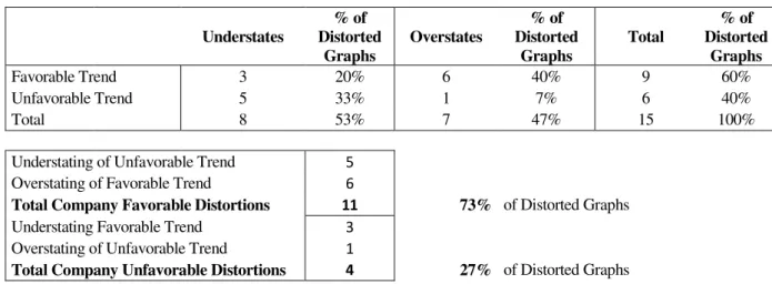
Material distortions are present in 56% of the graphs analyzed.37 Out of the materially
distorted graphs, 53% understate the underlying trend and 47% overstate it. The vast
majority of distortions, 73%, are favorable to the companies, as they enhance favorable
trends and mitigate the unfavorable ones. Table 4 summarizes these results.
Table 4 – GDI Analysis
Understates % of Distorted Graphs Overstates % of Distorted Graphs Total % of Distorted Graphs
Favorable Trend 3 20% 6 40% 9 60%
Unfavorable Trend 5 33% 1 7% 6 40%
Total 8 53% 7 47% 15 100%
Understating of Unfavorable Trend 5
Overstating of Favorable Trend 6
Total Company Favorable Distortions 11 73% of Distorted Graphs
Understating Favorable Trend 3
Overstating of Unfavorable Trend 1
Total Company Unfavorable Distortions 4 27% of Distorted Graphs
35 Refer to Appendix 6 for an example of a GDI calculation.
Measurement Distortion may result from lack of zero base line, broken axis and non-arithmetic scales (Beattie & Jones, 1992). Out of a total of 979 graphs38 only 281 (29%)
display a clearly indicated zero base line. Furthermore, only 358 graphs (37%) present a
vertical39 axis with scale. The vast majority of graphs lack these elements, which are
fundamental for a good data interpretation.40 Additionally, 26% of graphs do not present
labels with the exact values of the data being analyzed and 3% display multiple vertical
scales, which ought to be avoided as they impede correct readings. The misleading potential
of these graphs leaves readers vulnerable to bias and consequent inaccurate decisions.
Orientation Distortion
Orientation Distortion is associated with the slope of the graphs, which, when not at an optimal 45º angle, affects interpretation and precludes correct judgments (Beattie & Jones,
1997). As with the GDI calculation, this research considered the graphs displaying Net
Income41, as it is an important variable of company performance and an audited KFV,
present in graphs of 42% of annual reports and confirmed in the auditor’s report.
Out of the graphs analyzed, none displayed a 45 degree angle. The most approximate value
was of 48 degrees, displayed by a column graph. The average angle was 26 degrees, with
the minimum and the maximum being one and 70 degrees, respectively.42 Orientation
Distortion is pervasive in this sample, as the graphs studied do not enable a smooth reading and interpretation. Three graphs have an angle of one degree, meaning it is impossible to
have an understanding of the true evolution of the data. Such residual slopes, of one or two
38 Due to differences in design resulting in distinct graphs construction principles, only bar, column, line, area, bubble and combined graphs were considered. Pie, doughnut and radar graphs were excluded.
39 For bar graphs a horizontal axis was considered.
40 Please refer to Appendices 7 and 8 for examples of properly and improperly constructed graphs.
41 Only column and bar graphs were considered in this analysis. There were initially 28 column graphs and 4 bar graphs. However, because three column graphs and one bar graph did not present a sequence of at least two years, they were excluded. The final sample is thus composed by 28 graphs.
degrees, understate the perception of change, and ought to be adjusted as to provide a more
accurate reading.
Presentational Enhancement
There is Presentational Enhancement whenever one or more graph components hinder the
correct interpretation of the data displayed (Beattie & Jones, 1997). This distortion arises
from violations of the graph construction principles discussed in the Literature Review.
Overall, there are 2,064 of the above mentioned violations, corresponding to an average of
1.9 unconformities per graph. Among the graphs analyzed, 6% did not contain a title and
1% did not include a label of the data being presented. Furthermore, 71% of graphs43 do not
have a clearly signaled zero base line. The absence of these elements, particularly in graphs
displaying multiple indicators, inhibits an accurate interpretation and renders them futile.
The same is valid for the 34, three per cent, of graphs which include multiple scales44, and
often two different base lines.45. As much as 14% of time sequential graphs do not follow
the recommended time orientation, horizontally from left to the right, and vertically from
bottom to the top. Breaking cultural conventions, these graphs mislead their users.
Three dimensional effects are not pervasive, being present in only 2% of all graphs. Pie
graphs are responsible for 48% of all three dimensional features registered, equivalent to
20% of all pie graphs. In effect, 78% of all pie and doughnut graphs do not display slices in
the recommended order. Additionally, 14% of them display more than six slices, which
impairs interpretation and information extraction.
43 For structural reasons, only bar, column, line, area, bubble and combined graphs were considered when analyzing vertical or horizontal scales. Pie, doughnut and radar graphs were excluded.
5. CONCLUSION
This work project contributes to previous literature by adding one year to the study
of the use of graphs in financial reporting in Portugal. It examines the nature and
extent of graph usage and whether or not graphs are distorted.
Findings show that 94% of Portuguese listed companies show at least one graph in
their annual report. Column graphs are both the most prevalent and the most
numerous. The vast majority of companies, 38 (79%), opt to display graphs whose
color matches the company logo, suggesting an increase in communication
effectiveness. A large percentage of graphs, 31%, display information on four key
financial variables: Turnover, EBITDA, EBIT and Net Income. Graphical display of
information on capital markets is, however, the most pervasive among companies,
present in 75% of all reports.
Considering the principles of graph construction recommended, there are 2,064
instances of unconformity, an average of 1.9 per graph. However, results show no
evidence of Selectivity Distortion. Nevertheless, 56% of the Net Income graphs
examined display significant Measurement Distortion, and as much as 73% of
distortions are favorable to the companies. Orientation Distortion is also pervasive
in the same graph sample. These findings suggest that the absence of both explicit
guidelines and applicable curriculum on the subject, might be contributing to
maintain adverse graph practices.
Future research can cover further data periods, country comparisons, as well as the
reasons behind the changes in the information displayed graphically. More
in a faithful communication, and also examine the effects of more complex visual
displays, such as combined graphs and graphs with movement, on users.
From the results find in this work project, it is advisable that regulators clarify and
explicit the auditors’ responsibilities concerning graphic voluntary disclosures of
information. Preparers and auditors of annual reports should meticulously assess
whether or not graphs are presenting information faithfully, particularly when
graphs display audited figures, and finally, users of annual reports ought to be wary
of the existence of misleading graphs.
References
Association of Chartered Certified Accountants (ACCA). 2012. “Re-assessing the value of corporate reporting.” Found in: http://www.accaglobal.com/content/ dam/acca/global/PDF-technical/financial-reporting/reassessing-value.pdf
Arunachalam, Vairam. Pei, Buck K. W. & Steinbart, Paul John. 2002. “Impression management with graphs: effects on choices.” Journal of Information Systems, 16(2): 183–202.
Beattie, V. & Jones, M. J. 1992. “The use and abuse of graphs in annual reports: Theoretical framework and empirical study”. Accounting and Business Research, 22(88): 291–303.
Beattie, V. & Jones, M. J. 1997. “A comparative study of the use of financial
graphs in the corporate annual reports of major U.S. and U.K. companies.” Journal ofInternational Financial Management and Accounting, 8(1): 33-68.
Beattie, V. & Jones, M. J. 2008. “Corporate reporting using graphs: a review and synthesis.” Journal of Accounting Literature, 27: 71-110.
Brigham, E. F., & Houston, J. F. 2001. Fundamentals of financial management (9th ed.). Orlando: Harcourt, Inc.
Canniffe, M. 2003. “Annual reports”, Accountancy Ireland, 35(1): 7-9 quoted in
Penrose, John M. 2008. “Annual Report Graphic Use –A Review of the Literature”, Journal of Business Communication, 45(2): 158-180
Chekkar, R. & Martinez, I. 2011. “The Characteristics and Determinants of Voluntary Graphical Disclosure in France”. Paper presented at European Accounting Association: 34th Annual Congress, Rome-Siena, April.
Cleveland, William S. & McGill, Robert. 1985. “Graphical Perception and Graphical Methods for Analyzing Scientific Data.” Science, New Series, 229(4716): 828-833
Courtis, J. K. 1997. “Corporate Annual Report Graphical Communication in Hong Kong: Effective or Misleading?” The Journal of Business Communication, 34(3): 269–288.
David, C. 2001. “Mythmaking in Annual Reports”. Journal of Business and Technical Communication. 15(2): 195-222, quoted in Penrose, John M. 2008.
“Annual Report Graphic Use – A Review of the Literature”, Journal of Business Communication, 45(2): 158-180
Fisher, F. A., & Hu, M. Y. 1989. “Does the CEO’s letter to the shareholders have predictive value?” Business Forum, 14(1): 22-24.
Frownfelter-Lohrke, C. & Fulkerson, C.L. 2001. “The Incidence and Quality of Graphics in Annual Reports: An International Comparison.” The Journal of Business Communication, 38(3): 337–358.
Fulkerson, Jennifer. 1996. “How Investors Use Annual Reports”. American Demographics. 18(5): 16-18
Godfrey, J., Mather, P. & Ramsay, A. 2003. “Earnings and Impression Management in Financial Reports: the Case of CEO Changes”. Abacus. 39(1): 95-123
Hoadley, Ellen D. 1990. “Investigating the Effects of Color”. Communications of the ACM, 33(2): 120-139
Ianniello, G. 2009. “The use of graphs in annual reports of major Italian companies.” Int. J. Accounting, Auditing and Performance Evaluation, 5(4): 422-462
Kosslyn, S.M. 1989. “Understanding Charts and Graphs.” Applied Cognitive Psychology, 3: 185-226.
Mather, D., Mather, P., Ramsay, A. 2005. “An investigation into the measurement of graph distortion in financial reports.” Accounting and Business Research, 35(2): 147-160
Moskowitz, E.2000. “Believe it . . . or not.” Money, 29(5): 28
Newell, A. & H. A. Simon. 1972. Human Problem Solving. Englewood Cliffs, N.J: Prentice-Hall.
Payne, J. W., Bettman, J. R. & Johnson, E. J. 1993. The Adaptive Decision Maker. New York, NY: Cambridge University Press.
Penrose, John M.2008. “Annual Report Graphic Use – A Review of the Literature”, Journal of Business Communication, 45(2): 158-180
Ricketts, J. A. 1990. “Powers-of-ten biases”.MIS Quarterly, 14(1): 63-77
Steinbart, P. 1989. “The auditor’s responsibility for the accuracy of graphs in annual reports: Some evidence of the need for additional guidance.” Accounting Horizons, 3(3): 60-70
Taylor, Barbara G. & Anderson, Lane K. 1986. “Misleading Graphs: Guidelines
for the Accountant”. Journal of Accountancy, 162(4): 126-132
Tufte, Edward. 1993. The Visual Display of Quantitative Information. Cheshire, Connecticut: Graphics Press.
Vessey, I. & Galletta, D. 1991. “Cognitive Fit: An Empirical Study of Information Acquisition.” Information Systems Research, 2(1):63-84
Wozniak, A. & Ferreira, L. 2011. “The Use of Graphs in Financial Reporting.”
Paper presented at European Accounting Association: 35th Annual Congress, Ljubljana, May 2012.
Appendix 1: List of Companies Analyzed
Company Sector Industry
1 Altri, SGPS, S.A. Industrial Goods & Services Industrials 2 CTT - Correios de Portugal, SA Industrial Goods & Services Industrials 3 Mota-Engil, SGPS, S.A. Construction & Materials Industrials 4 Teixeira Duarte, SA Construction & Materials Industrials 5 Cimpor - Cimentos de Portugal, SGPS, SA Construction & Materials Industrials 6 Imobiliária Construtora Grão Pará, SA Construction & Materials Industrials 7 Lisgráfica - Impressão e Artes Gráficas, SA Industrial Goods & Services Industrials 8 Martifer - SGPS, SA Industrial Goods & Services Industrials 9 Sociedade Comercial Orey Antunes, SA Industrial Goods & Services Industrials 10 SDC- Investimentos, SGPS, SA Construction & Materials Industrials 11 Sonae Indústria, SGPS, SA Construction & Materials Industrials 12 Toyota Caetano Portugal, SA Industrial Goods & Services Industrials
13 Banco BPI, SA Banks Financials
14 Banif - Banco de Investimento, SA Banks Financials
15 Banco Comercial Português, SA Banks Financials
16 Banco Espírito Santo, SA Banks Financials
17 Caixa Económica Montepio Geral Banks Financials
18 Espírito Santo Financial Group, S.A. Financial Services Financials
19 Nexponor -, SICAFI, S.A. Real Estate Financials
20 Banco Santander Totta, S.A. Banks Financials
21 Sonae Capital - SGPS, SA Financial Services Financials
22 EDP - Energias de Portugal, SA Utilities Utilities
23 EDP Renováveis, SA Utilities Utilities
24 REN - Redes Energéticas Nacionais, SGPS, SA Utilities Utilities
25 Impresa - SGPS, SA Media Consumer Services
26 Jerónimo Martins - SGPS, SA Retail Consumer Services
27 NOS, SGPS, SA. Media Consumer Services
28 Sport Lisboa e Benfica - Futebol, SAD Travel & Leisure Consumer Services
29 Cofina - SGPS, SA Media Consumer Services
30 Sonae - SGPS, SA Retail Consumer Services
31 Estoril Sol, SGPS, S.A. Travel & Leisure Consumer Services
32 Futebol Clube do Porto - Futebol, SAD Travel & Leisure Consumer Services
33 Grupo Media Capital, SGPS, SA Media Consumer Services
34 SAG Gest - Soluções Automóvel Globais, SGPS, SA Retail Consumer Services
35 Ibersol - SGPS, SA Travel & Leisure Consumer Services
36 Sporting Clube de Portugal - Futebol, SAD Travel & Leisure Consumer Services 37 Portucel - Emp. Celulose e Papel Portugal,SGPS, SA Basic Resources Basic Materials
38 Semapa - Sociedade Investimento e Gestão, SGPS, SA Basic Resources Basic Materials 39 Inapa - Investimentos, Participações e Gestão, SA Basic Resources Basic Materials 40 F. Ramada - Investimentos, SGPS, SA Basic Resources Basic Materials
Company Sector Industry
41 Galp Energia, SGPS, SA Oil & Gas Oil & Gas
42 Compta-Equipamentos e Serviços de Informática, SA Technology Technology 43 Glintt - Global Intelligent Technologies, SA Technology Technology
44 Novabase, SGPS, SA Technology Technology
45 Reditus - SGPS, SA Technology Technology
13 Portugal Telecom, SGPS, S.A. Telecommunications Telecommunications
47 Sonaecom - SGPS, SA Telecommunications Telecommunications
21 Corticeira Amorim - SGPS, SA Food & Beverage Consumer Goods
49 SUMOL+COMPAL, S.A. Food & Beverage Consumer Goods
50 VAA - Vista Alegre Atlantis - SGPS, SA Personal & Household Goods Consumer Goods
51 Espírito Santo Saúde, SGPS, S.A. Health Care Health Care
Appendix 2: Sample Overview
Initial Sample (51) Final Sample (48)
Total Number of Graphs 1104 1104
Average Number of Graphs per Report 21.7 23
Standard Deviation 23.6 23.7
Minimum 0 1
Maximum 98 98
Median 12 16.5
PSI 20 (20) Remaining (28)
Total Number of Graphs 795 309
Average Number of Graphs per Report 39.8 11
Standard Deviation 27 8.8
Minimum 5 1
Maximum 98 32
Appendix 3: Graph Format Overview
Number of
Graphs
% of Category
% of Total Graphs
Number of Companies with at
least one Graph
% of Total Companies
BAR
Simple Bar Graphs 68 64% 6% 12 25%
Stacked Bar Graphs 29 27% 3% 8 17%
Clustered Bar Graphs 10 9% 1% 7 15%
Total Bar Graphs 107 100% 10% 18 38%
COLUMN
Simple Column Graphs 333 58% 30% 39 81%
Stacked Column Graphs 158 27% 14% 28 58%
Clustered Column Graphs 87 15% 8% 20 42%
Total Column Graphs 578 100% 52% 41 85%
LINE Total Line Graphs 169 100% 15% 34 71%
PIE Total Pie Graphs 54 100% 5% 19 40%
AREA Total Area Graphs 2 100% 0% 2 4%
OTHER
Doughnut Graphs 66 34% 6% 18 38%
Bubble Graphs 2 1% 0% 2 4%
Radar Graphs 4 2% 0% 2 4%
Combined Graphs 122 63% 11% 25 52%
Total Other Graphs 194 100% 18% 30 63%
TOTAL Total Graphs 1104 - 100% 48 100%
Appendix 4: Graph Color Overview
Black &
White Gray Blue Violet Pink Red Orange Yellow Green Brown Mixture
Bar 0 0 11 8 2 13 47 0 18 0 8
Column 1 9 166 22 48 28 80 5 62 0 157
Line 1 0 24 5 3 9 14 1 18 0 94
Pie 0 0 8 4 2 1 1 1 3 0 34
Area 0 0 1 0 0 1 0 0 0 0 0
Doughnut 0 0 8 2 2 6 1 0 7 0 40
Bubble 0 0 0 0 0 0 1 0 0 0 1
Radar 0 0 0 0 3 0 0 0 0 0 1
Combined 1 0 7 1 23 4 18 4 18 0 46
Total 3 9 225 42 83 62 162 11 126 0 381
Appendix 5: Graph Content Overview
Number of Graphs
% Number of Graphs
Number of Companies with at least one graph
% Number of Companies
Macroeconomic Data 153 13.86% 20 41.67%
Turnover 172 15.58% 30 62.50%
Financial Margins. Ratios and Returns 38 3.44% 15 31.25%
Asset Information 86 7.79% 15 31.25%
Debt Information 34 3.08% 21 43.75%
Equity Information 6 0.54% 6 12.50%
Capital Market Information 67 6.07% 36 75.00%
EBITDA 88 7.97% 21 43.75%
EBIT 40 3.62% 15 31.25%
Net Income 38 3.44% 20 41.67%
Risk 37 3.35% 8 16.67%
CAPEX 21 1.90% 10 20.83%
Human Resources 77 6.97% 23 47.92%
Sustainability 70 6.34% 13 27.08%
Consumer Service 17 1.54% 6 12.50%
Other 160 14.49% 27 56.25%
Appendix 6: Example of a GDI Calculation (Exaggeration of a Favorable Trend)
GDI Calculation
Appendix 7: Examples of Properly Constructed Graphs
Picture 2 – Properly Constructed Column Graph Source: Mota-Engil, Annual Report p:15 Picture 1 – Properly Constructed Pie Graph
Source: Caixa Económica Montepio Geral, Annual Report p:34
Picture 3 – Properly Constructed Doughnut Graph Source: Galp, Annual Report p:39
Picture 4 – Properly Constructed Line Graph
Appendix 8: Examples of Violation of Graphs Construction Principles
Picture 5 – Two different scales and base lines.
Source: Compta, Annual Report p:18
Picture 6 – Lack of title, unit, zero-base line and scale.
Source: Toyota Caetano Portugal, Annual Report p:12
Picture 7 – Lack of title, unit, time, scale and
zero-base line.
Source: EDP Renováveis, Annual Report p:116
Picture 8 – Lack of title, excessive slices, slices in wrong
order.
Appendix 9: Examples of Orientation Distortion
Picture 9 – 1º Angle
Source: Banco Santander Totta, Annual Report p:37
Es
Picture 10 – 18º Angle
Source: Martifer, Annual Report p:10