USABILITY EVALUATION OF PUBLIC WEB MAPPING SITES
WANG Cong
Department of TIANDITU, National Geomatics Center of China, No.28 Lianhuachi West Road,
Haidian District, Beijing, China
[email protected]
Key words:usability evaluation, public web mapping site, usability engineering
ABSTRACT:
Web mapping sites are interactive maps that are accessed via Webpages. With the rapid development of Internet
and Geographic Information System (GIS) field, public web mapping sites are not foreign to people. Nowadays,
people use these web mapping sites for various reasons, in that increasing maps and related map services of web
mapping sites are freely available for end users. Thus, increased users of web mapping sites led to more usability
studies. Usability Engineering (UE), for instance, is an approach for analyzing and improving the usability of
websites through examining and evaluating an interface. In this research, UE method was employed to explore
usability problems of four public web mapping sites, analyze the problems quantitatively and provide guidelines
for future design based on the test results.
Firstly, the development progress for usability studies were described, and simultaneously several usability
evaluation methods such as Usability Engineering (UE), User-Centered Design (UCD) and Human-Computer
Interaction (HCI) were generally introduced. Then the method and procedure of experiments for the usability test
were presented in detail. In this usability evaluation experiment, four public web mapping sites (Google Maps,
Bing maps, Mapquest, Yahoo Maps) were chosen as the testing websites. And 42 people, who having different GIS
skills (test users or experts), gender (male or female), age and nationality, participated in this test to complete the
several test tasks in different teams. The test comprised three parts: a pretest background information questionnaire,
several test tasks for quantitative statistics and progress analysis, and a posttest questionnaire. The pretest and
posttest questionnaires focused on gaining the verbal explanation of their actions qualitatively. And the design for
test tasks targeted at gathering quantitative data for the errors and problems of the websites. Then, the results
mainly from the test part were analyzed. The success rate from different public web mapping sites was calculated
and compared, and displayed by the means of diagram. And the answers from questionnaires were also classified
and organized in this part. Moreover, based on the analysis, this paper expands the discussion about the layout,
map visualization, map tools, search logic and etc. Finally, this paper closed with some valuable guidelines and
suggestions for the design of public web mapping sites. Also, limitations for this research stated in the end.
1. Introduction
The Geographic Information System (GIS) field has
experienced a significant development with the spread of
World Wide Web (WWW). And the public web mapping
sites are not unfamiliar for people any more, the increasing
users inspired more attentions from researchers. Since the
gaps between users and software developers always led to
resources waste, the studies on usability becomes necessary.
Usability engineering (UE) is a method to describe methods
(Nielsen, 1994). Researchers generally used the UE method to study users’ requirements and gained the guides for interactive maps. The User-Centred Design (UCD), however,
is an approach throughout the entire life cycle of a system
(ISO, 1999) and will achieve the needs of users. The process
of UCD mostly can be seen as an iterative process. Moreover,
the UCD usually referred to Human-Computer Interaction
(HCI) methods. Both of them can help improve the usability
of the interactive systems, so the methods above effects a
positive role in usability studies of public web mapping sites.
In this research, UE method and the user testing was
employed to explore usability problems of four public web
mapping sites, analyzed the problems quantitatively and
provided guidelines for future design based on the test
results.
2. Methodology
User testing was mainly used in this research which is a
common method in HCI. Users (testing participants) would
operate public web mapping sites to identify the errors and
defects of them.
2.1 Procedure
Four public web mapping sites (Google Maps, Bing maps,
Mapquest, Yahoo Maps) were chosen as the testing websites.
And 42 people, who having different GIS skills (test users or
experts), gender (male or female), age and nationality,
participated in this test to complete the several test tasks in
different teams. The small group of participants is
recommended in usability literature (Noelsen, 1994). In this
evaluation experiment, participants were required to
complete certain operation tasks in a given scenario at the
same time in a lab. The whole process of the test would be
recorded by the computers.
2.2 Description of the experiment
The experiment comprised three parts: a pretest background
information questionnaire, several test tasks for quantitative
statistics and progress analysis, and a posttest questionnaire.
Hence, the evaluation results should be both qualitative and
mainly get the basic and advanced information of each
participant. The basic information is name, age, gender
nationality, and the advanced information includes the
description of GIS skills, the familiar level for the four map
websites, the frequency of using map websites and etc. The
purpose of the pretest is to get the background information.
The posttest questionnaire aims at gaining the explanation for
their operations and the visual feelings for the websites.
Generally, the qualitative results will assist the researchers to
understand the quantitative information from the experiment,
and the verbal results is also the straightforward suggestions
for the website designers.
However, the completion of test tasks may be the most
important part of the experiment. In this research, participants
would give a scenario to conduct the experiment step by step.
The system will record the completion time of each task and
the whole time of the experiment for each participant. The
total clicks will also be recorded as the quantitative results.
The three types of quantitative data can present the effective
and efficient situation of the websites. And it can be also used
in the success calculation for future study. The success rate is defined as “the percentage of tasks that users complete correctly” (Nielsen, 2001). In the process of completion, the failure operation will be scored as fail and the participants
can continue the experiment for the next task. The success
operation which gets the ideal results will be score as
successful. Partial success operation will be given the weight
of 0.5. So the final success rate for each website can be
calculated according to the formula (1):
(Ns(Nps*0.5))/N (1)
Where Ns: total number of successful operations
Nps:total Number of Partially Successful
operations
N: number of total operations
Moreover, the scenario of this experiment is that: complete
the tasks as a traveler who arrived firstly in Washington, DC
description of tasks listed below: (1) Open the website and
change the needed language; (2) Locate the Scenic Spot
(White House); (3) Find the other information for the White
House such as scenic introduction, image picture, 3D model;
(4) Search a desired hotel around and try to find other
information about the hotel such as price and website link; (5)
Find the route from the White House to your hotel, and
choose a suitable route.
3. Results
3.1 Quantitative Results
The average time spend for each task of four websites is one
part of quantitative data, and it is in strong correlation with
the situation of usability for websites and the degree of the
satisfaction. To some extent, the less time used to complete
one task states that users achieve the goal with less attempts
or good conditions of one websites in the aspects of task
related. In the research, the results of the correlation between
different web mapping sites and the average time spent
(seconds) show in the Figure1 below.
As Figure 1 shows, different tasks led to the most different
time spend. Complicated tasks would spend more time to
achieve the goal. But for same tasks, different web mapping
sites also have the different performance.
Figure1 Different Web Mapping Sites based on average time
spend for each task in the experiment
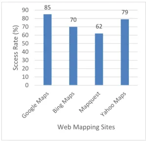
Furthermore, based on the method of calculating success rate,
the success rate of four web mapping sites has been recorded,
calculated and displayed in Figure 2.
Figure 2 Success Rate (%) for four web mapping sites
The success rate can explain the whole performance and
usability condition directly and integrally. The Figure 2
indicates that, Google maps is the most suitable for
participant to get the desirable results and can satisfy the
participants’ needs from the tasks above. And the less usable
web mapping sites is Map Quest.
3.1 Qualitative Results
The qualitative results could be gathered in the questionnaire
of pretest and posttest. And the posttest questionnaire is more
valuable for identifying the errors and defects of web
mapping sites. Participants explains their actions during the
experiment and gives visualized description of the websites.
These verbal data can be used to enhance the design of the
websites directly for designers.
4. Discussion
The research can assist us evaluate the usability of the four
web mapping sites. And the usability problems which
occurred during the experiment give the designers
suggestions and guidelines for future progress.
4.1 User Interface
0 10 20 30 40 50 60 70 80 90 100 Av e ra ge T im e Sp e n d (s )
Web Mapping Sites
Task1 Task2 Task3 Task4 Task5
85 70 62 79 0 10 20 30 40 50 60 70 80 90 Sc ce ss Rate (% )
The “start page” of web mapping sites is very important for
users, for the reason that the first impression can guide the users’ estimation for their “tasks”. In many cases, too much information in the first page would make users feel messy
and disordered, which may have a negative impact on their
operations. In research, this problems may present in Task 1.
Too many links, advertisements, and images may led to the
low effective load speed. Users may spend more time to open
the homepage, and wait for the whole information loading.
Google maps is one example that included various
information in the first page. The Yahoo Maps, however, has
less information in the first page and the layout is very clean.
Hence, for designers the design of the homepage should be
clear and simple to let the users start using the map in a short
time after entering the website page.
Moreover, the layout of the homepage should consider the user’ usual habits. Some users cannot find the search box or location button when starting attempts. Too much time when
spending on searching the button will led to the exhausted
patience. For example, Map Quest is not clear for users to
find the search box, and the “directions” and “locations” are
difficult to get. Thus, the search box that users may be used
firstly should be given an essential role in the layout. The
search boxes which designed friendly and easily to use shows
in Figure3. The two search boxes are from Map Quest and
Yahoo Maps.
Figure 3 Different Types of Search Boxes
4.2 Functionality
In a way, functionality decided the performance of one web
mapping site. All users want the web sites has a high
feedback speed, so the rapid responding speed is vital when
clicking the buttons on web mapping site. When conducting
the “back-button” cannot guide the users back to the previous page or homepage and get lost in the sites. In the verbal
questionnaire, users expect that there should be a short cut
back to the home page to avoid lost when using the website
functions such as route display, pictures of the POI and other
advanced information. Thus when linking with more
additional services (such as hotels and tourist attractions), the
web mapping sites will led to the problems above.
4.3 Search Operations
Search Operations can mainly identify usability problems
relating information queries. The search logic, default
settings and the search results have an important effect on the
using experience for users. From the posttest questionnaire,
several suggestions have been proposed. 1) The box can be
operated the search is single. Some users want to search more
than one addresses or locations, but most of web mapping sites just provide just one search box. The “directions” cannot satisfy the users’ needs, because sometimes they only want to get the spatial locations on one screen size. For example,
some participants in the experiments want to search the “White House” and the hotel at the same time. But the four websites cannot allow this operation. 2) The default
Settings also confused users sometimes. Some web mapping
sites set the first page locating at the current location such as
Bing Maps, users should change the location in USA then search the “White House” in the experiment. While some participants cannot find the “location changed” button easily. Also, some websites will change the language to the location,
and the change button is also difficult to find. These default
settings will make users feel boring when achieving their
objectives. 3) The search results may be ultimate display of
the search operation. But the display of the search results in
some web mapping sites are messy. When searching certain
location, the results are shown disordered. Take the “White House” as an example, in some websites, when finishing searching the “White House”, results from different countries displayed. Users should choose the right one from several
options. Thus, the information from the posttest questionnaire
about search operation is valuable for the designers to
The Visualization of the web mapping sites would be a
complicated element for designers. There always a gap
between the designers and the users. Some factors such as
colour and fashion are difficult to judge. Some feedbacks
from questionnaire show that visualization is restless and
awful, and the colours may be old-fashioned. Despite this,
this part is difficult to balance the needs of users and the
ideas of designers.
This discussion proposed some guidelines for designers
based on the experiments, but there still some limitations of
this experiments, such as test tasks and questionnaire.
5. Conclusion
The usability evaluation studies are popular nowadays. In this
paper, the experiment aimed at identifying usability problems
and providing suggestions for designers. The problems and
advices were proposed on the aspects of User Interface,
functionality, search operations and visualization to enhance
the performance of the websites.
REFERENCE
Annu-Maaria Nivala., 2008, Usability Evaluation of Web
Mapping Sites. The Cartographic Journal 45 (2), pp.129-138
Bing Maps., 2014, online at:
http://cn.bing.com/maps/
Google Maps., 2014, online at: https://maps.google.com/ ISO 13407(1999) ‘Human-Centered Design for Interactive System’, International Organisation for Standardisation, Geneva, Switzerland.Map Quest., 2014, online at:
http://www.mapquest.com/
Nielsen, J., 1994, Guerilla HCI: Using Discount UsabilityEngineering to Penetrate the Inimidation Barrier.
Http://www.useit.com/papers/guerilla_hci.html
Nielsen.J., 2001, Success Rate: The simplest usability Metric.
Http://www.useit.com/alertbox/20010218.html