Reply on the Comments on
When is Statistical Significance not Significant?
*Dalson B. Figueiredo Filho
Universidade Federal de Pernambuco, BrazilEnivaldo C. da Rocha
Universidade Federal de Pernambuco, Brazil
Mariana Batista
Universidade Federal de Pernambuco, Brazil
Ranulfo Paranhos
Universidade Federal de Alagoas, Brazil
José Alexandre da Silva Jr.
Universidade Federal de Alagoas, Brazil(SILVA, Glauco P. GUARNIERI, Fernando H. Comments on When is Statistical
Significance not Significant? Brazilian Political Science Review. Vol.8, Nº 02, 2014)
t is very rewarding for us to receive a serious commentary on "When is
Statistical Significance not Significant?". We are pleased with Silva and
Guarnieri's (2014) remarks and we believe that they generally agree with us.
However, their review makes it clear that some points were left behind. The
principal aim of this paper is to answer Silva and Guarnieri's (2014) comments on
(*)http://dx.doi.org/10.1590/1981-38212014000100024
The replication dataset can be found in bpsr.org.br/files/arquivos/Banco_Dados_Figueiredo et al.html. We are grateful for the Berkeley Initiative for Transparency in Social Science (BITSS) and thankful to Anderson Silva, Gauss Cordeiro, Ernani Carvalho and Marcelo
Figueiredo Filho et al. (2013). Methodologically, we use both observational and
simulation data to defend our view on the proper use of the p-value statistic in
empirical research.
(1) Scholars must always graphically analyze their data before interpreting the p-value
In many cases, as pointed out by Silva and Guarnieri (2014), graphical
analysis cannot help you. That being said, ignoring graphs is a much worse path to
trail. Graphical analysis is a powerful tool not only for examining linear
relationships but also to identify exponential, quadratic, and cubic relationships.
Additionally, graphical analysis can be applied to more descriptive goals
not related to the presence of covariates or model selection. We simulated an
independent t test comparison between the heights of men and women. For both
groups the distribution is normal. Men have an average of 1.75m with a standard
deviation of .15. Women have an average of 1.60m with a standard deviation of .10.
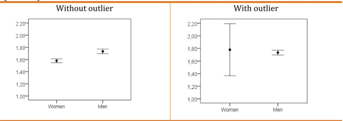
Figure 1 illustrates the data.
Figure 1. Error bar for the height for men and women without and with outlier
(n = 100)
Without outlier With outlier
Source: Banco_Dados_Figueiredo et al.
When there is no outlier, as long that there is no overlap between
confidence intervals, we may conclude that men are taller than women in the
population. The mean difference between groups is statistically significant
(p-value<.001). However, in the outlier example we observe an increase in women
clear that if scholars only evaluate the p-value, they would wrongly conclude that
there is no difference between the height of men and women within the population
when in fact there is.
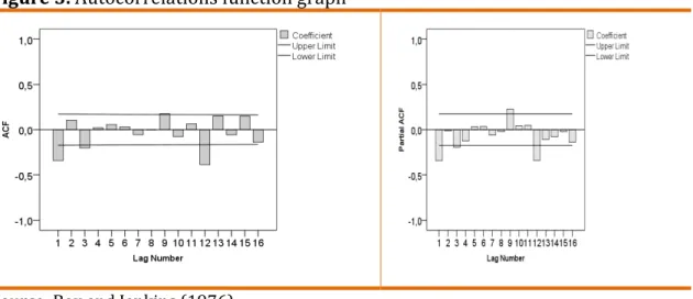
In some specific areas of Statistics, graphs are a fundamental step of the
scientific initiative. The selection of the appropriate specification in time series
analysis depends heavily on graphs. Let us examine data from Box and Jenkins
(1976)1.
Figure 2. Monthly total airline passengers from 1949 to 1960
Source: Box and Jenkins (1976).
We observe strong seasonality, tendency and increasing variance over
time. We must graphically examine the original distribution of the variables before
choosing the appropriate model.
Figure 3. Autocorrelations function graph
Source: Box and Jenkins (1976).
Using both graphical analysis and adjustment measures, we define the
model order that best fits the data. In this case SARIMA (0,1,1) (0,1,1). Graphical
analysis is at the heart of all statistical analysis.
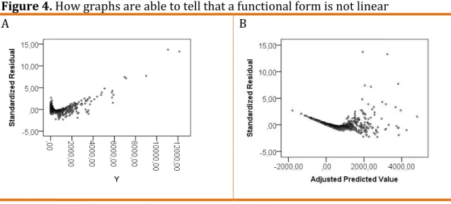
Now let us deal directly with Silva and Guarnieri's (2014) example
regarding Taagepera's (2012) experiment. They argue that "a simulation of this
data shows that the graphical evaluation would not be enough to avoid a
misguided analysis" (SILVA AND GUARNIERI, 2014, p. 02). We disagree. To make
our case we simulated a table of values of y, x1, x2 and x3 following Taagepera
(2012). All values are random and the y value came from = � � /� . The next
step is to fit a linear model to explain the variance of y and graphically analyze the
residuals. Figure 4 displays this information.
Figure 4. How graphs are able to tell that a functional form is not linear
A B
Source: Banco_Dados_Figueiredo et al.
Graphical examination of the standardized residuals and predicted values
shows that the relationship is not linear. Graphical analysis reveals that the linear
function is not appropriate to model y. We should never adjust regression models
without relying on residuals inspection. Silva and Guarnieri (2014) also argue that
theory should inform the adequate functional form. We completely agree with
them on this. However, sometimes data defies theoretical expectations and at
times we do not have strong theoretical assumptions to follow. In the total absence
of theoretical guidance, graphical analysis can help scholars in a more inductive
Finally, modern graphical and statistical tools are very important to data
analysis and there is no point in avoiding them. Theory and statisticaltools should
be applied together in order to advance scientific knowledge. We are not arguing
that graphical analysis is helpful at all times. Graphs can be tricky, but ignoring
them is way more dangerous.
(2) It is pointless to estimate the p-value for non-random samples
Silva and Guarnieri (2014) argue that the p-value is a measure to adjust a
model to our data (SILVA AND GUARNIERI, 2014, p. 03). We disagree. Examples of
model adjustment statistics are: r2, adjusted r2, pseudo r2, log likelihood, etc. The
p-value is the probability of encountering the observed p-value of the test-statistic or
more extreme departure from the null hypothesis when the null hypothesis is true
(EVERITT and SKRONDAL, 2010).
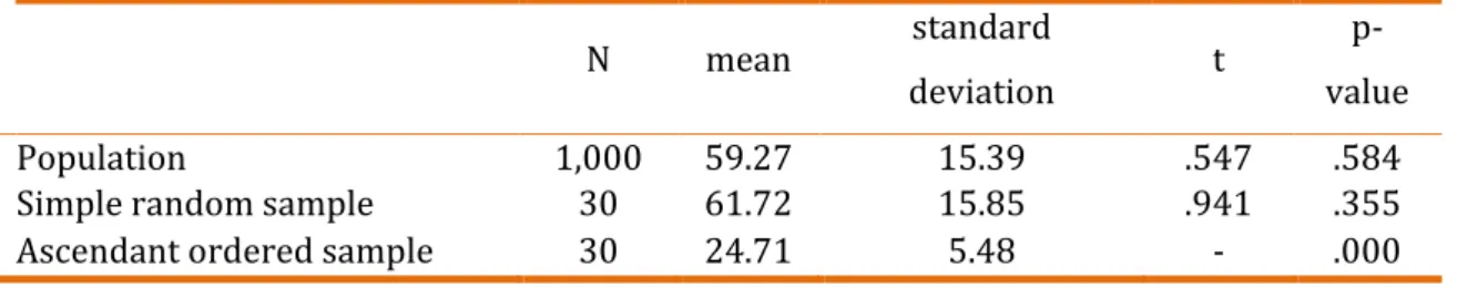
The main problem in estimating p-values for non-random samples is the
tendency to overestimate/underestimate the t statistic. In order to show this we
simulated a population with 1,000 observations, mean of 59 years (Enivaldo's age)
and standard deviation of 16 years (Dalson's age divided by 2). We then selected
an ascendant ordered sample of the first 30 cases. Finally, we selected a simple
random sample with the same size and compared the samples mean with the
population mean. The table 1 summarizes the mean comparison.
Table 1. Simulation (test value = 59)
N mean standard
deviation t
p-value
Population 1,000 59.27 15.39 .547 .584
Simple random sample 30 61.72 15.85 .941 .355
Ascendant ordered sample 30 24.71 5.48
-34.270
.000
Source: Banco_Dados_Figueiredo et al.
When the sample is random with only 30 observations we get pretty close
to the population parameter (59). So close that we cannot reject the null
hypothesis (p-value = .355). We also observe that the p-value estimated from the
illustrates why we should avoid interpreting the p-value when dealing with
population data. Finally, when we examine the ascendant ordered sample, the
p-value leads us to reject H0 when we should not (p-value<.001). For the
non-random sample we underestimate both the true mean and the standard deviation.
The interpretation of the p-value is not reliable for non-random samples.
In short, as long as we are interested in making reliable inferences about
reality we must follow the standard procedures of statistical inference. The central
limit theorem only applies to random samples. If your sample is not random then
you cannot invoke the central limit theorem and therefore both p-values and
confidence intervals will be troubled.
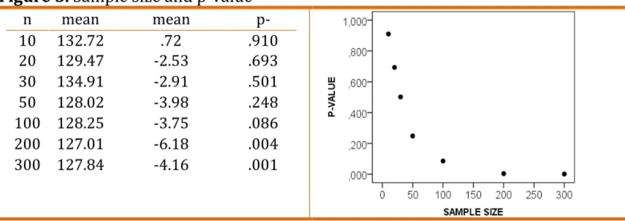
(3) The p-value is highly affected by the sample size
Silva and Guarnieri (2014) argues that "the larger the sample size, the
higher the p-value" (SILVA and GUARNIERI, 2014, pp. 03-04). The p-value is highly
affected by the sample size since the number of cases goes into the denominator.
However, the larger the sample size, the lower the p-value goes, and not higher as
pointed out by our reviewers. To show the impact of sample size on statistical
significance we simulated a random variable with a mean of 128 and a standard
deviation of 24. We then tested if the mean differs from 132, varying the sample
size from 10 to 300. Figure 5 summarizes this information.
Figure 5. Sample size and p-value
n mean mean
difference
p-value
10 132.72 .72 .910
20 129.47 -2.53 .693
30 134.91 -2.91 .501
50 128.02 -3.98 .248
100 128.25 -3.75 .086
200 127.01 -6.18 .004
300 127.84 -4.16 .001
Source: Banco_Dados_Figueiredo et al.
For sample sizes from 10 to 50 the erroneous conclusion would be the
population mean. However, as long the sample size reaches 100 cases, the t test is
statistically significant at 10% level. When we reach 200 cases, the difference is
significant at 1% level. Therefore, the researcher would rightlyconclude that the
two means are different. Graphical analysis also indicates a negative relationship
between sample size and the p-value (r2 linear = .632; p-value < .05; n = 7; r2
exponential = .985; p-value < .001).
Statistical theory teaches us that estimates from small samples are much
more unstable. In addition, when the sample is small, only large effects could reach
statistical significance. One of the assumptions of the p-value is that the sample
follows a normal distribution. When the sample is small it becomes impossible to
reliably test this assumption. Therefore, when the sample is too large even trivial
effects can reach statistical significance.
Another problem associated with the interpretation of the p-value in small
samples is the outliers, since estimates from small samples are much more affected
by deviant cases. To make our case, we simulated two variables with a positive
correlation of .7 in a sample of 20 cases. Figure 6 displays this data.
Figure 6 - Simulated correlation between X and Y
A
C
B
When the sample size is small, the presence of a single outlier is
shattering. The y outlier underestimates the true level of association between X
and Y (see figure b). The x outlier affects both the magnitude and the statistical
significance of the correlation (see figure c). The conclusion would be that the
variables are statistically independent when in fact they are positively correlated.
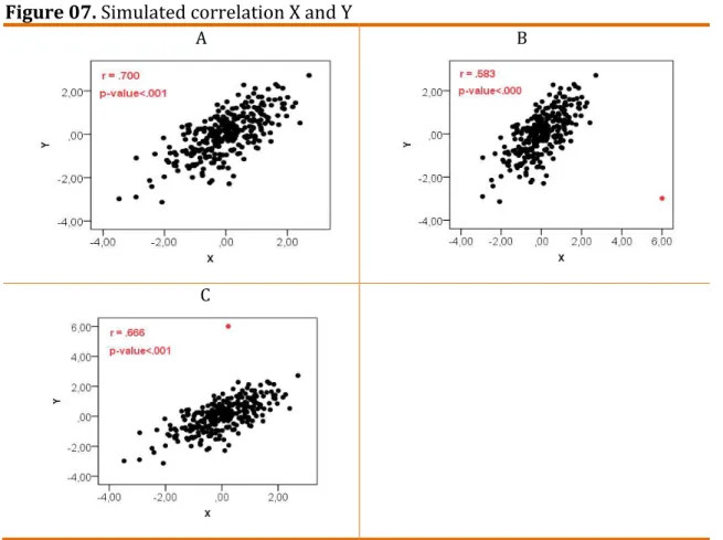
And what happens when the sample size gets bigger? Figure 7 answer this
question.
Figure 07. Simulated correlation X and Y
A B
C
Source: Banco_Dados_Figueiredo et al.
Although we observe an underestimation of the true population parameter
(.700), the sample size is enough to reduce the effect of the outlier. There is no
substantive change in the conclusions. In short, the interpretation of the value
depends on the sample size. The bigger the sample, the lower the p-value.
Extremely large samples will reach statistical significant differences/effects
(4) It is pointless to estimate the p-value when dealing with data on population
We firmly believe that measurement error is not a sufficient reason to
estimate p-values when dealing with data from population. Instead, if we were
working with a random sample there are some applications of models that
specifically deal with measurement error and treats all independent variables as
random variables. We believe that p-values cannot reflect the variables
measurement quality. The majority of Political Science research is based on
samples. However, we are not interested in the sample per se. We are interested in
samples insofar as they can help us understand the population. This is the logic
behind all statistical inference. The main implication of using samples to learn
about population is that we always have some degree of uncertainty. If you are
working with the population there is no uncertainty. Therefore, there is no need to
estimate the p-value.
General considerations
According to Greenland and Poole (2013) p-values are here to stay.
Therefore, it is important to get their interpretation right. Statistical inference
depends upon working with a random sample selected from a specific population.
Non-random samples tend to produce biased inferences. Scholars from different
areas must abandon hypothesis testing based on population. The great advantage
of statistics is to estimate the quantity of unknown information (population) based
on what we know (sample) with parsimony, low cost, low time and, evidently, with
some uncertainty. On the other hand, if you already know all the elements of your
population there is no unknown information to be estimated. There is no
estimation in the population. We truly appreciate Silva and Guarnieri's (2014)
comments. We believe that science is a collective enterprise that can only thrive
through the efforts of its members. With this reply we hope to advance the debate
on statistical significance in Political Science.
Revised by Paulo Scarpa
References
BOX, G. E. P.; JENKINS, G. M. (1976). Time series analysis forecasting and control. San Francisco: Holden-Say.
EVERITT, B. S. and SKRONDAL, A. (2010), The Cambridge dictionary of statistics, Cambridge University Press.
FIGUEIREDO FILHO, D. B.; PARANHOS, R.; ROCHA, E. C. da; SILVA, M. B.; SILVA JUNIOR, J. A.; SANTOS, M. L. and MARINO, J. G. (2013), When is statistical
significance is not significant? . Brazilian Political Science Review, Vol. 07, pp. 31-55.
GREENLAND, S. and POOLE, C. (2013), Living with p values: resurrecting a Bayesian perspective on frequentist statistics. Epidemiology. Vol. 24, Nº 01, pp. 62-68.
SILVA, G. and GUARNIERI, F. (2014), Comments on When is Statistical Significance not Significant. Brazilian Political Science Review. Vol. 08, Nº 02, pp. 129-132.