Gonçalo Lopes Ferreira
Licenciado em Ciências da Engenharia e Gestão Industrial
User
-
Centered Design of the Interface
Prototype of a Business Intelligence
Mobile Application
Dissertação para obtenção do Grau de Mestre em Engenharia e Gestão Industrial
Orientadora: Professora Doutora Isabel Lopes Nunes,
Professora Auxiliar, Faculdade de Ciências e Tecnologia
da Universidade Nova de Lisboa
Júri:
Presidente: Prof. Doutor Virgílio António Cruz Machado
Arguente: Prof. Doutor Nuno Manuel Robalo Correia
Vogais: Prof. Doutora Isabel Maria Nascimento Lopes Nunes
Engº Bruno Miguéns Mourão
User-Centered Design of the Interface Prototype of a Business Intelligence Mobile Application
Gonçalo Lopes Ferreira
Licenciado em Ciências da Engenharia e Gestão Industrial
Dissertação para obtenção do Grau de Mestre em Engenharia e Gestão Industrial
Orientadora: Professora Doutora Isabel Lopes Nunes, Professora Auxiliar, Faculdade de Ciências e Tecnologia da Universidade Nova de Lisboa
User-centered design of the interface prototype of a business intelligence mobile application
Copyright © Gonçalo Lopes Ferreira, FCT/UNL e UNL
Acknowledgments
To my dissertation advisor, Professor Doctor Isabel Lopes Nunes, for the availability, encouragement, support, text reviews and for always pointing me in the right direction.
To my internship advisors, Bruno Mourão and João Ferreira for all the help, knowledge, advice, commitment and availability.
To everyone at the office: Sofia, José, Daniela, Rita, Inês Torres, Inês Dias, Mariana, Hugo, Vanessa and Pedro for the help and for making me feel like a part of the team.
To the users and participants of the research process: Miguel Andrade, Luís Tomás, Vítor Santos, Paulo Nazaré and José Grilo for their availability and interest in helping this dissertation reach its goals.
To Alfredo Rodrigues, for the interest in making this dissertation possible. To Professor Doctor Rui Rodrigues, for his wise words and for believing in me. To Joana, for the support, faith, kindness and joy.
To my college friends, The AVC: Coelho, Diogo, DJ, Gus, Johnny, Nakata, Rato, Salgado and Zé for the moral support and all the good times spent together in these last few years.
To my family for all the love, kindness and support.
“
Everybody is a genius.
But if you judge a fish by its ability to climb a tree,
it will live its whole life
believing that it is stupid”
Abstract
In a society in constant technological evolution, companies try to equip themselves with tools that allow them to achieve, or maintain, the leadership position in the markets in which they compete in. Success often lies in the ability to exploit the existent Business Intelligence (BI) in the best possible way. Moreover, mobile devices such as smartphones and tablets assume themselves as elements with an increasingly preponderant use in the everyday life. In the convergence of these two factors, emerges the need to develop mobile “management facilitators”, capable of providing companies’ workers the access to BI, anywhere and at a few touches distance. To make this possible, not only does the correct information needs to be selected, but also organized and presented in a highly intuitive and easy to use way.
It’s in this context that the work present in this dissertation emerges: User-Centered Design of the interface prototype of a Business Intelligence mobile application for a company in the retail industry. Thus, the goal of this dissertation resides in the development of an adequate interface, through the continuous interaction with a group of representative users in activities such as users’ needs assessment, interface design, heuristic evaluation and usability tests.
From meetings with the users, 29 needs were identified for the BI application. These needs were later converted into functional requirements which originated two prototypes, one for smartphones and the other for tablets. These were subjected to a heuristic evaluation and tested through the application of the Cognitive Walkthrough method to representative users, to collect performance and satisfaction metrics.
It was concluded that the designed interfaces were in accordance with 14 of the 16 heuristics, which led to three modifications on the interfaces. The Cognitive Walkthrough results showed that the interfaces are intuitive since all the tasks were completed with 100% success, in reasonable times and with a number of actions close to the ideal.
Keywords: User-Centered Design; Cognitive Walkthrough; Heuristic Evaluation; Prototype;
Resumo
Numa sociedade em constante evolução tecnológica, as empresas tentam munir-se de ferramentas que lhes permitam atingir, ou manter, a liderança nos mercados nos quais competem. O sucesso muitas vezes reside na capacidade de explorar da melhor forma a informação de gestão existente. Por outro lado, equipamentos móveis como smartphones e tablets assumem-se como elementos de uso cada vez mais preponderante no quotidiano. Na convergência destes dois fatores, surge a necessidade de desenvolver “facilitadores de gestão” móveis, que disponibilizem aos trabalhadores das empresas o acesso a Business Intelligence em qualquer lado e à distância de poucos toques. Para tal, não só é necessário selecionar a informação correta mas também organizá-la e apresentá-la de uma forma altamente intuitiva e de fácil utilização.
É neste contexto que surge o trabalho desenvolvido nesta dissertação: User-Centered Design de um protótipo da interface de uma aplicação móvel de Business Intelligence para uma empresa da indústria do retalho. Assim, esta dissertação tem como objetivo o desenvolvimento de uma interface adequada, através da constante interação com um grupo de utilizadores representativos do público-alvo em atividades como o levantamento de necessidades, desenho de interfaces, avaliação heurística e testes de usabilidade.
Em reuniões com os utilizadores foram identificadas 29 necessidades para a aplicação móvel de BI. As necessidades foram posteriormente convertidas em requisitos funcionais que por sua vez originaram dois protótipos, um para smartphone e outro para tablet. Estes foram submetidos a uma avaliação heurística e testados através da aplicação do método Cognitive Walkthrough a utilizadores representativos de modo a recolher métricas de performance e satisfação.
Concluiu-se que as interfaces desenhadas estavam em conformidade com 14 das 16 heurísticas, o que levou a três modificações nas interfaces. Os resultados do Cognitive Walkthrough mostraram que as interfaces são intuitivas visto que todas as tarefas foram concluídas com 100% de sucesso, em tempos razoáveis e com um número de ações próximo do ideal.
Table of Contents
1. Introduction ... 1
1.1. Context ... 1
1.2. Objectives ... 2
1.3. Methodology ... 3
1.4. Structure of the dissertation ... 4
2. Literature review ... 7
2.1 Business intelligence ... 7
2.2 Mobile business intelligence ... 8
2.3 User-centered design ... 8
2.4 Usability testing ... 12
3. Interface prototypes development ... 19
3.1. User’s needs assessment ... 19
3.2. System functional requirements definition ... 22
3.3. Preparations for the interface design ... 30
3.4. Interface design ... 37
4. Usability evaluation and testing ... 53
4.1. Interface simulator creation ... 53
4.2. Heuristic evaluation ... 54
4.3. Cognitive walkthrough ... 65
4.4. Analysis and discussion of results ... 74
5. Conclusions and suggestions for future work ... 87
5.1. Conclusions ... 87
5.2. Future work ... 89
References ... 91
Appendices ... 97
Appendix A –Overview of the process: From the user’s needs to the interface design . 99 Appendix B - Gantt chart of the User-Centered Design activities ... 103
Appendix C - Questionnaire handed to the Cognitive Walkthrough participants ... 107
List of Figures
Figure 1.1 – BI application development methodology overview. ... 3
Figure 2.1 – The activities of the UCD according to ISO 13407 (1999). ... 9
Figure 3.1 – Seven users raised 29 needs. ... 20
Figure 3.2 –User’s needs prioritization criteria. ... 23
Figure 3.3 –Final prioritization of the user’s needs. ... 23
Figure 3.4 – Outcome of the final meeting. ... 29
Figure 3.5 – The two approaches of prototyping (adapted from (Nielsen, 1993)). ... 32
Figure 3.6 – Comparison between iOS segmented control and Android drop-down menu. ... 34
Figure 3.7 – Similarities between Facebook on iOS and Android. ... 35
Figure 3.8 – Tablet preferred orientation in finance and business applications advertising (adapted from (Park, 2011)). ... 36
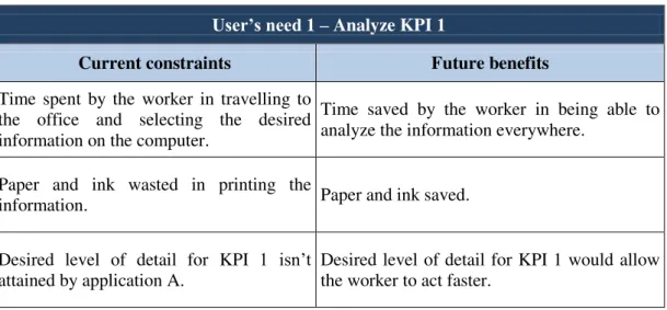
Figure 3.9 –“Login” screen comparison between the smartphone and tablet interfaces. ... 38
Figure 3.10 –“Home” screen comparison between the smartphone and tablet interfaces. ... 38
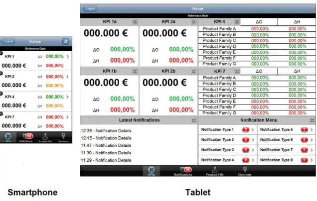
Figure 3.11 – Navigation between the "Home" and the "KPI 1" screens in the smartphone interface. ... 40
Figure 3.12 –“KPI 1a” screen comparison between the smartphone and tablet interfaces. ... 40
Figure 3.13 – Several sidebar design versions. ... 42
Figure 3.14 – Expanding the KPI sidebar... 43
Figure 3.15 –Connection between the “KPI 1a” and the “KPI 1a Chart” screens in the smartphone interface. ... 43
Figure 3.16 –Navigation in the “KPI 1a Chart” screen. ... 44
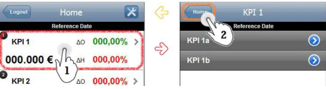
Figure 3.17 –“Notifications Menu” screen comparison between the smartphone and tablet interfaces. ... 45
Figure 3.18 – "Clear" button functionality. ... 46
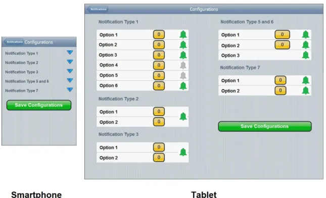
Figure 3.19 –Notifications “Configuration” screen comparison between the smartphone and tablet interfaces. ... 47
Figure 3.20 – Spinner popup to select the desired option. ... 48
Figure 3.21 – Saving notifications configurations. ... 48
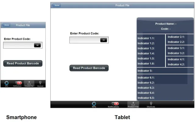
Figure 3.22 –“Product File” screen comparison between the smartphone and tablet interfaces. .. 49
Figure 3.23 – Both ways to access the product file. ... 49
Figure 3.24 –“Shortcuts” screen comparison between the smartphone and tablet interfaces. ... 50
Figure 3.25 – Logout confirmation. ... 51
Figure 3.26 – Six user's needs originated the design of 199 screens. ... 51
Figure 4.1 – Interface simulation using PowerPoint. ... 53
Figure 4.2 – "Configurations Saved" notification ... 56
Figure 4.3 – Animation indicating that the refreshing is in process. ... 56
Figure 4.4 – Example of an attempt to reduce users' memory load. ... 58
Figure 4.5 –“Product Not Found” error message. ... 60
Figure 4.6 – Three different sizes for touchable targets (adapted from (Microsoft, 2012)). ... 62
Figure 4.7 – Target and space sizes in a critical area of the smartphone interface. ... 62
Figure 4.8 – Icons used in the interfaces. ... 63
Figure 4.9 – New version for the tab icons... 64
Figure 4.10 – "Magnifying Glass" icon modification. ... 64
Figure 4.12 – A participant performing the Cognitive Walkthrough on the smartphone interface
prototype simulation. ... 74
Figure 4.13 – Task time results for the tablet (a) and the smartphone (b) prototypes. ... 76
Figure 4.14 – Errors results (number of errors) for the tablet (a) and the smartphone (b) prototypes. ... 78
Figure 4.15 – Errors results (participants who made errors) for the tablet (a) and the smartphone (b) prototypes. ... 78
Figure 4.16 – Reason for the high number of "Type B" errors on task 6. ... 79
Figure 4.17 – Tab bar of the smartphone interface. ... 79
Figure 4.18 – Initial version of the method to access charts. ... 80
Figure 4.19 – Second version of the method to access charts. ... 81
Figure 4.20 – Efficiency results for the tablet (a) and the smartphone (b) prototypes. ... 81
Figure 4.21 – ASQ results for the tablet (a) and the smartphone (b) prototypes. ... 83
Figure 4.22 – SUM results for the tablet and the smartphone prototypes. ... 84
Figure C.1 – Page 1 (Personal data) of the questionnaire handed to the Cognitive Walkthrough participants. ... 109
Figure C.2 – Pages 2 to 7 (ASQ) of the questionnaire handed to the Cognitive Walkthrough participants. ... 109
List of Tables
Table 3.1 –Fraction of the organized list of collected user’s needs. ... 21
Table 3.2 – List of currently used BI applications and the KPIs accessible from them. ... 22
Table 3.3 – Current constraints vs. future benefits analysis for user’s need 1. ... 25
Table 3.4 –Current constraints vs. future benefits analysis for user’s need 11. ... 25
Table 3.5 –Current constraints vs. future benefits analysis for user’s need 19. ... 26
Table 3.6 –Converting user’s need 1 into system functional requirements. ... 27
Table 4.1 – List of heuristics and guidelines used in the evaluation of the interface. ... 55
Table 4.2 – Common usability study scenarios and the appropriate metrics to collect in each case (adapted from (Tullis & Albert, 2008)). ... 68
Table 4.3 – Testing results example (Participant 7). ... 75
Table 4.4 – Task time results for the tablet and the smartphone prototypes. ... 76
Table 4.5 – SUS results for the tablet and the smartphone prototypes. ... 85
Table D.1 – Testing results of participant 1. ... 113
Table D.2 – Testing results of participant 2. ... 113
Table D.3 – Testing results of participant 3. ... 114
Table D.4 – Testing results of participant 4. ... 114
Table D.5 – Testing results of participant 5. ... 115
Table D.6 – Testing results of participant 6. ... 115
Table D.7 – Testing results of participant 7. ... 116
List of Abbreviations
ASQ After-Scenario Questionnaire BI Business Intelligence
EDA Enterprise Digital Assistant GUI Graphical User Interface KPI Key Performance Indicator
OS Operating System
SUM Single Usability Metric SUS System Usability Scale UCD User-Centered Design
1.
Introduction
1.1.
Context
Nowadays, mobile devices such as smartphones and tablets have an increasingly important role in society. All around the world, people are trading in their old mobile phones in favor of brand new smartphones. According to a recent report, the number of smartphones being used worldwide exceeded the 1 billion mark for the first time ever (Five Star Equities, 2012). This pattern can be observed in Portugal as well. In the first quarter of 2012, 307 thousand smartphones have been sold, which means a sales growth of 40% compared with the same period of 2011 (Fernandes, 2012). Tablets are also finding their place in people’s lives. Recent studies reveal that worldwide tablet sales are predicted to rise to 165.9 million units in 2013 (IDC, 2012). Once again, Portugal follows this trend. Total tablet sales in Portugal were estimated to reach 220 thousand units at the end of 2012 and 320 thousand in 2013. However, despite this growth, the volume sold in the Portuguese market is much smaller when compared to other countries with a similar amount of inhabitants (Dinheiro Vivo, 2012). The numbers speak for themselves and the natural trend is for the number of people who own smartphones and tablets to keep rising.
Aside from personal use, these devices are ideal for increasing the productivity of multi-tasking business professionals (Kavan, 2011). With this in mind, it is not a surprise that companies often adapt the way they work, to take advantage of these technologies hoping the transition would increase their revenues. Smartphones have been playing a key role in industries such as the military, logistics, manufacturing, distribution, retail, and many others. For instance, in the retail industry, smartphones and tablets are being used by companies in activities such as barcode changing, order processing, stock location, supply chain management and communication improvement (Roche, 2012).
All of these tasks are easier to accomplish due to the incorporation of smartphones and tablets in the companies way of working, which results in an increase in employee productivity while also helping them achieve higher efficiency levels (Roche, 2012).
Having usability in consideration in every stage of product development is essential to obtain an easy to use product, capable of improving the user’s productivity. However, when it comes to multitouch interfaces such as smartphones and tablets, there isn’t much body of knowledge approaching this matter, perhaps due to the young nature of the devices. Despite this situation, there is a vast literature regarding guidelines and good practices for usability, which, coupled with the guidelines provided by the creators of smartphones and tablets operating systems (OS) can somewhat ensure usability for touch and multitouch systems (Simões-Marques & Nunes, 2012). It’s in this context that the opportunity presented in this dissertation appeared. A retail company decided that the prospect of providing their store managers a solution that would grant them mobility while working was very appealing and seemed like an achievable project. The referred profession requires people to be in constant motion, moving between their office and other parts of their working place. However, they are currently forced to be at a specific place such as their office in order to access data necessary for them to make decisions, thus the importance of developing a mobile Business Intelligence (BI) application.
The choice for materializing this concept fell on touchscreen systems, because they’re more suited for information retrieval rather than data entry (Meredith, 2008) and also because of their intuitive, easy to use and flexible nature (Simões-Marques & Nunes, 2012) ideal for the type of user role in question.
1.2.
Objectives
The main goal of this dissertation is the development, evaluation and testing of two interface prototypes, one for smartphones and the other for tablets, of a mobile touchscreen BI application for store managers at a retail company. The interface prototypes intend to provide developers with a good base upon which they can create the interface of the real BI application. The application should be capable of granting the company’s store managers mobility, while giving them access to management information to assist them in making decisions and also the means to detect problems and inefficiencies in the production process. By doing such, it is expected an increase in the users’ productivity as well as improvements in their working method.
Both interface prototypes should be developed according to the user’s needs, take advantage of the standard mobile devices capabilities, such as animations, transitions and navigation; and ultimately become the foundation of the real BI application.
1.3.
Methodology
The methodology to develop the BI application followed a User-Centered Design (UCD) approach and consisted of four main phases: user’s needs assessment, system functional requirements definition, interface prototypes development and usability evaluation and testing. Each phase encompassed various activities. Their length ranged from only a few hours to more than a month. The four phases, as well as the main activities contained in them, are depicted in Figure 1.1.
Figure 1.1 – BI application development methodology overview.
Phase 1, as the name suggests, involved knowing the target user as well as its needs (through individual interviews and work environment observation). At this point the users were also asked about:
What is the most important information subject of a daily analysis;
Which applications are accessed in order to retrieve the most important information.
This phase ended with the listing of all the needs collected from the interviews.
served to discuss and reach an agreement on the information and functionalities to be included on the application.
In phase 3, the design of both the smartphone and the tablet interfaces took place. Before actually designing the interfaces, a market research of similar applications was done to gain inspiration and also some knowledge on the matter. These interfaces designs were based on usability principles as well as guidelines provided by the OS’ developers such as Android™ and Apple®
that provide step-by-step tutorials on how to develop good applications for their systems.
The fourth and final phase refers to usability evaluation and testing. Firstly, a simulation of the interfaces was created. Then both prototypes were evaluated according to usability heuristics and a group of participants were asked to take part in a Cognitive Walkthrough, where they were presented a number of tasks and tried to complete them on the interface prototypes. Finally, the results of the tests were processed and analyzed with the purpose of improving the interfaces design. Being a product intended to serve professional needs, it’s extremely important to have a good usability and thus, to be easy to use.
The overview of the all the steps in the process between collecting the user’s needs and designing the interfaces, as well as the Gantt chart representing all the UCD activities, are both presented in the appendices section (appendices A and B, respectively).
1.4.
Structure of the dissertation
This dissertation is organized in five chapters which will be briefly described next.
The first chapter, of introductory nature, contextualizes the reader in the expanding world of smartphones and tablets and their growing usage in the industrial environment, lists the objectives of the dissertation and explains in a very concise way the methodology used to achieve the objectives.
The second chapter presents the literature review. The main concepts present in the dissertation such as Business Intelligence and User-Centered Design are explained and their importance is illustrated with several examples found on the literature.
The third and fourth chapters describe all the UCD activities that took place in order to accomplish this dissertation’s objectives. Both chapters are structured in a way that reflects the order in which the activities were executed.
they were “converted” into functional requirements. It also provides an analysis of the currently used applications. Furthermore, many screens representing the different sections of the application are displayed along with detailed explanations of the factors that contributed to their design. The fourth chapter approaches the last phase of development which comprises the heuristic evaluation and the usability testing of the prototypes. Concerning the first, it describes the criteria behind selecting appropriate heuristics to evaluate the prototypes and shows the results from such evaluation. Regarding the second, it lists the metrics collected from the tests and describes how the tests took place. Finally the results from the tests are analyzed and some modifications done to the interfaces in accordance with the results.
2.
Literature review
In the ever-changing retail industry, companies need to be constantly adapting themselves to consumer demand and use all the tools at their disposal to increase their competitiveness and the efficiency of their operations in order to boost their revenue. Retailers have a massive amount of information on their hands and sometimes it becomes hard to keep track of what is important and valuable (MicroStrategy, 2007). One common challenge that retailers face is the availability of the right information, at the right place and at the right time (Moinuddin, 2006). The line between success and failure sometimes lies in finding the correct way to harness such information, and use it to the company’s advantage.
2.1
Business intelligence
Given the constant need for computer systems that support the analysis of large amounts of data from various perspectives, containing current and historical data, as well as the integration of the data from several operational systems, it emerged in the 80s the concept of Business Intelligence (Gonçalves, Santos, & Cruz, 2011). As a term, BI replaced decision support, executive information systems, and management information systems (Thomsen, 2003). BI systems provide actionable information delivered at the right time, at the right location and in the right form to assist decision makers in making accurate business decisions (Nagash, 2004).
To this extent, it’s natural that retail companies set their sights on solutions that provide them the ability to easily access the most important and critical information in a clean and organized way. The implementation of BI applications can be found in many industries. The following paragraphs describe some examples of the implementation of BI solutions across a variety of industries. For example, the Credit Information Bureau, a department of the State Bank of Pakistan implemented BI applications in order to be able to provide fast, dynamic and accurate analysis on individual or group borrowers (Nadeem & Jaffri, 2004).
A different study, proposes the implementation of a BI system in factories’ shop floor in order to organize the large quantities of data it generates. This study aims to aid managers in decision-making, thereby enhancing the company’s competitiveness. To that extent, a prototype (with simulated data) was developed to test the viability of that proposal and it was concluded that the flexibility of the system would provide managers with a good support for decision making in search for better results (Fortulan & Filho, 2005).
allow small and medium-sized enterprises to take advantage of better information that enables them to run their businesses more efficiently (Vai, 2010).
In the health care industry, an attempt was made to develop and implement a BI solution to analyze the quality of life of patients with primary hyperhidrosis, before and after undergoing a video-assisted thoracic simpaticectomia. The study concluded that the implementation of a BI solution in this field improved the analysis of the alterations in the patients’ quality of life by allowing a better understanding of several factors (Gonçalves, Santos, & Cruz, 2011).
Another recent study intended to develop a BI solution for Portugal’s intelligent transportation system that would support the companies’ top management decisions. The authors of the study concluded that the use of the proposed BI solution would help decision makers in the transportation sector (Sampaio, et al., 2011).
2.2
Mobile business intelligence
As seen, the importance of BI is evident in the various industries, with companies seeking better ways to use the available information to their advantage. In addition, the shift from a wired to a wireless world of connectivity has placed handheld devices like smartphones and tablets on the center of a new era of mobile computing (Ramakrishnan, 2008). The idea of convergence between BI and mobility is obvious within this context (Airinei & Homocianu, 2010) with executives and information consumers starting to realize that they can easily and effectively analyze the same information on their smartphone and tablet devices as they did on their desktop computer or laptop in their office. The advantages of consuming mobile BI being that informed decisions can be made in the field in real time, instead of being delayed until a later date (Capgemini, 2011). A recent study, assessing the current state of mobile BI as well as its future, states that mid-sized BI vendors are presenting advanced, yet very usable mobile BI solutions. All of these solutions support the iOS® platform, 90% support Android, 50% support BlackBerry® and approximately 30% support Windows® (Tabbitt, 2013).
Therefore, companies are focusing their attentions on these devices as a way to equip their employees with tools capable of increasing their productivity. A market study, assessing the changes regarding mobile BI in many industries, has verified that 68% of the companies consider the existence of mobile BI as “critical” or “very important” (Dresner, 2011).
2.3
User-centered design
Centered Design. The role of the UCD method is vital to the success of site and/or application development (Battilana, 2008).
Concerning the UCD, it is a structured methodology that involves users in all of their activities since the early stages of the development process (Nunes, 2006) and it is widely considered the key to product usability and usefulness (Mao, et al., 2005). The UCD methodology is standardized in ISO 13407 (1999), which describes the four essential UCD activities as follows:
“Understand and specify the context of use”;
“Specify the user and organizational requirements”;
“Produce design solutions”;
“Evaluate designs against requirements”.
The way these activities are connected is shown in Figure 2.1.
Figure 2.1 – The activities of the UCD according to ISO 13407 (1999).
Based on the UCD principles, a method called Schaffer-Weinschenk™ was developed to optimize user experience and performance, its steps are described as follows (Navalkar, 2004):
1. Plan the project– Identify the main activities and adequate staff and time. Establish the
extent of usability work required;
2. Evaluate the current applications– Identify potential improvements;
3. Know what the organization wants – Identify business rules and directions before
4. Know what the users want– Understand different users and their needs to help build a
solid foundation;
5. Design the structure – Ensure that users can understand what is offered, find things
quickly, and navigate efficiently;
6. Check standards – Use standards to save time, improve design quality, provide
consistency and help concentrate creativity;
7. Design screens– Create screen designs once the navigation and standard templates are in
place;
8. Support implementation– Hand over the functional specification to the implementation
team;
9. Evaluate usability – Complete a full simulation test. Maintain an ongoing process of
monitoring site performance;
10. Localize the application – Create localized versions of the design to accommodate
additional cultural contexts if required.
The following paragraphs list several examples of the importance of implementing UCD in the developments of products from various industries.
Early uses of UCD are present in the development of a Geographic Information System easier to understand, learn and use (Lanter & Essinger, 1991).
In the videogame industry, a study was performed attempting to address the challenges in game design by following UCD methods (Pagulayan, et al., 2002). The videogame industry is a good example that reflects the importance of following the UCD approach because users do not want to read manuals to play games (Kent, 2000).
More recently, in the military industry, UCD was successfully followed in the design of the graphical user interfaces (GUI) of advanced communication devices used in challenging environments (Luostarinen, et al., 2010).
In the health care industry, an attempt was made to follow the UCD approach to develop a technological platform aiming to aid diabetes’ patients in managing their disease. In this study, the user’s needs were collected through interviews and meetings, and then mockups of the platform were prepared and validated through heuristic evaluation. Finally, usability tests were carried out to find usability problems (Fico, et al., 2011).
and conducting interviews. Next, a prototype was created and usability testing was performed in the early stages before creating a fully interactive shopping window after analyzing existing similar products. (Zagel & Bodendorf, 2012).
As said before, the UCD approach can be successfully applied to products from various industries and contexts. Concerning mobile applications, a company called Digia was among the first to develop applications for smartphones. The first two applications developed by Digia to include the UCD approach were a global positioning system navigator and an image edition application. After their initial experience with the UCD approach, the company’s workers came to the conclusion that UCD practices help to ensure the product operates properly (Kangas & Kinnunen, 2005).
Regarding the development of mobile applications nowadays, they are usually linked with touchscreen technology. The use of touchscreens has grown in the past decade and it has become increasingly common to have them integrated with handheld mobile devices (Birch, 2012). A good example of designing for touchscreens can be found in public kiosks. The University of Pittsburgh has developed a public touchscreen display system for the students of its School of Information Sciences in order to provide them useful information. Its development followed the UCD approach and involved the collection of user’s needs, prototype development and usability testing (Zhang & Jeng, 2011).
Also in the context of designing for touchscreens following the UCD method, a touchscreen prototype of a point of sales application was developed. The project involved creating a set of guidelines for touchscreen point of sales applications which were later applied in the design of the application GUI (Sjöberg, 2005).
Reducing the scope of the UCD implementation to handheld mobile devices supporting touchscreen technology, a few studies can be found in the literature.
In the health care industry, the UCD approach was followed to develop a tablet application as a new method of collecting additional data for the skin cancer research from the patients in the hospital. The outcome of the project was very positive, with patients being satisfied with the application, medical professionals saving up to 90% of time and hospital managers saving money (Holzinger, et al., 2011).
There is another study which ran through the various stages of the UCD methodology in a similar manner as the one presented in this dissertation. Such study involved the development of a mobile application for the elderly tell their stories. In this study, the UCD was used to focus on the elderly’s specificities in order to develop an adequate product, easily used by them. The various stages of the UCD present in this study contained user research, user’s needs collection, low -fidelity prototypes design and also usability tests (Tenreiro, 2011).
A prime example of the importance of following the UCD methods in the development of a mobile BI application can be found in a real-world case study, in which a company was in charge of developing a mobile BI application for a major consumer products company in North America. This BI application was initially destined to the top fifty executives and vice-presidents of the company, who were seeking to gain mobile access to unit sales volume data. The application made such an impact that the company immediately decided to expand the implementation of the BI application to other business units. One of the factors responsible for such a success was the inclusion of users in the early stages of product development, with users actively participating in workshops where they could give feedback on the designs and help improving them (Capgemini, 2011).
2.4
Usability testing
One of the most important factors of the UCD approach is usability. ISO 9241-11 (1998) defines usability as the “extent to which a product can be used by specified users to achieve specified goals with effectiveness, efficiency and satisfaction in a specified context of use”. More recently, ISO/IEC 9126-1 (2000) defines usability as “the capability of the software product to be understood, learned, used and attractive to the user, when used under specified conditions”.
There are several methods that contribute to ensure the usability of a product. Most of these methods are applied in a specific phase of the development of a product (designing, prototyping, testing and evaluation) (Simões-Marques & Nunes, 2012). The importance of integrating the concept of usability in the development of products takes shape in activities such as heuristic evaluation and usability testing.
Heuristic evaluation
Heuristic evaluation was the most popular UCD approach in the 90s. However, nowadays it has become less relevant due to the growth of the mobile market and consequent departure from desktop applications (Cockton, 2013). Still, it’s an important activity in the product development cycle.
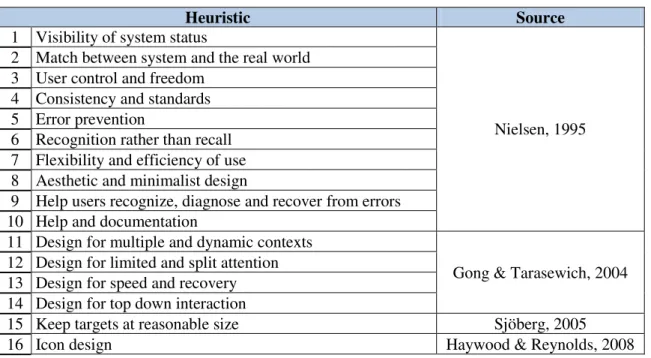
Some of the most well-known and used heuristics are the following:
Nielsen’s 10 Usability Heuristics for User Interface Design, which, as the name suggests,
consists in a set of ten general principles for interaction design (Nielsen, 1995);
Connell’s Usability Evaluation Principles, which consists in a set of thirty principles grouped into five categories (Connell, 2000);
Nielsen-Shneiderman Heuristics, which consists in a set of fourteen principles based on
Nielsen’s heuristics and Shneiderman’s golden rules (Zhang, et al., 2003);
Shneiderman’s Eight Golden Rules of Interface Design, is a set of eight principles
applicable in most interactive systems (Shneiderman & Plaisant, 2005);
Weinschenk and Barker’s classification, which consists in a list of twenty principles
collected from various sources (Sauro, 2011).
There are a lot of examples in the literature regarding the heuristic evaluation of various systems, some are depicted next.
A study, aiming to evaluate the design of a tailored system for self-care management of depressive symptoms in people living with HIV/AIDS, compared it against Nielsen’s 10 Heuristics and helped the authors find some serious usability issues (Lai, 2007).
Another study, also in the health care industry, used Nielsen-Shneiderman Heuristics to conduct a heuristic evaluation to evaluate the treatment delivery system at a hospital in Toronto, Canada; and concluded that heuristic evaluation is an efficient method that can be successfully applied to radiotherapy delivery systems to detect usability issues and improve patient safety. The heuristic evaluation resulted in the identification of 75 usability issues (Chan, et al., 2012).
Another study adapted and tailored Nielsen’s 10 Heuristics in order to evaluate a website for low-literate parents in the Neonatal Intensive Care Unit. The results from the evaluation allowed the authors to categorize and prioritize the usability problems which, in turn, eased the design of modifications to the website (Choi & Bakken, 2010).
A study, aiming to examine the evolution of security-related features of software like Microsoft® Internet Explorer® and Word®, used Nielsen’s heuristics as the basis for a summary-level
Cognitive walkthrough
While heuristic evaluation is considered an informal usability inspection technique (Choi & Bakken, 2010) and favor usability experts over representative users, in formal usability testing, representative users are observed using a site or prototype while performing a set of typical user tasks in order to achieve predefined goals (Battleson, Booth, & Weintrop, 2001). This is procedure is commonly known as Cognitive Walkthrough.
The output of the Cognitive Walkthrough can take many forms, depending on the goals of study, the product tested and the goals of the users. Concerning the goals of the study, these can either be of a formative or summative nature (Tullis & Albert, 2008).
A formative study involves periodically evaluating a product or design, identifying insufficiencies, making recommendations and improving the design according to the recommendations. This process is repeated until the product is released, ideally, close to perfection. On the other hand, a summative study involves assessing how well a released product meets its objectives and perhaps compares it to other similar products. While formative testing focuses on identifying ways of improving products before their release, summative testing aims to evaluate a product against a certain set of criteria (Tullis & Albert, 2008).
Regarding the user’s goals, depending on what they are, two main aspects of the user experience should be measured: performance and satisfaction. Performance metrics tell many things about how the user interacts with the product. It includes measuring task success, task time, the amount of effort to accomplish each task, the number of errors committed, etc. These metrics are critical for many products, especially those destined to serve professional purposes (such as company’s internal applications). On the other hand, satisfaction metrics deal with the user’s comments and thoughts about his/her experience while interacting with the product (Tullis & Albert, 2008). While performance metrics are collected throughout the usability test, satisfaction metrics can also be collected after the tasks (post-task ratings) or after the entire testing session (post-session ratings). Satisfaction metrics are self-reported and can be collected through various methods like open-ended questions or questionnaires. The methods to collect post-task ratings include the following (Tullis & Albert, 2008):
Ease of Use, which consists in a single question that asks users to rate the how easy/difficult
each task was;
After-Scenario Questionnaire, which is a set of three questions that touch the three
Expectation Measure, which consists in two questions, one answered before attempting the
task and the other after finishing it. The “before” rating is called the expectation rating while the “after” rating is called the experience rating. Both rating are then displayed in a scatterplot;
Usability Magnitude Estimation, which takes a slightly different approach on post-task
ratings. This method consists in asking participants to assign “usability values” for each task as they complete them, gradually building a “usability ruler”.
An online usability study, aiming to compare several methods of collecting post-task ratings, asked 1,131 participants to perform six tasks on a website. The results of the study showed that the pattern of the results was very similar for all methods, which wasn’t a surprise due to the large size of the sample. Then, the results of a smaller sample were analyzed and the conclusion was that the “Ease of Use” method was the most appropriate for smaller sample sizes (Tedesco & Tullis, 2006).
Regarding post-session ratings, some common techniques to collect them are the following (Tullis & Albert, 2008):
Aggregating individual task ratings, which consists in simply averaging the results of
post-task ratings;
System Usability Scale, which consists in a set of 10 statements to which participants rate
their level of agreement through a 5-point scale;
Computer System Usability Questionnaire, which is a questionnaire designed to be
administered by mail or online. It consists in a set of 19 statements to which participants rate their level of agreement. The results can be divided in four categories (system usefulness, information quality, interface quality, and overall satisfaction);
Questionnaire for User Interface Satisfaction, which consists in 27 9-point rating scales
divided into five categories (overall reaction, screen, terminology/system information, learning, and system capabilities);
Usefulness, Satisfaction, and Ease of Use Questionnaire, which consists in 30 statements
to which participants rate their level of agreement through 7-point rating scales. The statements are divided into four categories (usefulness, satisfaction, ease of use, and ease of learning);
Product Reaction Cards, which consists in presenting participants a set of 118 cards, each
An online study, intended to compare the several post-session questionnaires, measured the reactions of 123 participants while navigating in two web portals. Each participant would answer to only one questionnaire to evaluate both web portals. The authors of the study concluded that the System Usability Scale (SUS) produced the most reliable results across different sample sizes (8, 10, 12 and 14 participants) (Tullis & Stetson, 2004).
There are some examples in the literature regarding the implementation of these methods in usability testing.
An example can be found on the website of the University of Buffalo’s libraries. The website was subjected to usability testing through a set of 11 representative questions aiming to determine whether or not the libraries’ users could effectively use the website to perform specific tasks. The users’ performance and comments proved invaluable in exposing many usability problems of the site and all parties involved were impressed by the effectiveness of usability testing (Battleson, Booth, & Weintrop, 2001).
Another website usability study, involved the application of the Cognitive Walkthrough method to evaluate the interface of a website destined for children aged between 5 and 7 years old. The study consisted in comparing the tests results of the children with adults by subjecting both groups to a set of representative tasks divided into several actions. The authors of the study concluded that the combined analysis allowed the discovery of a greater number of interface design problems, making the Cognitive Walkthrough a reliable source for finding usability problems present on an interface aimed at children (Mano & Campos, 2006).
A study involved the comparison of the usability of three different mobile phones when users attempt to shop, purchase and playback music and video media files on their mobile handsets. The study consisted in subjecting users to the Cognitive Walkthrough procedure. Users were asked to perform alternatively two sets of tasks (one for purchasing media and the other to playback the purchased media). Performance metrics were collected from the tests such as the time to complete the tasks, success rates and number of attempts as well as self-reported metrics such as ease of use and satisfaction. The results were then summed through the SUM (Single Usability Metric) in order to assess which tasks had a better performance in which mobile phone (Weiss & Whitby, 2008).
3.
Interface prototypes development
The process of developing any product capable of satisfying its target user’s needs requires many steps that should be taken in a cautious, structured way. Generally, a product can only be positively accepted and used by the target user if it has usability. Ideally, usability engineering should accompany the entire lifecycle of the product, with important activities happening even before designing the actual user interface (Nielsen, 1993). The following chapter describes in great detail, every step taken in the process of developing the interface prototypes. From collecting the user’s needs and “converting” them into system functional requirements, to finding appropriate software or understanding the differences between designing for different mobile operating systems, all the details are presented. Furthermore, several screen designs are displayed along with the detailed explanation of the reasons that led to such design.
3.1.
User’s need
s assessment
Assessing the user’s needs is a vital stage of the development of every product. Collecting the user’s needs in the initial stages of the project and having them in mind throughout the entire process is crucial to obtain a product that provides good user experience (UX).
In order to develop an appropriate BI application capable of fully satisfying the user’s needs, first and foremost it’s absolutely necessary to answer two questions: “Who is going to use the product?” and “How is the product going to be used?”.
To answer the first question, there are many ways which can help in building a profile of the target user. Market analysis or observational studies are usually conducted to characterize individual users (Nielsen, 1993). However, in this particular case, the target user is already defined – store managers in a retail company. Still, it’s important to know the users’ needs and be in touch with them.
The answer for the second question comes from a great understanding of the job position, the work environment as well as all the tasks performed on a daily basis.
In order to collect the user’s needs, a sample of seven company’s store managers was selected based on their availability and also their interest in this particular subject. All the store managers were male with an average age of 43 years (ranging between 34 and 52 years) and their working experience varied from 6 to 20 years, averaging at 13 years.
working hours and in their working place. The method used for these interviews varies based on the product in development, but their goal is always to find existing or latent needs (Kraft, 2012). The purpose of these interviews was also to present users with the project goals. These are the development of a BI application able to give users mobility and the ability to assist them in the decision-making process while they are away from their desks. With this thought in mind, the users were asked a few questions in the following structured way: (1) what Key Performance Indicators (KPI) they classified as important to have with them while they’re working away from their offices, (2) which level of importance they assign to each one of those KPIs (Maximum, High or Medium), (3) what applications they currently access to retrieve the said KPIs and (4) which tasks they need to complete on a daily basis. All of their answers and additional comments were noted in paper and all the interviews ended with the promise of a second meeting, this time with all the users, in order to conclude this phase of the process.
After the interviews, the users gave a guided tour of their workplace while, at the same time, describing some tasks that usually arise on a daily basis. These tours were very important to gain a better understanding of the users’ working environment, how the application would be used and also enabled to build a good knowledge of the company’s processes. Also, empirical knowledge played an important part at this point. By observing users’ routines and procedures it was possible to confront users with eventual needs that they didn’t raise in the first place. For instance, a user that had a small notepad filled with memos was asked whether or not he felt the need for the BI application to have a feature that would ease that process, for example, a virtual notepad that would allow the user to write notes and send them via e-mail. The information noted from these tours was then added to the information collected from the interviews.
With the initial set of interviews and tours concluded, it was possible to know the users’ needs as well as understand what kind of usage would be given to the BI application in question. A total of 29 needs were collected from the seven interviewed users as shown in Figure 3.1.
Figure 3.1 – Seven users raised 29 needs.
that raised the need. This table was built with the help of software such as Microsoft Excel®. A
fraction of the table (with five examples) is presented in Table 3.1.
Table 3.1 – Fraction of the organized list of collected user’s needs.
Code User’s need description Level of importance Amount of users
1 Analyze KPI 1 Maximum 7
11 Access the information anywhere outside the workplace Maximum 5
12 Analyze KPI 8 High 3
20 Send and receive e-mails Maximum 7
26 Access the workplace’s video feed Medium 3
Having the needs organized in this structured way allows for a better future prioritization because the user’s needs could easily be arranged by different criteria such as level of importance or number of users raising each need (more on the prioritization process in subchapter 3.2).
The following step consisted in analyzing and listing the currently used BI applications in a similar organized way because a large part of this job involved analyzing KPIs which are spread across many BI applications available both on the computer and the smartphone. Such analysis is very important because users are already experienced with these applications and can point some user experience problems or simply indicate some improvement opportunities. Due to these applications’massive nature (displaying a great amount of data), they can’t simply be ported onto tablets and smartphones mainly due to screen size restrictions. This situation leads inevitably to an overhaul in terms of the interface design of the developed BI application.
At this point, the KPIs classified as important by the users (regardless of the importance level attributed to them) were crossed with the currently used BI applications. The result, as shown in Table 3.2, is the list of currently available BI applications that give access to the KPIs classified as important. The applications were classified by name, platform availability (Computer, Smartphone or EDA – Enterprise Digital Assistant) and type of KPIs accessible from them. The applications were codified as letters A to F and the indicators as numbers 1 to 10.
Table 3.2 – List of currently used BI applications and the KPIs accessible from them.
Application Name Platform Availability Key Performance Indicators
A Smartphone (iOS) KPI 1, KPI 4
B EDA KPI 3, KPI 9
C Computer (Windows) KPI 1, KPI 2, KPI 3
D Computer (Windows) KPI 6, KPI 7, KPI 8, KPI 9
E Computer (Windows) KPI 4
F Computer (Windows) KPI 1, KPI 2, KPI 3, KPI 4, KPI 5
As seen in Table 3.2, there are six applications currently used by the store managers, which contain KPIs considered important for the scope of the BI application in development. Out of these applications, two of them are considered mobile (A and B). Application A refers to a smartphone application available only for iOS (Apple mobile operating system) while application B refers to an EDA which is a mobile device similar to a Personal Digital Assistant (PDA) but with a more rugged build (Janssen, 2012). The remaining four applications are software for Windows and the users have access to them in their office’s computer. The KPIs available in all of these applications range from sales performance (KPI 1) to the size of the waiting lines (KPI 6).
Due to sharing the mobility feature with the mobile BI application in development, the currently available mobile BI applications were then subject of a more detailed analysis. This analysis intended to justify the need to develop the new mobile BI application by pointing the gaps of the available content of the current mobile BI applications. With this in mind, it’s clear that both applications A and B do not provide the access to every KPI considered important for the users (only KPI 1, 3 and 10 in application A and KPI 4 in application B are available) and so, the need to develop a new mobile BI application was completely justified and plausible.
And so, the first phase ended and it was time to prioritize the user’s needs collected at that point.
3.2.
System functional requirements definition
Number of users raising each need;
Level of importance of each need, assigned by the users (Maximum, High or Medium).
Having the needs listed in the way shown in Table 3.1 allowed to easily arrange them according to each individual criterion. This process is shown in Figure 3.2.
Figure 3.2 –User’s needs prioritization criteria.
Having two separate tables, one for each criterion, was a good way to start the prioritization process and assess the importance of each user’s need. Still, it was necessary to find a way of combining both criteria in order to have only one list of prioritized needs. The solution found was the creation of four levels of prioritization (A, B, C and D), as depicted in Figure 3.3.
Level A – User’s needs classified with a maximum level of importance, raised by at least 80% of the users (e.g. all seven users raised the need number 20, and, at the same time, classified it with maximum importance);
Level B – User’s needs classified with a maximum level of importance, raised by less than 80% of the users (e.g. four users raised the need number 16 and classified it with maximum importance);
Level C – User’s needs classified with a high level of importance, raised by any number of users and considered to be of reasonable implementation (e.g. five users raised the need number 5 and classified it with high importance);
Level D –Discarded user’s needs. Needs classified with a high/medium level of importance, raised by less than 50% of the users and considered to be of not so reasonable implementation. For instance, only three users raised need 26 and classified it with medium importance. This need refers to the ability of viewing the workplace’s closed-circuit television from the smartphone/tablet and the possible future benefits from its implementation wouldn’t be proportional to the probable high costs of implementing such functionality
As seen in Figure 3.3, the list of needs was shortened from 29 to 20 needs due to having 9 needs assigned to level D and thus, discarded. The remaining 20 needs were distributed by the other levels (nine needs in level A, four needs in level B and seven needs in level C) according to the criteria described earlier.
After having the user’s needs prioritization defined, the next step consisted in performing an analysis which placed side by side, the current constraints of not having the need satisfied by a mobile BI application available versus the future benefits of having the need satisfied by a mobile BI application.
This analysis was performed for each one of the 20 user’s needs from levels A, B and C. Such analysis is very important because the weaknesses identified in the current situation may present opportunities for future improvements (Nielsen, 1993). For example, Table 3.3 lists the current constraints of not having KPI 1 (with the desired level of detail) available on a mobile BI application as well as the future benefits of having KPI 1 available on the mobile BI application in development.
analysis. However, application A doesn’t grant KPI 1 the level of detail desired by the store managers to make a proper analysis. These are the current constraints listed in Table 3.3. On the other hand, if the mobile BI application in development was available to use, the benefits of this scenario would be that the store managers wouldn’t need to travel to their office and analyze KPI 1 on their desktop or print anything because they would be able to make the desired analysis of KPI 1 anywhere, using their smartphone/tablet.
Table 3.3 – Current constraints vs. future benefits analysis for user’s need 1. User’s need 1 – Analyze KPI 1
Current constraints Future benefits
Time spent by the worker in travelling to the office and selecting the desired information on the computer.
Time saved by the worker in being able to analyze the information everywhere.
Paper and ink wasted in printing the
information. Paper and ink saved.
Desired level of detail for KPI 1 isn’t attained by application A.
Desired level of detail for KPI 1 would allow the worker to act faster.
Because of the wide variety of current constraints and possible future benefits which arose from the several user’s needs gathered in Phase 1, one example may not be enough to completely illustrate the importance of such analysis. Therefore, two more examples regarding the analysis performed for needs 11 and 19 are presented in Table 3.4 and Table 3.5, respectively.
Table 3.4 –Current constraints vs. future benefits analysis for user’s need 11. User’s need 11 – Access the information anywhere outside the workplace
Current constraints Future benefits
Inability to access certain content/applications outside of the workplace.
Application and its content available everywhere.
Delay in the treatment of some matters. Faster acting in the treatment of some matters.
the mobile BI application were available, the store managers could access the desired content anywhere, increasing their productivity because they would act faster on the matters.
Table 3.5 –Current constraints vs. future benefits analysis for user’s need 19. User’s need 19 – Register notes and send them by e-mail
Current constraints Future benefits
Time spent in manually taking notes and later entering them on the computer to send by e-mail.
Notes are taken directly on the devices and sent by e-mail sooner, increasing the productivity of the worker.
Time spent in manually taking notes to deal with issues later because the information needed to solve the issues is only available on the computer.
Store managers do not have to take notes because they have the chance to deal with the issues at the time they emerge.
This last example refers to the user’s need of having the ability to take notes (written, audio or video) and send them by e-mail. Currently, the store managers usually carry a small notebook and write notes of things/situations they consider important and need to either analyze in more detail later, or send by e-mail to fellow co-workers. The time spent in taking the notes and entering them again on the computer could be used for something else, more productive, if they had the ability of taking notes directly on their mobile devices and send them by e-mail. Also, if the information is available on the BI application in development, instead of taking notes of something they need to analyze later on the computer, they could analyze it right away by accessing the application. Altogether, the store managers would have an increase in productivity.
After characterizing both current constraints and future benefits for each of the 20 user’s needs from levels A, B and C, the next step involved “converting” the user’s needs into detailed system functional requirements. In other words, the needs describe the information content whereas the functional requirements give details on how to provide that information in the application’s functional point of view. The purpose of this process is to aid in the future designing of the interfaces. Also, these functional requirements were accompanied by technical requirements, which will not be mentioned because they have no effect in the designing of the interfaces and thus, do not fall within the scope of this dissertation.
Description, (2) Information, (3) Functionality and (4) Functional requirement. The process of creating the functional requirements for user’s need 1 can be found in Table 3.6.
Table 3.6 –Converting user’s need 1 into system functional requirements. User’s need 1 – Analyze KPI 1
Description Info.1 Func.2 Functional Requirement
Access KPI 1 section X Button available in the main menu that allows the user to access the KPI 1 section of the app.
Select type of KPI 1 X Menu with two options (“KPI 1a” and “KPI 1b”).
Table with 4 columns X After entering the desired KPI 1 section, a table with 4 columns is shown.
Column 1
(Store code & name) X
The code and name of every store is listed in column 1.
Column 2
(KPI 1 value) X KPI 1 value for each store is listed in column 2. Column 3
(ΔH) X
The percentage of KPI 1 deviation relative to KPI 1 history (ΔH) is listed in column 3.
Column 4
(ΔO) X
The percentage of KPI 1 deviation relative to KPI 1 budget (“orçado” in Portuguese) (ΔO) is listed in column 4.
Reference Date X The reference date is shown at the top of the table (previous day is shown by default).
Sort rows X
Button available on the header of each column that allows the user to sort the information of the rows of that column in an ascending/descending order.
Access Chart X Button that allows the user to access the KPI 1 chart. Refresh values X Button that allows the user to refresh the values. Toggle between store
group A, B or C X
Segmented control that allows the user to toggle between store group A, B or C.
Return to the main
menu X
Button available on the top left corner of the screen that, when pressed, allows the user to return to the main menu of the app.
By detailing each feature of the interface in a logical way, the designing process would later be much simpler because every information/function was discriminated at this point. In the case of the user’s need 1, the store managers intended to analyze the behavior of KPI 1 on the day before (by default). In order to perform this analysis they would access the KPI 1 section on the main menu of the BI application by pressing the respective button. Then, they would be presented with a table with the KPI 1 behavior in each store in the day before (KPI 1 value, KPI 1ΔH and KPI 1 ΔO). The store managers could then analyze charts or sort the rows by KPI 1 value, ΔH or ΔO. This would be done by pressing the respective header button. Finally, a “back” button is available for the store managers to return to the main menu of the application. All of these steps can be clearly understood simply by consulting Table 3.6.
With every system functional requirement, current constraint and future benefit defined for each user’s need, it was time to close the second phase by arranging a meeting with all the seven users. The purpose of this meeting was to validate the entire prioritization process along with each of the 20 user’s needs (the discarded user’s needs were no longer addressed).
The meeting took place in the company’s headquarters. At the meeting, the users were greeted and seated around a table and the presentation started by reminding them about the purpose and importance of their presence. First, they were shown the entire prioritization process (how the criteria were defined and such) along with the list of needs comprising each priority level. After giving the overview of the process, and starting from priority level A, each need was individually analyzed. At that point, the users could participate with comments and exchange views with each other. After presenting each need, the users were asked whether or not they agreed with the way the need was defined as well as with the priority level assigned to it.
By promoting a group discussion where users could express their opinions while hearing others’ opinions, it was almost guaranteed that every single decision regarding the content/functionalities to be included in the BI application would satisfy the majority. The outcome of the meeting was the following: