Pixualization: Glitch art and Data visualization
Ernesto Peña, Teresa M. Dobson, Omar Juárez
Data visualization, pixel sorting, data bending, photography.
Due to their trans-modal affordances, techniques mainly used for the production of glitch art such as pixel sorting and data-bending are potential data visualization tools that can be effectively adapted to the representation of abstract relations. To demonstrate this assertion, we present a method intended for the visualization of data through these techniques. The method presented here consists in sorting the composite pixels of greyscale images to make evident relationships between pixels that otherwise would be impossible to perceive. Here, we use this method to arrange an array of images in a very specific order, but this is only one of the potential applications that this method could have.
1 Glitch art techniques
The practice of data sorting in computer systems, described as “a process of associating the address of the location in which each item is to be placed with the identifying key of the item,” goes as far back as the 1950s (Isaac & Singleton, 1956). One of the instances to which this practice has been applied is the redistribution and averaging of pixels within a digital image through algorithms for the purpose of improving embedded compression (e.g., Agaian & Perez, 2005; De Smet, 2010; Peng & Kieffer, 2004), a practice that has been known as “pixel sorting.” In the last 5 years, the idea of redistributing pixels within an image and the concept of pixel sorting itself has been taken up and repurposed by several glitch artists. Proponents of Glitch Art envision what they have called “digital noise” as a form of art based on the disruption of ordinary sorts of discourses (Menkman, 2011). The approach to pixel sorting that glitch artists have usually engaged in entails the following: 1) the identification of each individual pixel by the retrieval of its color information and 2) the rearrangement of the pixels. The identification of the pixels depends on the color model that the image is using, with RGB being the most common. Under this model, the color information is separated in three color layers (red, green and blue), in concordance with the trichromatic theory of human colour perception (Colman, 2014), and the luminance of each one of these layers is expressed as
an alphanumeric value. The redistribution of the pixels within the image can follow several different procedures that range from simple randomization to very specific behaviours. In most cases, the process of pixel sorting is done through specialized software such as Processing 2 (Fry & Reas, 2004), but due to the acceptance that this practice has had and because many glitch artists – often programmers – (e.g., Asendorf, n.d.) have made their own protocols available, there is an
increasing number of communities of informed practitioners (e.g., “/r/ pixelsorting,” n.d.) and pixel redistribution behaviours (see Figure 1).
Figure 1 A pixel-sorting behavior that redistributes the pixels of the image in a spiral known as
“SpiralSortPixels” (Thompson, 2015).
Pixel sorting is only one of the many practices that glitch artists engage in for the intervention of digital images. Another popular practice is data bending. The concept “data bending” has its origins in a technique developed in the 1970s known as circuit-bending, an approach that “takes found objects such as battery-powered children’s toys and inexpensive synthesizers and modifies them into DIY musical instruments and homemade audio generators” (Hertz & Parikka, 2012, p.426). Similarly, data bending involves using software with the intention of disrupting a file at the raw data level (e.g., Geere, 2010). This notion of aesthetic outcomes from purposeful disruption of data has been applied to visuals (e.g., Webber, 2011), audio (e.g., Whitelaw, 2004), literature (e.g., Mason, 2012) and, more recently, as a metaphoric tool to raise awareness about issues of social justice (e.g., Barness, 2015). Because data bending occurs at a raw data level and raw data is inherently trans-modal until it is codified for a particular output (either image or sound), it is possible to disrupt media from software editors intended for a different mode: for instance, it is possible to disrupt image files using audio edition software (e.g., Ahuja & Lu, 2014). Probably due to its accessibility and ease of use, the most common technique for “glitching” image files is opening them in a text editor and modifying them by duplicating, deleting or replacing the codified alphanumeric data. The result of that operation appears as image “damage” (Dallas, 2013a, 2013b)(see Figure 2).
Figure 2 An image before and after being “glitched” through data bending. The process for this particular
photograph consisted mostly of copying data from the same picture and pasting it in a different location within the alphanumeric raw data sequence that comprises the image.
Raw data from any file is expressed in a standardized format known as ASCII (American Standard Code for Information Interchange), comprised of 255 characters that account for every combination of binary data (0/1) in an array of 8 digits. ASCII can be transcoded to other formats depending on its purpose. For images in particular, the colour information is expressed in hexadecimal format, a numeral system based on 16 characters that uses solely numbers (0-9) and the first 6 letters of the Roman alphabet (A-F). The Hexadecimal format is the current standard for the expression of color information in the web and its syntax has been adopted by both proprietary and open access image editors, either stand-alone or web based. Colors in hexadecimal format are expressed in 3 bytes of 2 bits that account for the red, green and blue color layers, known as channels. Each one of these channels contains not colour, but luminance information scaling from white to black. The colour is produced by the overlap of these channels. For instance, to generate a particular tone of a dark teal colour, the value for the red channel should be 51 (of 255, with 20% luminance), the value for the green channel should be 102 (of 255, with 40% luminance) and the value for the blue channel should be 102 (of 255, with 40% luminance). In hexadecimal notation, the same color will be expressed as 336666, where 33 is the luminance of the red channel and 66 the luminance of both the green and the blue channel. This same color expressed in ASCII format is 3ff (see Table 1). Modifying the raw data in ASCII format by adding lexical items to the code results in apparently random colour information: for instance, the addition of the lexical item “Dog” in a particular position would generate a single RGB color pixel with a hexadecimal colour code of 446f67 (see Table 1). Transcodification between ASCII and hexadecimal notation can be accomplished through many open access standalone and web-based applications.
Table 1 Translation between ASCII and hexadecimal format and the corresponding pixel luminance in an image file. D o g 3 f f ASCII 44 6f 67 33 66 66 Hexadecimal Luminance
2 Data visualization
Data visualization is not a discipline in itself, but a set of practices oriented to the visual representation of abstract relations, often (although not always) of a quantitative nature (Tufte, 1983, 1990, 1997). The practice of visualizing information has been seen as the equivalent of mode translation or transformation (Neurath, 2009) of data into visual representations through processes of hierarchical organization and reinterpretation. However, due to the extended adoption of formulaic resources product of this transformation, such as visualization patterns (e.g., Behrens, n.d.), software (Bastian, Heymann, & Jacomy, 2009) or computer languages and libraries (Bostock, n.d.; Gentleman & Ihaka, 2015), data visualization has evolved predominantly (although not exclusively) into practices of adaptation, where data is accommodated to pre-existing visual models depending on the desired outcome, or new visualizations are created by modifying others (Moere & Purchase, 2011). These visual representations and models are known as “data visualizations,” a term often used interchangeably (some would argue mistakenly) with “infographics” (Krum, 2013).
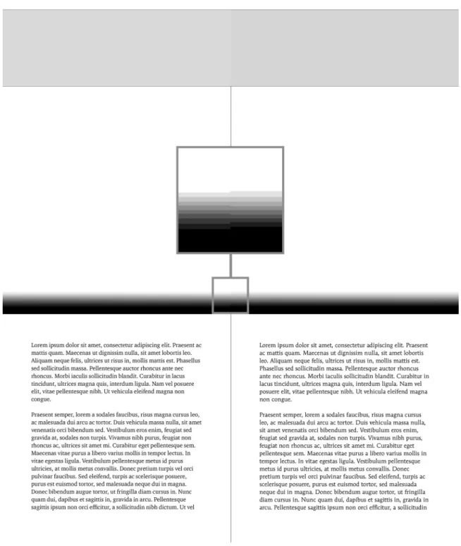
Since its origins in the 14th century (Mijksenaar, 1997), the purpose of data visualization has been the depiction of abstract concepts. The possibility of establishing conventions for the representation of some of these concepts has depended on the definition of concrete quantifiable, hierarchical units. Alternatively, there are values that can be easily qualified but not quantified, values that are more common in figurative representations such as photographs or paintings. Zikkenheimer (1986) places iconic imagery (photographs or drawings) and data visualization (diagrams, graphs or maps) at different ends of what Mijksenaar calls the “visualization spectrum” (Mijksenaar, 1997, p.34) (see Figure 3), the former dealing with concrete matters and the latter with concepts. For instance, in a bar chart of two columns, it is not only possible to know when one column is bigger that the other, it also possible to know how much bigger it is due to the existence of a quantifiable scale. In contrast, when comparing two grey squares, it is possible to know which square is darker, but it is not possible to say how much darker is it from mere observation, unless its darkness is given in quantifiable units (see Figure 4).
Figure 3 Difference in perceived luminance between two squares based on quantity of standard units (in
this case, circles of the same diameter).
Figure 4 The “visualization spectrum” (Mijksenaar, 1997, p.34) as envisioned by Zikkenheimer 1986).
3 How black or white is “Black and White”
We would argue that raster digital imagery (also known as bitmap imagery) is already given in quantifiable units: pixels. The resolution of a digital picture provides the width and height in a specific number of pixels and the multiplication of these values gives the objective number of pixels in a particular image. For instance, in an image of 1280 by 768, the number of pixels is 983,040; however, in a photograph these pixels are not arranged by color, tone or luminance and in
consequence cannot be quantified or compared. We could think about pixels in a photograph as syntactically scattered, yet semiotically organized data. Here, we argue that by organizing the data syntactically – sacrificing the visual semiotic affordances of a photograph – this
kind of representation can be transposed to the other end of the visualization spectrum, (Mijksenaar, 1997) enabling attributes such as objective comparison or contrast. Below, we present a method of drawing attention to these attributes using the glitch art techniques of data bending and pixel-sorting as data visualization tools. This
approach would be particularly useful in situations in which some degree of quantitative rigour is required, but the main or only source of data is either figurative imagery, or visual artifacts too complex to be compared and quantified in their native form, as it tends to be the case with organic forms. Think about cases in which it is necessary to compare and express numerically the difference between two or more irregular shapes, for instance, comparing satellite images of the same geographical area as it changes over time (see Figure 5). Existing software allows for comparison, highlighting differences even at a pixel-by-pixel level, but it would still be necessary to sort the pixels of the resulting image to allow for quantification. Another example of a specific application of the method described here could be the calculation of typographic colour, defined as “the darkness of the type as set in mass”, a feature that depends on the design of the typeface and the space between letter, words and text lines (Bringhurst, 2013, p. 324). According to Bringhurst (2013), evenness in typographic colour should
be the aim of any typographer, once issues of legibility and readability are addressed. The method presented here would provide a resource to either compare typographic texture density between different layouts, or to assess consistency of the typographic colour within a work in a quantitative manner (see Figure 6). Moreover, this approach could also help to quantify and visualize ink consumption of different typefaces, an issue that gain prominence in U.S. media recently (Stix, 2014; Vincent, 2014)
Figure 5 Image created from NASA satellite images showing a comparison of Arctic ice between 1984 and
Figure 6 Comparison of texture density (typographic colour) between ITC Charter (Carter, 2005) and ITC
4 The method
To demonstrate this method, we selected 10 photographs from the Flickr Commons (“Flickr Commons,” 2008) repository based on an advanced search by color (black and white), orientation (square), size (small, all sizes) and licence (Creative Commons). The method described below was applied to each one of the photographs. This protocol resulted in monochromatic gradients, arrayed based on density of black pixels, grey pixels of any shade, and white pixels which were also analyzed. The first step of this method consisted in the homogenization of the size of the pictures for comparison purposes. Using a raster graphics editor (i.e., GIMP [Kimball & Mattis, 2014]), all images were resized to 600 by 600 pixels at 72 pixels per inch. This entailed trimming some of the pictures to get a perfect square. The color model was also homogenized to 8 bits greyscale and the images saved to uncompressed TIFF format (Tagged Image File Format) at maximum quality to prevent compression (see Figure 7).
Figure 7 Images selected for this demonstration after resizing. From right to left, in the first row: 1) Mary
[George] in Lincoln Inn, Greek girl in coffee shop, July 1950 from Lincoln Coffee Lounge & Cafe, Rowe Street, Sydney (Bird, 1950); 2) Brick turreted tower (Simonton & Mares, 1860); 3) Portrait of Charlie Parker, Tommy Potter, and Max Roach, Three Deuces, New York, N.Y., ca. Aug. 1947 (Gottlieb, 1947); 4) Lincoln’s funeral on Pennsylvania Ave. (Library of Congress, 1865); 5) Ornamental garden, Kylemore, Co Galway (Mares & Simonton, 1871). From left to right, in the second row: 6) Unidentified sailors on HMAS Perth (Silk, 1941); 7) Källahamn, Öland, Sweden (Sjöbeck, 1941); 8) Lion tamer (Tyne & Wear Archives & Museums, n.d.); 9) Tatiana Riabouchinska and Roman Jasinsky in Les Dieux mendicants (Dupain, 1938); 10) “Top Women” at U.S. Steel’s Gary, Indiana, Works, 1940-1945 (U.S. National Archives, 1939).
The next step entailed retrieving the raw ASCII data from the pictures and converting it to Hexadecimal format. In the process, each photograph in TIFF format was duplicated and renamed. The duplicated file was opened in a basic text editor, revealing the raw data and saved as a text file (*.txt). It is important to point out that even a minor change to the data could have altered the actual picture; it is at this level that the technique of data bending is applied for the production of glitch pieces. In this instance, the conversion from ASCII to hexadecimal was achieved through an open access standalone hexadecimal editor (i.e., Hex Fiend [2012]), but it could have been performed using one of the many online converters available. The result of this conversion was an array of alphanumeric characters arranged in pairs and separated by a space. This new version of the image raw data was also saved. If an online editor were used instead, it would be necessary to copy and paste the data in a new text document.
The third step was the rearrangement of the color information from lighter to darker, or vice versa. Unlike with color images, greyscale does not require three overlaid channels; rather, it requires only one for luminance information. The hexadecimal code for neutrals (greys) progresses from 0 to 9 and from A to F; hence, it is not possible to sort these values solely numerically or alphabetically. The process of sorting hexadecimal values has to be mediated
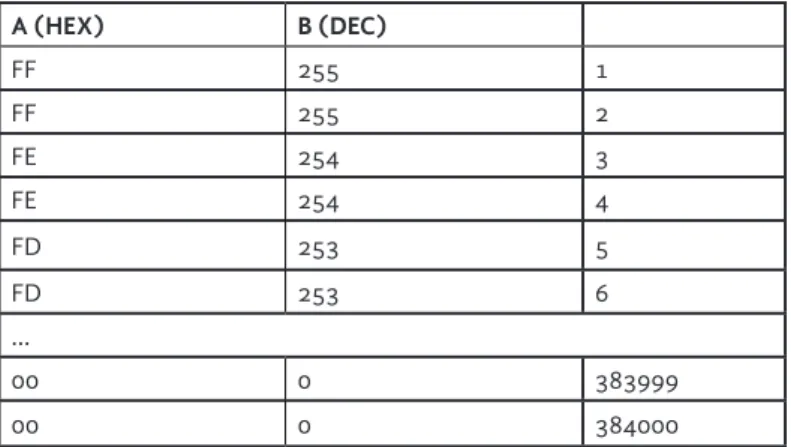
through a decimal format that can range from 0 to 255 and has a number for every hexadecimal or ASCII symbol. This format, unlike hexadecimal or ASCII, can be sorted seamlessly either in ascending or descending order using a spreadsheet application. However, due to the characteristics of these kinds of applications, the data has to be presented as a list in order to be sorted. One possible way to achieve this is using the find/replace function existent in virtually any text editor to replace every space between the bytes of the picture raw data in hexadecimal format for a carriage return (Enter key). Alternatively, scripts applied from any browser could be also used for this purpose.
Once expressed as a list, the data was copied and pasted in a single column (A) of a new spreadsheet document. The resulting column was, for each respective image, approximately 384,000 rows containing 1 byte (2 digits) each. The conversion to decimal format was done within the program (i.e., StarOffice [2011]) by applying the function “=HEX2DEC (placement of the byte in
hexadecimal format)”. This was accomplished by placing the formula in the column (B) adjacent to the one with the hexadecimal data (A) and referring the operation to the data of that column (e.g., ‘=HEX2DEC(a1)’). After the application of the formula to the first
cell, the function “Autofill” was run on the same number of rows of the first column, generating a second column with the decimal expression of the hexadecimal values (see Table 2). At this point it was possible to use the data to calculate average values such as
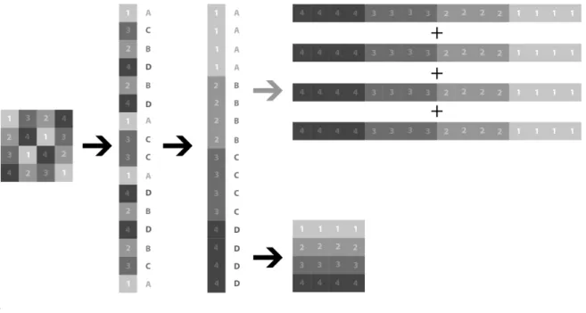
the mean, median or mode of the bytes within the image. The use of the mean in this demonstration is described below, but the other statistical averages could also be used to determine the middle value (median), or the most prominent tone in the image (mode). After converting the values in the first column to hexadecimal in a second column, the second column was sorted in descending order while the first one was also selected, sorting this column as well. After sorting, the column of hexadecimal information was copied and pasted in a new document in the hexadecimal editor (i.e., Hex Fiend [2012]) and saved as a *.data or *.raw file to be opened in the raster graphic editor. Following this process, the new document produced was a series of bytes that could be shaped into any proportion by assigning a width and height in pixels. Considering that the number of pixels of the same color (bytes with the same information) varies within an image and between different images, the most sensible way to display this data seemed to be arraying all the pixels in a single line and “extruding” this line to increase its visibility. In order to do that, it would have been necessary to set a width of the number of bytes in the image (around 384,000) by 1 pixel of height and multiply it until it is perceivable. The problem with this approach would be an exponential increment of the file size, making it unmanageable. As the demonstration of this method did not require such a fine
granularity, we elected to adjust the ratio to the existent pixels (bytes) of the image (see Figure 8). In every case, after setting the desired proportions of the image, the result was a seamless gradient from white to black, unique for each photograph (see Figure 9).
Table 2 Translation between hexadecimal and decimal format within spreadsheet software for the purpose of alphabetical sorting . B (DEC) A (HEX) 1 255 FF 2 255 FF 3 254 FE 4 254 FE 5 253 FD 6 253 FD … 383999 0 00 384000 0 00
Figure 8 A scheme of the entire process presented in this paper: 1) The data of the original image was accessed and converted to hexadecimal format, 2) rearranged as a list, 3) sorted numerically using decimal format, and 4) reassembled without adding new bytes to the existing data
.
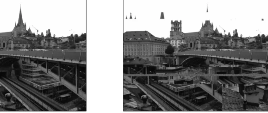
Figure 9 Dark and bright images before and after the pixel sorting process. The pixels of the images were rearranged from white to black, top to bottom.
It is important to note that the outcomes of the method presented here could have been achieved through software such as Processing 2 (Fry & Reas, 2004), but the use of this or any other tool would have hidden the underlying processes of pixel sorting and would have granted no access to the data, making further calculations impossible. For instance, the mean of all the data bytes in decimal expression within the images, obtained during the third step of this method, is necessary for the final steps. The mean of the data bytes in decimal format was converted to hexadecimal to get an estimated average of the luminance of each image and its corresponding gradient after the pixel sorting process. Using this value as a reference, the 10 images were arrayed from dark to bright in the figure presented below (see Figure 10).
Figure 10 Images used for this demonstration arrayed from dark to bright based on the average value of
their data bytes, converted from decimal to hexadecimal expression. From top to bottom: The first row displays the average bytes of the image in decimal format; the second row displays the same average in hexadecimal format and its corresponding luminance; the third row displays the gradient resulting from the pixel sorting process applied to each image displayed in the last row.
Once the pixels were sorted by luminance and reassembled as an image, some of the functionalities of the chosen raster graphics editor could be used to ease the representation of data. For instance, two of the ten images used in the demonstration of this method (see Figure 10) yielded the same mean value, but the aspect of the gradient, a product of the pixel sorting process, evidenced a different distribution. However, the fine granularity of the gradient would have made difficult the assessment and comparison of the distributions. Two functions or effects were used to coarsen the granularity of photograph gradients that share the mean value for purpose of comparison: 1) the creation of larger areas of tonality by averaging the luminance of the
pixels within even-sized sections of the gradient, and 2) the creation of larger areas of tonality by averaging an even number of luminance values within the gradient (see Figure 11). These functions or effects are known as “pixelation”(“pixelation, n.,” n.d.) or “mosaic” (depending on the software) and “posterization” (“posterization, n.,” n.d.). Besides these two specific effects,
there are several others that, in combination with access to the raw data and the glitch art techniques exposed here (databending and pixel-sorting), could be used to visualize quantitative data from photographs.
Figure 11 Comparison of the gradients of the two photographs with the same mean value: On the first
row of the right block of the image, the two gradients are compared in their original condition. The second row shows the gradients after applying a pixelation filter. The third row shows the gradients after applying a posterization filter. By applying these filters to the original gradient, the distribution of the luminance of the two photos is made easier to assess.
5 Discussion and future endeavours
The use of raster graphic editors and access to the raw data offered by the Glitch Art techniques presented here enable many possibilities for visualizing data from photographic imagery. Software such as GIMP (Kimball & Mattis, 2014) and its equivalents enable not only for the trans-mediation of data from raw to raster graphic formats (e.g., TIF, EPS, GIF, JPG, etc.), but also for the editing or preparing photographs and other kinds of iconic imagery before engaging in the redisposition of the raw data. This preparation could be done, for instance, by removing elements that could affect the interpretation of the data before applying the method described here, or isolating the elements within the image that will be quantified through pixel-sorting.
It is important to note that part of the aesthetic appeal of Glitch Art comes from the alteration of image colors through the disarticulation of bytes and the rearrangement of components. Consequently, glitch artists usually work with color imagery. The method presented here, however, applies specifically for greyscale images. Although the basic principles of the method are the same, particular circumstances, like the difference in composition between the greyscale bytes (2 bits) and the color bytes (6 bits), would result in an incorrect trans-mediation of the data from raw to bitmap if this method were applied in its current form to color images. This does not mean that this method cannot be adapted for that purpose, but it would require the consideration of various other factors, including the modification of the code offered here for the arrangement of the
data in list format. The development of further protocols for the use of image editing software in combination with the techniques presented here, as well as the exploration of the use of iconic color imagery for data visualization purposes, are only two of the many possible future endeavours that we foresee could be explored in detail in future research.
References
AGAIAN, S. S., & PEREZ, J. P. 2005. New Pixel Sorting Method for Palette Based Steganography and Color Model Selection. International Workshop on Spectral Methods an Multirate Signal Processing (SMMSP).
AHUJA, M., & LU, D. 2014, July 23. What Paris looks like with an echo. The Washington Post. Retrieved from http://www.washingtonpost.com/blogs/
innovations/wp/2014/07/23/what-paris-looks-like-with-an-echo/ ASENDORF, K. n.d. Kim Asendorf. Retrieved July 27, 2015, from http://
kimasendorf.com/www/
BARNESS, J. 2015. Social Disruptions: WYSi-WE, What You See is What Emerged. Visual Communication, v.14, n.1, p.41–48. http://doi. org/10.1177/1470357214535304
BASTIAN, M., HEYMANN, S., & JACOMY, M. 2009. Gephi: An Open Source Software for Exploring and Manipulating Networks. In Third International AAAI Conference on Weblogs and Social Media. Retrieved from http://www.
aaai.org/ocs/index.php/ICWSM/09/paper/view/154
BEHRENS, C. n.d. About. Retrieved from http://www.niceone.org/ infodesignpatterns
BIRD, B. 1950. Mary [George] in Lincoln Inn, Greek girl in coffee shop, July 1950 from Lincoln Coffee Lounge & Cafe, Rowe Street, Sydney. Retrieved from https://www.flickr.com/photos/statelibraryofnsw/5394413351/
BOSTOCK, M. n.d. D3.js (Version 3). Retrieved from http://d3js.org/
BRINGHURST, R. 2013. The elements of typographic style (4th ed.). Vancouver, B.C. Canada: Hartley & Marks, Publishers.
CARTER, M. 2005. ITC Charter (Version v 1.0.38). International Typeface Corporation.
COLMAN, A. M. 2014. Trichromatic theory. Retrieved July 28, 2015, from http:// www.oxfordreference.com/view/10.1093/acref/9780199534067.001.0001/ acref-9780199534067-e-8573
DALLAS. 2013a, April 24. Glitch Art (Part 1: The Basic Databend) |
Oskoui+Oskoui Blog. Retrieved from http://blog.oskoui-oskoui.com/?p=6161 DALLAS. 2013b, June 7. Glitch Art (Part 2: Photoshop Raw Glitch) |
Oskoui+Oskoui Blog. Retrieved from http://blog.oskoui-oskoui.com/?p=6298 DE SMET, P. 2010. Optimized high speed pixel sorting and its application in
watershed based image segmentation. Pattern Recognition, 43(7), 2359–2366. http://doi.org/10.1016/j.patcog.2010.01.014
com/photos/statelibraryofnsw/4051611764/
FLICKR COMMONS. 2008. Retrieved from www.flickr.com/commons
FRY, B., & REAS, C. 2004. Processing 2 (Version 2.2.1). Processing Foundation. Retrieved from www.processing.org
GEERE, D. 2010, August 17. Glitch art created by “databending” (Wired UK). Retrieved July 27, 2015, from http://www.wired.co.uk/news/ archive/2010-08/17/glitch-art-databending
GENTLEMAN, R., & IHAKA, R. 2015. R: The R Project for Statistical Computing (Version 3.2.2). The R Foundation. Retrieved from https://www.r-project. org/
GOTTLIEB, W. 1947. Portrait of Charlie Parker, Tommy Potter, and Max Roach, Three Deuces, New York, N.Y., ca. Aug. 1947 (LOC). Retrieved from https:// www.flickr.com/photos/library_of_congress/5105149798/
HERTZ, G., & PARIKKA, J. 2012. Zombie Media: Circuit Bending Media Archaeology into an Art Method. Leonardo, v.45, n.5, p. 424–430. HEX FIEND. 2012. (Version Version 2.1.2). Ridiculous Fish.
ISAAC, E. J., & SINGLETON, R. C. 1956. Sorting by Address Calculation. Journal of the ACM, 3(3), 169–174. http://doi.org/10.1145/320831.320834
KIMBALL, S., & MATTIS, P. 2014. GIMP (Version 2.8.14). Retrieved from www. gimp.org
KRUM, R. 2013. Cool Infographics: Effective Communication with Data Visualization and Design. Indianapolis, IN: Wiley.
LIBRARY OF CONGRESS. 1865. Lincoln’s funeral on Pennsylvania Ave. (LOC). Retrieved from https://www.flickr.com/photos/
library_of_congress/3252915551/
MARES, F. H., & SIMONTON, J. 1871. Ornamental garden, Kylemore, Co Galway. Retrieved from https://www.flickr.com/photos/nlireland/16140098514/ MASON, S. 2012. Glitched Lit: Possibilities for Databending Literature. In
Proceedings of the 2nd Workshop on Narrative and Hypertext (pp. 41–44). New York, NY, USA: ACM. http://doi.org/10.1145/2310076.2310086 MENDOZA, J. 2003. ITC Mendoza (Version v 1.180). International
Typeface Corporation.
MENKMAN, R. 2011. Glitch studies manifesto. In Video vortex reader II: Moving images beyond YouTube (pp. 336–347). Amsterdam: Institute of Network Cultures.
MIJKSENAAR, P. 1997. Visual Function: An Introduction to Information Design. 010 Publishers. Retrieved from http://books.google.ca/books?id=-j7JcB2al7sC MOERE, A. V., & PURCHASE, H. 2011. On the role of design in information
visualization. Information Visualization, v.10, n.4, p.356–371. http://doi.org/ http://dx.doi.org.ezproxy.library.ubc.ca/10.1177/1473871611415996
NASA EARTH OBSERVATORY, & ALLEN, J. 2012. Arctic Sea Ice Minimum Comparison. Retrieved from https://commons.wikimedia.org/wiki/ File:Arctic_Sea_Ice_Minimum_Comparison.png
NEURATH, M. 2009. The transformer: principles of making isotype charts. London: Hyphen Press.
PENG, K., & KIEFFER, J. C. 2004. Embedded image compression based on wavelet pixel classification and sorting. IEEE Transactions on Image Processing, v.13, n.8, p.1011–1017. http://doi.org/10.1109/TIP.2004.828441
PIXELATION, N. n.d. OED Online. Oxford University Press. Retrieved from http://www.oed.com.ezproxy.library.ubc.ca/view/Entry/261848
POSTERIZATION, N. n.d. OED Online. Oxford University Press. Retrieved from http://www.oed.com.ezproxy.library.ubc.ca/view/Entry/237460
/R/PIXELSORTING. n.d. Retrieved July 27, 2015, from http://www.reddit. com/r/pixelsorting/
SILK, G. 1941. Unidentified sailors on HMAS Perth. Retrieved from https://www. flickr.com/photos/australian-war-memorial/2864435680/
SIMONTON, J., & MARES, F. H. 1860. Brick turretted tower. Retrieved from https://www.flickr.com/photos/nlireland/18357908211/
SJÖBECK, M. 1941. Källahamn, Öland, Sweden. Retrieved from https://www. flickr.com/photos/swedish_heritage_board/11981941023/
STAROFFICE. 2011. OpenOffice.org (Version v.3.3). OpenOffice.org. STIX, M. 2014, March 29. Teen to government: Change your typeface, save
millions - CNN.com. Retrieved October 24, 2015, from http://www.cnn. com/2014/03/27/living/student-money-saving-typeface-garamond-schools/ index.html
THOMPSON, J. 2015, January 15. jeffThompson/PixelSorting. Retrieved August 4, 2015, from https://github.com/jeffThompson/PixelSorting
TUFTE, E. R. 1983. The visual display of quantitative information. Graphics Press. Retrieved from http://books.google.ca/books?id=tWpHAAAAMAAJ
TUFTE, E. R. 1990. Envisioning information. Cheshire, Conneticut: Graphics Press. Retrieved from http://books.google.ca/books?id=1uloAAAAIAAJ TUFTE, E. R. 1997. Visual explanations: images and quantities, evidence
and narrative. Graphics Press. Retrieved from http://books.google.ca/ books?id=OqlpAAAAMAAJ
TYNE & WEAR ARCHIVES & MUSEUMS. n.d. Lion tamer. Retrieved from https://www.flickr.com/photos/twm_news/6211107418/
U.S. NATIONAL ARCHIVES. 1939. “Top Women” at U.S. Steel’s Gary, Indiana, Works, 1940-1945. Retrieved from https://www.flickr.com/photos/
usnationalarchives/3660777810/
VINCENT, J. 2014, April 1. Why US government won’t save $400m by switching fonts. Retrieved December 5, 2016, from http://www.independent.co.uk/ news/science/save-400m-by-switching-fonts-unfortunately-it-wont-work-for-the-us-government-or-for-you-9229297.html
WEBBER, H. 2011, December 21. ExtraFile: Databending and Corrupt Files As Art. Retrieved July 27, 2015, from http://thenextweb.com/dd/2011/12/21/
extrafile-databending-and-corrupt-files-as-art/
WHITELAW, M. 2004. Hearing pure data: Aesthetics and ideals of data-sound. In Unsorted : thoughts on the information arts : an A to Z for SonicActsX (pp. 45–53). Amsterdam : Sonic Acts Press. Retrieved from http://www. glennbach.com/ai/whitelaw_hearing_pure_data.pdf
ZIKKENHEIMER, L. 1986. Beeldmateriaal en buitenlandse vrouwen: Een handreiking voor het ontwerpen en selecteren van visueel voorlichtings- en lesmateriaal voor buitenlandse ... immigranten lektuur). Den Haag: Nederlands Bibliotheek en Lektuur Centrum.
Sobre os autores
Ernesto Peña<[email protected]>, <[email protected]> Department of Language and Literacy Education
University of British Columbia http://lled.educ.ubc.ca/ 6445 University Boulevard Vancouver, BC Canada V6T 1Z2
Dr. Teresa M. Dobson
Department of Language and Literacy Education University of British Columbia
http://lled.educ.ubc.ca/ 6445 University Boulevard Vancouver, BC Canada V6T 1Z2 Omar Juárez <[email protected]> Independent Researcher http://www.omarojo.com/ Artigo recebido em 26/09/2016 Artigo aceito em 20/12/2016


![Figure 7 Images selected for this demonstration after resizing. From right to left, in the first row: 1) Mary [George] in Lincoln Inn, Greek girl in coffee shop, July 1950 from Lincoln Coffee Lounge &](https://thumb-eu.123doks.com/thumbv2/123dok_br/17199251.784676/8.892.133.801.778.1044/figure-images-selected-demonstration-resizing-george-lincoln-lincoln.webp)